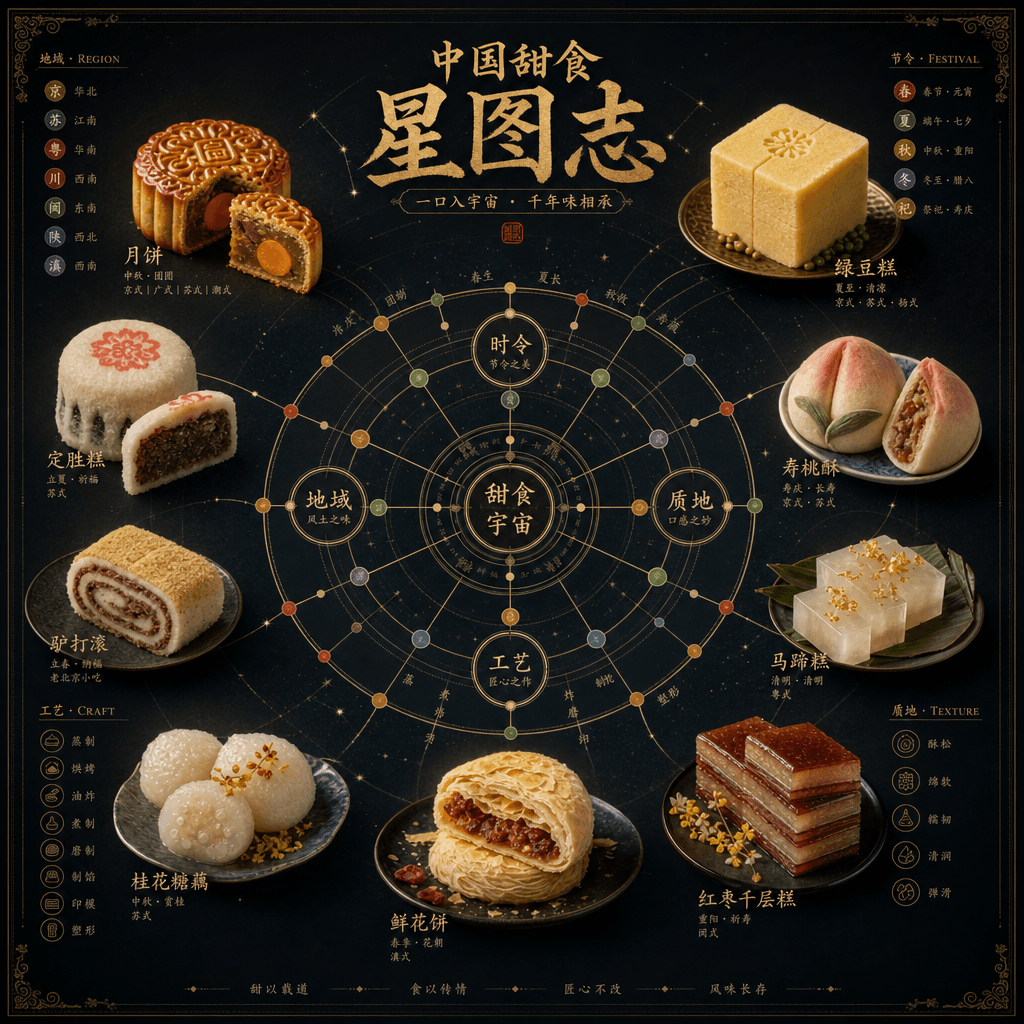
“Genealogy of the Chinese Dim Sum Universe”
"Chinese Dessert Universe Genealogy" is a combination of museum-style information graphics and high-end food photography. In the center is a star chart-like structure. Moon cakes, mung bean cakes, Dingsheng cakes, peach cakes, donkey rolls, horseshoe cakes, etc. are arranged like constellation nodes. The connecting lines mark the relationship between region, festival, taste and craftsmanship. There is a close-up of the food next to each node. The title is solemn and grand, with a ratio of 4:5.