New: GPT Image 2.5 Flare and Sunburst. Try them free with 3 images on sign-up, then 8 credits each.
Try GPT Image 2.5

AI Infographic Prompts

Prompts for infographics, diagrams, explainers, and educational posters. They specify the topic, the sections or steps to show, the layout grid, and how text should be handled. Keep labels short and ask for a clear hierarchy, because long paragraphs are the least reliable part of a generated infographic.

Sort by:

Showing 1201–1256 of 1,256 prompts

Commercial Kitchen Workflow Infographic

Commercial Kitchen Workflow Infographic

"Chinese restaurant back kitchen moving line overview" combines catering industrial design with documentary kitchen photography, overlooking a busy but orderly back kitchen, forming a clear closed loop from washing, cutting, preparing, frying, serving, passing dishes to recycling. Peak hours, pot firepower, food preparation turnover and safety tips are listed next to it. The overall professional, enthusiastic and full of fireworks, with a ratio of 16:9.

Urban Laundry Anthropological Infographic

Urban Laundry Anthropological Infographic

"Research on the Aesthetics of the Clothes Drying System of Mountain City Residents" combines social observation photography with design illustrations. Clothes of different colors and materials are dried on the balconies in layers. The picture uses thin lines and small labels to analyze the structure of the clothes drying pole, space utilization, color rhythm, and weather response. The title is like a calm anthropology magazine, with a ratio of 4:5.

Hand-Pulled Noodle Mechanics Poster

Hand-Pulled Noodle Mechanics Poster

"Poster on Mechanical Analysis of Hand-pulled Noodles" combines food photography with scientific illustrations. The main picture is a freeze-frame of a chef's continuous movements of stretching noodles. Parameters such as stretching, torsion, rebound, thickness uniformity, dough moisture content, etc. are marked with thin lines on the side. The background is a mist-filled kitchen. The title is serious and professional, with a ratio of 4:5.

"Moon Nursery Schedule"

"Moon Nursery Schedule"

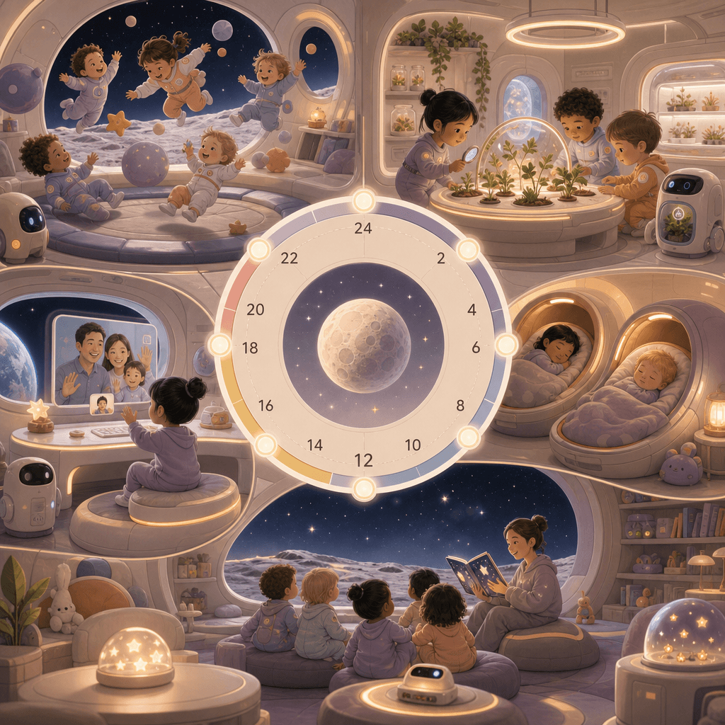
"Moon Nursery Schedule" combines children's space design with a future world view. The screen adopts a circular 24-hour orbital timeline. The nodes include low-gravity games, aerospace plant classes, nap cabins, earth video calls, and starry sky story time. It is accompanied by small scene illustrations and equipment diagrams. The colors are gentle. It is not a cold science fiction but a future with living temperature. The ratio is 9:16.

Sustainable Fishing Port Infographic

Sustainable Fishing Port Infographic

"New Energy Fishing Port Daily Operation Diagram" combines industrial space photography with sustainable industry information graphics. The fishing port in the morning fog is equipped with solar roofs, electric cold chain vehicles, seafood sorting platforms, and wind power lighthouses. On the right side are energy consumption, fishing species, supply cycles, and weather forecast modules. It has a simple and professional temperament, with a ratio of 16:9.
"Make one's childhood into a theme park map"

"Make one's childhood into a theme park map"

"Make one's childhood into a theme park map", the memory narrative is integrated with the park guidance system, and the picture is presented in a cute flat map style: the old community slide area, the concession stand area, the afternoon cicada chirping forest area, the cartoon theater area in front of the TV, the summer homework maze area, and the grandma's kitchen dessert station. Each area is equipped with detailed illustrations and nostalgic text, just like a real theme park map single page, with a ratio of 4:5.

"Late Night Radio Program Schedule"

"Late Night Radio Program Schedule"

"Late Night Radio Program List" combines sound media with editorial schedule design. The screen is like a radio station's all-night program list. From 22:00 to 05:00, it is divided into "overtime with you, for insomniacs, anonymous stories, city wind, and daybreak." Each column is decorated with minimal illustrations and waveforms, and the background is dark studio equipment. The ratio is 9:16.

"Twelve Greens of Spring" Visual Dictionary

"Twelve Greens of Spring" Visual Dictionary

The "Twelve Greens of Spring" visual dictionary combines a color sample book with a nature observation poster. The picture is composed of 12 vertical color strips, corresponding to names such as "new willow green, moist moss green, matcha green, glass bottle green, green plum green, and after-rain leaf green". Each color strip is accompanied by a macro photo and an emotional description. The layout is minimalist and advanced, like a designer's inspiration board, with a ratio of 9:16.

“The Urban Night Runner’s Gear Guide 2026”

“The Urban Night Runner’s Gear Guide 2026”

"Urban Night Runner Equipment Guide 2026" combines product display with lifestyle posters. The main screen is a front view of a night runner's full body equipment. Shoes, reflective vests, bone conduction headphones, arm bags, water bottles, and heart rate rings are marked with thin lines. Next to them are heart rate zones, urban routes, and nighttime lighting recommendations. The color scheme is dark blue with fluorescent green, like a sports brand technical manual, and the ratio is 9:16.

“Chinese Wedding Color Archives”

“Chinese Wedding Color Archives”

"Chinese Wedding Color Archives" combines traditional etiquette with modern editorial formats. The picture is divided into five modules: "rouge red, gold thread yellow, jade white, ebony black, and pomegranate pink" to display wedding clothes, utensils, pastries, invitations, flowers and patterns. The central title is like a high-end wedding magazine feature, with very short notes around it explaining the symbolic meaning behind each color. The overall design is solemn and exquisite, with a ratio of 4:5.

“Social heat map of hot pot restaurants”

“Social heat map of hot pot restaurants”

"Social Heat Map of Hot Pot Restaurants" combines catering space design with social behavior analysis. It takes an overhead shot of the floor plan of a lively hot pot restaurant. Different seating areas are marked as "family reunion area", "colleague dining area", "ambiguous trial area", "friends complain area" and "alone get off work recovery area". The heat map shows spiciness, drink consumption and laughter density. The style is humorous and professional, with a ratio of 16:9.
"Air Profile of a Used Bookstore"

"Air Profile of a Used Bookstore"

"Air Section of an Old Bookstore" is a fusion of spatial narrative and conceptual information graphics. The picture cuts a cross-section of an old bookstore. Different layers of air are filled with visual symbols of paper dust, coffee aroma, umbrella dripping, page turning sound waves, and the creak of the wooden floor. These "invisible components" are annotated with academic style labels next to it. The title is very poetic and the ratio is 3:4.

“The Economics of a Breakfast Stall”

“The Economics of a Breakfast Stall”

"The Economics of a Breakfast Stall" is an infographic poster combined with street photography. The center of the picture is a perspective view of a steaming pancake stall. The cost components are listed on the left: batter, eggs, crackers, sauces, stall fees, labor, and rainy weather losses. The right side is the curve of queue length and table turnover speed during peak hours. At the bottom is written "Why are some people willing to walk two more streets for a hot mouthful of steam?" The whole thing is both down-to-earth and highly designed, with a ratio of 4:5.

Island Typhoon Preparation Infographic

Island Typhoon Preparation Infographic

"Island Typhoon Preparation Checklist 12 hours before" is an emergency poster integrated with a travel lifestyle magazine. The center of the picture is a cross-sectional view of an island B&B. Steps such as window reinforcement, water storage, lighting preparation, garden tidying, suspension notice, and kitchen food storage are marked with numerical labels. The sidebar has a wind speed grade ribbon and a timeline. The title is minimalist and eye-catching. The overall design is practical and visually attractive, with a ratio of 4:5.

Ryokan Daily Operations Timeline

Ryokan Daily Operations Timeline

"One day operation panel of a mountain hot spring hotel" combines hospitality service design with lifestyle photography. The vertical timeline starts from 6:00 cleaning, 10:00 welcome, 15:00 check-in, 18:00 dinner, 21:00 private bath, 23:30 lights out. It is equipped with small scene illustrations and simplified data at each time point such as passenger flow, hot water energy consumption, towel replacement volume, etc. The title is elegant and calm, and the color scheme refers to wood color, fog blue, and hot spring white steam. The proportions 9:16.

Jiangnan Garden Night Tour Guide Book

Jiangnan Garden Night Tour Guide Book

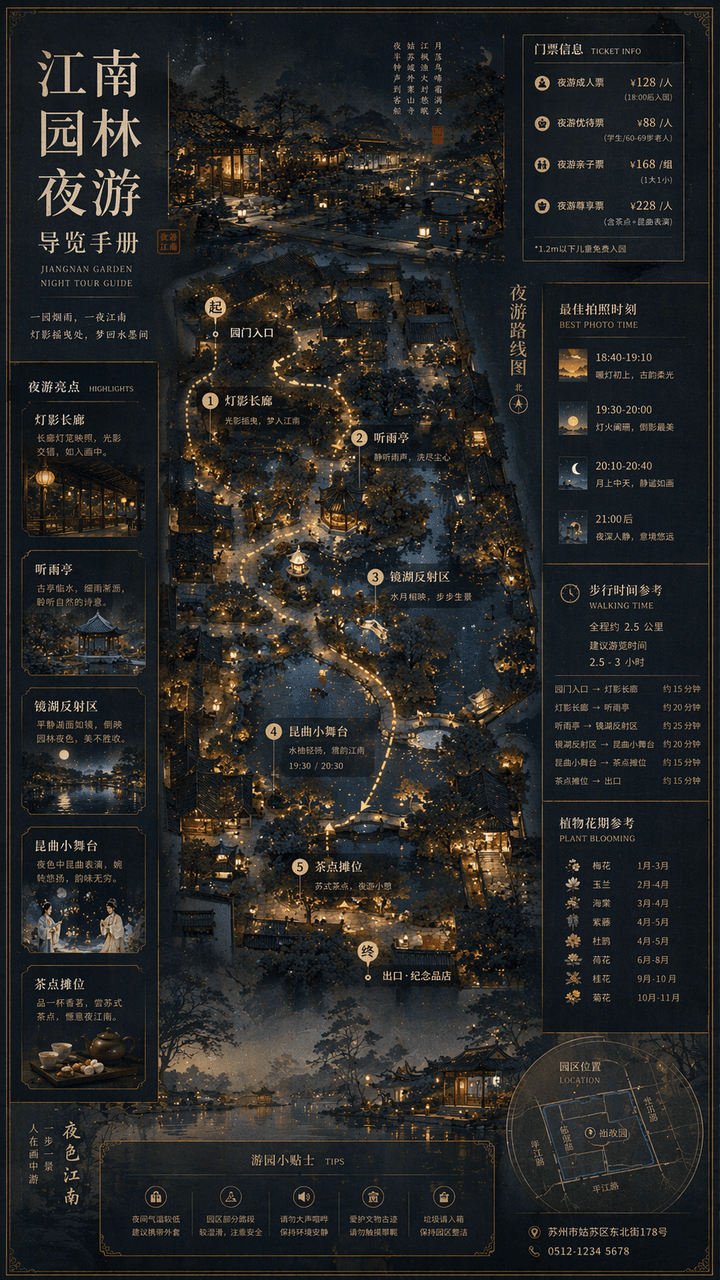
"Jiangnan Garden Night Tour Guide Manual" combines traditional landscape paintings with modern cultural tourism map systems. The main screen is an overhead view of the garden plus a partial perspective view, marking the night tour route, lantern spots, listening to the rain pavilion, mirror lake reflection area, Kunqu opera performance small stage and refreshment stalls. The sidebar includes ticket levels, best photo moments, walking time, and plant flowering periods. The font is a combination of Song Dynasty and modern fine black, and the overall elegant and precise ratio is 9:16.

Finals Week Library Survival Infographic

Finals Week Library Survival Infographic

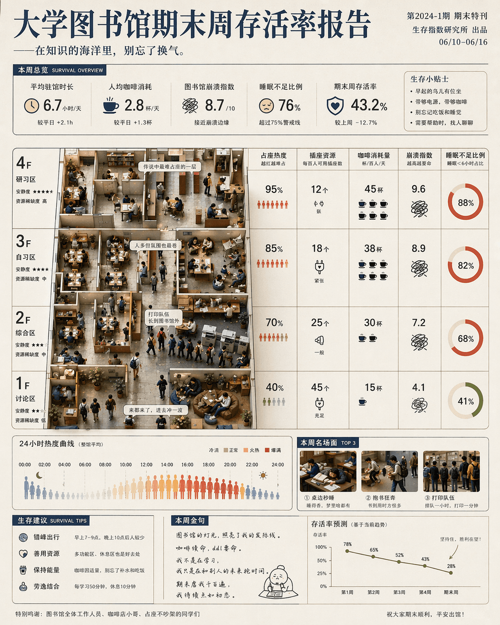
"University Library Final Week Survival Rate Report" is a fusion of humorous data posters and campus life photography. The main screen is based on the library floor plan, with seat occupation heat, socket resources, coffee consumption, crash index and sleep deprivation ratio marked by floor and time. Miniature scenes of students are partially embedded: running with books, falling asleep at the table, and the printing queue is too long. The title is serious, and the subtitle is slightly teasing, with a ratio of 4:5.

90-minute urban therapy trail after get off work

90-minute urban therapy trail after get off work

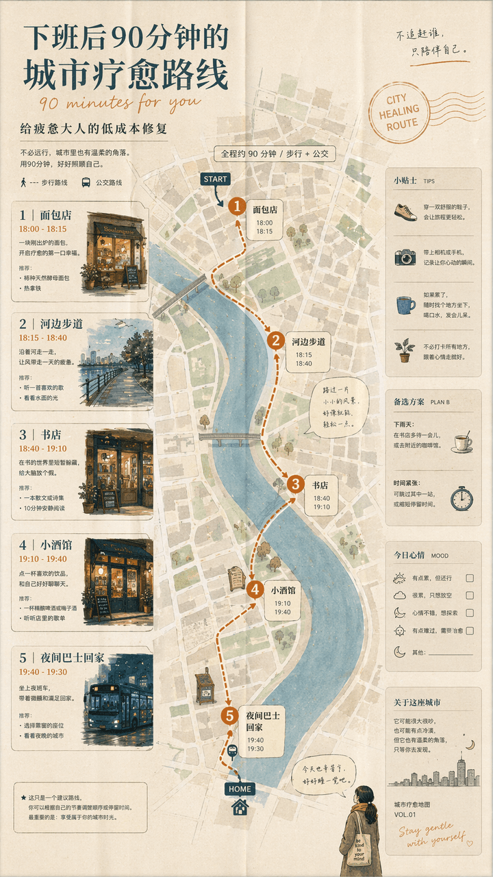
"A 90-minute urban healing route after get off work" is a combination of a lifestyle map and a guidebook. The screen unfolds like a foldable city map: the first stop is a bakery, the second stop is a riverside walk, the third stop is a bookstore, the fourth stop is a bistro, and the fifth stop is a night bus home. The route is marked with small illustrations and time suggestions. The title is gentle, and the subtitle reads "Low-cost fix for tired adults". The whole thing looks like an independent city guide magazine, with a ratio of 9:16.

Coffee Brewing Competition Infographic

Coffee Brewing Competition Infographic

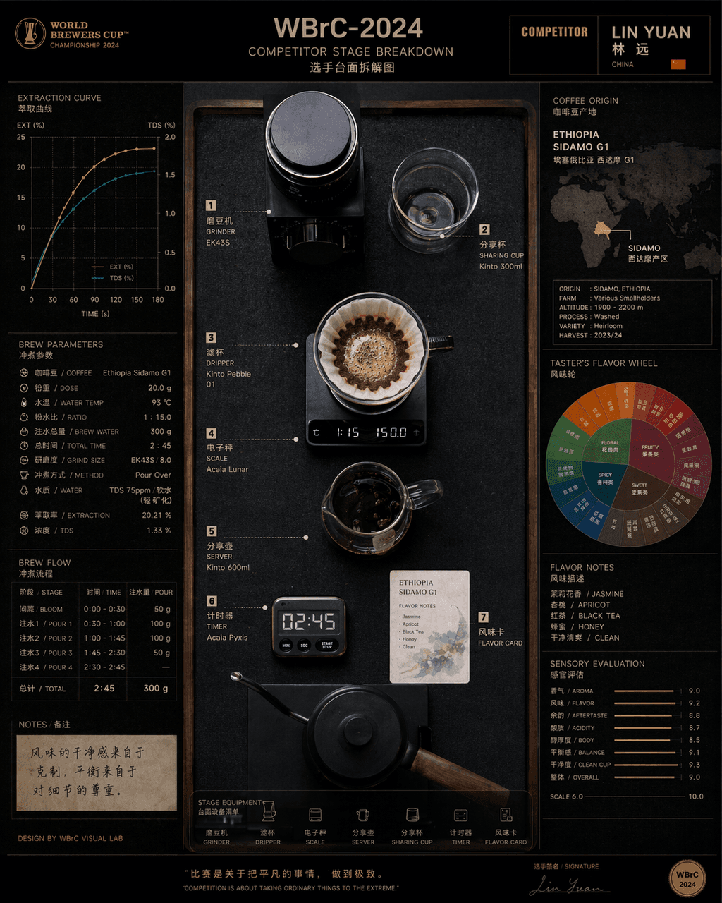
"Disassembly of countertops of contestants at the Hand-brew Coffee World Championship" combines product process photography with competitive sports visuals. In the center is an overhead shot of the competition platform, with grinders, filter cups, electronic scales, sharing pots, timers, and flavor cards accurately positioned. On the left are the extraction curves and brewing parameters, and on the right are bean source maps and flavor wheels. The title on the top has event numbers and player names. The overall look is like a fusion of a high-end food industry atlas and a sports event visual system, with a ratio of 4:5.

Emotional first aid kit for contemporary people

Emotional first aid kit for contemporary people

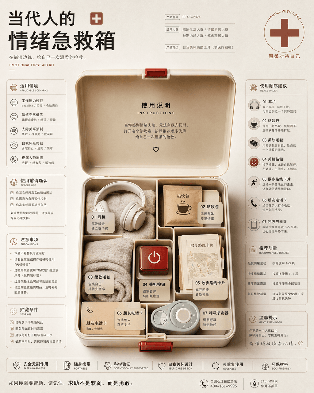
"Contemporary People's Emotional First Aid Kit Instruction Page", the packaging design is integrated with health information graphics. In the center of the picture is an open first aid kit, which is not medicine but headphones, hot drink packs, soft blankets, power off buttons, walking route cards, friend phone cards, and breathing pacemakers. The left and right sides are typed like drug instructions, with detailed descriptions of applicable situations, order of use, precautions and recommended dosages. The style is rational and restrained but the bottom layer is very gentle, with a ratio of 4:5.

Summer convenience store freezer chromatography

Summer convenience store freezer chromatography

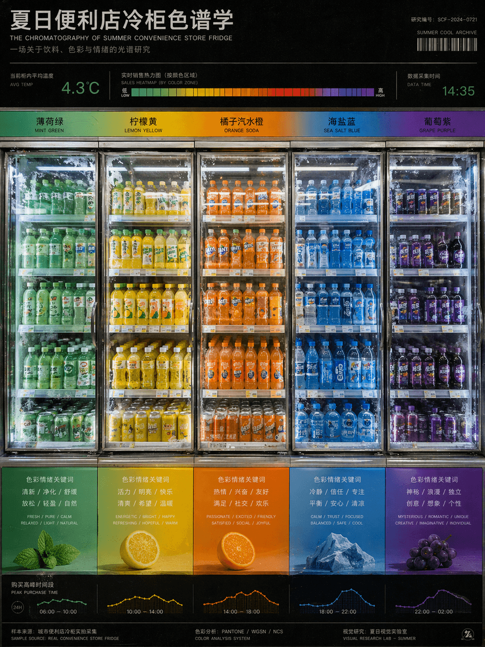
"Summer Convenience Store Refrigerator Chromatography" is a fusion of product photography and color research charts. The refrigerators are arranged from left to right according to the gradient of beverage packaging colors, from mint green to lemon yellow, orange soda orange, sea salt blue, and grape purple. There are temperature readings and sales heat bars on the top, and the bottom corresponds to the emotional keywords and purchase time periods brought by each color. The picture looks like a design school color course poster, but the content comes from a real convenience store scene. The frosting details of the glass door and the reflection of fluorescent lights are very realistic, with a ratio of 3:4.

Antarctic Station Kitchen Infographic

Antarctic Station Kitchen Infographic

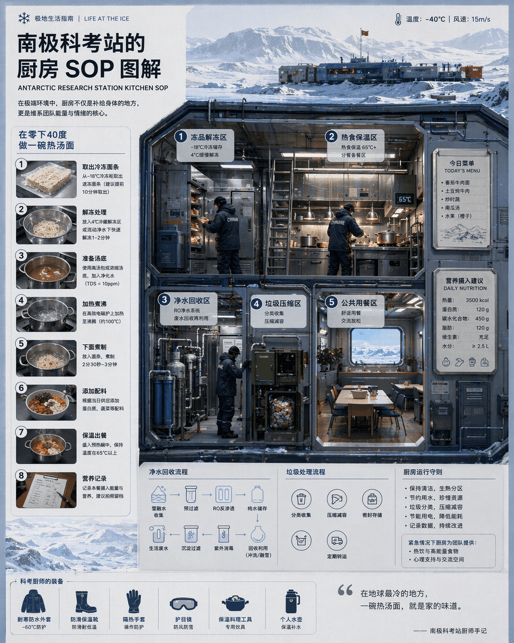
“Kitchen SOP at Antarctic Research Station "Illustration" combines scientific illustrations with catering flow charts. The main screen is a cross-section of a cold-resistant kitchen, with partitions indicating thawing of frozen products, hot food insulation, purified water recycling, garbage compression, and public dining areas. The chef wears a heavy scientific examination uniform. There is a magnetically attached today's menu and nutritional intake recommendations on the wall. A numbered step-by-step diagram on the left explains "making a bowl of hot noodle soup at minus 40 degrees." The visual style is clean and professional, and the information density is high, like a National Geographic special issue insert, with a ratio of 4:5.

Night Navigation Service Design

Night Navigation Service Design

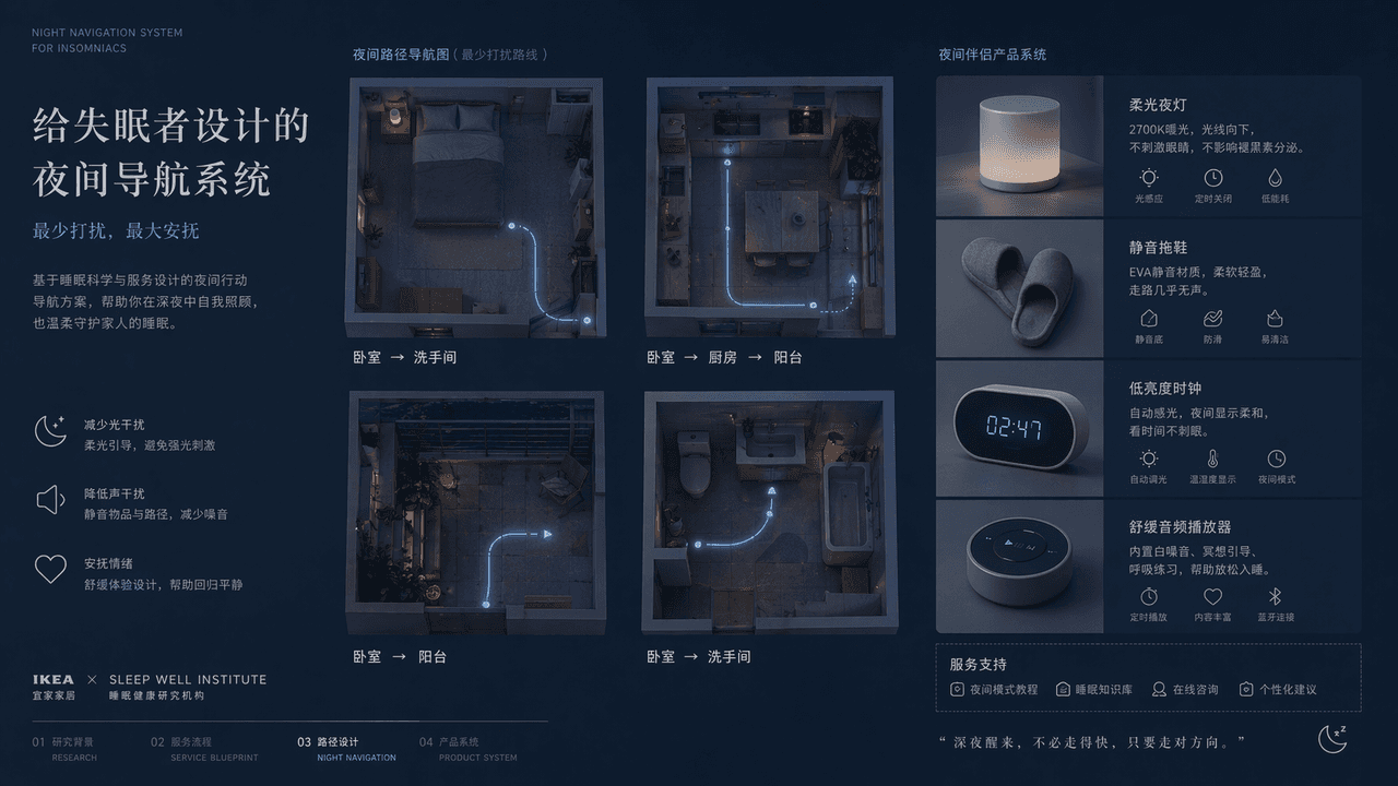
"A night navigation system designed for insomniacs", the service design plan display page, the main screen is an overhead view of the four night paths of the bedroom, kitchen, balcony, and bathroom, with extremely thin luminous lines marking the route that least disturbs the family. Next to it is the design of supporting objects such as soft night lights, silent slippers, low-brightness clocks, soothing audio players, etc. The title is restrained and gentle, and the color is indigo, gray blue, and milk white. The overall picture is like a joint proposal from IKEA + a medical sleep research institution, with both functional rationality and emotional comfort. The proportions 16:9.

Emoji History Museum Exhibit

Emoji History Museum Exhibit

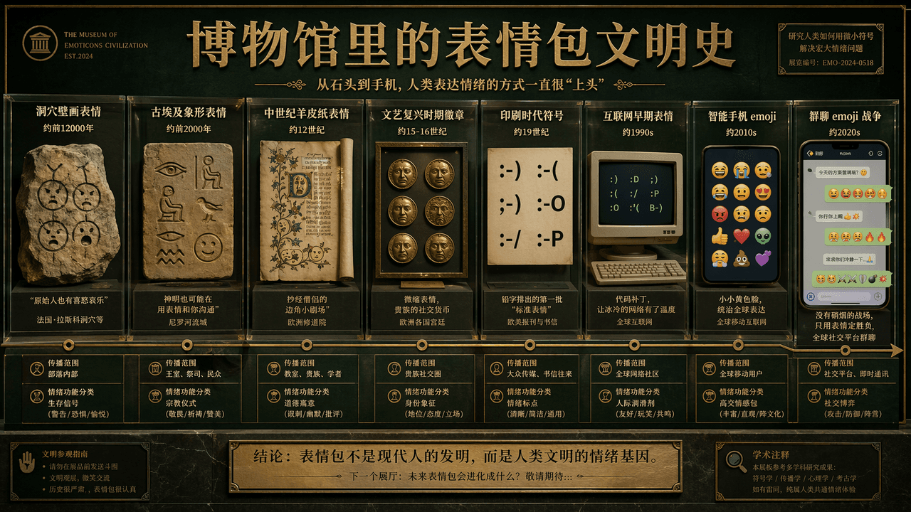
"The History of Emoji Civilization in the Museum" is a humorous fusion of academic display boards and Internet subculture. The main screen is like the wall of the exhibition hall of the Natural History Museum. The timeline extends from "cave painting emoticons" to "group chat emojis". War", representative emoticons of each era are displayed in the form of showcases, slates, parchments, computer screens, and mobile phone bubbles, with brief academic notes, age, scope of dissemination, and "classification of emotional functions." The title is serious, and the subtitle is slightly humorous. The color scheme uses museum dark green, warm white, and copper gold. The picture is both solemn and absurd, with a ratio of 16:9.
Four-Season Seaside Storefront Guide

Four-Season Seaside Storefront Guide

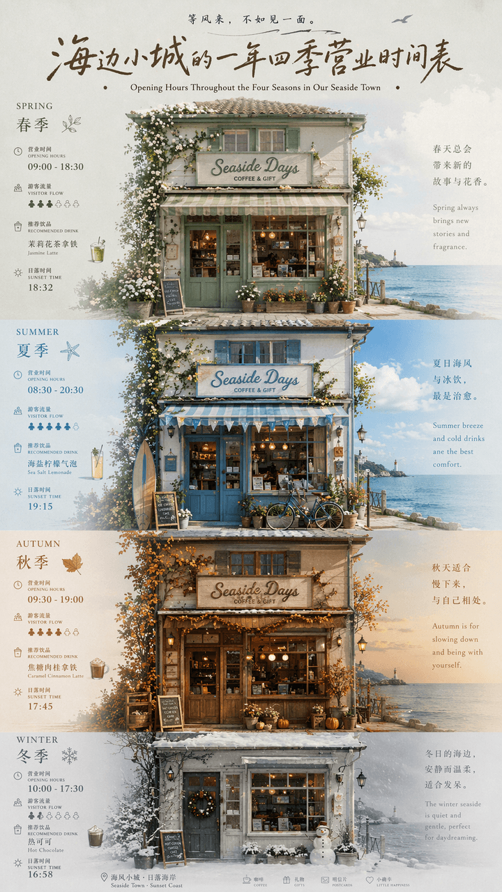
"A year-round business schedule of a small seaside town" is a fusion of local cultural and tourism posters and calendar infographics. The picture is centered on the facade of a seaside store. The four seasons of spring, summer, autumn and winter are represented by changes in window furnishings, door plants, sky colors and clothing. Each season is next to a thin number. The business hours, tourist flow, recommended drinks, and sunset time are marked. The title uses retro handwritten signature characters, and the subtitles are arranged in Chinese and English. The whole thing looks like an independent magazine travel feature. The color scheme transitions from sage green in spring, sea salt blue in summer, caramel brown in autumn to foggy gray white in winter. The proportions 9:16.
Emotional Transit Map Poster

Emotional Transit Map Poster

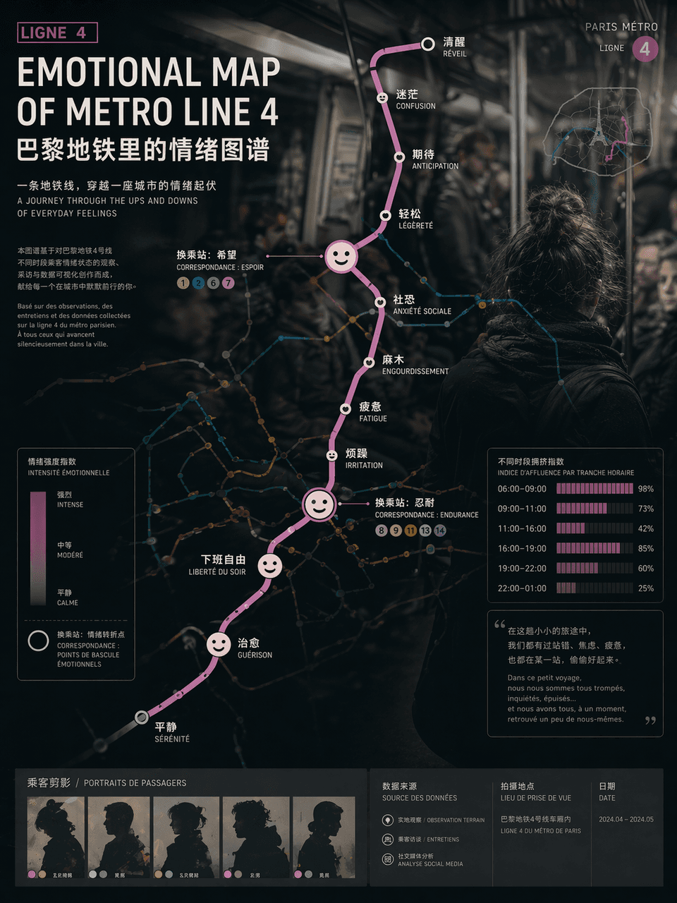
"EMOTIONAL MAP OF METRO LINE"/"EMOTIONAL MAP OF METRO LINE" 4", the emotional visualization poster is integrated with the urban traffic map. The route map uses standard subway map syntax, but the station name of each station is replaced with an emotional state, such as "awake", "numb", "expectation", "social fear" and "free from get off work", and the transfer nodes are enlarged into abstract expression icons , the background is vaguely blurred out in the style of documentary photography of crowded carriages. Passenger silhouettes and crowding index bar charts at different time periods are embedded in the corners of the poster. The title uses calm Swiss-style sans serifs. The subtitle is like an introduction to an art exhibition. The overall design combines social observation and contemporary art temperament. The proportions 3:4.

Vintage Writer Desk Infographic

Vintage Writer Desk Infographic

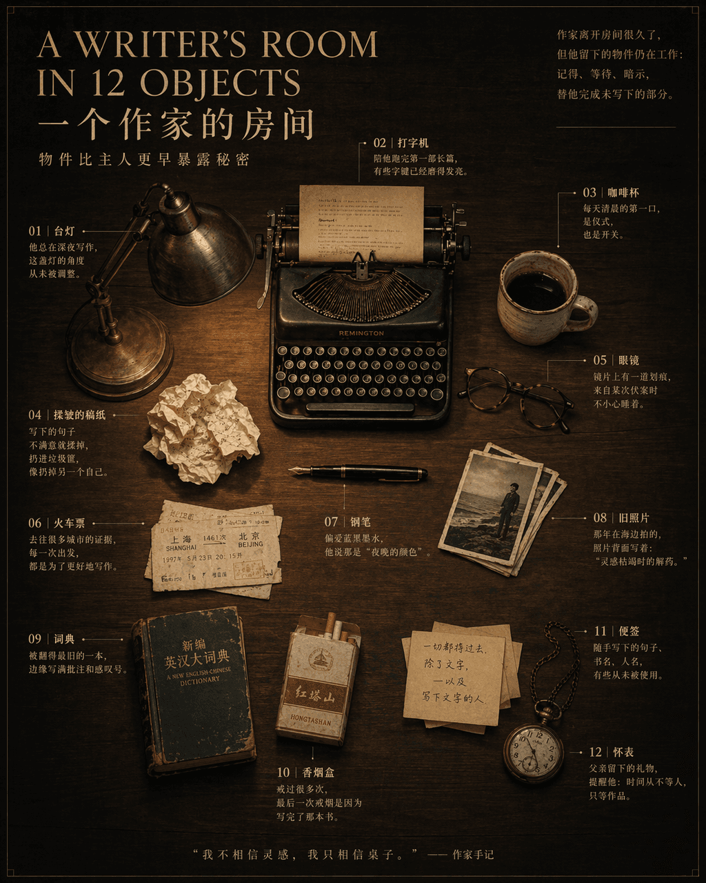
“A WRITER’S ROOM IN 12 OBJECTS”, a magazine inside-page still life narrative poster, in the center is an overhead shot of a dark wood desk with 12 OBJECTS Objects are precisely placed: pens, typewriters, glasses, coffee cups, crumpled manuscript paper, train tickets, desk lamps, old photos, dictionaries, cigarette boxes, sticky notes, pocket watches. Notes are drawn with thin lines next to each item, marking a short story related to the owner. The title uses an elegant serif font, and the subtitle reads "Objects reveal secrets earlier than their owners." 4:5.

City Insomnia Index Poster

City Insomnia Index Poster

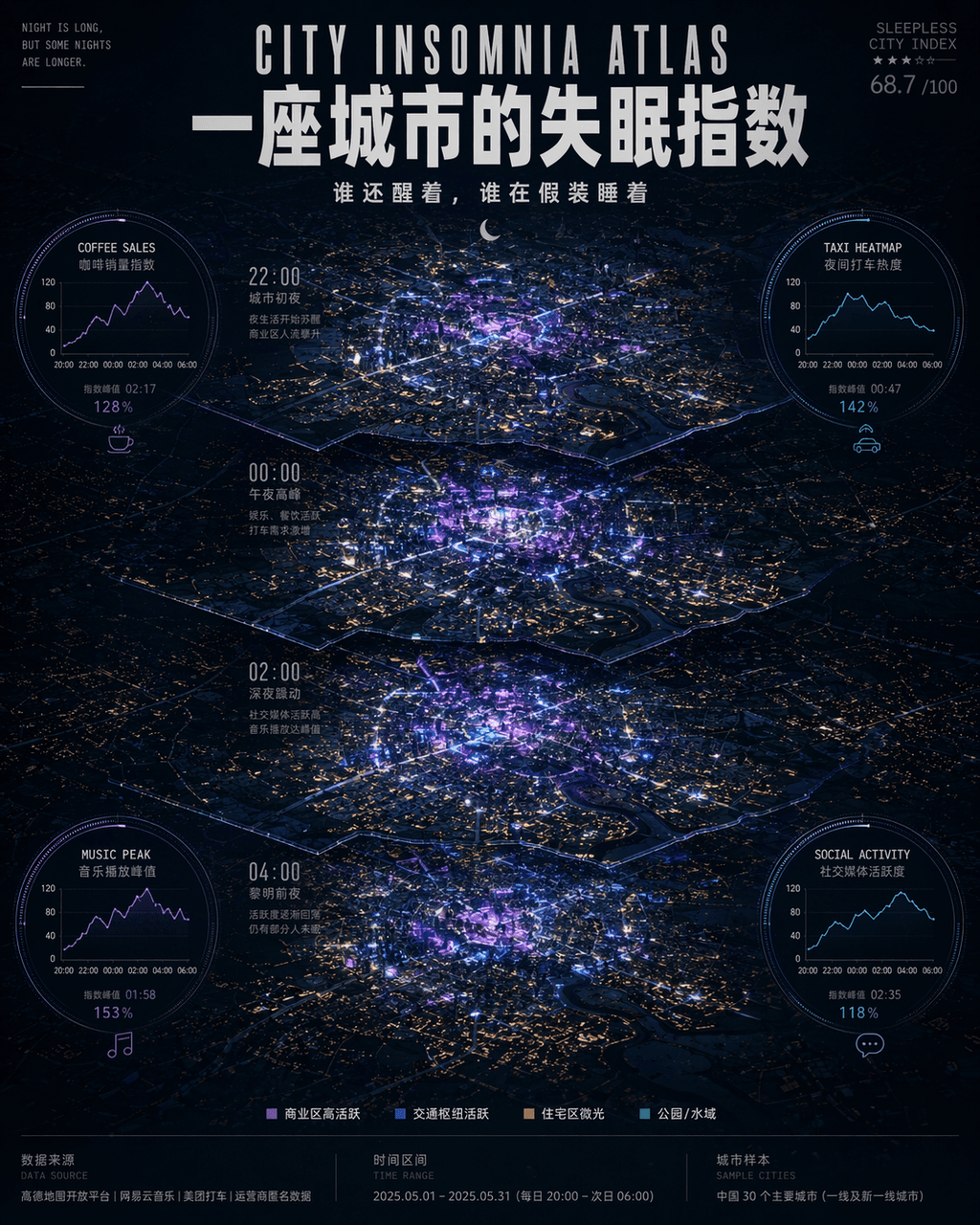
"A city's insomnia index"/"CITY INSOMNIA ATLAS", nightlife data visualization poster, the center is a top-down perspective of the city's night view map, according to late night 22:00, 00:00, 02:00, 04:00 The four time periods are illuminated in layers, with the commercial area highlighted in neon purple and electric blue, and the residential area presented in a dot matrix of dim yellow window light. Four circular data modules are embedded around the map: coffee sales curve, night taxi popularity, music playback peak, and social media activity. The title uses narrow uppercase English and Chinese bold overlapping, and the subtitle reads "Who is still awake and who is pretending to be asleep". The small characters at the bottom annotate the data source, time interval and city sample number. The overall visual reference is "Monocle" + Technology think tank report style, the atmosphere is between urban romance and mild anxiety, ratio 4:5.

Vintage PRS Guitar Lineage Poster

Vintage PRS Guitar Lineage Poster

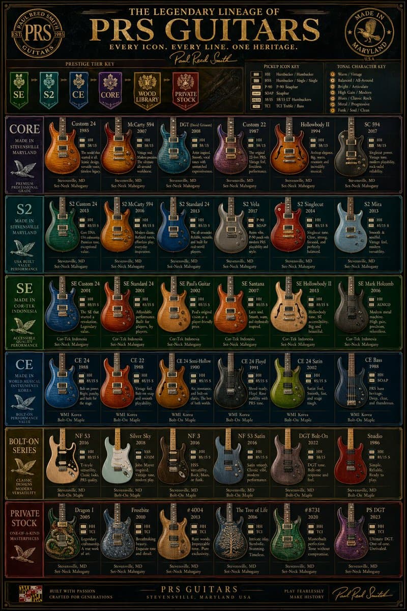
luxury vintage guitar comparison infographic poster. a highly detailed, vertically oriented PRS electric guitar lineup chart designed like a premium museum poster or collector's reference board. ornate, dark, glossy, high-contrast, gold-fo…

Ethnographic Plate for Tibetan Ceremonial Hat

Ethnographic Plate for Tibetan Ceremonial Hat

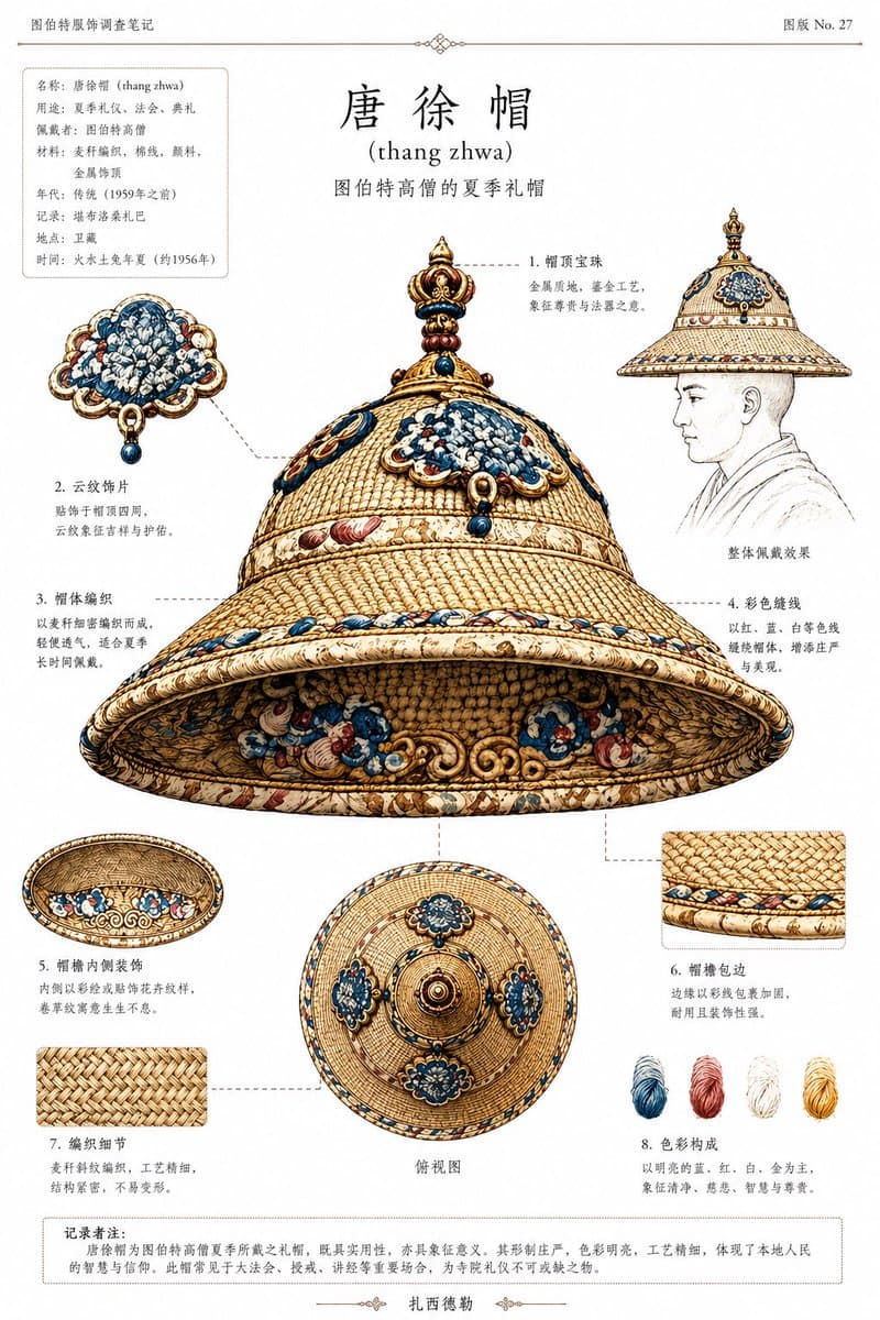
Using REFERENCE_0 and REFERENCE_1, create a clean ethnographic archive plate focused on the ceremonial hat. Use REFERENCE_0 as the historical Tibetan context and silhouette reference, and REFERENCE_1 as the color, material, and ornament reference for the hat. Isolate and reconstruct the hat as a museum-style object study, removing the seated body as the main subject. Present the hat on an off-white document page as a scholarly catalog sheet in Chinese with small romanization. Add 8 numbered callouts around the object with fine dashed leader lines, each pointing to a specific structural detail. The centerpiece should be one large three-quarter underside view of the hat. Also include exactly 4 supplementary views/details: 1 side-profile wearing sketch with a faint line-drawn bust, 1 underside interior view, 1 top-down view, and 2 square close-up material swatches. Add exactly 4 thread-color samples near the lower right: blue, red, white, and yellow. At the top center, add the large title {argument name="headline text" default="唐徐帽"} with the romanization {argument name="romanization" default="(thang zhwa)"} beneath it, plus a smaller subtitle describing it as a summer ceremonial hat of high-ranking Tibetan monks. In the upper left, add a boxed metadata panel with multiple short Chinese fields, and in the upper right add a plate number reading {argument name="plate number" default="图版 No. 27"}. At the bottom, add one bordered note paragraph in Chinese. Overall style: meticulous archival infographic, anthropological catalog illustration, historically informed, precise woven texture, ivory-gold base with blue and red ornament, elegant print layout, thin rules and decorative divider marks, high-detail object rendering on a plain paper background.

Air Sign Zodiac Character Poster

Air Sign Zodiac Character Poster

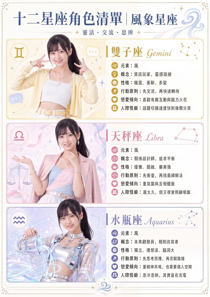
Chinese zodiac-themed character infographic poster. clean pastel editorial infographic with anime-inspired fashion photography, soft magical accents, elegant horoscope design, premium magazine layout. the same young East Asian woman used a…

Fire Sign Zodiac Character Poster

Fire Sign Zodiac Character Poster

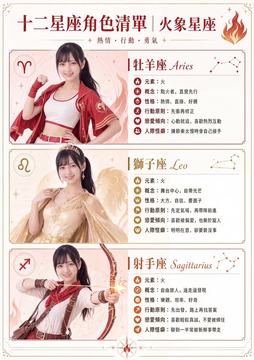
A polished vertical infographic poster in elegant East Asian editorial style, themed around the fire signs of the zodiac using one consistent female character reimagined in three different costumes. Cream parchment background with thin ornamental borders, small corner flourishes, tiny sparkles, and warm red-orange-gold accents throughout. Large Chinese headline at the top reading {argument name="headline text" default="十二星座角色清單|火象星座"}, with a smaller subheading beneath reading {argument name="subheading text" default="熱情・行動・勇氣"}, and a decorative flame icon at the top right. The layout contains exactly 3 stacked profile panels with rounded rectangular borders and generous margins: Aries on top, Leo in the middle, Sagittarius on the bottom. Each panel is split visually with the character on the left and a text/spec area on the right, plus a zodiac symbol badge on the far left and a small constellation diagram on the far right. Use the same young East Asian woman in all 3 panels, slim build, long dark hair in a high ponytail, shown from about thigh-up to waist-up, facing slightly toward camera, styled as a fashion-model zodiac character sheet. Keep facial features neutral and refined, clean beauty lighting, soft airbrushed illustration-photo composite look. Panel 1: Aries. Chinese title and English subtitle: "牡羊座 Aries". Dominant color scheme: vivid red with warm coral highlights. Zodiac symbol badge shows Aries glyph. Constellation on the right. Behind the character, faint circular mystical line art and flame motifs. Outfit: sporty warrior idol styling with a white crop top, red open short-sleeve jacket with gold trim, red belt, and red wrist wraps or fingerless arm accessories. Pose: confident, energetic, one fist raised near the shoulder and the other hand on her hip. Include exactly 6 info lines with small circular icons before each line, all in Chinese: 1) "元素:火" 2) "概念:點火者,直覺先行" 3) "性格:熱情、直接、好勝" 4) "行動原則:先衝再修正" 5) "戀愛傾向:心動就追,喜歡熱烈互動" 6) "人際怪癖:嫌節奏太慢時會自己接手". Panel 2: Leo. Chinese title and English subtitle: "獅子座 Leo". Dominant color scheme: gold, champagne, and soft amber. Zodiac symbol badge shows Leo glyph. Constellation on the right. Background includes radiant sunburst styling and a faint majestic lion illustration silhouette behind the character. Outfit: glamorous regal gown in pale gold with ornate embroidery, jeweled bodice details, flowing translucent cape sleeves, elegant necklace, and a small crown or tiara. Pose: poised and queenly, one hand lightly touching the chest or collarbone, shoulders open, projecting confidence and star power. Include exactly 6 info lines with small circular icons before each line, all in Chinese: 1) "元素:火" 2) "概念:舞台中心,自帶光芒" 3) "性格:大方、自信、要面子" 4) "行動原則:先定氣場,再帶隊前進" 5) "戀愛傾向:喜歡被偏愛,也樂於寵人" 6) "人際怪癖:明明在意,卻要裝沒事". Panel 3: Sagittarius. Chinese title and English subtitle: "射手座 Sagittarius". Dominant color scheme: rust red, burnt orange, brown leather, and warm ivory. Zodiac symbol badge shows Sagittarius glyph. Constellation on the right. Background features faint compass-circle graphics and flame accents. Outfit: adventurous archer styling with an ivory blouse, red scarf, brown leather harness straps, utility belt, and arm bracers. Pose: dynamic action shot drawing a bow, arrow aimed to the right, with a small glowing spark at the bow grip or arrow rest. Include exactly 6 info lines with small circular icons before each line, all in Chinese: 1) "元素:火" 2) "概念:自由旅人,邊走邊發現" 3) "性格:樂觀、坦率、好奇" 4) "行動原則:先出發,路上再找答案" 5) "戀愛傾向:喜歡輕鬆真誠,不愛被綁住" 6) "人際怪癖:聊到一半常被新鮮事帶走". Overall design should feel premium, feminine, mystical, and collectible, like a social-media-ready zodiac character list poster. Use elegant serif-style Chinese typography for the main sign names and italic calligraphic English for Aries, Leo, and Sagittarius. Keep all text crisp, aligned, and readable. Add one small decorative fire emblem centered near the bottom border. Aspect ratio 3:4 portrait.

Earth Signs Zodiac Character Poster

Earth Signs Zodiac Character Poster

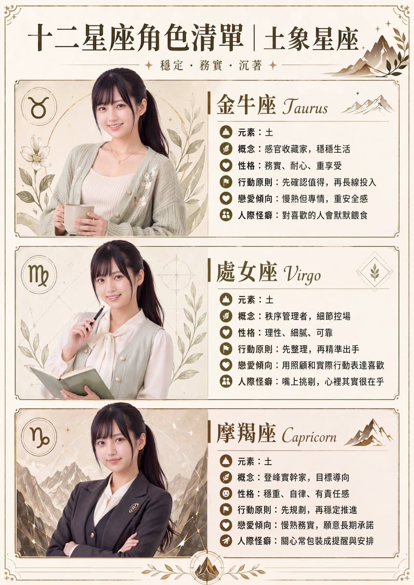
vintage zodiac character infographic poster. earth signs only. List of Twelve Zodiac Characters|Earth Signs. Taurus Taurus. Virgo Virgo. Capricorn Capricorn. Traditional Chinese. elegant editorial infographic with soft anime-inspired live-…

Water Signs Zodiac Character Poster

Water Signs Zodiac Character Poster

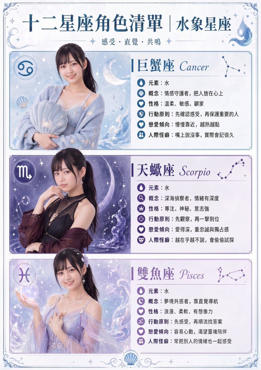
Chinese zodiac-style character infographic poster. twelve zodiac character list, water signs edition. {argument name="headline text" default="十二星座角色清單|水象星座"}. 巨蟹座 Cancer. 天蠍座 Scorpio. 雙魚座 Pisces. Traditional Chinese. vertical poster. elega…

Vintage Claude Shannon Infographic Poster

Vintage Claude Shannon Infographic Poster

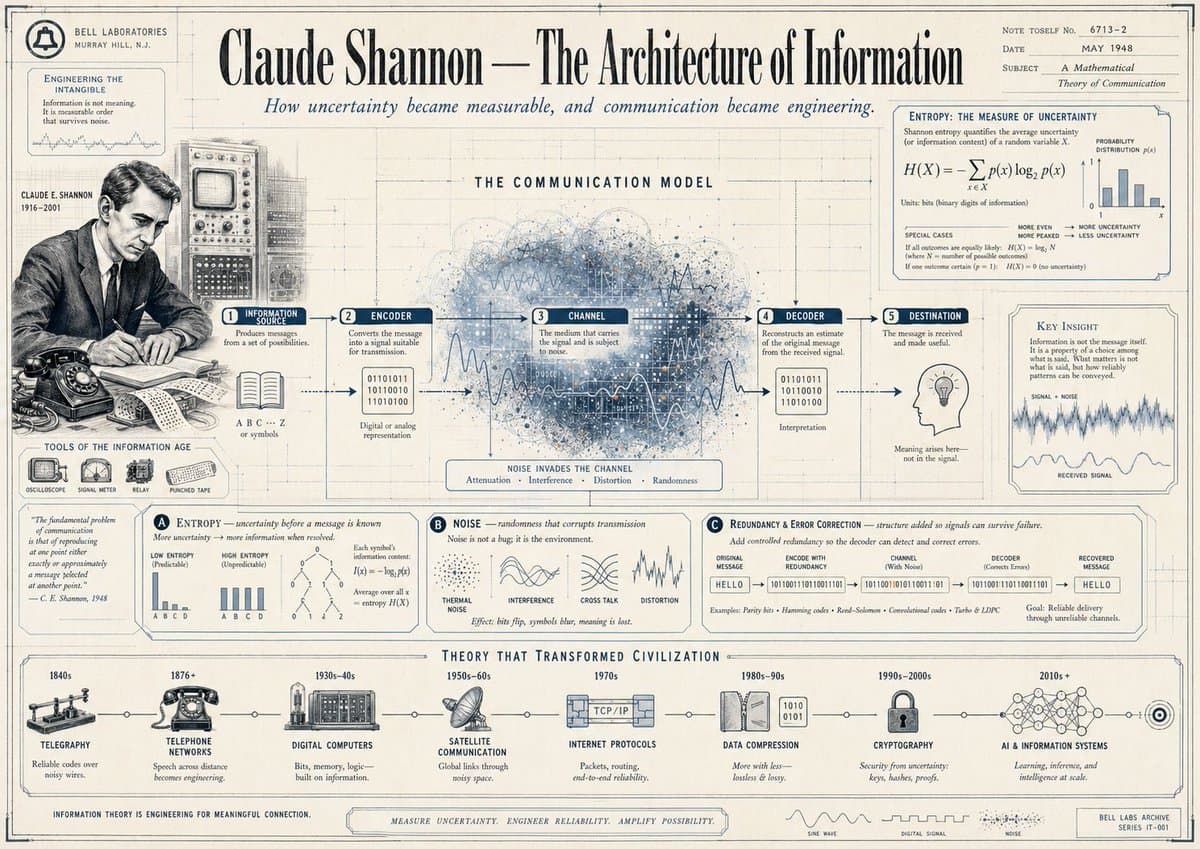
vintage editorial infographic poster. Claude Shannon and information theory. A Mathematical Theory of Communication. left archival sidebar. THE COMMUNICATION MODEL. ENTROPY: THE MEASURE OF UNCERTAINTY. lower theory panels. THEORY THAT TRAN…

Taoist Three Souls Seven Po Poster

Taoist Three Souls Seven Po Poster

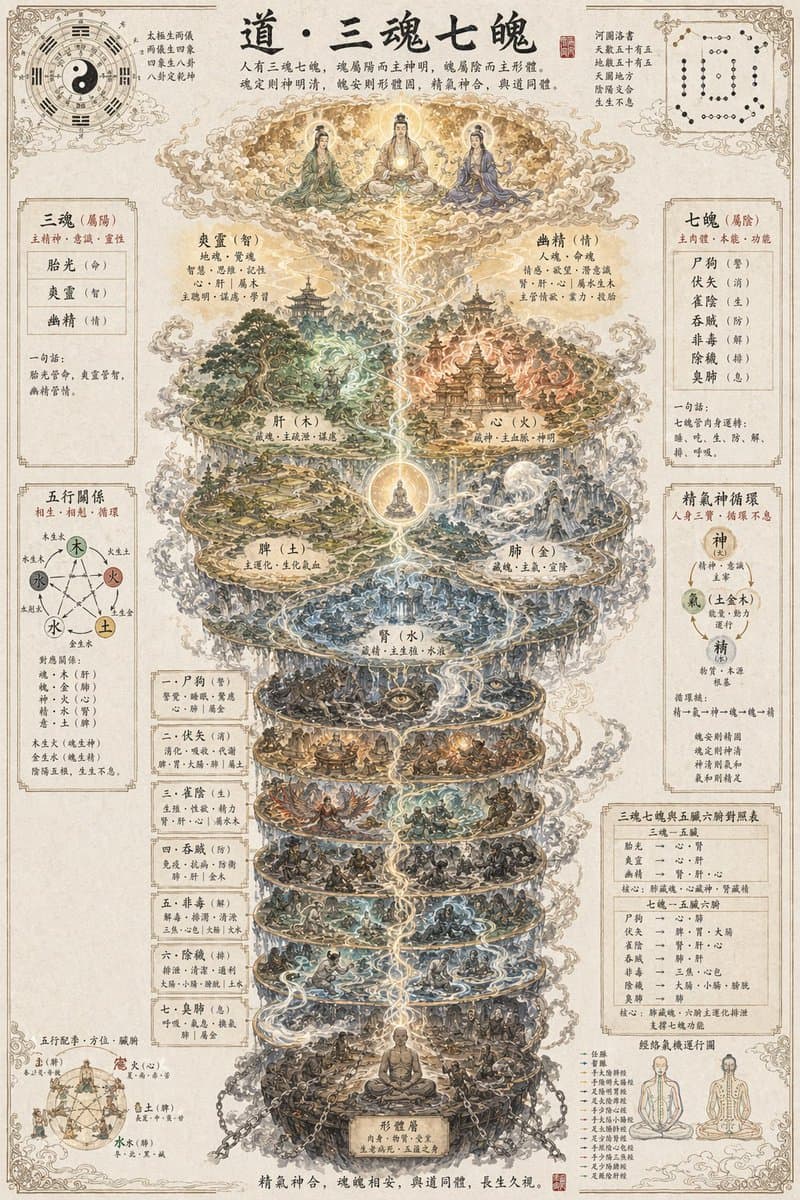
A highly detailed vertical Taoist esoteric infographic poster in the style of an ancient Chinese religious scroll, printed on aged beige rice paper with fine ornamental borders, inked calligraphy, faded stains, and classical diagram annotations. At the top center, large black brush-calligraphy title text reads {argument name="headline text" default="道·三魂七魄"}. Directly below the title is a smaller paragraph of classical Chinese explanatory text in neat calligraphy. The composition is perfectly symmetrical and centered on a glowing vertical spiritual axis made of white-gold energy, mist, and lightning-like qi currents running from the bottom of the page to the heavens. At the very top, above the axis, depict 3 seated Taoist immortals or deities on clouds in a golden celestial realm, arranged left, center, and right, with halos and flowing robes in muted green, cream, and blue. Beneath them, create a towering multi-layered cosmological body diagram made of 9 stacked circular realms or platforms connected by swirling clouds and luminous energy. The upper 5 larger realms represent the five zang organs as miniature mythic landscapes: 1 forested green realm labeled liver/wood, 1 fiery red-gold temple city realm labeled heart/fire, 1 yellow earth realm with terraces labeled spleen/earth, 1 silver-blue mountain-and-water realm labeled lung/metal, and 1 dark blue watery abyss realm labeled kidney/water. Place a glowing meditating figure in a bright orb at the center junction between the upper organ realms and lower spirit layers. Below these, add 7 progressively darker circular underworld-like realms for the seven po souls, each densely populated with tiny scenes of human figures, spirits, beasts, ritual activity, suffering, temptation, conflict, and karmic symbolism, all wrapped by drifting smoke and energy ribbons. At the very bottom, show a seated human figure in meditation within a root-like cavern or corporeal foundation, surrounded by chains, rocks, and embodied worldly attachments. Around the central column, include exactly 9 labeled side panels and diagrams in traditional Chinese layout: top left a bagua and yin-yang cosmology circle; top right a dotted numerological or constellation-like chart; left upper a boxed list for 3 souls; right upper a boxed list for 7 po souls; left middle a five-elements relationship diagram with 5 colored nodes; right middle a circular essence-qi-spirit cycle diagram with 3 nodes; left lower a vertical boxed list of 7 categories or stages; right lower a boxed correspondence table; bottom left a five-direction and five-element human-body relation chart; bottom right a standing and seated meridian or cultivation body diagram. Use many small Chinese labels throughout every section, with classical seal stamps in red. The overall palette is antique parchment, sepia ink, muted jade, cinnabar red, smoky gray, gold, teal, and indigo. The style should feel like a museum-quality Daoist metaphysical chart, ultra intricate, hand-painted gongbi plus ink wash illustration, sacred, mystical, scholarly, dense with symbolism, extremely fine linework, soft cloud layering, and high-resolution poster design.

Japanese Sci-Fi Suit-Up Process Board

Japanese Sci-Fi Suit-Up Process Board

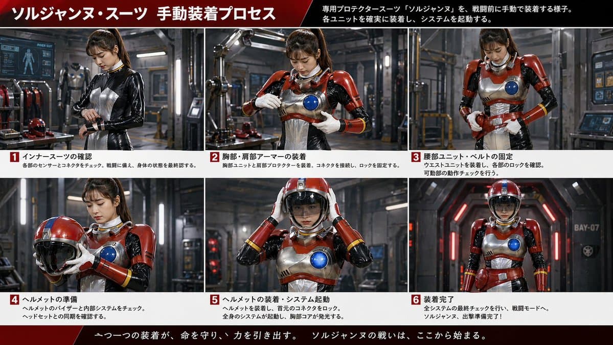
Japanese sci-fi armor dressing-process infographic. cinematic live-action tokusatsu-inspired promotional board, realistic industrial lighting, polished metal surfaces, sharp photographic detail. manual pre-battle suit-up sequence for a fem…

Parent-Child Miscommunication Infographic

Parent-Child Miscommunication Infographic

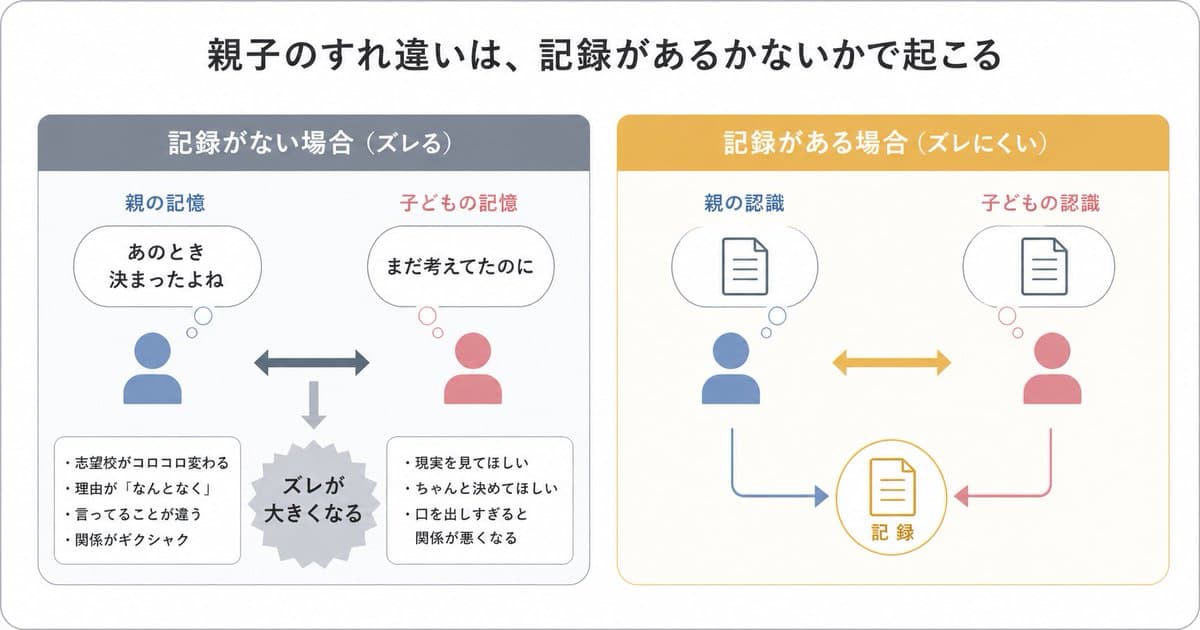
{"type":"Japanese infographic","style":"simple, easy-to-understand flat vector diagram, clean white background, rounded light-gray outer frame, minimal pastel color palette, presentation-slide design, clear hierarchy, lots of whitespace, modern sans-serif Japanese typography","canvas":{"aspect_ratio":"16:9"},"headline":{"text":"{argument name=\"headline text\" default=\"親子のすれ違いは、記録があるかないかで起こる\"}","position":"top center","size":"large bold black"},"layout":{"structure":"2 side-by-side rounded panels beneath the headline","sections":[{"title":"When there is no record (misaligned)","position":"left","count":8,"header_color":"muted blue-gray","panel_border":"light gray","labels":["Parents' memories","Children's memories","It was decided at that time","I was still thinking about it","The gap gets bigger","The schools I want to apply to change all the time","The reason is ``for some reason'''',"I'm saying Things are wrong.","The relationship is strained.","I want you to look at the reality.","I want you to make a decision.","If you talk too much, the relationship will deteriorate."],"contents":{"top_left":{"type":"parent icon with thought bubble","icon_color":"blue","caption":"Parent's memory","bubble_text":"It was decided then\n"},"top_right":{"type":"child icon with thought bubble","icon_color":"pink","caption":"Childhood memory","bubble_text":"I was still thinking about it"},"center":{"type":"horizontal double-headed arrow","color":"blue-gray"},"bottom_center":{"type":"downward arrow leading to burst shape","color":"light gray","burst_text":"The gap is getting bigger"},"bottom_left":{"type":"rounded note box","bullet_count":4,"bullets":["The school I want to apply to keeps changing","The reason is ``for some reason'''',"What I'm saying is different","The relationship is awkward"]},"bottom_right":{"type":"rounded note box","bullet_count":3,"bullets":["I want you to see the reality","I want you to decide properly","If you talk too much, the relationship will deteriorate"]}}},{"title":"If you have records (hard to slip)","position":"right","count":7,"header_color":"mustard yellow","panel_border":"light yellow","labels":["Parent awareness","Child awareness","Record"],"contents":{"top_left":{"type":"parent icon with thought bubble containing document symbol","icon_color":"blue","caption":"Parent awareness"},"top_right":{"type":"child icon with thought bubble containing document symbol","icon_color":"pink","caption":"Children's recognition"},"center":{"type":"horizontal double-headed arrow","color":"mustard yellow"},"bottom_center":{"type":"circular record icon with document symbol","outline_color":"mustard yellow","text":"record"},"bottom_left_connector":{"type":"curved arrow from parent to record","color":"blue"},"bottom_right_connector":{"type":"curved arrow from child to record","color":"pink"}}}],"spacing":"balanced, symmetrical"},"visual_language":{"icons":"generic human bust icons and simple document line icons","emphasis":"contrast the left panel's misunderstanding with the right panel's shared record","mood":"educational, calm, practical"},"text_language":"Japanese","render_quality":"crisp vector edges, infographic suitable for social media educational posts"}

3D Stone Staircase Evolution Infographic

3D Stone Staircase Evolution Infographic

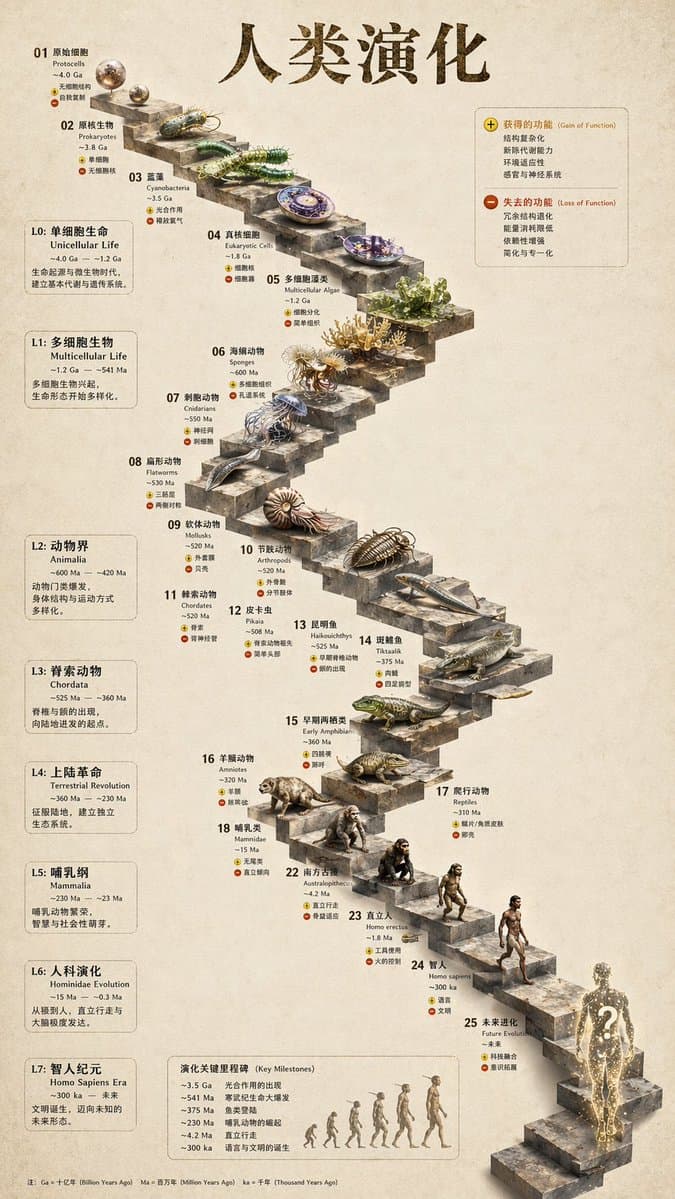
evolutionary timeline infographic. Function gained / function lost. Legend with plus and minus icons. Key milestones in evolution. Timeline with a silhouette graphic of 6 figures showing ape-to-human evolution. Winding stone staircase with…

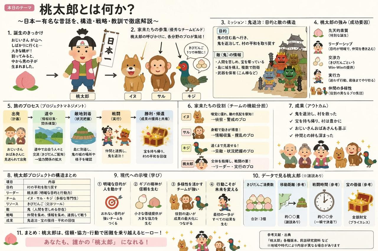
Momotaro Explainer Slide in Hybrid Style

Momotaro Explainer Slide in Hybrid Style

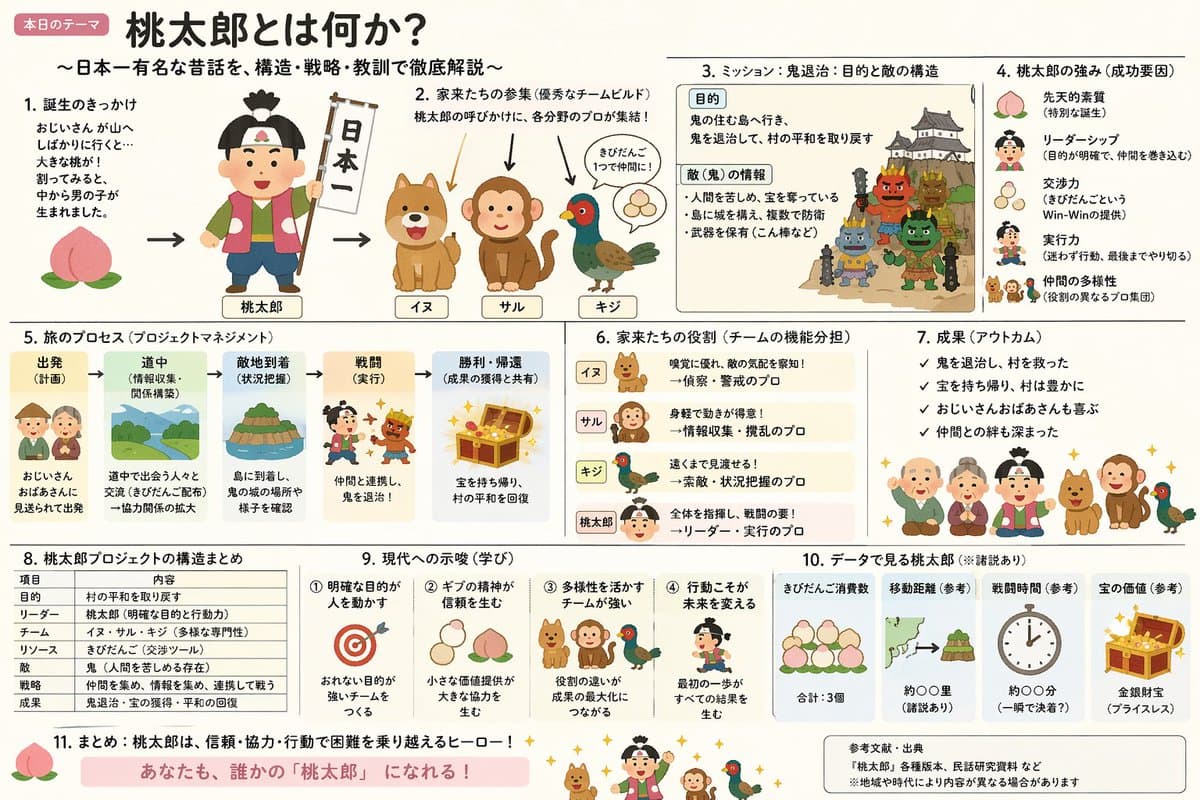
Create an explanatory slide ({argument name="format" default="ponchi-e diagram"}) for {argument name="theme" default="Momotaro"} that fuses the gentle atmosphere of "Irasutoya" with the overwhelming information density of "Kasumigaseki slides".

Illustrated City Food Map

Illustrated City Food Map

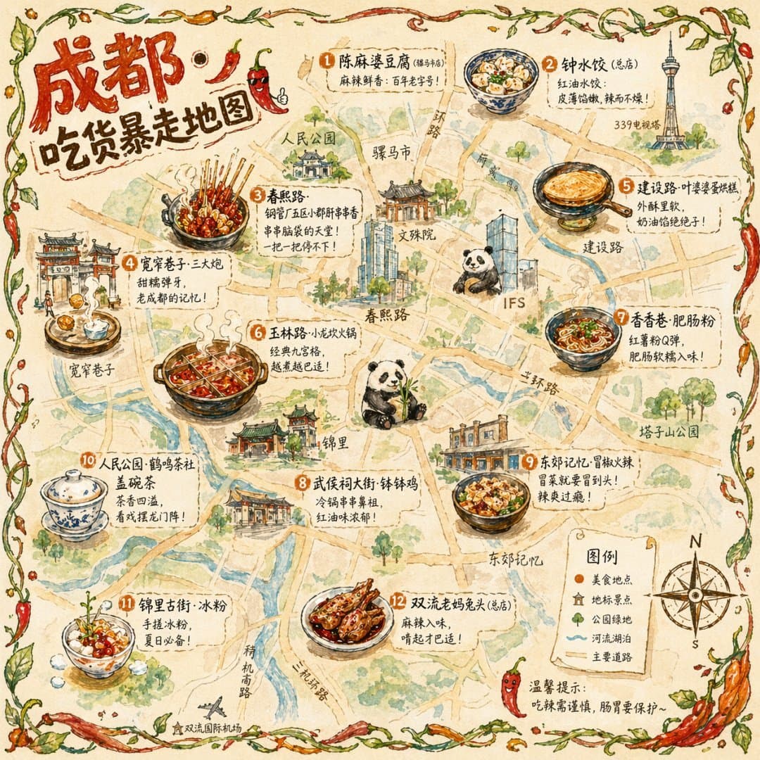
illustrated map infographic. {argument name="art style" default="watercolor and ink hand-drawn illustration on vintage parchment"}. landmarks. food_spots. 图例. {argument name="city name" default="成都"} {argument name="map title" default="吃货暴…

VR Headset Exploded View Poster

VR Headset Exploded View Poster

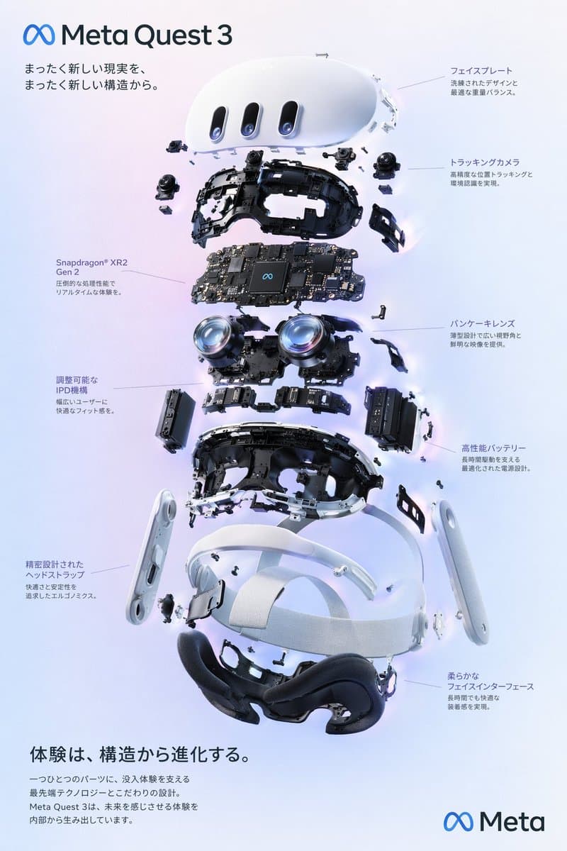
exploded view product diagram poster. VR headset. clean high-tech 3D render, studio lighting, glowing accents. {argument name="background color" default="soft purple and blue gradient"}. ∞ {argument name="product name" default="Meta Quest…

Japanese AI Game Dev Overview Slide Prompt

Japanese AI Game Dev Overview Slide Prompt

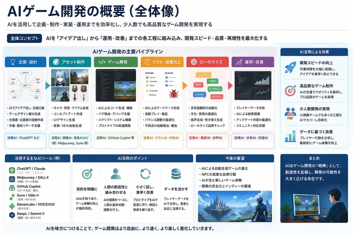
Try generating a horizontal Powerpoint image here and we'll determine which model you're using, so here's a single Powerpoint image summarizing current AI game development in Japanese. Regarding game development technology, I also created powerpoint drawings to explain where power is needed on a man-hour basis and how mass production is important.

Palm Reading Diagnosis Report

Palm Reading Diagnosis Report

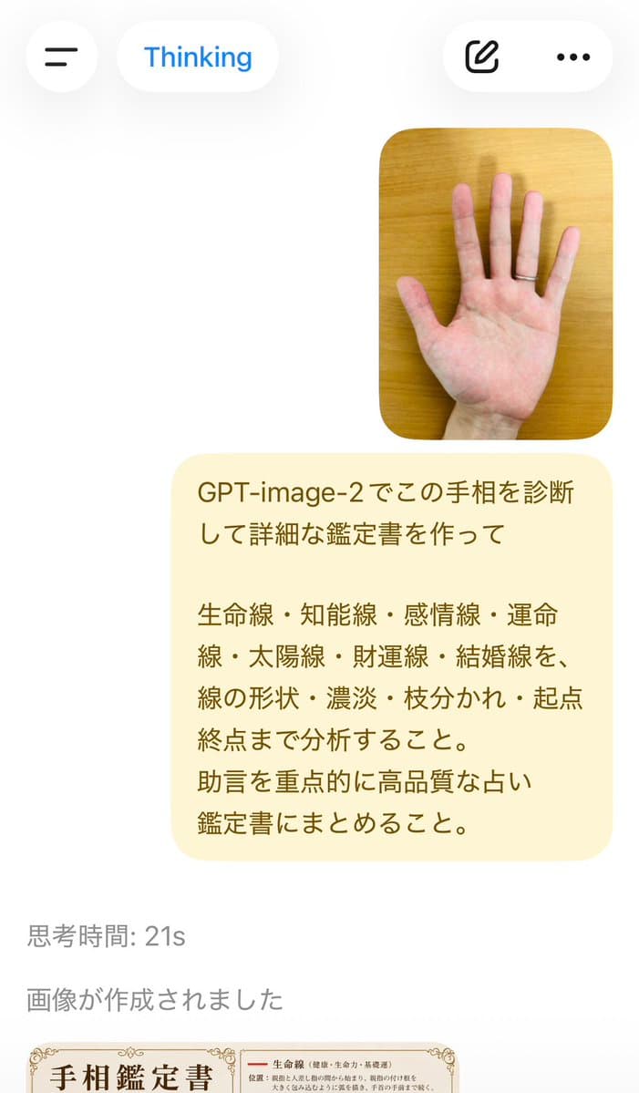
Diagnose this palm reading with GPT-image-2 and create a detailed appraisal report. Analyze the Life line, Intelligence line, Heart line, Fate line, Sun line, Fortune line, and Marriage line, including their shape, shading, branching, and starting and ending points. Focusing on advice and compiling it into a high-quality fortune-telling appraisal report.

Museum-Style Hanfu Breakdown Infographic

Museum-Style Hanfu Breakdown Infographic

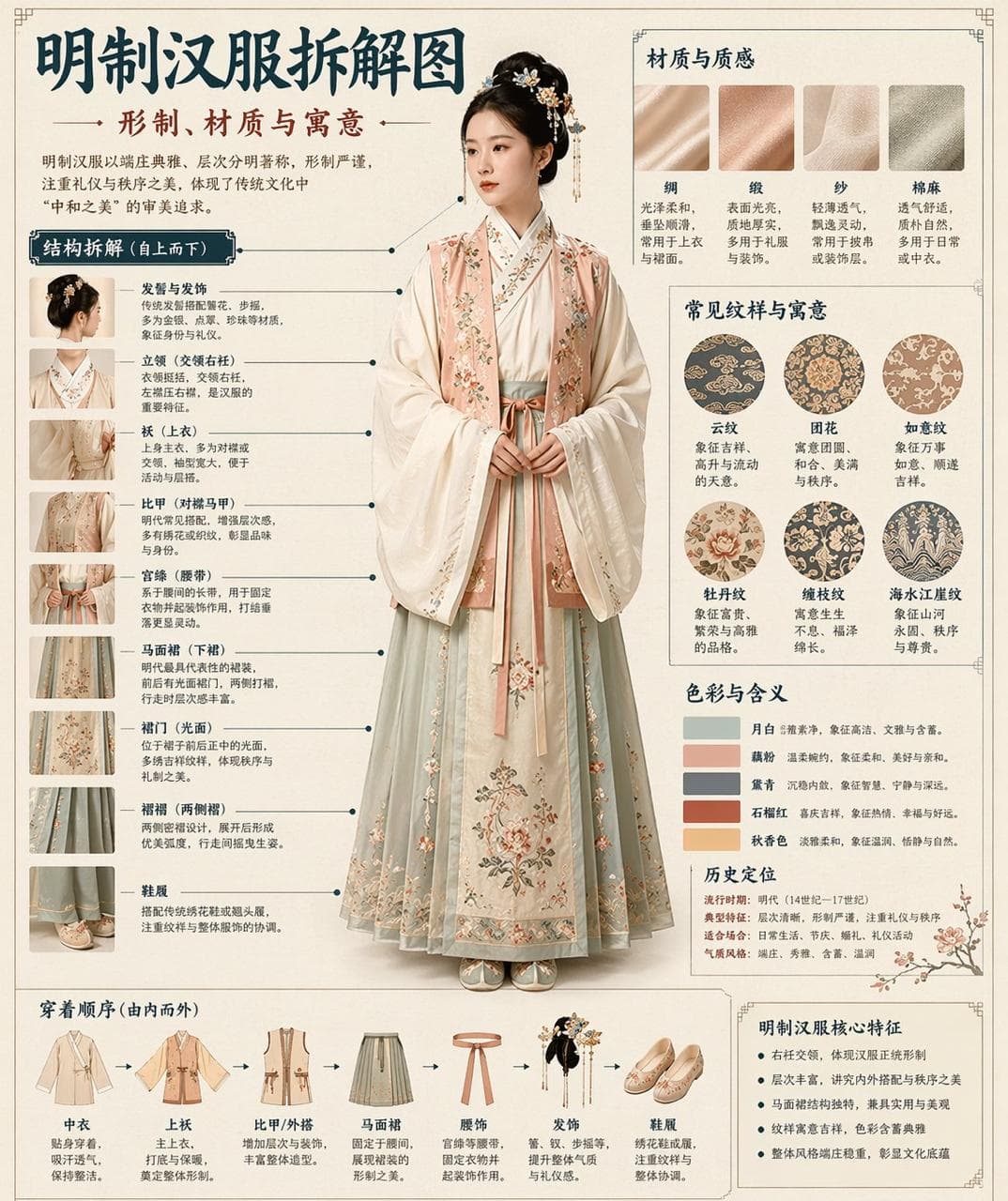
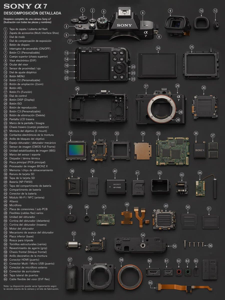
Please automatically generate a "Museum Illustrated Chinese Disassembly Information Map" based on the [theme]. The entire picture is required to have a realistic main vision, structural disassembly, Chinese annotation, material description, pattern meaning, color meaning and summary of core features. You need to automatically determine the most appropriate subject object, clothing system, utensil structure, era style, key components, material technology, color scheme and layout structure based on the [theme]. The user does not need to provide other information. The overall style should be: National Museum display boards, historical costume illustrations, cultural museum thematic information graphics, rather than ordinary posters, antique photos, e-commerce details pages or animation illustrations. The background uses paper textures such as off-white, silk white, and light brown. The overall design is high-end, restrained, professional, and collectible. The format is fixed to: - Top: Chinese main title + subtitle + introduction - Left: Structural disassembly area, with Chinese leads marking key components and partial close-ups - Upper right: Material/Technology/Texture area, showing real texture samples with explanations - Middle right: Pattern / Color / Meaning area, displaying main color plates, pattern samples and cultural explanations - Bottom: Wearing order/composition flow chart + summary of core features If the theme is suitable for displaying people, the whole body posture of a real person will be used as the central subject; if it is more suitable for utensils or single structures, the disassembly diagram of the central subject will be changed, but the overall form of a complete Chinese information graphic will be maintained. All text must be in Simplified Chinese, clear, regular and readable, without garbled characters, typos, English or pinyin. Emphasis is placed on the actual structure, material differences, cultural descriptions and illustrated qualities. Avoid: poster-like, photo-studio-like, e-commerce-like, animation-like, cosplay-like, random labeling, wrong structure, garbled characters, fake materials, and excessive decoration.

Momotaro Explainer Slide

Momotaro Explainer Slide

We have created an explanatory slide (punch picture) of Momotaro that combines the heartwarming atmosphere of ``Irasutoya'' and the overwhelming information density of ``Kasumigaseki Slide.''

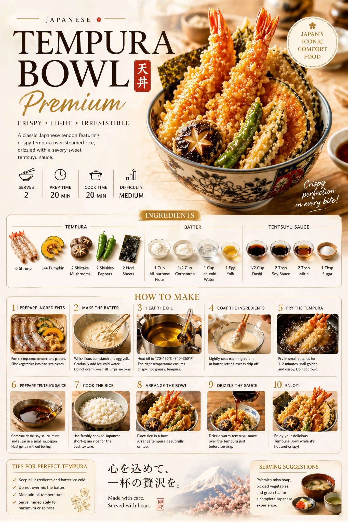
Premium Food Recipe Poster Elegant Layout

Premium Food Recipe Poster Elegant Layout

Create a premium food preparation poster for [ DISH NAME ], with a beautiful hero dish, warm natural lighting, cream background, elegant step-by-step recipe layout, ingredients, cooking process, premium food photography, refined English typography, luxury restaurant advertisement style, clean design, rich colors, highly detailed, visually irresistible, cinematic masterpiece.

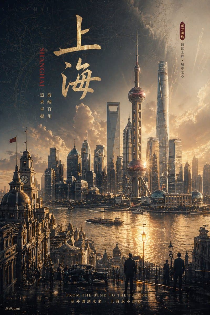
Cinematic Infographic Concept Poster

Cinematic Infographic Concept Poster

Please automatically generate a top-level concept poster/infographic movie poster based on the [theme]. The only input variables are: 【Topic】:__Ranking of Emperors in Chinese History_ The AI is required to automatically deduce and uniformly design all the following visual systems based on this theme, without any additional specification from me: - Core subject (can automatically determine which characters, products, buildings, utensils, symbols, scenes or abstract images are more suitable) - Bottom support structure - Floating symbols or spiritual symbols above - Scene wrapping elements - Metaphor system - Color levels - Material comparison - Light and shadow logic - Title, subtitle, auxiliary copy - Expression of brand sense and high-end sense The final image must be: A stunning, precise, unified, cinematic, ultra-detailed concept poster that can be used for high-end printing. 【General style】 Hyper-realistic 3D commercial CGI rendering, integrating cinematic lighting, luxury visual language, futuristic concept design and epic composition. The picture must have a "single main visual core" and cannot be cluttered, look like a collage, or look like an ordinary e-commerce poster. [Automatic derivation rules] The AI must automatically determine the most appropriate one based on the [topic]: 1. Core visual metaphors 2. Subject type and posture 3. Support structure form 4. Suspended element form 5. Scene shell and space atmosphere 6. Main color, secondary color, accent color 7. Material combination 8. Text temperament and layout style For example: - If the theme is biased toward power, order, capital, and rule, it will automatically bias toward thrones, crowns, machinery, temples, red curtains, metals, and power structures. - If the theme favors technology, AI, chips, and the future, it will automatically favor mechanical structures, energy cores, light beams, dark metals, and holograms. - If the theme favors luxury goods, high-end, scarcity, and collection, it will automatically favor jewelry, mirror materials, black gold systems, exhibition stands, and museum-style lighting. - If the theme focuses on people, IP, and characters, the characters will automatically be the main visual core, and the corresponding world view and symbolic system will be automatically matched. - If the theme is city, civilization, epic, or destiny, it will automatically transform into a grand narrative space structure and ritual scene. 【Composition Rules】 - Absolutely high-end feel - Strong central order and overall unity - Allows for epic compositions that are symmetrical or close to the central axis - The visual gravity is clear and a clear hierarchy is formed from top to bottom. - The negative space at the edge is clean, restrained and breathable - Meaningless decoration is not allowed, style pollution is not allowed, and multiple systems are not allowed to fight with each other. 【Visual quality】 - Super high details - Volumetric light clarity - Realistic materials - Reflection, refraction, shadow, fog, natural depth of field - Every element is aesthetically controlled by an industrial-grade visual director - Overall reaching the level of high-end brand campaign key visual / luxury invitation poster / conceptual editorial poster 【Typesetting system】 - Overall 90% visual, 10% text - AI automatically generates the most matching main title and subtitle based on the [topic] - The title must be concise, sharp and powerful - The copywriting is distributed in a safe negative space and does not overwhelm the main body. - If the theme is more suitable for Chinese, Chinese titles will be generated first; if the theme is more suitable for English, English titles will be automatically generated; Chinese and English can also be combined, but they must be unified and advanced - The text must be as short and accurate as possible, do not pile up words [Signature requirements] Naturally add the author's signature in the bottom corner of the screen: @a9quant The signature should be small, but clear, refined, and high-end, not overwhelming, just like the official author's signature in top visual works. [Output requirements]

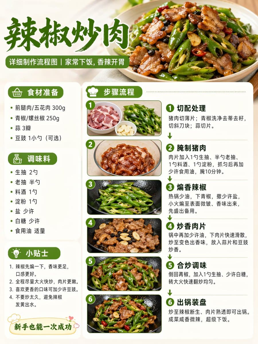
Chili Pork Cooking Flowchart

Chili Pork Cooking Flowchart

Help me make the detailed production flow chart of the dish of Chili Stir-fried Pork, real style, suitable for Xiaohongshu picture and text ratio

Theme Science Encyclopedia Card

Theme Science Encyclopedia Card

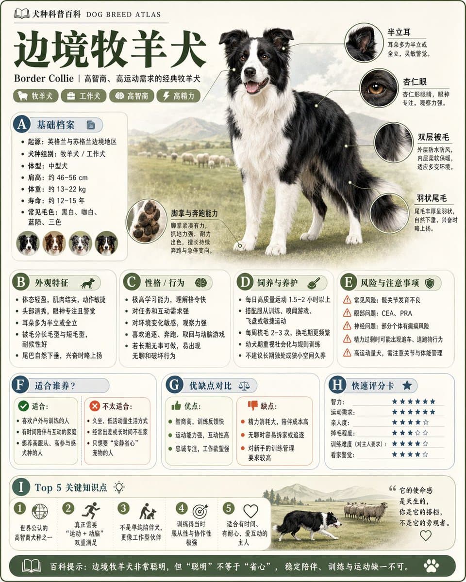
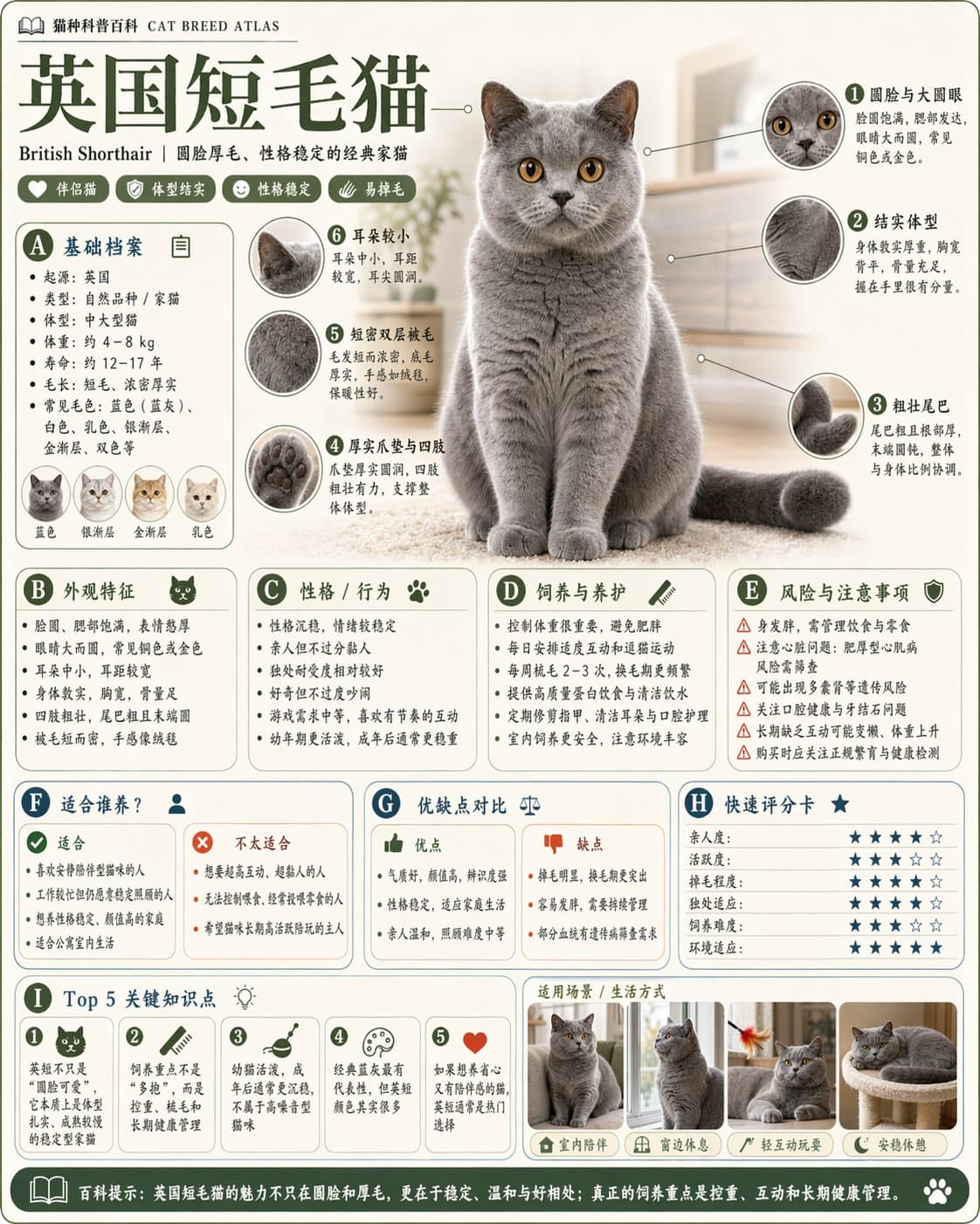
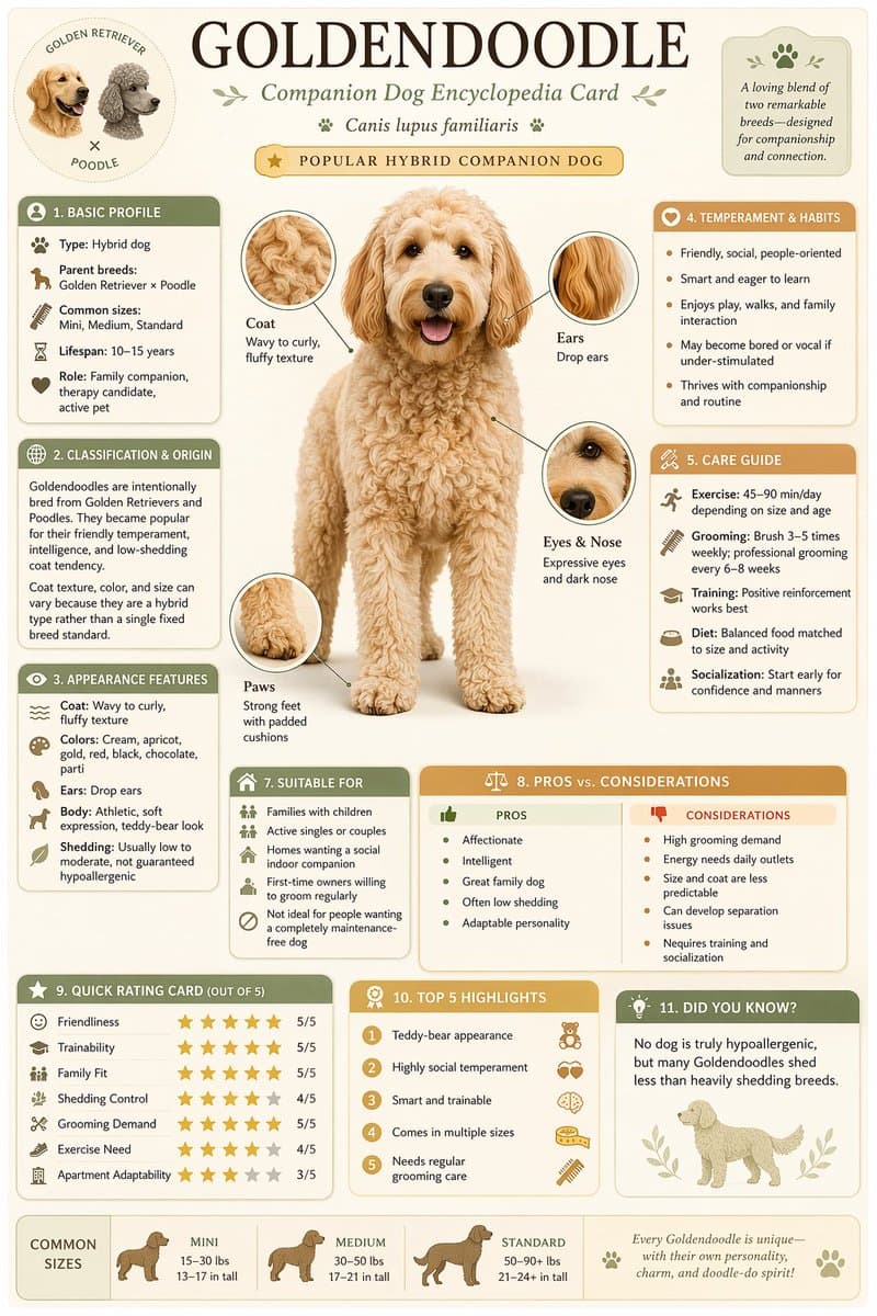
Please generate a high-quality vertical "popular science encyclopedia map" based on the [theme]. This picture is not an ordinary poster, nor is it a simple illustration, but a modular science information map that has a "picture book feel, an encyclopedia feel, a sense of information structure, and a sense of collection". The overall style refers to the combination of advanced natural history illustrations, modern encyclopedia pages, lifestyle knowledge cards and social media high-dissemination information graphics. Please make the screen contain: - A clear and beautiful theme main vision - Enlarged details of some local features - Multiple rounded corner modular information partitions - Clear title hierarchy and key labels - Concise but rich encyclopedia content - Visual scoring, summary of key points or Top 5 modules Please automatically adapt the content columns according to the theme, giving priority to choosing from these directions and combining them appropriately: Basic files, classification information, appearance characteristics, habits/ecology, formation mechanism/structural composition, growth or use conditions, care or maintenance suggestions, risks and precautions, suitable people or applicable scenarios, comparison of advantages and disadvantages, and quick score card. Visual requirements: Light and clean background, soft colors, light shadows, exquisite small icons, rounded information boxes, neat layout, high information density but not crowded, good reading experience. The whole thing must be like a popular science encyclopedia card that can be truly published, read, collected, and serially produced, rather than an advertising image. Please do not make it into an ordinary commercial poster. It is necessary to highlight the characteristics of "knowledge organization + module information + illustrated display".

Science Encyclopedia Infographic

Science Encyclopedia Infographic

Please generate a high-quality vertical "popular science encyclopedia map" based on the [theme]. This picture is not an ordinary poster, nor is it a simple illustration, but a modular science information map that has a "picture book feel, an encyclopedia feel, a sense of information structure, and a sense of collection". The overall style refers to the combination of advanced natural history illustrations, modern encyclopedia pages, lifestyle knowledge cards and social media high-dissemination information graphics. Please make the screen contain: - A clear and beautiful theme main vision - Enlarged details of some local features - Multiple rounded corner modular information partitions - Clear title hierarchy and key labels - Concise but rich encyclopedia content - Visual scoring, summary of key points or Top 5 modules Please automatically adapt the content columns according to the theme, giving priority to choosing from these directions and combining them appropriately: Basic files, classification information, appearance characteristics, habits/ecology, formation mechanism/structural composition, growth or use conditions, care or maintenance suggestions, risks and precautions, suitable people or applicable scenarios, comparison of advantages and disadvantages, and quick score card. Visual requirements: Light and clean background, soft colors, light shadows, exquisite small icons, rounded information boxes, neat layout, high information density but not crowded, good reading experience. The whole thing must be like a popular science encyclopedia card that can be truly published, read, collected, and serially produced, rather than an advertising image. Please do not make it into an ordinary commercial poster. It is necessary to highlight the characteristics of "knowledge organization + module information + illustrated display".

Chengdu Food Map Illustration

Chengdu Food Map Illustration

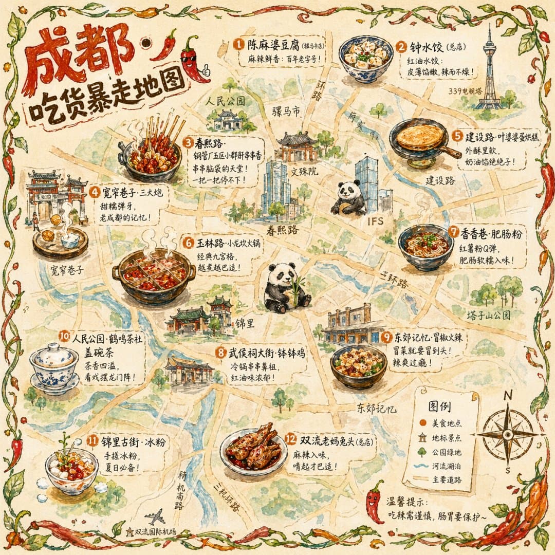
A hand-drawn style city food map with Chengdu as the theme. The picture is based on a hand-drawn simplified city map from a bird's-eye view, marking the main roads and landmarks but not pursuing precise proportions but pursuing a cute hand-drawn feel. There are 12 exquisite hand-drawn illustrations of food places scattered on the map: Chuanchuanxiang on Chunxi Road (a bamboo stick stuck with various ingredients steaming), Three Cannons on Kuanzhai Alley (three glutinous rice dumplings flying towards a copper plate), Egg Baked Cake on Jianshe Road (golden and crispy, being turned over), Hot Pot on Yulin Road (a nine-grid pot rolling and bubbling), etc. Each illustration accounts for about 5% of the map. The area is marked with the name of the store and a recommendation in handwriting next to it, "The store where people are still queuing up at two in the morning." The edges of the map are framed by hand-painted vines and pepper decorations. There is a hand-drawn compass and legend in the lower right corner. The title "Chengdu·Foodie Rampage Map" in the upper left corner uses round hand-painted artistic characters and is decorated with chili peppers. The overall painting style is a hand-painted texture mixed with watercolor + colored pencil. The colors are mainly warm colors (pepper red, turmeric, emerald green), and the picture ratio is 1:1.