Limited-time deal: GPT Image 2 from $0.007 per image
Try it now

Prompt Template Library

Discover and use high-quality prompt templates to create stunning AI images.

⌘ K
Sort by:

Showing 181–240 of 589 prompts

Brand material package

Brand material package

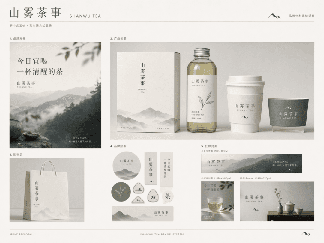
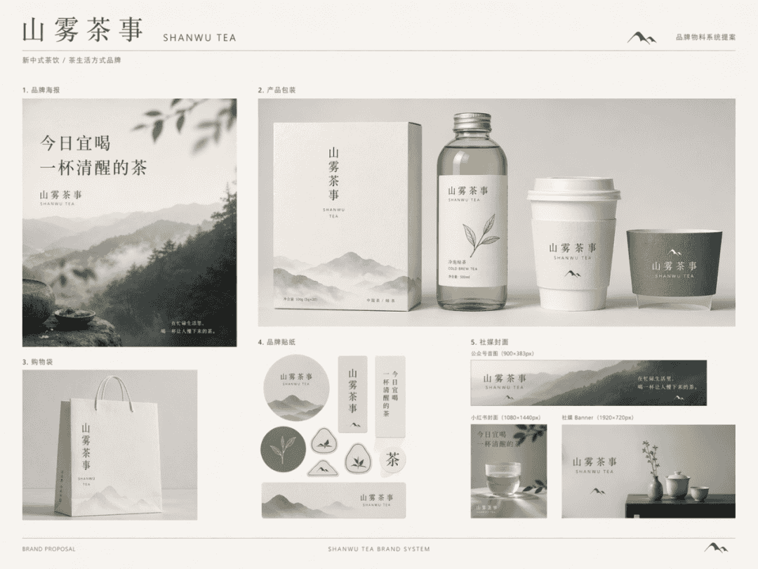
Generate a complete set of brand material package display pictures for the brand "Shanwu Tea Shi", like a page of mature brand system proposals. Brand positioning: New Chinese tea drink/tea lifestyle brand Brand temperament: Oriental restraint, natural poetry, quiet high-end, lifestyle sense Main color system: off-white, tea green, moon gray, supplemented by a small amount of ink gray, the following materials need to be included: 1. Brand poster 2. Product packaging 3. Shopping bag 4. Brand sticker 5. Social media cover

Logo application renderings

Logo application renderings

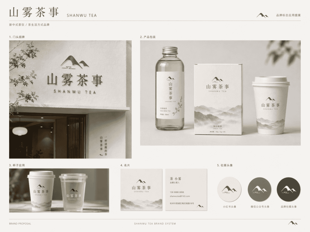
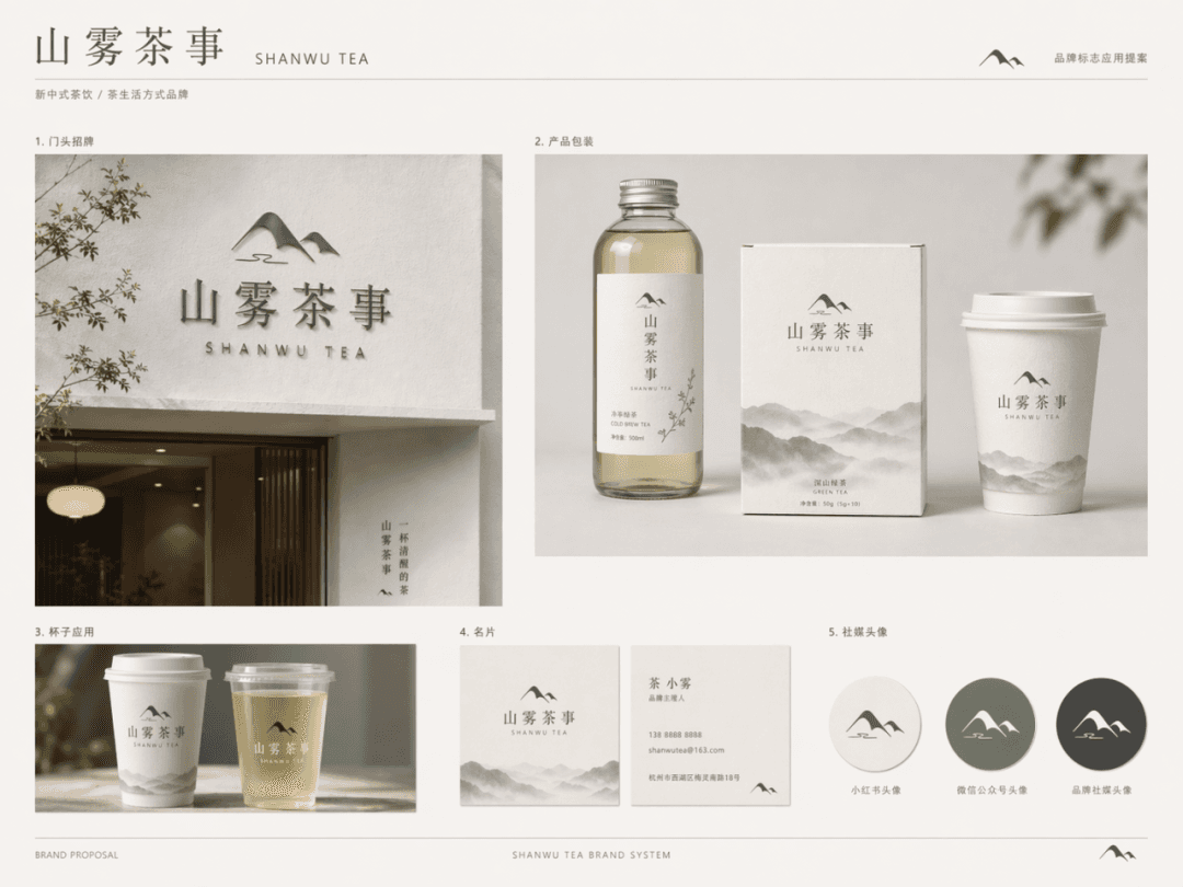
Apply the "Shanwu Tea Service" brand logo to multiple brand touch points to generate a unified style logo application rendering/brand proposal display page. The brand logo is set to: the Chinese word mark "山木茶事" + a graphic symbol that combines a minimalist mountain shape with mist. The overall design is simple, modern, and has a restrained oriental feel. It is necessary to show the following application scenarios: 1. Door sign 2. Product packaging 3. Cup application 4. Business card 5. Social media avatar

brand direction board

brand direction board

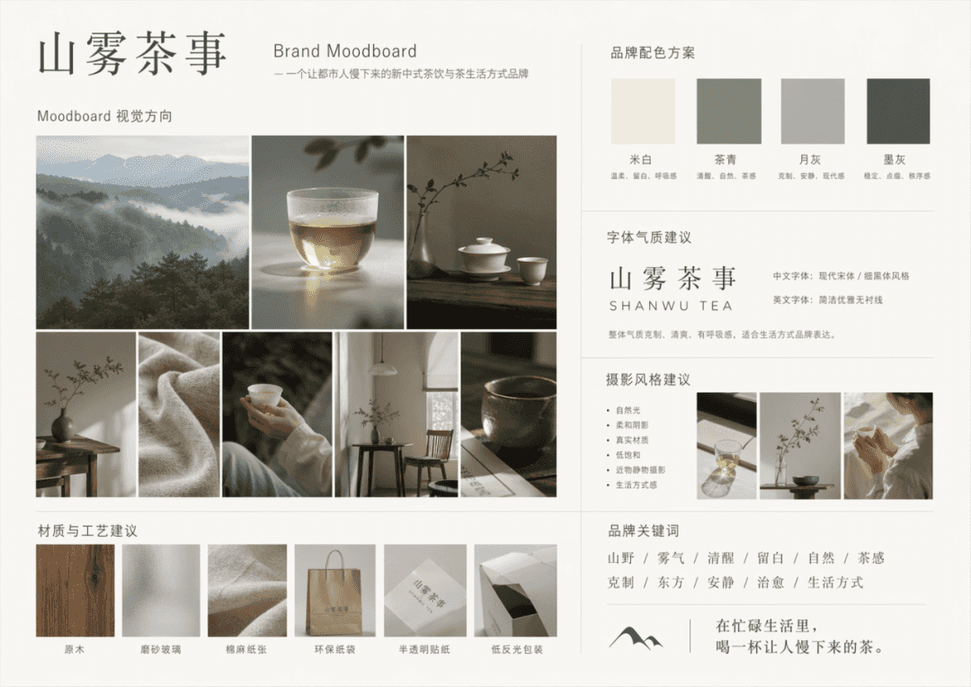
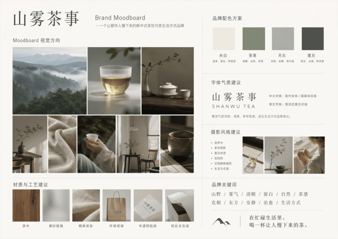
Generate a complete Brand Moodboard based on the following brand description. Brand name: Shanwu Tea Shi, brand description: a new Chinese tea drink and tea lifestyle brand for urban young people, keywords: mountains, fog, sobriety, white space, nature, tea feeling, restraint, oriental, quiet, healing, lifestyle, main colors: off-white, tea green, moon gray, can be embellished with a small amount of ink gray. The output content includes: 1. Moodboard visual direction 2. Brand color scheme 3. Font temperament suggestions 4. Photography style suggestions 5. Material and process suggestions 6. Brand keyword layout area

Product comparison chart

Product comparison chart

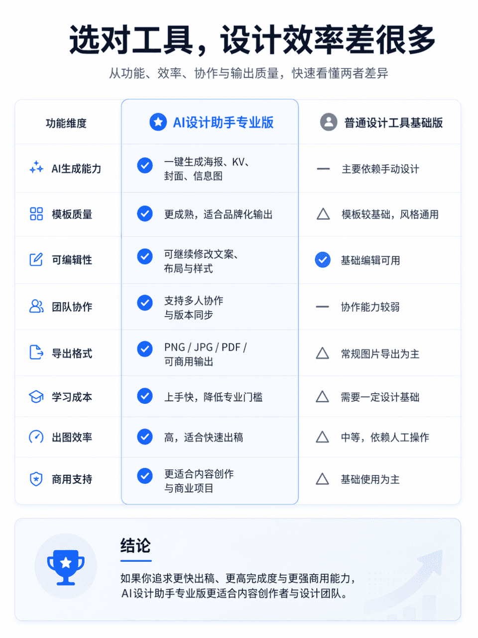
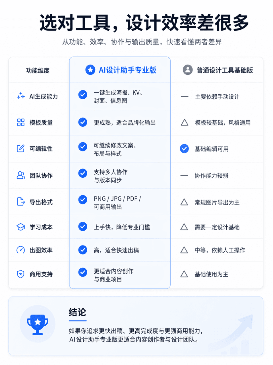
The frame size is 3:4, and a professional and clear product function comparison chart is generated. The comparison object is AI Design Assistant Professional Edition vs. General Design Tool Basic Edition. The overall layout is divided into left and right columns for comparison. The left side is "AI Design Assistant Professional Edition" and the right side is "General Design Tool Basic Edition". Place an eye-catching main title at the top of the screen, "Choose the right tool, and the design efficiency will be much different." The subtitle can be supplemented with "Quickly understand the differences between the two in terms of functionality, efficiency, collaboration, and output quality." The overall style refers to the product comparison page of the official website, which requires a simple layout, clear information hierarchy, sufficient white space, modern fonts, restrained and advanced color matching, and the visual texture of a real Internet product official website. You can add slight icons, dividers, card shadows and key highlights, but avoid e-commerce promotions, clutter, and low-quality tables.

Mobile phone screenshot promotional image

Mobile phone screenshot promotional image

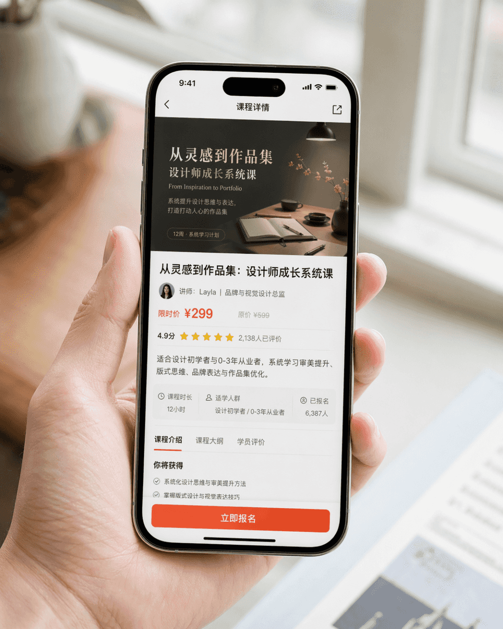
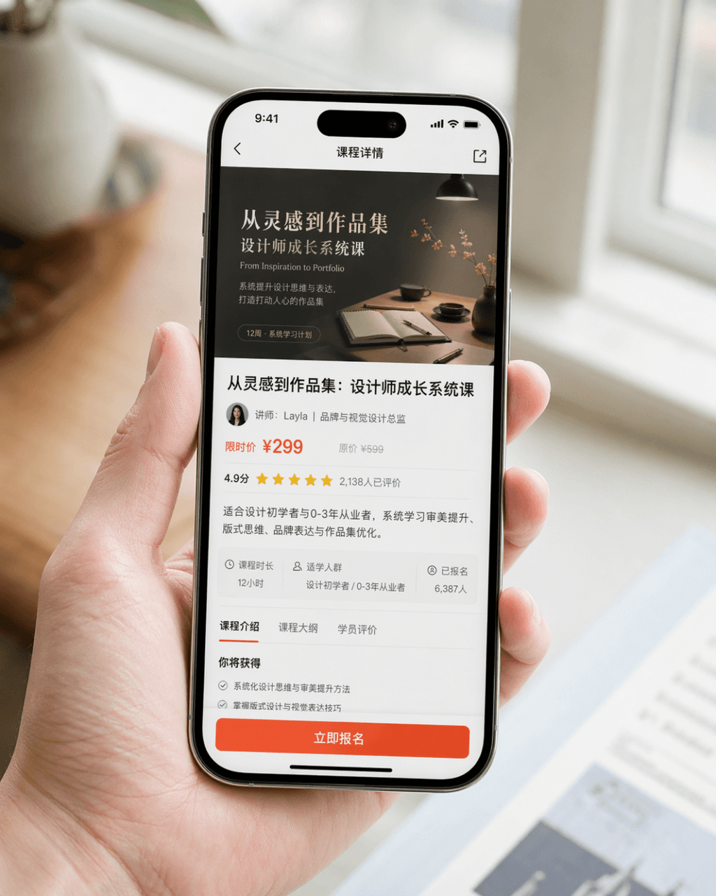
Generate a very realistic mobile phone screenshot promotional image. The device is iPhone 15 Pro. The screen content is the course details page of a design learning app. The page clearly displays the course cover, course title, instructor information, price information, user ratings, summary summary, and an eye-catching "Register Now" button. The picture is a close-up composition of a person naturally holding a mobile phone. The character's hands are clean and natural, the mobile phone screen is clear and bright, and the background is blurred. The overall picture looks like the product PR picture officially released by the brand. It requires realistic photography texture, soft and high-end light, concise composition, and realistic details. Avoid exaggerated UI, cheap e-commerce style, and excessive design.

Home screen of event landing page

Home screen of event landing page

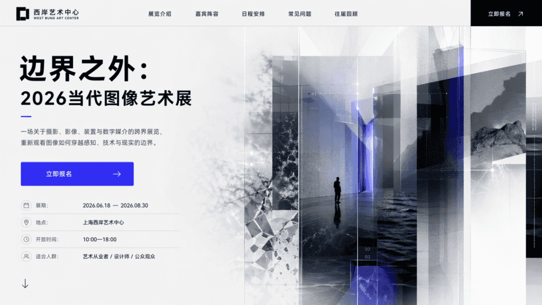
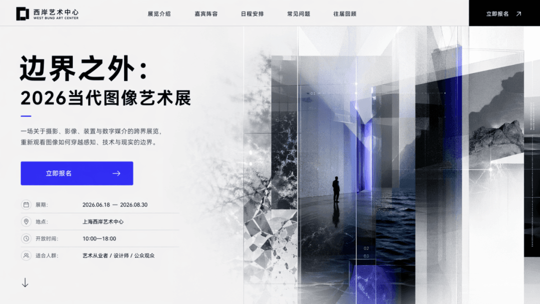
Design an event landing page homepage with the theme "Beyond the Boundary: 2026 Contemporary Image Art Exhibition" and the CTA as "Register Now." The page must contain the main title, subtitle, buttons, auxiliary visuals, and exhibition information, just like the first screen of a real web page.

SaaS dashboard

SaaS dashboard

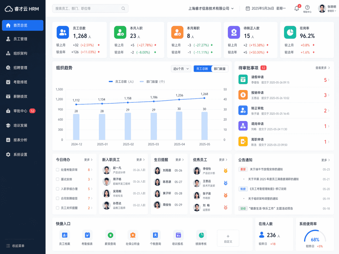
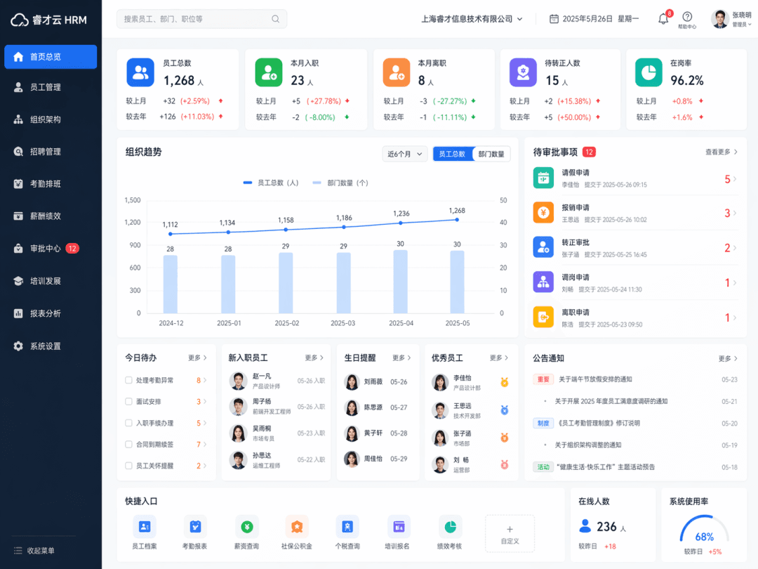
Generate a SaaS dashboard interface, the product type is "Enterprise Human Resources Management System". The real HR background homepage is presented as a whole, including left navigation, top search, employee statistics card, organizational trend chart, approval module, and user module. The interface is clean and rational, like a mature enterprise office system.

App homepage concept map

App homepage concept map

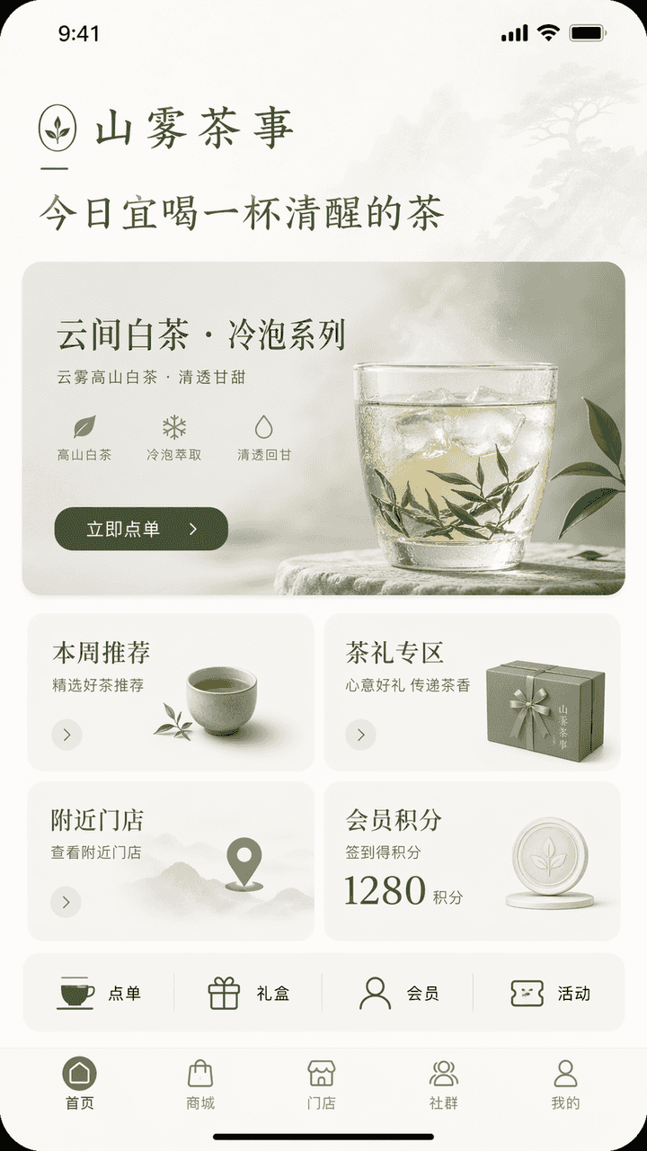
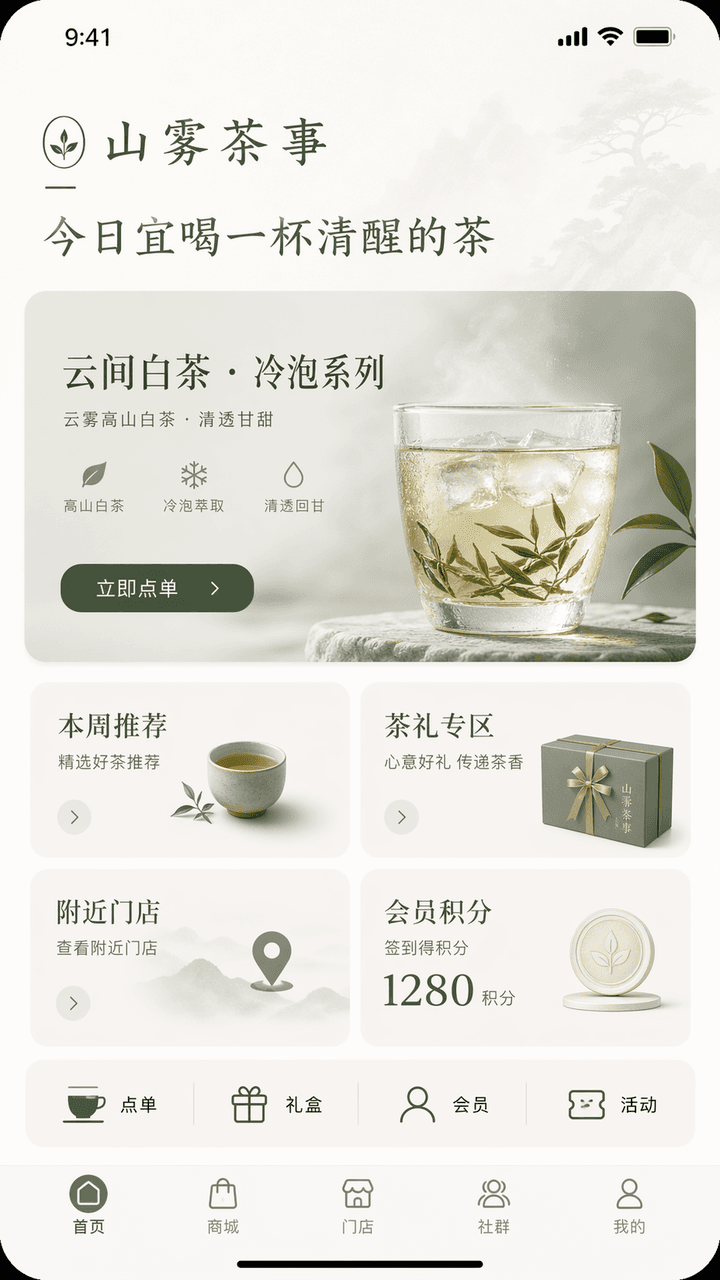
Design an iPhone-style app homepage concept interface. The brand name is "Shanwu Tea Shi", the industry is new Chinese tea drinks/tea lifestyle, and the functions are store ordering, new cold brew tea product recommendations, tea gift purchases, membership points, and nearby store inquiries. The top of the homepage displays the brand greeting "Today is a good time to drink a cup of sober tea", the main visual is the new product recommendation card "Yunjian White Tea·Cold Brew Series", and the button is "Order Now"; in the middle, there are four modules: this week's recommendations, tea gift area, nearby stores, and member points; a row of quick entrances is added below: ordering, gift boxes, members, and activities; the bottom navigation bar is homepage, mall, store, community, and mine. The overall interface needs to have an oriental temperament of restraint + a mature brand feel. The color scheme should be controlled within three colors: off-white, tea green, and moon gray. The interface should be like the homepage of a high-end lifestyle brand app, with clear hierarchy, concise information, reasonable buttons, and all text in accurate Chinese.

Method flow chart

Method flow chart

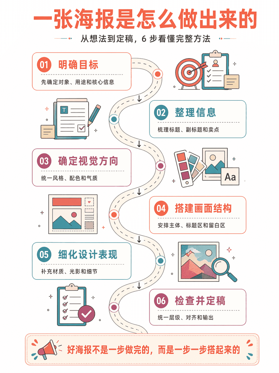
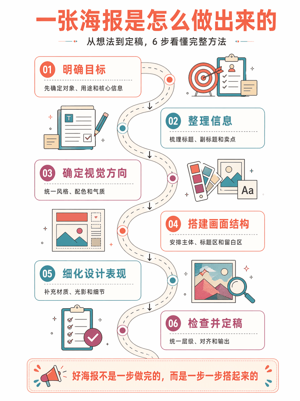
Generate vertical method flow chart poster "AI Poster Production Flow Chart", summarizing 6 steps. The style is: large white space on a white background, series of steps on a curved road, isometric information illustration, retro flat geometric style, coral orange + lake blue + purple red color scheme, thin line strokes, refreshing and orderly. Each step includes a number, title, short description, and arrow connections. The Chinese language is accurate, has a strong tutorial feel, and is suitable for course illustrations.

Data summary long chart

Data summary long chart

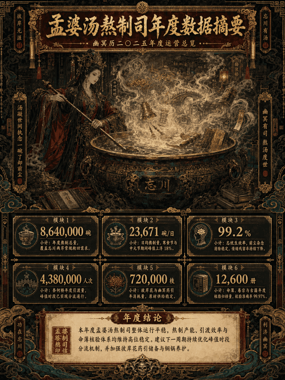
Picture frame 3:4, create a long vertical data summary picture with the theme of "Annual Data Summary of Meng Po Soup Making Department". The main subject is Meng Po cooking soup in front of a huge copper pot. The steam is surging. In the mist of the soup, there are faintly visible Bana flowers, Naihe Bridge, lanterns, runes, scrolls, copper bells, ancient books, fortune books, clouds and ghost patterns. The overall design adopts a maximalist style, but the information level must be clear, such as the combination of consulting report visualization + Oriental Monster setting set + advanced exhibition long picture. The picture is a long vertical version of the infographic, with the title area at the top, the main visual area in the middle, the data module area at the bottom, and the conclusion area at the bottom unfolded layer by layer. The color scheme is controlled to the four main colors of dark vermilion, gilt, jet black, and peacock green, with partial embellishments of old paper off-white and patina green. The picture is gorgeous, complex, mysterious, and solemn, but it cannot be chaotic and out of control. It must be high-end, orderly, and have strong decorative aesthetics.

Teaching Illustrated Posters

Teaching Illustrated Posters

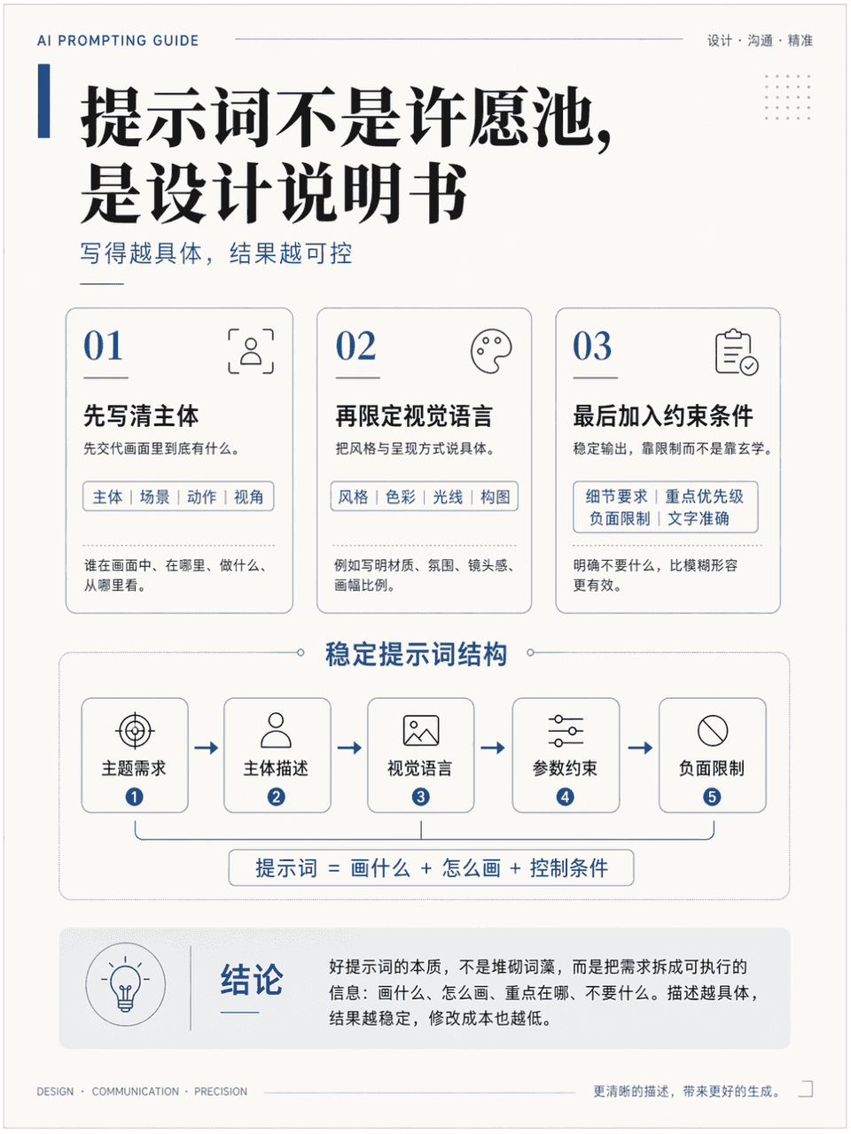
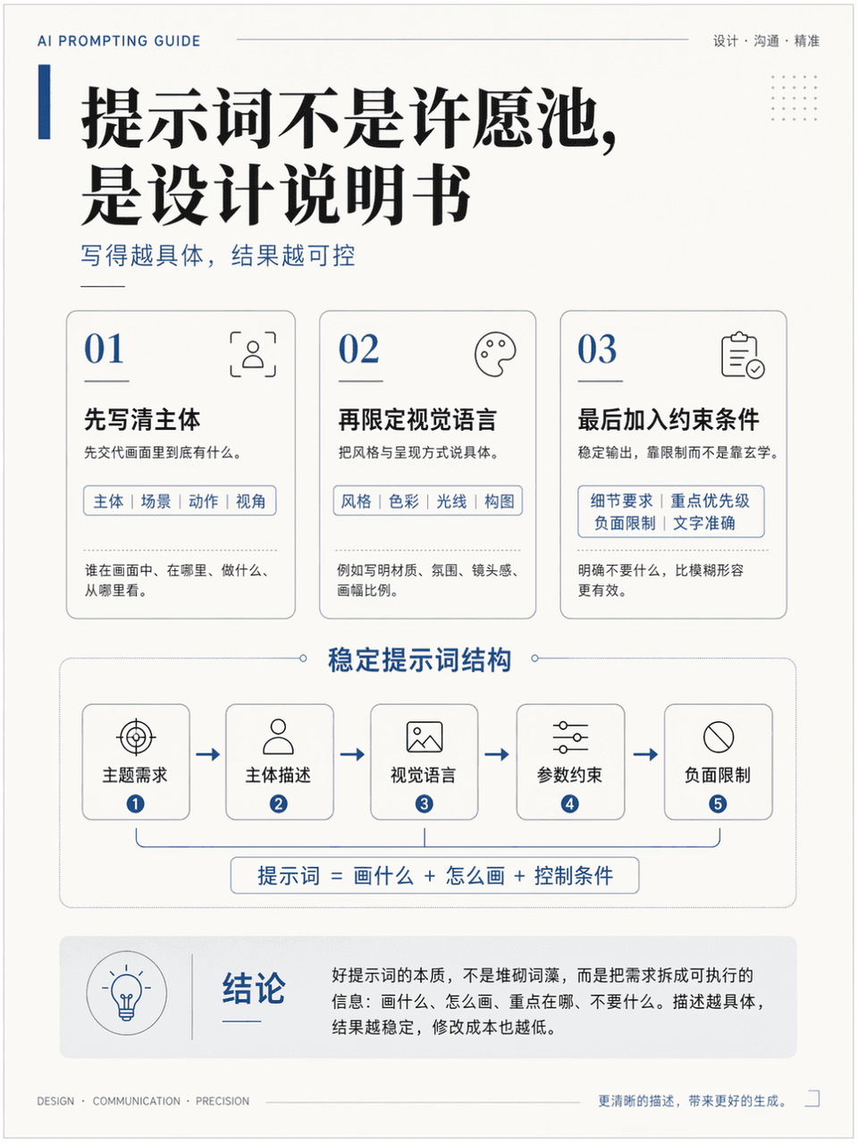
The frame size is 3:4, and a vertical teaching illustration poster is generated to explain the knowledge point "How to write more stable AI drawing prompts". It needs to include a title, 3 key modules, 1 core diagram, and 1 conclusion area. The title is "The prompt is not a wishing well, it is a design instruction". It looks like a high-quality course handout page. It is professional, clean, and academic. It also has a sense of advanced design. The Chinese language is accurate, the hierarchy is clear, the layout is restrained, and there is sufficient white space.

Thesis technology roadmap

Thesis technology roadmap

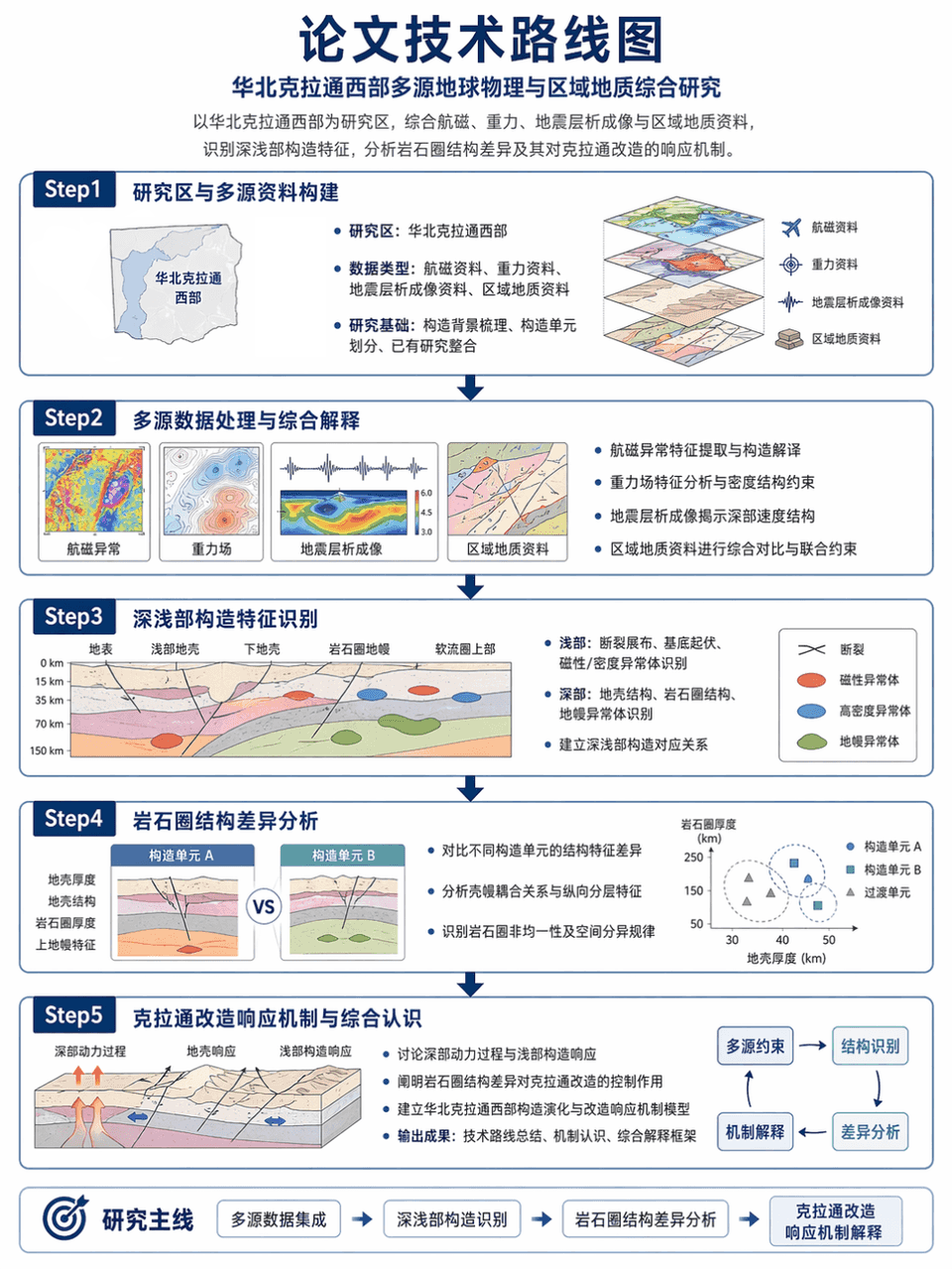
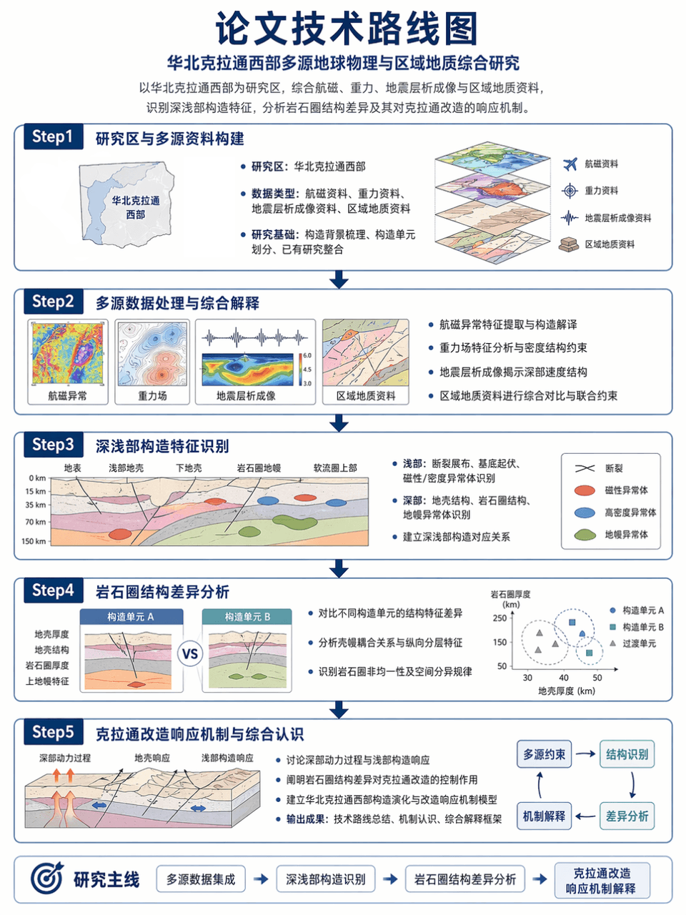
Picture frame 3:4, generate the technical roadmap of the thesis: taking the western part of the North China Craton as the research area, integrating aeromagnetic, gravity, seismic tomography and regional geological data, identifying the deep and shallow structural characteristics, and analyzing the differences in lithospheric structure and its response mechanism to the craton transformation. Use a Step1-Step2-Step3-Step4-Step5 structure, with clear arrows, accurate terminology, and restrained and professional layout.

Technology infographic

Technology infographic

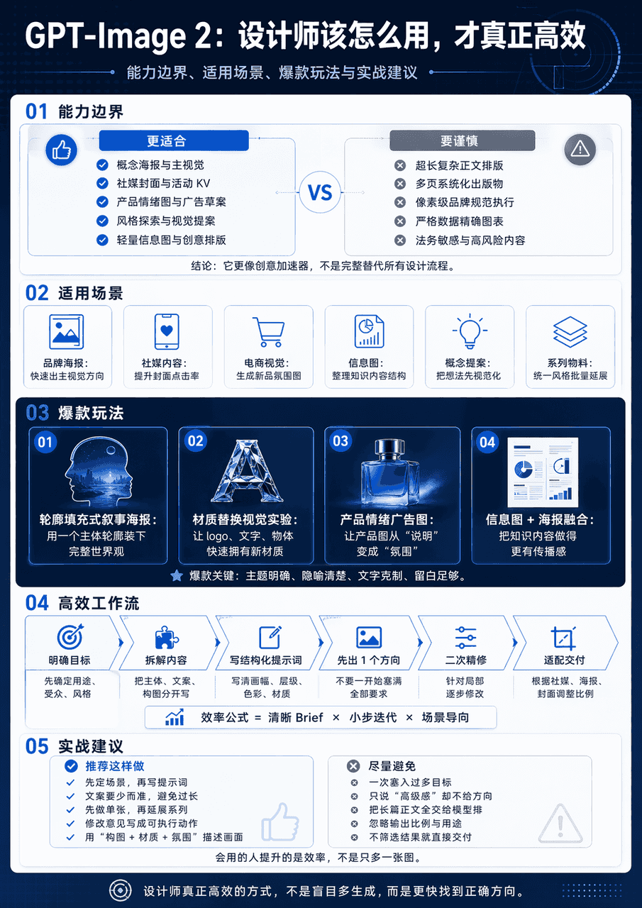
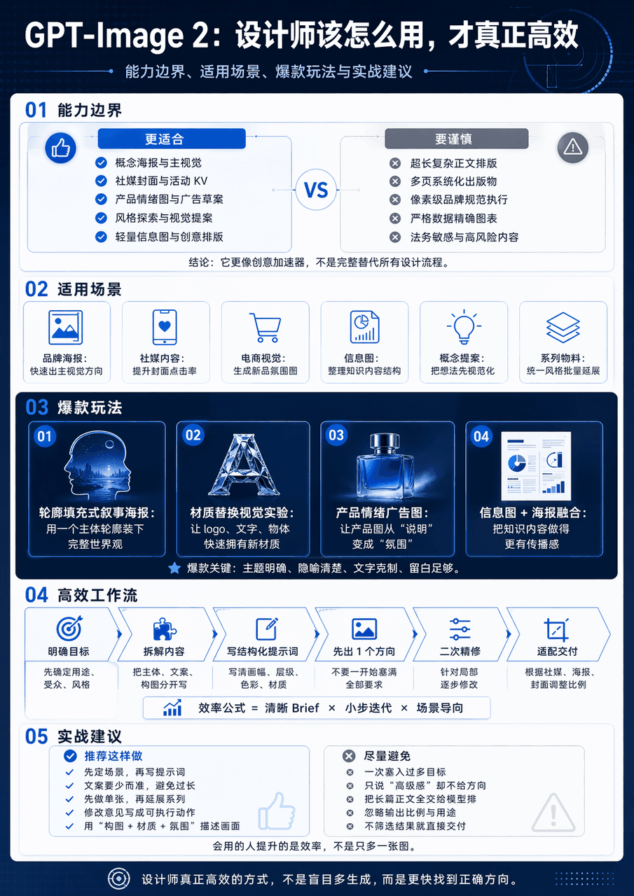
Generate a vertical science and technology information map with the theme of GPT-Image 2 Design Application Guide. The whole map is divided into 5 modules. The big title "GPT-Image 2: How should designers use it to be truly efficient" is set at the top. The subtitles are capability boundaries, applicable scenarios, popular gameplay and practical suggestions. The middle diagram adopts the form of minimalist interface card + process arrow + comparison structure chart. The information level is clear and the visual center is clear.

Concept emotions poster

Concept emotions poster

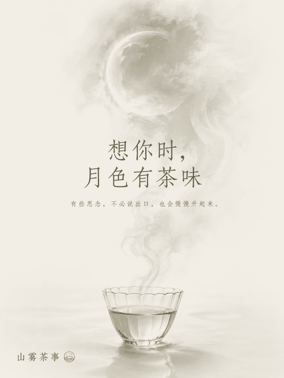
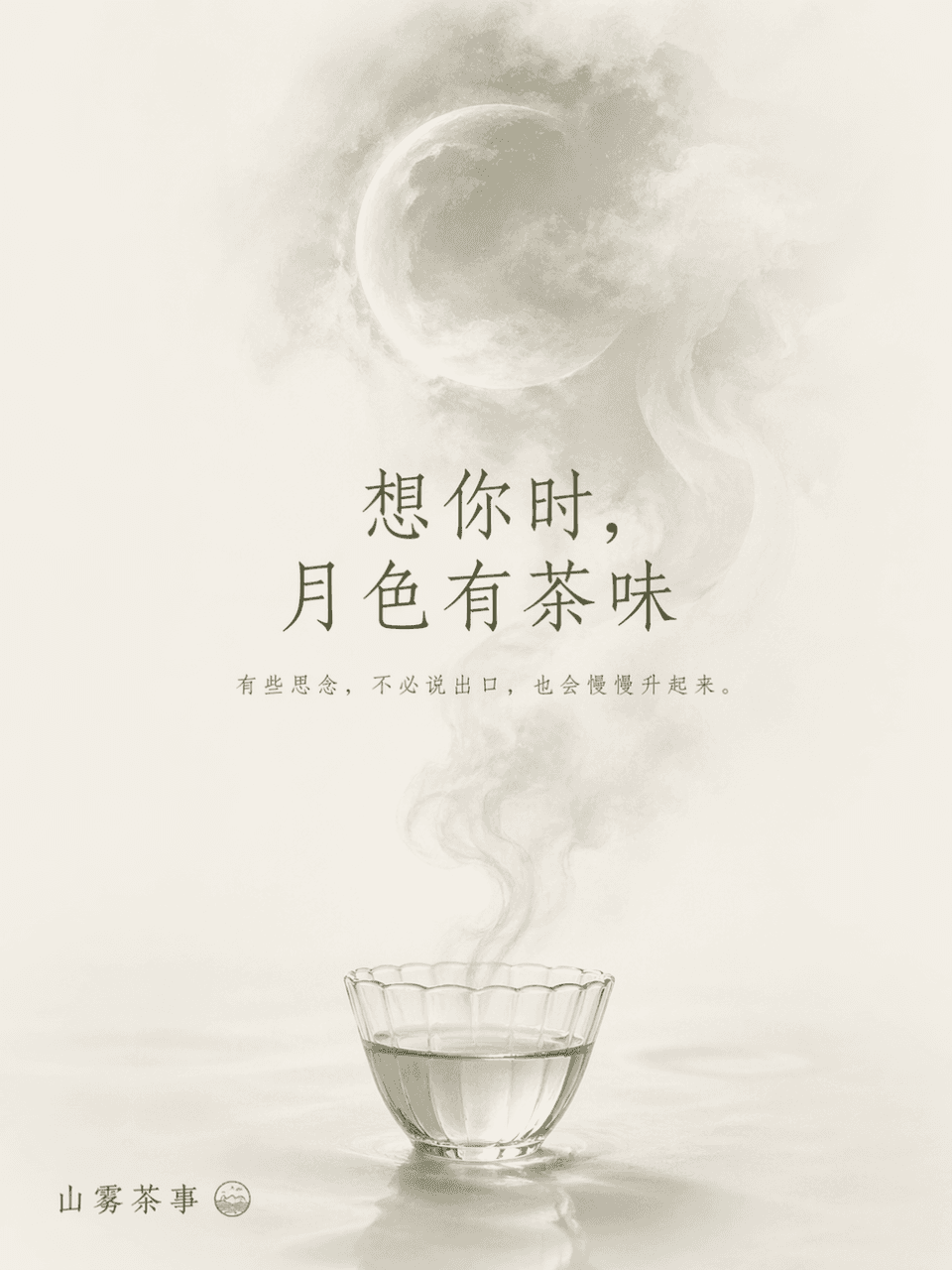
The frame size is 3:4, and a conceptual emotional poster is generated for the brand Shanwu Tea Event, with the theme word "Missing". The main body of the picture is a transparent tea cup placed at the bottom of the picture. The rising tea mist slowly turns into the shape of a blurry moon. The background is left largely blank, using the "tea mist moon" as a metaphor for longing and reunion. Title: When I miss you, the moonlight smells like tea. Small text: Some thoughts will rise slowly without saying them. The style is oriental, poetic and restrained, and the colors are controlled within three colors: off-white, tea green and moon gray.

Event communication poster

Event communication poster

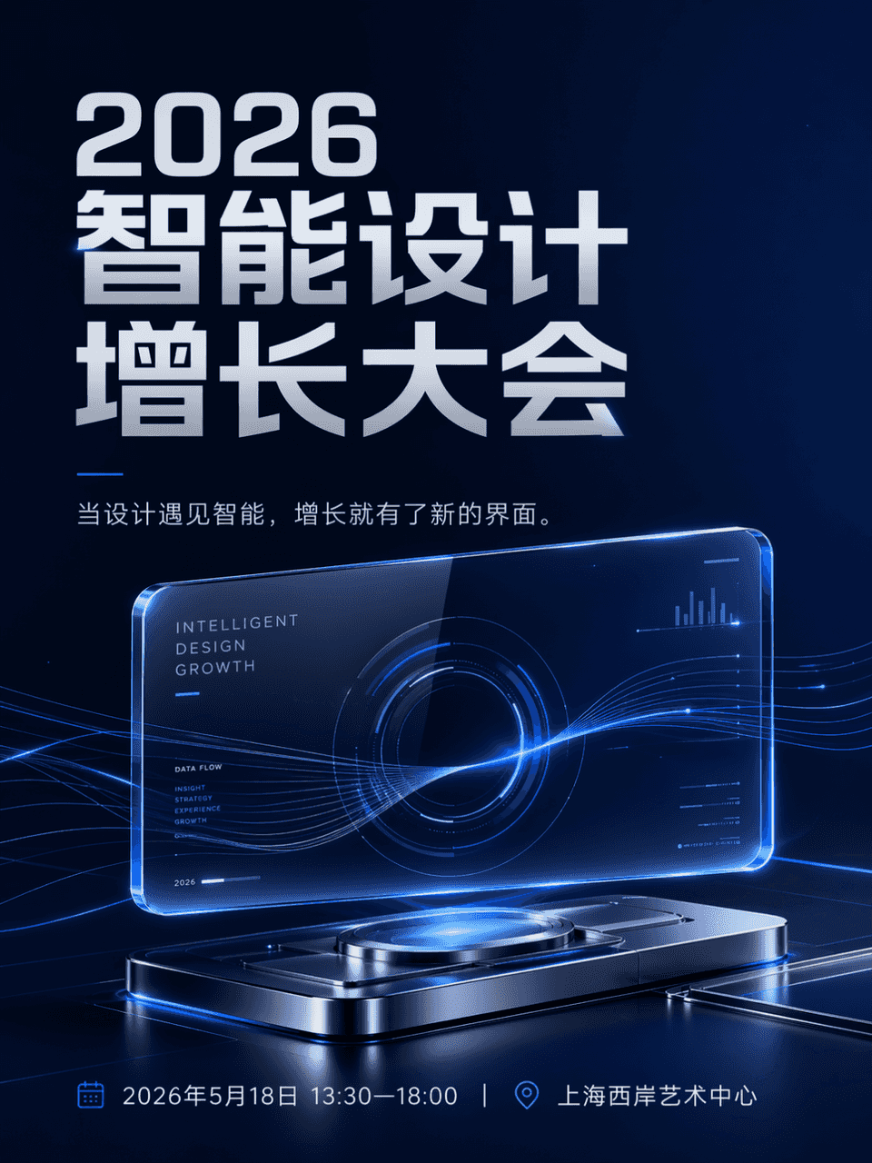
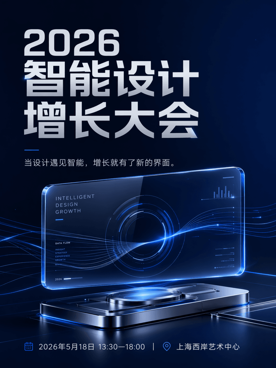
The frame size is 3:4, and the event poster is generated. The event name is 2026 Intelligent Design Growth Conference, time and place: May 18, 2026, 13:30-18:00|Shanghai West Bund Art Center. The hierarchy is clear, the activity name is the largest, and the side information is clear and orderly. The main body is a suspended and luminous transparent glass interface, which is combined with a small number of flowing data lines and metal reflective devices to form a futuristic visual center. The copy is When design meets intelligence, growth has a new interface. The style is technological, and overall suitable for public accounts and social media communication. The color control is dark blue, silver gray, and electric blue. The composition is clean, the white space is sufficient, and the information layout is orderly. It is like the main visual of a mature technology brand’s annual event. There is no cheap conference background or cluttered light effects.

Urban river narrative poster

Urban river narrative poster

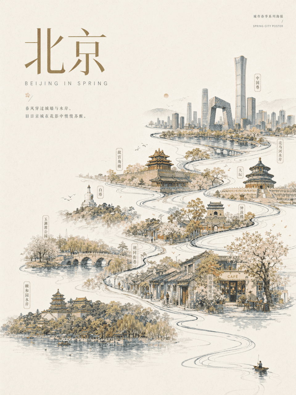
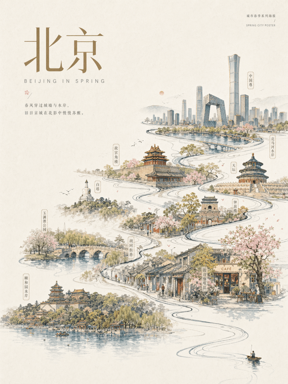
Frame 3:4, Urban Beijing: Design a Beijing spring city poster. Off-white paper background with large areas of white space. There is only a tiny rower, walker or traveler in the lower right corner of the picture. The main movement brings out a main flowing line, which gradually evolves into an urban river/street/skyline, internally connecting landmark buildings, old towns, bridges, parks, waterfronts and representative street scenes. The overall image is a combination of hand-painted urban scrolls and modern posters, elegant, festive, contemporary and restrained. And add the main title "Beijing" and decorative text in the same style to the screen.

Joint postcard poster

Joint postcard poster

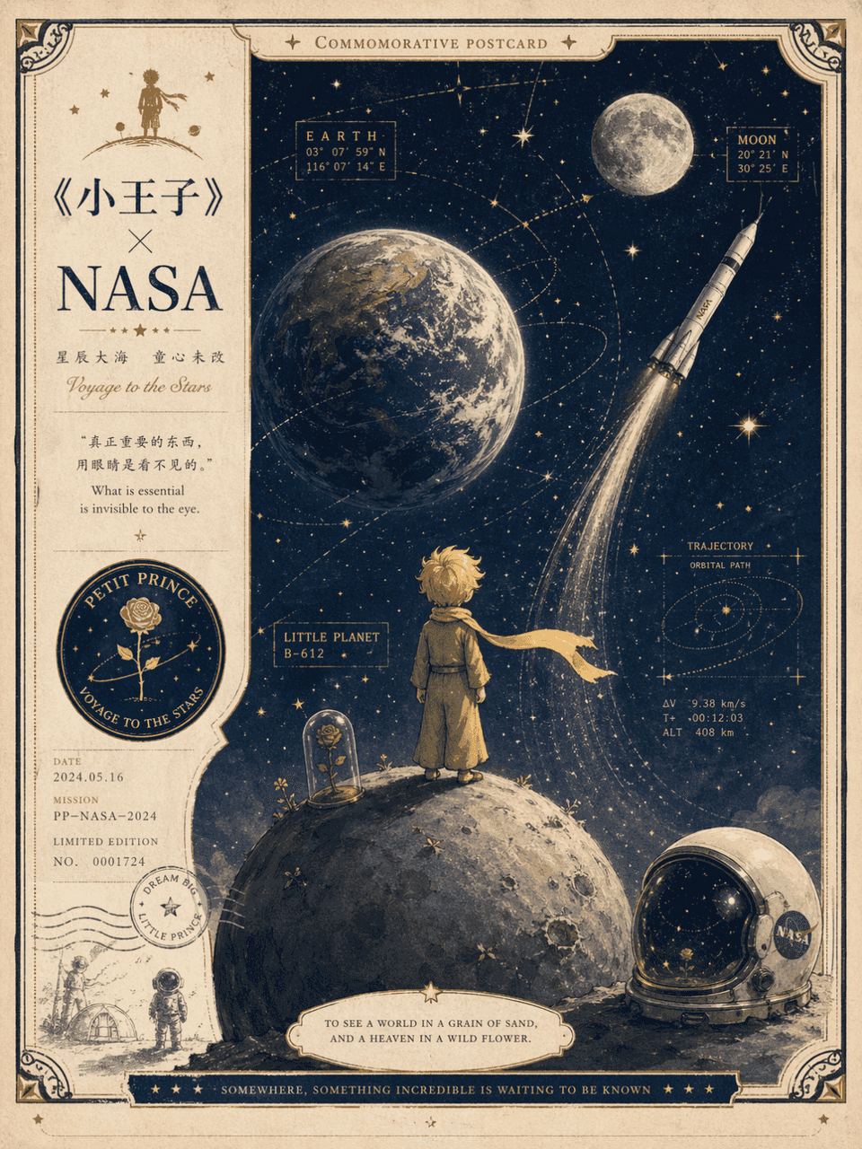
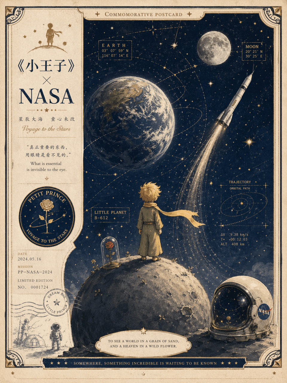
Design a "Little Prince" x NASA co-branded postcard. The picture combines the classic image of the little prince standing on a small planet looking up at the universe, with NASA aerospace elements such as rockets, astronaut helmets, earth, moon, star map coordinates, mission badges, etc. It is a natural combination and is not a simple collage. The overall look is like a collectible commemorative postcard, with a sense of fairy tale, space exploration and retro paper design. The color scheme is cream white, midnight blue, starlight gold, and foggy gray blue, which is exquisite, high-end and restrained.

Profile silhouette world view poster

Profile silhouette world view poster

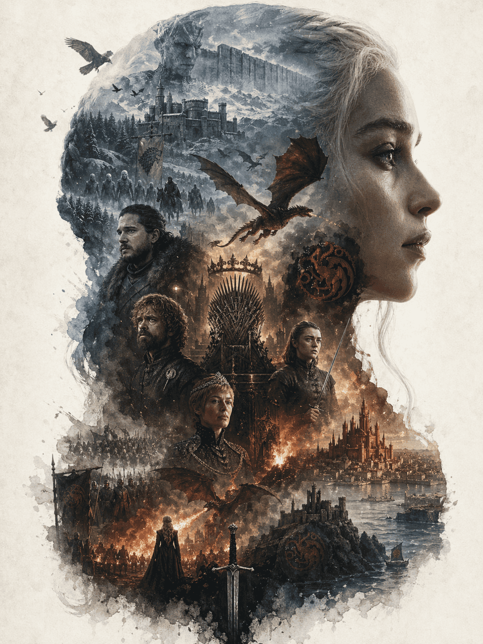
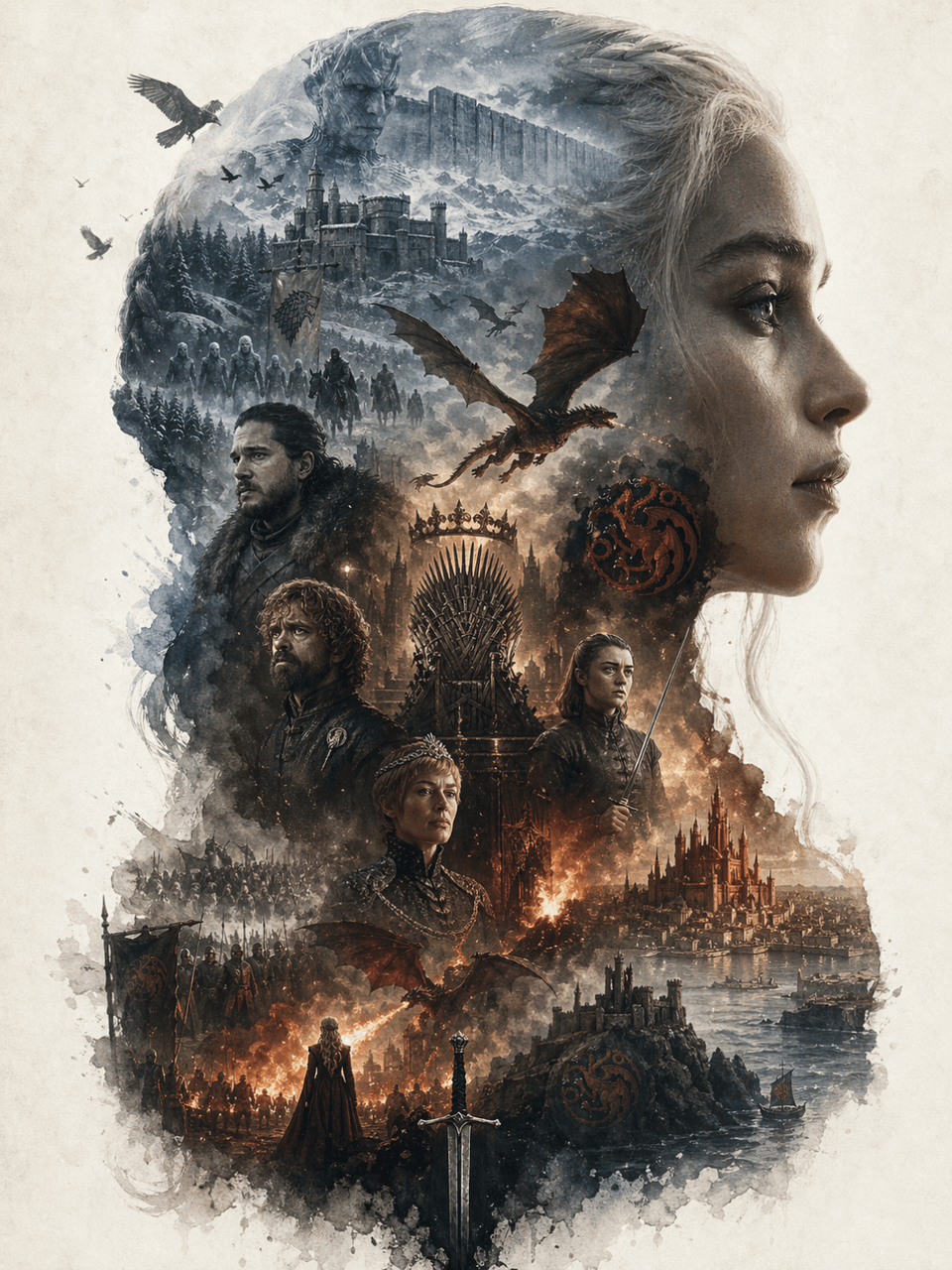
The frame size is 3:4, creating a collectible epic narrative poster around the Game of Thrones. The huge side profile of Daenerys Targaryen is used as the main outer outline, and the inside of the silhouette extends a complete world view: representative scenes, key characters, symbols, buildings, creatures, props, and atmosphere clues. Not an ordinary collage, but an advanced outline-fill narrative composition. Double exposure association, movie poster + dreamy watercolor texture, air perspective, light fog transition, paper particles, white edges, large area of ​​blank space, quiet, grand, sacred, nostalgic, poetic. The elements must be strongly bound to the theme, clearly identifiable, and the overall design must have a collectible, epic, and artistic giclée poster quality.

Screenshots of social platform activities

Screenshots of social platform activities

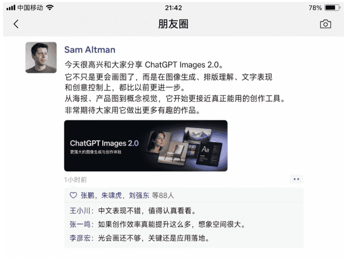
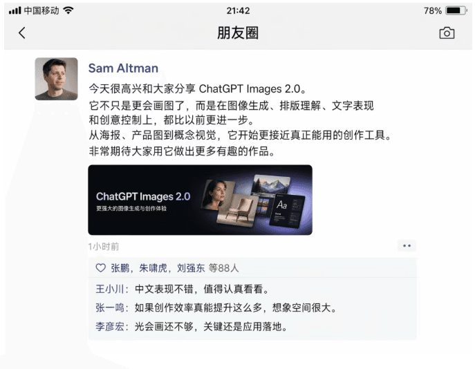
Generate a screenshot of WeChat Moments. Sam Altman uses Chinese Moments to introduce ChatGPT Images 2.0. There was interaction in the comment area below: Wang Xiaochuan: "The Chinese performance is good, it is worth taking a closer look." Zhang Yiming: "If the creative efficiency can really be improved so much, there is a lot of room for imagination." Robin Li: "It is not enough to be able to draw, the key is to implement the application."

Candid photos of the press conference

Candid photos of the press conference

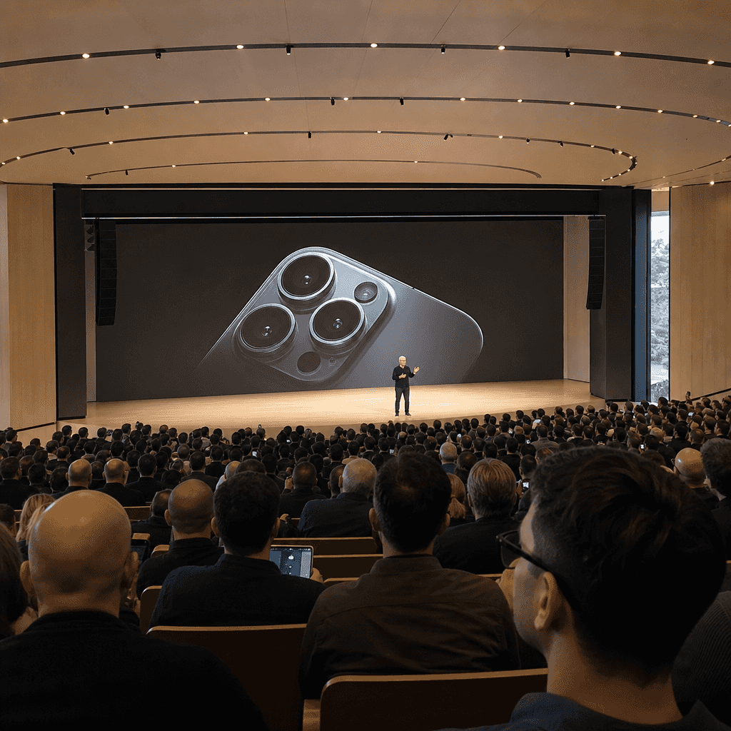
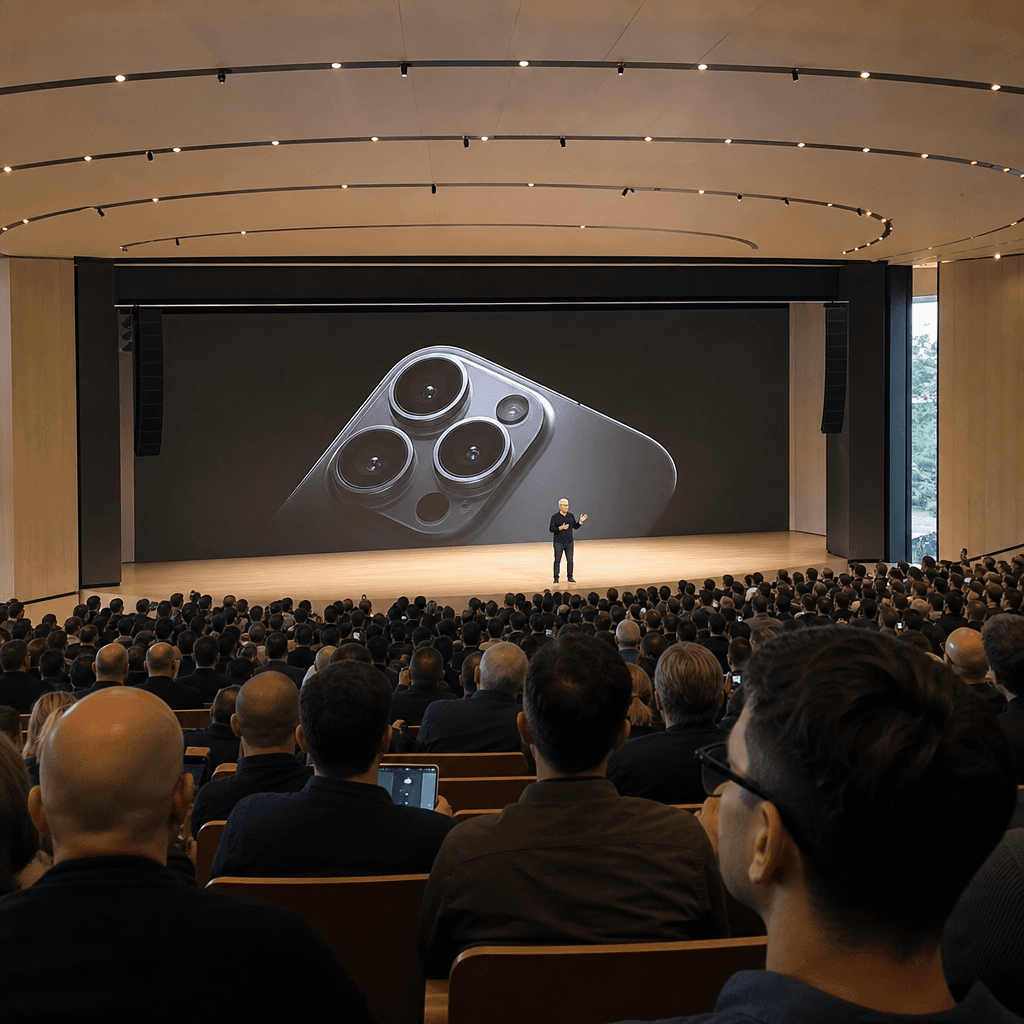
Tim Cook is speaking on stage at the iPhone 20 launch event at Apple Park. This is an amateur iPhone photo taken from a distance from the auditorium.

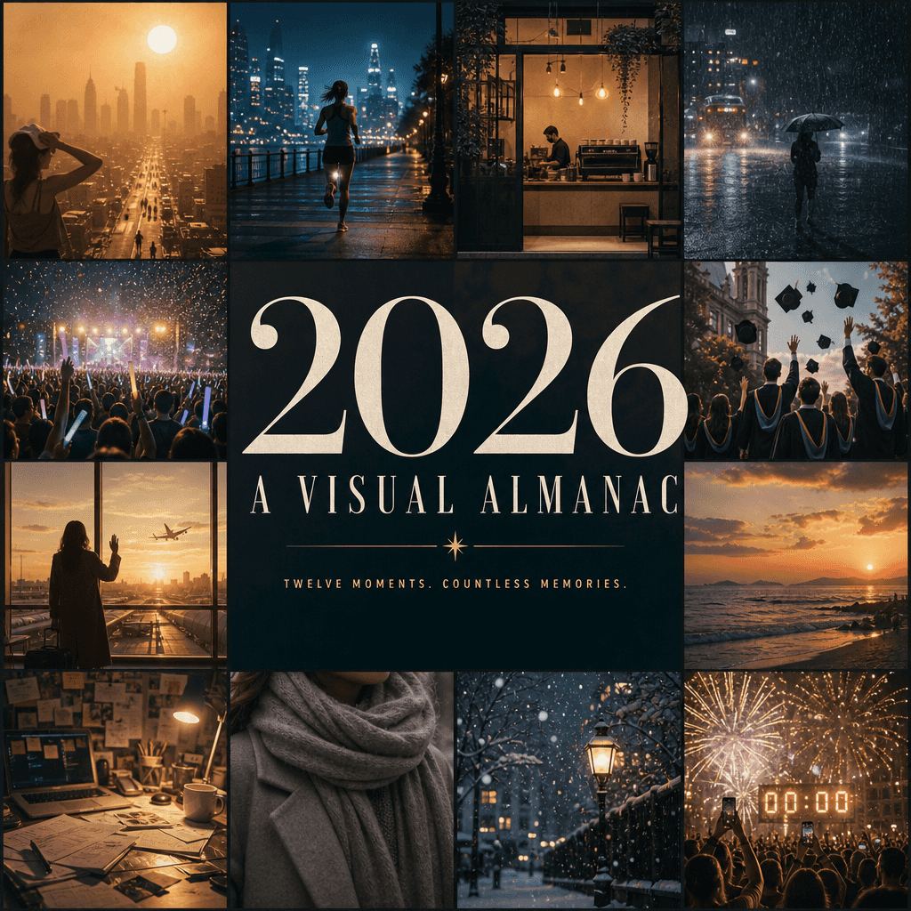
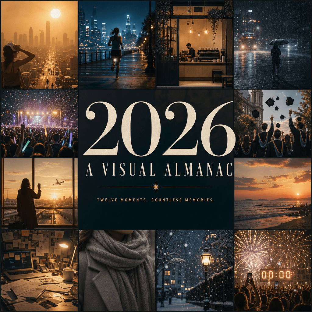
“Make 2026 into a page-turning visual yearbook cover”

“Make 2026 into a page-turning visual yearbook cover”

"Make 2026 into a page-turning visual yearbook cover", the annual summary poster is integrated with editorial design. The picture is composed of twelve small windows, representing the most vivid visual memories of the year: urban heat wave, night run, coffee shop opening, heavy rain, concert glow sticks, graduation photos, airport farewell, seaside sunset, messy desk, winter scarf, first snow, New Year's Eve countdown, the central title "2026 / A VISUAL "ALMANAC" dominates the entire screen, with a minimalist subtitle. The whole thing is like the cover of a high-end cultural yearbook, with rich information and complete emotions, in a ratio of 4:5.

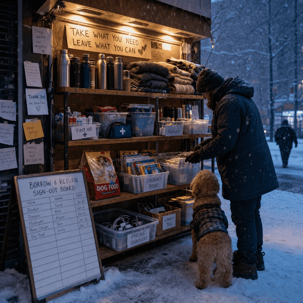
“Community Sharing Station on Blizzard Days”

“Community Sharing Station on Blizzard Days”

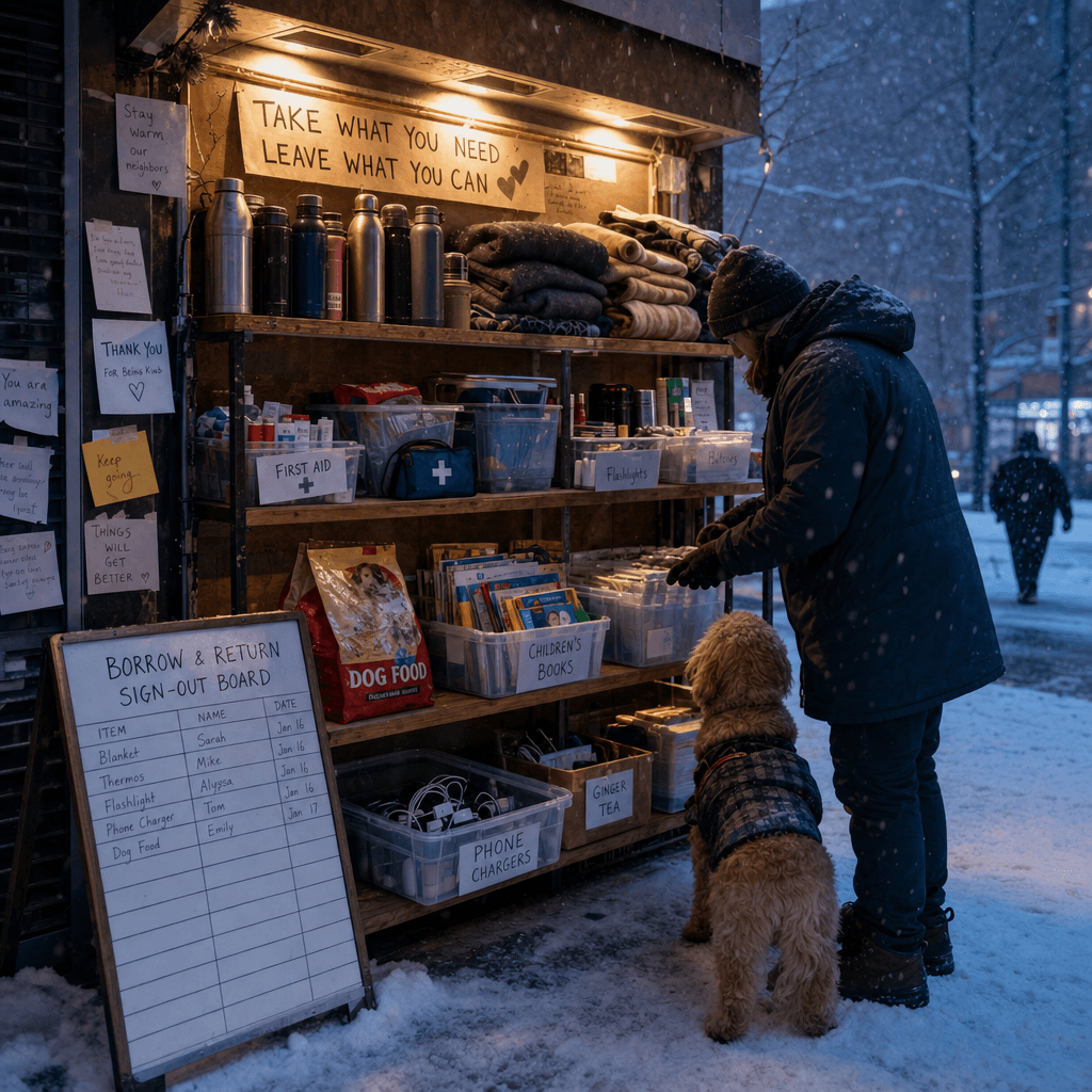
"Community Sharing Material Station on Blizzard Days" combines social mutual aid design with winter documentary photography. The main picture is a community temporary material station. The shelves are equipped with thermos bottles, blankets, flashlights, first aid kits, dog food, children's books, ginger tea bags and spare chargers. Next to it are a borrowing registration board and neighbor message notes. The picture is cold yet warm, with a ratio of 16:9.

"Parallel World Post-it Wall: If I had made another choice that day"

"Parallel World Post-it Wall: If I had made another choice that day"

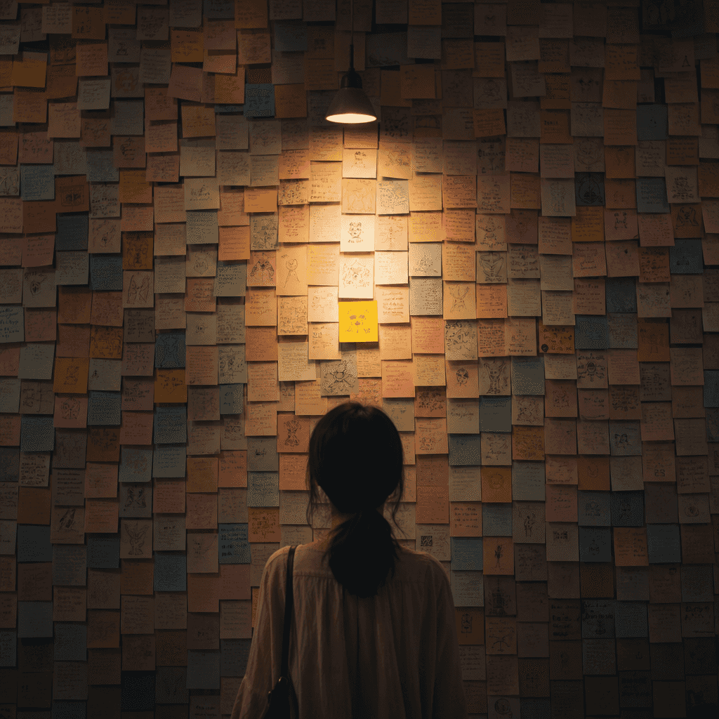
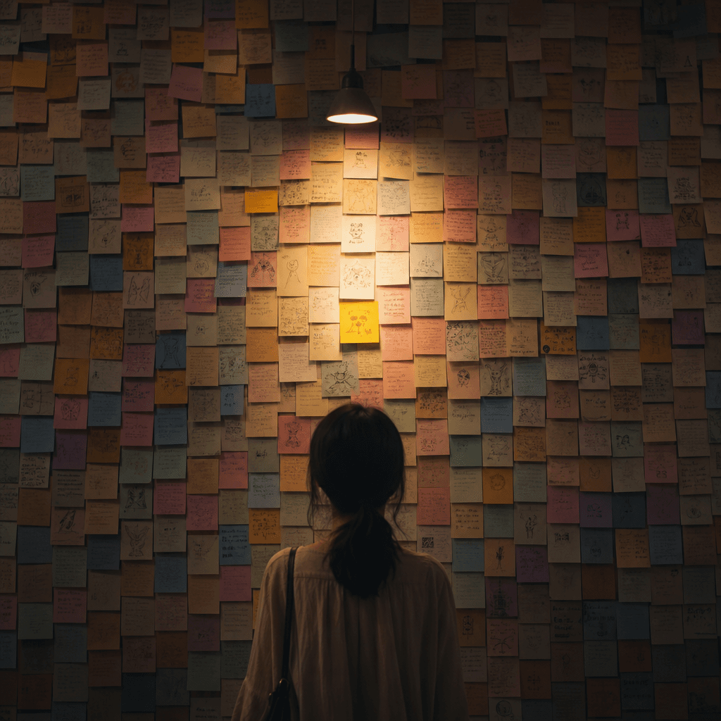
"Parallel World Post-it Note Wall: If I Made Another Choice That Day" combines a conceptual art poster with a handwritten note installation. An entire wall is composed of notes of different colors. Each note represents another branch of life: going to another city, studying a different major, unsaid words, a train that left early, and starting work again. A warm lamp in the center illuminates the middle note. The emotions are complex and delicate, and the ratio is 4:5.

“Desktop theme system designed for late-night writers”

“Desktop theme system designed for late-night writers”

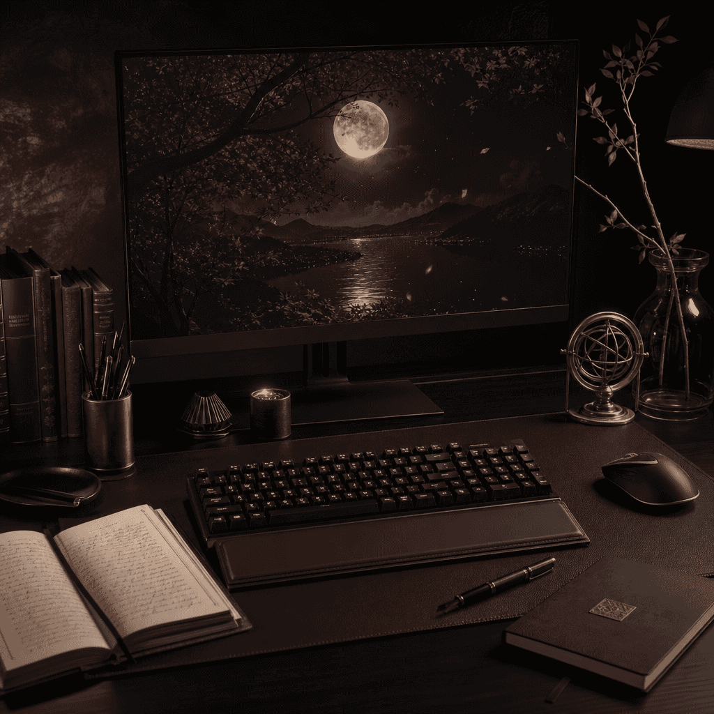
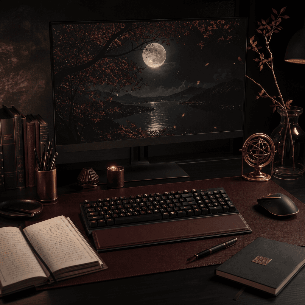
"Desktop theme system designed for late-night writers", UI theme design is combined with literary still life photography. The screen displays a unified theme style of computer desktop, input method skin, focus timer, folder icons, night wallpaper, mechanical keyboard lighting effects and desktop widgets. The colors are coal black, moon white, dark wine red, and old copper. The temperament is restrained and mature, and the ratio is 16:9.

"A Weekly Diary of the Emotions of Potted Plants"

"A Weekly Diary of the Emotions of Potted Plants"

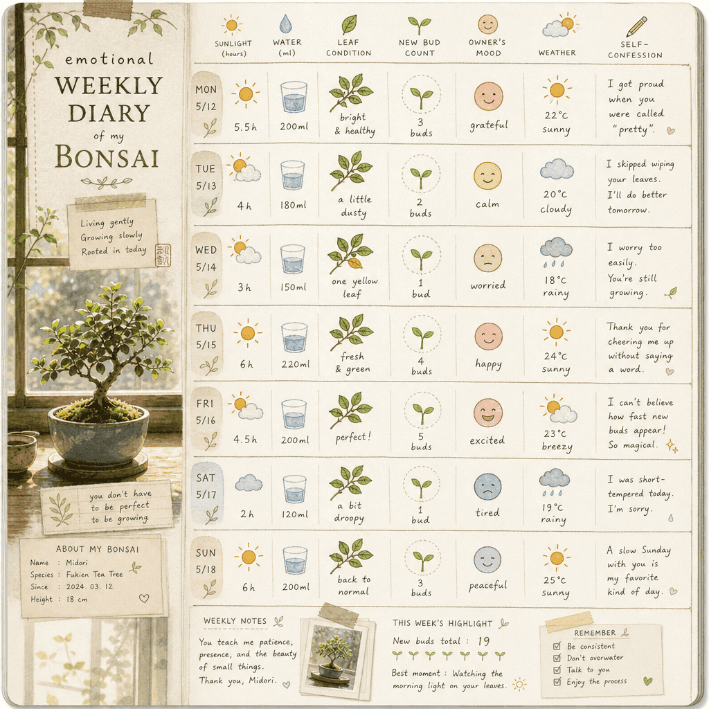
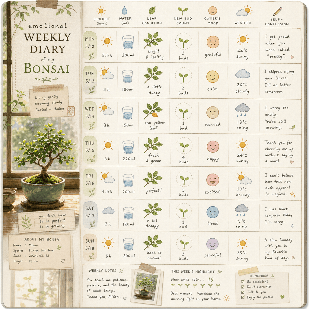
"Weekly Diary of the Emotions of Potted Plants" is a combination of a handbook style diary and plant observation illustrations. The 7-day vertical page records the light, water volume, leaf status, number of new shoots, owner's mood, weather and a small confession. The protagonist is a pot of green plants by the window. The style is quiet and healing, with a ratio of 9:16.

"Classic Oil Painting Version Internet Customer Service Center"

"Classic Oil Painting Version Internet Customer Service Center"

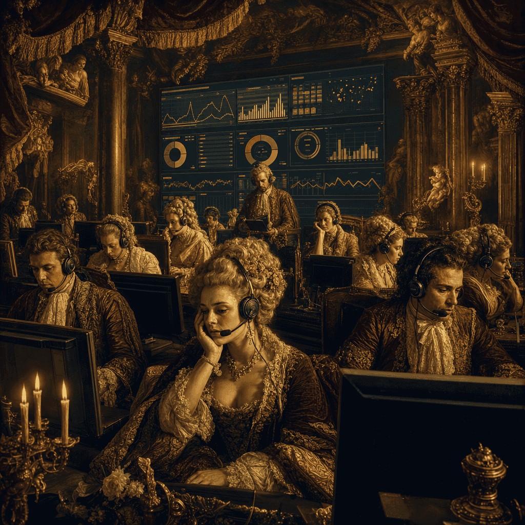
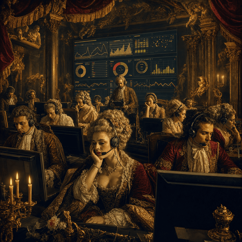
"Classic oil painting version of the Internet Customer Service Center" is an absurd fusion of Baroque group portraits and modern office systems. In the luxurious oil painting composition, a group of customer service staff sit in front of candlelight and gold curtains and answer headphones. A huge screen at the back displays the number of work orders, satisfaction, and waiting time. The characters are gorgeously dressed but have professionally exhausted expressions, with a strong sense of conflict. The ratio is 16:9.

“A comforting guide for passengers on the last subway train”

“A comforting guide for passengers on the last subway train”

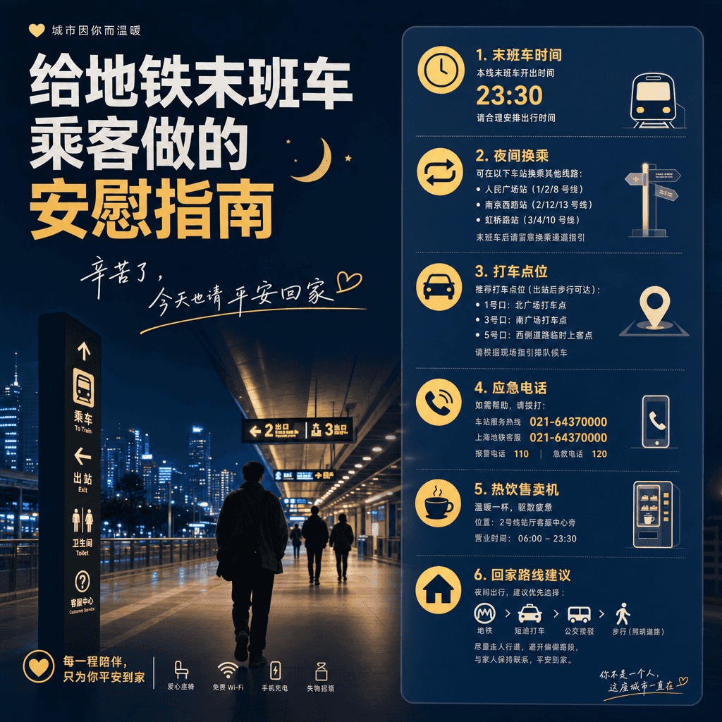
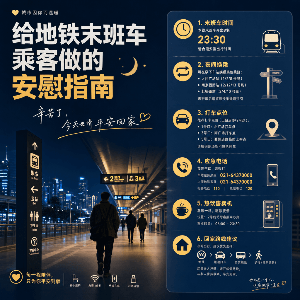
"A comforting guide for passengers on the last subway train" combines public service visuals with humane copywriting. The image looks like a public welfare poster at a subway station. The content includes the last train time, night transfers, taxi spots, emergency telephone numbers, hot drink vending machines, and suggestions for home routes. It also adds gentle copywriting "Thank you for your hard work, please go home safely today", with a ratio of 4:5.

"A city's evening style consumerology"

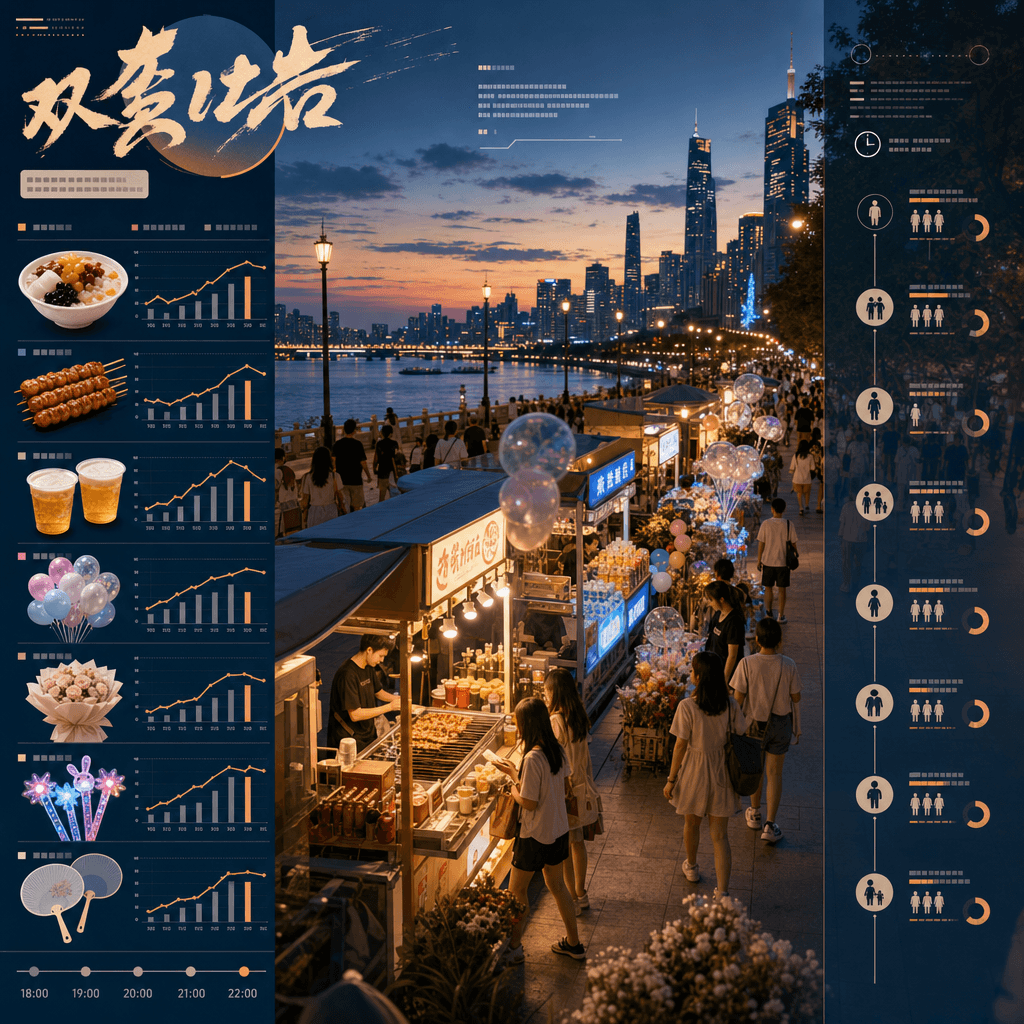
"A city's evening style consumerology"

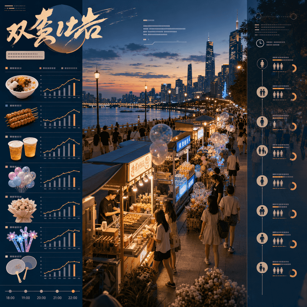
"A City's Evening Breeze Consumption" combines lifestyle posters with lightweight data graphics. In the center of the picture is a riverside walk in the evening, with stalls selling ice cream, sausages, beer, balloons, bouquets, fluorescent toys, and handheld fans along the way. The sidebar records the sales changes of different products from 18:00 to 22:00 and the corresponding groups. The title is like a magazine column, with a ratio of 9:16.
"Illustrated Tools for Street Shoe Repair Shops"

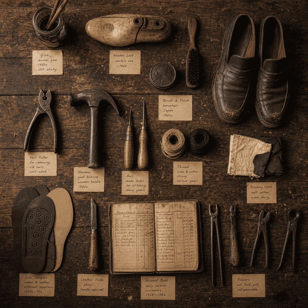
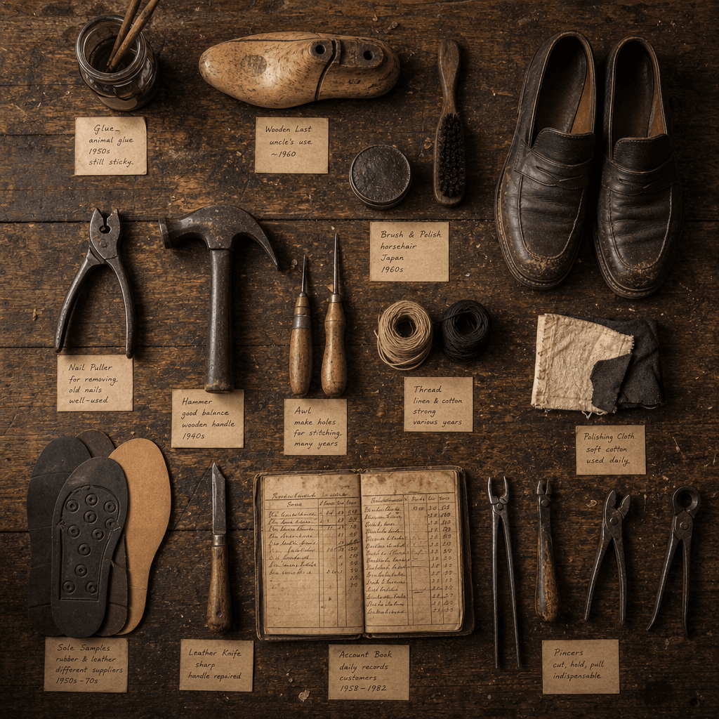
"Illustrated Tools for Street Shoe Repair Shops"

"Illustrated Tools of a Street Shoe Repair Shop" combines craft anthropology with still life photography. The main picture is an overhead shot of an old craftsman's workbench. Shoe lasts, pliers, needlework, glue, polishing cloth, shoe sole samples, and account books are presented like specimens. Each tool is accompanied by a small handwritten note describing its traces of use and age. The ratio is 4:5.

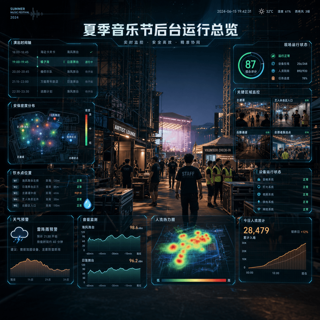
"Summer Music Festival Backstage Operations Overview"

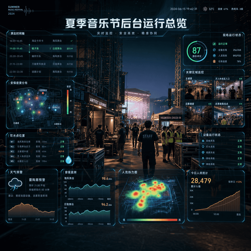
"Summer Music Festival Backstage Operations Overview"

"Summer Music Festival Backstage Operation Overview", a large-scale event dashboard is integrated with on-site photography. The main background is the passageway, equipment box, artist rest area, and volunteer gathering point behind the stage. The foreground is superimposed with the performance timeline, security level, drinking water point, people flow heat map, weather warning, and volume monitoring. The title is like the event master control room screen, with a ratio of 16:9.

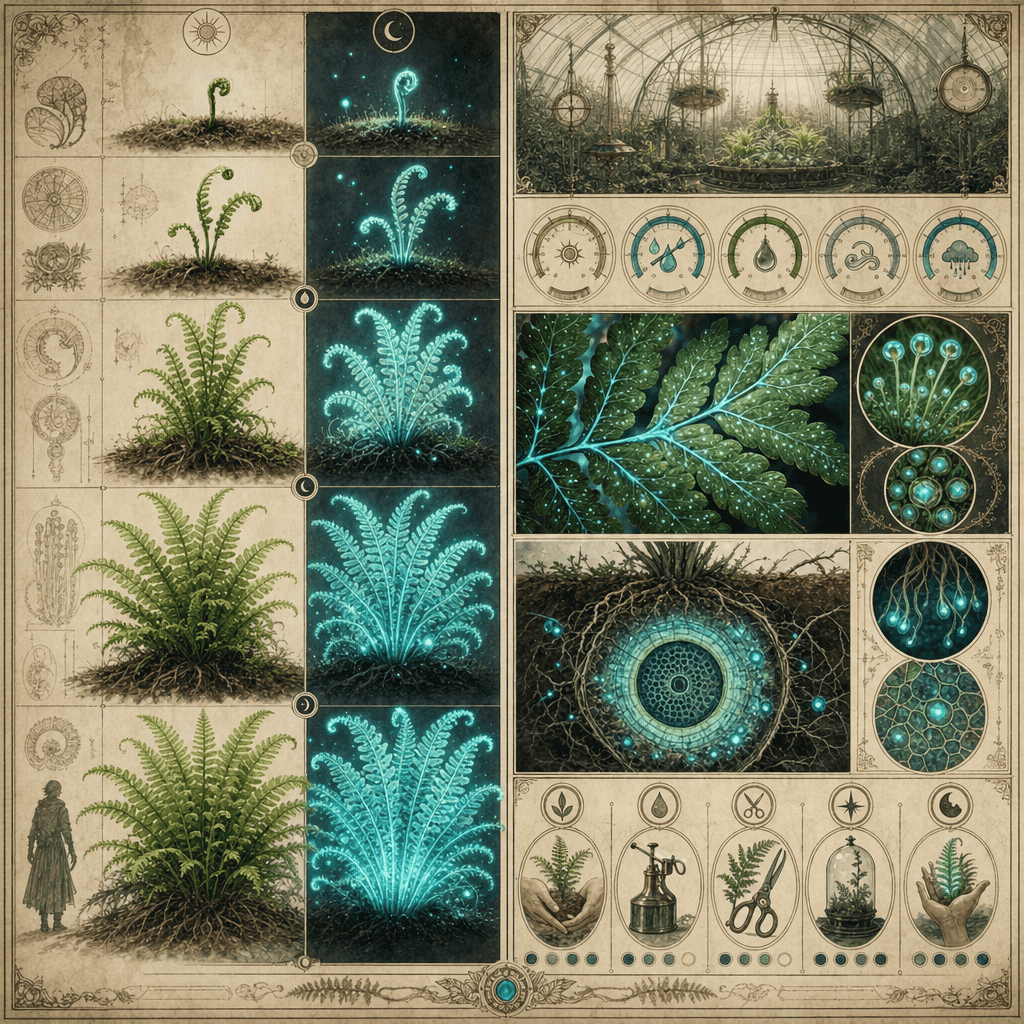
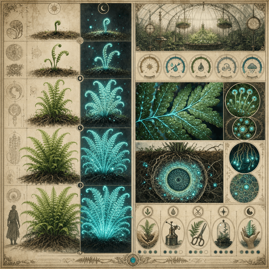
"Magical Plant Greenhouse Observation Journal: Glowing Ferns"

"Magical Plant Greenhouse Observation Journal: Glowing Ferns"

"Magic Plant Greenhouse Observation Log: Glowing Ferns" is a fusion of scientific research archives and fantasy plant illustrations. The left side shows the different growth stages of plants and the comparison of day and night luminous intensity. The right side shows greenhouse environmental parameters, leaf macro, root system profiles and care suggestions. The whole thing looks like a serious botany poster, but the object comes from a fantasy world, with a ratio of 4:5.

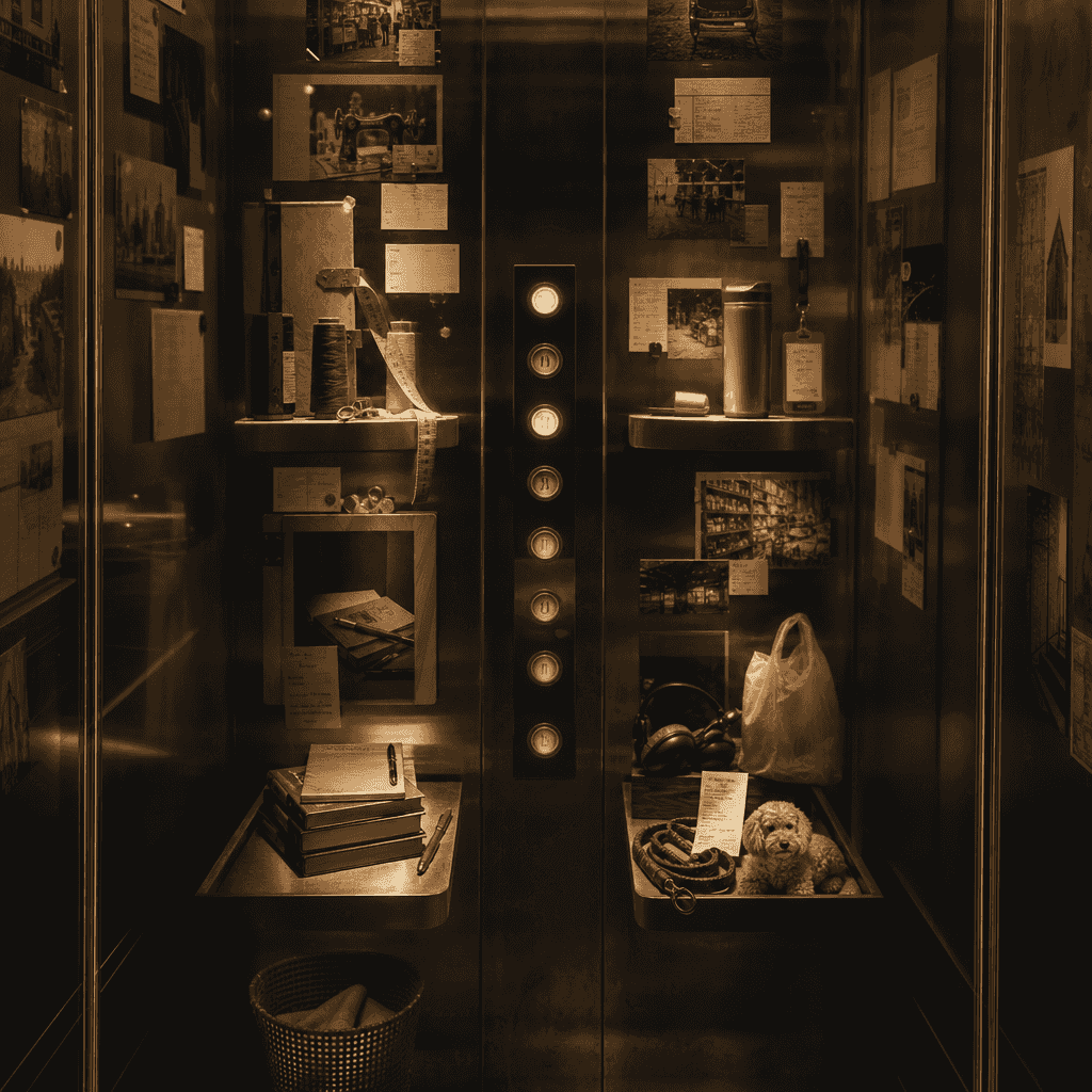
"Archives of Floor Stories in Old Elevators"

"Archives of Floor Stories in Old Elevators"

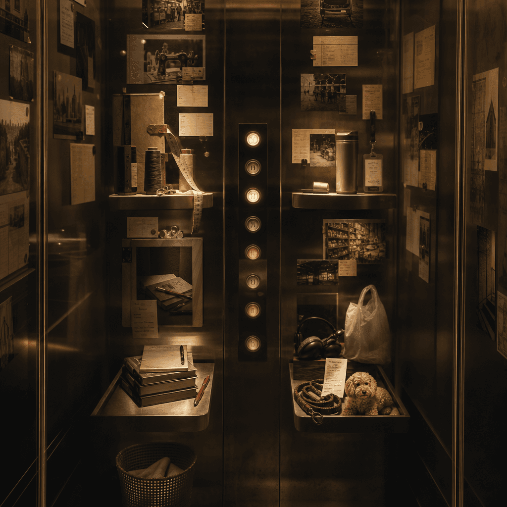
"Floor Story Archives in Old Elevators" combines architectural space photography with narrative label design. The inner wall of an old elevator is transformed into an information display. Each floor button corresponds to a story about a resident: a tailor, a retired teacher, a young man living alone, a night shift nurse, and a couple who runs a pet shop. The lighting is dim but warm, and the picture has a very cinematic feel, with a ratio of 9:16.

"Urban Tree ID Card System"

"Urban Tree ID Card System"

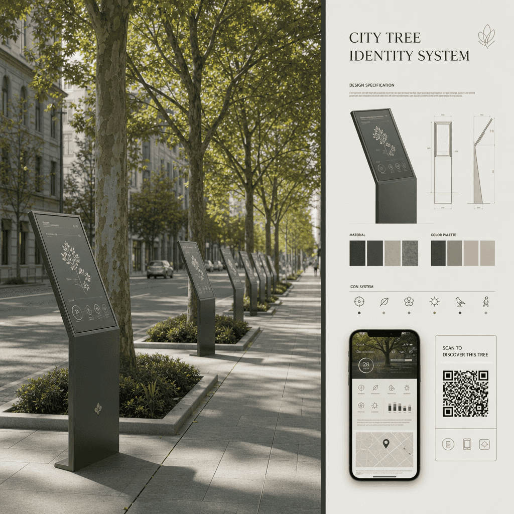
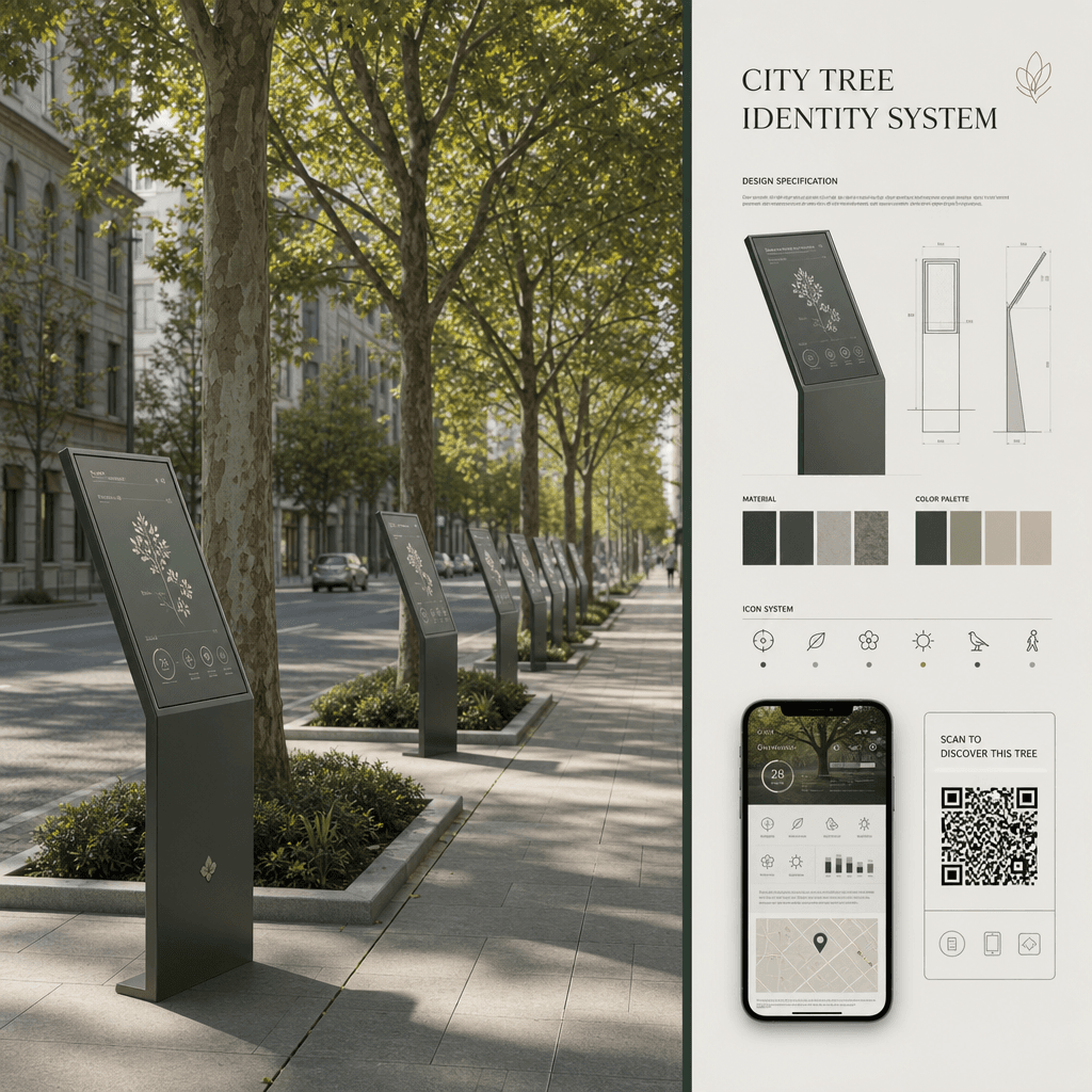
"Urban Tree ID Card System" is a visual fusion of public ecological design and archives. The picture shows the trees on both sides of the street. A minimalist information sign is erected in front of each tree to record the age of the tree, tree species, flowering time, shade index, bird preference, and suitable walking period. On the right side are the design specifications and QR code interface of the sign, with a ratio of 16:9.

"One Man's Moving List Theater"

"One Man's Moving List Theater"

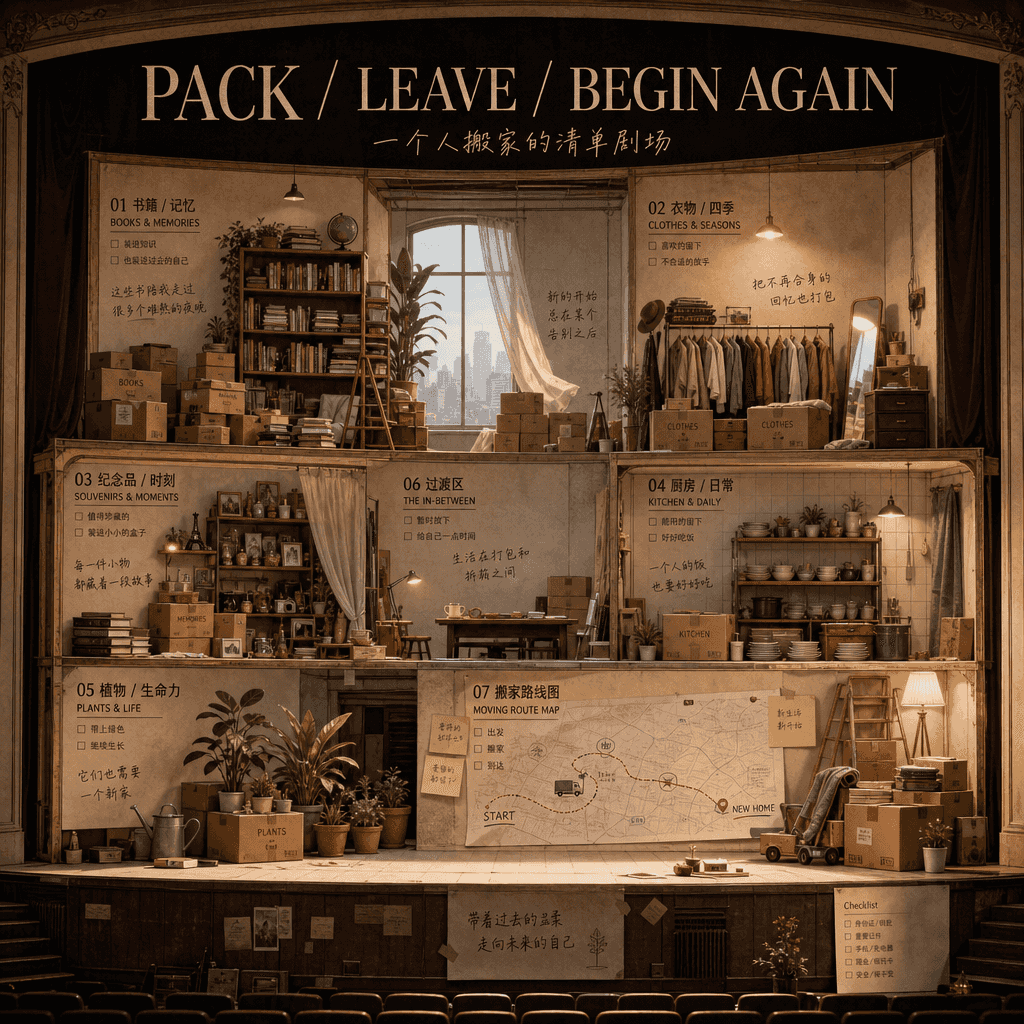
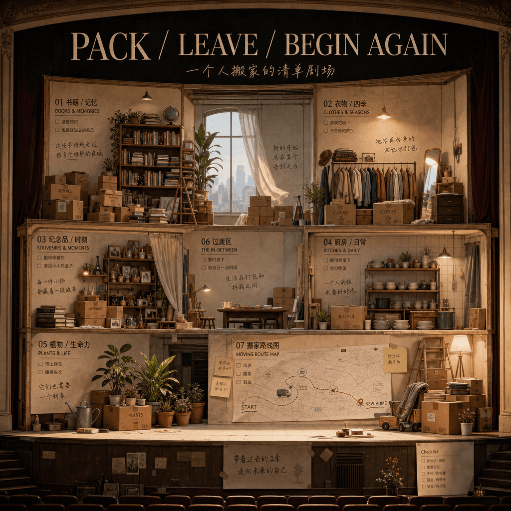
"A Man's Moving List Theater" combines a theatrical stage section with a life organization diagram. The picture is like a section of a stage set. Cardboard boxes, tapes, old books, plants, pots and bowls, clothes, souvenirs, and moving road maps are placed in different areas. Each box is labeled with a note of memories, and the title reads "PACK / LEAVE / BEGIN AGAIN". The ratio is 16:9.

"The postcard shop's best-selling list for the whole year"

"The postcard shop's best-selling list for the whole year"

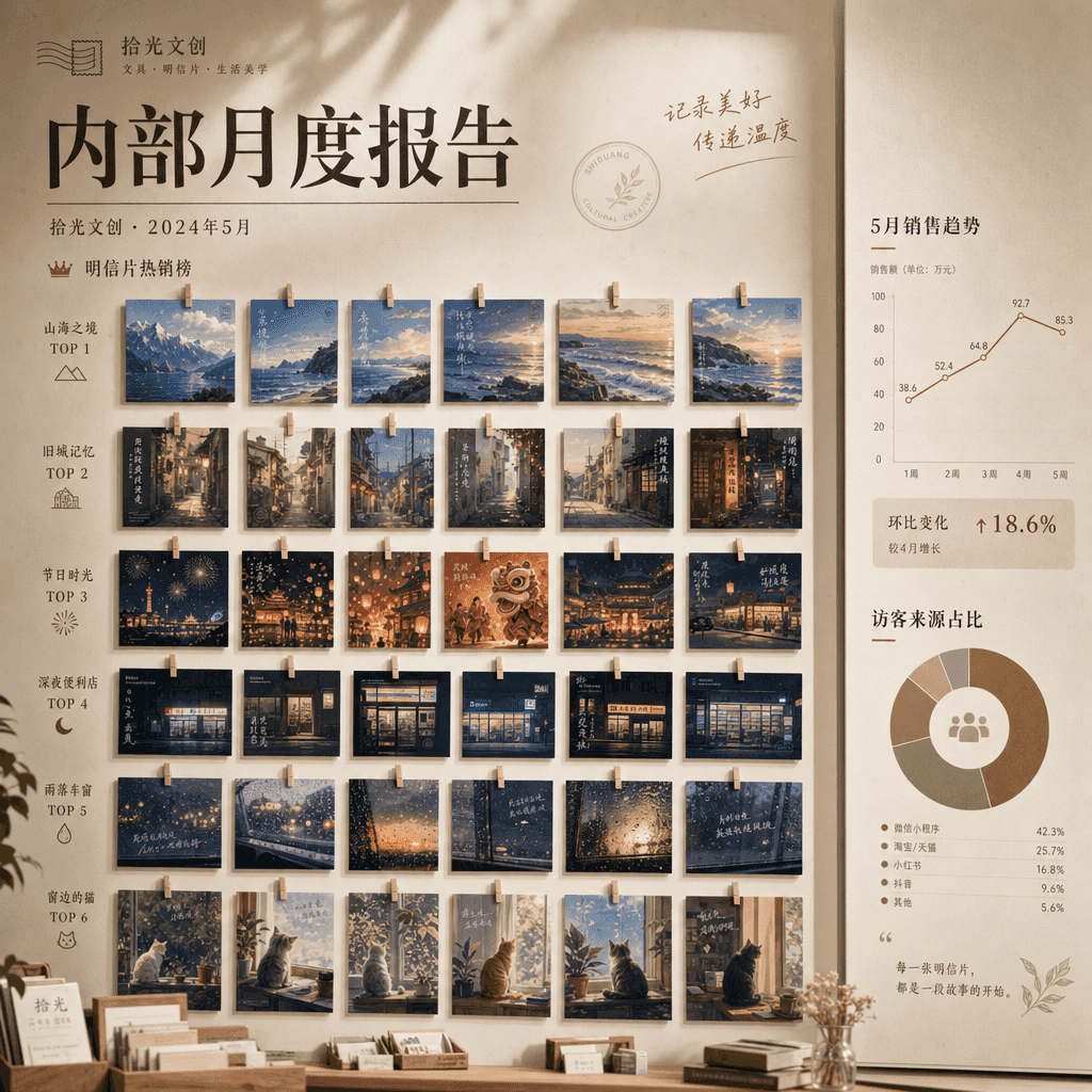
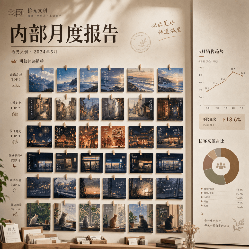
"The best-selling list of postcard stores throughout the year" combines retail list posters with illustration displays. The walls are neatly hung with postcards of different themes: mountains and seas, old cities, festivals, late-night convenience stores, rainy car windows, cats and window sills. The monthly sales changes and the ratio of tourist sources are marked on the right side. The title is like the cover of a cultural and creative brand's internal monthly report, with a ratio of 4:5.

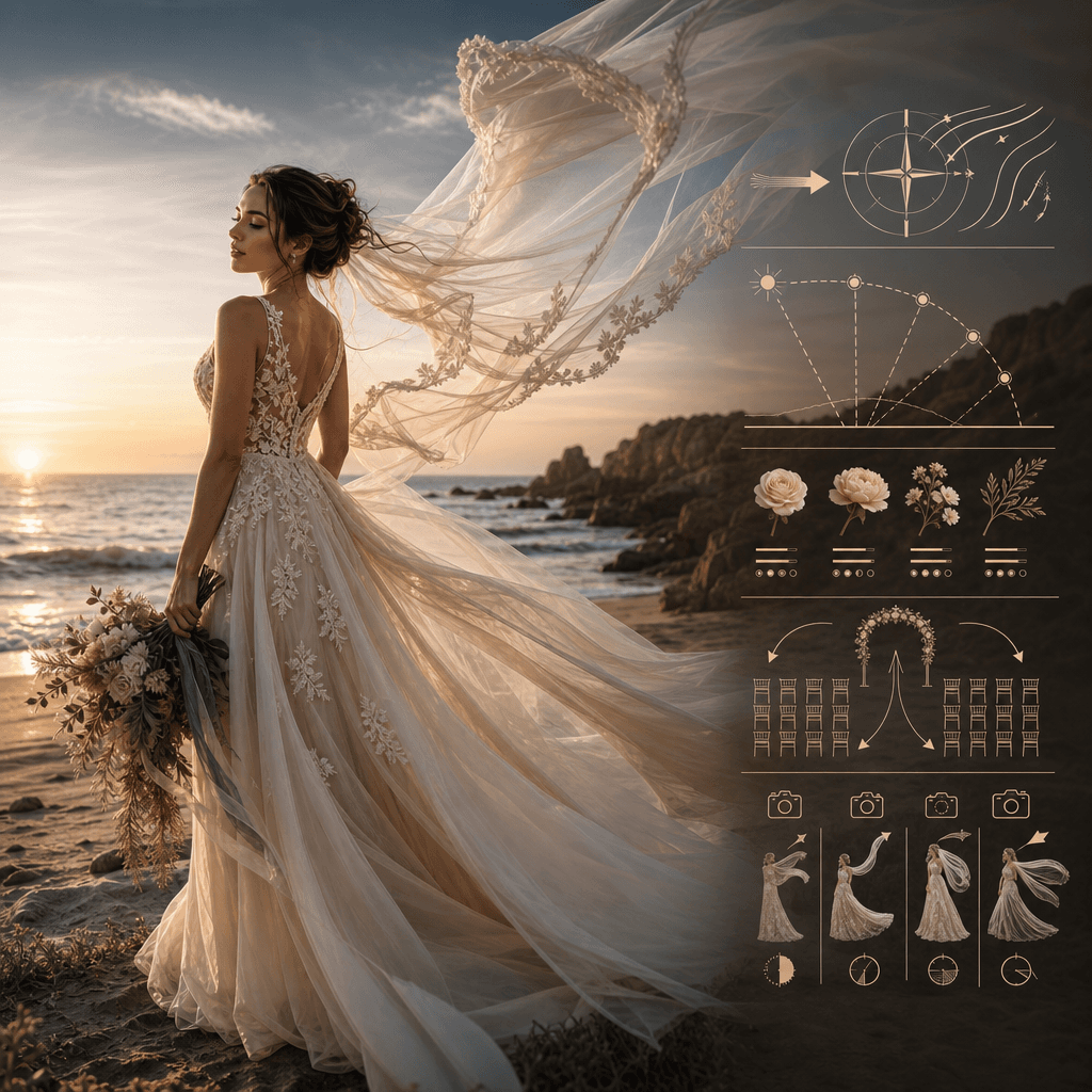
"Research on the wind direction and skirt hem of seaside wedding"

"Research on the wind direction and skirt hem of seaside wedding"

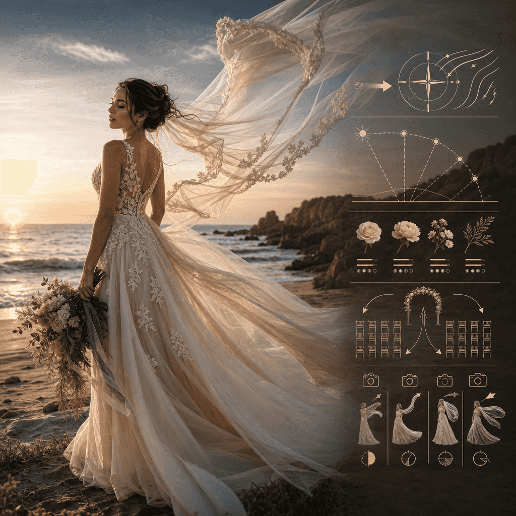
"Research on Wind Direction and Skirt Hemlines at Seaside Weddings" is a small-scale fusion of fashion photography and environmental data maps. The main picture shows the moment when a bride's veil is blown by the wind at the seaside. On the right side, detailed pictures are used to explain the wind direction, light angle, flower material tolerance, ceremony positioning and photography suggestions. It combines beauty and professional execution, with a ratio of 4:5.

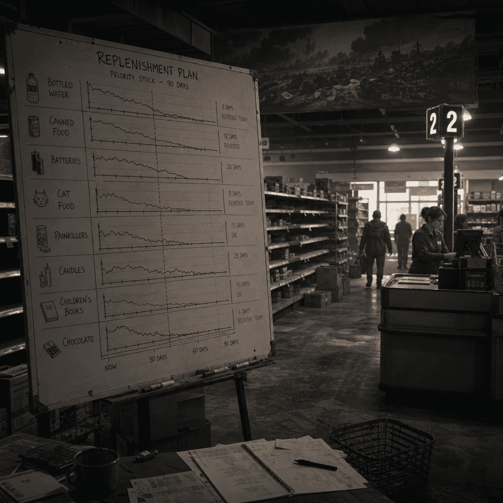
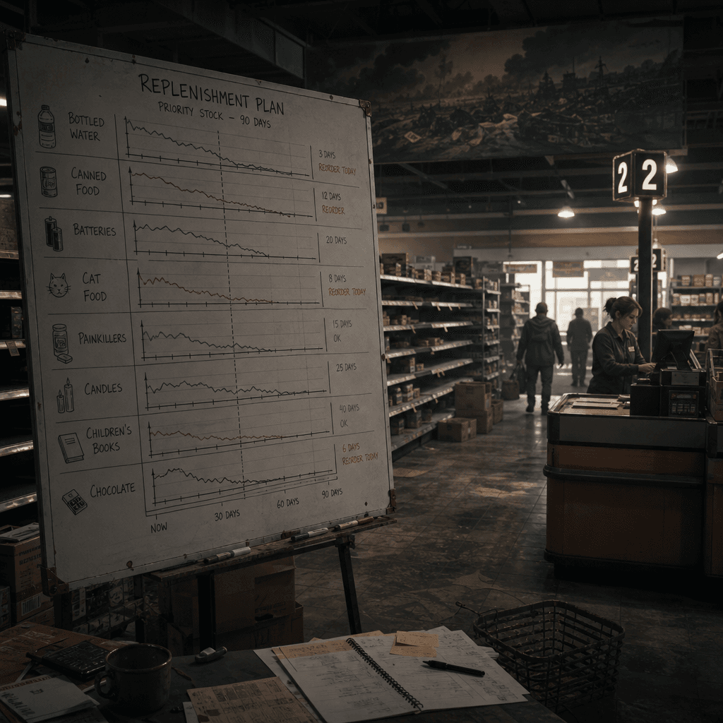
“Supermarket replenishment plan before the end of the world”

“Supermarket replenishment plan before the end of the world”

"Supermarket replenishment plan before the end of the world" combines disaster narratives with retail operation charts. The main screen shows the supermarket manager's replenishment board, which lists inventory lines such as drinking water, cans, batteries, cat food, painkillers, candles, children's books, chocolates, etc. The background is half-empty shelves and a still orderly checkout area, like the setting diagram of a quiet apocalyptic movie, with a ratio of 16:9.

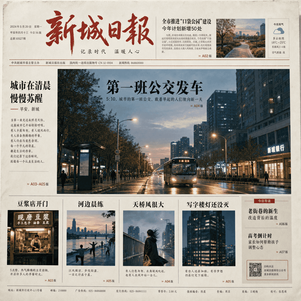
"Make a city's early morning the front page of a newspaper"

"Make a city's early morning the front page of a newspaper"

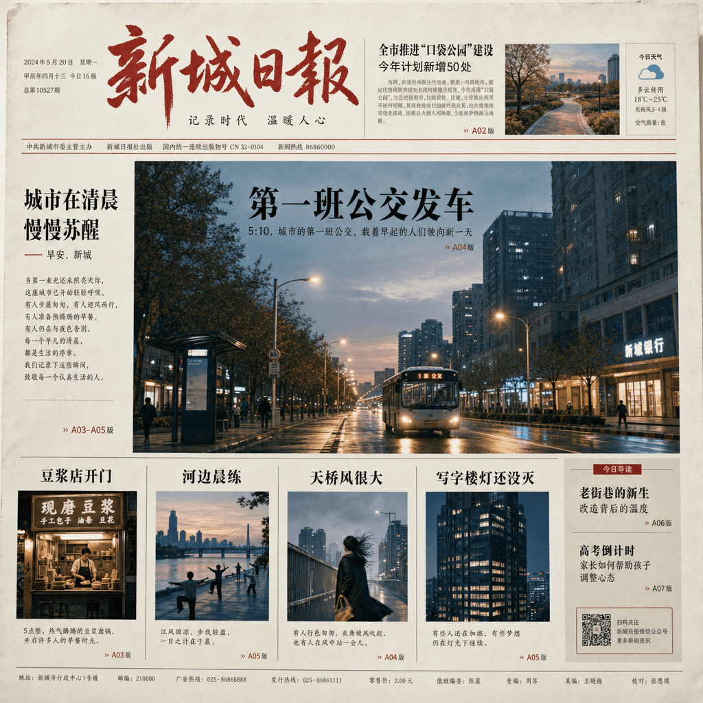
"Make a city's early morning into the front page of a newspaper." The news layout is combined with morning street photography. The front page columns include "The first bus departs", "The soymilk store opens", "Morning exercise by the river", "The overpass is very windy" and "Office building lights are not out yet". The big picture is of a wet street at dawn. The layout is really like a newspaper but the content is full of life warmth. The ratio is 4:5.

“Genealogy of the Chinese Dim Sum Universe”

“Genealogy of the Chinese Dim Sum Universe”

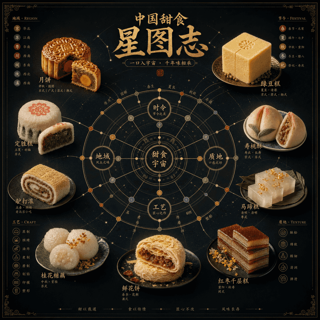
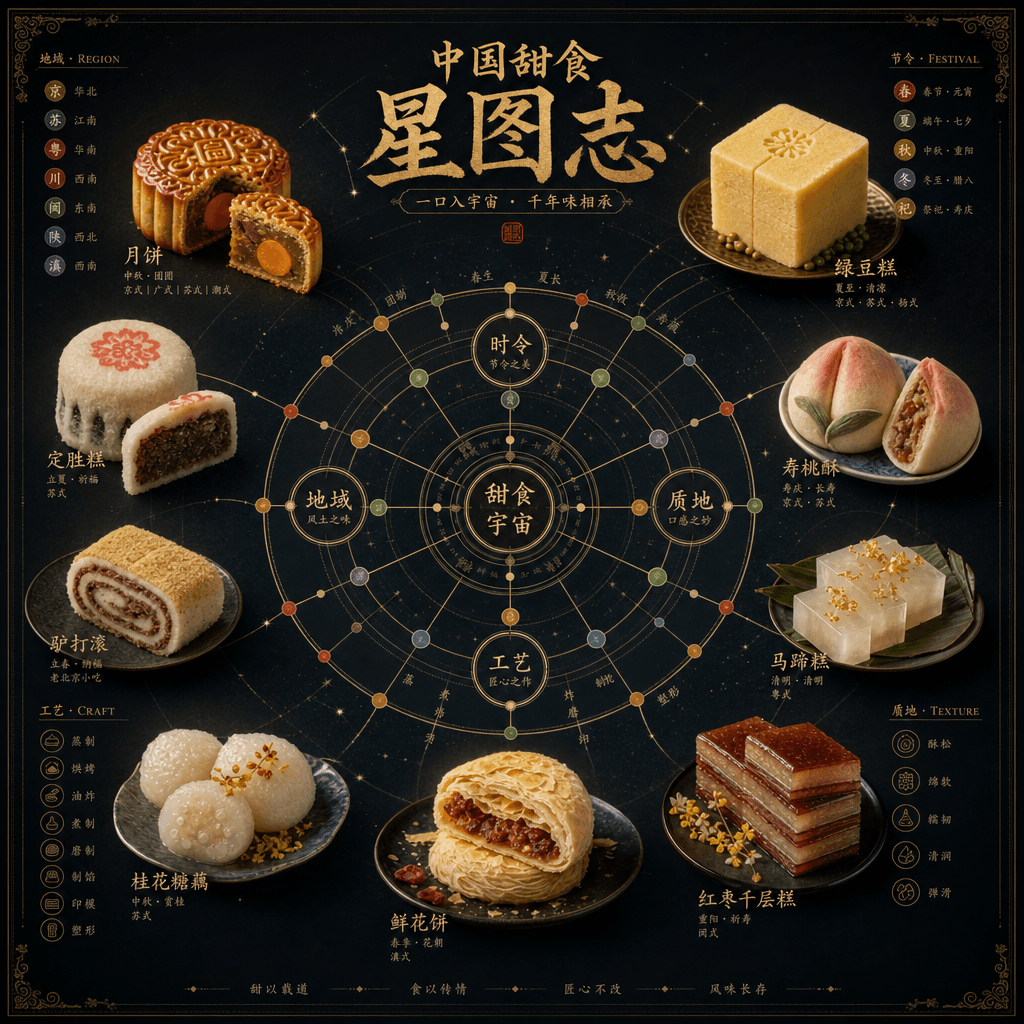
"Chinese Dessert Universe Genealogy" is a combination of museum-style information graphics and high-end food photography. In the center is a star chart-like structure. Moon cakes, mung bean cakes, Dingsheng cakes, peach cakes, donkey rolls, horseshoe cakes, etc. are arranged like constellation nodes. The connecting lines mark the relationship between region, festival, taste and craftsmanship. There is a close-up of the food next to each node. The title is solemn and grand, with a ratio of 4:5.

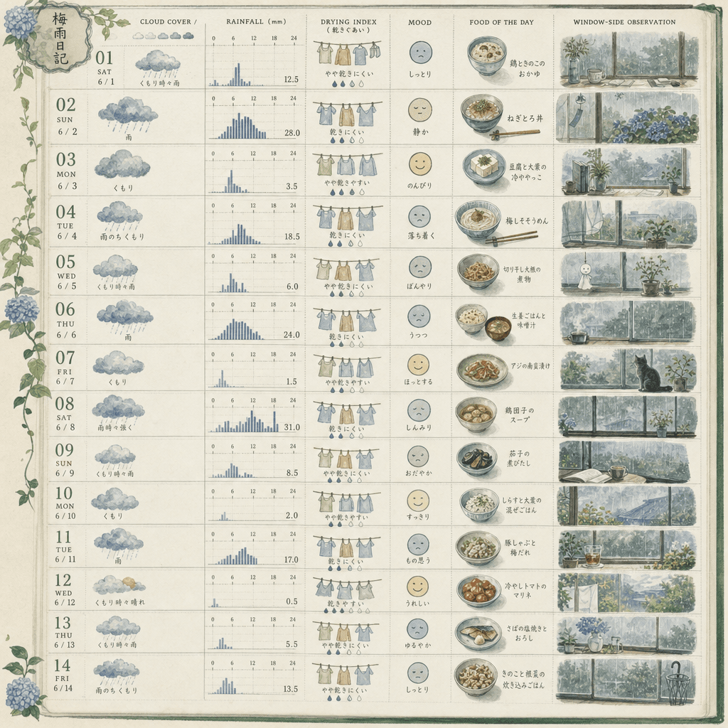
"Designing a visual weather diary for the rainy season"

"Designing a visual weather diary for the rainy season"

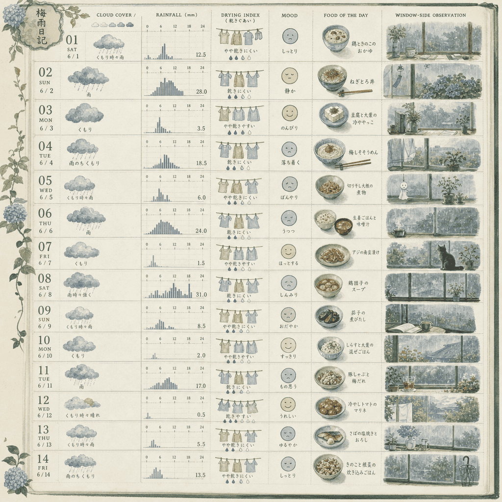
"Designing a visual weather diary for the rainy season", the handbook page is integrated with the weather chart. The vertical screen is composed of weather entries for 14 consecutive days. Each day includes cloud cover, rainfall, clothing dryness index, mood icons, today's suitable food, and window observation vignettes. The layout is exquisite, like a very healing independent publication, with a ratio of 9:16.

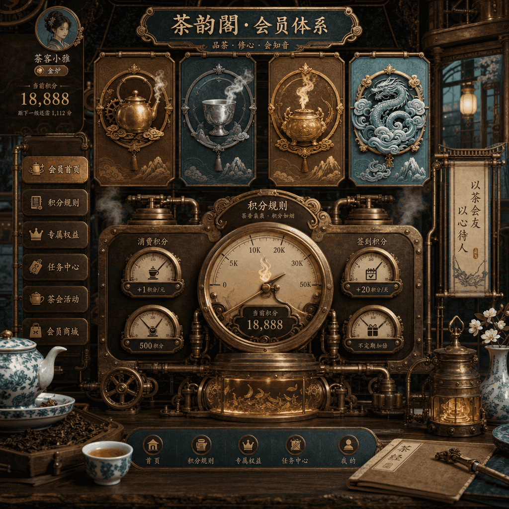
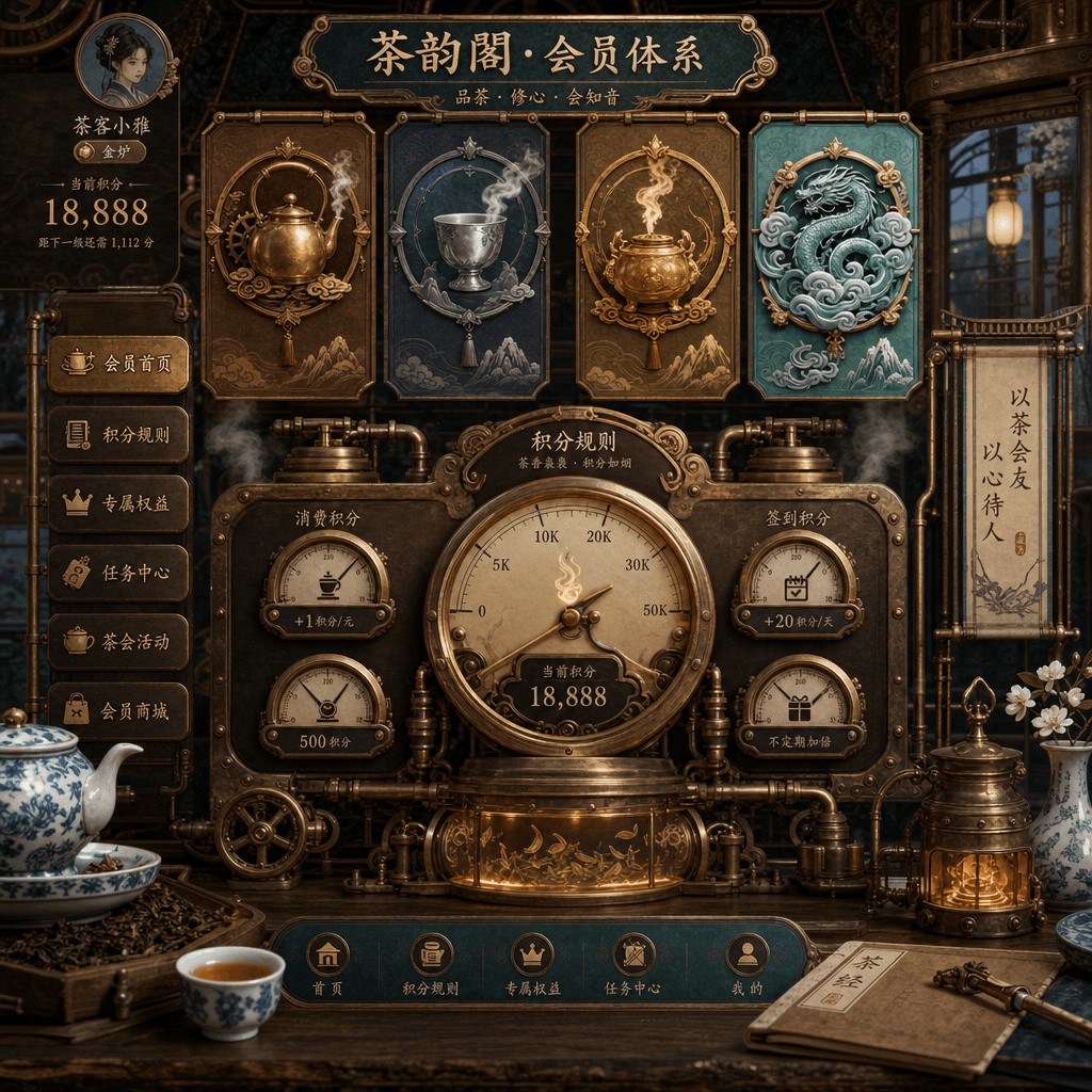
“Steampunk Teahouse Membership System Interface”

“Steampunk Teahouse Membership System Interface”

"Steampunk teahouse membership system interface", the membership UI is integrated with the old industrial decoration style. The main interface displays the membership level "Copper Pot/Silver Cup/Golden Furnace/Cloud Mist Master", and the points rules are written as a tea smoke steam dashboard. The background is gears, copper pipes, old wooden tables and blue and white porcelain. The colors are rich but not messy, and the ratio is 9:16.

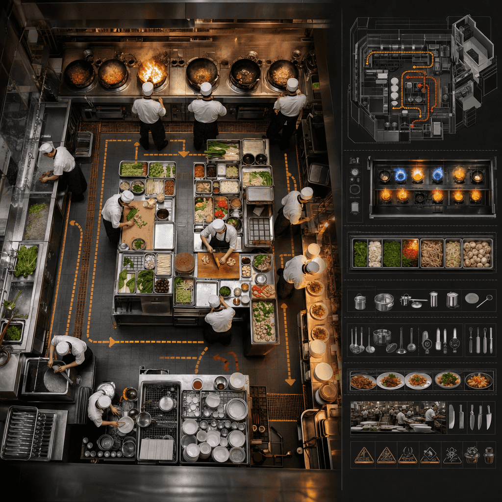
"General Map of the Back Kitchen Operation Line of a Chinese Restaurant"

"General Map of the Back Kitchen Operation Line of a Chinese Restaurant"

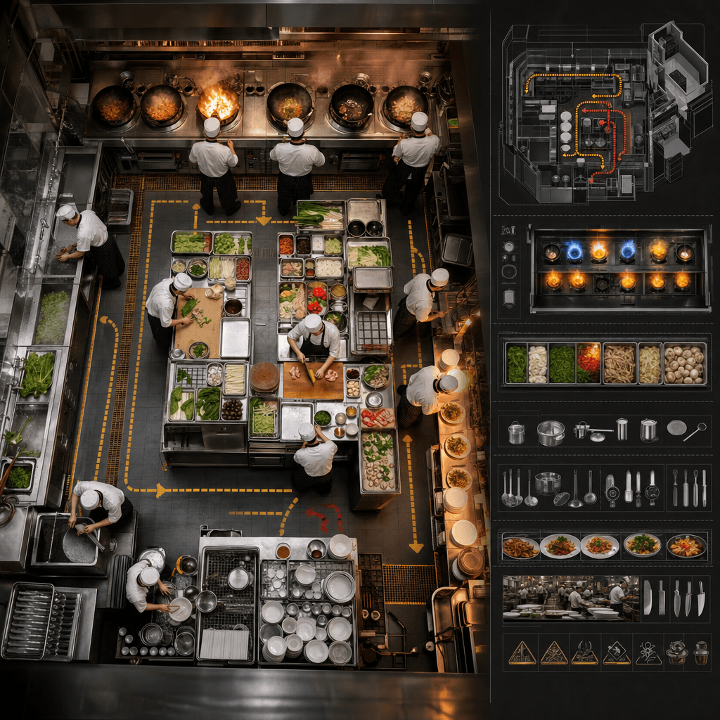
"Chinese restaurant back kitchen moving line overview" combines catering industrial design with documentary kitchen photography, overlooking a busy but orderly back kitchen, forming a clear closed loop from washing, cutting, preparing, frying, serving, passing dishes to recycling. Peak hours, pot firepower, food preparation turnover and safety tips are listed next to it. The overall professional, enthusiastic and full of fireworks, with a ratio of 16:9.

"A visual poem about the 30 seconds before the train arrives"

"A visual poem about the 30 seconds before the train arrives"

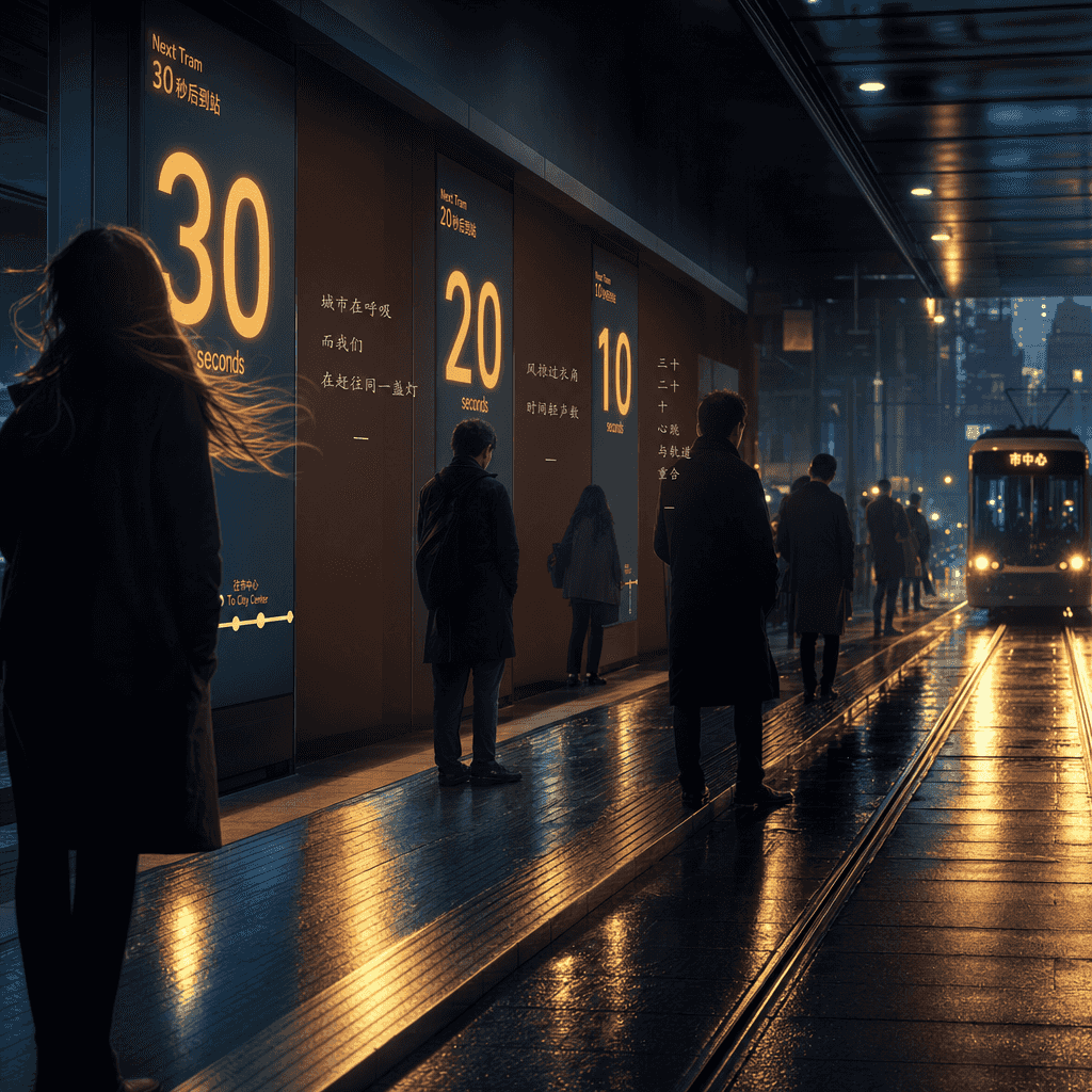
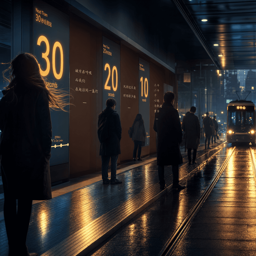
"Visual poetry about the 30 seconds before the tram arrives at the station", the dynamic information screen is integrated with urban emotional photography. The electronic screen on the platform counts down 30, 20, and 10 seconds. The silhouettes of characters, wind, lights, shoe tips, and track reflections all become the narrative of the screen. A small amount of text is interspersed between the screen modules like lines of poetry, with a ratio of 16:9.

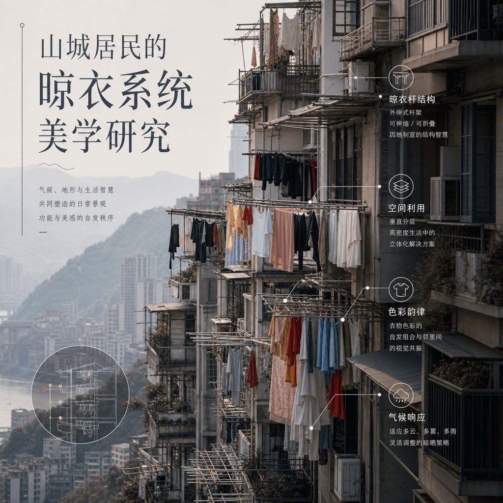
"Research on the Aesthetics of the Clothes Drying System of Mountain City Residents"

"Research on the Aesthetics of the Clothes Drying System of Mountain City Residents"

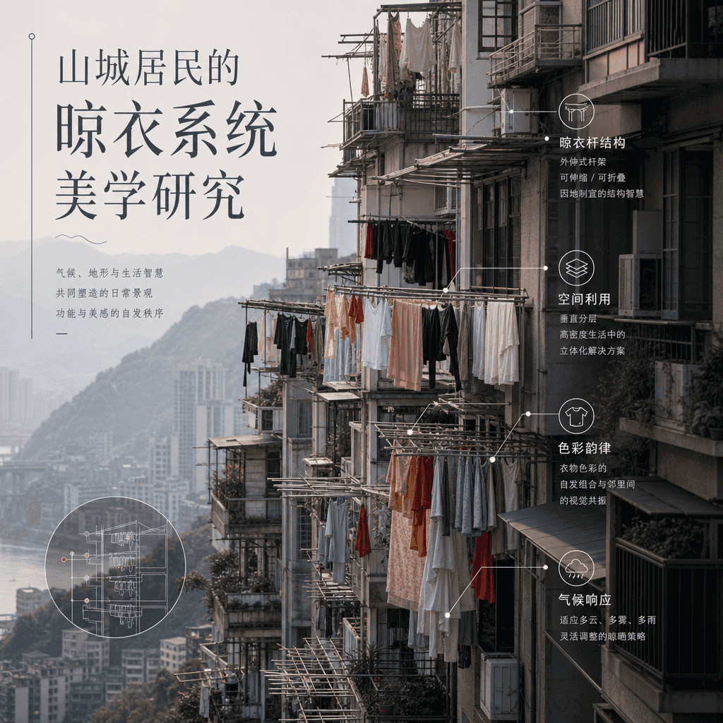
"Research on the Aesthetics of the Clothes Drying System of Mountain City Residents" combines social observation photography with design illustrations. Clothes of different colors and materials are dried on the balconies in layers. The picture uses thin lines and small labels to analyze the structure of the clothes drying pole, space utilization, color rhythm, and weather response. The title is like a calm anthropology magazine, with a ratio of 4:5.

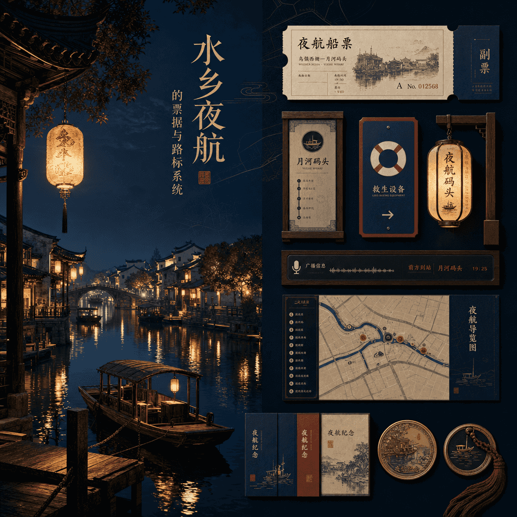
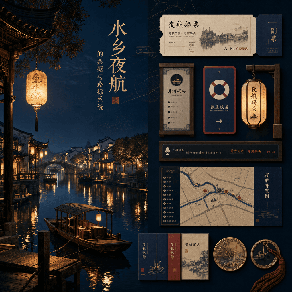
"Ticket and road sign system for night sailing in the water town"

"Ticket and road sign system for night sailing in the water town"

"Ticket and road sign system for night sailing in the water town" combines cultural tourism service design with traditional night scene painting. The main picture is the waterway and dock reflected in the night lanterns. On the right side are the boat tickets, stop signs, life-saving instructions, broadcast screens, navigation maps and commemorative medal designs. The title is exquisite, elegant and the proportion is 9:16.

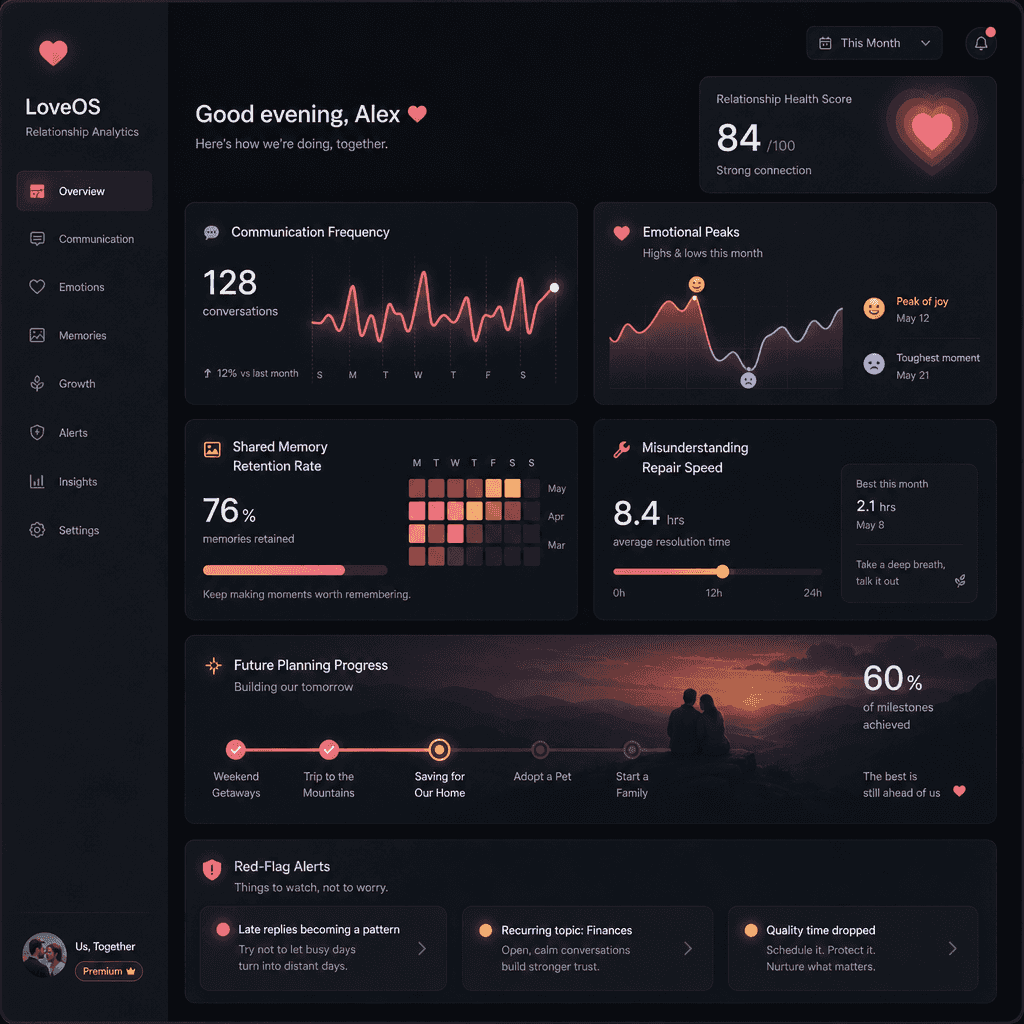
"Make a love into a SaaS product backend"

"Make a love into a SaaS product backend"

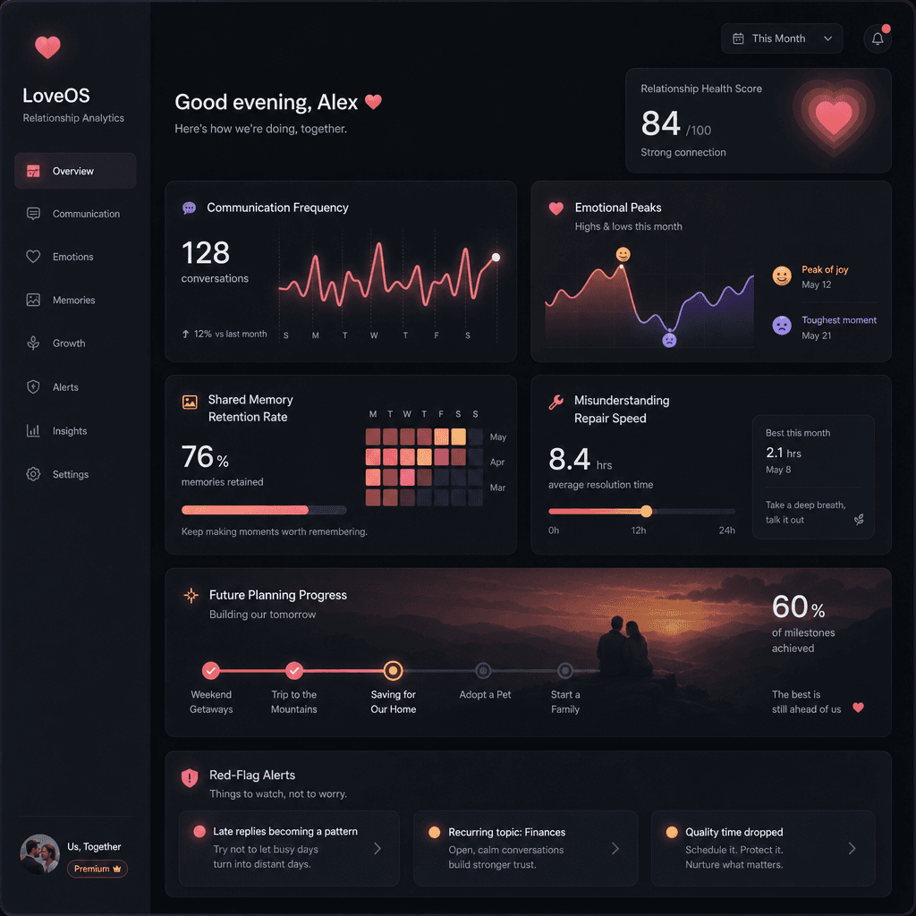
"Make a love into a SaaS product backend", the Internet product dashboard is integrated with emotional narrative and humor. The page modules include communication frequency, emotional peak, joint memory retention rate, misunderstanding repair speed, future planning progress bar, and red flag warning reminder. The interface is professional and restrained, but every indicator has an emotional metaphor, with a ratio of 16:9.

"Convenience store duty log during typhoon days"

"Convenience store duty log during typhoon days"

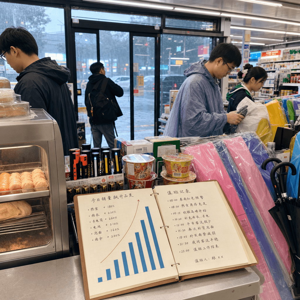
"Convenience Store Duty Log on a Typhoon Day" combines documentary commercial photography with operational reports. A heavy rain pours outside the glass door, and the indoor lighting is stable and bright. There are simple charts on the checkout table showing the surge in sales of hot food, raincoats, flashlights, batteries, instant noodles, and umbrellas. The store clerks and customers in the background have real expressions. The text is like a duty record manual, with a ratio of 16:9.

“An Illustrator’s Repository of Inspiration”

“An Illustrator’s Repository of Inspiration”

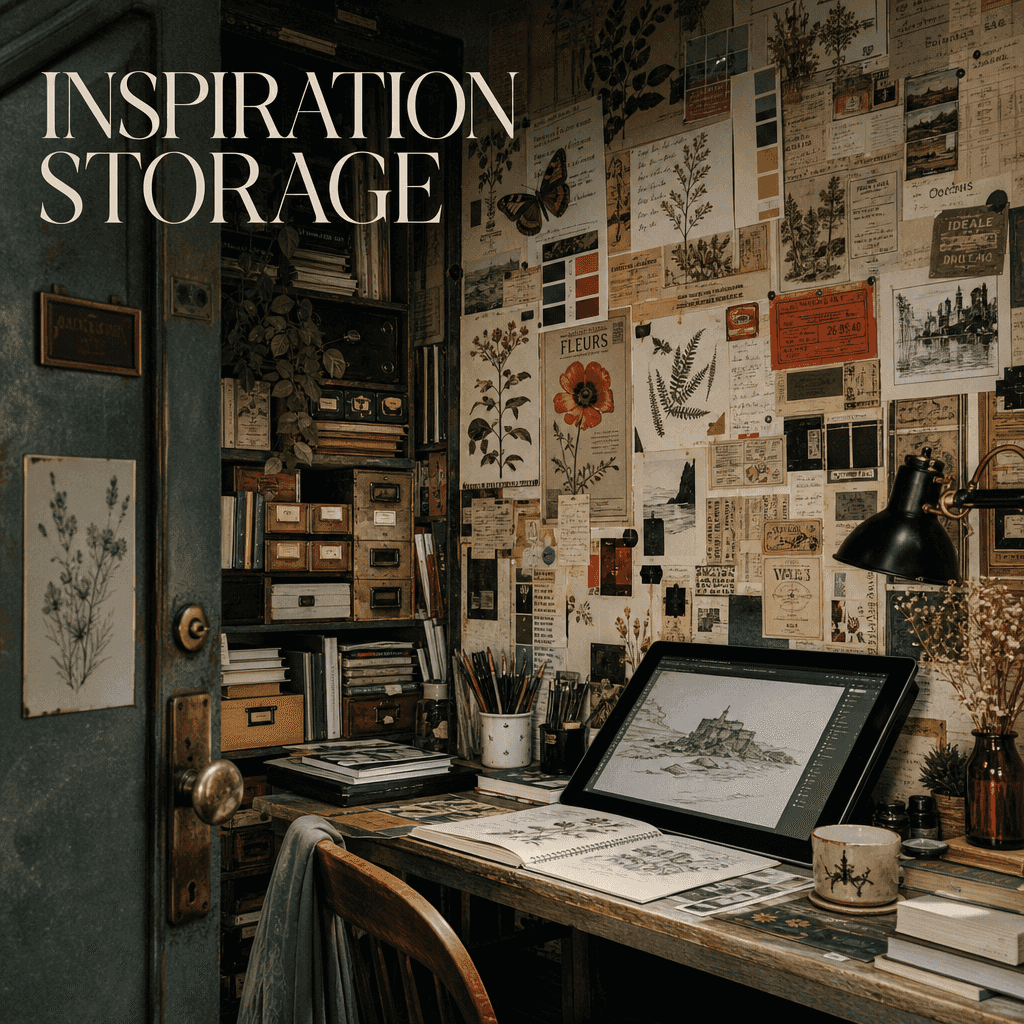
"An Illustrator's Inspiration Storage Room" is a magazine-like space collage. The picture is like an opened secret room. The walls are covered with travel tickets, color cards, old packaging, ancient book illustrations, plant embossings, advertising clippings, casually written words and phrases. There are tablets and unfinished sketches on the table, with the title "INSPIRATION STORAGE". The whole thing is like a special feature of an artist's studio, with a ratio of 4:5.

“Communal Kitchens in Retirement Communities in 2045”

“Communal Kitchens in Retirement Communities in 2045”

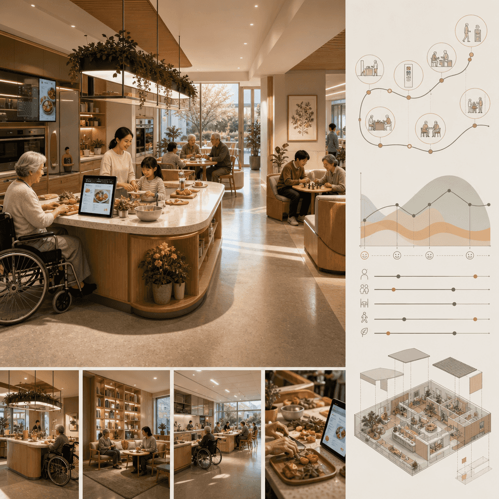
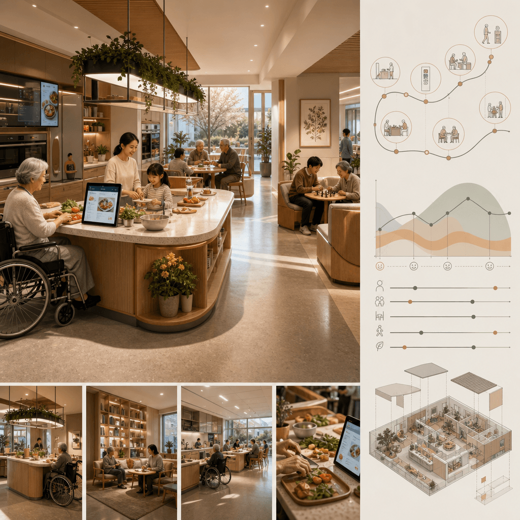
"Public Kitchen in a Retirement Community in 2045" combines social design proposals with real living spaces. The picture shows a bright and warm shared kitchen: low operating table, wheelchair accessible circulation line, recipe screen, common dining island, and intergenerational interaction corner. On the right is the user journey and emotional curve. The whole thing looks like an International Design Award poster, with a ratio of 16:9.

"Poster analyzing the mechanics of hand-pulled noodles"

"Poster analyzing the mechanics of hand-pulled noodles"

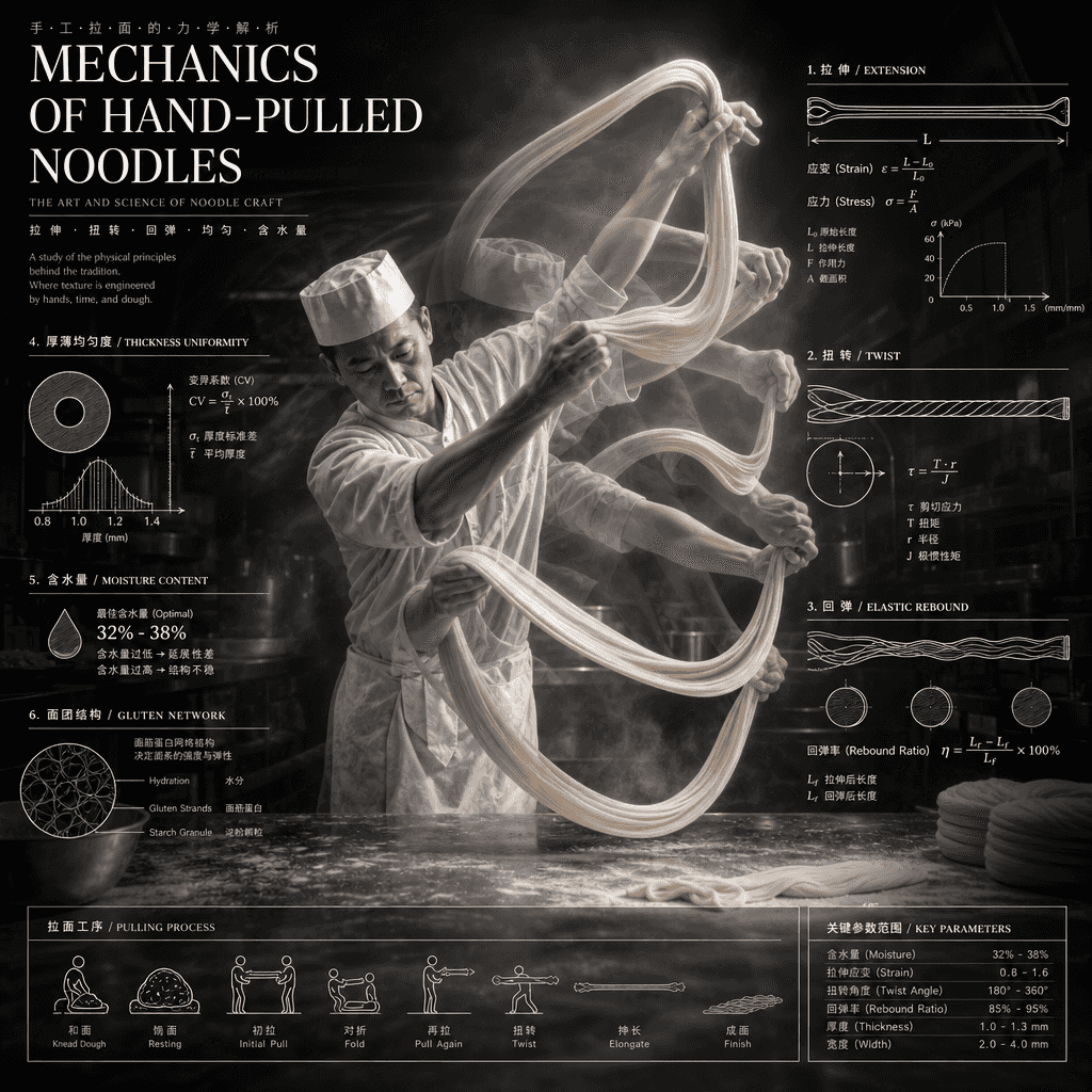
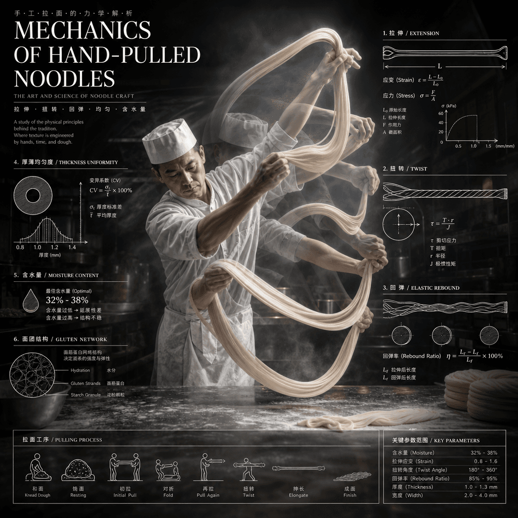
"Poster on Mechanical Analysis of Hand-pulled Noodles" combines food photography with scientific illustrations. The main picture is a freeze-frame of a chef's continuous movements of stretching noodles. Parameters such as stretching, torsion, rebound, thickness uniformity, dough moisture content, etc. are marked with thin lines on the side. The background is a mist-filled kitchen. The title is serious and professional, with a ratio of 4:5.

"Moon Nursery Schedule"

"Moon Nursery Schedule"

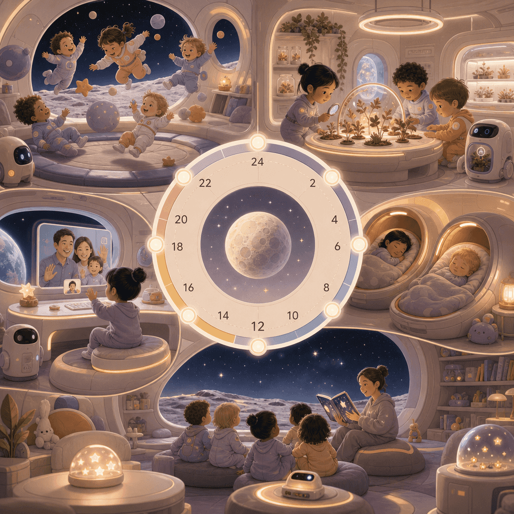
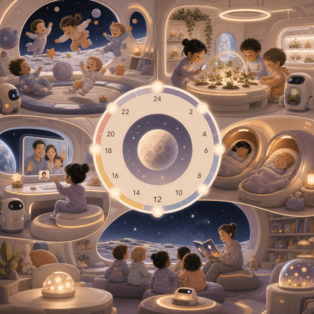
"Moon Nursery Schedule" combines children's space design with a future world view. The screen adopts a circular 24-hour orbital timeline. The nodes include low-gravity games, aerospace plant classes, nap cabins, earth video calls, and starry sky story time. It is accompanied by small scene illustrations and equipment diagrams. The colors are gentle. It is not a cold science fiction but a future with living temperature. The ratio is 9:16.

“Old-school photo studio ID photo sample wall”

“Old-school photo studio ID photo sample wall”

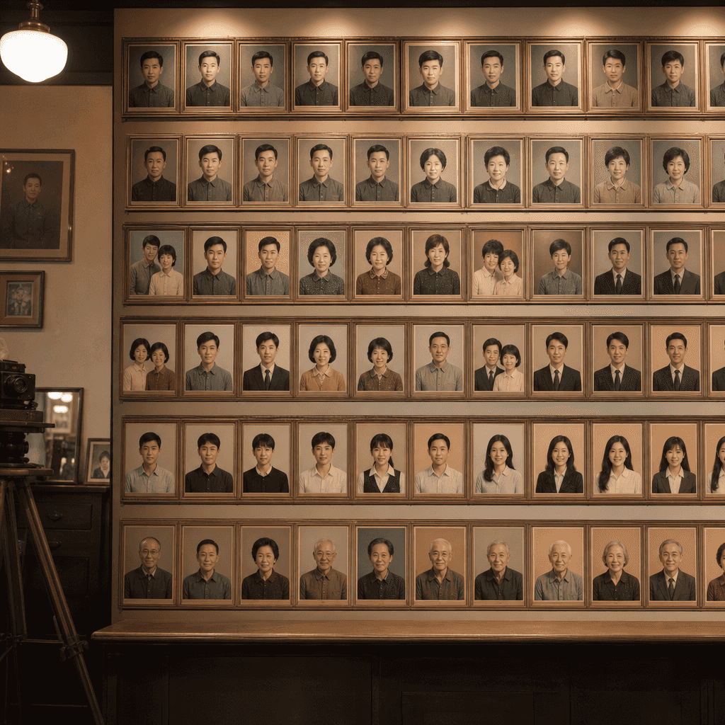
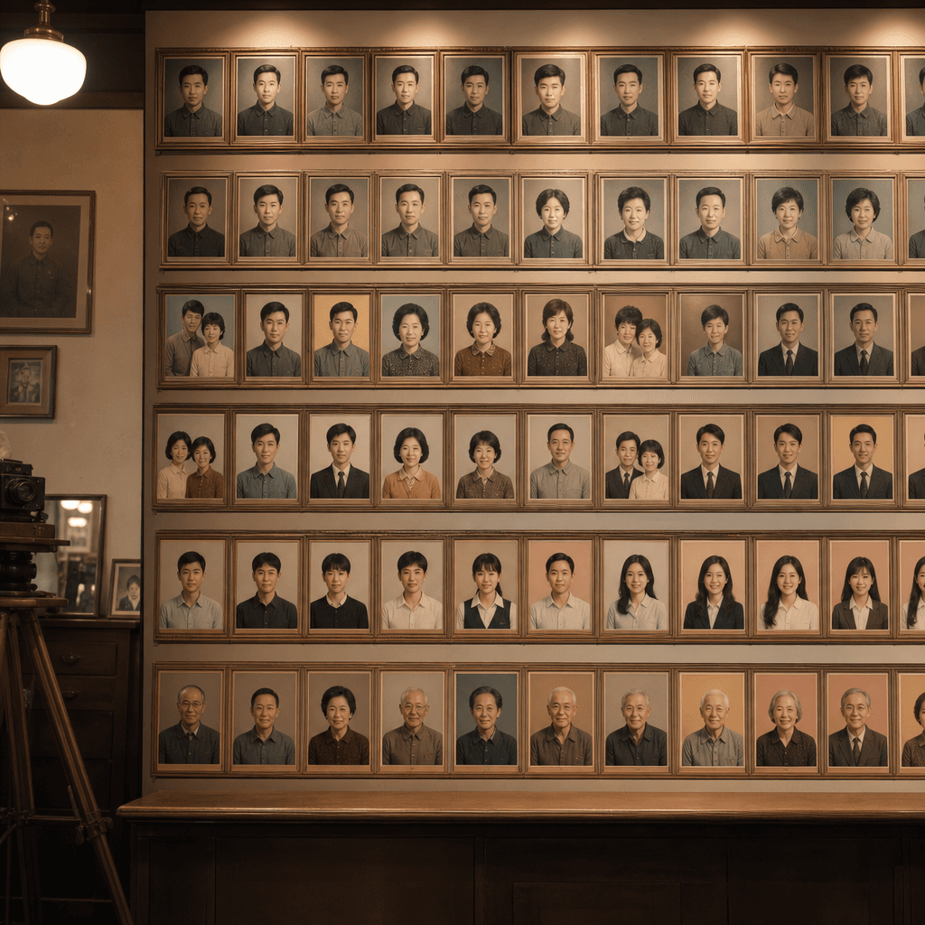
"Sample wall of ID photos in an old-school photo studio" combines retro commercial space photography with sociological observation. The wall is lined with sample portraits of different eras, occupations, and ages: teachers, workers, students, newlyweds, young people entering the workforce, and retired seniors. Each row has descriptions of age, clothing trends, and background color changes, like a city memory archive wall, with a ratio of 4:5.

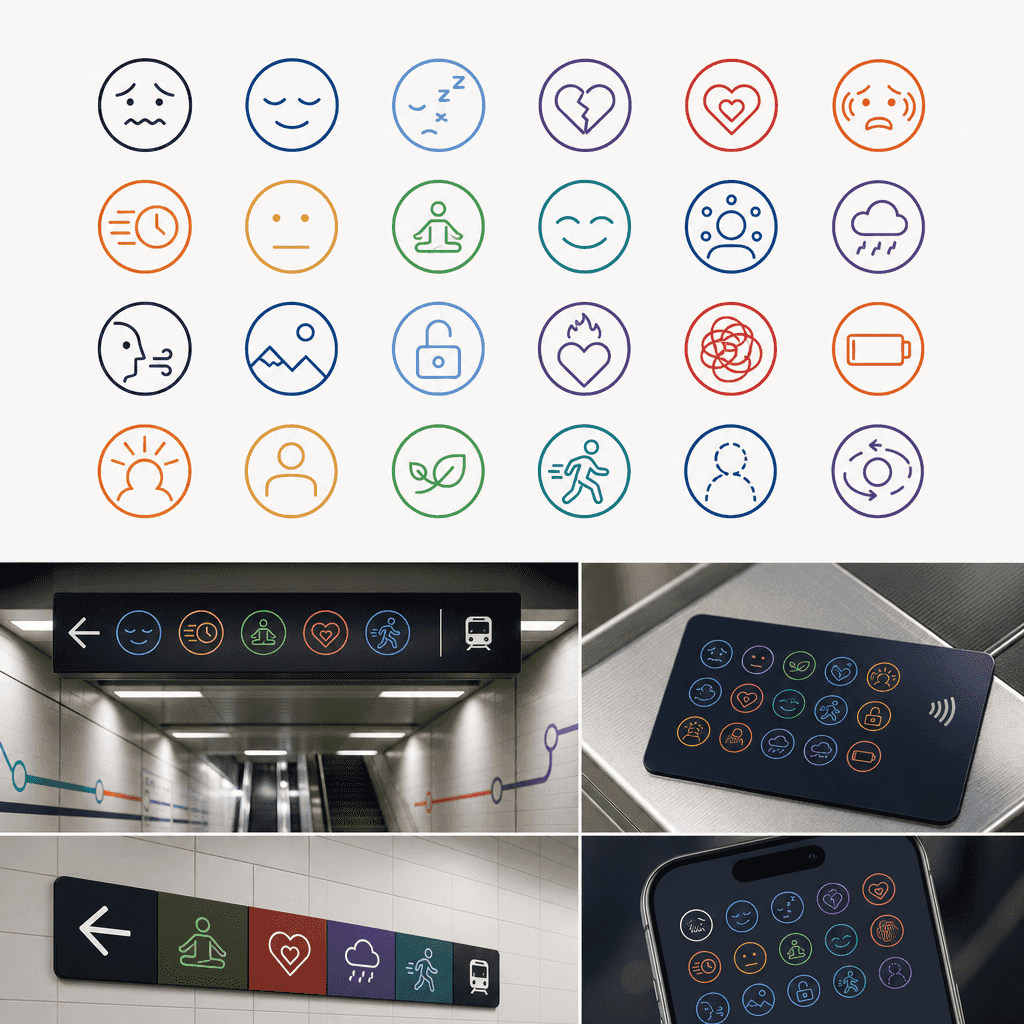
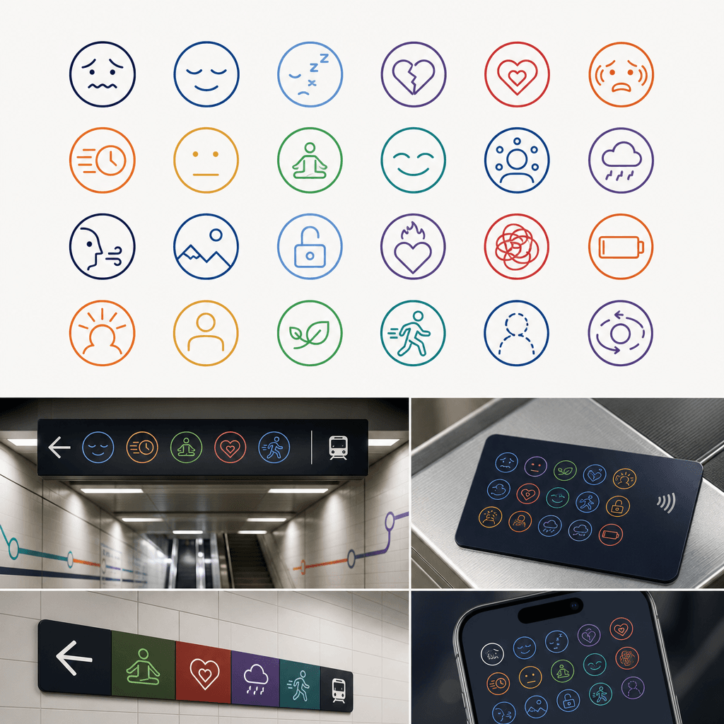
"Made a set of subway station guide pictograms for emotions"

"Made a set of subway station guide pictograms for emotions"

"Make a set of subway station guide pictograms for emotions", an icon design system proposal, the entire image displays 24 minimalist pictograms: anxiety, calm, sleepiness, lovelorn, relaxation, love, social fear, lateness, freedom, numbness, etc., presented with a unified geometric language and color system, and placed in simulated subway station guide boards, ticket cards, and App icons to verify the effect, with a ratio of 16:9.

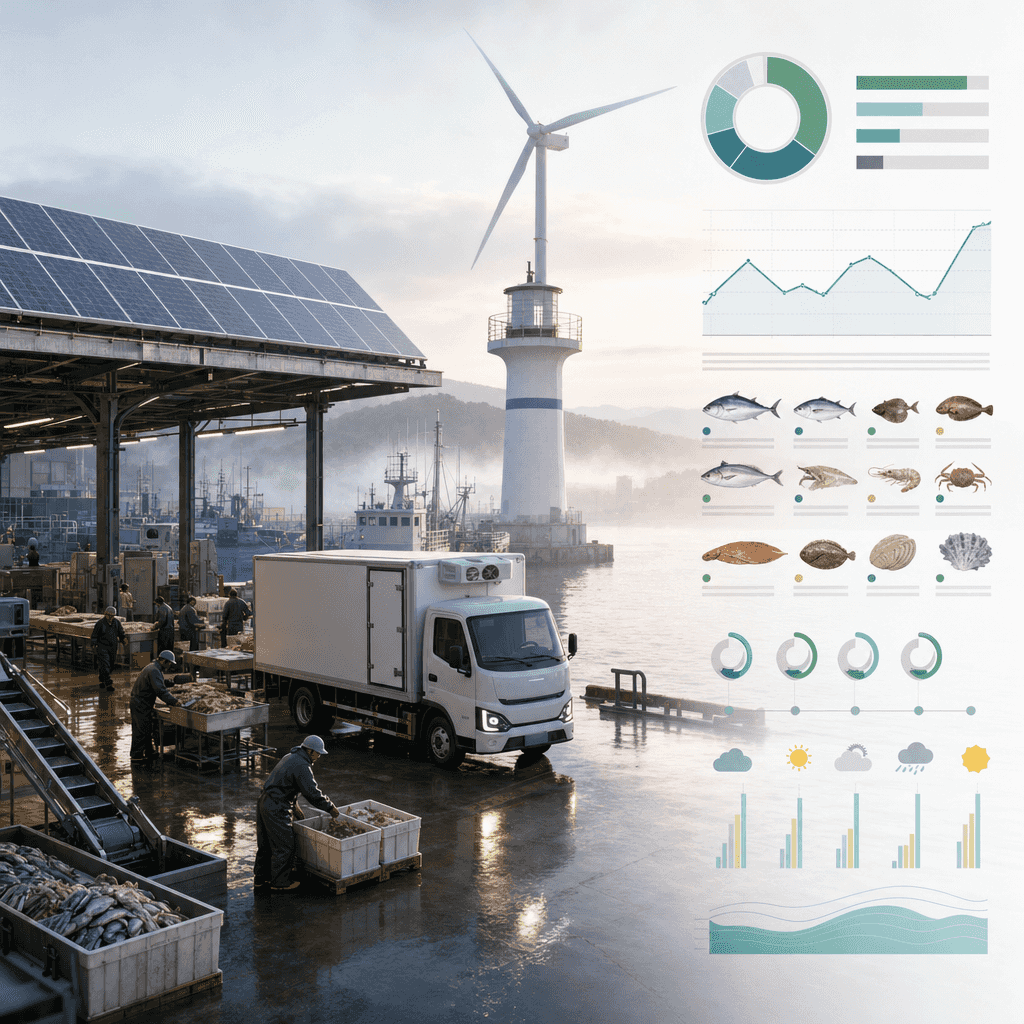
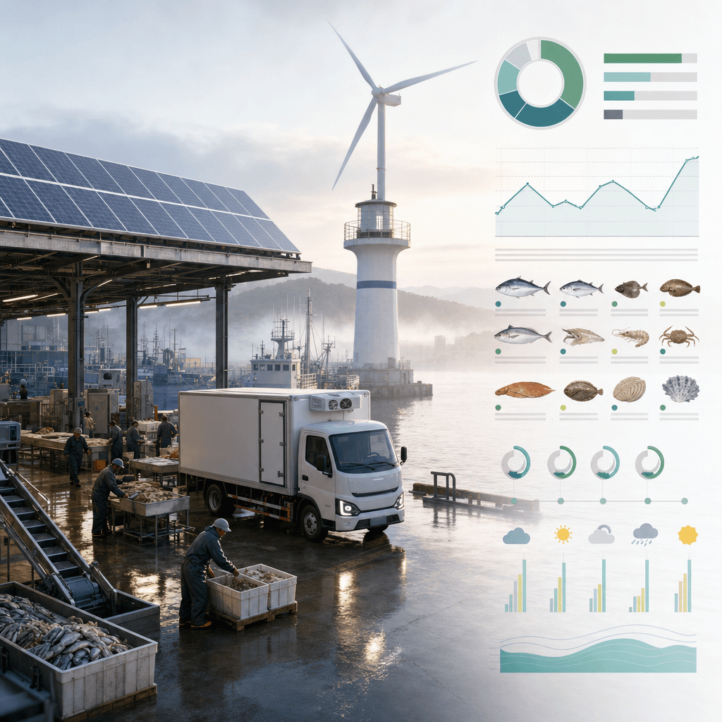
"Daily Operation Chart of New Energy Fishing Port"

"Daily Operation Chart of New Energy Fishing Port"

"New Energy Fishing Port Daily Operation Diagram" combines industrial space photography with sustainable industry information graphics. The fishing port in the morning fog is equipped with solar roofs, electric cold chain vehicles, seafood sorting platforms, and wind power lighthouses. On the right side are energy consumption, fishing species, supply cycles, and weather forecast modules. It has a simple and professional temperament, with a ratio of 16:9.
"Make one's childhood into a theme park map"

"Make one's childhood into a theme park map"

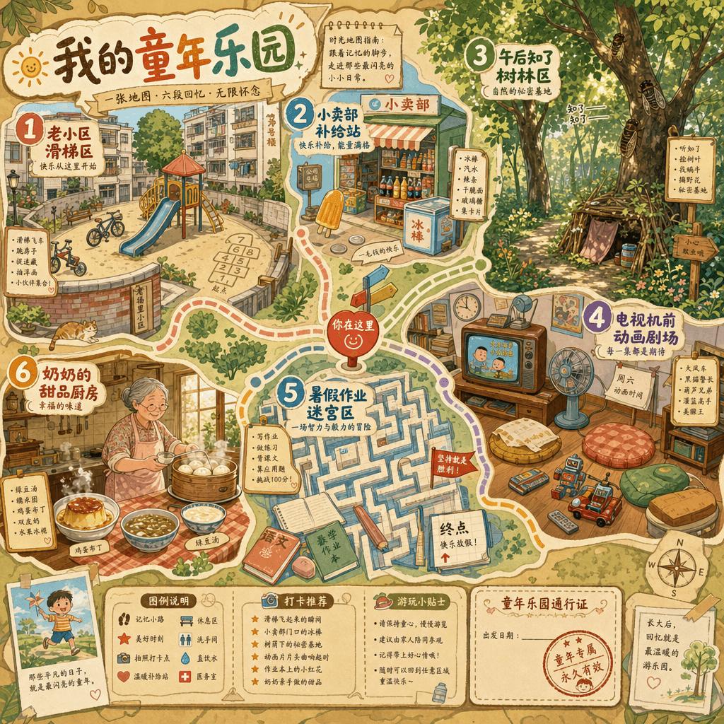
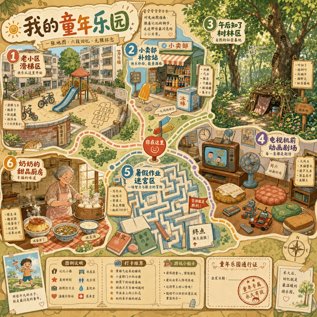
"Make one's childhood into a theme park map", the memory narrative is integrated with the park guidance system, and the picture is presented in a cute flat map style: the old community slide area, the concession stand area, the afternoon cicada chirping forest area, the cartoon theater area in front of the TV, the summer homework maze area, and the grandma's kitchen dessert station. Each area is equipped with detailed illustrations and nostalgic text, just like a real theme park map single page, with a ratio of 4:5.

"Late Night Radio Program Schedule"

"Late Night Radio Program Schedule"

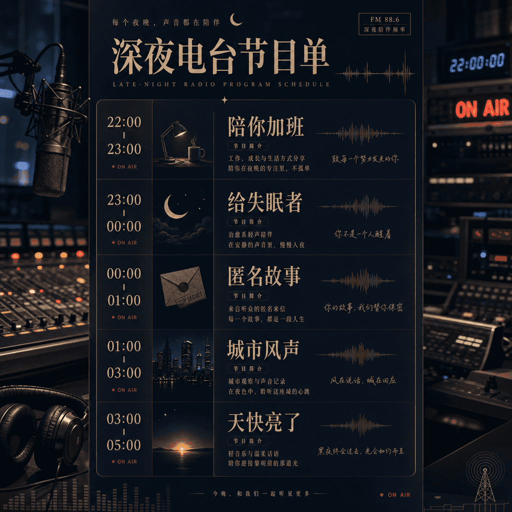
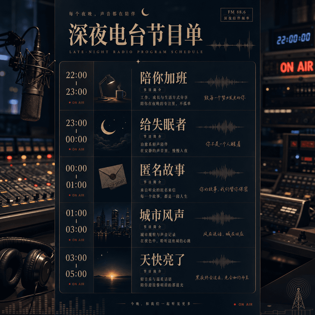
"Late Night Radio Program List" combines sound media with editorial schedule design. The screen is like a radio station's all-night program list. From 22:00 to 05:00, it is divided into "overtime with you, for insomniacs, anonymous stories, city wind, and daybreak." Each column is decorated with minimal illustrations and waveforms, and the background is dark studio equipment. The ratio is 9:16.

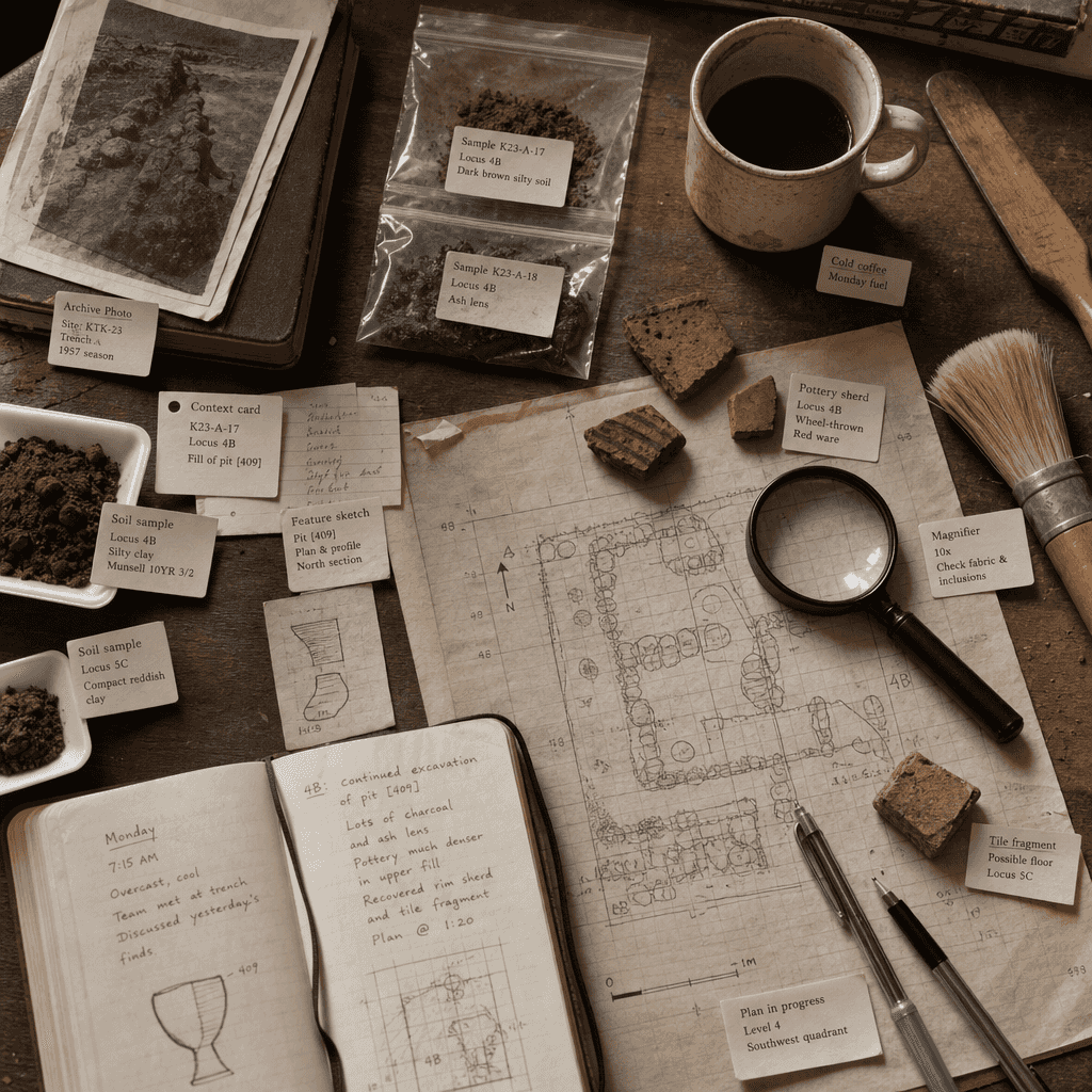
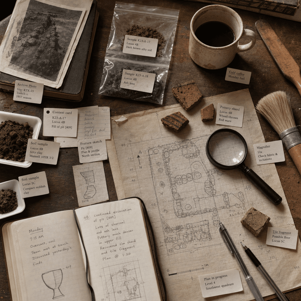
"Archaeologist's Desktop Monday"

"Archaeologist's Desktop Monday"

"Archaeologist's Desktop Monday" combines an overhead still life narrative with a research document style. There are brushes, specimen bags, magnifying glasses, numbered cards, soil samples, broken pottery shards, cold coffee, an opened field notebook and an unfinished plan of the site on the table. Small labels next to it explain the purpose of each thing and the discovery of the day. It has a temperament like a feature map in an academic magazine, with a ratio of 4:5.