
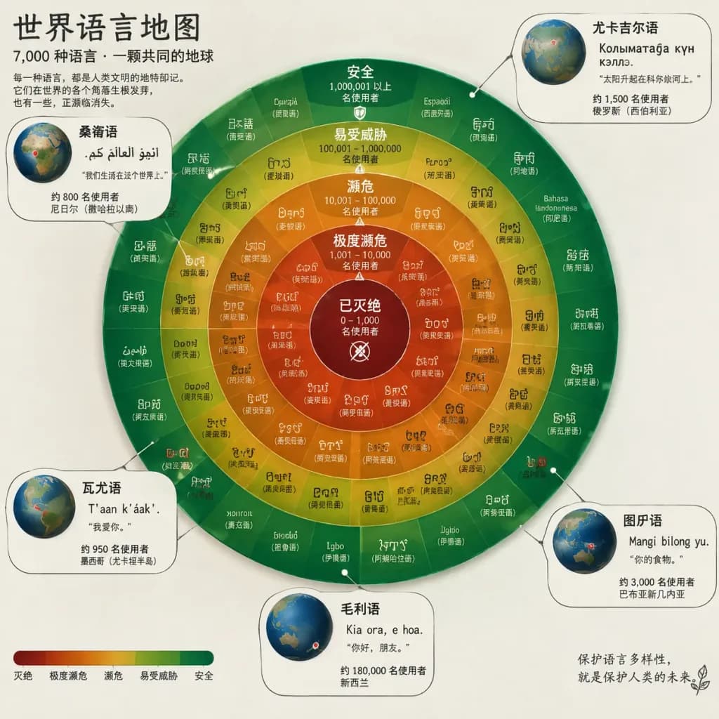
Orrery Chart of Endangered World Languages
Renders an astronomical orrery-style circular infographic classifying world languages by endangerment. Customize the language count or spotlighted languages to suit your data.
Prompt
A circular infographic designed like an astronomical orrery, mapping [7,000] of the world's languages arranged in concentric rings classified by endangerment status: extinct at the core center, radiating outward through critically endangered, endangered, vulnerable, and safe on the outermost ring. Each language is represented by a small typographic tile rendered in its native script. A radial color gradient transitions from deep crimson red at the center to vivid emerald green at the outer edge. The rings are labeled with speaker population ranges. Five spotlight callout diagrams branch outward to highlight specific endangered languages, displaying miniature 3D globes indicating their geographic origin alongside a single surviving sentence inscribed in their script.
What you can customize
Swap these parts of the prompt for your own subject or wording before you generate.
[7,000]placeholder
Prompt details
- Category
- Infographic / Education
- Model
- GPT IMAGE 2.5 Sunburst
- Cost per image
- 1K: 11 credits · 2K: 22 credits · 4K: 36 credits
- Aspect ratio
- 1:1
- Added