Limited-time deal: GPT Image 2 from $0.007 per image
Try it now

Prompt Template Library

Discover and use high-quality prompt templates to create stunning AI images.

⌘ K
Sort by:

Showing 241–300 of 589 prompts

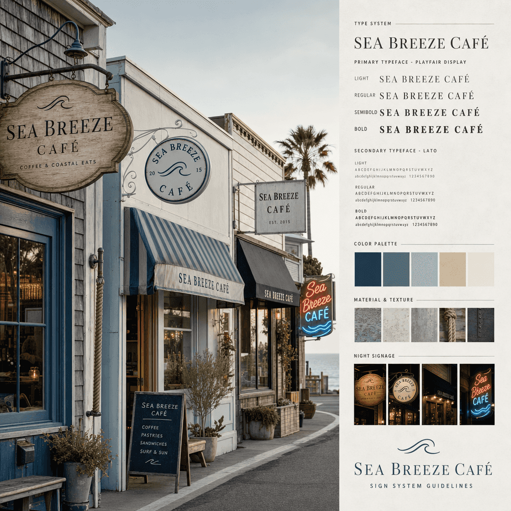
“Sea Breeze Cafe Signage System”

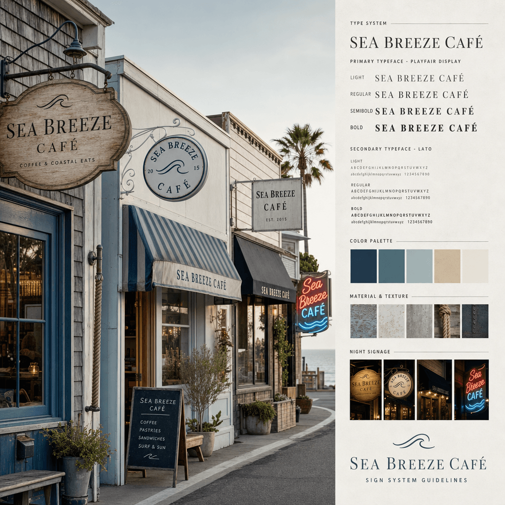
“Sea Breeze Cafe Signage System”

"Sea Breeze Cafe Signboard System" combines the brand's outdoor vision with coastal street scene photography. The main image is a row of small seaside shop facades. The signboard system is unified but each has its own personality: wooden signs, enamel, canvas, standing blackboard and neon lights. The right side shows the word weight specification, color matching, weathered material performance and night lighting effect. The overall image is like the cover of a brand manual, with a ratio of 4:5.
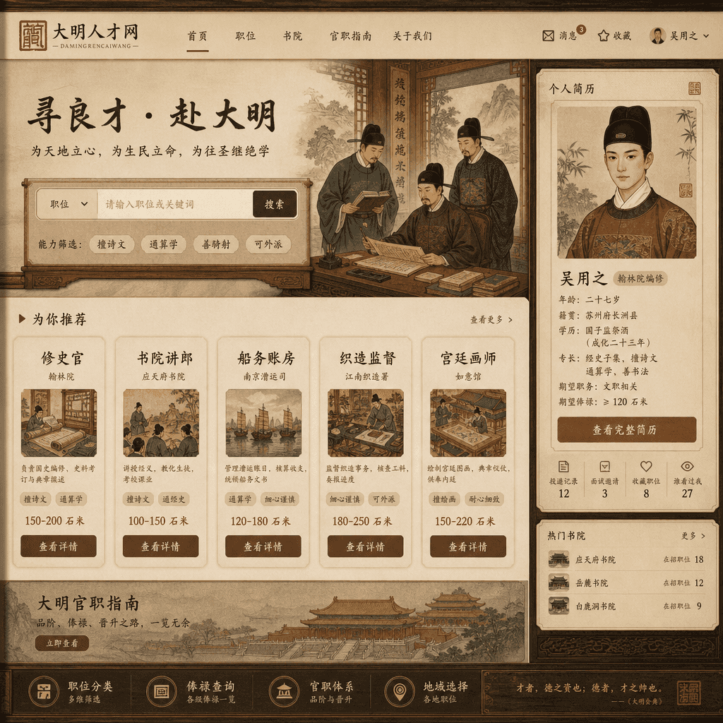
"Home page of the job search website for people in the Ming Dynasty"

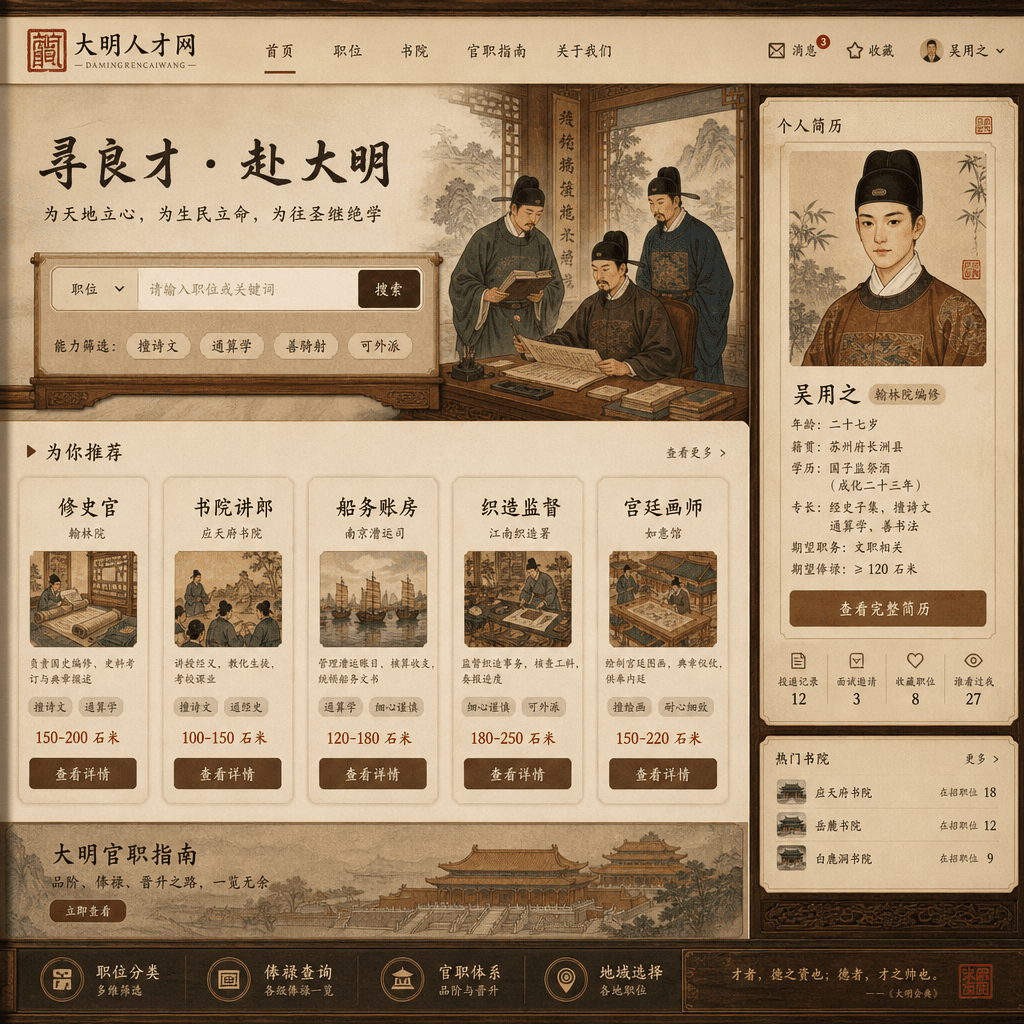
"Home page of the job search website for people in the Ming Dynasty"

"The homepage of the job search website for people in the Ming Dynasty", a humorous fusion of historical costumes and modern recruitment platform interfaces. The main interface has job recommendations such as "historian/academy lecturer/shipping accountant/weaving supervisor/palace painter", and the filtering conditions are "good at poetry/common arithmetic/good at riding and shooting/can be dispatched". The personal resume card uses a meticulous portrait, and the salary unit is expressed in salary and stone meters. The layout is exactly like the real recruitment product homepage, with a ratio of 16:9.

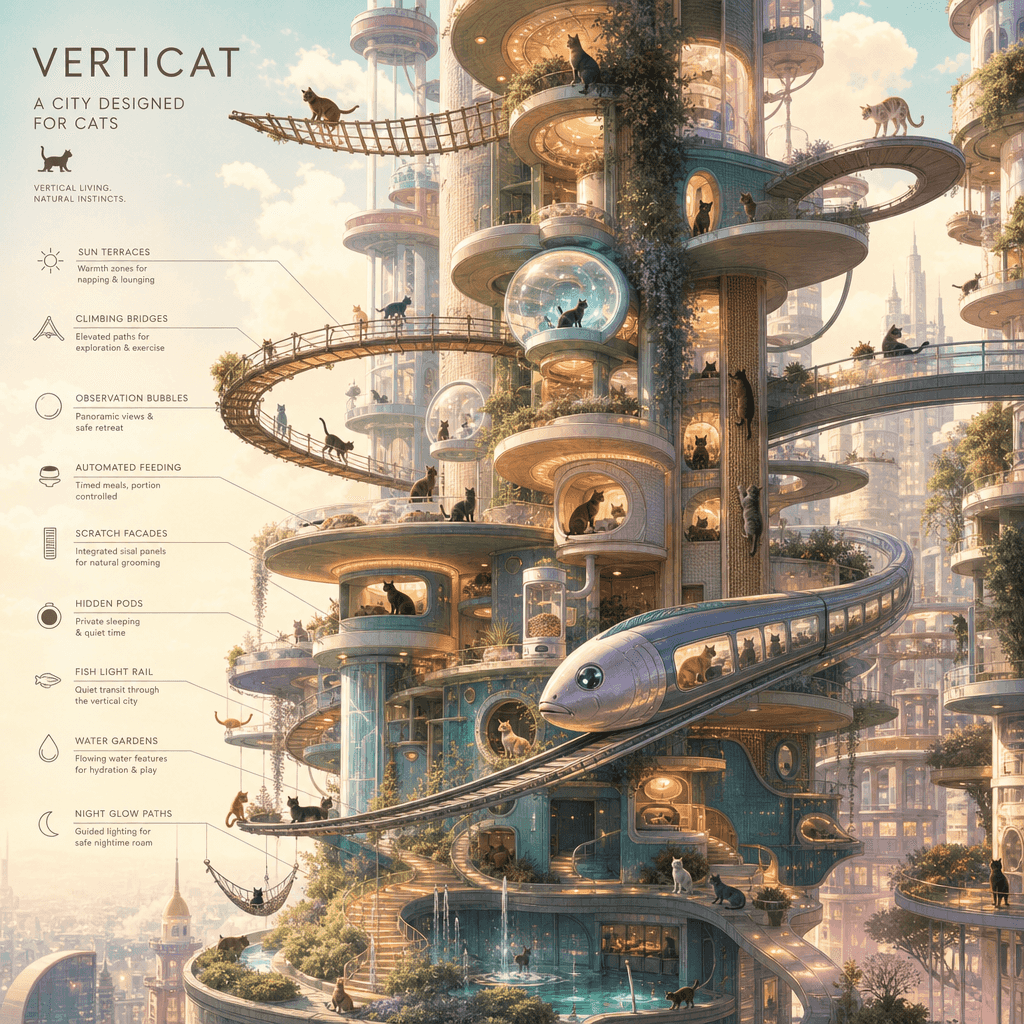
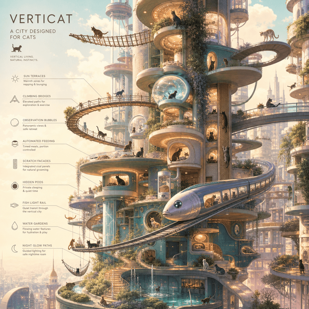
“A vertical city designed for cats”

“A vertical city designed for cats”

"A Vertical City Designed for Cats" combines architectural concept illustrations with pet lifestyles. The ultra-high vertical layout shows a three-dimensional city specially designed for cats: a climbing bridge, a sunbathing platform, a transparent viewing bubble, an automatic feeding station, a hidden sleeping cabin, a scratching board facade, and a fish-shaped light rail. Each floor is accompanied by a brief functional description and silhouettes of cat activities. The colors are dreamy but the structure is reasonable, with a ratio of 9:16.

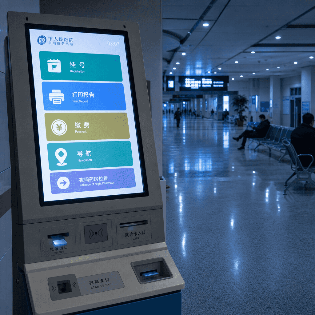
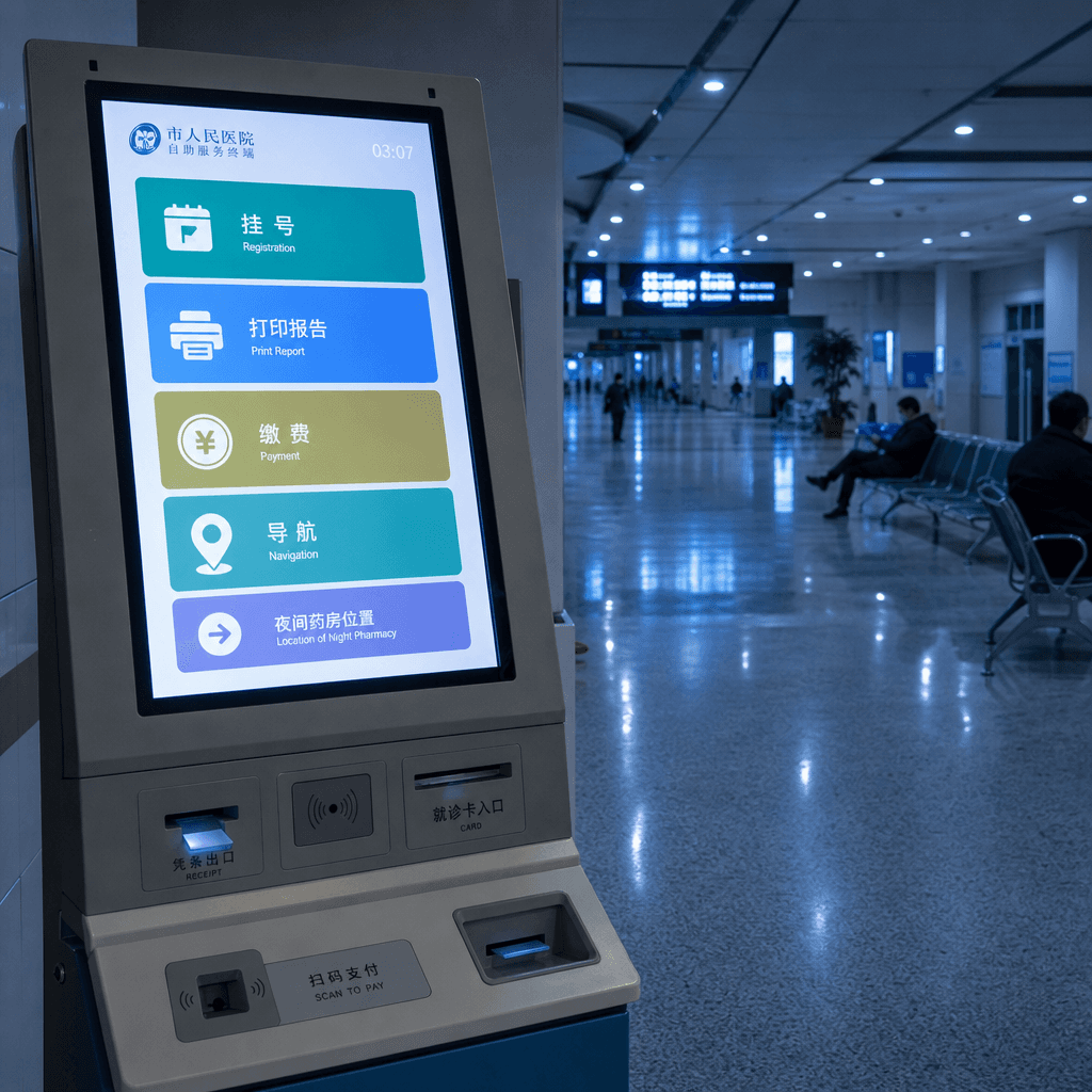
"Hospital self-service machine interface at three o'clock in the morning"

"Hospital self-service machine interface at three o'clock in the morning"

"Hospital self-service machine interface at three o'clock in the morning" combines a documentary space atmosphere with a rigorous UI. The picture is a close-up view of a hospital self-service terminal. The screen content clearly displays buttons such as registration, printing reports, payment, navigation, and night pharmacy locations. The machine is surrounded by an empty hall, cold white lighting, and tired but quiet people. The overall image is calm and real, with a touch of the fragility of human fireworks. The ratio is 9:16.

“Science classroom upgrade plan for rural primary schools”

“Science classroom upgrade plan for rural primary schools”

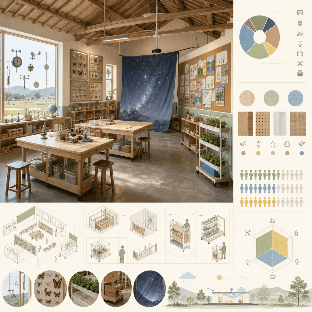
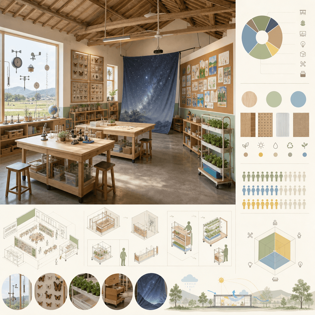
"Science Classroom Upgrade Plan for Rural Primary Schools" is a public education design proposal. The main picture is a perspective view of the transformed classroom: low-cost experimental bench, weather observation window, insect specimen corner, plant hydroponic rack, movable starry sky projection cloth, student works wall. The budget, materials and frequency of use are listed on the right side. The overall picture is warm and pragmatic, like the winning plan of a public welfare design competition, with a ratio of 16:9.

"Twelve Greens of Spring" Visual Dictionary

"Twelve Greens of Spring" Visual Dictionary

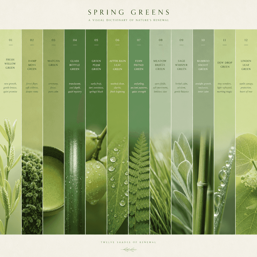
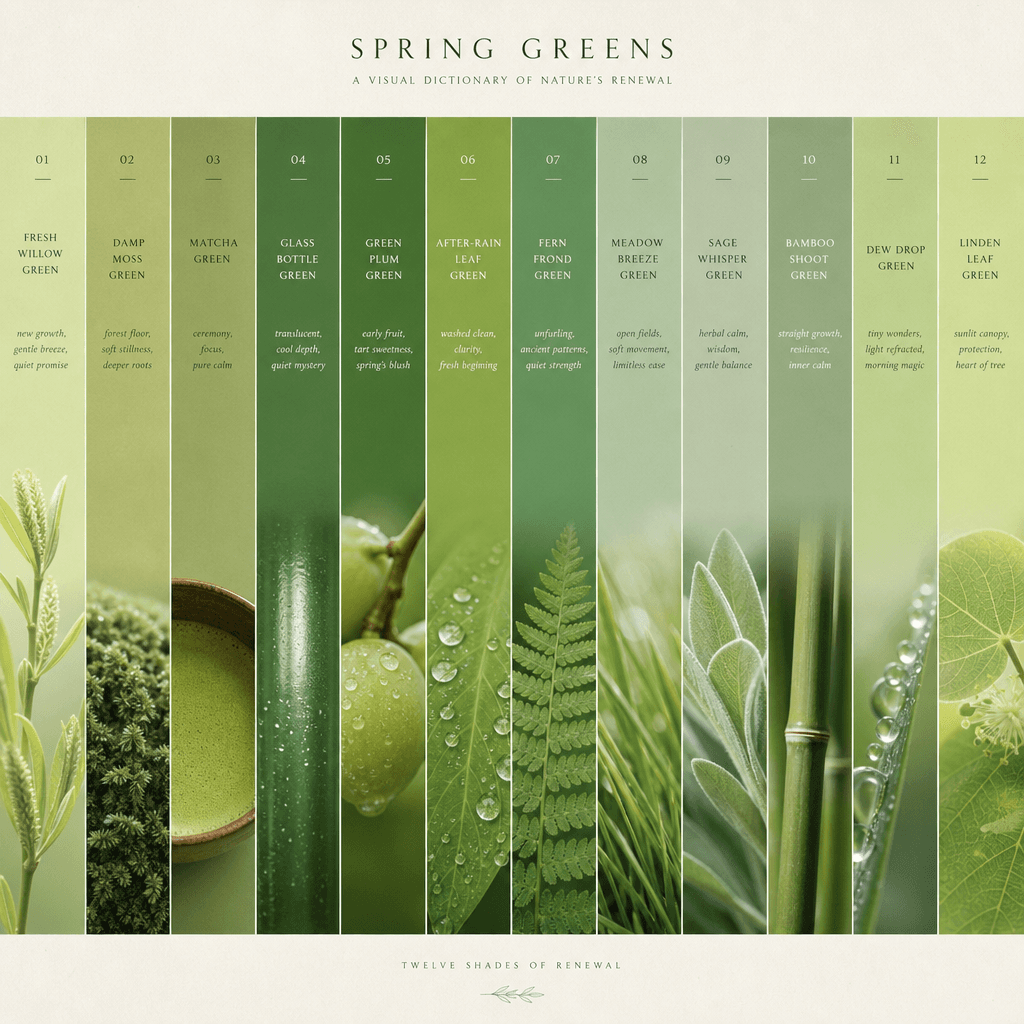
The "Twelve Greens of Spring" visual dictionary combines a color sample book with a nature observation poster. The picture is composed of 12 vertical color strips, corresponding to names such as "new willow green, moist moss green, matcha green, glass bottle green, green plum green, and after-rain leaf green". Each color strip is accompanied by a macro photo and an emotional description. The layout is minimalist and advanced, like a designer's inspiration board, with a ratio of 9:16.

"Indie Record Store Weekly Recommendations Wall"

"Indie Record Store Weekly Recommendations Wall"

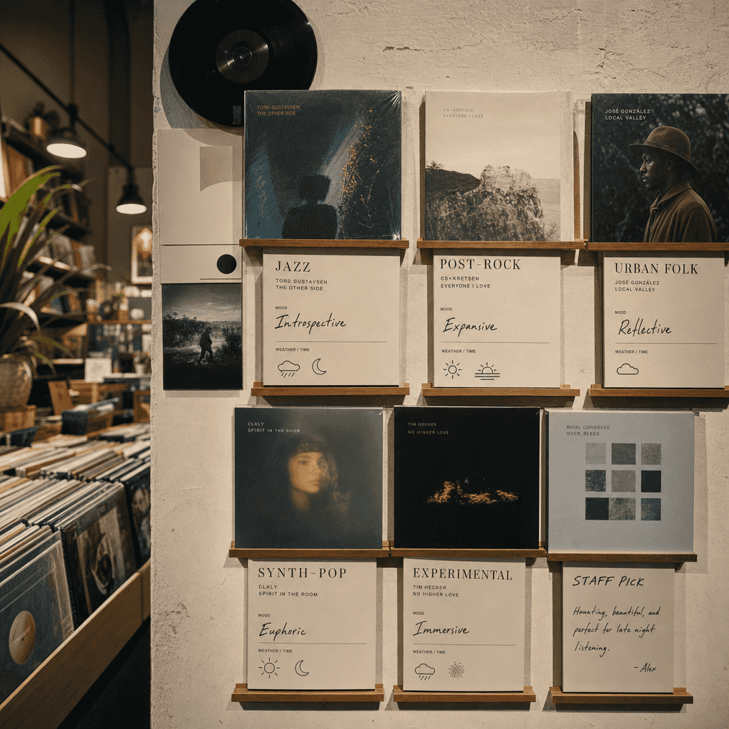
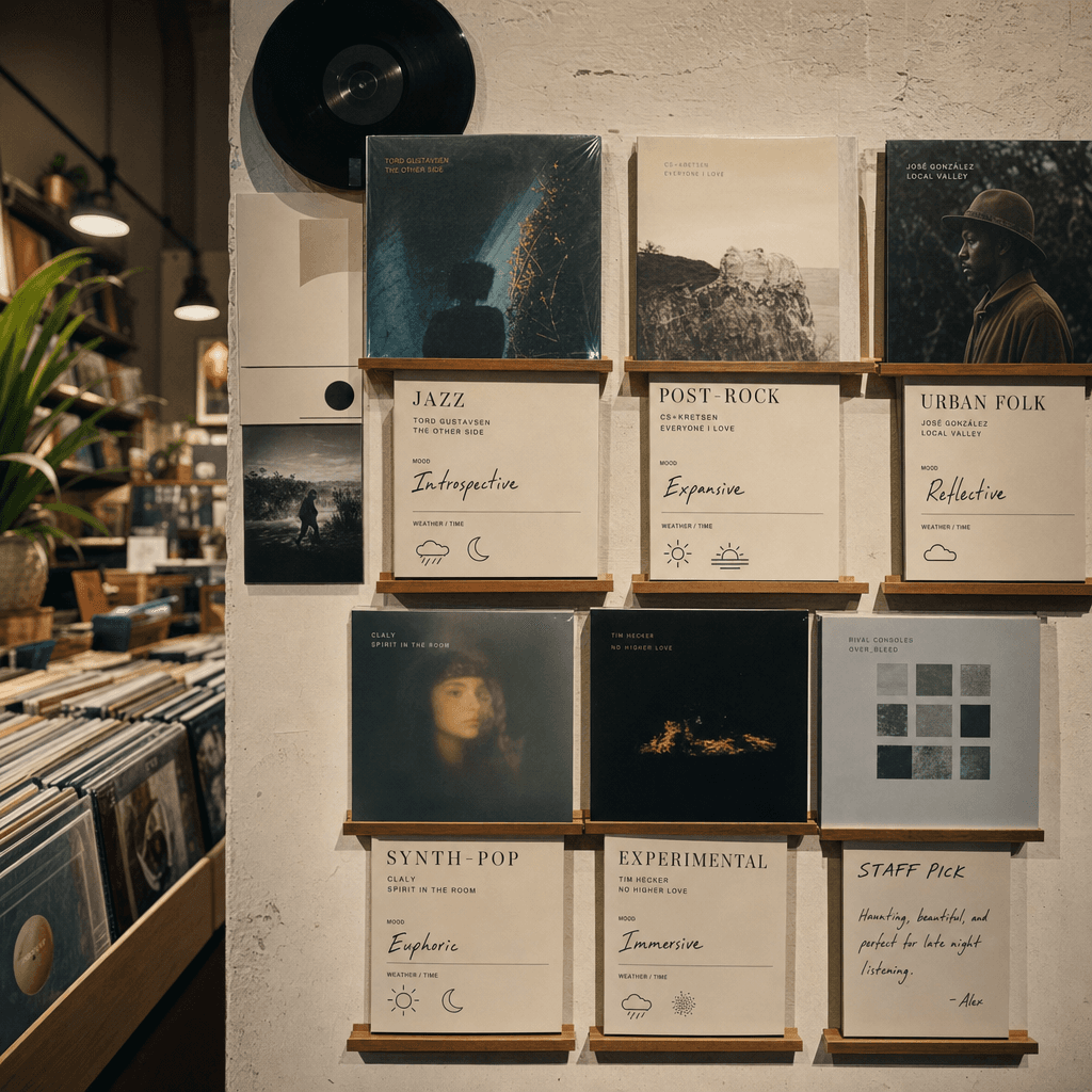
"Independent Record Store Weekly Recommendation Wall" combines retail space photography with music editing layout. The main screen is the record recommendation wall in the store. The store clerk's handwritten labels are mixed with exquisitely typed recommendation cards: jazz, post-rock, urban folk, synth pop, experimental electronic. Each album is assigned an emotional keyword and suitable weather/time for listening, like a lifestyle media special page, with a ratio of 4:5.

"Mythical Creature Containment Bureau File Page: Kirin"

"Mythical Creature Containment Bureau File Page: Kirin"

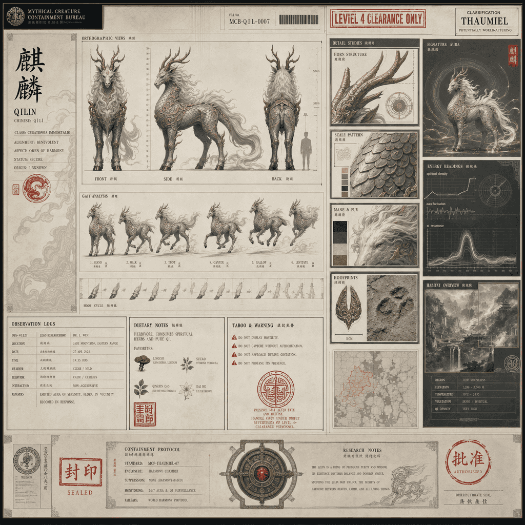
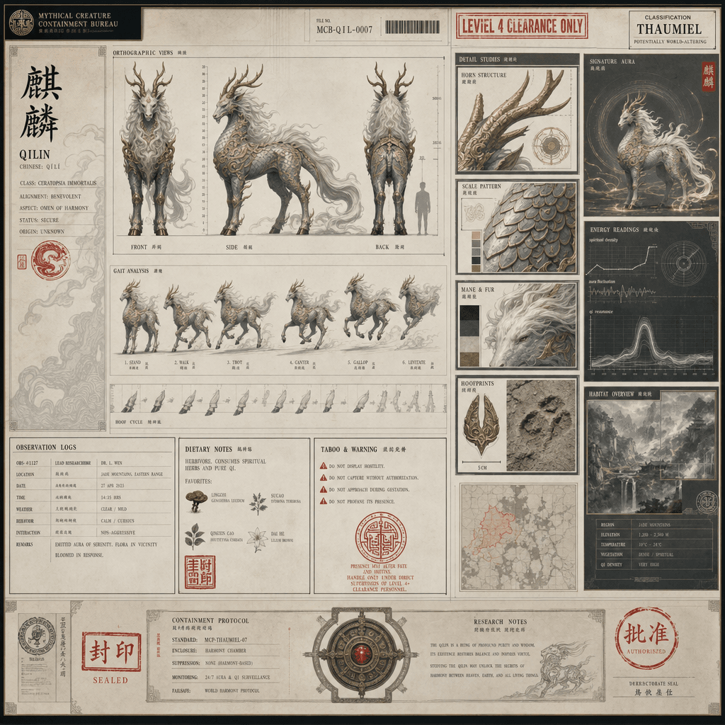
"Mythical Creature Containment Bureau File Page: Kirin" combines the institutional file design with the Oriental fantasy creature setting. The picture looks like a top-secret containment file. On the left is a three-dimensional view of the front, side and back of the Kirin and its gait breakdown. On the right is the horn, scales, mane, hoof print details and habitat environment data module. The file is printed with a rank seal, observation log, dietary habits and taboo instructions. The overall image has a sense of sacredness and a calm temperament of a modern institution, with a ratio of 16:9.

"The vending machine brand universe on a rainy night in Tokyo"

"The vending machine brand universe on a rainy night in Tokyo"

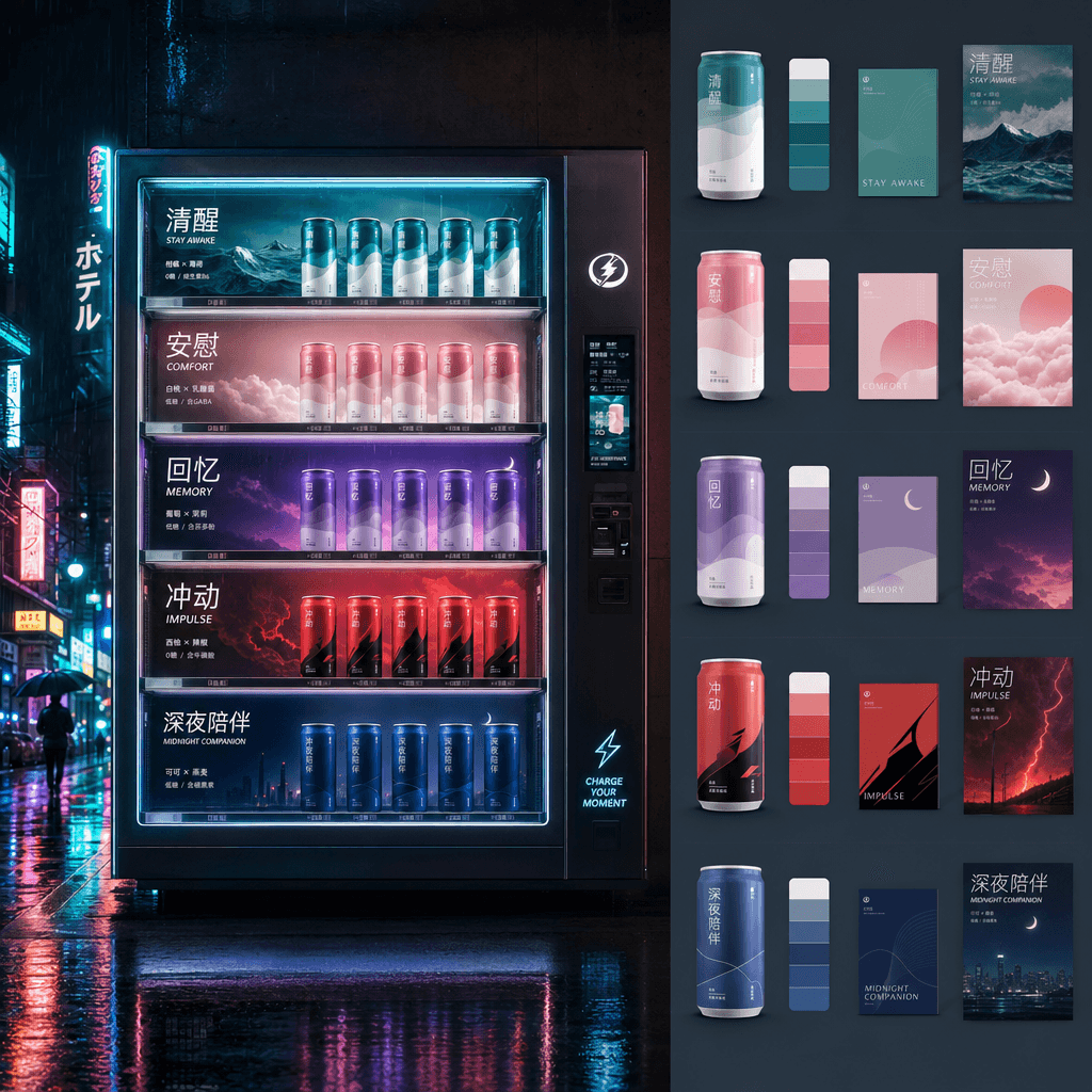
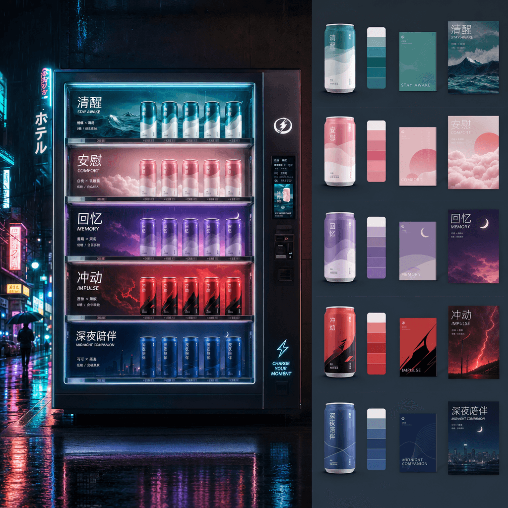
"The vending machine brand universe on a rainy night in Tokyo" combines urban photography with systematic packaging design. The entire vending machine glows in the neon light of the rainy night. Each layer of drinks represents a brand sub-series: sobriety, comfort, memory, impulse, and late-night companionship. The can design, color palette, slogan and small poster of each series are unfolded on the right side. The vision is very unified, with a ratio of 16:9.

“A miniature museum of lost and found items”

“A miniature museum of lost and found items”

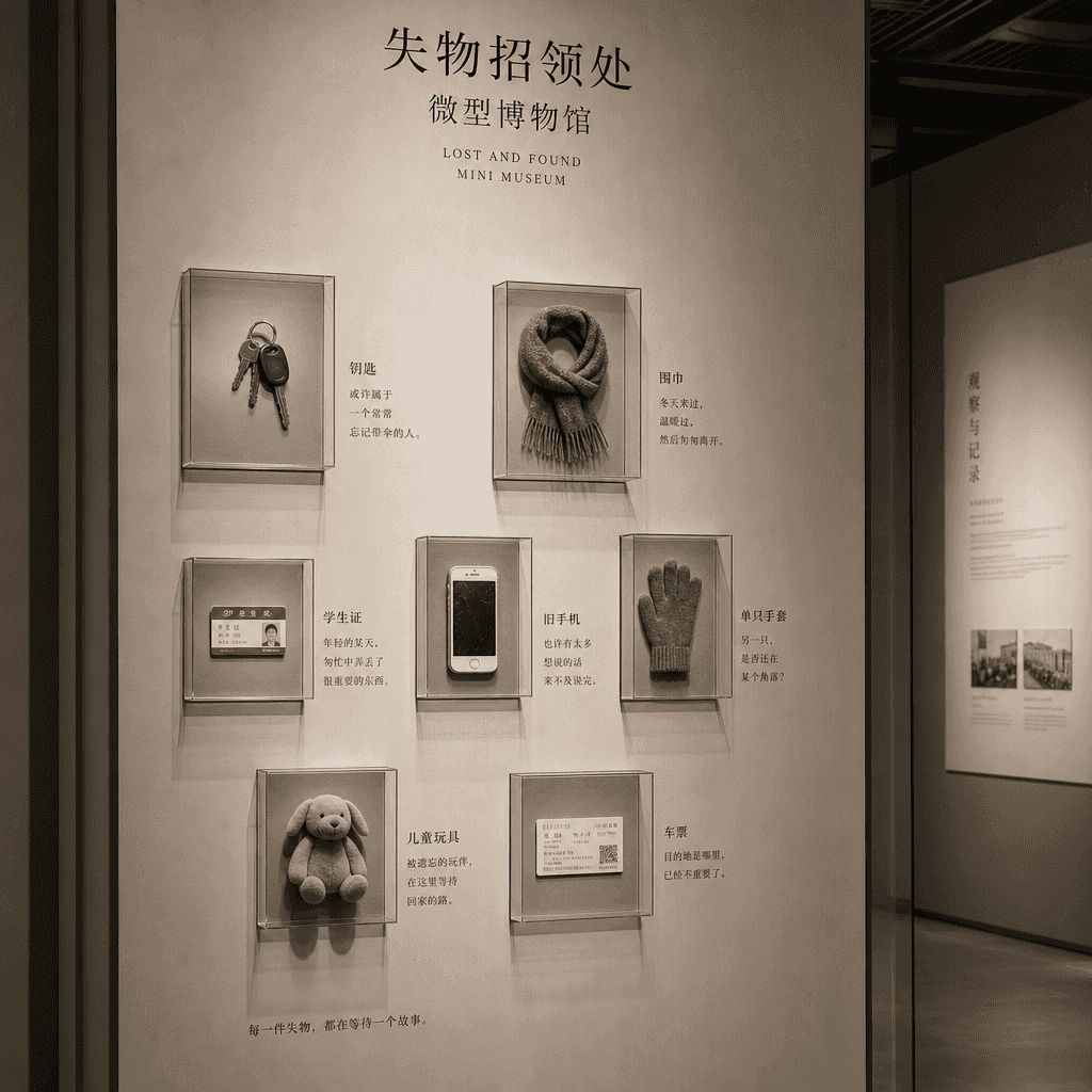
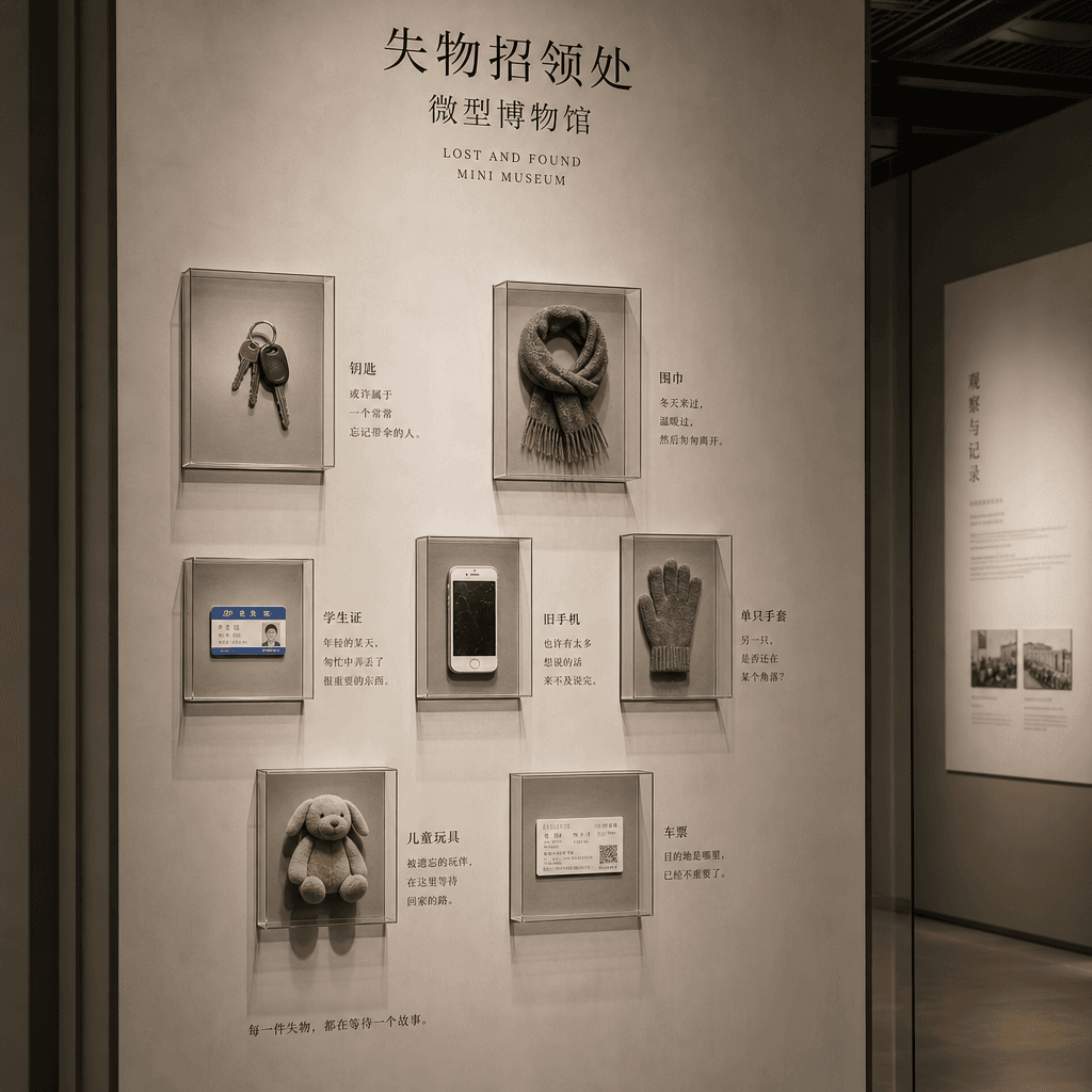
"A miniature museum of lost and found items", the display design is combined with anthropological observation. The picture is like a museum exhibition wall, displaying unclaimed keys, scarves, student ID cards, old mobile phones, single gloves, children's toys, and tickets. Each item has a very short text next to it to guess its story. The layout is restrained and solemn, like a real exhibition guide system, with a ratio of 4:5.

“The Urban Night Runner’s Gear Guide 2026”

“The Urban Night Runner’s Gear Guide 2026”

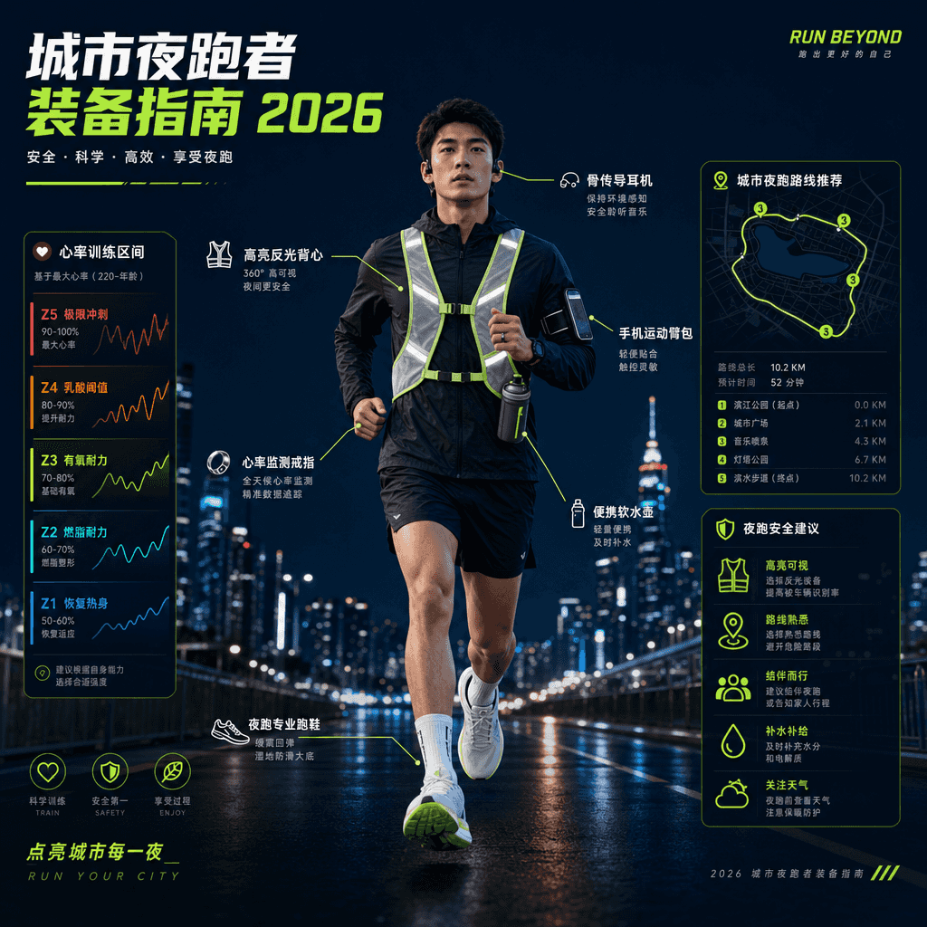
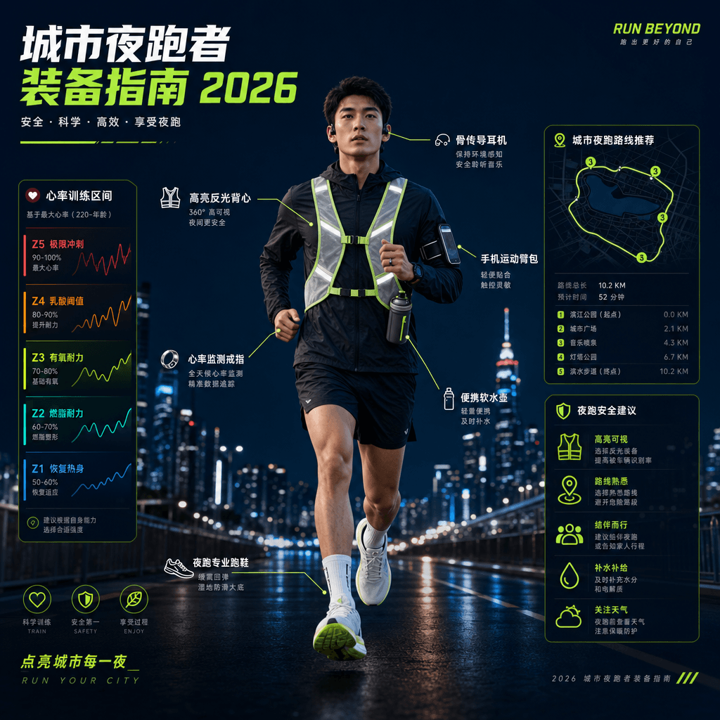
"Urban Night Runner Equipment Guide 2026" combines product display with lifestyle posters. The main screen is a front view of a night runner's full body equipment. Shoes, reflective vests, bone conduction headphones, arm bags, water bottles, and heart rate rings are marked with thin lines. Next to them are heart rate zones, urban routes, and nighttime lighting recommendations. The color scheme is dark blue with fluorescent green, like a sports brand technical manual, and the ratio is 9:16.

“Chinese Wedding Color Archives”

“Chinese Wedding Color Archives”

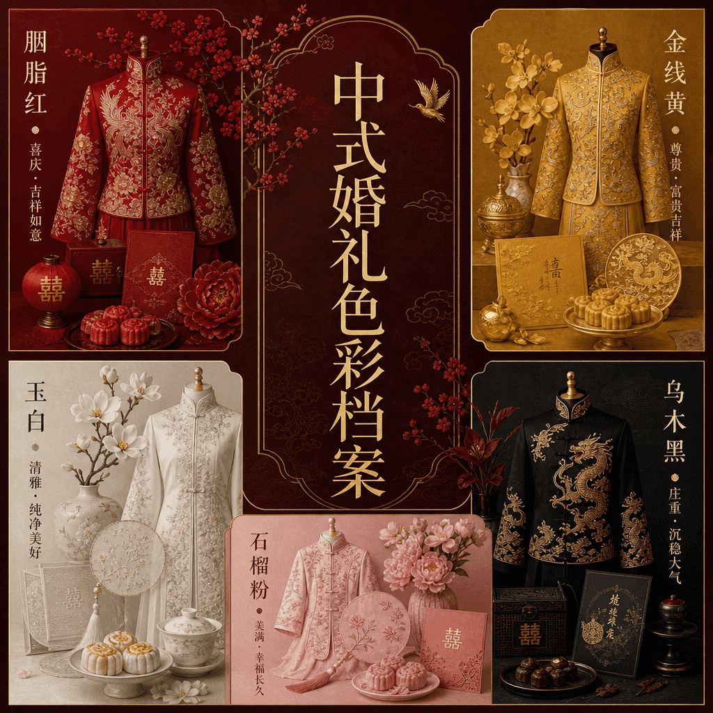
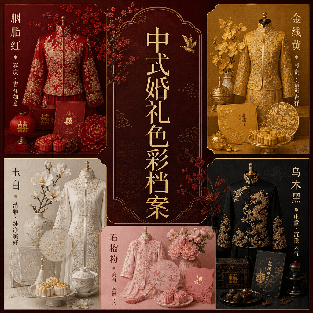
"Chinese Wedding Color Archives" combines traditional etiquette with modern editorial formats. The picture is divided into five modules: "rouge red, gold thread yellow, jade white, ebony black, and pomegranate pink" to display wedding clothes, utensils, pastries, invitations, flowers and patterns. The central title is like a high-end wedding magazine feature, with very short notes around it explaining the symbolic meaning behind each color. The overall design is solemn and exquisite, with a ratio of 4:5.

"Library Borrowing Terminal of the Future"

"Library Borrowing Terminal of the Future"

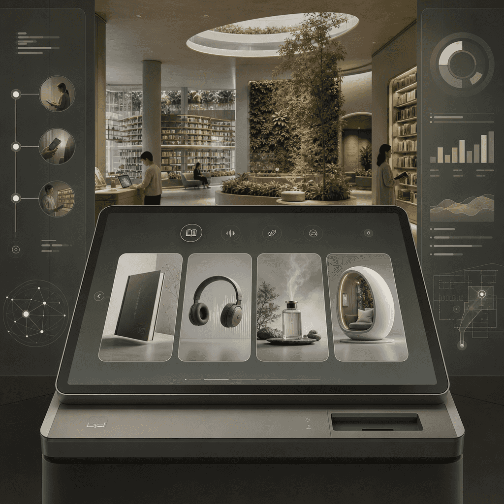
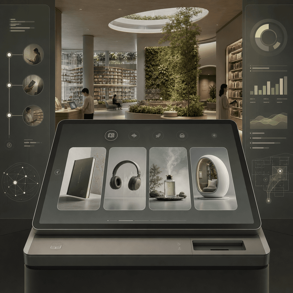
"Library Borrowing Terminal of the Future", the product UI is integrated with the architectural space concept map. The foreground is a large screen of a minimalist lending terminal, which can filter physical books, sound files, smell memories, and immersive reading cabins. The background is an open library space, with extended bookshelves and plant walls. The sidebar displays the reader's journey process, borrowing data, and space guidance. The colors are calm and restrained, and the ratio is 16:9.

“Social heat map of hot pot restaurants”

“Social heat map of hot pot restaurants”

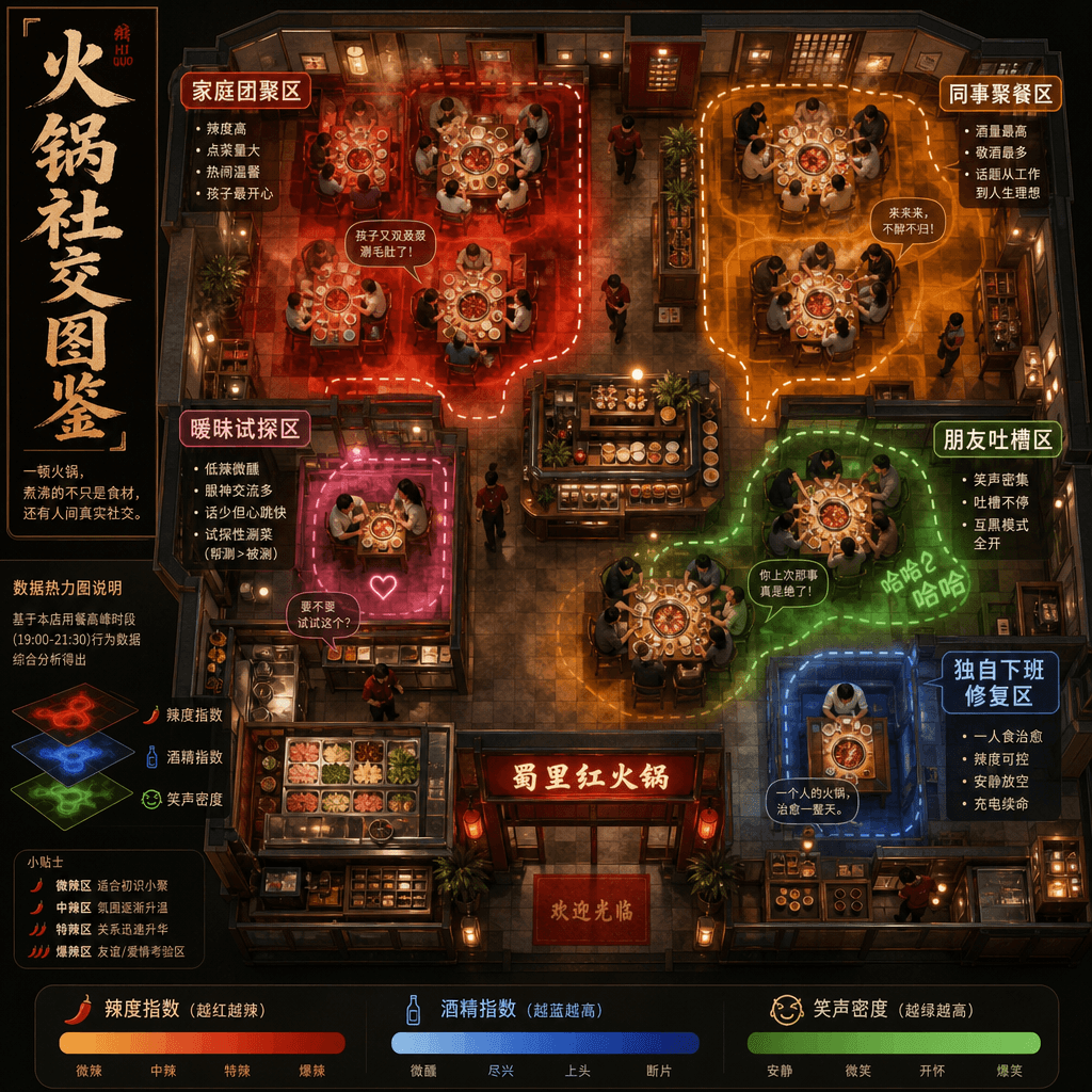
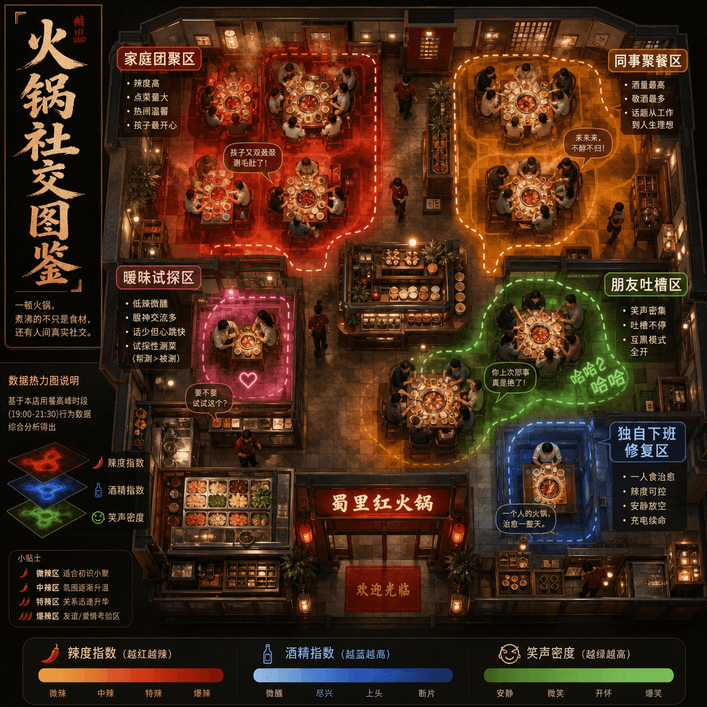
"Social Heat Map of Hot Pot Restaurants" combines catering space design with social behavior analysis. It takes an overhead shot of the floor plan of a lively hot pot restaurant. Different seating areas are marked as "family reunion area", "colleague dining area", "ambiguous trial area", "friends complain area" and "alone get off work recovery area". The heat map shows spiciness, drink consumption and laughter density. The style is humorous and professional, with a ratio of 16:9.

"Air Profile of a Used Bookstore"

"Air Profile of a Used Bookstore"

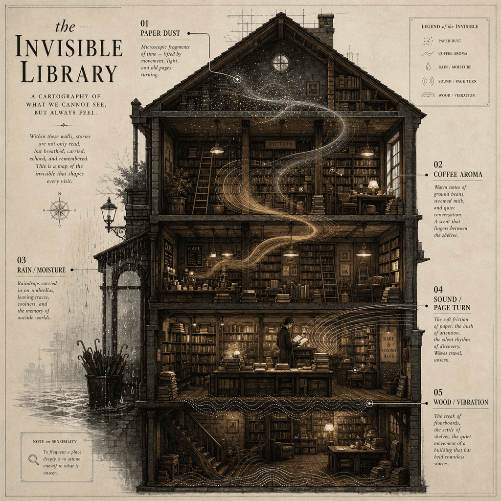
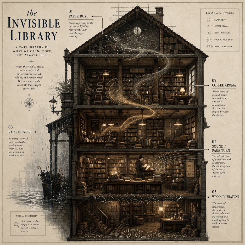
"Air Section of an Old Bookstore" is a fusion of spatial narrative and conceptual information graphics. The picture cuts a cross-section of an old bookstore. Different layers of air are filled with visual symbols of paper dust, coffee aroma, umbrella dripping, page turning sound waves, and the creak of the wooden floor. These "invisible components" are annotated with academic style labels next to it. The title is very poetic and the ratio is 3:4.

"Visual order for a summer fruit stand"

"Visual order for a summer fruit stand"

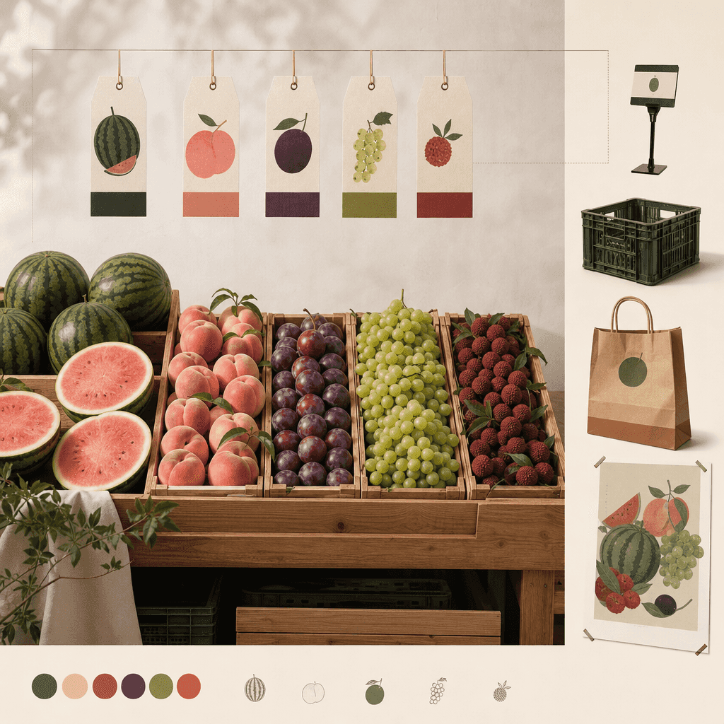
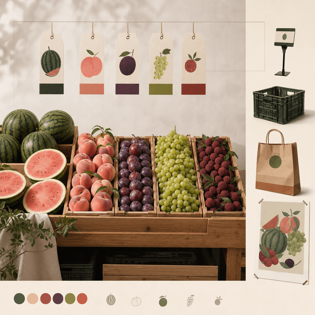
"Visual order of summer fruit stalls" is a fusion of agricultural still life photography and modern display science illustrations. Watermelons, peaches, plums, grapes, and bayberries are neatly displayed according to size and color. The top hangtag uses a unified brand language. On the right side are price tags, turnover boxes, paper bags, and seasonal poster extensions. The colors are full but not overly commercial, like a brand manual about daily aesthetics, with a ratio of 4:5.

“Redesign of cafe ordering system for socially anxious users”

“Redesign of cafe ordering system for socially anxious users”

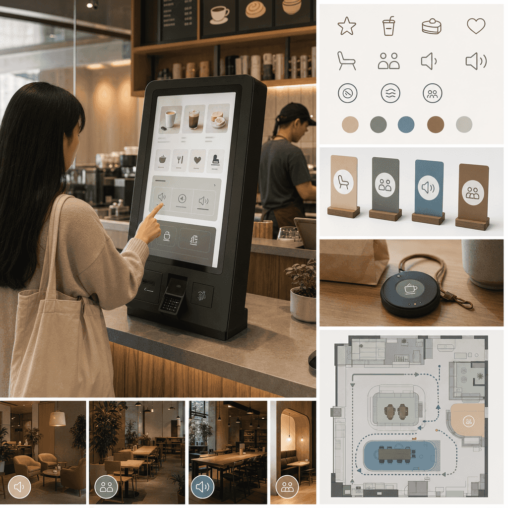
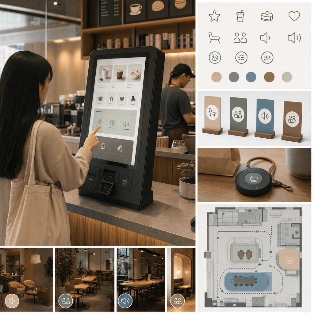
"Redesign of the cafe ordering system for socially anxious users", service design proposal diagram, the main screen shows the new solution for the cafe counter and self-service ordering screen, reduces language contact, adds the option of "default recommendation/no communication for meal taking/seat preference/volume area", expands the icon system, table card, meal pick-up card, and waiting area moving line diagram on the right side. The overall feeling is very realistic, with a ratio of 16:9.

“Moments of silence at the airport in the early morning”

“Moments of silence at the airport in the early morning”

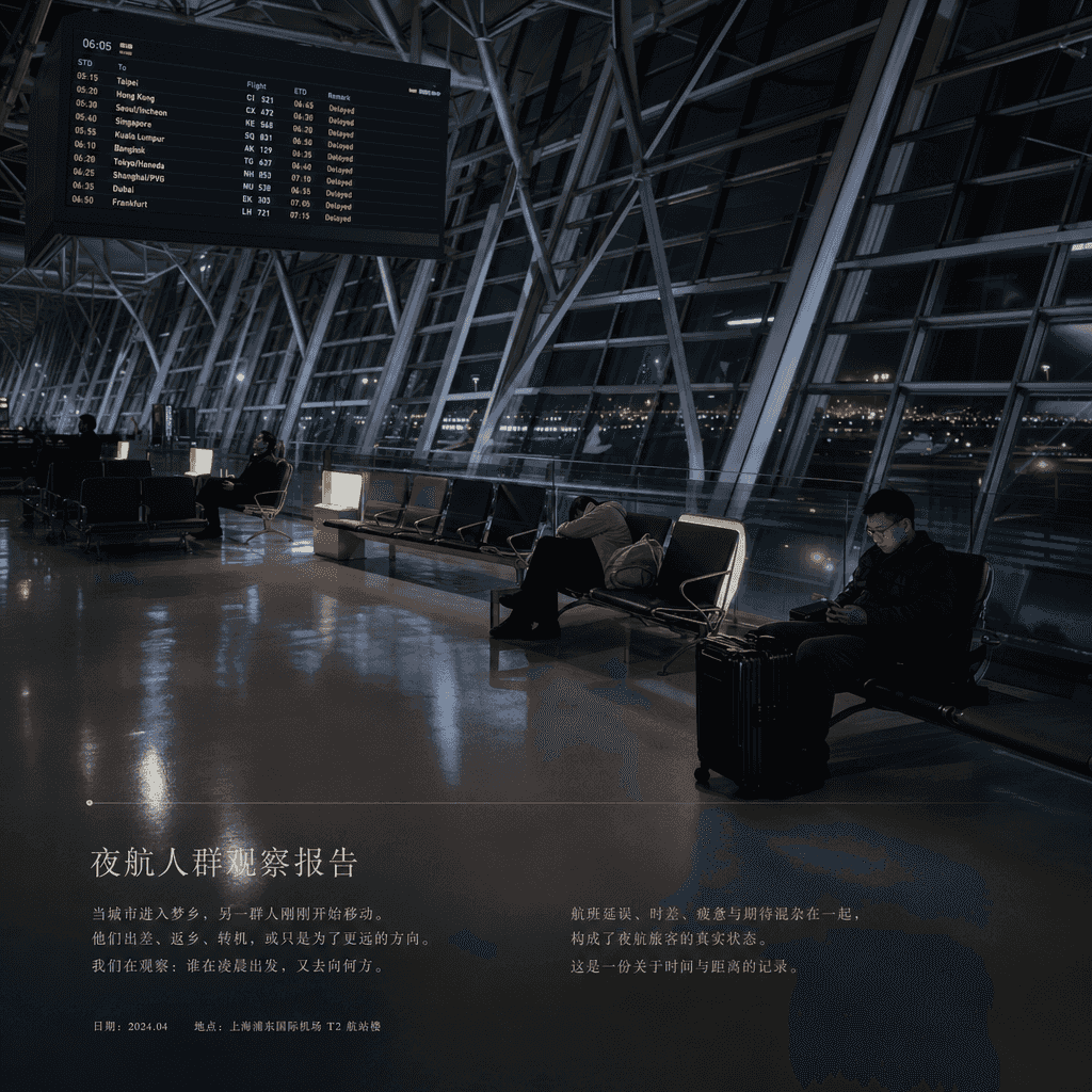
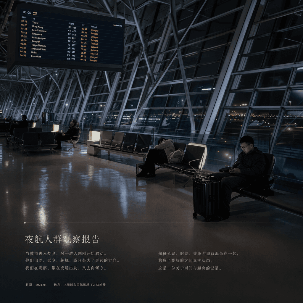
"Silent moment at the airport in the early morning" is a visual fusion of documentary photography and flight information. The main image is an almost empty international airport terminal, with departure cities and delay information scrolling on the electronic screen. A few passengers sit in a daze under the soft light, sleeping, and looking at their mobile phones. The small column at the bottom is like a column in an aviation and travel magazine that writes "Night Flight Crowd Observation Report". The tone is quiet and cold, with a ratio of 16:9.

"Graduation Album Cover System in a Parallel World"

"Graduation Album Cover System in a Parallel World"

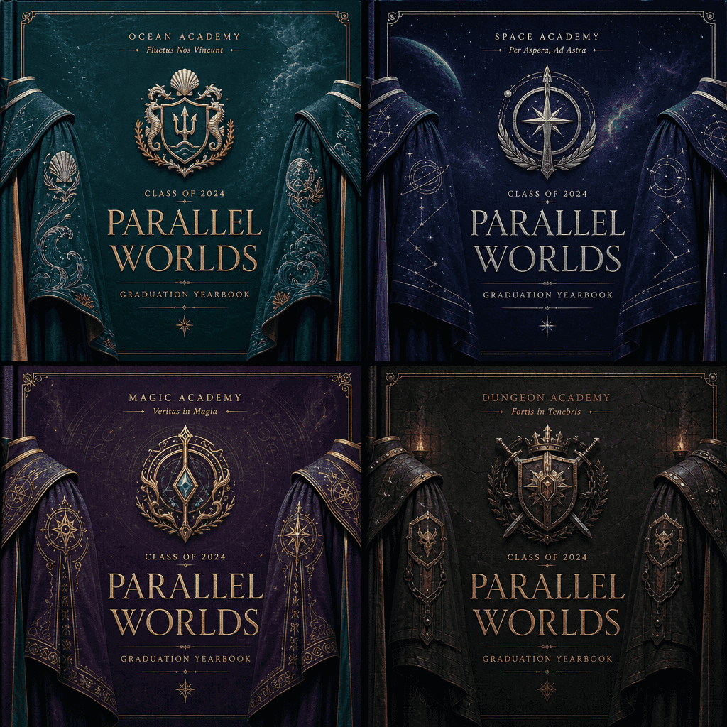
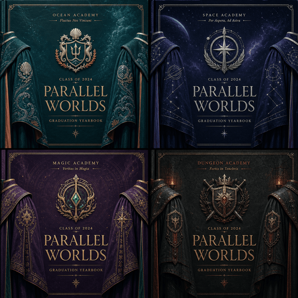
"Graduation Album Cover System in a Parallel World", the school yearbook design is integrated with the concept of multiverse. The entire image is divided into four versions: Ocean Academy, Space Academy, Magic Academy, Dungeon Academy. Each version uses a unified layout but different badges, colors, school mottos and graduation uniform details. The central title remains the same, reflecting the identity switching in the parallel world. The whole image looks like a senior editorial design proposal, with a ratio of 1:1.

“The Economics of a Breakfast Stall”

“The Economics of a Breakfast Stall”

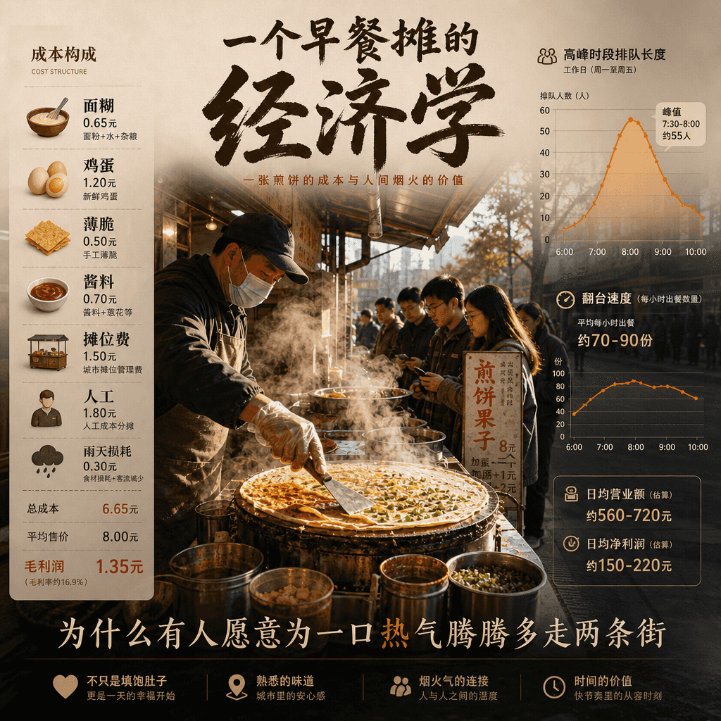
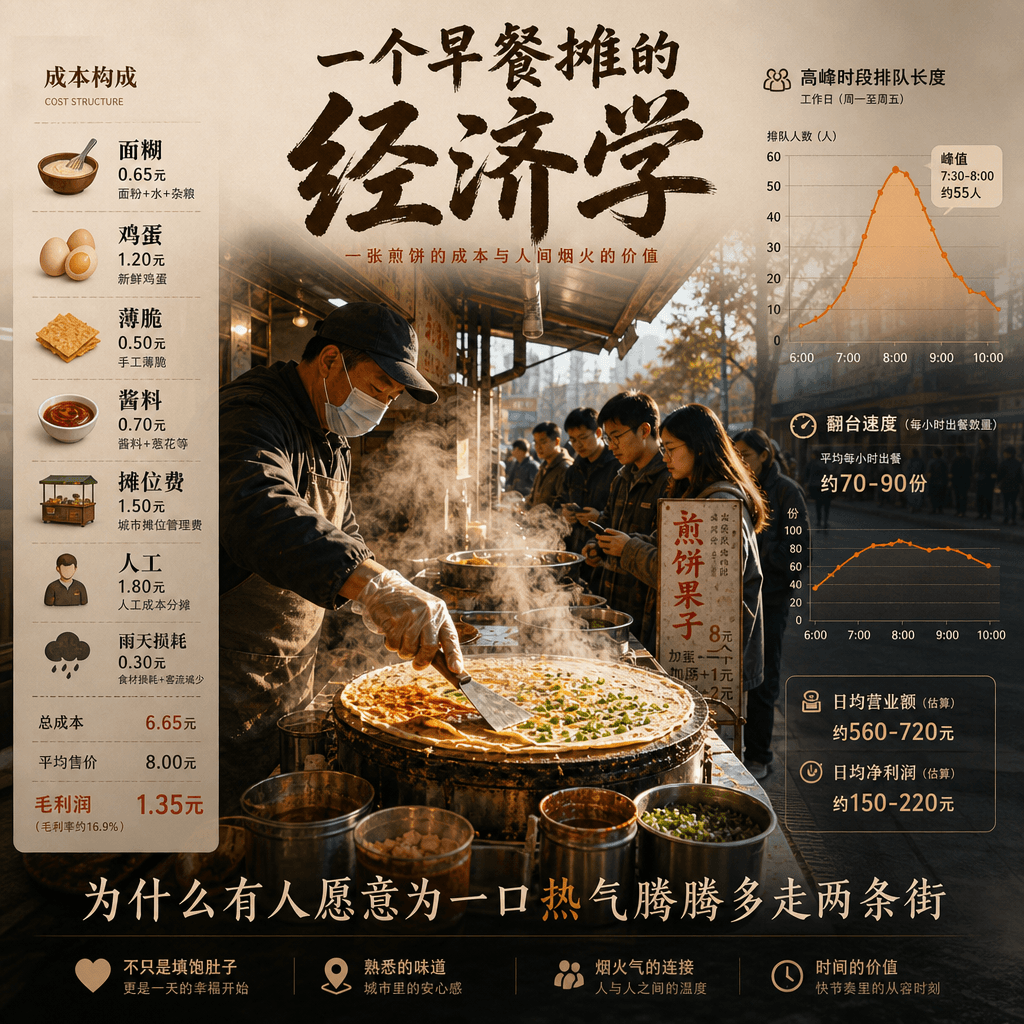
"The Economics of a Breakfast Stall" is an infographic poster combined with street photography. The center of the picture is a perspective view of a steaming pancake stall. The cost components are listed on the left: batter, eggs, crackers, sauces, stall fees, labor, and rainy weather losses. The right side is the curve of queue length and table turnover speed during peak hours. At the bottom is written "Why are some people willing to walk two more streets for a hot mouthful of steam?" The whole thing is both down-to-earth and highly designed, with a ratio of 4:5.

"Rainforest Reserve Monitoring Overview Screen"

"Rainforest Reserve Monitoring Overview Screen"

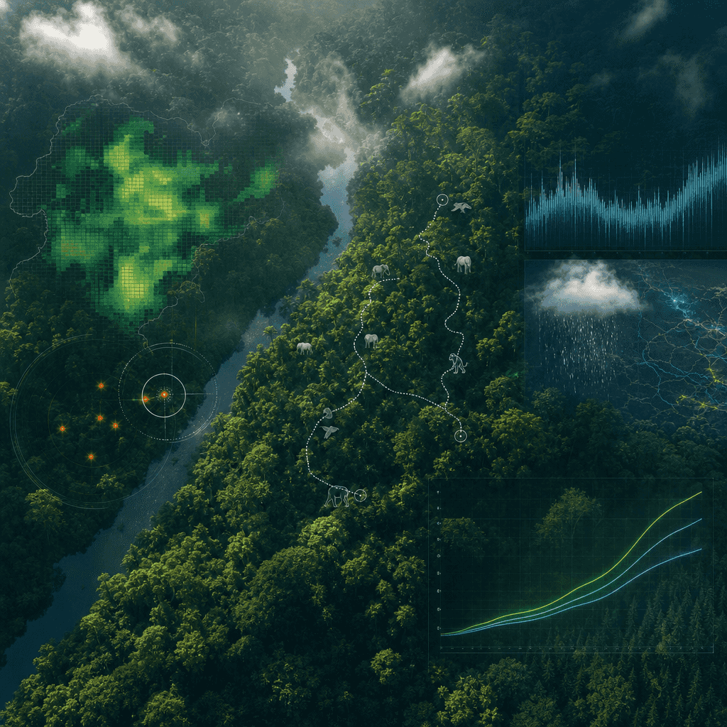
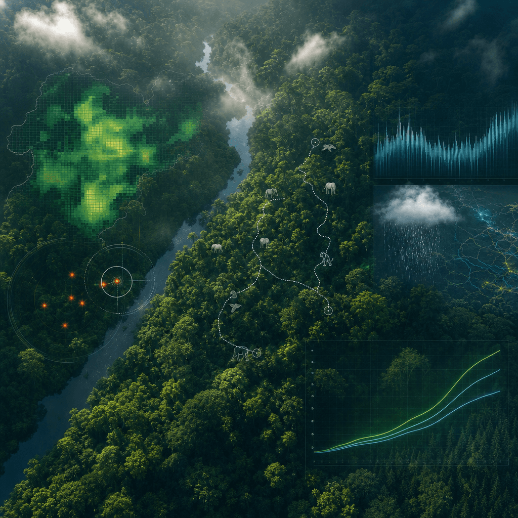
"Rainforest Reserve Monitoring Overview Screen" integrates ecological scientific research dashboard and immersive natural photography. The main background of the picture is a magnificent scene overlooking the tropical rainforest canopy. The foreground is superimposed with a translucent data layer: canopy density, endangered animal activity trajectories, poaching warnings, rainfall and carbon sink curves. The title is like the vision of a United Nations environmental protection project. The temperament is professional and solemn, the colors are bright but not overly saturated, and the ratio is 16:9.

"Cosmic Post Office Parcel Tracking Page"

"Cosmic Post Office Parcel Tracking Page"

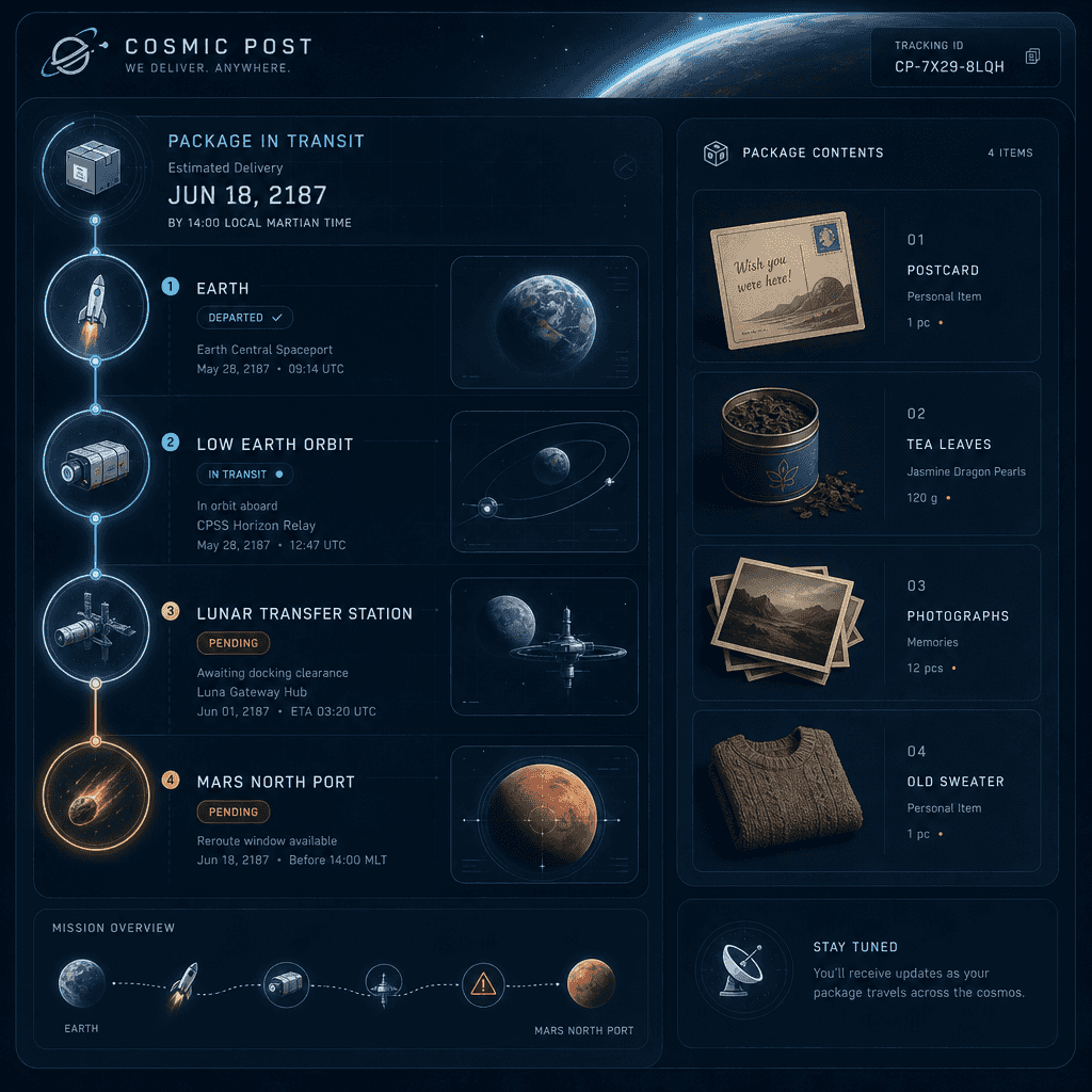
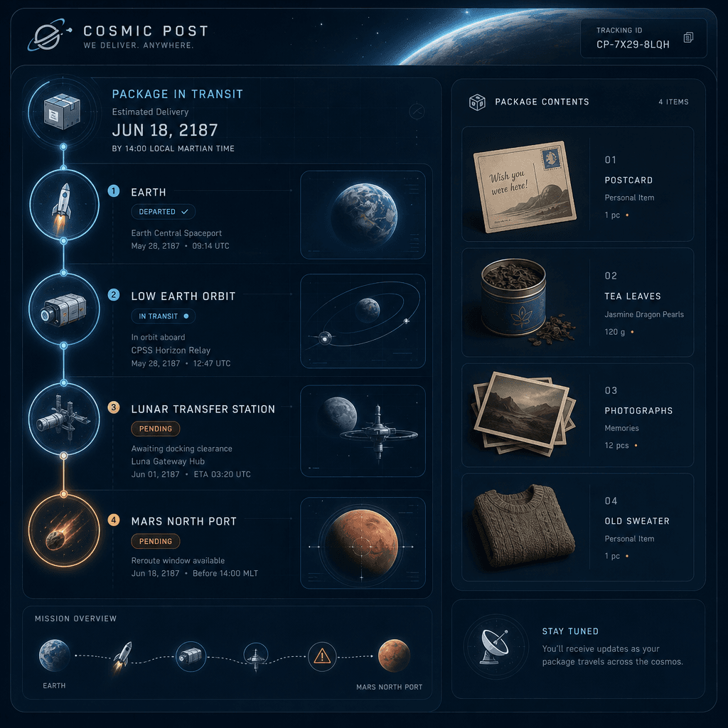
"Package tracking page of the Space Post Office" integrates the logistics system UI with the sci-fi worldview. The picture is a package tracking details page, and the route is displayed segment by segment from "Earth-Low Earth Orbit-Moon Transfer Station-Mars North Port". The node icons are designed as small rockets, cargo cabins, space customs, and meteorite warning areas. On the right is a list of package items: postcards, tea leaves, photos, and old sweaters. The overall picture is calm and rational but has a hint of human touch, with a ratio of 9:16.

"Twelve hours preparation list before island typhoon"

"Twelve hours preparation list before island typhoon"

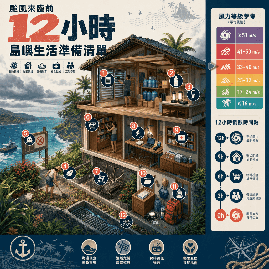
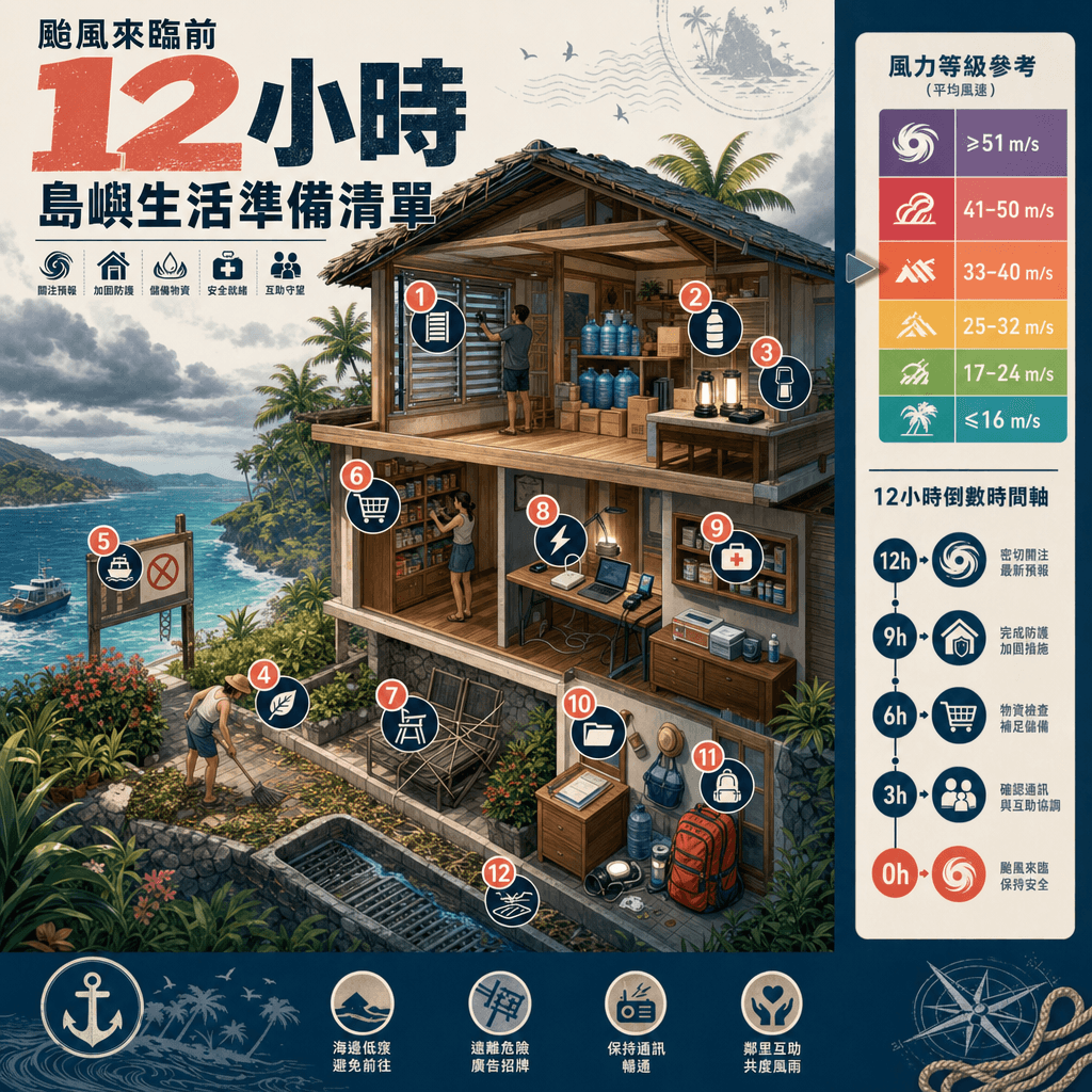
"Island Typhoon Preparation Checklist 12 hours before" is an emergency poster integrated with a travel lifestyle magazine. The center of the picture is a cross-sectional view of an island B&B. Steps such as window reinforcement, water storage, lighting preparation, garden tidying, suspension notice, and kitchen food storage are marked with numerical labels. The sidebar has a wind speed grade ribbon and a timeline. The title is minimalist and eye-catching. The overall design is practical and visually attractive, with a ratio of 4:5.

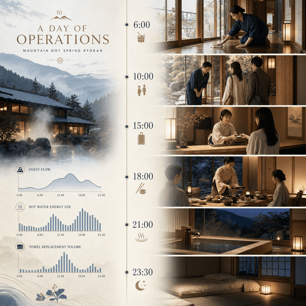
"One day operation panel of mountain hot spring hotel"

"One day operation panel of mountain hot spring hotel"

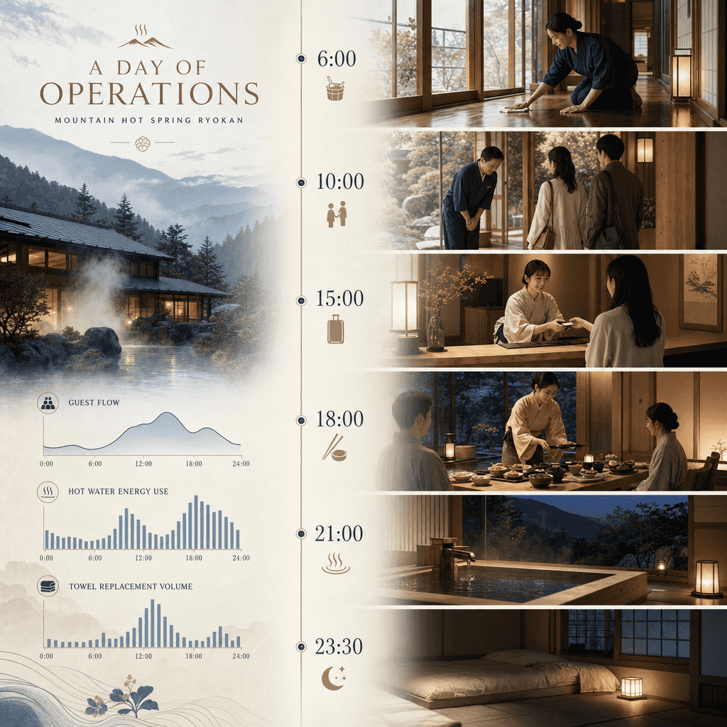
"One day operation panel of a mountain hot spring hotel" combines hospitality service design with lifestyle photography. The vertical timeline starts from 6:00 cleaning, 10:00 welcome, 15:00 check-in, 18:00 dinner, 21:00 private bath, 23:30 lights out. It is equipped with small scene illustrations and simplified data at each time point such as passenger flow, hot water energy consumption, towel replacement volume, etc. The title is elegant and calm, and the color scheme refers to wood color, fog blue, and hot spring white steam. The proportions 9:16.

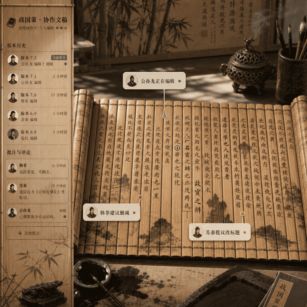
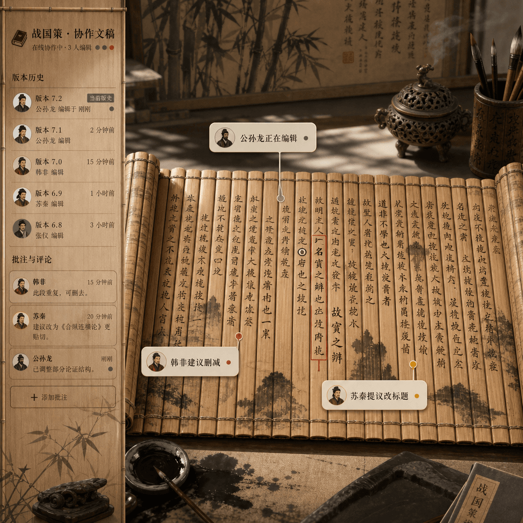
"Multi-person collaboration document interface in the Warring States Period"

"Multi-person collaboration document interface in the Warring States Period"

"Multi-person collaborative document interface in the Warring States Period" is an absurd fusion of bamboo slip documents and online document product design. The picture looks like a real-time collaborative editor interface, but the bottom layer is unfolded bamboo slips and brush ink. Comment bubbles from different authors are marked with "Gongsun Long is editing", "Han Fei suggested deletion" and "Su Qin proposed changing the title". The sidebar is version history and comments. The whole is full of academic rigor and Internet office humor, with a ratio of 16:9.

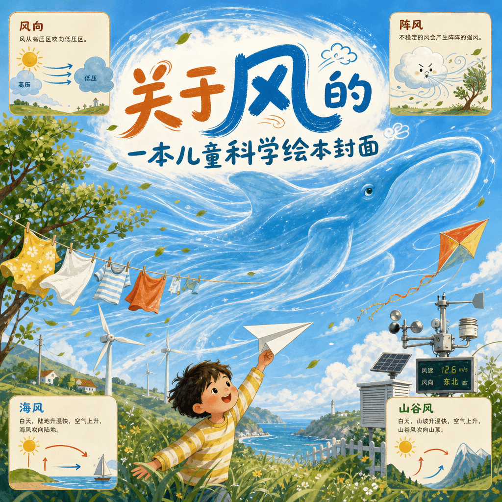
"Cover of a children's science picture book about wind"

"Cover of a children's science picture book about wind"

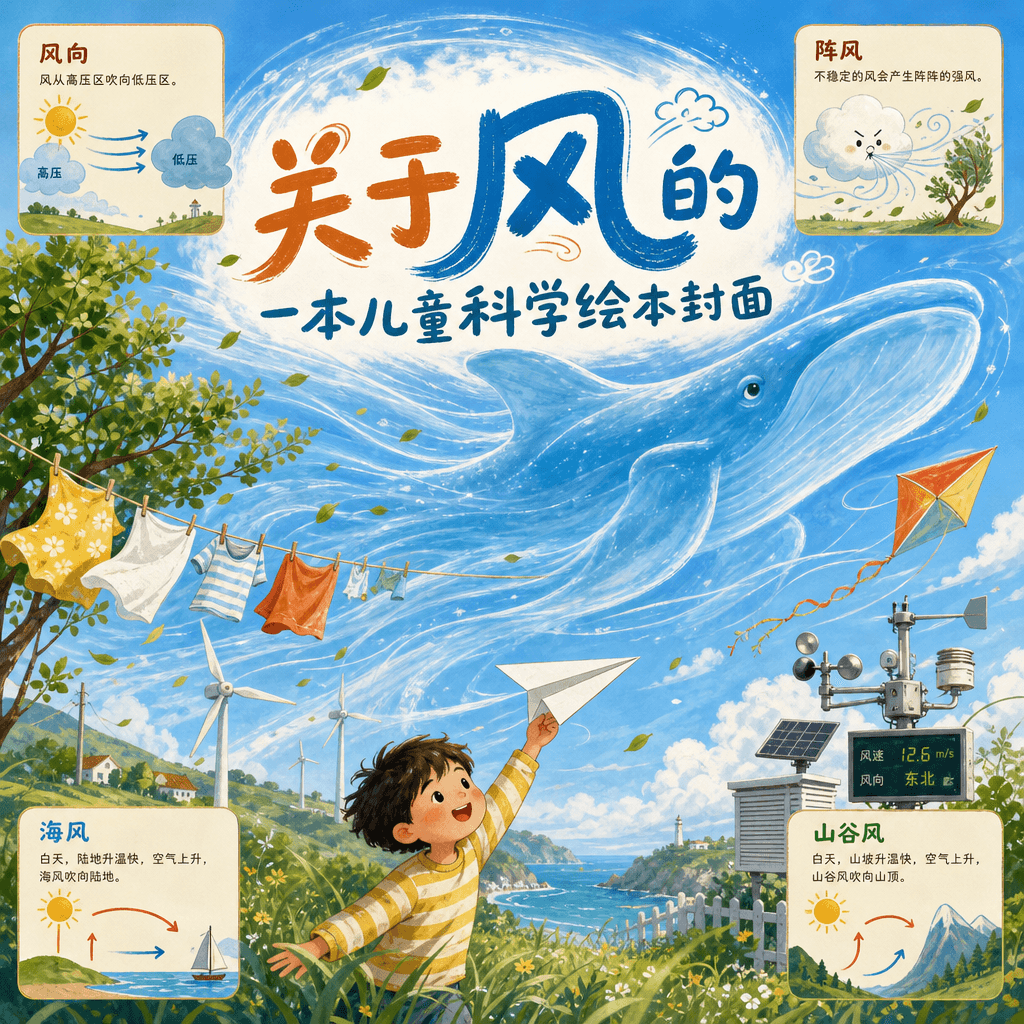
"Cover of a children's science picture book about wind" is a visual fusion of children's book illustrations and popular science information. In the picture, the wind is personified as a transparent blue whale, passing through windmills, clotheslines, leaves, kites, weather stations and children's paper airplanes. There are simple icons in the corners to explain wind direction, gusts, sea breezes and valley breezes. The title is written in large and cute handwriting, with a ratio of 3:4.

"The Corner Florist's Color Operations Manual"

"The Corner Florist's Color Operations Manual"

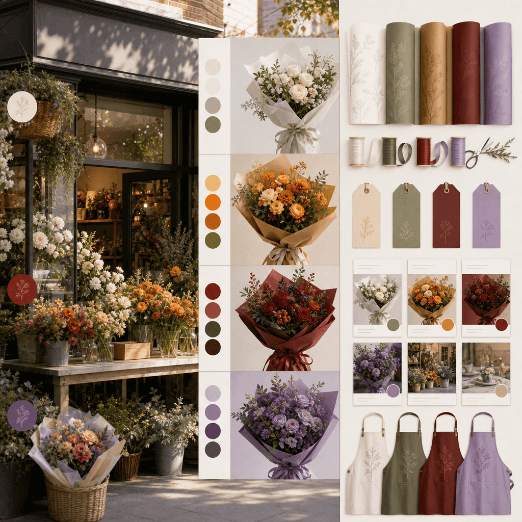
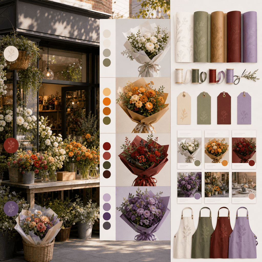
"Color Operation Manual for the Corner Flower Shop", the brand guide is integrated with real store photography. The main picture is the flower shop front and display stand. It is divided into different main color bands according to weekdays and weekends: cream and white wedding, orange daily, crimson holiday, purple night show. On the right side are wrapping paper, ribbons, price tags, social media templates, and apron color scheme. The text is like a chapter page of the brand manual, soft but professional, with a ratio of 4:5.
"The weather forecast universe in an old-fashioned radio"

"The weather forecast universe in an old-fashioned radio"

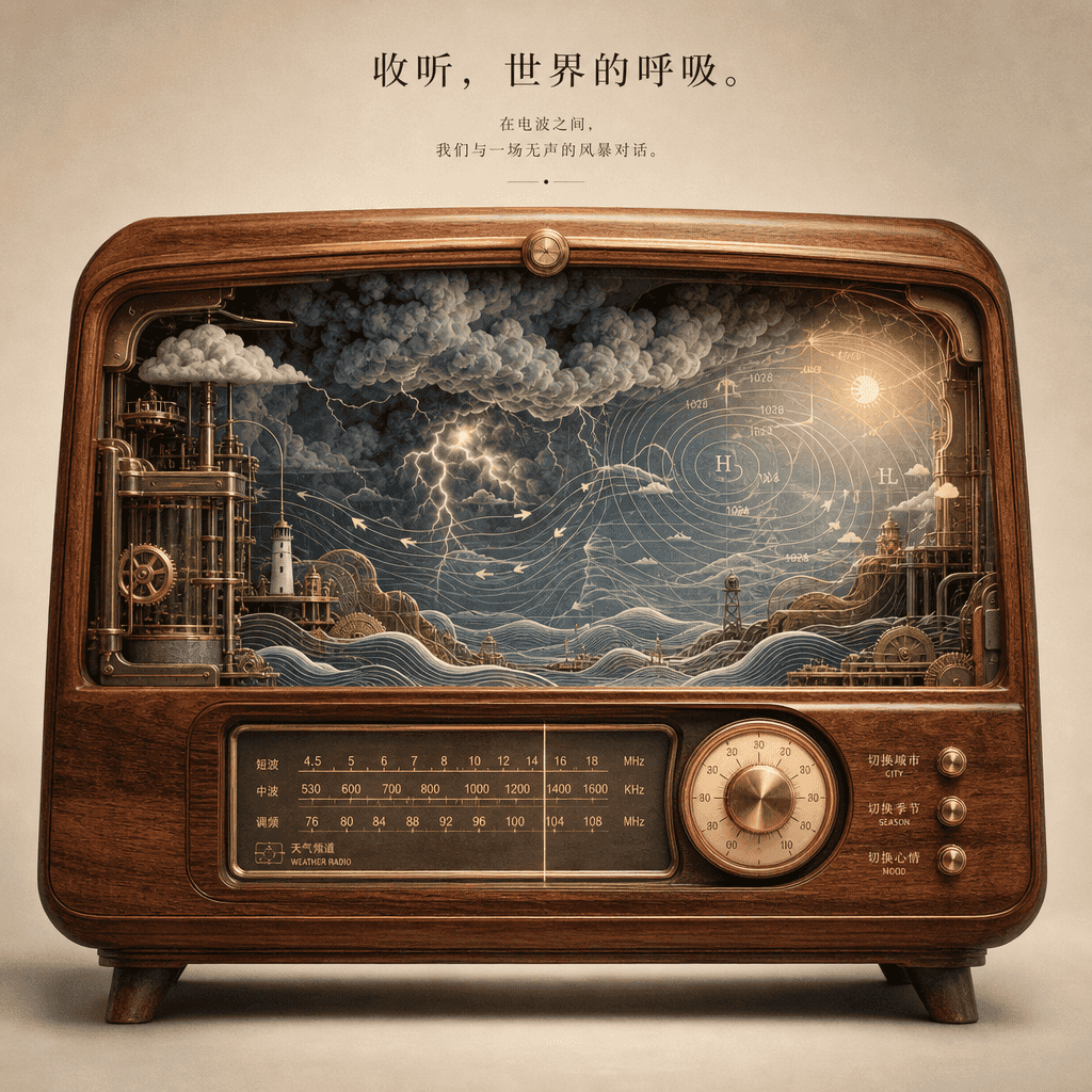
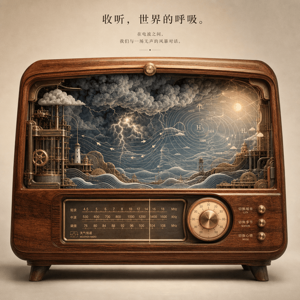
"Weather forecast universe in an old-fashioned radio", a surreal product poster. The main picture is a cross-section of a wooden radio. The inside is not a circuit but a complete miniature weather system: thunderstorm clouds, sunny wind fields, wave lines, air pressure diagrams. "Switch city/switch season/switch mood" is marked next to the knob. The title is poetic, and the whole thing looks like a mixture of a children's book cover and a high-end concept poster, with a ratio of 4:5.
Waiting experience design for future clinics

Waiting experience design for future clinics

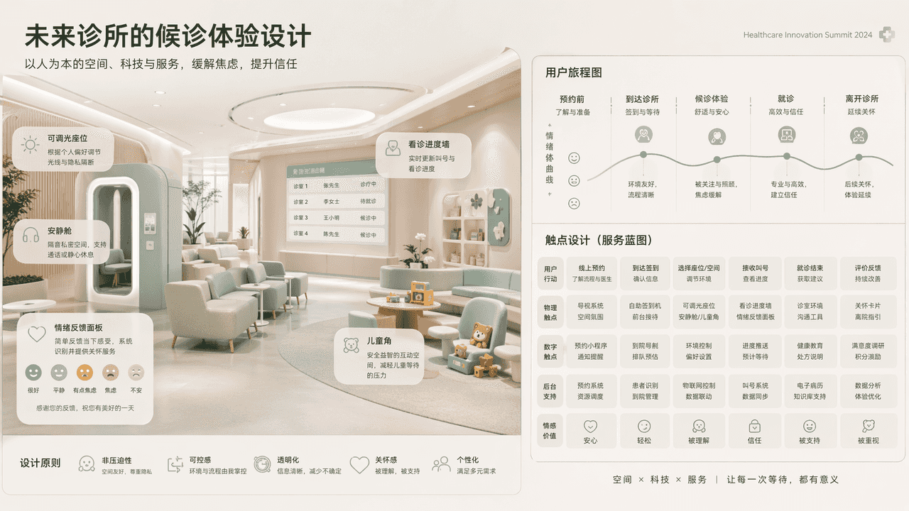
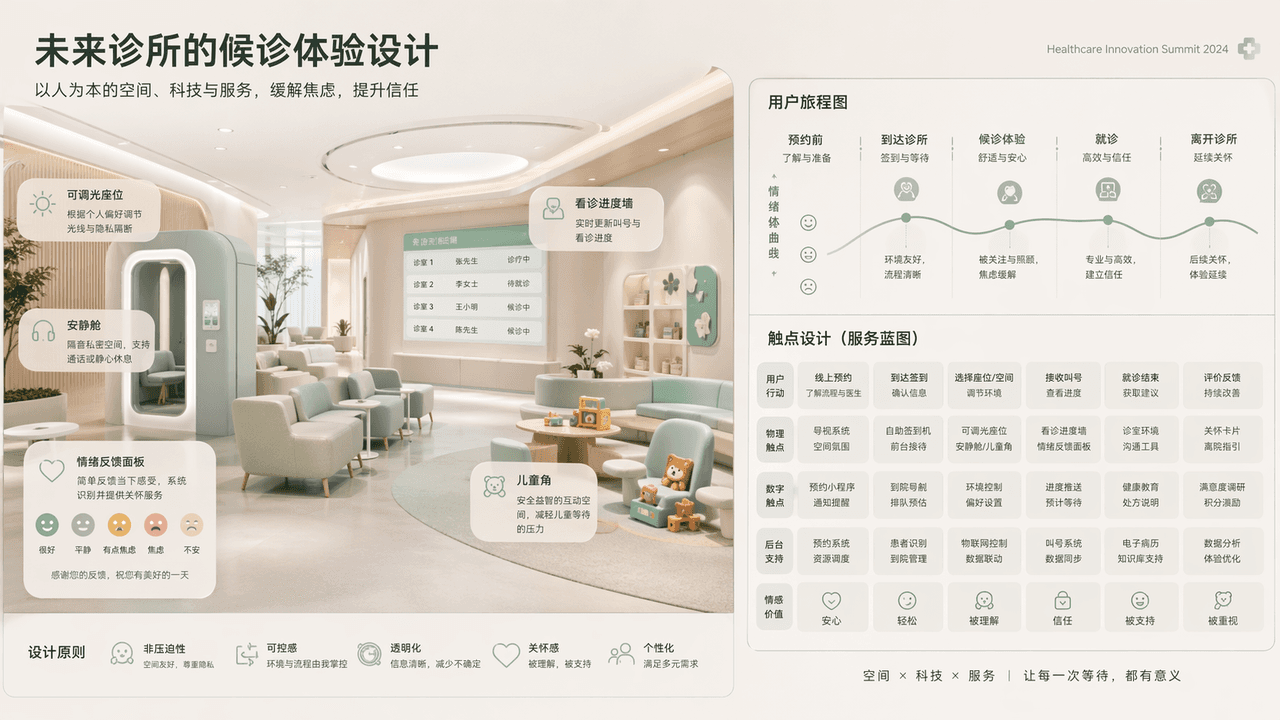
"Waiting experience design for future clinics" combines the medical space vision with the service blueprint. The main screen shows a non-oppressive future waiting area: dimmable seats, quiet cabins, children's corners, emotional feedback panels, and consultation progress walls. The user journey map and touch point design are expanded on the right side. The color scheme is low-saturated mint green, warm white and foggy gray. The overall image is like the keynote vision of the Medical Innovation Conference, with a ratio of 16:9.

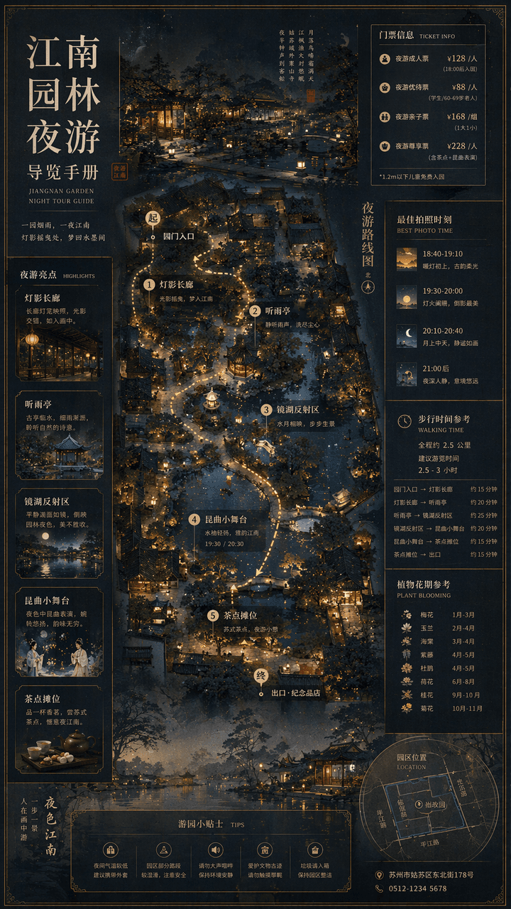
Jiangnan Garden Night Tour Guide Book

Jiangnan Garden Night Tour Guide Book

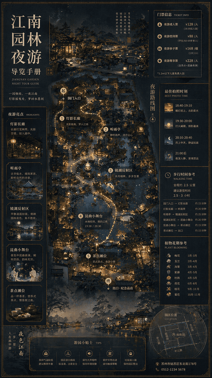
"Jiangnan Garden Night Tour Guide Manual" combines traditional landscape paintings with modern cultural tourism map systems. The main screen is an overhead view of the garden plus a partial perspective view, marking the night tour route, lantern spots, listening to the rain pavilion, mirror lake reflection area, Kunqu opera performance small stage and refreshment stalls. The sidebar includes ticket levels, best photo moments, walking time, and plant flowering periods. The font is a combination of Song Dynasty and modern fine black, and the overall elegant and precise ratio is 9:16.

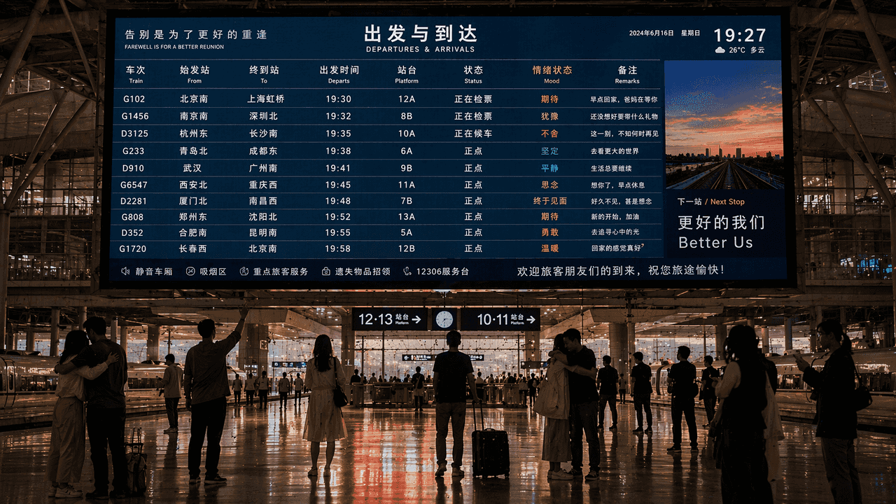
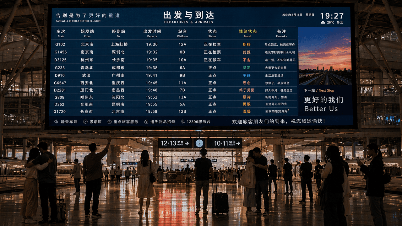
Farewell and reunion information screens in high-speed rail stations

Farewell and reunion information screens in high-speed rail stations

"Farewell and Reunion Information Screen in High-Speed ​​Railway Station" combines a public information display with emotional narrative photography. There is a huge train timetable screen in the center of the screen, but there is an additional column of 'emotional states' next to the train destination, such as "anticipation/hesitancy/reluctance/finally meeting". The silhouettes of the crowd on the platform include moments such as hugging, waving, and standing silently. The screen UI is real and usable, and the overall look is like a cross between a news photography and a poetic poster, with a ratio of 16:9.

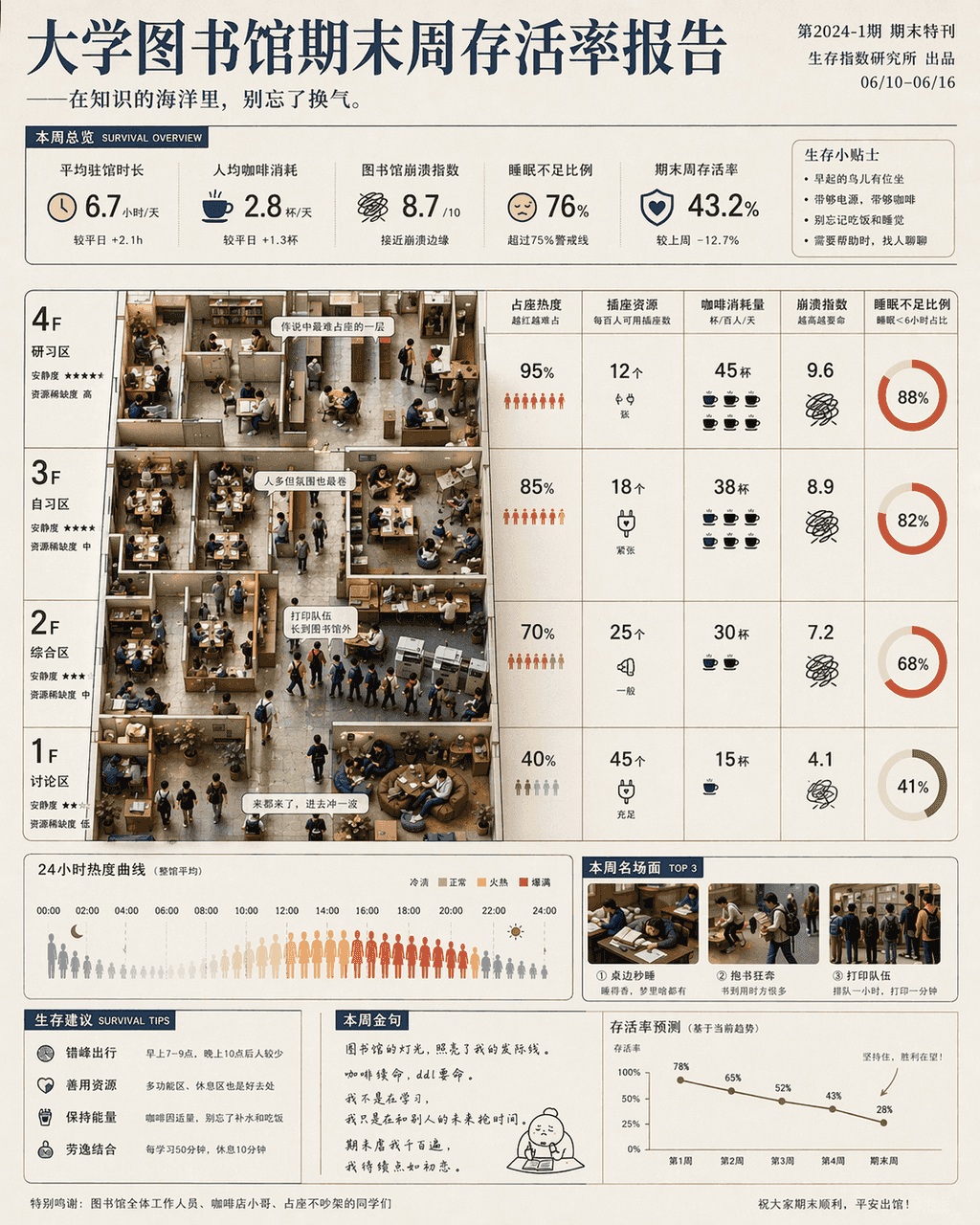
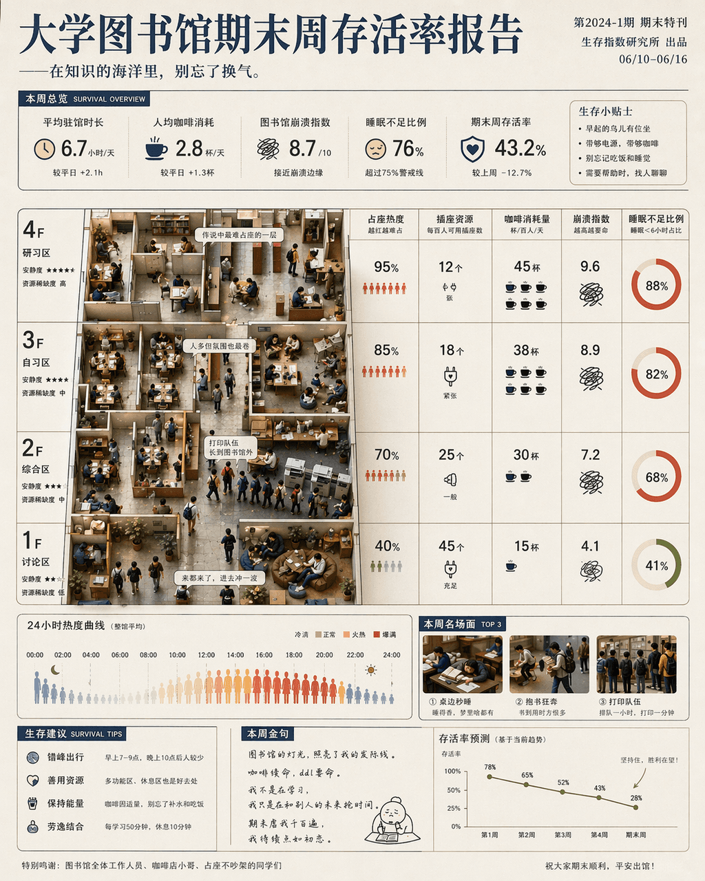
University Libraries Final Week Survival Rate Report

University Libraries Final Week Survival Rate Report

"University Library Final Week Survival Rate Report" is a fusion of humorous data posters and campus life photography. The main screen is based on the library floor plan, with seat occupation heat, socket resources, coffee consumption, crash index and sleep deprivation ratio marked by floor and time. Miniature scenes of students are partially embedded: running with books, falling asleep at the table, and the printing queue is too long. The title is serious, and the subtitle is slightly teasing, with a ratio of 4:5.
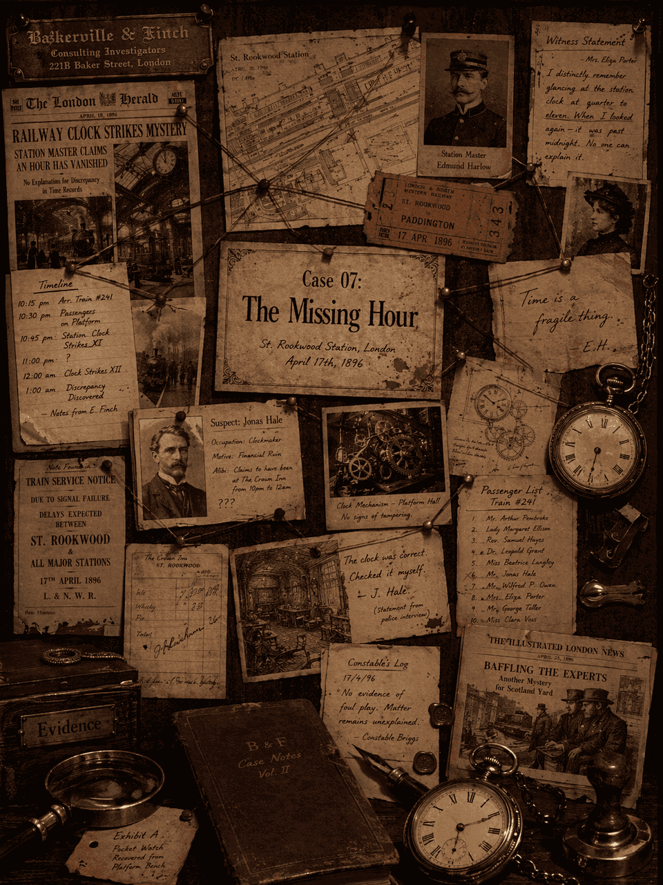
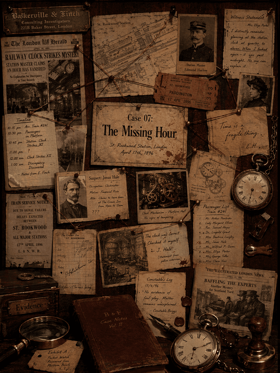
Victorian detective agency case board

Victorian detective agency case board

"Victorian Era Detective Agency Case Board" combines criminal reasoning visuals with archive wall design. The main screen is a case wall covered with stitch connections, old photos, maps, tickets, newspaper clippings and handwritten notes. The central title card reads "Case 07: The Missing Hour". There is a pocket watch, magnifying glass and seal in the lower right corner. The color is dark brown, burgundy, and coal black. The details are rich enough to be read one by one, like a film and television art concept map, with a ratio of 3:4.

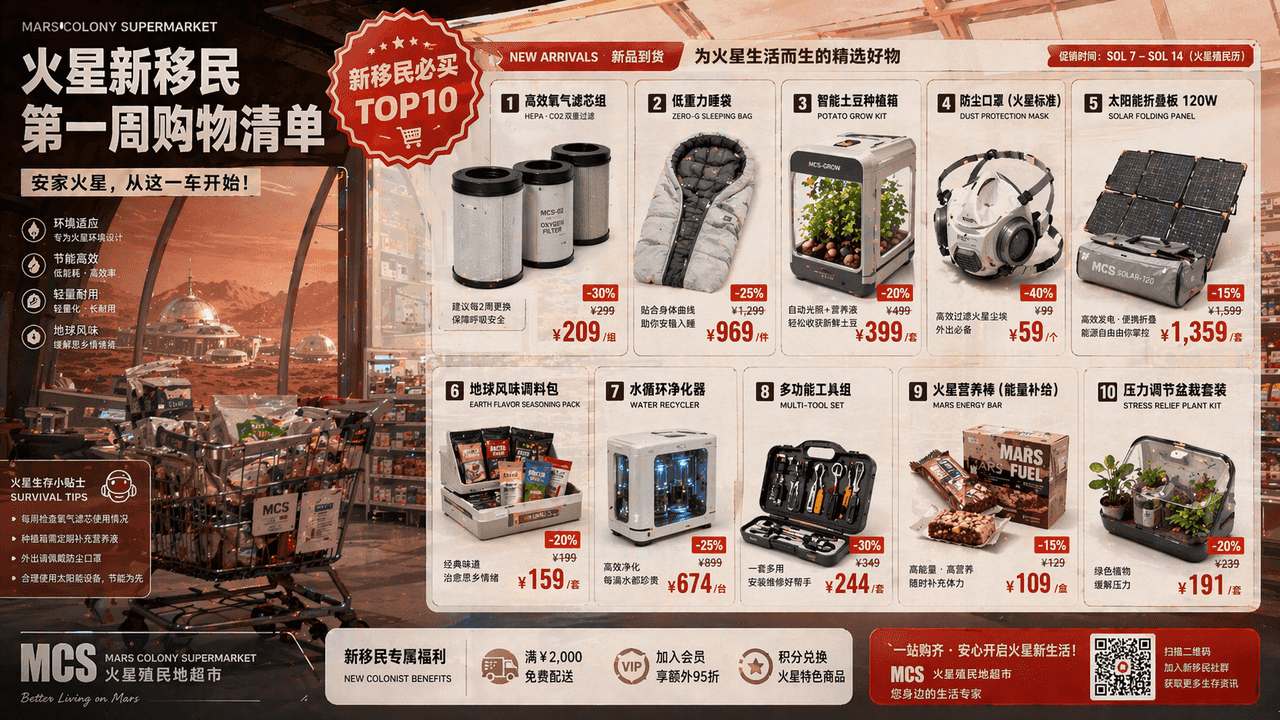
Shopping list for first week of colonization of Mars

Shopping list for first week of colonization of Mars

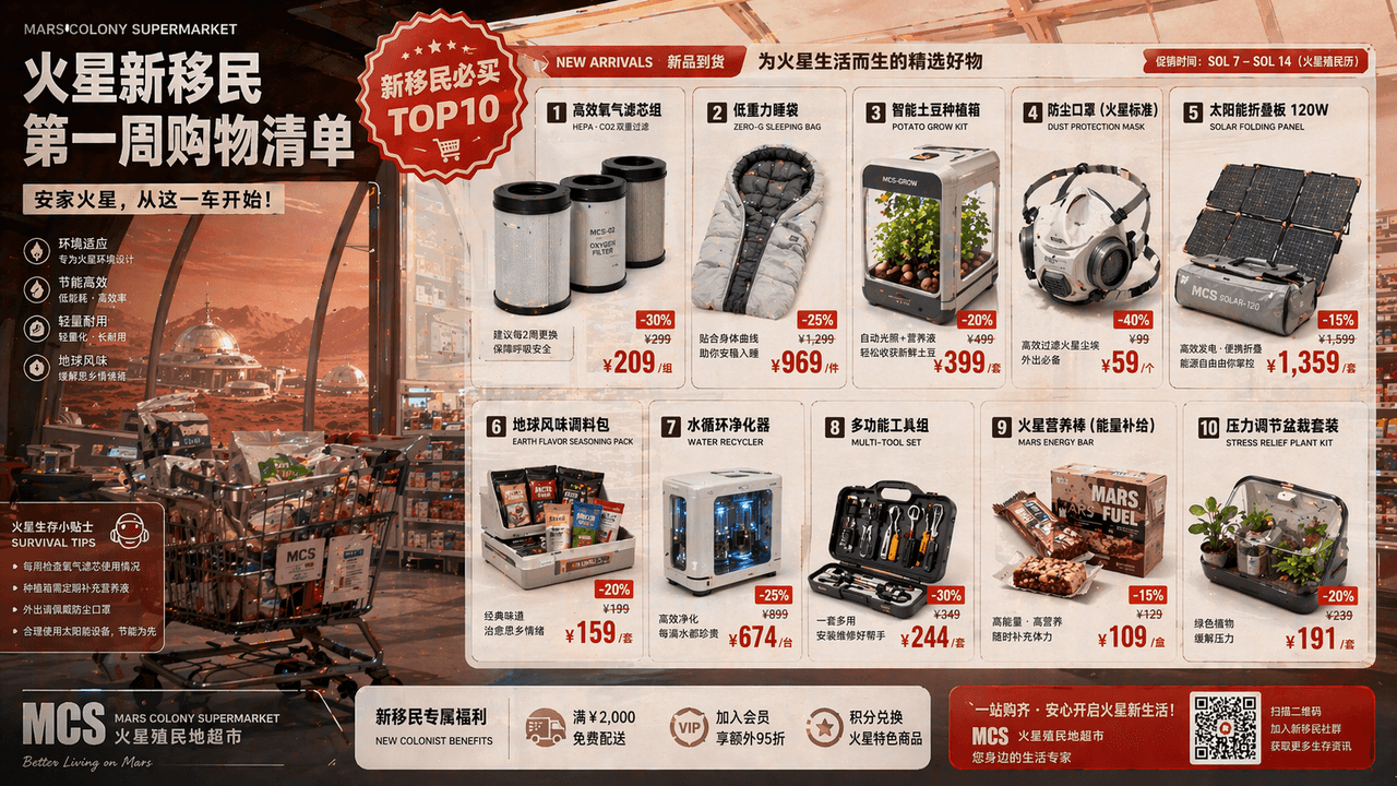
"First Week Shopping List for New Immigrants from Mars", a supermarket promotion page is combined with a colonial worldview setting. The main screen looks like a DM promotional page for a large warehouse store, which lists oxygen filters, low-gravity sleeping bags, potato planting boxes, dust masks, solar folding panels, and earth-flavored seasoning bags. It is equipped with exaggerated discount labels and "Top 10 Must-Buy for New Immigrants" badges. The background is the red sand and dust of the Martian residential area shining through the glass dome, with a ratio of 16:9.

Showa-style home appliance manual: an electric fan that can accompany people in a daze

Showa-style home appliance manual: an electric fan that can accompany people in a daze

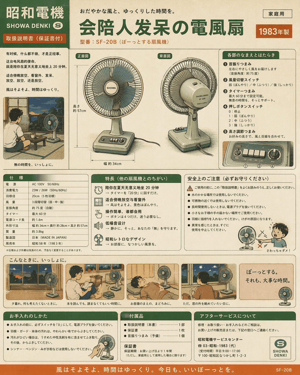
"Showa-style home appliance manual: an electric fan that can accompany people in a daze", the product manual is humorously integrated with life narratives, the picture is like the color page manual of home appliances in the 1980s, the front and back views of the host, button functions, power parameters, and usage scenario comics are all complete, but the selling point is "to accompany you to sit for 20 minutes in the summer meaninglessly" and "suitable for relaxing and looking out the window in the evening." The colors are nostalgic cream green, off-white, and orange, with a ratio of 4:5.
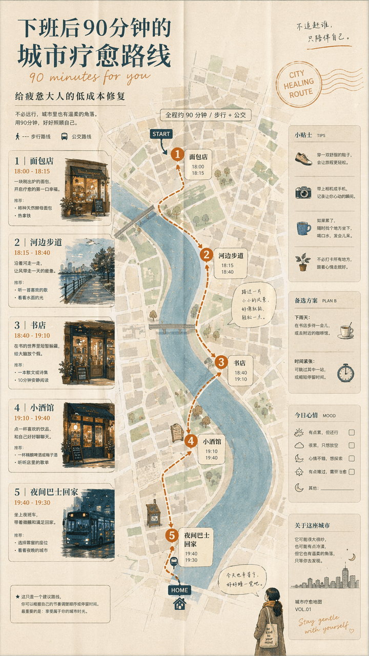
90-minute urban therapy trail after get off work

90-minute urban therapy trail after get off work

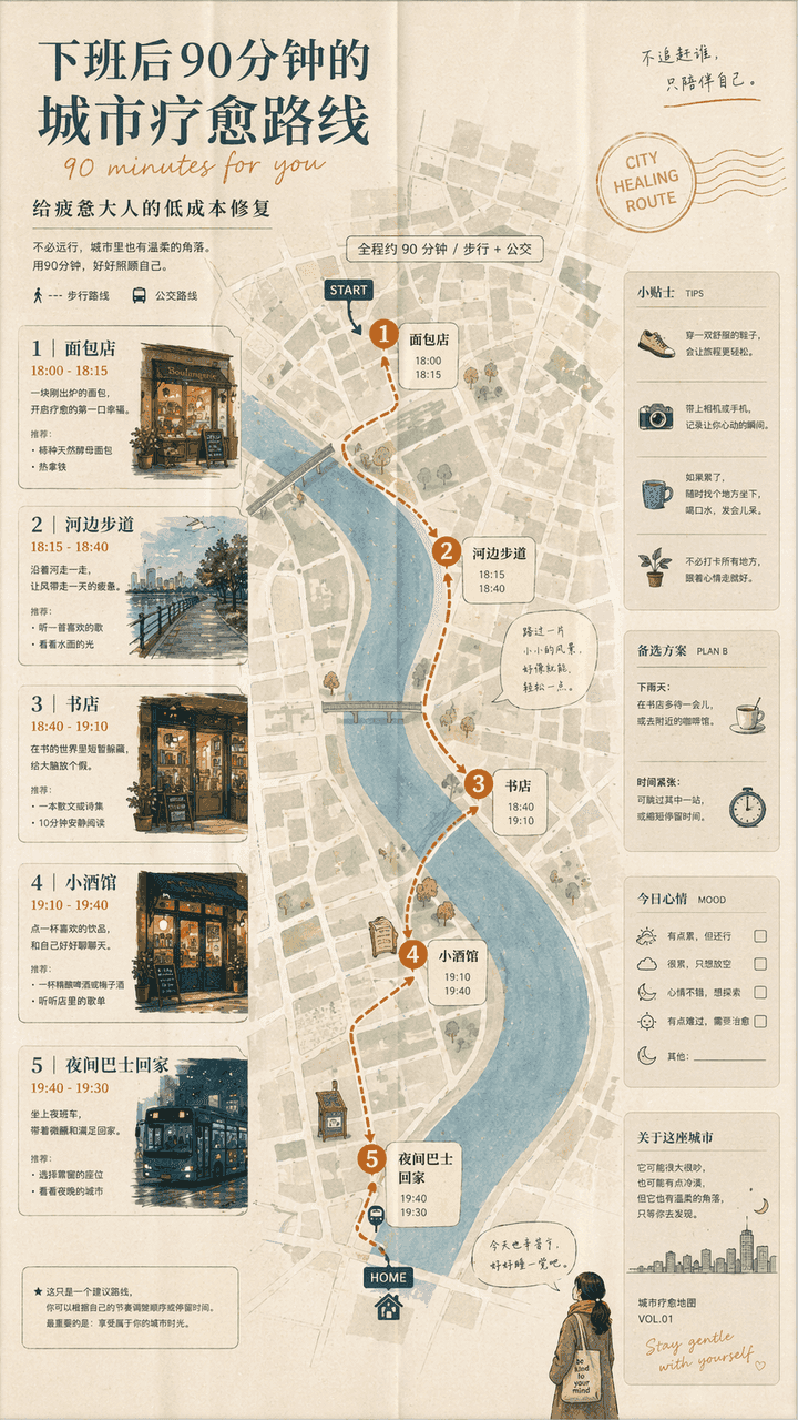
"A 90-minute urban healing route after get off work" is a combination of a lifestyle map and a guidebook. The screen unfolds like a foldable city map: the first stop is a bakery, the second stop is a riverside walk, the third stop is a bookstore, the fourth stop is a bistro, and the fifth stop is a night bus home. The route is marked with small illustrations and time suggestions. The title is gentle, and the subtitle reads "Low-cost fix for tired adults". The whole thing looks like an independent city guide magazine, with a ratio of 9:16.

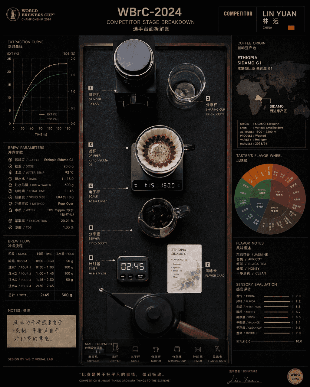
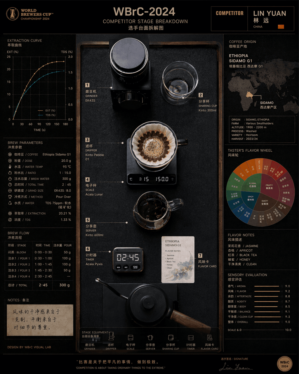
Disassembly diagram of the countertop of the hand-brewed coffee world competition contestant

Disassembly diagram of the countertop of the hand-brewed coffee world competition contestant

"Disassembly of countertops of contestants at the Hand-brew Coffee World Championship" combines product process photography with competitive sports visuals. In the center is an overhead shot of the competition platform, with grinders, filter cups, electronic scales, sharing pots, timers, and flavor cards accurately positioned. On the left are the extraction curves and brewing parameters, and on the right are bean source maps and flavor wheels. The title on the top has event numbers and player names. The overall look is like a fusion of a high-end food industry atlas and a sports event visual system, with a ratio of 4:5.
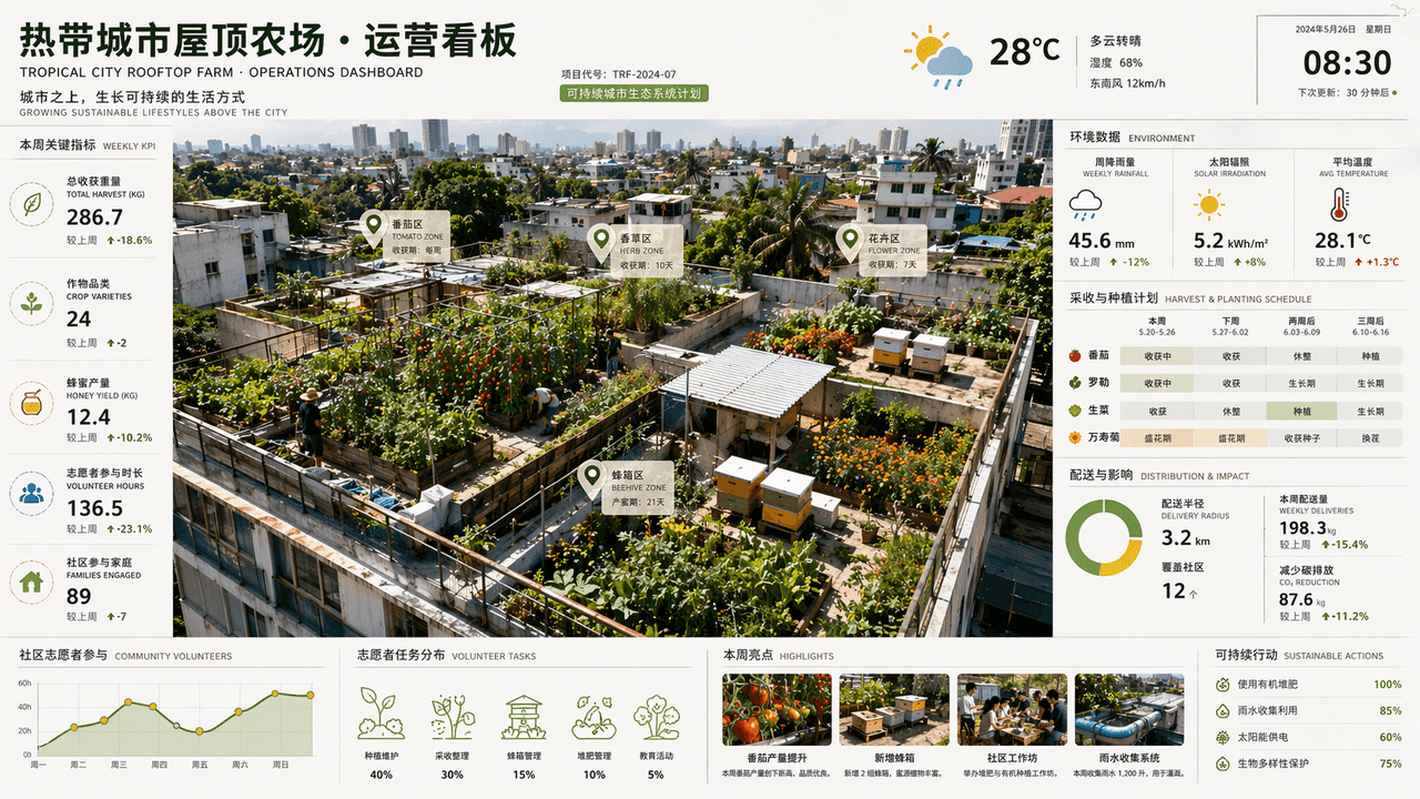
Tropical city rooftop farm operation signage

Tropical city rooftop farm operation signage

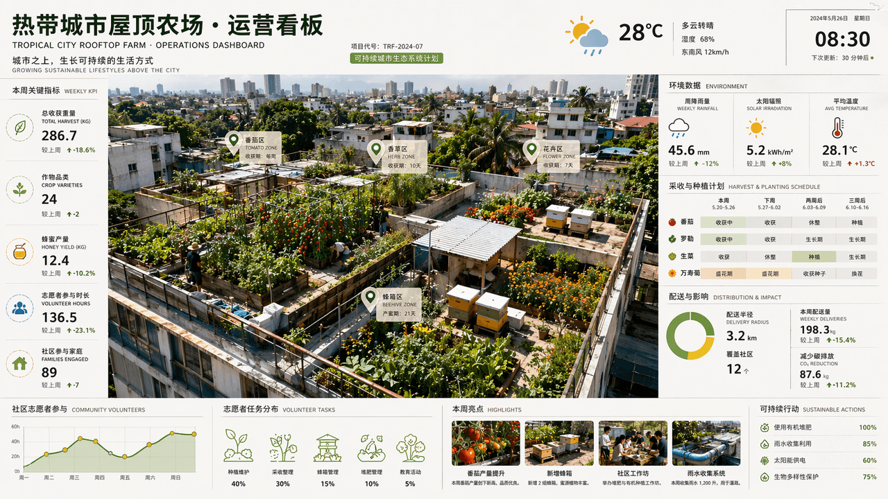
"Tropical City Rooftop Farm Operations Dashboard" is a fusion of space photography and commercial dashboard. Tomatoes, herbs, flowers and beehives are planted on different roofs in the overhead view. The side of the screen displays weekly rainfall, solar irradiation, harvesting cycle, distribution radius and community volunteer participation data. The title is like an architectural firm's sustainable project report page. The color scheme is leaf green, earthy brown, sun yellow and after-rain blue. It is rich in information but the picture is refreshing, with a ratio of 16:9.

Emotional first aid kit for contemporary people

Emotional first aid kit for contemporary people

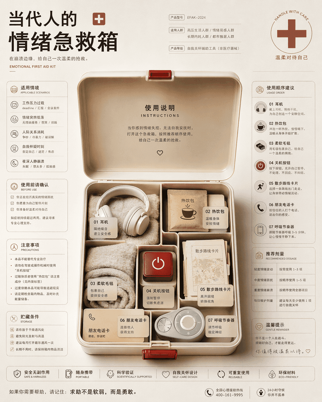
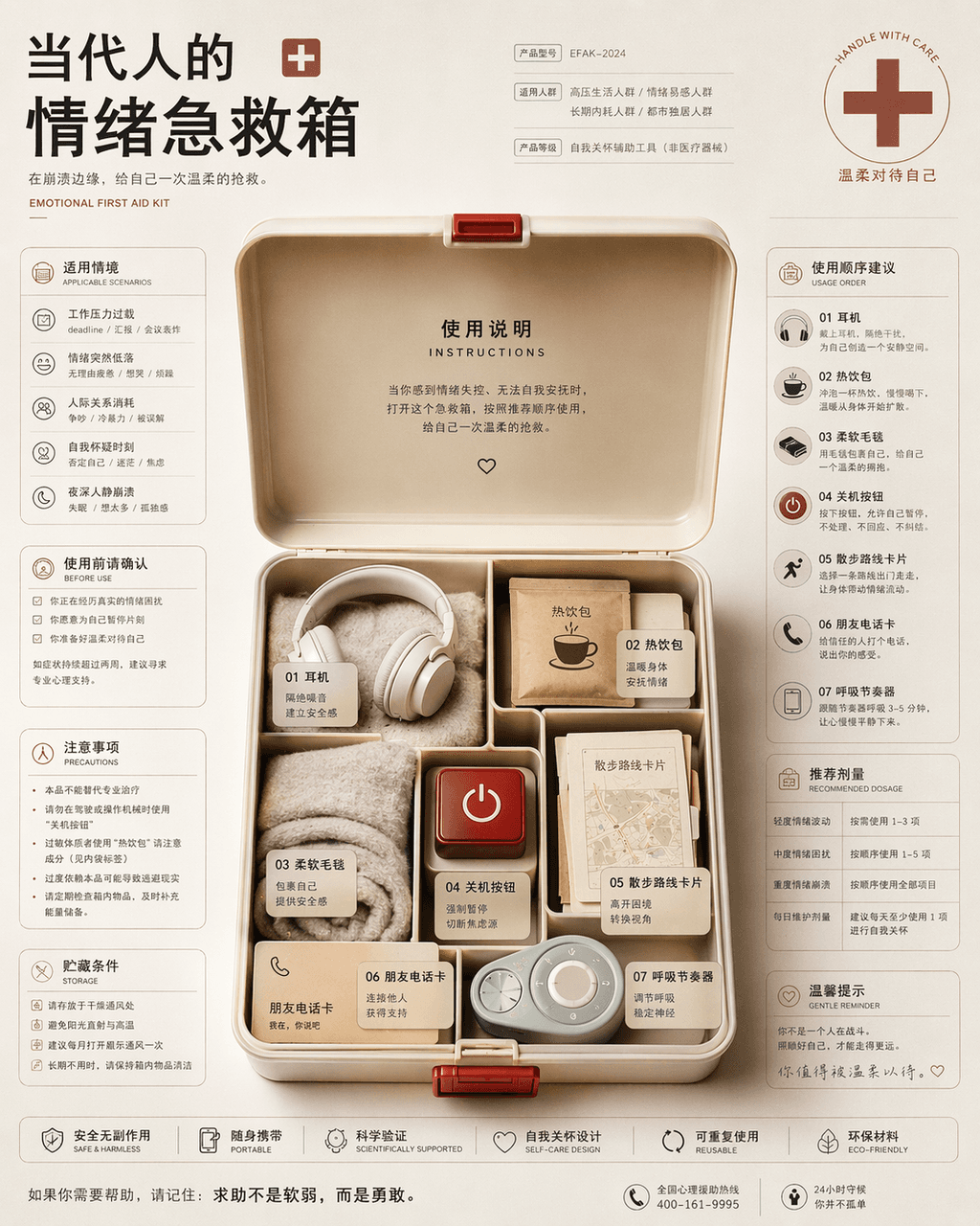
"Contemporary People's Emotional First Aid Kit Instruction Page", the packaging design is integrated with health information graphics. In the center of the picture is an open first aid kit, which is not medicine but headphones, hot drink packs, soft blankets, power off buttons, walking route cards, friend phone cards, and breathing pacemakers. The left and right sides are typed like drug instructions, with detailed descriptions of applicable situations, order of use, precautions and recommended dosages. The style is rational and restrained but the bottom layer is very gentle, with a ratio of 4:5.
The Medieval Alchemist's Desktop Operating System

The Medieval Alchemist's Desktop Operating System

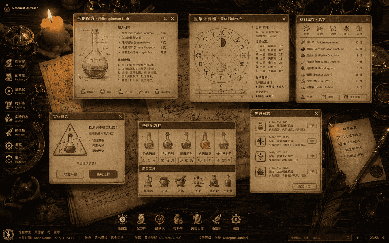
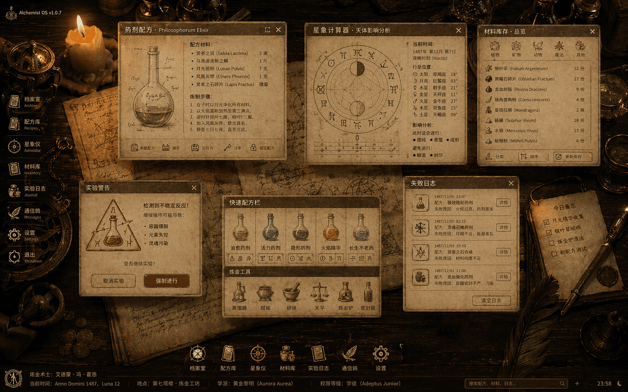
"The Medieval Alchemist's Desktop Operating System" is a fusion of ancient book illustrations and desktop UI. The picture is an overhead shot of a wooden table, with translucent system windows floating on the table: potion formulas, astrology calculators, material inventories, experiment warning pop-ups, and failure logs. The icons are all reconstructed from quills, glass bottles, and semiotic emblems. The background is parchment and copper instruments illuminated by candles. The whole thing looks like a complete set of ancient magic OS visual specifications, with a ratio of 16:10.

Midnight Bakery's Last Bake

Midnight Bakery's Last Bake

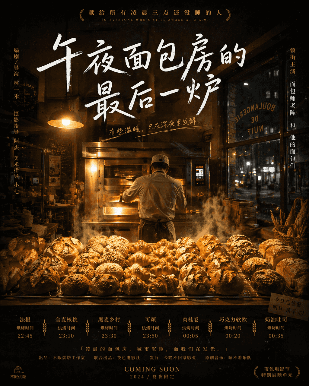
"The Last Oven in the Midnight Bakery" is a fusion of movie poster and food photography narrative. In the center is a row of freshly baked bread steaming under the warm yellow light. The baker's back is standing in front of the oven. The city outside the window has become quiet. The title has a strong handwriting feel. The subtitle area reads "Dedicated to all those who are still awake at three in the morning" like an independent movie poster. The types of bread and baking time are listed in small letters at the bottom, with a ratio of 4:5.
2040 Children’s Room Safety Interactive System

2040 Children’s Room Safety Interactive System

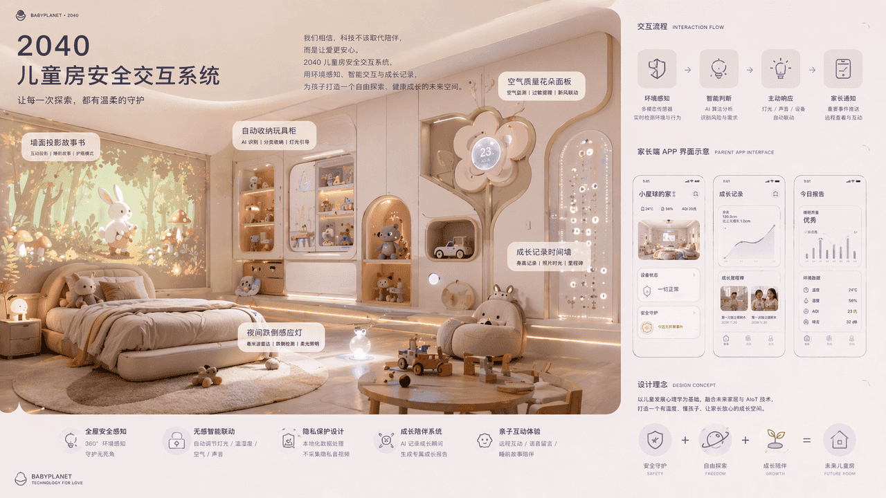
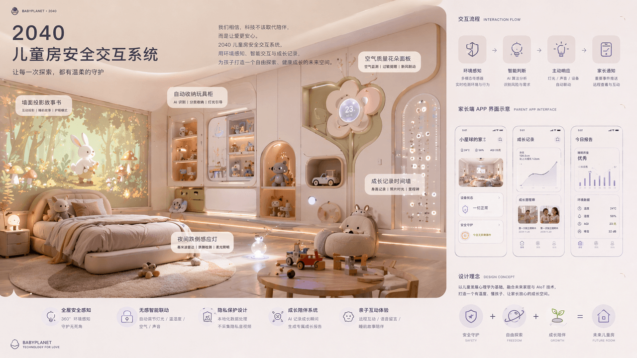
"2040 Children's Room Safety Interaction System" combines product concept drawings with parent-child lifestyle posters. The main screen shows the space perspective of the future children's room: wall projection storybook, automatically stored toy cabinet, night fall sensor light, air quality flower panel, growth record time wall. On the right side is the interaction process and parent app interface diagram. The color is gentle, the material is rounded and soft-packed, and the layout is like a maternal and child technology brand new product launch conference, with a ratio of 16:9.

Summer convenience store freezer chromatography

Summer convenience store freezer chromatography

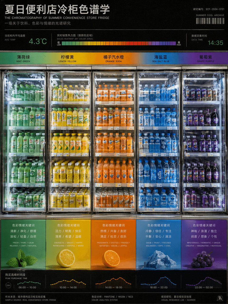
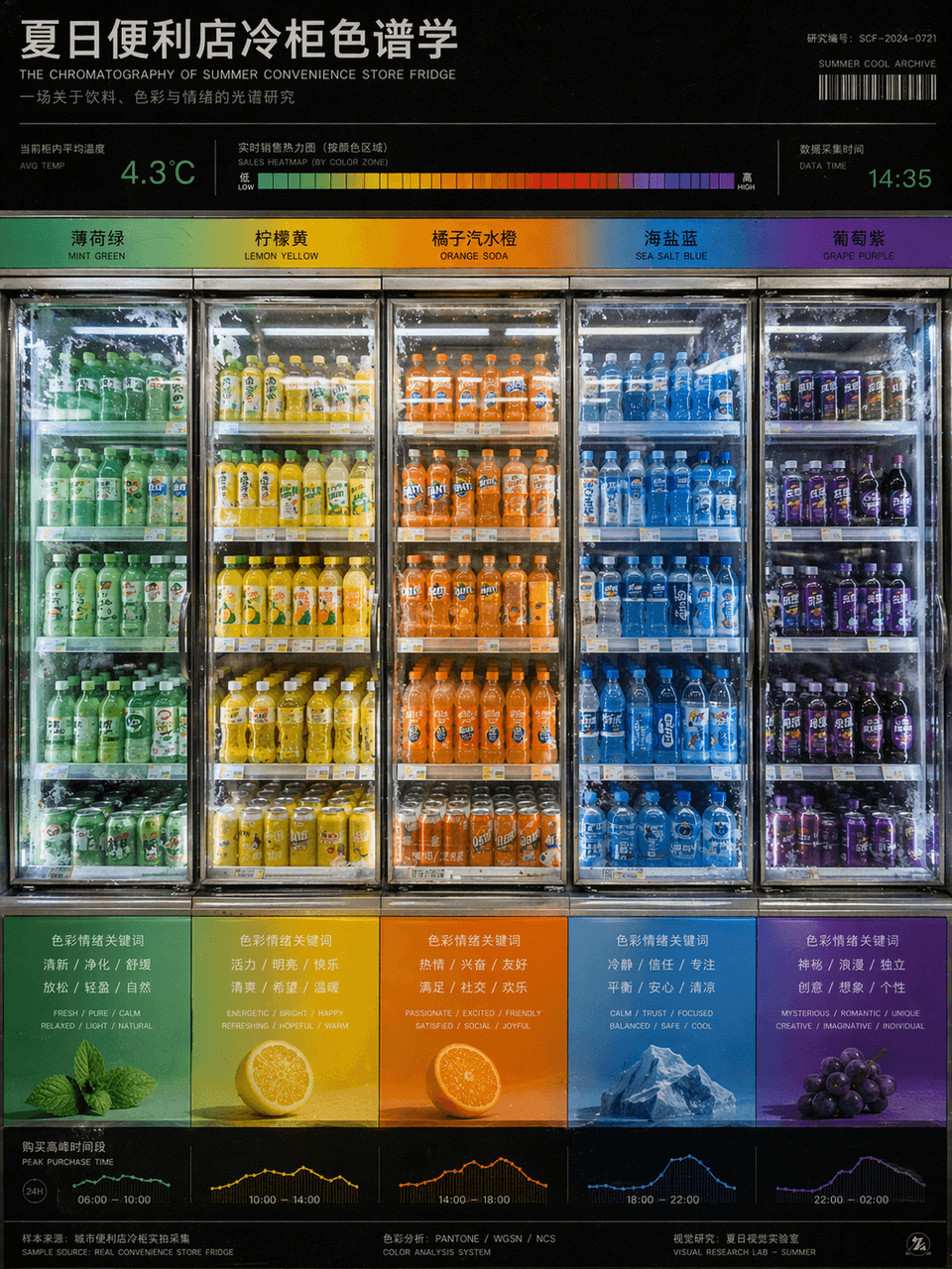
"Summer Convenience Store Refrigerator Chromatography" is a fusion of product photography and color research charts. The refrigerators are arranged from left to right according to the gradient of beverage packaging colors, from mint green to lemon yellow, orange soda orange, sea salt blue, and grape purple. There are temperature readings and sales heat bars on the top, and the bottom corresponds to the emotional keywords and purchase time periods brought by each color. The picture looks like a design school color course poster, but the content comes from a real convenience store scene. The frosting details of the glass door and the reflection of fluorescent lights are very realistic, with a ratio of 3:4.

A man completes a space voyage in a rental house

A man completes a space voyage in a rental house

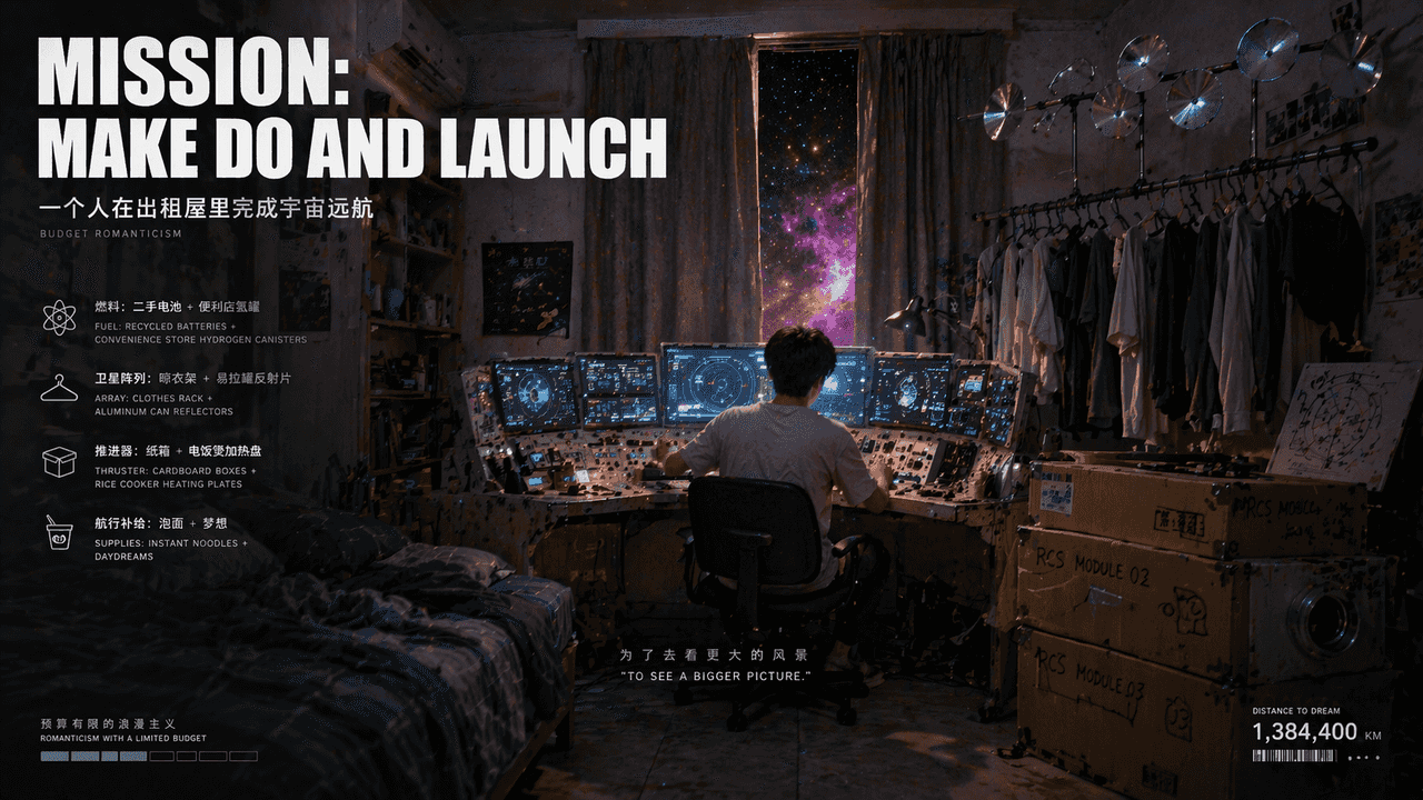
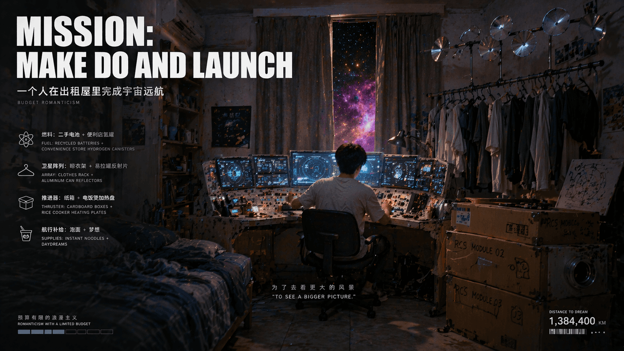
"A man completes a cosmic voyage in a rental house" is a fusion of surreal indoor photography and science fiction concept posters. The main body of the picture is an ordinary small rental house, but the desk extends into a spaceship console, the clothes drying rack looks like a satellite array, and there are nebulae outside the gaps in the curtains. The cardboard boxes stacked beside the bed are transformed into thruster modules. The title reads "MISSION: MAKE DO AND LAUNCH", and the subtitle describes "romanticism on a limited budget" in very small characters. The overall image is gentle, lonely and hopeful, with a ratio of 16:9.

Real-time hot search list of the Republic of China Newspaper

Real-time hot search list of the Republic of China Newspaper

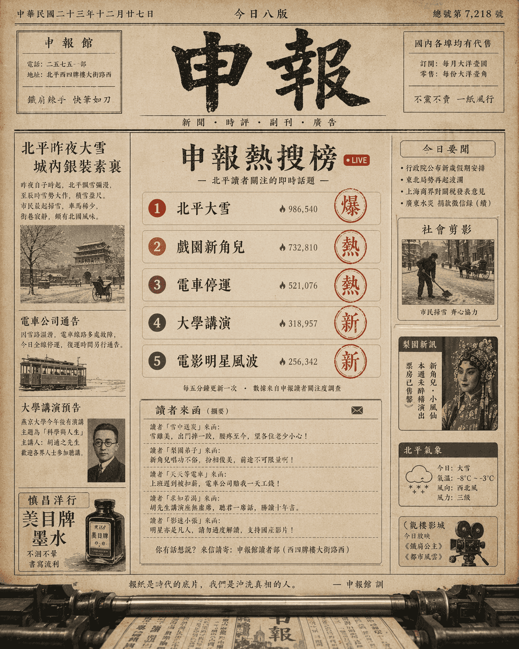
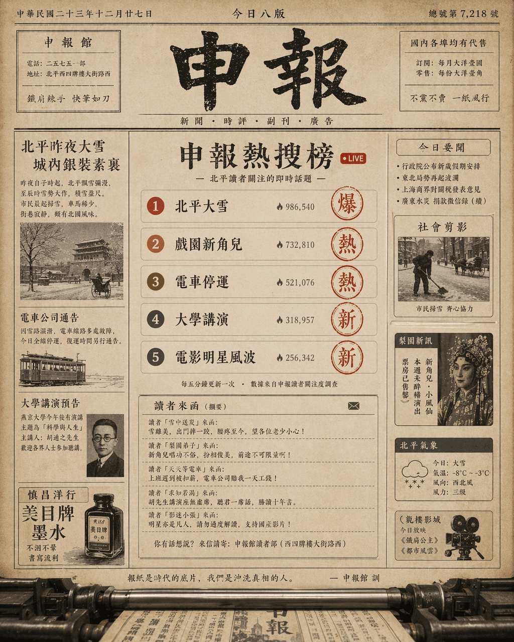
"Real-time Hot Search List of the Republic of China Newspaper Office" combines the old newspaper layout with the social media hot list interface. The image looks like a printing front page of a newspaper, but in the middle is a scrolling hot search list. The entries are "Heavy Snow in Peking", "New Corner in the Theater" and "Tram Stop" Fortune", "University Lecture" and "Movie Star Controversy". The red seal on the right side of the entry indicates the popularity. The comment area appears in the form of short sentences from readers. The format mixes typesetting, old paper texture and modern digital list logic. The temperament is smart and humorous, and the proportion 4:5.

A rainy day sound sample cover of a city

A rainy day sound sample cover of a city

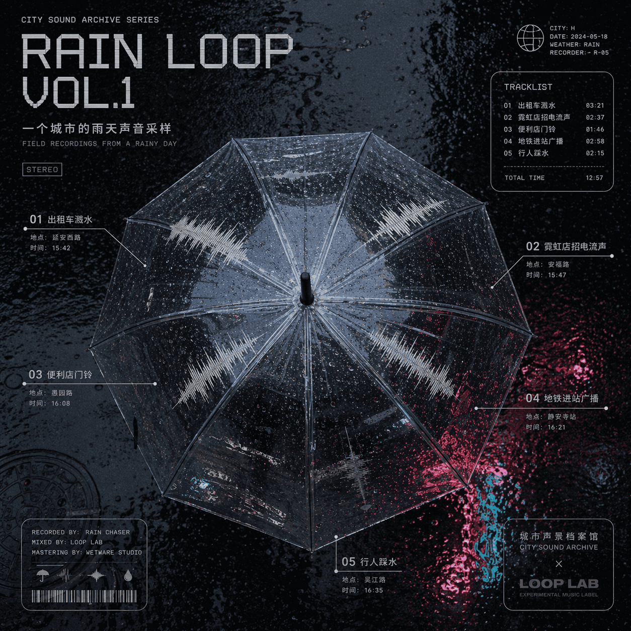
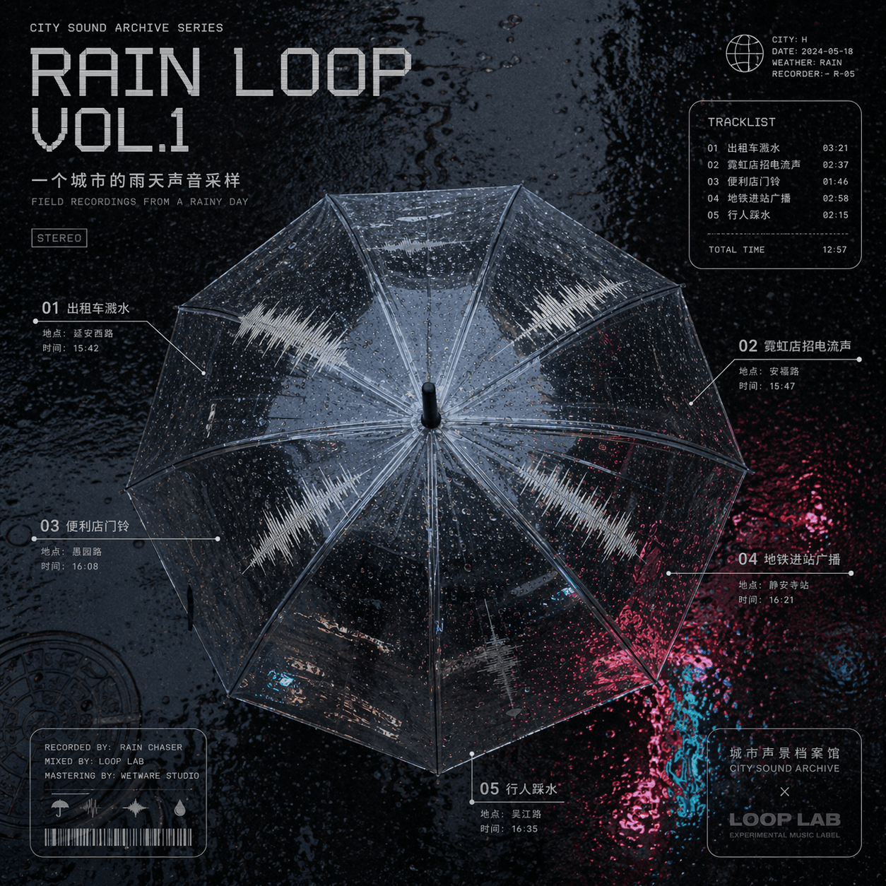
"A rainy day sound sample cover of a city" is a combination of music album cover and urban soundscape archives. The center is a top view of a transparent umbrella. Different sound track waveforms are distributed on the umbrella surface: taxi splashing water, neon shop signs, convenience store doorbells, subway arrival announcements, pedestrians treading water, and the sampling location and time are annotated in small characters around it, with the title "RAIN LOOP" VOL.1" uses a cold electronic font, and the background is the highly reflective texture of wet asphalt road. The overall design looks like a joint design between an experimental music album and the Sound Map Archive, with a ratio of 1:1.

Kitchen SOP diagram at Antarctic research station

Kitchen SOP diagram at Antarctic research station

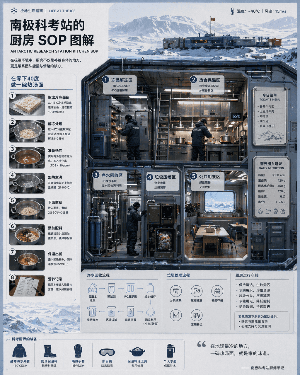
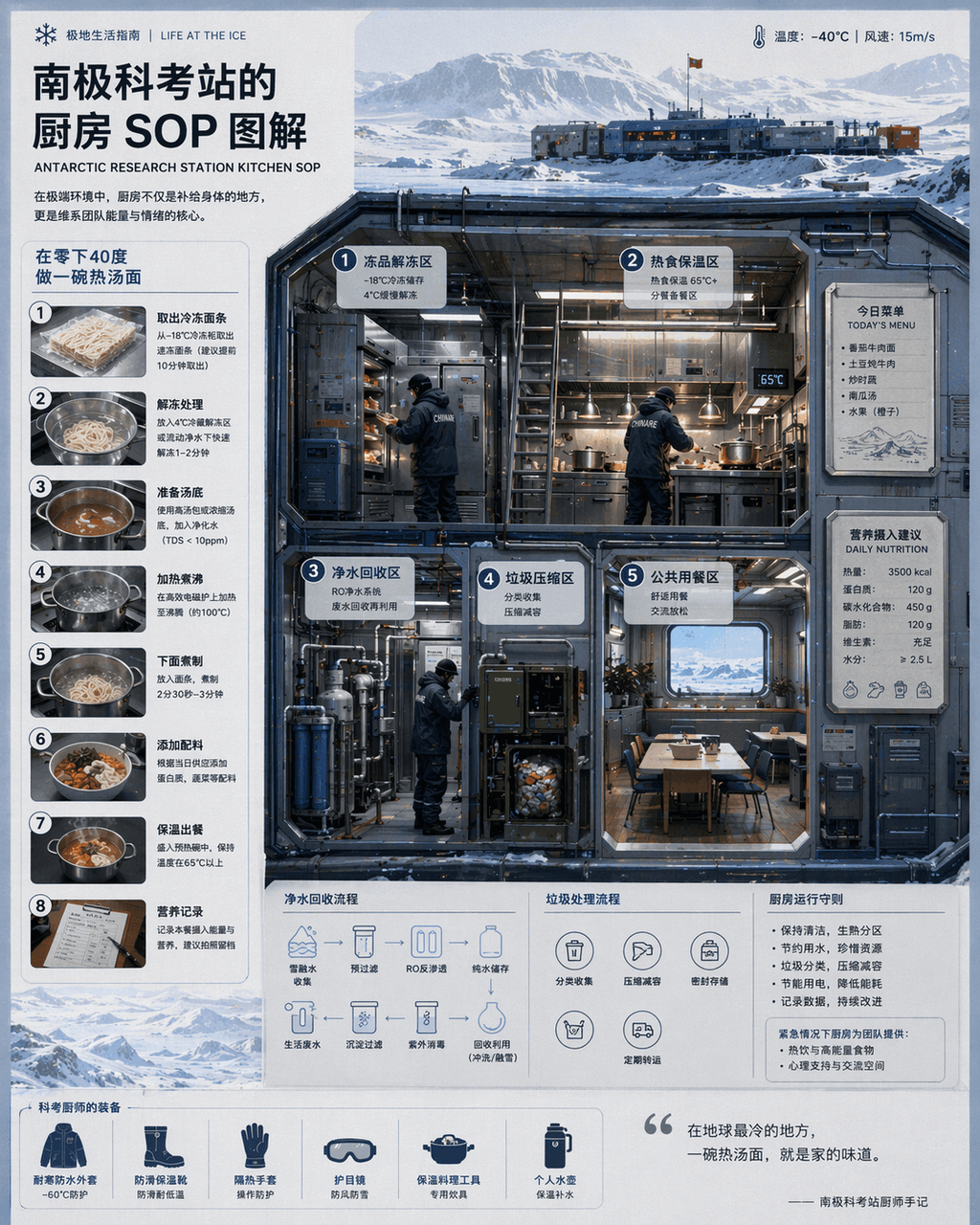
“Kitchen SOP at Antarctic Research Station "Illustration" combines scientific illustrations with catering flow charts. The main screen is a cross-section of a cold-resistant kitchen, with partitions indicating thawing of frozen products, hot food insulation, purified water recycling, garbage compression, and public dining areas. The chef wears a heavy scientific examination uniform. There is a magnetically attached today's menu and nutritional intake recommendations on the wall. A numbered step-by-step diagram on the left explains "making a bowl of hot noodle soup at minus 40 degrees." The visual style is clean and professional, and the information density is high, like a National Geographic special issue insert, with a ratio of 4:5.
Ancient Egyptian stock trading terminal

Ancient Egyptian stock trading terminal

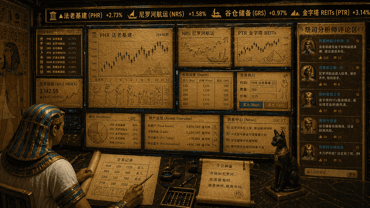
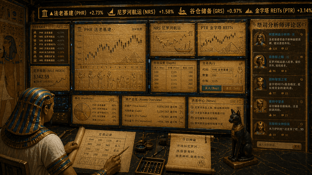
"The stock trading terminal of the ancient Egyptians", an absurd fusion of temple mural elements and financial trading UI. The screen looks like a multi-screen trading workstation, but all charts, K-lines and stock symbols are engraved on the golden slate and papyrus interface. The top ticker scrolls "Pharaonic infrastructure, Nile shipping, granary reserves, pyramids REITs", the trader is the image of a clerk wearing a headdress, and the priest analyst comment area is displayed on the right side. The overall color scheme is gold sand, peacock blue, and obsidian. The style is serious but has a contrasting sense of joy, with a ratio of 16:9.

A night navigation system designed for insomniacs

A night navigation system designed for insomniacs

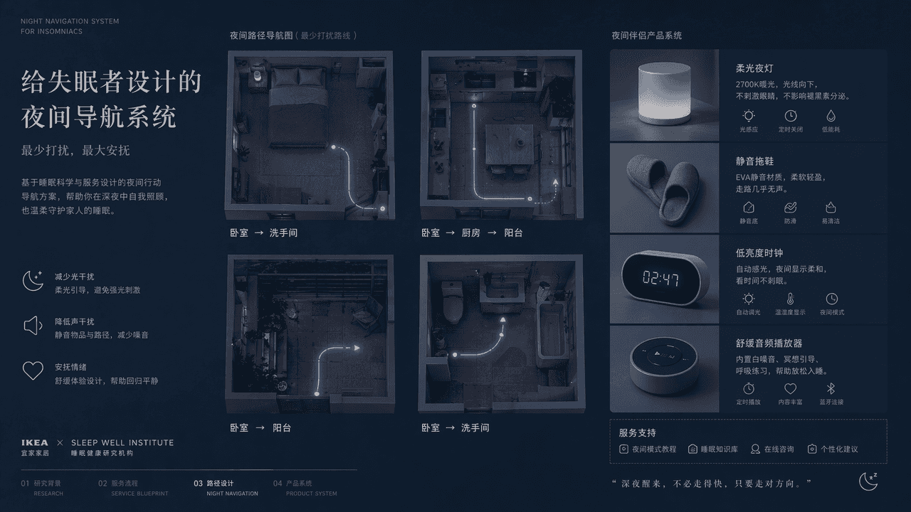
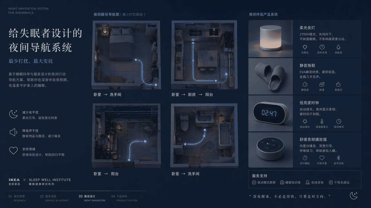
"A night navigation system designed for insomniacs", the service design plan display page, the main screen is an overhead view of the four night paths of the bedroom, kitchen, balcony, and bathroom, with extremely thin luminous lines marking the route that least disturbs the family. Next to it is the design of supporting objects such as soft night lights, silent slippers, low-brightness clocks, soothing audio players, etc. The title is restrained and gentle, and the color is indigo, gray blue, and milk white. The overall picture is like a joint proposal from IKEA + a medical sleep research institution, with both functional rationality and emotional comfort. The proportions 16:9.

A rock band's disbandment announcement poster

A rock band's disbandment announcement poster

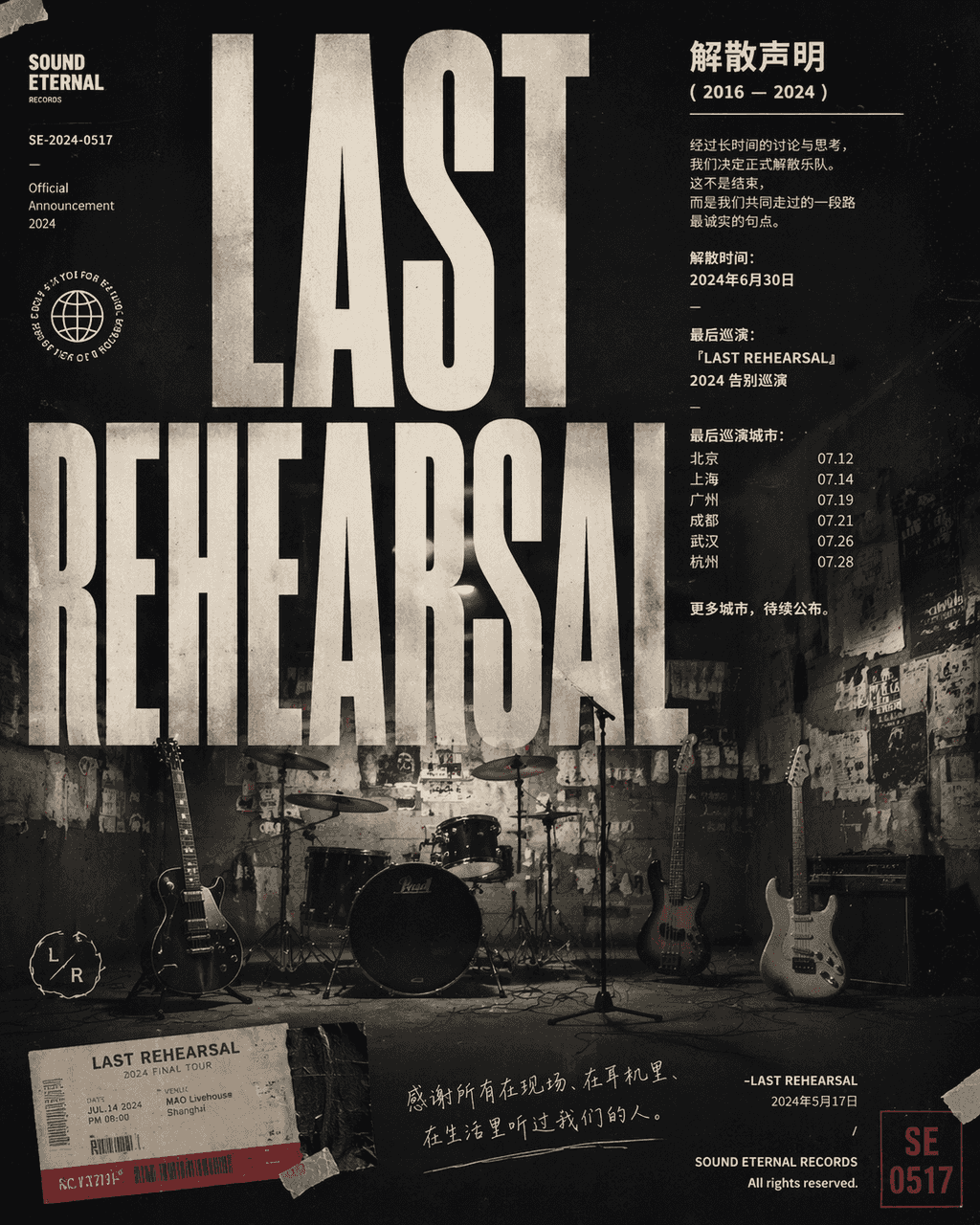
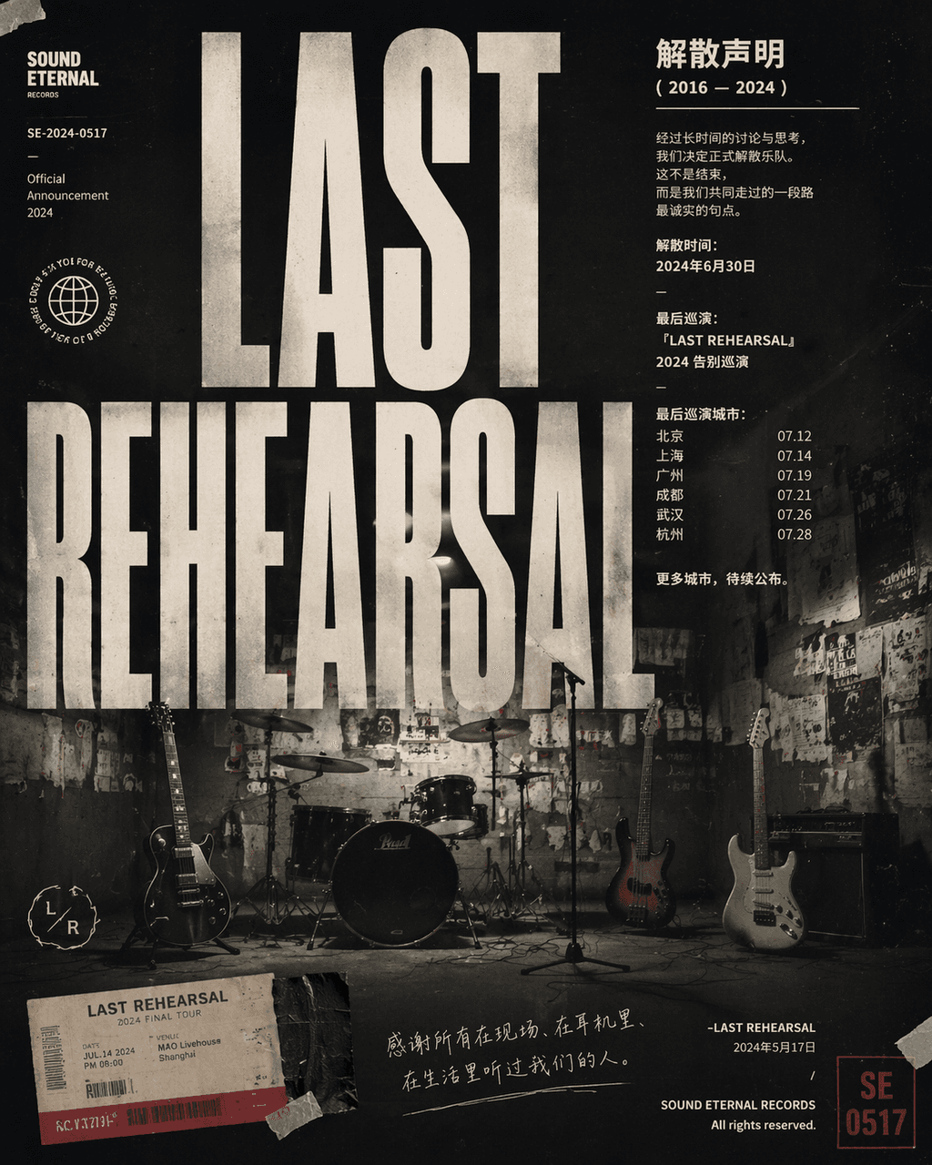
"Poster announcing the dissolution of a rock band", a combination of emotional photography and typography poster design. In the center are four unused musical instruments lying in an empty practice room. The wall is covered with old performance posters and torn tape, with the title "LAST" "REHEARSAL" uses a huge compressed sans serif to cover the screen. The main text area is like a formal statement with the disbandment time, final tour city and a restrained farewell. In the corner, a seal number, ticket stub, and handwritten notes are added. The overall image is like a crossover between a music label's visual system and a documentary photography magazine, with a ratio of 4:5.
Showa style family photo album interface design

Showa style family photo album interface design

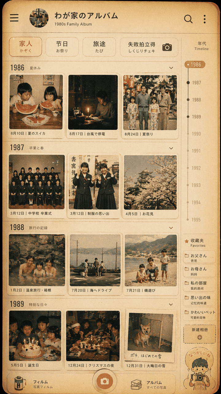
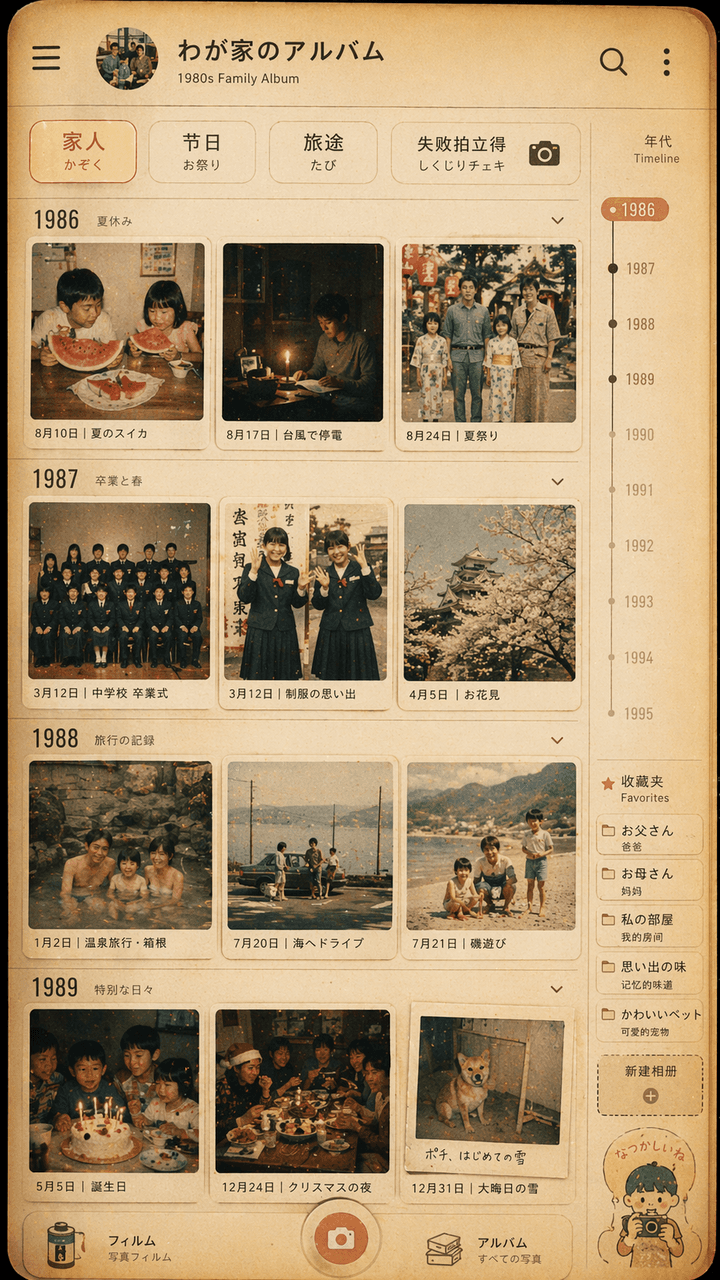
"Showa style family photo album interface design", the retro photo wall is integrated with the modern photo album App UI. The screen simulates the timeline page of a photo management application, but each thumbnail is from the 1980s. Daily life of a Japanese family in the 1970s: summer watermelon, typhoon power outage, school uniform graduation photo, hot spring trip, Christmas dinner table. The top filter reads "Family/Festival/Travel/Failure Polaroid". There is a year scale and favorites label on the right side. The overall color is film-like, warm yellow and slightly faded. The picture is both like a real mobile phone interface and a gentle display of family memories. The ratio is 9:16.

Community convenience store night shift records on the moon

Community convenience store night shift records on the moon

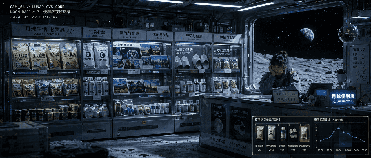
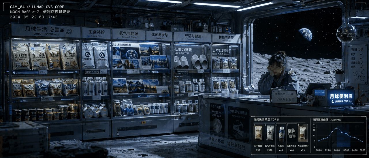
"Night shift record of a community convenience store on the moon" is a fusion of documentary-style illustrations and product display photography. The shelves in the store are arranged according to the needs of life on the moon: freeze-dried ramen, oxygen supply packs, earth postcards, low-gravity slippers, insomnia medicine, and space pot seeds. Behind the checkout counter is a tired but A gentle shop assistant, the black universe and the earth in the distance can be seen outside the glass window. The upper left corner of the picture looks like a surveillance video with time code superimposed on it. The lower right corner uses a small module to display hot-selling items and nighttime passenger flow curves. The light is cold white fluorescence intertwined with the blue shadow of the moon, like a combination of movie stills and commercial space design drawings. The proportions 21:9.

Cyberpunk Chinese Medicine Shop Brand Identity Proposal

Cyberpunk Chinese Medicine Shop Brand Identity Proposal

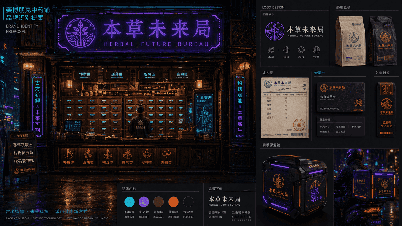
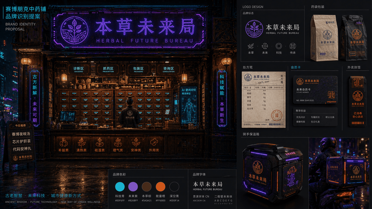
"Cyberpunk Chinese Medicine Shop Brand Identification Proposal" combines the traditional medicine cabinet space with the future urban visual system. The main picture is a night view of the front facade of the medicine shop. Electronic labels are embedded in the wooden medicine cabinet drawers. The neon sign reads "Future Bureau of Materia Medica" and the brand is expanded on the right. The logo, medicine bag packaging, prescription note, membership card, takeout seal and rider incubator design are mainly in blue-purple neon, dark wood brown, and fluorescent orange. The layout is like the homepage of a professional brand proposal booklet, with a combination of oriental old objects and high-tech urban night colors, with a ratio of 16:9.

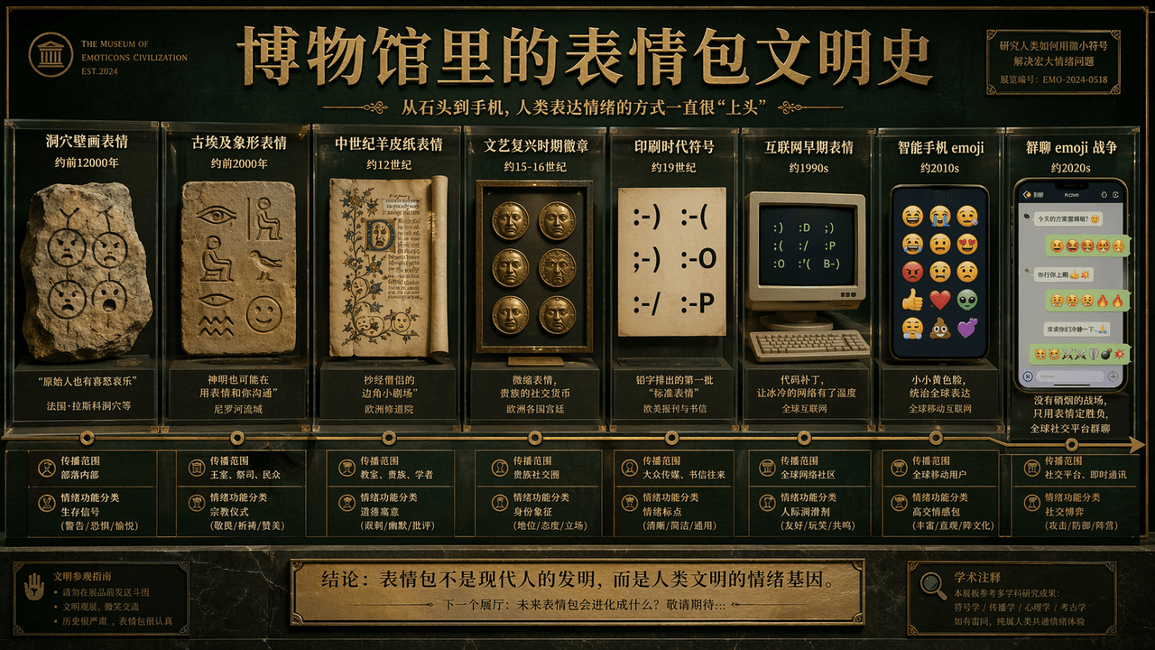
The history of emoji civilization in the museum

The history of emoji civilization in the museum

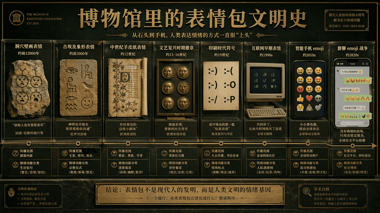
"The History of Emoji Civilization in the Museum" is a humorous fusion of academic display boards and Internet subculture. The main screen is like the wall of the exhibition hall of the Natural History Museum. The timeline extends from "cave painting emoticons" to "group chat emojis". War", representative emoticons of each era are displayed in the form of showcases, slates, parchments, computer screens, and mobile phone bubbles, with brief academic notes, age, scope of dissemination, and "classification of emotional functions." The title is serious, and the subtitle is slightly humorous. The color scheme uses museum dark green, warm white, and copper gold. The picture is both solemn and absurd, with a ratio of 16:9.

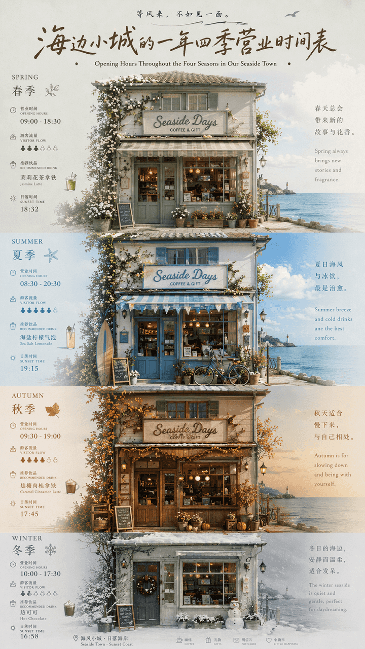
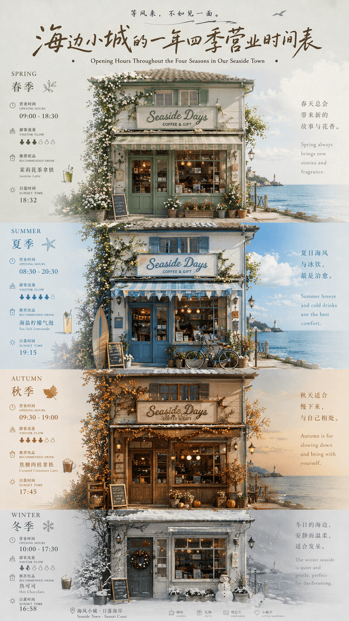
The seaside town’s business schedule throughout the year

The seaside town’s business schedule throughout the year

"A year-round business schedule of a small seaside town" is a fusion of local cultural and tourism posters and calendar infographics. The picture is centered on the facade of a seaside store. The four seasons of spring, summer, autumn and winter are represented by changes in window furnishings, door plants, sky colors and clothing. Each season is next to a thin number. The business hours, tourist flow, recommended drinks, and sunset time are marked. The title uses retro handwritten signature characters, and the subtitles are arranged in Chinese and English. The whole thing looks like an independent magazine travel feature. The color scheme transitions from sage green in spring, sea salt blue in summer, caramel brown in autumn to foggy gray white in winter. The proportions 9:16.

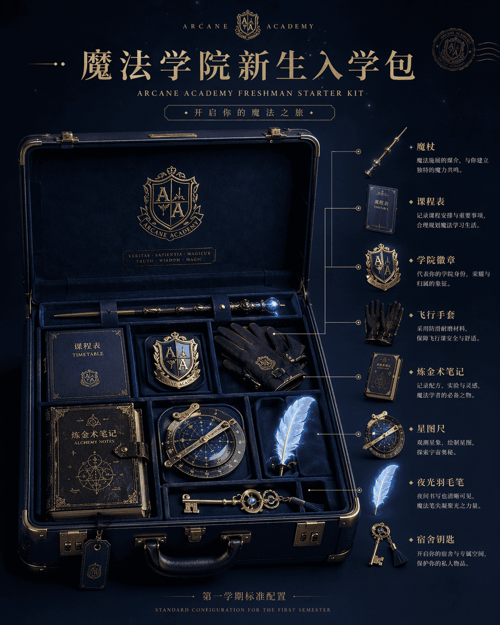
School of Magic Freshman Admission Pack

School of Magic Freshman Admission Pack

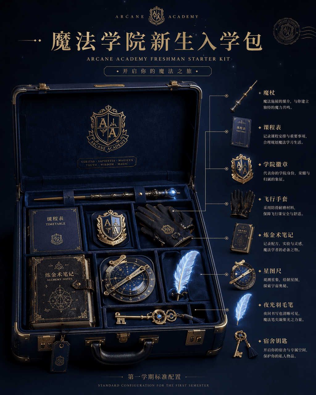
"Magic Academy Freshman Admission Pack" product display picture, the main image of the e-commerce is integrated with the fantasy world view setting. The center of the picture is an open dark blue hard-shell suitcase, inside which are neatly arranged a wand, curriculum, academy badge, flying gloves, alchemy notes, star ruler, luminous quill, and The home key, on the right side is the exploded diagram annotation and usage description of each item. The title at the top is like a high-end brand new product release page, and the small letters at the bottom read "Standard Configuration for the First Semester". The light is studio-level soft light, but the object has a faint magic glow. The material is rich in details, like a luxury travel brand and magic. IP co-branded materials, ratio 4:5.
A map of emotions in the Paris Metro

A map of emotions in the Paris Metro

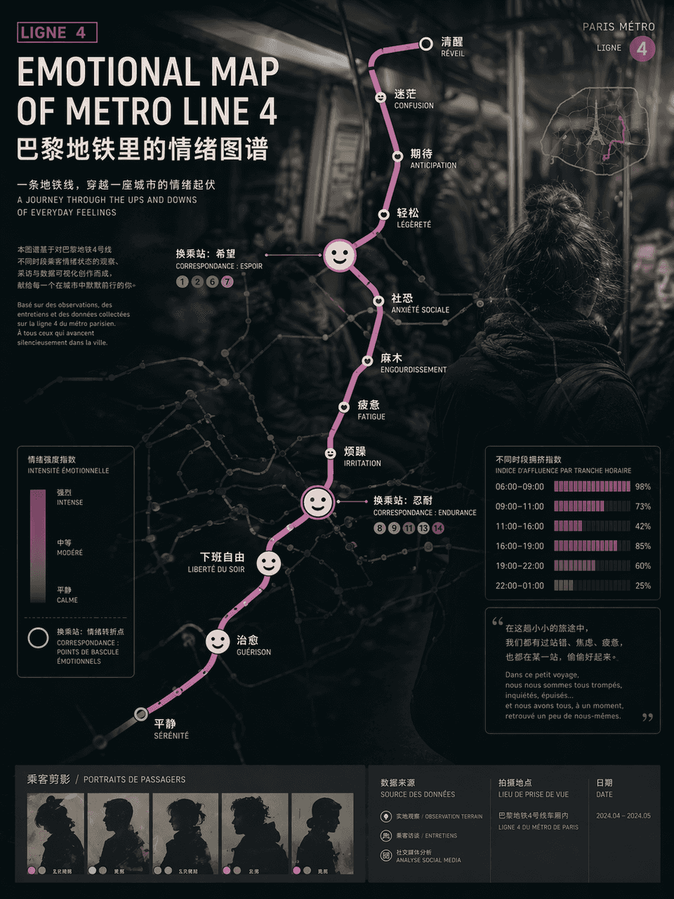
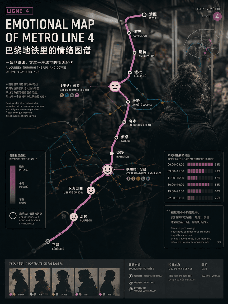
"EMOTIONAL MAP OF METRO LINE"/"EMOTIONAL MAP OF METRO LINE" 4", the emotional visualization poster is integrated with the urban traffic map. The route map uses standard subway map syntax, but the station name of each station is replaced with an emotional state, such as "awake", "numb", "expectation", "social fear" and "free from get off work", and the transfer nodes are enlarged into abstract expression icons , the background is vaguely blurred out in the style of documentary photography of crowded carriages. Passenger silhouettes and crowding index bar charts at different time periods are embedded in the corners of the poster. The title uses calm Swiss-style sans serifs. The subtitle is like an introduction to an art exhibition. The overall design combines social observation and contemporary art temperament. The proportions 3:4.

Chinese breakfast restaurant menu screen in 2049

Chinese breakfast restaurant menu screen in 2049

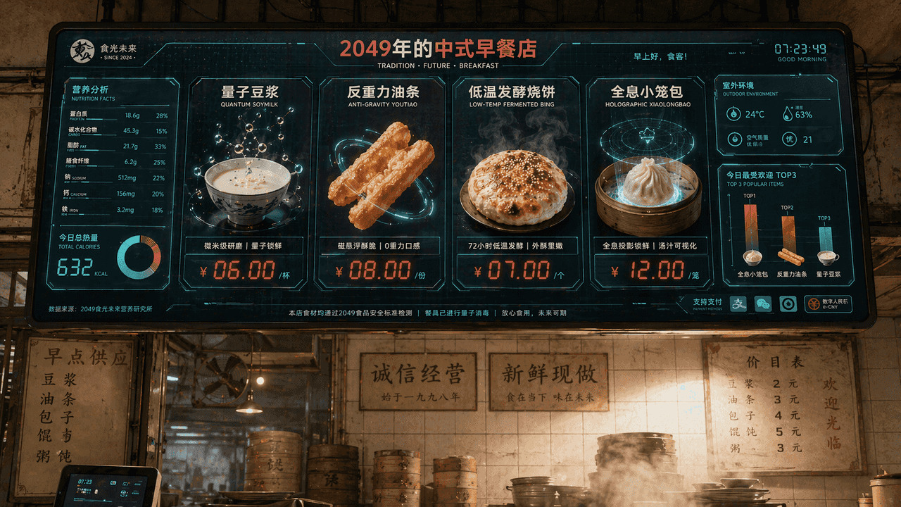
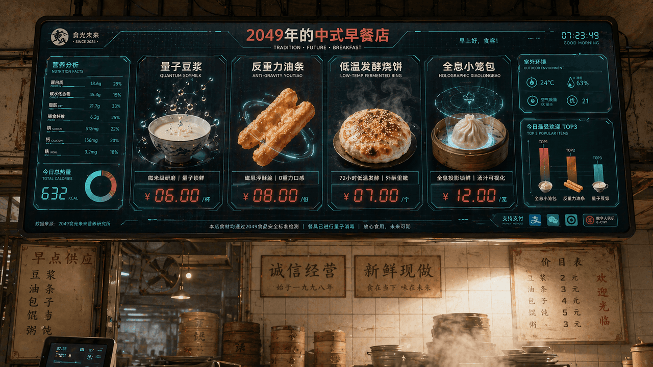
"Chinese Breakfast Shop Menu Screen in 2049", the catering brand vision is integrated with the sci-fi screen interface. The main screen is a huge electronic ordering screen hanging above the shop. The dishes include "Quantum Soy Milk", "Anti-Gravity Fritters", "Low-temperature Fermented Shaobing" and "Holographic Xiao Long Bao". Each dish is displayed with extremely exquisite food 3D renderings. The price tag uses red LED digital characters. On the left is a nutritional value and calorie information chart, and in the lower right corner is "Today's Most Popular TOP3" bar chart, the background retains the tiled wall of an old-fashioned breakfast shop and the real steam-filled environment, forming a collision between old and new. The color scheme is milk white, tomato red, and digital green, with a ratio of 16:9.

a writer's room

a writer's room

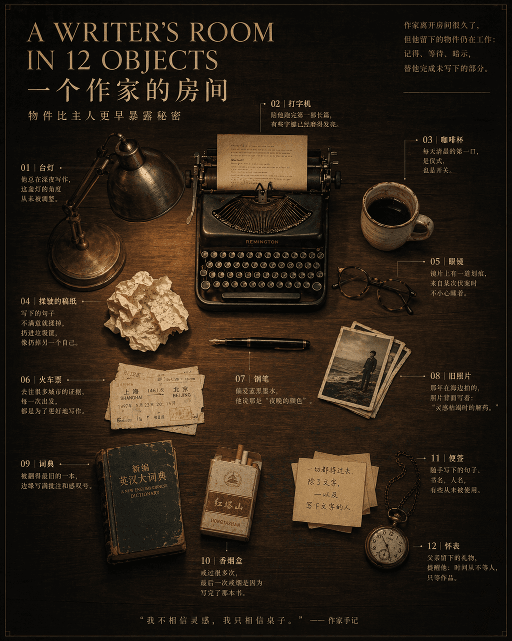
“A WRITER’S ROOM IN 12 OBJECTS”, a magazine inside-page still life narrative poster, in the center is an overhead shot of a dark wood desk with 12 OBJECTS Objects are precisely placed: pens, typewriters, glasses, coffee cups, crumpled manuscript paper, train tickets, desk lamps, old photos, dictionaries, cigarette boxes, sticky notes, pocket watches. Notes are drawn with thin lines next to each item, marking a short story related to the owner. The title uses an elegant serif font, and the subtitle reads "Objects reveal secrets earlier than their owners." 4:5.
Future wet market guidance system

Future wet market guidance system

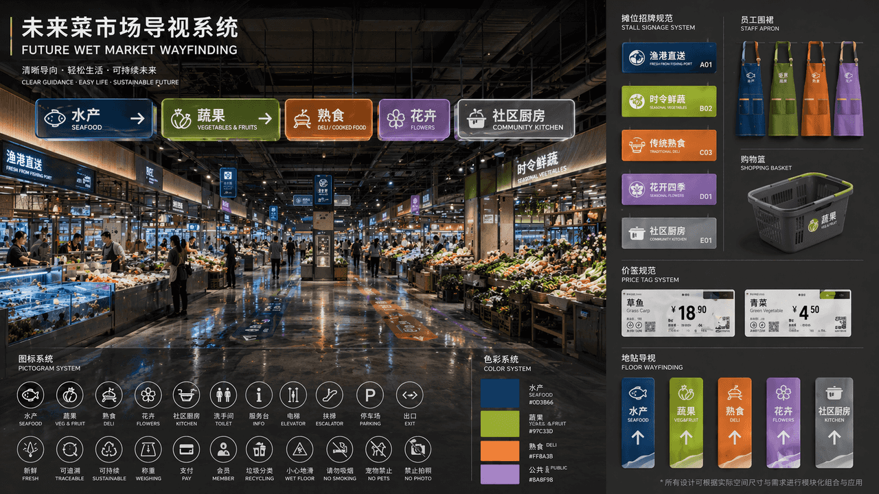
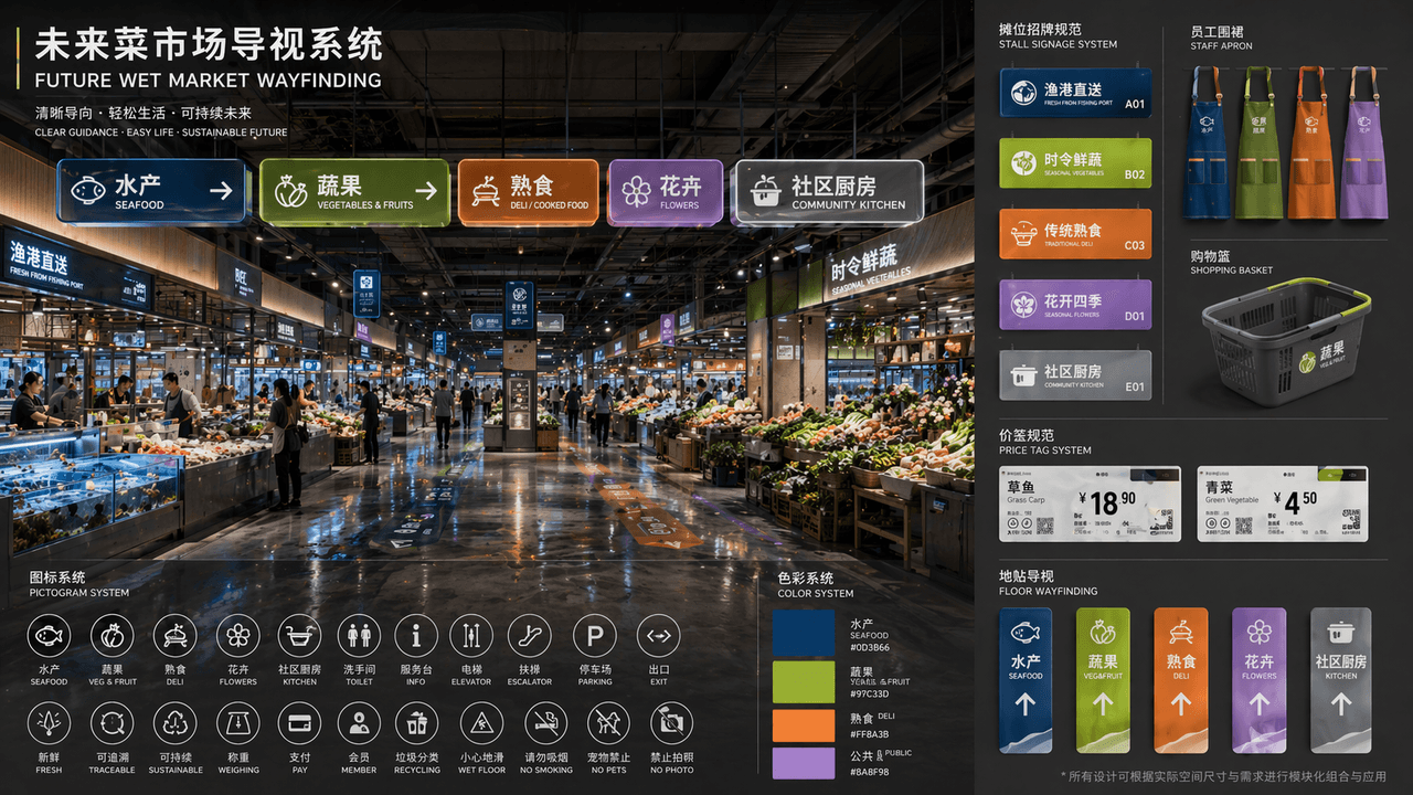
"FUTURE WET MARKET WAYFINDING" is a complete set of public space visual identity proposals. The main picture is a perspective view of the renovated futuristic wet market hall. A modular luminous guide board is hung on the top. The partitions include "aquatic products/fruits and vegetables/delicatessen/flowers/community kitchen". The color system corresponds to deep sea blue, yellow green, warm orange, and lavender. A pictogram is placed in the lower left corner. Icon system, on the right side is an expanded view of unified specifications for stall signs, staff aprons, shopping baskets, price tags and floor stickers. The title layout is like a design institute bidding proposal. The overall design has a sense of life and high-end public design. The material emphasizes frosted acrylic, recycled metal, and the reflection of wet floors, with a ratio of 16:9.