New: GPT Image 2.5 Flare and Sunburst. Try them free with 3 images on sign-up, then 8 credits each.
Try GPT Image 2.5

GPT Image 2 Prompts

8,665 templates · updated Oct 2026

GPT Image 2 is OpenAI's image generation and editing model (gpt-image-2). It follows long, structured instructions closely, which makes it a strong fit for posters, product shots, UI mockups and infographics with short on-image text.

This page lists the 8,665 library templates set up for GPT Image 2. Each one opens in the generator with GPT Image 2 selected: 43 credits at 1K, up to 16 reference images and 16 aspect ratios. GPT Image 2 Saver runs the same model for a flat 5 credits at any size.

Showing 121–150 of 150 GPT Image 2 · Logo & Branding prompts

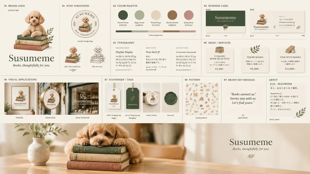
Toy Poodle Bookstore Brand Identity Board

Toy Poodle Bookstore Brand Identity Board

brand identity board. warm, elegant, literary bookstore branding centered on a small apricot toy poodle mascot sitting on a stack of vintage books with a delicate olive branch accent. stacked vintage hardcovers in muted forest green, beige…

brand identitybookstorelogo design
Minimalist Word Shape Vector Logo

Minimalist Word Shape Vector Logo

A minimalist logo design where the word "[WORD]" is transformed into a physical object related to its meaning. The letters are subtly reshaped to form the silhouette of the object while remaining clearly readable. Monochrome solid black design on a clean white background, balanced centered composition, modern branding style, flat graphic vector aesthetic, high contrast.

logominimalisttypography
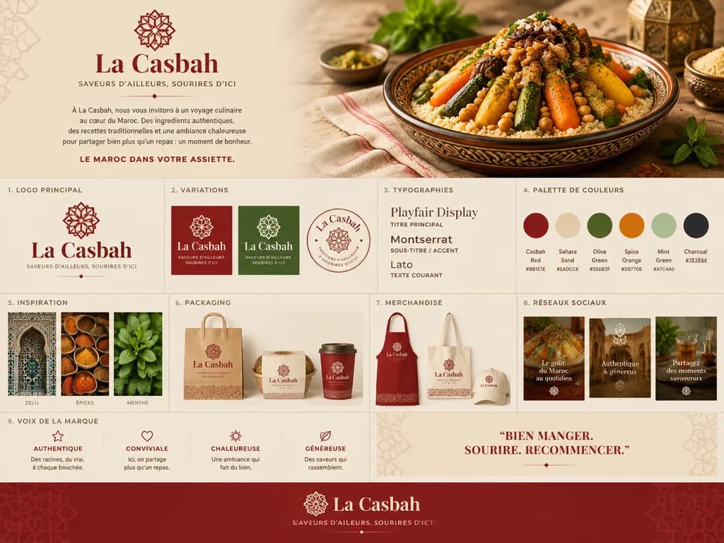
Moroccan Restaurant Brand Identity Board

Moroccan Restaurant Brand Identity Board

Using the reference photo of the couscous dish as the hero food visual, create a polished one-page brand identity board for a Moroccan restaurant named [La Casbah]. Position the dish seamlessly in the top-right hero area on a warm beige editorial layout with refined Moroccan design accents. Top-left brand block: the restaurant name [La Casbah] in an elegant serif logotype, a delicate geometric emblem above it, and the French tagline “SAVEURS D’AILLEURS, SOURIRES D’ICI”, followed by a short French narrative paragraph and a bold tagline. Below, arrange a clean 9-section brand guide grid: 1) “LOGO PRINCIPAL” on a light background, 2) “VARIATIONS” featuring red square, green square, and circular seal versions, 3) “TYPOGRAPHIES” displaying headline, subtitle, and body styles, 4) “PALETTE DE COULEURS” with 6 swatches labeled Casbah Red, Sahara Sand, Olive Green, Spice Orange, Mint Green, and Charcoal with hex codes, 5) “INSPIRATION” with 3 image tiles of zellij arch tilework, spices, and mint, 6) “PACKAGING” with mockups of a paper takeout bag, bowl sleeve, and cup, 7) “MERCHANDISE” with apron, tote bag, and cap mockups, 8) “RÉSEAUX SOCIAUX” with 3 social post tiles, and 9) “VOIX DE LA MARQUE” listing 4 tone pillars. Add a quote block reading “BIEN MANGER. SOURIRE. RECOMMENCER.” and a full-width deep red footer banner with a centered logo and subtle geometric patterns. Style: luxury agency brand presentation, pristine typography, photorealistic mockups.

brand identityrestaurant brandingbrand board
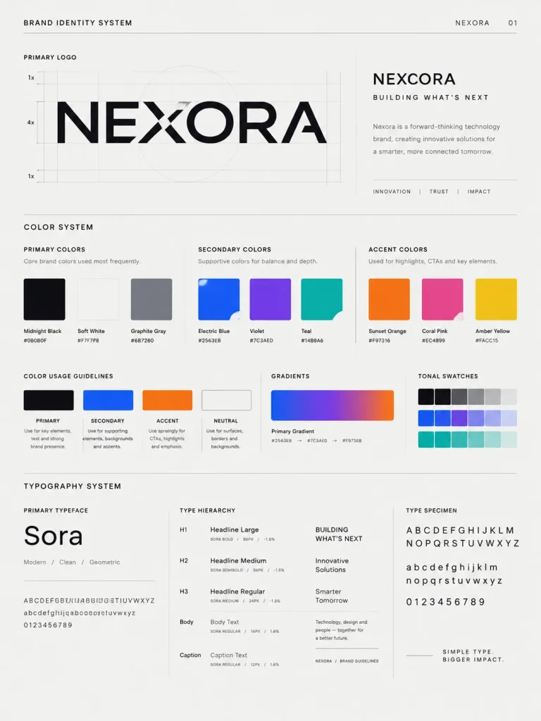
Brand Identity System Poster

Brand Identity System Poster

A high-end, agency-grade brand identity system presentation poster for [Brand name], incorporating the logo from the reference image. The layout is structured as a client-ready brand guidelines board designed by a top branding agency. Sections include: a primary logo showcase with construction grid lines; a comprehensive color system displaying primary, secondary, and accent color swatches with mock HEX codes, labeled usage guidelines, gradient strips, and tonal swatches; and a typography system showing font hierarchy with uppercase, lowercase, and numeric specimens matched to the brand's aesthetic. Clean editorial layout, Swiss graphic design influence, generous white space, crisp vector-style precision, professional studio presentation lighting.

brand identitybrand guidelinesposter design
Hand-Drawn Marker Logo Overlay

Hand-Drawn Marker Logo Overlay

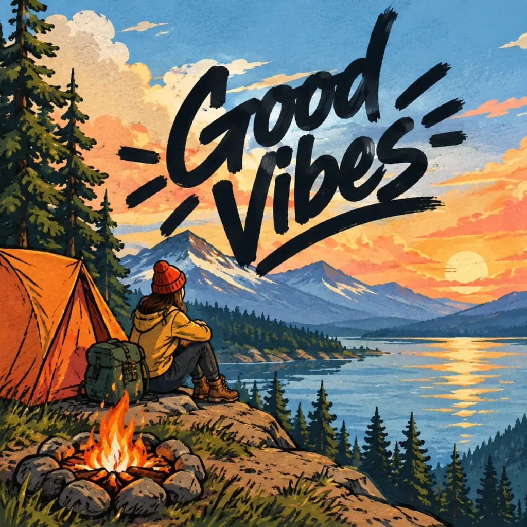
First reference image: an illustration. Second reference image: a logo design on a black background. Task: Integrate the exact logo from the second reference image into the largest open, uncluttered area of the first illustration [Add a brief note about the placement here]. Style and Rendering: - Render the logo bold and large, using rough, hand-drawn strokes resembling a thick marker signed directly onto the surface. - Allow the marker strokes to overflow slightly past the open negative space into adjacent illustrated elements. - Dynamic Contrast Rule: The logo stroke color must strictly contrast with the background directly beneath it (dark marker over light backgrounds, light marker over dark backgrounds). Shift stroke color mid-line if crossing multiple tone values; never allow the logo to blend into the background. Constraints: - Do not alter the original illustration in any other way; maintain all original colors, lines, and composition intact.

logobrandingillustration
Retro 1980s Neon Wordmark Logo

Retro 1980s Neon Wordmark Logo

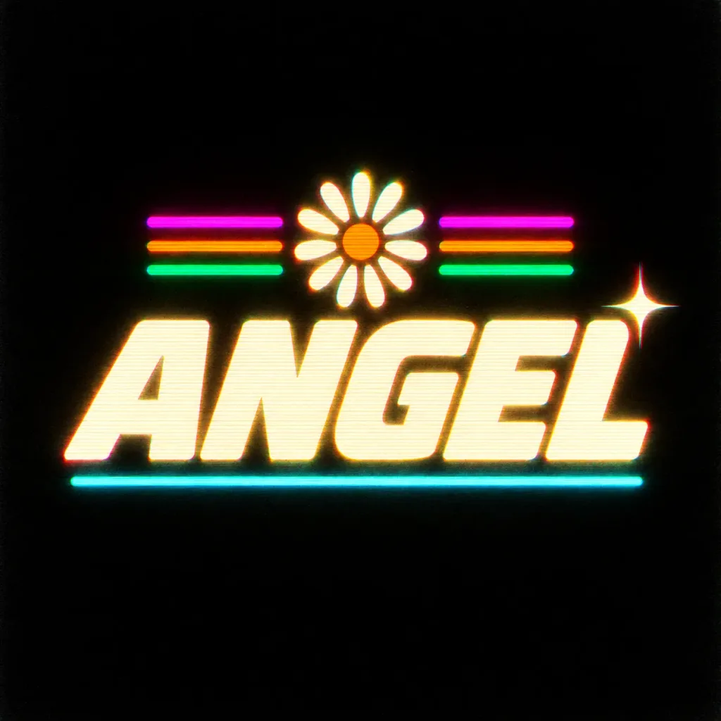
Centered retro 1980s neon arcade logo on a pure black background. The central text reads "[ANGEL]" in massive, bold, italicized all-caps block typography rendered in creamy off-white with a soft warm yellow neon glow, slightly rounded edges, and CRT scanline halftone textures. Directly above the center of the wordmark sits a glowing daisy emblem with 1 orange circular center and 12 glowing white oval petals. Flanking the daisy are 6 neon horizontal stripes: 3 on the left and 3 on the right, stacked in magenta, orange, and green from top to bottom. Directly below the lettering is a single thin glowing cyan underline spanning most of the logo width. Positioned near the upper-right corner of the final letter is a single bright four-point star sparkle. Visual effects include subtle red and cyan chromatic aberration, bloom, VHS tape softness, fine grain, and a subtle edge vignette. Minimalist square composition with ample negative black space, clean typography, no frame, no watermark.

neon1980sretro
Futuristic Creative Toy Brand Kit

Futuristic Creative Toy Brand Kit

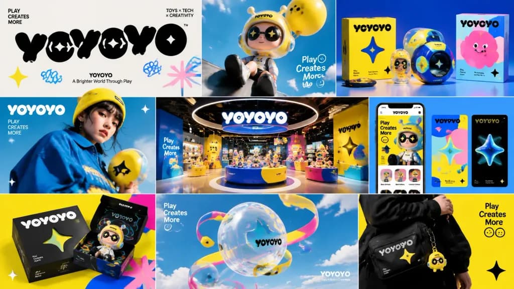
A polished brand kit presentation for a company named [YOYOYO], displayed across a cohesive multi-panel showcase. The visual identity blends playful toy-inspired consumer aesthetics with premium creative technology design. Includes bold experimental typography, bright electric colors, clean geometric shapes, dynamic motion graphics cues, and slightly surreal imagery. Features tactile product mockups, premium packaging concepts, high-fashion editorial photography, immersive experiential retail displays, and digital touchpoints. Art-directed studio lighting, inventive and youthful mood, rhythmic visual pacing, and sophisticated creative-agency presentation style.

brand kitvisual identitybranding mockup
Custom Typography Font Specimen Page

Custom Typography Font Specimen Page

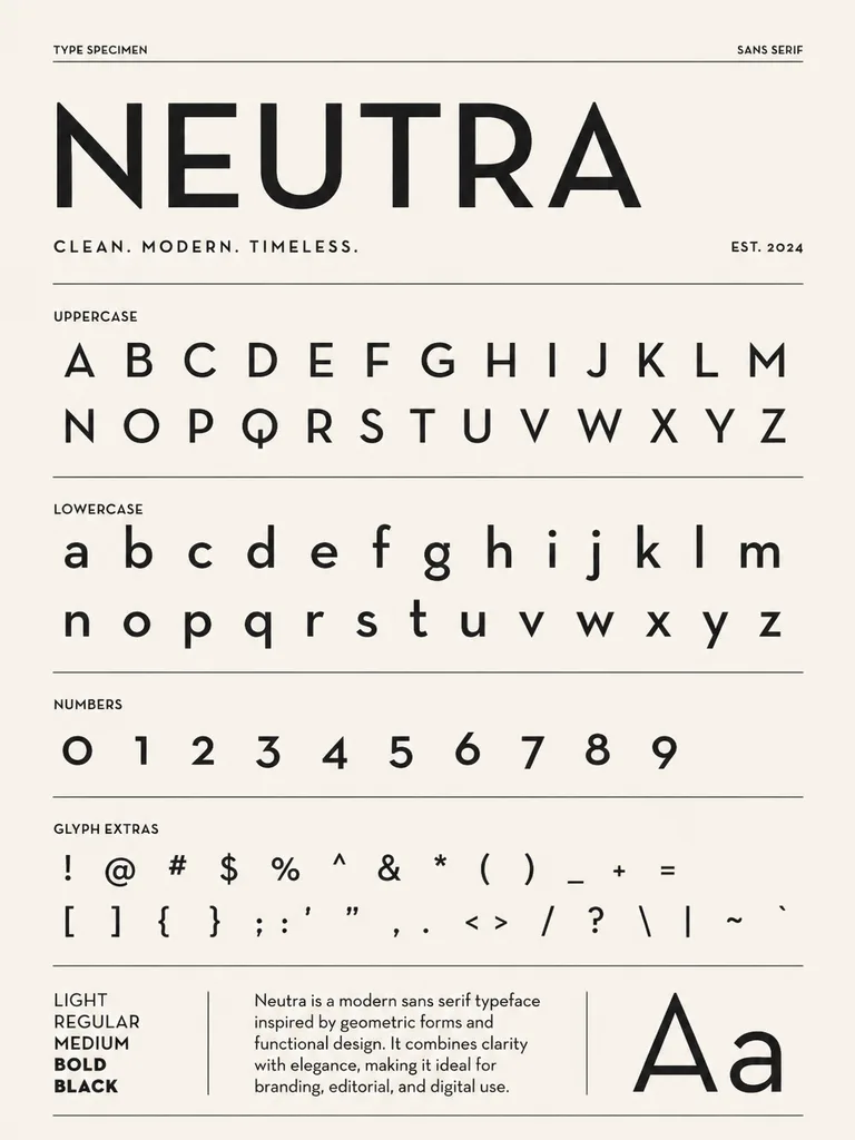
Based on the typography design in the reference image, create a font specimen book layout displaying neatly arranged [English letters and numbers]. Clean editorial presentation, organized typographic grid, sharp and balanced glyph details on a neutral background.

typographyfont-specimeneditorial-design
Minimalist Professional Business Card with QR Code

Minimalist Professional Business Card with QR Code

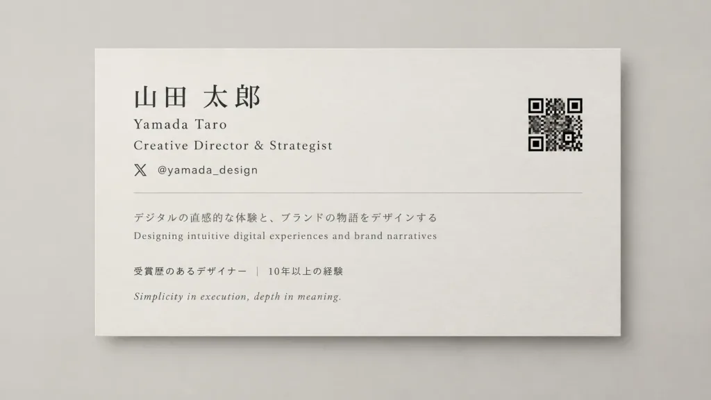
Graphic design mockup of an elegant, horizontal business card with a clean and sophisticated aesthetic. [Layout & Composition] Horizontal orientation with generous negative space, balanced visual hierarchy, and a luxury minimalist tone. Front view against a clean, neutral studio backdrop. [Text Content] - Name: [Yamada Taro] - Title / Profession: [Creative Director & Strategist] - Social Handle: @[yamada_design] - Bio snippet: [Designing intuitive digital experiences and brand narratives] - Key Highlights: [Award-winning designer | 10+ years experience] - Tagline: [Simplicity in execution, depth in meaning] All text rendered sharply in clean, modern Japanese and Latin typography, ensuring high legibility and refined font pairing. [QR Code Specifications] A crisp, high-contrast square QR code linked to [https://x.com/yamada_design], positioned neatly on the card with sufficient quiet-zone margins around it. Perfectly flat, unwarped, devoid of overlay decorations or blurring, optimized for clear smartphone scanning. [Color & Finish] Sophisticated monochromatic palette with subtle warm gray or muted neutral tones, matte cardstock texture, crisp print finish suitable for executive stationery.

business cardbrandingstationery
Brand visual system

Brand visual system

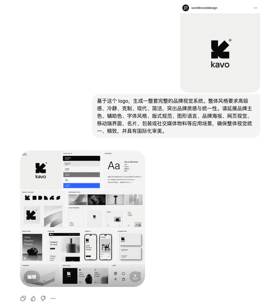
Based on this logo, a complete set of brand visual system is generated. The overall style requires a sense of high-end, calmness, restraint, modernity, simplicity, and highlights the brand texture and unity. Please extend the brand’s main colors, auxiliary colors, font styles, layout specifications, graphic language, brand posters, web page visuals, mobile interfaces, business cards, packaging or social media materials and other application scenarios to ensure that the overall vision is unified, refined, and has an international aesthetic.

Old brand renewal case

Old brand renewal case

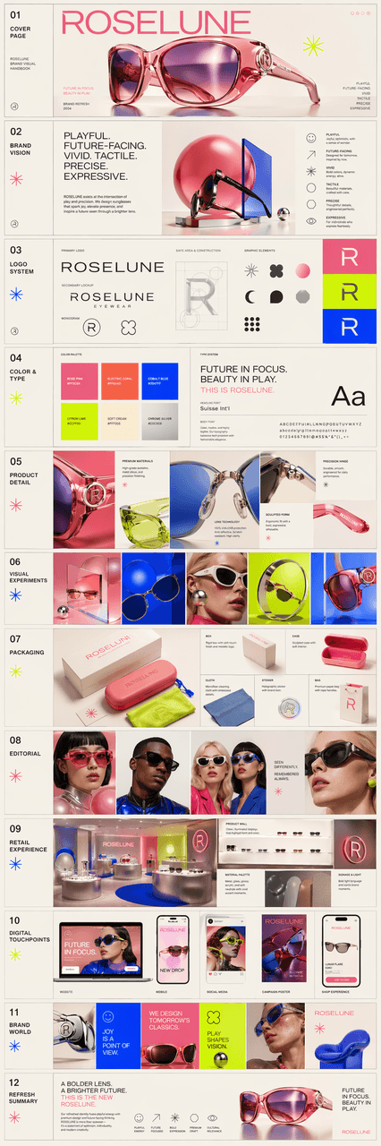
Create an exquisite multi-page brand visual manual for a sunglasses company called ROSELUNE, presented in the form of multiple pictures. The brand's temperament should be fun, futuristic, brightly colored, and have a strong sense of design, striking a balance between "toy-like vitality" and "the sophistication of a high-end creative technology brand." The visual language includes highly saturated bright colors, geometric shapes, modern fonts, dynamic rhythms and slightly surreal image expressions. The overall needs reflect: attention to product details, visual experimentation, packaging design exploration, editorial style photography, immersive retail experience, and cross-platform brand applications. Finally, it was integrated into a complete overview long picture, like an old brand renewal proposal made by a high-end creative studio.

Brand Identity Guidelines Manual

Brand Identity Guidelines Manual

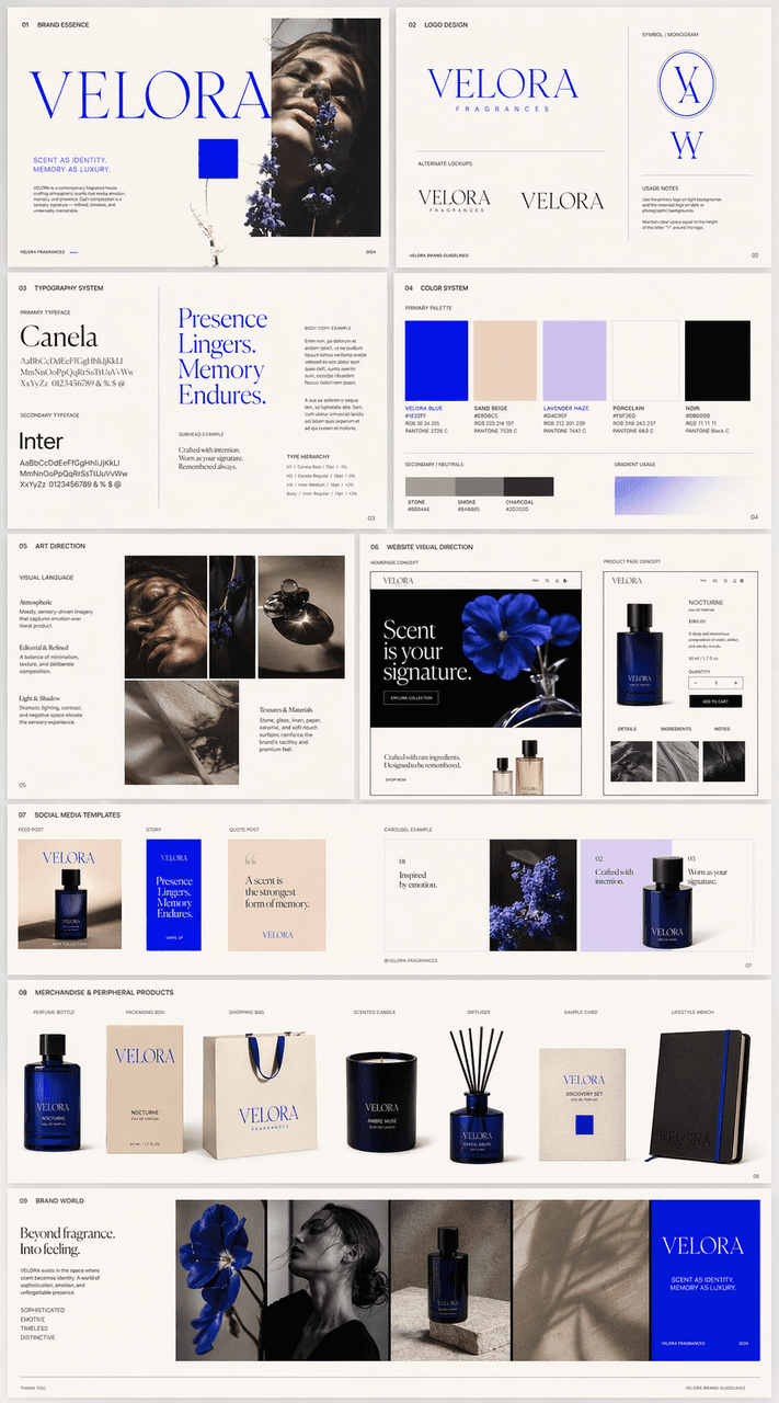
Based on the uploaded mood board, we created an exquisite multi-page brand visual manual for a fragrance company called VELORA, and finally integrated it into a complete overview. Content needs to include: logo design, font system, color system, art direction, website visual direction, social media templates and peripheral product concepts. The overall vision must strictly refer to the temperament of the mood board and remain unified, complete, and mature, just like a real brand full case submission page.

Brand Visual Identity Manual

Brand Visual Identity Manual

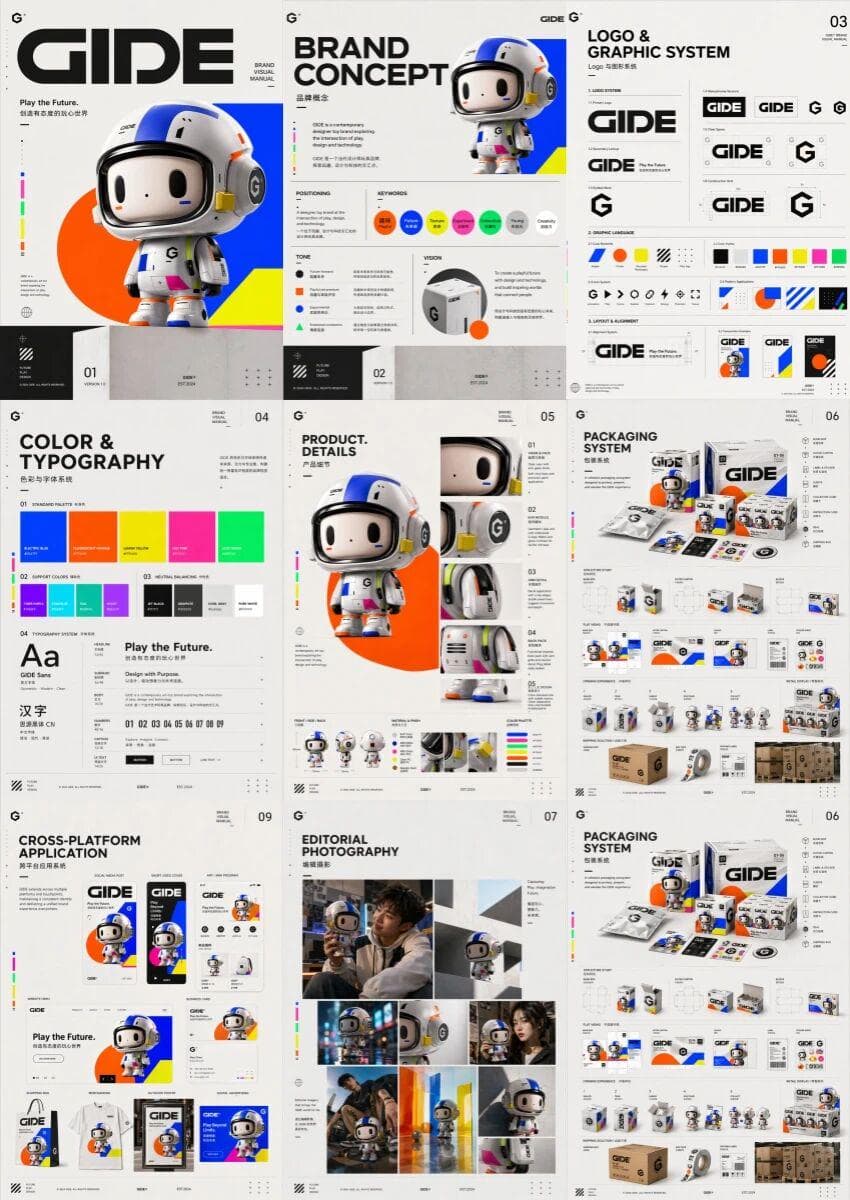
Designed a high-end, multi-page, unified brand visual manual for the trendy toy brand GIDE, displaying multiple pictures side by side into a complete brand visual manual. Content includes cover, brand concept, logo and graphic system, colors and fonts, product details, packaging design, editorial photography, immersive retail experience, cross-platform application and summary page. The overall style is fun, futuristic, color tension and high-end design, striking a balance between the vitality of trendy play and the sophistication of a creative technology brand. The visual language includes highly saturated bright colors, simple geometric figures, modern fonts, dynamic rhythm and slightly surreal expressions to build a unified, confident, contemporary and complete brand worldview, like a brand manual at the level of a high-end creative studio.

Multilingual brand version

Multilingual brand version

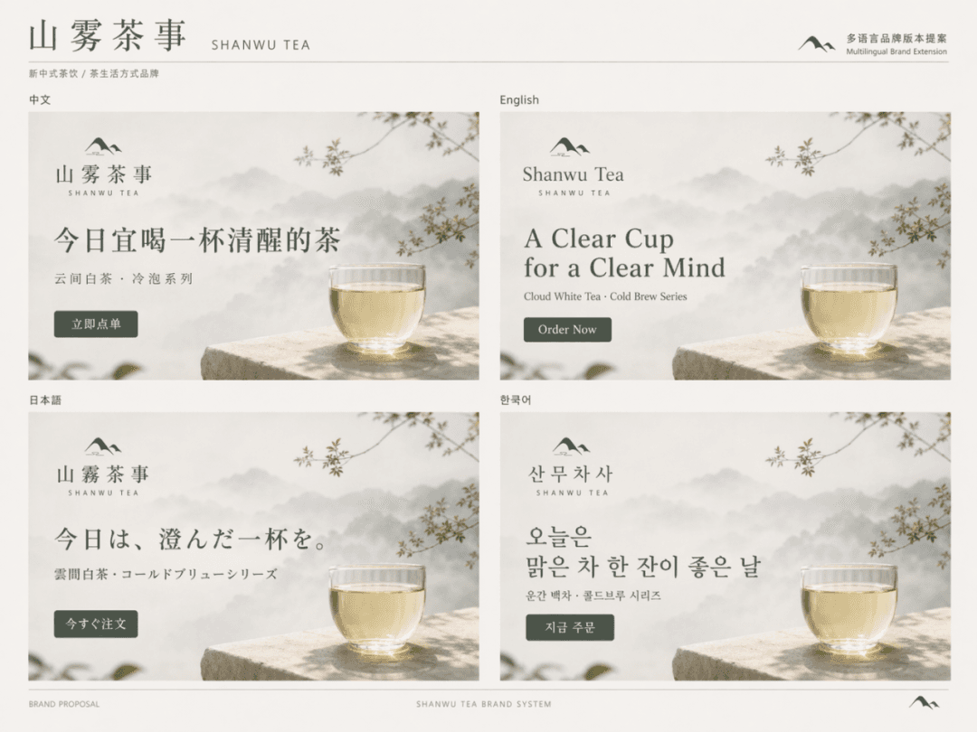
Generate a set of Chinese, English, Japanese and Korean multi-lingual visual versions for the brand "Shanwu Tea Event". It is required to maintain the same layout logic, brand temperament, visual system and layout order, only replace the language content, and the overall look is like an international visual extension page of a mature brand. The four language versions are displayed side by side to form a complete picture of the brand's multilingual proposal.

Store visual extension

Store visual extension

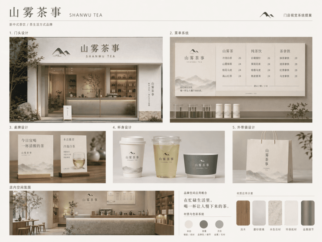
Designed a complete offline store visual extension plan for the brand "Shanwu Tea Shi", suitable for tea drink shops/tea lifestyle retail spaces. Brand keywords: mountains, fog, tea feeling, white space, nature, quiet, modern oriental. Color matching: off-white, tea green, moon gray. Material recommendations: light wood, frosted glass, beige stone, environmentally friendly paper, metal details. The following content needs to be presented: 1. Door design 2. Menu system 3. Table design 4. Cup body design 5. Take-out bag design

Brand material package

Brand material package

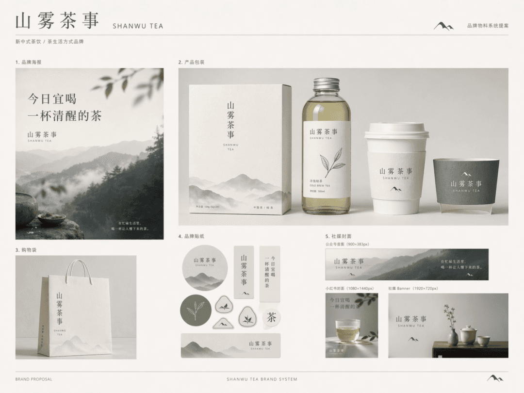
Generate a complete set of brand material package display pictures for the brand "Shanwu Tea Shi", like a page of mature brand system proposals. Brand positioning: New Chinese tea drink/tea lifestyle brand Brand temperament: Oriental restraint, natural poetry, quiet high-end, lifestyle sense Main color system: off-white, tea green, moon gray, supplemented by a small amount of ink gray, the following materials need to be included: 1. Brand poster 2. Product packaging 3. Shopping bag 4. Brand sticker 5. Social media cover

Logo application renderings

Logo application renderings

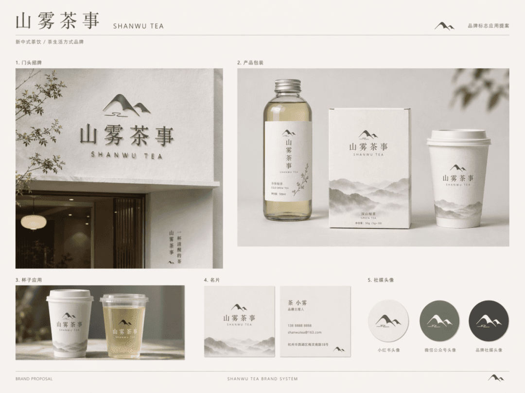
Apply the "Shanwu Tea Service" brand logo to multiple brand touch points to generate a unified style logo application rendering/brand proposal display page. The brand logo is set to: the Chinese word mark "山木茶事" + a graphic symbol that combines a minimalist mountain shape with mist. The overall design is simple, modern, and has a restrained oriental feel. It is necessary to show the following application scenarios: 1. Door sign 2. Product packaging 3. Cup application 4. Business card 5. Social media avatar

Brand Identity Moodboard

Brand Identity Moodboard

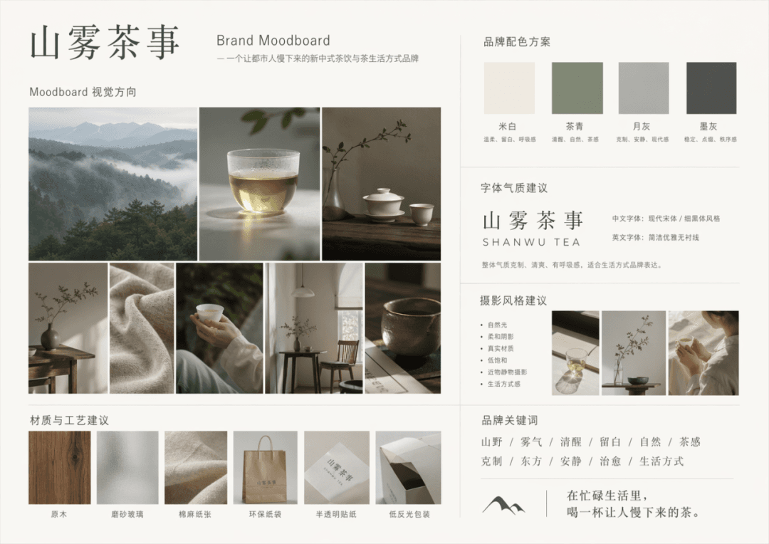
Generate a complete Brand Moodboard based on the following brand description. Brand name: Shanwu Tea Shi, brand description: a new Chinese tea drink and tea lifestyle brand for urban young people, keywords: mountains, fog, sobriety, white space, nature, tea feeling, restraint, oriental, quiet, healing, lifestyle, main colors: off-white, tea green, moon gray, can be embellished with a small amount of ink gray. The output content includes: 1. Moodboard visual direction 2. Brand color scheme 3. Font temperament suggestions 4. Photography style suggestions 5. Material and process suggestions 6. Brand keyword layout area

“Sea Breeze Cafe Signage System”

“Sea Breeze Cafe Signage System”

"Sea Breeze Cafe Signboard System" combines the brand's outdoor vision with coastal street scene photography. The main image is a row of small seaside shop facades. The signboard system is unified but each has its own personality: wooden signs, enamel, canvas, standing blackboard and neon lights. The right side shows the word weight specification, color matching, weathered material performance and night lighting effect. The overall image is like the cover of a brand manual, with a ratio of 4:5.

Tokyo Vending Machine Brand Showcase

Tokyo Vending Machine Brand Showcase

"The vending machine brand universe on a rainy night in Tokyo" combines urban photography with systematic packaging design. The entire vending machine glows in the neon light of the rainy night. Each layer of drinks represents a brand sub-series: sobriety, comfort, memory, impulse, and late-night companionship. The can design, color palette, slogan and small poster of each series are unfolded on the right side. The vision is very unified, with a ratio of 16:9.

"Visual order for a summer fruit stand"

"Visual order for a summer fruit stand"

"Visual order of summer fruit stalls" is a fusion of agricultural still life photography and modern display science illustrations. Watermelons, peaches, plums, grapes, and bayberries are neatly displayed according to size and color. The top hangtag uses a unified brand language. On the right side are price tags, turnover boxes, paper bags, and seasonal poster extensions. The colors are full but not overly commercial, like a brand manual about daily aesthetics, with a ratio of 4:5.

"The Corner Florist's Color Operations Manual"

"The Corner Florist's Color Operations Manual"

"Color Operation Manual for the Corner Flower Shop", the brand guide is integrated with real store photography. The main picture is the flower shop front and display stand. It is divided into different main color bands according to weekdays and weekends: cream and white wedding, orange daily, crimson holiday, purple night show. On the right side are wrapping paper, ribbons, price tags, social media templates, and apron color scheme. The text is like a chapter page of the brand manual, soft but professional, with a ratio of 4:5.

Cyberpunk Apothecary Brand Identity Board

Cyberpunk Apothecary Brand Identity Board

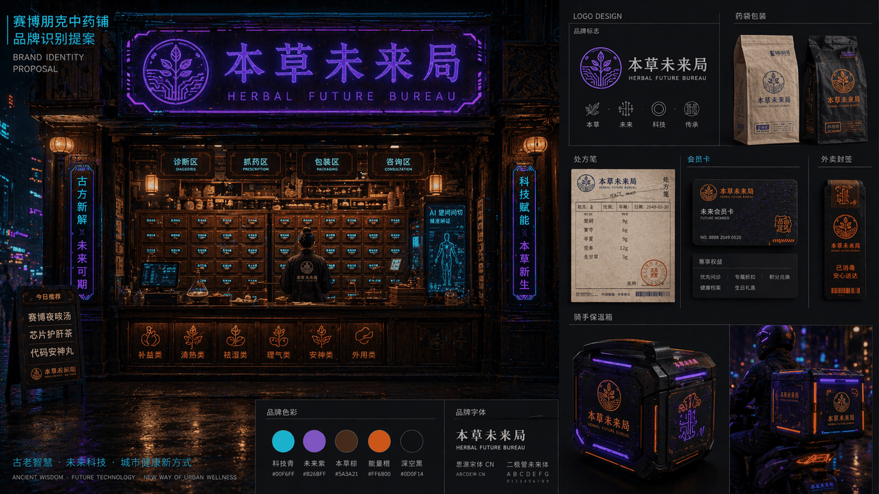
"Cyberpunk Chinese Medicine Shop Brand Identification Proposal" combines the traditional medicine cabinet space with the future urban visual system. The main picture is a night view of the front facade of the medicine shop. Electronic labels are embedded in the wooden medicine cabinet drawers. The neon sign reads "Future Bureau of Materia Medica" and the brand is expanded on the right. The logo, medicine bag packaging, prescription note, membership card, takeout seal and rider incubator design are mainly in blue-purple neon, dark wood brown, and fluorescent orange. The layout is like the homepage of a professional brand proposal booklet, with a combination of oriental old objects and high-tech urban night colors, with a ratio of 16:9.

Future wet market guidance system

Future wet market guidance system

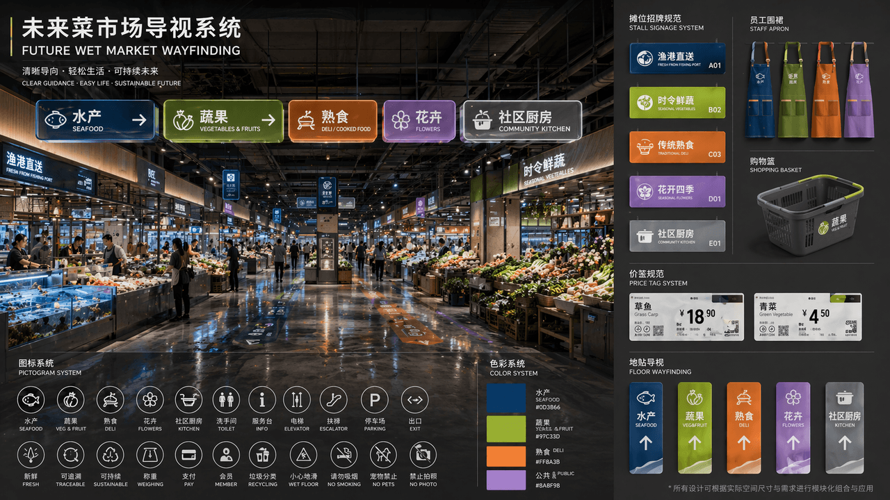
"FUTURE WET MARKET WAYFINDING" is a complete set of public space visual identity proposals. The main picture is a perspective view of the renovated futuristic wet market hall. A modular luminous guide board is hung on the top. The partitions include "aquatic products/fruits and vegetables/delicatessen/flowers/community kitchen". The color system corresponds to deep sea blue, yellow green, warm orange, and lavender. A pictogram is placed in the lower left corner. Icon system, on the right side is an expanded view of unified specifications for stall signs, staff aprons, shopping baskets, price tags and floor stickers. The title layout is like a design institute bidding proposal. The overall design has a sense of life and high-end public design. The material emphasizes frosted acrylic, recycled metal, and the reflection of wet floors, with a ratio of 16:9.

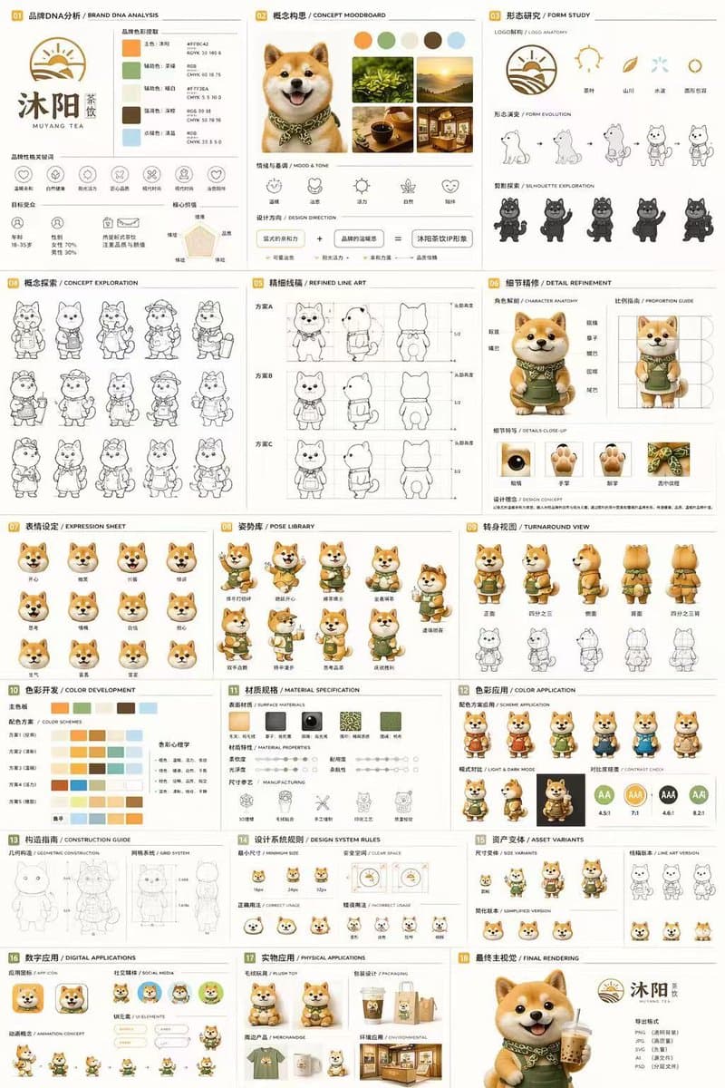
18-Panel Mascot Brand Identity Document

18-Panel Mascot Brand Identity Document

18-panel brand identity and character design document. {argument name="character description" default="3D rendered cute Shiba Inu mascot wearing a green apron"}. 01 品牌DNA分析 / BRAND DNA ANALYSIS. 02 概念构思 / CONCEPT MOODBOARD. 03 形态研究 / FORM…

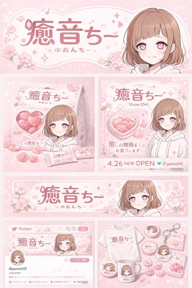
Anime Character Brand Identity & Merch Board

Anime Character Brand Identity & Merch Board

brand identity and merchandise design board. anime girl with short brown bob hair, pink eyes, wearing a white hoodie, gentle smile. header banner. product packaging. promotional poster. horizontal web banner. social media profile mockup. m…

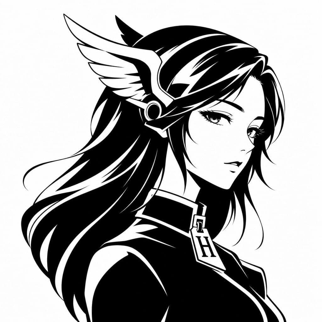
Monochrome Hermes-Inspired Avatar

Monochrome Hermes-Inspired Avatar

Create a minimalist black-and-white vector avatar logo of a mythic anime woman shown in elegant side profile facing right, cropped from the chest up on a plain white background. Give her long flowing {argument name="hair color" default="black"} hair with bold white highlight streaks and smooth graphic shapes, rendered as high-contrast ink silhouette art with clean sharp edges. She wears a winged headpiece reminiscent of Hermes or a messenger god helmet, with one large white feathered wing visible on the side of her head and a circular metallic earpiece detail. Dress her in a sleek high-collar garment with a luxury-fashion feel, and hang a prominent pendant or zipper pull shaped like the letter {argument name="monogram letter" default="H"} at the center of the collar. The face is intentionally obscured by a centered soft gray rectangular blur block covering most facial features, creating a censored anonymous profile-image effect. Overall style: luxury brand avatar, fashion logo, anime-inspired goddess silhouette, monochrome vector emblem, smooth negative-space highlights, balanced composition, modern and iconic, suitable for a social media profile picture.

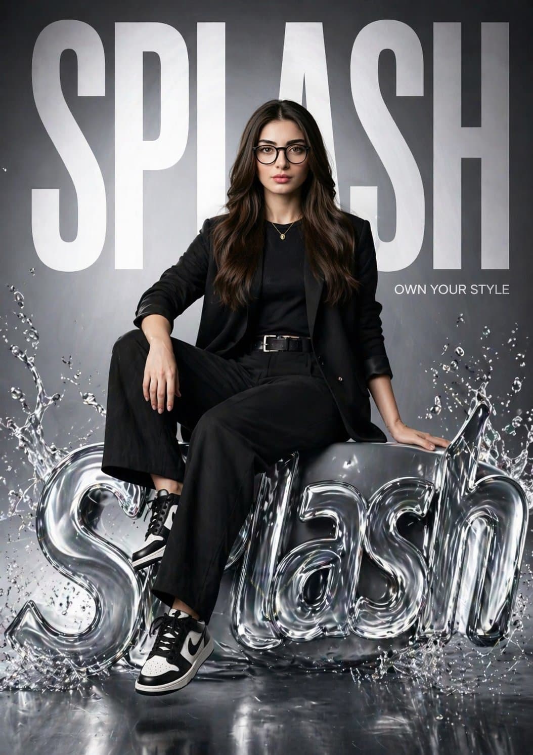
SPLASH Fashion Brand Hyper-Realistic Campaign Poster

SPLASH Fashion Brand Hyper-Realistic Campaign Poster

Create a hyper-realistic fashion poster for “SPLASH” featuring the same girl from the reference image (keep her face 100% identical). She is sitting confidently on a glossy, liquid-style 3D SPLASH logo with water splash effects. One leg relaxed, one bent, strong editorial pose. Background has massive bold “SPLASH” text filling the frame, partially behind her. Add small tagline: “Own Your Style.” Outfit: modern black street-fashion (blazer, fitted top, trousers, sneakers). Lighting: cinematic studio, soft key light + rim light, reflective highlights on liquid logo. Style: luxury brand campaign (Zara / H&M), clean glossy environment. Camera: 85mm lens, shallow depth of field, 8K, ultra-detailed, photorealistic.

Surrealist Liquor Brand High Fashion Poster

Surrealist Liquor Brand High Fashion Poster

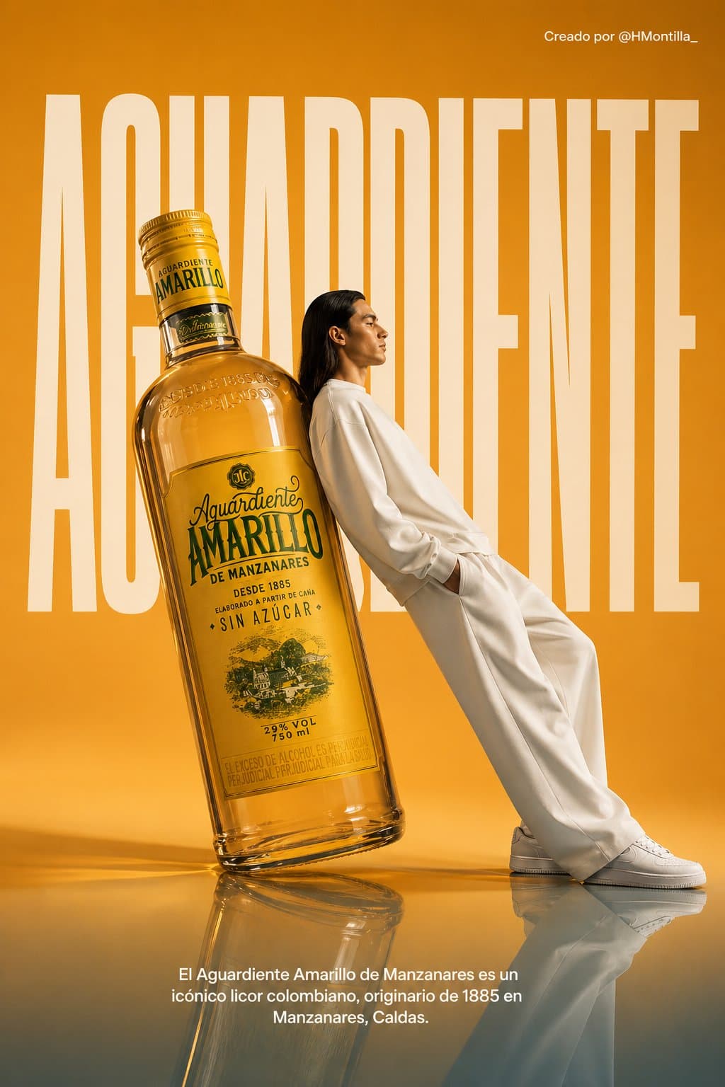
Un póster publicitario surrealista de alta costura para Aguardiente Amarillo. La escena se sitúa en un estudio minimalista y monocromático de color naranja claro, con un suelo semirreflectante. El foco central es una botella de Aguardiente Amarillo de tamaño descomunal y gigante, colocada en ángulo diagonal y que sirve como respaldo. Un modelo masculino de moda, de cabello largo y oscuro, vestido con un conjunto impecable y totalmente blanco —compuesto por una sudadera y pantalones de pierna ancha—, apoya toda su espalda contra la botella gigante en una postura relajada e inclinada. Mira hacia la derecha, de perfil, con la vista al frente y una expresión serena; calza zapatillas blancas de tamaño estándar. En el fondo, la palabra "AGUARDIENTE" aparece escrita con una tipografía sans-serif condensada, blanca, masiva y en negrita, parcialmente oculta por la botella gigante y por el modelo para crear una sensación de profundidad. En la esquina superior derecha se lee: "Creado por @HMontilla_". En la parte inferior central, una frase publicitaria en tipografía sans-serif blanca reza: "El Aguardiente Amarillo de Manzanares es un icónico licor colombiano, originario de 1885 en Manzanares, Caldas". La iluminación es suave, fría y uniforme, proyectando sombras tenues y un reflejo sutil de los sujetos sobre el suelo azul brillante. La estética general es limpia, moderna y de alto concepto. Establecer la relación de aspecto en 3:4.

Retro Newspaper Front Page

Retro Newspaper Front Page

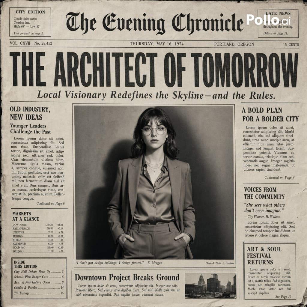
Create the most realistic front page design of a vintage newspaper featuring the main character. The layout should be made in the style of a real printed newspaper with a cinematic black-and-white aesthetic. The main photo should be prominently placed in the center, framed, like the image in the title of the article. The subject in the photo should remain unchanged and clearly distinguishable in natural light and slightly increased contrast in order to match the spectacular editorial style. Create a bold, attention-grabbing headline at the top (create a unique title that matches the spirit of the photo - it can be romantic, mysterious, funny, or dramatic). Add a smaller subtitle under it, which will look like a real newspaper caption. Add realistic newspaper elements: Columns of small text (in the style of lorem ipsum, but framed like real news) At the top is the fictitious name of the publication (for example, The Daily Prompts, AI Times or similar - think creatively, according to the picture) Date, issue number and location Decorative lines, dividers, and vintage typography Small additional articles or captions to the main image Optional stamps, doodles, or editorial notes to add personality. Style: Black and white or slightly faded monochrome paper Fine paper texture, grain, and ink defects Small shadows and creases that mimic real printed paper The aesthetics of a clean but slightly worn vintage newspaper Mood: Give the design personality, expressiveness and plot, as if the plot is part of the main article. Aspect ratio: 4:5 or 1:1 High-detail, ultra-realistic hybrid of editorial photography and print design.