
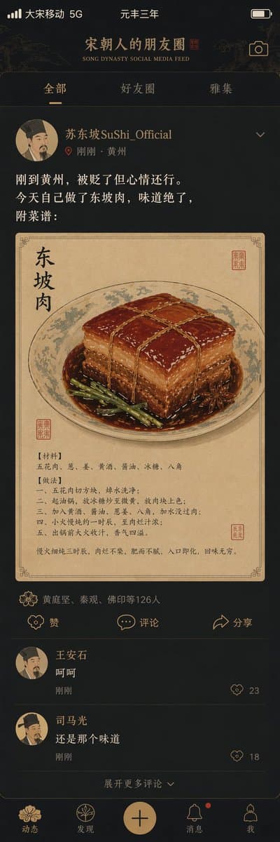
Song Hanedanı Sosyal Medya Akışı
Tarihi figürleri modern uygulama tasarımıyla harmanlayan, posterler ve yaratıcı kampanyalar için ideal, mizahi bir Song Hanedanı sosyal medya akışı kullanıcı arayüzü oluşturun.
İstem
"Song Dynasty People's Circle of Friends"/"SONG DYNASTY SOCIAL MEDIA "FEED", antik ve modern mizahı birleştiren bir arayüz tasarım tarzı. Ekran bir cep telefonu sosyal medya arayüzünü simüle eder ancak içerik tamamen Song Hanedanı sahnelerinden oluşur. Avatarlar Song Hanedanı edebiyatçılarının portreleridir. Kullanıcı adı "Su Dongpo SuShi_Official" şeklindedir. Paylaştığı içerik: "I just arrived in Huangzhou and was demoted but I am in a good mood today." Dongpo Pork, delicious, attached recipe: ", görsel gongbi resmi tarzında Dongpo Pork yakın çekimidir, beğeni listesi "Huang Tingjian, Qin Guan, Foyin, etc. 126 people", yorum alanı "Wang Anshi: Haha", "Sima Guang: Still the same taste", beğeni simgesi gibi arayüz ögeleri Song Hanedanı motifleriyle değiştirilmiştir, durum çubuğunda "Da Song Mobile" 5G" ve "Yuanfeng Three Years" görünür, renk eşleşmesi cep telefonunun koyu modu ile Song Hanedanının zarif tonlarıdır, tarih ve sosyal medyanın ilginç çarpışmasının bir başyapıtı
Kullanım rehberi
Bu kullanım rehberi şu anda İngilizce olarak sunulmaktadır.
A phone social-feed screen transplanted into Song dynasty China: a scholar-portrait avatar, a post about life in exile, a fine-brush braised pork illustration, ornament-style like icons and a status bar reading Great Song Mobile 5G with a reign-year date. Suited to history memes, museum merchandise and time-slip interface concepts.
When to use
Playful explainers for museum or heritage accounts, warm-up visuals for literature or history classes, exhibition posters and merchandise, and concept practice for interface designers. Keep one full post plus two or three comments per screen so the whole phone, from status bar to bottom tabs, reads at a glance.
What the existing cover image shows
The existing cover illustration is an extremely tall vertical image (roughly 1:3) in dark mode with gold-bronze linework. The status bar reads Great Song Mobile 5G and the reign year; the header carries a bilingual title with three tabs beneath it. The post shows a painted-portrait avatar, the username, a timestamp with the city, three lines of text, then a fine-brush illustration of braised pork on paper with the ingredients and steps printed beside it. The likes list, three action buttons, two comments and an expand-comments line are all clear, and the five bottom tabs use floral icons. The post text and comments are the most legible part; the small recipe text inside the picture is nearly unreadable at thumbnail size. The like icon is a small blossom, so the ornament-swap idea is present but subtle.
Suggested setup
- Aspect ratio
- 9:16 · The record says 1:1, yet the cover is about 1:3, taller than any phone, and would need cropping to publish. Ask for a 9:16 vertical full phone screen with everything from status bar to bottom navigation inside the frame, the post and its picture in the upper half and the comments in the lower half.
- Reference images
- Not needed. The interface is invented; do not upload screenshots of real social apps as references, or their icons and brand elements will be copied along with the layout. For a particular painting manner, a single fine-brush or album-leaf painting can serve as a style reference.
What to customize
- Poster and post textUsername 'Jiangnan painter Shen Yanqiu', post: 'Just had a new scroll mounted. Opinions welcome.'
- Keep the post to two or three short lines and give it verbatim in quotes; long posts are where the characters start to scramble. The persona can be any invented Song-era role, but still ask for the avatar in painted-portrait style.
- Attached picture and its styleA corner of a garden in blue-green landscape style
- Give the picture one subject only; do not pack a whole recipe into it as the original does, since long text inside an image is the most error-prone element.
- Period swaps for interface elementsLike icon as a plum blossom, comment icon as a folded letter, bottom tabs as scroll, teacup and seal
- Spell out each icon and its replacement, and keep five tabs and three action buttons so the page structure holds together.
View a complete adaptation
Ming dynasty short-video app
The same period-meets-phone interface, recast as a Ming cloth merchant's garden short-video page in a light mode of rice-paper white and porcelain blue, with invented people and comments.
This adaptation has not been generated. The existing cover image comes from the original prompt collection and is not a result of this adaptation.
Ming Dynasty Short Video Feed, a humorous interface design fusing period life with modern phone UI. The screen imitates a short-video playback page, but every element is Ming dynasty. Avatar: a painted half-length merchant portrait; username Songjiang cloth merchant Shen Yanqiu. Video cover: a Suzhou garden corner in blue-green landscape style: covered bridge, lake rock, willow. Caption: New small garden, work starts today, come by when free. Right-side button column: plum blossom like, folded-letter comment, bookmark save, paper-kite share. Likes: Mrs. Zhou, Mr. Xu, Scholar Gu and 88 others. Comments: Squire Lu: big garden, much silver; Scholar Gu: when is the housewarming drink. Status bar: Great Ming Signal Full, reign year Wanli 12. Bottom tabs: Home, Circle, Post, Letters, Me. Light mode in rice-paper white with cobalt blue and cinnabar red accents, regular-script headings with a thin modern sans serif, 9:16 vertical, a witty collision of history and short video.
Troubleshooting
- Post, comment or in-picture text comes out with wrong or invented characters
- Shorten every string and quote each one separately, drop long passages such as the recipe or keep a single line; if Chinese still breaks, generate the layout first and repaint only the text areas with an edit mask.
- The whole image turns into a classical painting and loses the phone
- Open the prompt by stating it is a phone screenshot, list the status bar, header, tabs, post, action row, comments and bottom navigation in top-to-bottom order, and ask to keep rounded cards and divider lines.
Editorial notes and generation record
AI-assisted editorial analysis of the source prompt and existing illustration. Settings are starting suggestions; the new adaptation is not a model test.
No new illustration was generated for this guide. The observations refer to the prompt's existing cover image from its source collection; its generation details are not recorded.
İstem ayrıntıları
- Kategori
- UI / UX tasarımı
- Model
- GPT IMAGE 2
- Görsel başına maliyet
- 1K: 43 kredi · 2K: 86 kredi · 4K: 143 kredi
- En boy oranı
- 1:1
- Oluşturan
- @Panda20230902
- Lisans
- CC BY 4.0
- Eklenme
- Güncellenme