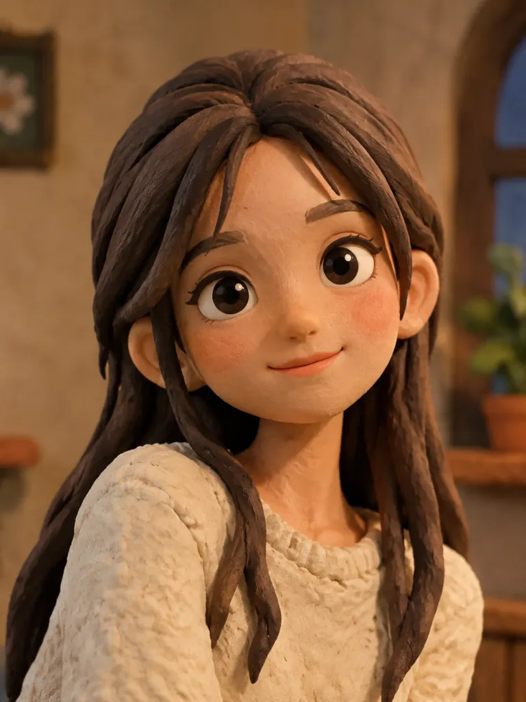
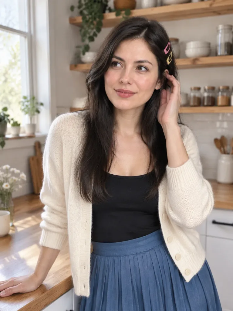
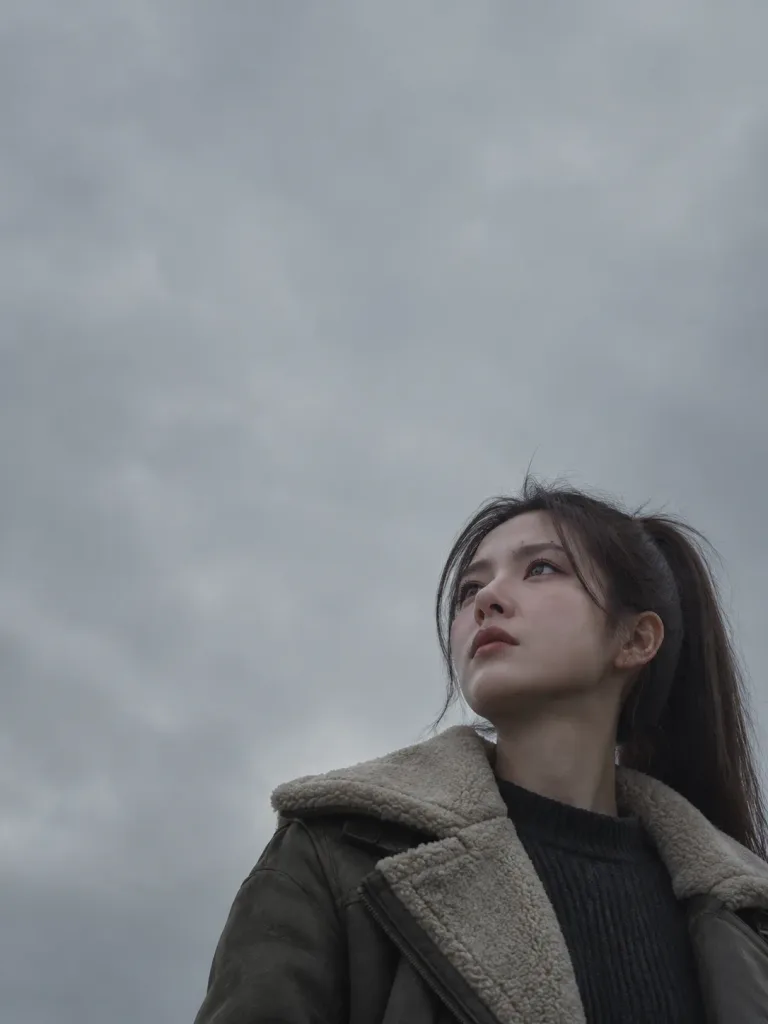
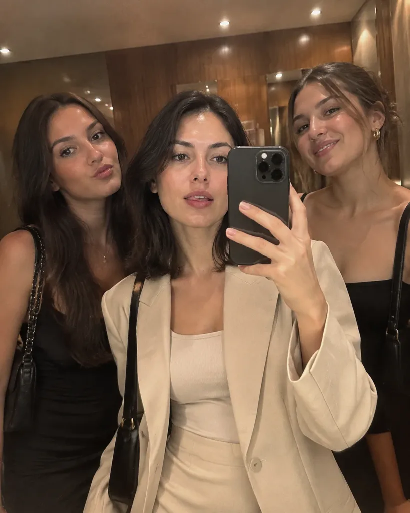
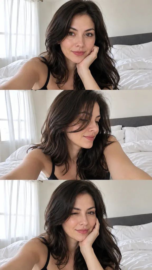
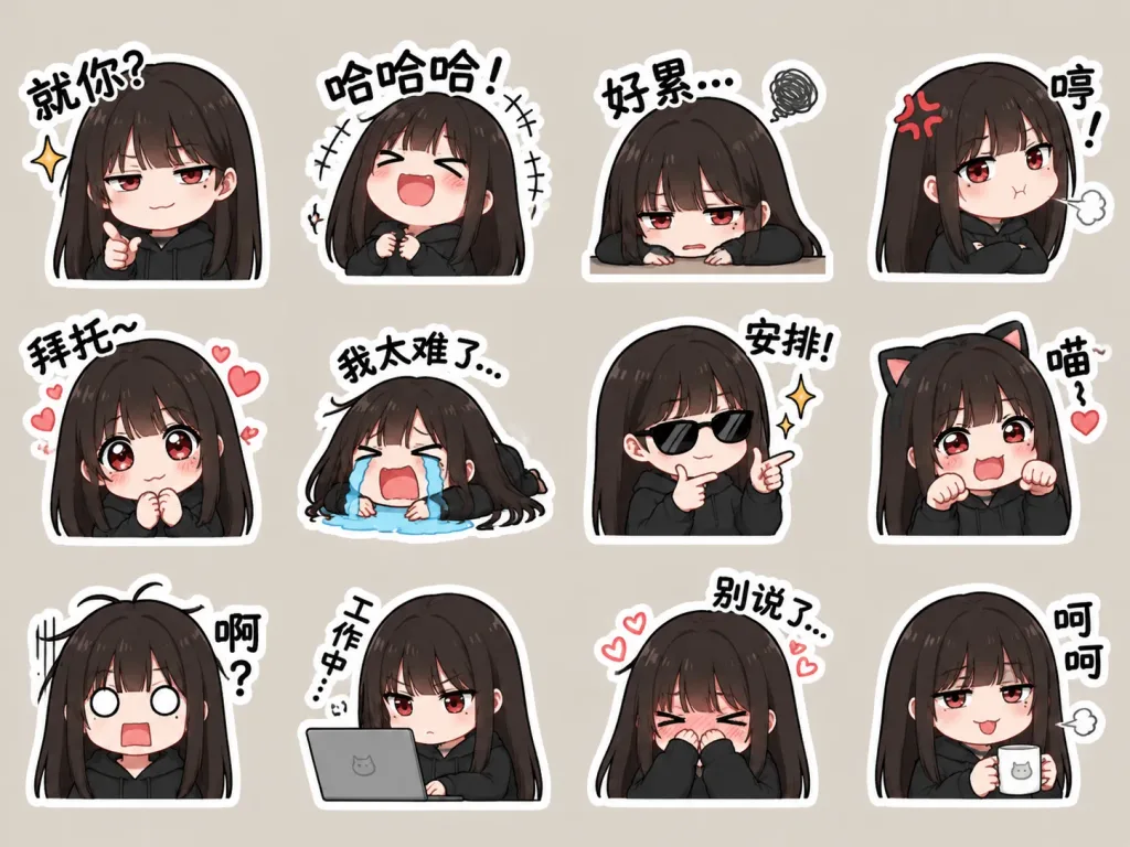
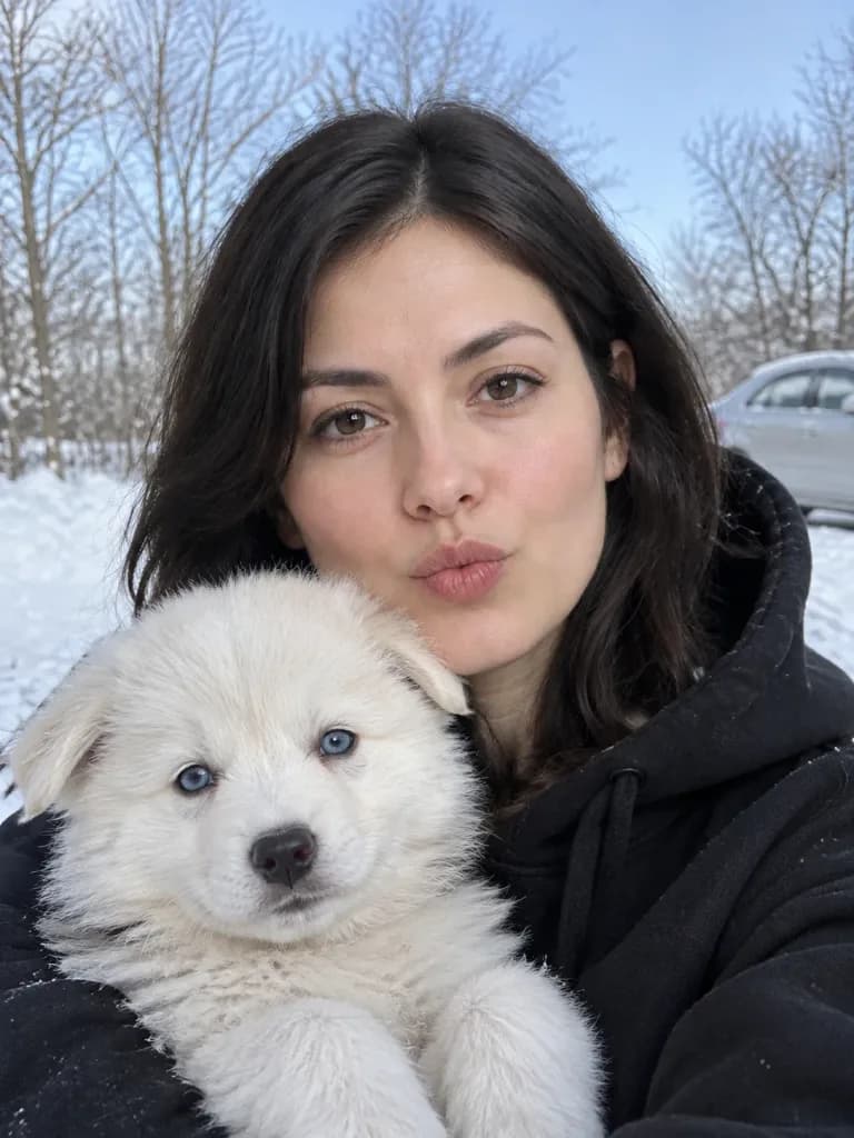
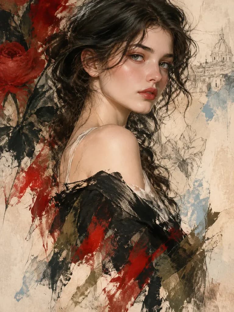
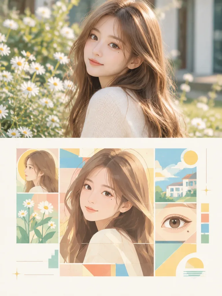
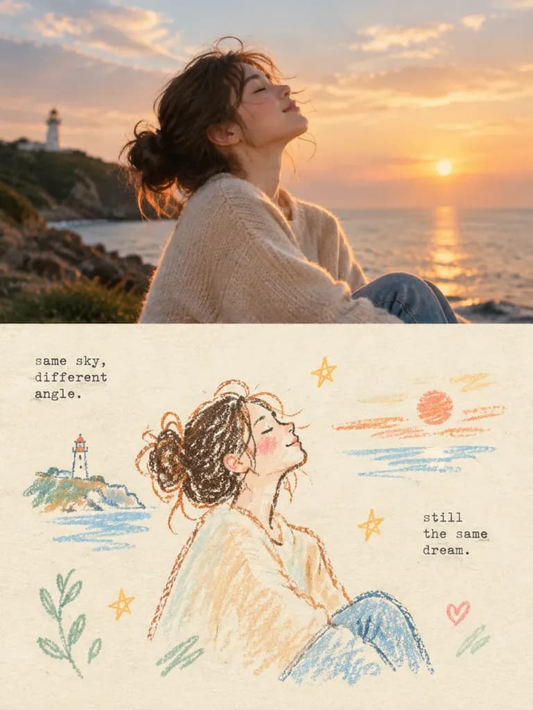
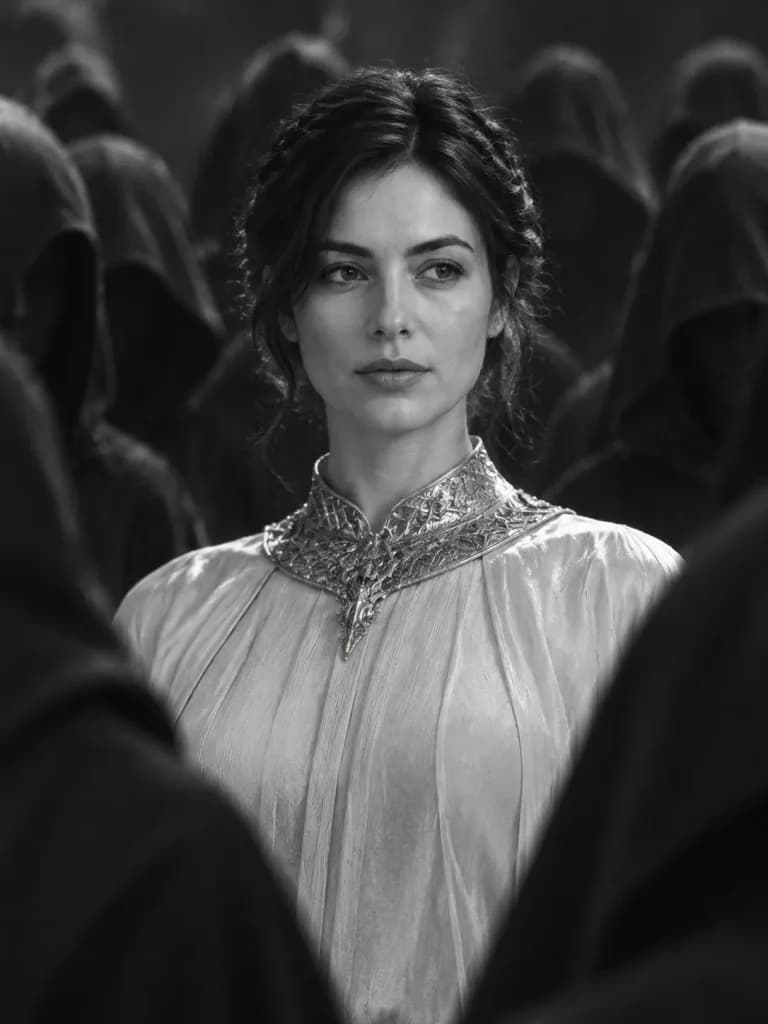
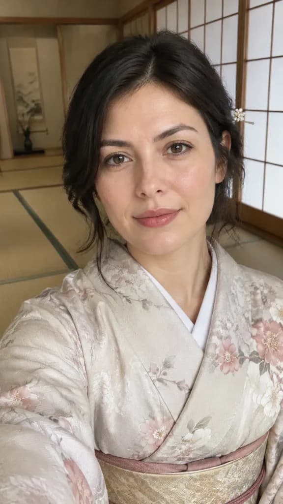
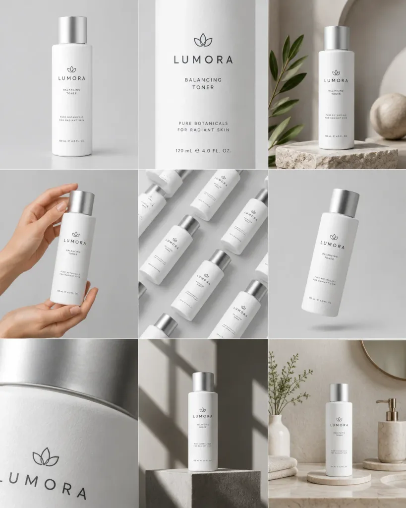
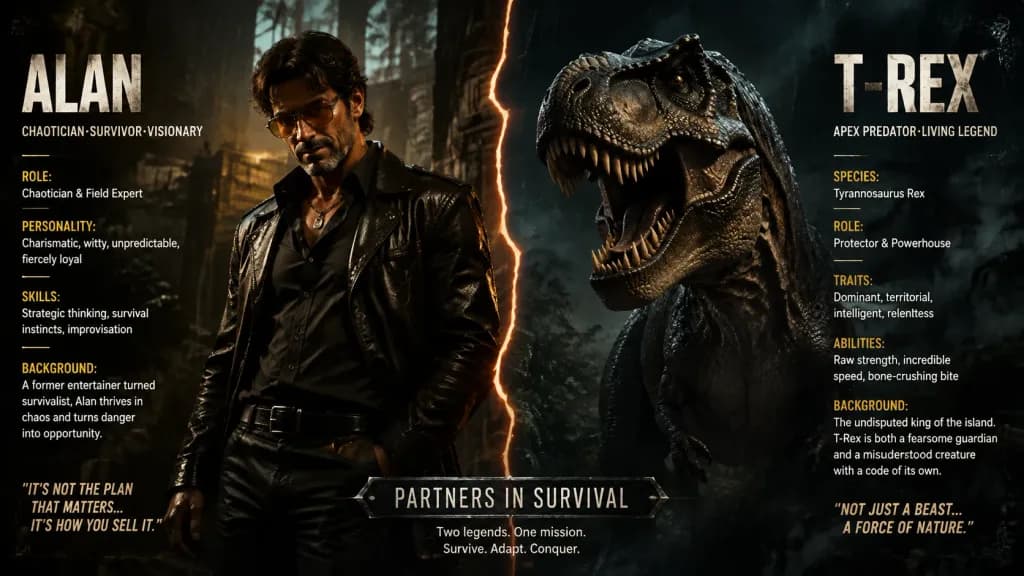
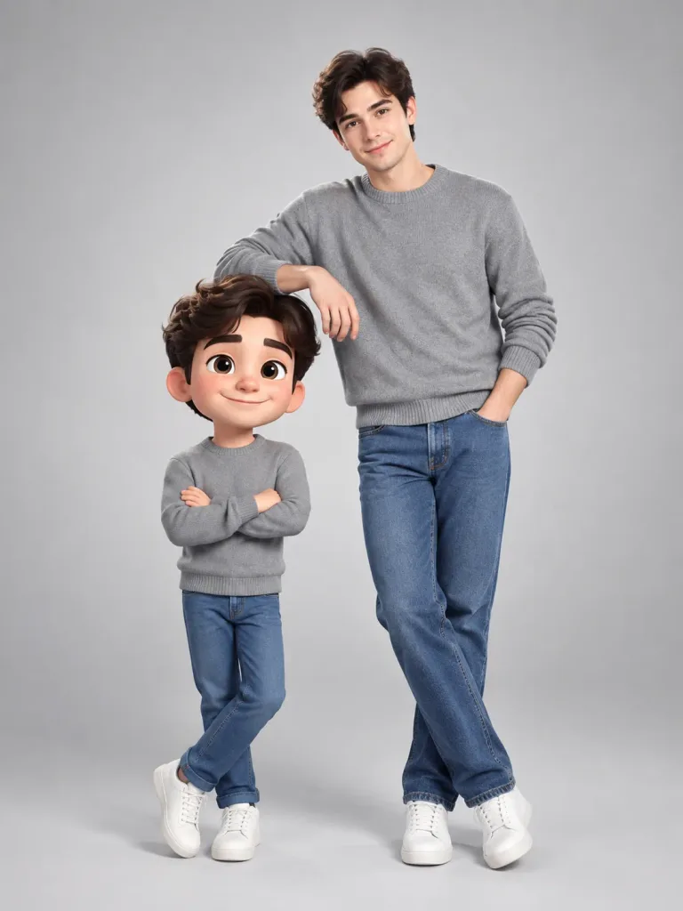
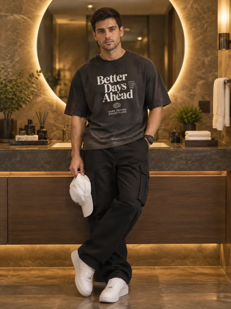
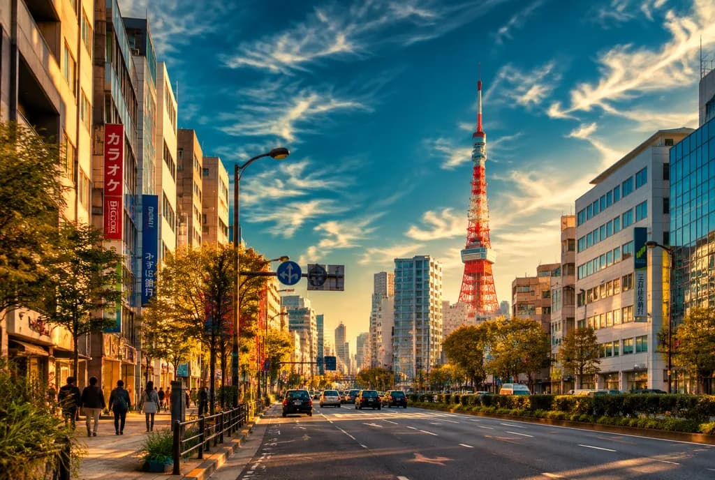
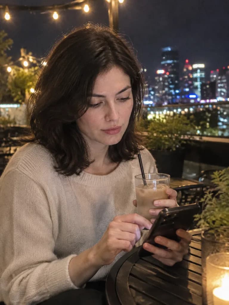
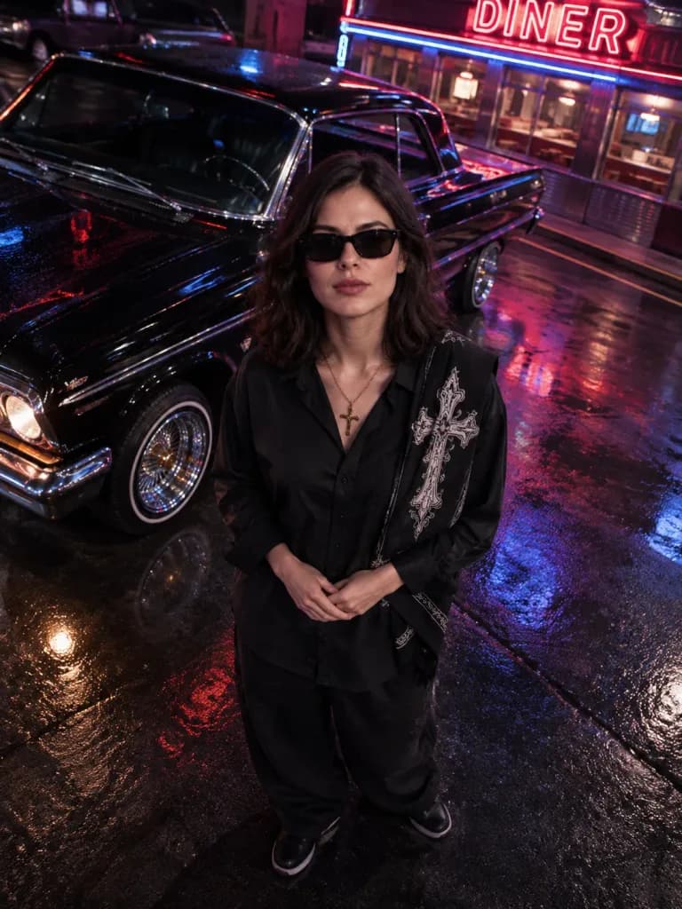
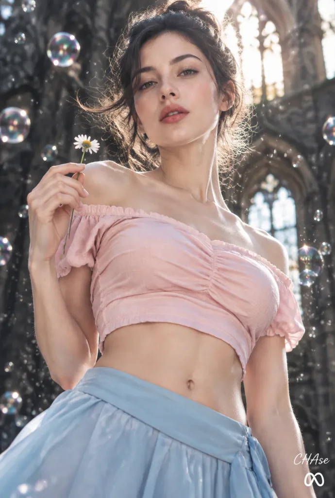
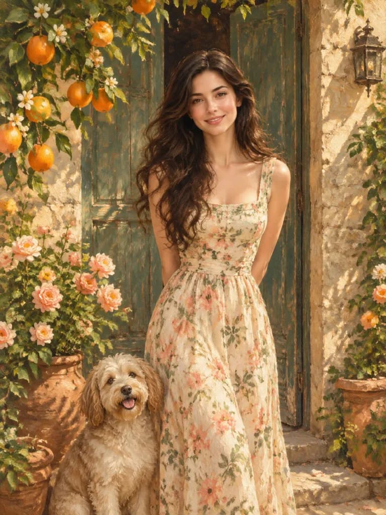
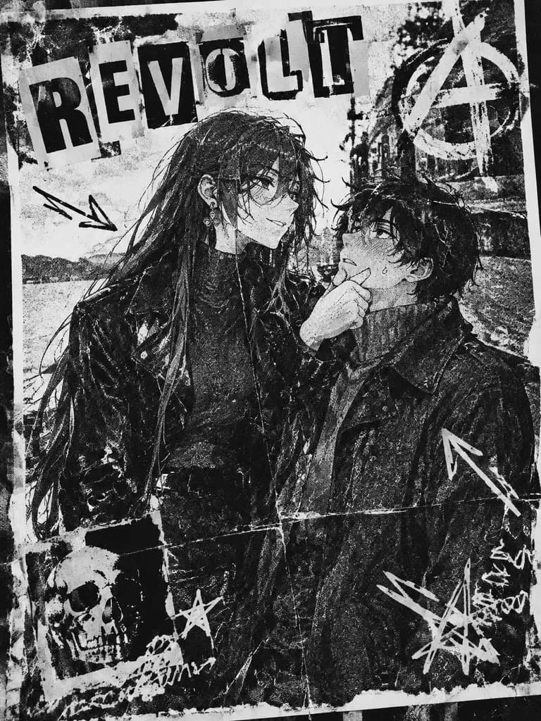
An independent high-end split design poster based on the reference photo, in a [3:4 vertical composition], split strictly 50/50 vertically into upper and lower sections.
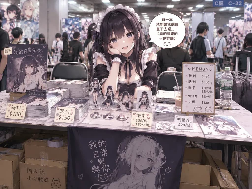
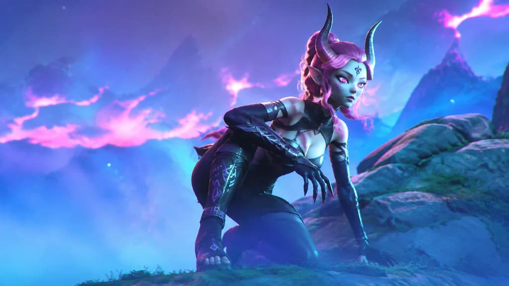
Top 50%: The original reference photo is preserved with its original subject identity, natural lighting, genuine textures, and color mood, with subtle editorial magazine-grade color grading. The background extends naturally without stretching or altering the subject.
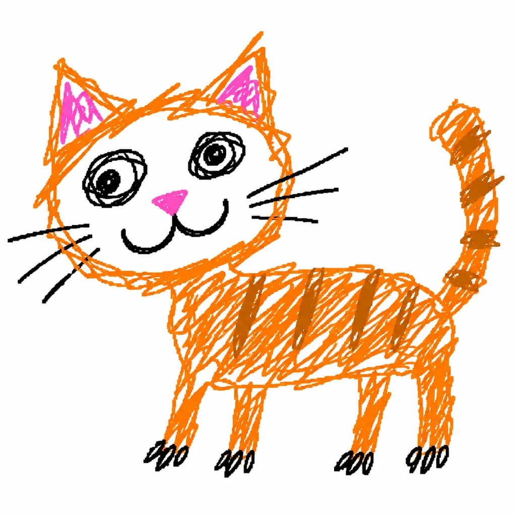
Bottom 50%: Reconstructs the reference photo's core subject, posture, visual essence, and emotional metaphor into a [vintage paper texture pastel crayon graffiti illustration]. Not a photographic redraw, but an abstract, simplified artistic interpretation retaining recognizable silhouettes and gestures.
Illustration details:
- Coarse-grained chalk and pastel crayon hand-drawn outlines: textured, dry, slightly broken, loose lines with chalk dust particles and rounded tips.
- Minimal soft pastel color fills inside the subject using sparse swatches, grids, or light smudges without realistic shading or volume.
- Small naive doodle elements (stars, botanicals, abstract marks) drawn in single, loose, incomplete strokes using the same chalk language.
- Small-scale focal element surrounded by generous breathing white space; off-center or asymmetrical layout.
- Background: Ultra-clean, bright, warm light paper texture (cream, ivory, pale beige, or soft off-white) with faint fiber texture, significantly brighter than lines and swatches for clear contrast.
- Color palette: 2–4 pastel tones extracted from the reference photo ([peach pink, apricot orange, soft sky blue, mint green]), paired with distinct darker colored chalk outlines (coral, slate, warm umber).
- Typography: Short, poetic text fragments scattered naturally in typewriter-style monospace font with subtle mechanical printing imperfections, colored in dark slate gray or muted black.
postersplit screencrayon sketch