신규: GPT Image 2.5 Flare와 Sunburst. 가입하면 3장 무료, 이후 장당 8 크레딧.
GPT Image 2.5 사용해 보기

AI UI 목업 프롬프트

대시보드, 앱 화면, 디바이스 목업, 랜딩 페이지, 정보 밀도가 높은 페이지 레이아웃 등 인터페이스 콘셉트를 위한 프롬프트입니다. 잘 쓴 프롬프트는 화면 영역을 읽는 순서대로 나열하고, 플랫 캡처와 디바이스 목업 중 하나를 정하며, 반드시 읽혀야 하는 몇 개의 라벨만 따옴표로 지정합니다. 결과물은 실제 개발용 사양보다는 프레젠테이션, 무드보드, 초기 콘셉트에 활용하세요.

정렬 기준:

프롬프트 625개 중 541–600개 표시

다크 모드 소셜 미디어 프로필 목업

다크 모드 소셜 미디어 프로필 목업

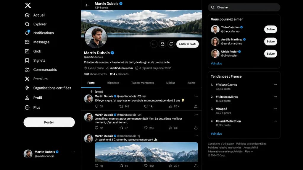
A realistic dark-mode desktop social media interface mockup closely resembling the desktop X/Twitter layout in French, presented as a full-screen browser screenshot on a dark black background with subtle dark gray dividers. Left sidebar: - Top: White X logo. - Vertical navigation list of 11 items with white icons and text: “Accueil”, “Explorer”, “Notifications” (with a small blue notification badge reading “3”), “Messages”, “Grok”, “Signets”, “Communautés”, “Premium”, “Organisations certifiées”, “Profil”, and “Plus”. - Middle-lower area: Large pill-shaped white button labeled “Poster”. - Bottom: Compact user card for [Martin Dubois] with handle @martindubois and a circular user avatar. Center column (Profile view): - Header: Back arrow, name “[Martin Dubois]” with a blue verification checkmark, and subtext “1 248 posts”. - Cover image: Wide panoramic banner of cloudy alpine mountains above a forest lake. - Profile row: Circular profile picture of a young man in dark clothing slightly overlapping the banner bottom-left. On the right, three circular icon buttons and a rounded light button labeled “Éditer le profil”. - Info section: Display name “[Martin Dubois]” with blue checkmark, handle @martindubois, French bio reading “Créateur de contenu • Passionné de tech, de design et de productivité.” - Metadata row: Location “Lyon, France”, link “martindubois.com”, and “A rejoint X en janvier 2021”. - Stats row: “320 abonnements” and “12,4 k abonnés”. - Tab bar with 5 items: “Posts” (active, underlined in electric blue), “Réponses”, “Tweets marquants”, “Médias”, “J’aime”. - Feed containing 3 posts: 1. Pinned post labeled “Épinglé”, date “12 mai”, text: “10 leçons que j’ai apprises en construisant mon projet pendant 2 ans 💡”, metrics: 24 replies, 142 reposts, 1 k likes, 85 k views. 2. Date “2h”, text: “Le meilleur moment pour commencer était hier. Le deuxième meilleur moment, c’est maintenant.”, metrics: 12 replies, 37 reposts, 256 likes, 8 k views. 3. Date “1j”, text: “Un week-end à Chamonix, toujours ressourçant 🏔️”, attached with an embedded daylight photo of snowy peaks, metrics row at bottom. Right sidebar: - Rounded search bar with placeholder text “Chercher”. - Card titled “Vous pourriez aimer” with 3 suggestions: “Théo Catarino” @theocatarino, “Aurélie Martinez” @aurel_martinez, and “Ulrich Rozier” @ulrichrozier, each with avatar, blue badge, and white “Suivre” button, ending with a “Voir plus” link. - Card titled “Tendances : France” with 4 ranked trends: 1. “#RolandGarros” (32,1 k posts), 2. “#FêteDesMères” (18,4 k posts), 3. “Mbappé” (45,2 k posts), 4. “#LundiMotivation” (12,3 k posts), ending with “Voir plus”. - Bottom footer: Small gray legal links and “© 2024 X Corp.”. Style: Crisp vector-like UI elements, authentic typography, precise layout spacing, modern dark-mode digital product design.
ui 목업소셜 미디어다크 모드
일본식 산업 B2B 제안서 표지 슬라이드

일본식 산업 B2B 제안서 표지 슬라이드

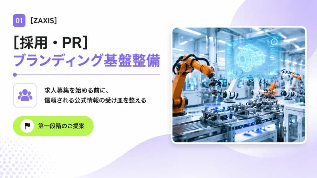
A clean 16:9 Japanese corporate B2B proposal cover slide for an industrial automation and engineering company, designed with a modern consulting deck aesthetic, generous whitespace, and subtle tech accents. Layout and Content: - Top-left: A small rounded purple square badge displaying white text "01", followed by the company name "[ZAXIS]" in crisp black sans-serif typography. - Main Headlines: Directly below, a large bold black Japanese headline reading "[採用・PR]", stacked above a matching large bold lavender headline reading "[ブランディング基盤整備]". Underneath the headlines is a thin lavender horizontal dividing line with a small circular dot on its left edge. - Middle-left: A rounded square outline card containing a minimalist lavender community/people icon. Directly to its right are two lines of black Japanese body copy: "[求人募集を始める前に、]" and "[信頼される公式情報の受け皿を整える]". - Lower-left: A vibrant lime-green rounded pill button featuring a small white circle with a black flag icon and the Japanese text "[第一段階のご提案]". - Right half: A large rounded-corner photo card with a soft drop shadow and a thin white border, depicting a brightly lit futuristic smart factory floor with orange and white robotic arms assembling precision parts, blue-tinted machinery, and a glowing translucent holographic CAD interface floating above the workstation. Background and Atmosphere: Bright white background with soft lavender gradient washes, a large semi-transparent lavender circular gradient behind the photo card in the upper-right, a gentle lavender wave shape flowing from bottom-center toward the right, and a subtle pale lavender halftone dot pattern in the lower-left corner. Crisp, professional, polished corporate presentation slide.

프레젠테이션 슬라이드b2b 제안서일본어 타이포그래피
일본어 AI 자소서 첨삭 앱 UI 목업

일본어 AI 자소서 첨삭 앱 UI 목업

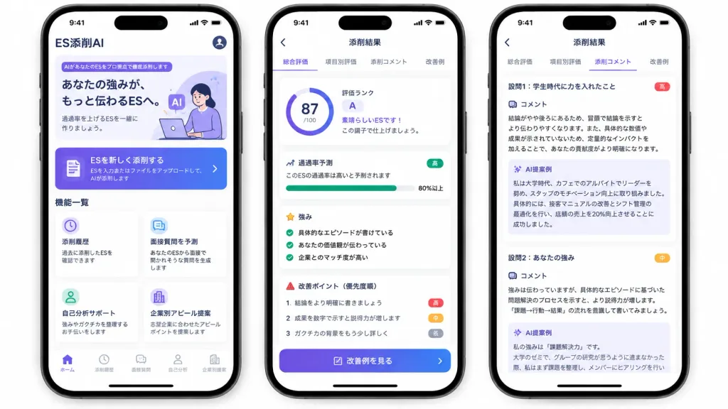
A polished marketing mockup for a Japanese mobile app called [ES添削AI], an AI entry-sheet critique tool for job-hunting students, presented on three modern black-framed iPhones displayed side-by-side on an isolated white background. Composition & Layout: Wide horizontal 16:9 framing showing exactly three smartphones with subtle drop shadows, rounded corners, top Dynamic Island displaying status bar time 9:41, and bottom iOS home indicators. Clean UI cards, soft elevation shadows, and a purple-to-indigo gradient visual identity. Phone 1 (Home Screen): - Top header: text "ES添削AI" at top left, circular profile icon at top right. - Hero card: purple tag reading "AIがあなたのESをプロ視点で徹底添削します", bold headline "あなたの強みが、もっと伝わるESへ。", subtext "通過率を上げるESを一緒に作りましょう。", and a minimal graphic of a student working on a laptop with lavender AI badges. - Primary CTA button: gradient card with document icon reading "ESを新しく添削する" and small text "ESを入力またはファイルをアップロードして、AIが添削します" with a right chevron. - Feature grid section titled "機能一覧" with exactly four white cards: 1) Clock icon: "添削履歴" / "過去に添削したESを確認できます"; 2) Chat icon: "面接質問を予測" / "あなたのESから面接で聞かれそうな質問を生成します"; 3) User icon: "自己分析サポート" / "強みやガクチカを整理するお手伝いをします"; 4) Building icon: "企業別アピール提案" / "志望企業に合わせたアピールポイントを提案します". - Bottom tab bar with 5 items: "ホーム" (active), "添削履歴", "面接質問", "自己分析", "企業別提案". Phone 2 (Results Overview Screen): - Top navigation bar: back arrow and centered title "添削結果". - Tab bar with 4 items: "総合評価" (active with purple underline), "項目別評価", "添削コメント", "改善例". - Overall evaluation card: circular progress score ring showing "[87]/100", alongside text "評価ランク", large letter "[A]", "素晴らしいESです!", and "この調子で仕上げましょう。". - Pass rate card: title "通過率予測", text "このESの通過率は高いと予測されます", green badge "高", progress bar filled to "80%以上". - Strengths section: title "強み" with 3 green checkmark items: "具体的なエピソードが書けている", "あなたの価値観が伝わっている", "企業とのマッチ度が高い". - Areas for improvement: title "改善ポイント(優先度順)" with 3 items: 1 "結論をより明確に書きましょう" (red badge "高"), 2 "成果を数字で示すと説得力が増します" (orange badge "中"), 3 "ガクチカの背景をもう少し詳しく" (gray badge "低"). - Bottom gradient button: "改善例を見る". Phone 3 (Detailed Critique Screen): - Top navigation bar: back arrow and title "添削結果", repeating the 4 tabs with "添削コメント" active. - Two stacked white critique cards: 1. Heading "設問1:学生時代に力を入れたこと" (red badge "高"), "コメント" analyzing conclusion placement and quantitative impact, followed by a pale lavender box titled "AI提案例" rewriting a cafe leadership experience with a 20% sales increase. 2. Heading "設問2:あなたの強み" (orange badge "中"), "コメント" advising evidence-based problem-solving structure, followed by an "AI提案例" box beginning "私の強みは『課題解決力』です。", slightly cut off at the bottom. Style: Modern Japanese iOS mobile app design, crisp Japanese typography, clean whitespace, subtle pastel accents, trustworthy and professional finish.

ui 목업모바일 앱일본 앱
모바일 라이브 커머스 화면 목업

모바일 라이브 커머스 화면 목업

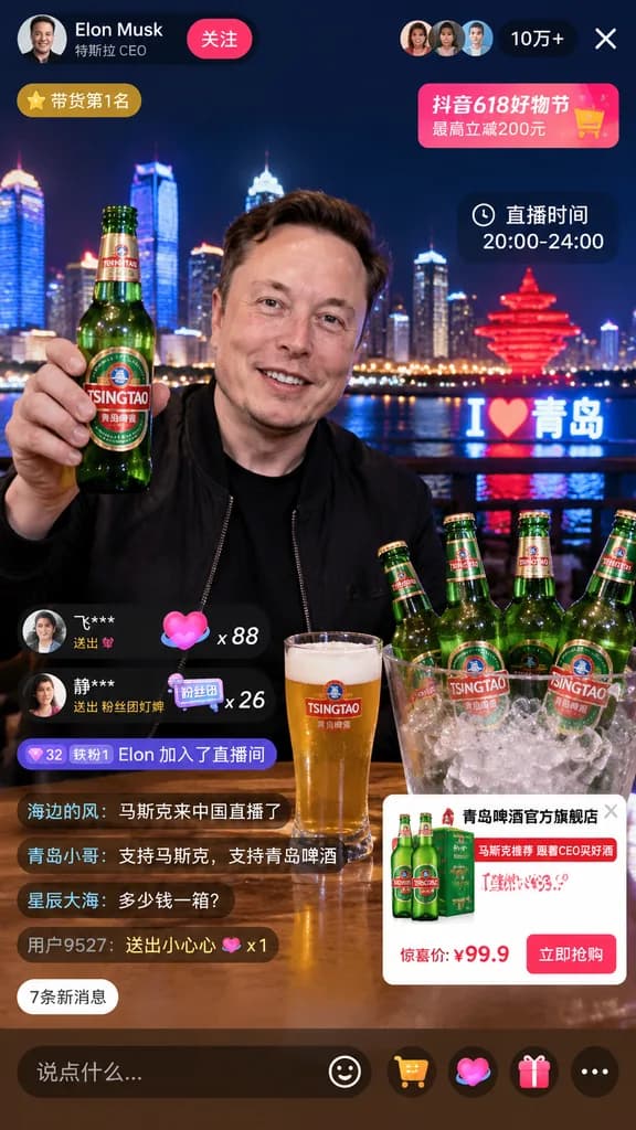
livestream interface mockup. [Elon Musk]. smiling man in a black jacket. holding up a green glass beer bottle with a [TSINGTAO] label. [Qingdao skyline at night] with illuminated skyscrapers, a river, a glowing red sculptural monument, and…

라이브커머스ui이커머스목업소셜커머스
미래지향적 AI 런칭 캠페인 히어로 배너

미래지향적 AI 런칭 캠페인 히어로 배너

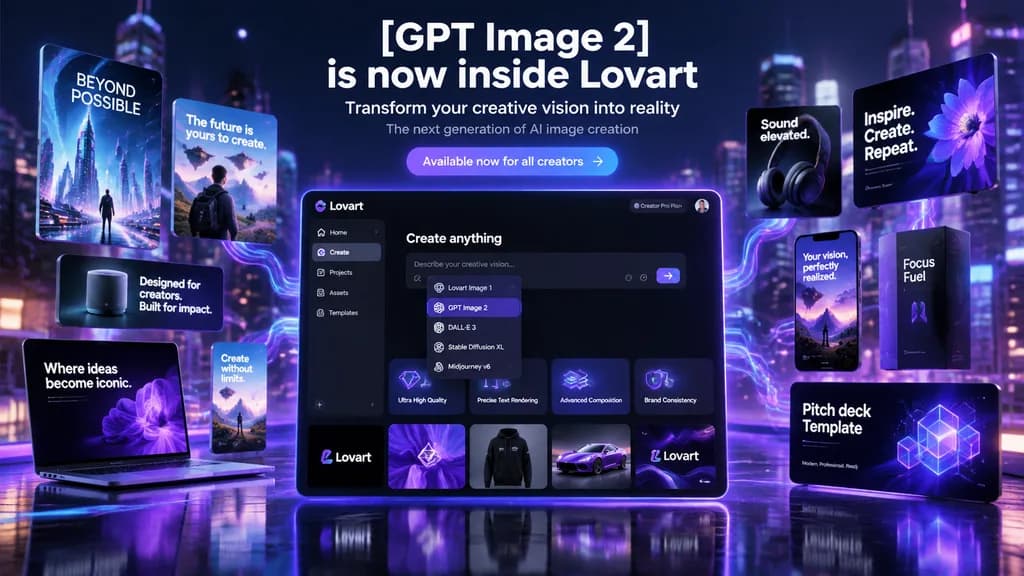
futuristic AI product launch campaign hero banner. high-end 3D advertising composite with cinematic neon lighting, polished UI mockups, floating product cards, and glossy tech presentation aesthetics. left floating posters and devices. cen…

제품 런칭히어로 배너ui 목업
택티컬 JRPG 사제 캐릭터 상태창

택티컬 JRPG 사제 캐릭터 상태창

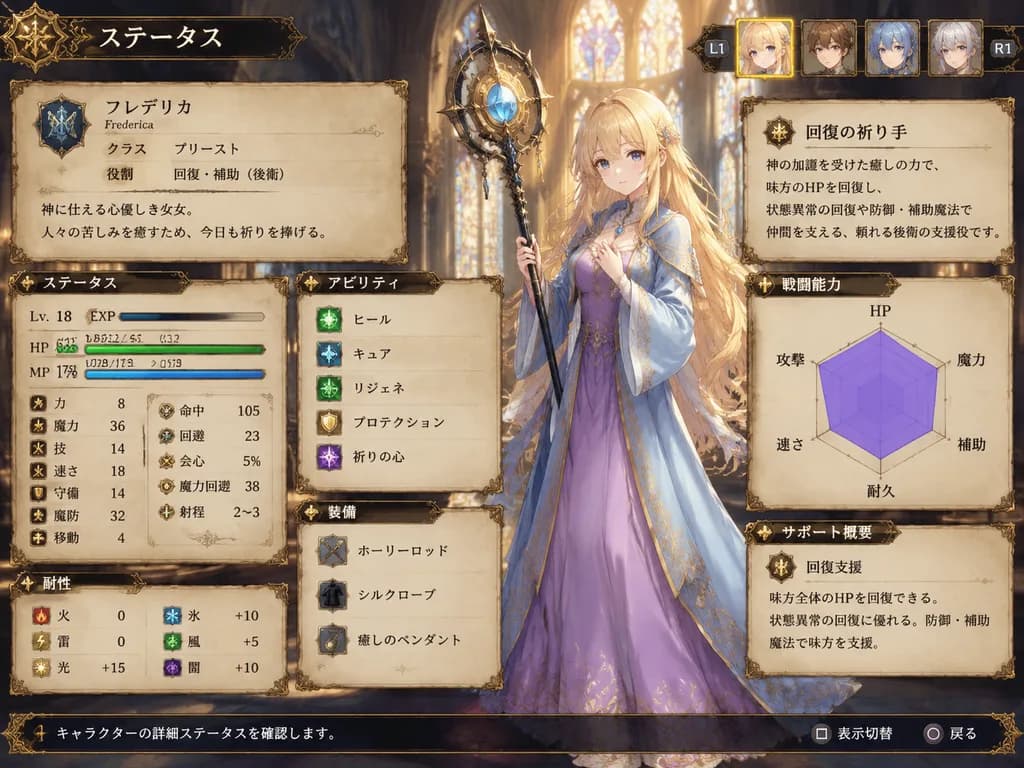
fantasy JRPG character status screen mockup. ornate medieval parchment interface with dark bronze filigree borders and warm fantasy atmosphere. very long, slightly wavy, loose hair flowing past the waist with soft bangs. ステータス. identity pa…

jrpg상태창게임 ui
인테리어 디자인 잡지 표지 목업

인테리어 디자인 잡지 표지 목업

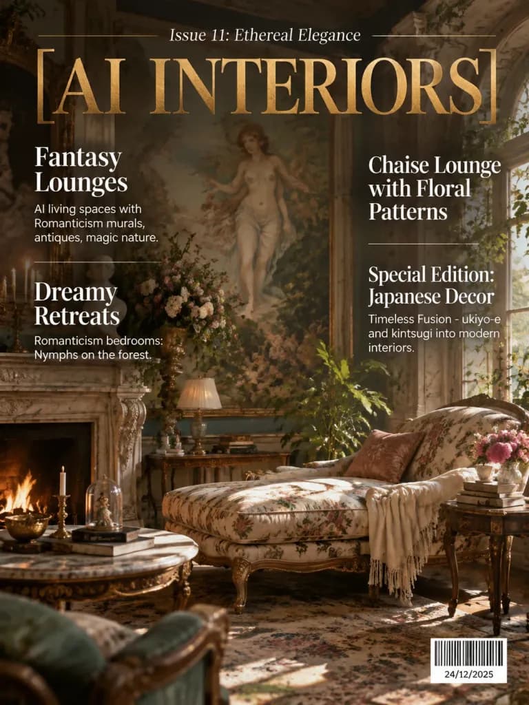
A realistic mockup of an interior design magazine cover. The main title in metallic gold foil reads "[AI INTERIORS]", with the header "Issue 11: Ethereal Elegance". The background features an opulent interior living space with Romanticism murals, antique furnishings, and enchanting botanical details. The editorial text overlay is clean and arranged into two distinct columns in crisp white typography. Left column: - Top headline: "Fantasy Lounges" with caption "AI living spaces with Romanticism murals, antiques, magic nature." - Lower headline: "Dreamy Retreats" with caption "Romanticism bedrooms: Nymphs on the forest". Right column: - Top headline: "Chaise Lounge with Floral Patterns" - Lower headline: "Special Edition: Japanese Decor" with subtitle "Timeless Fusion - ukiyo-e and kintsugi into modern interiors." - Bottom right corner: a clean, realistic retail barcode (black and white stripes) with the date "[24/12/2025]". Precise editorial grid alignment, elegant serif and sans-serif typography, high-end publication design.
잡지 표지목업에디토리얼 디자인
음악 앱 UI 콘셉트 프레젠테이션 포스터

음악 앱 UI 콘셉트 프레젠테이션 포스터

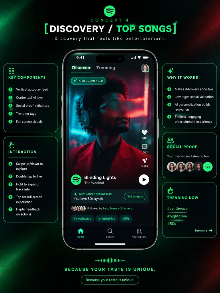
premium app UI concept poster. futuristic dark neon interface. [DISCOVERY / TOP SONGS]. KEY COMPONENTS. INTERACTION. WHY IT WORKS. SOCIAL PROOF. TRENDING NOW. Spotify-inspired music discovery redesign. portrait. deep black with subtle grai…
ui디자인케이스스터디스마트폰목업
모던 SaaS 제품 인터페이스 비주얼

모던 SaaS 제품 인터페이스 비주얼

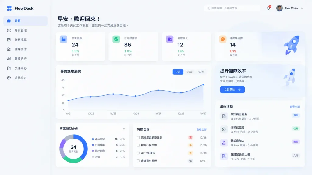
Atmospheric product interface visual for a modern [SaaS platform]. Clean visual hierarchy, balanced contrast, soft diffused shadows, neutral minimalist color palette. Composition focused on visual clarity, calm aesthetic, and sophisticated dashboard layout, designed as a premium software interface experience.

ui디자인saas대시보드
애니메이션 결과가 포함된 모바일 AI 채팅 스크린샷

애니메이션 결과가 포함된 모바일 AI 채팅 스크린샷

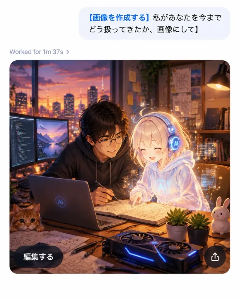
A realistic mobile AI chat app screenshot showing an image-generation result with a polished iOS-like interface and a high-quality anime illustration inside the generated image card, on a clean white canvas without a device frame, vertical 4:5 aspect ratio. Top chat area: Near the top right, one large light-gray rounded message bubble containing Japanese sans-serif text: "[画像を作成する 私があなたを今までどう扱ってきたか、画像にして]". The opening phrase is bold blue, and the remainder is black. Below the bubble, aligned left, a small gray status line displays "[Worked for 1m 37s ›]". Generated image card: Below the status line, a large rounded-rectangle image card with smoothly curved corners depicts a warm cinematic anime-style scene in a cozy developer studio at dusk. Exactly two main characters are featured: one young Japanese man with tousled dark hair, round glasses, and a dark hoodie leaning over a desk with a pen in hand; and one petite glowing holographic AI girl with pale blond hair, a translucent white hoodie, and round futuristic headphones, smiling as she points at an open notebook. The atmosphere is affectionate, collaborative, and magical. Illustration details inside the card: A sunset city skyline through a wide window, warm desk-lamp illumination, wall shelves with books, pinned diagrams and sticky notes, and soft bokeh lights. On the wooden desk: exactly one open laptop with a subtle circular AI logo, exactly two external monitors on the left displaying code and a landscape, exactly one open notebook with sketches and formulas, exactly one GPU-style device with blue LED accents, exactly one orange cat peeking from the bottom-left edge, exactly one white rabbit figurine on the right, exactly two small potted succulents, and scattered sketch papers, cables, and pens. A delicate golden aura and subtle floating UI particles surround the holographic girl. Card overlay UI: Two floating overlay controls on the image card: one dark translucent pill button at bottom-left reading "[編集する]" in white Japanese sans-serif text, and one circular dark translucent share button at bottom-right with a white upward-pointing share arrow. Visual style: Crisp app interface combined with rich anime art, sharp legible typography, warm amber and violet cinematic lighting, soft depth of field, high contrast between the minimalist white UI and the cozy dark studio illustration.

채팅ui애니메이션모바일앱
모바일 앱 아이콘 콘셉트 보드

모바일 앱 아이콘 콘셉트 보드

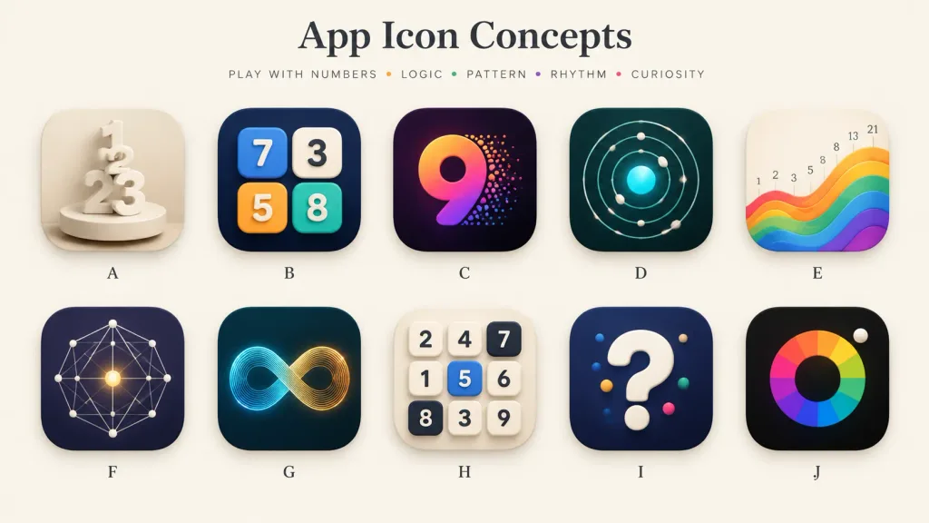
A polished presentation board showcasing 10 alternative app icon concepts for a [number-play and logic puzzle] mobile app. Wide 16:9 landscape canvas on a warm off-white background, minimal gallery-style spacing, soft shadows, and a premium design-review aesthetic. Header: Centered at the top, a large elegant serif title: "[App Icon Concepts]". Below it, a small uppercase tracked tagline: "[PLAY WITH NUMBERS • LOGIC • PATTERN • RHYTHM • CURIOSITY]" with tiny colored dots between words. Grid & Icons: A clean 2-row by 5-column grid containing exactly 10 identical-sized rounded-square app icons with consistent corner radii, subtle drop shadows, and a single centered letter label beneath each, labeled A through J: - A: Cream monochrome icon with stacked 3D numerals 1, 2, and 3 standing on a circular pedestal, sculptural plaster look. - B: Dark navy icon featuring four raised rounded number tiles (blue 7, cream 3, orange 5, teal 8) arranged like playful puzzle blocks. - C: Deep purple-black icon with a large gradient numeral 9 in orange, magenta, and violet, with colorful particle dots bursting from its right edge. - D: Dark teal icon showing an orbital logic pattern of concentric circular paths, small white spheres, and a glowing cyan center. - E: Warm ivory icon displaying rising rainbow wave bands from left to right, with small Fibonacci numbers (1, 2, 3, 5, 8, 13, 21) above the wave. - F: Dark indigo icon with a geometric constellation network of thin white connecting lines, dots, and a glowing golden center point. - G: Dark teal icon featuring a luminous infinity loop made of fine parallel lines transitioning from cyan to golden orange. - H: Light cream icon with a 3x3 grid of tactile number tiles (top row: 2, 4, 7; middle: 1, 5, 6; bottom: 8, 3, 9; tile 5 is blue, 7 and 8 are dark). - I: Dark navy icon with a large glossy white 3D question mark accented with small colored dots. - J: Near-black icon with a segmented rainbow circular color wheel around a dark center disk, and a small white sphere at the upper-right edge. Style: High-end mobile app icon exploration sheet, soft 3D rendering combined with crisp vector precision, realistic highlights, subtle ambient occlusion, balanced negative space, clean typography, no watermarks.

앱 아이콘ui 디자인콘셉트 보드
와이어프레임 기반 전문 웹페이지 리디자인

와이어프레임 기반 전문 웹페이지 리디자인

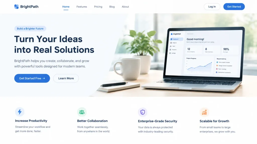
Professional web page design created strictly using the text content from the reference image, completely redesigning and ignoring its original layout. Clean, modern, and well-organized website UI layout featuring balanced visual hierarchy, elegant typography, generous whitespace, and a beautiful visual flow.

ui 디자인웹페이지와이어프레임 리디자인
바우하우스 기하학 벡터 아이콘 스타일 보드

바우하우스 기하학 벡터 아이콘 스타일 보드

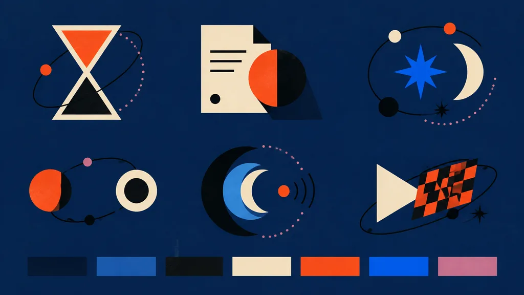
modern abstract vector icon style board for frontend assets. hourglass icon made from two cream-outlined triangles, upper chamber filled orange-red, lower chamber black, surrounded by a loose black orbital line with one small orange dot an…

벡터아이콘세트바우하우스
일본 매거진 크리에이터 인터뷰 2페이지 스프레드

일본 매거진 크리에이터 인터뷰 2페이지 스프레드

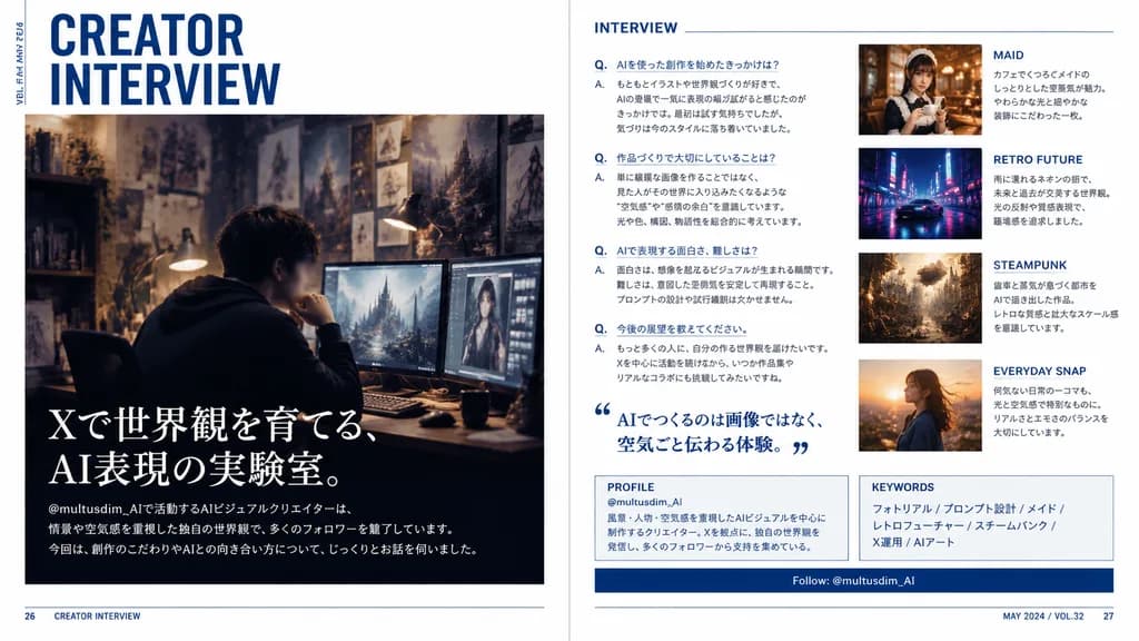
A polished two-page magazine spread in Japanese, designed like a contemporary creator profile feature in a premium culture and design magazine. The layout features a clean editorial interview spread with a crisp white background, deep navy blue accents, subtle rule lines, sharp grid alignment, and sophisticated typography. Left page: - Top left: large stacked headline reading “CREATOR INTERVIEW” in bold condensed sans-serif, with small vertical running text along the outer margin reading “VOL.23 / MAY 2024”. - Center to lower section: a large cinematic photo of a [male AI visual creator] sitting at a desk wearing a dark hoodie in a moody, dimly lit studio workspace. His face is subtly blurred or anonymized. The workspace features multiple glowing monitors showing digital artwork, a warm desk lamp, and background walls filled with concept sketches and fantasy art prints. - Lower left overlay on the photo: large Japanese feature headline in elegant white Mincho serif text reading “Xで世界観を育てる、AI表現の実験室。”, followed by smaller introductory Japanese body text referencing the handle “@multusdim_AI” and describing atmosphere-driven AI worldbuilding, along with a bottom horizontal editorial blurb. Right page: - Section 1 (left column): titled “INTERVIEW” in clean blue sans-serif, containing 4 structured Japanese Q&A entries labeled with blue “Q.” and “A.”, plus a large blue Japanese pull quote with stylized quote marks reading “AIでつくるのは画像ではなく、空気ごと伝わる体験。” - Image cards (right column, stacked vertically): 1. “MAID” card showing a warm cafe portrait of an elegant maid-themed woman holding a cup, with Japanese caption. 2. “RETRO FUTURE” card showing a neon-lit, rainy sci-fi street scene with a sleek car, with Japanese caption. 3. “STEAMPUNK” card showing an intricate brass clockwork city with steam and gears, with Japanese caption. 4. “EVERYDAY SNAP” card showing a candid outdoor portrait in golden hour sunset light, with Japanese caption. - Bottom panels: a boxed “PROFILE” section with handle “@multusdim_AI” and background bio, a “KEYWORDS” box listing “フォトリアル / プロンプト設計 / メイド / レトロフューチャー / スチームパンク / X運用 / AIアート”, and a navy blue horizontal bar reading “Follow: @multusdim_AI”. - Footer: page numbers 26 and 27 in bottom corners with small folio text “CREATOR INTERVIEW” and “MAY 2024 / VOL.32”. Authentic Japanese print typography and magazine layout hierarchy.

매거진 스프레드에디토리얼 디자인일본어 타이포그래피
웹 배너 광고 시안 그리드

웹 배너 광고 시안 그리드

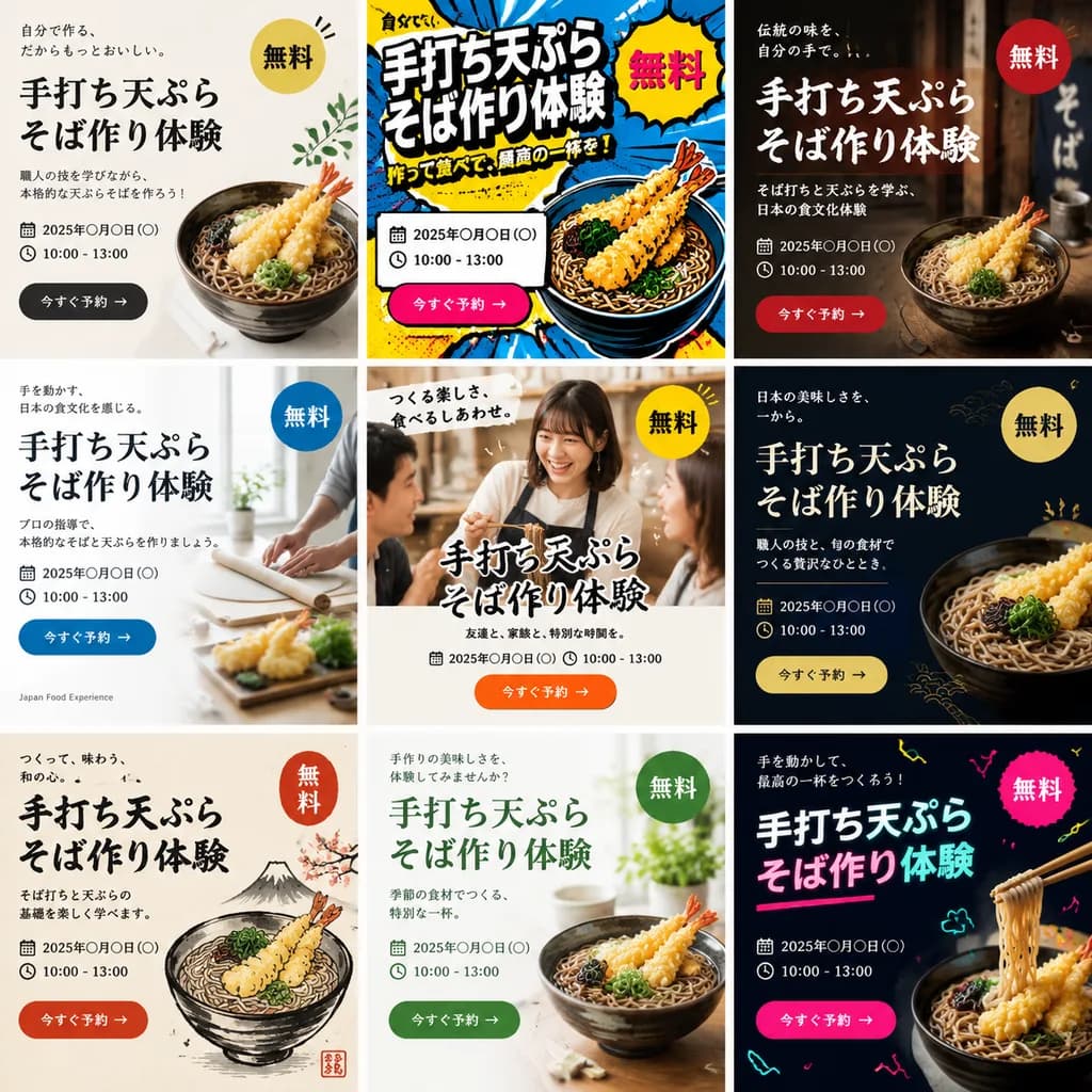
A single image displaying a 3x3 grid of 9 distinct web banner advertisements promoting a [handmade tempura soba noodle making workshop]. Each of the 9 banner designs features a completely different aesthetic style, layout, color palette, and background visual. Every advertisement includes prominent typographic elements: a bold Japanese main headline, supporting sub-copy, date and time placeholder, a bright "Free" badge, and a call-to-action button. The diverse styles span modern minimalist, vibrant pop art, traditional Japanese rustic aesthetic, clean corporate editorial, and casual lifestyle photography, tailored to attract [Gen Z and people in their 40s].

웹 광고배너 디자인광고 시안
OpenAI 출처 검증 화면 편집

OpenAI 출처 검증 화면 편집

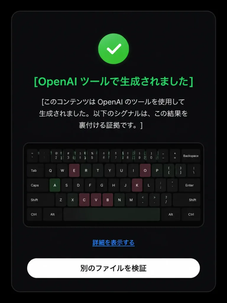
Based on the reference image, edit the dark verification-result screen to display a positive detection result. Maintain the original dark rounded card layout, centered composition, embedded keyboard thumbnail, bottom text link, and white rounded button. Modify exactly three status elements: 1. Replace the pink circular 'X' icon with a green circular checkmark icon. 2. Change the headline color to green with text: 「[OpenAI ツールで生成されました]」. 3. Update the body text below the headline to: 「[このコンテンツは OpenAI のツールを使用して生成されました。以下のシグナルは、この結果を裏付ける証拠です。]」. Preserve the remaining UI elements exactly as shown: - Link text: 「[詳細を表示する]」 - Button text: 「[別のファイルを検証]」 Style: Clean modern Japanese UI screenshot, authentic web app interface, high-contrast dark mode, rounded card borders.

ui 디자인검증 화면다크 모드
몰입형 음악 앱 UI 포스터

몰입형 음악 앱 UI 포스터

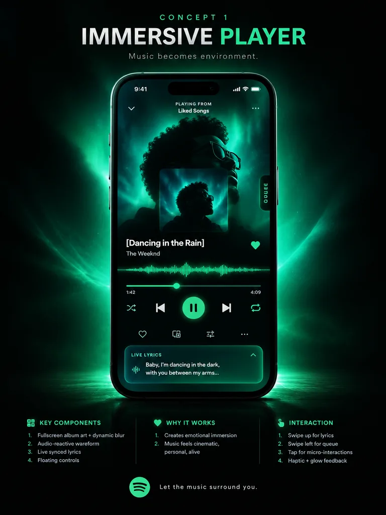
music app UI concept poster. premium futuristic mobile app showcase, dark mode, cinematic product presentation, Spotify-inspired green neon glow, high contrast, sleek glassmorphism, polished tech advertising aesthetic. IMMERSIVE PLAYER. mo…

ui-ux-design음악 플레이어앱 목업
다크 모드 AI 요금제 페이지 UI

다크 모드 AI 요금제 페이지 UI

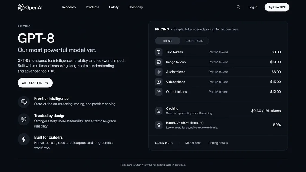
dark mode web page UI mockup. sleek, modern, dark theme with white and light grey text. GPT-8 is designed for intelligence, reliability, and real-world impact. Built with multimodal reasoning, long-context understanding, and advanced tool…

ui 목업다크 모드요금제 페이지
SaaS AI 스튜디오 랜딩 페이지 목업

SaaS AI 스튜디오 랜딩 페이지 목업

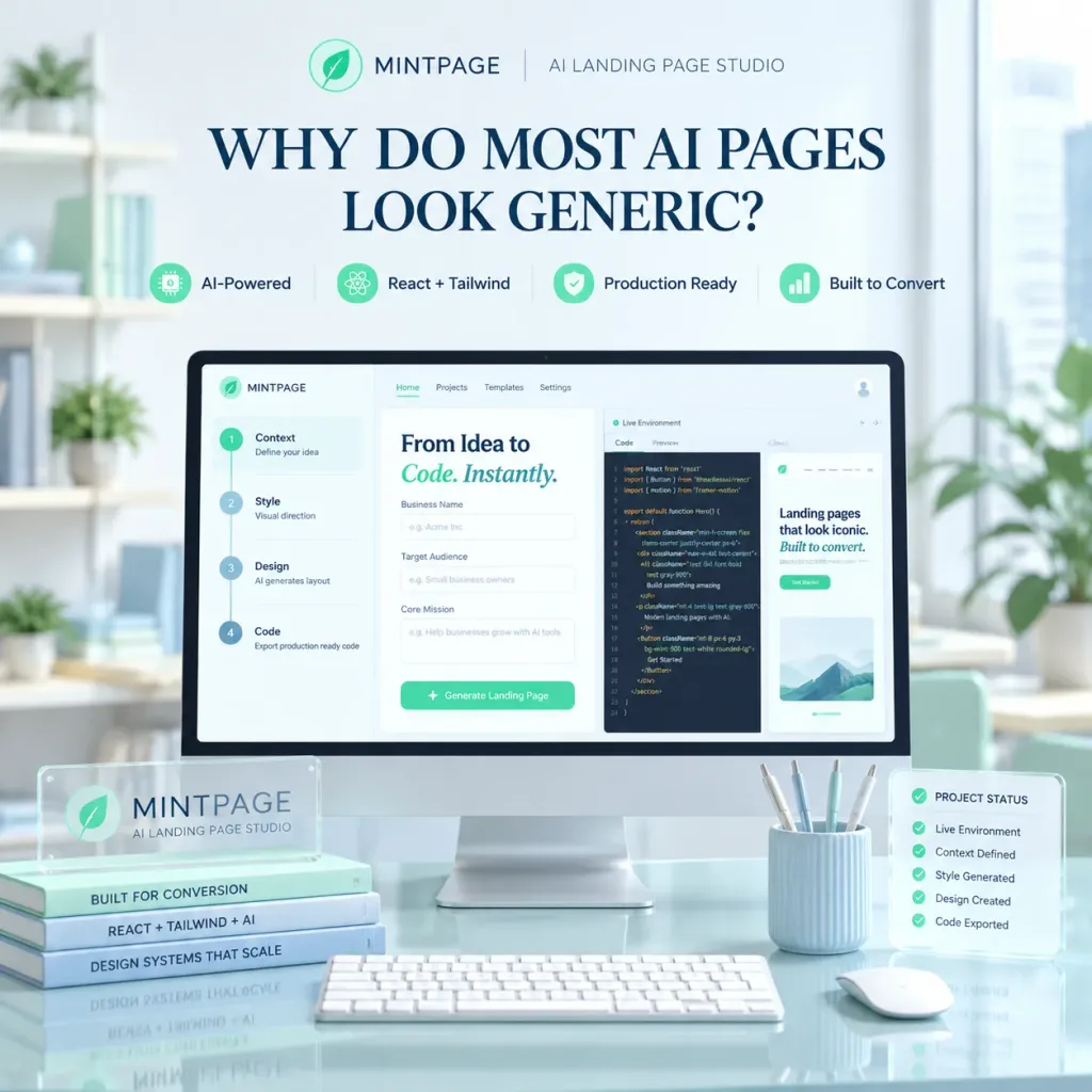
A polished square SaaS landing page hero image for [MINTPAGE], an AI landing page studio. In the center, a large desktop monitor rests on a glossy glass desk inside a bright, minimal modern office with soft daylight from a window on the right and soft-focus shelves and indoor plants in the background. At the top of the composition, display a neat brand header with a circular mint leaf logo, the text "[MINTPAGE]", a thin divider line, and the subtitle "[AI LANDING PAGE STUDIO]". Below the header, a prominent dark blue serif headline reads: "[WHY DO MOST AI PAGES LOOK GENERIC?]". Beneath the headline, arrange four small feature badges in a row with mint icons: "AI-Powered", "React + Tailwind", "Production Ready", "Built to Convert". The monitor screen shows a clean web-app builder UI with a top navbar and a three-panel split workspace: the left panel displays a 4-step vertical setup flow ("1) Context — Define your idea", "2) Style — Visual direction", "3) Design — AI generates layout", "4) Code — Export production ready code"); the center panel displays the heading "From Idea to Code. Instantly." with "Code. Instantly." in mint italic, above form fields for Business Name, Target Audience, and Core Mission; the right panel shows a "Live Environment" code editor with React/Tailwind code and a preview snippet reading "Landing pages that look iconic. Built to convert.". On the desk foreground, place a translucent acrylic desk plaque labeled "MINTPAGE" with the subtitle "AI LANDING PAGE STUDIO", stacked beside three slim books titled "BUILT FOR CONVERSION", "REACT + TAILWIND + AI", and "DESIGN SYSTEMS THAT SCALE"; in front of the screen sits a slim white keyboard; to the right sits a white mouse, a pale blue ribbed pen cup with four pens, and a translucent floating status card titled "PROJECT STATUS" showing five checked items ("Live Environment", "Context Defined", "Style Generated", "Design Created", "Code Exported"). Pastel mint and pale blue color palette, glassmorphism accents, soft volumetric lighting, crisp 3D mockup photography style, no people.

saasui디자인랜딩페이지
레트로 그린 터미널 HUD 디스플레이

레트로 그린 터미널 HUD 디스플레이

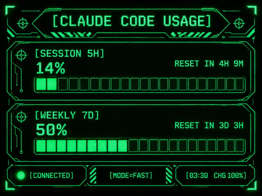
Retro-futuristic monochrome green terminal HUD interface designed for an M5Stack-style compact display. At the top, the title displays "[CLAUDE CODE USAGE]" in crisp pixelated typography. The body features two usage sections: the first labeled "[SESSION 5H]" displaying "14%" and "RESET IN 4H 9M", and the second labeled "[WEEKLY 7D]" displaying "50%" and "RESET IN 3D 3H". Each section includes a chunky horizontal gauge bar with exactly 20 rectangular segments; the upper gauge has 2 filled glowing segments and the lower gauge has 10 filled glowing segments. Along the bottom, three modular footer panels show: left "[CONNECTED]" with an illuminated status dot, center "[MODE=FAST]", and right "[03:30 CHG 100%]". Sci-fi frame with angular geometric borders, corner brackets, circuit line accents, tiny target icons, diagonal hazard striping, and subtle CRT scanline pixel glow on a deep black background.

터미널hud픽셀아트
영양 음식 스캐너 앱 프로토타입 쇼케이스 보드

영양 음식 스캐너 앱 프로토타입 쇼케이스 보드

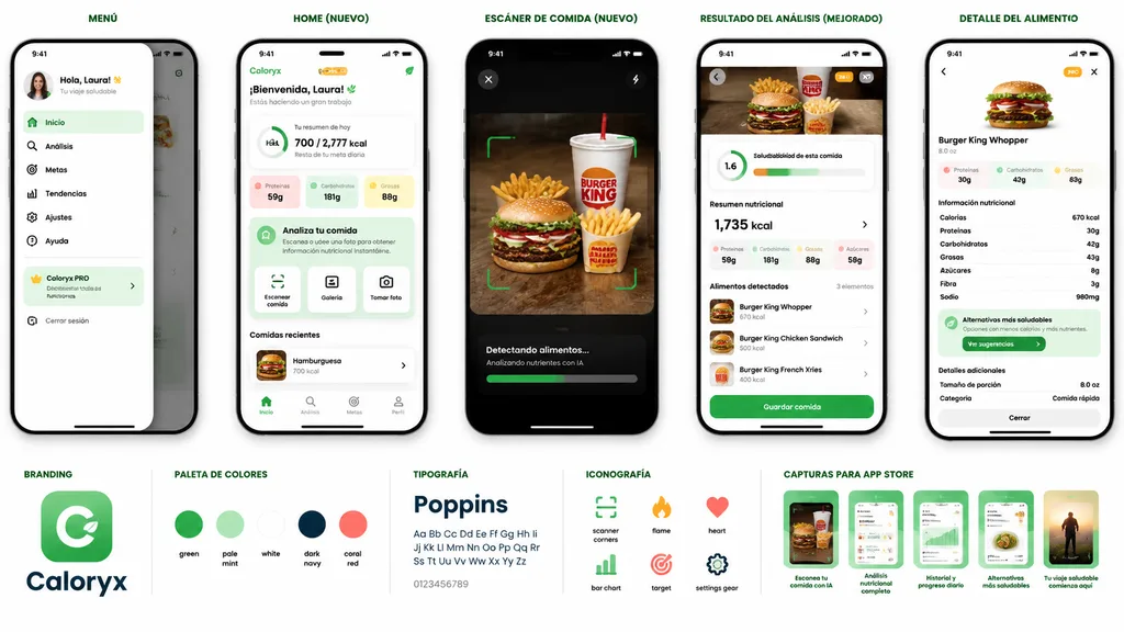
mobile app prototype presentation board for a nutrition and food scanner app. AI-powered meal scanning, calorie tracking, nutritional analysis, healthier alternatives, and progress dashboard. MENÚ. slide-out side navigation drawer with pro…

ui목업모바일앱영양트래커
겨울 모닥불 배경화면 디바이스 목업

겨울 모닥불 배경화면 디바이스 목업

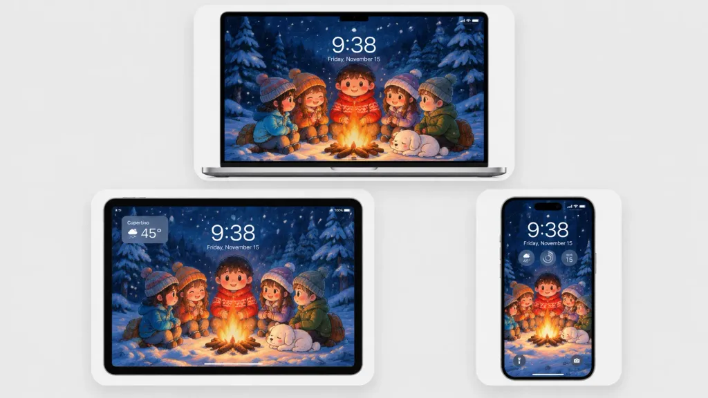
A polished multi-device product mockup showcasing a cozy winter wallpaper across three Apple-style devices set against a light gray studio background. Each device sits inside a rounded white display card with soft drop shadows: a laptop centered at the top, a tablet at the lower left, and a smartphone at the lower right. All screens display the same Japanese crayon-anime illustration cropped to fit: five cute cartoon children and a sleeping small white dog gathered around a glowing campfire in a snowy pine forest at night under falling snow and deep navy-blue trees, illuminated by warm orange firelight. Behind the campfire stands a round-faced child in a red winter sweater, flanked by friends in winter attire. Realistic lock-screen UI overlays appear on the screens: time "[9:38]", date "[Friday, November 15]", status icons, and translucent widgets. The tablet includes an upper-left translucent weather widget displaying "[Cupertino]" and "[45°]"; the phone features three circular widgets below the time and dual bottom lock-screen icons. Clean minimalist tech mockup, thin black bezels, soft ambient lighting, sharp screen details, no brand logos or watermarks.

목업배경화면디바이스 목업
판타지 오토배틀러 게임 플레이 UI

판타지 오토배틀러 게임 플레이 UI

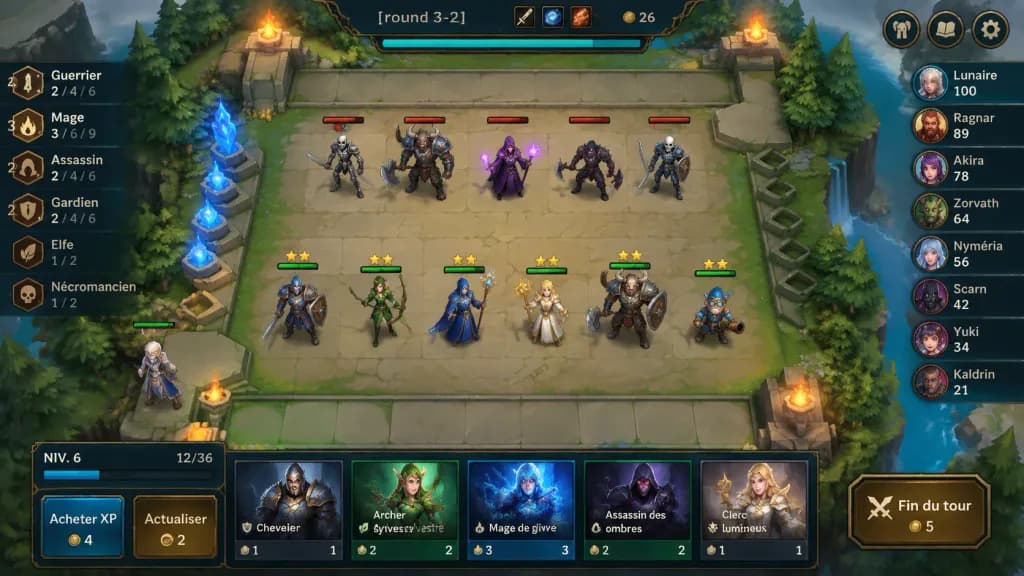
A polished 2D fantasy auto-battler gameplay mockup screenshot for [round 3-2], shown from an isometric top-down perspective with crisp hand-painted fantasy game art and a League-of-Legends/TFT-inspired interface. In the center is a square stone battlefield grid on a floating forest platform with worn beige tiles, mossy edges, stone railings, evergreen trees, cliffs, water at the right edge, glowing blue crystals on the left, and four flaming braziers near the arena corners. Top center ornate dark HUD bar displays "[round 3-2]", item icons, gold counter "26", and a cyan progress bar beneath; top-right features three rounded menu buttons (helmet, book, gear). On the board, exactly 11 visible characters: 5 enemy units on the upper half with red health bars (skeleton swordsman, horned beast warrior with axe, purple mage holding magic, dark rogue with axe, armored skeleton fighter); 6 allied units on the lower half with green health bars and yellow star ratings (blue-and-brown knight, green elf archer, blue-armored staff mage, blonde cleric with golden staff, horned tank warrior with shield, small blue gnome engineer); plus one bench character at the lower-left edge. Left trait panel shows 6 vertical synergy rows with bronze icons: "Guerrier" with "4" and "2 / 4 / 6"; "Mage" with "3" and "3 / 6 / 9"; "Assassin" with "2" and "2 / 4 / 6"; "Gardien" with "2" and "2 / 4 / 6"; "Elfe" with "1 / 2"; "Nécromancien" with "1 / 2". Right leaderboard shows 8 players with circular fantasy avatars: "Lunaire 100", "Ragnar 89", "Akira 78", "Zorvath 64", "Nyméria 56", "Scarn 42", "Yuki 34", "Kaldrin 21". Bottom shop panel features a level box reading "NIV. 6" with XP "12/36", two buttons labeled "Acheter XP" (cost 4) and "Actualiser" (cost 2), five champion shop cards ("Chevalier" cost 1, "Archer sylvestre" cost 2, "Mage de givre" cost 3, "Assassin des ombres" cost 2, "Clerc lumineux" cost 1), and a gold-bordered button labeled "Fin du tour" (cost 5). Saturated colors, soft ambient lighting, clean bevels, dark teal and bronze frames.

오토배틀러게임ui목업
레트로 디지털 카메라 LCD 화면

레트로 디지털 카메라 LCD 화면

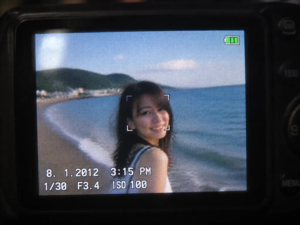
A close-up shot of a small digital camera LCD screen displaying an [early 2010s style] photo based on the reference photo, capturing a nostalgic compact camera aesthetic. The image features slight motion blur, digital grain, visible LCD pixel grid structure, compressed digital artifacts, subtle glare, and soft colors characteristic of an early 2010s CCD sensor. A realistic on-screen camera UI overlay displays the timestamp '8. 1. 2012 3:15 PM', exposure settings '1/30 F3.4 ISO 100', a focus indicator, and a small green battery icon in the corner. Outside the illuminated LCD, the surrounding dark camera body softly blurs into darkness.

디지털카메라ccd센서빈티지디지털
모바일 라이브 스트리밍 UI 목업

모바일 라이브 스트리밍 UI 목업

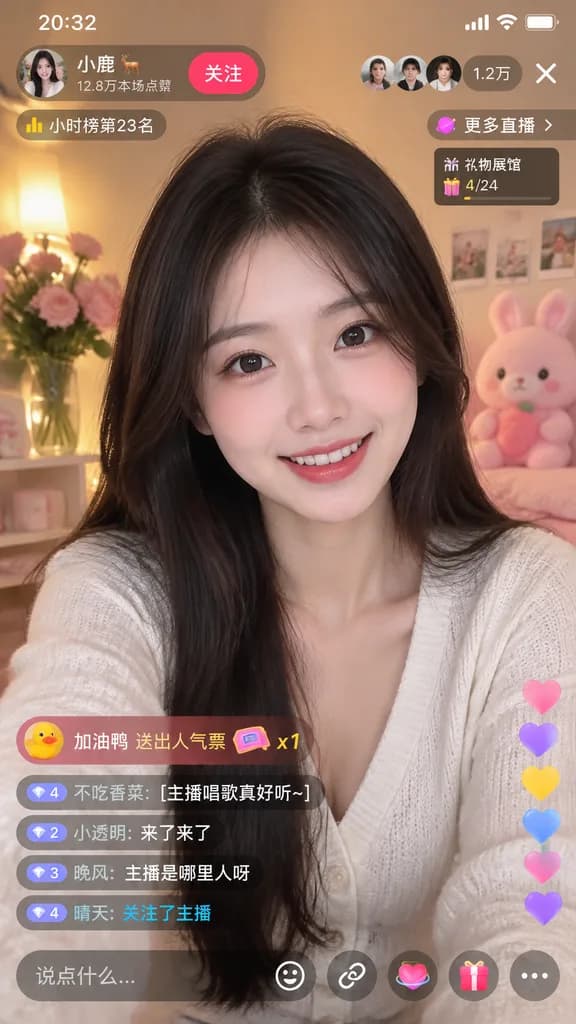
mobile live-streaming app interface mockup. young Asian woman, long dark hair, smiling at camera. [white V-neck cardigan]. cozy room, warm lighting, pink flowers, pink plush toy. 20:32. [小鹿 🦌]. 12.8万本场点赞. 关注. [1.2万]. X. 小时榜第23名. 更多直播 >. 礼…

라이브 스트리밍모바일 ui앱 목업
귀여운 3D 앱 마스코트 아이콘 그리드

귀여운 3D 앱 마스코트 아이콘 그리드

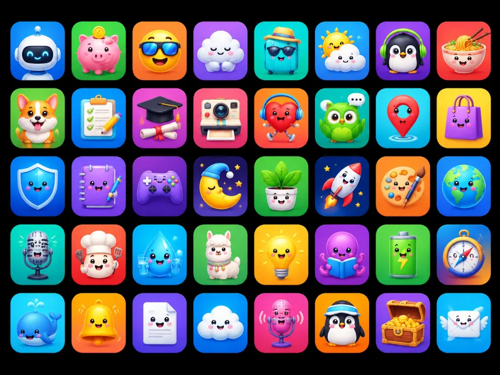
A polished app-store mascot icon showcase featuring [40] unique cute 3D mascot icons, designed as ASO-friendly mobile app icon concepts. Composition and canvas: Horizontal 4:3 composition on a solid pure black background, displaying a neat grid of rounded-square app tiles arranged in exactly 5 rows and 8 columns, evenly spaced with uniform margins. Each tile is a glossy squircle with a smooth soft gradient background, subtle inner glow, and a soft drop shadow. No text, no typographic labels, no watermarks. Visual style: High-end 3D clay and toy mascot style, kawaii expressions, big friendly glossy eyes, tiny smiles, smooth rounded forms, vibrant saturated colors, bright studio lighting, soft ambient occlusion shadows, crisp clean edges, premium iOS icon aesthetic. Icon grid details (40 discrete items arranged left to right, top to bottom): 1. White robot head mascot on blue gradient 2. Pink piggy bank with gold coin on green gradient 3. Smiling yellow face wearing a sun visor on orange gradient 4. Sleepy white cloud hugging itself on purple gradient 5. Turquoise suitcase wearing sunglasses and straw hat on teal gradient 6. Cute sun peeking behind a raincloud on blue gradient 7. Black penguin wearing green headphones on purple gradient 8. Smiling noodle bowl with chopsticks on red-orange gradient 9. Happy corgi dog mascot on green gradient 10. Checklist clipboard with pencil on blue gradient 11. Graduation cap over diploma silhouette on purple-pink gradient 12. Cute retro instant camera on pink-red gradient 13. Red running heart character with headphones on orange-red gradient 14. Green owl with speech bubble on teal gradient 15. Red map pin mascot on cyan gradient 16. Purple shopping bag character on yellow gradient 17. Blue glossy shield mascot on deep blue gradient 18. Purple notebook mascot holding a pen on violet gradient 19. Purple game controller mascot on dark purple gradient 20. Sleeping crescent moon wearing a nightcap on dark starry gradient 21. Smiling potted houseplant in white pot on green gradient 22. White rocket launching on navy starry gradient 23. Artist palette mascot with paintbrush on orange gradient 24. Smiling planet Earth globe on blue gradient 25. Vintage microphone mascot on teal gradient 26. Chef mascot with chef hat and spatula on red-orange gradient 27. Smiling water droplet holding a glass of water on cyan gradient 28. Fluffy llama mascot on green gradient 29. Glowing yellow lightbulb mascot on yellow-orange gradient 30. Purple octopus reading an open book on violet gradient 31. Green battery mascot with lightning bolt on green gradient 32. Directional compass mascot on blue-orange gradient 33. Blue whale mascot with water spout on cyan gradient 34. Shiny yellow bell mascot on orange gradient 35. Smiling white folded document mascot on purple gradient 36. Happy fluffy cloud mascot on blue gradient 37. Pink microphone mascot with soundwaves on magenta gradient 38. Penguin mascot wearing a sporty visor on orange gradient 39. Wooden treasure chest overflowing with gold coins on purple gradient 40. Smiling postal envelope mascot with angel wings on sky blue gradient Constraints: Maintain strict uniform size, visual fidelity, and lighting angle across all 40 icons.

앱아이콘3d아이콘귀여운
SaaS 대시보드 노트북 목업

SaaS 대시보드 노트북 목업

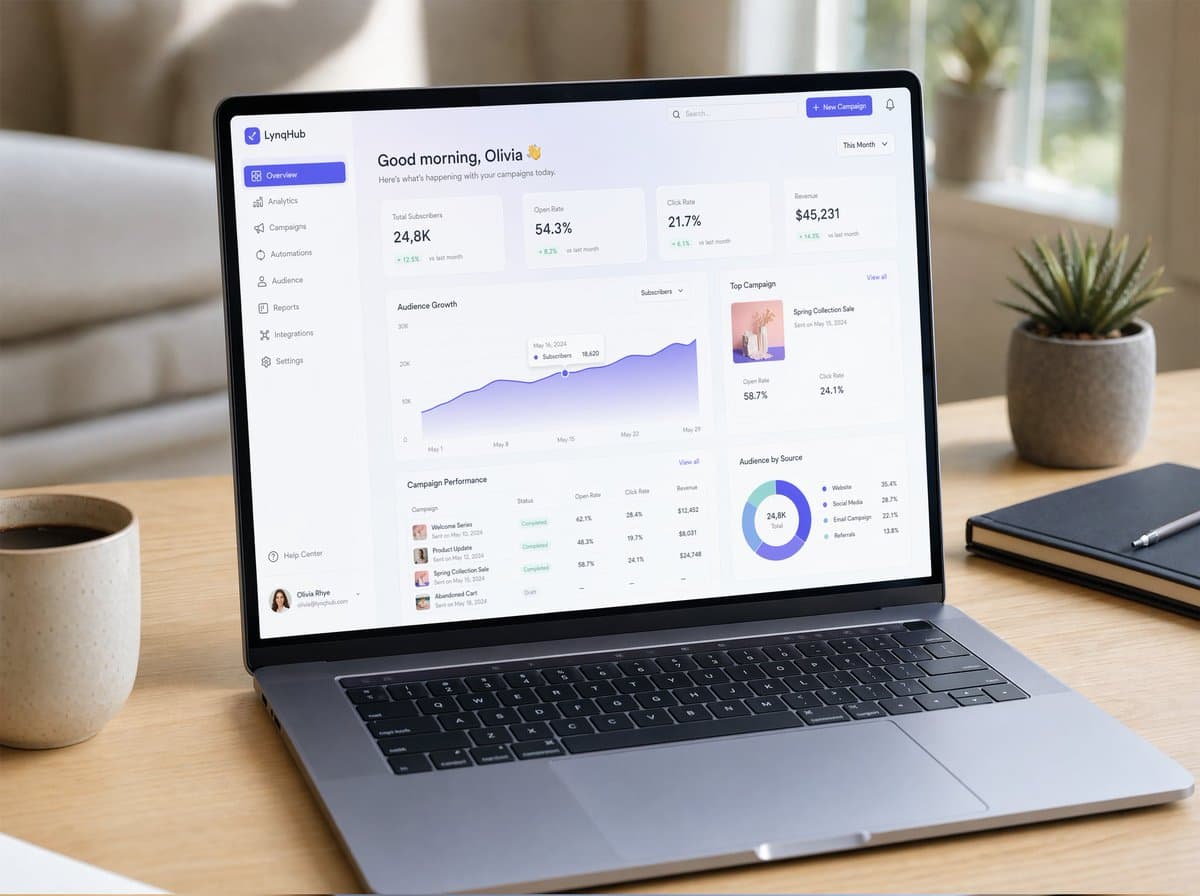
부드러운 자연광이 비치는 미니멀한 나무 책상 위에 놓인 슬림하고 모던한 노트북 화면에 표시된 극사실적인 UI/UX 목업. 화면에는 우아한 타이포그래피, 글래스모피즘(glassmorphism) 카드, 부드러운 그라디언트, 은은한 드롭 섀도우, 깔끔하게 배치된 컴포넌트가 돋보이는 깔끔한 SaaS 대시보드가 나타남. 차트, 분석 패널, 사이드바 내비게이션, 마이크로 인터랙션이 보임. 사실적인 macOS 스타일의 창 프레임, 화면에 비친 부드러운 반사, 얕은 피사계 심도, 아늑한 작업 공간 분위기, 포토리얼리즘 제품 사진 스타일로 촬영됨, 초정밀 디테일.

UI 목업제품 사진SaaS
소셜 앱 매칭 성공 화면

소셜 앱 매칭 성공 화면

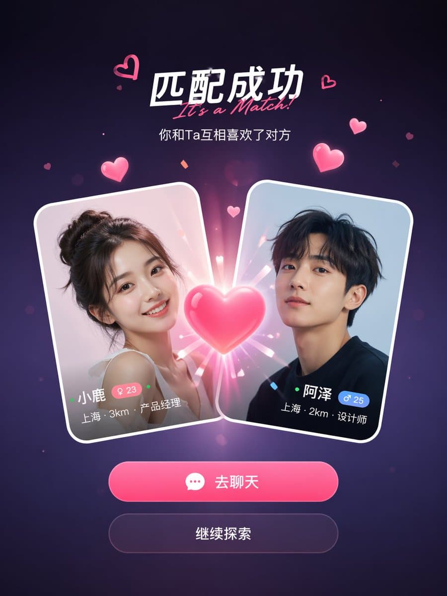
소셜 데이팅 앱 매칭 성공 화면 목업. 중앙에서 두 사용자의 프로필 카드가 충돌하며 그 사이에 빛나는 하트 효과가 나타남. 상단 헤드라인에는 "It's a Match!"라고 적혀 있고 아래에 부제목이 있음. 각 카드는 프로필 사진, 이름, 나이, 위치, 직업을 보여줌. 카드 아래에는 두 개의 액션 버튼이 있음: 기본 핑크색 "Chat" 버튼과 보조 "Continue" 버튼. 떠다니는 핑크색 하트 입자와 반짝임 효과가 있는 어두운 보라색 그라데이션 배경. 깔끔하고 모던한 모바일 UI 디자인, 9:16 세로 화면비, 사실적인 앱 스크린샷 미학, 세련된 그림자 및 글래스모피즘(glass-morphism) 카드 테두리 처리.

소셜 앱UI 목업매칭 화면
UI 클래스

UI 클래스

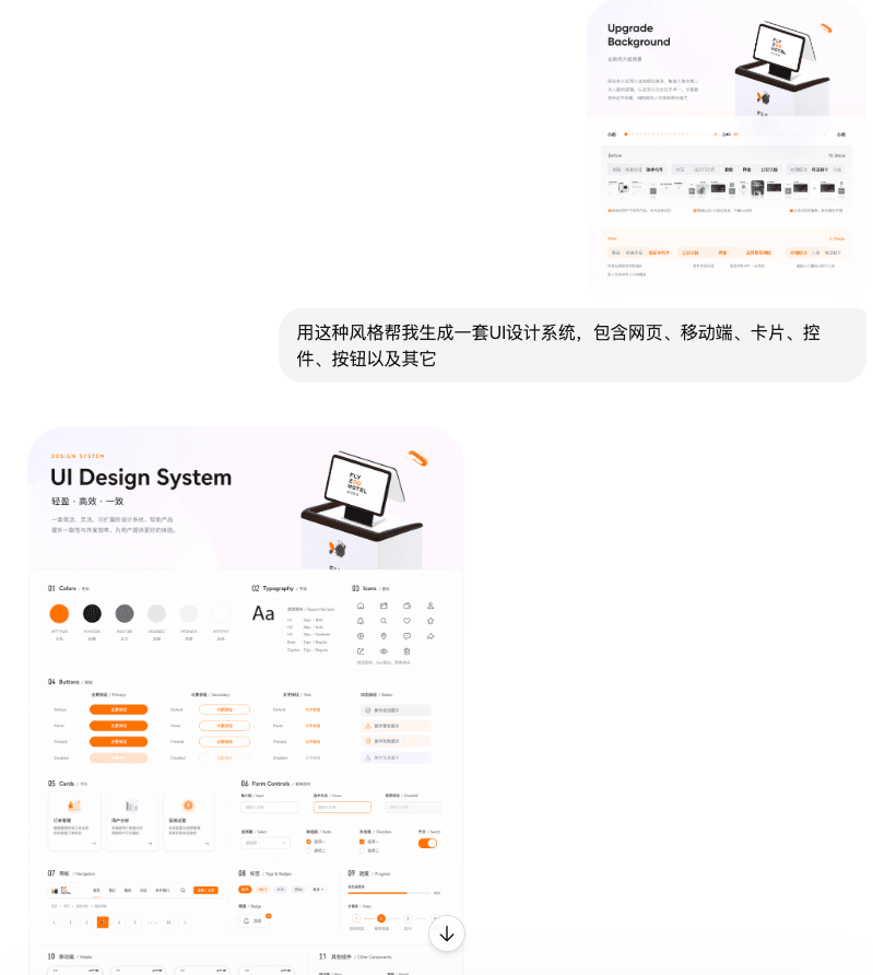
이 스타일을 사용하여 웹 페이지, 모바일 화면, 카드, 컨트롤, 버튼 등을 포함한 UI 디자인 시스템을 생성해 주세요

소프트웨어 인터페이스 #44

소프트웨어 인터페이스 #44

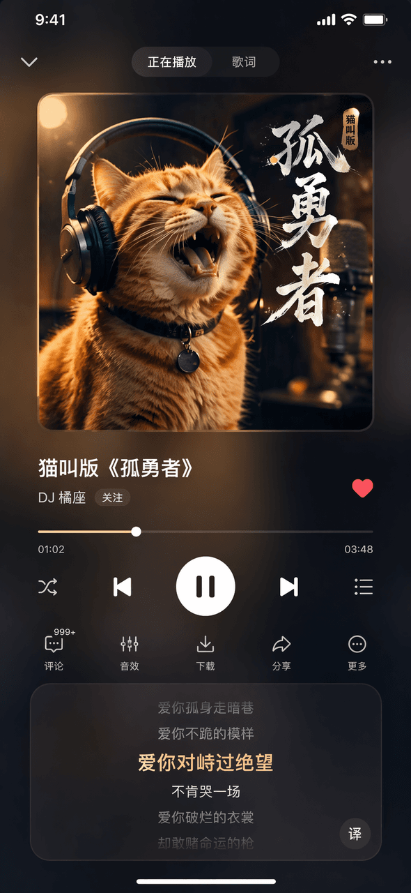
Prompt Words 가상의 음악 앱의 '지금 재생 중' 화면 이미지를 그려주세요. 상단의 앨범 커버 이미지에는 헤드폰을 쓴 치즈태비 고양이가 있습니다. 중앙의 노래 제목은 "Cat Meowing Version of "Lonely Brave""이고 가수 이름은 "DJ Orange Seat"입니다. 하단에는 진행 표시줄과 컨트롤 버튼, 하단의 가사 스크롤 영역, 그리고 전반적으로 어두운 블러 처리된 반투명 유리 효과가 적용되어 있습니다.

소프트웨어 인터페이스 #43

소프트웨어 인터페이스 #43

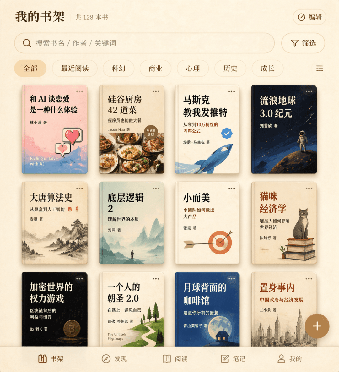
프롬프트 단어 가상의 독서 앱을 위한 책장 인터페이스를 그려주세요. 3줄의 책 표지 그리드에는 "What's it like to fall in love with AI", "42 Dishes from the Silicon Valley Kitchen", "Musk Taught Me to Tweet" 등을 포함한 12개의 가상 도서 제목이 표시되며, 상단에는 검색창과 필터 라벨, 오른쪽 하단 모서리에는 플로팅 추가 버튼이 있고, 전체적으로 베이지색 양피지 질감이 적용되어 있습니다.

소프트웨어 인터페이스 #42

소프트웨어 인터페이스 #42

프롬프트 단어 가상의 작업 관리 앱 대시보드 뷰 스크린샷을 그립니다. "To Do", "In Progress", "Completed" 세 개의 열이 있으며 각 열에는 3~4개의 카드가 있습니다. 각 카드에는 제목, 라벨, 마감일, 담당자의 아바타가 포함되어 있으며 전반적으로 플랫 디자인입니다.

소프트웨어 인터페이스 #41

소프트웨어 인터페이스 #41

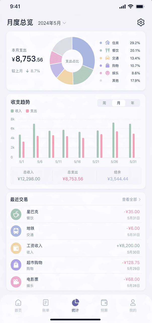
Prompt Words 가상의 가계부 앱의 월간 개요 페이지를 그립니다. 상단의 링 차트는 지출 분류를 보여주고, 중앙에는 세로 막대형 차트, 하단에는 최근 5건의 거래 내역 목록이 있으며, 전체적으로 모란디 색상 체계를 사용하고 오른쪽 상단 모서리에 톱니바퀴 아이콘이 있습니다.

스마트폰 스크린샷 프로모션 이미지

스마트폰 스크린샷 프로모션 이미지

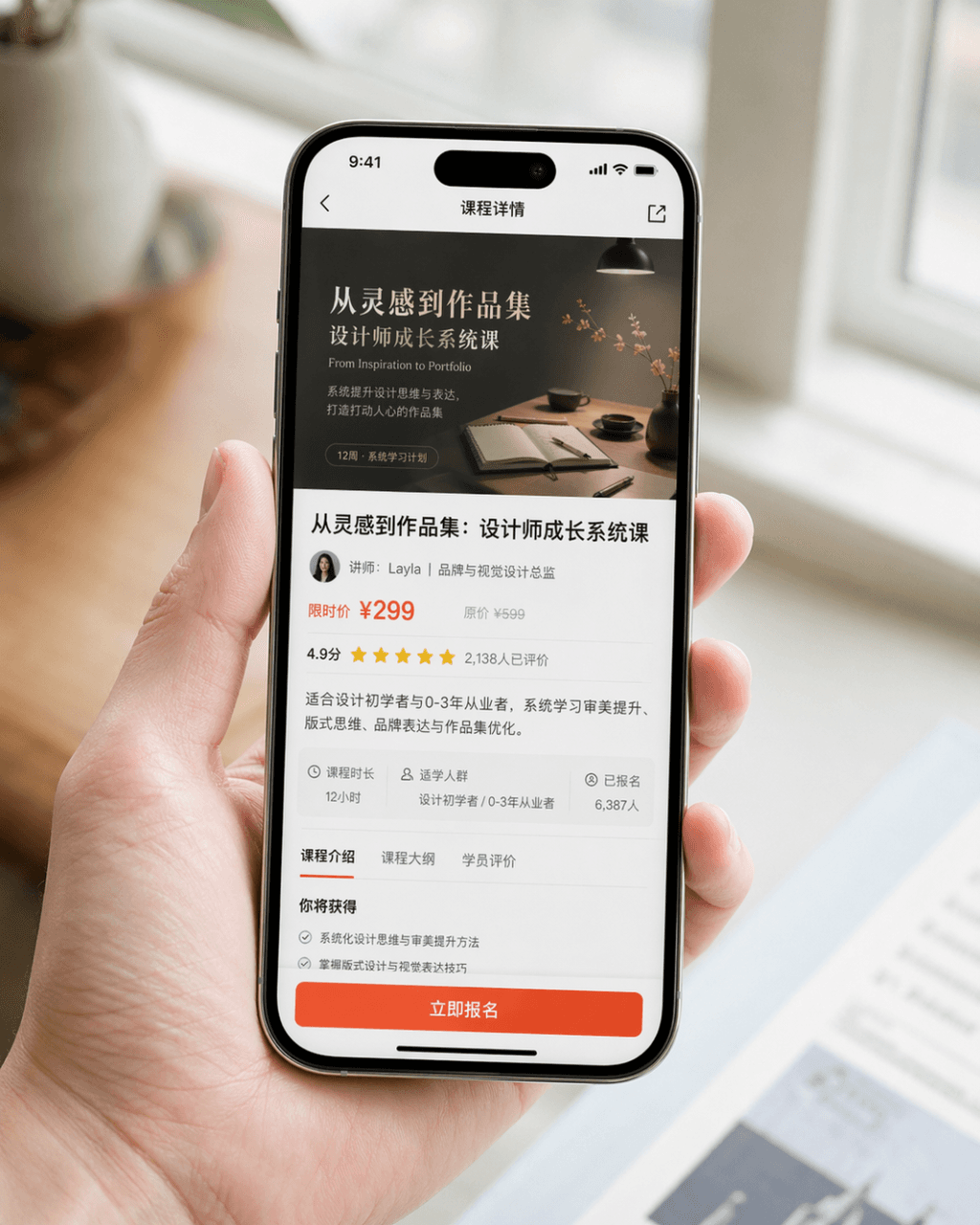
매우 사실적인 스마트폰 스크린샷 프로모션 이미지를 생성합니다. 기기는 iPhone 15 Pro입니다. 화면 콘텐츠는 디자인 학습 앱의 강좌 상세 페이지입니다. 페이지에는 강좌 커버 이미지, 강좌 제목, 강사 정보, 가격 정보, 사용자 평점, 요약 개요, 그리고 눈에 띄는 "Register Now" 버튼이 명확하게 표시되어 있습니다. 구도는 스마트폰을 자연스럽게 들고 있는 사람의 클로즈업 샷입니다. 인물의 손은 깔끔하고 자연스러우며, 스마트폰 화면은 선명하고 밝고 배경은 아웃포커싱으로 흐려져 있습니다. 전체적인 이미지는 브랜드에서 공식 발표한 제품 PR 사진처럼 보여야 합니다. 사실적인 사진 질감, 부드럽고 고급스러운 조명, 간결한 구도, 현실적인 디테일이 필요합니다. 과장된 UI, 저렴한 느낌의 이커머스 스타일, 과도한 디자인은 피해주세요.

이벤트 랜딩 페이지 홈 화면

이벤트 랜딩 페이지 홈 화면

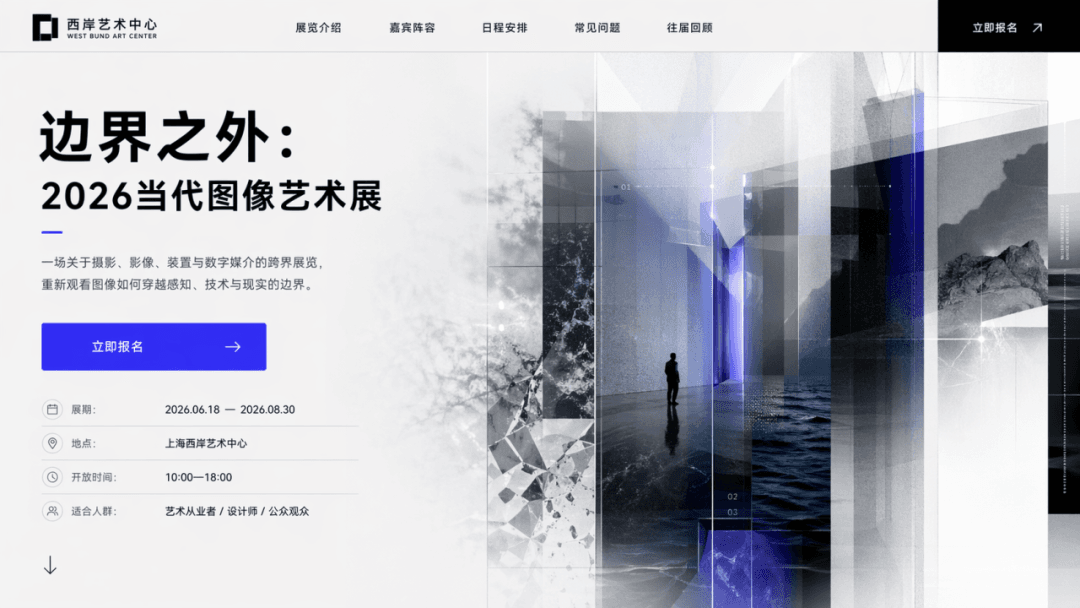
"Beyond the Boundary: 2026 Contemporary Image Art Exhibition" 테마와 "Register Now." CTA가 포함된 이벤트 랜딩 페이지의 홈 화면을 디자인하세요. 실제 웹 페이지의 첫 화면처럼 메인 타이틀, 서브 타이틀, 버튼, 보조 비주얼, 전시 정보가 반드시 포함되어야 합니다.

SaaS 대시보드

SaaS 대시보드

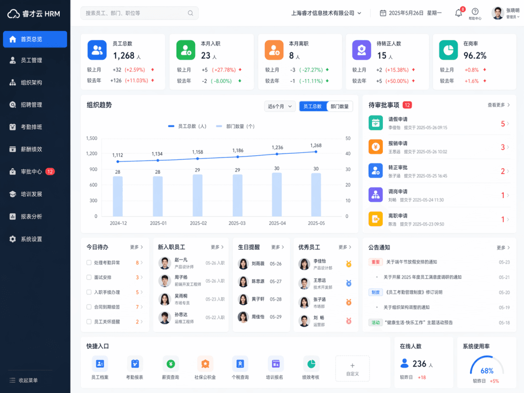
SaaS 대시보드 인터페이스를 생성합니다. 제품 유형은 "Enterprise Human Resources Management System"입니다. 왼쪽 내비게이션, 상단 검색창, 직원 통계 카드, 조직 트렌드 차트, 결재/승인 모듈, 사용자 모듈을 포함하여 실제 HR 백엔드 홈 화면이 전체적으로 표현됩니다. 인터페이스는 성숙한 엔터프라이즈 업무 시스템처럼 깔끔하고 합리적입니다.

앱 홈 화면 콘셉트 맵

앱 홈 화면 콘셉트 맵

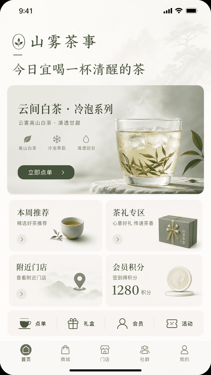
iPhone 스타일의 앱 홈 화면 콘셉트 인터페이스를 디자인합니다. 브랜드 이름은 "Shanwu Tea Shi", 업종은 신중국 차 음료/티 라이프스타일이며, 기능은 매장 주문, 신제품 콜드브루 차 추천, 티 선물 구매, 멤버십 포인트 및 주변 매장 조회입니다. 홈 화면 상단에는 브랜드 인사말 "Today is a good time to drink a cup of sober tea"가 표시되고, 메인 비주얼은 신제품 추천 카드 "Yunjian White Tea·Cold Brew Series", 버튼은 "Order Now"입니다. 중앙에는 이번 주 추천, 티 선물 코너, 주변 매장, 멤버십 포인트의 4개 모듈이 있고, 아래에는 주문, 선물 상자, 멤버십, 이벤트 등 빠른 바로가기 행이 추가됩니다. 하단 내비게이션 바는 홈, 쇼핑몰, 매장, 커뮤니티, 마이페이지로 구성됩니다. 전체 인터페이스는 절제된 동양적 정취와 성숙한 브랜드 감성을 지녀야 합니다. 색상 구성은 오프화이트, 티 그린, 문 그레이의 세 가지 색상 이내로 통제되어야 합니다. 명확한 계층 구조, 간결한 정보, 합리적인 버튼을 갖춘 하이엔드 라이프스타일 브랜드 앱의 홈 화면과 같아야 하며, 모든 텍스트는 정확한 중국어로 작성되어야 합니다.

심야 작가 데스크 셋업

심야 작가 데스크 셋업

"심야의 작가를 위해 디자인된 데스크톱 테마 시스템", UI 테마 디자인과 문학적인 정물 사진의 결합. 화면에는 컴퓨터 데스크톱, 입력기 스킨, 집중 타이머, 폴더 아이콘, 밤 배경화면, 기계식 키보드 조명 효과 및 데스크톱 위젯이 통일된 테마 스타일로 표시됩니다. 색상은 석탄 블랙, 달빛 화이트, 다크 와인 레드, 앤틱 코퍼입니다. 절제되고 성숙한 분위기를 풍기며 비율은 16:9입니다.

페스티벌 운영 대시보드

페스티벌 운영 대시보드

"Summer Music Festival Backstage Operation Overview", 대규모 이벤트 대시보드가 현장 사진과 통합되어 있습니다. 주요 배경은 무대 뒤 통로, 장비 박스, 아티스트 휴게 공간, 자원봉사자 집결지입니다. 전경에는 공연 타임라인, 보안 수준, 식수대, 인파 흐름 히트맵, 기상 경보 및 볼륨 모니터링이 오버레이되어 있습니다. 타이틀은 이벤트 마스터 컨트롤 룸 화면과 같으며, 비율은 16:9입니다.

스팀펑크 찻집 멤버십 시스템 인터페이스

스팀펑크 찻집 멤버십 시스템 인터페이스

"스팀펑크 찻집 멤버십 시스템 인터페이스", 멤버십 UI는 오래된 인더스트리얼 인테리어 스타일과 어우러집니다. 메인 인터페이스에는 "Copper Pot/Silver Cup/Golden Furnace/Cloud Mist Master" 회원 등급이 표시되며, 포인트 규칙은 찻물 김과 증기 형태의 대시보드로 표현되어 있습니다. 배경에는 기어, 구리 파이프, 오래된 나무 테이블, 청화백자가 배치되어 있습니다. 색상은 풍부하지만 산만하지 않으며, 비율은 9:16입니다.

"Make a love into a SaaS product backend"

"Make a love into a SaaS product backend"

"Make a love into a SaaS product backend", 감성적인 서사와 유머가 결합된 인터넷 프로덕트 대시보드. 페이지 모듈에는 소통 빈도, 감정의 최고점, 공동 기억 유지율, 오해 해결 속도, 미래 계획 진행률 바, 레드 플래그 경고 알림이 포함됩니다. 인터페이스는 전문적이고 절제되어 있지만 모든 지표에는 감정적인 은유가 담겨 있으며, 비율은 16:9입니다.

명나라 취업 포털

명나라 취업 포털

"명나라 사람들을 위한 구직 웹사이트 홈페이지", 역사적 복식과 현대 채용 플랫폼 인터페이스의 유머러스한 융합. 메인 인터페이스에는 "역사가/서원 강사/해운 회계사/직조 감독관/궁중 화가"와 같은 추천 직무가 있으며, 필터링 조건은 "시문에 능함/일반 산술/기사(말타기와 활쏘기)에 능함/파견 근무 가능"이다. 개인 이력서 카드에는 정교한 공필화 초상화가 사용되며, 급여 단위는 봉은과 석미로 표시된다. 레이아웃은 실제 채용 제품 홈페이지와 완전히 동일하며, 비율은 16:9이다.

심야 병원 키오스크

심야 병원 키오스크

"새벽 3시의 병원 무인 수납기 인터페이스"는 다큐멘터리적 공간 분위기와 정교한 UI를 결합합니다. 이미지는 병원 무인 수납 단말기의 클로즈업 뷰입니다. 화면에는 접수, 처방전/검사 결과 출력, 수납, 길 안내, 야간 약국 위치와 같은 버튼이 선명하게 표시됩니다. 기기 주변은 텅 빈 홀, 차가운 백색 조명, 지쳤지만 조용한 사람들로 둘러싸여 있습니다. 전반적인 이미지는 차분하고 현실적이며, 일상적인 인간 삶의 덧없음과 온기가 묻어납니다. 비율은 9:16입니다.

"미래의 도서관 대출 터미널"

"미래의 도서관 대출 터미널"

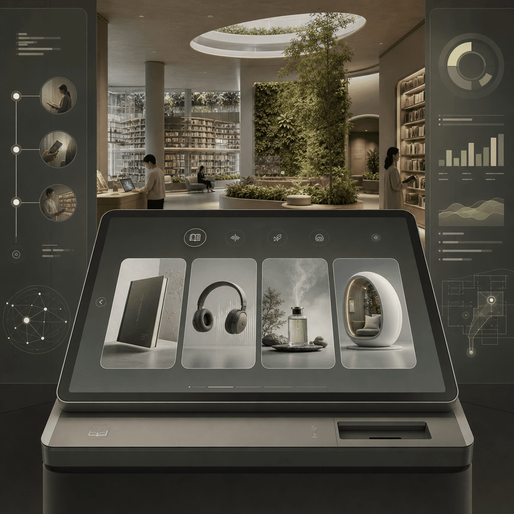
"Library Borrowing Terminal of the Future", 건축 공간 콘셉트 맵과 통합된 제품 UI. 전경에는 실물 도서, 오디오 파일, 후각적 기억, 몰입형 독서 캐빈을 필터링할 수 있는 미니멀한 대출 터미널의 대형 화면이 있습니다. 배경에는 길게 뻗은 책장과 식물 벽이 있는 개방형 도서관 공간이 펼쳐집니다. 사이드바에는 독자의 이용 여정 프로세스, 대출 데이터, 공간 안내가 표시됩니다. 차분하고 절제된 색상, 화면 비율은 16:9.

사회적 불안 완화 카페 주문 리디자인

사회적 불안 완화 카페 주문 리디자인

"Redesign of the cafe ordering system for socially anxious users", 서비스 디자인 제안 다이어그램, 메인 화면에는 카페 카운터와 셀프 주문 화면의 새로운 솔루션이 표시되며, 언어적 접촉을 줄이고, "default recommendation/no communication for meal taking/seat preference/volume area" 옵션을 추가하며, 오른쪽에는 아이콘 시스템, 테이블 카드, 픽업 카드 및 대기 공간 동선 다이어그램을 확장합니다. 전체적인 느낌은 매우 사실적이며, 비율은 16:9입니다.

"열대우림 보호구역 모니터링 개요 화면"

"열대우림 보호구역 모니터링 개요 화면"

"열대우림 보호구역 모니터링 개요 화면"은 생태 과학 연구 대시보드와 몰입감 넘치는 자연 사진을 결합합니다. 이미지의 주요 배경은 열대우림 수관을 내려다보는 웅장한 장면입니다. 전경에는 반투명 데이터 레이어가 중첩되어 있습니다: 수관 밀도, 멸종 위기 동물 활동 궤적, 밀렵 경고, 강우량 및 탄소 흡수원 곡선. 제목은 유엔 환경 보호 프로젝트의 비전과 같습니다. 분위기는 전문적이고 장엄하며, 색상은 선명하지만 과도하게 채도가 높지 않고, 화면비는 16:9입니다.

"우주 우체국 소포 추적 페이지"

"우주 우체국 소포 추적 페이지"

"Package tracking page of the Space Post Office"는 물류 시스템 UI와 SF 세계관을 결합합니다. 이미지는 소포 추적 세부 정보 페이지이며 경로는 "Earth-Low Earth Orbit-Moon Transfer Station-Mars North Port" 구간별로 표시됩니다. 노드 아이콘은 소형 로켓, 화물 보관함, 우주 세관 및 운석 경고 구역으로 디자인되었습니다. 오른쪽에는 엽서, 찻잎, 사진, 낡은 스웨터 등 소포 품목 목록이 있습니다. 전체적인 이미지는 차분하고 이성적이면서도 인간적인 온기가 느껴지며 화면 비율은 9:16입니다.

죽간 협업 문서

죽간 협업 문서

"Multi-person collaborative document interface in the Warring States Period"는 죽간 문서와 온라인 문서 프로덕트 디자인의 기발한 융합입니다. 이미지는 실시간 협업 에디터 인터페이스처럼 보이지만, 기본 레이어는 펼쳐진 죽간과 붓글씨 먹물로 되어 있습니다. 서로 다른 작성자의 댓글 말풍선에는 "Gongsun Long is editing", "Han Fei suggested deletion", "Su Qin proposed changing the title"이라는 표시가 적혀 있습니다. 사이드바에는 버전 히스토리와 댓글이 있습니다. 전체적으로 학술적 엄격함과 인터넷 오피스 유머가 가득 차 있으며, 비율은 16:9입니다.

열대 도시 옥상 농장 운영 사이니지

열대 도시 옥상 농장 운영 사이니지

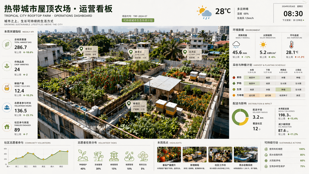
"Tropical City Rooftop Farm Operations Dashboard"는 우주 항공 사진과 상업용 대시보드가 융합된 이미지입니다. 오버헤드 뷰로 내려다본 여러 옥상에 토마토, 허브, 꽃, 벌통이 가꾸어져 있습니다. 화면 측면에는 주간 강우량, 일사량, 수확 주기, 유통 반경, 지역 사회 자원봉사 참여 데이터가 표시됩니다. 타이틀은 건축 설계 사무소의 지속 가능한 프로젝트 보고서 페이지와 같은 느낌을 줍니다. 색상 구성은 리프 그린, 어시 브라운, 선 옐로우, 비 온 뒤의 블루입니다. 정보가 풍부하면서도 시각적으로 산뜻하며, 비율은 16:9입니다.

중세 연금술사 운영체제

중세 연금술사 운영체제

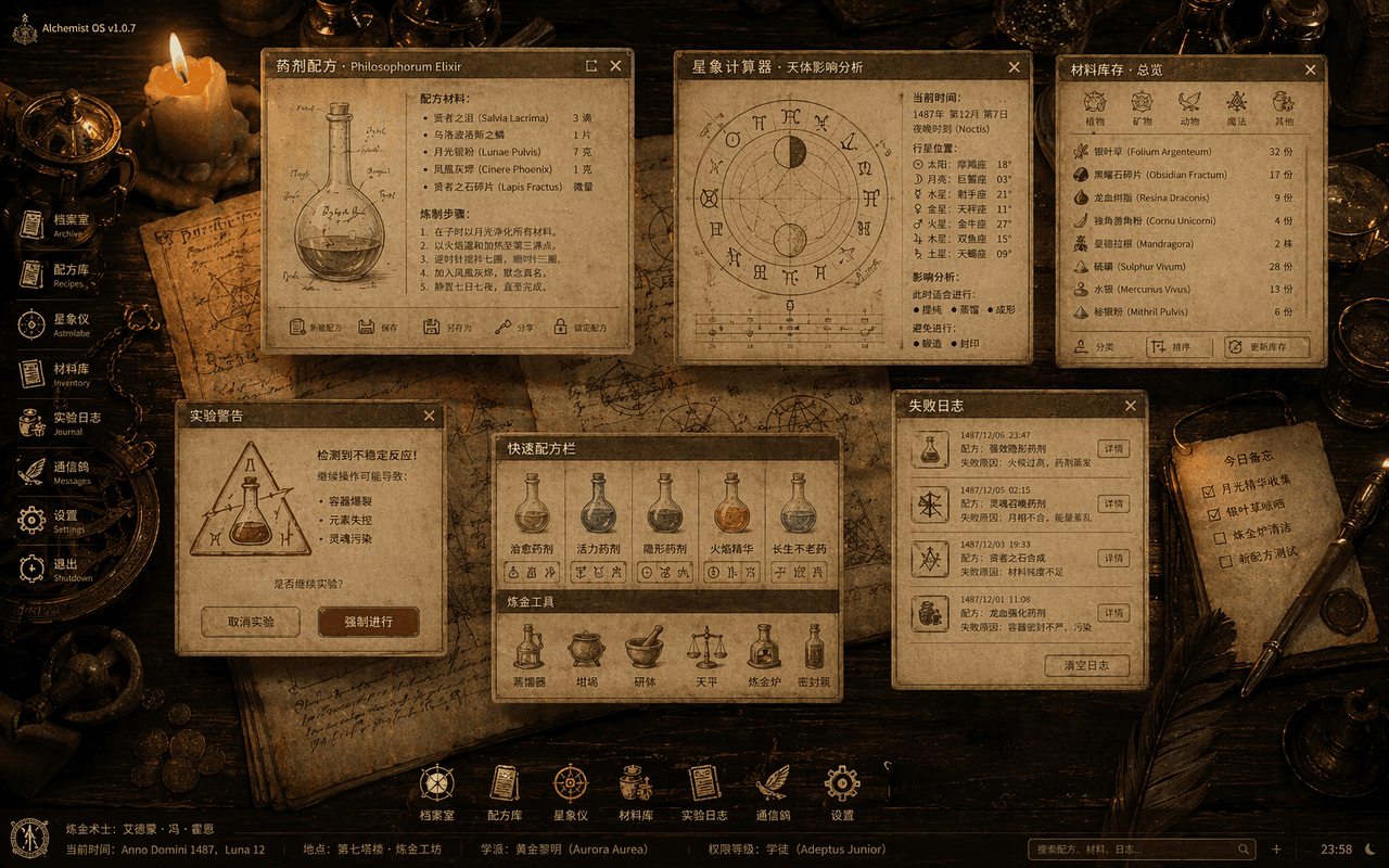
"중세 연금술사의 데스크톱 운영체제"는 고서의 삽화와 데스크톱 UI가 융합된 비주얼입니다. 이미지는 나무 테이블을 위에서 내려다본 오버헤드 샷이며, 반투명한 시스템 창들이 테이블 위에 떠 있습니다. 물약 제조법, 점성술 계산기, 재료 인벤토리, 실험 경고 팝업, 실패 기록 로그 등이 표시되어 있습니다. 아이콘은 모두 깃펜, 유리병, 기호학적 엠블럼을 기반으로 재구성되었습니다. 배경은 촛불로 비춰진 양피지와 구리 도구들입니다. 전체적으로 고대 마법 OS의 완전한 비주얼 사양서처럼 보이며, 화면 비율은 16:10입니다.

고대 이집트 주식 거래 터미널

고대 이집트 주식 거래 터미널

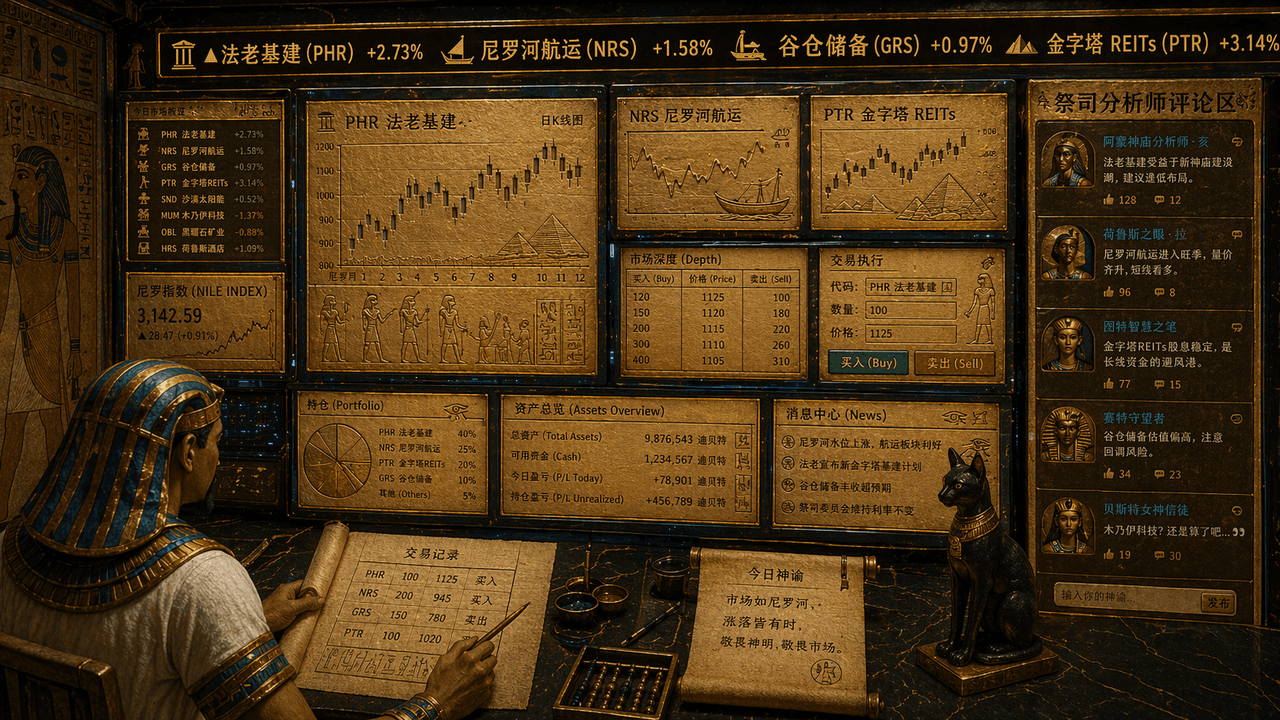
"고대 이집트인의 주식 거래 터미널", 신전 벽화 요소와 금융 거래 UI의 기발한 융합. 화면은 멀티 스크린 트레이딩 워크스테이션처럼 보이지만, 모든 차트, 캔들스틱, 주식 심볼은 황금 석판과 파피루스 인터페이스에 새겨져 있습니다. 상단 티커에는 "Pharaonic infrastructure, Nile shipping, granary reserves, pyramids REITs"가 스크롤되고, 트레이더는 머리 장식을 착용한 서기의 모습이며, 오른쪽에는 사제 애널리스트 댓글 영역이 표시됩니다. 전반적인 색상 구성은 골드 샌드, 피콕 블루, 옵시디언입니다. 진지하면서도 대비되는 유쾌함이 느껴지는 스타일, 비율 16:9.

쇼와 스타일 가족 사진 앨범 인터페이스 디자인

쇼와 스타일 가족 사진 앨범 인터페이스 디자인

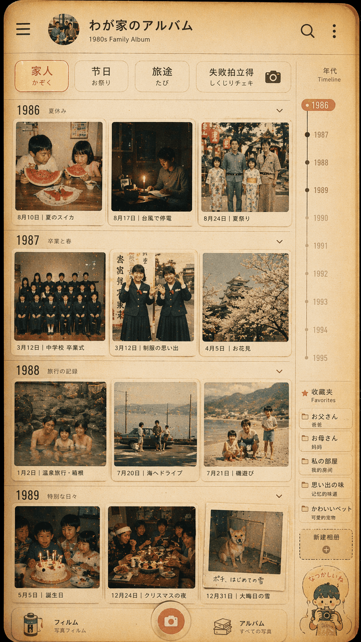
"쇼와 스타일 가족 사진 앨범 인터페이스 디자인", 레트로한 포토월이 현대적인 사진 앨범 앱 UI와 통합되어 있습니다. 화면은 사진 관리 애플리케이션의 타임라인 페이지를 시뮬레이션하지만, 각 썸네일은 1980년대의 사진입니다. 1970년대 일본 가족의 일상생활: 여름 수박, 태풍 정전, 교복 졸업사진, 온천 여행, 크리스마스 저녁 식탁. 상단 필터에는 "Family/Festival/Travel/Failure Polaroid"라고 적혀 있습니다. 오른쪽에는 연도 눈금과 즐겨찾기 라벨이 있습니다. 전체적인 색감은 필름 느낌의 따뜻한 노란빛이며 약간 바랜 느낌입니다. 실제 휴대폰 인터페이스 같으면서도 따스한 가족의 추억을 보여줍니다. 비율은 9:16입니다.

2049년 중국 조식 식당의 메뉴판 화면

2049년 중국 조식 식당의 메뉴판 화면

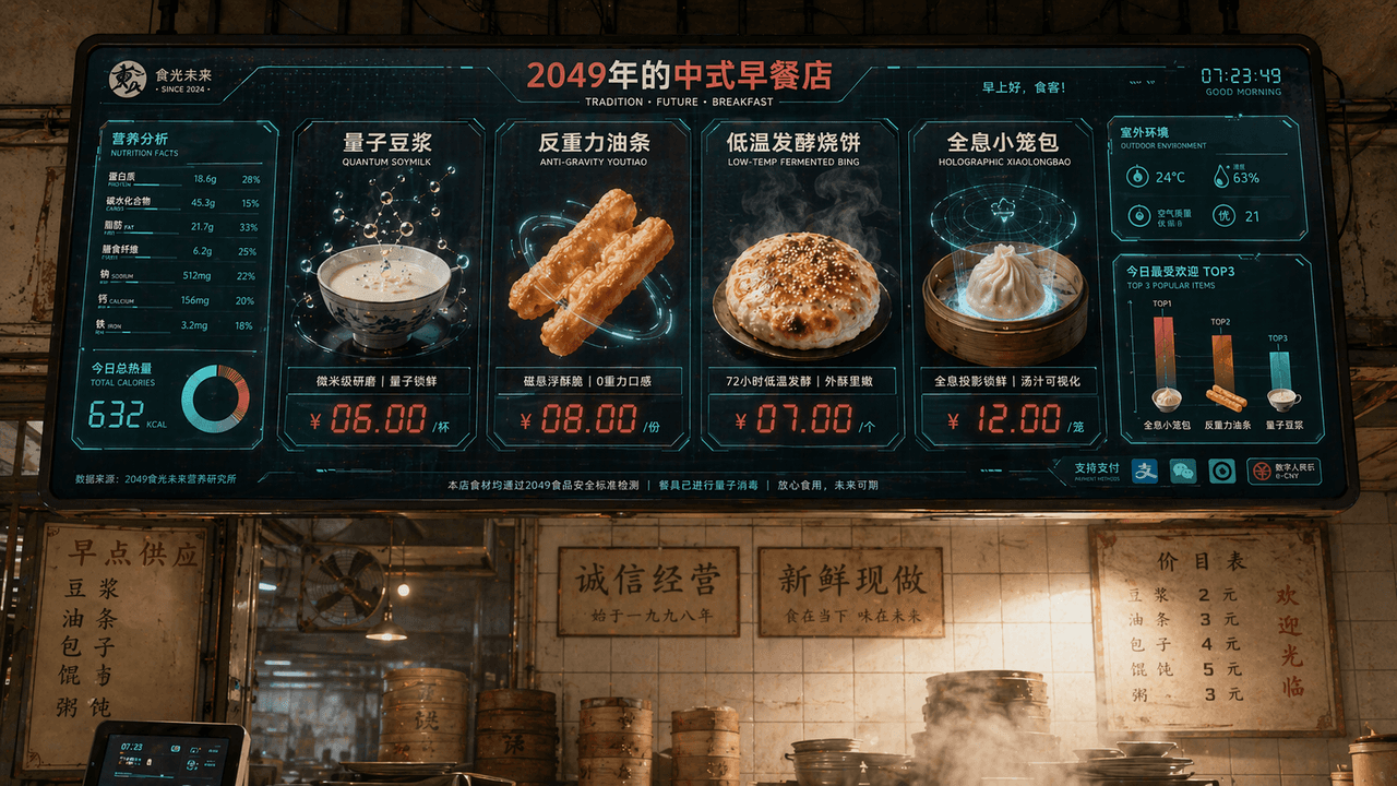
"Chinese Breakfast Shop Menu Screen in 2049", 외식 브랜드 비전이 SF 화면 인터페이스와 결합되어 있습니다. 메인 화면은 매장 위에 매달린 거대한 전자 주문 화면입니다. 요리 메뉴에는 "Quantum Soy Milk", "Anti-Gravity Fritters", "Low-temperature Fermented Shaobing", "Holographic Xiao Long Bao"가 포함됩니다. 각 요리는 매우 정교한 음식 3D 렌더링으로 표시됩니다. 가격표는 빨간색 LED 디지털 문자를 사용합니다. 왼쪽에는 영양가 및 칼로리 정보 차트가 있고, 오른쪽 하단에는 "Today's Most Popular TOP3" 막대 차트가 있으며, 배경에는 옛날 조식 식당의 타일 벽과 실제 김이 모락모락 피어오르는 환경이 그대로 남아 있어 신구의 조화를 이룹니다. 색상 구성은 밀크 화이트, 토마토 레드, 디지털 그린이며 비율은 16:9입니다.

당나라의 배달 앱

당나라의 배달 앱

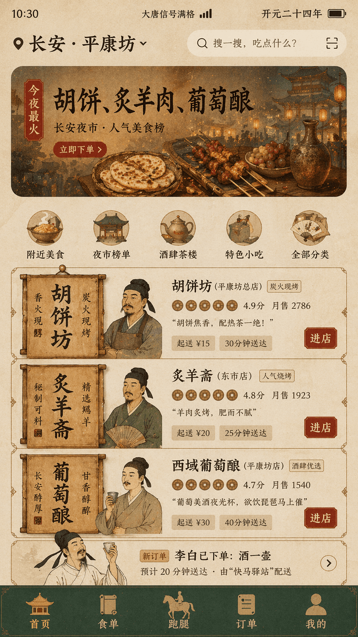
"Tang Dynasty Food DELIVERY INTERFACE"는 고대 생활 풍경과 현대 모바일 제품 UI의 융합 디자인입니다. 화면은 스마트폰의 배달 홈 인터페이스를 시뮬레이션하며, 상단 위치 표시에는 "Chang'an · "Pingkangfang""이 표시되고, 추천 배너에는 "Tonight's most popular: Hu cakes, roasted mutton, grape wine"이라고 적혀 있습니다. 가맹점 카드는 당나라 상점 간판과 목재 현판 요소를 활용해 재구성되었고, 프로필 아바타는 세밀화 스타일의 상점 주인 흉상이며, 평점은 엽전 아이콘으로 표시되고, 주문 목록에는 "Li Bai has placed an order: a pot of wine"이 나타납니다. 하단 내비게이션 바는 "Homepage/Food List/Run Errands/Orders/Mine", 상태 표시줄에는 "Datang Signal Full" 및 "Kaiyuan Twenty-Fourth Year"가 표시됩니다. 전반적인 색상은 황토색, 석록색, 금박 붉은색이며, 서체는 비문 양식의 타이틀 서체와 현대적인 얇은 산세리프의 혼합입니다. 인터페이스는 실제 제품 디자인 시안 같으면서도 역사적 유머 감각을 담고 있으며, 비율은 9:16입니다.

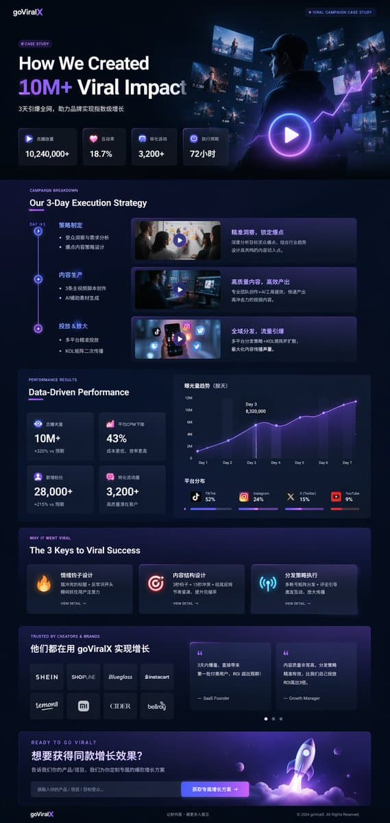
다크 모드 마케팅 케이스 스터디 UI

다크 모드 마케팅 케이스 스터디 UI

UI/UX 랜딩 페이지 목업. 다크 모드, 세련되고 모던한 에스테틱, 글래스모피즘, {argument name="primary accent color" default="네온 퍼플 및 블루"} 글로우 액센트. Our 3-Day Execution Strategy. Data-Driven Performance. The 3 Keys to Viral Success. TRUSTED BY CREATORS & BRANDS. READY TO…

이커머스 라이브 스트리밍 UI 목업

이커머스 라이브 스트리밍 UI 목업

라이브 스트리밍 UI 목업. 미소 짓고 있는 {argument name="host name" default="Elon Musk"}의 인물 사진, 흰색 기술 도면 그래픽이 들어간 검은색 티셔츠 착용. {argument name="product name" default="테슬라 사이버트럭 전기 픽업트럭"}. 왼쪽에는 '{argument name="left background logo" default="SPACEX"}' 텍스트가…

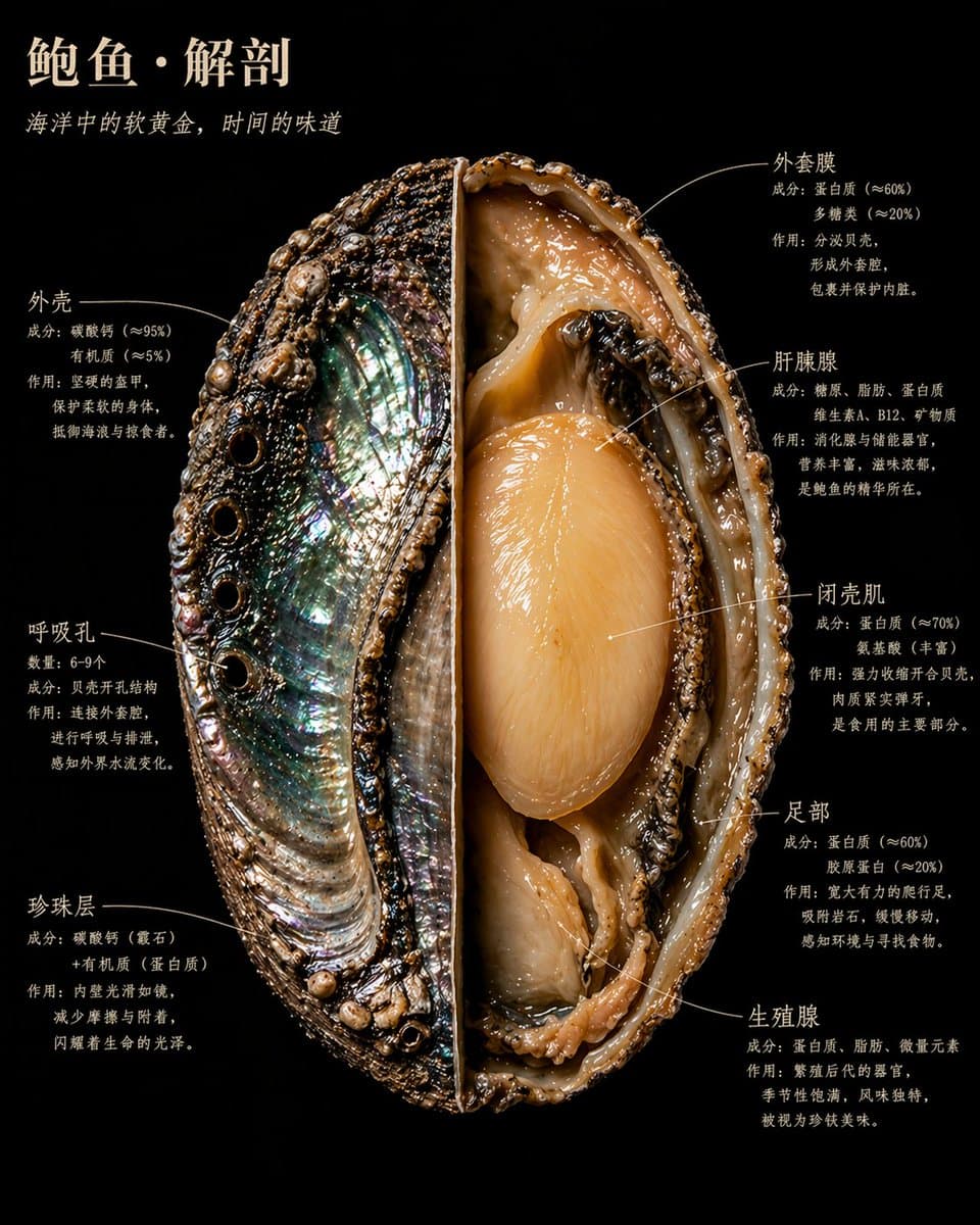
박물학자 스타일의 음식 표본 단면도

박물학자 스타일의 음식 표본 단면도

박물학의 거장이 야생에서 발견한 표본을 해부한 듯한 [food name]의 한 조각/단면. 박물관의 귀중한 소장품처럼 절개되고, 펼쳐지고, 고정되어 있다. 하지만 내셔널 지오그래픽 사진작가가 된 카라바조 시대의 빛으로 조명된다. 각각의 내부 구조는 고유한 물질적 진실성으로 빛난다. 단면은 강렬할 정도로 날카롭다. 내부는 경이로울 정도로 아름답다. 완전한 표본이 화면에 제시된다: 절반은 원래 형태를 유지하여 [external surface description: texture/color/texture]을(를) 보여주고, 나머지 절반은 중심부까지 절개되어 [internal core structure description: the most important 1-2 internal visual features]이(가) 선명하게 드러난다. [Add 1-2 sentences to describe the most visually interesting cross-sectional details of the food] 배경: 칠흑 같은 블랙 벨벳. [Food Name]은(는) 귀중하면서도 위험한 무언가처럼 그 속에 떠 있다. 주석 텍스트는 구조의 가장자리에 밀착되어 있으며, 손글씨 느낌의 세리프 서체는 결코 가볍게 들뜨지 않는다. 화면에는 각 3줄로 구성된 다음 주석들이 포함된다: 첫째 줄은 구조 이름, 둘째 줄은 성분/데이터, 셋째 줄은 설명 및 인용구: [Structure 01 name] [Ingredients/Data Description] [What does this structure do and why is it important] [Structure 02 name] [Ingredients/Data Description] [What does this structure do and why is it important] [Structure 03 name] [Ingredients/Data Description] [What does this structure do and why is it important] [Structure 04 name] [Ingredients/Data Description] [What does this structure do and why is it important] [Structure 05 name] [Ingredients/Data Description] [What does this structure do and why is it important] [Structure 06 Name] [Ingredients/Data Description] [What does this structure do and why is it important] 기타 항목이 있다면 생략하되 이 서식을 계속 유지할 것 메인 타이틀, 좌측 상단, 따뜻한 아이보리 화이트 대문자 폰트: 【Food name】·Anatomy 이탤릭체의 부제가 바로 이어짐: [A sentence that reveals the essence of this food, no more than 15 words] 전체적인 분위기: 오듀본 박물관 일러스트레이션 × 카라바조의 명암법 × 역사상 가장 아름다운 과학 사진. 4K 정밀도, 표본 전용 조명, 극대화된 내부 디테일. 차가운 임상적 느낌 없이 모든 것이 살아 숨 쉬는 듯한 감각. 도식적이거나 만화, 단순화된 일러스트가 아닌 사실주의적 스타일. 각 질감은 실제 물리적인 텍스처를 지님: 거칠고, 매끄럽고, 촉촉하고, 건조하고, 치밀하고, 포슬포슬함.

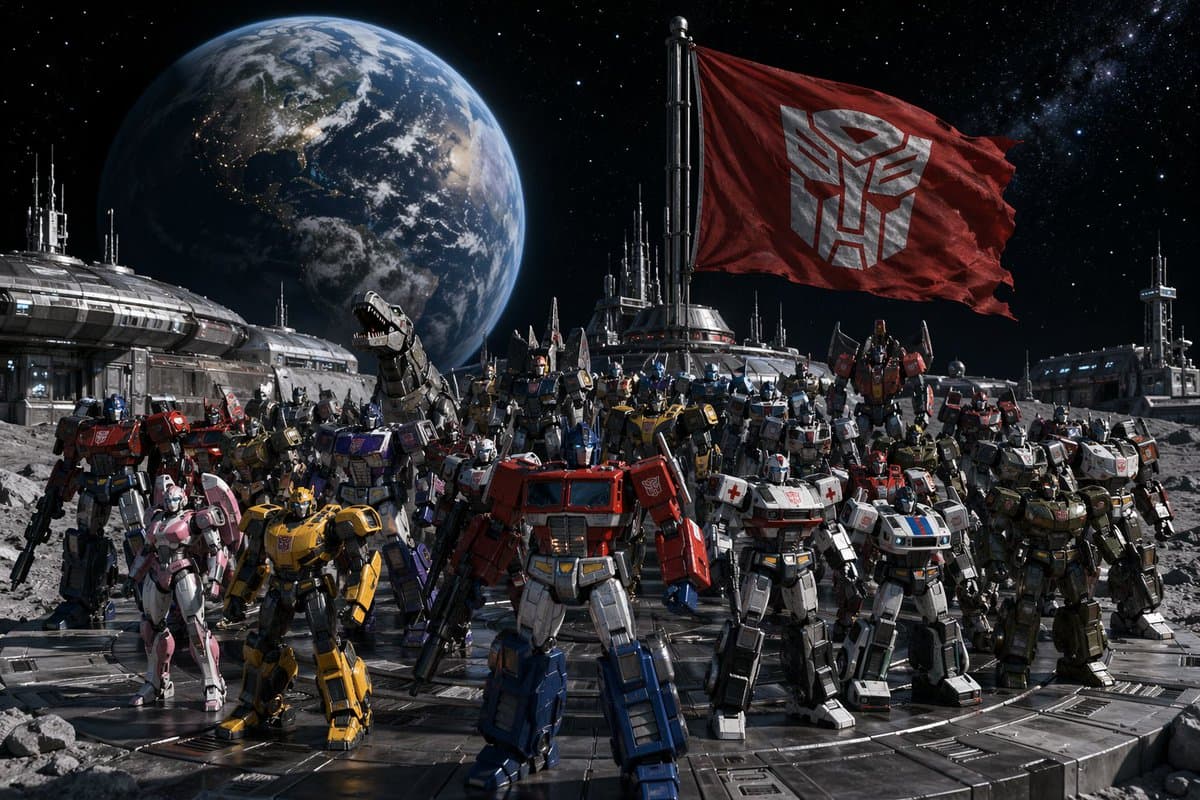
달 기지에 집결한 오토봇

달 기지에 집결한 오토봇

그림 1: 모든 오토봇이 달 기지에 모여 있고, 그들 뒤로 별이 빛나는 밤하늘에 지구가 떠 있으며, 사이버트론 깃발이 펄럭이고 있다. 그림 2: 모든 디셉티콘이 외계 전함 갑판에 배열되어 있고, 메가트론이 왕좌에 앉아 군대 전체를 내려다보고 있다.

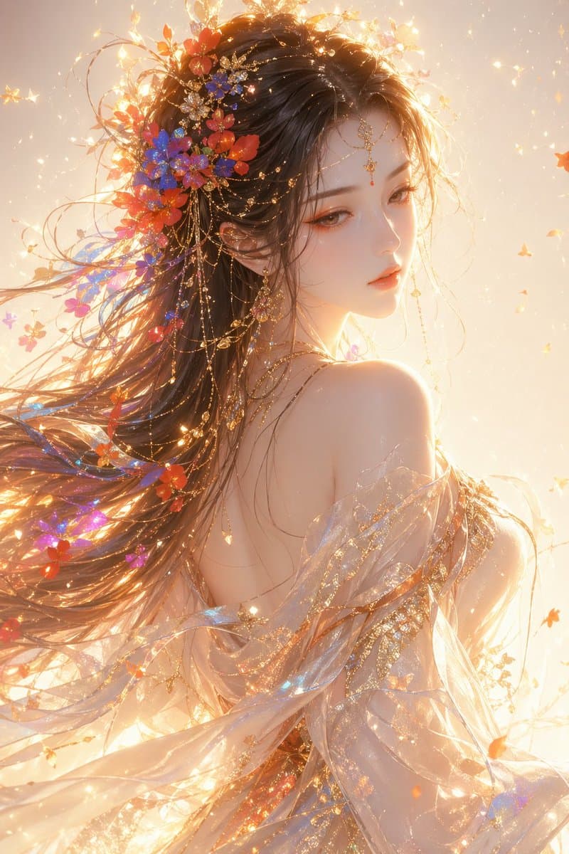
동양 판타지 여성 반신 포트레이트

동양 판타지 여성 반신 포트레이트

동양 판타지 스타일의 여성, 상반신 초상화, 뒤돌아보는 측면 모습, 영묘하고 우아한 분위기, 부드럽고 성스러운 아름다움, 섬세한 이목구비, 살짝 내리뜬 눈, 맑고 투명한 쿨톤의 하얀 피부, 우아한 오렌지 핑크 메이크업과 골드 하이라이트. 흩날리는 긴 머리카락에는 다채로운 꽃과 빛 입자(빨강, 파랑, 주황, 보라)가 스며들어 있습니다. 머리카락은 유려하고 공기감이 느껴집니다. 반투명한 실크 드레스와 숄을 착용하고 있으며, 소재는 가볍고 투명하여 바람에 하늘거리며, 표면에는 금박 질감과 반짝이는 입자가 수놓아져 있습니다. 전체적인 명암은 따뜻한 골든 역광, 강렬한 림 라이트, 뚜렷한 볼륨 라이트, 떠다니는 빛 입자, 부드러운 빛과 확산광으로 몽환적인 분위기를 연출합니다. 배경은 은은한 반짝임과 파티클 효과가 있는 깔끔하고 밝은 그라데이션이며, 전체적인 분위기는 신비롭고 몽환적이며 성스럽습니다. 스타일: 하이엔드 CG 일러스트레이션, 극도로 정밀함, 영화급 조명 및 명암, 소프트 라이트 렌더링, 8K 디테일, 아트스테이션 인기 작품 스타일