
提示詞
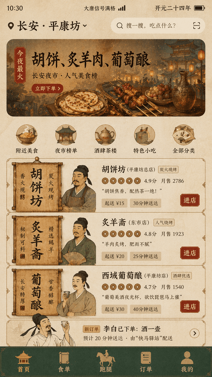
"Tang Dynasty Food DELIVERY INTERFACE" 是一場古代生活場景與現代行動端產品 UI 的融合設計。畫面模擬手機上的外送首頁介面,頂部定位顯示 "Chang'an · "Pingkangfang",橫幅推薦寫著 "Tonight's most popular: Hu cakes, roasted mutton, grape wine",店家卡片採用唐代招幌與木質招牌元素重構,頭像是工筆畫風格的掌櫃半身像,評分以銅錢圖示呈現,訂單列表中出現 "Li Bai has placed an order: a pot of wine",底部導覽列為 "Homepage/Food List/Run Errands/Orders/Mine",狀態列顯示 "Datang Signal Full" 與 "Kaiyuan Twenty-Fourth Year",整體配色為赭石、石綠、金箔紅,字體融合了碑刻風格的標題字與現代纖細無襯線體,介面宛如真實的產品設計稿,同時充滿歷史幽默感,比例 9:16。
使用說明
這份使用說明目前提供英文版本。
A food-delivery home screen set in Tang dynasty Chang'an: a ward-level location pin, a night-market banner, merchant cards rebuilt from wooden shop signs, copper-coin ratings and an order strip announcing that a poet has ordered a jug of wine. Good for heritage merchandise, time-slip product concepts and classroom visuals.
When to use
Playful content for tourism and museum accounts, concept practice for product designers, promotional material for history-themed restaurants, and exhibition boards. Keep the real delivery-app order: location and search, banner, category icons, three merchant cards, order strip, bottom tabs; do not break that sequence to squeeze in more shops.
What the existing cover image shows
The existing cover illustration is a 9:16 phone home screen on an aged-paper ground. The status bar shows a clock, a full-signal label and the reign year; the location row names the city and ward beside a search field. The banner is a painted night market with a hot-tonight tag, a large three-dish headline and a red order button. Below five round category icons sit three merchant cards, each with a vertical calligraphy sign on the left, a fine-brush shopkeeper bust, copper-coin ratings, monthly sales, a one-line slogan, minimum order and delivery time, and a red enter-shop button; then an order strip about the poet's jug of wine, and a dark green bottom bar whose five icons are pavilions, scrolls and a post horse. Text is sharp throughout, and the mix of stele-style headings with a thin sans serif is really there. Weaker points: prices use a modern currency sign, the stone-green tone shows almost only in the bottom bar, and the three shopkeepers share similar faces and dress.
Suggested setup
- Aspect ratio
- 9:16 · The prompt calls for 9:16 and the cover matches it; the 1:1 in the record fits neither. Ask for a complete phone screen with the status bar and bottom tabs inside the frame, the banner taking about the top quarter, and three merchant cards of equal height, each with room for its wooden sign.
- Reference images
- None. The interface and shops are invented; do not upload screenshots of real delivery apps, or their icons and colors will be copied. For a specific painting manner, one fine-brush figure painting or a Tang mural can serve as a style reference.
What to customize
- City, ward and banner dishesLuoyang, South Market; tonight's hits: sesame flatbread, steamed fish, pear-blossom wine
- Keep exactly three dishes so the banner headline stays on one line, and write the location as city plus place so the pin row does not wrap.
- Three merchants and their keepersSesame Flatbread Shop, Steamed Fish Hall, Pear Blossom Tavern, run by an old man with a fan, a sturdy cook in an apron and a young man holding a cup
- Stay with three cards and give each keeper a distinct age, beard and hand-held object, or the three faces will come out alike.
- Palette and typePorcelain blue, rice-paper white, cinnabar red; stele-style headings with a thin sans body
- Assign each color to a region (background, bar, buttons) and name heading and body fonts separately, or everything merges into one warm yellow.
View a complete adaptation
Ming dynasty ride-hailing app
The same period-life-meets-mobile-UI design, recast as the home screen of a Ming-era Nanjing ride app offering sedan chairs, carriages and pleasure boats, in porcelain blue and rice-paper white at 9:16.
This adaptation has not been generated. The existing cover image comes from the original prompt collection and is not a result of this adaptation.
Ming Dynasty Ride Hailing Interface, a design that fuses period daily life with modern mobile product UI. The screen imitates the home page of a ride app on a phone. The location at the top reads Nanjing, Qinhuai riverside; the banner reads Travel today: soft sedan chair, two-horse carriage, night pleasure boat. Vehicle cards are rebuilt from Ming memorial-arch and wooden-sign elements, with fine-brush half-length portraits of a chair bearer, a carriage driver and a boatwoman as avatars; ratings appear as silver-ingot icons. The trip list includes: a Qinhuai painter has requested one pleasure boat. Bottom tabs: Home, Chairs and Horses, Boats, Trips, Me. Status bar: Great Ming Post Signal Full and the reign year Wanli 8. Palette of cobalt porcelain blue, rice-paper white and cinnabar red; regular-script style headings mixed with a modern thin sans serif. It should look like a real product design mockup while carrying a time-travel sense of humor, ratio 9:16.
Troubleshooting
- The three shopkeepers come out as the same face
- Describe each keeper's age, beard, headwear and hand-held item separately and require different sign text on each card; if they still repeat, regenerate the three cards enlarged on their own and composite them back.
- The phone frame gets cropped, losing the status bar or bottom tabs
- Write 'complete phone screen with a narrow margin on all sides' and list all five tab labels verbatim so the model is obliged to draw them.
Editorial notes and generation record
AI-assisted editorial analysis of the source prompt and existing illustration. Settings are starting suggestions; the new adaptation is not a model test.
No new illustration was generated for this guide. The observations refer to the prompt's existing cover image from its source collection; its generation details are not recorded.
提示詞資訊
- 模型
- GPT IMAGE 2
- 每張圖消耗
- 1K:43 點數 · 2K:86 點數 · 4K:143 點數
- 畫幅比例
- 1:1
- 收錄時間
- 更新時間