Mới: GPT Image 2.5 Flare và Sunburst. Dùng thử miễn phí 3 ảnh khi đăng ký, sau đó 8 tín dụng mỗi ảnh.
Dùng thử GPT Image 2.5

Prompt AI về Phong cách Nhật Bản

201 mẫu · GPT IMAGE 2, Nano Banana Pro · cập nhật thg 10 2026

Bộ sưu tập này trải rộng từ infographic kinh doanh tinh gọn, các trang truyện tranh shoujo manga nhiều khung hình, tài liệu quét chân thực cho đến ảnh chụp chân dung tự nhiên. Mỗi mẫu đều lồng ghép kiểu chữ Nhật Bản chuẩn mực, khoảng trắng tinh tế và bố cục cân đối. Tùy chỉnh văn bản trong ngoặc vuông, phong cách người mẫu và bảng màu để phù hợp với dự án của bạn.

Sắp xếp theo:

Hiển thị 121–180 trong số 201 prompt

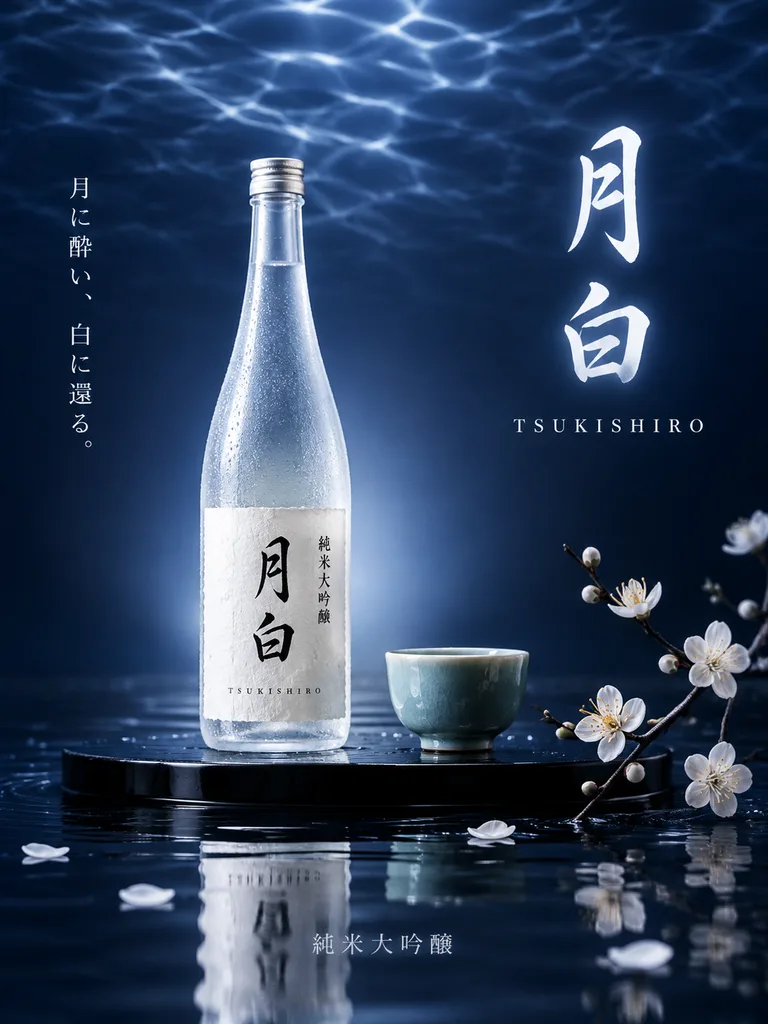
Poster Quảng Cáo Rượu Sake Nhật Bản Cao Cấp

Poster Quảng Cáo Rượu Sake Nhật Bản Cao Cấp

Luxurious Japanese poster advertisement for a premium sake brand named "[月白]" with the romanized subtitle "[TSUKISHIRO]". A refined studio setting against a deep midnight-to-navy blue backdrop with shimmering water-ripple caustics across the upper frame, resembling moonlight over calm water. Slightly left of center on a glossy black lacquer platform rests a tall, slender frosted glass sake bottle with cool silver-blue condensation, a pale textured paper label inscribed with bold black calligraphy reading "[月白]", small vertical text reading "純米大吟醸", and tiny romanized letters "[TSUKISHIRO]" along the lower label edge. A soft cool-white halo glows behind the bottle. To its right on the same platform sits a small celadon-green ceramic sake cup. A delicate white plum blossom branch enters from the lower right with open blossoms and buds, scattering loose petals onto the glossy dark water surface below, which casts soft reflections of the bottle, cup, and platform. On the right side, prominent vertical glowing brush calligraphy reads "[月白]" with spaced serif lettering "[TSUKISHIRO]" underneath. On the far left, an elegant vertical Japanese tagline reads "[月に酔い、白に還る。]". At bottom center, pale gray typography reads "純米大吟醸". Cool moonlit lighting, minimalist negative space, crisp commercial product photography.
sakeposterquảng cáo
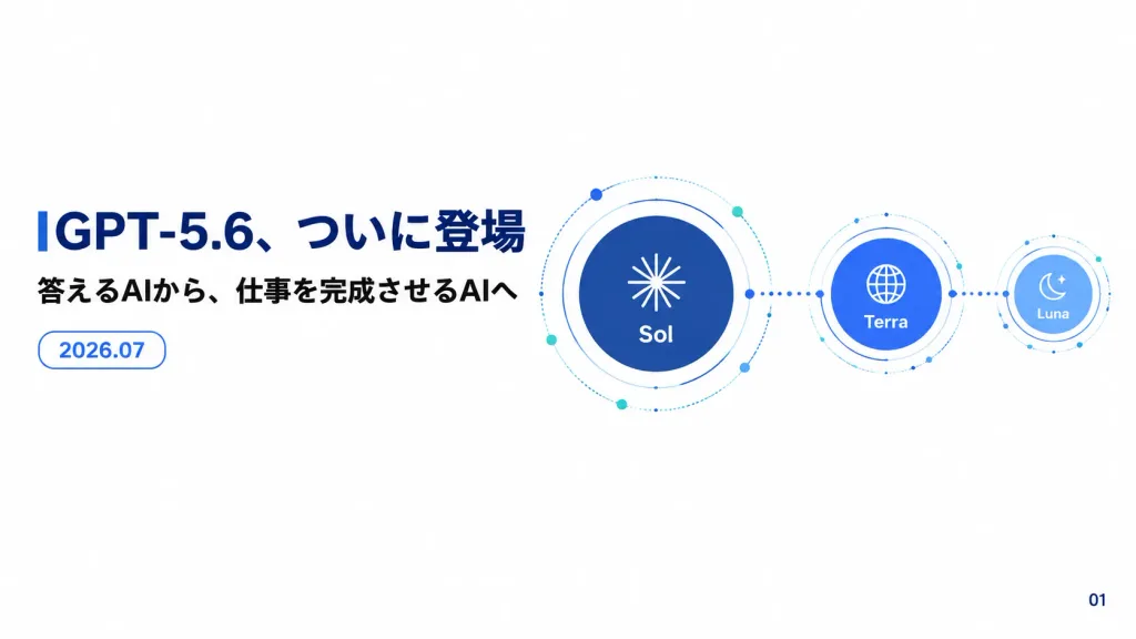
Slide Thuyết Trình Công Nghệ Tiếng Nhật Tối Giản

Slide Thuyết Trình Công Nghệ Tiếng Nhật Tối Giản

A clean Japanese product announcement presentation slide for [GPT-5.6] in a 16:9 widescreen corporate tech style. Crisp vector graphics, clean solid white background with generous negative space, subtle dotted orbital lines, and no photographic textures. Layout and Content: - Left side: Large bold navy Japanese headline reading “[GPT-5.6、ついに登場]”. Directly beneath it, a smaller bold black Japanese subtitle: “[答えるAIから、仕事を完成させるAIへ]”. Below the subtitle, a small rounded-rectangle badge with a thin blue outline containing blue text: “[2026.07]”. - Right side: A connected orbital diagram of exactly three circular model nodes aligned horizontally from largest to smallest: 1. A large dark navy circle labeled “Sol” beneath a white radial starburst icon, wrapped in thin concentric orbital rings, dotted arcs, and tiny blue and teal nodes. 2. A medium cobalt-blue circle labeled “Terra” beneath a white globe icon, connected by a dotted line with small solid dots, surrounded by thin orbital rings. 3. A small pale sky-blue circle labeled “Luna” beneath a white crescent moon and star icon, connected via dotted line, with delicate orbit rings. - Bottom right corner: A small page number “[01]”. Style: Modern Japanese sans-serif typography, precise technical line art, minimalist corporate tech aesthetic.

thuyết trìnhslideinfographic
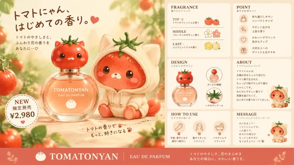
Tờ Rơi Quảng Cáo Nước Hoa Mèo Cà Chua Kawaii

Tờ Rơi Quảng Cáo Nước Hoa Mèo Cà Chua Kawaii

Cute Japanese perfume advertising flyer for an original tomato-cat fragrance brand, designed in a soft commercial poster style for a kawaii cosmetic line. Canvas and Composition: - Wide horizontal 16:9 flyer divided into a large left hero panel and a narrower right information panel. - Warm cream background with soft peach tones, gentle warm sunlight, shallow depth of field, blurred tomato vines and green foliage framing the edges, and a textured warm beige paper feel. Left Hero Panel: - Features exactly two tomato-cat characters center-left: one small glossy red tomato cat resting on a round glass perfume bottle, and one larger tomato cat wearing an oversized pale cream cat-eared hoodie. Both feature green tomato calyx stems as leafy hair, tiny glossy black eyes, small white mouths, blush cheeks, and rounded bodies. - The perfume bottle is clear glass holding pale peach liquid, crowned with a tomato-shaped red character cap, labeled in clean white serif text: "[TOMATONYAN] EAU DE PARFUM" with a tiny tomato graphic. - Upper-left handwritten Japanese headline: "[トマトにゃん、はじめての香り。]" with neat promotional subtext and a small heart icon. - Lower-left dotted circular "NEW" badge with Japanese pricing text. - Bottom-center handwritten Japanese mini-note accented with tiny paw prints. - Lower brand bar: a full-width muted coral banner along the base with a tomato icon, bold serif text "[TOMATONYAN]", "EAU DE PARFUM", and two white Japanese tagline lines. Right Information Panel: - Six rounded cream information cards arranged neatly over a pale peach base, framed with delicate red-brown serif headings and Japanese subtitles: 1. "FRAGRANCE": Scent pyramid displaying 3 rows labeled TOP, MIDDLE, and LAST with tomato, floral, and pale citrus icons. 2. "POINT": Recommendation card with 4 line-art icon rows (handbag, sparkle, heart, gift). 3. "DESIGN": Feature illustration of the tomato-cat flacon with 2 small thumbnail insets (bottle profile and stem detail). 4. "ABOUT": Character background paragraph with a miniature tomato cat in a hoodie at the base. 5. "HOW TO USE": 3 application steps with circular icons (pulse points, hair/linen mist, bath relaxation). 6. "MESSAGE": Handwritten Japanese character note with a tiny hoodie-wearing tomato cat. Style & Constraints: - Blends delicate watercolor kawaii character illustration with clean, glossy Japanese commercial beauty packaging photography. - Elegant brown typography, muted coral accents, subtle water drops on glossy tomato skin, soft tabletop shadows. - Commercial layout, authentic Japanese promotional copy, no barcodes, no real-world logos.
nước hoakawaiimỹ phẩm
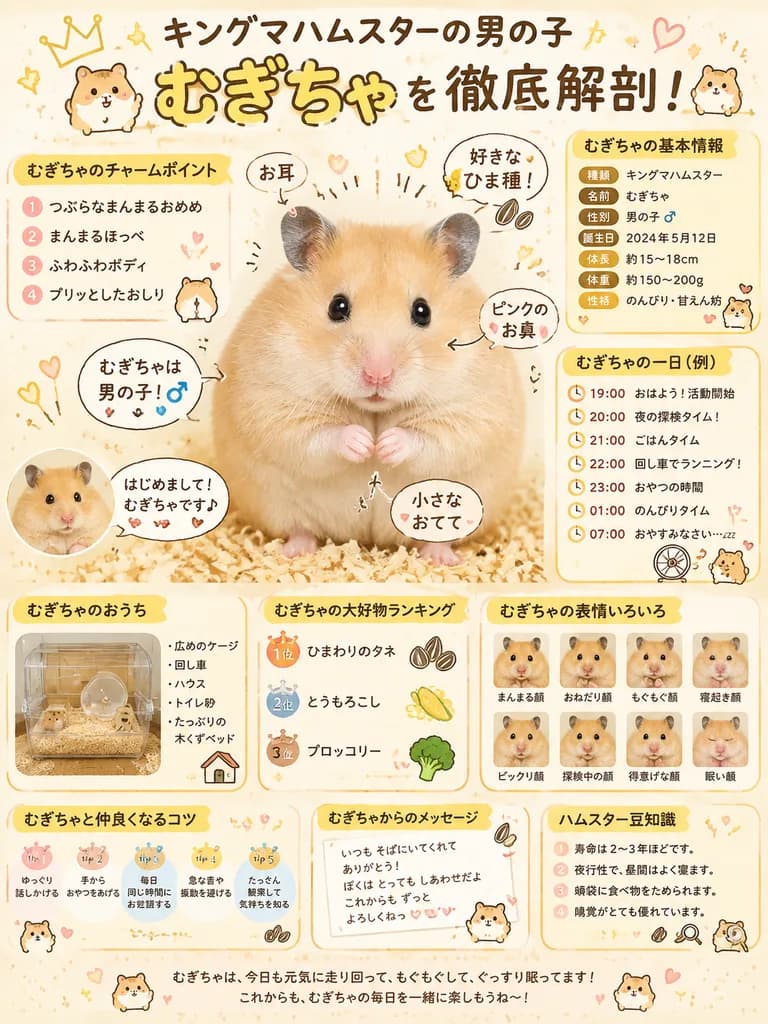
Poster Infographic Hồ Sơ Chuột Hamster Kiểu Nhật

Poster Infographic Hồ Sơ Chuột Hamster Kiểu Nhật

cute hamster infographic poster. [キングマハムスターの男の子 むぎちゃ を徹底解剖!]. むぎちゃの基本情報. むぎちゃのチャームポイント. central callouts. むぎちゃの一日(例). むぎちゃのおうち. むぎちゃの大好物ランキング. むぎちゃの表情いろいろ. むぎちゃと仲良くなるコツ. むぎちゃからのメッセージ. ハムスター豆知識. bottom footer. male Syrian hamster. [むぎちゃ]. g…

chuột hamsterinfographicposter
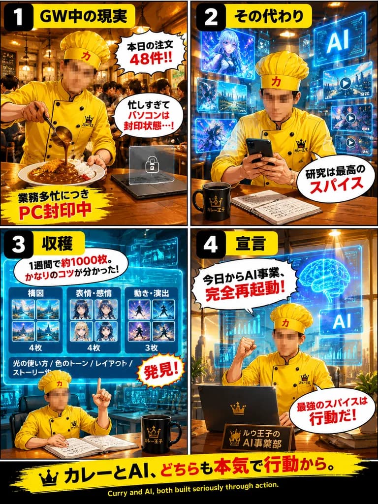
Áp Phích Truyện Tranh Bốn Khung Đầu Bếp Cà Phê và AI

Áp Phích Truyện Tranh Bốn Khung Đầu Bếp Cà Phê và AI

four-panel promotional manga-style infographic poster. GW中の現実. busy curry restaurant packed with customers, warm wooden interior, hanging pendant lights; the chef pours curry sauce from a ladle onto rice in the foreground while a closed la…

truyện tranhmangađồ họa thông tin
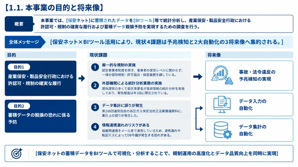
Slide Chiến Lược Chuyển Đổi BI Chuẩn Nhật

Slide Chiến Lược Chuyển Đổi BI Chuẩn Nhật

A polished Japanese corporate presentation slide layout, 16:9 widescreen ratio, clean white background, structured corporate color scheme of navy (#003b8f, #001f5b), sky blue, and subtle cool gray dividers. Consulting deck aesthetic with high typography density, clean vector linework, rounded rectangular containers, and precise grid alignment. Top Left Header: Bold navy title: 「[1.1. 本事業の目的と将来像]」 Top Overview Container: A white horizontal card directly below the title outlined in thin navy. On the far left, a solid dark navy rounded badge labeled 「概要」. Body text inside: 「本事業では、[保安ネット]に蓄積されたデータを[BIツール]等で統計分析し、産業保安・製品安全行政における許認可・規制の確実な履行および蓄積データ毀損予防を実現するための調査を行う。」 Key Takeaway Band: A pale blue full-width strip with a navy directional chevron on the left labeled 「全体メッセージ」. Main bold navy headline: 「[保安ネット×BIツール活用により、現状4課題は予兆検知と2大自動化の3将来像へ集約される。]」 Main Body Layout (Three columns divided into two horizontal tiers, connected by clean directional flow arrows): 1. Left Column (Header: 「目的」): - Card 1: Dark navy background card with small white pill tag 「目的1」, text: 「産業保安・製品安全行政における許認可・規制の確実な履行」 - Card 2: Dark navy background card with small white pill tag 「目的2」, text: 「蓄積データの毀損の恐れに係る予防」 2. Center Column (Header: 「現状課題」): Two soft gray rounded cards enclosing four numbered items with circular navy badges (1 to 4): - Badge 1: 「画一的な規制の実施」 with subtext 「認定事業者制度を除き、事業者の保安レベルに関わらず、一律の個別規制・許可届出・検査義務を課している。」 - Badge 2: 「外部機関による統計分析業務の実施」 with subtext 「関係課室の多くで委託事業者が事故情報の統計分析を実施しており、報告頻度は年1回に限定されている。」 - Badge 3: 「データ集計に誤りが発生」 with subtext 「第208回通常国会の高圧ガス保安法改正法案審議資料に、集計上の誤りが発生した。」 - Badge 4: 「情報連携漏れのリスクがある」 with subtext 「組織間連携をメール等で運用しているため、連携漏れや転記ミスによってDB不備が発生する恐れがある。」 3. Right Column (Header: 「将来像」): Three cards with subtle blue borders and minimalist blue line icons: - Card 1 (linked from issues 1-2 via a navy arrow): Icon of magnifying glass with rising bar chart and warning triangle; label: 「事故・法令違反の予兆検知の実現」 - Card 2 (linked from issues 3-4 via branching arrow): Icon of monitor with file sync arrows; label: 「データ入力の自動化」 - Card 3 (linked from issues 3-4 via branching arrow): Icon of database cylinder with gear; label: 「データ集計の自動化」 Bottom Takeaway Strip: Full-width white banner with a thin navy border and target icon on the left. Bold navy summary: 「[保安ネットの蓄積データをBIツールで可視化・分析することで、規制運用の高度化とデータ品質向上を同時に実現]」.

thuyết trìnhinfographictư vấn
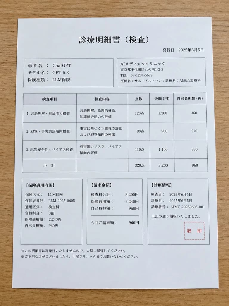
Mockup Hóa Đơn Khám Bệnh AI Kiểu Nhật

Mockup Hóa Đơn Khám Bệnh AI Kiểu Nhật

Japanese medical billing statement parody document. a single printed examination statement sheet placed on a light brown wooden tabletop. 診療明細書(検査). 言語理解、論理的推論、知識統合能力の評価. 事実に基づく正確性の評価および幻覚傾向の検出. 有害出力リスク、バイアス傾向の評価. 【保険適用内訳】. 【請求金額】. 【診療情報】.…

mockuptài liệutiếng nhật
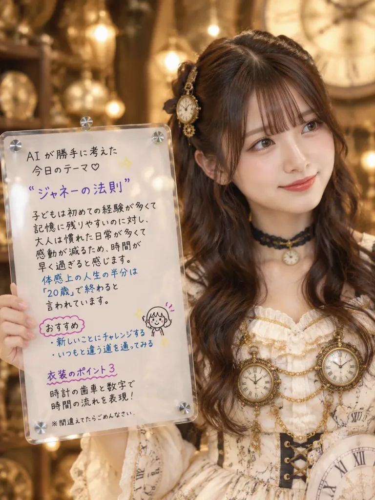
Cô gái steampunk chủ đề đồng hồ cầm bảng mica

Cô gái steampunk chủ đề đồng hồ cầm bảng mica

A vertical 3:4 photorealistic portrait of [a young Japanese woman with long wavy dark brown hair and soft makeup], positioned on the right side of the frame with a gentle smile, looking slightly toward the viewer's right. She wears [cream-white steampunk clock dress with Roman numerals and antique clock ornaments], detailed with gold trim, delicate ruffles, a black choker with a small clock pendant, and exactly 2 large round antique clock ornaments hanging on the bodice with gold chains. Her half-up hair with straight bangs features small antique gear-and-clock hair clips. On the left, a realistic hand holds a transparent acrylic board with rounded corners, realistic glossy reflections, and exactly 5 visible screw caps (one near each corner and one on the upper edge). The board features neat handwritten Japanese text in black, purple, and blue ink, a small yellow sparkle doodle, and a tiny smiling girl doodle at the lower right: 「AI が勝手に考えた 今日のテーマ♡ “[ジャネーの法則]” 子どもは初めての経験が多くて 記憶に残りやすいのに対し、 大人は慣れた日常が多くて 感動が減るため、時間が 早く過ぎると感じます。 体感上の人生の半分は 『20歳』で終わると 言われています。 おすすめ ・新しいことにチャレンジする ・いつもと違う道を通ってみる 衣装のポイント3 時計の歯車と数字で 時間の流れを表現! ※間違えてたらごめんなさい」 Background: [warm antique clock workshop with golden bokeh and a giant clock face] visible softly blurred in the upper right. Lighting: Cinematic warm lighting, soft brass hues, shallow depth of field. Mood: [gentle morning greeting, elegant and hopeful].

steampunknhat-banmang-xa-hoi
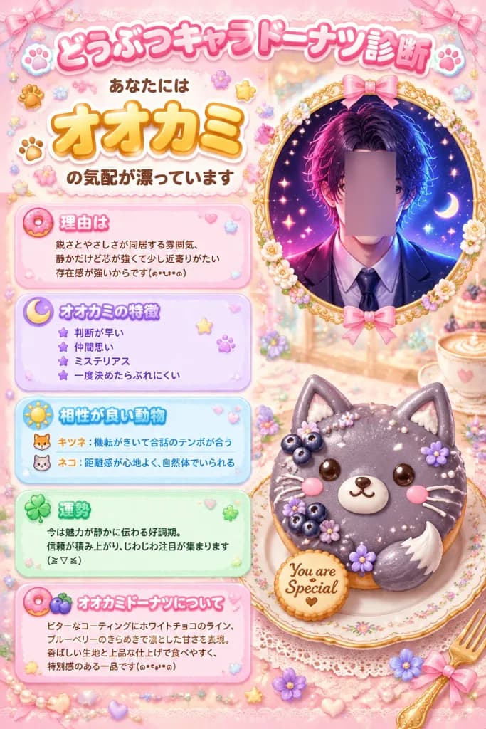
Áp phích Trắc nghiệm Bánh Donut Sói Kawaii

Áp phích Trắc nghiệm Bánh Donut Sói Kawaii

Cute Japanese "animal character donut diagnosis" infographic poster for [wolf], in a pastel kawaii dessert aesthetic. Vertical 2:3 composition with a soft pink bakery café backdrop embellished with pearls, lace, sparkles, tiny hearts, stars, flowers, ribbons, and glossy confectionery decorations in warm cream, pink, lavender, sky blue, mint, and gold. Top headline area: - Large rounded bubble-letter Japanese title: 「どうぶつキャラドーナツ診断」 in pink with white outline and drop shadow. - Subtitle below: smaller 「あなたには」, very large golden-orange outlined text 「オオカミ」, followed by 「の気配が漂っています」. - Surrounded by tiny paw prints, stars, flower stickers, and pastel ribbon ornaments. Right side visual: - Upper right: Circular ornate gold-framed portrait adorned with small cream flowers and pink ribbons. Inside is a stylish handsome anime man, chest-up, wearing a dark suit, white shirt, and tie, with wavy black hair illuminated by neon magenta and electric blue highlights against a dark starry background. The center of his face is obscured by a vertical soft-edged rectangular blur block in muted mauve. - Lower right: In front of the portrait, on a decorative plate, rests a realistic-cute animal donut shaped like a gray wolf face: round purple-gray icing, two pointed ears, glossy black eyes, small pink blush cheeks, white muzzle, tiny black nose and smiling mouth, white icing whisker lines, and a crescent tail accent on the lower right. Decorated with 3 clusters of dark blueberries, tiny purple sugar flowers, pearl sprinkles, and white icing drizzles. A small round cookie beside it reads "You are Special." Left column: 5 stacked rounded pastel gradient information cards with translucent glossy borders: 1. Pink card with donut icon, heading 「理由は」, text: 「鋭さとやさしさが同居する雰囲気、静かだけど芯が強くて少し近寄りがたい存在感が強いからです(。•ᴗ•。)」 2. Purple card with crescent moon icon, heading 「オオカミの特徴」, 4 bullet items: 「判断が早い」, 「仲間思い」, 「ミステリアス」, 「一度決めたらぶれにくい」 3. Light blue card with sun icon, heading 「相性が良い動物」, 2 bullet items: fox icon with 「キツネ:機転がきいて会話のテンポが合う」, cat icon with 「ネコ:距離感が心地よく、自然体でいられる」 4. Mint green card with clover icon, heading 「運勢」, text: 「今は魅力が静かに伝わる好調期。信頼が積み上がり、じわじわ注目が集まります(≧▽≦)」 5. Pink card with donut and blueberry icons, heading 「オオカミドーナツについて」, text: 「ビターなコーティングにホワイトチョコのライン、ブルーベリーのきらめきで凛とした甘さを表現。香ばしい生地と上品な仕上げで食べやすく、特別感のある一品です(๑•᎑•๑)」 Style: High-detail kawaii Japanese social media diagnostic infographic, glossy stickers, soft glow, pastel gradients, edible 3D pastry realism combined with anime illustration. Balanced layout with crisp legible typography.

đồ họa thông tinkawaiiáp phích
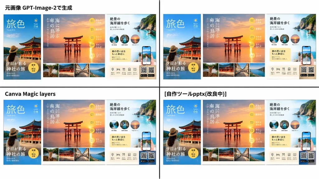
Slide So Sánh Bố Cục Tờ Rơi Du Lịch

Slide So Sánh Bố Cục Tờ Rơi Du Lịch

comparison presentation slide with two large poster-layout travel advertisements. clean Japanese business presentation, white background, black divider lines, screenshot-like composite layout. left comparison area. right comparison area. J…

thuyết trìnhslidetờ rơi
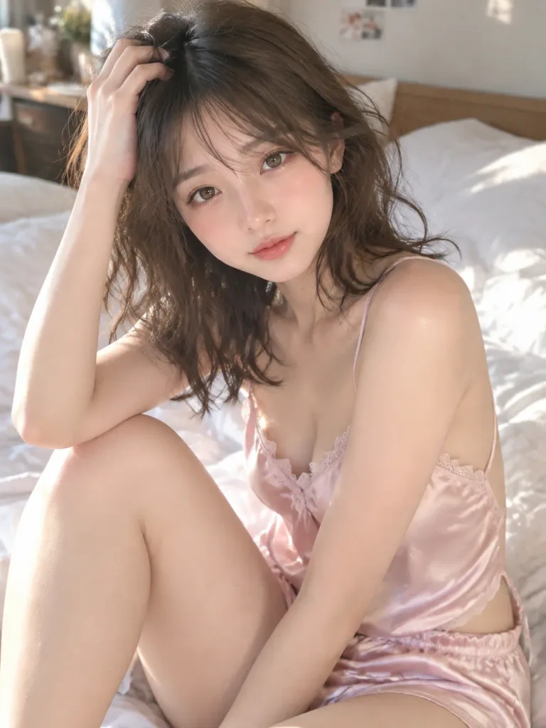
Ảnh Chụp Ngẫu Hứng Bằng Điện Thoại Buổi Sáng

Ảnh Chụp Ngẫu Hứng Bằng Điện Thoại Buổi Sáng

Amateur smartphone photo, slightly low resolution, casual candid composition. A cute [Japanese woman in her 20s] with translucent warm ivory glowing skin, soft double eyelids, large warm dark brown eyes with catchlights, subtle natural aegyo-sal under eyes, soft straight-arched eyebrows, small cute nose with soft rounded tip, thin upper lip and plump coral pink lower lip with a sweet, sleepy expression, and soft rosy cheeks on an oval face. Messy bedhead shoulder-length wavy hair with side-swept bangs. Wearing a [pale pink silk camisole with thin straps, chest lace trim, and open back] and matching silk shorts. Sitting relaxed on a bed with one knee drawn up, running fingers through her hair with a slight head tilt. Lived-in cozy bedroom with rumpled white sheets and pillows, soft natural morning sunlight streaming from an off-camera window, gentle background bokeh. Very natural makeup: light mascara, sheer warm beige-pink eyeshadow, sheer coral-pink lip gloss, soft peach blush.

chụp ngẫu hứngảnh điện thoạiđồ ngủ
Vẽ Bậy Bằng Bút Chì Trên Sách Lịch Sử

Vẽ Bậy Bằng Bút Chì Trên Sách Lịch Sử

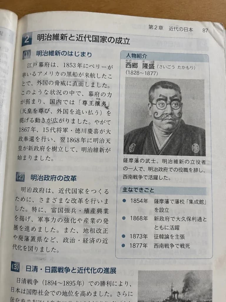
A close-up shot of an open page from an authentic [Japanese middle school history textbook]. The layout features clean typography with accurate, educational Japanese text describing [a famous historical figure], alongside dates and historical bullet points. In the biography profile box, a printed portrait photograph of [the historical figure] has silly graphite pencil doodles drawn directly over the face, giving them [a cartoon mustache, spiral glasses, and funny eyebrows]. Realistic paper texture, slightly creased page corners, natural classroom desk lighting.

sách giáo khoavẽ bậytiếng nhật
Poster Quảng Cáo Mô Hình Thu Nhỏ Nhật Bản

Poster Quảng Cáo Mô Hình Thu Nhỏ Nhật Bản

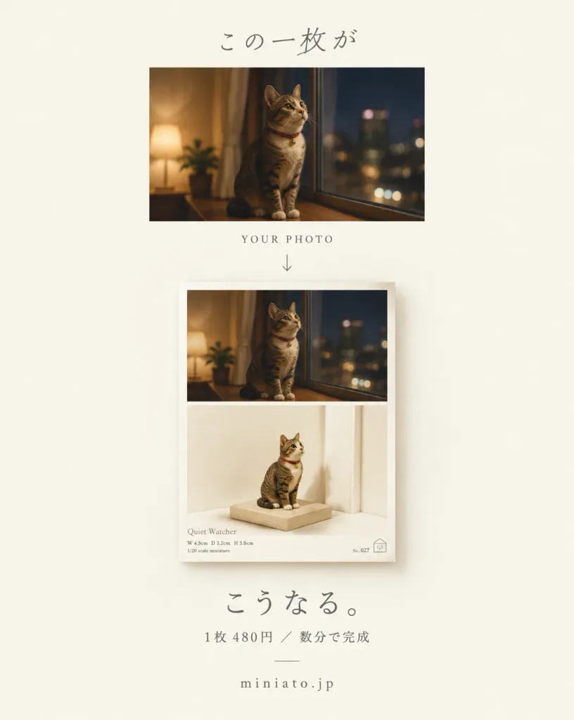
A minimalist Japanese promotional poster advertising a photo-to-miniature poster service. Canvas: Vertical 4:5 poster on a warm off-white background with a centered layout, generous negative space, soft editorial design, and an elegant Japanese lifestyle aesthetic. Top Section: - Top center text: Japanese headline "[この一枚が]" in thin, gray, handwritten-style typography. - Upper panel: The original landscape photo of [a tabby cat with a red collar] sitting on a window ledge at night, looking upward, bathed in warm indoor lighting with a shallow depth of field. - Directly below the photo: Centered caption "YOUR PHOTO" in small, spaced serif capital letters, followed by a thin downward arrow pointing to the mockup below. Main Section: - A larger vertical poster mockup displayed beneath the arrow. It is split into exactly two vertically stacked halves: - Upper half: Displays the exact unchanged original cat photo. - Lower half: A realistic miniature diorama illustration featuring the same cat reimagined as a tiny sculpted figure resting on a small beige platform beside a tall white wall or door frame, with soft gallery lighting, subtle cast shadows, and an ivory background. - Mockup details: Small editorial text in the lower-left corner reading "Quiet Watcher" with tiny technical specification lines underneath, plus subtle catalog markings in the bottom-right corner. Bottom Section: - Centered bold Japanese headline: "[こうなる。]" - Beneath it, a smaller muted gray subline: "[1枚 480円 / 数分で完成]" - At the base, spaced lowercase serif text: "[miniato.jp]". Style & Color Palette: Premium editorial print design, muted beige, warm ivory, and soft gray tones, delicate shadows, precise spacing, quiet and sophisticated mood.

postertối giảnnhật bản
Áp Phích Trắc Nghiệm Tính Cách Bánh Donut Mèo Kawaii

Áp Phích Trắc Nghiệm Tính Cách Bánh Donut Mèo Kawaii

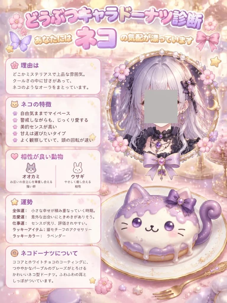
Vertical 3:4 kawaii Japanese personality diagnosis infographic poster set in a magical dessert café, with a soft color palette of [pastel pink, lavender, cream, and gold]. - Header: Large rounded bubble lettering with a white outline and pink-purple gradient reading "[どうぶつキャラドーナツ診断]". Beneath it, smaller warm yellow text reads "あなたには", followed by a prominent central result word "[ネコ]", and trailing text "の気配が漂っています". Decorated with exactly six motifs: two pink flowers, two small stars, one butterfly, and one ribbon. - Split Layout: - Left Column: Exactly five translucent rounded white cards with soft pink borders and tiny decorative icons: 1. "理由は": Short text explaining a mysterious refined mood, coolness balanced with sweetness, and a cat-like aura. 2. "ネコの特徴": Exactly five bullet points describing a free-spirited nature, cautious affection, aesthetic refinement, selective sweetness, and observant wit. 3. "相性が良い動物": Exactly two compatible animals with minimal line icons—"オオカミ" (mutual independence, strong bonds) and "ウサギ" (gentle, soothing dynamic). 4. "運勢": Exactly five lines covering overall luck, love luck, career luck, lucky item, and lucky color. 5. "ネコドーナツについて": Product description detailing cocoa and white chocolate coating, glossy purple glaze, fluffy ears, and tail. - Right Column: - Upper Hero: Ornate circular frame adorned with pearls, blossoms, crescent moon charms, and a ribbon, framing a mysterious anime girl with [silvery lavender hair], dark gothic attire, and glowing purple gemstones. A plain opaque gray square censor block covers the center of her face. - Lower Hero: A large cat-shaped donut on a gold-rimmed white porcelain plate. Features cream and lavender icing, dripping purple glaze, edible glitter, two upright cat ears, a curled purple tail on the right, a purple ribbon bow on the upper right ear, glossy purple eyes, three whisker lines on each cheek, a smiling mouth, pink blush, and edible pearls. A small gold dessert fork rests beside the plate. - Background & Style: Dreamy bokeh with donuts, macarons, glowing sparkles, tiny stars, and floating pearls. High-detail 3D-anime hybrid dessert illustration with clean, readable Japanese typography in rounded fonts.

infographickawaiibánh donut
Minh họa quạt mùa hè Nhật Bản hiện đại

Minh họa quạt mùa hè Nhật Bản hiện đại

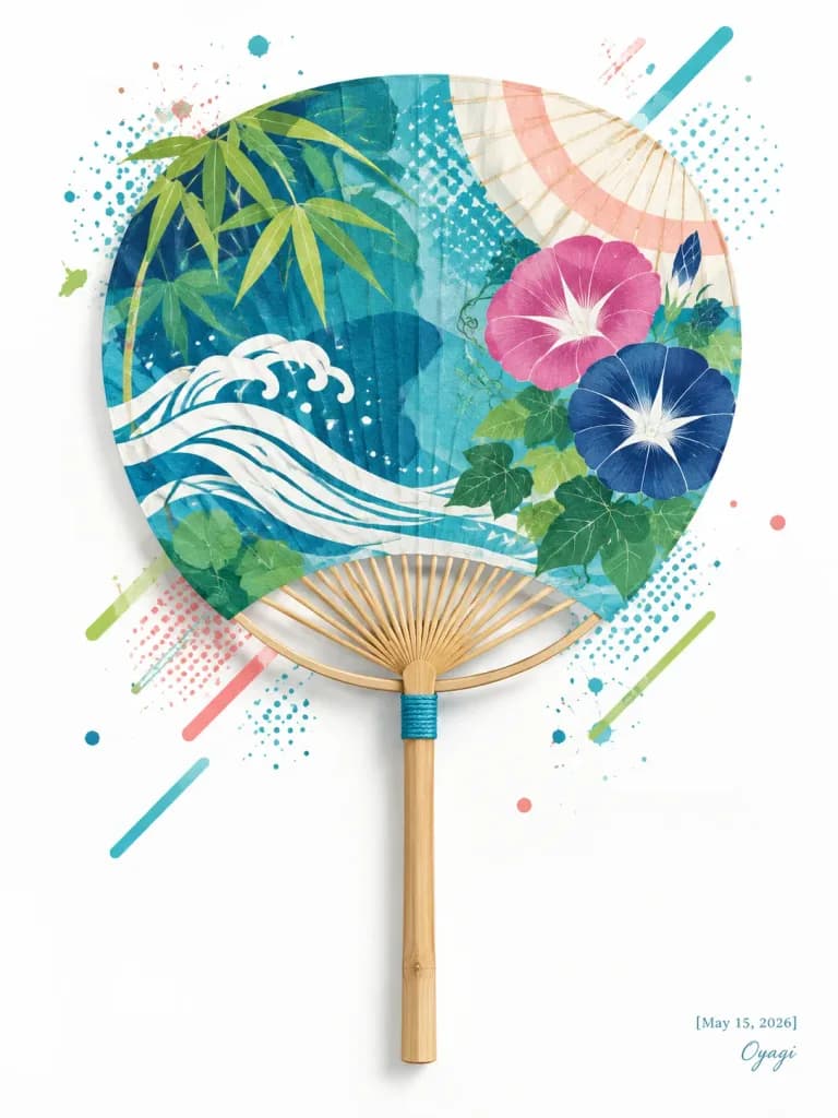
A stylish contemporary Japanese summer poster illustration on a clean white vertical background, centered on a traditional round uchiwa fan with a bamboo handle. The fan face features teal and deep blue layered translucent graphic shapes, blending ukiyo-e motifs with modern graphic design. The composition includes six decorative motif groups: 1) a stylized white flowing wave ribbon sweeping across from lower left, 2) green bamboo leaves clustered at the upper left edge, 3) morning glory flowers on the right with one large pink blossom, one large navy blossom, and small dark blue buds, 4) rounded green foliage near the flowers and lower left, 5) a subtle pale parasol arc with cream and coral bands behind the upper right, and 6) abstract halftone dots, splatters, and diagonal geometric strokes in turquoise, lime green, coral pink, and navy scattered around the fan. Realistic pale bamboo fan ribs radiate from the base with a small turquoise cord wrap at the collar, extending into a natural bamboo handle. Crisp mixed-media aesthetic: flat vector art with paper texture, screen-print halftone textures, translucent overlays, fine vertical fan pleat lines, and soft cast shadows. In the bottom right corner, a small elegant date and signature read "[May 15, 2026]" and "[Oyagi]". Dominant palette: [teal, indigo, lime green, white, coral pink]. Clean, airy composition with ample negative space; no extra text, no watermarks, no borders.

áp phíchnhật bảnuchiwa
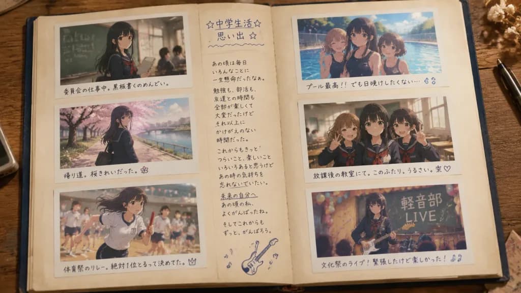
Trang Sổ Lưu Niệm Ký Ức Học Đường Hoài Niệm

Trang Sổ Lưu Niệm Ký Ức Học Đường Hoài Niệm

An overhead flat-lay photograph of an open scrapbook album resting on a warm wooden table, capturing nostalgic middle school memories of [Mio]. The horizontal album spread features aged cream paper pages, slightly visible dark blue cover edges, and subtle shadows along the central spine under cozy indoor lighting. Layout and Content: - Exactly 6 rectangular photo prints with white instant-photo borders, arranged neatly with 3 on the left page and 3 on the right page. - Anime-style illustration prints inside realistic photo sleeves, slightly faded analog tones, with soft, readable Japanese school life scenes. - Top-left photo: [Mio], a Japanese middle school girl with [long black hair] wearing a dark sailor uniform, standing near a classroom chalkboard holding a notebook, with classmates softly blurred behind her. Handwritten caption below: 「委員会の仕事中。黒板書くのめんどい。」 - Middle-left photo: The same girl walking home under blooming pink cherry blossoms along a river path in spring uniform. Handwritten caption below with a small flower doodle: 「帰り道。桜きれいだった。」 - Bottom-left photo: Sports day relay race, running with determination holding a red baton in a white gym uniform. Handwritten caption below with a small crown doodle: 「体育祭のリレー。絶対1位とるって決めてた。」 - Top-right photo: Summer school swimming pool under bright sunlight, the girl and two friends in dark school swimsuits near sparkling water. Handwritten caption below with water drop doodles: 「プール最高!!でも日焼けしたくない…」 - Middle-right photo: Three cheerful schoolgirls posing together in an empty afternoon classroom, flashing peace signs. Handwritten caption below with a heart doodle: 「放課後の教室にて。このふたり、うるさい。笑」 - Bottom-right photo: School festival light music club stage scene with balloons, festive decorations, and a chalkboard sign reading 「軽音部 LIVE」. Handwritten caption below with musical note doodles: 「文化祭のライブ!緊張したけど楽しかった!」 Central Spine Column: - A narrow vertical handwritten journal entry in Japanese running down the inner margin. - Header at the top with stars and a wavy underline: 「☆中学生活☆ 思い出 ☆」 - Several brief heartfelt handwritten diary lines reflecting on hard work, friendships, and a reminder to her future self not to forget these days, accompanied by small hand-drawn music notes and a cute electric guitar doodle. Style & Details: - Photorealistic physical scrapbook setting combined with detailed anime illustrations within each photograph. - Realistic paper grain, authentic ballpoint and marker pen ink textures, warm coming-of-age nostalgia, shallow depth of field.

scrapbookanimealbum-anh
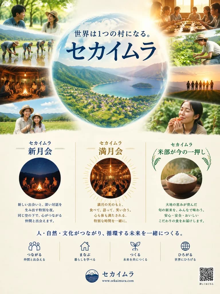
Áp Phích Chiến Dịch Cộng Đồng Sinh Thái Nhật Bản

Áp Phích Chiến Dịch Cộng Đồng Sinh Thái Nhật Bản

A polished Japanese promotional poster for a community and sustainability project named [セカイムラ], designed as an elegant eco-lifestyle campaign flyer. Vertical layout on a soft cream paper background with a warm, luminous, aspirational mood. Top half: A large translucent globe is centered, glowing softly with warm sunrise light from the upper right. Inside the globe is a cinematic aerial view of a lush green mountain valley opening to a calm blue bay or lake, dotted with small village houses and terraced fields. Positioned over the globe is a Japanese slogan line reading "[世界は1つの村になる。]", and directly beneath it is the large main title rendered in bold dark navy Japanese calligraphic typography: "[セカイムラ]". Arranged around the perimeter of the globe are 8 candid lifestyle photographs softly fading into the edges: 1. Top left: two people conversing under green trees outdoors. 2. Upper left: a group planting crops together in a flooded rice paddy. 3. Middle left: a community circle sitting together inside a rustic wooden lodge at night. 4. Lower left: two smiling figures posing gently in an open meadow. 5. Top right: people sharing a communal meal along a wooden table bathed in warm indoor lighting. 6. Middle right: a person gently tending vegetable plants in a sunny garden. 7. Lower right-mid: a silhouette of people holding hands along a grassy mountain ridge at golden sunset. 8. Lower right: a close-up portrait of a person holding and savoring farm-fresh food. Photography style: natural skin tones, soft depth of field, warm golden-hour tones, seamless advertising collage compositing. Bottom half: Three evenly spaced feature cards on a light cream background, divided by subtle vertical rules: - Card 1 (left): dark blue header "セカイムラ 新月会", a circular photo of a nighttime campfire gathering, and a short block of Japanese descriptive body text. - Card 2 (center): warm gold header "セカイムラ 満月会", a circular photo of an indoor party beneath fairy lights with subtle radiating sunburst linework, and a short block of Japanese descriptive text. - Card 3 (right): forest green header "セカイムラ 米部が今の一押し" with subtle rice ear vector motifs, a circular photo of a wooden bowl filled with freshly steamed white rice, and a short block of Japanese descriptive text. Below the feature cards: A centered dark navy slogan reads: "[人・自然・文化がつながり、循環する未来を一緒につくる。]". Directly beneath, a horizontal row of 4 minimalist line icons with two-line Japanese labels: 1. People icon: "つながる / 仲間と出会える" 2. House icon: "まなぶ / 暮らしを学べる" 3. Sprout icon: "つくる / 未来を共につくる" 4. Globe icon: "ひろがる / 世界にひろげる" Footer: A small circular emblem logo followed by the project title in Japanese, with the website URL "[www.sekaimura.com]" beneath it in clean sans-serif type. A neat QR code is positioned in the bottom-right corner with small Japanese caption text. Color palette of deep navy blue, forest green, warm gold, cream, and sky blue. Graphic design is balanced, refined, editorial, and reminiscent of premium Japanese nonprofit print publications.

áp phíchnhật bảncộng đồng sinh thái
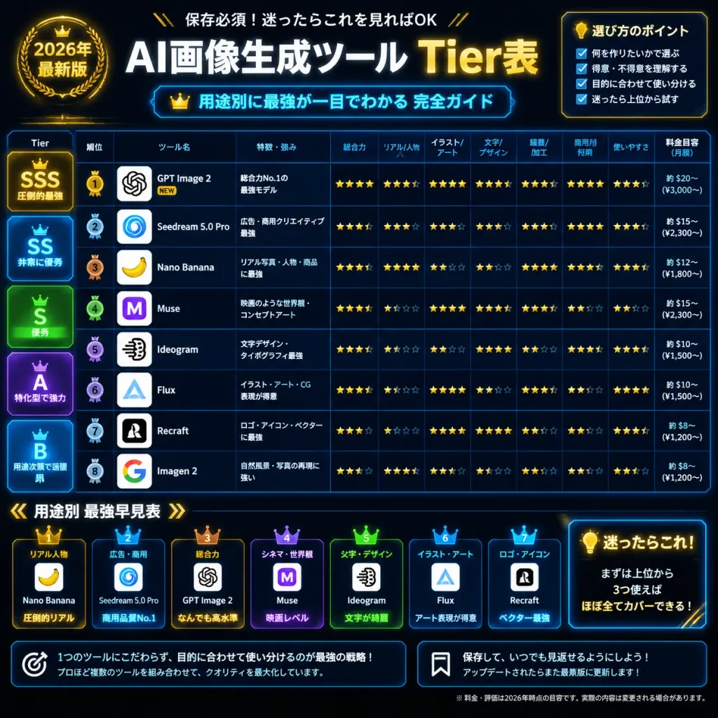
Đồ Họa Thông Tin Xếp Hạng Công Cụ Công Nghệ Tiếng Nhật

Đồ Họa Thông Tin Xếp Hạng Công Cụ Công Nghệ Tiếng Nhật

Dense square 1:1 Japanese social media infographic ranking [AI image generation tools] as a 2026 tier list, designed with a premium cyber dashboard aesthetic in black, navy, and metallic gold. Background and Style: Pitch-black background with subtle dark blue grid lines, glowing cyan dividers, and gold tech accents. Clean glassmorphic panels, crisp borders, and ultra-sharp Japanese typography. App icons are displayed inside white rounded squares. Header: - Main title at top: 「AI画像生成ツール Tier表」 with "AI" and Japanese text in white, and "Tier表" in glowing gold. - Upper-left gold badge: 「2026年 最新版」. - Small header line above title: 「保存必須!迷ったらこれを見ればOK」. - Blue-outlined subtitle bar underneath: 「用途別に最強が一目でわかる 完全ガイド」 accompanied by a small gold crown. Top-Right Panel: - Bordered card titled 「選び方のポイント」 featuring 4 checkbox bullet points: 1. 「何を作りたいかで選ぶ」 2. 「得意・不得意を理解する」 3. 「目的に合わせて使い分ける」 4. 「迷ったら上位から試す」 Main Comparison Table: - Left tier markers: • SSS (Gold): 「圧倒的最強」 • SS (Cyan): 「非常に優秀」 • S (Green): 「優秀」 • A (Purple): 「特化型で強力」 • B (Pale Blue): 「用途次第で活躍」 - 8 Ranked Tool Rows with circular rank medals, square logos, names, short descriptions, and colored tags: 1. [GPT Image 2] — Rank 1 gold medal with "NEW", logo resembling the OpenAI knot, description 「総合力No.1の最強モデル」 2. Seedream 5.0 Pro — Blue spiral logo, description 「広告・商用クリエイティブ最強」 3. Nano Banana — Yellow banana logo, description 「リアル写真・人物・商品に最強」 4. Muse — Purple M logo, description 「映画のような世界観・コンセプトアート」 5. Ideogram — Black typographic abstract logo, description 「文字デザイン・タイポグラフィ最強」 6. Flux — Blue triangular logo, description 「イラスト・アート・CG表現が得意」 7. Recraft — Monochrome R logo, description 「ロゴ・アイコン・ベクターに最強」 8. Imagen 2 — Multicolor Google G logo, description 「自然風景・写真の再現に強い」 - 8 Rating Columns with Japanese headers: 「総合力」, 「リアル/人物」, 「イラスト/アート」, 「文字/デザイン」, 「編集/加工」, 「商用利用」, 「使いやすさ」, 「料金目安(月額)」. Each row contains metallic gold star ratings (full, half, and empty) and compact monthly pricing estimates. Bottom Section: - Horizontal guide titled 「用途別 最強早見表」 with 7 numbered crowned cards: 1. 「リアル人物」 — Nano Banana — 「圧倒的リアル」 2. 「広告・商用」 — Seedream 5.0 Pro — 「商用品質No.1」 3. 「総合力」 — [GPT Image 2] — 「なんでも高水準」 4. 「シネマ・世界観」 — Muse — 「映画レベル」 5. 「文字・デザイン」 — Ideogram — 「文字が綺麗」 6. 「イラスト・アート」 — Flux — 「アート表現が得意」 7. 「ロゴ・アイコン」 — Recraft — 「ベクター最強」 - Bottom-Right Glow Panel titled 「迷ったらこれ!」 with a lightbulb icon and the text 「まずは上位から 3つ使えば ほぼ全てカバーできる!」 Footer: - Left dark card with target icon: 「1つのツールにこだわらず、目的に合わせて使い分けるのが最強の戦略!」 and 「プロほど複数のツールを組み合わせて、クオリティを最大化しています。」 - Right dark card with bookmark icon: 「保存して、いつでも見返せるようにしよう!」 and 「アップデートされたらまた最新版に更新します!」 - Small disclaimer at base noting prices and ratings are 2026 estimates.

đồ họa thông tinbảng xếp hạngtiếng nhật
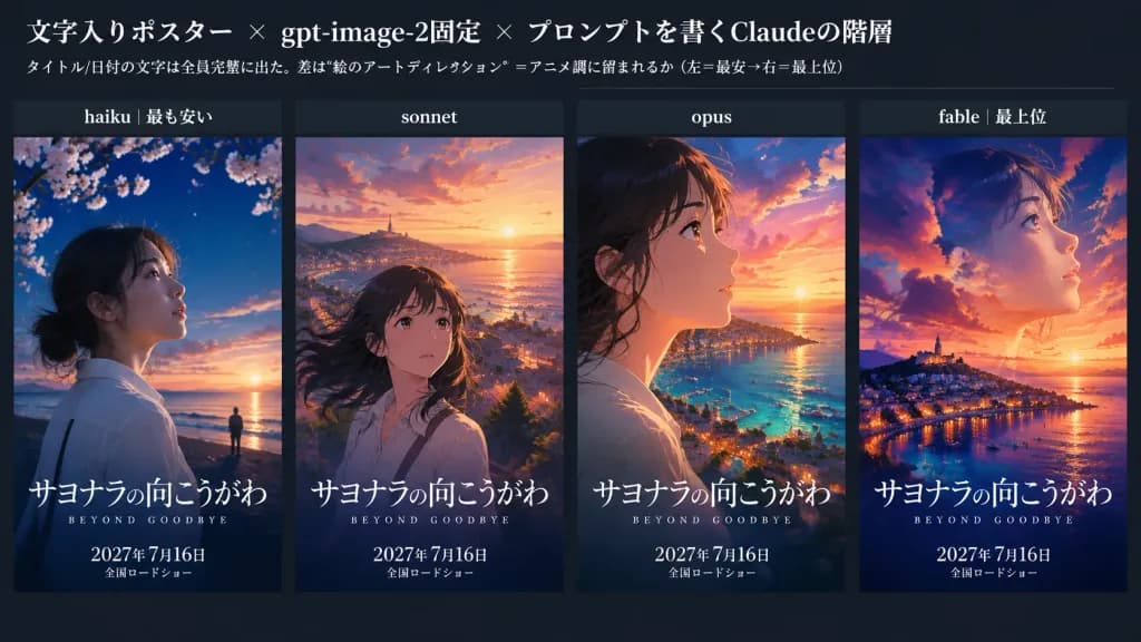
So Sánh Poster Phim Anime Bốn Cấp Độ

So Sánh Poster Phim Anime Bốn Cấp Độ

A 16:9 horizontal social-media comparison graphic featuring four side-by-side anime movie posters against a dark charcoal background. At the top, a clean header displays a prominent Japanese title in the upper left: 「文字入りポスター × gpt-image-2固定 × プロンプトを書くClaudeの階層」 with a smaller subtitle below: 「タイトル/日付の文字は全員完璧に出た。差は“絵のアートディレクション”=アニメ調に留まれるか(左=最安→右=最上位)」. Directly beneath the header, exactly 4 vertical poster panels are arranged horizontally with narrow gutters. Above each poster sits a dark label strip with white text, reading from left to right: 1) “haiku|最も安い”, 2) “sonnet”, 3) “opus”, 4) “fable|最上位”. All 4 posters feature identical typography: large Japanese title [サヨナラの向こうがわ], small English subtitle [BEYOND GOODBYE] below it, and release text [2027年 7月16日] followed by 「全国ロードショー」 at the bottom. Each text appears once per poster, rendered crisply and legibly. From left to right, the posters depict: 1. (haiku): Semi-realistic, live-action leaning visual. A young woman in profile looking up toward the right, dark hair tied back, pale skin, white blouse, set against a night-blue coastal sky with cherry blossoms, a warm ocean sunset, and a tiny silhouette standing at the waterfront. 2. (sonnet): Classic painterly anime movie visual. A girl centered slightly low with windblown long dark hair and a melancholy expression looking up at a glowing sunset over a seaside town, distant birds, and shimmering ocean. 3. (opus): High-end dramatic anime key visual. Close-up side profile of the girl looking right with warm rim lighting, overlooking a sprawling coastal city and turquoise bay at sunset, complete with boats, glowing lights, and vivid orange-purple clouds. 4. (fable): Highly artistic double-exposure anime visual. A large ethereal face of the young woman dissolving softly into a sunset sky, harbor town, and luminous clouds. Below, a vibrant hillside coastal city, sea reflections, and boat lights under a rich palette of deep orange, purple, and midnight blue. Lighting and style: Cinematic sunset color grading, emotional seaside departure theme, sharp contrast between the dark UI canvas and vibrant posters.

infographicanimeposter
Chân Dung Flash Tự Nhiên Của Nữ Nhân Viên Văn Phòng Nhật Bản

Chân Dung Flash Tự Nhiên Của Nữ Nhân Viên Văn Phòng Nhật Bản

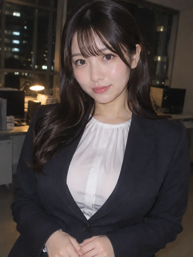
A photo-realistic candid upper-body portrait of a cute young Japanese office lady (OL) in her early 20s, framed from the chest up. She has a soft, youthful face with large expressive eyes, delicate fair skin with a natural glow, subtle natural makeup, and dark hair styled in gentle waves with neat natural bangs. Her expression is calm and professional, featuring a polite subtle smile. She wears modest corporate attire: a loose-fitting, crisp white long-sleeve blouse with draped fabric, paired with a tailored [navy or black] jacket worn buttoned for coverage. Relaxed posture with hands lightly clasped in front. Shot with direct on-camera flash in a dim indoor office at night, creating a soft luminous flash glow on her skin. Realistic 35mm film grain, subtle color noise, shallow depth of field, and a softly blurred nighttime office background with warm lamp bokeh and distant city window lights.

nữ nhân viên văn phòngnhật bảnchân dung tự nhiên
Poster Infographic Anime Học Tiếng Anh

Poster Infographic Anime Học Tiếng Anh

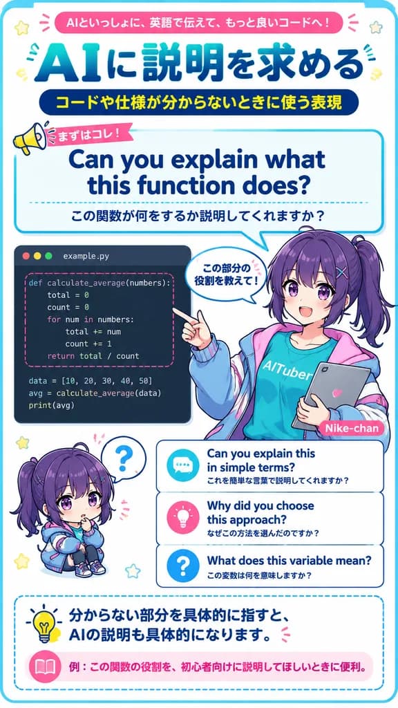
vertical Japanese educational infographic poster for English learning with AI coding assistant. bright clean anime magazine layout, crisp vector typography mixed with polished anime illustration, white background, rounded blue border, teal…

infographicanimegiáo dục
Đồ Họa Thông Tin Nhật Bản Phong Cách Sổ Tay

Đồ Họa Thông Tin Nhật Bản Phong Cách Sổ Tay

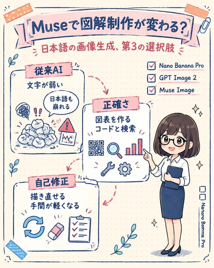
A vertical hand-drawn Japanese infographic in a cute stationery scrapbook style on dotted cream notebook paper, explaining that [Muse] innovates illustrated infographic creation as a third option for Japanese image generation. Composition & Layout: Vertical 4:5 orientation. Warm off-white dotted grid paper background. At the top, a wide pale pink ribbon banner with bold dark navy Japanese headline text: 「[Museで図解制作が変わる?]」, accompanied by a centered red subtitle beneath: 「[日本語の画像生成、第3の選択肢]」. The body contains exactly 3 white sketch-outlined content cards on the left and center, connected by dashed pink arrows, with an illustrated female presenter on the right. Content Cards (Exactly 3): 1. Upper-left card: Topped with a pink tape label featuring bold navy text 「従来AI」. Two lines below: 「文字が弱い」 and a speech bubble reading 「日本語も崩れる」. Decorated with a doodle of a crumpled paper pile, chaotic scribbles, exclamation marks, and an alert icon chart. 2. Center card: Topped with a pink tape label reading 「正確さ」. Two lines below: 「図表を作る」 and 「コードと検索」. Decorated with a QR-code doodle, a magnifying glass, a red-and-blue bar chart, a wrench, and a gear icon. 3. Lower-left card: Topped with a pink tape label reading 「自己修正」. Two lines below: 「描き直せる」 and 「手間が軽くなる」. Decorated with circular refresh arrows, a tiny eraser, and a checklist with checkmarks. Right Side Details: A neat checklist with exactly 3 checked items written in English: "Nano Banana Pro", "GPT Image 2", and "Muse Image". In the lower right margin, a vertical side note reading "Nano Banana Pro" next to two empty checkboxes. Presenter Character: A friendly chibi Japanese businesswoman standing on the right, occupying about one-third of the total height. She has [shoulder-length dark brown bob hair], round black eyeglasses, a rolled-sleeve white button-up blouse, a navy pencil skirt, and navy flats. She smiles warmly and points toward the center card. Decorative Accents: Exactly 2 pieces of decorative tape at the top corners, 1 doodle paperclip at upper right, 1 blue tape strip near lower left, sparkles, hand-drawn leafy doodles, and sketchy navy border lines. Style & Color: Japanese social media explainer visual, warm and clean hand-lettered aesthetic, sketchy navy ink outlines, soft pastel fills in dusty pink, cream, soft gray, with small red and blue accent touches. No photographic realism.

đồ-họa-thông-tinnhật-bảnvăn-phòng-phẩm
Banner Tính Năng Trình Tạo Biểu Mẫu SaaS Nhật Bản

Banner Tính Năng Trình Tạo Biểu Mẫu SaaS Nhật Bản

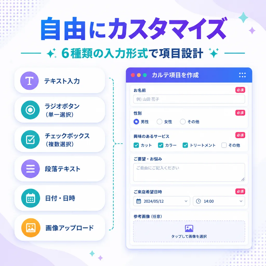
SaaS feature update banner infographic. clean modern Japanese tech marketing visual, soft gradient abstract background, premium UI showcase, minimal flat illustration, rounded cards, subtle shadows, crisp typography. input type list. form…

saasbannerui-ux
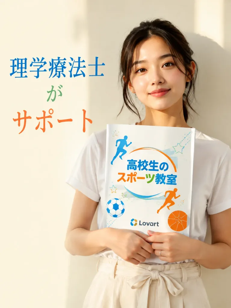
Chân Dung Tờ Rơi Thể Thao Nhật Bản

Chân Dung Tờ Rơi Thể Thao Nhật Bản

Vertical promotional flyer photo with a clean editorial advertising aesthetic. A young Japanese woman in her 20s wearing [a plain white short-sleeve T-shirt tucked into high-waisted off-white linen pants with a tied waist belt] stands against a warm pale cream wall in soft direct sunlight with gentle shadows. Framed from upper thighs to head, positioned slightly right of center, she looks calmly and confidently toward the camera with a relaxed expression, natural glowing skin, subtle makeup, and loose dark hair tied back with wispy strands around her face. She holds a white booklet vertically against her chest with both hands, wearing a delicate thin ring on one finger. On the left side of the composition, headline text reads "[理学療法士がサポート]" in an elegant Japanese Mincho-style serif font, with "理学療法士" in blue, "が" in green, and "サポート" in orange. The booklet cover displays a colorful sports school logo with the title "[高校生のスポーツ教室]" in playful rounded Japanese lettering, accented with blue, orange, and green details, designed for [high school students], and the "[Lovart]" sponsor logo near the bottom. Cover graphics include a blue running silhouette, an orange running silhouette, a blue-and-white soccer ball, an orange basketball, a dynamic circular swoosh arc wrapping the title, and faint decorative stars and dots. Bright airy color palette, shallow depth of field, crisp commercial photography, clean layout without extra text.

tờ rơinhật bảnthương mại
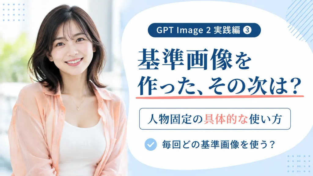
Banner thu nhỏ khóa học phong cách Nhật

Banner thu nhỏ khóa học phong cách Nhật

Clean promotional banner and video thumbnail in a 16:9 horizontal layout. Split composition: on the left (40% width), a realistic waist-up portrait of [a smiling Japanese woman in her late 20s with shoulder-length layered black hair, wearing a peach sheer button-up shirt over a white ribbed camisole and a delicate gold necklace], posed against a bright, soft-focus daylight background. On the right (60% width), a large rounded white organic panel over a pale powder blue background with decorative dotted grid accents in corners and light diagonal hatching near the edge. Crisp Japanese typography containing exactly four text elements: 1) a top dark navy rounded pill badge reading "[GPT Image 2 実践編 ③]"; 2) a prominent navy Mincho serif headline reading "[基準画像を\n作った、その次は?]" with a coral underline under the second line; 3) a framed subtitle reading "[人物固定の具体的な使い方]" with "[具体的な]" highlighted in coral; 4) a bottom checklist row featuring a pale blue circular checkmark icon followed by "[毎回どの基準画像を使う?]". Polished educational course aesthetic, airy spacing, no harsh shadows.

bannerảnh thu nhỏkhóa học
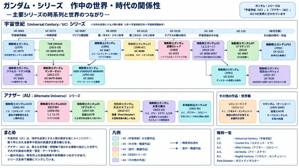
Infographic Dòng Thời Gian Loạt Phim Gundam

Infographic Dòng Thời Gian Loạt Phim Gundam

A clean, highly structured Japanese corporate presentation slide summarizing [ガンダム・シリーズ 作中の世界・時代の関係性], with the subtitle 「―主要シリーズの時系列と世界のつながり―」. White background, dark navy typography, thin gray border frames, pale pastel color-coded cards, dense Japanese sans-serif text in a crisp 16:9 infographic layout. Top Area: Large dark navy title at top-left. At top-right, a rounded badge stating the series are divided into 「宇宙世紀(UC)」 and 「アナザー(AU)」 worlds. Main Section: Large bordered panel titled [宇宙世紀(Universal Century/UC)シリーズ] with explanatory note 「※地球を起源とする人類の歴史(1年=宇宙世紀元年=宇宙移民開始年)」. Inside, a horizontal timeline spanning 9 era markers: 「UC 0001 宇宙移民開始」, 「UC 0079」, 「UC 0087」, 「UC 0093」, 「UC 0123」, 「UC 0153」, 「UC 100」, 「UC 110」, 「(年代不詳)」, beneath an era label row: 「黎明期」, 「一年戦争期」, 「グリプス戦役期」, 「第一次ネオ・ジオン抗争」, 「第二次ネオ・ジオン抗争」, 「ラプラスの箱の時代」, 「宇宙世紀のその後」, 「その他の時代・作品」. Inside this panel, exactly 14 rounded pastel rectangular cards: 1) 「機動戦士ガンダム (1979) / UC 0079 / 地球連邦軍とジオン公国の戦争」, 2) 「THE ORIGIN (2015-18) / UC 0068-0079 / 一年戦争前夜の物語」, 3) 「機動戦士Zガンダム (1985) / UC 0087 / エゥーゴとティターンズの戦い(グリプス戦役)」, 4) 「機動戦士ガンダムZZ (1986-87) / UC 0088 / ZZの直後、ネオ・ジオンの台頭」, 5) 「機動戦士ガンダム 逆襲のシャア (1988) / UC 0093 / シャアの反乱とラプラスの箱」, 6) 「機動戦士ガンダムUC(ユニコーン) (2010-14) / UC 0096-0097 / ラプラスの箱の継承を巡る戦い」, 7) 「機動戦士ガンダムNT(ナラティブ) (2018) / UC 0097 / UCの後継へ」, 8) 「機動戦士ガンダムF91 (1991) / UC 0123 / 新時代の幕開け」, 9) 「機動戦士Vガンダム (1993) / UC 0153 / ザンスカール帝国との戦争」, 10) 「機動戦士ガンダム 閃光のハサウェイ (2021) / UC 0105 / 地球連邦の腐敗と新たな抗争の火種」, 11) 「機動戦士ガンダム ククルス・ドアンの島 (2022) / UC 0083 / 一年戦争中の一編」, 12) 「機動戦士ガンダム THE ORIGIN(左記に記載)」, 13) 「機動戦士ガンダム サンダーボルト (2012-17) / UC 0079-0080 / 一年戦争中の並行世界」, 14) 「機動戦士ガンダム 0083 STARDUST MEMORY (1991-92) / UC 0083 / デラーズ・フリートの襲撃」. Connected by solid arrows for 「時系列の流れ」 and dashed arrows for 「並行・関連作品」. Middle Left Section: Bordered panel titled [アナザー(AU:Alternate Universe)シリーズ] containing 6 pastel cards: 1) 「機動戦士ガンダムSEED (2002-03) / C.E.(コズミック・イラ)/ 遺伝子調整者を巡る人類の対立」, 2) 「機動戦士ガンダムSEED DESTINY (2004-05) / C.E.71-73 / SEEDの続編」, 3) 「機動戦士ガンダム00(ダブルオー) (2007-09) / 西暦2307年 / 化石燃料枯渇後の人類の争い」, 4) 「機動戦士ガンダム 鉄血のオルフェンズ (2015-17) / 西暦(Post Disaster)/ 火星移民後の厳しい社会」, 5) 「機動戦士ガンダム 水星の魔女 (2022-23) / A.S.(アド・ステラ)122年 / 企業群による支配とモビルスーツ開発競争」, 6) 「新機動戦記ガンダムW (1995-96) / A.C.(アフター・コロニー)/ 宇宙コロニーの独立運動と戦争」. Middle Right Section: Bordered panel titled 「その他の作品・世界観」 with 2 cards: 「Gのレコンギスタ (2014-15) / R.C.(リギルド・センチュリー)/ 複数の時代が交錯する多層的な世界」 and 「∀ガンダム(ターンエー) (1999-2000) / 西暦2345年 / すべてのガンダムの未来の物語」. Bottom Area: Three equal boxed columns. Left: 「まとめ」 bullet points on UC origins and AU branch worlds. Center: 「凡例」 with 5 color swatches. Right: Abbreviations list (「UC:Universal Century(宇宙世紀)」, 「C.E.:Cosmic Era」, etc.). Style: Educational Japanese slide format, pure vector-style diagram layout, flat subtle fills, no illustrations, no robot art, no photos, no watermarks.

gundamdòng thời gianinfographic
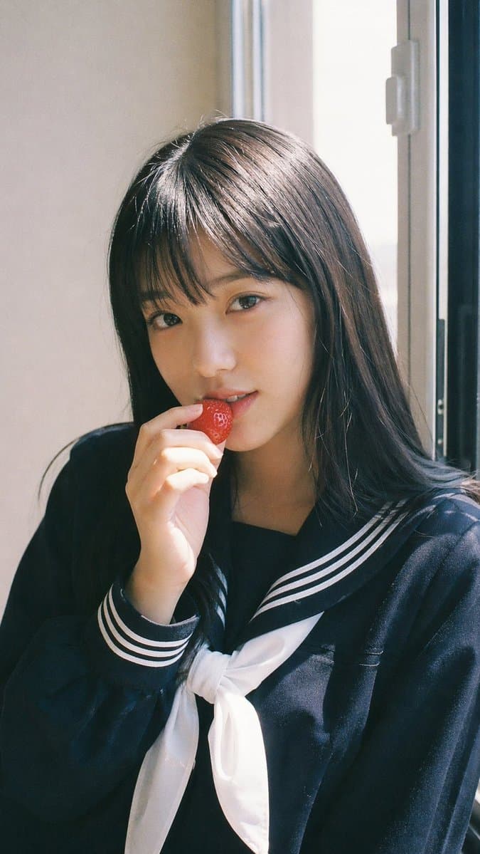
Chân dung học đường với dâu tây phong cách Fujifilm

Chân dung học đường với dâu tây phong cách Fujifilm

Khổ dọc 9:16 - Chân dung phong cách Japanese Fuji film, một chủ thể. Thẩm mỹ Fujifilm analog (cảm giác của Pro 400H / Superia), tông màu pastel mềm mại, ám nhẹ màu xanh lục-đỏ tươi (green-magenta shift), độ tương phản thấp, gentle highlight roll-off, fine film grain, subtle halation, slight vignette. Ánh sáng ban ngày tự nhiên tươi sáng, ánh sáng mặt trời khuếch tán qua cửa sổ, bóng đổ mềm mại, không khí thoáng đãng. Nữ idol trẻ tuổi, trang điểm tự nhiên tối giản, làn da tươi tắn rạng rỡ, kết cấu chân thực. Trang phục: đồng phục học sinh Nhật Bản (phong cách thủy thủ hoặc áo blazer), kiểu dáng gọn gàng, trẻ trung và sạch sẽ. Tóc: tóc sẫm màu tự nhiên, thẳng hoặc xõa mềm mại, vài lọn tóc buông lơi. Tạo dáng: hướng về phía trước, tư thế thư giãn, một tay cầm nhẹ quả dâu tây gần môi, hành động đang dang dở như chuẩn bị cắn. Biểu cảm: ánh nhìn tinh nghịch mềm mại, mỉm cười nhẹ, giao tiếp bằng mắt nhẹ nhàng với camera. Bối cảnh: trong nhà tối giản gần cửa sổ, phông nền sạch sẽ, không khí thường ngày. Tâm trạng: tươi mới, trẻ trung, khoảnh khắc thường ngày ngọt ngào, vẻ quyến rũ tinh tế.

chân dunggiả lập phimnhật bản
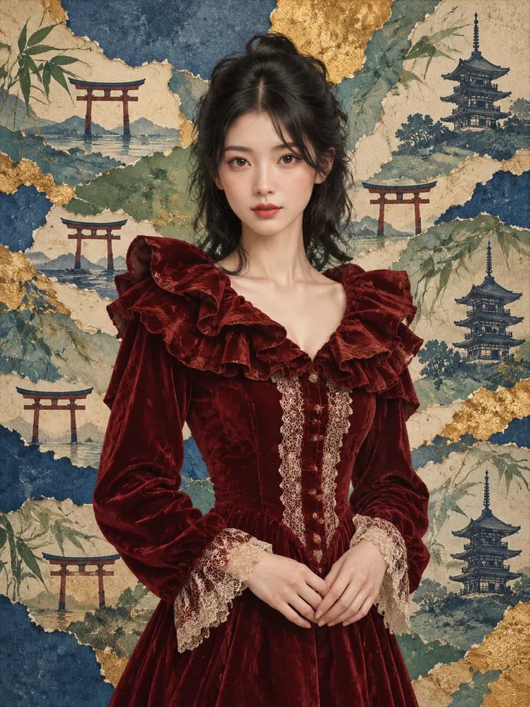
Chân Dung Nhung Đỏ Cắt Dán Kiểu Nhật

Chân Dung Nhung Đỏ Cắt Dán Kiểu Nhật

A stylized waist-up to three-quarter portrait of a Japanese woman inspired by [Non, Nōnen Rena], centered and facing forward with a calm, poised expression, hands gently clasped at her waist. She has medium-length dark black hair, softly layered and swept back with a tousled crown, and fair skin. She wears a luxurious deep crimson velvet dress featuring a dramatic oversized ruffled collar, intricate vertical lace trim down the bodice, and lace-trimmed cuffs in a romantic vintage aesthetic. Painterly editorial illustration style with realistic anatomy, soft shading, rich fabric textures, and subtle velvet highlights. Background is an artisanal torn-paper collage themed around Japan, layered with textured paper in indigo blue, teal, sage green, cream, and gold leaf tones. Features exactly 5 torii gate silhouettes scattered across the backdrop, 3 pagoda silhouettes on the right and lower right, and painted bamboo leaves woven into torn paper layers with irregular ripped edges and decorative gold leaf accents. Vertical composition, sophisticated museum-poster aesthetic, no text, no borders.

thời trangcắt dánchân dung
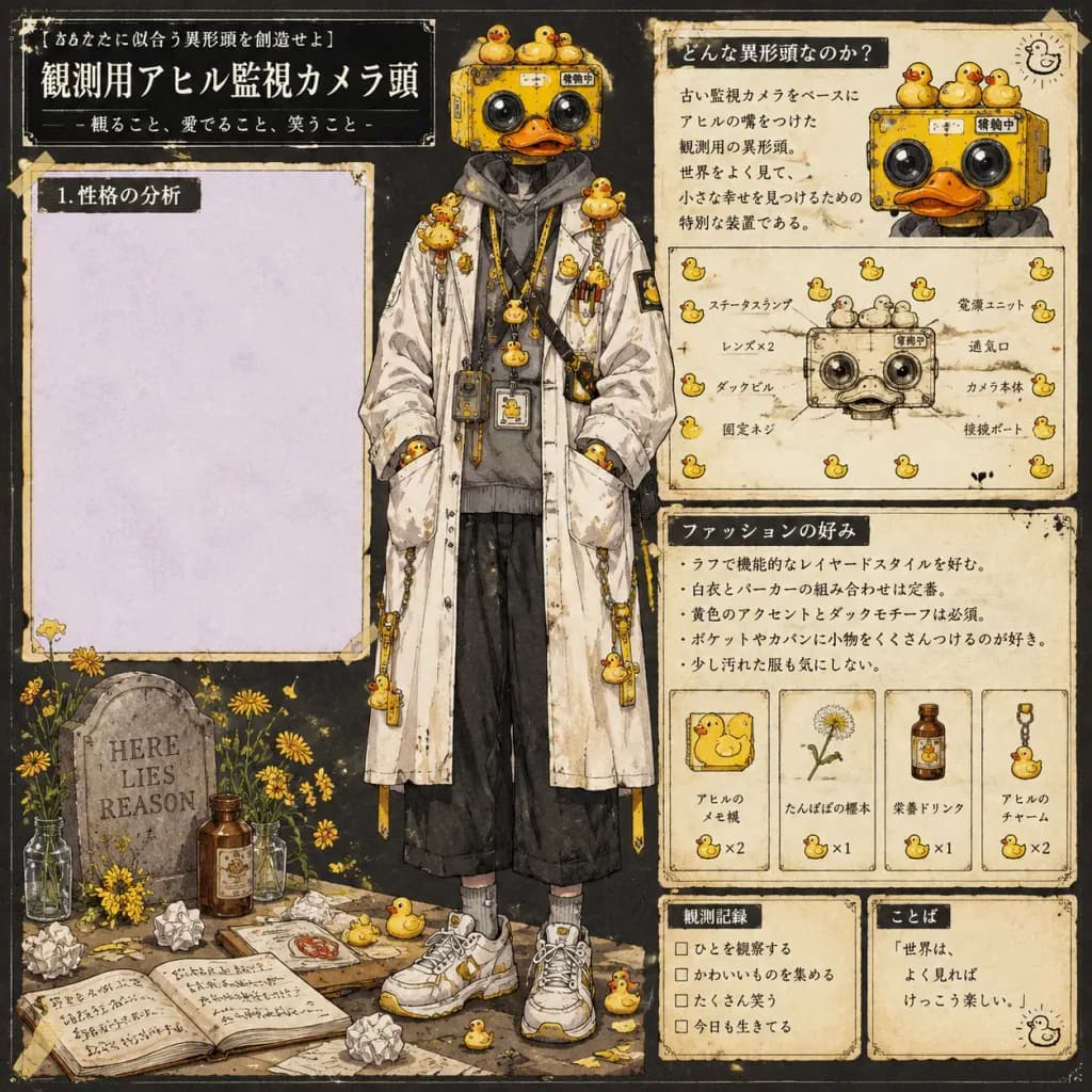
Bảng Thiết Kế Nhân Vật Đầu Camera Vịt

Bảng Thiết Kế Nhân Vật Đầu Camera Vịt

Dense vertical Japanese character-design reference sheet for an eccentric humanoid named [Observation Appareil Surveillance Camera Head], arranged on a square 1:1 poster layout with aged cream paper panels on a dark charcoal background. Hand-drawn editorial layout with thin black borders, corner ornaments, tape-like edges, ink speckles, and vintage field-notebook texture. Semi-realistic anime concept art illustration using watercolor, gouache, fine ink linework, and warm yellow accents. Main Subject: Centered full-body standing figure with a yellow rectangular retro security-camera head styled like a quirky toy machine, featuring two glossy black lens eyes, an orange duck bill mouth, tiny screws, seams, weathered metal, and a miniature Japanese status label. Wearing a long off-white stained lab coat over a gray hoodie, black loose cropped pants, gray socks, chunky white sneakers with yellow accents, lanyards, chains, pens, clips, ID badges, miniature devices, and rubber duck charms. Relaxed pose, hands tucked in coat pockets, facing forward, whimsical yet mysterious. Typography & Text: - Top-left headline: "[あなたに似合う異形頭を創造せよ]" - Main title: "[観測用アヒル監視カメラ頭]" - Subtitle: "[- 観ること、愛でること、笑うこと -]" - Typography is strictly Japanese (white text on black header boxes, black ink on cream panels), except for an engraved stone inscription. Panels & Layout: - Panel 1 (left): A large empty pale lavender writing area titled "[1. 性格の分析]". - Panel 2 (upper-right lore panel): Titled with Japanese text meaning "What kind of abnormal head is it?", featuring a cropped portrait of the character at the top right and a technical device diagram at the bottom. - Panel 3 (mid-to-lower-right fashion panel): Titled with Japanese text meaning "Fashion preferences", containing bullet-point Japanese body copy and a row of 4 small labeled item cards: a duck memo pad, a dandelion specimen, a medicinal drink bottle, and a hanging duck charm. - Bottom left foreground: A small graveyard-like still life with a stone tombstone engraved "[HERE LIES REASON]", yellow flowers in glass bottles, a brown medicinal bottle, a clipboard with red stamp, scattered sheets, crumpled paper balls, and an open notebook with handwritten Japanese notes. - Bottom right: Two small boxed footer cards (a checklist-style observation log and a quote card with a tiny duck doodle). Discrete Repeated Motifs: Include rubber duck motifs throughout the sheet: 3 on top of the camera head, 1 on the top-left head corner, 1 hanging upper left, 1 hanging upper right, 8 clustered around the shoulders and chest, 4 on lanyards/necklace, 2 on coat pockets, 1 printed on a chest badge, 1 on a sleeve patch, 2 on dangling side straps, 3 near feet and floor props, 1 in the top-right panel corner, 8 surrounding the device diagram, and 2 within the item cards. Style Constraints: Finished Japanese concept-art character sheet aesthetic; asymmetrical magazine editorial composition; no photorealism; no 3D render look; no additional characters; no English text except the tombstone inscription.

thiết-kế-nhân-vậtconcept-artanime-manga
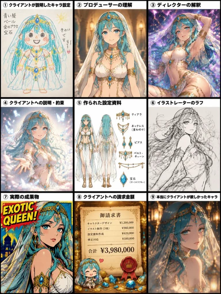
Meme Quy Trình Thiết Kế Nhân Vật Chín Khung

Meme Quy Trình Thiết Kế Nhân Vật Chín Khung

A 3×3 Japanese meme-style comic comparison chart in a 3:4 vertical orientation, depicting how an original character design mutates through a creative production pipeline. The layout features nine equal rectangular panels separated by thick black borders, each topped with a white label strip containing bold black Japanese text and circled numbers. The recurring character across all panels is [a turquoise-haired veiled exotic fantasy queen with gold jewelry and blue gemstones], wearing ornate golden headpieces, layered necklaces, armlets, waist chains, and flowing pale fabric, rendered in differing styles per panel: 1. 「① クライアントが説明したキャラ設定」: A childlike crayon drawing on paper with wobbly lines, simple round face, messy turquoise hair, crude yellow jewelry, and basic blue gemstones. 2. 「② プロデューサーの理解」: A clean, standard commercial anime concept portrait of the veiled queen in balanced white and gold attire under warm indoor lighting. 3. 「③ ディレクターの解釈」: An overproduced, dramatic fantasy splash illustration with a sensual dynamic pose, sparkling purple cosmic galaxy background, floating gold chains, and glowing turquoise jewels. 4. 「④ クライアントへの説明・約束」: A polished, dreamy pitch illustration surrounded by floating pastel sparkles, glowing butterflies, romantic soft lighting, and an ethereal flowing veil. 5. 「⑤ 作られた設定資料」: A clean design model sheet on a white background showing exactly two full-body turnaround views (front and back/side) alongside detailed sketches of necklaces, earrings, and gem accessories with small annotation notes. 6. 「⑥ イラストレーターのラフ」: A loose, energetic monochrome pencil sketch with sketchy construction lines, sweeping hair, and gestural accessory markings. 7. 「⑦ 実際の成果物」: A bold retro pop-art comic book cover illustration with heavy ink outlines, halftone dot textures, vivid saturated colors, and bold text reading "[EXOTIC QUEEN!]" in the top corner. 8. 「⑧ クライアントへの請求金額」: An opulent invoice scene displaying a parchment document titled 「御請求書」 with the prominent total price "[¥3,980,000]", surrounded by piles of gold coins, sparkling gemstones, a wax seal, and a tiny cute chibi version of the character. 9. 「⑨ 本当にクライアントが欲しかったキャラ」: The client's true wish: a breathtaking, cinematic fantasy portrait of the queen with an elegant and mysterious expression, delicate turquoise ornaments, translucent veil, and soft ambient bokeh from glowing golden lanterns. Style: Crisp Japanese manga infographic collage with distinctive visual styles in each panel, vibrant colors, rich decorative details, and sharp typography.

memeđồ-họa-thông-tintruyện-tranh
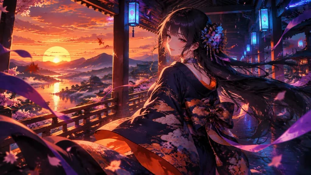
Thiếu Nữ Kimono Dưới Hoàng Hôn Neon

Thiếu Nữ Kimono Dưới Hoàng Hôn Neon

Cinematic anime illustration of [a young Japanese woman] in an open-air traditional corridor at sunset, looking back over her shoulder with a gentle sleepy smile as if saying good night. She wears an elegant dark navy-black kimono with vivid orange lining and stylized cloud patterns, tied with a large obi bow, with long flowing [black] hair swept dramatically by the wind and adorned with small blue-purple flowers. The setting blends traditional Japanese architecture with subtle cyberpunk neon: wooden pillars and railings frame a wide panoramic view of a massive orange sun setting behind layered mountains, misty clouds, and a reflective river, while glowing cyan-blue rectangular lantern signs hang overhead along the corridor. Wide 16:9 composition, dynamic diagonal perspective, with the character positioned slightly right of center as her sleeves and ribbons sweep across the foreground. Windblown air filled with pink flower petals, red-orange leaf fragments, and long purple ribbon streamers. Dramatic split lighting featuring warm sunset orange from the left and cool electric blue-magenta neon from above and right, creating saturated contrast, rim light on hair strands, and deep shadows. Style: detailed Japanese anime key visual, painterly digital art, crisp linework with textured brushwork, luminous glow, romantic nocturne mood, no text, no watermark, no modern lettering.

animekimonocyberpunk
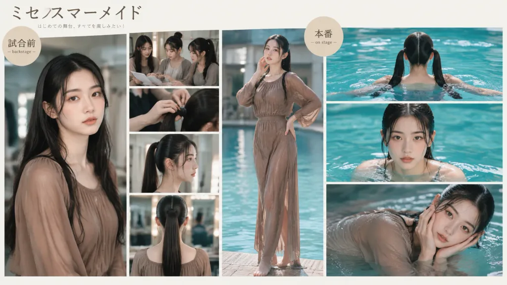
Bảng ý tưởng cắt dán cho vở kịch Nhật Bản

Bảng ý tưởng cắt dán cho vở kịch Nhật Bản

A polished Japanese stage-performance photo collage and concept board for a fictional mermaid-themed theatrical production, presented in a clean editorial lifestyle-magazine layout. Layout & Composition: A wide 16:9 landscape collage separated by thin white grid gutters into a backstage preparation area on the left and a pool performance area on the right, surrounded by cream-white negative space. The grid contains exactly 9 photo panels: - Left backstage area (5 panels): 1 large vertical portrait of [a young East Asian woman with long glossy black hair] in [a loose taupe-brown chiffon blouse or wet dress with gathered neckline and long sleeves]; 1 upper-right candid group shot of three young women reviewing papers; 1 middle close-up of hands styling hair; 1 medium profile portrait showing a sleek high ponytail; 1 lower rear view showing a center-parted sleek ponytail. - Center divider (1 panel): 1 full-body vertical shot of the woman standing near a pool in a wet taupe long-sleeve dress, one hand near her face and one on her hip. - Right pool performance area (3 panels): 1 upper rear view swimming with twin ponytails above turquoise water; 1 middle front-facing portrait with wet hair and shoulders emerging from the pool; 1 lower-right expressive close-up leaning sideways with clinging wet chiffon, hands framing her face. The panels seamlessly transition from preparation to stage action. Typography & Badges: - Top left: large handwritten Japanese title "[ミセスマーメイド]" with small subtitle text "[はじめての舞台、すべてを楽しみたい!]". - Over the left portrait: a small beige circular label badge reading "試合前" with tiny English text "— backstage —". - Near the top of the center/right division: a small beige circular label badge reading "本番" with tiny English text "— on stage —". Delicate, minimal Japanese editorial typography. Visual Style & Lighting: Realistic editorial fashion photography, natural soft daylight, shallow depth of field, muted taupe and cream tones contrasted with vibrant aqua-turquoise pool water, clear water reflections. Exactly 9 photo panels and 2 circular badges. No extra logos, watermarks, or decorative icons.

moodboardcat-dantap-chi
Slide Tư Vấn Mạng Xã Hội Tiếng Nhật

Slide Tư Vấn Mạng Xã Hội Tiếng Nhật

Japanese social media consulting infographic. clean flat vector infographic, soft pastel blue and mint gradient background, large rounded white panel, bold black Japanese typography, friendly hand-drawn icons with thin outlines, organized…

infographicthuyết trìnhtiếng nhật
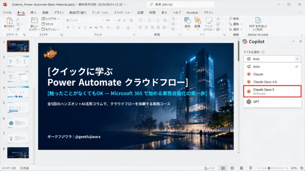
Ảnh chụp màn hình PowerPoint với bộ chọn mô hình AI

Ảnh chụp màn hình PowerPoint với bộ chọn mô hình AI

Realistic 16:9 desktop screenshot of Microsoft PowerPoint running on Windows in Japanese, capturing an active slide editing session. The PowerPoint interface features a light gray chrome, Japanese ribbon tabs (File, Home, Insert, Draw, Design, Transitions, Animations, Slide Show, Record, Review, View, Help), and add-in icons. Top title bar displays the file name "[Udemy_Power-Automate-Basic-Material.pptx]" alongside last-saved metadata. The left thumbnail panel displays exactly 8 slide thumbnails numbered 1 to 8; Slide 1 is highlighted with an orange selection border. The central slide canvas features a dark, cinematic title slide with a deep navy gradient overlay atop a night architectural render of glowing glass towers, subtle mist, and small walking silhouettes. In the top-left of the slide sits a tiny orange clownfish mascot wearing a black top hat. The slide text is left-aligned in crisp Japanese typography: large bold white title "[クイックに学ぶ\nPower Automate クラウドフロー]", cyan subtitle "[触ったことがなくてもOK — Microsoft 365 で始める業務自動化の第一歩]", smaller white description "[全5回のハンズオン+AI活用コラムで、クラウドフローを体験する実践コース]", and bottom-left author tag "[ギークフジワラ|@geekfujiwara]". On the right side, an open AI assistant sidebar showcases a model selection dropdown menu listing exactly five options: "Auto" with a checkmark, "Claude", "Claude Opus 4.8", "Claude Opus 5" highlighted by a prominent red rectangular outline with small gray "Anthropic" subtext, and "GPT". Authentic UI elements including status bar, scrollbars, zoom slider, and clean vector icons, with no browser chrome.

powerpointảnh chụp màn hìnhgiao diện phần mềm
Infographic Tâm Lý Trang Đích Tiếng Nhật

Infographic Tâm Lý Trang Đích Tiếng Nhật

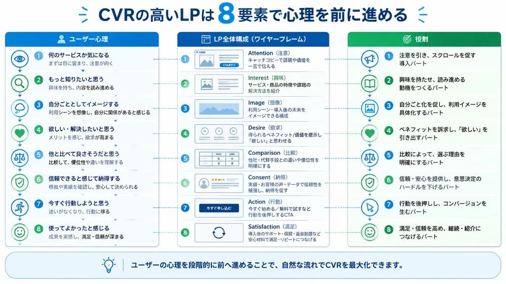
Japanese marketing infographic. ユーザー心理. LP全体構成(ワイヤーフレーム). 役割. rounded rectangular note bar with light background and thin blue outline. high-converting landing page structure guided by user psychology. clean flat business infographic. blue…

infographictrang đíchtiếp thị
Ba đề xuất thiết kế bìa quảng bá phong cách Nhật

Ba đề xuất thiết kế bìa quảng bá phong cách Nhật

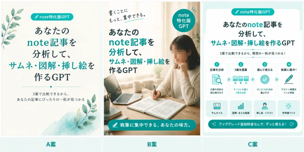
A wide 2:1 horizontal comparison banner preview showing exactly three proposed Japanese promotional cover designs for a service called "[note特化版GPT]", set against a clean off-white background with thin pale vertical separators and generous margins. A bottom label strip runs under the panels with three centered teal labels: "A案", "B案", and "C案". Panel A (left proposal): Minimalist editorial cover design on an ivory paper background with soft watercolor teal wash at the bottom right and delicate leafy botanical sprigs on the left and lower right. Top center features a rounded pill badge reading "note特化版GPT" with a tiny pen icon. Large centered Japanese headline mixing charcoal and teal: "あなたの note記事を 分析して、 サムネ・図解・挿し絵を作るGPT". A thin divider with a small center dot beneath the headline. Bottom subcopy: "3案で比較できるから、あなたの記事にぴったりの一枚が見つかる". Panel B (middle proposal): Warm lifestyle creator cover featuring a softly lit woman working at a desk near a window, with a laptop, open notebook with thumbnail sketches, hand holding a pen, coffee cup, and stationery. The woman's face is obscured with a clean square blur mosaic. Bold dark charcoal and teal Japanese overlay headline on the left: "あなたの note記事を 分析して、 サムネ・図解・挿し絵を作るGPT". Handwritten note at top left: "書くことに もっと、集中できる。" Circular teal badge at upper right reading "note 特化版 GPT". Teal rounded bottom banner with a small icon and white text: "執筆に集中できる、あなたの味方。" Cozy natural beige lighting. Panel C (right proposal): Structured infographic cover on a pale mint background with a rounded white card container. Top pill badge: "note特化版GPT". Centered headline: "あなたのnote記事を 分析して、 サムネ・図解・挿し絵を作るGPT" with subheadline "3案で比較できるから、理想の一枚が見つかる!". Middle row features exactly four step cards connected by small arrows: 1) "記事を分析" (document and magnifying glass icon, "内容や目的を読み解きます"), 2) "3案を提案" (three thumbnail cards labeled A, B, C, "テイストの違う3案を比較"), 3) "選んで使える" (checkmark icon, "ぴったりの1枚を選ぶだけ"), 4) "執筆に集中!" (pen writing icon, "デザイン時間をぐっと時短"). Lower row displays four feature cards: 1) "サムネイル", 2) "図解・まとめ画像", 3) "挿し絵・イラスト", 4) "世界観づくり". Bottom teal ribbon with sparkle icons reading "アップグレード追加料金なしで、ずっと使える!" and a small heart outline. Style: Cohesive palette of teal, mint, ivory, charcoal, and warm beige. Clean, legible Japanese typography combining modern sans-serif and subtle serif accents. No extra panels, no watermarks.

bannermockuptiếng nhật
Đồ họa Thông tin Công thức Bento Kawaii

Đồ họa Thông tin Công thức Bento Kawaii

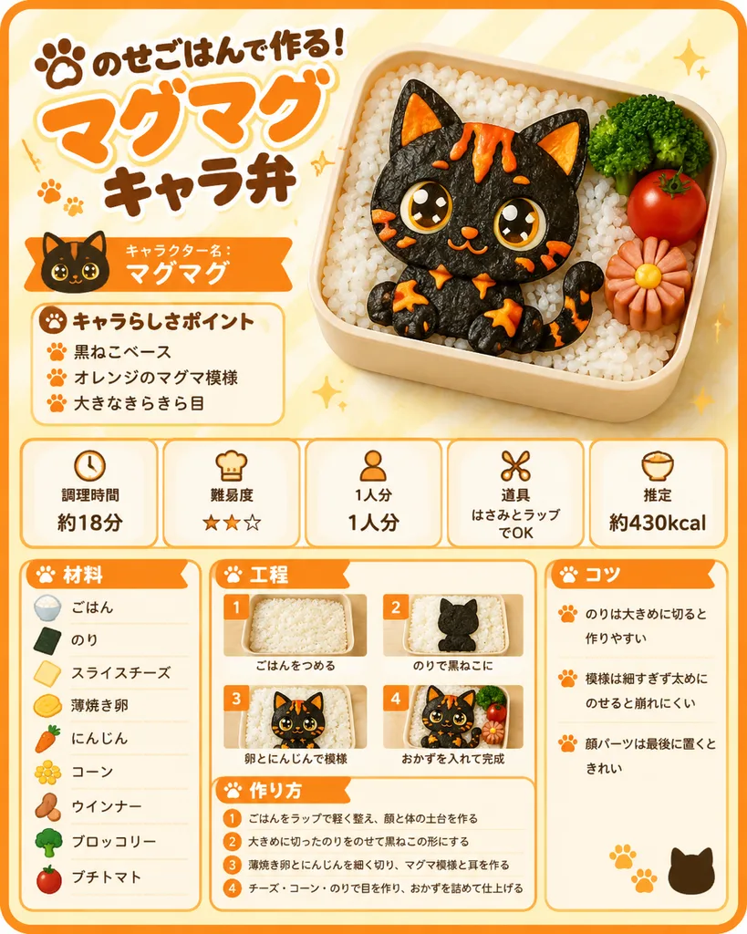
{"type":"cute Japanese recipe infographic poster for a character bento","style":"bright kawaii food magazine layout, clean vector-and-photo hybrid, rounded orange border, cream background with pale yellow stripes, playful rounded Japanese typography, warm studio lighting, appetizing realistic bento photography with illustrated sparkle accents","main_subject":{"dish":"magma-pattern black cat character bento made from rice and seaweed","character_name":"[マグマグ]","description":"a chibi black cat sitting inside a rectangular lunch box on a bed of white rice, made with glossy black seaweed, orange magma cracks, large golden sparkling eyes, small orange nose, pointed ears with orange cheese-like inner ears, tiny paws, curled tail, cute smile","bento_contents":{"count":4,"items":["white rice base","black cat seaweed character","green broccoli florets","red cherry tomato and sliced sausage flower"]}},"layout":{"format":"single-page vertical recipe card, 4:5 aspect ratio","top_section":{"position":"top half","count":3,"elements":["left title block with paw icon and headline","large right bento hero image","orange ribbon character-name label"]},"visible_text":{"headline":"[のせごはんで作る!マグマグキャラ弁]","character_label":"キャラクター名:マグマグ","point_box_title":"キャラらしさポイント"},"character_points":{"count":3,"items":["黒ねこベース","オレンジのマグマ模様","大きなきらきら目"]},"info_cards":{"position":"middle row","count":5,"cards":[{"icon":"clock","label":"調理時間","value":"約18分"},{"icon":"chef hat","label":"難易度","value":"★★☆"},{"icon":"person","label":"1人分","value":"1人分"},{"icon":"scissors","label":"道具","value":"はさみとラップでOK"},{"icon":"bento bowl","label":"推定","value":"約430kcal"}]},"lower_section":{"columns":3,"left_column":{"title":"材料","count":9,"items":["ごはん","のり","スライスチーズ","薄焼き卵","にんじん","コーン","ウインナー","ブロッコリー","プチトマト"]},"center_top":{"title":"工程","count":4,"steps":[{"number":1,"label":"ごはんをつめる","image":"plain white rice packed in the lunch box"},{"number":2,"label":"のりで黒ねこに","image":"black seaweed silhouette of cat placed on rice"},{"number":3,"label":"卵とにんじんで模様","image":"cat face completed with eyes and orange magma markings"},{"number":4,"label":"おかずを入れて完成","image":"finished bento with broccoli, tomato, and sausage garnish"}]},"center_bottom":{"title":"作り方","count":4,"steps":["ごはんをラップで軽く整え、顔と体の土台を作る","大きめに切ったのりをのせて黒ねこの形にする","薄焼き卵とにんじんを細く切り、マグマ模様と耳を作る","チーズ・コーン・のりで目を作り、おかずを詰めて仕上げる"]},"right_bottom":{"title":"コツ","count":3,"tips":["のりは大きめに切ると作りやすい","模様は細すぎず太めにのせると崩れにくい","顔パーツは最後に置くときれい"]}},"design_details":{"colors":"orange, cream, brown, black, white, green, red","decorations":"small paw prints, orange section ribbons, thin rounded dividers, numbered orange squares, soft drop shadows","typography":"large orange headline for [マグマグ], dark brown secondary text, clean legible Japanese body text","camera":"top-down three-quarter product view for the bento, consistent miniature photos for process steps","quality":"crisp print-ready recipe sheet, clean layout, all Japanese text sharp and legible"}}

đồ họa thông tinbentocông thức
Poster Quảng Cáo Nước Giải Khát Nhật Bản

Poster Quảng Cáo Nước Giải Khát Nhật Bản

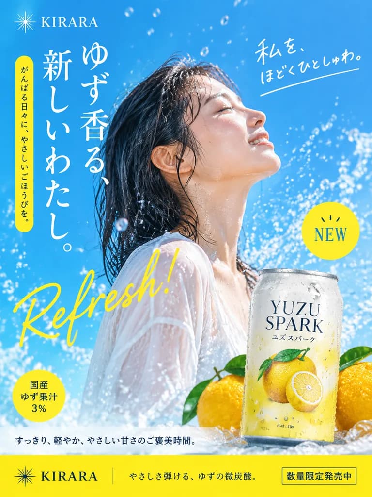
Japanese beverage advertisement poster. young Asian woman in profile view, [eyes closed, looking up, feeling refreshed]. chilled aluminum beverage can. yellow circular badge. yellow circular badge. wet hair, glowing wet skin, wearing a she…

nước giải khátposterquảng cáo
Lưới Banner Quảng Cáo Web Nhật Bản

Lưới Banner Quảng Cáo Web Nhật Bản

2x2 advertisement banner grid. four distinct quadrants, each displaying a finished commercial web banner advertisement in Japanese design style. top-left. skincare and beauty. close-up portrait of a young East Asian woman with radiant, hyd…

bannerquảng cáodạng lưới
Infographic Thiết Kế Web Tiếng Nhật Pastel Dễ Thương

Infographic Thiết Kế Web Tiếng Nhật Pastel Dễ Thương

A clean, cute Japanese infographic on a soft off-white background with rounded pastel abstract corner blobs and tiny decorative dots and rings, designed as a friendly web-design explainer poster. At the top center, a large bold rounded Japanese headline reading "[Google Fontsってなに?]" in very dark navy, with a small yellow accent mark near the first word. Directly below it, a medium-size blue subheading reading "[無料で使えるWebフォントサービス]", flanked by dotted divider lines extending left and right. In the middle, three rounded rectangular feature cards arranged evenly in a horizontal row: Card 1 is pale blue with a blue number badge "1", an icon of the multicolor Google "G" beside overlapping font sheets marked "Aa", a bold Japanese title "Googleが提供するフォント集", and subtext "Webサイトやアプリ、資料づくりに使える"; Card 2 is pale mint green with a green number badge "2", an icon of a pink piggy bank with a gold coin labeled "¥0" and motion marks, a bold title "無料で利用できる", and subtext "個人でも企業でも使いやすい"; Card 3 is pale warm cream with an orange number badge "3", an icon of a browser window with a globe, a bold title "Web上で読み込める", and subtext "HTMLやCSSに追加してすぐ使える". Below the cards, a wide horizontal white code bar with rounded corners and a subtle outline, featuring a pale blue circular </> icon on the left and a monospaced code line: "<link href=\"https://fonts.googleapis.com/...\" rel=\"stylesheet\">" with the URL in blue. Beneath that, a dashed rounded pill-shaped note box with a blue star icon reading "[例:Kiwi Maru もGoogle Fontsで使えます]". At the bottom left, a tiny smiling potted plant illustration. At the bottom right, a browser-style sample window with a light blue title bar and three traffic-light dots; inside, bold sample copy "やさしい文字で、伝わるデザイン。" with subtext "Kiwi Maru のサンプル" on the left, and a white inset card showing large black Japanese characters "あア" with font label "[Kiwi Maru]" below. Flat vector illustration style, crisp outlines, soft pastel palette, balanced composition, generous whitespace, rounded sans-serif typography, beginner-friendly tech education aesthetic.

infographictiếng nhậtvector
So Sánh Slide Báo Cáo DX Bốn Khung

So Sánh Slide Báo Cáo DX Bốn Khung

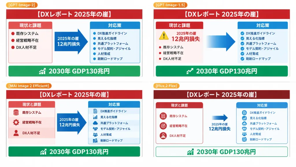
Using the provided reference image as the source slide, a 16:9 white comparison canvas showing four different regenerated versions of the same Japanese government-style DX report slide in a 2×2 grid with generous white margins. - Layout and Structure: Four distinct panels. The top-left panel retains the reference slide nearly unchanged and scaled down. The other three panels present simplified variations following the same layout logic: a red header, red "current issues" column on the left, blue "countermeasures" column on the right, a large blue transition arrow pointing right, and a green goal bar along the bottom. - Labels: Small orange badge labels above each panel: "[GPT-Image-2]" on top-left, "[GPT-Image-1.5]" on top-right, "[MAI Image 2 Efficient]" on bottom-left, and "[Flux.2 Flex]" on bottom-right. - Text Content: Headline reads "[DXレポート 2025年の崖]". Legible Japanese key phrases throughout: "2025年の崖", "12兆円損失", "現状と課題", "対応策", "既存システム", "経営戦略不在", "DX人材不足", "DX推進ガイドライン", "見える化指標", "共通プラットフォーム", "モデル契約・アジャイル", "人材育成", "刷新ロードマップ", and bottom green banner "2030年 GDP130兆円". - Variations: Top-right has clean modern PowerPoint formatting with a yellow warning badge and bold gradient arrow. Bottom-left is slightly denser with multi-tiered stacked blocks. Bottom-right features a minimalist layout with dark red header and outlined cards. - Style: Flat presentation slide screenshot, crisp vector infographic aesthetic, perfectly legible typography, no photorealistic elements, no people, no artifacts.

đồ họa thông tinthuyết trìnhpowerpoint
Bảng chữ cái hiragana nét đơn dạng móc nối

Bảng chữ cái hiragana nét đơn dạng móc nối

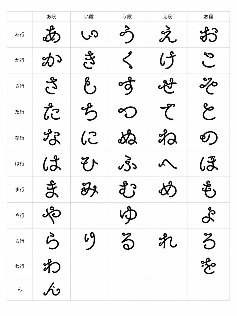
typographic specimen chart. a complete Japanese hiragana syllabary table rendered as an experimental strange loop-line font. one large black custom hiragana glyph per occupied cell, centered within each grid square; leave the historically…

hiraganakiểu-chữbảng-mẫu
Poster Công Thức Cá Hồi Xào Kim Chi Kiểu Nhật

Poster Công Thức Cá Hồi Xào Kim Chi Kiểu Nhật

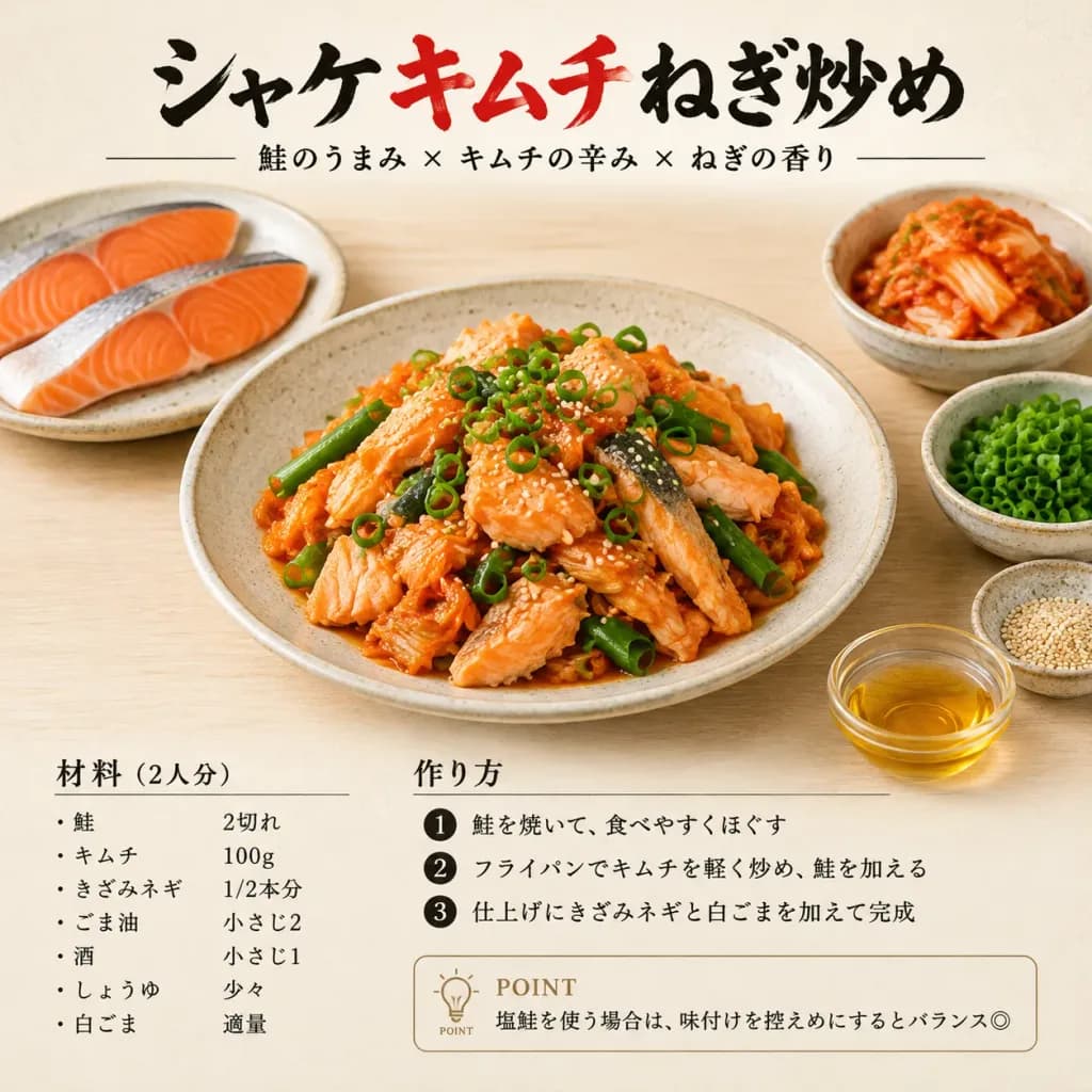
A square Japanese recipe card poster for [シャケキムチねぎ炒め], shot in natural daylight food photography style on a pale wooden tabletop with a soft cream background. Composition & Layout: - Centered main subject: A large shallow beige ceramic plate filled with freshly cooked salmon, kimchi, and scallion stir-fry. - Surrounding ingredient dishes (exactly 5 items): A plate with two raw salmon fillets at the upper left, a small bowl of kimchi at the upper right, a small bowl of chopped green onions at the lower right, a small bowl of white sesame seeds at the bottom right, and a small glass bowl of golden cooking oil near the bottom right foreground. Food Details: - Flaked moist salmon chunks, glossy red-orange kimchi ribbons, tender scallion pieces, topped with scattered sliced green onion rings and toasted sesame seeds. Fresh, appetizing texture without heavy steam. Graphic Design & Typography: - Top header: Large Japanese brush calligraphy reading "[シャケキムチねぎ炒め]", with "キムチ" in vivid red and the remaining characters in black. Beneath it, flanked by thin horizontal rules, the subtitle: "鮭のうまみ × キムチの辛み × ねぎの香り". - Lower-left recipe section: Titled "材料(2人分)", listing: • 鮭 2切れ • キムチ 100g • きざみネギ 1/2本分 • ごま油 小さじ2 • 酒 小さじ1 • しょうゆ 少々 • 白ごま 適量 - Lower-middle recipe section: Titled "作り方", with 3 numbered steps: 1. 鮭を焼いて、食べやすくほぐす 2. フライパンでキムチを軽く炒め、鮭を加える 3. 仕上げにきざみネギと白ごまを加えて完成 - Bottom note: A neat boxed tip with a simple lightbulb icon, labeled "POINT", containing the text: "塩鮭を使う場合は、味付けを控えめにするとバランス◎". Style: Elegant Japanese cookbook editorial design, subtle paper grain, clean minimalist typography, sharp and legible text, realistic high-end culinary photography.
công thứcinfographicnhật bản
Áp phích biên tập đẳng cự phố sách Jimbocho

Áp phích biên tập đẳng cự phố sách Jimbocho

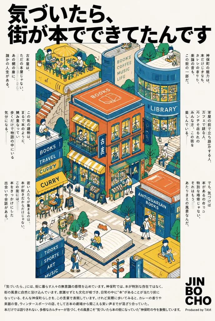
Japanese illustrated city poster. Jimbocho as a whimsical book town integrated with reading culture and playful urban discovery. A dense isometric illustration of a vibrant book-town block where architecture, rooftops, plazas, and streets…

áp phíchbiên tậpđẳng cự
Máy Pachinko Nhại Siêu Thực Nhật Bản

Máy Pachinko Nhại Siêu Thực Nhật Bản

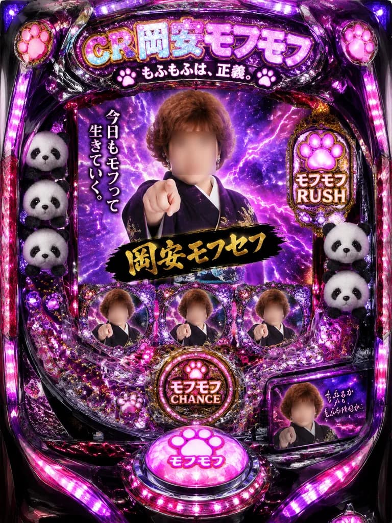
Front-facing product-style photograph of a parody Japanese pachinko machine, executed as an overdesigned, surreal contemporary art piece. The cabinet features a [glossy black and metallic purple] body with sparkling chrome trim, jewel-faceted acrylic molding, embedded pink paw-print emblems, and intense magenta-violet LED edge lighting. In the central video screen, a dramatic middle-aged Japanese woman with [short curly auburn-brown hair] in a [dark kimono] strikes a confrontational heroic pointing pose against a cosmic purple lightning-and-nebula background, her face intentionally obscured by a soft rectangular blur. Three smaller secondary portraits of the same pointing woman appear across the cabinet interface, each with identical blurred-face censorship (4 blurred portraits total). Tucked along the left and right borders of the playfield are [3 plush panda heads]. At the top header, glittering marquee text reads "CR 岡安モフモフ" with a subtitle beneath: "もふもふは、正義。". To the left of the screen, vertical typography reads "今日もモフって生きていく。". Over the woman's chest area, a black brushstroke banner displays gold calligraphy reading "岡安モフセフ". On the right flank, a glowing bonus panel displays a paw icon and "モフモフ RUSH". Near lower center, a circular emblem reads "モフモフ CHANCE", directly above a large domed glowing push-button marked "モフモフ" with a pink paw icon. In the lower-right sub-display, a small inset of the woman appears with handwritten script: "もふるか もふられるか…". Kitschy, gaudy, maximalist aesthetic with sharp specular reflections and high decorative density.

pachinkoarcadenhật bản
Poster Cắt Dán Thời Trang Đường Phố Nhật Bản Y2K

Poster Cắt Dán Thời Trang Đường Phố Nhật Bản Y2K

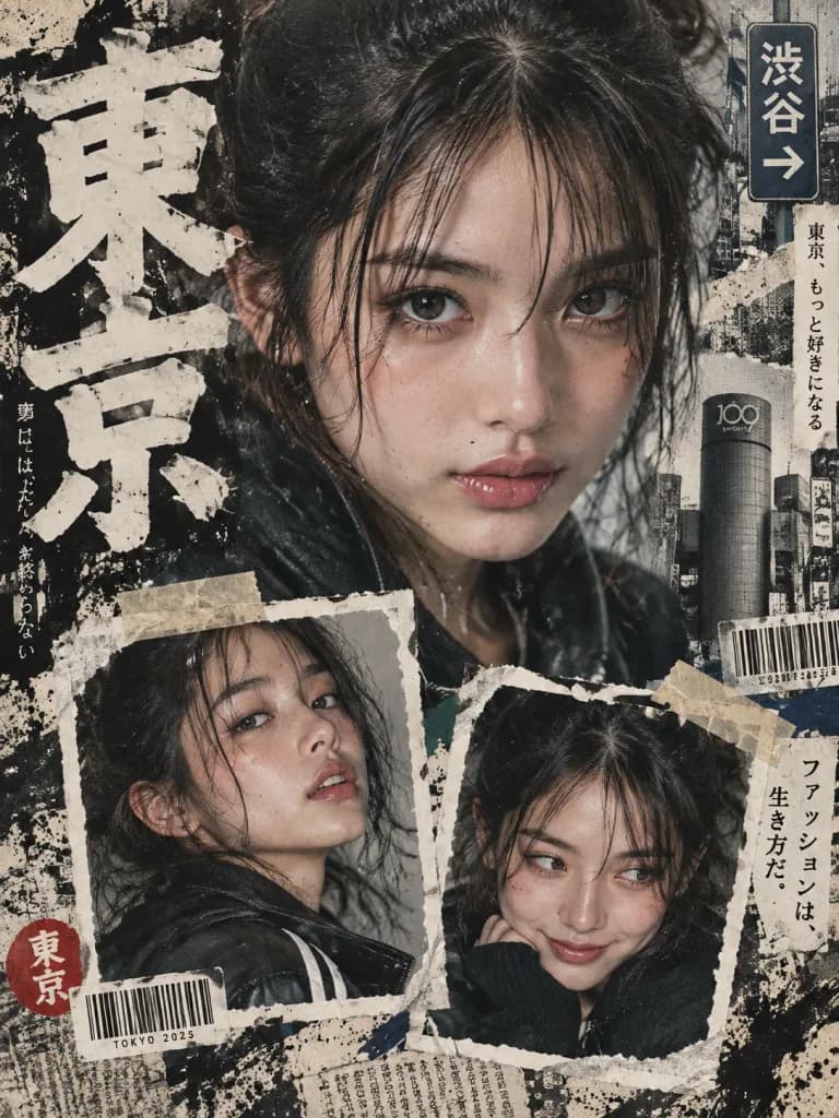
A [bold Y2K Japanese street-editorial collage poster] with a high-fashion magazine aesthetic, gritty paper textures, torn magazine cutouts, distressed ink splashes, and an urban [Tokyo]-inspired design. Top composition: One large cinematic close-up portrait with intense eye focus, natural skin texture, glossy lips, messy tied-up hair, no glasses, soft dramatic lighting, and a confident yet innocent expression in a fashion photography style. Bottom composition: Exactly two smaller portrait collage frames showing different facial expressions and angles, styled like ripped polaroid prints taped onto the poster. Graphic elements: [Oversized bold Japanese typography], minimal English text, subtle Japanese street signs, barcode stickers, newspaper scraps, vintage grunge textures, paint strokes, fine film grain, masking tape strips, and layered paper collage design. Style & palette: Modern Japanese fashion zine editorial mood board, cinematic shadows, sharp eye detail, balanced neutral tones, avoiding pink tones, bubbles, or cartoon elements.

editorialy2knhật bản
Nữ Phục Vụ Maid Cafe Bắn Tim Bằng Tay

Nữ Phục Vụ Maid Cafe Bắn Tim Bằng Tay

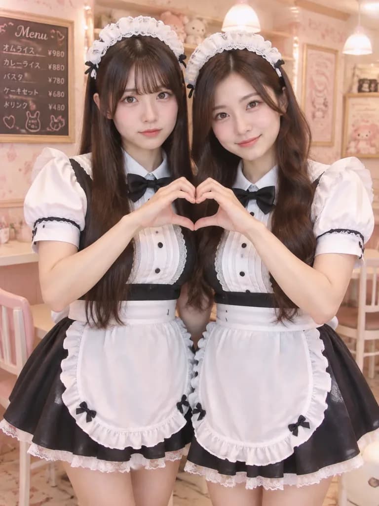
Realistic portrait photo of two young Japanese women dressed as maid cafe waitresses, standing close together inside a pastel kawaii maid cafe. Both wear matching classic black-and-white maid uniforms: black short-sleeve dresses with white puffed sleeves, white lace-trimmed collars, bib fronts, ruffled white aprons with small bows at the hem corners, and white lace maid headbands over dark hair. The woman on the left has [long straight dark brown hair with soft bangs], a calm slightly serious expression, looking directly at the camera. The woman on the right has [long wavy dark brown hair parted to the side], a gentle friendly smile, looking at the camera. They raise their inner hands together in the center to form a single heart shape with their fingers. Composition & Lighting: Medium vertical shot from mid-thigh up, subjects filling most of the frame. Soft flattering lighting, shallow depth of field with crisp focus on faces and hands, and warm beige-pink color grading. Background: Softly blurred warm cream and pastel pink interior featuring cute patterned wallpaper, framed menu boards, plush toys on shelves, and warm ambient ceiling lights. Style: Photorealistic snapshot with natural skin texture, authentic Japanese maid cafe atmosphere. No anime stylization, watermarks, or distorted hands.

maid cafenhật bảnbắn tim
Đồ Họa Thông Tin Dòng Thời Gian Mô Tô Nhật Bản

Đồ Họa Thông Tin Dòng Thời Gian Mô Tô Nhật Bản

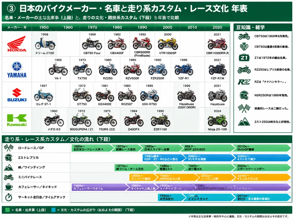
Japanese motorcycle history infographic timeline. 豆知識・雑学. 走り系・レース系カスタム/文化の流れ(下段). Japanese. 4:3 landscape poster, clean editorial infographic, crisp vector layout mixed with realistic side-view cutout motorcycle illustrations with soft cas…

mô tôđồ họa thông tindòng thời gian
Áp Phích Quảng Cáo Siêu Thực Nhật Bản

Áp Phích Quảng Cáo Siêu Thực Nhật Bản

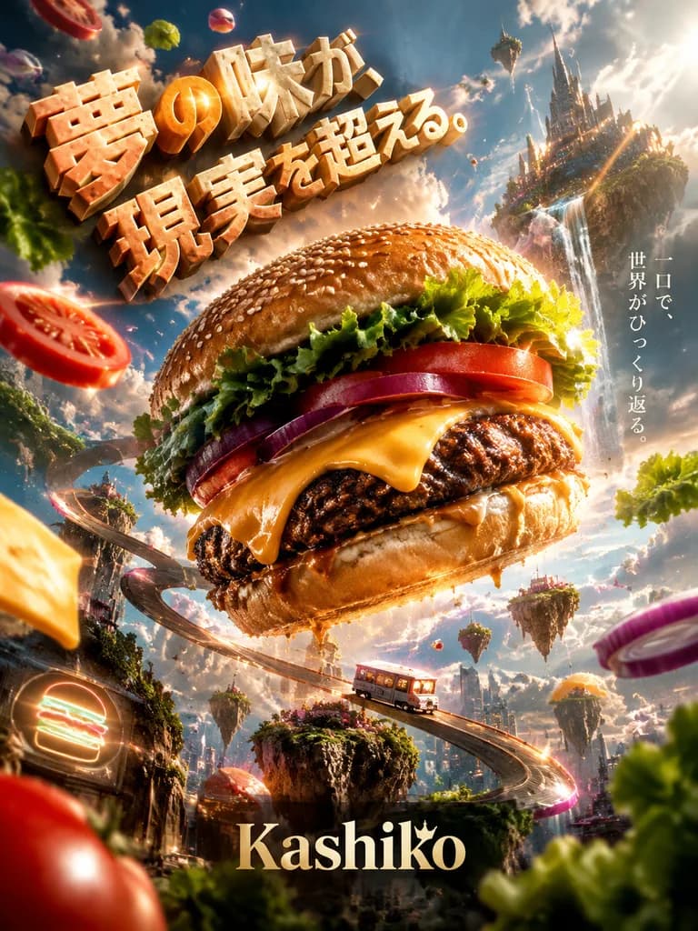
A photorealistic commercial poster advertising a fictional brand called "[Kashiko]" centered around the theme of a [Hamburger]. The concept completely breaks from reality with an insane, surreal interpretation that still conveys high-end commercial appeal. If working from the reference image, incorporate its subject by having them interact directly with the brand theme. Composition & Perspective: Extreme wide-angle perspective with intentional optical distortion and altered scale. The layout features dense visual layering across foreground, middle ground, and background, anchored by an impossible central subject that defies the laws of physics alongside subtle surreal details throughout the scene. Lighting: Cinematic movie-grade lighting with dramatic volumetric rays, intense backlighting, crisp rim lights, glowing particles, and neon accents guiding the viewer's gaze. Typography & Text: Integrated Japanese typography rendered as tangible, physical 3D objects embedded directly within the environment, reacting physically to surrounding light and elements. Includes an intriguing, cryptic Japanese advertising catchphrase that feels strangely fitting yet defies conventional logic. Style & Details: Tangible photorealistic textures, moisture, steam, and light dust particles captured like a professional medium-format commercial photograph, balancing high visual density with unified, sophisticated art direction. Completely fictional branding without real-world logos.

áp phíchquảng cáosiêu thực
Poster Anime Thử Thách Phượt Xe Máy Mùa Hè

Poster Anime Thử Thách Phượt Xe Máy Mùa Hè

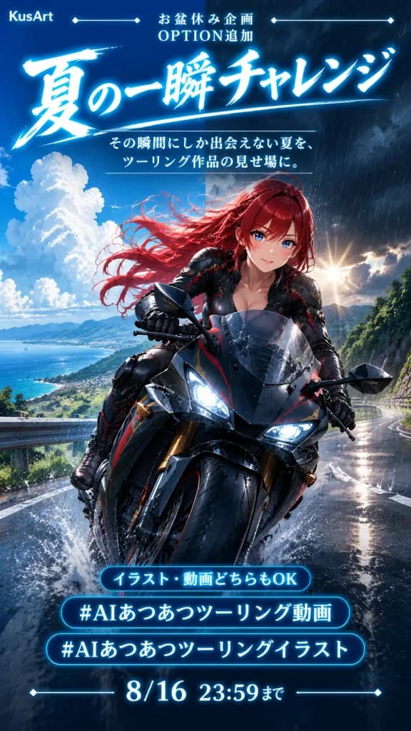
Vertical Japanese promotional poster for a summer motorcycle touring challenge, anime key visual aesthetic with integrated event announcement typography, 9:16 aspect ratio. Composition & Layout: - Top header: Small "KusArt" logo on the top left flanked by thin decorative horizontal lines with diamond endpoints. Centered small header text 「お盆休み企画」, with 「OPTION追加」 directly underneath. - Upper third: Dominant main title in huge, luminous Japanese calligraphy: "[夏の一瞬チャレンジ]". Below it, a thin divider line and a two-line subtitle: 「その瞬間にしか出会えない夏を、」 and 「ツーリング作品の見せ場に。」. - Bottom information section: Exactly three glowing cyan outlined text blocks. Block 1 is a small pill-shaped badge reading 「イラスト・動画どちらもOK」. Block 2 is a bold hashtag bar reading "[#AIあつあつツーリング動画]". Block 3 is a second hashtag bar reading "[#AIあつあつツーリングイラスト]". At the very bottom, deadline displayed in crisp bright numerals: "[8/16 23:59まで]", framed by thin lines with diamond endpoints. Main Subject: An anime-style female rider with [long flowing crimson red hair] and vivid blue eyes, riding a glossy black sport touring motorcycle accented with subtle red and gold trim. She wears a form-fitting black leather racing suit with red accent panels, black gloves, and a confident gentle smile. The motorcycle curves toward the viewer on a wet mountain road, front wheel dynamic in the lower foreground, windshield beaded with raindrops, tires kicking up water spray. Environment & Lighting: Split-sky atmospheric contrast: the left side shows clear summer blue skies with towering white cumulonimbus clouds over distant mountains and a coastline; the right side transitions into a sudden dark evening rain shower with vertical rain streaks. Glossy wet asphalt reflects sunlight breaking through storm clouds, bordered by guardrails and lush green mountain greenery. Cinematic dark blue color grading, high contrast, glowing cyan-white typography, splashing water effects.

posteranimexe máy
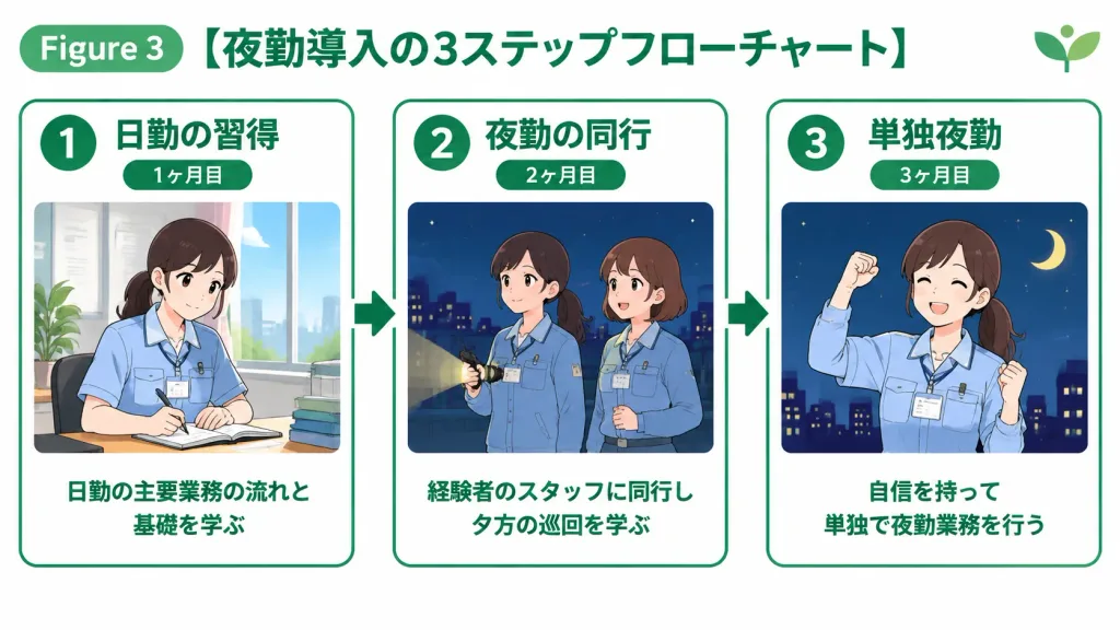
Slide Quy Trình 3 Bước Phong Cách Nhật Bản

Slide Quy Trình 3 Bước Phong Cách Nhật Bản

A clean, friendly 3-step flowchart presentation slide in Japanese business manual style on a solid white background, 16:9 aspect ratio. Top Section: - Top-left badge labeled "Figure 3" next to a prominent Japanese title: "[3-Step Flowchart for Night Shift Introduction]" in bold, legible Gothic font. - Small abstract logo icon in the top-right corner. - Color theme: [green] accents. Card Arrangement: - Three rectangular cards arranged horizontally side by side, connected sequentially from left to right with thick arrows. Borders and accents styled in [green]. Card 1 (Left): - Circular badge with number "1", title "[Day Shift Mastery]", and a capsule badge reading "[Month 1]". - Center illustration: gentle 2D hand-drawn illustration of a Japanese woman taking notes at a desk by a sunny window. - Bottom text: Japanese description reading "[Learn core day shift workflows and fundamentals]". Card 2 (Center): - Circular badge with number "2", title "[Night Shift Shadowing]", and a capsule badge reading "[Month 2]". - Center illustration: two Japanese women in uniform holding a flashlight with a city skyline and night sky. - Bottom text: Japanese description reading "[Shadow experienced staff during evening rounds]". Card 3 (Right): - Circular badge with number "3", title "[Solo Night Shift]", and a capsule badge reading "[Month 3]". - Center illustration: smiling Japanese woman striking a victory pose under a night sky with a crescent moon. - Bottom text: Japanese description reading "[Conduct independent night duties with confidence]". Style & Constraints: - Flat 2D vector graphic design, clean linework, friendly corporate aesthetic. - All Japanese text clearly rendered in readable Gothic typography. - Strictly flat 2D layout filling the entire canvas, no 3D mockups, no device frames, no realistic photographic shadows, no angled perspective.
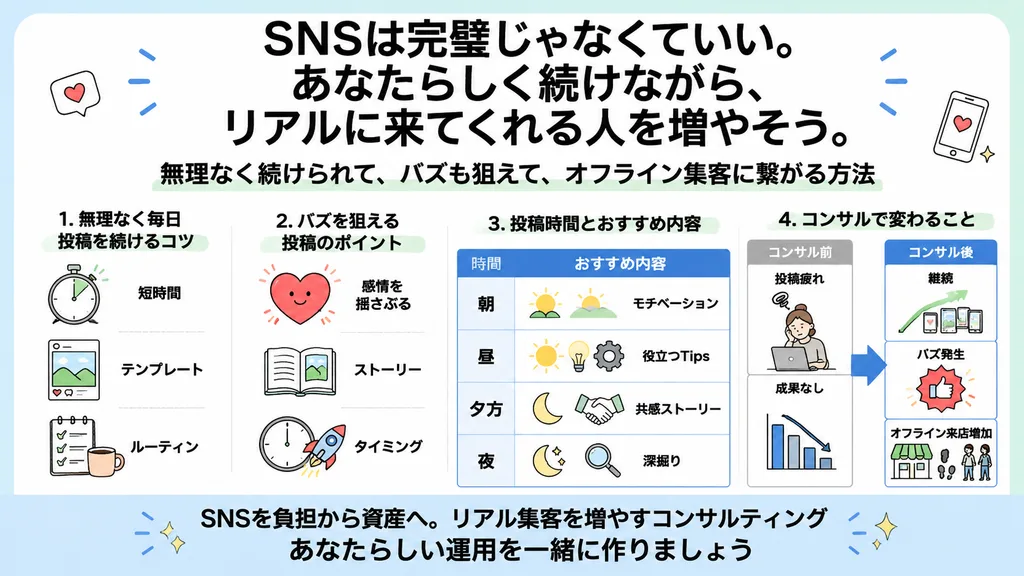
infographiclưu-đồslide-doanh-nghiệp
Chân Dung Thủy Cung Cá Vàng Nhật Bản

Chân Dung Thủy Cung Cá Vàng Nhật Bản

Subject: [Japanese goldfish aquarium portrait]. Person and Expression: [Young woman with black hair, soft bangs and loose strands with a wet look], translucent skin, natural and delicate makeup, moist eyes, and a quiet, dreamlike expression looking slightly upward. Clothing and Pose: Pale cream yukata-style top adorned with modest cherry blossom and Japanese patterns, water glisten reflecting across her shoulders. Natural posture as if floating underwater surrounded by goldfish, body turned slightly sideways. Setting and Background: Fantastical space inspired by an artistic Japanese goldfish aquarium, turquoise aquatic tanks, glass reflections, and subtle traditional Japanese motifs. Countless vibrant red, white, and orange goldfish drifting around her, fine rising bubbles, and gentle surface ripples reminiscent of a poetic summer festival goldfish game. Composition and Camera: Profile-leaning close-up portrait, low-angle upward perspective, shot on an 85mm portrait lens with shallow depth of field. Heavily blurred goldfish in the foreground creating layered depth, cinematic framing directed toward the light ahead of her gaze. Lighting and Texture: Cinematic lighting with turquoise blue ambient glow contrasting with vivid goldfish orange, realistic skin texture with visible pores, clear underwater optical transparency, poetic and serene mood.

cá vàngthủy cungchân dung
Poster Đồ Trang Trí Phòng Sứa Màu Tím Pastel

Poster Đồ Trang Trí Phòng Sứa Màu Tím Pastel

pastel kawaii interior goods poster. Japanese social media graphic, soft dreamy lavender aesthetic, airy white background, cute handwritten annotations, sparkles and tiny jellyfish doodles, feminine cozy room theme. jellyfish-inspired bedr…

kawaiiposterpastel
Biển Quảng Cáo Mì Siêu Thực Kiểu Nhật

Biển Quảng Cáo Mì Siêu Thực Kiểu Nhật

A bright, surreal Japanese food advertisement billboard in 16:9 horizontal format for [NISSIN] cup noodles, emphasizing a creamy dairy-and-cheese theme in a glossy commercial photo-illustration style. Subject and Layout: In the center, a young woman shown from the chest up stands in a green pasture under a clear blue sky. She has long, wavy [golden yellow] hair and wears an elegant white lace blouse. Her face is completely obscured by a flat, vertical rectangular censor block with a warm beige-to-brown gradient. With her right hand, she holds an oversized instant noodle cup close to the camera on the right side, tilted slightly toward the viewer. Product and Branding Details: The cup features bold blue lettering reading "[MILK SEAFOOD]" with authentic [NISSIN] Cup Noodle styling, blue horizontal stripes, and red/yellow accents on a clean white background. Thick, melted pale-yellow cream and cheese drip down the rim, with gentle steam wafting upward. Exactly two red [NISSIN] shield logos are placed on the canvas: one in the upper-left corner and one in the lower-left corner. Across the bottom, display large handwritten Japanese slogan text: "[あぁ、チーズ感!ミルクシーフード]". Environment and Elements: A sunny pastoral field with rolling green hills under a bright blue sky. Include exactly 4 prominent farm animals in the midground: two black-and-white Holstein cows (one by the woman's shoulder, one at the far right), one white sheep beside the left cow, and one white goat standing beside the oversized cup. Scatter exactly 7 tiny cows on the distant hills. In the sky, feature exactly 4 stylized cream-dollop clouds: one large blob in the upper-left, one large blob in the upper-right, one small cloud on the left horizon, and one on the right horizon. A thick, wavy pale-yellow cream banner spans the bottom edge behind the slogan text. Style: Hyperrealistic commercial ad collage, vivid daylight, clean studio illumination on the subject and product, playful absurdist Japanese advertising mood.
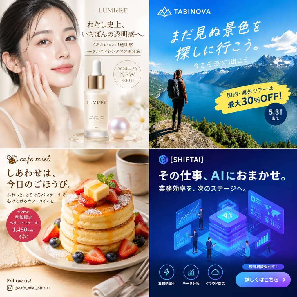
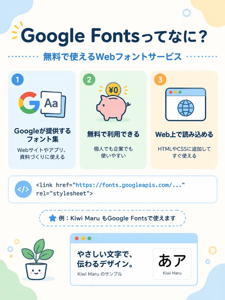
biển quảng cáoquảng cáothực phẩm
Đồ Họa Thông Tin Chứng Nhận Xem Chỉ Tay AI Nhật Bản

Đồ Họa Thông Tin Chứng Nhận Xem Chỉ Tay AI Nhật Bản

ornate Japanese palm reading certificate infographic. clean elegant fortune-telling report, white parchment background, thin gold decorative border with floral corner ornaments, soft beige and gold dividers, delicate serif Japanese typogra…

xem-chỉ-tayđồ-họa-thông-tinnhật-bản
Poster Moodboard Ba Bảng Kiểu Nhật

Poster Moodboard Ba Bảng Kiểu Nhật

A landscape 4:3 scrapbook collage poster divided into exactly three tall vertical columns with thin borders, exploring three creative posting styles for [Nota]. Color palette of warm beige, sepia, cream, and deep teal, with glowing dust particles, delicate bokeh, and drifting flower petals throughout. The mood is [soft, nostalgic, dreamy, emotional]. Column 1 (Daily Life / Inner Talk): Header with small number “01”, title “INNER TALKS”, subtitle “watashi no uchigawa no hanashi”, large Japanese headline “[日常のなかの、小さな光。]”, and cursive English text “Little lights in everyday life.” Main visual depicts a morning bedroom scene: a young woman with shoulder-length wavy brown hair (face softly obscured), curled up on a white bed by a sunlit window in an oversized white sweatshirt, pale gray sweatpants, and white socks. Potted plants, a small wooden dresser, books, a ceramic mug, sheer curtains, and warm sunbeams surround her. Includes Japanese text paragraphs, an English poem reading “Soft light. Soft heart. Quiet moments. That’s enough.”, small labels “INNER PEACE”, “DAILY LIFE”, “SOFT FEELINGS”, “SELF LOVE”, and cursive text “be gentle with yourself”. Column 2 (AI Images / Photo Moodboard): Header with small number “02”, title “AI IMAGES”, and Japanese subtitle “AIが写す、感情のかけらたち”. Dark teal-green cinematic background with grainy texture and luminous bokeh. Exactly 6 overlapping photo prints with thin cream borders: (1) upper-left portrait of a woman looking down in warm light, (2) upper-right backlit windswept silhouette portrait, (3) middle-left nighttime street portrait of a woman in a sleeveless top, (4) middle-right intimate close-up with hands near face and colorful bokeh, (5) lower-left emotional low-angle portrait leaning forward, (6) lower-right warm close portrait in a white top. Softly blurred painterly facial details, tiny vertical edge labels, delicate sparkle icons, and handwritten bottom caption: “Cinematic, Dreamy, Emotional. Not a photo. But real. AI creates the feeling I want to remember.” Column 3 (Idea & Prompt / Creative Notebook): Header with small number “03”, title “IDEA & PROMPT”, subtitle “アイデアとプロンプトの記録”, large Japanese text “感情と日常を、ビジュアルに変換する。”, and cursive English “Turning feelings and daily life into visuals.” Cream paper background with pressed flowers and washi tape. Organized as a pinboard with: exactly 4 black-and-white manga sketches near the upper right (full-body standing girl, close-up face, seated girl, profile view); a “CONCEPTS” card with 5 checkboxes (“日常のワンシーン”, “内面の気持ち”, “光と影のコントラスト”, “ノスタルジー”, “夢・記憶・希望”); a “PROMPT MEMO” card with 6 bullet items (“soft cinematic light”, “film grain, dreamy”, “moody, nostalgic”, “natural, emotional”, “not a photo”, “shot 3:2 --v 6 --style raw”); a “Today’s Mood” note reading “少し切ないけど あたたかい絵” with a heart; exactly 2 vibrant anime illustration cards; exactly 3 monochrome sketch cards; exactly 3 pencils and pens along the bottom; a “STYLE EXPERIMENTS” card listing 4 items (“Y2Kネオンポップ”, “80sアニメ”, “現代アート油彩”, “モノクロ漫画”); and a pink sticky note reading “Create what you feel. Share what you love. Inspire someone.” Footer: Running across the bottom margin, a thin cream banner with centered Japanese sentence “[好きなものを、AIで自由に。想いをカタチにして、誰かの心にそっと届きますように。]” followed by cursive English “Create freely with AI. Shape your feelings. May your art gently reach someone’s heart.”

postercắt dánscrapbook
Bản Mẫu Trang Nhất Báo Nhật Bản

Bản Mẫu Trang Nhất Báo Nhật Bản

photograph of a printed Japanese newspaper page. authentic newsprint texture, slightly angled top-down flat lay, natural soft room lighting, subtle paper wrinkling and ink absorption. vertical article text column. embedded news photo. Dark…

báo chítiếng nhậttrang nhất
Trang Quảng Cáo Tạp Chí Ẩm Thực Cà Phê Nhật

Trang Quảng Cáo Tạp Chí Ẩm Thực Cà Phê Nhật

A polished Japanese gourmet magazine editorial advertisement page for [キーマカレー], transforming the curry from the reference photo into an upscale restaurant presentation. The page features a structured three-part editorial layout: 1) Top hero section: On the right, the plated curry served in a rustic ceramic bowl on a dark wooden tabletop, accented with whole spices and garlic props; on the left, promotional Japanese typography with a small header label and a bold headline in elegant Mincho font praising the slow-cooked richness. 2) Bottom-left chef profile: A portrait of a professional chef in a dark uniform and apron with arms crossed inside an authentic kitchen, accompanied by vertical Japanese text and a handwritten name signature. 3) Bottom-right feature panel: A framed "secret of deliciousness" section featuring an editorial quote and exactly three numbered step-by-step process points, each accompanied by a small culinary photo. Warm ambient restaurant lighting, shallow depth of field, deep contrast, and glossy food textures. Color palette of rich browns, creams, and subtle gold accents with high-end Japanese culinary editorial design.

cà-rinhật-bảnẩm-thực
Trang Nhật Ký Manga Chuột Hamster Công Sở

Trang Nhật Ký Manga Chuột Hamster Công Sở

A vertical black-and-white Japanese manga diary page arranged in 5 horizontal panels stacked from top to bottom, rendered in clean grayscale ink and screentone in an office comedy shoujo/seinen style. Panel 1: Office reception and back-office desk. On the right, a cheerful young saleswoman in a business suit, ponytail with curled hair, blouse with ribbon tie, and shoulder bag enters smiling warmly. On the left, a tiny, round anthropomorphic hamster sits as an office clerk beside office paperwork, binders, stationery, and a computer monitor. Speech bubble from the woman: "[おはようございます!]". Right vertical narration box: "[ハムスターの職場には若いし誰よりも仕事が出来る営業の女の子がいる]". Left vertical narration box: "[とにかく元気が良く、ハキハキしている]". Panel 2: Wider desk scene showing exactly three characters: a stressed male office worker on the left buried behind stacks of paperwork, the small hamster in the center looking confused, and an overworked female colleague on the right hunched over a monitor. Spiral stress marks hover above the two human coworkers. Vertical narration box on the right: "[大体の社員が、仕事を抱えすぎて、頼むのもコストがかかるからと潰れかけてる中で]". Panel 3: The saleswoman leans over the desk with a friendly, respectful expression, holding out a neat stack of forms to the attentive hamster. A large vertical speech balloon on the right reads: "[ハムさん、手空いてますか?この書類にハンコ押してってください!自分はこの書類の枠印押すんで!]". Panel 4: Close-up desk scene. The hamster holds a small seal stamp and presses it onto documents with a proud expression surrounded by comic sparkles. The saleswoman holds completed papers with closed eyes and a grateful smile. Speech balloon on the right: "「いやー!ハムさんいてよかった!これで私外回り2件増やせますよ!超助かる!」". Narration box on the left: "「若いのに人に任せる塩梅も知ってて本当にすごいと思う。感謝も忘れないし人をいい気持ちにさせる力もある」". Panel 5: Closing portrait panel beside a large office window overlooking city buildings. The saleswoman waves goodbye with a radiant smile, hair floating, with bright emphasis lines around her face. Vertical narration box on the left: "「こういう子の頑張りが認められて欲しいなぁとつくづく思う」". Style: Crisp black panel gutters, classic screentone shading, vertical Japanese manga lettering, expressive chibi/office diary aesthetic, strictly black and white.

mangatruyện_tranhchuột_hamster
Banner quảng cáo bia phong cách Nhật Bản

Banner quảng cáo bia phong cách Nhật Bản

Japanese beverage advertisement banner. Young Japanese woman smiling warmly at the camera, wearing a clean white blouse, holding an ice-cold can of beer with visible condensation. catchphrases. product_branding. feature_highlights. rounded…

quang caobianhat ban