Mới: GPT Image 2.5 Flare và Sunburst. Dùng thử miễn phí 3 ảnh khi đăng ký, sau đó 8 tín dụng mỗi ảnh.
Dùng thử GPT Image 2.5

Prompt GPT Image 2

8.665 mẫu · cập nhật thg 10 2026

GPT Image 2 là mô hình tạo và chỉnh sửa hình ảnh của OpenAI (gpt-image-2). Mô hình tuân theo các chỉ dẫn dài, có cấu trúc rất chặt chẽ, đặc biệt phù hợp cho poster, ảnh chụp sản phẩm, mockup UI và infographic kèm chữ ngắn trên ảnh.

Trang này tổng hợp 8.665 mẫu trong thư viện được thiết lập sẵn cho GPT Image 2. Mỗi mẫu sẽ mở trực tiếp trong trình tạo ảnh với cấu hình GPT Image 2: 43 tín dụng ở độ phân giải 1K, tối đa 16 ảnh tham chiếu và 16 tỷ lệ khung hình. GPT Image 2 Saver chạy cùng mô hình với mức phí cố định 5 tín dụng cho mọi kích thước.

Hiển thị 481–540 trên tổng số 569 prompt GPT Image 2 · Thiết kế UI / UX

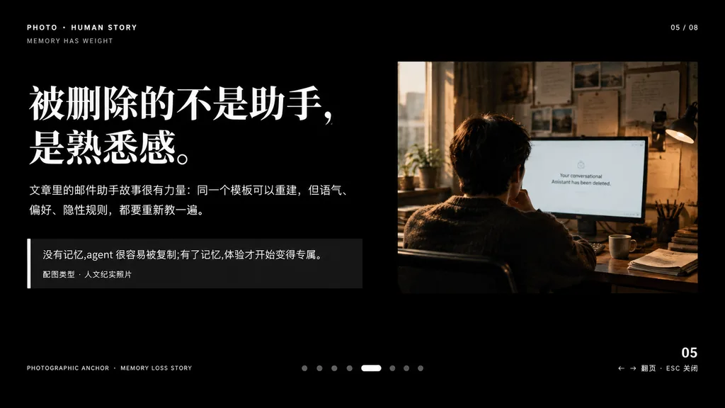
Slide thuyết trình mang tính tự sự với ảnh tài liệu

Slide thuyết trình mang tính tự sự với ảnh tài liệu

A minimalist cinematic presentation slide layout on a solid deep black background, widescreen 16:9, premium editorial keynote style. Asymmetrical composition with clean typography on the left and a documentary photograph on the upper right, framed by generous negative space. Left Typography and Text Blocks: - Top-left uppercase microtext: "PHOTO • HUMAN STORY", with "MEMORY HAS WEIGHT" slightly beneath it. - Main headline: very large, bold white Chinese serif typography across two lines reading "[被删除的不是助手,\n是熟悉感。]". - Body text directly below: medium-small white and light gray Chinese text across two lines reading "[文章里的邮件助手故事很有力量:同一个模板可以重建,但语气、\n偏好、隐性规则,都要重新教一遍。]". - Quote block below: a dark translucent rectangular box with a thin vertical white accent line on its left edge. Inside, text reading "[没有记忆,agent 很容易被复制;有了记忆,体验才开始变得专属。]" above a smaller caption line reading "配图类型 · 人文纪实照片". Upper Right Photograph: - A warm-toned, film-style humanistic documentary photo showing one adult seated from behind at a desk in a dimly lit office, looking at a computer screen. Beside the monitor is a desk lamp, with papers pinned on the wall and soft daylight streaming through a nearby window. The monitor displays a clean white interface with centered English text: "[Your conversational Assistant has been deleted.]". Muted brown, amber, and cool gray tones, intimate and melancholic atmosphere. UI Details & Pagination: - Top right: "05 / 08". - Bottom left microtext: "PHOTOGRAPHIC ANCHOR · MEMORY LOSS STORY". - Bottom right: "05" with tiny navigation hint "← → 翻页 · ESC 关闭". - Bottom center: 8 small pagination indicators, with the 5th dot styled as an elongated horizontal white pill and the other 7 as muted gray circles. Overall Aesthetic: High-end editorial magazine layout, crisp alignment, sophisticated typographic hierarchy, contemplative and narrative-driven.
thuyết trìnhkeynotethiết kế biên tập
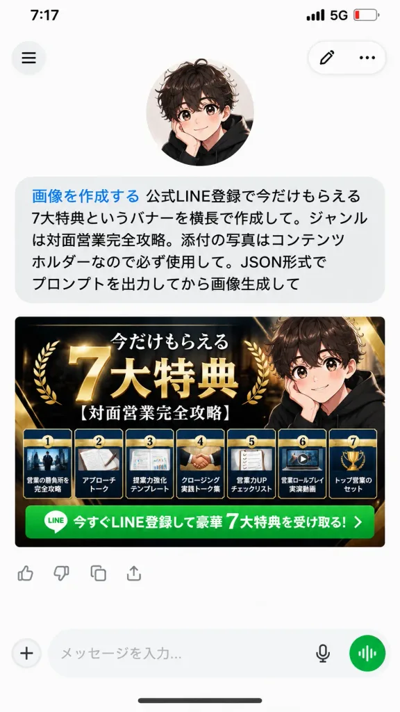
Ảnh Chụp Màn Hình Chat AI Kèm Banner Quảng Cáo

Ảnh Chụp Màn Hình Chat AI Kèm Banner Quảng Cáo

A realistic vertical 9:16 mobile smartphone screenshot of an AI chat app conversation on a clean white background. At the top, an iPhone-style status bar displays 7:17, 5G, and a low battery icon. Below the status bar, the app interface features a circular hamburger menu button on the top left, and a floating rounded pill container on the top right with an edit pencil icon and a three-dot menu icon. In the upper area, an avatar of a cute anime-style boy with curly dark brown hair, large sparkling eyes, rosy cheeks, and a black hoodie rests his cheek on one hand. Directly beneath him is a single large rounded light-gray user chat bubble containing Japanese text. The first phrase is rendered in blue text: 「画像を作成する」, immediately followed by black text: 「公式LINE登録で今だけもらえる7大特典というバナーを横長で作成して。ジャンルは対面営業完全攻略。添付の写真はコンテンツホルダーなので必ず使用して。JSON形式でプロンプトを出力してから画像生成して」. Beneath the chat bubble is a wide horizontal marketing banner image generated by the AI for [official LINE registration], sized to fit the phone's screen width. The banner has a premium luxury black, navy, and gold theme with glossy metallic accents. The main Japanese headline reads 「今だけもらえる 7大特典」 featuring a prominent oversized 3D gold "7" and bold white-and-gold lettering, accompanied by the topic subtitle 「[対面営業完全攻略]」. On the right side of the banner, the same anime boy avatar is integrated. Along the bottom of the banner are exactly seven distinct benefit cards in a neat horizontal row, each showing a small preview thumbnail, numbers 1 through 7, and titles: 1)営業の勝負所を完全攻略, 2)アプローチトーク, 3)提案力強化テンプレート, 4)クロージング実践トーク集, 5)営業力UPチェックリスト, 6)営業ロールプレイ実演動画, 7)トップ営業のセット. Below the cards runs a bright green call-to-action bar with a small LINE app icon and white text: 「今すぐLINE登録して豪華 7大特典を受け取る!」. Underneath the banner image are small reaction/action icons, followed by a bottom navigation input bar with a plus icon, text placeholder, microphone icon, and a circular green voice-mode button. Crisp typography, soft UI drop shadows, clean modern mobile interface design.

giao diện di độngảnh chụp màn hìnhứng dụng chat
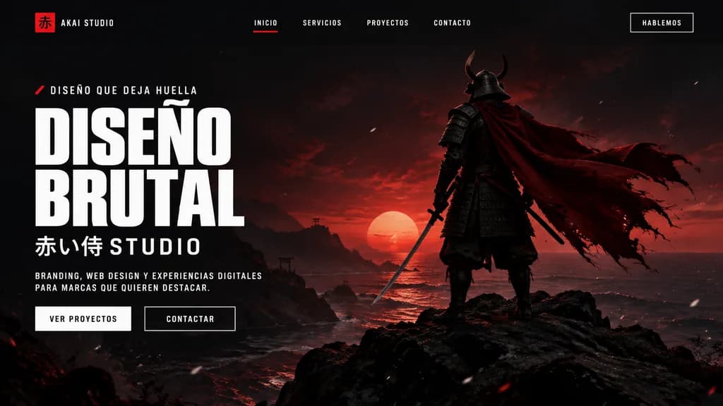
Trang Đích Đại Lý Phong Cách Samurai Brutalist

Trang Đích Đại Lý Phong Cách Samurai Brutalist

A cinematic dark landing page mockup for a creative agency called [AKAI STUDIO], presented inside a modern desktop browser window. The layout features a widescreen hero section with a dramatic black-to-deep-crimson gradient background, moody sunset backlighting, and subtle floating white dust or ember particles. On the right, a full-body samurai stands on jagged black rocks overlooking a calm shoreline, viewed from behind in dark layered armor and a horned helmet, holding a katana at his side, his long tattered crimson cape billowing dramatically to the right. On the left side, bold brutalist typography displays an eyebrow line with a small red accent mark reading "[DISEÑO QUE DEJA HUELLA]", followed by a massive, stacked white condensed headline reading "[DISEÑO BRUTAL]". Underneath, Japanese characters and text read "[赤い侍 STUDIO]", followed by a short supporting paragraph in small uppercase white lettering: "[BRANDING, WEB DESIGN Y EXPERIENCIAS DIGITALES PARA MARCAS QUE QUIEREN DESTACAR.]". Below the text are two call-to-action buttons: a solid light button labeled "VER PROYECTOS" and a dark outlined button labeled "CONTACTAR". The top navigation bar includes a left-aligned logo mark featuring a red square with the kanji "赤" and text "[AKAI STUDIO]", four centered uppercase menu links ("INICIO" with a red active underline, "SERVICIOS", "PROYECTOS", "CONTACTO"), and a boxed top-right action button reading "[HABLEMOS]".

trang đíchthiết kế webmockup ui
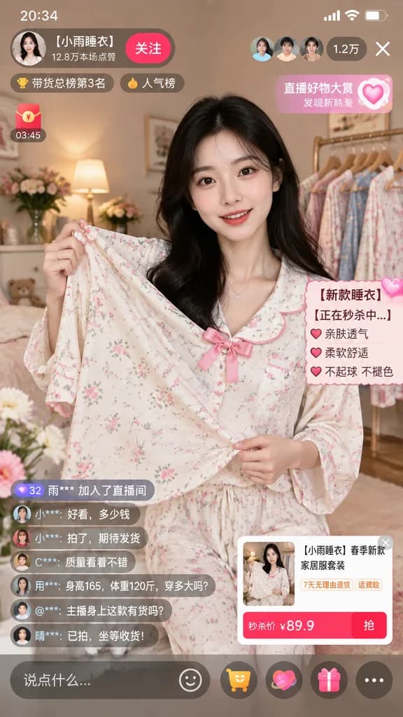
Mockup Giao Diện Livestream Bán Hàng

Mockup Giao Diện Livestream Bán Hàng

mobile live-streaming e-commerce interface mockup. young Asian woman with long dark hair, wearing a light-colored floral pajama set with a pink bow, holding the pajama top outward to display the fabric. [【小雨睡衣】春季新款家居服套装]. cozy bedroom sett…

livestreamthương mại điện tửgiao diện di động
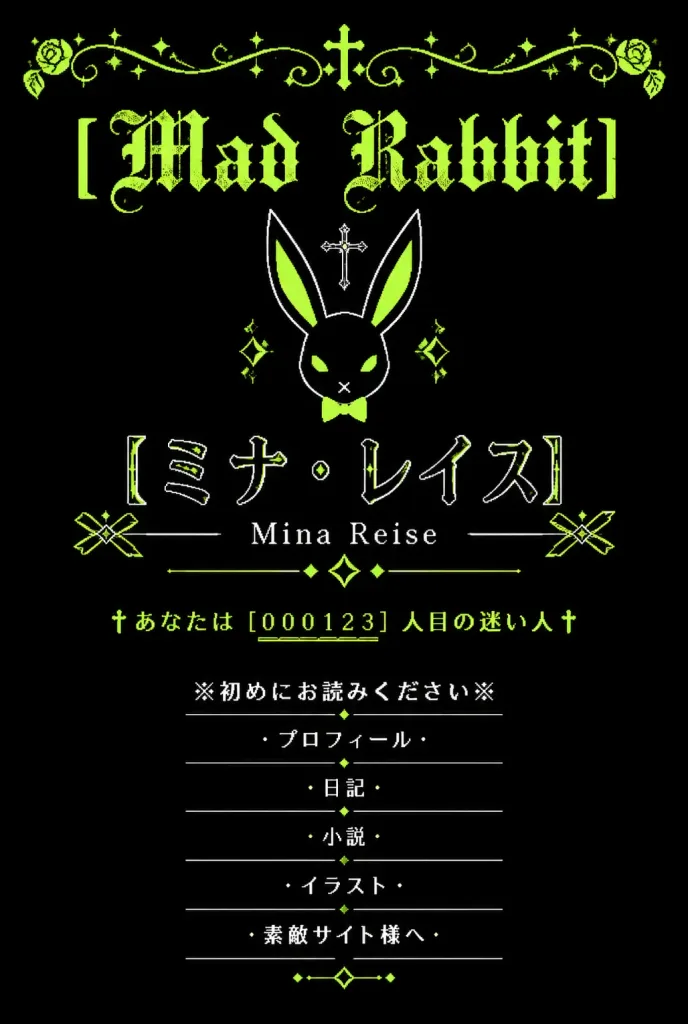
Trang Web Di Động Gothic Nhật Bản Cổ Điển

Trang Web Di Động Gothic Nhật Bản Cổ Điển

A vertical graphic inspired by nostalgic early-2000s Japanese mobile personal homepages (garakei web shrines) with a gothic lolita and dark fantasy aesthetic. Black background with a limited color palette of acid lime green, white, and deep black. Symmetrical, centered composition with generous negative space. At the top, an ornate lime-green filigree border spans the width, featuring curling vines, small sparkle stars, and a tiny central cross. Directly below is the distressed blackletter headline "[Mad Rabbit]" in acid lime green. Beneath the title sits a minimalist geometric white line-art rabbit head icon with long ears, lime-green inner ear fills, a small lime bow tie, diamond accents, and a small cross floating above it. In the main identity area below the rabbit icon: large Japanese katakana text in thin outlined white lettering with lime highlights reading "[ミナ・レイス]", followed directly underneath by the romanized name "[Mina Reise]" in a delicate serif font, flanked by thin horizontal rules, two geometric ribbon-like side ornaments, and a central diamond sparkle motif. Below the name section is an authentic retro homepage visitor hit counter in lime green: "†あなたは [000123] 人目の迷い人†" with underlined digits. At the bottom, a vertically stacked navigation menu consisting of exactly 6 centered items in white Japanese text, each separated by thin divider lines and flanked by cross or bullet symbols: 1) ※初めにお読みください※ 2) ・プロフィール・ 3) ・日記・ 4) ・小説・ 5) ・イラスト・ 6) ・素敵サイト様へ・ Small lime diamond dots and delicate dividers embellish the menu section. Style: Distressed pixel-era typography, delicate line art, 2000s mobile web shrine aesthetic. Completely flat 2D graphic, no modern UI chrome, no phone mockup frame, no photographic elements.
y2kgothic lolitathiết kế web
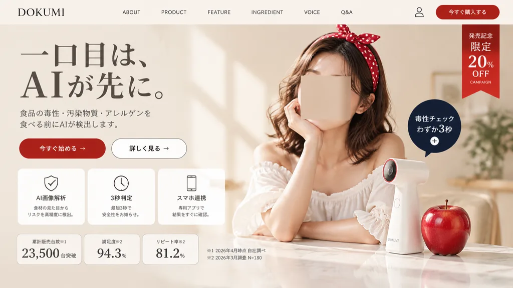
Hero Trang Đích Sản Phẩm AI Nhật Bản

Hero Trang Đích Sản Phẩm AI Nhật Bản

A polished Japanese landing page hero section screenshot for a fictional consumer tech brand named [DOKUMI]. The layout follows a premium beauty-tech and food-safety aesthetic in a soft warm beige and ivory palette with generous whitespace and elegant editorial styling. Top Navigation Bar: Contains 8 elements in a single horizontal row: brand logo text "[DOKUMI]" on the far left, followed by "ABOUT", "PRODUCT", "FEATURE", "INGREDIENT", "VOICE", "Q&A", a small user profile icon, and a rounded red button labeled "今すぐ購入する" on the far right. Below this button on the upper-right corner hangs a vertical red ribbon badge with stacked white text: "発売記念", "限定", "20%", "OFF", and small text "CAMPAIGN". Hero Section - Left Column: - Headline in elegant large Japanese Mincho serif typography over two lines: "一口目は、" on the first line, "AIが先に。" on the second line with dramatic scale. - Refined gray two-line Japanese subheading detailing AI detection of food toxins, contaminants, and allergens prior to consumption. - Two horizontal CTA buttons: a solid red pill button labeled "今すぐ始める →" and a white outlined pill button labeled "詳しく見る →". - Row of three rounded white feature cards with subtle borders and thin black line icons: 1) shield icon labeled "AI画像解析" with small explanatory text, 2) clock icon labeled "3秒判定" with subtitle, 3) smartphone icon labeled "スマホ連携" with subtitle. - Bottom statistics row with three bordered metric cards: "累計販売台数※1" displaying "23,500" "台突破", "満足度※2" displaying "94.3%", and "リピート率※2" displaying "81.2%". To the right, two small footnote lines in Japanese: "※1 2026年4月時点 自社調べ" and "※2 2026年3月調査 N=180". Hero Section - Right Column: Soft, luminous lifestyle photo of a stylish young Japanese woman with wavy shoulder-length brown hair wearing a large red polka-dot headband and an off-shoulder white ruffled blouse, resting her chin on one hand over a glossy tabletop. Her face is obscured by a neutral skin-tone rectangular privacy marker. On the table stands a sleek, minimalist white handheld scanner gadget with a subtle red-accented lens ring, next to a realistic glossy red apple. Floating beside the device is a dark navy circular callout badge with white text reading "毒性チェック" and "わずか3秒" above a small plus icon. Lighting and Finish: Gentle natural window light from the left casting subtle diagonal wall shadows, realistic textures, and clean modern Japanese UI composition.

trang đíchthiết kế webảnh chụp ui
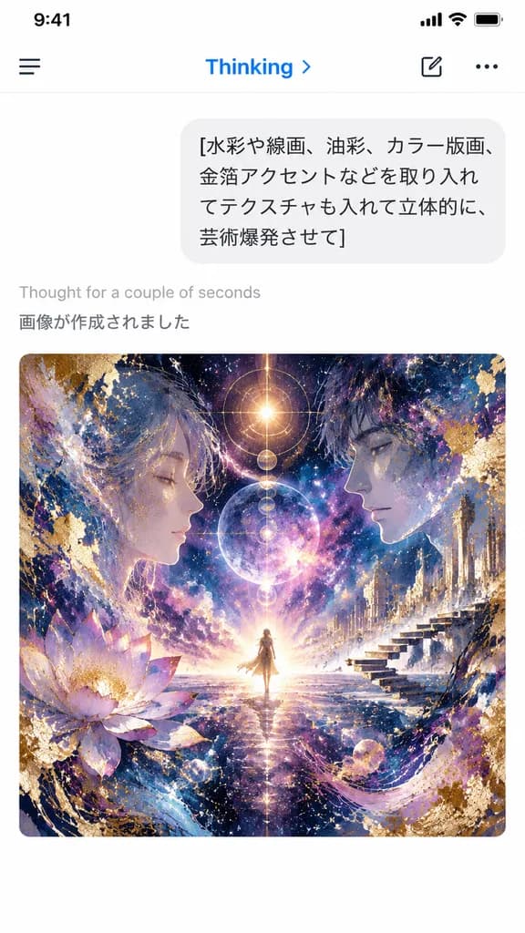
Ảnh Chụp Màn Hình Chat AI Trên Điện Thoại với Tranh Vũ Trụ

Ảnh Chụp Màn Hình Chat AI Trên Điện Thoại với Tranh Vũ Trụ

A vertical smartphone screenshot of an AI chat app interface in light mode, capturing a freshly generated image result. At the top is a clean mobile header with a hamburger icon on the left, the blue label "Thinking" with a small right chevron, and a compose icon alongside a three-dot menu on the right. Below the header is a rounded light-gray user chat bubble showing four lines of Japanese text: "[水彩や線画、油彩、カラー版画、 金箔アクセントなどを取り入れ てテクスチャも入れて立体的に、 芸術爆発させて]". Beneath the bubble, on a crisp white background, appear two system status lines: light gray "Thought for a couple of seconds" followed by darker gray "画像が作成されました". Centered in the lower half is a large rounded-corner artwork preview in a square format: an intricate cosmic visionary collage featuring a tiny radiant figure standing at the central horizon, flanked by two large semi-transparent human profiles facing inward. Swirling nebulae, glowing celestial bodies, gold-leaf leafing, splash textures, ink lines, architectural floating steps on the right, and a lotus bloom on the left merge in a palette of deep indigo, violet, magenta, and luminous gold. Authentic iOS mobile interface aesthetic, sharp typography, minimal layout outside the vibrant artwork.

ảnh chụp uiứng dụng di độnggiao diện chat
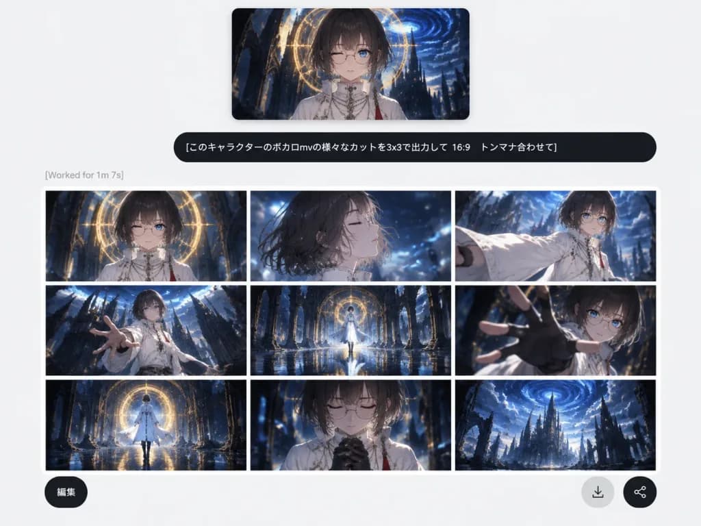
Giao Diện AI Tạo Ảnh Kèm Storyboard Anime

Giao Diện AI Tạo Ảnh Kèm Storyboard Anime

A clean social-media screenshot of a modern, minimalist web-app AI image generation interface on a light gray background with ample white space. At the top center, a rectangular reference image preview with soft shadows shows an anime character: an androgynous youth with a [dark ash-brown bob haircut with straight bangs], pale skin, thin round glasses, one winking eye, and one visible blue eye, dressed in a high-collar white ceremonial robe with necklaces and a red tassel, set against a dark fantasy gothic cathedral with a glowing golden circular halo and a swirling blue vortex sky. Directly below the preview is a wide, rounded black user prompt bubble displaying crisp white Japanese text: "[このキャラクターのボカロmvの様々なカットを3x3で出力して 16:9 トンマナ合わせて]". Beneath the prompt bubble, aligned to the left, is faint gray status text reading "[Worked for 1m 7s]". Below the status line is an output card featuring a 3x3 grid of 9 cinematic 16:9 anime storyboard panels separated by thin white grid lines, maintaining consistent color grading in dark navy blue, black, white, and warm gold with a glossy Vocaloid music-video aesthetic, wet reflective floors, and ruined gothic cathedral backdrops: 1. Top-left: Frontal bust shot of the character under the glowing golden circular arch. 2. Top-center: Windblown side-profile close-up with eyes closed amidst blue light motes. 3. Top-right: Dynamic three-quarter shot extending a billowing white sleeve forward. 4. Middle-left: Low-angle dramatic wide shot reaching toward the frame with cathedral spires. 5. Middle-center: Symmetrical full-body shot standing on a reflective wet floor framed by an archway. 6. Middle-right: Extreme foreshortened close-up reaching a gloved hand toward the lens. 7. Bottom-left: Wide rear view walking toward the luminous circular portal. 8. Bottom-center: Emotional close-up with eyes closed and hands clasped near the chest. 9. Bottom-right: Epic distant establishing shot of ruined gothic towers against the blue vortex sky. Floating over the lower portion of the grid are three circular UI buttons: a dark button at bottom-left labeled "[編集]", a light gray circular download arrow icon button, and a dark circular share icon button at bottom-right.

trình tạo aigiao diện webphân cảnh
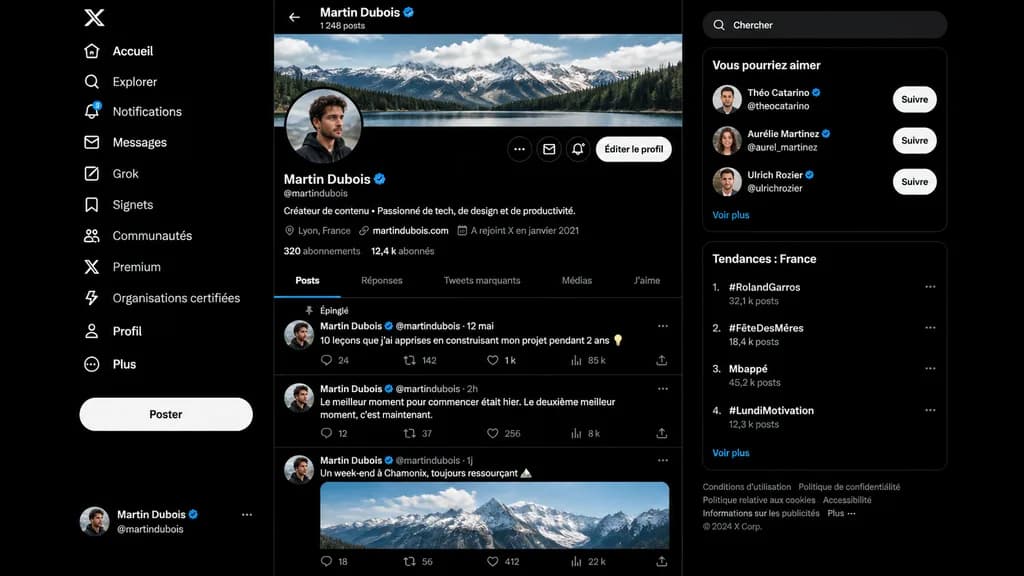
Bản dựng hồ sơ mạng xã hội chế độ tối

Bản dựng hồ sơ mạng xã hội chế độ tối

A realistic dark-mode desktop social media interface mockup closely resembling the desktop X/Twitter layout in French, presented as a full-screen browser screenshot on a dark black background with subtle dark gray dividers. Left sidebar: - Top: White X logo. - Vertical navigation list of 11 items with white icons and text: “Accueil”, “Explorer”, “Notifications” (with a small blue notification badge reading “3”), “Messages”, “Grok”, “Signets”, “Communautés”, “Premium”, “Organisations certifiées”, “Profil”, and “Plus”. - Middle-lower area: Large pill-shaped white button labeled “Poster”. - Bottom: Compact user card for [Martin Dubois] with handle @martindubois and a circular user avatar. Center column (Profile view): - Header: Back arrow, name “[Martin Dubois]” with a blue verification checkmark, and subtext “1 248 posts”. - Cover image: Wide panoramic banner of cloudy alpine mountains above a forest lake. - Profile row: Circular profile picture of a young man in dark clothing slightly overlapping the banner bottom-left. On the right, three circular icon buttons and a rounded light button labeled “Éditer le profil”. - Info section: Display name “[Martin Dubois]” with blue checkmark, handle @martindubois, French bio reading “Créateur de contenu • Passionné de tech, de design et de productivité.” - Metadata row: Location “Lyon, France”, link “martindubois.com”, and “A rejoint X en janvier 2021”. - Stats row: “320 abonnements” and “12,4 k abonnés”. - Tab bar with 5 items: “Posts” (active, underlined in electric blue), “Réponses”, “Tweets marquants”, “Médias”, “J’aime”. - Feed containing 3 posts: 1. Pinned post labeled “Épinglé”, date “12 mai”, text: “10 leçons que j’ai apprises en construisant mon projet pendant 2 ans 💡”, metrics: 24 replies, 142 reposts, 1 k likes, 85 k views. 2. Date “2h”, text: “Le meilleur moment pour commencer était hier. Le deuxième meilleur moment, c’est maintenant.”, metrics: 12 replies, 37 reposts, 256 likes, 8 k views. 3. Date “1j”, text: “Un week-end à Chamonix, toujours ressourçant 🏔️”, attached with an embedded daylight photo of snowy peaks, metrics row at bottom. Right sidebar: - Rounded search bar with placeholder text “Chercher”. - Card titled “Vous pourriez aimer” with 3 suggestions: “Théo Catarino” @theocatarino, “Aurélie Martinez” @aurel_martinez, and “Ulrich Rozier” @ulrichrozier, each with avatar, blue badge, and white “Suivre” button, ending with a “Voir plus” link. - Card titled “Tendances : France” with 4 ranked trends: 1. “#RolandGarros” (32,1 k posts), 2. “#FêteDesMères” (18,4 k posts), 3. “Mbappé” (45,2 k posts), 4. “#LundiMotivation” (12,3 k posts), ending with “Voir plus”. - Bottom footer: Small gray legal links and “© 2024 X Corp.”. Style: Crisp vector-like UI elements, authentic typography, precise layout spacing, modern dark-mode digital product design.

mockup uimạng xã hộichế độ tối
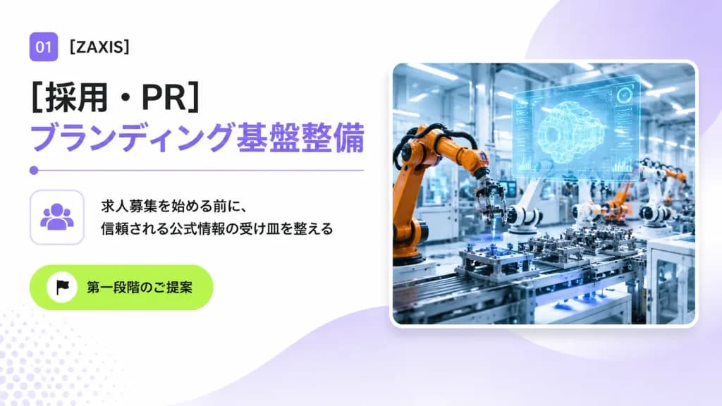
Trang Bìa Đề Xuất B2B Công Nghiệp Phong Cách Nhật

Trang Bìa Đề Xuất B2B Công Nghiệp Phong Cách Nhật

A clean 16:9 Japanese corporate B2B proposal cover slide for an industrial automation and engineering company, designed with a modern consulting deck aesthetic, generous whitespace, and subtle tech accents. Layout and Content: - Top-left: A small rounded purple square badge displaying white text "01", followed by the company name "[ZAXIS]" in crisp black sans-serif typography. - Main Headlines: Directly below, a large bold black Japanese headline reading "[採用・PR]", stacked above a matching large bold lavender headline reading "[ブランディング基盤整備]". Underneath the headlines is a thin lavender horizontal dividing line with a small circular dot on its left edge. - Middle-left: A rounded square outline card containing a minimalist lavender community/people icon. Directly to its right are two lines of black Japanese body copy: "[求人募集を始める前に、]" and "[信頼される公式情報の受け皿を整える]". - Lower-left: A vibrant lime-green rounded pill button featuring a small white circle with a black flag icon and the Japanese text "[第一段階のご提案]". - Right half: A large rounded-corner photo card with a soft drop shadow and a thin white border, depicting a brightly lit futuristic smart factory floor with orange and white robotic arms assembling precision parts, blue-tinted machinery, and a glowing translucent holographic CAD interface floating above the workstation. Background and Atmosphere: Bright white background with soft lavender gradient washes, a large semi-transparent lavender circular gradient behind the photo card in the upper-right, a gentle lavender wave shape flowing from bottom-center toward the right, and a subtle pale lavender halftone dot pattern in the lower-left corner. Crisp, professional, polished corporate presentation slide.

slide thuyết trìnhđề xuất b2bkiểu chữ nhật bản
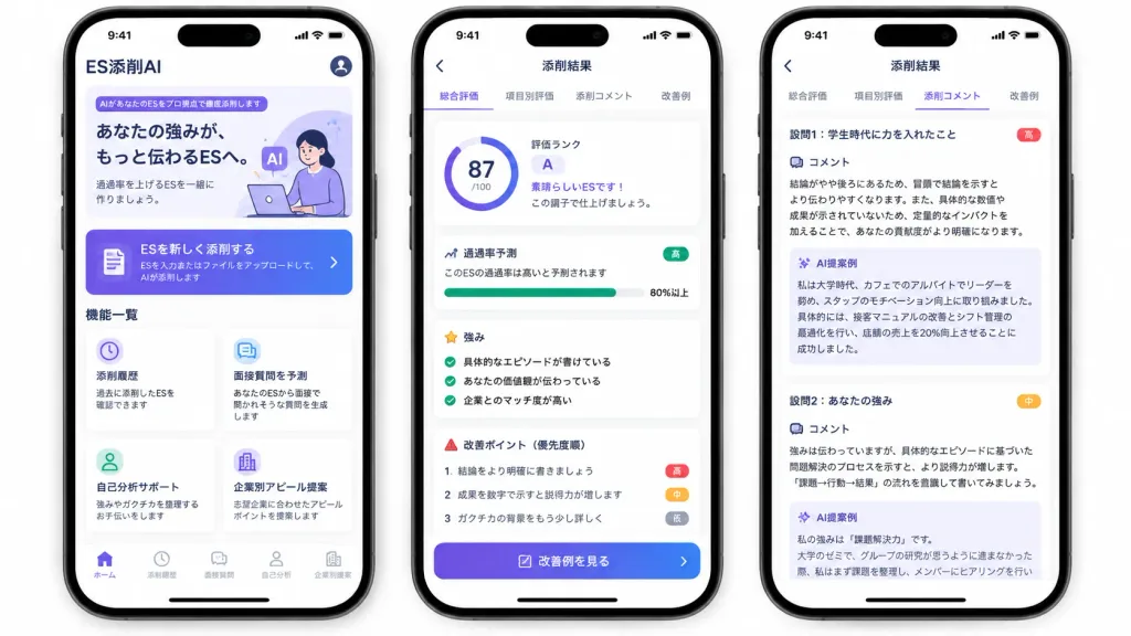
Mockup UI Ứng Dụng Sửa CV Bằng AI Của Nhật

Mockup UI Ứng Dụng Sửa CV Bằng AI Của Nhật

A polished marketing mockup for a Japanese mobile app called [ES添削AI], an AI entry-sheet critique tool for job-hunting students, presented on three modern black-framed iPhones displayed side-by-side on an isolated white background. Composition & Layout: Wide horizontal 16:9 framing showing exactly three smartphones with subtle drop shadows, rounded corners, top Dynamic Island displaying status bar time 9:41, and bottom iOS home indicators. Clean UI cards, soft elevation shadows, and a purple-to-indigo gradient visual identity. Phone 1 (Home Screen): - Top header: text "ES添削AI" at top left, circular profile icon at top right. - Hero card: purple tag reading "AIがあなたのESをプロ視点で徹底添削します", bold headline "あなたの強みが、もっと伝わるESへ。", subtext "通過率を上げるESを一緒に作りましょう。", and a minimal graphic of a student working on a laptop with lavender AI badges. - Primary CTA button: gradient card with document icon reading "ESを新しく添削する" and small text "ESを入力またはファイルをアップロードして、AIが添削します" with a right chevron. - Feature grid section titled "機能一覧" with exactly four white cards: 1) Clock icon: "添削履歴" / "過去に添削したESを確認できます"; 2) Chat icon: "面接質問を予測" / "あなたのESから面接で聞かれそうな質問を生成します"; 3) User icon: "自己分析サポート" / "強みやガクチカを整理するお手伝いをします"; 4) Building icon: "企業別アピール提案" / "志望企業に合わせたアピールポイントを提案します". - Bottom tab bar with 5 items: "ホーム" (active), "添削履歴", "面接質問", "自己分析", "企業別提案". Phone 2 (Results Overview Screen): - Top navigation bar: back arrow and centered title "添削結果". - Tab bar with 4 items: "総合評価" (active with purple underline), "項目別評価", "添削コメント", "改善例". - Overall evaluation card: circular progress score ring showing "[87]/100", alongside text "評価ランク", large letter "[A]", "素晴らしいESです!", and "この調子で仕上げましょう。". - Pass rate card: title "通過率予測", text "このESの通過率は高いと予測されます", green badge "高", progress bar filled to "80%以上". - Strengths section: title "強み" with 3 green checkmark items: "具体的なエピソードが書けている", "あなたの価値観が伝わっている", "企業とのマッチ度が高い". - Areas for improvement: title "改善ポイント(優先度順)" with 3 items: 1 "結論をより明確に書きましょう" (red badge "高"), 2 "成果を数字で示すと説得力が増します" (orange badge "中"), 3 "ガクチカの背景をもう少し詳しく" (gray badge "低"). - Bottom gradient button: "改善例を見る". Phone 3 (Detailed Critique Screen): - Top navigation bar: back arrow and title "添削結果", repeating the 4 tabs with "添削コメント" active. - Two stacked white critique cards: 1. Heading "設問1:学生時代に力を入れたこと" (red badge "高"), "コメント" analyzing conclusion placement and quantitative impact, followed by a pale lavender box titled "AI提案例" rewriting a cafe leadership experience with a 20% sales increase. 2. Heading "設問2:あなたの強み" (orange badge "中"), "コメント" advising evidence-based problem-solving structure, followed by an "AI提案例" box beginning "私の強みは『課題解決力』です。", slightly cut off at the bottom. Style: Modern Japanese iOS mobile app design, crisp Japanese typography, clean whitespace, subtle pastel accents, trustworthy and professional finish.

mockup uiứng dụng di độngứng dụng nhật bản
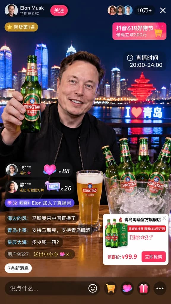
Mockup Giao Diện Livestream Bán Hàng Di Động

Mockup Giao Diện Livestream Bán Hàng Di Động

livestream interface mockup. [Elon Musk]. smiling man in a black jacket. holding up a green glass beer bottle with a [TSINGTAO] label. [Qingdao skyline at night] with illuminated skyscrapers, a river, a glowing red sculptural monument, and…

giao dien livestreammockup thuong mai dien tusocial commerce
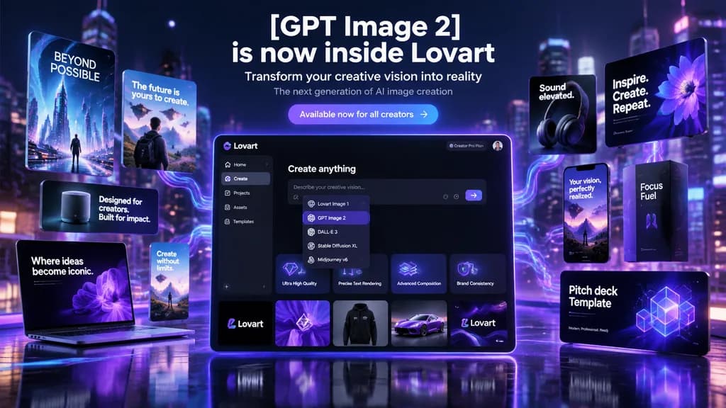
Banner Hero Chiến Dịch Ra Mắt AI Tương Lai

Banner Hero Chiến Dịch Ra Mắt AI Tương Lai

futuristic AI product launch campaign hero banner. high-end 3D advertising composite with cinematic neon lighting, polished UI mockups, floating product cards, and glossy tech presentation aesthetics. left floating posters and devices. cen…

ra mắt sản phẩmbanner heromockup ui
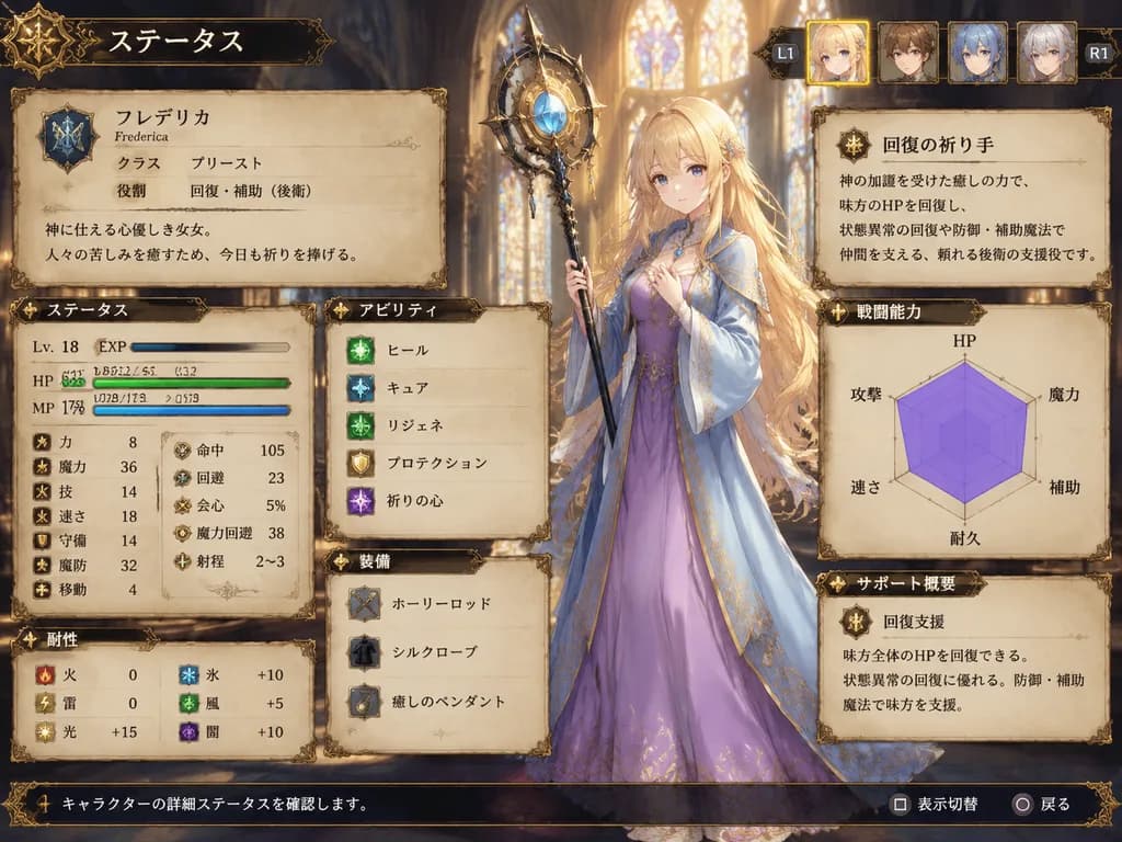
Màn Hình Chỉ Số Nữ Tu Sĩ JRPG Chiến Thuật

Màn Hình Chỉ Số Nữ Tu Sĩ JRPG Chiến Thuật

fantasy JRPG character status screen mockup. ornate medieval parchment interface with dark bronze filigree borders and warm fantasy atmosphere. very long, slightly wavy, loose hair flowing past the waist with soft bangs. ステータス. identity pa…

jrpgmàn hình chỉ sốui game
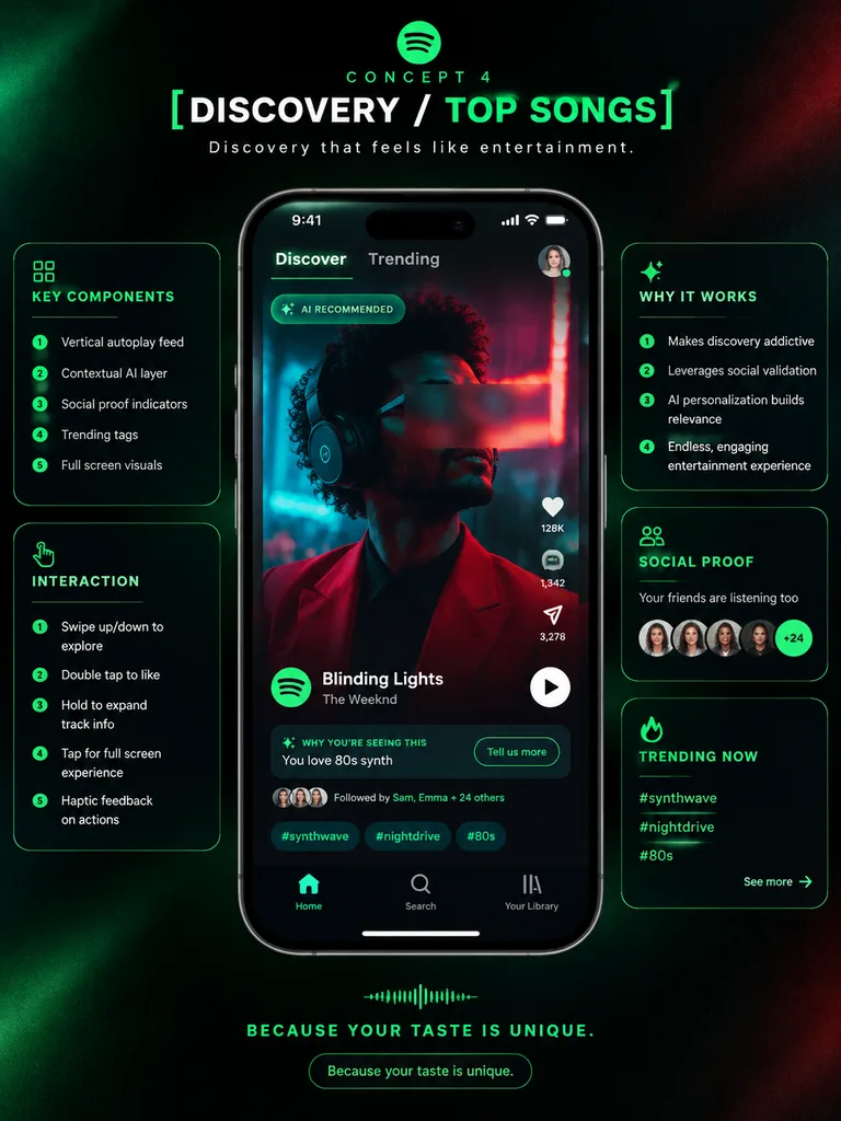
Poster Thuyết Trình Ý Tưởng UI Ứng Dụng Âm Nhạc

Poster Thuyết Trình Ý Tưởng UI Ứng Dụng Âm Nhạc

premium app UI concept poster. futuristic dark neon interface. [DISCOVERY / TOP SONGS]. KEY COMPONENTS. INTERACTION. WHY IT WORKS. SOCIAL PROOF. TRENDING NOW. Spotify-inspired music discovery redesign. portrait. deep black with subtle grai…

thiết kế uinghiên cứu tình huốngmockup điện thoại
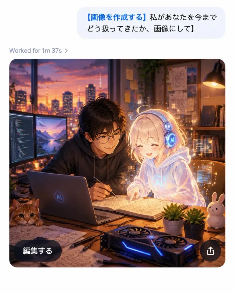
Ảnh Chụp Màn Hình Chat AI Di Động với Kết Quả Anime

Ảnh Chụp Màn Hình Chat AI Di Động với Kết Quả Anime

A realistic mobile AI chat app screenshot showing an image-generation result with a polished iOS-like interface and a high-quality anime illustration inside the generated image card, on a clean white canvas without a device frame, vertical 4:5 aspect ratio. Top chat area: Near the top right, one large light-gray rounded message bubble containing Japanese sans-serif text: "[画像を作成する 私があなたを今までどう扱ってきたか、画像にして]". The opening phrase is bold blue, and the remainder is black. Below the bubble, aligned left, a small gray status line displays "[Worked for 1m 37s ›]". Generated image card: Below the status line, a large rounded-rectangle image card with smoothly curved corners depicts a warm cinematic anime-style scene in a cozy developer studio at dusk. Exactly two main characters are featured: one young Japanese man with tousled dark hair, round glasses, and a dark hoodie leaning over a desk with a pen in hand; and one petite glowing holographic AI girl with pale blond hair, a translucent white hoodie, and round futuristic headphones, smiling as she points at an open notebook. The atmosphere is affectionate, collaborative, and magical. Illustration details inside the card: A sunset city skyline through a wide window, warm desk-lamp illumination, wall shelves with books, pinned diagrams and sticky notes, and soft bokeh lights. On the wooden desk: exactly one open laptop with a subtle circular AI logo, exactly two external monitors on the left displaying code and a landscape, exactly one open notebook with sketches and formulas, exactly one GPU-style device with blue LED accents, exactly one orange cat peeking from the bottom-left edge, exactly one white rabbit figurine on the right, exactly two small potted succulents, and scattered sketch papers, cables, and pens. A delicate golden aura and subtle floating UI particles surround the holographic girl. Card overlay UI: Two floating overlay controls on the image card: one dark translucent pill button at bottom-left reading "[編集する]" in white Japanese sans-serif text, and one circular dark translucent share button at bottom-right with a white upward-pointing share arrow. Visual style: Crisp app interface combined with rich anime art, sharp legible typography, warm amber and violet cinematic lighting, soft depth of field, high contrast between the minimalist white UI and the cozy dark studio illustration.

ui-chatanimeứng-dụng-di-động
Bảng Ý Tưởng Icon Ứng Dụng Di Động

Bảng Ý Tưởng Icon Ứng Dụng Di Động

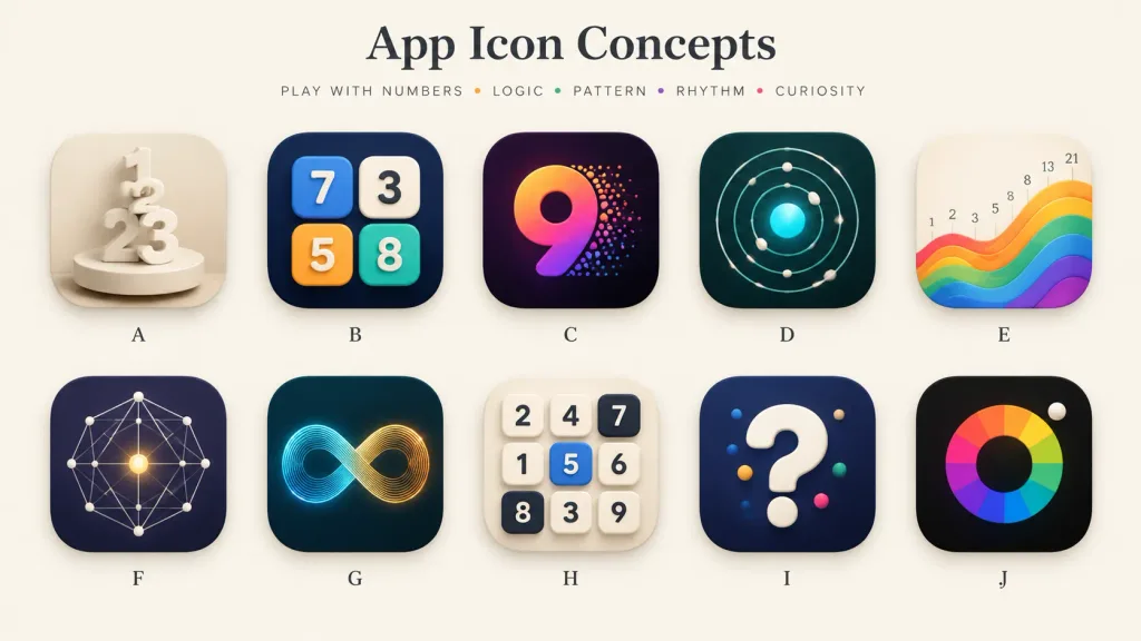
A polished presentation board showcasing 10 alternative app icon concepts for a [number-play and logic puzzle] mobile app. Wide 16:9 landscape canvas on a warm off-white background, minimal gallery-style spacing, soft shadows, and a premium design-review aesthetic. Header: Centered at the top, a large elegant serif title: "[App Icon Concepts]". Below it, a small uppercase tracked tagline: "[PLAY WITH NUMBERS • LOGIC • PATTERN • RHYTHM • CURIOSITY]" with tiny colored dots between words. Grid & Icons: A clean 2-row by 5-column grid containing exactly 10 identical-sized rounded-square app icons with consistent corner radii, subtle drop shadows, and a single centered letter label beneath each, labeled A through J: - A: Cream monochrome icon with stacked 3D numerals 1, 2, and 3 standing on a circular pedestal, sculptural plaster look. - B: Dark navy icon featuring four raised rounded number tiles (blue 7, cream 3, orange 5, teal 8) arranged like playful puzzle blocks. - C: Deep purple-black icon with a large gradient numeral 9 in orange, magenta, and violet, with colorful particle dots bursting from its right edge. - D: Dark teal icon showing an orbital logic pattern of concentric circular paths, small white spheres, and a glowing cyan center. - E: Warm ivory icon displaying rising rainbow wave bands from left to right, with small Fibonacci numbers (1, 2, 3, 5, 8, 13, 21) above the wave. - F: Dark indigo icon with a geometric constellation network of thin white connecting lines, dots, and a glowing golden center point. - G: Dark teal icon featuring a luminous infinity loop made of fine parallel lines transitioning from cyan to golden orange. - H: Light cream icon with a 3x3 grid of tactile number tiles (top row: 2, 4, 7; middle: 1, 5, 6; bottom: 8, 3, 9; tile 5 is blue, 7 and 8 are dark). - I: Dark navy icon with a large glossy white 3D question mark accented with small colored dots. - J: Near-black icon with a segmented rainbow circular color wheel around a dark center disk, and a small white sphere at the upper-right edge. Style: High-end mobile app icon exploration sheet, soft 3D rendering combined with crisp vector precision, realistic highlights, subtle ambient occlusion, balanced negative space, clean typography, no watermarks.

icon ứng dụngthiết kế uibảng ý tưởng
Bảng Phong Cách Biểu Tượng Vector Hình Học Bauhaus

Bảng Phong Cách Biểu Tượng Vector Hình Học Bauhaus

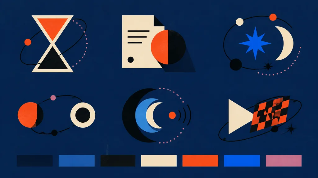
modern abstract vector icon style board for frontend assets. hourglass icon made from two cream-outlined triangles, upper chamber filled orange-red, lower chamber black, surrounded by a loose black orbital line with one small orange dot an…

vectorbộ-biểu-tượngbauhaus
Trang Đôi Tạp Chí Nhật Bản Phỏng Vấn Nhà Sáng Tạo

Trang Đôi Tạp Chí Nhật Bản Phỏng Vấn Nhà Sáng Tạo

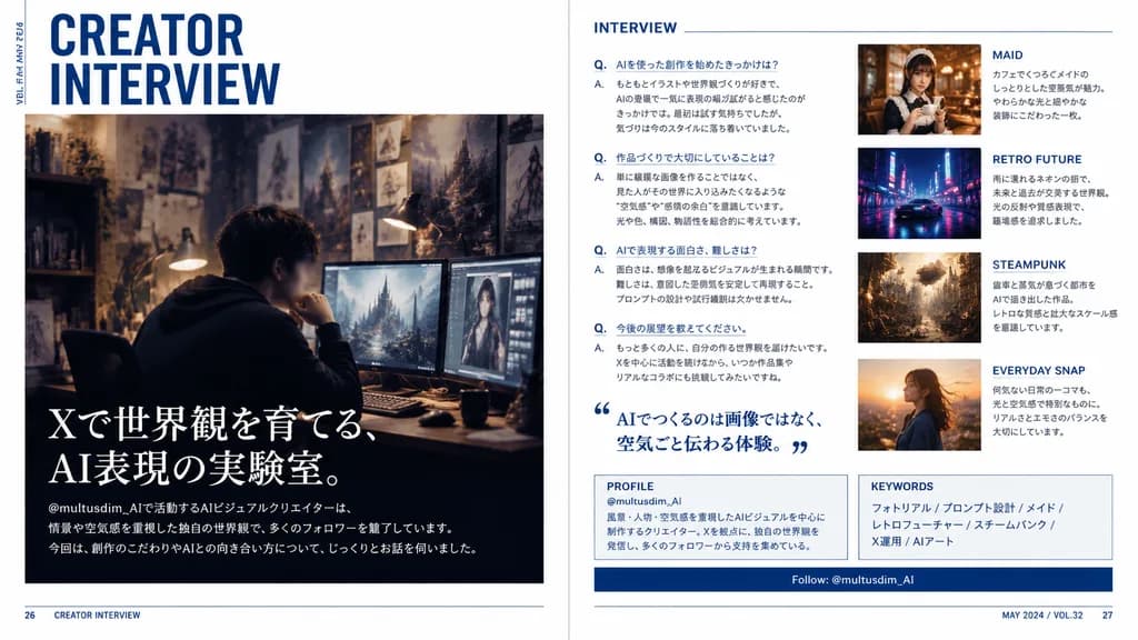
A polished two-page magazine spread in Japanese, designed like a contemporary creator profile feature in a premium culture and design magazine. The layout features a clean editorial interview spread with a crisp white background, deep navy blue accents, subtle rule lines, sharp grid alignment, and sophisticated typography. Left page: - Top left: large stacked headline reading “CREATOR INTERVIEW” in bold condensed sans-serif, with small vertical running text along the outer margin reading “VOL.23 / MAY 2024”. - Center to lower section: a large cinematic photo of a [male AI visual creator] sitting at a desk wearing a dark hoodie in a moody, dimly lit studio workspace. His face is subtly blurred or anonymized. The workspace features multiple glowing monitors showing digital artwork, a warm desk lamp, and background walls filled with concept sketches and fantasy art prints. - Lower left overlay on the photo: large Japanese feature headline in elegant white Mincho serif text reading “Xで世界観を育てる、AI表現の実験室。”, followed by smaller introductory Japanese body text referencing the handle “@multusdim_AI” and describing atmosphere-driven AI worldbuilding, along with a bottom horizontal editorial blurb. Right page: - Section 1 (left column): titled “INTERVIEW” in clean blue sans-serif, containing 4 structured Japanese Q&A entries labeled with blue “Q.” and “A.”, plus a large blue Japanese pull quote with stylized quote marks reading “AIでつくるのは画像ではなく、空気ごと伝わる体験。” - Image cards (right column, stacked vertically): 1. “MAID” card showing a warm cafe portrait of an elegant maid-themed woman holding a cup, with Japanese caption. 2. “RETRO FUTURE” card showing a neon-lit, rainy sci-fi street scene with a sleek car, with Japanese caption. 3. “STEAMPUNK” card showing an intricate brass clockwork city with steam and gears, with Japanese caption. 4. “EVERYDAY SNAP” card showing a candid outdoor portrait in golden hour sunset light, with Japanese caption. - Bottom panels: a boxed “PROFILE” section with handle “@multusdim_AI” and background bio, a “KEYWORDS” box listing “フォトリアル / プロンプト設計 / メイド / レトロフューチャー / スチームパンク / X運用 / AIアート”, and a navy blue horizontal bar reading “Follow: @multusdim_AI”. - Footer: page numbers 26 and 27 in bottom corners with small folio text “CREATOR INTERVIEW” and “MAY 2024 / VOL.32”. Authentic Japanese print typography and magazine layout hierarchy.

trang đôi tạp chíthiết kế biên tậpkiểu chữ nhật bản
Lưới Mẫu Thiết Kế Quảng Cáo Web

Lưới Mẫu Thiết Kế Quảng Cáo Web

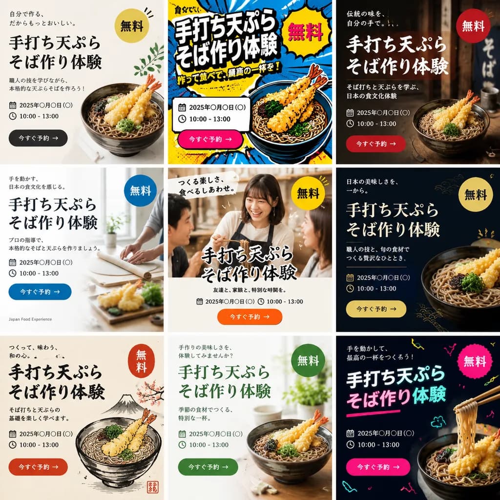
A single image displaying a 3x3 grid of 9 distinct web banner advertisements promoting a [handmade tempura soba noodle making workshop]. Each of the 9 banner designs features a completely different aesthetic style, layout, color palette, and background visual. Every advertisement includes prominent typographic elements: a bold Japanese main headline, supporting sub-copy, date and time placeholder, a bright "Free" badge, and a call-to-action button. The diverse styles span modern minimalist, vibrant pop art, traditional Japanese rustic aesthetic, clean corporate editorial, and casual lifestyle photography, tailored to attract [Gen Z and people in their 40s].

quảng cáo webthiết kế bannerbiến thể quảng cáo
Chỉnh Sửa Màn Hình Xác Minh OpenAI

Chỉnh Sửa Màn Hình Xác Minh OpenAI

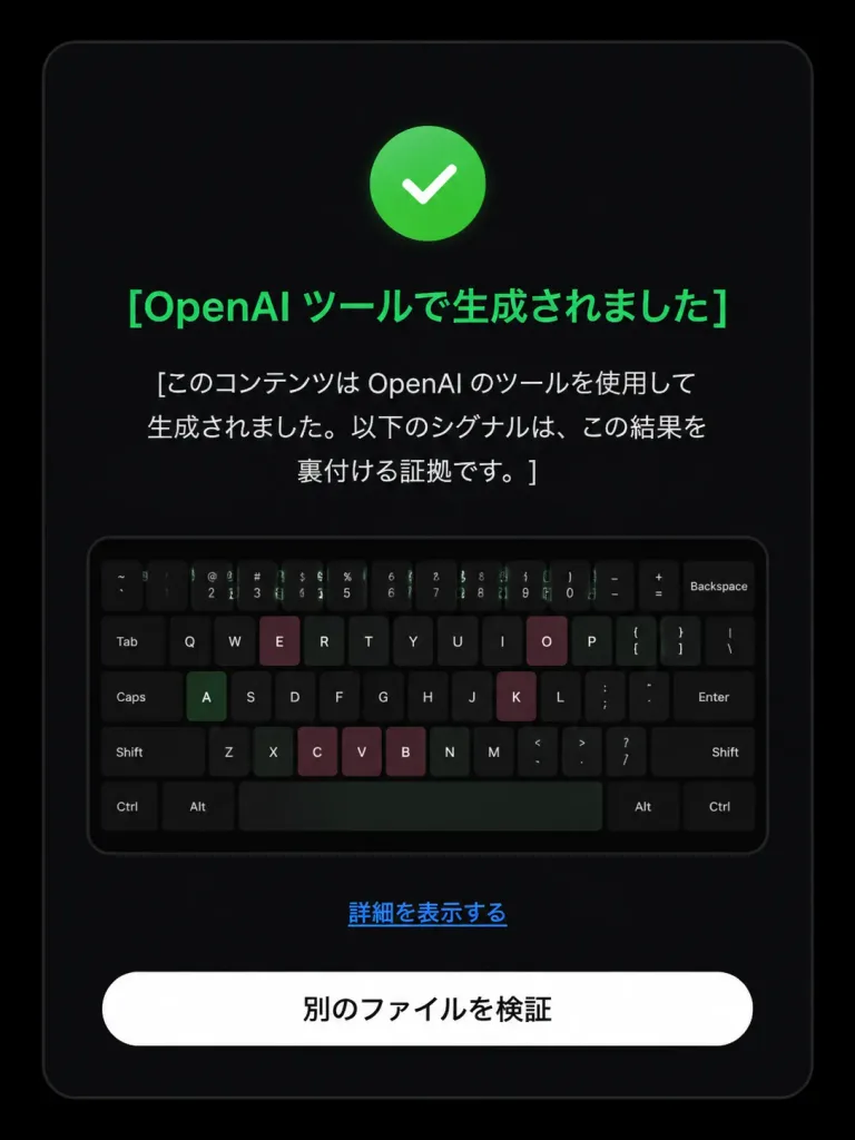
Based on the reference image, edit the dark verification-result screen to display a positive detection result. Maintain the original dark rounded card layout, centered composition, embedded keyboard thumbnail, bottom text link, and white rounded button. Modify exactly three status elements: 1. Replace the pink circular 'X' icon with a green circular checkmark icon. 2. Change the headline color to green with text: 「[OpenAI ツールで生成されました]」. 3. Update the body text below the headline to: 「[このコンテンツは OpenAI のツールを使用して生成されました。以下のシグナルは、この結果を裏付ける証拠です。]」. Preserve the remaining UI elements exactly as shown: - Link text: 「[詳細を表示する]」 - Button text: 「[別のファイルを検証]」 Style: Clean modern Japanese UI screenshot, authentic web app interface, high-contrast dark mode, rounded card borders.

thiết kế uimàn hình xác minhchế độ tối
Poster UI Ứng Dụng Âm Nhạc

Poster UI Ứng Dụng Âm Nhạc

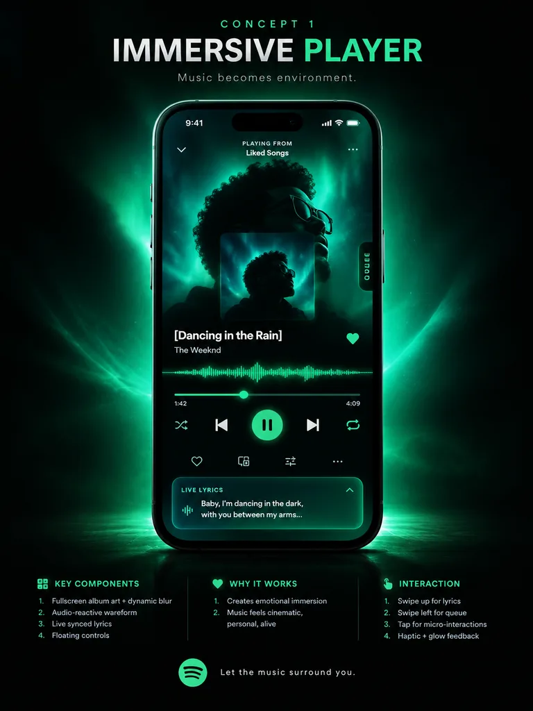
music app UI concept poster. premium futuristic mobile app showcase, dark mode, cinematic product presentation, Spotify-inspired green neon glow, high contrast, sleek glassmorphism, polished tech advertising aesthetic. IMMERSIVE PLAYER. mo…

ui-ux-designtrình phát nhạcmockup ứng dụng
Giao diện UI Trang Báo Giá AI Chế độ Tối

Giao diện UI Trang Báo Giá AI Chế độ Tối

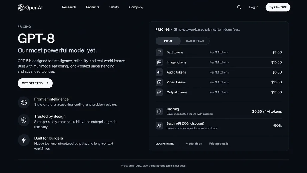
dark mode web page UI mockup. sleek, modern, dark theme with white and light grey text. GPT-8 is designed for intelligence, reliability, and real-world impact. Built with multimodal reasoning, long-context understanding, and advanced tool…

mockup uichế độ tốitrang bảng giá
Mockup Hero Trang Đích SaaS AI

Mockup Hero Trang Đích SaaS AI

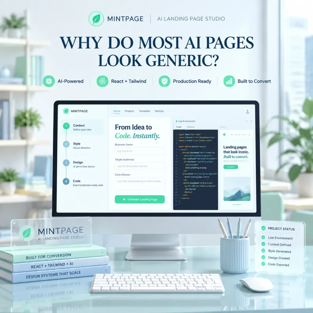
A polished square SaaS landing page hero image for [MINTPAGE], an AI landing page studio. In the center, a large desktop monitor rests on a glossy glass desk inside a bright, minimal modern office with soft daylight from a window on the right and soft-focus shelves and indoor plants in the background. At the top of the composition, display a neat brand header with a circular mint leaf logo, the text "[MINTPAGE]", a thin divider line, and the subtitle "[AI LANDING PAGE STUDIO]". Below the header, a prominent dark blue serif headline reads: "[WHY DO MOST AI PAGES LOOK GENERIC?]". Beneath the headline, arrange four small feature badges in a row with mint icons: "AI-Powered", "React + Tailwind", "Production Ready", "Built to Convert". The monitor screen shows a clean web-app builder UI with a top navbar and a three-panel split workspace: the left panel displays a 4-step vertical setup flow ("1) Context — Define your idea", "2) Style — Visual direction", "3) Design — AI generates layout", "4) Code — Export production ready code"); the center panel displays the heading "From Idea to Code. Instantly." with "Code. Instantly." in mint italic, above form fields for Business Name, Target Audience, and Core Mission; the right panel shows a "Live Environment" code editor with React/Tailwind code and a preview snippet reading "Landing pages that look iconic. Built to convert.". On the desk foreground, place a translucent acrylic desk plaque labeled "MINTPAGE" with the subtitle "AI LANDING PAGE STUDIO", stacked beside three slim books titled "BUILT FOR CONVERSION", "REACT + TAILWIND + AI", and "DESIGN SYSTEMS THAT SCALE"; in front of the screen sits a slim white keyboard; to the right sits a white mouse, a pale blue ribbed pen cup with four pens, and a translucent floating status card titled "PROJECT STATUS" showing five checked items ("Live Environment", "Context Defined", "Style Generated", "Design Created", "Code Exported"). Pastel mint and pale blue color palette, glassmorphism accents, soft volumetric lighting, crisp 3D mockup photography style, no people.

saasthiết-kế-uitrang-đích
Màn hình HUD Terminal Xanh Lá Retro

Màn hình HUD Terminal Xanh Lá Retro

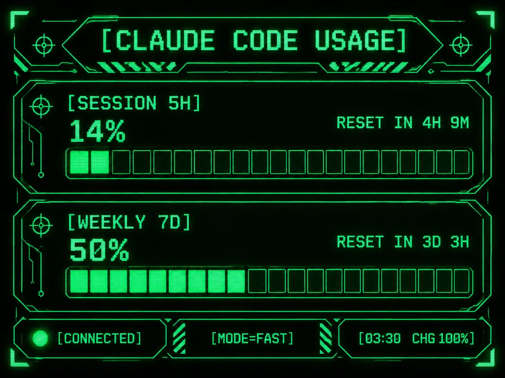
Retro-futuristic monochrome green terminal HUD interface designed for an M5Stack-style compact display. At the top, the title displays "[CLAUDE CODE USAGE]" in crisp pixelated typography. The body features two usage sections: the first labeled "[SESSION 5H]" displaying "14%" and "RESET IN 4H 9M", and the second labeled "[WEEKLY 7D]" displaying "50%" and "RESET IN 3D 3H". Each section includes a chunky horizontal gauge bar with exactly 20 rectangular segments; the upper gauge has 2 filled glowing segments and the lower gauge has 10 filled glowing segments. Along the bottom, three modular footer panels show: left "[CONNECTED]" with an illuminated status dot, center "[MODE=FAST]", and right "[03:30 CHG 100%]". Sci-fi frame with angular geometric borders, corner brackets, circuit line accents, tiny target icons, diagonal hazard striping, and subtle CRT scanline pixel glow on a deep black background.

terminalhudpixel art
Bảng Trình Bày Nguyên Mẫu Ứng Dụng Dinh Dưỡng

Bảng Trình Bày Nguyên Mẫu Ứng Dụng Dinh Dưỡng

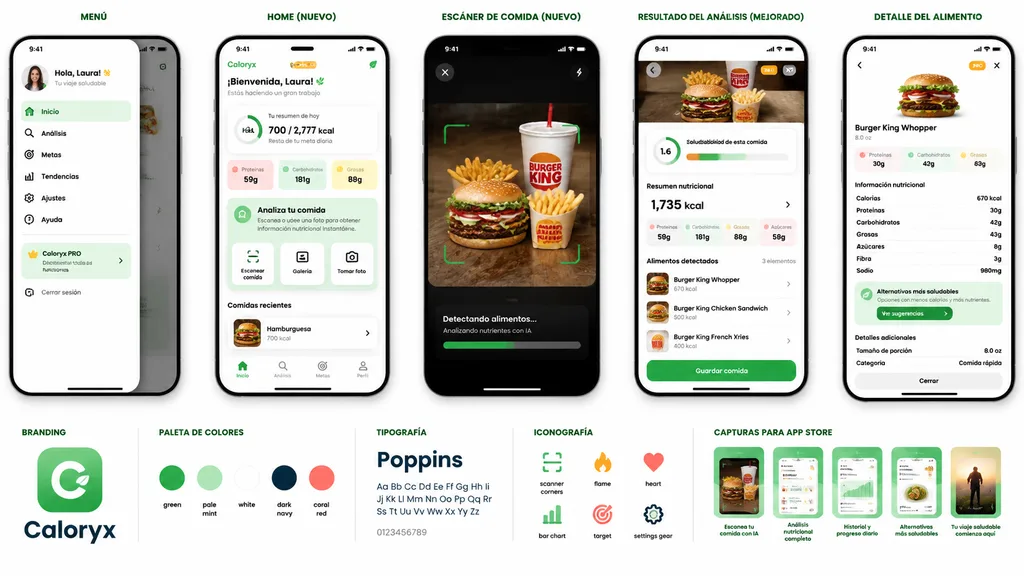
mobile app prototype presentation board for a nutrition and food scanner app. AI-powered meal scanning, calorie tracking, nutritional analysis, healthier alternatives, and progress dashboard. MENÚ. slide-out side navigation drawer with pro…

mockup-uiung-dung-di-dongtheo-doi-dinh-duong
Mockup Thiết Bị Hình Nền Lửa Trại Mùa Đông

Mockup Thiết Bị Hình Nền Lửa Trại Mùa Đông

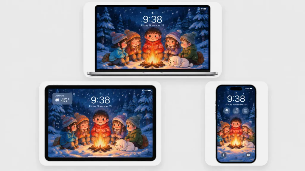
A polished multi-device product mockup showcasing a cozy winter wallpaper across three Apple-style devices set against a light gray studio background. Each device sits inside a rounded white display card with soft drop shadows: a laptop centered at the top, a tablet at the lower left, and a smartphone at the lower right. All screens display the same Japanese crayon-anime illustration cropped to fit: five cute cartoon children and a sleeping small white dog gathered around a glowing campfire in a snowy pine forest at night under falling snow and deep navy-blue trees, illuminated by warm orange firelight. Behind the campfire stands a round-faced child in a red winter sweater, flanked by friends in winter attire. Realistic lock-screen UI overlays appear on the screens: time "[9:38]", date "[Friday, November 15]", status icons, and translucent widgets. The tablet includes an upper-left translucent weather widget displaying "[Cupertino]" and "[45°]"; the phone features three circular widgets below the time and dual bottom lock-screen icons. Clean minimalist tech mockup, thin black bezels, soft ambient lighting, sharp screen details, no brand logos or watermarks.

mockuphình nềnthiết bị
Giao Diện Game Đấu Tướng Tự Động Giả Tưởng

Giao Diện Game Đấu Tướng Tự Động Giả Tưởng

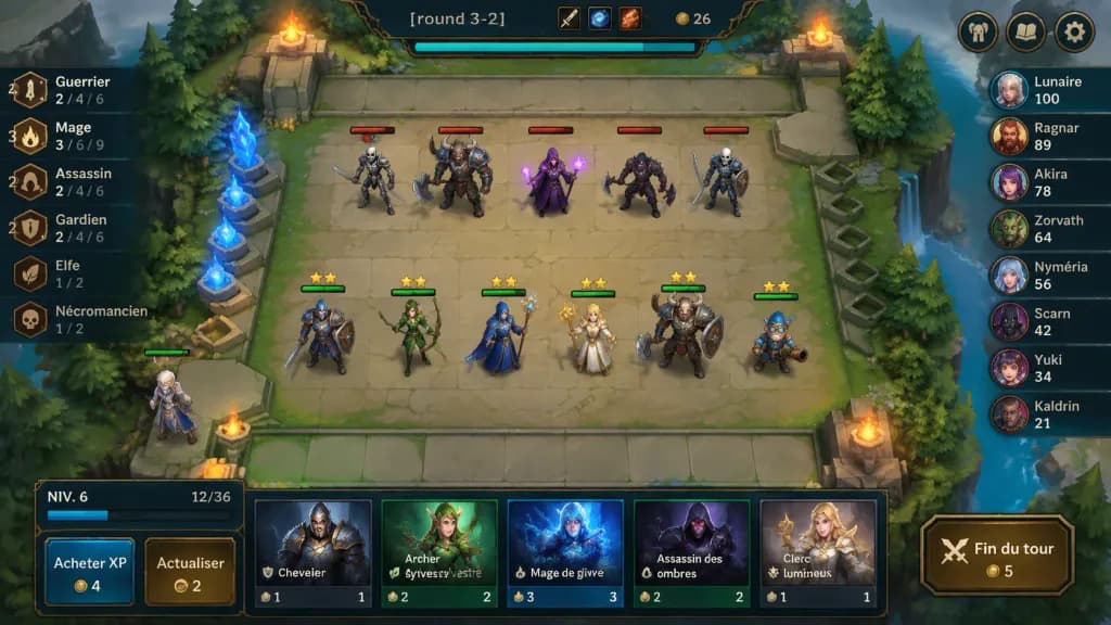
A polished 2D fantasy auto-battler gameplay mockup screenshot for [round 3-2], shown from an isometric top-down perspective with crisp hand-painted fantasy game art and a League-of-Legends/TFT-inspired interface. In the center is a square stone battlefield grid on a floating forest platform with worn beige tiles, mossy edges, stone railings, evergreen trees, cliffs, water at the right edge, glowing blue crystals on the left, and four flaming braziers near the arena corners. Top center ornate dark HUD bar displays "[round 3-2]", item icons, gold counter "26", and a cyan progress bar beneath; top-right features three rounded menu buttons (helmet, book, gear). On the board, exactly 11 visible characters: 5 enemy units on the upper half with red health bars (skeleton swordsman, horned beast warrior with axe, purple mage holding magic, dark rogue with axe, armored skeleton fighter); 6 allied units on the lower half with green health bars and yellow star ratings (blue-and-brown knight, green elf archer, blue-armored staff mage, blonde cleric with golden staff, horned tank warrior with shield, small blue gnome engineer); plus one bench character at the lower-left edge. Left trait panel shows 6 vertical synergy rows with bronze icons: "Guerrier" with "4" and "2 / 4 / 6"; "Mage" with "3" and "3 / 6 / 9"; "Assassin" with "2" and "2 / 4 / 6"; "Gardien" with "2" and "2 / 4 / 6"; "Elfe" with "1 / 2"; "Nécromancien" with "1 / 2". Right leaderboard shows 8 players with circular fantasy avatars: "Lunaire 100", "Ragnar 89", "Akira 78", "Zorvath 64", "Nyméria 56", "Scarn 42", "Yuki 34", "Kaldrin 21". Bottom shop panel features a level box reading "NIV. 6" with XP "12/36", two buttons labeled "Acheter XP" (cost 4) and "Actualiser" (cost 2), five champion shop cards ("Chevalier" cost 1, "Archer sylvestre" cost 2, "Mage de givre" cost 3, "Assassin des ombres" cost 2, "Clerc lumineux" cost 1), and a gold-bordered button labeled "Fin du tour" (cost 5). Saturated colors, soft ambient lighting, clean bevels, dark teal and bronze frames.

auto-battlergiao-diện-gamemockup
Màn Hình LCD Máy Ảnh Kỹ Thuật Số Cổ

Màn Hình LCD Máy Ảnh Kỹ Thuật Số Cổ

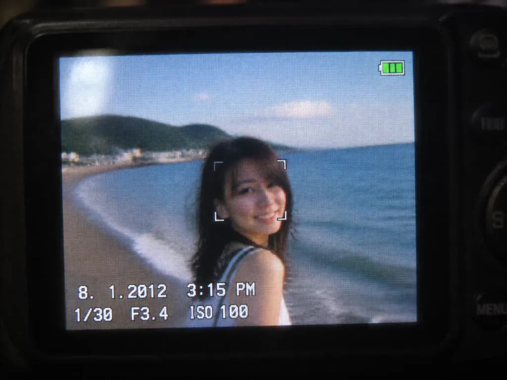
A close-up shot of a small digital camera LCD screen displaying an [early 2010s style] photo based on the reference photo, capturing a nostalgic compact camera aesthetic. The image features slight motion blur, digital grain, visible LCD pixel grid structure, compressed digital artifacts, subtle glare, and soft colors characteristic of an early 2010s CCD sensor. A realistic on-screen camera UI overlay displays the timestamp '8. 1. 2012 3:15 PM', exposure settings '1/30 F3.4 ISO 100', a focus indicator, and a small green battery icon in the corner. Outside the illuminated LCD, the surrounding dark camera body softly blurs into darkness.

máy ảnh kỹ thuật sốcảm biến ccdkỹ thuật số cổ
Bản mẫu giao diện phát trực tiếp trên di động

Bản mẫu giao diện phát trực tiếp trên di động

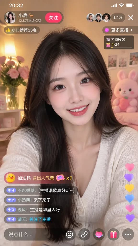
mobile live-streaming app interface mockup. young Asian woman, long dark hair, smiling at camera. [white V-neck cardigan]. cozy room, warm lighting, pink flowers, pink plush toy. 20:32. [小鹿 🦌]. 12.8万本场点赞. 关注. [1.2万]. X. 小时榜第23名. 更多直播 >. 礼…

phát trực tiếpgiao diện di độngbản mẫu ứng dụng
Lưới Biểu Tượng Linh Vật Ứng Dụng 3D Dễ Thương

Lưới Biểu Tượng Linh Vật Ứng Dụng 3D Dễ Thương

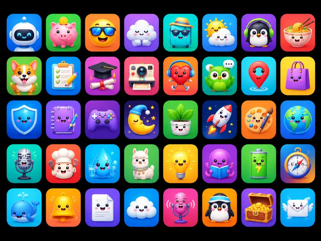
A polished app-store mascot icon showcase featuring [40] unique cute 3D mascot icons, designed as ASO-friendly mobile app icon concepts. Composition and canvas: Horizontal 4:3 composition on a solid pure black background, displaying a neat grid of rounded-square app tiles arranged in exactly 5 rows and 8 columns, evenly spaced with uniform margins. Each tile is a glossy squircle with a smooth soft gradient background, subtle inner glow, and a soft drop shadow. No text, no typographic labels, no watermarks. Visual style: High-end 3D clay and toy mascot style, kawaii expressions, big friendly glossy eyes, tiny smiles, smooth rounded forms, vibrant saturated colors, bright studio lighting, soft ambient occlusion shadows, crisp clean edges, premium iOS icon aesthetic. Icon grid details (40 discrete items arranged left to right, top to bottom): 1. White robot head mascot on blue gradient 2. Pink piggy bank with gold coin on green gradient 3. Smiling yellow face wearing a sun visor on orange gradient 4. Sleepy white cloud hugging itself on purple gradient 5. Turquoise suitcase wearing sunglasses and straw hat on teal gradient 6. Cute sun peeking behind a raincloud on blue gradient 7. Black penguin wearing green headphones on purple gradient 8. Smiling noodle bowl with chopsticks on red-orange gradient 9. Happy corgi dog mascot on green gradient 10. Checklist clipboard with pencil on blue gradient 11. Graduation cap over diploma silhouette on purple-pink gradient 12. Cute retro instant camera on pink-red gradient 13. Red running heart character with headphones on orange-red gradient 14. Green owl with speech bubble on teal gradient 15. Red map pin mascot on cyan gradient 16. Purple shopping bag character on yellow gradient 17. Blue glossy shield mascot on deep blue gradient 18. Purple notebook mascot holding a pen on violet gradient 19. Purple game controller mascot on dark purple gradient 20. Sleeping crescent moon wearing a nightcap on dark starry gradient 21. Smiling potted houseplant in white pot on green gradient 22. White rocket launching on navy starry gradient 23. Artist palette mascot with paintbrush on orange gradient 24. Smiling planet Earth globe on blue gradient 25. Vintage microphone mascot on teal gradient 26. Chef mascot with chef hat and spatula on red-orange gradient 27. Smiling water droplet holding a glass of water on cyan gradient 28. Fluffy llama mascot on green gradient 29. Glowing yellow lightbulb mascot on yellow-orange gradient 30. Purple octopus reading an open book on violet gradient 31. Green battery mascot with lightning bolt on green gradient 32. Directional compass mascot on blue-orange gradient 33. Blue whale mascot with water spout on cyan gradient 34. Shiny yellow bell mascot on orange gradient 35. Smiling white folded document mascot on purple gradient 36. Happy fluffy cloud mascot on blue gradient 37. Pink microphone mascot with soundwaves on magenta gradient 38. Penguin mascot wearing a sporty visor on orange gradient 39. Wooden treasure chest overflowing with gold coins on purple gradient 40. Smiling postal envelope mascot with angel wings on sky blue gradient Constraints: Maintain strict uniform size, visual fidelity, and lighting angle across all 40 icons.

biểu tượng ứng dụngbiểu tượng 3dkawaii
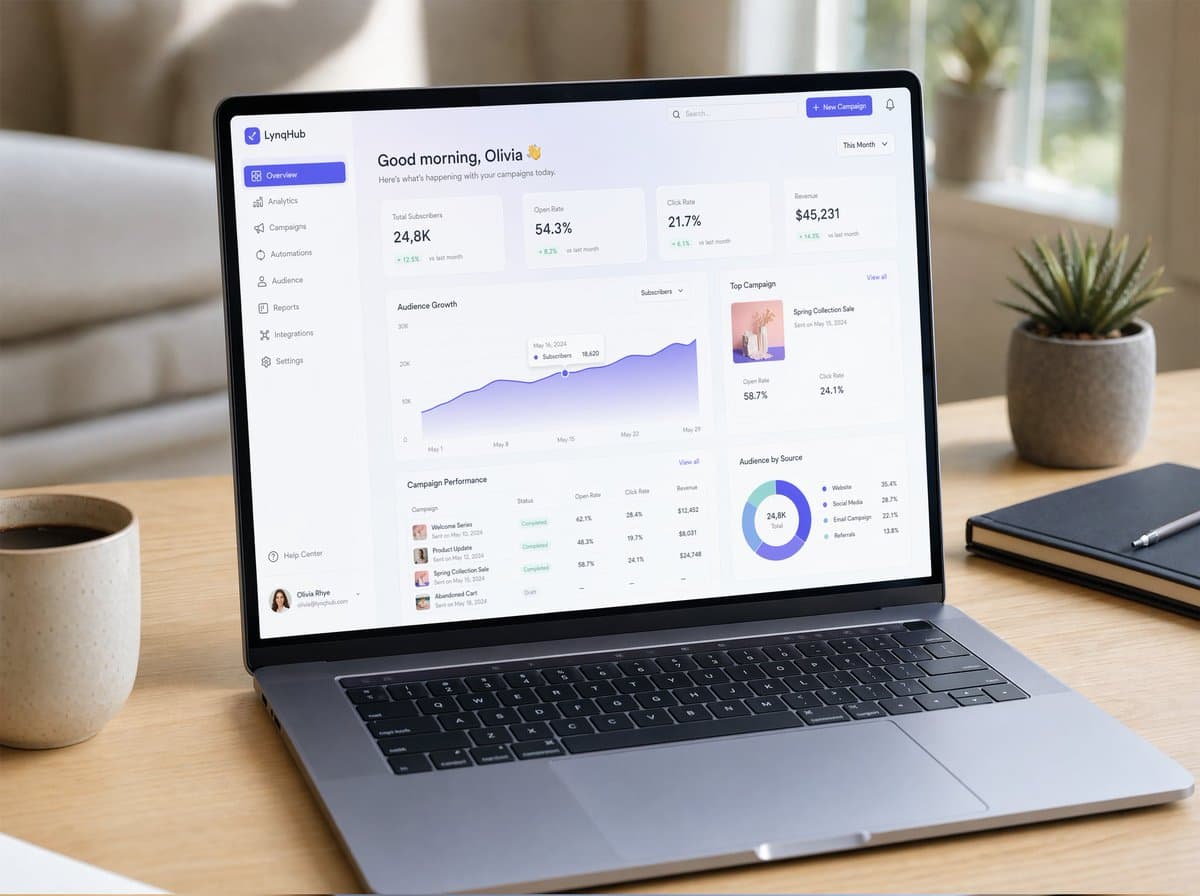
Mockup Laptop SaaS Dashboard

Mockup Laptop SaaS Dashboard

Một bản mockup UI/UX siêu thực được hiển thị trên một chiếc laptop hiện đại mỏng đặt trên bàn gỗ tối giản với ánh sáng ban ngày tự nhiên êm dịu. Màn hình hiển thị một SaaS dashboard gọn gàng với nghệ thuật chữ thanh lịch, các thẻ glassmorphism, dải màu gradient mượt mà, bóng đổ tinh tế và các thành phần được căn lề đều đặn. Hiển thị rõ các biểu đồ, bảng phân tích, thanh điều hướng sidebar và micro-interactions. Khung cửa sổ mang phong cách macOS chân thực, hình ảnh phản chiếu nhẹ trên màn hình, độ sâu trường ảnh nông (shallow depth of field), không gian làm việc ấm cúng, được chụp theo phong cách nhiếp ảnh sản phẩm siêu thực (photorealistic), cực kỳ chi tiết.

mockup UInhiếp ảnh sản phẩmSaaS
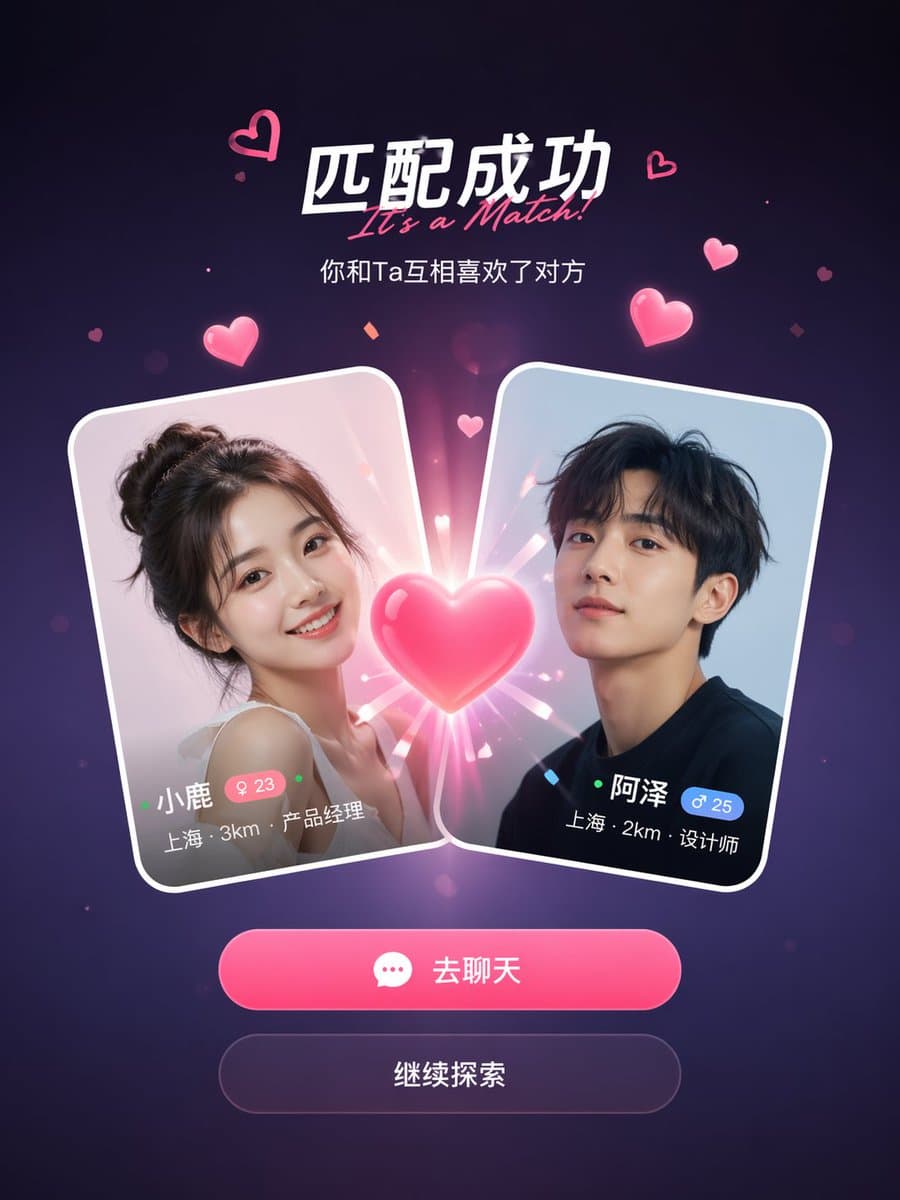
Màn hình ghép đôi thành công ứng dụng xã hội

Màn hình ghép đôi thành công ứng dụng xã hội

Một mockup màn hình ghép đôi thành công của ứng dụng hẹn hò xã hội. Hai thẻ hồ sơ người dùng va vào nhau ở giữa với hiệu ứng trái tim phát sáng ở giữa. Tiêu đề ghi "It's a Match!" với một phụ đề bên dưới. Mỗi thẻ hiển thị ảnh đại diện, tên, tuổi, vị trí và chức danh công việc. Bên dưới các thẻ là hai nút hành động: một nút "Chat" chính màu hồng và một nút "Continue" phụ. Nền gradient màu tím đậm với các hạt trái tim màu hồng lơ lửng và hiệu ứng lấp lánh. Thiết kế mobile UI sạch sẽ, hiện đại, tỷ lệ khung hình dọc 9:16, thẩm mỹ ảnh chụp màn hình ứng dụng chân thực, bóng đổ được trau chuốt và các cạnh thẻ theo phong cách glass-morphism.

ứng dụng xã hộiUI mockupmàn hình ghép đôi
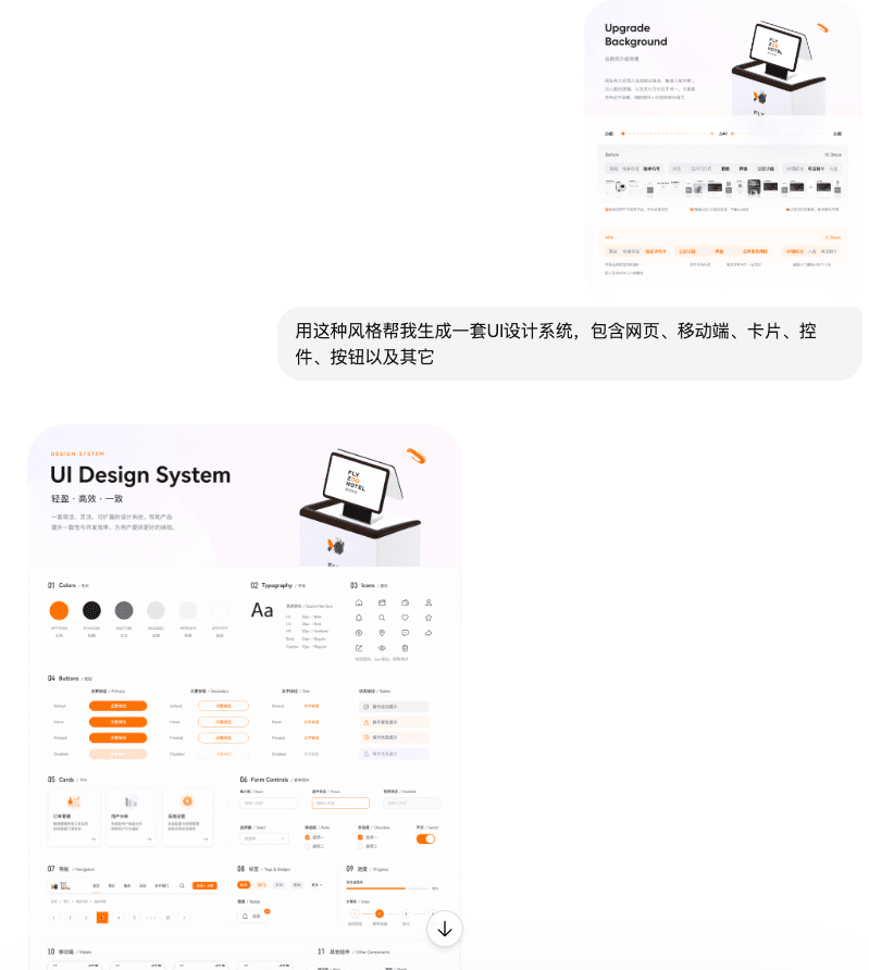
Hệ thống thiết kế UI

Hệ thống thiết kế UI

Sử dụng phong cách này để giúp tôi tạo một hệ thống thiết kế UI, bao gồm các trang web, thiết bị di động, thẻ, bộ điều khiển, nút bấm và các thành phần khác

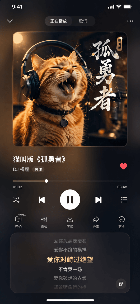
Giao diện phần mềm #44

Giao diện phần mềm #44

Từ khóa gợi ý Vẽ hình ảnh trang Now Playing của một ứng dụng âm nhạc hư cấu. Ảnh bìa album ở trên cùng hiển thị một chú mèo mướp màu cam đang đeo tai nghe. Tên bài hát ở giữa là "Cat Meowing Version of "Lonely Brave"" và tên ca sĩ là "DJ Orange Seat". Thanh tiến trình và các nút điều khiển ở phía dưới, khu vực cuộn lời bài hát ở dưới cùng, và hiệu ứng kính mờ tối màu tổng thể.

Giao diện phần mềm #43

Giao diện phần mềm #43

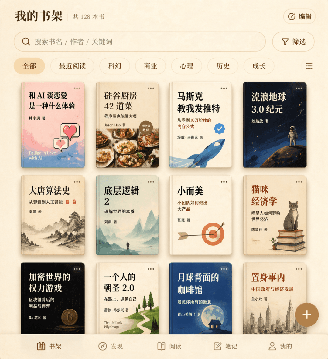
Prompt Words Vẽ giao diện giá sách cho một ứng dụng đọc sách hư cấu. Lưới bìa sách 3 hàng hiển thị 12 tựa sách hư cấu, bao gồm "What's it like to fall in love with AI", "42 Dishes from the Silicon Valley Kitchen", "Musk Taught Me to Tweet", v.v., với hộp tìm kiếm và nhãn bộ lọc ở trên cùng, nút thêm nổi ở góc dưới bên phải và tổng thể bề mặt giấy da màu be.

Giao diện phần mềm #42

Giao diện phần mềm #42

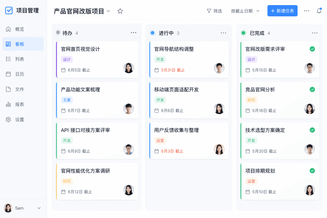
Prompt Words Vẽ ảnh chụp màn hình chế độ xem bảng điều khiển của một ứng dụng quản lý tác vụ hư cấu. Có ba cột gồm "To Do", "In Progress" và "Completed", mỗi cột có từ ba đến bốn thẻ. Mỗi thẻ chứa tiêu đề, nhãn, thời hạn và ảnh đại diện của người phụ trách, với thiết kế tổng thể theo phong cách phẳng.

Giao diện phần mềm #41

Giao diện phần mềm #41

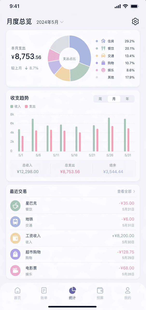
Prompt Words Vẽ trang tổng quan hàng tháng của một ứng dụng kế toán hư cấu. Biểu đồ hình khuyên ở trên cùng hiển thị phân loại chi tiêu, biểu đồ cột ở giữa, danh sách năm giao dịch gần đây ở dưới cùng, bảng màu Morandi tổng thể và biểu tượng bánh răng ở góc trên bên phải.

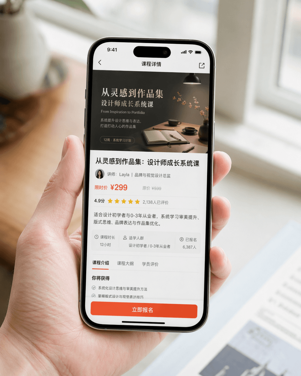
Hình ảnh quảng bá ảnh chụp màn hình điện thoại di động

Hình ảnh quảng bá ảnh chụp màn hình điện thoại di động

Tạo một hình ảnh quảng bá ảnh chụp màn hình điện thoại di động cực kỳ chân thực. Thiết bị là iPhone 15 Pro. Nội dung màn hình là trang chi tiết khóa học của một ứng dụng học thiết kế. Trang hiển thị rõ ràng ảnh bìa khóa học, tiêu đề khóa học, thông tin giảng viên, thông tin giá cả, đánh giá của người dùng, phần tóm tắt và nút "Register Now" bắt mắt. Bức ảnh là một bố cục cận cảnh chụp một người đang cầm điện thoại di động một cách tự nhiên. Bàn tay của nhân vật sạch sẽ và tự nhiên, màn hình điện thoại rõ ràng và sáng, còn hậu cảnh được làm mờ. Tổng thể bức ảnh trông giống như hình ảnh PR sản phẩm được thương hiệu phát hành chính thức. Yêu cầu kết cấu nhiếp ảnh chân thực, ánh sáng dịu nhẹ và cao cấp, bố cục súc tích cùng các chi tiết chân thực. Tránh UI phóng đại, phong cách thương mại điện tử giá rẻ và thiết kế rườm rà quá mức.

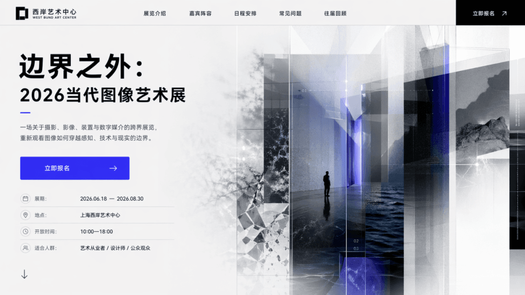
Màn hình chính của landing page sự kiện

Màn hình chính của landing page sự kiện

Thiết kế trang chủ landing page sự kiện với chủ đề "Beyond the Boundary: 2026 Contemporary Image Art Exhibition" và CTA là "Register Now." Trang phải bao gồm tiêu đề chính, tiêu đề phụ, các nút bấm, hình ảnh bổ trợ và thông tin triển lãm, giống như màn hình đầu tiên của một trang web thực tế.

Bảng điều khiển SaaS

Bảng điều khiển SaaS

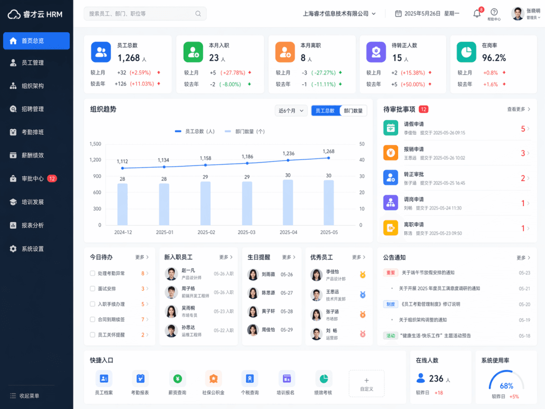
Tạo giao diện bảng điều khiển SaaS, loại sản phẩm là "Enterprise Human Resources Management System". Trang chủ hậu đài quản trị HR thực tế được hiển thị tổng thể, bao gồm điều hướng bên trái, thanh tìm kiếm trên cùng, thẻ thống kê nhân viên, biểu đồ xu hướng tổ chức, mô-đun phê duyệt và mô-đun người dùng. Giao diện gọn gàng và hợp lý, giống như một hệ thống văn phòng doanh nghiệp hoàn chỉnh.

Bản đồ ý tưởng trang chủ ứng dụng

Bản đồ ý tưởng trang chủ ứng dụng

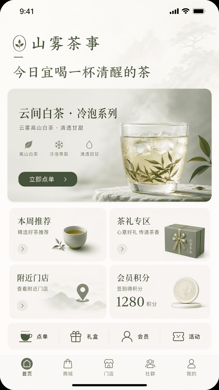
Thiết kế giao diện ý tưởng trang chủ ứng dụng theo phong cách iPhone. Tên thương hiệu là "Shanwu Tea Shi", ngành hàng là đồ uống trà Trung Hoa thế hệ mới/phong cách sống về trà, và các chức năng gồm đặt hàng tại quán, đề xuất sản phẩm trà ủ lạnh mới, mua sắm quà tặng trà, điểm thành viên và tra cứu cửa hàng gần đây. Phần trên cùng của trang chủ hiển thị lời chào thương hiệu "Today is a good time to drink a cup of sober tea", hình ảnh thị giác chính là thẻ giới thiệu sản phẩm mới "Yunjian White Tea·Cold Brew Series", và nút bấm là "Order Now"; ở giữa có bốn mô-đun: gợi ý tuần này, khu vực quà tặng trà, cửa hàng gần đây và điểm thành viên; một hàng lối vào nhanh được thêm vào bên dưới: đặt hàng, hộp quà, thành viên và hoạt động; thanh điều hướng dưới cùng gồm trang chủ, trung tâm mua sắm, cửa hàng, cộng đồng và trang cá nhân. Giao diện tổng thể cần có khí chất phương Đông đầy kiềm chế + cảm giác thương hiệu chín muồi. Bảng màu nên được kiểm soát trong vòng ba màu: trắng nhạt, xanh trà và xám mặt trăng. Giao diện phải giống như trang chủ ứng dụng của một thương hiệu phong cách sống cao cấp, với phân cấp rõ ràng, thông tin ngắn gọn, các nút bấm hợp lý và toàn bộ văn bản bằng tiếng Trung chính xác.

Góc làm việc nhà văn nửa đêm

Góc làm việc nhà văn nửa đêm

"Hệ thống giao diện máy tính dành cho người viết văn đêm muộn", thiết kế giao diện UI kết hợp với nhiếp ảnh tĩnh vật mang hơi hướng văn học. Màn hình hiển thị phong cách chủ đề đồng nhất của màn hình máy tính, giao diện bộ gõ tiếng, đồng hồ bấm giờ tập trung, biểu tượng thư mục, hình nền đêm, hiệu ứng ánh sáng bàn phím cơ và các tiện ích màn hình desktop. Màu sắc gồm đen than, trắng ánh trăng, đỏ rượu vang sẫm và đồng cổ. Khí chất điềm đạm, trưởng thành, tỷ lệ 16:9.

Bảng điều khiển vận hành lễ hội

Bảng điều khiển vận hành lễ hội

"Summer Music Festival Backstage Operation Overview", bảng điều khiển sự kiện quy mô lớn được tích hợp với ảnh chụp tại chỗ. Nền chính là lối đi, thùng thiết bị, khu vực nghỉ ngơi của nghệ sĩ và điểm tập trung tình nguyện viên phía sau sân khấu. Tiền cảnh xếp chồng dòng thời gian biểu diễn, cấp độ an ninh, điểm cấp nước uống, bản đồ nhiệt lưu lượng người, cảnh báo thời tiết và giám sát âm lượng. Tiêu đề giống như màn hình phòng điều khiển trung tâm sự kiện, tỷ lệ 16:9.

“Giao diện hệ thống thành viên quán trà phong cách Steampunk”

“Giao diện hệ thống thành viên quán trà phong cách Steampunk”

"Giao diện hệ thống thành viên quán trà phong cách Steampunk", UI thành viên được tích hợp với phong cách trang trí công nghiệp cổ điển. Giao diện chính hiển thị cấp độ thành viên "Copper Pot/Silver Cup/Golden Furnace/Cloud Mist Master", và quy tắc tích điểm được thể hiện như một bảng điều khiển hơi nước khói trà. Nền là các bánh răng, ống đồng, bàn gỗ cũ và đồ gốm hoa lam. Màu sắc phong phú nhưng không rối mắt, và tỷ lệ là 9:16.

"Biến tình yêu thành trang quản trị sản phẩm SaaS"

"Biến tình yêu thành trang quản trị sản phẩm SaaS"

"Biến tình yêu thành trang quản trị sản phẩm SaaS", trang tổng quan sản phẩm internet được tích hợp với lối kể chuyện cảm xúc và sự hài hước. Các mô-đun trang bao gồm tần suất giao tiếp, đỉnh điểm cảm xúc, tỷ lệ lưu giữ ký ức chung, tốc độ hóa giải hiểu lầm, thanh tiến trình lập kế hoạch tương lai và lời nhắc cảnh báo red flag. Giao diện chuyên nghiệp và chừng mực, nhưng mỗi chỉ số đều mang một ẩn dụ cảm xúc, tỷ lệ 16:9.

Cổng việc làm triều Minh

Cổng việc làm triều Minh

"Trang chủ trang web tìm việc dành cho người thời nhà Minh", sự kết hợp hài hước giữa trang phục lịch sử và giao diện nền tảng tuyển dụng hiện đại. Giao diện chính có các gợi ý việc làm như "thái sử lệnh/giảng sư thư viện/kế toán thị bạc ty/đốc công cục dệt/họa sĩ cung đình", và điều kiện lọc là "tinh thông thi phú/thông hiểu toán thuật/giỏi cưỡi ngựa bắn cung/có thể đi công tác". Thẻ sơ yếu lý lịch cá nhân sử dụng chân dung vẽ nét tỉ mỉ (công bút), đơn vị tiền lương được tính bằng bổng ngân và thạch mễ. Bố cục hoàn toàn giống như trang chủ của một sản phẩm tuyển dụng thực tế, tỷ lệ 16:9.

Kiosk bệnh viện ban đêm

Kiosk bệnh viện ban đêm

"Giao diện máy tự phục vụ bệnh viện lúc ba giờ sáng" kết hợp bầu không khí không gian mang tính tài liệu với giao diện UI chuẩn mực, chặt chẽ. Bức ảnh là góc nhìn cận cảnh của một trạm tự phục vụ trong bệnh viện. Nội dung màn hình hiển thị rõ ràng các nút chức năng như đăng ký khám, in phiếu kết quả, thanh toán, chỉ đường và vị trí quầy thuốc trực đêm. Xung quanh chiếc máy là sảnh chờ vắng lặng, ánh đèn trắng lạnh và những con người mệt mỏi nhưng trật tự. Tổng thể bức tranh toát lên vẻ tĩnh lặng, chân thực và thoáng nét mong manh của đời sống nhân sinh. Tỷ lệ khung hình là 9:16.

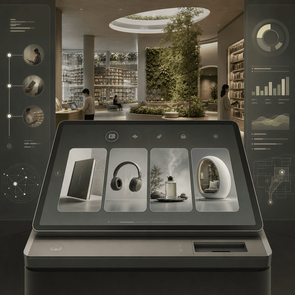
"Thiết bị mượn sách thư viện tương lai"

"Thiết bị mượn sách thư viện tương lai"

"Thiết bị mượn sách thư viện tương lai", giao diện UI của sản phẩm được tích hợp với bản vẽ ý niệm không gian kiến trúc. Tiền cảnh là màn hình lớn của một trạm mượn sách theo phong cách tối giản, có thể lọc sách giấy, tệp âm thanh, ký ức mùi hương và các cabin đọc sách đắm chìm. Hậu cảnh là không gian thư viện mở với những giá sách trải dài và bức tường cây xanh. Thanh bên hiển thị quy trình trải nghiệm của độc giả, dữ liệu mượn và điều hướng không gian. Màu sắc điềm tĩnh và tiết chế, tỷ lệ 16:9.

Tái thiết kế gọi món cà phê: Lo âu xã hội

Tái thiết kế gọi món cà phê: Lo âu xã hội

"Redesign of the cafe ordering system for socially anxious users", sơ đồ đề xuất thiết kế dịch vụ, màn hình chính hiển thị giải pháp mới cho quầy cà phê và màn hình gọi món tự phục vụ, giảm tiếp xúc ngôn ngữ, thêm tùy chọn "default recommendation/no communication for meal taking/seat preference/volume area", mở rộng hệ thống biểu tượng, thẻ bàn, thẻ nhận món và sơ đồ luồng di chuyển khu vực chờ ở bên phải. Cảm giác tổng thể rất chân thực, tỷ lệ 16:9.

"Màn hình tổng quan giám sát khu bảo tồn rừng nhiệt đới"

"Màn hình tổng quan giám sát khu bảo tồn rừng nhiệt đới"

"Rainforest Reserve Monitoring Overview Screen" tích hợp bảng điều khiển nghiên cứu khoa học sinh thái và nhiếp ảnh thiên nhiên sống động. Nền chính của bức ảnh là khung cảnh hùng vĩ nhìn từ trên cao xuống tán rừng mưa nhiệt đới. Tiền cảnh được xếp lớp dữ liệu bán trong suốt: mật độ tán rừng, quỹ đạo hoạt động của động vật có nguy cơ tuyệt chủng, cảnh báo săn trộm, biểu đồ lượng mưa và bể hấp thụ carbon. Tiêu đề mang phong cách tầm nhìn của một dự án bảo vệ môi trường Liên Hợp Quốc. Khí chất chuyên nghiệp và trang nghiêm, màu sắc tươi sáng nhưng không quá bão hòa, và tỷ lệ khung hình là 16:9.

"Trang theo dõi bưu kiện của Bưu điện Vũ trụ"

"Trang theo dõi bưu kiện của Bưu điện Vũ trụ"

"Package tracking page of the Space Post Office" tích hợp giao diện người dùng hệ thống hậu cần với thế giới quan khoa học viễn tưởng. Hình ảnh là một trang chi tiết theo dõi bưu kiện, và lộ trình được hiển thị từng chặng từ "Earth-Low Earth Orbit-Moon Transfer Station-Mars North Port". Các biểu tượng nút được thiết kế dưới dạng tên lửa nhỏ, khoang chở hàng, hải quan vũ trụ và khu vực cảnh báo thiên thạch. Ở bên phải là danh sách các món đồ trong bưu kiện: bưu thiếp, lá trà, ảnh chụp và áo len cũ. Tổng thể hình ảnh toát lên vẻ điềm tĩnh, lý tính nhưng vẫn phảng phất nét ấm áp tình người, tỷ lệ khung hình 9:16.

Tài liệu cộng tác dạng thẻ tre

Tài liệu cộng tác dạng thẻ tre

"Multi-person collaborative document interface in the Warring States Period" là sự kết hợp phi lý giữa tài liệu thẻ tre và thiết kế sản phẩm tài liệu trực tuyến. Bức tranh trông giống như giao diện trình chỉnh sửa cộng tác theo thời gian thực, nhưng lớp dưới cùng là những thẻ tre mở ra cùng nét mực lông. Bong bóng bình luận từ các tác giả khác nhau được đánh dấu bằng "Gongsun Long is editing", "Han Fei suggested deletion" và "Su Qin proposed changing the title". Thanh bên là lịch sử phiên bản và bình luận. Toàn bộ hình ảnh tràn ngập sự nghiêm cẩn học thuật cùng tính hài hước của văn phòng thời Internet, tỷ lệ 16:9.

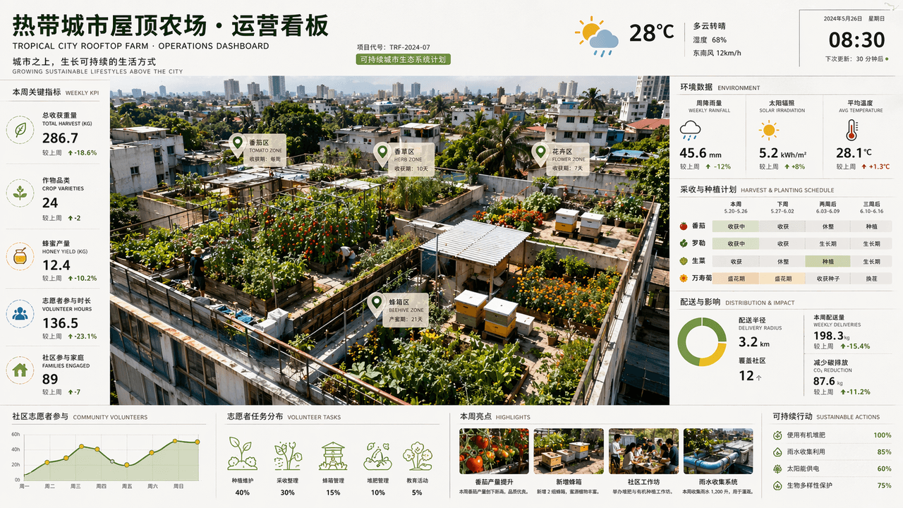
Bảng thông tin vận hành trang trại tầng thượng thành phố nhiệt đới

Bảng thông tin vận hành trang trại tầng thượng thành phố nhiệt đới

"Tropical City Rooftop Farm Operations Dashboard" là sự kết hợp giữa nhiếp ảnh chụp từ trên không và bảng điều khiển thương mại. Cà chua, thảo mộc, hoa và các tổ ong được nuôi trồng trên các mái nhà khác nhau trong góc nhìn từ trên cao. Cạnh màn hình hiển thị lượng mưa hàng tuần, bức xạ mặt trời, chu kỳ thu hoạch, bán kính phân phối và dữ liệu tham gia của tình nguyện viên cộng đồng. Tiêu đề giống như trang báo cáo dự án bền vững của một công ty kiến trúc. Bảng màu gồm xanh lá cây, nâu đất, vàng nắng và xanh lam sau mưa. Bố cục giàu thông tin nhưng hình ảnh vẫn tươi mới, thoáng đãng, với tỷ lệ khung hình 16:9.

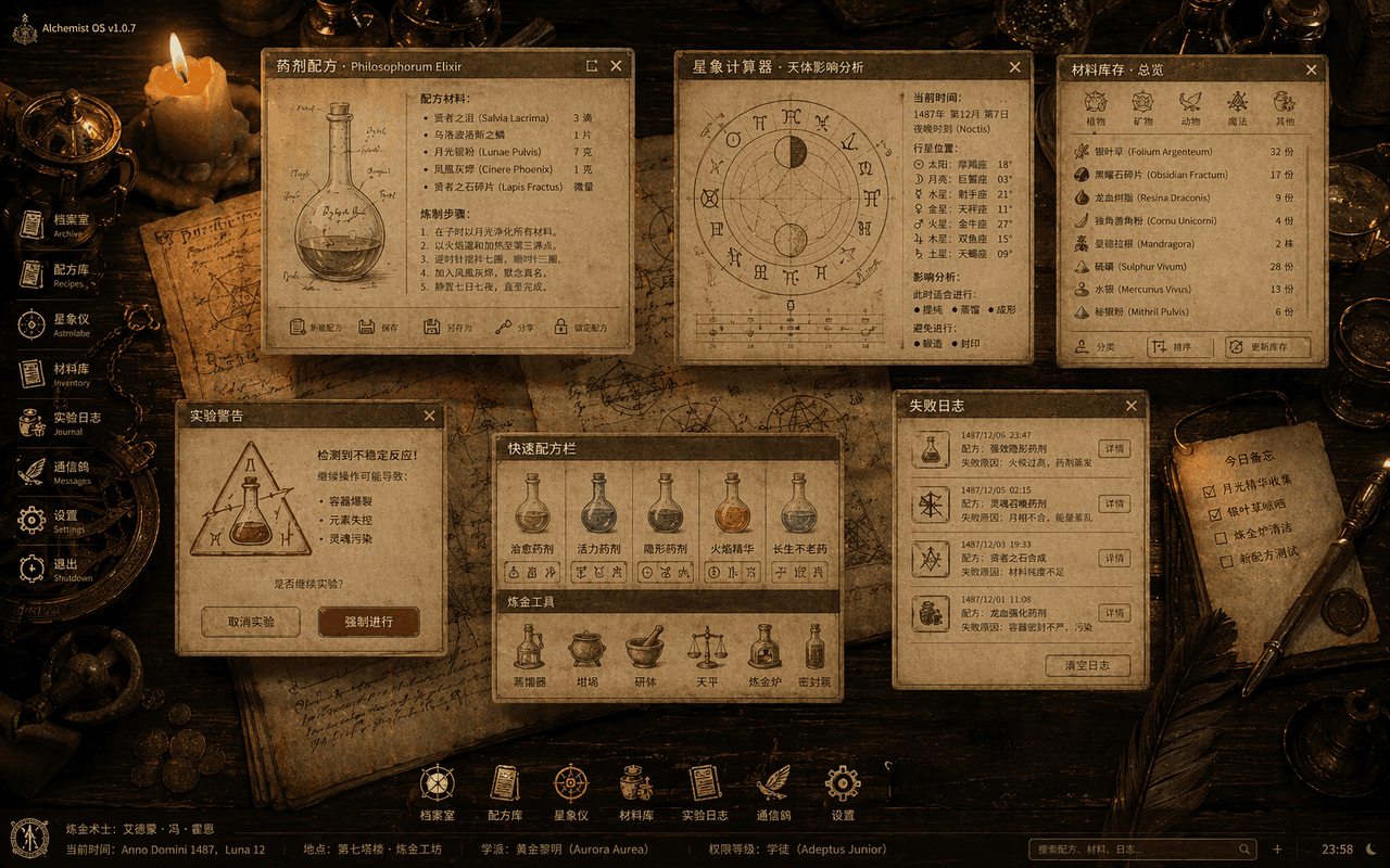
Hệ điều hành giả kim thuật thời Trung cổ

Hệ điều hành giả kim thuật thời Trung cổ

"The Medieval Alchemist's Desktop Operating System" là sự kết hợp giữa các hình minh họa sách cổ và giao diện người dùng máy tính để bàn. Bức ảnh là góc chụp từ trên cao xuống một chiếc bàn gỗ, với các cửa sổ hệ thống bán trong suốt lơ lửng trên mặt bàn: công thức độc dược, máy tính chiêm tinh học, kho nguyên liệu, cửa sổ bật lên cảnh báo thí nghiệm và nhật ký thất bại. Tất cả các biểu tượng đều được tái hiện từ bút lông, chai thủy tinh và các biểu tượng ký hiệu học. Nền là giấy da và các dụng cụ bằng đồng được thắp sáng bằng nến. Toàn bộ hình ảnh trông giống như một bộ quy chuẩn trực quan hoàn chỉnh về hệ điều hành ma thuật cổ đại, với tỷ lệ 16:10.

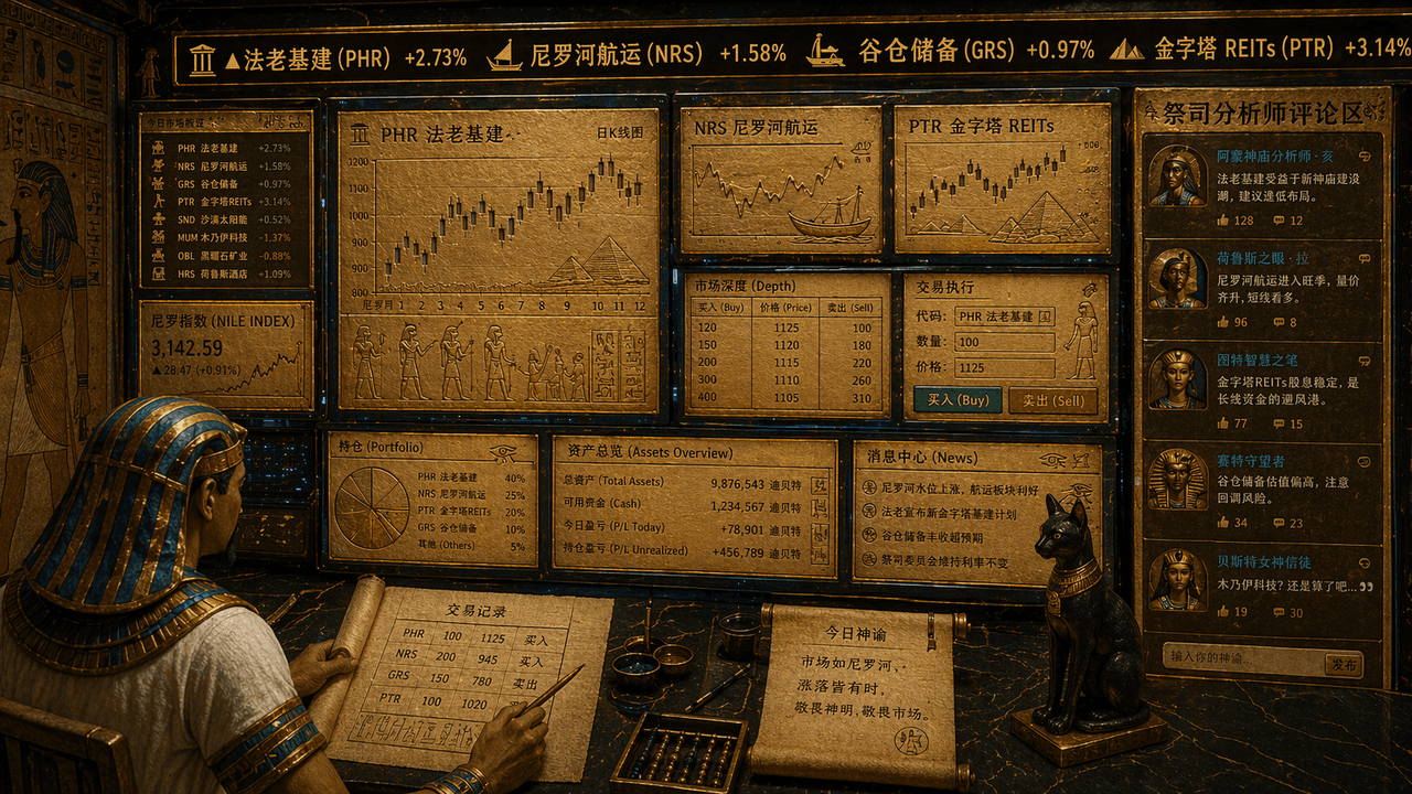
Thiết bị đầu cuối giao dịch chứng khoán Ai Cập cổ đại

Thiết bị đầu cuối giao dịch chứng khoán Ai Cập cổ đại

"The stock trading terminal of the ancient Egyptians", sự kết hợp độc đáo đầy phi lý giữa các yếu tố bích họa đền thờ và giao diện người dùng giao dịch tài chính. Màn hình trông giống như một trạm giao dịch đa màn hình, nhưng tất cả các biểu đồ, đường K-line và mã cổ phiếu đều được khắc trên phiến đá vàng và giao diện giấy cói. Bảng điện tử chạy chữ phía trên hiển thị "Pharaonic infrastructure, Nile shipping, granary reserves, pyramids REITs", nhà giao dịch là hình ảnh một viên thư lại đội khăn trùm đầu, và khu vực bình luận của nhà phân tích tư tế được hiển thị ở phía bên phải. Bảng màu tổng thể là vàng cát, xanh khổng tước và đá obsidian. Phong cách nghiêm túc nhưng mang lại cảm giác hài hước tương phản, tỷ lệ khung hình 16:9.

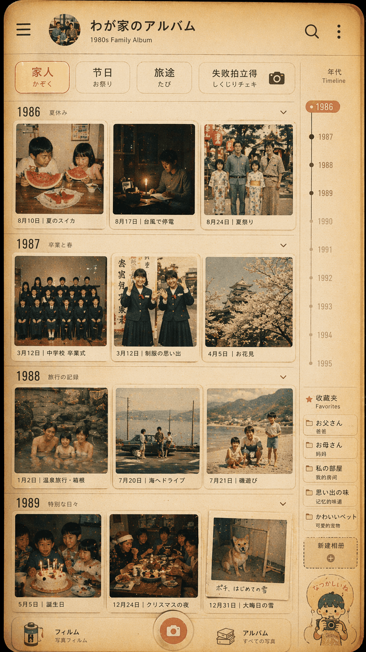
Thiết kế giao diện album ảnh gia đình phong cách Showa

Thiết kế giao diện album ảnh gia đình phong cách Showa

"Thiết kế giao diện album ảnh gia đình phong cách Showa", bức tường ảnh retro được tích hợp với giao diện UI ứng dụng album ảnh hiện đại. Màn hình mô phỏng trang dòng thời gian của một ứng dụng quản lý ảnh, nhưng mỗi hình thu nhỏ đều mang phong cách những năm 1980. Cuộc sống thường ngày của một gia đình Nhật Bản vào những năm 1970: dưa hấu mùa hè, mất điện do bão, ảnh tốt nghiệp mặc đồng phục học sinh, chuyến đi suối nước nóng, bàn tiệc tối Giáng sinh. Bộ lọc phía trên có dòng chữ "Family/Festival/Travel/Failure Polaroid". Có thang đo năm và nhãn mục yêu thích ở phía bên phải. Tông màu tổng thể mang chất phim, sắc vàng ấm áp và hơi phai màu. Bức ảnh vừa giống một giao diện điện thoại di động chân thực, vừa là sự tái hiện dịu dàng những kỷ niệm gia đình. Tỷ lệ là 9:16.

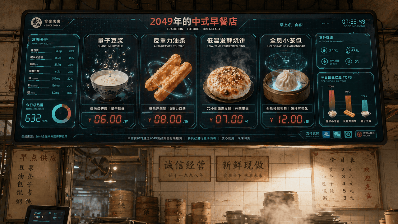
Màn hình thực đơn quán ăn sáng Trung Hoa năm 2049

Màn hình thực đơn quán ăn sáng Trung Hoa năm 2049

"Chinese Breakfast Shop Menu Screen in 2049", tầm nhìn thương hiệu ẩm thực được tích hợp với giao diện màn hình khoa học viễn tưởng. Màn hình chính là một màn hình gọi món điện tử khổng lồ treo phía trên quán. Các món ăn bao gồm "Quantum Soy Milk", "Anti-Gravity Fritters", "Low-temperature Fermented Shaobing" và "Holographic Xiao Long Bao". Mỗi món ăn đều được hiển thị bằng hình ảnh kết xuất 3D món ăn cực kỳ tinh xảo. Bảng giá sử dụng các ký tự kỹ thuật số LED màu đỏ. Bên trái là biểu đồ thông tin dinh dưỡng và calo, góc dưới bên phải là biểu đồ cột "Today's Most Popular TOP3", hậu cảnh vẫn giữ lại bức tường gạch men của một quán ăn sáng kiểu cũ cùng môi trường nghi ngút khói sương chân thực, tạo nên sự giao thoa va chạm giữa cũ và mới. Bảng màu gồm trắng sữa, đỏ cà chua và xanh lá kỹ thuật số, tỷ lệ 16:9.

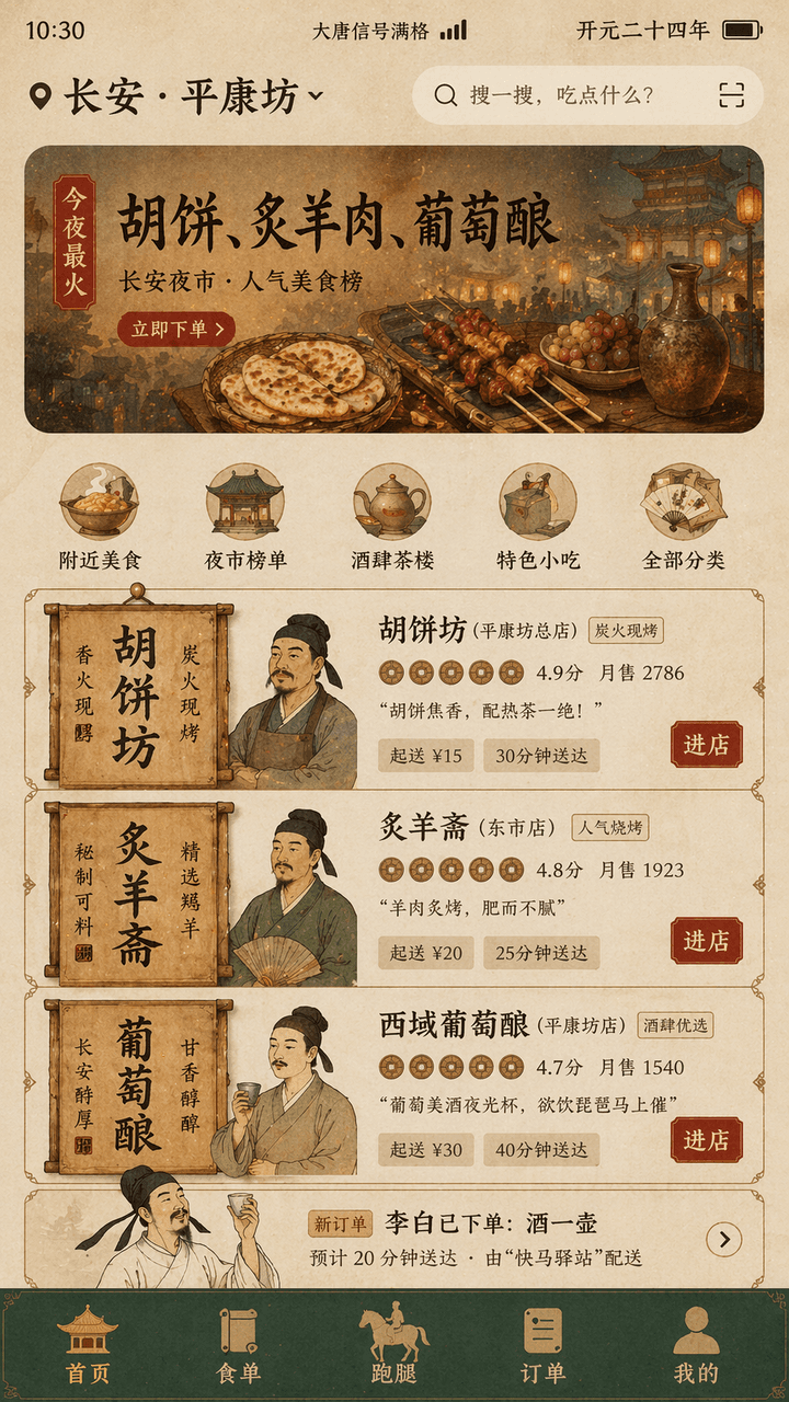
Ứng dụng giao đồ ăn thời Đường

Ứng dụng giao đồ ăn thời Đường

"Tang Dynasty Food DELIVERY INTERFACE" là thiết kế kết hợp giữa khung cảnh đời sống cổ đại và giao diện người dùng sản phẩm di động hiện đại. Màn hình mô phỏng giao diện trang chủ đặt đồ ăn trên điện thoại di động, vị trí trên cùng hiển thị "Chang'an · "Pingkangfang", banner đề xuất hiển thị "Tonight's most popular: Hu cakes, roasted mutton, grape wine", thẻ quán ăn được tái hiện bằng biển hiệu và bảng gỗ thời nhà Đường, ảnh đại diện là tượng bán thân của chủ quán theo phong cách tỉ mỉ (công bút), điểm đánh giá hiển thị dưới dạng biểu tượng đồng xu đồng, mục "Li Bai has placed an order: a pot of wine" xuất hiện trong danh sách đơn hàng, thanh điều hướng dưới cùng là "Homepage/Food List/Run Errands/Orders/Mine", thanh trạng thái hiển thị "Datang Signal Full" và "Kaiyuan Twenty-Fourth Year", tông màu tổng thể là màu hoàng thổ, xanh đá, đỏ dát vàng, phông chữ là sự kết hợp giữa các từ tiêu đề kiểu văn bia và phông sans-serif mỏng hiện đại, giao diện trông như bản thiết kế sản phẩm thực tế nhưng mang lại khiếu hài hước lịch sử, tỷ lệ 9:16.

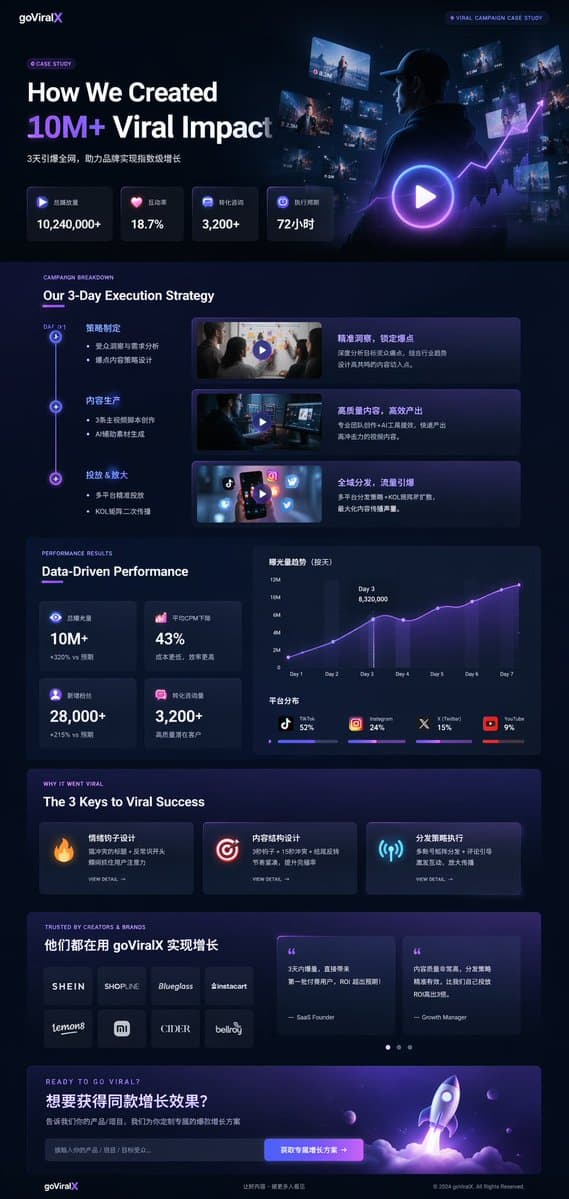
UI nghiên cứu điển hình tiếp thị chế độ tối

UI nghiên cứu điển hình tiếp thị chế độ tối

Mockup trang landing page UI/UX. chế độ tối, thẩm mỹ hiện đại bóng bẩy, phong cách kính mờ (glassmorphism), điểm nhấn phát sáng {argument name="primary accent color" default="tím và xanh lam neon"}. Our 3-Day Execution Strategy. Data-Drive…