Nowość: GPT Image 2.5 Flare i Sunburst. Wypróbuj za darmo: 3 obrazy po rejestracji, potem 8 kredytów za obraz.
Wypróbuj GPT Image 2.5

Prezentacje – prompty AI

116 szablonów · GPT IMAGE 2, Nano Banana Pro · zaktualizowano paź 2026

Te prompty generują profesjonalne pitch decki, diagramy tablicowe, wielopanelowe storyboardy i plansze prezentacji architektonicznych. Charakteryzują się uporządkowanym układem z czytelną hierarchią wizualną, światłem w kompozycji (negative space) i modułowymi kartami. Zmieniaj tematy w nawiasach, typy wykresów i palety barw zgodnie ze swoją branżą.

Sortuj według:

Prompty 1–60 z 116

Szablon Slajdu Prezentacji z Wykresem

Szablon Slajdu Prezentacji z Wykresem

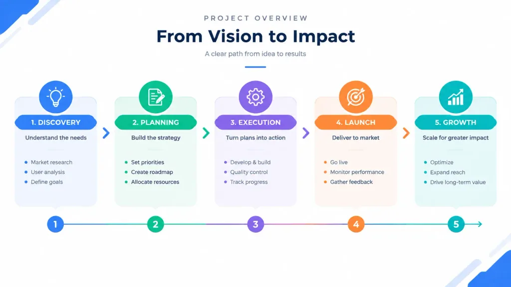
A professional presentation slide featuring [a clean overview diagram that shows the entire structure at a glance with labeled sections]. Modern corporate infographic style, [dynamic flow arrows guiding from start to finish], clear visual hierarchy, minimal text placeholders, clean geometric shapes, high visual contrast, balanced negative space, crisp modern business deck layout.

prezentacjadiagraminfografika
Plansza Architektoniczna Muzeum Nadbrzeżnego

Plansza Architektoniczna Muzeum Nadbrzeżnego

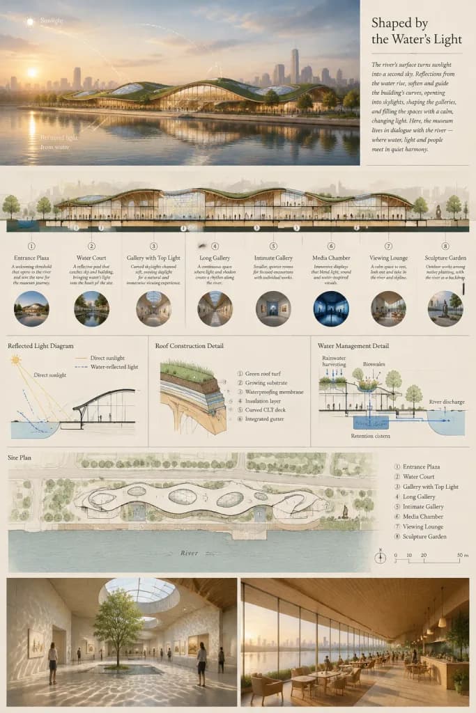
Vertical 2:3 architectural competition presentation board for a waterfront museum titled "[Shaped by the Water's Light]", showcasing how reflected daylight from a river informs the building form, galleries, and surrounding landscape. Color palette: muted warm-gray, slate blue, natural timber, and pale beige drawing paper tones with thin serif typography. Board Layout from top to bottom: 1. Main Hero Rendering (Top): A panoramic horizontal view of a low riverside museum with a gently undulating green roof, curved skylights, and warm glowing glass gallery walls. River in the foreground showing mirrorlike water reflections, atmospheric golden hour haze, a distant city skyline, and promenade trees. Subtle white solar diagram arcs trace from a low sun across the water and into the building envelope. 2. Top-Right Text Block: Elegant title "[Shaped by the Water's Light]" accompanied by a brief poetic paragraph describing the interplay of water reflections, curved skylights, and quiet exhibition galleries. 3. Middle Sectional Perspective: A long longitudinal cutaway section through the museum showing 8 labeled spaces in sequence: 1) Entrance Plaza, 2) Water Court, 3) Gallery with Top Light, 4) Long Gallery, 5) Intimate Gallery, 6) Media Chamber, 7) Viewing Lounge, 8) Sculpture Garden. Each zone features a short explanatory caption, a small circular photographic thumbnail underneath, structural curved timber ribs, visitors, and bouncing daylight rays. 4. Technical Diagram Band: Exactly 3 technical vector diagrams: - "Reflected Light Diagram" illustrating direct versus water-reflected solar angles. - "Roof Construction Detail" showing layered green roof turf, substrate, waterproofing, insulation, curved CLT deck, and integrated gutter. - "Water Management Detail" showing rainwater harvesting, bioswales, retention cistern, and river discharge. 5. Site Plan Drawing: An aerial architectural site plan with delicate black linework on pale paper, showing the contoured riverbank, footprint of the museum with 8 numbered program markers matching the section, pedestrian boardwalks, trees, and graphic scale bar. 6. Bottom Renderings (Two side-by-side interior perspectives): - Left: A sunlit gallery hall with caustic rippled light reflections across pale concrete floors and walls, minimalist art, and a courtyard tree. - Right: A warm timber-lined riverside viewing café with floor-to-ceiling glass and visitors seated by the panoramic water view. Visual style: Sophisticated architectural visualization by [a competition architecture studio], realistic materials, clean diagram overlays, crisp professional drafting layout, highly detailed, no watermarks.

architekturaplanszamuzeum
Prezentacja Analityczna w Sali Zarządu

Prezentacja Analityczna w Sali Zarządu

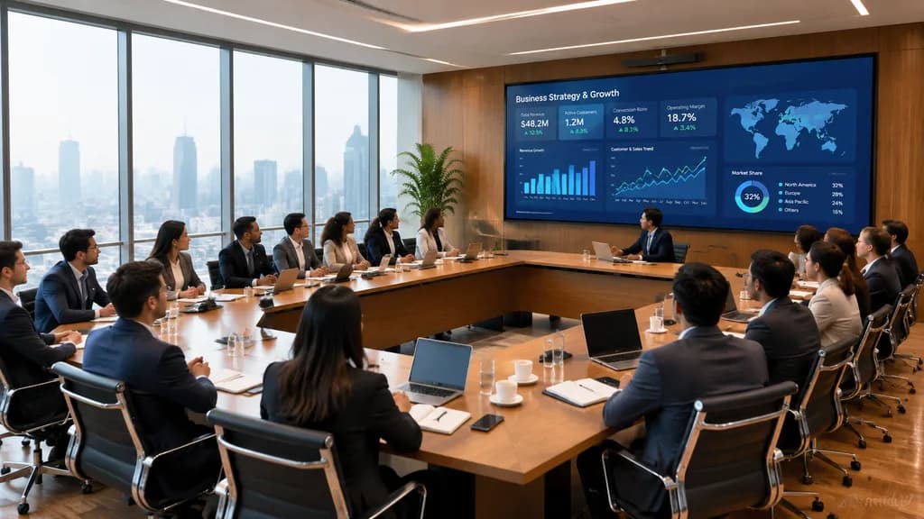
A wide-angle photorealistic corporate boardroom scene during an executive business meeting, viewed from the back corner of the room. Around [18] professionals of varied ethnicities in business attire sit around a large U-shaped light wood conference table, with open laptops, notebooks, coffee cups, water glasses, and smartphones in front of them. The attendees are focused toward a large wall-mounted digital presentation screen set on a warm wood-paneled wall. The display shows a dark blue analytics dashboard featuring bar charts, line graphs, KPI tiles, a world map, and percentage metrics. A presenter sits near the center-right facing the screen, guiding the strategy session. Floor-to-ceiling windows along the left wall reveal a hazy urban daytime skyline. The interior features sleek black leather office chairs with chrome frames, polished wood floors, recessed linear ceiling lights, and a tall potted plant beside the display. Shot in a cinematic architectural photography style with natural daylight balanced by clean interior lighting, sharp details, and subtle reflections.

sala konferencyjnaspotkanie biznesowepanel analityczny
Futurystyczny Slajd Prezentacji SaaS w Stylu Glassmorphism

Futurystyczny Slajd Prezentacji SaaS w Stylu Glassmorphism

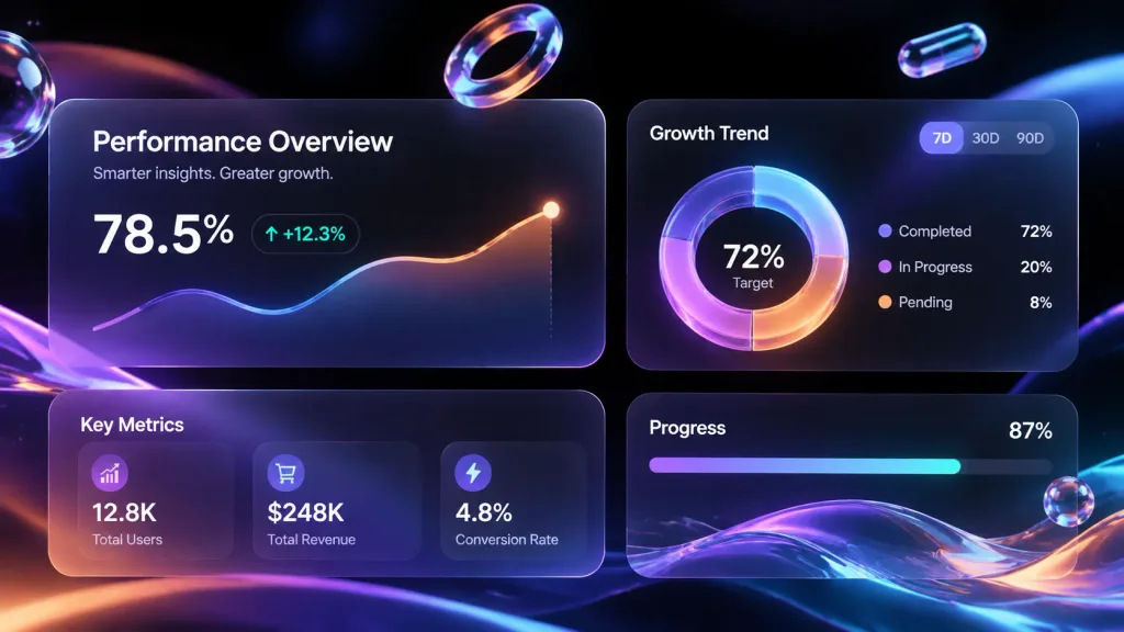
A high-fidelity futuristic presentation slide design in 16:9 aspect ratio. The layout features [a bento grid content layout] with modular rounded-rectangle cards crafted from frosted glassmorphism material with delicate blurred edges and soft ambient occlusion shadows. Floating within the layout are high-end collectible 3D abstract shapes made of [polished metal, iridescent acrylic, and transparent glass, including floating capsules and fluid waves]. Accentuated by clean sans-serif typography, [glowing neon 3D donut charts, and capsule progress indicators]. Background and highlights consist of a [deep void black] base illuminated by flowing aurora gradients of [neon purple, electric blue, soft coral orange, and cyan]. Style blends Apple Keynote minimalism with modern premium SaaS UI design, soft ray-traced reflections, cinematic volumetric lighting, and generous internal whitespace.

prezentacjaglassmorphismsiatka bento
Siatka Przeglądu Japońskich Slajdów Biznesowych

Siatka Przeglądu Japońskich Slajdów Biznesowych

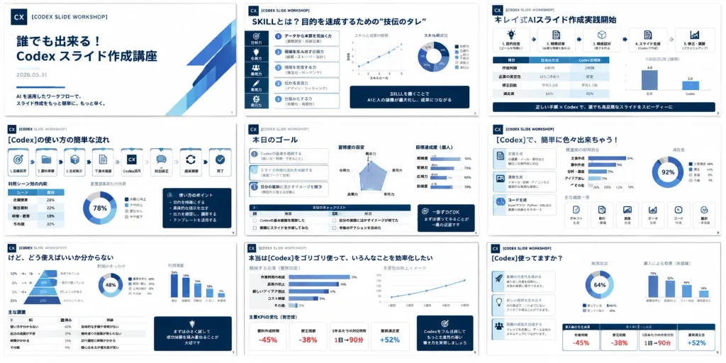
A high-density presentation overview showing exactly 9 miniature slides from a Japanese business training deck about [Codex slide creation workshop]. The slides resemble a polished corporate consulting deck, arranged in a neat 3 by 3 grid on a pure white background with thin, uniform gaps between slides, each slide rendered in 16:9 landscape format. Composition: Wide rectangular collage, 2:1 aspect ratio. Crisp vector-like slide thumbnails with a clean white and deep navy color palette, featuring subtle accent highlights in blue, cyan, red, and muted gray. Clean Japanese corporate typography, dense structured text blocks, data visualizations, cards, monochrome icons, and slide numbers. A small square "CX" logo and the label "[CODEX SLIDE WORKSHOP]" appear consistently across slides. Slide Layout Details (exactly 9 slides): 1. Title slide: Minimalist white layout with navy "CX" logo at top left, spaced caption "[CODEX SLIDE WORKSHOP]", bold Japanese main title "[誰でも出来る!Codex スライド作成講座]", date "2026.05.31", and a short subtitle about AI workflow slide production. 2. Skills slide: Header "SKILLとは?目的を達成するための“技伝のタレ”", dense analytical layout with a left vertical icon strip, numbered skill list, two small scatter/line charts, one donut chart, and dark navy callout boxes. 3. Formula slide: Header "キレイ式AIスライド作成実践開始", process framework with icon cards, a comparison table, a small bar chart, and a dark navy bottom banner. 4. Workflow slide: Header "[Codex]の使い方の簡単な流れ", horizontal chain of 8 process cards with icons (target, folder, cube, document, CX logo, chat bubble, circular arrows, checkmark), accompanied by miniature tables, a donut chart, and a navy sidebar memo. 5. Goal slide: Header "本日のゴール", three numbered goal cards on the left, a central radar chart, progress bars on the right, and a bottom checklist table with navy callout box. 6. Capabilities slide: Header "[Codex]で、簡単に色々出来ちゃう!", left column of three icon cards, central bar chart, right donut chart, and a bottom row of six compact feature cards. 7. Challenges slide: Header "けど、どう使えばいいか分からない", large slanted 4-tier funnel/pyramid chart with percentages on the left, donut chart, vertical bar chart, bottom data table, and navy quote card. 8. Efficiency slide: Header "本当は[Codex]をゴリゴリ使って、いろんなことを効率化したい", multiple horizontal bar charts, an upward-trending line chart, four KPI cards displaying red negative percentages, and a navy recommendation box. 9. Impact slide: Header "[Codex]使ってますか?", three bulleted explanatory blocks on the left, central donut chart, right bar chart, and bottom KPI cards showing stats like "-45%", "-38%", "1日→90分", and "+52%". Style: Japanese management-consulting deck aesthetic, rigorous information hierarchy, dark navy headers, subtle gray borders, rounded metric containers, and clean vector infographics. No people, no photos, no device mockups, no browser interface, no watermarks.

prezentacjaslajdyinfografika
Slajd Prezentacji w Stylu Rysunku na Tablicy

Slajd Prezentacji w Stylu Rysunku na Tablicy

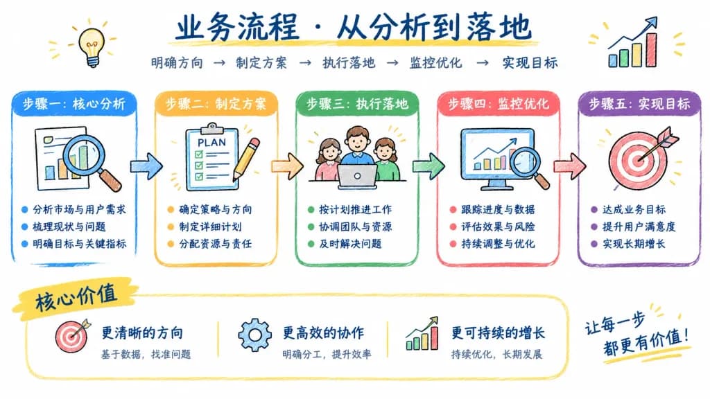
A presentation slide in a whiteboard doodle style, explaining [a step-by-step business workflow]. Clean white background, featuring a consistent hand-drawn colored thick pencil sketch style, sketchy icons, directional arrows, and structured diagram blocks. Includes legible hand-lettered Chinese text annotations such as "[步骤一:核心分析]" and clear summary bullet points. High information density with an organized visual hierarchy.

biała tablicaprezentacjadoodle
Storyboard Reklamy Letniej Piżamy

Storyboard Reklamy Letniej Piżamy

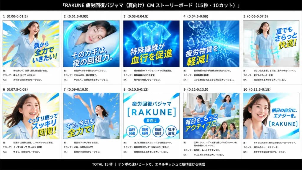
An advertising storyboard presentation board for a 15-second Japanese summer pajama commercial for [RAKUNE], themed around fatigue recovery, cool comfort, and energetic mornings. Wide 16:9 canvas with a white background and subtle gray grid lines, framed by a solid black header bar at the top and footer bar at the bottom. The header features centered white Japanese typography: “[RAKUNE 疲労回復パジャマ(夏向け) CM ストーリーボード(15秒・10カット)]”. The footer contains centered white Japanese text: “TOTAL 15秒 | テンポの速いビートで、エネルギッシュに駆け抜ける構成”. Arranged in a clean 2-row by 5-column grid containing exactly 10 numbered storyboard panels. Each panel includes a bold cut number and timestamp at the top, a vibrant rectangular image frame, and three structured production note lines below labeled “画:”, “テロップ:”, and “NA:”. 1. Panel “1 (0:00-0:01.5)”: Energetic morning scene of a smiling young Japanese woman in pale blue summer pajamas stepping forward dynamically against blue and yellow speed lines. Large overlaid text: “朝から 全力で いきたい!”. 2. Panel “2 (0:01.5-0:03)”: Serene close-up of the woman sleeping soundly on a pillow, enclosed by a glowing cyan circular energy swirl. Large text: “そのカギは、夜の回復力。” 3. Panel “3 (0:03-0:04.5)”: Technical visualization of floating blue pajama apparel glowing with illuminated fiber patterns and dynamic energy rays. Large text: “特殊繊維が 血行を促進”. 4. Panel “4 (0:04.5-0:06)”: Abstract blue burst graphic showing translucent fatigue bubble particles dissolving away. Large text: “疲労物質を 軽減!”. 5. Panel “5 (0:06-0:07.5)”: The woman standing happily in a bright, sunlit room wearing short-sleeve pale blue pajamas, with curved cyan airflow arrows indicating breathability. Large text: “夏でも さらっと 快適!”. 6. Panel “6 (0:07.5-0:09)”: Dynamic wake-up portrait of the woman smiling with flowing hair against radiating yellow and sky-blue light rays. Large text: “ぐっすり眠って スッキリ 回復!”. 7. Panel “7 (0:09-0:10.5)”: Joyful outdoor shot of the woman stretching both arms upward under a clear blue sky with confetti-like motion sparks. Large text: “さあ、今日も 全力で!”. 8. Panel “8 (0:10.5-0:12)”: Clean white product logo card with cyan diagonal shapes, displaying “疲労回復パジャマ”, the main logo “[RAKUNE]”, a small “[夏向け]” pill tag, and four circular feature badges labeled “血行促進”, “疲労軽減”, “快適設計”, and “吸汗速乾”. 9. Panel “9 (0:12-0:13.5)”: Diagonal split collage showing the active woman working at a desk, jogging outdoors, and laughing with friends. Large text: “毎日を、もっとアクティブに.” 10. Panel “10 (0:13.5-0:15)”: Polished brand hero close-up of the woman smiling toward the camera over a bright cyan-white gradient background with the text “明日の自分に、エナジーを。” and the “[RAKUNE]” logo. Style: High-energy Japanese commercial pitch deck, bright advertising lighting, cool cyan and primary blue tones with vivid yellow accents, crisp professional typography.

storyboardreklamaprezentacja
Minimalistyczna Plansza Prezentacji Architektonicznej

Minimalistyczna Plansza Prezentacji Architektonicznej

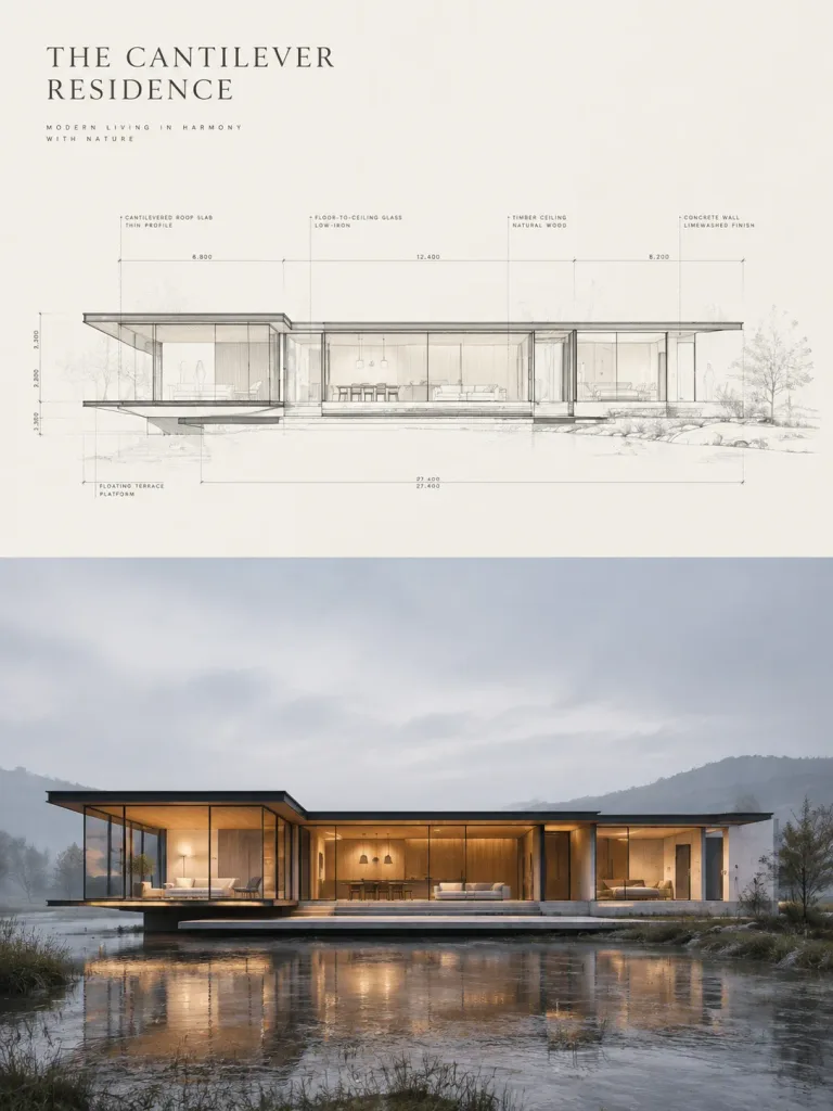
An ultra-premium real estate sales poster and minimalist architectural presentation board featuring a two-zone vertical split composition. Composition & Layout: - Top Half: An elegant architectural elevation-section hybrid drawing on a warm-white background, executed with ultra-fine charcoal drafting lines, dimension strings, micro-scale English technical annotations, faint grid logic, and ghosted human scale figures and vegetation outlines. The drawing aligns perfectly with the building below. - Bottom Half: A hyper-realistic front-facing architectural photograph of the completed residence, serving as the primary visual anchor. - Upper Left: Minimalist fictional luxury branding with a refined editorial project title [THE CANTILEVER RESIDENCE] and a discreet subtitle in micro-typography. Architecture & Materials: - A low horizontal contemporary glass residence with a disciplined rectilinear profile and subtle spatial expansion: a decisive projecting left pavilion volume, cantilevered thin roof and floor slabs, continuous floor-to-ceiling low-iron glazing, blackened steel framing, and pale concrete or limewashed masonry walls. - A thin floating platform terrace extends forward toward the viewer. - Interior spaces visible through glass with warm timber ceilings, minimalist built-in cabinetry, pendant lights, and curated restrained lounge furniture. Setting & Lighting: - Set in a serene, misty open landscape with shallow reflective wet ground, faint distant rolling hills, and cool diffused dawn or overcast dusk exterior light. - Warm, soft golden interior luminance contrasting gently with the exterior cool fog, highlighting spatial depth, cantilever edges, and platform joints. Style & Color Palette: - Museum-grade editorial presentation board aesthetic, high-end architectural visualization, immaculate linework hierarchy, generous negative space. - Palette: warm white, fog gray, charcoal linework, pale limestone beige, matte black, and amber timber tones. - Clean, sharp, zero visual clutter, no real architect names, no watermarks.

architekturaprezentacjanieruchomości
Płaska Ilustracja Wektorowa do Prezentacji

Płaska Ilustracja Wektorowa do Prezentacji

A cute modern Japanese-style flat vector illustration of a friendly young woman standing upright in a calm professional pose against a solid clean white background. She has [black] shoulder-length bob hair with a side part and a minimal, softly obscured faceless design. She wears a [bright orange] cardigan-style jacket with exactly 3 visible black buttons over a white shirt, paired with beige high-waisted wide-leg trousers, white socks, and orange flats. Her left arm is extended holding an open gray laptop angled outward, while her right hand rests casually in her trouser pocket. Floating beside her upper body on the right is exactly one teal closed notebook featuring a thick black outline, white page edges, and a centered white heart icon on its cover. Thick rounded black outlines, subtle cream flat shading, simple shapes, generous negative space, no text, and no drop shadows.

wektorilustracjaflat design
Okładka Strategiczna z Chińskim Kołem Zamachowym Wzrostu

Okładka Strategiczna z Chińskim Kołem Zamachowym Wzrostu

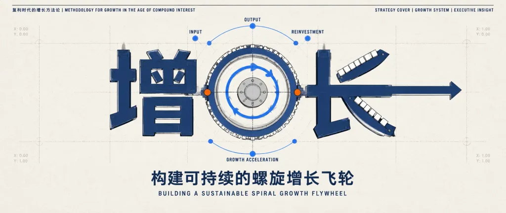
A clean, McKinsey-style strategy presentation cover slide on [compound-interest growth methodology], combining architectural Chinese typography with an engineered flywheel mechanism. Wide panoramic composition on an off-white paper textured background with subtle grain, a thin black top rule, and faint gray construction grid lines. Top header: - Top left text in small uppercase condensed sans-serif: "复利时代的增长方法论 | METHODOLOGY FOR GROWTH IN THE AGE OF COMPOUND INTEREST" - Top right text in small uppercase condensed sans-serif: "STRATEGY COVER | GROWTH SYSTEM | EXECUTIVE INSIGHT" Central elements: - Across the center, the large dark navy Chinese characters "增长" constructed like mechanical letterforms with thick strokes, black outlines, subtle bevels, and embedded rectangular modules. - Integrated directly into and behind the characters, centered between "增" and "长", is a circular flywheel mechanism featuring 3 concentric rings, a light gray central hub, blue curved directional arrows, and small gear-like white rectangular blocks along the outer arc. - Exactly 3 labeled node points above the flywheel connected by a thin blue arc: "INPUT", "OUTPUT", and "REINVESTMENT". - Exactly 1 label centered below the flywheel: "GROWTH ACCELERATION". - 2 orange accent nodes positioned on the flywheel, with small blue nodes along the guide arcs. - 2 diagonal segmented ramps attached to the right character "长", composed of small white rectangular steps. - 1 horizontal navy arrow extending toward the right margin from the center-right. - Subtle, pale gray blueprint coordinate markings along the grid lines. Bottom typography: - Centered below the diagram, bold Chinese title: "构建可持续的螺旋增长飞轮" - Beneath it, smaller uppercase English subtitle: "BUILDING A SUSTAINABLE SPIRAL GROWTH FLYWHEEL" Style & Constraints: - Precise corporate consulting vector illustration with blueprint technical aesthetics. - Color palette: dark navy, black, off-white, light gray, and minimal vibrant orange accents. - High contrast, crisp linework, ample negative space, disciplined geometric symmetry. - No human figures, photos, drop shadows, watermarks, or extra floating sections. Preserve exact text spelling.

doradztwoprezentacjainfografika
Kolaż Szablonów Prezentacji

Kolaż Szablonów Prezentacji

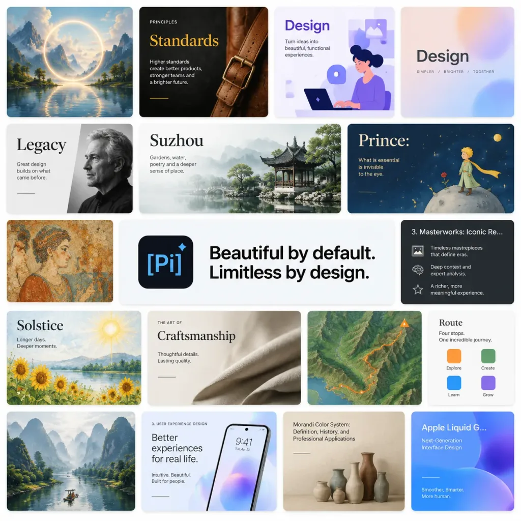
A polished SaaS promotional collage and presentation template mosaic for [Pi], set against a clean white background in a 1:1 square canvas. The layout is arranged as a tight grid of rounded-rectangle slide thumbnails separated by thin white gutters, featuring subtle drop shadows and modern digital product aesthetics. At the center is a dominant horizontal banner with a dark rounded-square app icon on the left showing a light-blue "[Pi]" mark and diamond accent, alongside bold, crisp black text reading "[Beautiful by default. Limitless by design.]". Surrounding the central banner are 17 distinct presentation slide tiles: 1. Top-left: painterly fantasy landscape with a luminous circular ring over water and mountain peaks. 2. Top-center: dark editorial "Standards" slide with a leather strap photo and mustard-yellow title typography. 3. Top-right: purple and white "Design" slide with an illustration of a person at a laptop and geometric UI motifs. 4. Far top-right: pastel gradient "Design" title card. 5. Left-middle: monochromatic "Legacy" slide with cropped serif text and a grayscale portrait. 6. Center-middle: "Suzhou" slide with serif title, pale misty mountains, and a classical garden photo. 7. Right-middle: storybook-style "Prince:" slide showing a tiny prince on an asteroid under a starry sky. 8. Far-left middle: antique fresco mural slide thumbnail. 9. Central banner: [Pi] logo and main slogan. 10. Far-right: dark lecture slide titled "3. Masterworks: Iconic Re…" with bulleted text and small icons. 11. Lower-left: watercolor "Solstice" slide with sunflowers, sun, and a lake. 12. Lower-center: refined "Craftsmanship" slide with folded fabric photography and serif headings. 13. Lower-right: stylized topographic terrain map slide with an orange trail line. 14. Far-right lower card: small "Route" card with four colored square markers. 15. Bottom-left: misty karst mountain river photography slide. 16. Bottom-center: "3. User Experience Design" slide featuring a smartphone mockup on an iridescent background. 17. Bottom-right: muted beige "Morandi Color System: Definition, History, and Professional Applications" slide with ceramic vases, alongside a partially visible blue-purple "Apple Liquid G… Next-Generation Interface Design" slide. Crisp English typography throughout, 14px rounded corners, neutral and pastel palette, premium product launch aesthetic, no browser chrome, no watermarks.

prezentacjaprojektowanie-uiszablony
Minimalistyczny schemat na białej tablicy

Minimalistyczny schemat na białej tablicy

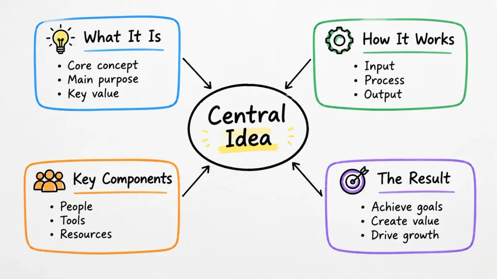
A simple whiteboard-style diagram explaining [a core concept, workflow, and key components]. The main topic '[Central Idea]' is placed in the center, connected with clean directional arrows to related sub-topics enclosed in rounded outline boxes. Minimalist dry-erase board aesthetic with crisp black marker lines and subtle colored marker accents. Clear, legible handwritten-style typography with concise labels and high contrast, arranged in a clean, uncluttered layout.

biała tablicadiagraminfografika
Porównanie Rekonstrukcji Slajdu Prezentacji

Porównanie Rekonstrukcji Slajdu Prezentacji

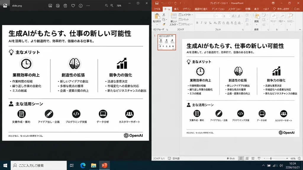
A realistic side-by-side Windows desktop screenshot showing a polished presentation slide reconstruction based on the reference image. The left panel shows a dark image viewer window displaying the clean exported slide. The right panel shows Microsoft PowerPoint in editing view containing the exact same editable slide. The slide retains the original Japanese monochrome infographic layout: 1 top title and header row, 3 mid-page comparison columns, and 1 bottom use-case row with 5 icon-labeled items, a footer line, and the [OpenAI] logo at the bottom right. Clean, legible Japanese typography, properly aligned dividers, crisp monochrome icons, and no clutter, selection handles, or malformed vector artifacts. Crisp UI detailing, native desktop app appearance, high readability.

powerpointzrzut ekranuinfografika
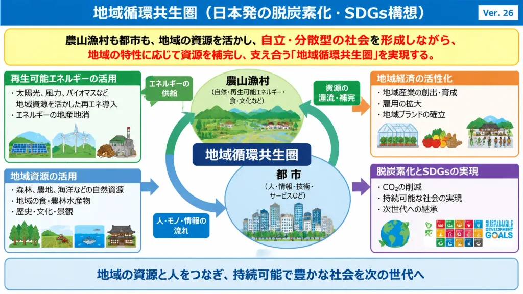
Odtworzenie Infografiki Polityki w Stylu Kasumigaseki

Odtworzenie Infografiki Polityki w Stylu Kasumigaseki

Faithfully recreate the Japanese Kasumigaseki-style policy infographic slide from the reference image as a clean, high-resolution 16:9 presentation graphic. - Composition & Layout: Preserve the original dense information architecture, blue top title bar, yellow and red emphasis banners, interconnected flow arrows, structured callout boxes, and landscape or business miniature diagrams. - Text & Typography: Top header text reads "[地域循環共生圏(日本発の脱炭素化・SDGs構想)]", version tag reads "[Ver. 26]", and the central concept label reads "[地域循環共生圏]". Maintain all visible Japanese labels and annotations faithfully. - Style & Details: Clean vector-style graphic presentation, sharp readable typography, crisp container borders, and clear miniature icons, retaining the crowded, official government policy aesthetic. - Constraints: Do not simplify the layout, modernize the formatting, omit small text labels, or add watermarks and unrelated decorative elements.

infografikapolitykajapoński
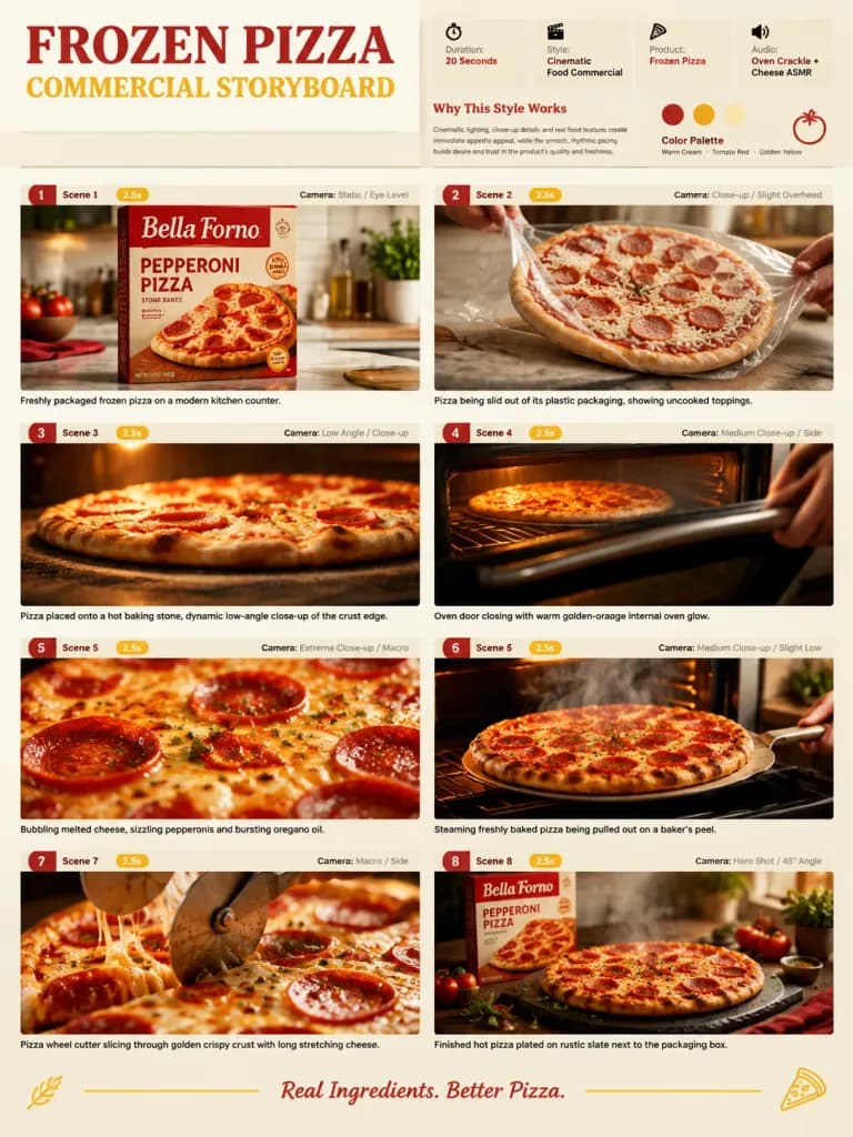
Storyboard Reklamy Mrożonej Pizzy

Storyboard Reklamy Mrożonej Pizzy

Single-page premium commercial storyboard presentation in a 3:4 portrait layout for an advertising campaign featuring [Frozen Pizza]. HEADER: - Bold editorial typography displaying project title - Information metadata cards: Duration: [20 Seconds], Style: Cinematic Food Commercial, Product: [Frozen Pizza], Audio: Oven Crackle + Cheese ASMR - "Why This Style Works" summary section - Color palette: warm cream, tomato red, and golden yellow - Minimal decorative culinary motifs STORYBOARD GRID (8 distinct panels): 1. The [Frozen Pizza] box standing upright on a sleek modern kitchen counter, clear front packaging branding. 2. Pizza being slid out of its plastic packaging, showing uncooked toppings, sauce, and shredded mozzarella. 3. Pizza placed onto a hot baking stone, dynamic low-angle close-up of the crust edge. 4. Oven door closing with warm golden-orange internal oven glow illuminating the baking pizza. 5. Extreme macro shot of bubbling melted cheese, sizzling pepperonis, and bursting oregano oil. 6. Steaming freshly baked pizza being pulled out on a baker's peel, realistic rising heat vapor. 7. Pizza wheel cutter slicing through golden crispy crust with long stretching strings of melted cheese. 8. Final hero commercial packshot: the finished hot pizza plated on rustic slate next to the pristine packaging box. EACH PANEL INCLUDES: - Clean scene index label - Duration badge - Camera direction note - Crisp visual frame STYLE: Hyper-realistic commercial food photography, warm cinematic studio lighting, shallow depth of field, appetizing details, clean agency presentation board layout.

storyboardreklama żywnościreklama
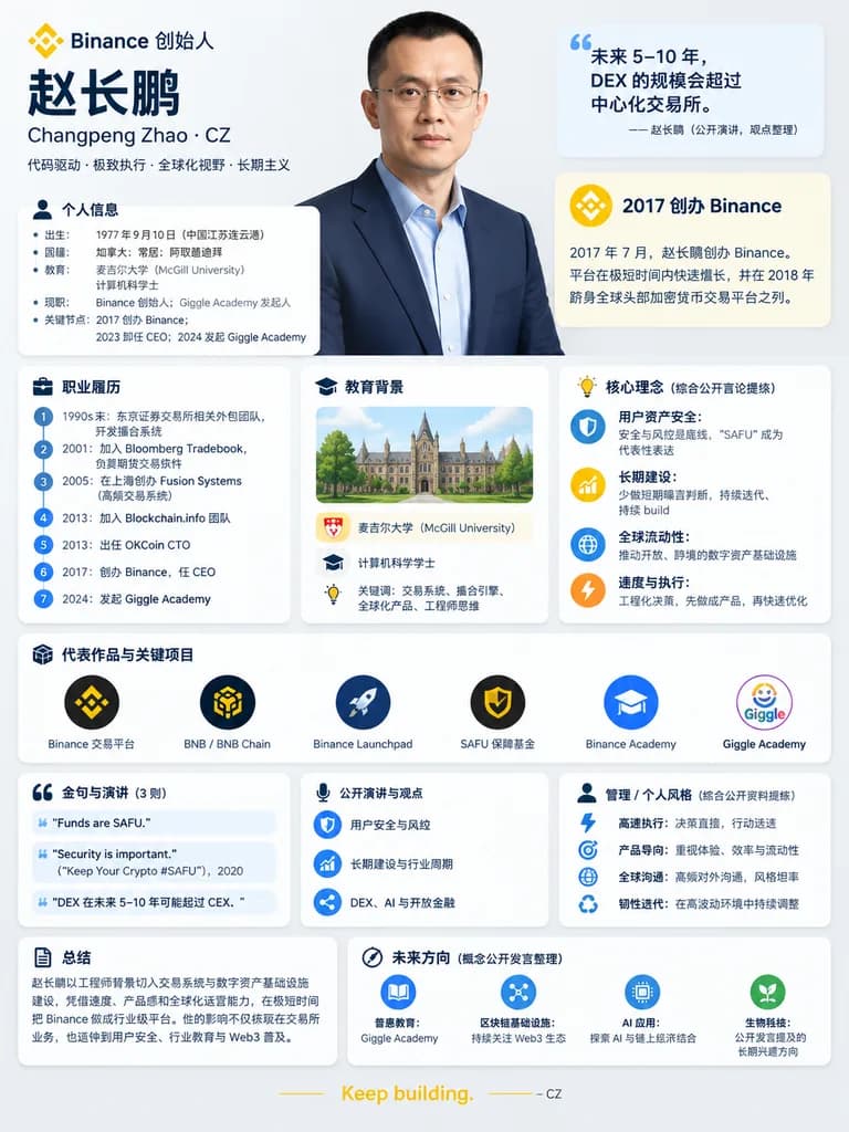
Plakat Infograficzny z Biografią Lidera Biznesu

Plakat Infograficzny z Biografią Lidera Biznesu

professional Chinese-language biography infographic poster. 2017 创办 Binance. 职业履历. 教育背景. 核心理念(综合公开言论提炼). 代表作品与关键项目. 金句与演讲(3 则). 公开演讲与观点. 管理 / 个人风格(综合公开资料提炼). 总结. 未来方向(概念公开发言整理). [赵长鹏]. Changpeng Zhao · CZ. Binance 创始人. large upper-body stu…

infografikabiografiafintech
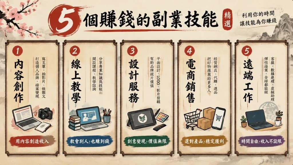
Kreatywne Szablony Diagramów i Infografik

Kreatywne Szablony Diagramów i Infografik

Create an infographic diagram based on one of the following visual formats: 1. Menu Style: A diagram displaying "5 selected [skills to earn money with side jobs]" designed as a traditional Japanese restaurant menu. Features vertical Japanese-style typography, expressive brush strokes, calligraphic accents, and a textured washi paper background. 2. Prescription Style: A diagram illustrating "[correct way to use AI]" in the visual layout of a clinical medical prescription. Includes a prominent "Rx" symbol, clean white background, minimalist grid lines, and medical blue accent colors. 3. Boarding Pass Style: A graphic comparison showing "[life without AI] → [life after AI utilization]" formatted as an airline boarding pass. Includes clear departure and destination airport-style fields, flight gate details, seat assignment, and a readable barcode. 4. Dashboard UI Style: A comparative performance infographic for "[ChatGPT vs Claude]" rendered as a modern dark mode software dashboard UI. Features sleek KPI metric cards, comparative bar charts, graphs, and refined glowing neon accent indicators. 5. Diagnosis Chart Style: A decision tree flowchart helping users find the right "[AI tool]" for their needs. Formatted as a clear Yes/No branching diagnostic flowchart with directional arrows, labeled pathways, and organized color-coded nodes.

infografikadiagramdashboard
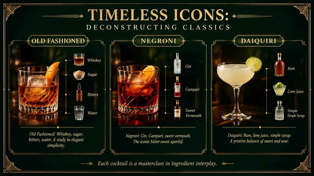
Infografika na Slajdzie: Dekonstrukcja Klasycznych Koktajli
Infografika na Slajdzie: Dekonstrukcja Klasycznych Koktajli
A single 16:9 widescreen educational presentation slide infographic about [TIMELESS ICONS:] and the deconstruction of classic cocktails, in a luxurious vintage speakeasy Art Deco style. Background and Frame: Dark emerald green velvet background with a subtle vignette, thin double-line gold border, rounded dark frame, and ornate Art Deco corner flourishes. Warm amber photographic lighting. Typography and Header: Elegant metallic gold and cream serif typography. Large centered main title at the top: "[TIMELESS ICONS:]", with a spaced subtitle beneath reading "[DECONSTRUCTING CLASSICS]". Layout: Exactly 3 vertical cocktail panels separated by thin gold ornamental borders, each topped with a small gold title plaque. Each panel features a realistic cocktail photo on the left or center and a vertical ingredient stack on the right, connected by fine dotted gold guide lines. Along the bottom, a centered italic footer quote reads: "[Each cocktail is a masterclass in ingredient interplay.]", flanked by small gold flourishes. Panel Contents: - Panel 1: Plaque labeled "OLD FASHIONED". A crystal rocks glass with amber whiskey, a large clear ice cube, and an orange peel garnish on a dark bar surface. Descriptive text: "Old Fashioned: Whiskey, sugar, bitters, water. A study in elegant simplicity." Exactly 4 mini-images with labels: "Whiskey", "Sugar", "Bitters", "Water". - Panel 2: Plaque labeled "NEGRONI". A lowball glass with deep red liquid, ice, and an orange slice garnish. Descriptive text: "Negroni: Gin, Campari, sweet vermouth. The iconic bitter-sweet aperitif." Exactly 3 mini-images with labels: "Gin", "Campari", "Sweet Vermouth". - Panel 3: Plaque labeled "DAIQUIRI". A coupe glass filled with pale frothy daiquiri and a lime wheel garnish. Descriptive text: "Daiquiri: Rum, lime juice, simple syrup. A pristine balance of sweet and sour." Exactly 3 mini-images with labels: "Rum", "Lime Juice", "Simple Syrup". Style & Constraints: Premium cocktail-menu infographic with photorealistic drinks and glassware, crisp readable gold lettering, high contrast, and speakeasy ambiance. Exactly 3 cocktail panels and exactly 10 ingredient mini-images total. No people, no watermarks, no extra drinks.

infografikakoktajlart-déco
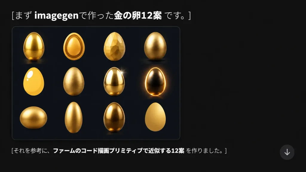
Slajd Prezentacji Koncepcji Złotego Jajka po Japońsku

Slajd Prezentacji Koncepcji Złotego Jajka po Japońsku

A modern presentation slide and social media graphic in 16:9 format on a dark charcoal-black background (#181818) with generous negative space on the right. Top left text features clean Japanese typography reading: "[まず imagegenで作った金の卵12案 です。]" with "imagegen" and "金の卵12案" in bold white and remaining characters in regular white. Below the headline on the left sits a dark navy-black rounded rectangular card with a subtle border and soft drop shadow. Inside the card is a 4-column by 3-row grid showing 12 distinct [golden egg] concept renderings: 1) glossy smooth upright gold egg with bright highlight, 2) stylized oval egg with a raised rim icon outline, 3) low-poly faceted gemstone egg, 4) smooth metallic egg on a soft contact shadow, 5) flat bright yellow-gold egg with bold white highlight, 6) textured brushed-gold egg, 7) polished reflective egg with a sparkle star flare, 8) dark luminous egg with vivid rim lighting, 9) wide squat golden egg, 10) elongated tall slender gold egg, 11) deep bronze-gold reflective egg, 12) minimalist matte yellow-gold egg silhouette. Lower left text reads: "[それを参考に、ファームのコード描画プリミティブで近似する12案 を作りました。]" with the central clause in bold white. A semi-transparent circular down-arrow UI button floats near the lower right.

prezentacjaslajdinfografika
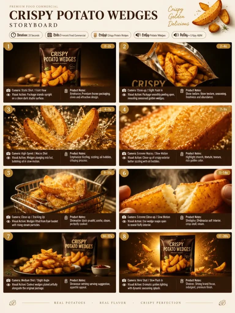
Prezentacja Storyboardu Reklamy Kulinarnej

Prezentacja Storyboardu Reklamy Kulinarnej

A single-page premium advertising agency storyboard presentation in a 3:4 portrait layout for a commercial featuring [Crispy Potato Wedges]. HEADER: - Bold luxury typography displaying campaign details. - Information badges: Duration: 20 Seconds | Style: Cinematic Food Commercial | Product: [Crispy Potato Wedges] | Audio: Frying + Crispy ASMR. - Minimalist food-themed decorative design with a warm cream, golden yellow, and dark brown aesthetic. STORYBOARD GRID (8 cinematic panels, each including scene number, duration badge, camera direction, visual action, and product notes): 1. Premium frozen packaging standing upright on a clean dark studio surface. 2. Package smoothly peeling open, revealing seasoned golden wedges inside. 3. Potato wedges plunging into hot, bubbling oil in high-speed slow motion. 4. Extreme macro close-up of the crispy exterior batter sizzling with fine oil bubbles. 5. Golden wedges lifted from the fryer basket with rising steam particles. 6. Close-up of one wedge snapping open to reveal a steaming, fluffy interior. 7. Perfectly cooked wedges artistically plated alongside the original package. 8. Hero packshot with dramatic golden lighting and a dynamic seasoning splash. STYLE & CAMERA: Ultra-realistic high-end food photography, extreme macro lenses, high-speed shutter effects, dramatic commercial studio lighting, rich golden-brown textures, clean and organized agency layout.

storyboardreklamafotografia kulinarna
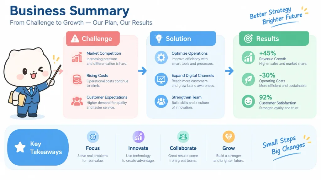
Wizualne Jednostronicowe Podsumowanie Dokumentu

Wizualne Jednostronicowe Podsumowanie Dokumentu

A business document summary visualized as a clean single-sheet diagram ('ponchi-e' style infographic), featuring [a cute and friendly mascot character] presenting the key points. Layout includes organized flowchart boxes, connecting arrows, minimalist icons, and clear visual hierarchy. Style is clean flat vector illustration, pastel and corporate accent colors, neat typography placeholders, bright and tidy white background.

infografikadiagramilustracja biznesowa
Plansza Architektoniczna Nowoczesnej Willi

Plansza Architektoniczna Nowoczesnej Willi

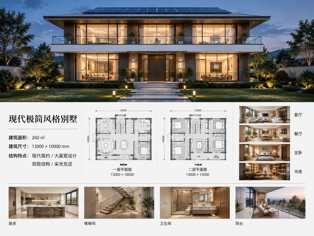
A polished architectural presentation board for a [modern minimalist villa]. The top half features a photorealistic dusk exterior rendering of a symmetrical two-story luxury house: a clean white and charcoal facade, broad overhanging flat roof with visible rooftop solar panels, full-width second-floor balcony with glass railing, floor-to-ceiling windows with warm interior glow, centered dark entry door, landscaped lawn, paved walkway, and subtle garden pathway lights. Lighting is blue hour twilight with soft shadows and realistic materials. The bottom half is a crisp architectural presentation layout on a clean white background with thin divider lines: - Left side: a typographic specification block featuring the headline "[现代极简风格别墅]" followed by three lines of Chinese specification text for floor area, building dimensions, and structural features. - Center: two grayscale architectural floor plans with room layouts and furniture outlines, labeled "一层平面图" and "二层平面图", both marked with dimensions "13000 × 10000". - Right column: four vertical interior thumbnail renderings labeled in Chinese: "客厅", "餐厅", "主卧", "书房". - Bottom strip: four horizontal interior thumbnail renderings labeled "厨房", "楼梯间", "卫生间", "阳台". All interior thumbnails maintain a consistent warm minimalist aesthetic with beige and light wood tones, recessed architectural lighting, and modern luxury furnishings. Editorial real-estate sales board layout, sharp typography, precise architectural graphic design.

architekturaplanszarzut-kondygnacji
Prezentacja Storyboardu Japońskiego Produktu AI

Prezentacja Storyboardu Japońskiego Produktu AI

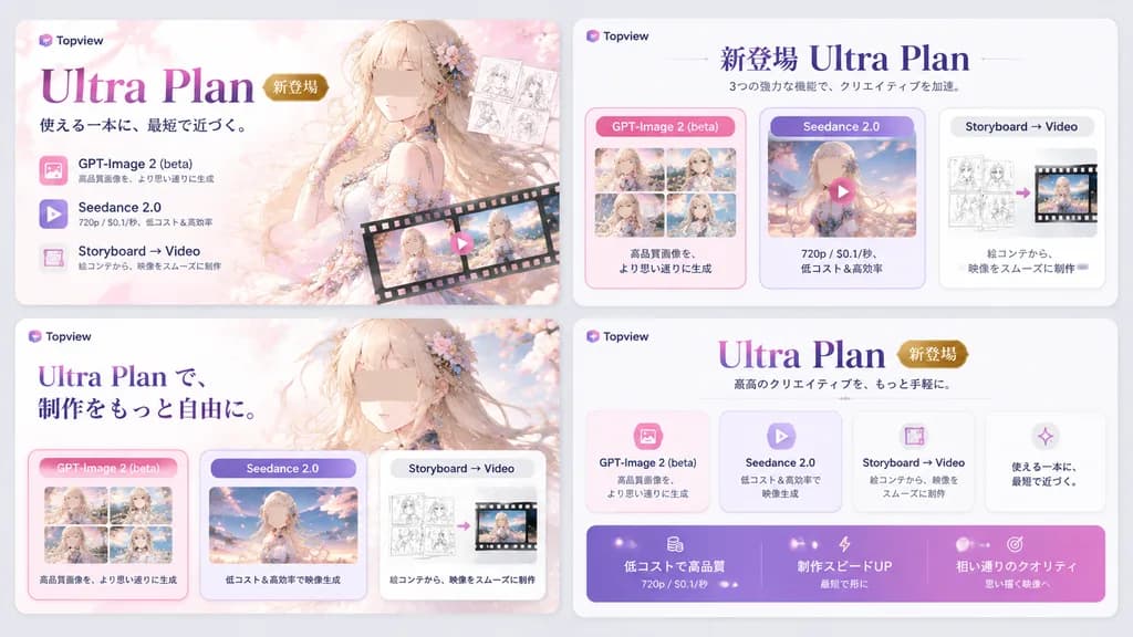
Japanese promotional storyboard sheet. premium AI creative suite landing-page style ad for image and video generation. panel 1. panel 2. panel 3. panel 4. ethereal anime young woman. Topview. Ultra Plan. 新登場. Japanese. 16:9. light gray ove…

storyboardprezentacjasaas
Moodboard Architektury Wnętrz

Moodboard Architektury Wnętrz

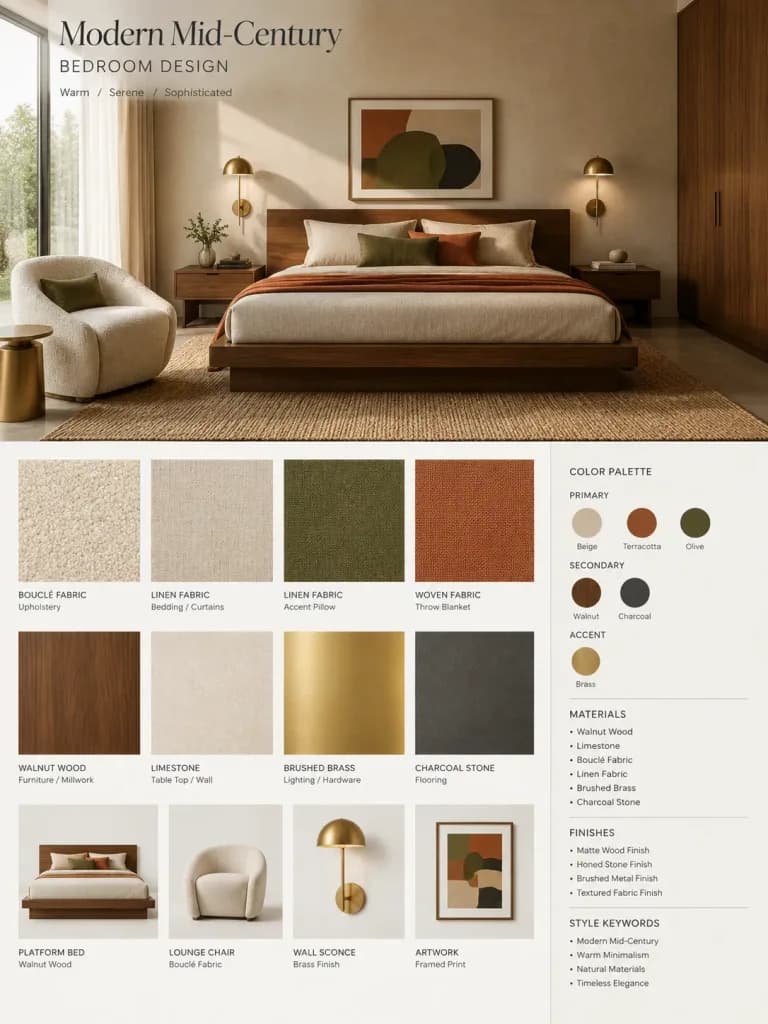
A high-end architectural firm interior design mood board presentation based on the reference photo of a [bedroom], styled in [Modern Mid-century] aesthetics with a [warm, serene, sophisticated] mood. Vertical layout composition: - Upper section: A photorealistic interior architectural rendering of the [bedroom], consistent in structure with the reference photo but elevated into a polished client proposal. Features: [low-profile walnut platform bed, textured bouclé lounge chair, sculptural brass sconces], [walnut wood, honed limestone, woven linen], in a palette of [terracotta, warm beige, muted olive, charcoal], illuminated by [soft diffused morning sunlight]. - Lower section: An orderly grid of tactile material and furnishing samples directly corresponding to the rendering, including textured fabric swatches, wood blocks, stone slabs, brushed metal swatches, and paint color chips. - Bottom right: A clean graphic design legend info box displaying primary, secondary, and accent color swatches, core material tags, finish specifications, and architectural style keywords. Presentation style: Minimalist architecture studio board layout, disciplined grid alignment, elegant white space, crisp modern typography with neatly aligned [English] material and finish labels.

architektura wnętrzmoodboardwizualizacja
Futurystyczna infografika przepływu pracy prezentacji AI
Futurystyczna infografika przepływu pracy prezentacji AI

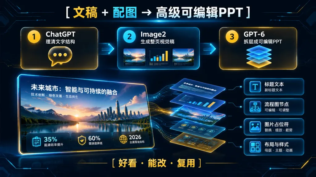
A dark futuristic Chinese workflow infographic slide for an editable presentation pipeline, 16:9 horizontal layout. Deep navy and black background with subtle circuit-line textures, thin glowing borders, cyan and gold neon accents, soft bloom highlights, and a clean corporate SaaS aesthetic. Main headline centered at the top: "[文稿 + 配图 → 高级可编辑PPT]", with "文稿" in gold, "配图" in cyan, and the rest in white, accented with a subtle cyan lens flare below. Top workflow process: Exactly 3 large rounded rectangular glassmorphism cards connected by a glowing horizontal arrow line running left to right: 1. Yellow numbered badge "1", title "ChatGPT", subtitle "理清文字结构", large gold chat-bubble icon with three dots. 2. Cyan numbered badge "2", title "Image2", subtitle "生成整页视觉稿", small visual preview showing 3 inner sub-panels (landscape, mini bar chart, second landscape). 3. Yellow numbered badge "3", title "GPT-6", subtitle "拆层成可编辑PPT", layered floating blue sheets over a gold base icon. Central demonstration (lower middle-left): One large tilted PPT slide mockup with rounded corners and glowing edges. Slide title: "[未来城市:智能与可持续的融合]", subtitle: "[技术创新 · 绿色发展 · 生态共生]". Slide graphic depicts a cinematic mountain lake sunset with an inset city skyline. Bottom metric bar displays 3 items: "35% 能源效率提升" with cyan clipboard icon, "60% 碳排放降低" with gold shield icon, and "2026 全面落地目标" with gold globe icon. Layer decomposition & output list: To the right, the central slide separates into 7 translucent floating layer sheets with flowing cyan and gold data streams. Connected to these layers on the far right are 4 vertical stacked cards: 1. "标题文本" with subtext "副标题文本", letter 'T' icon. 2. "流程图节点" with subtext "可编辑 · 可调整", flowchart icon. 3. "图片占位符" with subtext "替换 · 缩放 · 裁剪", image frame icon. 4. "布局与样式" with subtext "母版 · 主题 · 动画", grid layout icon. Bottom slogan centered in gold Chinese text: "[好看 · 能改 · 复用]". Sharp vector UI, crisp typography, no watermarks, no people.

infografikaprezentacjaprzepływ pracy
Układ Prezentacji Storyboardu Reklamowego

Układ Prezentacji Storyboardu Reklamowego

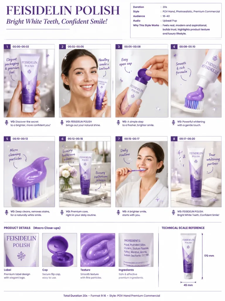
A commercial storyboard pitch sheet for a [luxury toothpaste] advertisement presented in a clean A4 portrait layout. Minimal editorial design with an elegant [purple] and white branding palette, crisp agency typography, and a white background. Top Header: • Title: [FEISIDELIN POLISH] • Subtitle: Bright White Teeth, Confident Smile! • Right metadata panel detailing Duration (20s), Style (POV Hand, Photorealistic, Premium Commercial), Audience (18–40), Audio (Upbeat Pop), and Why This Style Works. Main Content: • 8 storyboard frames arranged in a neat 4×2 grid. • Each frame includes a small [purple] index number tab, timecode, realistic product shot, handwritten annotation notes, curved arrows, sparkle graphic accents, and voiceover caption text. • Scenes depicted: hand holding the toothpaste tube, front beauty shot, opening the cap, squeezing [purple] paste onto a toothbrush, macro paste texture, product placed in an elegant luxury marble bathroom, daily routine lifestyle hero shot, and final call-to-action recommendation frame. Bottom Section: • Four macro detail close-ups: Label, Cap, Texture, Ingredients. • Technical scale reference with product dimensions. • Footer text: "Total Duration 20s • Format 9:16 • Style: POV Hand Premium Commercial". Style: Professional advertising pitch board, photorealistic product photography, soft commercial bathroom lighting, subtle depth of field, high-end agency presentation aesthetics.

storyboardreklamapitch deck
Slajd Prezentacji w Stylu Malarstwa Tuszem

Slajd Prezentacji w Stylu Malarstwa Tuszem

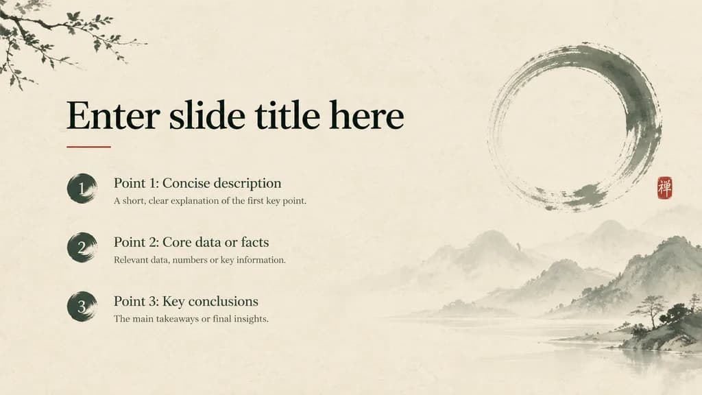
Presentation slide design. Title: "[Enter slide title here]" Key Points: - [Point 1: Concise description] - [Point 2: Core data or facts] - [Point 3: Key conclusions] Visual Elements: [Textured warm rice paper background, subtle East Asian ink-wash brushwork motifs, Zen enso circle, miniature vermilion red seal stamp, soft misty gradients]. Overall mood: [Quiet, restrained, wabi-sabi, contemporary East-Asian luxury]. Layout: [Split layout with left-aligned typography and generous negative space on the right]. Typography Hierarchy: [Large elegant display serif for title, legible light serif for body points, clear visual hierarchy and generous margins]. Color Palette: [Warm parchment #F5F0E8, deep pine charcoal ink #2C3E2D, subtle red accent].

prezentacjaslajdmalarstwo tuszem
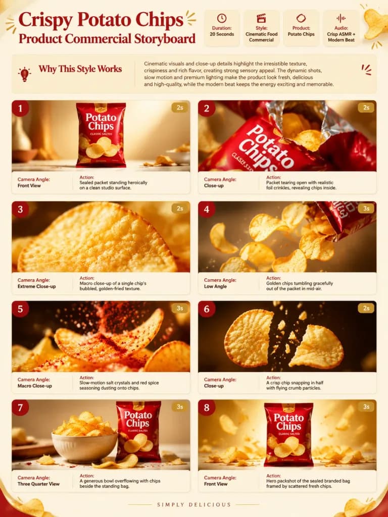
Storyboard Reklamy Chrupiących Chipsów

Storyboard Reklamy Chrupiących Chipsów

Single-page premium commercial advertising storyboard presentation sheet for a [potato chips] campaign. Warm cream background with red and golden accent details. Header section: - Bold presentation title: "Crispy [Potato Chips] Product Commercial Storyboard" - Information badges: "Duration: [20 Seconds]", "Style: Cinematic Food Commercial", "Product: [Potato Chips]", "Audio: Crisp ASMR + Modern Beat" - Brief text card titled "Why This Style Works" Storyboard grid featuring 8 cinematic frames, each accompanied by a scene number, duration badge, camera angle label, and brief action notes: 1. Sealed packet standing heroically on a clean studio surface. 2. Packet tearing open with realistic foil crinkles, revealing chips inside. 3. Extreme macro close-up of a single chip's bubbled, golden-fried texture. 4. Golden chips tumbling gracefully out of the packet in mid-air. 5. Slow-motion macro of salt crystals and red spice seasoning dusting onto chips. 6. A crisp chip snapping in half with flying textured crumb particles. 7. Generous ceramic bowl overflowing with chips beside the standing bag. 8. Hero packshot of the sealed branded bag framed by scattered fresh chips. Visual style: Ultra-realistic high-end commercial food photography, crisp studio lighting, glossy packaging textures, dynamic shallow depth of field, premium agency pitch deck presentation.

storyboardreklamareklama żywności
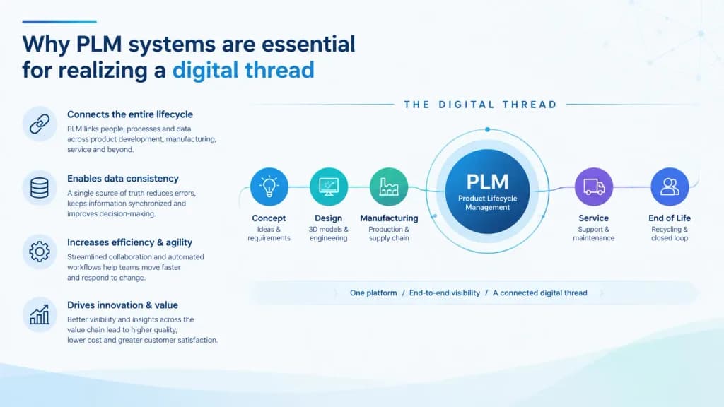
Slajd biznesowy dotyczący cyfrowego wątku

Slajd biznesowy dotyczący cyfrowego wątku

A professional business presentation slide graphic with the title “[Why PLM systems are essential for realizing a digital thread]”. The layout organizes structured supporting points and a sleek infographic diagram visualizing the connected digital thread. Clean corporate design, high legibility, modern typography, minimalist vector icons, subtle technical accents, crisp 16:9 slide format.

prezentacjaslajdinfografika
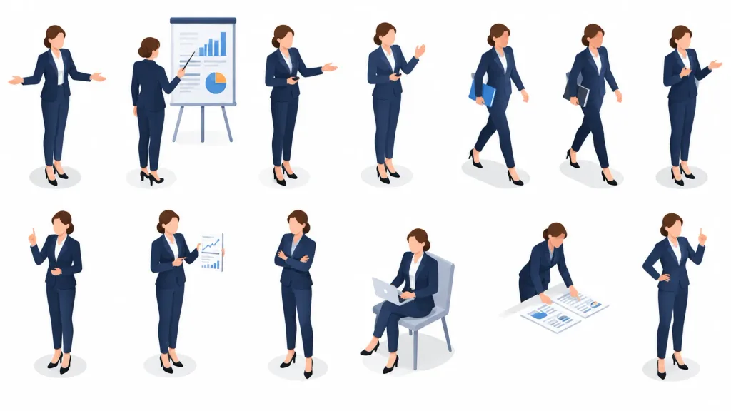
Zestaw póz izometrycznych prezentera biznesowego

Zestaw póz izometrycznych prezentera biznesowego

Isometric vector character pose sheet featuring the same [professional businesswoman presenter] in 13 discrete presentation and office situations, arranged neatly in two rows (top row of 7 figures, bottom row of 6 figures) with generous spacing on a solid bright white background. Each figure is full-body with soft oval gray floor shadows underneath, viewed from consistent isometric angles without overlapping. Character appearance: [light-skinned woman with brown hair in a low bun], simplified faceless features, wearing a consistent [dark navy suit, white blouse, black heels]. Poses include: 1) standing facing forward with an open welcoming gesture, 2) rear-view pointing with a stick at a presentation board with charts, 3) standing holding a remote clicker and gesturing sideways, 4) holding a remote while speaking, 5) walking while holding a folder under one arm, 6) walking holding a notebook, 7) standing and gesturing in conversation, 8) raising an index finger to make a point, 9) holding up a report sheet with line charts, 10) standing with arms crossed confidently, 11) seated on a simple gray chair using a laptop, 12) leaning down pointing at documents, 13) standing with one hand on hip and pointing upward. Visual style: Clean, modern semi-flat isometric vector illustration with subtle gradients and soft shading. Props align with a [corporate business presentation]. No background scenery, borders, text, or watermarks.

izometrycznywektorarkusz postaci
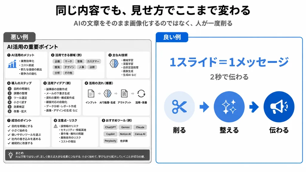
Infografika Porównująca Projekty Japońskich Slajdów
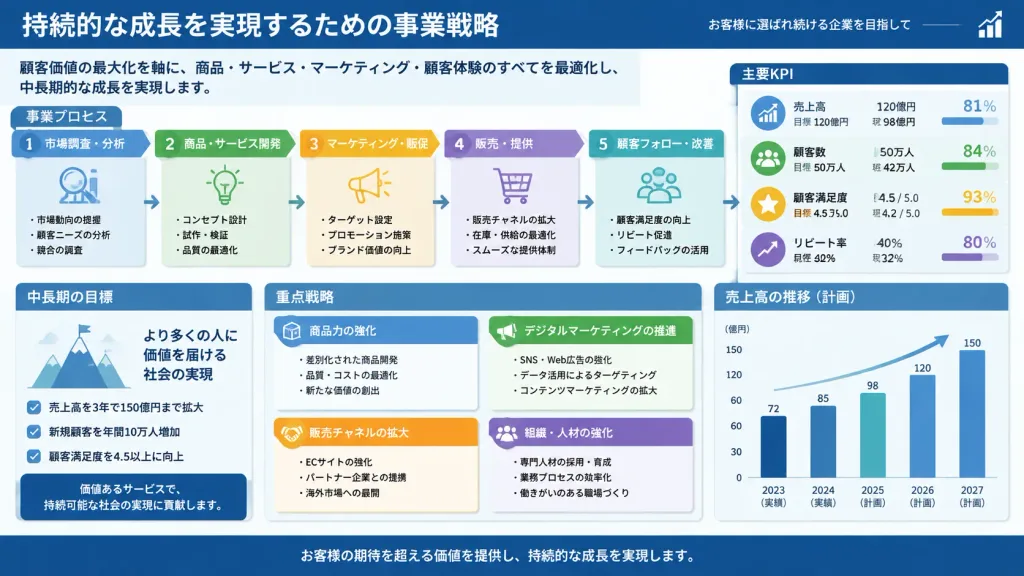
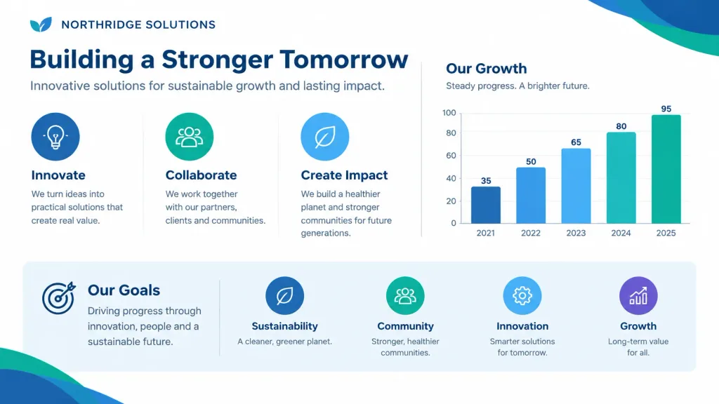
Infografika Porównująca Projekty Japońskich Slajdów

clean Japanese presentation infographic comparing bad and good slide design. 悪い例. dense monochrome black and gray boxed slide with many tiny sections, intentionally cluttered and hard to read. small list with a tiny blue bar chart icon. ro…

infografikaprojektowanie slajdówprezentacja
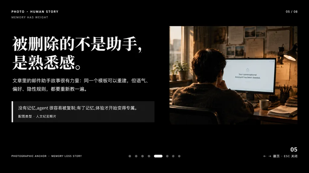
Narracyjny slajd edytorski ze zdjęciem dokumentalnym

Narracyjny slajd edytorski ze zdjęciem dokumentalnym

A minimalist cinematic presentation slide layout on a solid deep black background, widescreen 16:9, premium editorial keynote style. Asymmetrical composition with clean typography on the left and a documentary photograph on the upper right, framed by generous negative space. Left Typography and Text Blocks: - Top-left uppercase microtext: "PHOTO • HUMAN STORY", with "MEMORY HAS WEIGHT" slightly beneath it. - Main headline: very large, bold white Chinese serif typography across two lines reading "[被删除的不是助手,\n是熟悉感。]". - Body text directly below: medium-small white and light gray Chinese text across two lines reading "[文章里的邮件助手故事很有力量:同一个模板可以重建,但语气、\n偏好、隐性规则,都要重新教一遍。]". - Quote block below: a dark translucent rectangular box with a thin vertical white accent line on its left edge. Inside, text reading "[没有记忆,agent 很容易被复制;有了记忆,体验才开始变得专属。]" above a smaller caption line reading "配图类型 · 人文纪实照片". Upper Right Photograph: - A warm-toned, film-style humanistic documentary photo showing one adult seated from behind at a desk in a dimly lit office, looking at a computer screen. Beside the monitor is a desk lamp, with papers pinned on the wall and soft daylight streaming through a nearby window. The monitor displays a clean white interface with centered English text: "[Your conversational Assistant has been deleted.]". Muted brown, amber, and cool gray tones, intimate and melancholic atmosphere. UI Details & Pagination: - Top right: "05 / 08". - Bottom left microtext: "PHOTOGRAPHIC ANCHOR · MEMORY LOSS STORY". - Bottom right: "05" with tiny navigation hint "← → 翻页 · ESC 关闭". - Bottom center: 8 small pagination indicators, with the 5th dot styled as an elongated horizontal white pill and the other 7 as muted gray circles. Overall Aesthetic: High-end editorial magazine layout, crisp alignment, sophisticated typographic hierarchy, contemplative and narrative-driven.

prezentacjakeynoteprojektowanie edytorskie
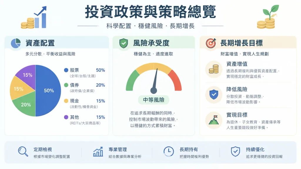
Diagram strategii portfela inwestycyjnego

Diagram strategii portfela inwestycyjnego

A clean and structured infographic overview diagram summarizing the investment policy and strategy shown in the reference image. The layout features organized visual sections explaining [asset allocation, risk tolerance, and long-term growth objectives], using modern minimalist charts, legible typography, and financial icons on a clean [light neutral] background.

infografikainwestycjeportfel
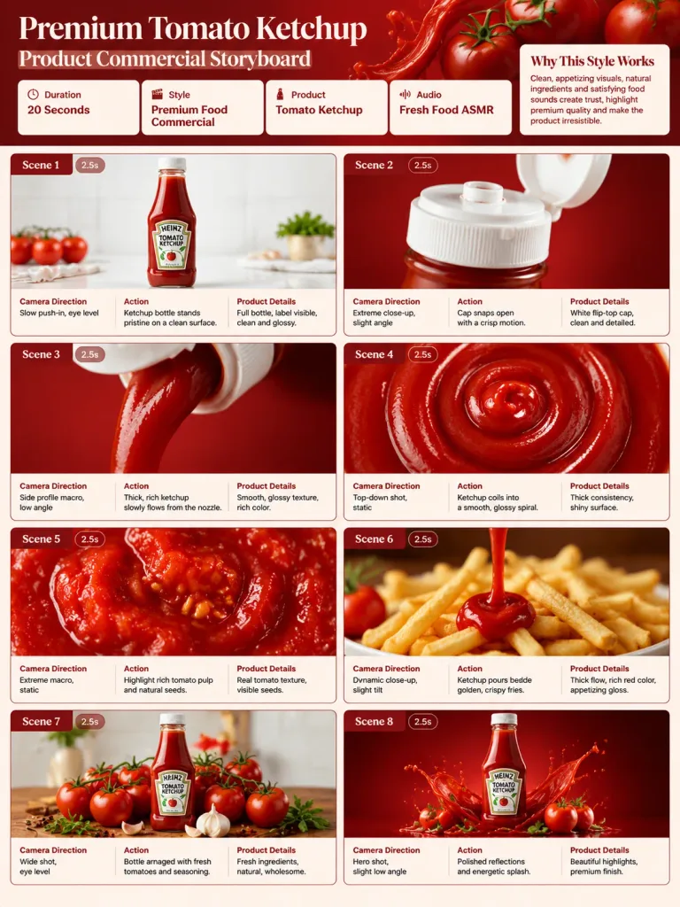
Plansza Storyboardu Reklamowego Ketchup

Plansza Storyboardu Reklamowego Ketchup

A single-page commercial storyboard presentation sheet in a 3:4 portrait layout for a luxury [tomato ketchup] advertising campaign. Clean red, cream, and white editorial aesthetic with bold graphic design typography. HEADER SECTION: - Title: "[Premium Tomato Ketchup Product Commercial Storyboard]" - Information cards displaying: Duration: [20 Seconds], Style: [Premium Food Commercial], Product: [Tomato Ketchup], Audio: [Fresh Food ASMR] - A brief "Why This Style Works" summary card. STORYBOARD GRID (8 cinematic panels, each labeled with Scene Number, Duration Badge, Camera Direction, Action, and Product Details): 1. Slow push-in on the ketchup bottle standing pristine on a clean white surface. 2. Extreme macro close-up of the bottle cap snapping open. 3. Side profile macro of thick, rich ketchup slowly flowing from the nozzle. 4. Top-down shot of ketchup coiling into a smooth, glossy spiral. 5. Extreme macro texture shot highlighting rich tomato pulp and natural seeds. 6. Dynamic pour shot beside golden, crispy french fries. 7. Wide packshot of the bottle arranged among fresh whole vine tomatoes and seasoning. 8. Final hero packshot featuring polished surface reflections and an energetic, controlled ketchup splash. VISUAL STYLE: Ultra-realistic commercial food photography, crisp studio lighting, glossy liquid physics, professional advertising agency presentation board.

storyboardketchupreklama
Infografika biznesowa w stylu Microsoft 365

Infografika biznesowa w stylu Microsoft 365

A flat and minimalist infographic illustrating [a modern business workflow]. Graphic-driven visual expression with minimal text, using a Microsoft 365 inspired color scheme and aesthetic. Modern clean icons, structured layout, and ample white space. Any Japanese text is crisp, legible, and rendered in Hiragino Gothic sans-serif style without artifacts. Clean vector corporate design on a solid bright background.

infografikaflat designgrafika biznesowa
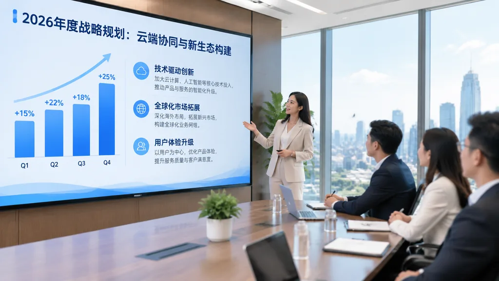
Spotkanie Strategiczne w Jasnym Biurze

Spotkanie Strategiczne w Jasnym Biurze

Recreate the business meeting from the reference photo as a polished, high-end corporate publicity photograph from a new angle. Position the camera closer to the presentation display in a wide front-left perspective, making the screen dominate the left side of the frame while the conference table and seated attendees are positioned on the right beside floor-to-ceiling windows. Replace dim surveillance aesthetics with bright natural daylight, crisp modern architectural office lighting, and professional interior decor. Remove all security overlays, timestamps, and camera artifacts. The presentation display shows a sleek keynote strategy slide in Chinese with headline "[2026年度战略规划:云端协同与新生态构建]". On the left of the slide, display an upward-trending quarterly bar chart with 4 bars: "[Q1 +15%]", "[Q2 +22%]", "[Q3 +18%]", "[Q4 +25%]". On the right of the slide, display three structured sections with bold Chinese headings: "[技术驱动创新]", "[全球化市场拓展]", and "[用户体验升级]", each accompanied by concise Chinese body text. Photorealistic, clean corporate branding aesthetic, neat seating, subtle soft blur on attendee faces.

korporacyjnespotkanie biznesoweprezentacja
Gęsty japoński slajd biznesowy

Gęsty japoński slajd biznesowy

A dense, highly detailed Japanese business presentation slide (Ponchi-e style) with minimal empty space. Professional corporate infographic layout filled with structured text boxes, process flowcharts, KPI metric callouts, and clean Japanese typography. Polished slide deck styling with clear visual hierarchy, subtle color-coded categories, and sharp vector diagrams. Text and content in Japanese: [insert Japanese presentation text or topic details].

prezentacjaslajdinfografika
Konwersja obrazu na edytowalny slajd

Konwersja obrazu na edytowalny slajd

Reproduce the reference image as a single presentation slide layout. Structure all text into clean, clear, and editable typography blocks matching the original wording. Retain and integrate all diagrams, charts, and graphical figures directly from the original reference image, preserving exact proportions, corporate color palette, layout spacing, and visual hierarchy.

prezentacjaukład slajdupowerpoint
Siatka Pitch Decku B2B SaaS

Siatka Pitch Decku B2B SaaS

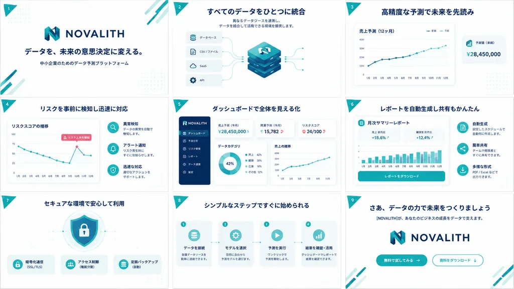
A clean, high-end Japanese B2B SaaS pitch deck and service concept board for [NOVALITH], displayed as exactly 9 widescreen 16:9 slides arranged in a 3x3 grid overview sheet. Canvas and layout: Landscape orientation, uniform white background, evenly spaced slides separated by thin pale borders. Color palette of corporate deep navy, vibrant teal, soft cyan accents, subtle dot grid textures, and a small teal triangular ribbon on the top-left of each slide displaying white numerals 1 through 9. Visual style: Modern Japanese enterprise tech aesthetic, crisp vector UI elements, minimal gradients, soft drop shadows, rounded container cards, thin teal telemetry lines, bold navy headings, and generous whitespace. Brand identity features a stylized geometric 'N' emblem in teal and navy with the uppercase wordmark [NOVALITH]. Vector icons, UI dashboards, and abstract technical diagrams only; no human photographs. Typography and language: All slide text in crisp Japanese typography with bold navy headlines and small legible subtext. Slide contents: 1. Cover: Large [NOVALITH] logo centered above headline 「データを、未来の意思決定に変える。」 and subtext 「中小企業のためのデータ予測プラットフォーム」, with teal diagonal corner lines. 2. Data Integration: Headline 「すべてのデータをひとつに統合」 with short integration subtext. Central stacked isometric database cube with the N logo, connected to 4 input cards labeled 「データベース」, 「CSV / ファイル」, 「SaaS」, and 「API」. 3. Forecasting: Headline 「高精度な予測で未来を先読み」. Large line chart card 「売上予測(12ヶ月)」 with legends 「実績」 and 「予測」, upward trendline, and floating KPI card 「予測値(来期)¥28,450,000」. 4. Risk Detection: Headline 「リスクを事前に検知し迅速に対応」. Line chart card 「リスクスコアの推移」 with declining zigzag path and callout 「リスク上昇を検知」. Right side features 3 circular icon rows for anomaly detection, alerts, and response. 5. Dashboard UI: Headline 「ダッシュボードで全体を見える化」. SaaS dashboard mockup with navy left navigation sidebar (6 menu items), KPI cards (「売上予測(今月)¥28,450,000」, 「需要予測(今月)15,782」, 「リスクスコア 24/100」), a donut chart, and a sales line graph. 6. Automated Reports: Headline 「レポートを自動生成し共有もかんたん」. Central document card titled 「月次サマリーレポート」 with metrics (+18.6%, +12.4%), a teal bar chart, and action button 「レポートをダウンロード」. 7. Security: Headline 「セキュアな環境で安心して利用」. Center shield and padlock graphic with 3 feature badges below: 「暗号化通信(SSL/TLS)」, 「アクセス制御(権限分割)」, and 「定期バックアップ(自動)」. 8. Process Steps: Headline 「シンプルなステップですぐに始められる」. 4 sequential workflow cards linked by dotted arrows: 「データを接続」, 「モデルを選択」, 「予測を実行」, and 「結果を確認・活用」. 9. Closing / CTA: Headline 「さあ、データの力で未来をつくりましょう」, subtext 「[NOVALITH]が、あなたのビジネスの成長をデータで支えます。」, large centered logo, and 2 CTA buttons: filled teal 「無料で試してみる →」 and outlined 「資料をダウンロード ↓」. Constraints: Unified branding, exact 3x3 layout, no stock photography, no extra slide tiles.

pitch decksaasprezentacja
Slajd Tytułowy Prezentacji o Literaturze Chińskiej

Slajd Tytułowy Prezentacji o Literaturze Chińskiej

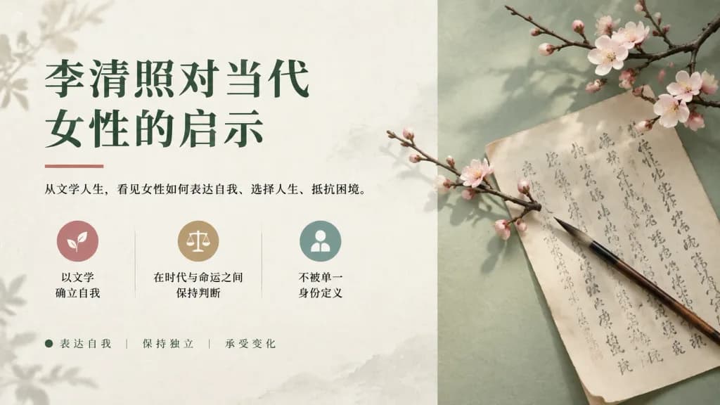
An elegant Chinese literary presentation cover slide about [李清照对当代女性的启示], blending Song dynasty poetic aesthetics with modern editorial graphic design, 16:9 widescreen layout. Background & Composition: Clean off-white background with subtle handmade paper texture, faint ink-wash stains, and delicate botanical shadows. The right third features a pale sage-green vertical backdrop panel. Generous negative space and refined margins throughout. Left Section (Typography & Info): - Headline (top-left): Large dark forest-green Chinese serif font on two lines: “[李清照对当代]” and “[女性的启示]”. Underlined by a thin muted red accent bar. - Subtitle: Smaller black Chinese serif text beneath the red bar: “[从文学人生,看见女性如何表达自我、选择人生、抵抗困境。]”. - Feature Row (middle-left): Three minimalist circular icon cards side by side, separated by faint vertical dividers: 1) muted rose circle with a white leaf icon and text “以文学\n确立自我”, 2) warm beige circle with a white balance-scale icon and text “在时代与命运之间\n保持判断”, 3) desaturated teal circle with a white person silhouette and text “不被单一\n身份定义”. - Keyword Tag Row (bottom-left): Small dark green accent dot followed by “表达自我 | 保持独立 | 承受变化”. Right Section (Still Life Photo): - An antique ivory calligraphy letter with gently curled edges and gray ink vertical calligraphy characters, laid diagonally across the sage-green surface. - A traditional black-and-brown bamboo calligraphy brush resting diagonally across the paper, angled toward the lower right. - Two blooming winter plum blossom branches with delicate pale pink-white blossoms: one arching across the upper-right corner, and one smaller branch extending across the center, casting soft translucent shadows. Style & Lighting: Museum catalog minimalism, calm scholarly atmosphere, natural soft daylight entering from the upper left. Muted color palette of ivory, sage green, forest green, muted rose, warm beige, and ink gray. Crisp typographic layout blended with realistic macro still-life photography.

prezentacjaslajdliteratura chińska
Slajd Prezentacji Ofertowej Co-Brandingu

Slajd Prezentacji Ofertowej Co-Brandingu

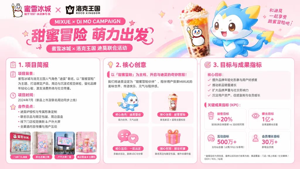
wide marketing proposal slide for a co-branded campaign visual concept. cute youthful brand-collaboration pitch deck, pastel pink gradient background, rounded white cards, soft shadows, hot-pink headings, small decorative sparkles and clou…

prezentacjapitch deckmarketing
Jednoslajdowa infografika artykułu informacyjnego

Jednoslajdowa infografika artykułu informacyjnego

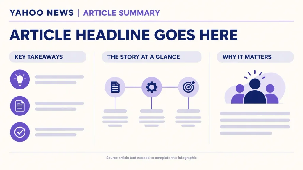
A single-slide infographic that clearly summarizes the following [Yahoo News] article, using diagrams, charts, and clear modern illustrations: --- [paste the Yahoo News article here]

infografikaslajdpodsumowanie wiadomości
Futurystyczna Grafika Prezentacji Marketingowej AI

Futurystyczna Grafika Prezentacji Marketingowej AI

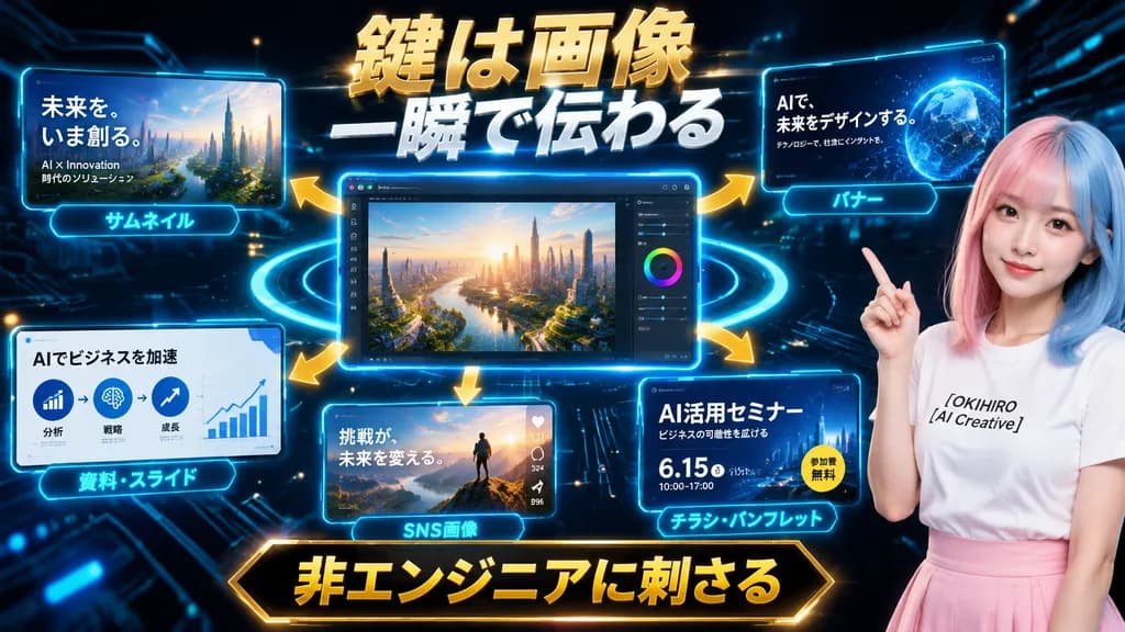
Futuristic Japanese promotional hero graphic and presentation slide for an AI creative service. Dark black and deep navy cyber background with glowing circuit board traces, floating digital particles, and neon cyan light rings orbiting a central screen. Layout and Composition: Wide landscape format featuring a central main UI window, five peripheral display panels connected by curved glowing gold arrows radiating outward, and a presenter on the far right. Central Interface: Large glowing blue-bordered desktop editor window displaying a photorealistic futuristic cityscape at sunrise, overlooking a winding river, lush urban greenery, and glass skyscrapers illuminated by warm morning sunlight, complete with an editing sidebar, sliders, and a color wheel on the right edge. Surrounding Panels: - Top-left panel: Thumbnail mockup of a futuristic metropolis with Japanese text "未来を、いま創る。" and smaller subtext "AI × Innovation" and "時代のソリューション", captioned with a glowing cyan tag reading "サムネイル". - Top-right panel: Web banner mockup showing an abstract blue holographic globe with text "AIで、未来をデザインする。" and subtext "テクノロジーで、社会にインパクトを。", captioned "バナー". - Bottom-left panel: Presentation slide mockup with clean business infographics, three circular process icons, an upward trending line chart, title "AIでビジネスを加速", captioned "資料・スライド". - Bottom-center panel: Social media post mockup showing a hiker on a mountain summit at dawn with text "挑戦が、未来を変える。" and social reaction icons, captioned "SNS画像". - Bottom-right panel: Event flyer mockup with dark blue theme, title "AI活用セミナー", subtext "ビジネスの可能性を広げる", date "6.15", time "10:00–17:00", a circular yellow badge reading "参加費無料", captioned "チラシ・パンフレット". Presenter: On the right side, a young Japanese female presenter shown from the waist up, smiling subtly and gesturing upward with her right index finger. Split-dyed pastel pink and pastel blue straight hair, wearing a white crewneck T-shirt printed with black text "[OKIHIRO AI Creative]" and a soft pink high-waisted skirt. Typography & Banners: - Top center headline: Massive bold 3D metallic gold and white Japanese text with rough texture and strong glow reading "鍵は画像" on line 1 and "一瞬で伝わる" on line 2. - Bottom center footer banner: Prominent black-and-gold framed banner holding bold gold Japanese text "非エンジニアに刺さる". Lighting and Style: High-contrast digital marketing aesthetic, glossy glassmorphic UI panels, vibrant cyan edge rim lights, polished commercial tech-presentation graphics.

marketingprezentacjagrafika główna
Plakat Infograficzny z Wiedzą Biznesową

Plakat Infograficzny z Wiedzą Biznesową

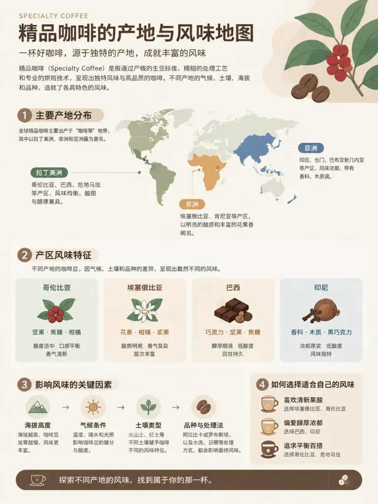
A professional knowledge infographic poster about [Map of Specialty Coffee Origins and Flavors]. Layout features 3 to 5 core knowledge sections structured with clear visual hierarchy, minimalist vector icons, flowcharts, and clean data visualization elements. Smooth visual flow guiding the viewer through the content. Includes prominent Chinese title typography and accurate Chinese explanatory text blocks. Style is modern flat vector design with generous whitespace and a sophisticated, cohesive color palette suitable for corporate presentations.

infografikawizualizacja-danychflat-design
Mockup UI Sekcji Hero Japońskiej Firmy Budowlanej

Mockup UI Sekcji Hero Japońskiej Firmy Budowlanej

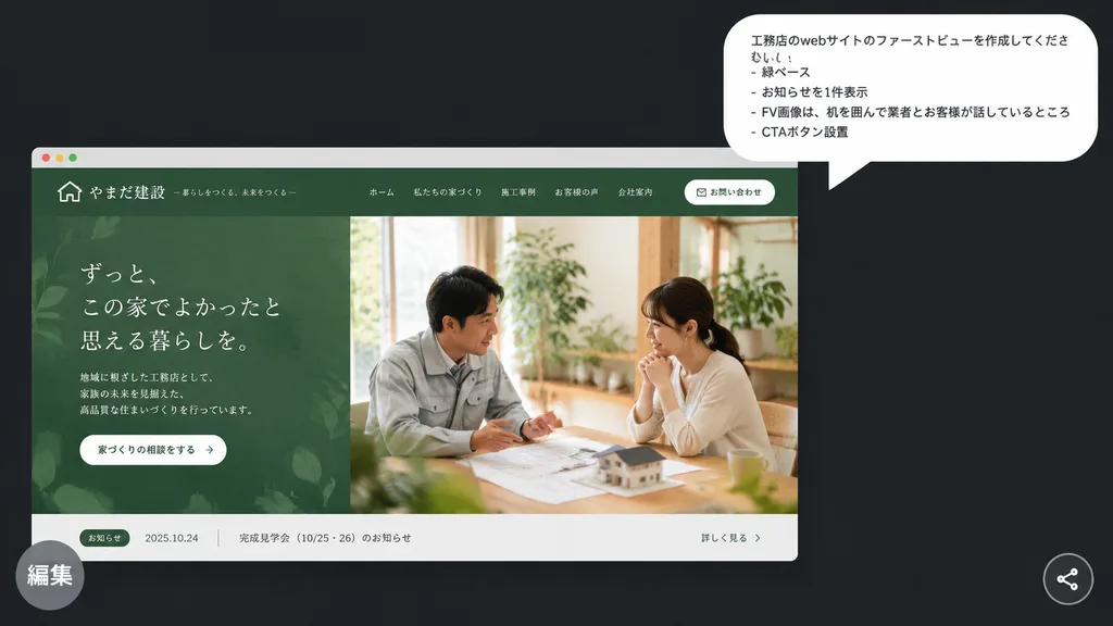
A polished presentation-style mockup on a [dark charcoal] background presenting a Japanese homebuilder website hero concept. In the upper right, a large white rounded speech bubble displays 4 Japanese bullet lines in clean sans-serif text: 「工務店のwebサイトのファーストビューを作成してください。」, 「- 緑ベース」, 「- お知らせを1件表示」, 「- FV画像は、机を囲んで業者とお客様が話しているところ」, 「- CTAボタン設置」. In the lower left, a realistic desktop browser mockup card features a muted forest-green theme for an elegant Japanese construction firm. The top navigation bar includes a small house icon logo, company name in Japanese, 5 navigation links, and 1 rounded white contact button. The hero section is split into two halves: the left shows an organic leaf-patterned green textured panel with Japanese headline typography, brief descriptive text, and a white pill CTA button; the right displays a warm natural-light photograph of exactly 2 people seated across a wooden table discussing architectural plans with a miniature house model, surrounded by indoor greenery. At the bottom of the browser frame, a narrow light-gray news bar shows 1 announcement item with a green category tag, a date, Japanese text, and a link. A semi-transparent gray circular badge with the Japanese label 「編集」 overlaps the bottom-left corner, and a small circular share icon rests in the bottom-right corner.

projektowanie-ui-uxmockup-stronysekcja-hero
Tło okładki prezentacji doradczej

Tło okładki prezentacji doradczej

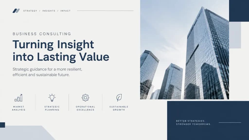
Clean case-style visual layout with a structured grid composition. Subtle abstract data cues including minimalist lines, geometric blocks, and rhythmic spacing. [Neutral professional color palette of slate gray, navy, and soft off-white]. Soft, even lighting with no dramatic contrast. Calm, credible, and serious corporate aesthetic, designed as a premium consulting-grade presentation cover.

prezentacjadoradztwoslajdy
Minimalistyczny slajd tytułowy prezentacji platformy AI

Minimalistyczny slajd tytułowy prezentacji platformy AI

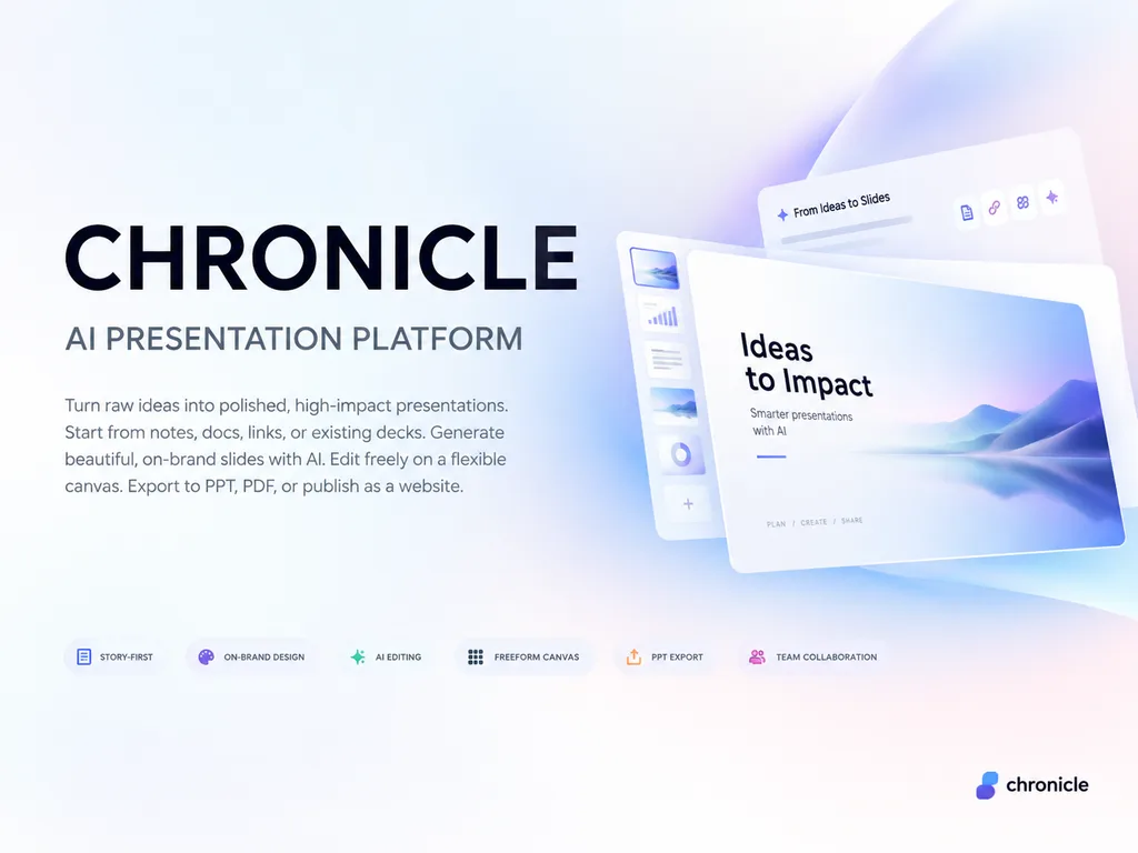
A premium 4:3 presentation cover slide introducing [Chronicle], an AI-native presentation platform. Style: Elegant, minimal, modern tech startup aesthetic inspired by Apple, Linear, and Notion brand books. Soft gradient background with subtle depth and clean generous whitespace. Layout: Asymmetrical, polished editorial layout with consulting-grade presentation quality. Typography and text elements (in English): Main title reads "[CHRONICLE]"; subtitle reads "[AI PRESENTATION PLATFORM]"; elegant body text reads "[Turn raw ideas into polished, high-impact presentations. Start from notes, docs, links, or existing decks. Generate beautiful, on-brand slides with AI. Edit freely on a flexible canvas. Export to PPT, PDF, or publish as a website.]"; small refined feature tags read "[STORY-FIRST]", "[ON-BRAND DESIGN]", "[AI EDITING]", "[FREEFORM CANVAS]", "[PPT EXPORT]", "[TEAM COLLABORATION]"; subtle logo text in the bottom corner reads "[chronicle]". Business-class premium, slightly futuristic, sharp graphic design.

prezentacjaslajdminimalizm
Zdjęcie z widowni Apple Keynote

Zdjęcie z widowni Apple Keynote

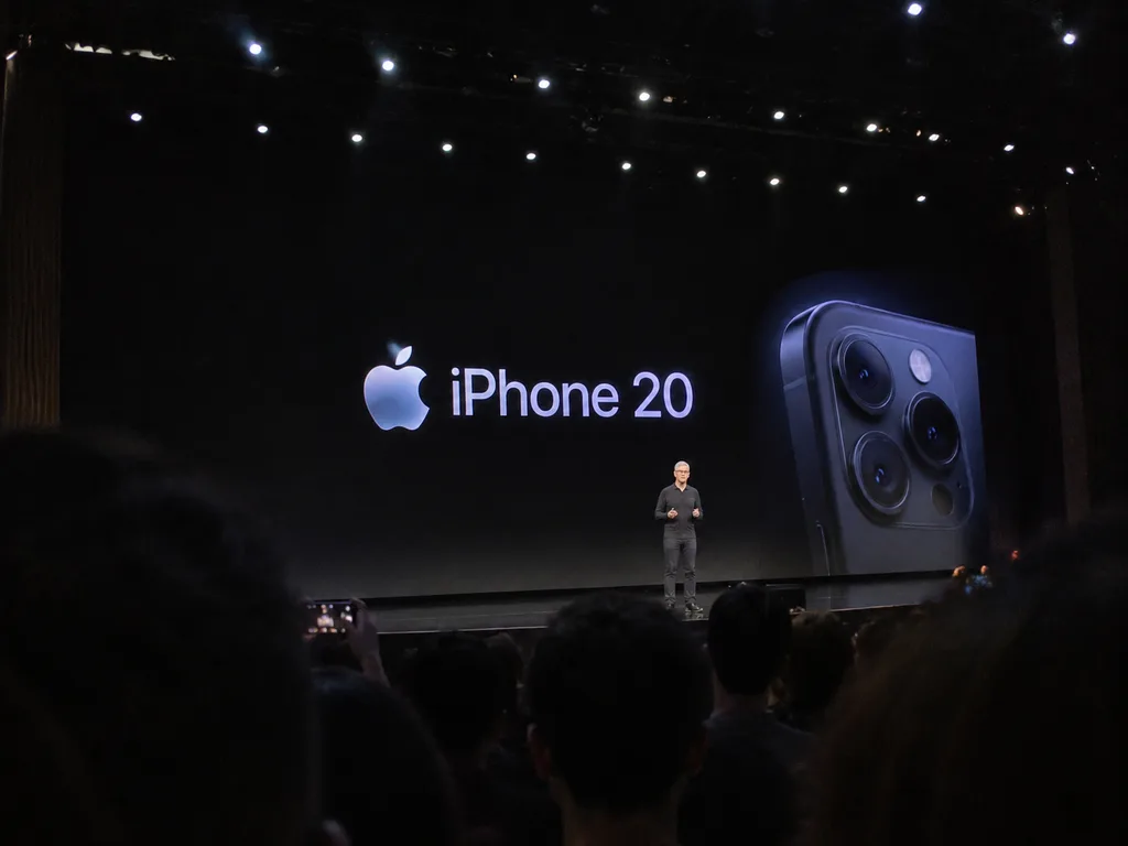
An amateur [iPhone] photo taken at Apple Park during the [iPhone 20 keynote]. [Tim Cook] is presenting on stage under auditorium spotlights, captured from a distance deep within the audience crowd. Smartphone snapshot perspective, candid audience composition with blurred silhouettes of heads in the foreground, handheld camera quality.

apple keynotetim cookwidok z widowni
Storyboard Reklamowy Mebli Biurowych

Storyboard Reklamowy Mebli Biurowych

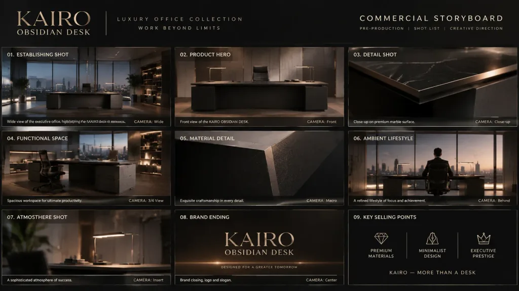
A professional cinematic commercial storyboard presented in a clean 16:9 layout, structured as an executive shot list presentation for a commercial ad campaign. Subject: The [KAIRO OBSIDIAN DESK] luxury office collection, featuring minimalist architecture, executive workspace design, and ultra-premium materials. Composition: Multi-frame advertising storyboard grid displaying sequential scenes, camera angles, and creative direction notes. Lighting: Moody architectural lighting, sophisticated rim lights, and soft ambient workspace glow. Style: High-end commercial film pre-production board, modern luxury corporate aesthetic.

storyboardreklamameble biurowe
Brutalistyczny Monochromatyczny Slajd Architektury

Brutalistyczny Monochromatyczny Slajd Architektury

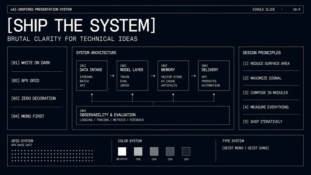
minimal monochrome presentation slide. high-contrast brutalist technical design, black background with subtle navy tint, thin white wireframe borders, zero decoration, strict grid, mono-first typography, futuristic industrial UI aesthetic.…

prezentacjamakietabrutalizm
Nowoczesny Minimalistyczny Slajd ze Schematem Blokowym

Nowoczesny Minimalistyczny Slajd ze Schematem Blokowym

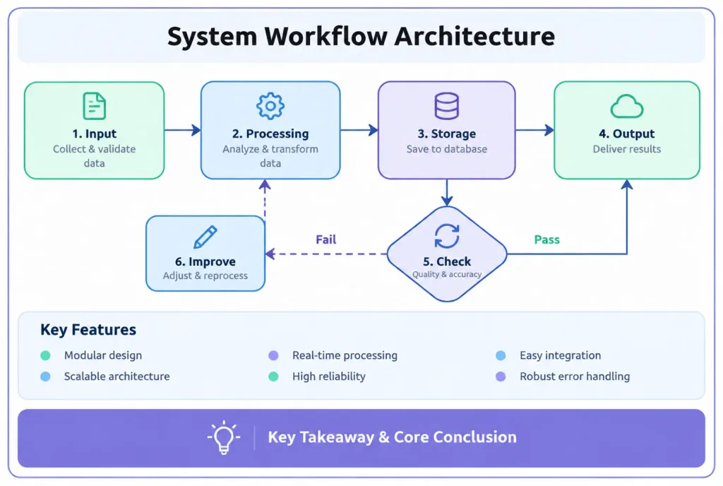
A modern minimalist flat UI vector presentation slide diagram about [System Workflow Architecture], horizontal 3:2 landscape format enclosed within a neat container frame. - Visual Style: Flat vector card-style design, pastel candy color palette with high brightness and low saturation (soft mint green, baby blue, lavender), crisp 2px to 3px solid darker outlines, large rounded corners (10-15px radius) on all cards, buttons, and nodes. Right-angle orthogonal elbow connector lines with directional arrows. - Layout Structure (top to bottom): 1. Header: Centered at top, bold black font reading "[System Workflow Architecture]". 2. Flowchart Area: Occupying central 50% of the canvas with rounded rectangular process nodes, right-angle connecting lines, and a dashed loopback connector. 3. Feature List: Short concise bullet points arranged cleanly with balanced white space below the flowchart. 4. Footer Summary Box: Full-width contrasting purple rounded banner spanning the bottom containing "[Key Takeaway & Core Conclusion]". Clean vector graphics, crisp typography, professional presentation slide aesthetic.

schemat-blokowyinfografikaprezentacja
Arkusz Izometrycznych Postaci do Galerii Sztuki

Arkusz Izometrycznych Postaci do Galerii Sztuki

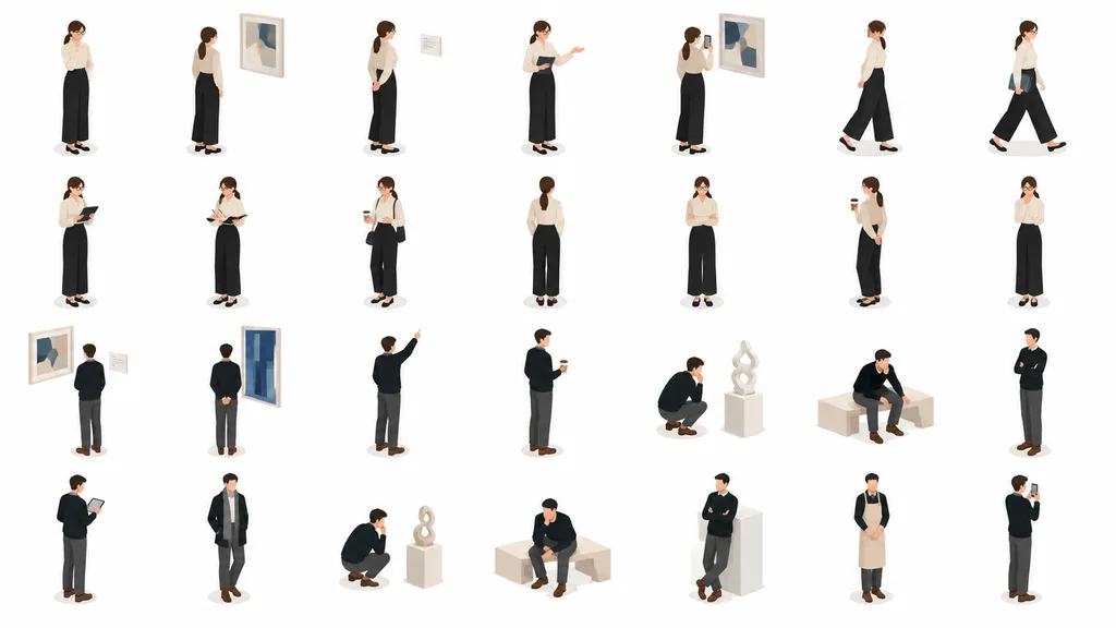
isometric people illustration set for presentations and service pages. clean flat-vector isometric illustration, soft 3D-like shading, minimal facial features, muted corporate colors, consistent proportions, pure white background, subtle o…

izometrycznypostaciewektor
Tablica Koncepcji Ikon Aplikacji

Tablica Koncepcji Ikon Aplikacji

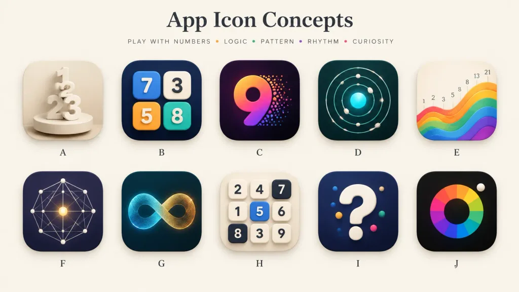
A polished presentation board showcasing 10 alternative app icon concepts for a [number-play and logic puzzle] mobile app. Wide 16:9 landscape canvas on a warm off-white background, minimal gallery-style spacing, soft shadows, and a premium design-review aesthetic. Header: Centered at the top, a large elegant serif title: "[App Icon Concepts]". Below it, a small uppercase tracked tagline: "[PLAY WITH NUMBERS • LOGIC • PATTERN • RHYTHM • CURIOSITY]" with tiny colored dots between words. Grid & Icons: A clean 2-row by 5-column grid containing exactly 10 identical-sized rounded-square app icons with consistent corner radii, subtle drop shadows, and a single centered letter label beneath each, labeled A through J: - A: Cream monochrome icon with stacked 3D numerals 1, 2, and 3 standing on a circular pedestal, sculptural plaster look. - B: Dark navy icon featuring four raised rounded number tiles (blue 7, cream 3, orange 5, teal 8) arranged like playful puzzle blocks. - C: Deep purple-black icon with a large gradient numeral 9 in orange, magenta, and violet, with colorful particle dots bursting from its right edge. - D: Dark teal icon showing an orbital logic pattern of concentric circular paths, small white spheres, and a glowing cyan center. - E: Warm ivory icon displaying rising rainbow wave bands from left to right, with small Fibonacci numbers (1, 2, 3, 5, 8, 13, 21) above the wave. - F: Dark indigo icon with a geometric constellation network of thin white connecting lines, dots, and a glowing golden center point. - G: Dark teal icon featuring a luminous infinity loop made of fine parallel lines transitioning from cyan to golden orange. - H: Light cream icon with a 3x3 grid of tactile number tiles (top row: 2, 4, 7; middle: 1, 5, 6; bottom: 8, 3, 9; tile 5 is blue, 7 and 8 are dark). - I: Dark navy icon with a large glossy white 3D question mark accented with small colored dots. - J: Near-black icon with a segmented rainbow circular color wheel around a dark center disk, and a small white sphere at the upper-right edge. Style: High-end mobile app icon exploration sheet, soft 3D rendering combined with crisp vector precision, realistic highlights, subtle ambient occlusion, balanced negative space, clean typography, no watermarks.

ikona aplikacjiprojektowanie uitablica koncepcji
Moodboard Kampanii Kolaboracji Marek

Moodboard Kampanii Kolaboracji Marek

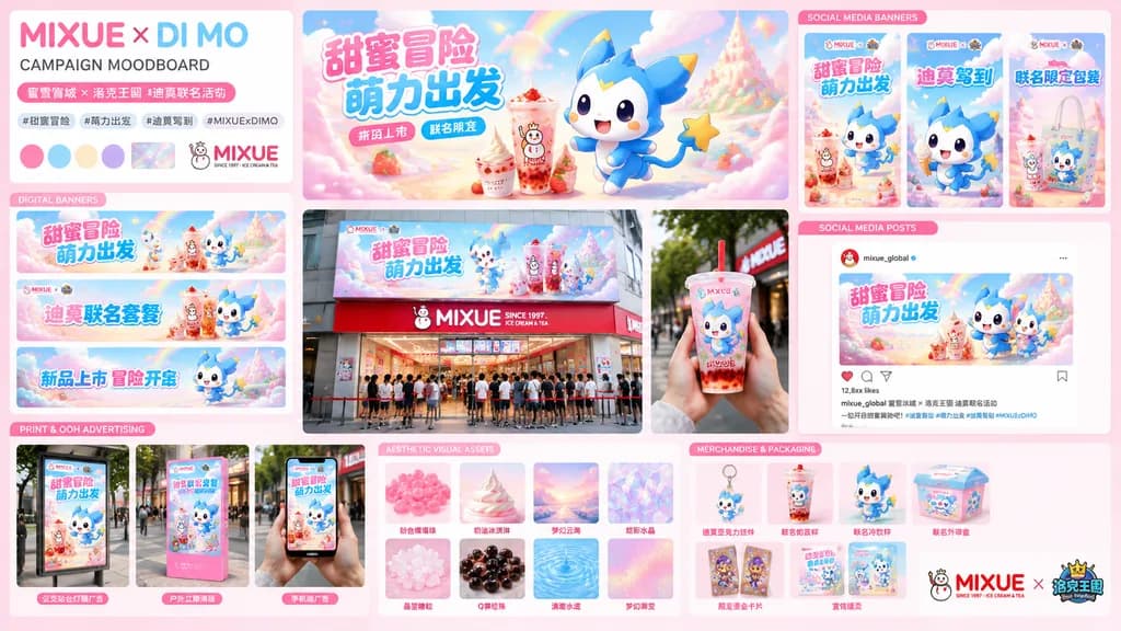
brand collaboration campaign moodboard and visual proposal board. large horizontal hero banner featuring a blue-and-white chibi creature mascot running joyfully beside a strawberry bubble tea and soft-serve drink cup, set against pastel ra…

moodboardbrandingpitch deck
Slajd Porównawczy z Trzema Billboardami Miejskimi

Slajd Porównawczy z Trzema Billboardami Miejskimi

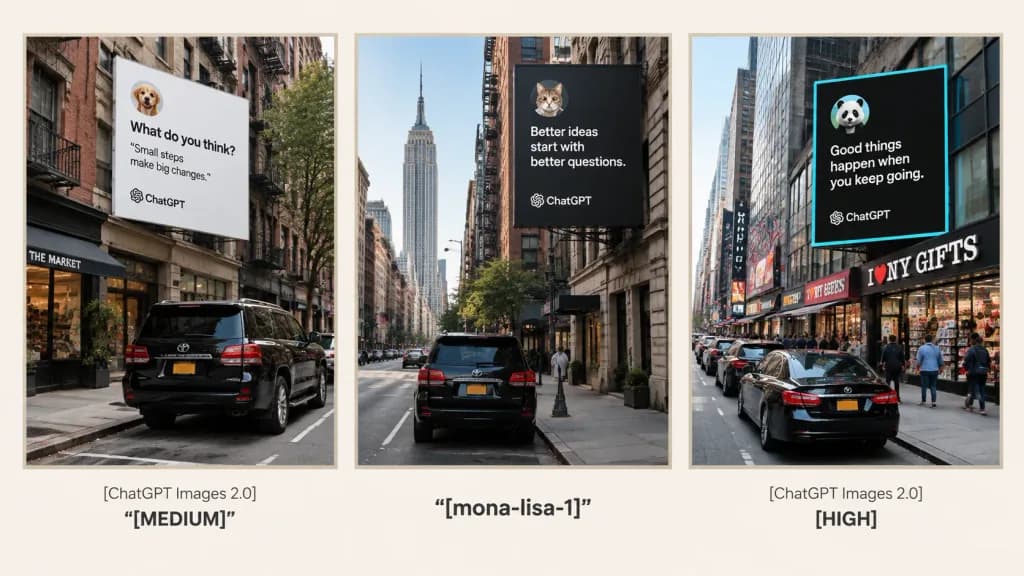
A clean 16:9 presentation comparison slide on a warm off-white background, featuring three tall vertical photo panels arranged side-by-side in a single row, framed by subtle pale beige borders. Under each panel is a centered, clean typography caption. Left panel: Realistic smartphone street photography in New York City, showing the rear view of a black SUV parked along the curb facing urban storefronts and brownstones. Mounted high on a building above is a large white square billboard resembling a social media quote card with a small circular animal avatar, the bold headline “What do you think?”, short quote text, and subtle ChatGPT branding. Caption below left panel: “[ChatGPT Images 2.0]” on the top line, with ““[MEDIUM]”” in bold below. Center panel: NYC street scene looking down a narrower Manhattan street with the Empire State Building framed in the distance and a black SUV parked in the foreground. High above hangs a large dark square billboard with crisp white quote text, a circular animal avatar icon, and ChatGPT branding. Caption below center panel: ““[mona-lisa-1]”” in bold typography. Right panel: A bustling NYC avenue with parked cars including a black sedan, commercial storefront signs including “I ♥ NY GIFTS”, and pedestrians. A prominent black billboard with a vivid cyan border features white text, a circular avatar, and ChatGPT branding. Caption below right panel: “[ChatGPT Images 2.0]” on the top line, with ““[HIGH]”” in bold below. Style: Minimalist presentation slide layout, photorealistic urban street photography inside the three framed panels, crisp text alignment, no superfluous graphic clutter.

billboardporównanieprezentacja
Minimalistyczna Infografika Podsumowująca

Minimalistyczna Infografika Podsumowująca

A visually clear and attractive infographic summarizing the following content: [Paste the full text of the article or report here]. Style: Minimalist, sophisticated hand-drawn diagram style similar to Napkin AI, professional yet approachable. Layout & Components: An engaging title at the top concisely stating the theme; 3 to 5 well-organized key takeaways; intuitive flowcharts, conceptual diagrams, and clean vector icons illustrating key processes; prominent emphasized callout data and key statistical metrics; and a distinct conclusion or next-step action box at the bottom. Aesthetics: Clean light background, elegant layout, generous white space, modern typography, and a cohesive, limited accent color palette.

infografikadiagramwizualizacja-danych
Ciepły Edytorski Slajd Tytułowy Prezentacji

Ciepły Edytorski Slajd Tytułowy Prezentacji

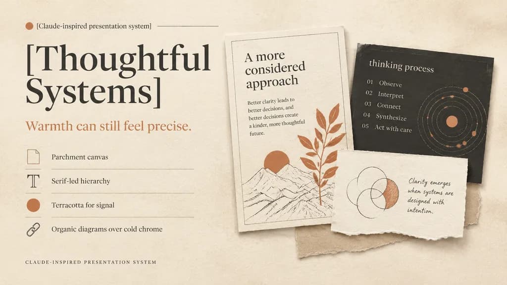
A refined editorial presentation cover slide in a warm design system, landscape 16:9 composition. Background of textured warm ivory parchment paper with subtle grain, soft realistic cast shadows, and tactile torn-paper collage layers. Color palette: warm ivory, cream, sand, charcoal, muted black, and terracotta accents. Left half layout: top label reading "[Claude-inspired presentation system]" beside a small terracotta dot and a hairline divider; below, an oversized high-contrast serif headline in muted black split across two lines reading "[Thoughtful Systems]"; underneath, a smaller serif subheadline in terracotta reading "[Warmth can still feel precise.]"; followed by a vertical list of 4 design principles separated by thin divider lines with small icons: 1) a rectangular parchment-sheet icon with "Parchment canvas", 2) a serif capital T icon with "Serif-led hierarchy", 3) a filled terracotta dot icon with "Terracotta for signal", 4) a chain-link icon with "Organic diagrams over cold chrome"; at the bottom left, small-caps spaced caption "CLAUDE-INSPIRED PRESENTATION SYSTEM". Right half layout: a layered collage of 3 physical paper cards: 1) a tall off-white card with a hairline border, heading "A more considered approach", short body copy on clarity, a minimalist line drawing with a terracotta sun, and an overlapping terracotta botanical branch; 2) a charcoal rectangular card partially behind it with lowercase title "thinking process", a 5-step numbered list ("01 Observe", "02 Interpret", "03 Connect", "04 Synthesize", "05 Act with care"), and a dotted circular orbital diagram with terracotta highlights; 3) a torn off-white note card in front with hand-drawn overlapping circles where one crescent is shaded in terracotta, accompanied by handwritten text "[Clarity emerges when systems are designed with intention.]"; a light beige paper strip peeks from beneath the cards. Soft natural diffused lighting, generous negative space, sophisticated print editorial aesthetic.

prezentacjaslajdprojektowanie edytorskie
Minimalistyczny japoński slajd prezentacji o AI

Minimalistyczny japoński slajd prezentacji o AI

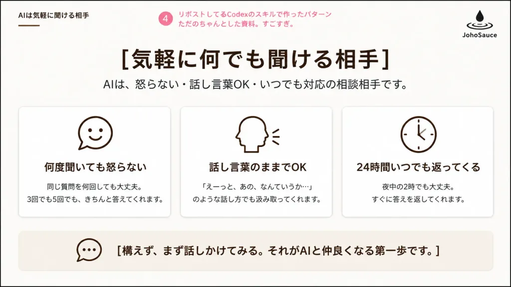
A clean Japanese corporate presentation slide about AI as an approachable conversation partner, designed in a polished business deck layout on a 16:9 widescreen canvas. White background with very subtle warm beige shading, a thin black outer border, generous margins, and a calm, minimalist aesthetic. Header: - Top-left small section title in Japanese: 「AIは気軽に聞ける相手」 with a short thin brown underline. - Top center-left: a pink circular badge containing 「4」 followed by pink annotation text: 「リポストしてるCodexのスキルで作ったパターン ただのちゃんとした資料。すごすぎ。」 - Top-right: a minimalist black logo consisting of a droplet falling into ripple rings, with 「JohoSauce」 written underneath. Main title area: - Centered large bold Japanese headline: 「[気軽に何でも聞ける相手]」 - Directly beneath it, a smaller dark-gray subtitle: 「AIは、怒らない・話し言葉OK・いつでも対応の相談相手です。」 Main content: - Exactly three equal rounded rectangular cards arranged in a horizontal row, with thin light-gray borders, white fill, subtle soft drop shadows, and centered dark-brown monoline icons at the top of each card. - Card 1: smiling chat bubble icon. Title: 「何度聞いても怒らない」. Body text: 「同じ質問を何回しても大丈夫。\n3回でも5回でも、きちんと答えてくれます。」 - Card 2: side profile head speaking with two small sound lines icon. Title: 「話し言葉のままでOK」. Body text: 「『えーっと、あの、なんていうか…』\nのような話し方でも汲み取ってくれます。」 - Card 3: simple analog clock icon. Title: 「24時間いつでも返ってくる」. Body text: 「夜中の2時でも大丈夫。\nすぐに答えを返してくれます。」 Bottom message bar: - A wide, pale beige rounded rectangular container spanning most of the slide width. - On the left inside: an outlined speech bubble icon. - To the right: bold Japanese message: 「[構えず、まず話しかけてみる。それがAIと仲良くなる第一歩です。]」 Style: Crisp vector rendering, Japanese business slide deck typography, dark brown and black text, minimal pink accents, no photographic elements, no gradients except faint background warmth.

prezentacjaslajdjapoński
Minimalistyczny Slajd Koncepcji Marki

Minimalistyczny Slajd Koncepcji Marki

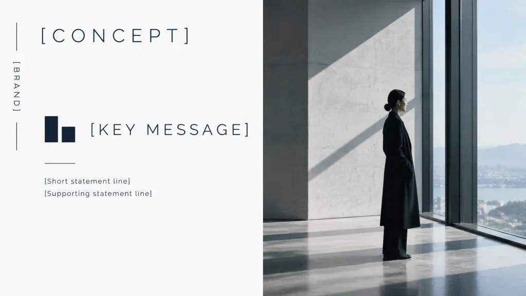
A minimalist luxury brand concept presentation cover slide in 16:9 widescreen format, featuring a split editorial layout with a refined monochrome palette of clean white, charcoal, deep navy-black, cool gray, and soft daylight. Left half (Graphic design panel): Clean white background with generous negative space. On the far left margin, one thin vertical line broken into two segments with the vertical uppercase text "[BRAND]" centered between them. Near the top-left, the large, wide-spaced uppercase headline "[CONCEPT]". In the middle-left area, a small abstract geometric logo composed of exactly two dark navy rectangular blocks, positioned next to the large wide-spaced title "[KEY MESSAGE]". Beneath the logo and title, a short horizontal rule followed by two small supporting text lines: "[Short statement line]" and "[Supporting statement line]". All typography uses a thin modern sans-serif typeface in dark navy-black with precise alignment. Right half (Photo panel): A full-height cinematic architectural photo showing a quiet, high-end interior with smooth concrete walls, tall floor-to-ceiling windows, soft natural daylight, and strong diagonal shadows. Slightly right of center stands [a woman in a long black coat, seen in side profile, standing calmly and looking out the window, with a low bun hairstyle and understated elegance]. Style: Premium Japanese and Scandinavian editorial design, calm, spacious, museum-like corporate branding aesthetic. Crisp editorial typography on the left, realistic photographic depth on the right. Constraints: Exactly 1 vertical brand label, 1 headline, 1 abstract logo, 1 central title, 1 horizontal rule, 2 supporting text lines, and 1 human subject. No mockups, frames, extra icons, or watermarks.

prezentacjabrandingminimalizm
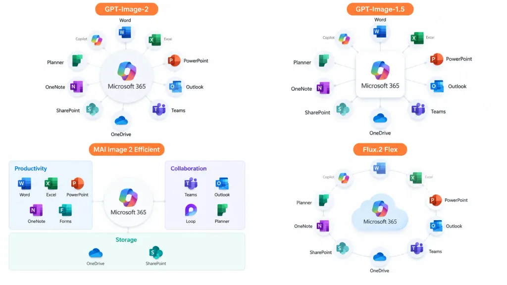
Infografika Porównawcza Ekosystemu Oprogramowania

Infografika Porównawcza Ekosystemu Oprogramowania

A clean 16:9 presentation comparison infographic showing the [Microsoft 365] ecosystem concept displayed across four quadrants in a 2×2 grid with generous whitespace and no hard divider lines, on a solid white background. Each quadrant displays an app ecosystem diagram centered on [Microsoft 365], surrounded by recognizable colored Microsoft app icons (Word, Excel, PowerPoint, Outlook, Teams, OneDrive, SharePoint, OneNote, Planner, Forms, Loop, Copilot) with crisp English labels and light gray connector lines. Each quadrant includes an orange label tag at the top: 1. Top-left: "[GPT-Image-2]" — polished circular hub diagram with app cards arranged radially around the central hub. 2. Top-right: "[GPT-Image-1.5]" — simplified radial hub diagram with icons orbiting a central square box. 3. Bottom-left: "[MAI Image 2 Efficient]" — structured dashboard-style diagram organized into labeled categories such as Productivity, Collaboration, and Storage. 4. Bottom-right: "[Flux.2 Flex]" — soft circular diagram with floating app icons orbiting a stylized cloud icon. Style: Modern corporate slide design, crisp vector icons, subtle drop shadows, clean typography, official Microsoft blue, green, orange, and purple color palette.

infografikaprezentacjadiagram

Wskazówki dotyczące promptów: Prezentacje

  • Określ dokładne proporcje obrazu, np. 16:9 dla slajdów ekranowych lub 2:3 dla pionowych plansz prezentacji architektonicznych.
  • Precyzyjnie definiuj strukturę układu, np. siatki bento (bento grids), kolaże slajdów 3x3 lub strefy rysunku na dzielonym ekranie.
  • Wprowadź pożądane wskazówki stylistyczne, takie jak matowy szklany efekt (glassmorphism), linie pisaka suchościeralnego czy precyzyjne detale rysunku architektonicznego, aby nadać całości właściwy ton.

Powiązane tematy

Najczęściej zadawane pytania

Który model AI sprawdza się najlepiej w promptach do prezentacji?
GPT Image 2 jest najczęściej wybieranym modelem dla tych szablonów, a za nim plasują się Nano Banana Pro i GPT Image 2.5 przy złożonych kompozycjach graficznych.
Czy zamiast pojedynczych slajdów mogę generować całościowe przeglądy zestawów slajdów?
Tak, określ układ siatki, np. kolaż przeglądowy 3x3 lub wyśrodkowaną mozaikę baneru SaaS otoczoną miniaturkami slajdów.
Jak kontrolować czytelność tekstu na generowanych slajdach?
Proś o minimalny tekst zastępczy (placeholder), krótkie nagłówki w nawiasach lub czyste, geometryczne ikony, aby utrzymać przejrzystą hierarchię wizualną.