
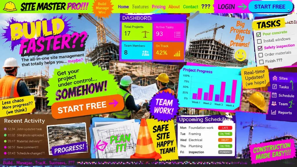
Worst UI UX Landing Page Concept
Generates an intentionally broken and chaotic landing page concept for testing bad design constraints. Swap the bracketed app topic to test horrible user interfaces for any niche.
Prompt
Landing page design for [a site management app for the construction industry] intentionally crafted with the worst possible UI/UX practices: zero legibility, zero readability, zero utility, and visually painful aesthetics. Chaos-driven cluttered layout, disastrous clashing color scheme with unreadable low-contrast text, awful mismatched novelty font choices, low-resolution unaligned stock photos overlapping haphazardly, broken alignment, overlapping buttons, and broken responsive grid elements creating maximum visual confusion.
What you can customize
Swap these parts of the prompt for your own subject or wording before you generate.
[a site management app for the construction industry]placeholder
Prompt details
- Category
- UI / UX Design
- Model
- GPT IMAGE 2
- Cost per image
- 1K: 43 credits · 2K: 86 credits · 4K: 143 credits
- Aspect ratio
- 16:9
- Added