
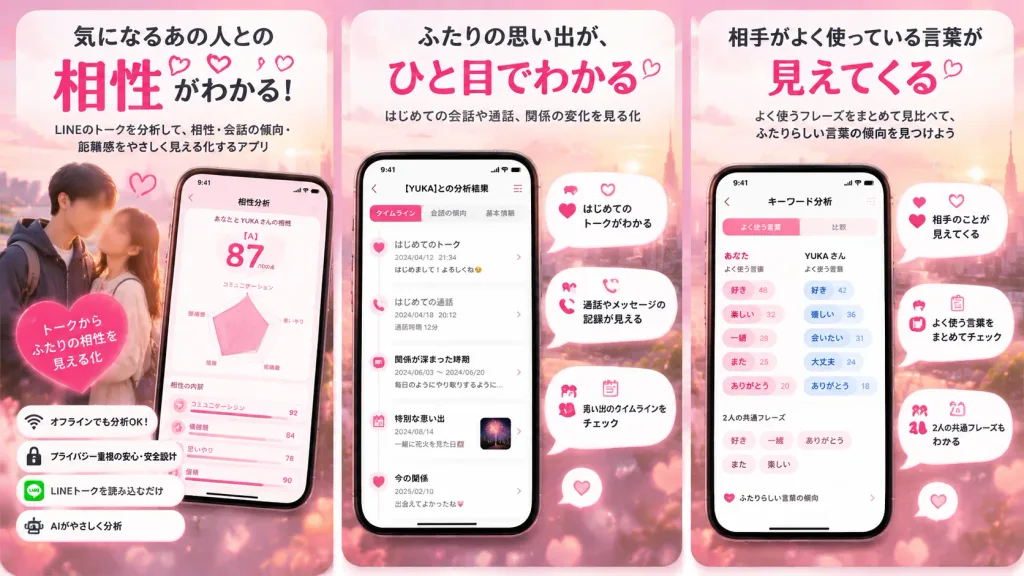
Romantic Chat Analysis App Promo Panels
Generates a three-panel Japanese app store advertisement featuring romantic pink UI mockups and relationship analytics. Customize the Japanese headlines, feature icons, and screen stats for other mobile apps.
Prompt
A three-panel vertical Japanese mobile app promotional graphic for a romantic chat analysis application, set against a soft blush pink, coral, white, and peach romantic dating aesthetic. Composition & Setting: A wide horizontal layout displaying exactly three tall rounded-rectangle poster panels side-by-side like App Store preview cards. Dreamy sunset cityscape background with soft pink clouds, warm romantic glow, subtle sparkles, floating hearts, and gentle bokeh lights. Panel 1 (Left - Compatibility Analysis): - Top headline: 「気になるあの人との 相性が わかる!」 with 「相性」 oversized in vibrant hot pink; subcopy below: 「LINEのトークを分析して、相性・会話の傾向・距離感をやさしく見える化するアプリ」 - Visuals: Blurred-face young couple standing closely at bottom-left; tilted smartphone at bottom-right showing a romantic compatibility score screen with a prominent grade "[A]", a pink radar chart, score "[87]", and breakdown cards. - Overlay badge on couple: 「トークから ふたりの相性を 見える化」 - Four stacked feature pills at bottom-left with icons: 1) Wi-Fi icon 「オフラインでも分析OK!」, 2) lock icon 「プライバシー重視の安心・安全設計」, 3) LINE chat icon 「LINEトークを読み込むだけ」, 4) robot icon 「AIがやさしく分析」 Panel 2 (Center - Timeline Memories): - Top headline: 「ふたりの思い出が、ひと目でわかる」 with 「ひと目でわかる」 in hot pink; subcopy: 「はじめての会話や通話、関係の変化を見る化」 - Visuals: Centered upright smartphone displaying a detailed vertical timeline screen titled 「[YUKA]との分析結果」 with clean mobile UI. - Four floating white speech-bubble callouts with pink icons: 1) heart icon 「はじめてのトークがわかる」, 2) phone icon 「通話やメッセージの記録が見える」, 3) calendar icon 「思い出のタイムラインをチェック」, 4) small decorative heart accent bubble Panel 3 (Right - Word Frequency): - Top headline: 「相手がよく使っている言葉が 見えてくる」 with 「見えてくる」 in hot pink; subcopy: 「よく使うフレーズをまとめて見比べて、ふたりらしい言葉の傾向を見つけよう」 - Visuals: Centered upright smartphone showing a pink-and-white keyword cloud dashboard with grouped pill tags and comparative stats for both partners. - Four floating white callout bubbles with pink icons: 1) heart icon 「相手のことが見えてくる」, 2) clipboard icon 「よく使う言葉をまとめてチェック」, 3) couple icon 「2人の共通フレーズもわかる」, 4) small heart badge Style & Constraints: Polished Japanese App Store screenshot design, cute modern UI, glossy phone mockups with soft drop shadows, clean rounded Japanese sans-serif typography. Exactly 3 poster panels, exactly 3 smartphones, no watermarks or QR codes.
What you can customize
Swap these parts of the prompt for your own subject or wording before you generate.
[A]placeholder[87]placeholder[YUKA]placeholder“気になるあの人との 相性が わかる!”quoted wording“相性”quoted wording“LINEのトークを分析して、相性・会話の傾向・距離感をやさしく見える化するアプリ”quoted wording“トークから ふたりの相性を 見える化”quoted wording“オフラインでも分析OK!”quoted wording
Prompt details
- Category
- UI / UX Design
- Model
- GPT IMAGE 2
- Cost per image
- 1K: 43 credits · 2K: 86 credits · 4K: 143 credits
- Aspect ratio
- 16:9
- Added