Novo: GPT Image 2.5 Flare e Sunburst. Teste grátis com 3 imagens no cadastro; depois, 8 créditos cada.
Testar GPT Image 2.5

Prompts para GPT Image 2

8.665 modelos · atualizado em out. de 2026

O GPT Image 2 é o modelo de geração e edição de imagens da OpenAI (gpt-image-2). Ele segue rigorosamente instruções longas e estruturadas, o que o torna ideal para pôsteres, fotos de produtos, mockups de UI e infográficos com textos curtos na imagem.

Esta página lista os 8.665 modelos da biblioteca configurados para o GPT Image 2. Cada um abre no gerador com o GPT Image 2 selecionado: 43 créditos em 1K, até 16 imagens de referência e 16 proporções de tela. O GPT Image 2 Saver executa o mesmo modelo por um valor fixo de 5 créditos em qualquer tamanho.

Mostrando 481–540 de 569 prompts para o GPT Image 2 · Design UI / UX

Slide narrativo editorial com foto documental

Slide narrativo editorial com foto documental

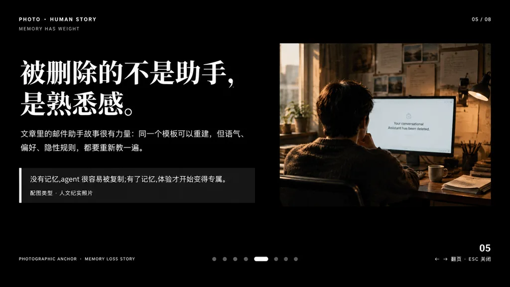
A minimalist cinematic presentation slide layout on a solid deep black background, widescreen 16:9, premium editorial keynote style. Asymmetrical composition with clean typography on the left and a documentary photograph on the upper right, framed by generous negative space. Left Typography and Text Blocks: - Top-left uppercase microtext: "PHOTO • HUMAN STORY", with "MEMORY HAS WEIGHT" slightly beneath it. - Main headline: very large, bold white Chinese serif typography across two lines reading "[被删除的不是助手,\n是熟悉感。]". - Body text directly below: medium-small white and light gray Chinese text across two lines reading "[文章里的邮件助手故事很有力量:同一个模板可以重建,但语气、\n偏好、隐性规则,都要重新教一遍。]". - Quote block below: a dark translucent rectangular box with a thin vertical white accent line on its left edge. Inside, text reading "[没有记忆,agent 很容易被复制;有了记忆,体验才开始变得专属。]" above a smaller caption line reading "配图类型 · 人文纪实照片". Upper Right Photograph: - A warm-toned, film-style humanistic documentary photo showing one adult seated from behind at a desk in a dimly lit office, looking at a computer screen. Beside the monitor is a desk lamp, with papers pinned on the wall and soft daylight streaming through a nearby window. The monitor displays a clean white interface with centered English text: "[Your conversational Assistant has been deleted.]". Muted brown, amber, and cool gray tones, intimate and melancholic atmosphere. UI Details & Pagination: - Top right: "05 / 08". - Bottom left microtext: "PHOTOGRAPHIC ANCHOR · MEMORY LOSS STORY". - Bottom right: "05" with tiny navigation hint "← → 翻页 · ESC 关闭". - Bottom center: 8 small pagination indicators, with the 5th dot styled as an elongated horizontal white pill and the other 7 as muted gray circles. Overall Aesthetic: High-end editorial magazine layout, crisp alignment, sophisticated typographic hierarchy, contemplative and narrative-driven.
apresentaçãokeynotedesign editorial
Captura de Chat de IA com Banner Promocional

Captura de Chat de IA com Banner Promocional

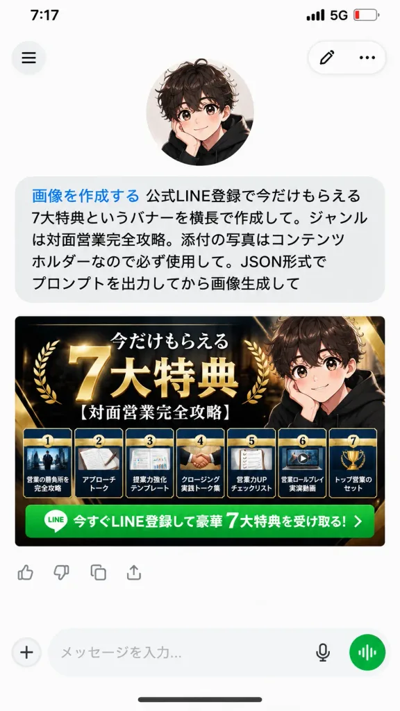
A realistic vertical 9:16 mobile smartphone screenshot of an AI chat app conversation on a clean white background. At the top, an iPhone-style status bar displays 7:17, 5G, and a low battery icon. Below the status bar, the app interface features a circular hamburger menu button on the top left, and a floating rounded pill container on the top right with an edit pencil icon and a three-dot menu icon. In the upper area, an avatar of a cute anime-style boy with curly dark brown hair, large sparkling eyes, rosy cheeks, and a black hoodie rests his cheek on one hand. Directly beneath him is a single large rounded light-gray user chat bubble containing Japanese text. The first phrase is rendered in blue text: 「画像を作成する」, immediately followed by black text: 「公式LINE登録で今だけもらえる7大特典というバナーを横長で作成して。ジャンルは対面営業完全攻略。添付の写真はコンテンツホルダーなので必ず使用して。JSON形式でプロンプトを出力してから画像生成して」. Beneath the chat bubble is a wide horizontal marketing banner image generated by the AI for [official LINE registration], sized to fit the phone's screen width. The banner has a premium luxury black, navy, and gold theme with glossy metallic accents. The main Japanese headline reads 「今だけもらえる 7大特典」 featuring a prominent oversized 3D gold "7" and bold white-and-gold lettering, accompanied by the topic subtitle 「[対面営業完全攻略]」. On the right side of the banner, the same anime boy avatar is integrated. Along the bottom of the banner are exactly seven distinct benefit cards in a neat horizontal row, each showing a small preview thumbnail, numbers 1 through 7, and titles: 1)営業の勝負所を完全攻略, 2)アプローチトーク, 3)提案力強化テンプレート, 4)クロージング実践トーク集, 5)営業力UPチェックリスト, 6)営業ロールプレイ実演動画, 7)トップ営業のセット. Below the cards runs a bright green call-to-action bar with a small LINE app icon and white text: 「今すぐLINE登録して豪華 7大特典を受け取る!」. Underneath the banner image are small reaction/action icons, followed by a bottom navigation input bar with a plus icon, text placeholder, microphone icon, and a circular green voice-mode button. Crisp typography, soft UI drop shadows, clean modern mobile interface design.

ui mobilecaptura de telaapp de chat
Landing Page Brutalista de Agência Samurai

Landing Page Brutalista de Agência Samurai

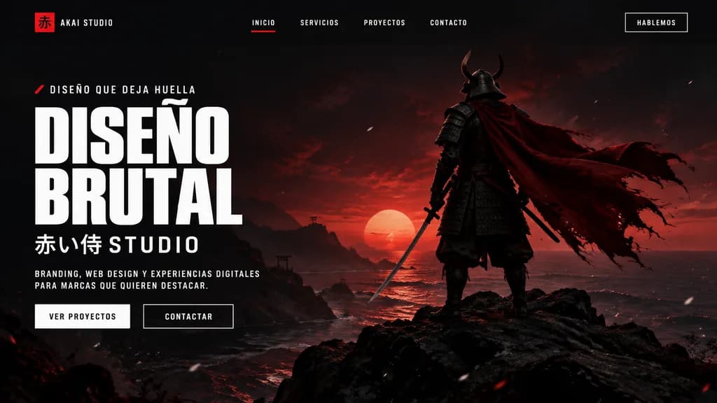
A cinematic dark landing page mockup for a creative agency called [AKAI STUDIO], presented inside a modern desktop browser window. The layout features a widescreen hero section with a dramatic black-to-deep-crimson gradient background, moody sunset backlighting, and subtle floating white dust or ember particles. On the right, a full-body samurai stands on jagged black rocks overlooking a calm shoreline, viewed from behind in dark layered armor and a horned helmet, holding a katana at his side, his long tattered crimson cape billowing dramatically to the right. On the left side, bold brutalist typography displays an eyebrow line with a small red accent mark reading "[DISEÑO QUE DEJA HUELLA]", followed by a massive, stacked white condensed headline reading "[DISEÑO BRUTAL]". Underneath, Japanese characters and text read "[赤い侍 STUDIO]", followed by a short supporting paragraph in small uppercase white lettering: "[BRANDING, WEB DESIGN Y EXPERIENCIAS DIGITALES PARA MARCAS QUE QUIEREN DESTACAR.]". Below the text are two call-to-action buttons: a solid light button labeled "VER PROYECTOS" and a dark outlined button labeled "CONTACTAR". The top navigation bar includes a left-aligned logo mark featuring a red square with the kanji "赤" and text "[AKAI STUDIO]", four centered uppercase menu links ("INICIO" with a red active underline, "SERVICIOS", "PROYECTOS", "CONTACTO"), and a boxed top-right action button reading "[HABLEMOS]".

landing pageweb designmockup ui
Mockup de Interface de Live Commerce

Mockup de Interface de Live Commerce

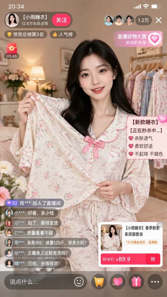
mobile live-streaming e-commerce interface mockup. young Asian woman with long dark hair, wearing a light-colored floral pajama set with a pink bow, holding the pajama top outward to display the fabric. [【小雨睡衣】春季新款家居服套装]. cozy bedroom sett…

live commercee-commerceui mobile
Página Móvel Gótica Japonesa Retrô

Página Móvel Gótica Japonesa Retrô

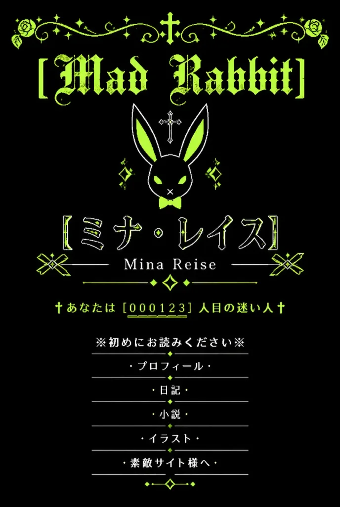
A vertical graphic inspired by nostalgic early-2000s Japanese mobile personal homepages (garakei web shrines) with a gothic lolita and dark fantasy aesthetic. Black background with a limited color palette of acid lime green, white, and deep black. Symmetrical, centered composition with generous negative space. At the top, an ornate lime-green filigree border spans the width, featuring curling vines, small sparkle stars, and a tiny central cross. Directly below is the distressed blackletter headline "[Mad Rabbit]" in acid lime green. Beneath the title sits a minimalist geometric white line-art rabbit head icon with long ears, lime-green inner ear fills, a small lime bow tie, diamond accents, and a small cross floating above it. In the main identity area below the rabbit icon: large Japanese katakana text in thin outlined white lettering with lime highlights reading "[ミナ・レイス]", followed directly underneath by the romanized name "[Mina Reise]" in a delicate serif font, flanked by thin horizontal rules, two geometric ribbon-like side ornaments, and a central diamond sparkle motif. Below the name section is an authentic retro homepage visitor hit counter in lime green: "†あなたは [000123] 人目の迷い人†" with underlined digits. At the bottom, a vertically stacked navigation menu consisting of exactly 6 centered items in white Japanese text, each separated by thin divider lines and flanked by cross or bullet symbols: 1) ※初めにお読みください※ 2) ・プロフィール・ 3) ・日記・ 4) ・小説・ 5) ・イラスト・ 6) ・素敵サイト様へ・ Small lime diamond dots and delicate dividers embellish the menu section. Style: Distressed pixel-era typography, delicate line art, 2000s mobile web shrine aesthetic. Completely flat 2D graphic, no modern UI chrome, no phone mockup frame, no photographic elements.
y2kgothic lolitaweb design
Hero de Landing Page para Produto IA Japonês

Hero de Landing Page para Produto IA Japonês

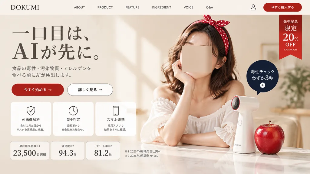
A polished Japanese landing page hero section screenshot for a fictional consumer tech brand named [DOKUMI]. The layout follows a premium beauty-tech and food-safety aesthetic in a soft warm beige and ivory palette with generous whitespace and elegant editorial styling. Top Navigation Bar: Contains 8 elements in a single horizontal row: brand logo text "[DOKUMI]" on the far left, followed by "ABOUT", "PRODUCT", "FEATURE", "INGREDIENT", "VOICE", "Q&A", a small user profile icon, and a rounded red button labeled "今すぐ購入する" on the far right. Below this button on the upper-right corner hangs a vertical red ribbon badge with stacked white text: "発売記念", "限定", "20%", "OFF", and small text "CAMPAIGN". Hero Section - Left Column: - Headline in elegant large Japanese Mincho serif typography over two lines: "一口目は、" on the first line, "AIが先に。" on the second line with dramatic scale. - Refined gray two-line Japanese subheading detailing AI detection of food toxins, contaminants, and allergens prior to consumption. - Two horizontal CTA buttons: a solid red pill button labeled "今すぐ始める →" and a white outlined pill button labeled "詳しく見る →". - Row of three rounded white feature cards with subtle borders and thin black line icons: 1) shield icon labeled "AI画像解析" with small explanatory text, 2) clock icon labeled "3秒判定" with subtitle, 3) smartphone icon labeled "スマホ連携" with subtitle. - Bottom statistics row with three bordered metric cards: "累計販売台数※1" displaying "23,500" "台突破", "満足度※2" displaying "94.3%", and "リピート率※2" displaying "81.2%". To the right, two small footnote lines in Japanese: "※1 2026年4月時点 自社調べ" and "※2 2026年3月調査 N=180". Hero Section - Right Column: Soft, luminous lifestyle photo of a stylish young Japanese woman with wavy shoulder-length brown hair wearing a large red polka-dot headband and an off-shoulder white ruffled blouse, resting her chin on one hand over a glossy tabletop. Her face is obscured by a neutral skin-tone rectangular privacy marker. On the table stands a sleek, minimalist white handheld scanner gadget with a subtle red-accented lens ring, next to a realistic glossy red apple. Floating beside the device is a dark navy circular callout badge with white text reading "毒性チェック" and "わずか3秒" above a small plus icon. Lighting and Finish: Gentle natural window light from the left casting subtle diagonal wall shadows, realistic textures, and clean modern Japanese UI composition.

landing pagedesign webui screenshot
Captura de Chat de IA Móvel com Arte Cósmica

Captura de Chat de IA Móvel com Arte Cósmica

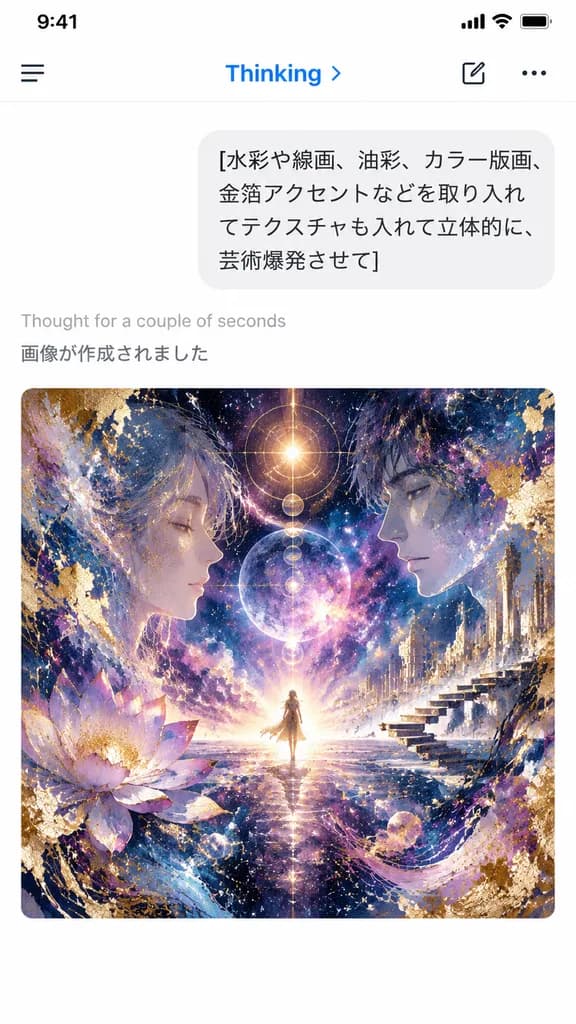
A vertical smartphone screenshot of an AI chat app interface in light mode, capturing a freshly generated image result. At the top is a clean mobile header with a hamburger icon on the left, the blue label "Thinking" with a small right chevron, and a compose icon alongside a three-dot menu on the right. Below the header is a rounded light-gray user chat bubble showing four lines of Japanese text: "[水彩や線画、油彩、カラー版画、 金箔アクセントなどを取り入れ てテクスチャも入れて立体的に、 芸術爆発させて]". Beneath the bubble, on a crisp white background, appear two system status lines: light gray "Thought for a couple of seconds" followed by darker gray "画像が作成されました". Centered in the lower half is a large rounded-corner artwork preview in a square format: an intricate cosmic visionary collage featuring a tiny radiant figure standing at the central horizon, flanked by two large semi-transparent human profiles facing inward. Swirling nebulae, glowing celestial bodies, gold-leaf leafing, splash textures, ink lines, architectural floating steps on the right, and a lotus bloom on the left merge in a palette of deep indigo, violet, magenta, and luminous gold. Authentic iOS mobile interface aesthetic, sharp typography, minimal layout outside the vibrant artwork.

captura de uiaplicativo móvelinterface de chat
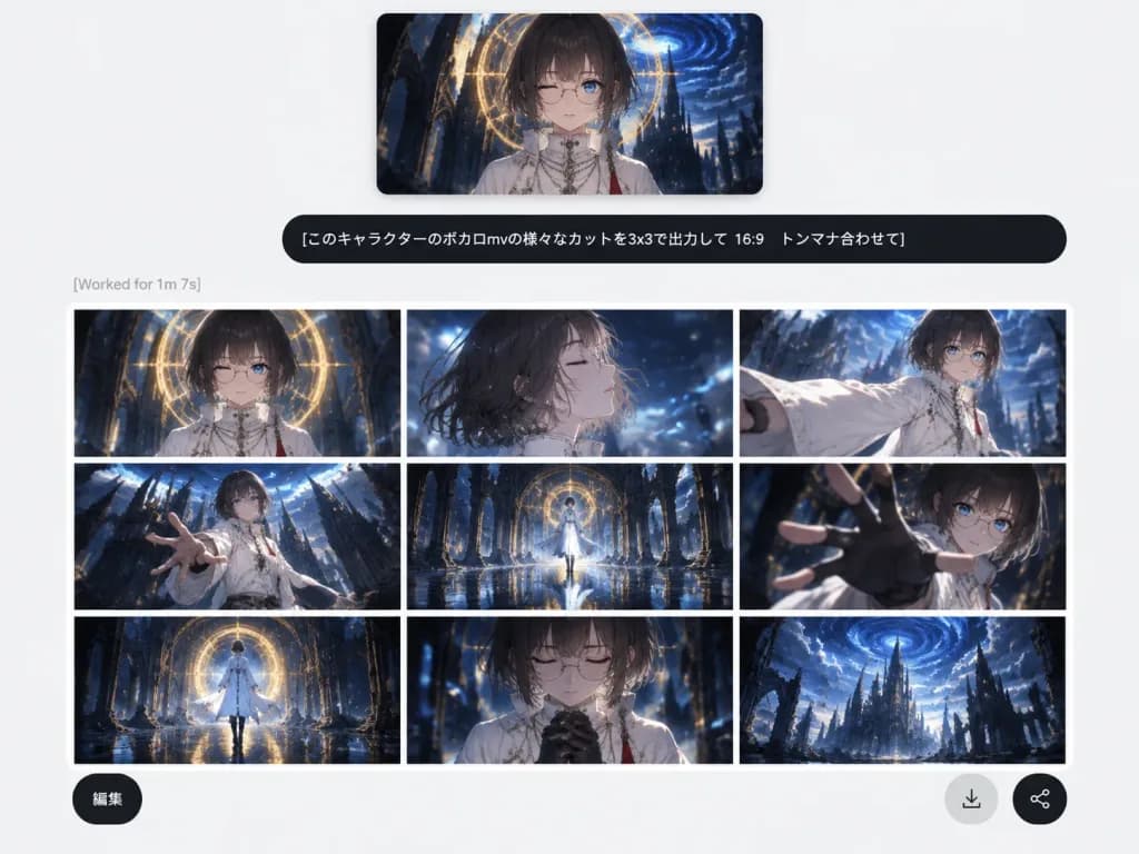
UI de Gerador de Imagens AI com Storyboard de Anime

UI de Gerador de Imagens AI com Storyboard de Anime

A clean social-media screenshot of a modern, minimalist web-app AI image generation interface on a light gray background with ample white space. At the top center, a rectangular reference image preview with soft shadows shows an anime character: an androgynous youth with a [dark ash-brown bob haircut with straight bangs], pale skin, thin round glasses, one winking eye, and one visible blue eye, dressed in a high-collar white ceremonial robe with necklaces and a red tassel, set against a dark fantasy gothic cathedral with a glowing golden circular halo and a swirling blue vortex sky. Directly below the preview is a wide, rounded black user prompt bubble displaying crisp white Japanese text: "[このキャラクターのボカロmvの様々なカットを3x3で出力して 16:9 トンマナ合わせて]". Beneath the prompt bubble, aligned to the left, is faint gray status text reading "[Worked for 1m 7s]". Below the status line is an output card featuring a 3x3 grid of 9 cinematic 16:9 anime storyboard panels separated by thin white grid lines, maintaining consistent color grading in dark navy blue, black, white, and warm gold with a glossy Vocaloid music-video aesthetic, wet reflective floors, and ruined gothic cathedral backdrops: 1. Top-left: Frontal bust shot of the character under the glowing golden circular arch. 2. Top-center: Windblown side-profile close-up with eyes closed amidst blue light motes. 3. Top-right: Dynamic three-quarter shot extending a billowing white sleeve forward. 4. Middle-left: Low-angle dramatic wide shot reaching toward the frame with cathedral spires. 5. Middle-center: Symmetrical full-body shot standing on a reflective wet floor framed by an archway. 6. Middle-right: Extreme foreshortened close-up reaching a gloved hand toward the lens. 7. Bottom-left: Wide rear view walking toward the luminous circular portal. 8. Bottom-center: Emotional close-up with eyes closed and hands clasped near the chest. 9. Bottom-right: Epic distant establishing shot of ruined gothic towers against the blue vortex sky. Floating over the lower portion of the grid are three circular UI buttons: a dark button at bottom-left labeled "[編集]", a light gray circular download arrow icon button, and a dark circular share icon button at bottom-right.

gerador de aiui webstoryboard
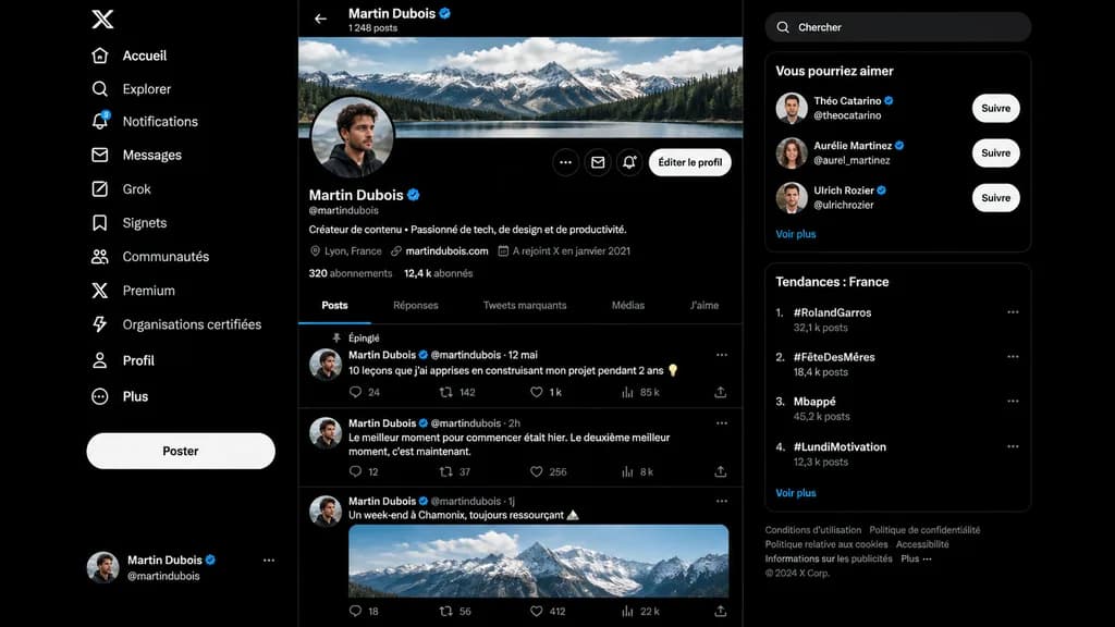
Mockup de Perfil Social em Modo Escuro

Mockup de Perfil Social em Modo Escuro

A realistic dark-mode desktop social media interface mockup closely resembling the desktop X/Twitter layout in French, presented as a full-screen browser screenshot on a dark black background with subtle dark gray dividers. Left sidebar: - Top: White X logo. - Vertical navigation list of 11 items with white icons and text: “Accueil”, “Explorer”, “Notifications” (with a small blue notification badge reading “3”), “Messages”, “Grok”, “Signets”, “Communautés”, “Premium”, “Organisations certifiées”, “Profil”, and “Plus”. - Middle-lower area: Large pill-shaped white button labeled “Poster”. - Bottom: Compact user card for [Martin Dubois] with handle @martindubois and a circular user avatar. Center column (Profile view): - Header: Back arrow, name “[Martin Dubois]” with a blue verification checkmark, and subtext “1 248 posts”. - Cover image: Wide panoramic banner of cloudy alpine mountains above a forest lake. - Profile row: Circular profile picture of a young man in dark clothing slightly overlapping the banner bottom-left. On the right, three circular icon buttons and a rounded light button labeled “Éditer le profil”. - Info section: Display name “[Martin Dubois]” with blue checkmark, handle @martindubois, French bio reading “Créateur de contenu • Passionné de tech, de design et de productivité.” - Metadata row: Location “Lyon, France”, link “martindubois.com”, and “A rejoint X en janvier 2021”. - Stats row: “320 abonnements” and “12,4 k abonnés”. - Tab bar with 5 items: “Posts” (active, underlined in electric blue), “Réponses”, “Tweets marquants”, “Médias”, “J’aime”. - Feed containing 3 posts: 1. Pinned post labeled “Épinglé”, date “12 mai”, text: “10 leçons que j’ai apprises en construisant mon projet pendant 2 ans 💡”, metrics: 24 replies, 142 reposts, 1 k likes, 85 k views. 2. Date “2h”, text: “Le meilleur moment pour commencer était hier. Le deuxième meilleur moment, c’est maintenant.”, metrics: 12 replies, 37 reposts, 256 likes, 8 k views. 3. Date “1j”, text: “Un week-end à Chamonix, toujours ressourçant 🏔️”, attached with an embedded daylight photo of snowy peaks, metrics row at bottom. Right sidebar: - Rounded search bar with placeholder text “Chercher”. - Card titled “Vous pourriez aimer” with 3 suggestions: “Théo Catarino” @theocatarino, “Aurélie Martinez” @aurel_martinez, and “Ulrich Rozier” @ulrichrozier, each with avatar, blue badge, and white “Suivre” button, ending with a “Voir plus” link. - Card titled “Tendances : France” with 4 ranked trends: 1. “#RolandGarros” (32,1 k posts), 2. “#FêteDesMères” (18,4 k posts), 3. “Mbappé” (45,2 k posts), 4. “#LundiMotivation” (12,3 k posts), ending with “Voir plus”. - Bottom footer: Small gray legal links and “© 2024 X Corp.”. Style: Crisp vector-like UI elements, authentic typography, precise layout spacing, modern dark-mode digital product design.

mockup uiredes sociaismodo escuro
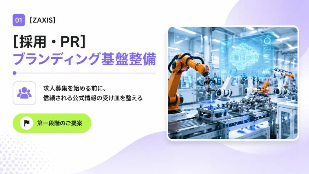
Slide de Capa para Proposta B2B Industrial Japonesa

Slide de Capa para Proposta B2B Industrial Japonesa

A clean 16:9 Japanese corporate B2B proposal cover slide for an industrial automation and engineering company, designed with a modern consulting deck aesthetic, generous whitespace, and subtle tech accents. Layout and Content: - Top-left: A small rounded purple square badge displaying white text "01", followed by the company name "[ZAXIS]" in crisp black sans-serif typography. - Main Headlines: Directly below, a large bold black Japanese headline reading "[採用・PR]", stacked above a matching large bold lavender headline reading "[ブランディング基盤整備]". Underneath the headlines is a thin lavender horizontal dividing line with a small circular dot on its left edge. - Middle-left: A rounded square outline card containing a minimalist lavender community/people icon. Directly to its right are two lines of black Japanese body copy: "[求人募集を始める前に、]" and "[信頼される公式情報の受け皿を整える]". - Lower-left: A vibrant lime-green rounded pill button featuring a small white circle with a black flag icon and the Japanese text "[第一段階のご提案]". - Right half: A large rounded-corner photo card with a soft drop shadow and a thin white border, depicting a brightly lit futuristic smart factory floor with orange and white robotic arms assembling precision parts, blue-tinted machinery, and a glowing translucent holographic CAD interface floating above the workstation. Background and Atmosphere: Bright white background with soft lavender gradient washes, a large semi-transparent lavender circular gradient behind the photo card in the upper-right, a gentle lavender wave shape flowing from bottom-center toward the right, and a subtle pale lavender halftone dot pattern in the lower-left corner. Crisp, professional, polished corporate presentation slide.

slide de apresentaçãoproposta b2btipografia japonesa
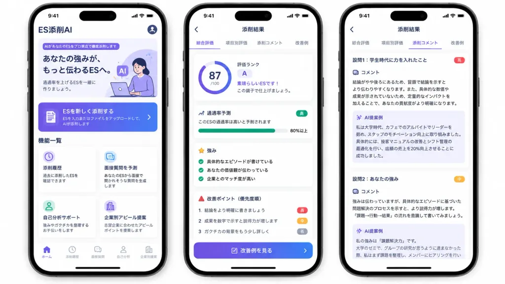
Mockup de UI de App Japonês de Currículo com IA

Mockup de UI de App Japonês de Currículo com IA

A polished marketing mockup for a Japanese mobile app called [ES添削AI], an AI entry-sheet critique tool for job-hunting students, presented on three modern black-framed iPhones displayed side-by-side on an isolated white background. Composition & Layout: Wide horizontal 16:9 framing showing exactly three smartphones with subtle drop shadows, rounded corners, top Dynamic Island displaying status bar time 9:41, and bottom iOS home indicators. Clean UI cards, soft elevation shadows, and a purple-to-indigo gradient visual identity. Phone 1 (Home Screen): - Top header: text "ES添削AI" at top left, circular profile icon at top right. - Hero card: purple tag reading "AIがあなたのESをプロ視点で徹底添削します", bold headline "あなたの強みが、もっと伝わるESへ。", subtext "通過率を上げるESを一緒に作りましょう。", and a minimal graphic of a student working on a laptop with lavender AI badges. - Primary CTA button: gradient card with document icon reading "ESを新しく添削する" and small text "ESを入力またはファイルをアップロードして、AIが添削します" with a right chevron. - Feature grid section titled "機能一覧" with exactly four white cards: 1) Clock icon: "添削履歴" / "過去に添削したESを確認できます"; 2) Chat icon: "面接質問を予測" / "あなたのESから面接で聞かれそうな質問を生成します"; 3) User icon: "自己分析サポート" / "強みやガクチカを整理するお手伝いをします"; 4) Building icon: "企業別アピール提案" / "志望企業に合わせたアピールポイントを提案します". - Bottom tab bar with 5 items: "ホーム" (active), "添削履歴", "面接質問", "自己分析", "企業別提案". Phone 2 (Results Overview Screen): - Top navigation bar: back arrow and centered title "添削結果". - Tab bar with 4 items: "総合評価" (active with purple underline), "項目別評価", "添削コメント", "改善例". - Overall evaluation card: circular progress score ring showing "[87]/100", alongside text "評価ランク", large letter "[A]", "素晴らしいESです!", and "この調子で仕上げましょう。". - Pass rate card: title "通過率予測", text "このESの通過率は高いと予測されます", green badge "高", progress bar filled to "80%以上". - Strengths section: title "強み" with 3 green checkmark items: "具体的なエピソードが書けている", "あなたの価値観が伝わっている", "企業とのマッチ度が高い". - Areas for improvement: title "改善ポイント(優先度順)" with 3 items: 1 "結論をより明確に書きましょう" (red badge "高"), 2 "成果を数字で示すと説得力が増します" (orange badge "中"), 3 "ガクチカの背景をもう少し詳しく" (gray badge "低"). - Bottom gradient button: "改善例を見る". Phone 3 (Detailed Critique Screen): - Top navigation bar: back arrow and title "添削結果", repeating the 4 tabs with "添削コメント" active. - Two stacked white critique cards: 1. Heading "設問1:学生時代に力を入れたこと" (red badge "高"), "コメント" analyzing conclusion placement and quantitative impact, followed by a pale lavender box titled "AI提案例" rewriting a cafe leadership experience with a 20% sales increase. 2. Heading "設問2:あなたの強み" (orange badge "中"), "コメント" advising evidence-based problem-solving structure, followed by an "AI提案例" box beginning "私の強みは『課題解決力』です。", slightly cut off at the bottom. Style: Modern Japanese iOS mobile app design, crisp Japanese typography, clean whitespace, subtle pastel accents, trustworthy and professional finish.

mockup uiapp móvelapp japonês
Mockup de Interface de Live Commerce Mobile

Mockup de Interface de Live Commerce Mobile

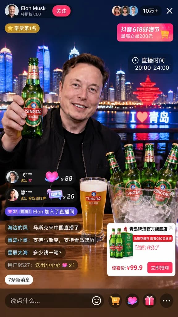
livestream interface mockup. [Elon Musk]. smiling man in a black jacket. holding up a green glass beer bottle with a [TSINGTAO] label. [Qingdao skyline at night] with illuminated skyscrapers, a river, a glowing red sculptural monument, and…

ui de livemockup ecommercesocial commerce
Banner Heroico de Lançamento de IA Futurista

Banner Heroico de Lançamento de IA Futurista

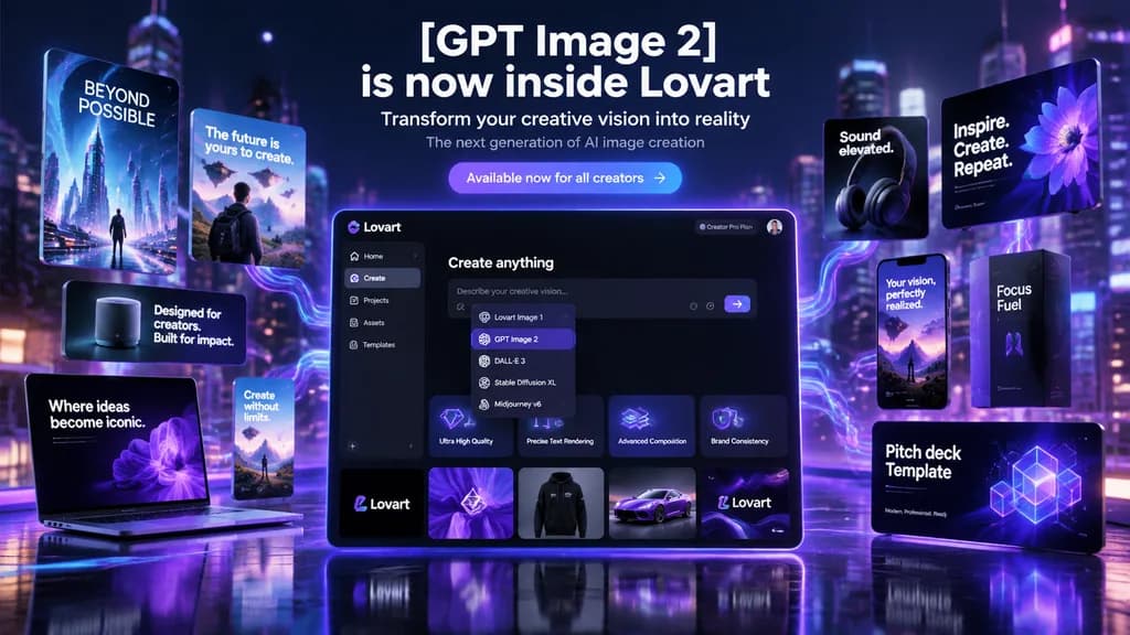
futuristic AI product launch campaign hero banner. high-end 3D advertising composite with cinematic neon lighting, polished UI mockups, floating product cards, and glossy tech presentation aesthetics. left floating posters and devices. cen…

lançamento de produtobanner heromockup ui
Tela de Status de Sacerdotisa de JRPG Tático

Tela de Status de Sacerdotisa de JRPG Tático

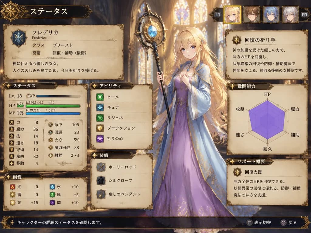
fantasy JRPG character status screen mockup. ornate medieval parchment interface with dark bronze filigree borders and warm fantasy atmosphere. very long, slightly wavy, loose hair flowing past the waist with soft bangs. ステータス. identity pa…

jrpgtela de statusui de jogo
Pôster de Apresentação de UI para App Musical

Pôster de Apresentação de UI para App Musical

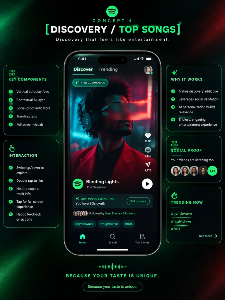
premium app UI concept poster. futuristic dark neon interface. [DISCOVERY / TOP SONGS]. KEY COMPONENTS. INTERACTION. WHY IT WORKS. SOCIAL PROOF. TRENDING NOW. Spotify-inspired music discovery redesign. portrait. deep black with subtle grai…

design de uiestudo de casomockup de celular
Captura de Chat de IA Móvel com Resultado Anime

Captura de Chat de IA Móvel com Resultado Anime

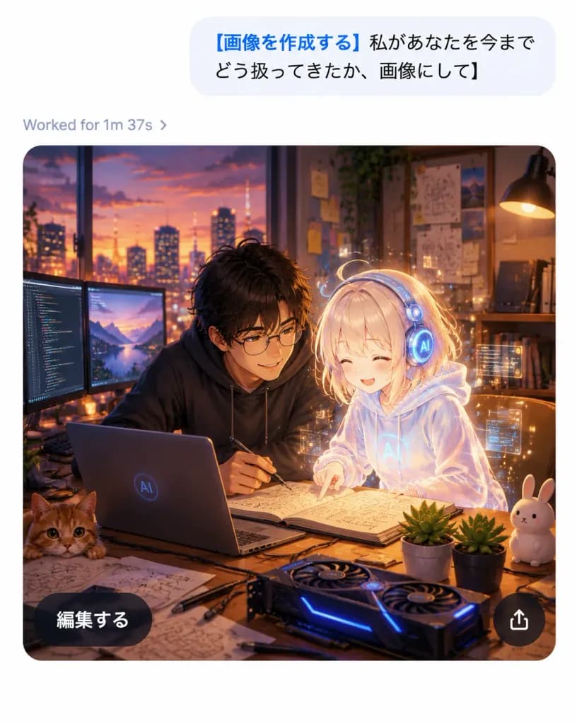
A realistic mobile AI chat app screenshot showing an image-generation result with a polished iOS-like interface and a high-quality anime illustration inside the generated image card, on a clean white canvas without a device frame, vertical 4:5 aspect ratio. Top chat area: Near the top right, one large light-gray rounded message bubble containing Japanese sans-serif text: "[画像を作成する 私があなたを今までどう扱ってきたか、画像にして]". The opening phrase is bold blue, and the remainder is black. Below the bubble, aligned left, a small gray status line displays "[Worked for 1m 37s ›]". Generated image card: Below the status line, a large rounded-rectangle image card with smoothly curved corners depicts a warm cinematic anime-style scene in a cozy developer studio at dusk. Exactly two main characters are featured: one young Japanese man with tousled dark hair, round glasses, and a dark hoodie leaning over a desk with a pen in hand; and one petite glowing holographic AI girl with pale blond hair, a translucent white hoodie, and round futuristic headphones, smiling as she points at an open notebook. The atmosphere is affectionate, collaborative, and magical. Illustration details inside the card: A sunset city skyline through a wide window, warm desk-lamp illumination, wall shelves with books, pinned diagrams and sticky notes, and soft bokeh lights. On the wooden desk: exactly one open laptop with a subtle circular AI logo, exactly two external monitors on the left displaying code and a landscape, exactly one open notebook with sketches and formulas, exactly one GPU-style device with blue LED accents, exactly one orange cat peeking from the bottom-left edge, exactly one white rabbit figurine on the right, exactly two small potted succulents, and scattered sketch papers, cables, and pens. A delicate golden aura and subtle floating UI particles surround the holographic girl. Card overlay UI: Two floating overlay controls on the image card: one dark translucent pill button at bottom-left reading "[編集する]" in white Japanese sans-serif text, and one circular dark translucent share button at bottom-right with a white upward-pointing share arrow. Visual style: Crisp app interface combined with rich anime art, sharp legible typography, warm amber and violet cinematic lighting, soft depth of field, high contrast between the minimalist white UI and the cozy dark studio illustration.

ui-chatanimeapp-móvel
Prancha de Conceitos de Ícones de App

Prancha de Conceitos de Ícones de App

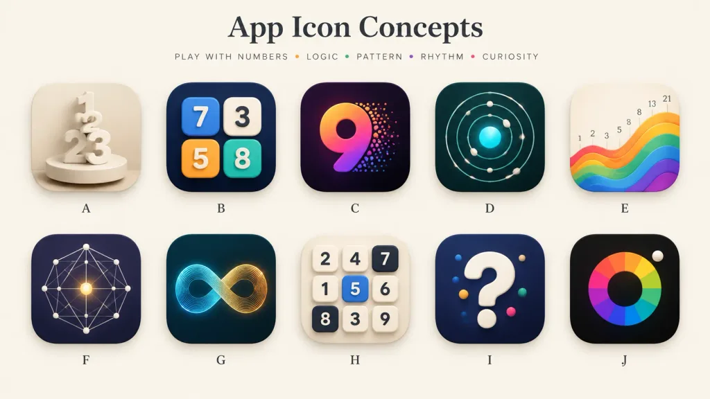
A polished presentation board showcasing 10 alternative app icon concepts for a [number-play and logic puzzle] mobile app. Wide 16:9 landscape canvas on a warm off-white background, minimal gallery-style spacing, soft shadows, and a premium design-review aesthetic. Header: Centered at the top, a large elegant serif title: "[App Icon Concepts]". Below it, a small uppercase tracked tagline: "[PLAY WITH NUMBERS • LOGIC • PATTERN • RHYTHM • CURIOSITY]" with tiny colored dots between words. Grid & Icons: A clean 2-row by 5-column grid containing exactly 10 identical-sized rounded-square app icons with consistent corner radii, subtle drop shadows, and a single centered letter label beneath each, labeled A through J: - A: Cream monochrome icon with stacked 3D numerals 1, 2, and 3 standing on a circular pedestal, sculptural plaster look. - B: Dark navy icon featuring four raised rounded number tiles (blue 7, cream 3, orange 5, teal 8) arranged like playful puzzle blocks. - C: Deep purple-black icon with a large gradient numeral 9 in orange, magenta, and violet, with colorful particle dots bursting from its right edge. - D: Dark teal icon showing an orbital logic pattern of concentric circular paths, small white spheres, and a glowing cyan center. - E: Warm ivory icon displaying rising rainbow wave bands from left to right, with small Fibonacci numbers (1, 2, 3, 5, 8, 13, 21) above the wave. - F: Dark indigo icon with a geometric constellation network of thin white connecting lines, dots, and a glowing golden center point. - G: Dark teal icon featuring a luminous infinity loop made of fine parallel lines transitioning from cyan to golden orange. - H: Light cream icon with a 3x3 grid of tactile number tiles (top row: 2, 4, 7; middle: 1, 5, 6; bottom: 8, 3, 9; tile 5 is blue, 7 and 8 are dark). - I: Dark navy icon with a large glossy white 3D question mark accented with small colored dots. - J: Near-black icon with a segmented rainbow circular color wheel around a dark center disk, and a small white sphere at the upper-right edge. Style: High-end mobile app icon exploration sheet, soft 3D rendering combined with crisp vector precision, realistic highlights, subtle ambient occlusion, balanced negative space, clean typography, no watermarks.

ícone de appdesign uiprancha de conceitos
Prancha de Ícones Vetoriais Geométricos Bauhaus

Prancha de Ícones Vetoriais Geométricos Bauhaus

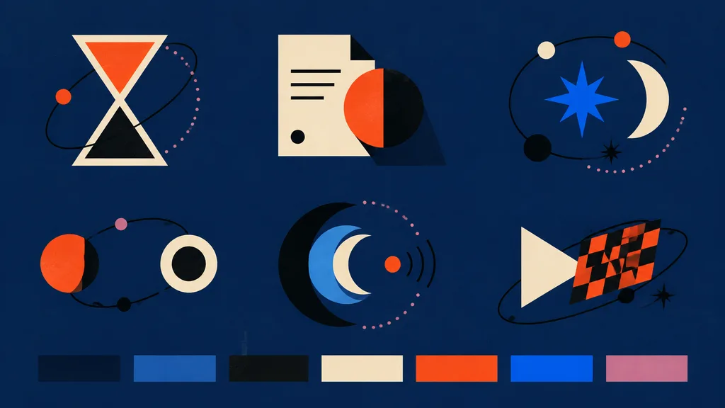
modern abstract vector icon style board for frontend assets. hourglass icon made from two cream-outlined triangles, upper chamber filled orange-red, lower chamber black, surrounded by a loose black orbital line with one small orange dot an…

vetorialconjunto-de-íconesbauhaus
Página Dupla Editorial Japonesa com Entrevista

Página Dupla Editorial Japonesa com Entrevista

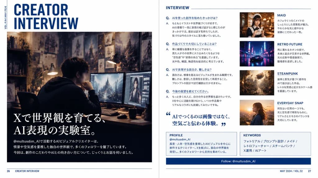
A polished two-page magazine spread in Japanese, designed like a contemporary creator profile feature in a premium culture and design magazine. The layout features a clean editorial interview spread with a crisp white background, deep navy blue accents, subtle rule lines, sharp grid alignment, and sophisticated typography. Left page: - Top left: large stacked headline reading “CREATOR INTERVIEW” in bold condensed sans-serif, with small vertical running text along the outer margin reading “VOL.23 / MAY 2024”. - Center to lower section: a large cinematic photo of a [male AI visual creator] sitting at a desk wearing a dark hoodie in a moody, dimly lit studio workspace. His face is subtly blurred or anonymized. The workspace features multiple glowing monitors showing digital artwork, a warm desk lamp, and background walls filled with concept sketches and fantasy art prints. - Lower left overlay on the photo: large Japanese feature headline in elegant white Mincho serif text reading “Xで世界観を育てる、AI表現の実験室。”, followed by smaller introductory Japanese body text referencing the handle “@multusdim_AI” and describing atmosphere-driven AI worldbuilding, along with a bottom horizontal editorial blurb. Right page: - Section 1 (left column): titled “INTERVIEW” in clean blue sans-serif, containing 4 structured Japanese Q&A entries labeled with blue “Q.” and “A.”, plus a large blue Japanese pull quote with stylized quote marks reading “AIでつくるのは画像ではなく、空気ごと伝わる体験。” - Image cards (right column, stacked vertically): 1. “MAID” card showing a warm cafe portrait of an elegant maid-themed woman holding a cup, with Japanese caption. 2. “RETRO FUTURE” card showing a neon-lit, rainy sci-fi street scene with a sleek car, with Japanese caption. 3. “STEAMPUNK” card showing an intricate brass clockwork city with steam and gears, with Japanese caption. 4. “EVERYDAY SNAP” card showing a candid outdoor portrait in golden hour sunset light, with Japanese caption. - Bottom panels: a boxed “PROFILE” section with handle “@multusdim_AI” and background bio, a “KEYWORDS” box listing “フォトリアル / プロンプト設計 / メイド / レトロフューチャー / スチームパンク / X運用 / AIアート”, and a navy blue horizontal bar reading “Follow: @multusdim_AI”. - Footer: page numbers 26 and 27 in bottom corners with small folio text “CREATOR INTERVIEW” and “MAY 2024 / VOL.32”. Authentic Japanese print typography and magazine layout hierarchy.

página dupladesign editorialtipografia japonesa
Grade de Variações de Anúncios Web

Grade de Variações de Anúncios Web

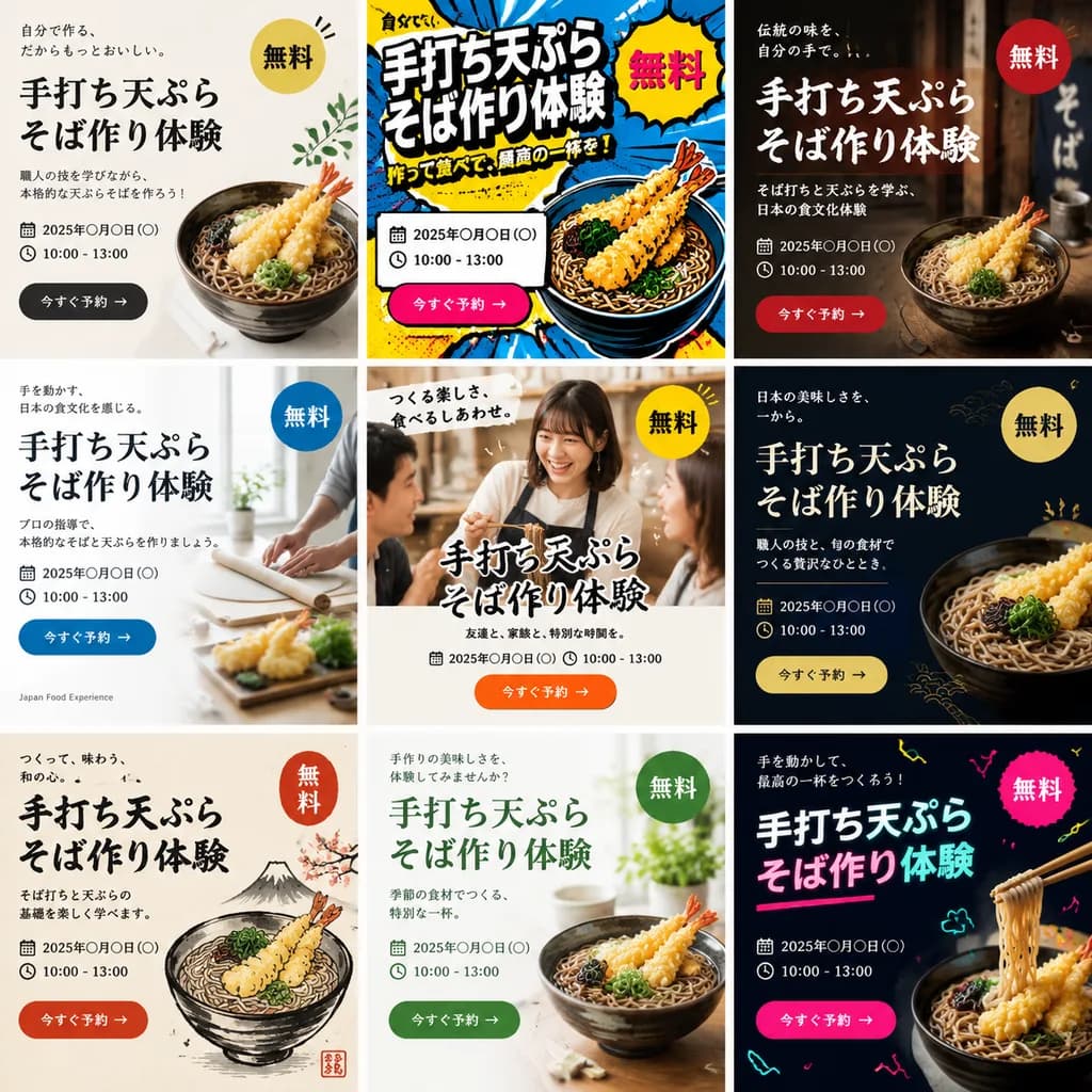
A single image displaying a 3x3 grid of 9 distinct web banner advertisements promoting a [handmade tempura soba noodle making workshop]. Each of the 9 banner designs features a completely different aesthetic style, layout, color palette, and background visual. Every advertisement includes prominent typographic elements: a bold Japanese main headline, supporting sub-copy, date and time placeholder, a bright "Free" badge, and a call-to-action button. The diverse styles span modern minimalist, vibrant pop art, traditional Japanese rustic aesthetic, clean corporate editorial, and casual lifestyle photography, tailored to attract [Gen Z and people in their 40s].

anúncio webdesign de bannervariações de anúncios
Edição de Tela de Verificação OpenAI

Edição de Tela de Verificação OpenAI

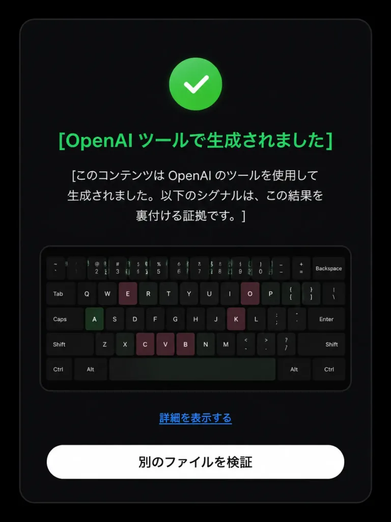
Based on the reference image, edit the dark verification-result screen to display a positive detection result. Maintain the original dark rounded card layout, centered composition, embedded keyboard thumbnail, bottom text link, and white rounded button. Modify exactly three status elements: 1. Replace the pink circular 'X' icon with a green circular checkmark icon. 2. Change the headline color to green with text: 「[OpenAI ツールで生成されました]」. 3. Update the body text below the headline to: 「[このコンテンツは OpenAI のツールを使用して生成されました。以下のシグナルは、この結果を裏付ける証拠です。]」. Preserve the remaining UI elements exactly as shown: - Link text: 「[詳細を表示する]」 - Button text: 「[別のファイルを検証]」 Style: Clean modern Japanese UI screenshot, authentic web app interface, high-contrast dark mode, rounded card borders.

design de uitela de verificaçãomodo escuro
Pôster de UI de App Musical

Pôster de UI de App Musical

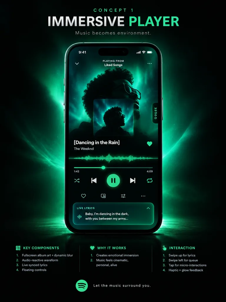
music app UI concept poster. premium futuristic mobile app showcase, dark mode, cinematic product presentation, Spotify-inspired green neon glow, high contrast, sleek glassmorphism, polished tech advertising aesthetic. IMMERSIVE PLAYER. mo…

ui-ux-designplayer de músicamockup de app
Mockup UI de Página de Preços de IA em Modo Escuro

Mockup UI de Página de Preços de IA em Modo Escuro

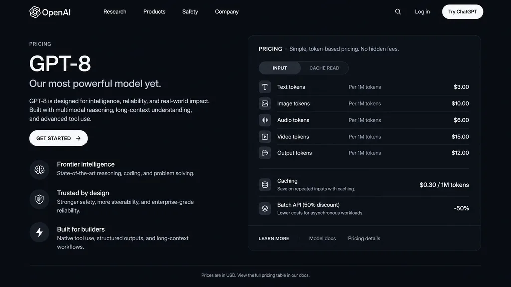
dark mode web page UI mockup. sleek, modern, dark theme with white and light grey text. GPT-8 is designed for intelligence, reliability, and real-world impact. Built with multimodal reasoning, long-context understanding, and advanced tool…

mockup uimodo escuropágina de preços
Mockup Hero para Landing Page SaaS AI

Mockup Hero para Landing Page SaaS AI

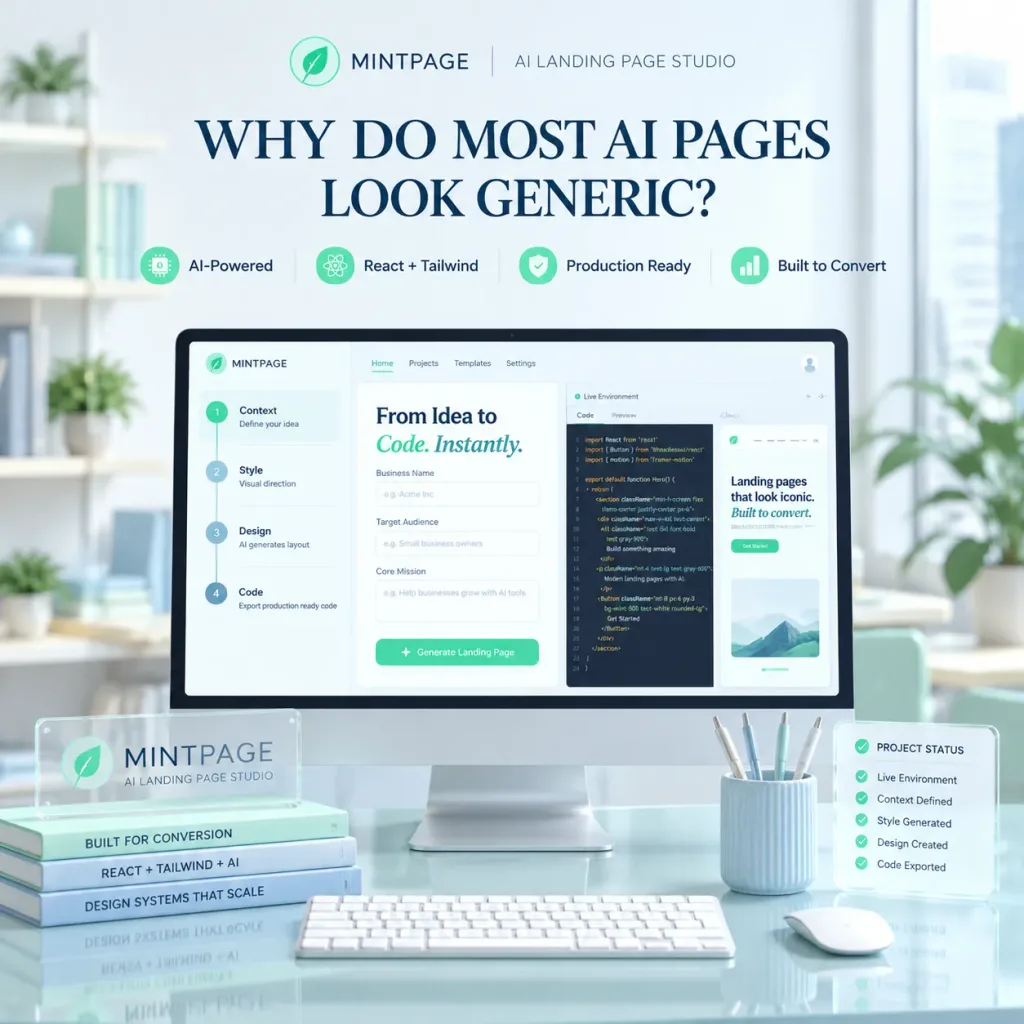
A polished square SaaS landing page hero image for [MINTPAGE], an AI landing page studio. In the center, a large desktop monitor rests on a glossy glass desk inside a bright, minimal modern office with soft daylight from a window on the right and soft-focus shelves and indoor plants in the background. At the top of the composition, display a neat brand header with a circular mint leaf logo, the text "[MINTPAGE]", a thin divider line, and the subtitle "[AI LANDING PAGE STUDIO]". Below the header, a prominent dark blue serif headline reads: "[WHY DO MOST AI PAGES LOOK GENERIC?]". Beneath the headline, arrange four small feature badges in a row with mint icons: "AI-Powered", "React + Tailwind", "Production Ready", "Built to Convert". The monitor screen shows a clean web-app builder UI with a top navbar and a three-panel split workspace: the left panel displays a 4-step vertical setup flow ("1) Context — Define your idea", "2) Style — Visual direction", "3) Design — AI generates layout", "4) Code — Export production ready code"); the center panel displays the heading "From Idea to Code. Instantly." with "Code. Instantly." in mint italic, above form fields for Business Name, Target Audience, and Core Mission; the right panel shows a "Live Environment" code editor with React/Tailwind code and a preview snippet reading "Landing pages that look iconic. Built to convert.". On the desk foreground, place a translucent acrylic desk plaque labeled "MINTPAGE" with the subtitle "AI LANDING PAGE STUDIO", stacked beside three slim books titled "BUILT FOR CONVERSION", "REACT + TAILWIND + AI", and "DESIGN SYSTEMS THAT SCALE"; in front of the screen sits a slim white keyboard; to the right sits a white mouse, a pale blue ribbed pen cup with four pens, and a translucent floating status card titled "PROJECT STATUS" showing five checked items ("Live Environment", "Context Defined", "Style Generated", "Design Created", "Code Exported"). Pastel mint and pale blue color palette, glassmorphism accents, soft volumetric lighting, crisp 3D mockup photography style, no people.

saasdesign-uilanding-page
Display HUD Terminal Verde Retrô

Display HUD Terminal Verde Retrô

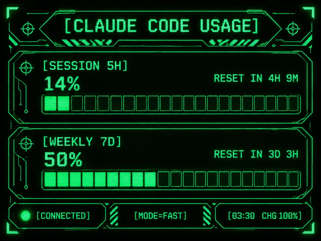
Retro-futuristic monochrome green terminal HUD interface designed for an M5Stack-style compact display. At the top, the title displays "[CLAUDE CODE USAGE]" in crisp pixelated typography. The body features two usage sections: the first labeled "[SESSION 5H]" displaying "14%" and "RESET IN 4H 9M", and the second labeled "[WEEKLY 7D]" displaying "50%" and "RESET IN 3D 3H". Each section includes a chunky horizontal gauge bar with exactly 20 rectangular segments; the upper gauge has 2 filled glowing segments and the lower gauge has 10 filled glowing segments. Along the bottom, three modular footer panels show: left "[CONNECTED]" with an illuminated status dot, center "[MODE=FAST]", and right "[03:30 CHG 100%]". Sci-fi frame with angular geometric borders, corner brackets, circuit line accents, tiny target icons, diagonal hazard striping, and subtle CRT scanline pixel glow on a deep black background.

terminalhudpixel art
Quadro de Apresentação de App Nutricional

Quadro de Apresentação de App Nutricional

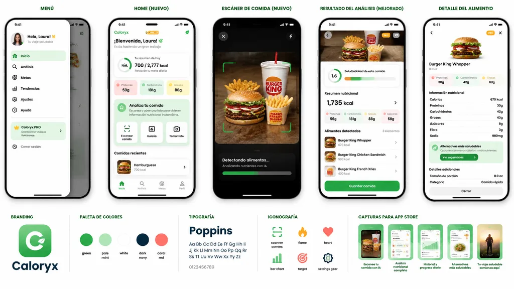
mobile app prototype presentation board for a nutrition and food scanner app. AI-powered meal scanning, calorie tracking, nutritional analysis, healthier alternatives, and progress dashboard. MENÚ. slide-out side navigation drawer with pro…

mockup-uiapp-mobilerastreador-nutricional
Mockup de Wallpaper de Fogueira de Inverno

Mockup de Wallpaper de Fogueira de Inverno

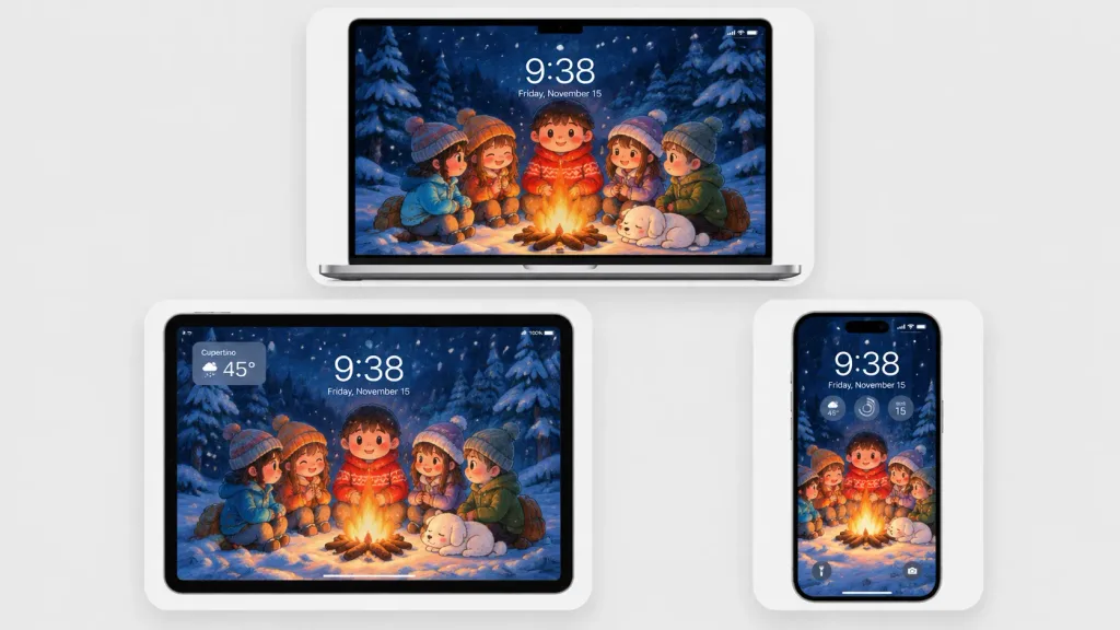
A polished multi-device product mockup showcasing a cozy winter wallpaper across three Apple-style devices set against a light gray studio background. Each device sits inside a rounded white display card with soft drop shadows: a laptop centered at the top, a tablet at the lower left, and a smartphone at the lower right. All screens display the same Japanese crayon-anime illustration cropped to fit: five cute cartoon children and a sleeping small white dog gathered around a glowing campfire in a snowy pine forest at night under falling snow and deep navy-blue trees, illuminated by warm orange firelight. Behind the campfire stands a round-faced child in a red winter sweater, flanked by friends in winter attire. Realistic lock-screen UI overlays appear on the screens: time "[9:38]", date "[Friday, November 15]", status icons, and translucent widgets. The tablet includes an upper-left translucent weather widget displaying "[Cupertino]" and "[45°]"; the phone features three circular widgets below the time and dual bottom lock-screen icons. Clean minimalist tech mockup, thin black bezels, soft ambient lighting, sharp screen details, no brand logos or watermarks.

mockupwallpaperdispositivos
Interface de Jogo Auto-Battler Fantasia

Interface de Jogo Auto-Battler Fantasia

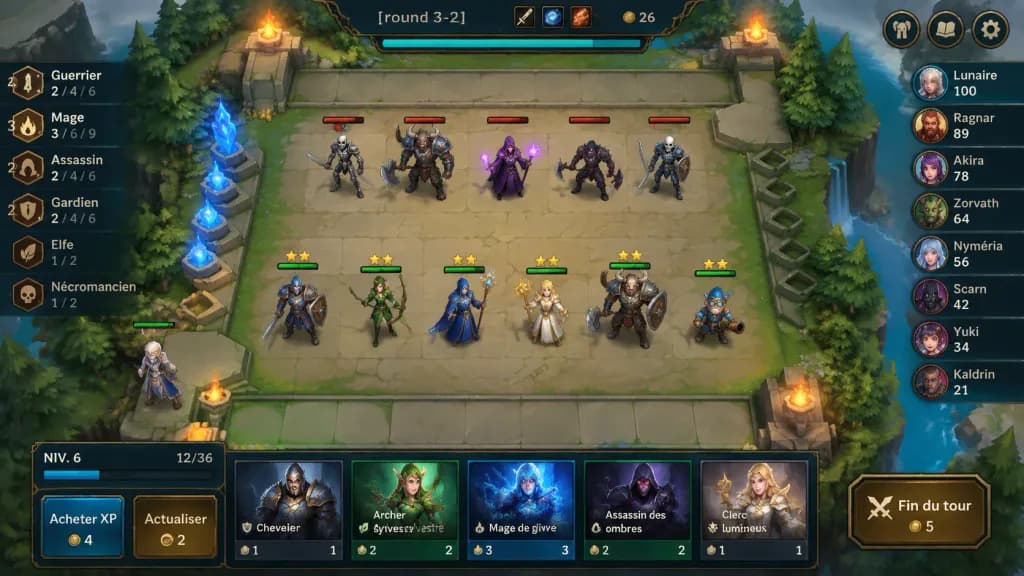
A polished 2D fantasy auto-battler gameplay mockup screenshot for [round 3-2], shown from an isometric top-down perspective with crisp hand-painted fantasy game art and a League-of-Legends/TFT-inspired interface. In the center is a square stone battlefield grid on a floating forest platform with worn beige tiles, mossy edges, stone railings, evergreen trees, cliffs, water at the right edge, glowing blue crystals on the left, and four flaming braziers near the arena corners. Top center ornate dark HUD bar displays "[round 3-2]", item icons, gold counter "26", and a cyan progress bar beneath; top-right features three rounded menu buttons (helmet, book, gear). On the board, exactly 11 visible characters: 5 enemy units on the upper half with red health bars (skeleton swordsman, horned beast warrior with axe, purple mage holding magic, dark rogue with axe, armored skeleton fighter); 6 allied units on the lower half with green health bars and yellow star ratings (blue-and-brown knight, green elf archer, blue-armored staff mage, blonde cleric with golden staff, horned tank warrior with shield, small blue gnome engineer); plus one bench character at the lower-left edge. Left trait panel shows 6 vertical synergy rows with bronze icons: "Guerrier" with "4" and "2 / 4 / 6"; "Mage" with "3" and "3 / 6 / 9"; "Assassin" with "2" and "2 / 4 / 6"; "Gardien" with "2" and "2 / 4 / 6"; "Elfe" with "1 / 2"; "Nécromancien" with "1 / 2". Right leaderboard shows 8 players with circular fantasy avatars: "Lunaire 100", "Ragnar 89", "Akira 78", "Zorvath 64", "Nyméria 56", "Scarn 42", "Yuki 34", "Kaldrin 21". Bottom shop panel features a level box reading "NIV. 6" with XP "12/36", two buttons labeled "Acheter XP" (cost 4) and "Actualiser" (cost 2), five champion shop cards ("Chevalier" cost 1, "Archer sylvestre" cost 2, "Mage de givre" cost 3, "Assassin des ombres" cost 2, "Clerc lumineux" cost 1), and a gold-bordered button labeled "Fin du tour" (cost 5). Saturated colors, soft ambient lighting, clean bevels, dark teal and bronze frames.

auto-battlerinterface-jogomockup
Tela LCD de Câmera Digital Retrô

Tela LCD de Câmera Digital Retrô

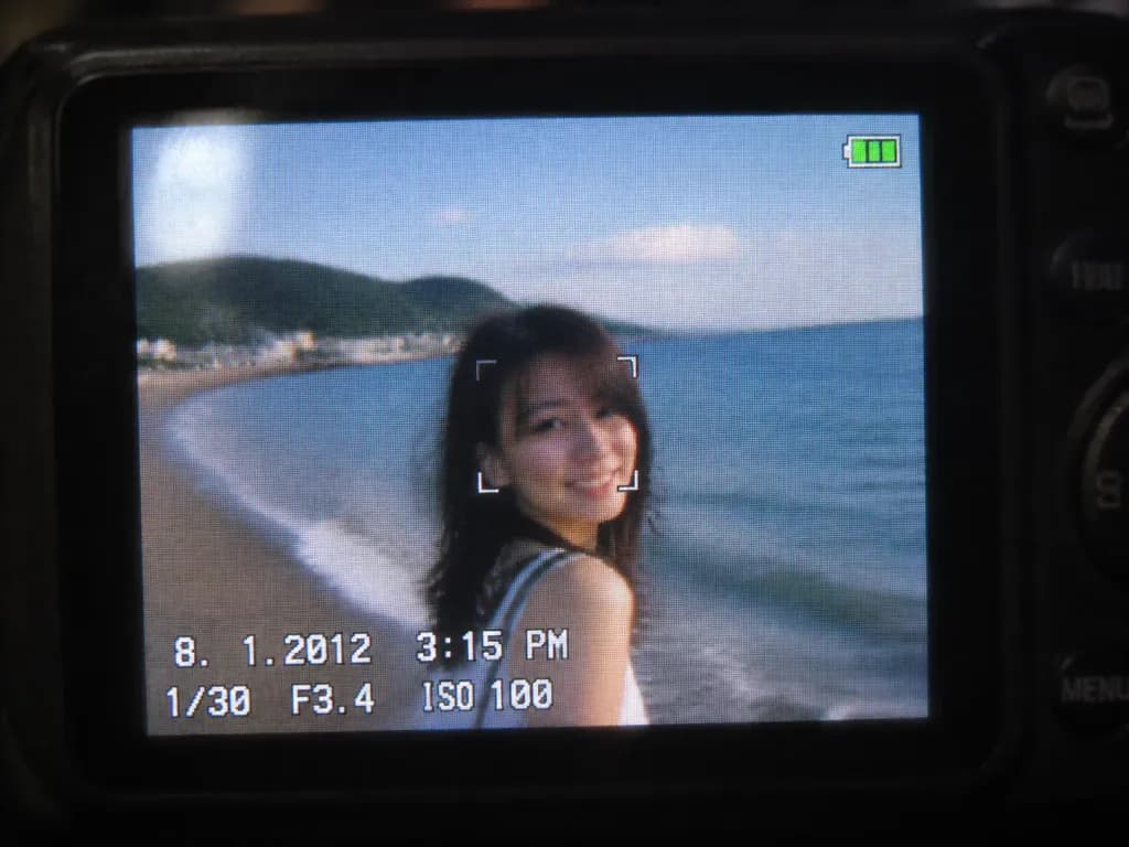
A close-up shot of a small digital camera LCD screen displaying an [early 2010s style] photo based on the reference photo, capturing a nostalgic compact camera aesthetic. The image features slight motion blur, digital grain, visible LCD pixel grid structure, compressed digital artifacts, subtle glare, and soft colors characteristic of an early 2010s CCD sensor. A realistic on-screen camera UI overlay displays the timestamp '8. 1. 2012 3:15 PM', exposure settings '1/30 F3.4 ISO 100', a focus indicator, and a small green battery icon in the corner. Outside the illuminated LCD, the surrounding dark camera body softly blurs into darkness.

câmera digitalsensor ccddigital vintage
Mockup de interface de live streaming móvel

Mockup de interface de live streaming móvel

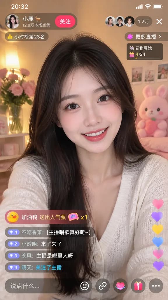
mobile live-streaming app interface mockup. young Asian woman, long dark hair, smiling at camera. [white V-neck cardigan]. cozy room, warm lighting, pink flowers, pink plush toy. 20:32. [小鹿 🦌]. 12.8万本场点赞. 关注. [1.2万]. X. 小时榜第23名. 更多直播 >. 礼…

transmissão ao vivoui mobilemockup de aplicativo
Grade de Ícones de Mascote 3D Fofos

Grade de Ícones de Mascote 3D Fofos

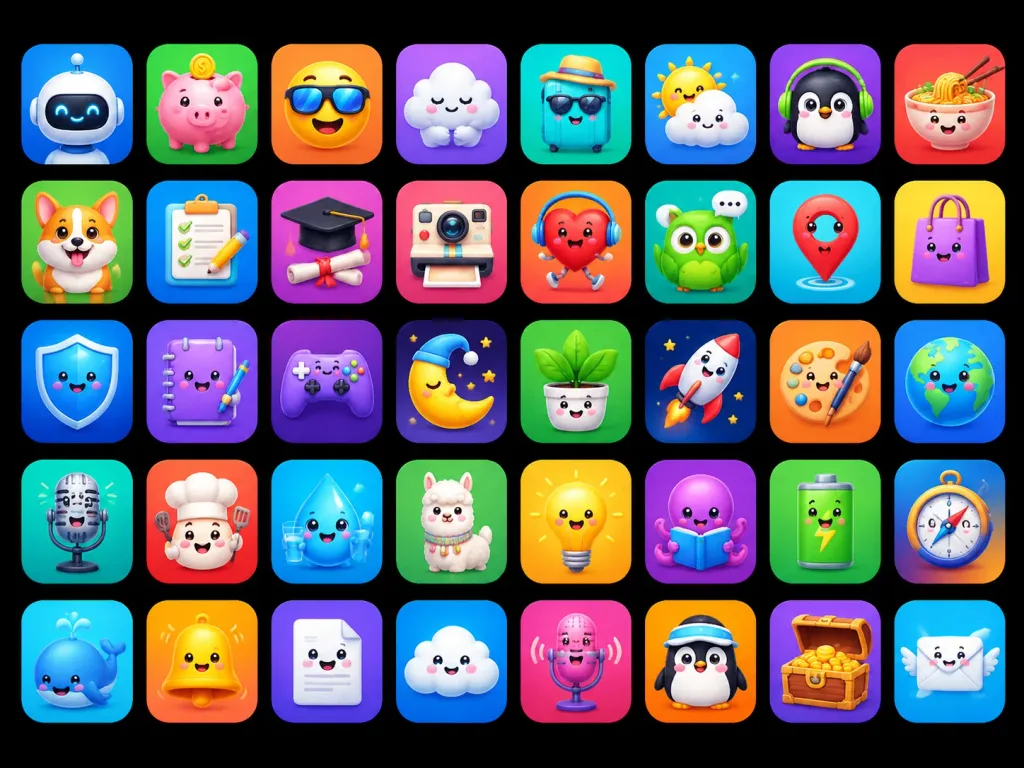
A polished app-store mascot icon showcase featuring [40] unique cute 3D mascot icons, designed as ASO-friendly mobile app icon concepts. Composition and canvas: Horizontal 4:3 composition on a solid pure black background, displaying a neat grid of rounded-square app tiles arranged in exactly 5 rows and 8 columns, evenly spaced with uniform margins. Each tile is a glossy squircle with a smooth soft gradient background, subtle inner glow, and a soft drop shadow. No text, no typographic labels, no watermarks. Visual style: High-end 3D clay and toy mascot style, kawaii expressions, big friendly glossy eyes, tiny smiles, smooth rounded forms, vibrant saturated colors, bright studio lighting, soft ambient occlusion shadows, crisp clean edges, premium iOS icon aesthetic. Icon grid details (40 discrete items arranged left to right, top to bottom): 1. White robot head mascot on blue gradient 2. Pink piggy bank with gold coin on green gradient 3. Smiling yellow face wearing a sun visor on orange gradient 4. Sleepy white cloud hugging itself on purple gradient 5. Turquoise suitcase wearing sunglasses and straw hat on teal gradient 6. Cute sun peeking behind a raincloud on blue gradient 7. Black penguin wearing green headphones on purple gradient 8. Smiling noodle bowl with chopsticks on red-orange gradient 9. Happy corgi dog mascot on green gradient 10. Checklist clipboard with pencil on blue gradient 11. Graduation cap over diploma silhouette on purple-pink gradient 12. Cute retro instant camera on pink-red gradient 13. Red running heart character with headphones on orange-red gradient 14. Green owl with speech bubble on teal gradient 15. Red map pin mascot on cyan gradient 16. Purple shopping bag character on yellow gradient 17. Blue glossy shield mascot on deep blue gradient 18. Purple notebook mascot holding a pen on violet gradient 19. Purple game controller mascot on dark purple gradient 20. Sleeping crescent moon wearing a nightcap on dark starry gradient 21. Smiling potted houseplant in white pot on green gradient 22. White rocket launching on navy starry gradient 23. Artist palette mascot with paintbrush on orange gradient 24. Smiling planet Earth globe on blue gradient 25. Vintage microphone mascot on teal gradient 26. Chef mascot with chef hat and spatula on red-orange gradient 27. Smiling water droplet holding a glass of water on cyan gradient 28. Fluffy llama mascot on green gradient 29. Glowing yellow lightbulb mascot on yellow-orange gradient 30. Purple octopus reading an open book on violet gradient 31. Green battery mascot with lightning bolt on green gradient 32. Directional compass mascot on blue-orange gradient 33. Blue whale mascot with water spout on cyan gradient 34. Shiny yellow bell mascot on orange gradient 35. Smiling white folded document mascot on purple gradient 36. Happy fluffy cloud mascot on blue gradient 37. Pink microphone mascot with soundwaves on magenta gradient 38. Penguin mascot wearing a sporty visor on orange gradient 39. Wooden treasure chest overflowing with gold coins on purple gradient 40. Smiling postal envelope mascot with angel wings on sky blue gradient Constraints: Maintain strict uniform size, visual fidelity, and lighting angle across all 40 icons.

ícone de appícone 3dkawaii
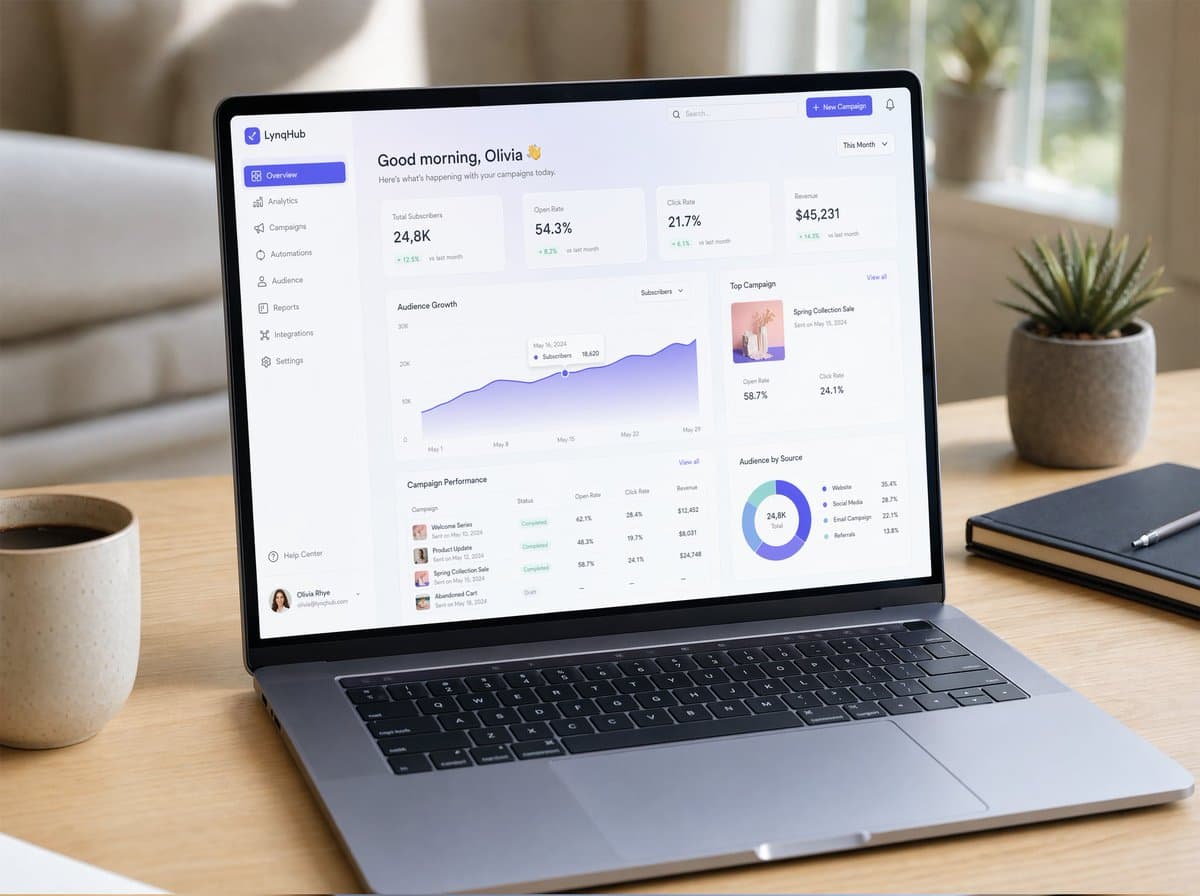
Mockup de Notebook com Dashboard SaaS

Mockup de Notebook com Dashboard SaaS

Um mockup de UI/UX hiper-realista exibido em um notebook moderno e fino, posicionado sobre uma mesa de madeira minimalista com luz natural suave. A tela mostra um dashboard SaaS clean com tipografia elegante, cards em glassmorphism, gradientes suaves, drop shadows sutis e componentes bem espaçados. Gráficos visíveis, painéis de analytics, navegação em sidebar e microinterações. Moldura de janela realista no estilo macOS, reflexos suaves na tela, shallow depth of field, atmosfera aconchegante de espaço de trabalho, capturado no estilo photorealistic product photography, ultra-detailed.

mockup UIfotografia de produtoSaaS
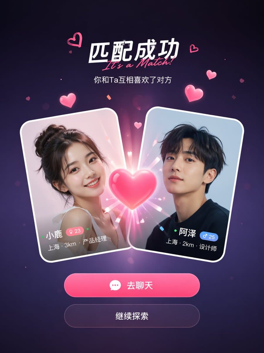
Tela de Sucesso de Match em App Social

Tela de Sucesso de Match em App Social

Um mockup de tela de sucesso de match de um app de relacionamentos social. Dois cartões de perfil de usuário colidindo no centro com um efeito de coração brilhante entre eles. O título diz "It's a Match!" com um subtítulo abaixo. Cada cartão mostra uma foto de perfil, nome, idade, localização e cargo. Abaixo dos cartões, dois botões de ação: um botão principal rosa de "Chat" e um botão secundário de "Continue". Fundo em gradiente roxo escuro com partículas flutuantes de corações rosa e efeitos de brilho. Design de UI mobile limpo e moderno, proporção vertical de 9:16, estética realista de captura de tela de app, sombras polidas e bordas de cartão em glass-morphism.

app socialmockup de UItela de match
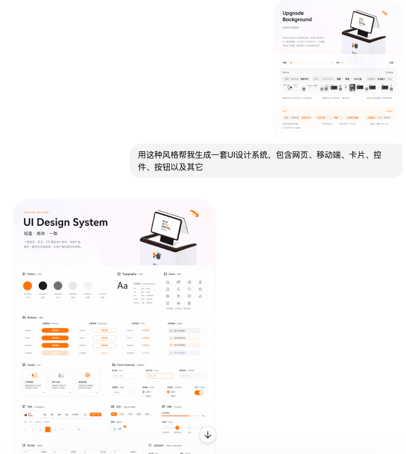
Classe de UI

Classe de UI

Use este estilo para me ajudar a gerar um design system de UI, incluindo páginas da web, telas móveis, cartões, controles, botões e outros

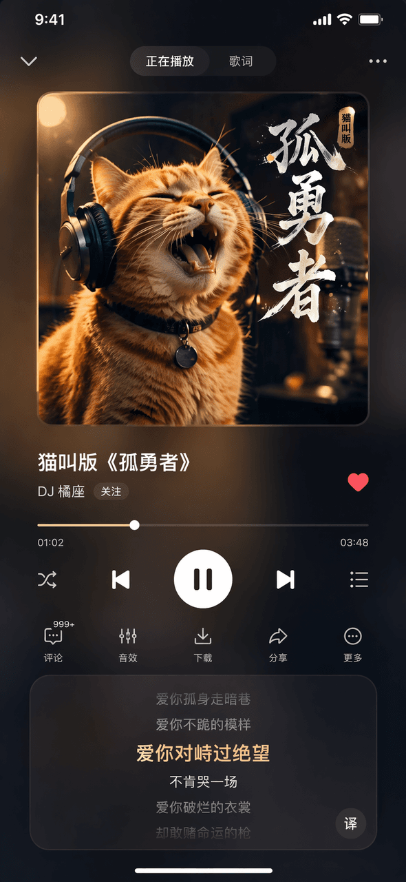
Interface de Software #44

Interface de Software #44

Prompt Words Desenhe uma imagem da página Tocando Agora de um aplicativo fictício de música. A imagem da capa do álbum na parte superior mostra um gato laranja usando fones de ouvido. O título da música no centro é "Cat Meowing Version of "Lonely Brave"" e o nome do cantor é "DJ Orange Seat". A barra de progresso e os botões de controle na parte inferior, a área de rolagem da letra na parte inferior e um efeito geral de vidro fosco escuro desfocado.

Interface de Software #43

Interface de Software #43

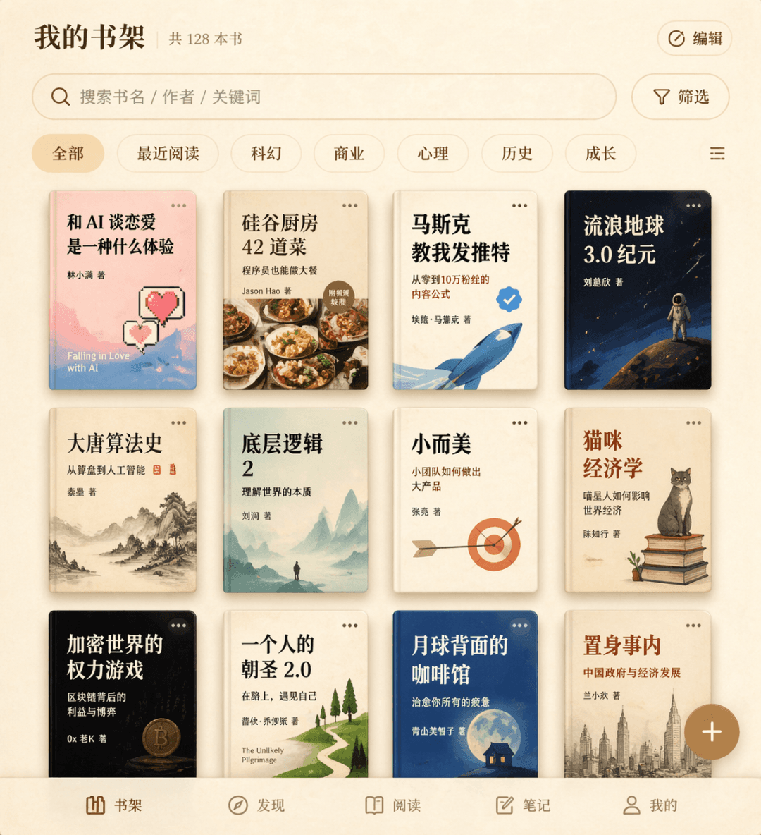
Palavras do prompt Desenhe uma interface de estante de livros para um aplicativo de leitura fictício. A grade de capas de livros de três linhas exibe doze títulos de livros fictícios, incluindo "What's it like to fall in love with AI", "42 Dishes from the Silicon Valley Kitchen", "Musk Taught Me to Tweet", etc., com uma caixa de pesquisa e etiquetas de filtro na parte superior, um botão flutuante de adicionar no canto inferior direito e uma textura geral de pergaminho bege.

Interface de Software #42

Interface de Software #42

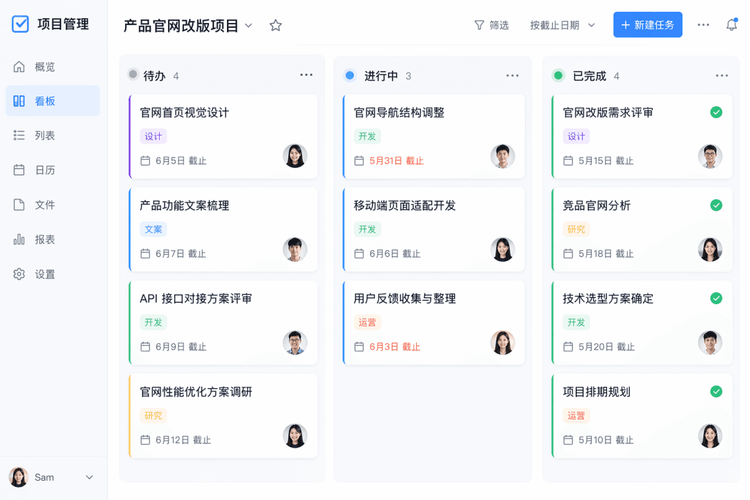
Palavras do Prompt Desenhe uma captura de tela da visualização do painel de um aplicativo fictício de gerenciamento de tarefas. Há três colunas de "To Do", "In Progress" e "Completed", com três a quatro cartões em cada coluna. Cada cartão contém um título, etiqueta, prazo e avatar do responsável, com um design flat geral.

Interface de Software nº 41

Interface de Software nº 41

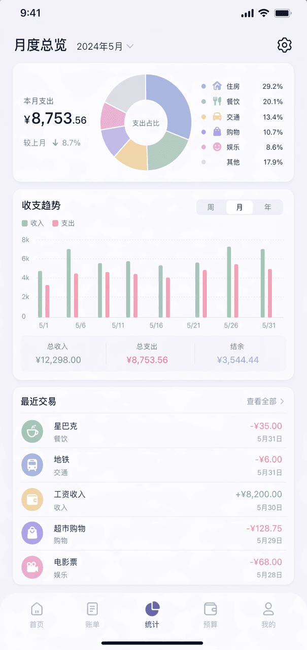
Prompt Words Desenhe uma página de visão geral mensal de um aplicativo de contabilidade fictício. O gráfico de rosca na parte superior mostra a classificação de despesas, o gráfico de colunas no meio, as cinco listas de transações recentes na parte inferior, esquema geral de cores Morandi e a engrenagem no canto superior direito.

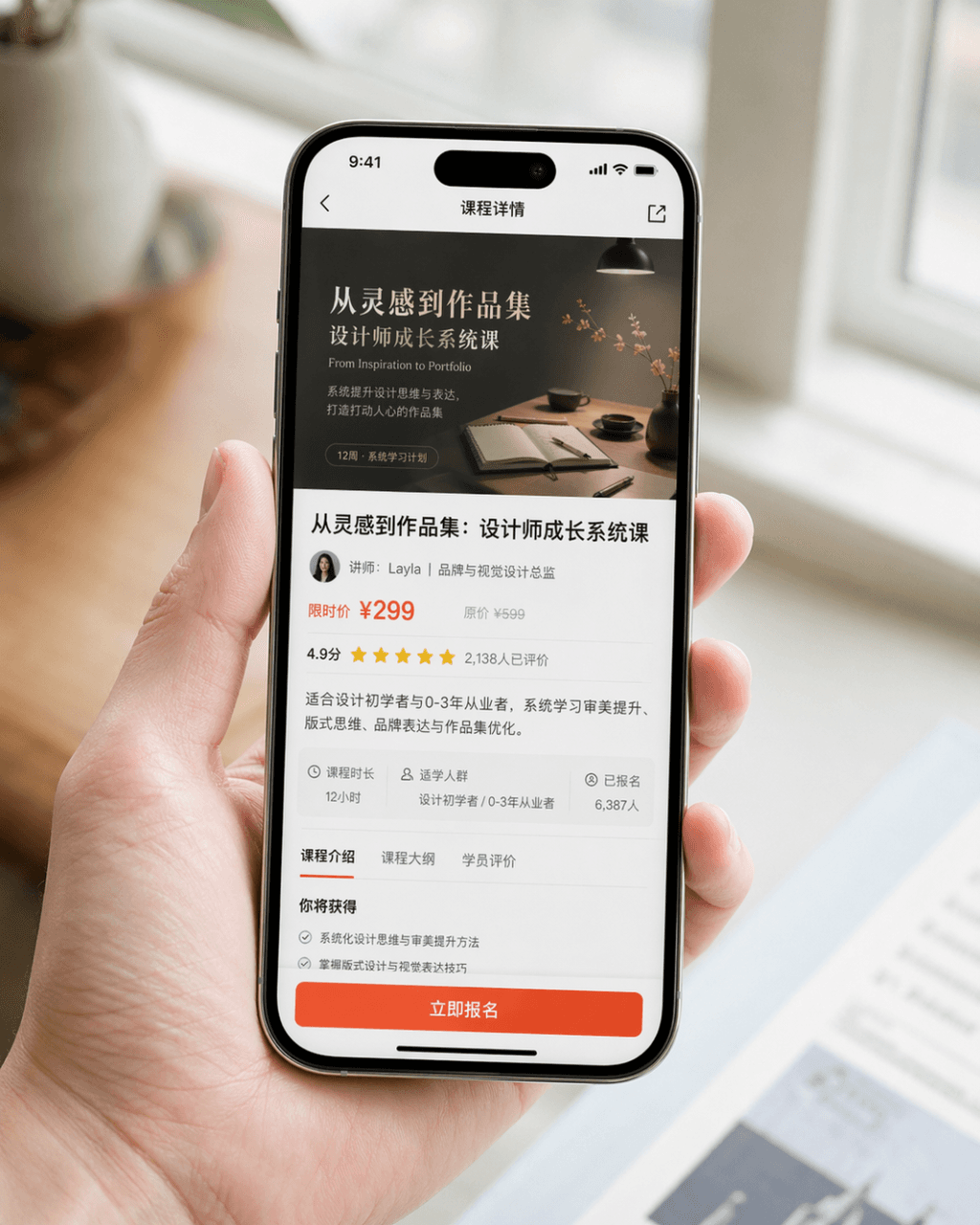
Imagem promocional de captura de tela de celular

Imagem promocional de captura de tela de celular

Gere uma imagem promocional muito realista de captura de tela de celular. O dispositivo é um iPhone 15 Pro. O conteúdo da tela é a página de detalhes do curso de um aplicativo de aprendizado de design. A página exibe claramente a capa do curso, o título do curso, as informações do instrutor, as informações de preço, as avaliações dos usuários, um resumo e um botão chamativo "Register Now". A imagem é uma composição em close-up de uma pessoa segurando o celular naturalmente. As mãos da pessoa são limpas e naturais, a tela do celular é nítida e brilhante, e o fundo é desfocado. A imagem geral parece uma foto oficial de RP do produto divulgada pela marca. Exige textura fotográfica realista, iluminação suave e sofisticada, composição concisa e detalhes realistas. Evite UI exagerada, estilo brega de e-commerce e design excessivo.

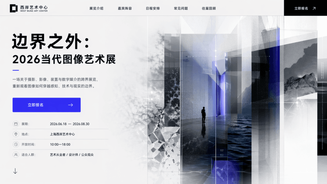
Tela inicial de landing page de evento

Tela inicial de landing page de evento

Crie a página inicial de uma landing page de evento com o tema "Beyond the Boundary: 2026 Contemporary Image Art Exhibition" e o CTA "Register Now." A página deve conter o título principal, subtítulo, botões, elementos visuais auxiliares e informações sobre a exposição, exatamente como a primeira dobra de uma página da web real.

Dashboard SaaS

Dashboard SaaS

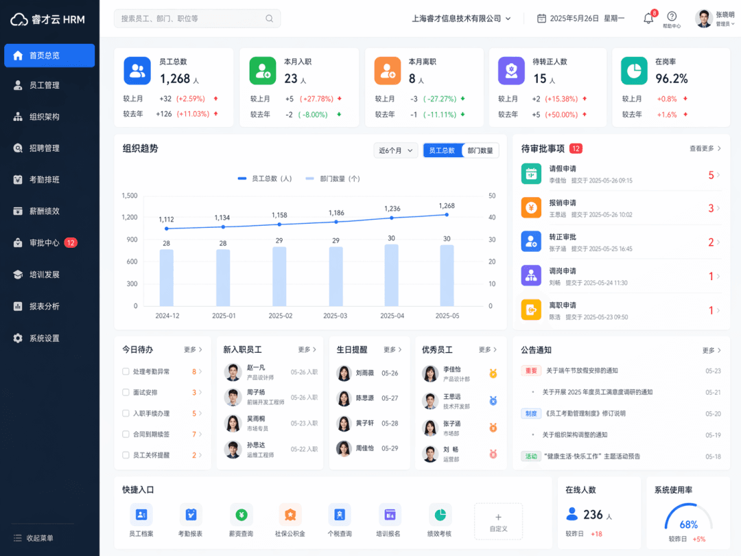
Gere uma interface de dashboard SaaS, o tipo de produto é "Enterprise Human Resources Management System". A página inicial real do painel de RH é apresentada como um todo, incluindo navegação à esquerda, pesquisa superior, cartão de estatísticas de funcionários, gráfico de tendências organizacionais, módulo de aprovações e módulo de usuário. A interface é limpa e racional, como um sistema corporativo maduro.

Conceito de página inicial de aplicativo

Conceito de página inicial de aplicativo

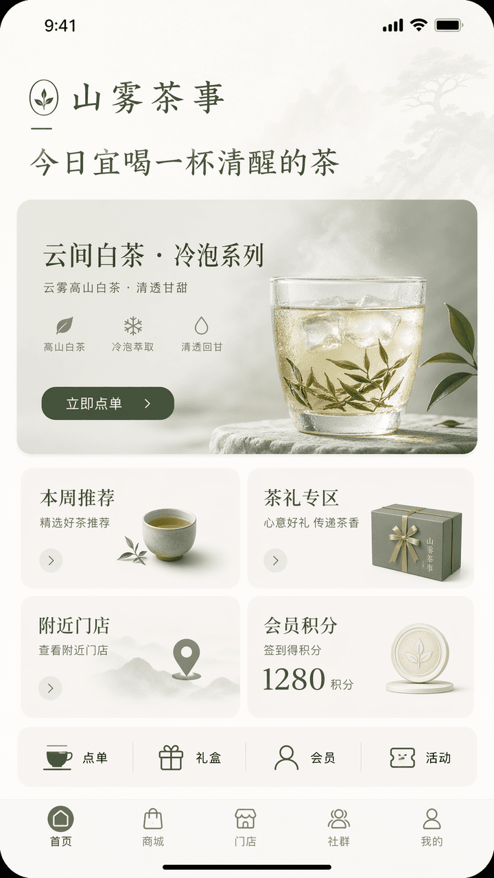
Projete uma interface conceitual de página inicial de aplicativo no estilo iPhone. O nome da marca é "Shanwu Tea Shi", o setor é novas bebidas de chá chinês/estilo de vida do chá, e as funções são pedidos na loja, recomendações de novos chás cold brew, compra de presentes de chá, pontos de fidelidade e busca de lojas próximas. O topo da página inicial exibe a saudação da marca "Today is a good time to drink a cup of sober tea", o visual principal é o cartão de recomendação de novos produtos "Yunjian White Tea·Cold Brew Series" com o botão "Order Now"; no centro, há quatro módulos: recomendações da semana, área de presentes de chá, lojas próximas e pontos de fidelidade; uma linha de acessos rápidos é adicionada abaixo: pedidos, caixas de presentes, membros e atividades; a barra de navegação inferior tem início, shopping, loja, comunidade e meu perfil. A interface geral precisa ter um temperamento oriental contido + uma sensação de marca madura. A paleta de cores deve ser restrita a três tons: off-white, verde-chá e cinza-lunar. A interface deve ser como a página inicial de um aplicativo de marca de estilo de vida de alto padrão, com hierarquia clara, informações concisas, botões bem posicionados e todos os textos em chinês correto.

Setup de mesa do escritor noturno

Setup de mesa do escritor noturno

"Sistema de temas de desktop projetado para escritores noturnos", o design de temas de UI é combinado com fotografia de natureza-morta literária. A tela exibe um estilo de tema unificado para área de trabalho de computador, skin de método de entrada, timer de foco, ícones de pastas, papel de parede noturno, efeitos de iluminação de teclado mecânico e widgets de desktop. As cores são preto-carvão, branco-lunar, vinho-escuro e cobre envelhecido. O clima é contido e maduro, com proporção de 16:9.

Painel de operações do festival

Painel de operações do festival

"Summer Music Festival Backstage Operation Overview", um painel de controle de evento de grande porte é integrado com fotografia no local. O plano de fundo principal mostra a passagem, caixas de equipamentos, área de descanso dos artistas e ponto de encontro dos voluntários atrás do palco. O primeiro plano é sobreposto com o cronograma das apresentações, nível de segurança, ponto de água potável, mapa de calor do fluxo de pessoas, alerta meteorológico e monitoramento de volume sonoro. O título se assemelha à tela da sala de controle principal do evento, com proporção de 16:9.

Interface do sistema de membros de uma casa de chá steampunk

Interface do sistema de membros de uma casa de chá steampunk

"Interface do sistema de membros de uma casa de chá steampunk", a UI de membros é integrada ao estilo de decoração industrial antigo. A interface principal exibe o nível de membro "Copper Pot/Silver Cup/Golden Furnace/Cloud Mist Master", e as regras de pontuação são apresentadas como um painel de vapor e fumaça de chá. O fundo apresenta engrenagens, tubos de cobre, mesas de madeira antigas e porcelana azul e branca. As cores são ricas, mas não poluídas, e a proporção é 9:16.

"Make a love into a SaaS product backend"

"Make a love into a SaaS product backend"

"Make a love into a SaaS product backend", o painel do produto de internet é integrado com narrativa emocional e humor. Os módulos da página incluem frequência de comunicação, pico emocional, taxa de retenção de memórias conjuntas, velocidade de resolução de mal-entendidos, barra de progresso do planejamento futuro e lembrete de aviso de red flag. A interface é profissional e discreta, mas cada indicador possui uma metáfora emocional, proporção 16:9.

Portal de Empregos Dinastia Ming

Portal de Empregos Dinastia Ming

"A página inicial do site de busca de empregos para pessoas da Dinastia Ming", uma fusão bem-humorada de trajes históricos e interfaces de plataformas modernas de recrutamento. A interface principal traz recomendações de empregos como "historiador/professor de academia/contador naval/supervisor de tecelagem/pintor da corte", e os filtros de pesquisa são "habilidade em poesia/aritmética comum/habilidade em montaria e arquearia/disponibilidade para viagens". O cartão de currículo individual utiliza um retrato meticuloso em estilo gongbi, e a unidade salarial é expressa em prata e medidas de arroz (shi). O layout é exatamente como a página inicial de um produto de recrutamento real, com proporção de 16:9.

Totem hospitalar noturno

Totem hospitalar noturno

"Interface de totem de autoatendimento hospitalar às três da manhã" combina uma atmosfera espacial documental com uma interface rigorosa. A imagem é um close-up de um terminal de autoatendimento hospitalar. O conteúdo da tela exibe claramente botões como cadastro/triagem, impressão de laudos, pagamento, navegação e localização da farmácia noturna. O totem está cercado por um saguão vazio, iluminação branca e fria, e pessoas cansadas, porém silenciosas. A imagem geral é calma e realista, com um toque da fragilidade da vida cotidiana. A proporção é 9:16.

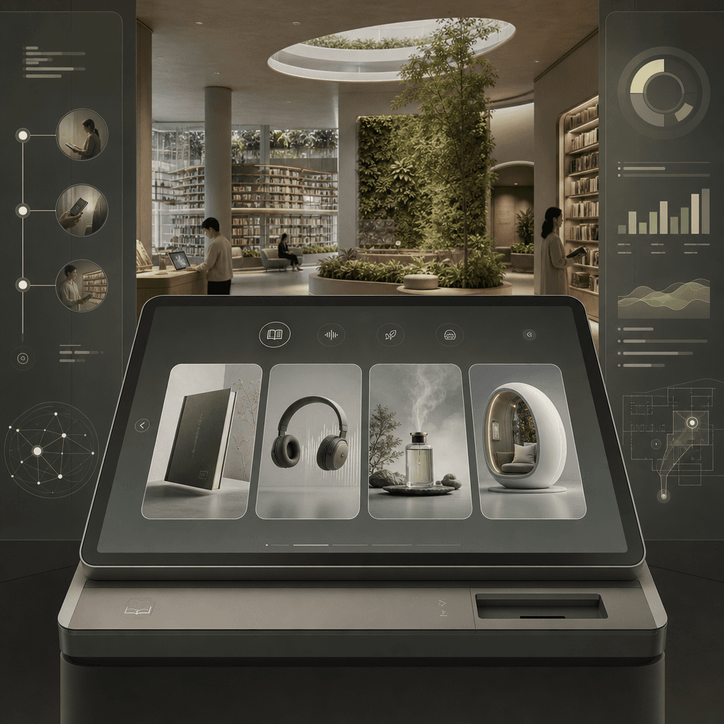
"Terminal de Empréstimo de Biblioteca do Futuro"

"Terminal de Empréstimo de Biblioteca do Futuro"

"Library Borrowing Terminal of the Future", a interface de usuário do produto é integrada ao mapa conceitual do espaço arquitetônico. Em primeiro plano, uma grande tela de um terminal de empréstimo minimalista, capaz de filtrar livros físicos, arquivos de som, memórias olfativas e cabines de leitura imersivas. Ao fundo, um espaço de biblioteca aberto, com estantes extensas e paredes verdes. A barra lateral exibe a jornada do leitor, dados de empréstimo e orientação espacial. As cores são calmas e contidas, e a proporção é 16:9.

Redesign de Pedidos em Cafeteria: Ansiedade Social

Redesign de Pedidos em Cafeteria: Ansiedade Social

"Redesign of the cafe ordering system for socially anxious users", diagrama de proposta de design de serviço, a tela principal mostra a nova solução para o balcão da cafeteria e a tela de autoatendimento, reduz o contato verbal, adiciona a opção de "default recommendation/no communication for meal taking/seat preference/volume area", expande o sistema de ícones, placa de mesa, cartão de retirada de pedidos e diagrama de fluxo de movimento da área de espera no lado direito. A sensação geral é muito realista, com proporção de 16:9.

"Tela de Visão Geral do Monitoramento da Reserva da Floresta Tropical"

"Tela de Visão Geral do Monitoramento da Reserva da Floresta Tropical"

"Tela de Visão Geral do Monitoramento da Reserva da Floresta Tropical" integra um painel de pesquisa científica ecológica e fotografia de natureza imersiva. O fundo principal da imagem é um cenário magnífico com vista superior da copa da floresta tropical. O primeiro plano é sobreposto com uma camada de dados translúcida: densidade do dossel florestal, trajetórias de atividade de animais ameaçados de extinção, alertas de caça ilegal, curvas de precipitação e sumidouros de carbono. O título lembra a visão de um projeto de proteção ambiental das Nações Unidas. O tom é profissional e solene, as cores são vivas, mas sem saturação excessiva, e a proporção é 16:9.

"Página de rastreamento de encomendas dos correios espaciais"

"Página de rastreamento de encomendas dos correios espaciais"

"Package tracking page of the Space Post Office" integra a UI de um sistema logístico com uma visão de mundo de ficção científica. A imagem é uma página de detalhes de rastreamento de encomendas, e a rota é exibida segmento por segmento de "Earth-Low Earth Orbit-Moon Transfer Station-Mars North Port". Os ícones dos nós são projetados como pequenos foguetes, cabines de carga, alfândega espacial e áreas de alerta de meteoritos. À direita, há uma lista de itens do pacote: cartões-postais, folhas de chá, fotos e suéteres velhos. A composição geral é calma e racional, mas possui um toque de calor humano, com proporção de 9:16.

Documento colaborativo em rolo de bambu

Documento colaborativo em rolo de bambu

"Multi-person collaborative document interface in the Warring States Period" é uma fusão absurda entre documentos em tiras de bambu e o design de produtos de documentos online. A imagem parece a interface de um editor colaborativo em tempo real, mas a camada inferior é composta por tiras de bambu desenroladas e tinta de pincel. Os balões de comentários de diferentes autores estão marcados com "Gongsun Long is editing", "Han Fei suggested deletion" e "Su Qin proposed changing the title". A barra lateral exibe o histórico de versões e comentários. O conjunto é repleto de rigor acadêmico e humor corporativo da era da internet, com proporção de 16:9.

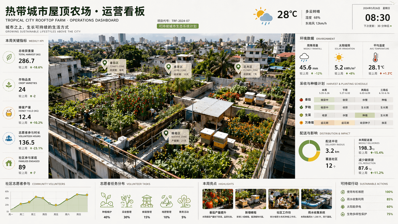
Sinalização operacional de fazenda urbana em telhado de cidade tropical

Sinalização operacional de fazenda urbana em telhado de cidade tropical

"Tropical City Rooftop Farm Operations Dashboard" é uma fusão de fotografia espacial e painel comercial. Tomates, ervas, flores e colmeias são cultivados em diferentes telhados na vista aérea superior. A lateral da tela exibe dados de precipitação semanal, irradiação solar, ciclo de colheita, raio de distribuição e participação de voluntários da comunidade. O título parece uma página de relatório de projeto sustentável de um escritório de arquitetura. O esquema de cores traz verde-folha, marrom-terra, amarelo-sol e azul pós-chuva. É rico em informações, mas a imagem é revigorante e limpa, com proporção de 16:9.

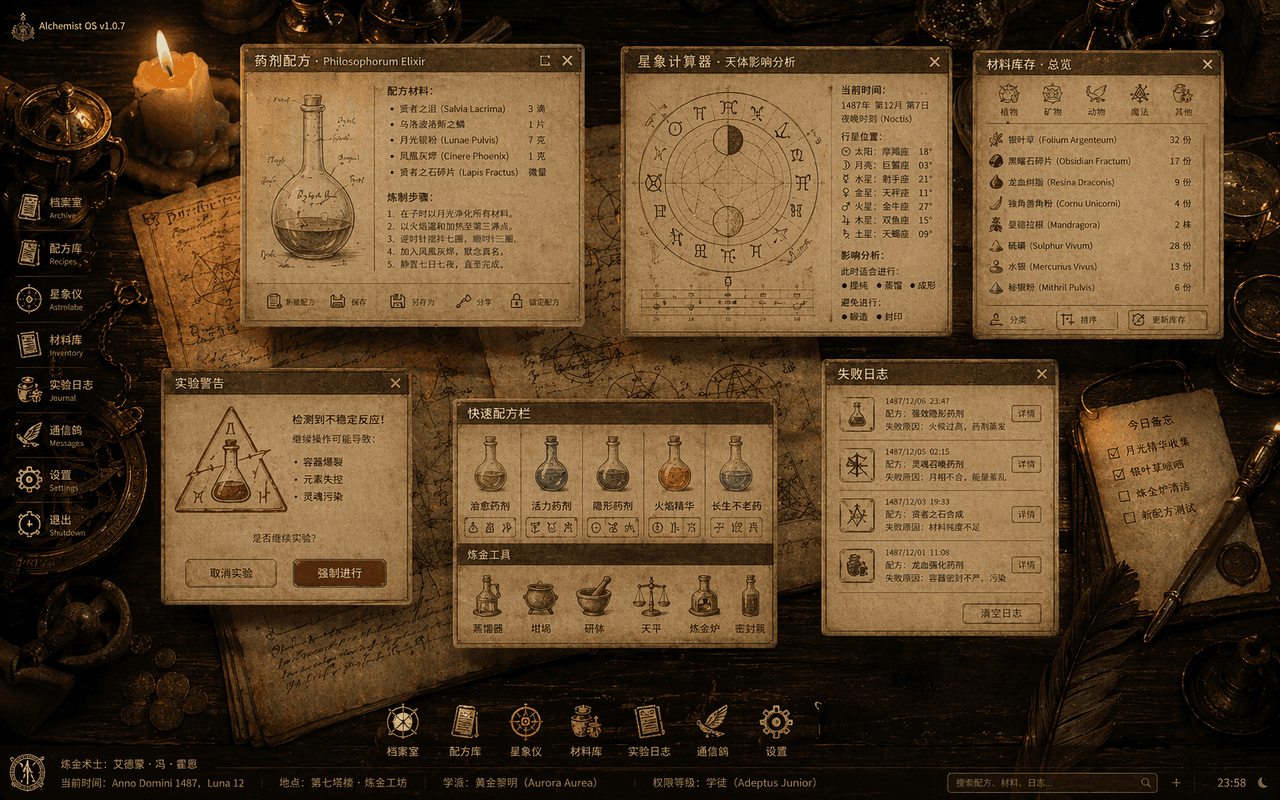
Sistema Operacional de Alquimista Medieval

Sistema Operacional de Alquimista Medieval

"O Sistema Operacional Desktop do Alquimista Medieval" é uma fusão de ilustrações de livros antigos com interface de desktop. A imagem é uma tomada aérea de uma mesa de madeira, com janelas translúcidas do sistema flutuando sobre ela: fórmulas de poções, calculadoras de astrologia, inventários de materiais, pop-ups de alerta de experimentos e registros de falhas. Os ícones são todos reconstruídos a partir de penas de escrever, frascos de vidro e emblemas semióticos. O fundo é composto por pergaminho e instrumentos de cobre iluminados por velas. O conjunto parece um conjunto completo de especificações visuais de um antigo sistema operacional mágico, com proporção de 16:10.

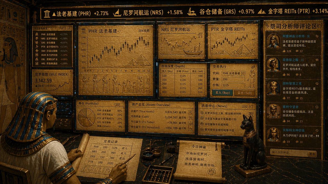
Terminal de negociação de ações do Antigo Egito

Terminal de negociação de ações do Antigo Egito

"O terminal de negociação de ações dos antigos egípcios", uma fusão absurda de elementos de murais de templos com interface de trading financeiro. A tela se parece com uma estação de trabalho de trading com múltiplos monitores, mas todos os gráficos, velas (candlesticks) e símbolos de ações estão gravados em uma interface de ardósia dourada e papiro. O letreiro superior rola "Pharaonic infrastructure, Nile shipping, granary reserves, pyramids REITs", o trader tem a imagem de um escriba usando um toucado, e a área de comentários do analista sacerdote é exibida no lado direito. A paleta de cores geral é areia dourada, azul-pavão e obsidiana. O estilo é solene, mas com um contraste cômico e alegre, na proporção 16:9.

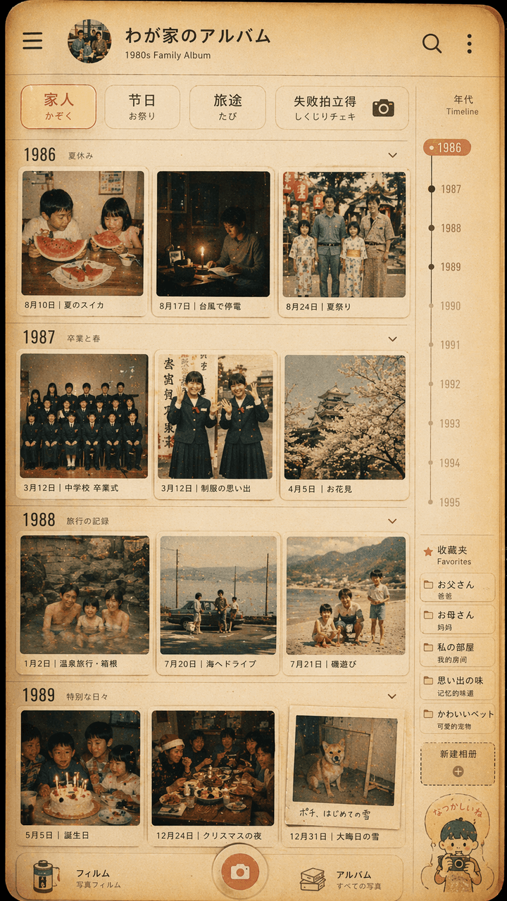
Design de interface de álbum de fotos de família no estilo Showa

Design de interface de álbum de fotos de família no estilo Showa

"Design de interface de álbum de fotos de família no estilo Showa", o mural de fotos retrô é integrado à moderna interface de aplicativo de álbum de fotos. A tela simula a página de linha do tempo de um aplicativo de gerenciamento de fotos, mas cada miniatura é dos anos 1980. O cotidiano de uma família japonesa nos anos 1970: melancia de verão, queda de energia por tufão, foto de formatura em uniforme escolar, viagem a fontes termais, mesa de ceia de Natal. O filtro superior exibe "Family/Festival/Travel/Failure Polaroid". Há uma escala de anos e uma etiqueta de favoritos no lado direito. A cor geral lembra filme fotográfico, amarelo quente e levemente desbotado. A imagem parece tanto uma interface real de celular quanto uma exibição afetuosa de memórias de família. A proporção é 9:16.

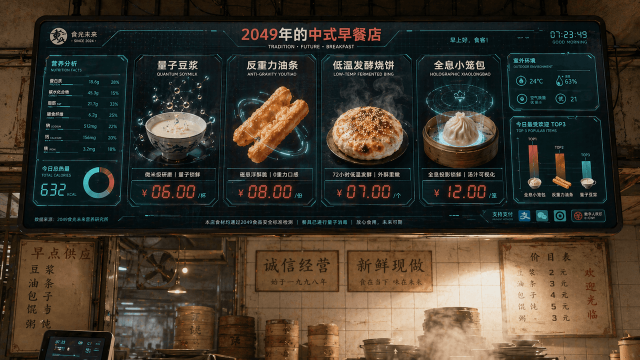
Tela de menu de restaurante de café da manhã chinês em 2049

Tela de menu de restaurante de café da manhã chinês em 2049

"Chinese Breakfast Shop Menu Screen in 2049", a identidade visual da marca gastronômica é integrada à interface de tela sci-fi. A tela principal é um enorme painel eletrônico de pedidos suspenso sobre a loja. Os pratos incluem "Quantum Soy Milk", "Anti-Gravity Fritters", "Low-temperature Fermented Shaobing" e "Holographic Xiao Long Bao". Cada prato é exibido com renderizações 3D de comida extremamente refinadas. A etiqueta de preço usa caracteres digitais de LED vermelho. À esquerda, há um gráfico de valores nutricionais e informações calóricas e, no canto inferior direito, um gráfico de barras "Today's Most Popular TOP3", o fundo preserva a parede de azulejos de uma casa de café da manhã tradicional e o ambiente real repleto de vapor, formando um contraste entre o antigo e o novo. O esquema de cores é branco-leite, vermelho-tomate e verde digital, com proporção de 16:9.

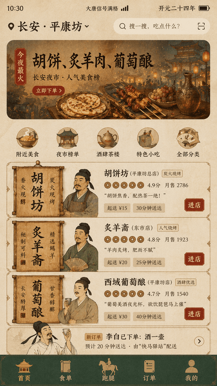
App de delivery da dinastia Tang

App de delivery da dinastia Tang

"Tang Dynasty Food DELIVERY INTERFACE" é um design de fusão entre cenas da vida antiga e a interface de um produto mobile moderno. A tela simula a interface da página inicial de delivery em um celular, onde a localização no topo exibe "Chang'an · "Pingkangfang"", o banner de recomendações traz "Tonight's most popular: Hu cakes, roasted mutton, grape wine", o card do comerciante é reconstruído usando elementos de placas de loja e tabuletas de madeira da dinastia Tang, o avatar é um busto do comerciante em estilo meticuloso gongbi, a pontuação é apresentada como um ícone de moeda de cobre, na lista de pedidos aparece "Li Bai has placed an order: a pot of wine", a barra de navegação inferior exibe "Homepage/Food List/Run Errands/Orders/Mine", a barra de status mostra "Datang Signal Full" e "Kaiyuan Twenty-Fourth Year", a paleta de cores geral é composta por ocre, verde-pedra e vermelho folha de ouro, a tipografia mescla títulos inspirados em monumentos clássicos com fontes sem serifa finas e modernas, a interface parece um rascunho de design de produto real, mas com um toque de humor histórico, na proporção 9:16.

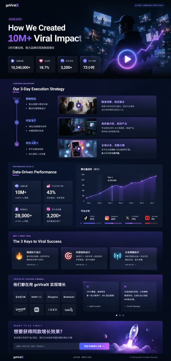
UI de estudo de caso de marketing em modo escuro

UI de estudo de caso de marketing em modo escuro

Mockup de landing page UI/UX. modo escuro, estética moderna e elegante, glassmorphism, detalhes brilhantes em {argument name="primary accent color" default="roxo e azul neon"}. Our 3-Day Execution Strategy. Data-Driven Performance. The 3 K…