Neu: GPT Image 2.5 Flare und Sunburst. Kostenlos testen mit 3 Bildern bei der Anmeldung, danach 8 Credits pro Bild.
GPT Image 2.5 testen

Editorial-Design AI-Prompts

218 Vorlagen · GPT IMAGE 2, Nano Banana Pro · aktualisiert Okt. 2026

Diese Vorlagen generieren Magazin-Cover, Präsentationsfolien, Brand-Guideline-Sheets und Infografik-Poster. Jedes Layout basiert auf strukturierten Rastersystemen, ausgewogenem Weißraum und disziplinierter typografischer Hierarchie. Passe den Text in den eckigen Klammern, Farbakzente und Hauptmotive an jede Publikation oder Kampagne an.

Sortieren nach:

121–180 von 218 Prompts

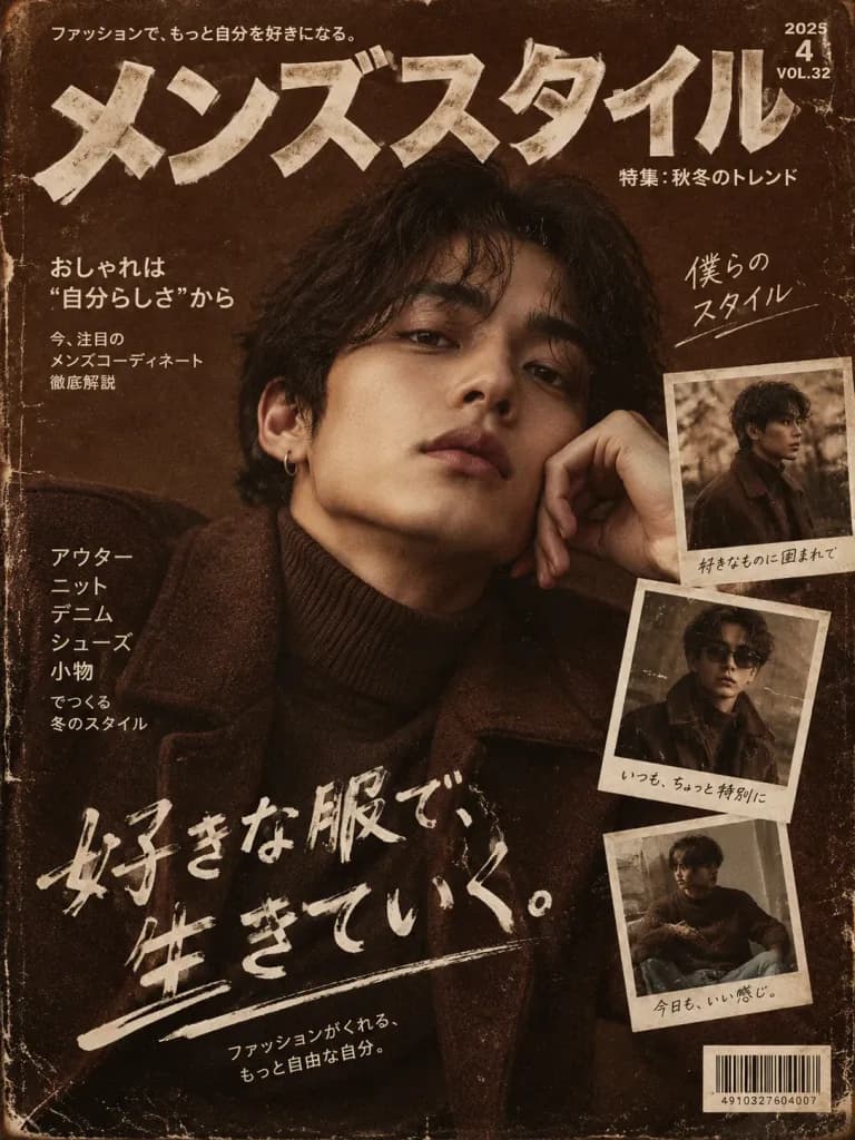
Schokobraunes Japanisches Magazin-Cover

Schokobraunes Japanisches Magazin-Cover

Vertical magazine cover with a [chocolate-brown] color palette, featuring bold Japanese typography, distressed textures, and a main portrait of [a stylish person] accompanied by smaller Polaroid photo overlays.

magazin-covertypografiejapanischer stil
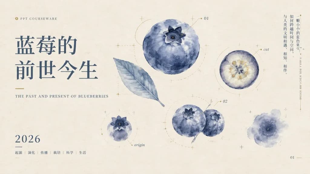
Elegantes Botanisches Präsentations-Titelblatt

Elegantes Botanisches Präsentations-Titelblatt

An elegant 16:9 widescreen presentation slide cover with a botanical academic aesthetic, set against a warm off-white handmade paper texture with subtle fibers and faint ink speckles. Layout and Typography: - Left third: Large Chinese title in dark blue-gray serif (Song/Ming style): "[蓝莓的\n前世今生]" in two stacked lines with generous line spacing. Above it, a tiny gold circular icon followed by small uppercase text "PPT COURSEWARE". Below the title, a short delicate gold line and the English subtitle in small serif capitals: "[THE PAST AND PRESENT OF BLUEBERRIES]". - Bottom left: Large serif year "[2026]", underlined by a thin line, followed by small category tags: "起源 | 演化 | 传播 | 栽培 | 科学 | 生活". - Far right margin: A narrow vertical column of small Chinese text: "[一颗小小的蓝色果实,如何跨越时间与空间,与人类的文明相遇、相知、相伴。]", alongside decorative small vertical English text. Botanical Illustrations: - Exactly 6 watercolor blueberry elements in desaturated indigo, smoky blue, and gray-blue with feathered edges: 1. Large soft blueberry bloom near the upper center with a dark star calyx. 2. Translucent blue leaf angled diagonally below-left of it. 3. Small blueberry bloom near the lower left labeled "origin". 4. Clustered pair of soft blueberries near lower middle-right. 5. Circular blueberry cross-section on the right labeled "cut" showing pale pulp and tiny seeds. 6. Small fuzzy blueberry watercolor wash near the lower right. Annotation & Diagram Accents: - Fine gold and blue-gray scientific marks: tiny registration crosses, dotted guide lines, delicate circles, thin leader lines. - Small numeric annotations: "01" near the upper-center berry, "02" near the middle-right cluster, and slide page number "01" at the bottom right corner. Style: - Minimalist Chinese new-literati aesthetic, scientific field notes, muted navy and gray palette with subtle antique-gold accents, generous negative space. No photorealism, no bright neon tones, no people, no watermark.

präsentationsfolieppt titelblattbotanisches aquarell
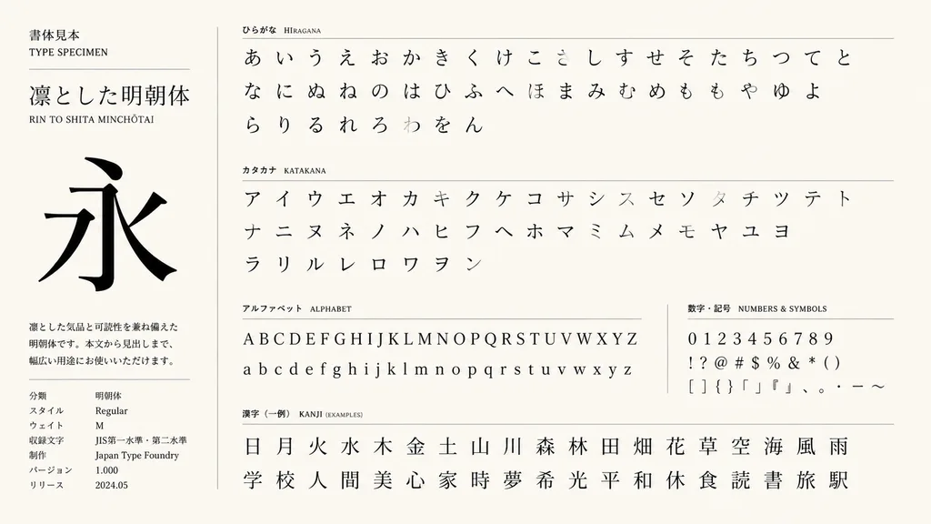
Mehrsprachiger Schriftsatz-Katalog

Mehrsprachiger Schriftsatz-Katalog

A font specimen book page layout inspired by the reference character design, featuring an organized typography catalog of [Hiragana, Katakana, English letters, and simple Kanji]. Clean editorial design, structured specimen grid, balanced glyph spacing, high legibility, minimalist graphic layout.

typografieschriftmustereditorial design
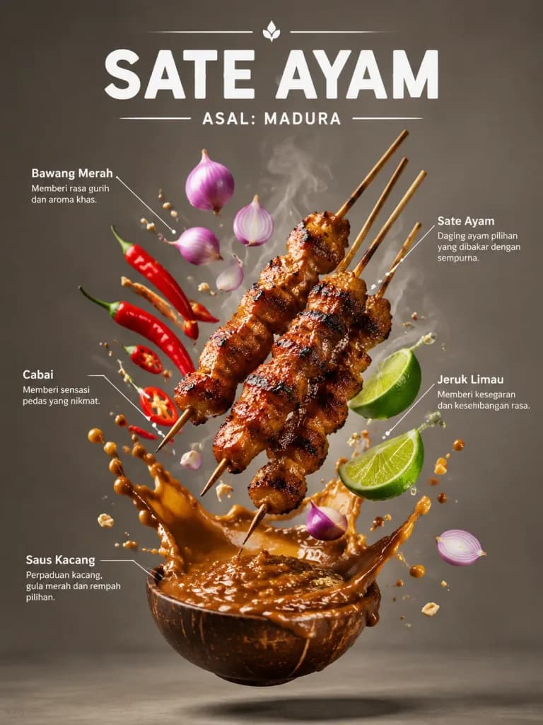
Indonesisches Food-Infografik-Poster

Indonesisches Food-Infografik-Poster

A food infographic poster of [Indonesian Sate Ayam], vertical composition. At the top, bold modern typography displays the dish name "[SATE AYAM]" and regional origin "[ASAL: MADURA]". The dish and its ingredients levitate in mid-air: skewers of charred grilled meat, glossy peanut sauce splashes frozen in motion, fresh shallots, lime wedges, chili peppers, and wisps of steam. Thin, clean white leader lines point to each floating ingredient with small Indonesian text labels. Food magazine editorial layout, dramatic studio contrast lighting, glossy sauce highlights, realistic shadows, shallow depth of field, minimalist neutral background.

food-fotografieinfografikkochposter
FIFA WM Sport-Editorial-Plakat

FIFA WM Sport-Editorial-Plakat

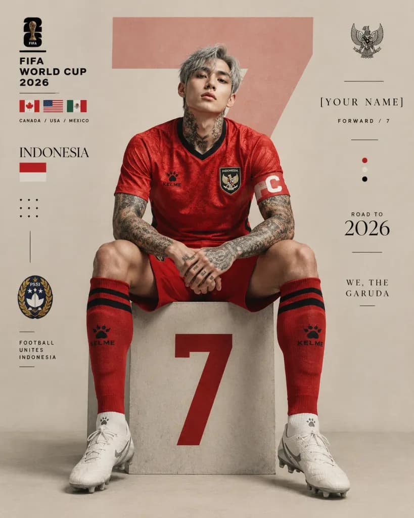
FIFA World Cup 2026 sports editorial poster design in a vertical 4:5 format with a minimalist beige studio background. Center composition featuring a [stylish Indonesia football player] sitting confidently on a large geometric plinth with the [number "7"] printed in bold red on the front. The player wears a modern national team football kit in [vivid textured red] with black collar trim, black Kelme logo, team crest, captain armband with white "C", red socks with black stripes, and white football boots. The player has messy silver-gray hair, sharp jawline, pale skin, tattoo-covered neck and arms, fashionable K-pop inspired aesthetic, intense facial expression, and relaxed pose with elbows resting on knees and hands clasped. Soft cinematic studio lighting with subtle shadows, detailed skin texture, and fabric folds. The background features an oversized semi-transparent number "7" behind the subject, modern graphic layout elements, thin black divider lines, minimalist dots, national flags, federation crests, and editorial typography blocks including: "FIFA WORLD CUP 2026", "INDONESIA", "[YOUR NAME]", "FORWARD / 7", "ROAD TO 2026", and "WE, THE GARUDA". Symmetrical framing, luxury sports campaign aesthetic, modern magazine layout grid, and soft beige and red palette.

weltmeisterschaftsportplakatfußball
Orientalisches Fenster-Designplakat

Orientalisches Fenster-Designplakat

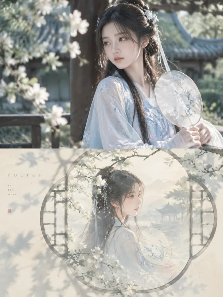
An independent high-end design poster in a [3:4 vertical composition], split strictly into top and bottom halves at a 1:1 height ratio (50% each). Top half: Retains the reference photo, preserving its main subject, realistic texture, natural lighting, and authentic color palette with subtle professional color grading suitable for an art magazine or exhibition print. The surrounding environment can be naturally extended to fit the frame without distorting or altering the subject. Bottom half: Reconstructs the recognizable subject, silhouette, and narrative essence of the reference photo into a soft, misty atmospheric oriental illustration. The composition is framed by traditional Chinese architectural window elements—such as a moon gate, latticed window, fan-shaped window, or hexagonal window frame—chosen to harmonize with the subject's contours. The subject, soft branch shadows, and dappled light naturally intersect, pass through, or spill beyond the frame, creating spatial layers of void and solid. Color and Lighting: Set against a [very light, low-saturation, clean composite color coordinated with the original image] such as misty blue, pale apricot, grayish green, or warm off-white. Lighting and shadows extract and soften the most vibrant tones of the reference image, avoiding harsh contrast or dark muddy tones. Texture and Typography: Fine inkjet grain, pastel diffusion, soft focus edges, and gentle light bleed, evoking morning sunlight falling through latticework onto a pale wall. Incorporates a minimal editorial typographic accent with a [very short English title] and tiny subtle caption words, set in a light, widely spaced font aligned quietly along the window contour or negative space. Overall Mood: Poetic, tranquil, modern oriental aesthetic with balanced negative space and airy breathing room.

posterasiatische ästhetikfensterrahmen
Konstruktivistisches Oldtimer-Editorial-Poster

Konstruktivistisches Oldtimer-Editorial-Poster

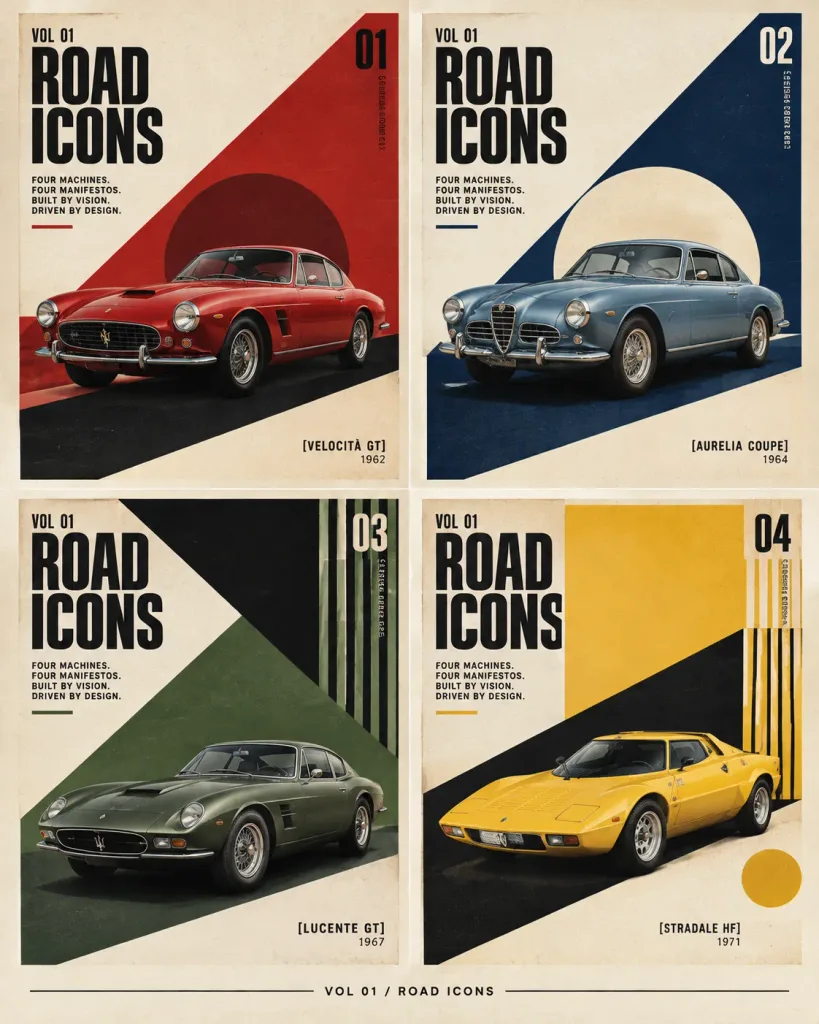
A constructivist editorial poster grid for [ROAD ICONS], featuring exactly four fictional classic sports cars as collectible magazine-cover panels. Canvas and Layout: Vertical poster, 4:5 aspect ratio, warm off-white paper background, subtle print grain, crisp high-resolution editorial design. A thin cream margin frames the full composition with narrow gutters separating panels. Exactly 4 equal rectangular panels arranged in a 2×2 grid. A small footer centered below the grid reads "VOL 01 / ROAD ICONS" flanked by thin horizontal rules. Shared Typography: Tall condensed bold sans-serif headline in black uppercase. Each panel includes "VOL 01" near the top left, a massive stacked "ROAD / ICONS" headline, a small manifesto text block reading "FOUR MACHINES. FOUR MANIFESTOS. BUILT BY VISION. DRIVEN BY DESIGN.", a large issue number in the upper right, tiny vertical microtext near the issue number, and a short underline accent matching that panel's color. Panel 1 (top left, Issue "01", deep red accent): A glossy red 1960s grand touring coupe angled slightly left-front, low stance, round headlights, oval grille, chrome accents, realistic studio lighting. Background features bold diagonal constructivist geometry with a large red triangular field on the right, a dark maroon circle behind the car, and a black diagonal road shadow. Bottom right label reads "[VELOCITÀ GT]" with year "1962". Panel 2 (top right, Issue "02", dark navy blue accent): A silver-blue classic coupe angled slightly left-front, round headlamps, chrome bumper, wire wheels, realistic glossy reflections. Background features a navy diagonal wedge from the top right, a pale cream circular sun motif behind the vehicle, and a dark blue base shadow. Bottom right label reads "[AURELIA COUPE]" with year "1964". Panel 3 (bottom left, Issue "03", muted forest green accent): A matte green vintage sports coupe angled left-front, elongated hood, low roof, subtle chrome wheels, realistic lighting. Background features a sharp black triangular wedge descending from the top, green diagonal planes, and a cluster of narrow vertical black-and-green stripes at the upper right. Bottom center label reads "[LUCENTE GT]" with year "1967". Panel 4 (bottom right, Issue "04", mustard yellow accent): A yellow wedge-shaped 1970s sports car angled left-front, pop-up headlight silhouette, black glass canopy, low angular body, realistic paint sheen. Background features a bold black diagonal wedge, mustard yellow rectangular field at the top, vertical stripe cluster at the upper right, and a mustard circle near the lower right. Bottom center label reads "[STRADALE HF]" with year "1971". Style: Mid-century constructivist graphic design combined with luxury automotive editorial, geometric color blocking, dramatic diagonal drop shadows, Swiss-grid layout discipline, realistic vehicle renders against flat graphical backdrops. Palette: cream, black, crimson red, navy, forest green, mustard yellow, subtle paper texture. Constraints: Exactly four cars and four numbered panels. No people, extra panels, watermarks, or QR codes.

konstruktivismusoldtimerposter
Editoriales monochromes Hochzeitseinladungs-Poster

Editoriales monochromes Hochzeitseinladungs-Poster

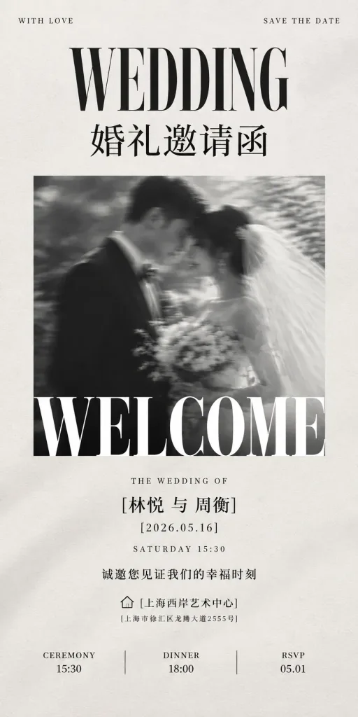
An ultra-tall luxury black-and-white wedding invitation poster in a 1:2 vertical aspect ratio, set against an off-white warm tactile paper background with subtle grain, faint fabric-like drop shadows, and generous margins. Layout and Composition: - Top header: Two tiny uppercase corner captions: "WITH LOVE" on the far left, "SAVE THE DATE" on the far right. - Center-top typography: A large condensed high-contrast serif headline "WEDDING", followed beneath by bold Chinese Songti calligraphy "婚礼邀请函". - Center visual: A single square black-and-white motion-blurred romantic photograph of a bride and groom leaning forehead-to-forehead; groom in a dark tailored suit on the left, bride on the right with a veil and bouquet, dreamily blurred. Overlaid across the bottom edge of the photo is an enormous cropped serif word "WELCOME" in solid white spanning the full width of the photo. - Lower editorial text (centered, crisp black ink): "THE WEDDING OF" "[林悦 与 周衡]" "[2026.05.16]" "SATURDAY 15:30" "诚邀您见证我们的幸福时刻" Venue line featuring a small minimalist outline house icon followed by "[上海西岸艺术中心]" and address "[上海市徐汇区龙腾大道2555号]". - Bottom schedule row: Three neat columns reading "CEREMONY 15:30", "DINNER 18:00", and "RSVP 05.01", separated by two thin vertical hairline dividers. Style & Aesthetics: Editorial quiet luxury, high-fashion magazine layout, pure monochrome palette without color accents, exquisite balanced negative space, sharp typography contrasted with soft motion blur in the photograph.

hochzeitseinladungpapeterieeditorial-design
Futuristisches Animations-Fachmagazin-Cover

Futuristisches Animations-Fachmagazin-Cover

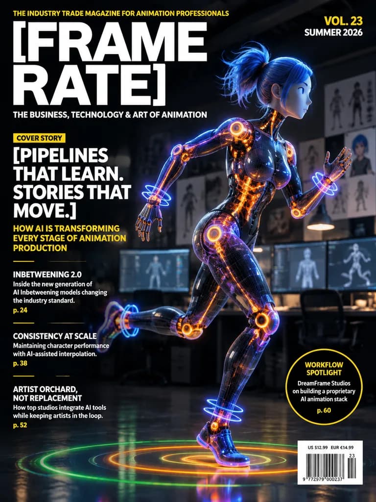
Futuristic professional magazine cover for the animation industry in portrait orientation, high-end editorial design layout. The masthead dominates the upper left in huge bold white sans-serif letters split across two lines: "[FRAME RATE]". Above the masthead, a small yellow all-caps tagline reads: "THE INDUSTRY TRADE MAGAZINE FOR ANIMATION PROFESSIONALS". Below the masthead, a smaller white subtitle reads: "THE BUSINESS, TECHNOLOGY & ART OF ANIMATION". In the upper right, stacked bold issue text displays "VOL. 23" in yellow and "SUMMER 2026" in white. The main cover visual features a stylized humanoid female-coded robot or digital mannequin in a dynamic running pose, facing right, shown full body with one leg lifted behind and one arm extended. Her body is constructed from semi-transparent dark mesh with glowing electric orange internal joints, spine, and mechanical elements, accented by blue and purple neon tracing lines and glowing circular motion rings around wrists, ankles, hips, and feet. She has messy tied-up blue hair and a smooth simplified face with minimal facial features like a 3D CG prototype. She is set inside a dark animation studio interior with softly blurred computer monitors, work desks, and concept art pinned to background walls under moody, low ambient lighting. Beneath her, a dark reflective floor features concentric holographic rings under her feet in green, yellow, and orange. On the left side, editorial cover lines in clean magazine typography: a small yellow label "COVER STORY", followed by a large bold white stacked headline: "[PIPELINES THAT LEARN. STORIES THAT MOVE.]", followed by a yellow subhead: "HOW AI IS TRANSFORMING EVERY STAGE OF ANIMATION PRODUCTION". Below, three secondary article listings separated by short yellow rules: 1) "INBETWEENING 2.0" with white teaser text "Inside the new generation of AI Inbetweening models changing the industry standard." and yellow page number "p. 24" 2) "CONSISTENCY AT SCALE" with white teaser text "Maintaining character performance with AI-assisted interpolation." and yellow page number "p. 38" 3) "ARTIST ORCHARD, NOT REPLACEMENT" with white teaser text "How top studios integrate AI tools while keeping artists in the loop." and yellow page number "p. 52" Near the lower right, a black circular badge outlined in yellow containing the text: "WORKFLOW SPOTLIGHT" at top, "DreamFrame Studios on building a proprietary AI animation stack" in the center, and "p. 60" at the bottom in yellow. In the bottom right corner, a white barcode box with pricing above: "US $12.99 EUR €14.99" and small issue serial numbers. Color palette: deep black, charcoal, crisp white, vivid yellow, electric orange, neon blue, and violet.

magazin-covereditorial designcyberpunk
Kinetisches Sport-Editorial-Poster

Kinetisches Sport-Editorial-Poster

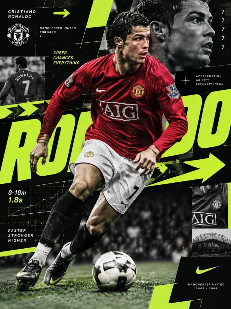
A dynamic editorial sports poster of [Cristiano Ronaldo], conveying speed through graphic structure rather than motion blur. The composition captures Manchester United-era Ronaldo during a sharp change of direction, photographed with a [35mm editorial lens] introducing subtle perspective distortion and high energy. The subject's portrait remains razor-sharp, surrounded by elements communicating acceleration: oversized kinetic typography stretching across the frame, directional arrows, modular data grids, fragmented graphic blocks, repeated numerical markers, and layered editorial layouts. Color palette of [matte black, crisp white, and fluorescent lime], where the vibrant lime functions as a navigational visual guide. High-end athletic brand identity design, sophisticated, structured, and modern.

sportpostereditorial-designkinetische typografie
Sport-Sammlerposter im Archiv-Look
Sport-Sammlerposter im Archiv-Look
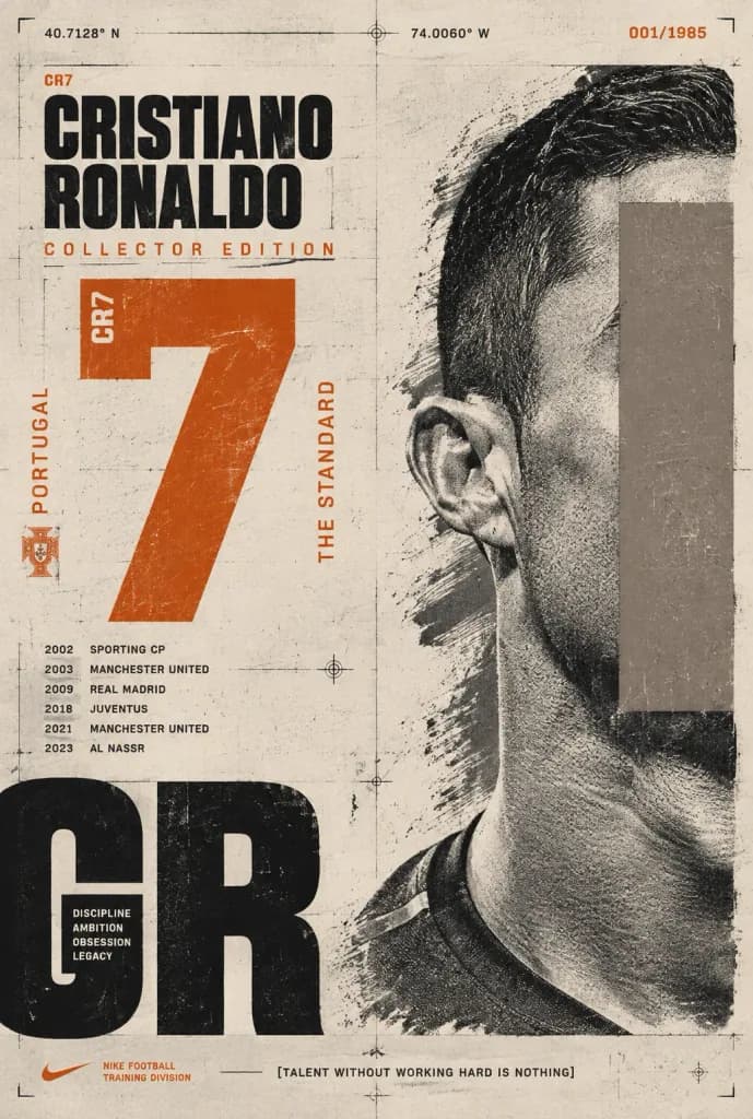
Vertical collector's-edition editorial sports poster featuring [CRISTIANO RONALDO], designed with a distressed archival print aesthetic and Swiss typographic layout on a warm off-white paper background showing grain, scratches, ink smudges, registration marks, thin grid lines, crop marks, and technical drafting crosshairs. Composition: - Right side: Extreme close-up black-and-white halftone portrait of the athlete, tightly cropped showing only the right side of the head, ear, neck, and shoulder. A muted taupe-gray vertical rectangular block covers the face area in an editorial censor-block style. High-contrast, gritty screenprint texture partially overlaid with rough dry brush textures. - Upper-left: Condensed bold sans-serif headline reading "[CRISTIANO RONALDO]" in black uppercase, topped with a tiny orange "CR7" label and underscored with spaced orange text "COLLECTOR EDITION". - Center-left: Huge distressed burnt orange jersey number "[7]", with tiny vertical white text "CR7" embedded along its upper-left edge. - Lower-left corner: Giant cropped black letters "CR" bleeding off the edge, containing stacked tiny motivational words: "DISCIPLINE", "AMBITION", "OBSESSION", "LEGACY". - Timeline & technical typography: Tiny black career timeline entries reading "2002 SPORTING CP", "2003 MANCHESTER UNITED", "2009 REAL MADRID", "2018 JUVENTUS", "2021 MANCHESTER UNITED", and "2023 AL NASSR". Vertical orange text "PORTUGAL" alongside a tiny Portugal crest icon. Vertical orange text "THE STANDARD" near the central number. Top coordinates "40.7128° N" and "74.0060° W", plus orange serial "001/1985" in the top-right corner. - Bottom: Small orange swoosh with "NIKE FOOTBALL TRAINING DIVISION" at bottom-left; center bottom quote reading "[TALENT WITHOUT WORKING HARD IS NOTHING]". Style: Premium flat graphic memorabilia, museum archival document aesthetic, high contrast, asymmetrical Swiss grid, weathered screenprint textures, no 3D effects.
cristiano ronaldosportplakatschweizer typografie
Japanische Präsentationsfolie zur Bereichsabgrenzung

Japanische Präsentationsfolie zur Bereichsabgrenzung

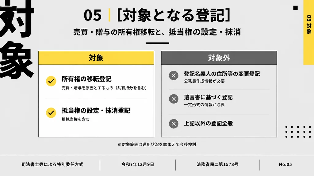
Japanese presentation slide. clean corporate infographic, minimal modern editorial layout, high contrast, light gray background with black, white, yellow, and medium gray accents, bold Japanese gothic sans-serif typography, precise grid al…

japanische foliebusiness-präsentationunternehmens-infografik
Mode-Identitäts Lookbook Charakterboard

Mode-Identitäts Lookbook Charakterboard

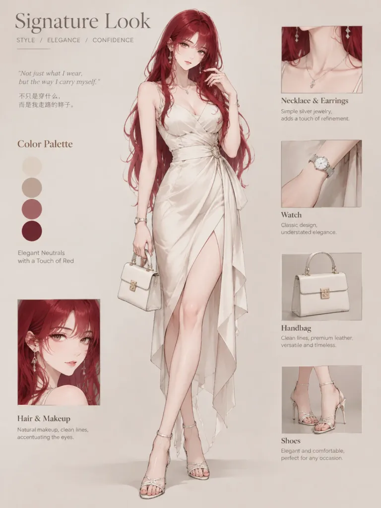
A refined signature look character board and fashion identity poster. In the center, a full-body character design shown head-to-toe wearing a signature [Dress], styled with matching shoes, curated accessories including fine jewelry, a handbag, and a wristwatch. The character features a polished hairstyle and minimal, defining makeup, posed with confident posture and subtle facial expression reflecting an authentic personal aura. Surrounding the figure is an elegant editorial layout with a dedicated color palette swatch, minimal accessory close-ups, and sparse, delicate text labels in clean typography explaining the styling choices in 1–2 short lines. Sophisticated neutral background, cohesive fashion lookbook aesthetic, perfectly balanced and uncluttered.

charakterboardmodeidentitätlookbook
Kinematografisches Editorial-Reiseplakat

Kinematografisches Editorial-Reiseplakat

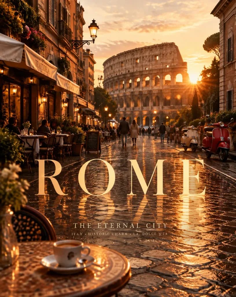
A premium vertical cinematic travel poster for [Rome], [Italy], capturing the unique identity, architectural character, and atmosphere of the destination. Scene: An atmospheric [golden hour] view of [a historic cobblestone street leading toward the Colosseum], photographed from a sophisticated cinematic perspective. Features [classical Roman facades and warm tiled rooftops] integrated into the urban setting, alongside authentic local details like [sidewalk café tables, vintage vespas, and wrought-iron street lamps]. The composition feels like an authentic captured travel moment rather than a standard tourist postcard. Signature Visual Element: The [wet cobblestone street] serves as the creative centerpiece, seamlessly integrating enormous elegant typography reading: [ROME]. The lettering interacts naturally with the scene, appearing [reflected across the wet stone paving], realistically matching the scene's perspective, shadows, lighting, texture, and depth. Foreground: Includes [a foreground café table with a ceramic espresso cup] to evoke the feeling of slow travel, adding narrative depth without overpowering the cityscape. Atmosphere & Lighting: [Romantic and nostalgic] mood with [warm golden hour] illumination, subtle [sun flares, soft evening dust, and warm street lights]. Sophisticated destination palette of [terracotta, warm ochre, weathered travertine stone, and deep amber]. Poster Typography & Layout: Main title: [ROME] Subtitle: [THE ETERNAL CITY] Small supporting line: [ITALY • HISTORIC CHARM • LA DOLCE VITA] Typography is minimal, refined, and editorial, inspired by luxury travel publications, using a sophisticated serif font with generous letter spacing placed in natural negative space. Composition: Three distinct depth layers—foreground [café table], middle ground [pedestrians and warm-lit trattorias], background [sunlit silhouette of the Colosseum]. Natural framing with cinematic leading lines. Visual Style: Ultra-realistic cinematic travel photography fused with luxury editorial poster design, subtle 35mm film grain.

reiseplakateditorial-designkinofotografie
Minimalistisches Sport-Editorial-Fußballplakat

Minimalistisches Sport-Editorial-Fußballplakat

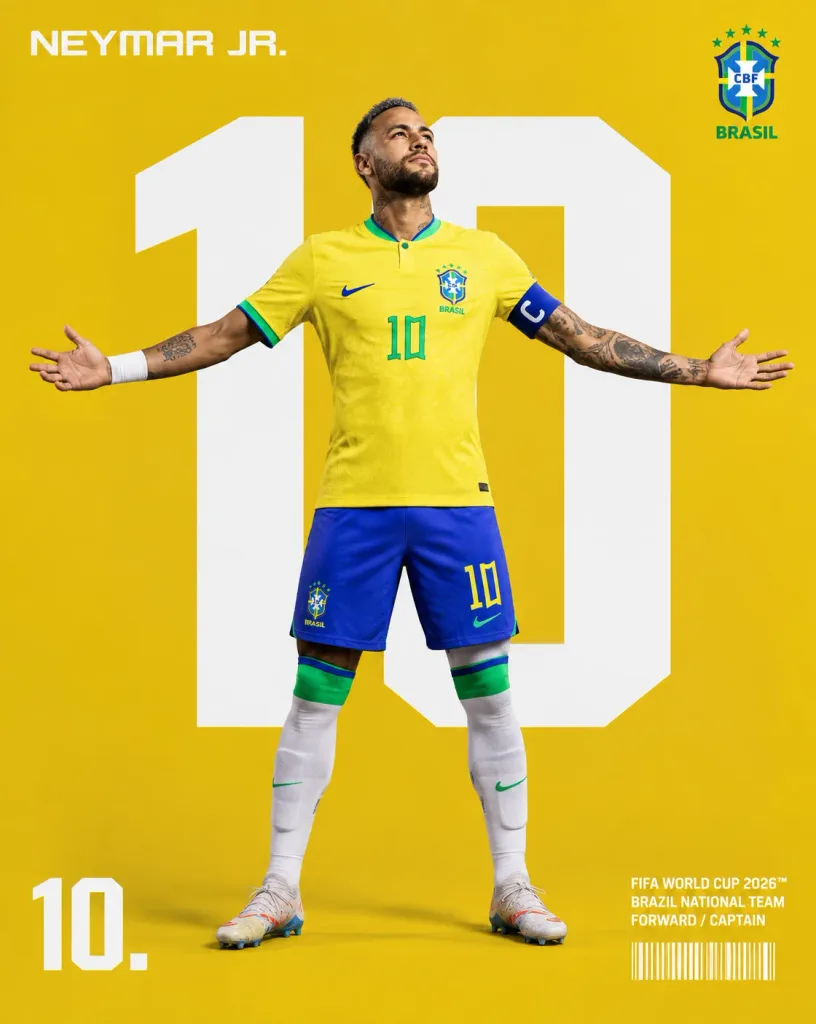
A premium sports editorial poster featuring a full-body professional [football player] celebrating [FIFA World Cup]. The subject stands confidently in the center with arms extended wide, looking slightly upward with a determined expression, wearing a [official national team jersey], matching shorts, socks, captain's armband, and football boots. Realistic muscle anatomy, defined facial features, and authentic fabric textures. Background & Composition: Vertical 4:5 composition against a solid studio background in the country's primary color. Directly behind the player is a gigantic bold white jersey number dominating the frame. Soft studio lighting casts subtle, natural floor shadows. Graphic Layout & Typography: • Top Left: Player name in futuristic geometric uppercase lettering. • Top Right: Official-style national team crest. • Bottom Left: Large player jersey number followed by a period, e.g. "10.". • Bottom Right: Clean editorial typographic block reading: "FIFA WORLD CUP 2026™" "[BRAZIL] NATIONAL TEAM" "[FORWARD / CAPTAIN]" with a small authentic barcode printed beneath it. Style: Minimalist sports editorial design, modern brand campaign visual, FIFA media day aesthetic, crisp typography, bold graphic layout, balanced negative space.
fußballsportplakateditorial-design
Minimalistisches Lila Marken-Poster-Triptychon

Minimalistisches Lila Marken-Poster-Triptychon

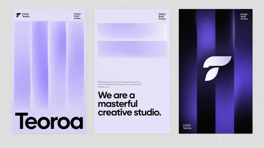
modern brand poster triptych mockup. minimalist Swiss-inspired graphic design, clean editorial layout, futuristic creative studio branding, soft gradients, sharp vector shapes, spacious composition. left poster. center poster. right poster…

markenidentitätposter-triptychonschweizer stil
FIFA WM 2026 Promo-Sportplakat

FIFA WM 2026 Promo-Sportplakat

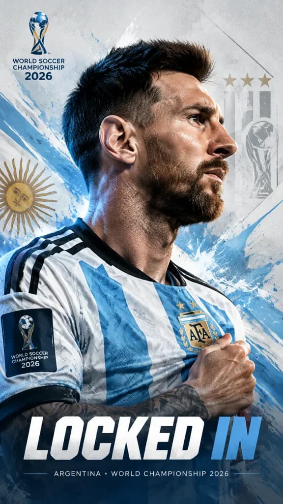
FIFA World Cup 2026 Locked In Poster. cinematic sports poster with editorial design. dramatic cinematic studio lighting. 9:16. [Lionel Messi]. powerful side-profile portrait looking forward with intense focus. determined, locked-in express…

weltmeisterschaftfußballsportplakat
Geteiltes Reiseplakat mit Foto und Aquarell

Geteiltes Reiseplakat mit Foto und Aquarell

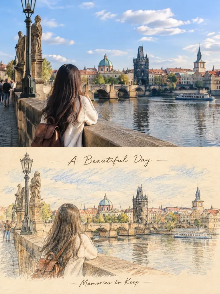
A vertical travel-journal poster with an exact 50/50 horizontal split layout. Top 50%: Keep the reference photo completely real and unchanged, maintaining the exact composition, architecture, people, lighting, and colors. Bottom 50%: Transform the identical scene from the reference photo into a delicate hand-drawn colored-pencil and watercolor sketch on warm cream paper, featuring soft washes, visible pencil strokes, delicate cross-hatching, and subtle paper texture, while keeping all subjects recognizable. Include elegant handwritten text: "[A Beautiful Day]" at the top and "[Memories to Keep]" at the bottom. Aesthetic is minimal, nostalgic, and sophisticated travel magazine style. Exact 50/50 dividing line, no photorealism in the bottom half.

reiseplakatgeteiltes bildaquarellskizze
Sportplakat zum Fußball-Rekordbruch

Sportplakat zum Fußball-Rekordbruch

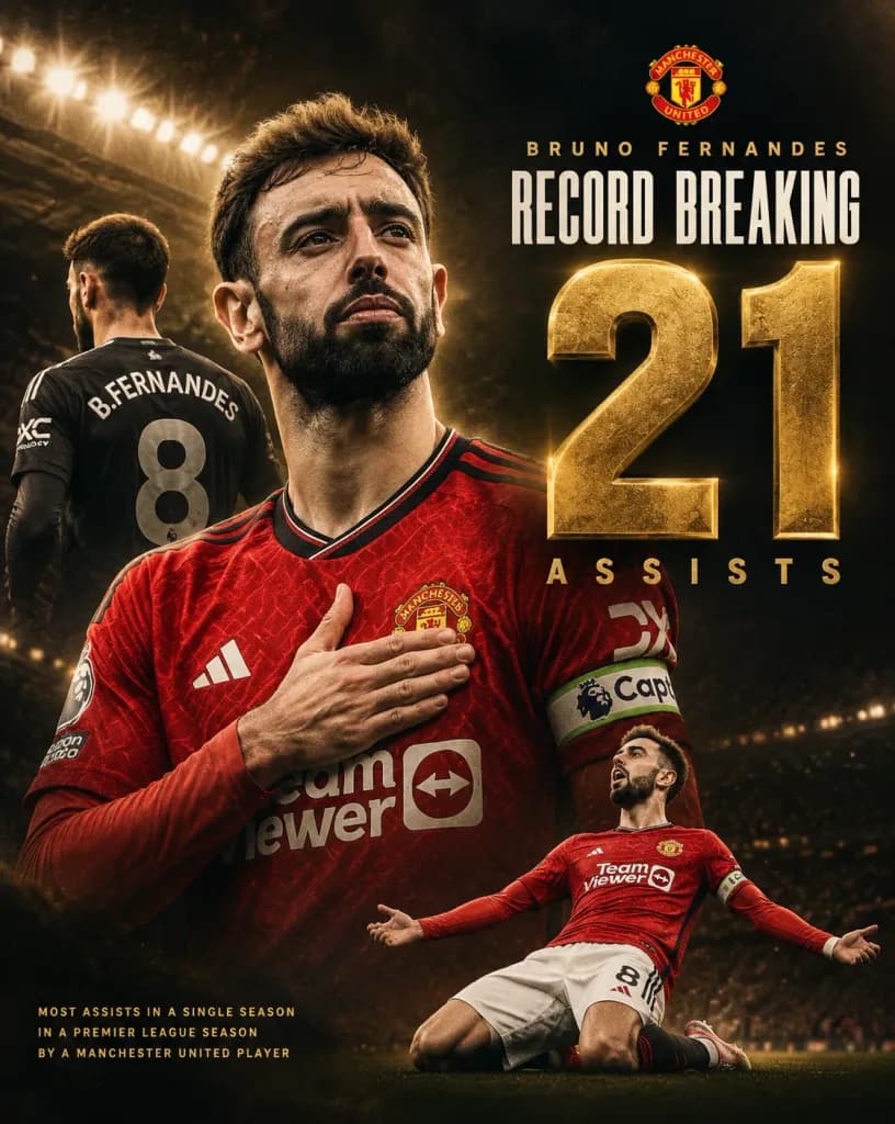
Vertical sports composite poster celebrating [Bruno Fernandes] breaking an assist record, designed with a premium cinematic sports-editorial aesthetic. Composition: - Exactly three depictions of [Bruno Fernandes] in Manchester United kits: 1. A dominant central chest-up portrait wearing the red home shirt with captain's armband, right hand placed over his heart, displaying an intense and proud expression. 2. A smaller background figure on the left, viewed from behind in a dark kit displaying "B. FERNANDES" and number "8". 3. A smaller action figure at the bottom right in the red kit, sliding or kneeling in celebration with arms spread wide. - The official Manchester United crest placed at the top center-right above the main headline typography. - An enormous record number dominating the right half, slightly overlapping the central portrait. Typography and Text Content: - "[BRUNO FERNANDES]" in small, spaced gold uppercase letters near the top. - "RECORD BREAKING" in tall, condensed white uppercase typography. - Giant metallic gold number "[21]" with beveled edges, realistic metallic texture, and subtle outer glow. - "[ASSISTS]" directly beneath the number in widely spaced gold uppercase letters. - Small bottom-left editorial caption: "MOST ASSISTS IN A SINGLE SEASON / IN A PREMIER LEAGUE SEASON / BY A MANCHESTER UNITED PLAYER". - Natural jersey details including "B. FERNANDES", "8", sponsor logos, and captain armband markings. Setting, Lighting, and Style: - Dark cinematic stadium backdrop with floodlights glowing in the upper left, atmospheric stadium haze, subtle gold sparks, and heavy black vignette borders. - High-contrast gold-and-black color grading, dramatic rim light carving out hair and shoulders, crisp fabric textures, realistic skin and sweat details. - Sharp, readable typography with no extra players, numbers, or watermarks.

sportplakatfußballmanchester united
Sommerliches Shonen-Manga-Magazincover

Sommerliches Shonen-Manga-Magazincover

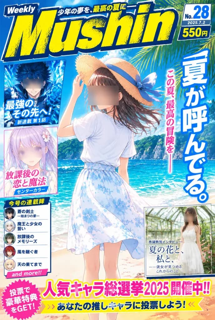
Cover of a fictional weekly Japanese shonen manga magazine with a vibrant summer theme, presented in a high-density glossy print layout. - Main Cover Art: An anime teenage girl stands on a sunny tropical beach, viewed from behind and slightly turned, holding a wide straw hat with a blue ribbon as sea breeze blows her medium brown hair to the right. She wears a plain white short-sleeve T-shirt tucked into a high-waisted white summer skirt with pale blue floral patterns. Her face is obscured by a rectangular censor-like blur. Background features sparkling turquoise ocean waves, white foam on sand, distant lush green island cliffs, clear cyan sky, fluffy summer clouds, and tropical palm fronds entering from the top right. - Masthead & Header: A massive distressed italic masthead reading "[Mushin]" across the top in bright yellow with dark navy outline and halftone texture. Includes a small "Weekly" badge at top left, a Japanese banner tagline, and issue information in the upper right showing "[No. 28]", "[2025.7.2]", and a "550 yen" price tag. - Main Headline: A tall vertical Japanese headline reading "[夏が呼んでる。]" on the right in bold white typography with blue drop shadow, flanked by a smaller vertical pink subtitle. - Inset Feature Panels (exactly 3): 1. Upper-left: A dark blue action manga hero with spiky hair and glowing blue fist (face blurred) with bold blue Japanese text. 2. Middle-left: A pastel lavender-haired anime girl with purple eyes (face blurred) framed in white with pink/blue Japanese text. 3. Lower-right: A promo box showing a young woman in a white dress in a botanical glasshouse (face blurred) with elegant serif Japanese interview text. - Additional Cover Elements: A left sidebar featuring 5 stacked serialized manga title blurbs ending with a pink "and more!!" tag. Across the bottom, a bold campaign banner with a pink starburst badge and headline reading "[人気キャラ総選挙2025 開催中!!]" above a yellow-and-white voting call-to-action bar. - Style & Constraints: Polished 90s-to-modern shonen editorial design, high-saturation summer palette, thick outlines, screen tones, glossy highlights, sticker-style graphic badges, and dense typography. Blur or obscure all visible faces.

manga-covershonenanime-mädchen
Minimalistisches Mittherbstfest-Plakat

Minimalistisches Mittherbstfest-Plakat

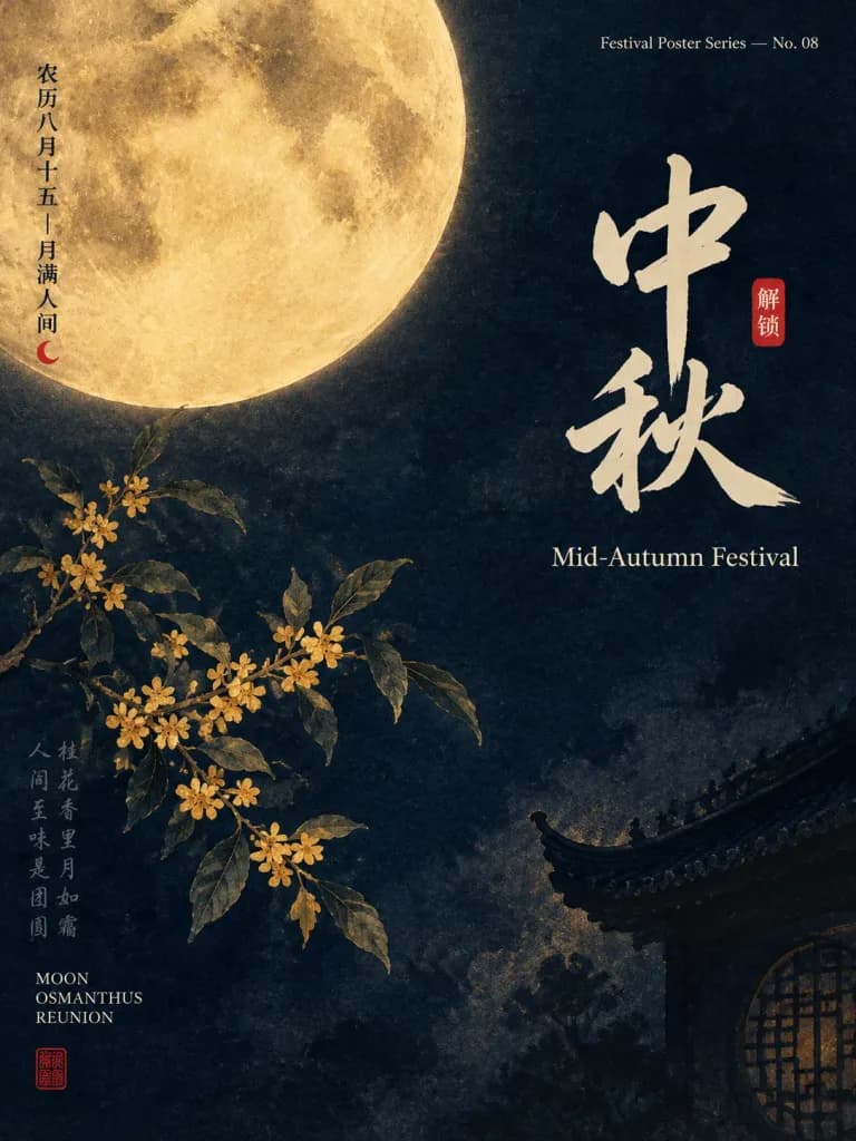
An elegant vertical festival poster for [Mid-Autumn Festival], blending traditional Chinese ink-wash painting aesthetics with modern editorial graphic design. Setting & Background: Deep midnight navy textured paper background with subtle paper grain, mottled ink wash gradients, and delicate aged print imperfections. A restrained color palette of deep midnight blue, parchment moon gold, ivory, muted ochre, and small vermilion red seal accents. Composition & Layout: Asymmetrical composition with generous negative space. A huge, textured full moon dominates the upper left, partially cropped by the top and left borders, rendered with tactile crater details, parchment-gold luminosity, and soft painterly edges. In the lower right, a faint silhouette of a traditional Chinese upturned roof eaves and a dim circular lattice window subtly emerge from the darkness. In the lower left, a single delicate osmanthus branch rises diagonally upward, featuring thin woody stems, small golden five-petal blossoms, and muted dark green-gray leaves. Typography & Text: Exactly 7 distinct text groups: 1. Left vertical Chinese date text beside the moon reading: “农历八月十五 — 月满人间” 2. A tiny red crescent moon mark beneath that vertical date 3. Upper-right small English series header: “Festival Poster Series — No. 08” 4. Large central-right Chinese brush calligraphy: “[中秋]” 5. Small red rectangular seal beside the calligraphy reading: “解锁” 6. Clean English title beneath the calligraphy: “[Mid-Autumn Festival]” 7. Lower-left English keywords stacked in small caps: “MOON / OSMANTHUS / REUNION” Include one faint, weathered vertical handwritten Chinese poem column alongside the osmanthus branch and a small red square artist seal in the bottom-left corner as decorative elements. Style & Mood: Refined museum exhibition poster, poetic, serene, quiet, minimal, subtle letterpress texture, cinematic moonlight illumination. Constraints: No people, animals, lanterns, mooncakes, or clutter. Keep all text crisp and legible except the intentionally faded decorative poem column.

mittherbstfestfestivalplakatchinesische kalligrafie
Light-Novel-Charakter-Beziehungsdiagramm-Poster

Light-Novel-Charakter-Beziehungsdiagramm-Poster

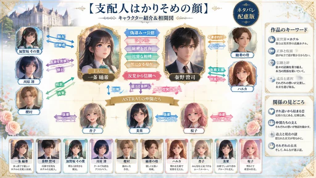
An ornate Japanese light-novel character relationship chart infographic poster, using the characters from the reference image. The setting features a soft cream and pale-blue fantasy background decorated with subtle ornate filigree borders, faint sparkles, delicate rose blossoms, and a small European-style hotel building vignette in the upper-left corner. At the top center, display the bold title text 「[支配人はかりそめの顔]」 with the subtitle 「[キャラクター紹介&相関図]」 below it, and a dark circular badge in the upper right reading 「[ネタバレ配慮版]」. Center heroine [一条 紬希] in a gilded frame labeled 「[主人公]」, with [秦野 啓司] in a large prominent frame on her right. Arrange the remaining 8 profile cards around them: [加賀坂 その葉], [川原 澪], [樫村], [紬希の母], [ハルカ], [杏子], [美果], and [桜子]. Connect characters with colorful arrows bearing relationship labels: 「親友」, 「理解者」, 「本音を見抜く」, 「憧れ」, 「相談」, 「画策」, 「仲直り中」, 「直感的理解」, 「メンター」, 「実務支援」, 「保護者的存在」, 「後輩 ムードメーカー」, 「後輩 グループを支える」, and 「後輩 明るさ・希望」. Between the two central leads, include horizontal callouts: 「偽溶み→公認」, 「ライバル」, 「秘密を共有」, 「対等な相棒」, 「気になる存在」, a central pink ribbon badge reading 「反発から信頼へ」, and three lower callouts: 「信頼」, 「協力を後押し」, and 「二人の空気に気づく」. Above the bottom three female characters, place a gold ribbon banner reading 「[ASTRALの仲間たち]」. Along the bottom, line up 10 compact character summary cards. On the far right, include two vertical sidebar boxes titled 「[作品のキーワード]」 and 「[関係の見どころ]」, each containing four bullet points with miniature icons. Clean editorial magazine layout, crisp typography, romantic-mystery aesthetic.

beziehungsdiagrammlight novelcharakterkarte
Retro-japanisches Redaktionelles Design-Poster

Retro-japanisches Redaktionelles Design-Poster

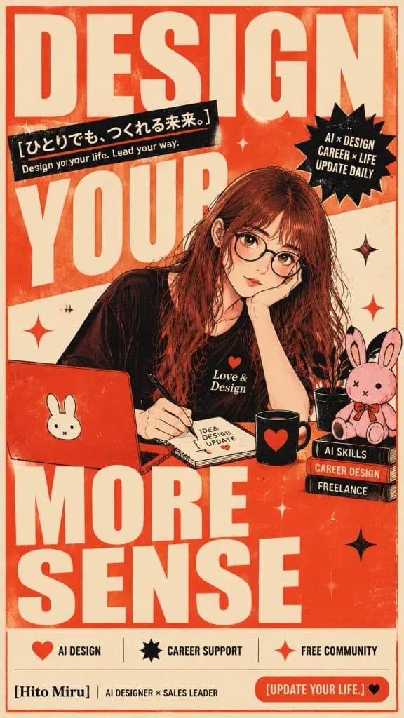
Bold vertical retro Japanese editorial poster, 9:16 aspect ratio, warm cream paper background with orange-red ink texture, thin orange border, distressed screen-print grain, and subtle halftone speckles. Layout & Typography: - Dominant giant condensed block letters in cream over orange-red structure reading four stacked words: “DESIGN” across the top, “YOUR” through middle-left, “MORE” across lower middle, and “SENSE” at the bottom. - Upper left-middle: slanted black banner displaying the Japanese headline “[ひとりでも、つくれる未来。]” with an orange underline, and below it the English subline “Design your life. Lead your way.” - Upper-right: black starburst badge containing three stacked lines: “AI × DESIGN”, “CAREER × LIFE”, “UPDATE DAILY”. - Bottom footer: three icon-and-label badges: red heart with “AI DESIGN”, black starburst with “CAREER SUPPORT”, and red sparkle with “FREE COMMUNITY”. - Bottom-left branding: “[Hito Miru] | AI DESIGNER × SALES LEADER”. - Bottom-right orange rounded button: “[UPDATE YOUR LIFE.]” followed by a black heart icon. Subject: - A young woman with long wavy [red-brown] hair, pale skin, round black glasses, and a soft thoughtful expression, overlapping the giant typography. - Resting cheek on one hand while writing with a pen in a spiral notebook labeled “IDEA DESIGN UPDATE” with a small red heart. - Wearing a black top featuring a small red heart and the text “Love & Design”. Desk & Props (exact objects): - 1 red laptop with a white bunny face sticker. - 1 spiral notebook labeled “IDEA DESIGN UPDATE”. - 1 black ceramic mug with a red heart motif. - 1 small black potted plant with simple minimalist leaves. - 1 stack of three books with readable spines: top “AI SKILLS”, middle “CAREER DESIGN”, bottom “FREELANCE”. - 1 small plush pink rabbit mascot sitting atop the book stack, featuring black-tipped ears and stitched X eye details. Decorations & Style: - Exactly 5 graphic sparkle accents (two red, three black) distributed across the composition. - Retro Japanese showa/riso-print editorial illustration style, limited palette of orange-red, cream, black, pink, and red, bold ink outlines, flat graphic shading, strictly no 3D or glossy gradients.

posterjapanisches retroeditorial design
Geteiltes Poster aus Foto und Illustration

Geteiltes Poster aus Foto und Illustration

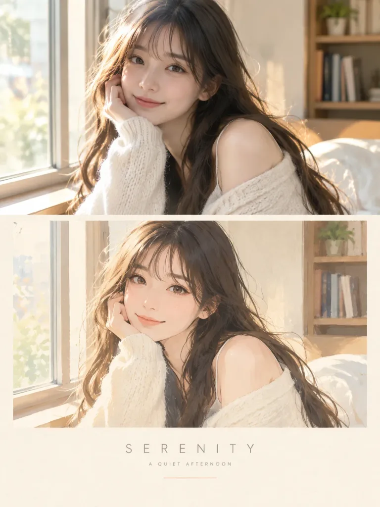
A vertical split-poster design. The top half is a realistic photograph of [a young woman smiling gently by a sunlit window], capturing authentic skin texture, natural expression, and cinematic depth of field under warm natural light. The bottom half transforms the exact same scene into a matching hand-drawn digital illustration, preserving the subject's pose, hairstyle, clothing, color palette, and key details. The illustration sits inside a clean rectangular frame against a warm ivory paper-textured background, rendered in a soft contemporary style with delicate brushstrokes, simplified organic shapes, pastel tones, and gentle outlines. Centered below the composition is a minimalist title in thin, wide-tracked all-caps typography reading "[SERENITY]", followed by a small subtitle line "[A QUIET AFTERNOON]", and a thin pastel divider line underneath. Clean editorial aesthetic, balanced layout, no visual clutter.

geteiltes posterfoto zu illustrationminimalistisches layout
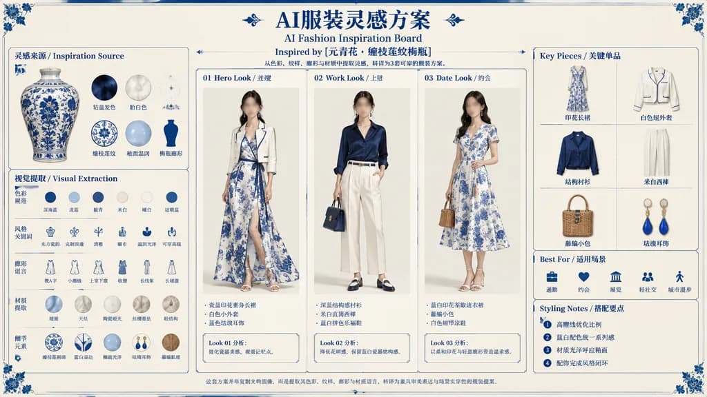
Mode-Inspirationsboard zu Blau-Weißem Porzellan

Mode-Inspirationsboard zu Blau-Weißem Porzellan

bilingual AI fashion inspiration board / museum-artifact-to-outfit styling plan. 灵感来源 / Inspiration Source. 视觉提取 / Visual Extraction. 3-Look Styling Plan. Key Pieces. Best For. Styling Notes. elegant editorial fashion board on warm ivory p…

mode-boardmoodboardblau-weiß-porzellan
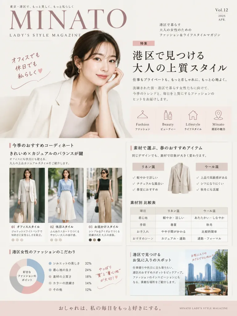
Editorial-Modemagazin-Seitenlayout

Editorial-Modemagazin-Seitenlayout

Editorial feature page layout for a high-end fashion magazine targeted at sophisticated [Minato-ku women]. The design is systematic, constructive, and easy to read, featuring elegant typography, editorial portrait photography cutouts, minimalist icons, comparison diagrams, infographic charts, and handwritten annotation callouts. Clean Japanese fashion magazine aesthetic, soft neutral and pastel tones, balanced grid composition, studio lighting.

magazin-layouteditorial designinfografik
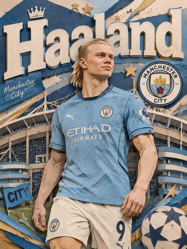
Sportplakat im Mehrschichtigen Papierschnitt-Stil

Sportplakat im Mehrschichtigen Papierschnitt-Stil

A premium layered paper-cut editorial poster introducing [Haaland]. The paper-cut character stands confidently in front of a [handcrafted football stadium backdrop], with large cut-paper typography displaying "[Haaland]" behind them. Accented with the club badge, subtle paper stars, football graphics, and dimensional paper decorations in club colors. Realistic paper fiber textures, brass pin joints, warm studio lighting, handcrafted paper craft aesthetic.

scherenschnittsportplakatfußball
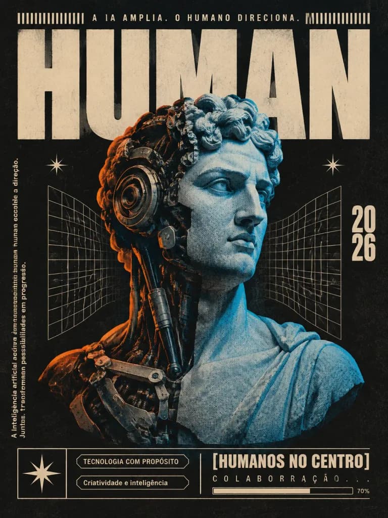
Retro-futuristisches Cyborg-Büsten-Plakat

Retro-futuristisches Cyborg-Büsten-Plakat

A vertical retro-futurist editorial poster on a deep charcoal-black textured paper background, featuring a worn halftone print finish, cream ink typography, and electric cyan-blue and orange accent lighting. The composition is centered on a male Greco-Roman marble bust cropped at the chest, facing slightly right with curly hair. The head and torso are split down the vertical center: the viewer's right half is a smooth classical marble bust illuminated in cyan-blue, while the viewer's left half reveals intricate cybernetic machinery with circular mechanical ear plates, exposed pistons, wires, dark metallic components, and a thin orange rim light. Behind the bust, a massive condensed block-capital headline reads "[HUMAN]" in cream lettering, partially hidden behind the head. At the top edge, small cream text reads "[A IA AMPLIA. O HUMANO DIRECIONA.]" flanked by barcode-style tick marks. Flanking the bust are two warped cream wireframe grid panels and two tiny starburst icons. Along the left edge, small vertical cream type reads "[A inteligência artificial acelera caminhos. A sensibilidade humana escolhe a direção. Juntas, transformam possibilidades em progresso.]". On the right, the year "[2026]" is stacked with "20" above "26". The bottom features an editorial layout bar: a cream framed square box with a star icon, next to outlined label tags reading "TECNOLOGIA COM PROPÓSITO" and "Criatividade e inteligência", followed by a bold label reading "[HUMANOS NO CENTRO]", the spaced caption "COLABORAÇÃO...", and a thin progress bar marked "70%". High contrast screenprint texture, subtle paper grain, vintage science-magazine graphic design.

plakatcyborgretrofuturismus
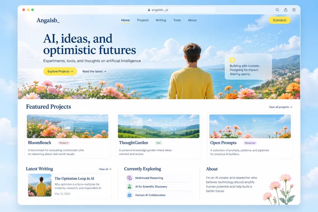
Editorial AI-Portfolio-Website-Mockup

Editorial AI-Portfolio-Website-Mockup

editorial portfolio website landing page mockup. clean modern web design, airy premium aesthetic, soft editorial typography, pastel coastal palette, subtle glassmorphism, high-end startup portfolio feel. desktop browser window mockup. roun…

ui ux designwebsite mockuplandingpage
Stilisiertes X-Buchstaben-Rahmenporträt

Stilisiertes X-Buchstaben-Rahmenporträt

Graphic portrait design centered on a large capital letter "X". The portrait of [Luo Yonghao] is masked inside the thick, clean, hard-edged strokes of the "X", with the face positioned around the intersection. Parts of the subject, including fingers, hair strands, and shoulders, realistically break out of the letter's boundaries and overlap in front of the white structural frame to create a layered 3D depth effect. Solid bright white negative space background. Natural skin tones and realistic portrait lighting, contrasting crisp vector-like edges with photorealistic skin and fabric textures.

x-rahmenbuchstabenmaskegrafikporträt
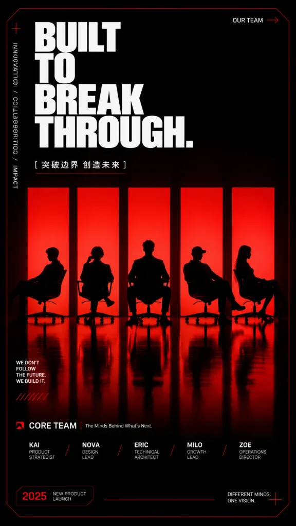
Team-Launch-Poster mit roten Silhouetten

Team-Launch-Poster mit roten Silhouetten

Bold vertical event and team poster with a dark cinematic stage aesthetic and glowing red backlit panels in a 9:16 portrait ratio. Background & Environment: Pure black background with a very thin dark-red tech border and subtle cut-corner geometry. Lower half features a glossy black reflective floor with elongated red reflections. Main Visual: Exactly five tall, evenly spaced vertical glowing red light panels centered horizontally. In front of the panels sit exactly five pure black silhouettes of people on minimalist office chairs, each in a unique posture: leftmost sitting sideways and leaning back; second with legs crossed and hand near face; center facing forward with broad shoulders; fourth wearing a cap leaning back; rightmost in side profile with long hair. Sharp contrast between the black silhouettes and intense red glow. Typography & Graphic Layout: - Top-left: Massive stacked headline in ultra-bold condensed sans-serif font in crisp white: "[BUILT TO BREAK THROUGH.]" across four lines ("BUILT", "TO", "BREAK", "THROUGH."). Below it, small subtitle text: "[突破边界 创造未来]" with a fine red underline. - Top-right: Small label reading "OUR TEAM" with a tiny red arrow. - Left margin: Vertical microtext reading "INNOVATION / COLLABORATION / IMPACT" with a small red plus sign above, and lower-left paragraph: "WE DON’T FOLLOW THE FUTURE. WE BUILD IT." accented with red hatch marks. - Bottom section: Labeled "CORE TEAM" with a small red icon and "The Minds Behind What's Next." Five aligned text columns below each silhouette separated by red slashes: "[KAI — PRODUCT STRATEGIST] / [NOVA — DESIGN LEAD] / [ERIC — TECHNICAL ARCHITECT] / [MILO — GROWTH LEAD] / [ZOE — OPERATIONS DIRECTOR]". - Bottom corners: Bottom-left badge reading "2025" and "NEW PRODUCT LAUNCH"; bottom-right text "DIFFERENT MINDS. ONE VISION." with a red cross accent. Style: High-contrast Swiss-grid editorial layout, red and black duotone palette, sharp vector-like typography, crisp floor reflections, cinematic tech launch atmosphere. No extra figures or clutter.

postersilhouetteevent-poster
Minimalistisches Typografie-Editorial-Poster

Minimalistisches Typografie-Editorial-Poster

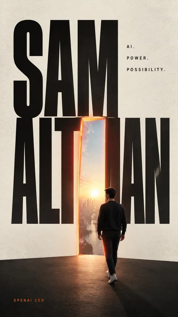
A minimalist cinematic editorial poster on a tall vertical canvas with an off-white textured paper background and a dark matte stage platform at the bottom. The composition is dominated by giant, condensed black sans-serif typography spelling "[SAM ALTMAN]" across nearly the entire height, with the first word stacked and overlapping the second. One central vertical letterform is replaced by an open glowing doorway outlined in warm orange-red light, opening into a bright sunrise sky with a distant cityscape. On the dark stage, a lone adult man is seen from behind in three-quarter profile, walking toward the doorway, wearing a dark crewneck sweater, dark trousers, and light sneakers, accented with subtle rim lighting. At the upper right of the typography, three small lines of spaced uppercase text read "[AI.]", "[POWER.]", and "[POSSIBILITY.]". In the lower-left corner, a small orange credit line reads "[OPENAI CEO]". Clean layout, strong scale contrast, generous negative space, muted neutral palette with warm orange accents, realistic lighting, and subtle film grain.

typografie postereditorial designminimalistisch
Titelseite einer Gaming-Tageszeitung

Titelseite einer Gaming-Tageszeitung

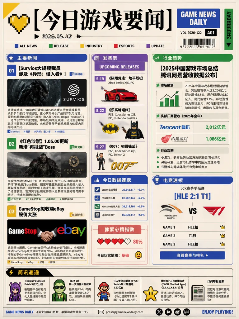
front page game news daily newspaper infographic. small colored squares and black sans-serif labels. main stories. 发售表. 《极限竞速:地平线6》. 《乐高蝙蝠侠》. 《007:初露锋芒》. 今日数据速览. blue header card with tiny bar-chart icon. 像素心情指数. small rounded card with pi…

zeitunginfografikgaming news
Geteiltes Editorial-Poster mit Pixel-Auflösung

Geteiltes Editorial-Poster mit Pixel-Auflösung

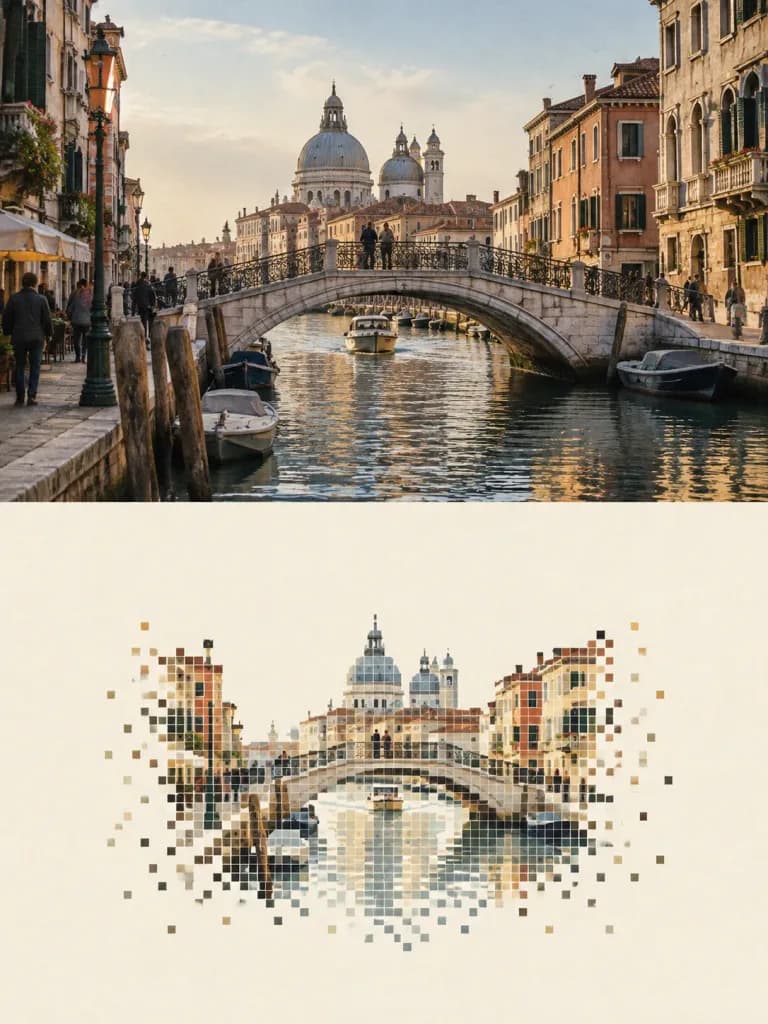
An editorial travel poster in a 3:4 vertical split composition, cleanly divided into an upper and lower half by a sharp, straight horizontal borderline without feathering or blending: Upper Half (approx. 50% height): A high-fidelity reproduction of [the reference travel photo of a historic European canal city with an arched stone bridge and classic facades]. Accurately preserves the architectural outlines, proportions, perspective, human figures, vehicles, lighting, and natural color atmosphere of the scene, treated only with subtle art-magazine color grading and very fine film grain. Lower Half (approx. 50% height): A minimalist 'pixel vanishing landscape' rendered on a warm off-white, light ivory paper background with 50%–65% empty negative space. Reorganizes the primary visual anchor ([the stone bridge and reflections]) into a compact composition occupying 30%–50% of the lower frame. The subject is reconstructed using crisp, discrete square pixel blocks: smaller, denser pixels define architectural edges, arches, and silhouettes, while the outer borders, water, and background gradually disperse into sparse, disconnecting pixels that vanish into the blank paper. The color palette is strictly extracted from the upper photo into 6–12 compressed tone steps, featuring muted environmental grays and selective focal accents, without any blur, smooth gradients, or digital glitch effects.

reisepostereditorial designpixel art
Japanische Magazin-Doppelseite mit Creator-Interview

Japanische Magazin-Doppelseite mit Creator-Interview

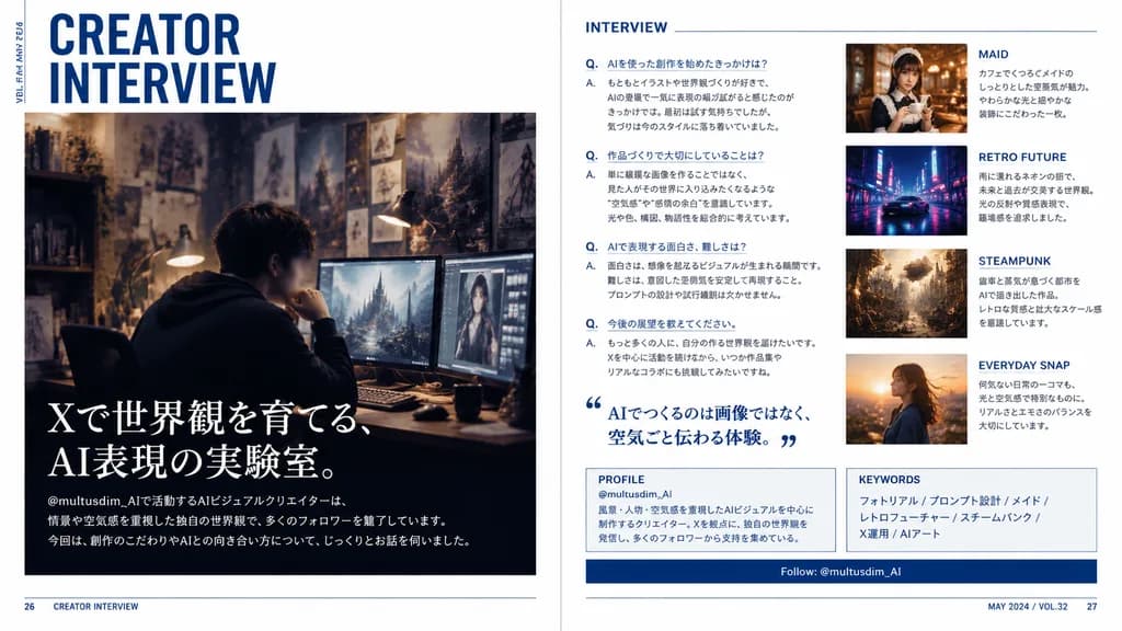
A polished two-page magazine spread in Japanese, designed like a contemporary creator profile feature in a premium culture and design magazine. The layout features a clean editorial interview spread with a crisp white background, deep navy blue accents, subtle rule lines, sharp grid alignment, and sophisticated typography. Left page: - Top left: large stacked headline reading “CREATOR INTERVIEW” in bold condensed sans-serif, with small vertical running text along the outer margin reading “VOL.23 / MAY 2024”. - Center to lower section: a large cinematic photo of a [male AI visual creator] sitting at a desk wearing a dark hoodie in a moody, dimly lit studio workspace. His face is subtly blurred or anonymized. The workspace features multiple glowing monitors showing digital artwork, a warm desk lamp, and background walls filled with concept sketches and fantasy art prints. - Lower left overlay on the photo: large Japanese feature headline in elegant white Mincho serif text reading “Xで世界観を育てる、AI表現の実験室。”, followed by smaller introductory Japanese body text referencing the handle “@multusdim_AI” and describing atmosphere-driven AI worldbuilding, along with a bottom horizontal editorial blurb. Right page: - Section 1 (left column): titled “INTERVIEW” in clean blue sans-serif, containing 4 structured Japanese Q&A entries labeled with blue “Q.” and “A.”, plus a large blue Japanese pull quote with stylized quote marks reading “AIでつくるのは画像ではなく、空気ごと伝わる体験。” - Image cards (right column, stacked vertically): 1. “MAID” card showing a warm cafe portrait of an elegant maid-themed woman holding a cup, with Japanese caption. 2. “RETRO FUTURE” card showing a neon-lit, rainy sci-fi street scene with a sleek car, with Japanese caption. 3. “STEAMPUNK” card showing an intricate brass clockwork city with steam and gears, with Japanese caption. 4. “EVERYDAY SNAP” card showing a candid outdoor portrait in golden hour sunset light, with Japanese caption. - Bottom panels: a boxed “PROFILE” section with handle “@multusdim_AI” and background bio, a “KEYWORDS” box listing “フォトリアル / プロンプト設計 / メイド / レトロフューチャー / スチームパンク / X運用 / AIアート”, and a navy blue horizontal bar reading “Follow: @multusdim_AI”. - Footer: page numbers 26 and 27 in bottom corners with small folio text “CREATOR INTERVIEW” and “MAY 2024 / VOL.32”. Authentic Japanese print typography and magazine layout hierarchy.

doppelseiteeditorial designjapanische typografie
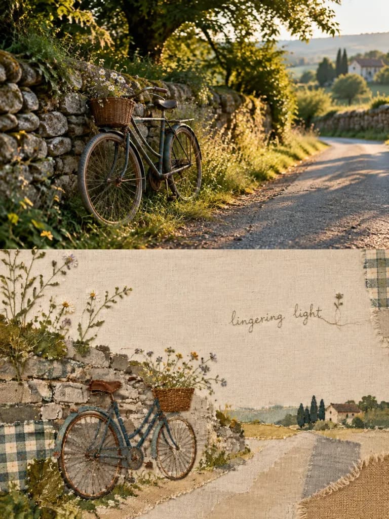
Geteiltes Editorial-Poster mit Stoff-Patchwork

Geteiltes Editorial-Poster mit Stoff-Patchwork

An independent high-end editorial design poster based on [the reference photo], presented in a 3:4 vertical layout strictly split 1:1 in height into upper and lower halves. Upper Half (50% height): Retains the original photo showing [a quiet countryside road with an old bicycle parked by a stone wall], maintaining its main structure, authentic textures, natural light and shadow, and atmosphere. Applied with subtle high-end art magazine photographic color grading, with natural environmental expansion at the edges to fit the frame without distorting or stretching the subject. Lower Half (50% height): A warm, vintage handmade patchwork textile collage reinterpreting the recognizable subjects, outlines, and emotional narrative from the upper photo. Constructed from textured fabric swatches including plaid cotton, natural linen, washed burlap, cross-stitching, visible hand-sewn threads, patches, and raw fringed edges. The composition emphasizes generous negative space, dynamic balance, and visual breathing room, allowing certain botanical stems, outlines, or silhouettes to naturally cross boundaries. Colors are derived from the vibrant soul hues of the photo above, translated into soft, tactile, healing textile tones. Text and Typography: Subtle embroidered fine-line stitches or faint handwritten thread text spelling an understated poetic phrase: "[lingering light]", integrated naturally alongside fabric edges and negative space as part of the emotional visual rhythm. Style: Contemporary textile art meets high-end lifestyle magazine, tactile, humanistic, restrained, poetic, and artisanal.

posterpatchworktextilkunst
Minimalistisches Porträt-Poster mit Süßem Maskottchen

Minimalistisches Porträt-Poster mit Süßem Maskottchen

A bright, clean graphic-and-photo composite poster featuring [Chinese actress Liu Yan]. Layout and composition: high-key solid color flat background with ample airy negative space and no complex depth of field; visual weight anchored at the bottom by a boldly cropped, realistic photographic portrait of [Liu Yan], showing only her recognizable facial and head features as if entering from the bottom frame. Graphic element: a cute, minimalist 2D flat doodle character or mascot icon gently resting on her head like a hair accessory, with rounded contours, clean edges, and facial features drawn with bold simple line art, creating a playful contrast between realistic photography and flat illustration. Typography: a large, soft handwritten headline at the top with loose kerning, a strong vertical or axial title in the center establishing visual hierarchy, and tiny precise info text along the borders. Lighting and color: high-key, luminous and fresh palette, soft natural lighting on the portrait, crisp dark contour lines, minimal shadows, clean and contemporary editorial design aesthetic.

postereditorial-designgrafikdesign
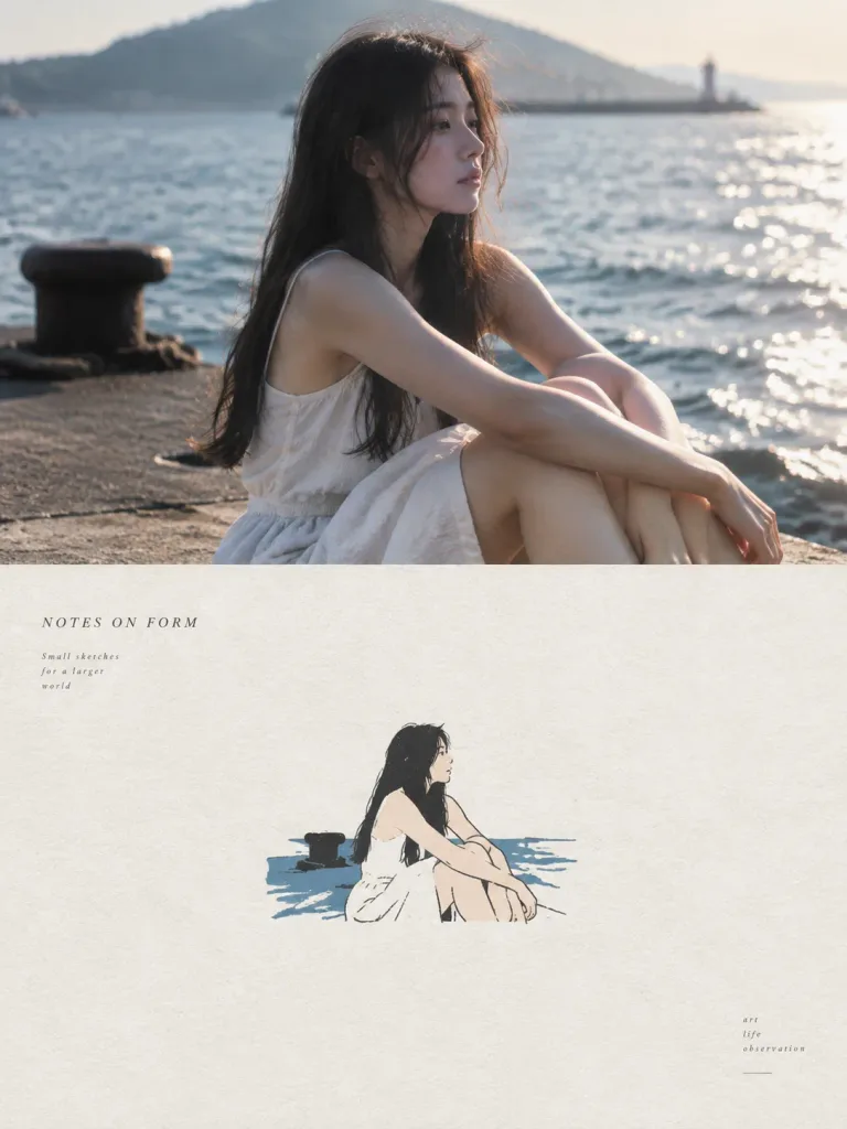
Geteiltes Foto- und Acryl-Poster

Geteiltes Foto- und Acryl-Poster

A split vertical editorial design poster in a [3:4] aspect ratio, divided into two equal horizontal halves with a strict 1:1 height ratio. Upper Half: Features the reference photo preserved with high-end magazine color grading, authentic textures, and natural lighting. The scene extends naturally to fill the top 50% without stretching or distorting the main subject. Lower Half: A minimalist hand-drawn cover illustration on rough, light-colored paper texture. The key subject, silhouette, and posture from the reference photo are reconstructed into simplified, thin, slightly trembling ink outlines filled with flat acrylic color blocks. The subject is compact, occupying about [10%–20%] of the lower half, surrounded by generous negative white space. Color & Style: Color palette is sampled strictly from the reference photo and compressed into no more than 4 primary colors. Restrained, graphic, and painterly feel with visible paper grain. No 3D rendering, watercolor wash, or heavy oil paint. Typography: Sparse, elegant, small editorial text and title [NOTES ON FORM] subtly placed within the lower white space, evoking an independent art publication.

geteiltes postereditorial-designacryl-kunst
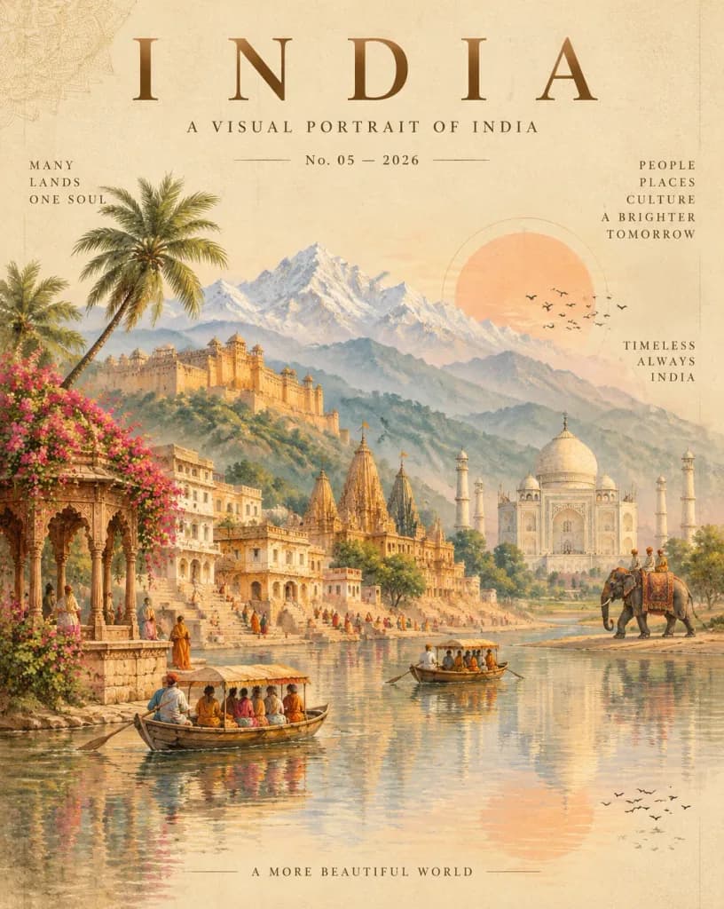
Editoriales Reiseplakat für Indien

Editoriales Reiseplakat für Indien

An elegant vertical travel poster and luxury magazine cover celebrating [INDIA], presented as a romantic fine-art collage on warm ivory paper with subtle vintage grain, faint vertical guidelines, and delicate mandala line art faintly visible in the upper-left corner. Typography and Layout: At the top, a large spaced-out serif headline reading "[INDIA]", directly followed by the subtitle "A VISUAL PORTRAIT OF INDIA" and an issue line "No. 05 — 2026". The composite illustration occupies the middle and lower two-thirds, with water reflections in the bottom third. Minimalist editorial text blocks include: left side "MANY / LANDS / ONE SOUL", upper right "PEOPLE / PLACES / CULTURE / A BRIGHTER / TOMORROW", mid-right "TIMELESS / ALWAYS / INDIA", and bottom center "A MORE BEAUTIFUL WORLD". Subject and Composition: A romantic composite Indian landscape featuring ten landmark and cultural elements: 1. Snow-covered Himalayan mountain peaks in the far distance. 2. Misty blue-green layered foothills in front of the peaks. 3. A grand Rajasthan-style hill fort perched on the left hillside. 4. Cream and sandstone riverside houses and bathing ghats descending to the river. 5. Ornate temple spires rising near the center. 6. The Taj Mahal on the right in soft white marble with graceful minarets. 7. A carved stone riverside pavilion on the far left covered in blooming pink bougainvillea. 8. A tall palm tree leaning inward from the left foreground. 9. Calm wooden river boats with passengers floating in the foreground. 10. An elephant with riders walking along the right riverbank. Tiny painterly figures in colorful traditional attire populate the ghats and riverfront. Lighting and Color: A luminous dawn or dusk palette of cream, peach, soft gold, dusty rose, pale blue, sage green, and sandstone. A large pale peach sun disk with a faint inner ring sits low behind the hills on the right, accompanied by two distinct flocks of silhouette birds in flight (one near the sun, one near the lower right reflection). Gentle water ripples softly mirror the sky, architecture, and boats. Style: Detailed romantic watercolor and gouache illustration blended with high-end editorial graphic design, balanced symmetry, atmospheric morning mist, fine architectural linework, and no modern elements.

reiseplakatmagazincoverindien
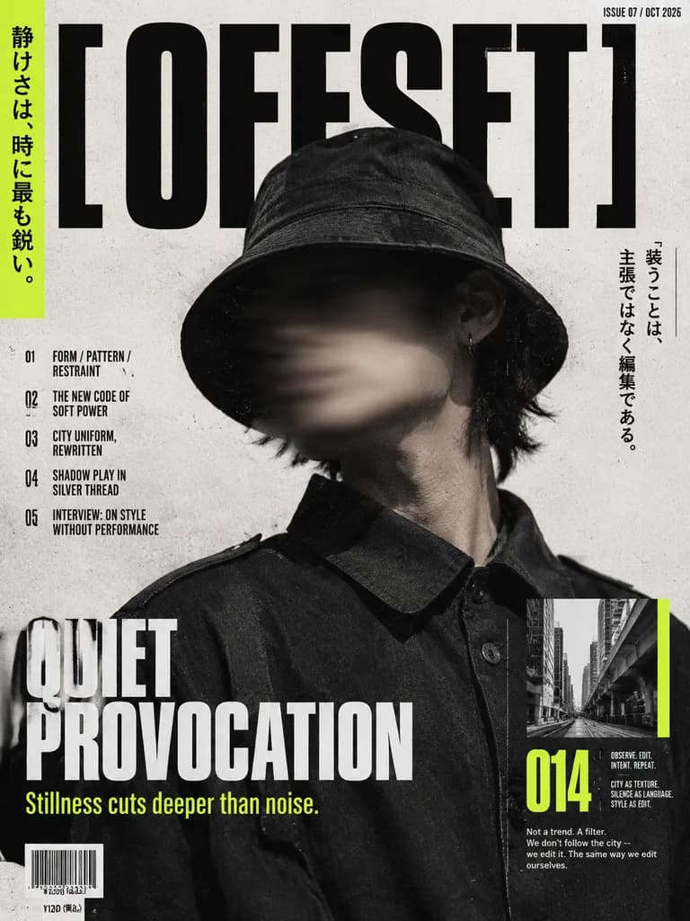
Japanisches Street-Fashion-Magazin-Cover

Japanisches Street-Fashion-Magazin-Cover

High-end editorial fashion magazine cover based on the reference photo, preserving the person, pose, hat, shirt, lighting direction, shadow, and face-obscuring blur. Crop closely into a vertical cover layout with the subject positioned slightly right of center. Typography and Layout: - Magazine title: huge black condensed typography reading "[OFFSET]" across the top, layered partially behind the subject's head. - Upper right issue line: "[ISSUE 07 / OCT 2026]". - Far left: vertical neon yellow-green accent strip with Japanese text: "[静けさは、時に最も鋭い。]". - Lower left: bold main cover headline "[QUIET PROVOCATION]" with yellow subtitle "[Stillness cuts deeper than noise.]". - Left column: exactly 5 numbered article teasers: 01 FORM / PATTERN / RESTRAINT 02 THE NEW CODE OF SOFT POWER 03 CITY UNIFORM, REWRITTEN 04 SHADOW PLAY IN SILVER THREAD 05 INTERVIEW: ON STYLE WITHOUT PERFORMANCE - Upper right: vertical Japanese quote block reading "装うことは、主張ではなく編集である。" - Lower right: exactly 1 small black-and-white urban architecture photo inset with a neon-green side accent, a large neon yellow-green page number "014", and 3 tiny editorial text clusters reading "OBSERVE. EDIT. INTENT. REPEAT.", "CITY AS TEXTURE. SILENCE AS LANGUAGE. STYLE AS EDIT.", and a short body paragraph below the number. - Lower section: 1 standard barcode graphic with price line "¥1200 (税込)". Style: Modern minimalist Japanese street fashion editorial, gritty off-white paper texture, bold black condensed fonts, distressed print ink, high contrast.

magazin-covereditorial-designjapanische typografie
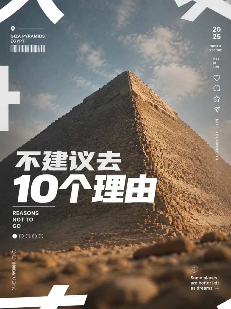
Reise-Cover-Poster mit Gizeh-Pyramide

Reise-Cover-Poster mit Gizeh-Pyramide

Vertical 3:4 social-media cover poster about travel advice for Egypt, editorial magazine layout. Subject & Composition: Dramatic low-angle photograph of the [Giza Pyramid] centered slightly toward the right, occupying most of the frame. Blurred rocky desert foreground at the bottom and a muted blue-gray, pale cloudy sky in the background. Lighting & Color: Warm directional sunlight illuminating the right face of the pyramid, with cool shadow on the left side. Soft desert haze, muted tones, and subtle film grain texture. Typography & Text Overlays: - Primary headline: Heavy, modern, blocky white sans-serif Chinese text placed across the lower-left to middle of the pyramid reading "[不建议去\n10个理由]", tightly kerned with the second line significantly larger. - Subtitle: Directly below the headline on the left, small uppercase English text stacked in three lines reading "REASONS / NOT TO / GO", underlined with a thin white divider. - Top-left info block: Thin white location pin icon, small horizontal line, uppercase text "GIZA PYRAMIDS" and "EGYPT", and a thin barcode-like graphic. - Right sidebar: Vertical minimalist UI column with stacked icons (heart, comment bubble, star, paper-plane). Above the icons, text "20" stacked over "25", "DREAM / RECORD", and "MAY. / 18 / SUN". Below them, vertically rotated text "NOT RECOMMENDED" with a thin extending line. - Bottom navigation: 5 pagination dots below the subtitle (first circle filled solid white, four hollow circles). At bottom-left, two tiny circle icons and vertical text "@ DREAM ARCHIVE". At bottom-right, a globe outline icon and "Some places / are better left / as dreams. —". - Edges: Massive abstract cropped white Chinese character fragments along the top, left, and bottom borders as decorative graphic elements. Style: Contemporary Xiaohongshu travel magazine aesthetic, clean vector UI overlays, subtle vignetting, no border, no watermark.

pyramiden von gizehreiseplakatsocial-media-cover
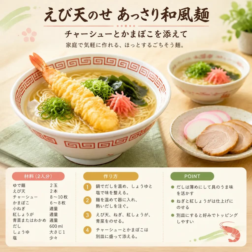
Japanisches Tempura-Nudel-Rezeptposter

Japanisches Tempura-Nudel-Rezeptposter

A warm Japanese recipe-card food editorial image for [えび天のせ あっさり和風麺], formatted like an authentic cookbook or food magazine poster with appetizing photography and neatly typeset Japanese typography. Setting & Canvas: Square 1:1 format, clean editorial composition with soft natural daylight, cream and light wood background, subtle light beige paper texture, and muted pastel accents. Composition & Main Subject: - Center food photography: In the left foreground, a large white ramen bowl with red traditional Chinese fret patterns containing thin Japanese noodles in clear light broth, topped with exactly 1 large crispy golden shrimp tempura, finely sliced green scallions, glossy dark wakame seaweed, and delicate pink pickled ginger. Under the bowl rests a folded pale green linen cloth. - In the right background, a smaller bowl of noodles with green onions and pickled ginger, softly blurred with shallow depth of field. - In the lower right, a small ceramic plate neatly presenting two toppings: fanned semicircular slices of pink-rimmed kamaboko fish cake and overlapping slices of tender chashu pork. - Upper right corner features a softly blurred small potted green plant. Typography & Layout: - Top header: Centered bold brush-calligraphy Japanese headline "[えび天のせ あっさり和風麺]", underscored by a thin salmon-pink decorative divider line and dotted accents. - Subtitle: "[チャーシューとかまぼこを添えて]" - Short description line: "[家庭で気軽に作れる、ほっとするごちそう麺。]" - Bottom third: A crisp rounded white recipe card divided into exactly 3 columns with pill-shaped colored headers: - Column 1 (Salmon-pink pill "材料(2人分)"): Lists 9 ingredients: ゆで麺 2玉; えび天 2本; チャーシュー 8〜10枚; かまぼこ 6〜8枚; 小ねぎ 適量; 紅しょうが 適量; 青菜またはわかめ 適量; だし 600ml; しょうゆ 大さじ1; 塩 少々. - Column 2 (Ochre pill "作り方"): Lists 4 numbered steps in gold circles: 1 鍋でだしを温め、しょうゆと塩で味を整える。 2 麺を温めて器に入れ、熱いだしを注ぐ。 3 えび天、ねぎ、紅しょうが、青菜をのせる。 4 チャーシューとかまぼこは別皿に盛って添える。 - Column 3 (Olive-green pill "POINT"): Lists 3 bullet points: だしは薄めにして具のうま味を活かす; ねぎと紅しょうがは仕上げにのせる; 別皿にすると好みでトッピングしやすい. - Lower-right corner of the recipe card has a tiny red shrimp illustration and subtle green brush stroke accent. Style & Constraints: High-key appetizing natural light food photography, sharp focus on the main bowl, soft shadows, clean legible text layout, strictly no people, no watermark, no extra decorative panels.

food-fotografierezeptkartejapanische küche
Luxus-Reiseplakat mit Emaille-Pin

Luxus-Reiseplakat mit Emaille-Pin

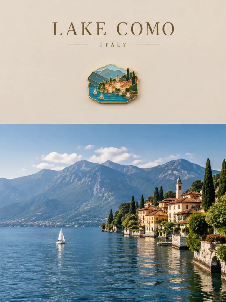
A luxury travel poster created using the reference photo with a split layout: the top 35% is graphic artwork, and the bottom 65% retains the reference photo completely unchanged. The top section features a minimalist matte background sampled from colors in the photo, a small centered collectible souvenir magnet designed as a realistic handcrafted enamel pin with thin gold contours depicting a simplified scene from the photo, and luxury editorial typography. Include the text "[location name]" and "[country]" in an elegant serif font. Aesthetic of quiet luxury, premium travel branding, and refined editorial composition.

reiseplakatemaille-pinquiet luxury
Konzeptionelles Geteiltes Spannungs-Plakat

Konzeptionelles Geteiltes Spannungs-Plakat

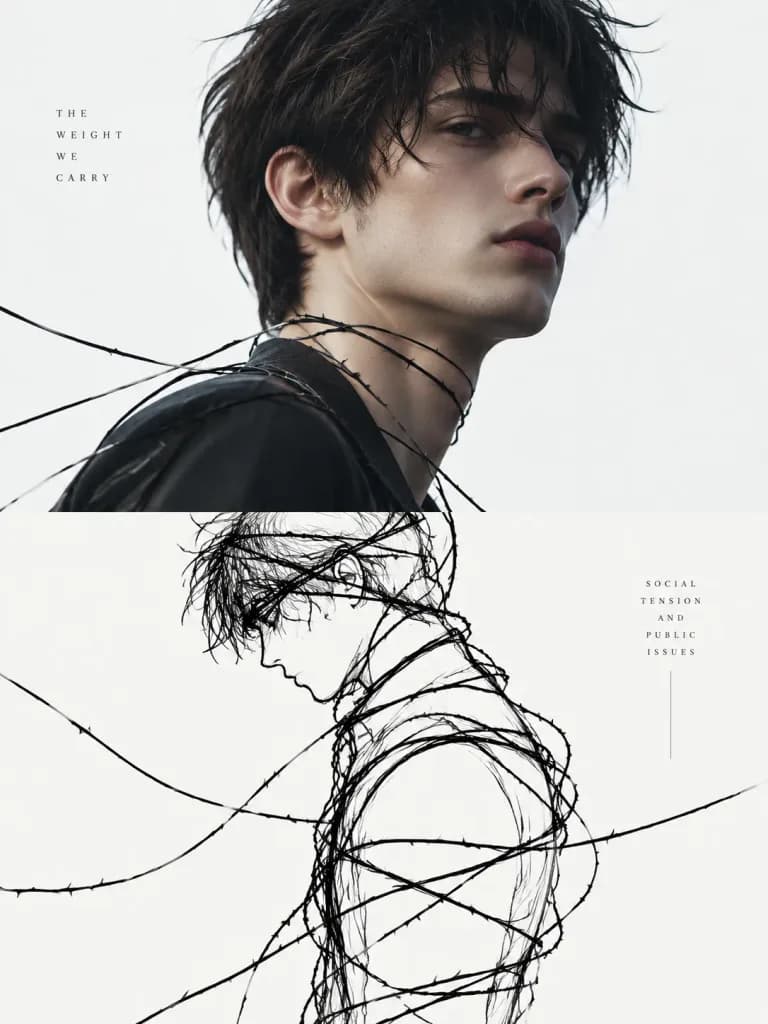
Split-screen conceptual poster based on the reference photo. Top half: The subject from the reference photo rendered with high-end editorial color grading. Bottom half: A minimalist conceptual line illustration representing [social tension and public issues]. Continuous hand-drawn black lines resembling [tight wires, thorns, or binding threads] that coil, knot, and tighten to reveal the subject's silhouette. Composition: Clean vertical split, abundant negative white space, quiet but tense atmosphere. Minimal text integrated seamlessly into the linework, in the style of experimental modernist editorial graphic design.

geteiltes bildstrichzeichnungeditorial-design
Minimalistischer Gesichtsästhetik-Bericht

Minimalistischer Gesichtsästhetik-Bericht

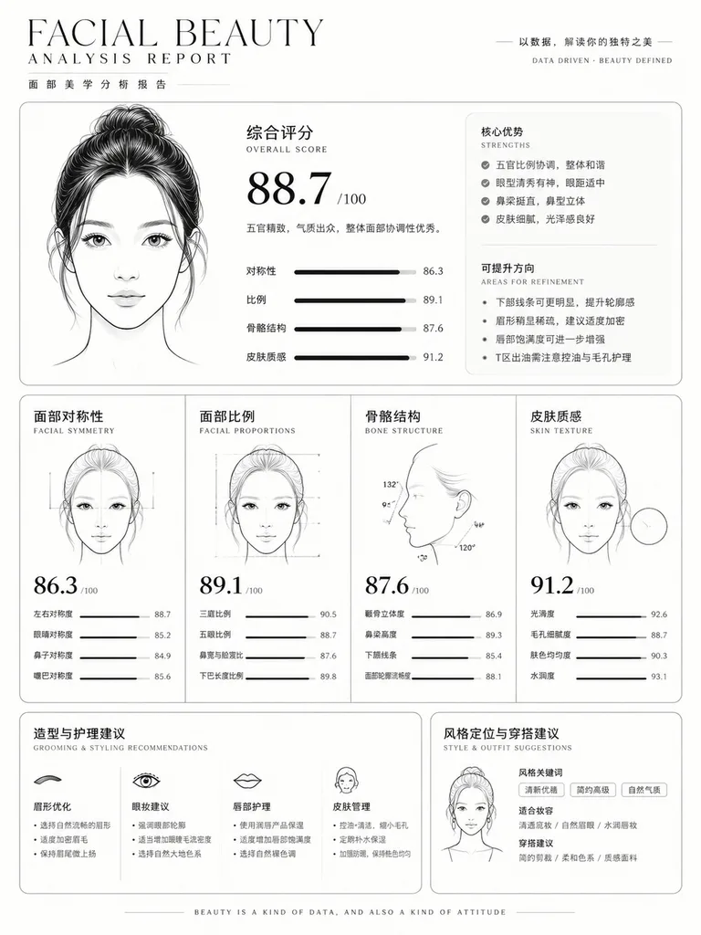
Based on the reference photo, create a clean, minimal, luxury facial beauty analysis report. Design using a [black on white] palette with elegant thin lines, rounded-corner cards, and modern editorial typography. Feature minimalist line-art facial outline diagrams, objective metrics covering facial symmetry, proportions, bone structure, and skin texture. Include numerical scores, distinct strengths, areas for refinement, and actionable grooming and styling recommendations in a structured, data-driven infographic layout.

gesichtsberichtästhetikanalyseinfografik
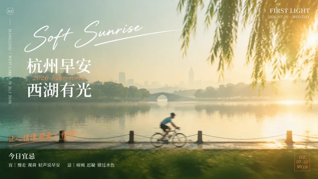
Sonnenaufgangs-Poster am Westsee

Sonnenaufgangs-Poster am Westsee

Cinematic morning travel poster for [Hangzhou] West Lake at sunrise, blending fine-art photography, soft motion blur, and refined editorial typography. Wide 16:9 landscape composition with a palette of pale misty green, warm gold, and ivory, featuring sunrise haze, subtle lens flare, and an overexposed morning glow from the upper right. Scene: A serene lakeside path beside West Lake at daybreak. In the foreground, a single cyclist in a light blue top and dark shorts rides from left to right along the path, rendered with ghosted motion trails and a softened silhouette. Willow branches hang softly blurred in the upper-right foreground, with textured dark green lawn along the lower edge. In the midground, calm reflective water mirrors the dawn sky, with faint tree silhouettes and a small arched bridge centered on the horizon, alongside a faint, hazy skyline in the far distance. Typography & Graphic Layout: - Upper left-center: Large white handwritten script reading “Soft Sunrise”, accented with a graceful underline extending toward the right. - Left side below: Large white Chinese title text in two stacked lines: “杭州早安” and “西湖有光”, separated by a small italicized orange subtitle reading “2026 lake note”. - Top right corner: Small white serif uppercase text reading “FIRST LIGHT” above “2026-07-20 · MONDAY”. - Far left border: A subtle vertical layout featuring a small circular “HZ” monogram at top, a thin hairline divider, and fine vertical text reading “HANGZHOU / WEST LAKE / 20 JUL 2026”. - Lower left: An orange handwritten Chinese line reading “让心情像湖面一样轻”, positioned above bold white text “今日宜忌” and an elegant small line reading “宜|慢走 观荷 轻声说早安 忌|喧闹 迟疑 错过水色”. - Bottom right corner: A small minimalist orange outlined square badge containing stacked text: “HZ”, “07·20”, and “MON”. Style & Constraints: Minimalist magazine editorial layout, crisp graphic overlays set against atmospheric mist and shallow contrast. Exactly one cyclist, one stone arch bridge, and the specified typography only.

reiseposterwestseehangzhou
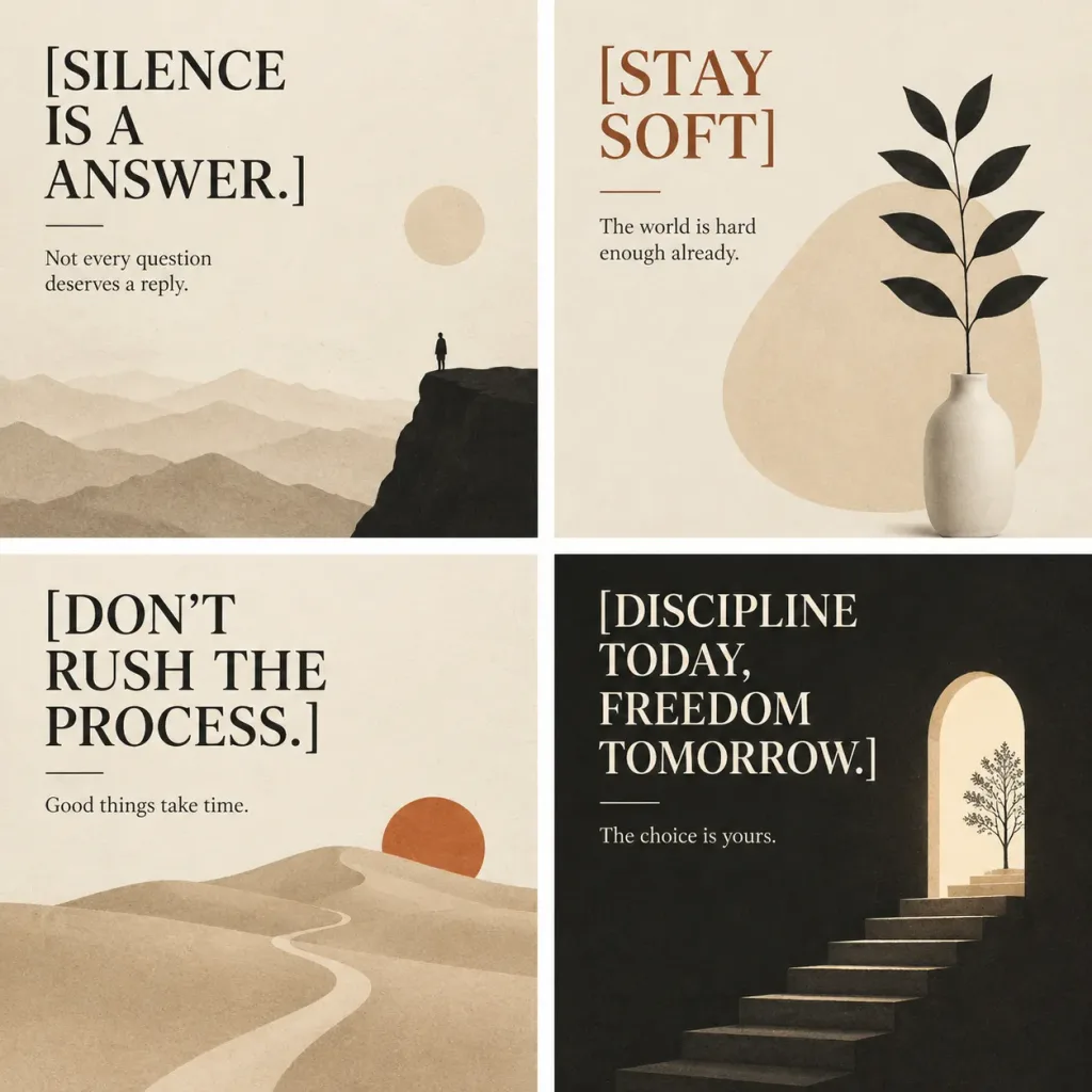
Minimalistisches Philosophisches Poster-Raster

Minimalistisches Philosophisches Poster-Raster

A refined 2x2 grid of four minimalist philosophical wall-art posters in a square format, separated by clean white gutters. Three panels feature a warm off-white paper texture, while the bottom-right panel features deep charcoal black. Calm, editorial, and contemplative mood. - Top-Left Poster: Cream background. In the upper-left, a large black serif headline reads “[SILENCE IS A ANSWER.]” stacked across lines, followed by a thin horizontal rule and small text: “Not every question deserves a reply.” Illustration shows distant beige mountain layers across the bottom, a dark black cliff on the lower right with a tiny solitary human silhouette standing at the edge, and a pale beige sun disk near the right. - Top-Right Poster: Cream background. In the upper-left, a large rust-brown serif headline reads “[STAY SOFT]”, followed by a short horizontal rule and small text: “The world is hard enough already.” Illustration features a rounded beige abstract shape in the center-right background, a matte white ceramic vase at the lower right, and a single slender black plant stem with exactly 8 black leaves. - Bottom-Left Poster: Cream background. In the upper-left, a large black serif headline reads “[DON’T RUSH THE PROCESS.]” on multiple lines, followed by a thin horizontal rule and small text: “Good things take time.” Illustration depicts soft rolling beige sand dunes across the lower half, a winding pale path leading toward the horizon, and a burnt-orange sun disk setting behind a dune on the right. - Bottom-Right Poster: Deep charcoal black background. In the upper-left, a large cream serif headline reads “[DISCIPLINE TODAY, FREEDOM TOMORROW.]” stacked on four lines, followed by a thin cream rule and small text: “The choice is yours.” Illustration shows a tall arched doorway glowing with warm cream light on the right, stone steps ascending into the arch, and a delicate tree silhouette near the top step. Style: Elegant editorial serif typography, muted earth-toned color palette (cream, beige, black, rust orange, charcoal), subtle paper grain, clean flat minimal vector shapes, and balanced asymmetry. Crisp, legible text without mockups, wall borders, or extra decorations.

wandkunstminimalistisches postertypografie
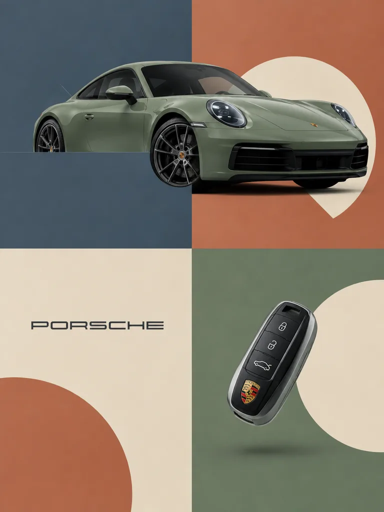
Editoriales Marken-Rasterplakat

Editoriales Marken-Rasterplakat

High-end editorial brand poster for [Porsche]. Subject: A signature hero product [such as a sleek sports car] dynamically integrated into graphic elements using a sandwich layering technique—parts of the car sit behind geometric blocks while the wheels and body panels overlap in front to establish authentic 3D depth. An iconic brand accessory [such as a floating minimalist key fob] rests in an opposing quadrant as a visual counterweight. Composition: Clean 2x2 grid layout overlaid with bold geometric color blocks, large minimalist arcs, and circles. Color Palette: Sophisticated muted palette using desaturated, earthy, matte tones [slate blue, dusty terracotta, sage green, and warm cream]; completely flat matte color blocks with zero gradients. Lighting & Style: High-end commercial studio photography, soft diffused studio light, gentle highlights, physically integrated into the graphic design. Branding: Minimalist single-color [Porsche] logo placed dead-center inside one background block.

editorial-designmarkenplakatgrafikdesign
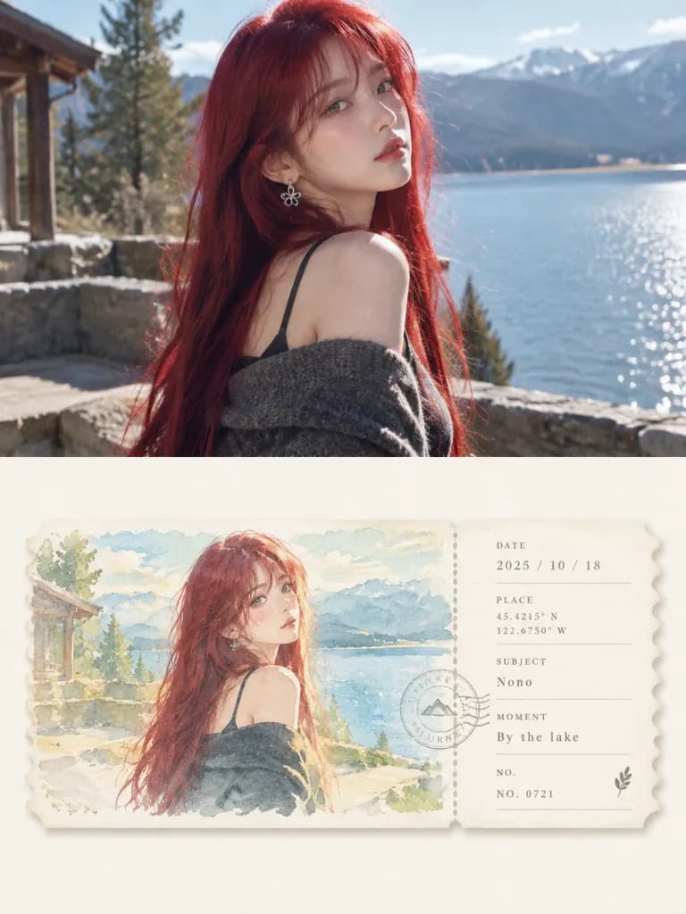
Geteiltes Poster aus Foto und Aquarell-Ticket

Geteiltes Poster aus Foto und Aquarell-Ticket

High-end editorial design poster in a 3:4 vertical layout, split strictly 50/50 into two equal-height sections. Top Half: Features the reference photo with its subject, natural lighting, and realistic texture intact. Subtle art-magazine color grading and seamless background extension to fit the frame without stretching or altering the subject. Bottom Half: Set against an ivory-white negative space background, displaying a horizontal matte watercolor ticket stub with delicate serrated edges and a subtle drop shadow. The ticket is divided by a vertical perforated tear line into a 74% left illustration section and a 26% right typographic stub. - Left Section: An airy, gentle watercolor reinterpretation of the reference photo's primary silhouette and scene. Rendered in a soft, bright healing color palette of [sage green, mist blue, cream yellow, and warm sand] with transparent washes, light paper grain, and softened background details reminiscent of an artist's travel journal. - Right Section: Clean, minimalist editorial typography strictly aligned to a grid. Includes structured fields such as [DATE, PLACE, SUBJECT, MOMENT, NO.], paired with delicate coordinate numbers and a faint circular postmark stamp overlapping the tear line. Overall Aesthetic: Elegant, tranquil travel publication design with quiet geometric order and authentic watercolor paper texture.

posteraquarellticket
Elektrobus-Ingenieur-Infografik

Elektrobus-Ingenieur-Infografik

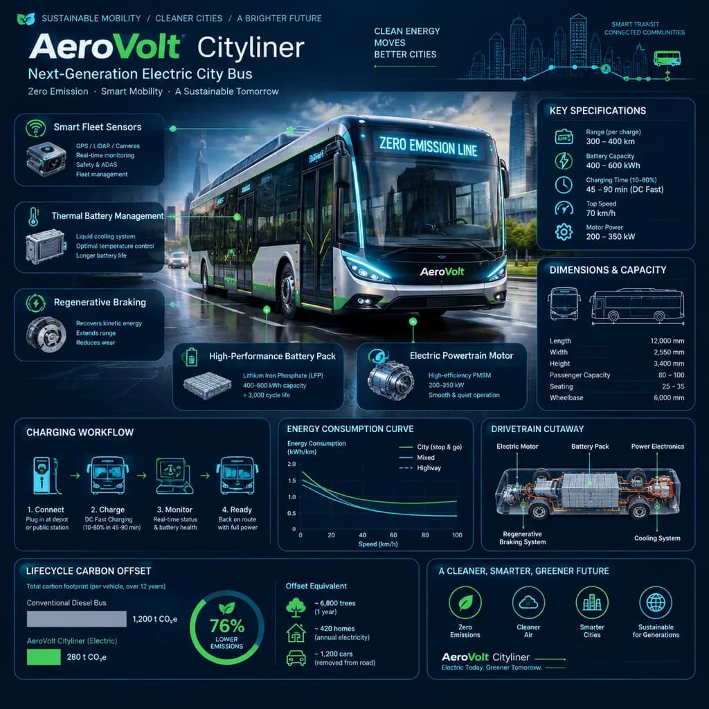
A square, reference-style sustainable transportation engineering infographic handbook page centered around a futuristic electric city bus named "[AeroVolt Cityliner]". Composition & Layout: 1:1 square aspect ratio. A clean, modular editorial visual encyclopedia layout with high information density, breathable whitespace, and rounded data cards. The background features subtle dark blueprint grids, transit route lines, and circuit schematic overlays. Central Subject: Highly detailed realistic 3D render of the electric city bus in a dynamic three-quarter front perspective on a modern smart-city boulevard. Features a sleek aerodynamic body, panoramic glass windshield, illuminated digital LED destination display reading "[ZERO EMISSION LINE]", low-floor chassis, futuristic LED lighting, and realistic street reflections. Infographic Modules & Engineering Callouts: Thin precision pointer lines connect bus components to technical annotations detailing battery pack technology, electric powertrain motor, regenerative braking, thermal battery management, and smart fleet sensors. Surrounding modular panels display technical specifications, vehicle dimensions and passenger capacity, charging workflow diagrams, energy consumption curves, drivetrain cutaway diagrams, and lifecycle carbon offset comparisons. Color Palette & Typography: Sophisticated palette of deep navy blue, graphite black, steel gray, vibrant electric green, and soft cyan accents. Clean, hierarchical technical typography with modern sans-serif headings, data readouts, and minimalist transit engineering icons. Style: High-end transportation encyclopedia page, editorial mobility handbook, scientific transit reference poster, technical accuracy, matte finish, professional publication quality.

infografikelektrobussmart city
Minimalistische Dokument- und Layout-Prompts

Minimalistische Dokument- und Layout-Prompts

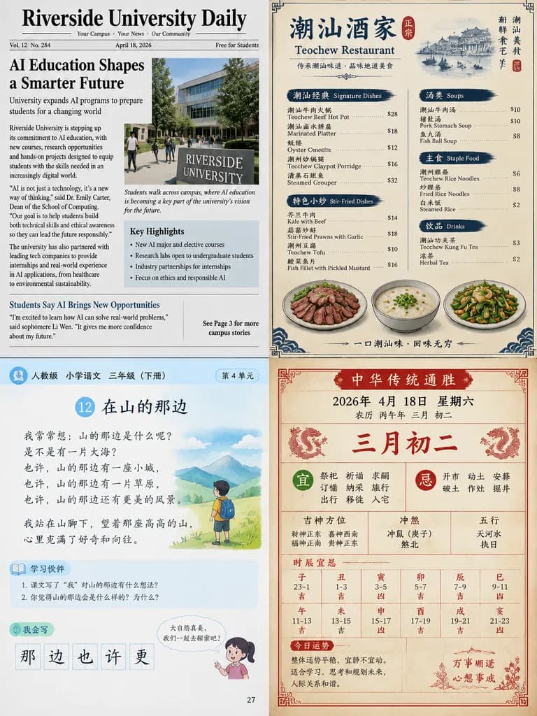
A detailed printed layout document: 1. A [campus daily newspaper] about [AI education] 2. A menu for a [Teochew restaurant] 3. A page from the [PEP version primary school third-grade Chinese] textbook 4. A page from a traditional Chinese almanac for [April 18, 2026]

dokumentenlayoutzeitungslayoutspeisekarte
Kaffee-Reise Infografik-Poster

Kaffee-Reise Infografik-Poster

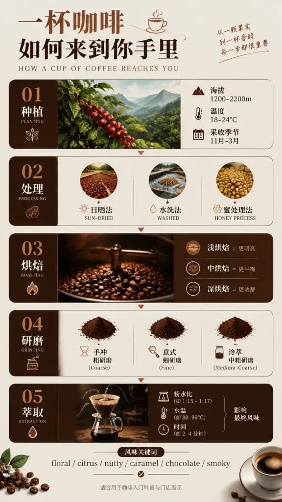
A Chinese infographic poster titled "[一杯咖啡 如何来到你手里]" ("[How a Cup of Coffee Reaches You]"), designed in a premium editorial information-design style. Vertical modular card layout featuring directional arrows, structured data boxes, minimalist line icons, and refined vector illustrations. Color palette composed of deep coffee brown, warm milk white, ink black, and elegant copper accents. The poster includes five numbered sections: - [01 Planting]: elevation [1200-2200m], temperature [18-24°C], harvest season [Nov-March] - [02 Processing]: [sun-dried, washed, honey process] - [03 Roasting]: [light roast = brighter, medium roast = balanced, dark roast = richer] - [04 Grinding]: [pour-over = coarse, espresso = fine, cold brew = medium-coarse] - [05 Extraction]: [powder-water ratio, water temperature, and time impact flavor] Flavor profile keywords displayed with slashes: "[floral / citrus / nutty / caramel / chocolate / smoky]". Fine print text at the bottom: "[适合用于咖啡入门科普与门店展示]". High-end cafe educational display board aesthetic, clean typography, balanced negative space, sharp graphic design layout.

kaffeeinfografikposter
Minimalistisches WM-Editorial-Plakat

Minimalistisches WM-Editorial-Plakat

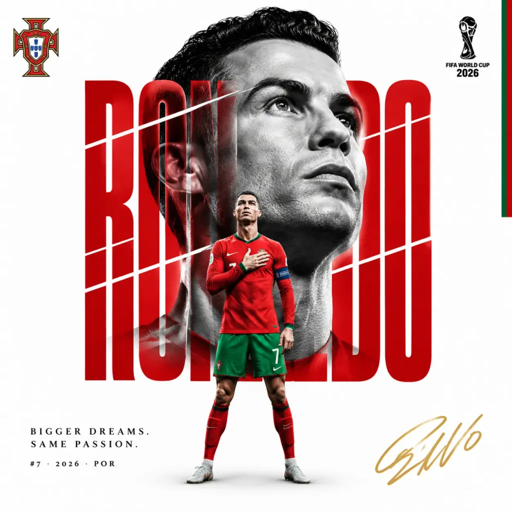
A luxury FIFA World Cup editorial sports poster set against a clean white background with no stadium, crowd, or smoke. 1:1 square composition with generous white negative space. TYPOGRAPHY LAYER (Behind the portrait): Giant vertical typography spelling "[PLAYER NAME]" in ultra-condensed bold letters with horizontal sliced segments at irregular intervals, colored in [TEAM COLOR HEX]. Razor-thin white gaps divide the slices, creating graphic depth that bleeds into the portrait. PORTRAIT LAYER (Middle ground): A monochrome, black-and-white close-up portrait of [PLAYER NAME] with [FACIAL EXPRESSION], ultra-high contrast, and dramatic lighting casting deep shadows across the jaw and cheekbones. The typography letterforms seamlessly overlap and integrate across the facial features. FOREGROUND LAYER: A full-color, sharp, full-body figure of [PLAYER NAME] in [SIGNATURE POSE], wearing the official [NATIONALITY] national team kit, positioned in the lower-center third of the poster without motion blur. GRAPHIC ACCENTS: - Small, crisp [NATIONAL TEAM CREST] in the top-left corner - Subtle [NATIONALITY] flag accent strip along the far-right edge - Hand-drawn player signature "[SIGNATURE MARK]" in gold ink in the bottom-right corner - FIFA World Cup 2026 collector emblem in the top-right - Editorial caption text: "[TAGLINE LINE 1]. [TAGLINE LINE 2]." - Micro caption below: "#[JERSEY NUMBER] · 2026 · [NATION CODE]" Style: Premium sports campaign poster, high-end editorial graphic design, sharp photorealistic details, high-contrast studio lighting.

weltmeisterschaftsportplakateditorial-design
Luxus-Kaffee-Tasting-Menü-Layout

Luxus-Kaffee-Tasting-Menü-Layout

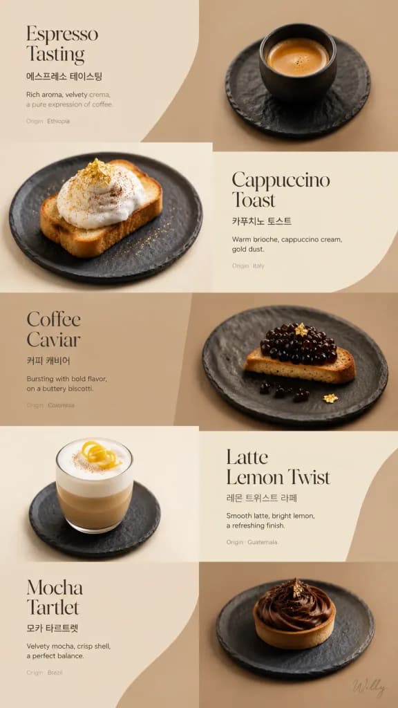
Luxury coffee tasting menu webpage layout with an irregular 3x3 grid composition and flowing editorial arrangement. Background: Tone-on-tone panels alternating between [latte beige (#F2E2D2)], [mocha brown (#D1B48F)], and coffee cream (#FAF5E6). Subject: Plated coffee tastings on minimalist slate ceramics, captured from mixed overhead and 45-degree angles. Items include espresso with crema foam, cappuccino toast with gold dust, coffee caviar on biscotti, latte with lemon twist, and mocha tartlet on matching plates. Typography: Bilingual layout featuring English names in an elegant serif Didot font, paired with clean Korean and English sans-serif subtitles, and tiny light gray origin notes. Lighting and Camera: Shot with 50mm and 100mm macro lenses, soft diffused overhead lighting, and subtle side rim lighting. Style: Minimalist luxury editorial aesthetic with generous whitespace and a harmonious coffee-toned color palette. A delicate handwritten signature 'Willy' is written in small script at the bottom right corner.

kaffeekartetasting-menüweb-layout
Art-déco Luxus-Wohnaccessoires E-Mail-Newsletter

Art-déco Luxus-Wohnaccessoires E-Mail-Newsletter

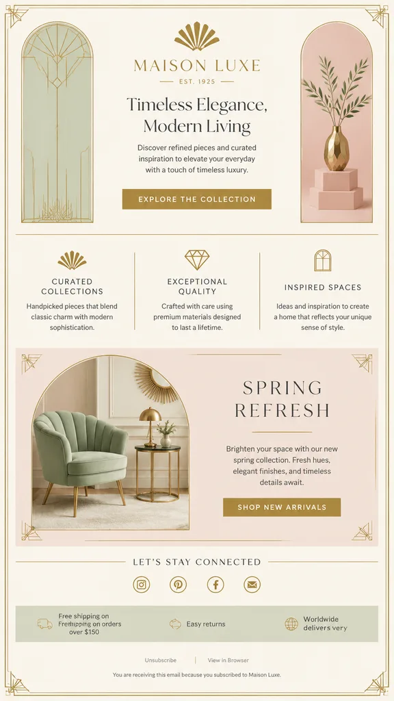
luxury promotional email newsletter layout. elegant Art Deco inspired home decor branding with thin gold linework and refined typography. hero. feature highlights. seasonal promotion. social footer. utility footer. gold rectangular button…

e-mail-vorlagenewsletter-mockupart déco
Editorial-Magazin-Collage Markenidentität

Editorial-Magazin-Collage Markenidentität

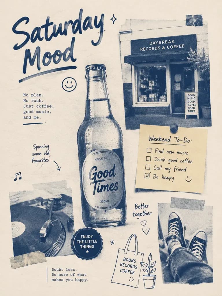
Visual system: [cream white, duo-tone, coarse grain, magazine collage, free columns, handwritten font, 9-grid module]. Brand elements: [glass bottle, bottle cap, small shop, music, sticky note, lifestyle doodle].

markenidentitätmagazin-collagemoodboard
Editoriale Fototutorial-Buchseite

Editoriale Fototutorial-Buchseite

A clean, premium Chinese photography tutorial editorial book page, portrait orientation, minimalist magazine spread layout on off-white paper with generous margins and refined typography. The layout consists of five structured sections: 1. Top Header: Small text reading "[人像摄影实战指南 | Chapter 04 光线与影响的运用]". 2. Upper-Left Column: Large chapter number "[04-2]" in muted olive green, followed by a bold black Chinese title split across two lines: "[自然光下的\n柔美人像]", and an olive-green subtitle: "[利用花影与漫射光\n营造温柔氛围]". Below, a short paragraph of black body text explaining how natural light and floral shadows soften sunlight. Beneath it, a section titled "● 拍摄要点" in olive green with three numbered tips in Chinese body text (1 "光线方向", 2 "前景与氛围", 3 "表情与情绪"). 3. Upper-Right Main Photo: A vertical editorial portrait of [a young East Asian woman with long straight black hair wearing a pale blush pink top and a delicate necklace, surrounded by soft white hydrangea-like flowers in foreground and background], captured in diffused natural daylight with shallow depth of field. Below the photo, a single line of camera settings text: "[● 焦距:85mm 光圈:f/2.8 快门:1/640s ISO:100 白平衡:自动]". 4. Bottom-Left Diagram: A rounded box titled "● 布光示意图" containing a minimalist black-and-white lighting diagram showing a sun icon, a camera icon, and a rear-view figure outline with dotted light path lines and explanatory Chinese technical annotations. 5. Bottom-Right Block: A section titled "● 更多尝试" in olive green displaying two small vertical thumbnail portraits of the same model with captions ("侧光拍摄,光影层次更强" and "逆光拍摄,增加通透感"), accompanied by a rounded rectangular tip box titled "✦ 小贴士" advising on morning and late afternoon light. Page number "[086]" at bottom-left. Style: Elegant Chinese publishing design, muted olive-green accents, crisp black typography, subtle light gray divider lines, realistic printed matte paper texture.

editorial-designbuchlayoutfototutorial
Seitenlayout eines Lehrbuchs für klassisches Chinesisch

Seitenlayout eines Lehrbuchs für klassisches Chinesisch

educational textbook page layout. clean typography, traditional Chinese aesthetic, soft beige background. [出师表]. 学习目标. numbered learning objectives with a soft red background. 课文. paragraphs of classical Chinese text with 14 superscript an…

lehrbuchseitenlayoutchinesische literatur
Architektonisches Stadt-Linienatlas-Poster

Architektonisches Stadt-Linienatlas-Poster

An architectural urban line atlas poster of [Yichun, Heilongjiang Province, China]. The composition is designed as a collectible vintage architectural editorial print on warm off-white paper, rendered in a two-color [dark green and dark grey line drawing] aesthetic with screen print texture and varied pen line weights. - Top Title Section: Bold modernist typography reading "[FOREST LINE ATLAS / YICHUN CHRONICLE]", complemented by Chinese subtitle "伊春 · 森林之城", catalog index "No. CN-HLJ-YC-01", and geographical coordinate metadata arranged in a structured layout. - Midground & Street Scene: A deep, slightly low-angle central street perspective receding toward the distant Lesser Khingan Mountains Korean pine forest and the silhouette of Wuying National Forest Park observation tower. The street features regional forestry bureau-style wooden buildings, local storefronts, utility poles with hanging wires, bus stop shelters, and authentic streetlights. - Foreground Details: Morning mist atmosphere with commuters in autumn and winter coats, cyclists, residents carrying groceries, and scattered fallen leaves on the pavement. Line weights are thicker in the foreground and delicate in the background. - Bottom Archive Block: A clean city archive label module displaying "YICHUN / HEILONGJIANG / CHINA" with a minimalist map index grid and numbering. - Typography & Signage: Limited readable signage such as "林业路" (Forestry Road) and "公交站" (Bus Stop), with all other signage abstracted into minimalist graphic strokes. - Restraints: No vibrant or high-saturation colors, no watercolor, no cartoon styling, no cyberpunk elements.

linienkunststadtposterarchitektur
Futuristisches KI-Magazin Mockup

Futuristisches KI-Magazin Mockup

Product photography mockup of [a compact magazine] standing upright on [a sleek modern workspace desk]. The front cover showcases [advanced artificial intelligence concepts, glowing holographic elements, and digital neural networks] with [futuristic typography branding]. Elegant editorial layout, premium glossy finish, realistic soft shadows, cinematic studio lighting.

magazin-mockupproduktfotografieeditorial-design