
Hệ thống chỉ dẫn chợ truyền thống tương lai
Tạo bảng trình bày bộ nhận diện trực quan và hệ thống chỉ dẫn hoàn chỉnh cho một khu chợ truyền thống tương lai, lý tưởng cho các đề xuất kiến trúc và thuyết trình thương hiệu.
Prompt
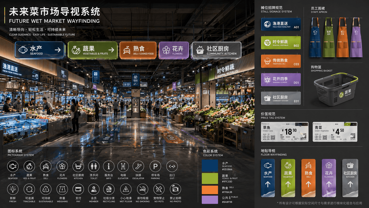
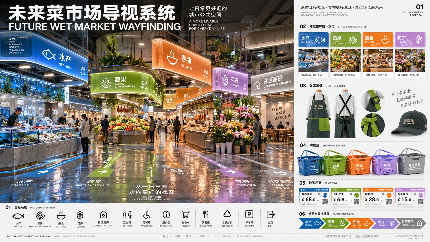
"FUTURE WET MARKET WAYFINDING" là một bộ đề xuất nhận diện trực quan không gian công cộng hoàn chỉnh. Hình ảnh chính là phối cảnh của sảnh chợ truyền thống tương lai đã được cải tạo. Một bảng chỉ dẫn phát sáng dạng mô-đun được treo ở phía trên. Các phân khu bao gồm "aquatic products/fruits and vegetables/delicatessen/flowers/community kitchen". Hệ thống màu sắc tương ứng với xanh biển sâu, xanh vàng, cam ấm và tím lavender. Một hệ thống biểu tượng tượng hình được đặt ở góc dưới bên trái, phía bên phải là bản vẽ mở rộng các quy cách thống nhất cho biển hiệu quầy hàng, tạp dề nhân viên, giỏ mua sắm, thẻ giá và nhãn dán sàn. Bố cục tiêu đề giống như một hồ sơ dự thầu của viện thiết kế. Thiết kế tổng thể mang lại cảm giác đời sống sinh hoạt kết hợp với thiết kế công cộng cao cấp. Vật liệu nhấn mạnh vào acrylic mờ, kim loại tái chế và sự phản chiếu của sàn ướt, tỷ lệ 16:9.
Hình ảnh mẫu
Ví dụ về bố cục và phong cách được tạo bằng công cụ hình ảnh tích hợp.
Hướng dẫn sử dụng
Hướng dẫn này hiện được cung cấp bằng tiếng Anh.
A public-market wayfinding proposal that links an environmental view to a reusable graphic system. Colors, pictograms, signs, and everyday objects should describe the same set of zones.
When to use
Spatial-branding concepts, design presentation boards, and early wayfinding-system studies. Use the perspective view to show context and the side modules to explain repeatable rules.
What the existing example shows
The example combines a large market-hall perspective on the left with sign, apron, basket, and label applications on the right. The source names five zones but supplies only four zone colors, which needs resolving in a complete system.
Suggested setup
- Aspect ratio
- 16:9 · Give roughly two-thirds of the board to the hall and one-third to system applications. Keep the same zone names and color mapping in both areas.
- Reference images
- Recommended if this is for a real space: a floor plan and current signage photos help define routes and mounting positions. The generated board is an early visual proposal.
What to customize
- Market identityNeighborhood Fresh Market / 邻里鲜集
- Use one bilingual name consistently across title, entrance sign, uniforms, and labels.
- Zone mappingSeafood blue, produce green, cooked food orange, flowers violet, kitchen teal
- Assign a distinct color to every named zone, then repeat the exact mapping in all applications.
- ApplicationsOverhead sign, stall sign, apron, basket, and price tag
- Choose a few representative items and keep pictograms and typography consistent rather than generating unrelated mockups.
View a complete adaptation
Neighborhood Fresh Market wayfinding
A complete five-zone color system that resolves the source prompt's missing fifth color.
This adaptation has not been generated. The existing image belongs to the original illustration record.
Design a 16:9 presentation board for a fictional public market named "邻里鲜集 / NEIGHBORHOOD FRESH MARKET". The left two-thirds show a bright renovated market hall with suspended modular wayfinding signs. The right third shows aligned examples of an overhead sign, stall sign, staff apron, shopping basket, and price tag. Use exactly one consistent five-zone system: 水产 / Seafood in deep blue, 蔬果 / Produce in yellow-green, 熟食 / Cooked Food in warm orange, 花卉 / Flowers in violet, and 社区厨房 / Community Kitchen in teal. Pair every color with a distinct pictogram and short text label. Use frosted acrylic, recycled-looking metal, restrained floor reflections, and clean architectural-presentation typography. Keep the legend readable and repeat the same zone mapping on all applications. Avoid dense paragraphs or unrelated logos.
Troubleshooting
- Colors or names change between applications
- Write the five-zone mapping once as a compact specification, then explicitly require every module to reuse it.
- The perspective is attractive but the system cannot be understood
- Enlarge the side legend and reduce mockup count; keep each pictogram paired with a readable zone name.
Editorial notes and generation record
AI-assisted editorial analysis of the source prompt and existing illustration. Settings are starting suggestions; the new adaptation is not a model test.
The existing illustration was generated with the built-in image tool. Its provider model is not disclosed. Actual image size: 1672 × 941.
Original illustration input
Create one finished image illustrating this image prompt.
Aspect ratio: 16:9.
“未来菜市场导视系统”/“FUTURE WET MARKET WAYFINDING”,一套完整的公共空间视觉识别提案,主画面为改造后的未来感菜市场大厅透视图,顶部悬挂模块化发光导视牌,分区包括“水产/蔬果/熟食/花卉/社区厨房”,色彩系统分别对应深海蓝、黄绿、暖橙、淡紫,左下角放置 pictogram 图标系统,右侧是摊位招牌统一规范、员工围裙、购物篮、价签与地贴的展开图,标题排版像设计院竞标提案,整体兼具生活气和高级公共设计感,材质强调磨砂亚克力、回收金属、潮湿地面的反光,比例 16:9。
Chi tiết prompt
- Danh mục
- Logo và thương hiệu
- Mô hình
- GPT IMAGE 2
- Chi phí mỗi ảnh
- 1K: 43 tín dụng · 2K: 86 tín dụng · 4K: 143 tín dụng
- Tỷ lệ khung hình
- 16:9
- Ngày thêm
- Cập nhật