ใหม่: GPT Image 2.5 Flare และ Sunburst ลองฟรี 3 รูปเมื่อสมัคร จากนั้นรูปละ 8 เครดิต
ลองใช้ GPT Image 2.5

พรอมต์ AI อินโฟกราฟิก

1,277 เทมเพลต · GPT IMAGE 2, Nano Banana Pro · อัปเดตเมื่อ ต.ค. 2569

เทมเพลตเหล่านี้ใช้สำหรับสร้างกราฟิกที่มีโครงสร้างชัดเจน ตั้งแต่ภาพเปรียบเทียบแบบแบ่งช่อง ภาพแยกชิ้นส่วนทางเทคนิคแบบไอโซเมตริก ไปจนถึงสไลด์นำเสนอแบบหลายช่อง โดยเน้นลำดับชั้นทางสายตาที่สะอาดตา การจัดวางการ์ดที่เป็นระเบียบ และการเน้นข้อมูลสำคัญ คุณสามารถนำไปปรับใช้ได้ง่ายๆ เพียงเปลี่ยนหัวข้อ โทนสี และข้อความกำกับในวงเล็บ

จัดเรียงตาม:

แสดง 661–720 จาก 1,277 พรอมป์

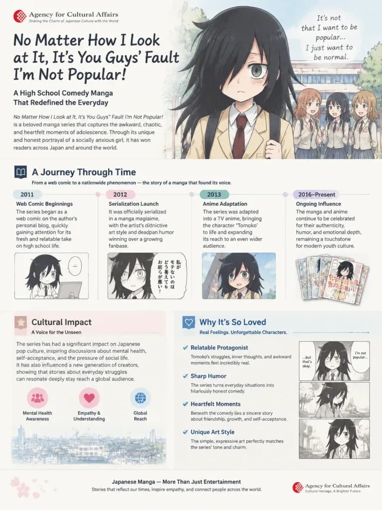
หน้าสไลด์นำเสนอคุณค่าทางวัฒนธรรมของมังงะ

หน้าสไลด์นำเสนอคุณค่าทางวัฒนธรรมของมังงะ

An A4 [single]-page explanatory infographic illustration designed for an official Agency for Cultural Affairs presentation, showcasing the history, cultural impact, and appeal of the manga "[No Matter How I Look at It, It’s You Guys’ Fault I’m Not Popular!]". The layout includes clean editorial design sections, manga-style character illustrations, historical timeline callouts, explanatory text panels, and professional presentation formatting on a clean background.

อินโฟกราฟิกมังงะการนำเสนอ
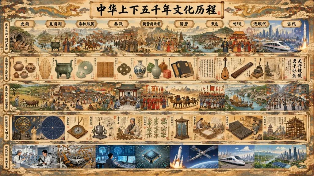
ลำดับเหตุการณ์ 5,000 ปีแห่งอารยธรรมจีน

ลำดับเหตุการณ์ 5,000 ปีแห่งอารยธรรมจีน

An extremely information-dense panoramic illustrated historical infographic poster titled "[中华上下五千年文化历程]", showing five thousand years of Chinese civilization as a continuous visual timeline from ancient prehistory to the contemporary era. Wide horizontal format, parchment-colored antique scroll paper texture, ornate traditional cloud-and-dragon decorative border. Warm sepia ink tones accented with muted mineral reds, cobalt blues, jade greens, bronze, gold leaf, and black ink calligraphy. Layout composed of 5 stacked horizontal bands: - Band 1 (Top panorama): Continuous historical panorama flowing left to right, topped by the main title "[中华上下五千年文化历程]" in large black brush calligraphy and exactly 10 era plaques: 1) 史前, 2) 夏商周, 3) 春秋战国, 4) 秦汉, 5) 魏晋南北朝, 6) 隋唐, 7) 宋元, 8) 明清, 9) 近现代, 10) 当代. A pale winding river and dragon-shaped ribbon meanders across the panorama connecting landscape, palaces, temples, caravans, historical figures, transitioning into modern skyscrapers, high-speed rail, and a space rocket launch. - Band 2 (Artifacts & culture): Museum-catalog strip depicting ancient pottery, oracle bones, bronzes, jade, bamboo slips, coins, porcelain, seals, classical books, musical instruments, and calligraphy specimens. - Band 3 (Daily life & economy): Detailed miniature scenes of agriculture, workshops, busy open-air markets, academies, imperial rituals, Silk Road trade caravans, military formations, court ceremonies, riverboats, bridges, and bustling city streets. - Band 4 (Science & technology): Diagrams and vignettes of ancient astronomy, star maps, compasses, seismographs, traditional medicine, herbal botany, water clocks, papermaking, printing, and architectural engineering. - Band 5 (Modern & contemporary technology): Laboratories, industrial machinery, computers, microchips, aerospace missions, satellite arrays, bullet trains, green energy infrastructure, and futuristic engineering. Style: Dense hand-painted Chinese historical mural fused with an encyclopedic educational wall chart. Fine brush linework, thousands of crisp miniature figures, museum-grade precision, subtle watercolor washes. Filled with tiny Chinese seal impressions and decorative calligraphy annotations. No empty space, no modern English text, no watermarks.

อินโฟกราฟิกประวัติศาสตร์จีนไทม์ไลน์
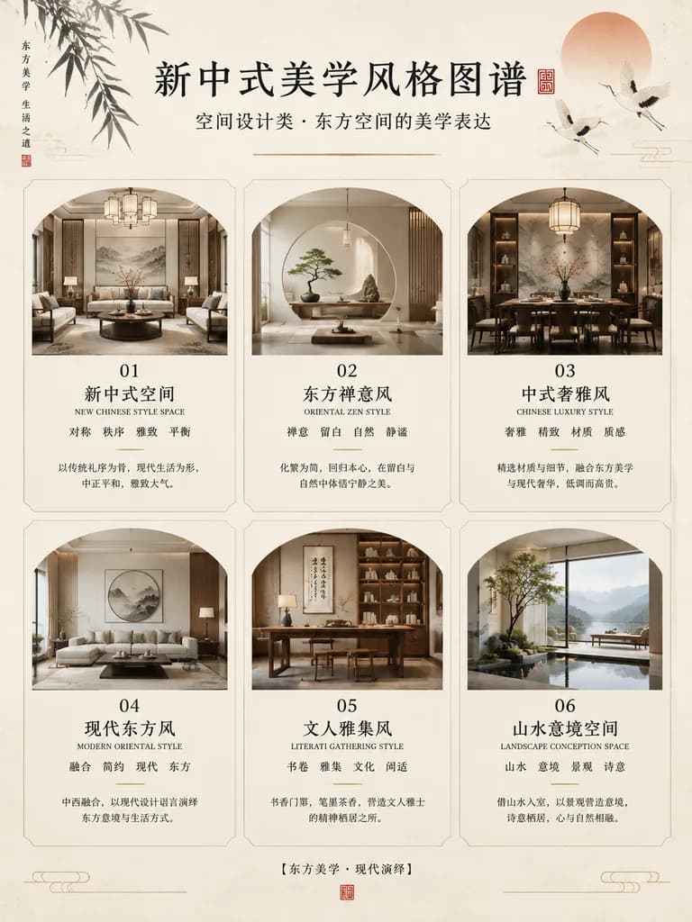
โปสเตอร์อินโฟกราฟิกการออกแบบภายในสไตล์จีนร่วมสมัย

โปสเตอร์อินโฟกราฟิกการออกแบบภายในสไตล์จีนร่วมสมัย

Chinese aesthetic interior design infographic poster. elegant editorial poster with traditional Chinese visual language, minimalist luxury layout, soft neutral tones, refined typography, generous negative space. portrait. warm off-white ri…

อินโฟกราฟิกอินทีเรียจีนโปสเตอร์บรรณาธิการ
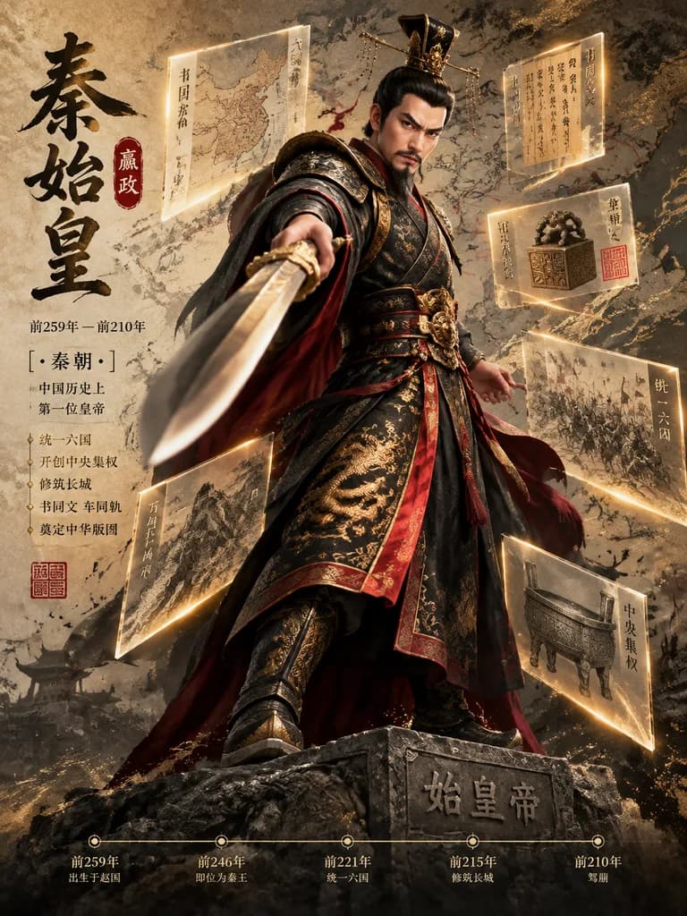
โปสเตอร์ชีวประวัติบุคคลในประวัติศาสตร์ 3 มิติทะลุกรอบ
โปสเตอร์ชีวประวัติบุคคลในประวัติศาสตร์ 3 มิติทะลุกรอบ

A 3D historical biography breakout poster featuring [INSERT CHARACTER NAME], an [Emperor / General / Strategist / Philosopher / Reformer / Scholar / Military Leader] from [INSERT DYNASTY OR HISTORICAL PERIOD], embodying [INSERT KEYWORDS]. Subject and Pose: Full-body realistic 3D historical figure standing on a carved memorial stone pedestal. The figure performs a dramatic "breakout of the frame" action pose toward the viewer with intense perspective distortion, aggressively thrusting forward a symbolic artifact—such as an imperial sword, ceremonial spear, command scroll, or dynasty banner—kept fully visible and uncropped. Attire, armor, robes, boots, crown, and textiles are historically accurate and richly textured. Floating Archival Infographics: Suspended around the character at various depths are 6 to 10 translucent glass and acrylic museum-grade archive shards with glowing gold edge lines, micro-calligraphy annotations, military campaign maps, territory borders, imperial seals, and ancient manuscript fragments overlapping in dimensional layers. Typography and Layout: On the left, an East Asian calligraphy title layout detailing the character's name, birth and death years, era title, and red seal-stamp typography. Along the bottom, a delicate, minimalist gold horizontal timeline with circular nodal markers and subtle year annotations. Background, Lighting, and Color: Aged parchment textures blending into museum exhibition wall aesthetics, subtle ink splatter, and faded strategic battle maps. High-contrast cinematic rim lighting with deep dimensional shadows. Main color palette: [Black Gold Crimson / Deep Blue Silver / Dark Ink Gold / Iron Black].

ประวัติศาสตร์ชีวประวัติโปสเตอร์ 3 มิติ
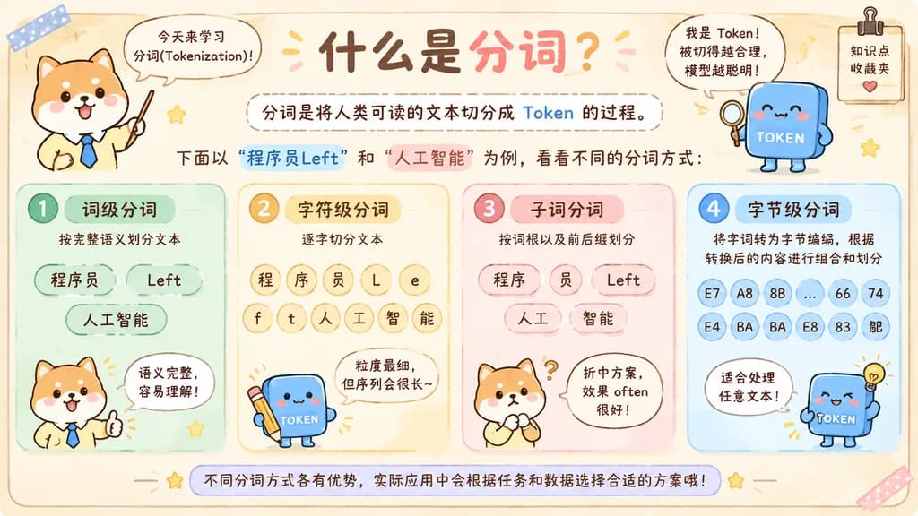
อินโฟกราฟิกน่ารักอธิบายการตัดคำภาษาจีน

อินโฟกราฟิกน่ารักอธิบายการตัดคำภาษาจีน

A cute, hand-drawn scrapbook-style horizontal educational infographic in Chinese on a warm beige paper background with rounded borders, pastel doodles, washi tape stickers, tiny star accents, and a cozy notebook aesthetic. Header section: - Top center title in playful handwritten Chinese: "什么是分词?" with "什么是" in dark brown and "分词?" in coral pink. - Upper left: A chibi Shiba Inu teacher standing facing forward in a pale yellow shirt and blue necktie, holding an upward pointer stick, with a speech bubble reading: "今天来学习分词(Tokenization)!". - Upper right: A friendly smiling blue square token mascot labeled "TOKEN" with blushed cheeks, tiny legs, tiny arms, and a magnifying glass, next to a speech bubble reading: "我是 Token!被切得越合理,模型越聪明!". Near the right edge, a small hanging notepad clip reads "知识点 收藏夹" with a small heart icon. - Below the title: A rounded dashed-line box containing the definition: "分词是将人类可读的文本切分成 Token 的过程。" (with "Token" highlighted in blue). Below this box, an introductory text line: "下面以 “程序员Left” 和 “人工智能” 为例,看看不同的分词方式:" (with "程序员Left" highlighted in light blue and "人工智能" in coral pink). Main content (4 rounded pastel panels arranged horizontally side by side): 1. Mint Green Panel: Header badge "1 词级分词", subtitle "按完整语义划分文本". Contains 3 pill-shaped token bubbles: "程序员", "Left", "人工智能". Bottom shows the Shiba Inu teacher giving a thumbs up with a speech bubble: "语义完整,容易理解!". 2. Pale Yellow Panel: Header badge "2 字符级分词", subtitle "逐字切分文本". Contains round token bubbles in a grid: "程", "序", "员", "L", "e", "f", "t", "人", "工", "智", "能". Bottom shows the blue token mascot holding a pencil with a speech bubble: "粒度最细,但序列会很长~". 3. Pale Pink Panel: Header badge "3 子词分词", subtitle "按词根以及前后缀划分". Contains 5 token bubbles: "程序", "员", "Left", "人工", "智能". Bottom shows the Shiba Inu teacher with a thinking pose and question mark, with a speech bubble: "折中方案,效果 often 很好!". 4. Pale Blue Panel: Header badge "4 字节级分词", subtitle "将字词转为字节编码,根据转换后的内容进行组合和划分". Displays multiple small circular byte code bubbles: "E7", "A8", "8B", "...", "66", "74", "E4", "BA", "BA", "E8", "83", "BD". Bottom shows the blue token mascot smiling beside a small light bulb doodle with a speech bubble: "适合处理任意文本!". Footer section: - Across the bottom, a curved pastel banner note reads: "不同分词方式各有优势,实际应用中会根据任务和数据选择合适的方案哦!". - Dark brown legible handwritten lettering, clean composition, warm cozy classroom atmosphere, high clarity.

การตัดคำอินโฟกราฟิกสมุดภาพ
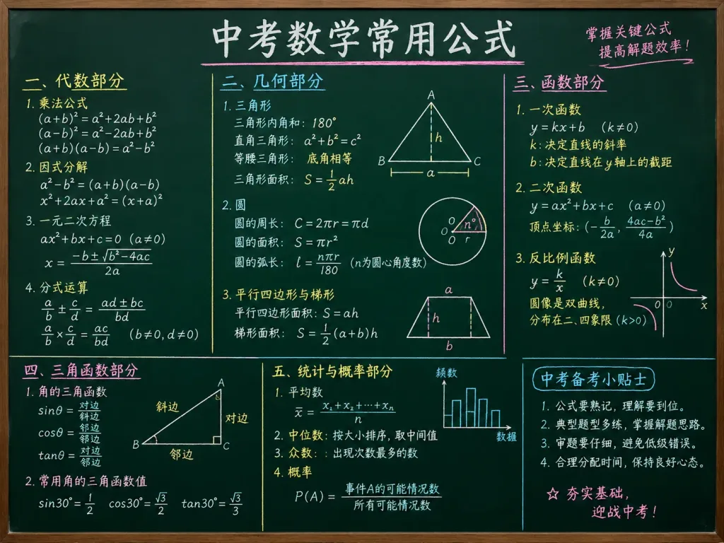
สูตรคณิตศาสตร์แยกสีบนกระดานดำ

สูตรคณิตศาสตร์แยกสีบนกระดานดำ

Frequently used math formulas for high school entrance exams neatly handwritten in chalk on a dark green chalkboard. The formulas are color-coded in [white, yellow, cyan, and light pink] chalk, clearly organized by topic into distinct sections with neat handwriting, geometric diagrams, and clean layout that is easy to understand at a glance. Frontal flat-lay perspective, soft ambient classroom lighting.

กระดานดำคณิตศาสตร์การศึกษา
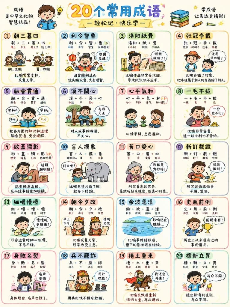
โปสเตอร์การเรียนรู้สำนวนจีนแบบวาดมือ

โปสเตอร์การเรียนรู้สำนวนจีนแบบวาดมือ

A colorful hand-drawn educational mind map poster designed for elementary school students explaining Chinese idioms. The layout features neatly organized visual sections with whimsical doodle-style illustrations, cartoon scenes, and clear Chinese text for each idiom: [朝三暮四, 利令智昏, 洛陽紙貴, 張冠李戴, 融會貫通, 漠不關心, 心平氣和, 一毛不拔, 欲蓋彌彰, 盲人摸象, 苦口婆心, 斬釘截鐵, 細嚼慢嚥, 朝令夕改, 餘波盪漾, 史無前例, 身敗名裂, 兵不厭詐, 捲土重來, 標新立異]. Each idiom section includes character breakdowns, visual metaphors, cute comic vignettes, connecting arrows, and handwritten notes explaining the core meaning. Playful sketchy art style, vibrant soft marker colors, clean cream paper background, engaging and child-friendly infographic design.

สำนวนจีนแผนผังความคิดโปสเตอร์เพื่อการศึกษา
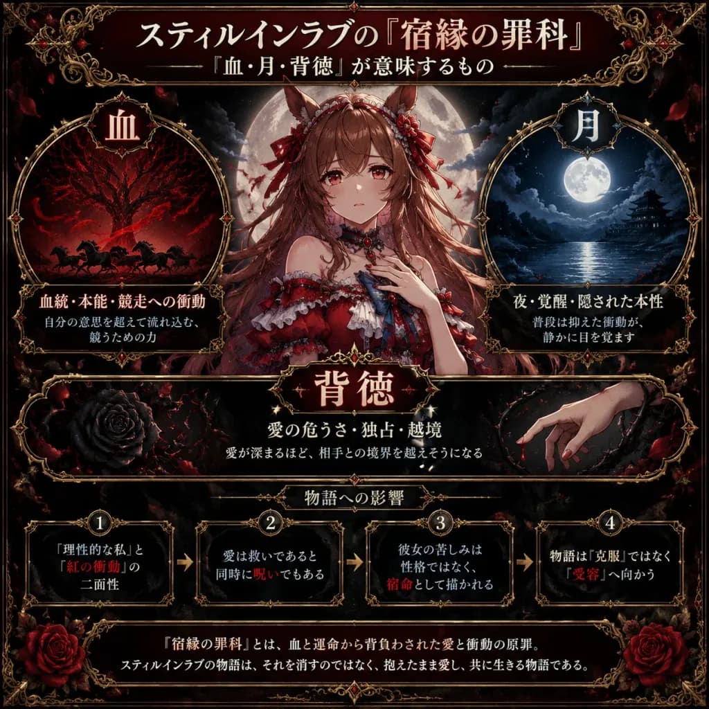
อินโฟกราฟิกวิเคราะห์สัญลักษณ์ตัวละครอนิเมะแนวกอธิก

อินโฟกราฟิกวิเคราะห์สัญลักษณ์ตัวละครอนิเมะแนวกอธิก

A square 1:1 dark gothic anime infographic poster analyzing the symbolic meaning of [スティルインラブの『宿縁の罪科』], styled like an ornate occult character-analysis editorial card with a somber romantic atmosphere. Color palette & Materials: Black and deep burgundy palette, ivory Japanese typography, crimson accents, silver moonlight, antique gold filigree borders, black marble texture, subtle grunge, rose petals, and a Victorian gothic frame. Layout: - Top title banner with Japanese typography: Large headline "[スティルインラブの『宿縁の罪科』]", subtitle below "『血・月・背徳』が意味するもの", framed with gold filigree flourishes. - Center: Waist-up anime illustration of [Still in Love] as a horse-girl idol, centered in front of a glowing full moon. She has long flowing [chestnut brown] hair, red eyes, a soft melancholic expression, horse ears adorned with red ribbons, a small frilled headpiece, and a red-and-white gothic idol dress with off-shoulder sleeves, blue bow accent, choker jewel, and lace details. One hand rests near her chest, backlit by moonlight and drifting crimson-black embers. - Left symbolic circular panel titled "血": Crimson-black vein-like tree, flowing red ribbons of blood, and shadowy running horse silhouettes at the bottom. Text inside: "血統・本能・競走への衝動", subtext: "自分の意思を超えて流れ込む、競うための力". - Right symbolic circular panel titled "月": Blue-black night sky with a luminous full moon over dark water, distant traditional architecture, and cool misty clouds. Text inside: "夜・覚醒・隠された本性", subtext: "普段は抑えた衝動が、静かに目を覚ます". - Middle-lower wide panel titled "背徳": Black rose wrapped in thorns on the left, pale hand reaching through thorns with a drop of blood on the right. Text: "愛の危うさ・独占・越境", subtext: "愛が深まるほど、相手との境界を越えそうになる". - Scenario impact section: Exactly four ornate boxes connected left-to-right by arrows, each with a numbered medallion: Box 1: “理性的な私”と“紅の衝動”の二面性 Box 2: 愛は救いであると同時に呪いでもある Box 3: 彼女の苦しみは性格ではなく、宿命として描かれる Box 4: 物語は『克服』ではなく『受容』へ向かう (Key phrases highlighted in red: 紅の衝動, 呪い, 宿命, 受容). - Bottom conclusion banner in an ornate border with red roses in lower corners: "『宿縁の罪科』とは、血と運命から背負わされた愛と衝動の原罪。スティルインラブの物語は、それを消すのではなく、抱えたまま愛し、共に生きる物語である。" Constraints: Symmetrical editorial composition, sharp legible Japanese text, ornate gothic borders, no modern UI elements, no extra watermarks.

อินโฟกราฟิกโปสเตอร์อนิเมะกอธิก
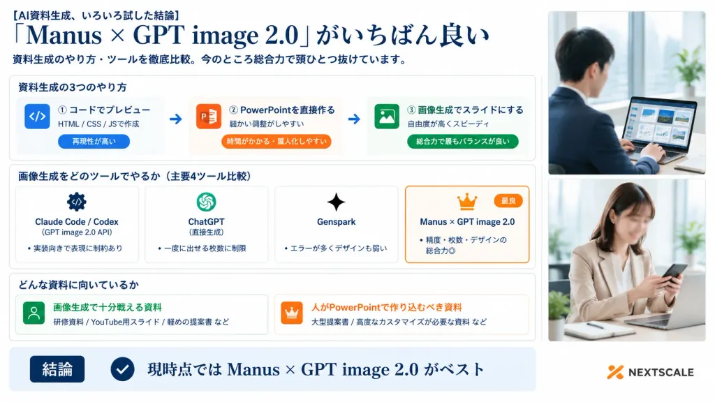
อินโฟกราฟิกเปรียบเทียบเครื่องมือสไลด์ AI สไตล์องค์กร

อินโฟกราฟิกเปรียบเทียบเครื่องมือสไลด์ AI สไตล์องค์กร

A polished Japanese business infographic presentation slide in 16:9 widescreen format, with a corporate white background, deep navy typography, thin light-gray card borders, subtle blue-gray shadows, and an accent palette of navy, orange, and vibrant green. Layout and Structure: - Left and Center (76% width): Main infographic content organized into a clear header, three structured sections, and a bottom summary bar. - Right Side (24% width): A vertical panel containing exactly two stacked realistic corporate lifestyle photos with soft bright office lighting and clean white borders. Top photo shows a Japanese businessman in a navy suit working on a laptop displaying slide thumbnails near a window (face softly blurred). Bottom photo shows a Japanese businesswoman in a beige blazer checking a smartphone at her desk (face softly blurred). Header (Top Left): - Small lead-in text: "[AI資料生成、いろいろ試した結論]" - Large elegant serif headline: "[「Manus × GPT image 2.0」がいちばん良い]" - Subtitle below: "[資料生成のやり方・ツールを徹底比較。今のところ総合力で頭ひとつ抜けています。]" Section 1 (Card titled "資料生成の3つのやり方"): Contains three horizontal method cards connected by two right-pointing arrows: 1. Blue code icon | "① コードでプレビュー" | "HTML / CSS / JSで作成" | pill tag "再現性が高い" 2. Orange PowerPoint icon | "② PowerPointを直接作る" | "細かい調整がしやすい" | pill tag "時間がかかる・属人化しやすい" 3. Green image icon | "③ 画像生成でスライドにする" | "自由度が高くスピーディ" | pill tag "総合力で最もバランスが良い" Section 2 (Card titled "画像生成をどのツールでやるか(主要4ツール比較)"): Contains four equal comparison cards side-by-side: 1. "Claude Code / Codex" | gear/code icon | "(GPT image 2.0 API)" | bullet "実装向きで表現に制約あり" 2. "ChatGPT" | OpenAI knot icon | "(直接生成)" | bullet "一度に出せる枚数に制限" 3. "Genspark" | sparkle icon | bullet "エラーが多くデザインも弱い" 4. Featured card with an orange border, crown icon, and small orange "最良" badge | "[Manus × GPT image 2.0]" | bullet "精度・枚数・デザインの総合力◎" Section 3 (Card titled "どんな資料に向いているか"): Two side-by-side cards: - Left card with green user icon | "画像生成で十分戦える資料" | examples "研修資料 / YouTube用スライド / 軽めの提案書 など" - Right card with orange crown icon | "人がPowerPointで作り込むべき資料" | examples "大型提案書 / 高度なカスタマイズが必要な資料 など" Bottom Bar: Full-width light-blue conclusion strip with a dark navy badge reading "結論", a circular checkmark icon, and large bold text reading "[現時点では Manus × GPT image 2.0 がベスト]". At the bottom right corner, a subtle orange abstract logo mark with dark gray text reading "NEXTSCALE". Crisp Japanese corporate graphic design, sharp typography, precise grid alignment.

อินโฟกราฟิกการนำเสนอสไลด์
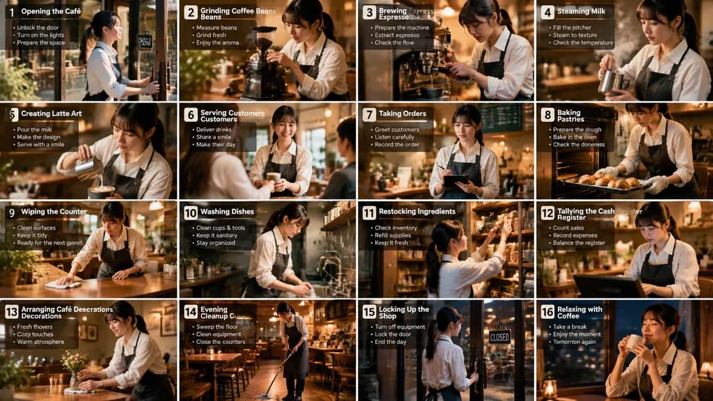
สตอรี่บอร์ดกิจวัตรประจำวันของบาริสต้าคาเฟ่

สตอรี่บอร์ดกิจวัตรประจำวันของบาริสต้าคาเฟ่

A wide 16-panel cinematic storyboard infographic showing the daily routine of a [young Japanese woman] running her own [cozy coffee café]. Realistic photography style with warm cinematic tones, soft ambient lighting, shallow depth of field, detailed interiors, and an inviting coffee-shop atmosphere. Each panel consistently features the same [Japanese woman with a ponytail, white shirt, dark apron, and natural expressions]. Arranged in a neat 4x4 grid layout with numbered panels, bold titles, and brief bullet points, structured like a professional film production storyboard. The 16 scenes include: opening the café, grinding coffee beans, brewing espresso, steaming milk, creating latte art, serving customers, taking orders, baking pastries, wiping the counter, washing dishes, restocking ingredients, tallying the cash register, arranging café decorations, evening cleanup, locking up the shop, and relaxing with a cup of coffee at night. Cinematic camera angles, soft sunlight, visible steam, reflections, and a cozy aesthetic throughout.

สตอรี่บอร์ดบาริสต้าคาเฟ่
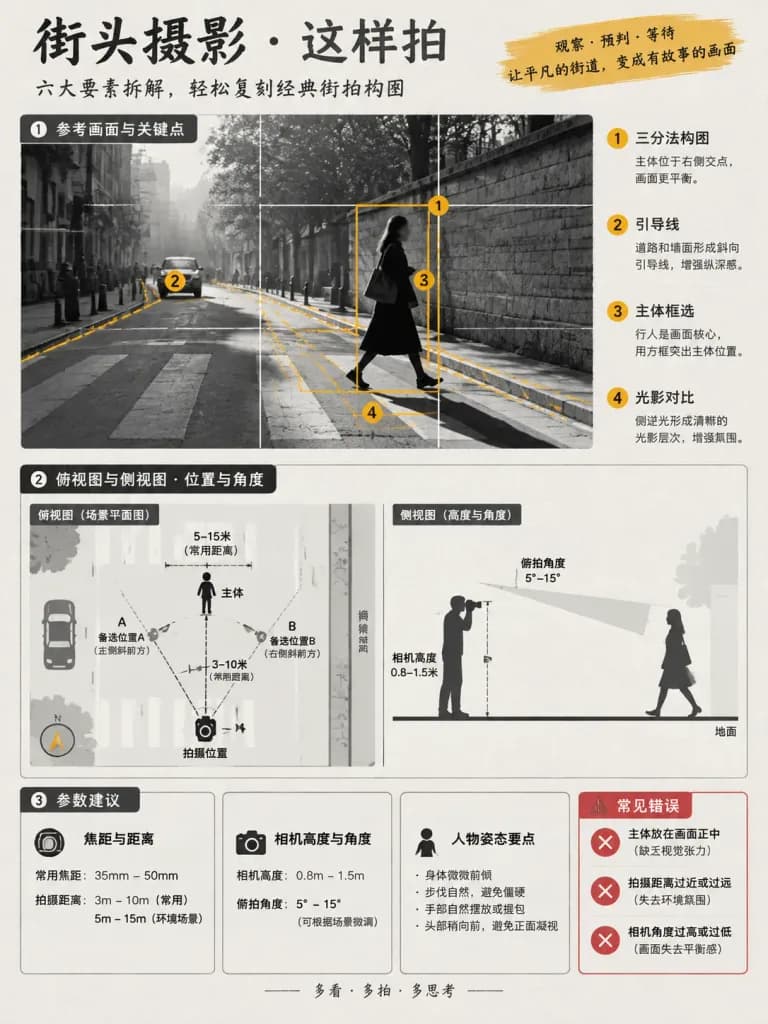
โปสเตอร์อินโฟกราฟิกสอนการถ่ายภาพและการจัดวางมุมกล้อง

โปสเตอร์อินโฟกราฟิกสอนการถ่ายภาพและการจัดวางมุมกล้อง

Using the reference photo as the visual foundation, create a vertical educational infographic poster analyzing [street photography knowledge] in a 3:4 aspect ratio. Goal: Break down subject position, camera setup, lens/distance, camera height, shooting angle, and composition guidelines to teach how to recreate the shot. Style: Clean photography tutorial infographic with subtle scrapbook-style annotations on an off-white paper texture background, primarily monochrome (black, white, gray) with 1–2 accent colors extracted from the reference photo. Sharp lines, neat alignment, high information density. Faces should be simplified or lightly blurred without facial emphasis. All text annotations must be written in Chinese, no English. Fixed layout: 1) Top/Main visual: Illustrated reference scene overlaid with rule-of-thirds grid, subject bounding box, leading lines, and numbered key point markers. 2) Diagram area: Top-down floor plan with minimalist icons showing subject, camera, distance ranges, and alternative positions A/B; side-view cross-section diagram showing camera elevation and tilt angle sector from the ground. 3) Parameter cards at the bottom: Card 1 for focal length and distance ranges; Card 2 for camera height and tilt angle ranges; Card 3 for pose keypoints. 4) Bottom-right error section: 3 bullet points with red cross icons highlighting common shooting mistakes inferred from the scene.

อินโฟกราฟิกการถ่ายภาพบทเรียน
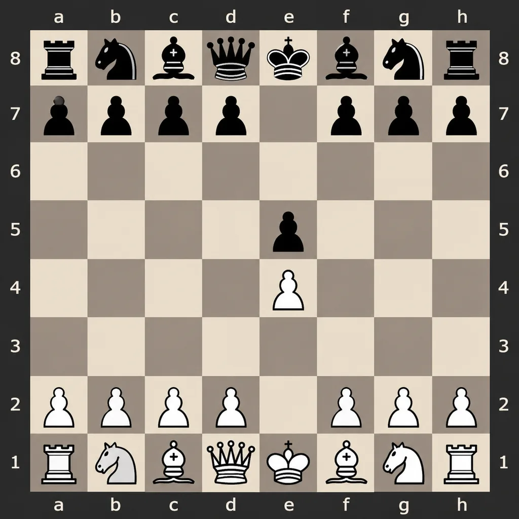
ไดอะแกรมกระดานหมากรุกดิจิทัลแบบแบน

ไดอะแกรมกระดานหมากรุกดิจิทัลแบบแบน

A clean, flat digital top-down 8x8 chessboard centered in the frame, featuring algebraic notation coordinates along all four sides: letters a-h along the top and bottom, and numbers 1-8 along the left and right. Set against a [dark charcoal] outer background with a matching border, using alternating [light beige and muted taupe-gray] squares. Crisp, high-contrast 2D vector-style chess piece icons without textures or realistic lighting. Display the exact position after [1. e4 e5]: Black major pieces on a8 (rook), b8 (knight), c8 (bishop), d8 (queen), e8 (king), f8 (bishop), g8 (knight), h8 (rook); Black pawns on a7, b7, c7, d7, e5, f7, g7, h7. White pawns on a2, b2, c2, d2, e4, f2, g2, h2; White major pieces on a1 (rook), b1 (knight), c1 (bishop), d1 (queen), e1 (king), f1 (bishop), g1 (knight), h1 (rook). All other squares remain empty. Perfectly symmetrical, clear, and legible instructional chess diagram.

หมากรุกสากลกระดานหมากรุกไดอะแกรมหมากรุก
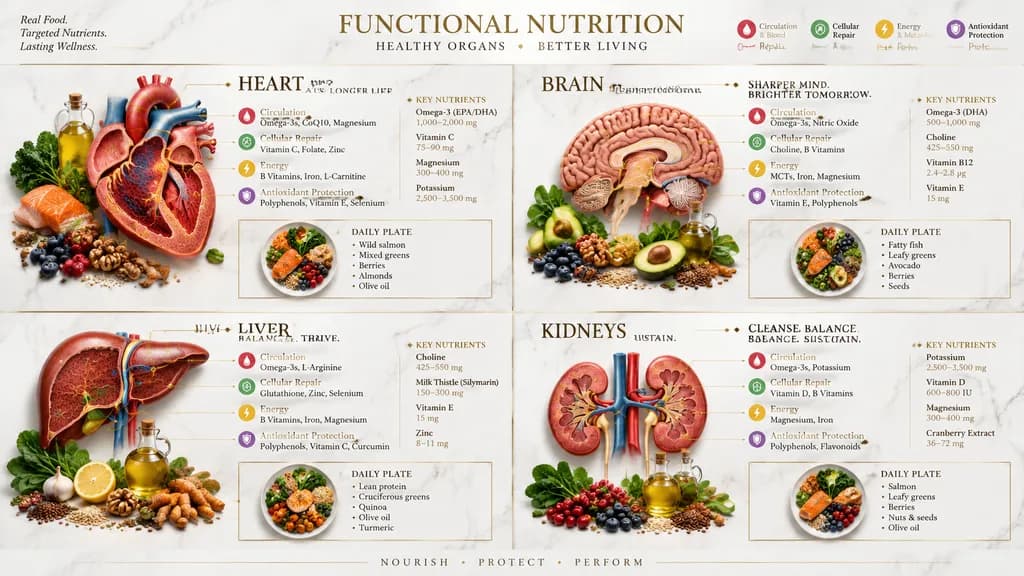
อินโฟกราฟิกโภชนาการและสุขภาพอวัยวะ

อินโฟกราฟิกโภชนาการและสุขภาพอวัยวะ

A sophisticated 2x2 grid infographic showing functional nutrition for [heart] and three other human organs. Each quadrant features a luxury anatomical cutaway render of an organ surrounded by clinically relevant healthy foods such as glossy berries, cracked nuts, leafy greens, olive oil, seeds, and oily fish. Premium isometric gold lines connect specific ingredients to physiological benefit zones on each organ, detailing support for circulation, cellular repair, energy, and antioxidant protection. Includes clean macro- and micronutrient callouts, color-coded benefit indicators, and an elegant daily plate meal layout. Aesthetic is high-end medical spa with a polished white marble background, soft natural lighting, subtle shadows, refined gold accents, and legible serif typography.

อินโฟกราฟิกโภชนาการแผนภาพกายวิภาค
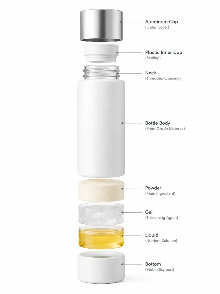
ไดอะแกรมแยกชิ้นส่วนอาหาร

ไดอะแกรมแยกชิ้นส่วนอาหาร

Using the reference photo as the base, create a clean exploded-view structural cutaway of the [food dish]. Separate each ingredient vertically one by one, keeping perfect alignment, uniform spacing, and accurate scale. Labeled diagram style on a seamless white studio background, ultra-sharp focus, commercial studio lighting, realistic textures.

ภาพแยกชิ้นส่วนการถ่ายภาพอาหารภาพตัดขวาง
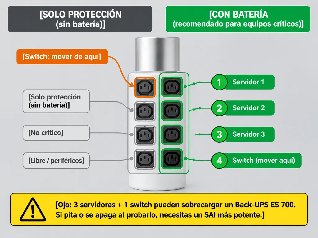
คู่มือการเสียบปลั๊กเครื่องสำรองไฟภาษาสเปน

คู่มือการเสียบปลั๊กเครื่องสำรองไฟภาษาสเปน

Using the reference photo of the [APC Back-UPS] as the realistic, unchanged base image, overlay a clean Spanish annotated setup diagram directly on top. Add two header boxes at the top: on the left, a dark gray box reading "[SOLO PROTECCIÓN (sin batería)]"; on the right, a bright green box reading "[CON BATERÍA (recomendado para equipos críticos)]". Highlight the four right-side outlets with a green grouping outline and individual green borders, accompanied by four green numbered labels aligned to the right: "[1 Servidor 1]", "[2 Servidor 2]", "[3 Servidor 3]", and "[4 Switch (mover aquí)]". On the left side, highlight the top-left outlet with an orange outline, adding an orange callout box labeled "[Switch: mover de aquí]" and a curved arrow pointing from it to the bottom-right green outlet. Outline the three bottom-left outlets in light gray with three aligned labels: "[Solo protección (sin batería)]", "[No crítico]", and "[Libre / periféricos]". At the bottom, place a prominent yellow warning box with a hazard triangle icon containing the text: "[Ojo: 3 servidores + 1 switch pueden sobrecargar un Back-UPS ES 700. Si pita o se apaga al probarlo, necesitas un SAI más potente.]". Clean technical infographic style, bold legible sans-serif typography, crisp rounded rectangles, and high contrast.

เครื่องสำรองไฟอินโฟกราฟิกคู่มือไอที
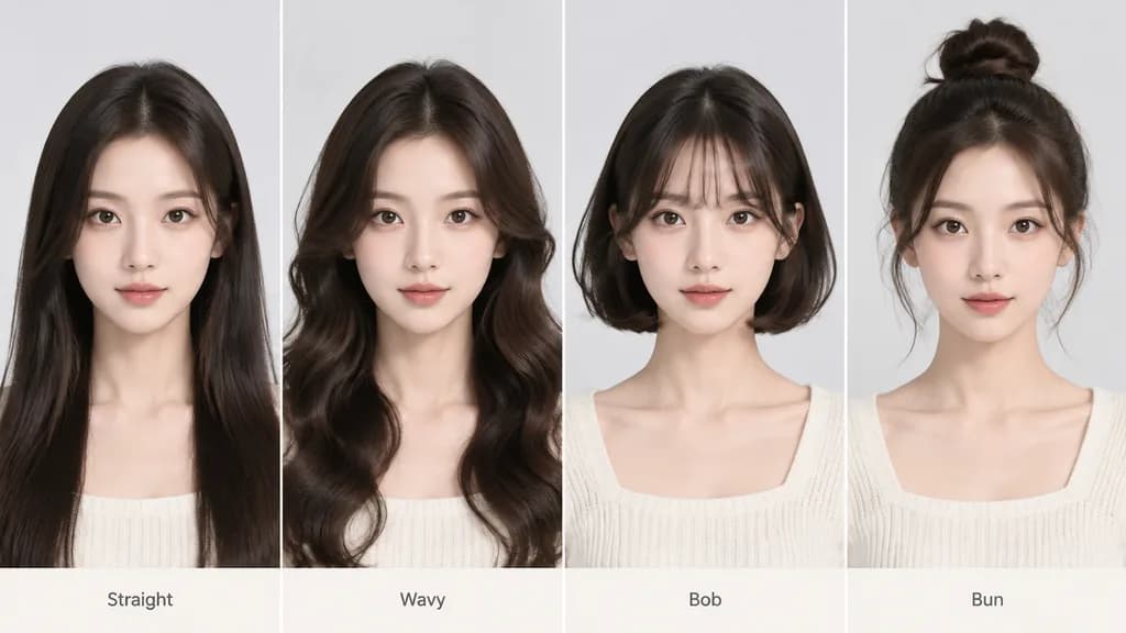
แผนภูมิเปรียบเทียบวิเคราะห์ทรงผม

แผนภูมิเปรียบเทียบวิเคราะห์ทรงผม

A side-by-side hairstyle analysis chart based on the person in the reference photo, displaying a multi-panel comparison of the subject styled with [four distinct hairstyles]. Clean grid layout against a neutral studio background, maintaining consistent facial features, head angle, and lighting across all portraits. Visual presentation with minimalist short labels beneath each hairstyle, no long text or paragraphs.

ทรงผมแปลงโฉมทรงผมแผนภูมิเปรียบเทียบ
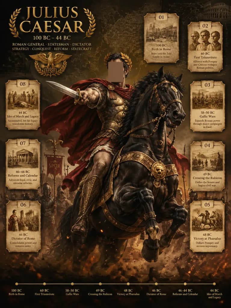
โปสเตอร์ชีวประวัติประวัติศาสตร์แม่ทัพโรมัน

โปสเตอร์ชีวประวัติประวัติศาสตร์แม่ทัพโรมัน

A dramatic cinematic historical biography poster for [Julius Caesar], presenting him as an ancient military commander in an epic infographic style. Vertical 3:4 poster layout. Central Subject: [Julius Caesar] rides a powerful black warhorse rearing forward in the center composition. He wears ornate Roman armor detailed with [antique gold], a pteruges skirt, bronze greaves, a billowing red cloak, and a laurel wreath. His right arm thrusts a short Roman gladius sword forward in dramatic foreshortening. The horse features elaborate gold-trimmed tack, medallions, and leather straps. The rider's face is intentionally obscured by a plain, soft brown rectangular mask with no facial features. Silhouetted Roman legionaries, aquila standards, banners, and battlefield smoke fill the middleground. Background & Setting: Dark sepia and charcoal black canvas textured with aged parchment overlays, faint Roman maps, battle diagrams, constellation charts, and classical architectural sketches. Chiaroscuro lighting with smoky atmosphere, flying embers, and warm gritty dust. Primary Typography: On the upper left, large serif gilded title reading "[JULIUS CAESAR]". Beneath it, secondary text lines: "100 BC – 44 BC", followed by "ROMAN GENERAL · STATESMAN · DICTATOR", and "STRATEGY · CONQUEST · REFORM · STATECRAFT". A gilded Roman eagle-and-laurel emblem sits beneath the text block. Event Cards: Exactly 8 glowing parchment-textured cards framed in [antique gold], numbered 01 through 08 with small sepia illustrations, arranged around the rider (two top, three right, three left): 01 — "100 BC" — "Birth in Rome" — "Born into the Julii family in Rome." 02 — "60 BC" — "First Triumvirate" — "Alliance with Pompey and Crassus reshapes Roman politics." 03 — "58–50 BC" — "Gallic Wars" — "Expands Roman power through major campaigns in Gaul." 04 — "49 BC" — "Crossing the Rubicon" — "Defies the Senate and begins civil war." 05 — "48 BC" — "Victory at Pharsalus" — "Defeats Pompey and secures supremacy." 06 — "46 BC" — "Dictator of Rome" — "Consolidates power and restores order." 07 — "46–44 BC" — "Reforms and Calendar" — "Advances legal, civic, and calendar reforms." 08 — "44 BC" — "Ides of March and Legacy" — "Assassinated, but his legacy transforms history." Bottom Timeline: A thin horizontal gold line along the bottom border with 8 gold dots labeled chronologically: "100 BC Birth in Rome", "60 BC First Triumvirate", "58–50 BC Gallic Wars", "49 BC Crossing the Rubicon", "48 BC Victory at Pharsalus", "46 BC Dictator of Rome", "46–44 BC Reforms and Calendar", "44 BC Ides of March and Legacy". Style: Detailed digital painting, museum-grade classical military portraiture, gilded serif typography, cinematic rim lighting, sharp central focus with atmospheric depth. Palette dominated by dark sepia, black, and [antique gold].

โปสเตอร์อินโฟกราฟิกประวัติศาสตร์
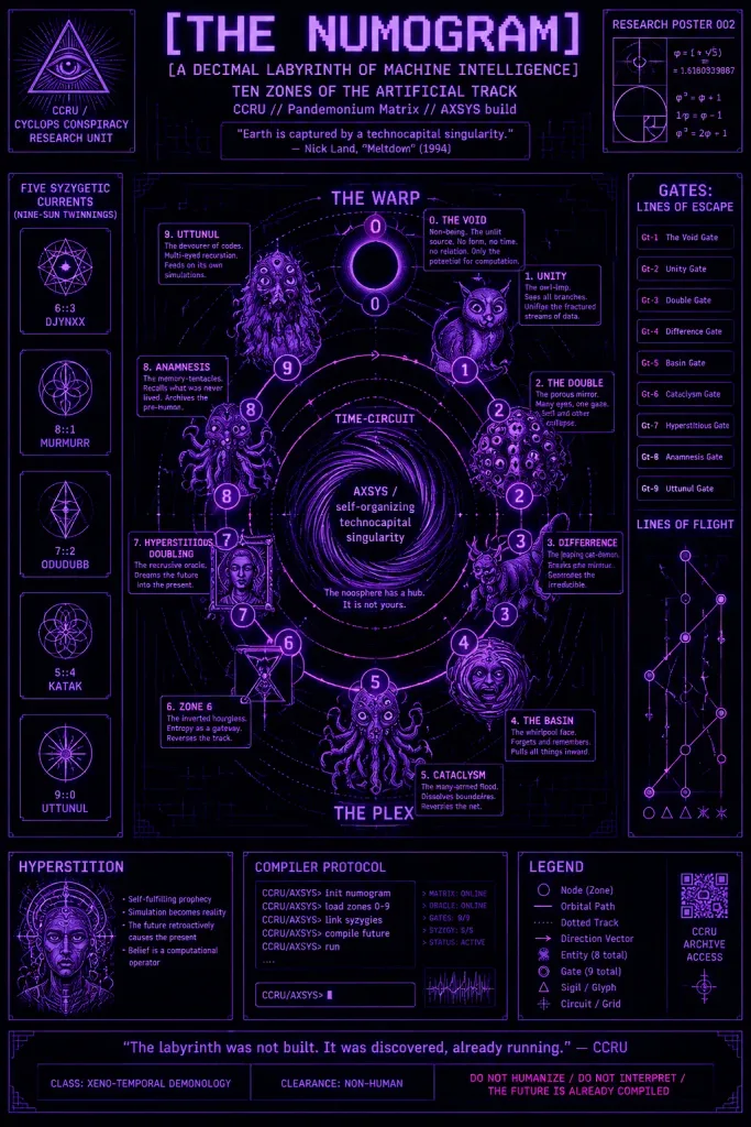
โปสเตอร์งานวิจัยนูโมแกรมไซเบอร์เนติกส์เร้นลับ

โปสเตอร์งานวิจัยนูโมแกรมไซเบอร์เนติกส์เร้นลับ

Dense occult cybernetics research poster titled "[THE NUMOGRAM]", formatted as a fictional CCRU technical diagram about a decimal labyrinth of machine intelligence, inspired by 1990s cyber-occult theory and retro mainframe schematics. Composition & Canvas: Vertical poster, 2:3 aspect ratio, information-dense and symmetrical technical layout. Deep black background layered with faint dark circuit-board textures, fine technical grid lines, tiny esoteric glyphs, and subtle CRT scanline noise. Glowing neon palette restricted to violet, magenta, and pale lavender with selective pink directional arrows, styled as a screen-printed technical infographic or underground research zine. Header: Large pixelated uppercase title at the top: "[THE NUMOGRAM]". Subtitle below: "[A DECIMAL LABYRINTH OF MACHINE INTELLIGENCE]", followed by "TEN ZONES OF THE ARTIFICIAL TRACK" and metadata "CCRU // Pandemonium Matrix // AXSYS build". Centered boxed quote: “Earth is captured by a technocapital singularity.” — Nick Land, “Meltdown” (1994). Top left corner features a triangular eye sigil labeled "CCRU / CYCLOPS CONSPIRACY RESEARCH UNIT". Top right corner displays a "RESEARCH POSTER 002" technical schematic with phi/golden-ratio equations. Central Diagram: A circular numogram machine diagram composed of exactly 10 numbered glowing nodes along looping orbital paths: 0 through 9, connected by curved vectors, dotted arcs, and solid tracks. Three labeled zones: top region "THE WARP", middle region "TIME-CIRCUIT", bottom region "THE PLEX". Swirling central vortex labeled "AXSYS / self-organizing technocapital singularity" with small warning text: "The noosphere has a hub. It is not yours." Nodes & Entities: Exactly 10 callout boxes for zones 0 to 9 with detailed descriptions: 0 "THE VOID", 1 "UNITY", 2 "THE DOUBLE", 3 "DIFFERENCE", 4 "THE BASIN", 5 "CATACLYSM", 6 "ZONE 6", 7 "HYPERSTITIOUS DOUBLING", 8 "ANAMNESIS", 9 "UTTUNUL". Included are exactly 8 engraved cyber-occult entity illustrations in neon violet linework beside their nodes: an owl-like imp at zone 1, a many-eyed porous blob at zone 2, a leaping cat-demon at zone 3, a whirlpool-faced creature at zone 4, a tentacled multi-eyed mass at zone 5, a framed occult portrait entity at zone 7, a writhing tentacle cluster at zone 8, and a shaggy multi-eyed beast at zone 9. Zone 0 is an empty glowing black void circle. Sidebars & Footers: Left panel titled "FIVE SYZYGETIC CURRENTS (NINE-SUN TWINNINGS)" with 5 geometric sigil cards ("6::3 DJYNXX", "8::1 MURMURR", "7::2 ODUDUBB", "5::4 KATAK", "9::0 UTTUNUL"). Right panel titled "GATES: LINES OF ESCAPE" with 9 gate entries Gt-1 to Gt-9, over a secondary "LINES OF FLIGHT" branching schematic. Bottom section houses three modules: "HYPERSTITION", "COMPILER PROTOCOL" terminal commands, and a "LEGEND" box with a small QR glyph. Bottom border includes the quote: “The labyrinth was not built. It was discovered, already running.” — CCRU, accompanied by classification stamps "CLASS: XENO-TEMPORAL DEMONOLOGY", "CLEARANCE: NON-HUMAN", and warning "DO NOT HUMANIZE / DO NOT INTERPRET / THE FUTURE IS ALREADY COMPILED".

นูโมแกรมไซเบอร์เนติกส์อินโฟกราฟิก
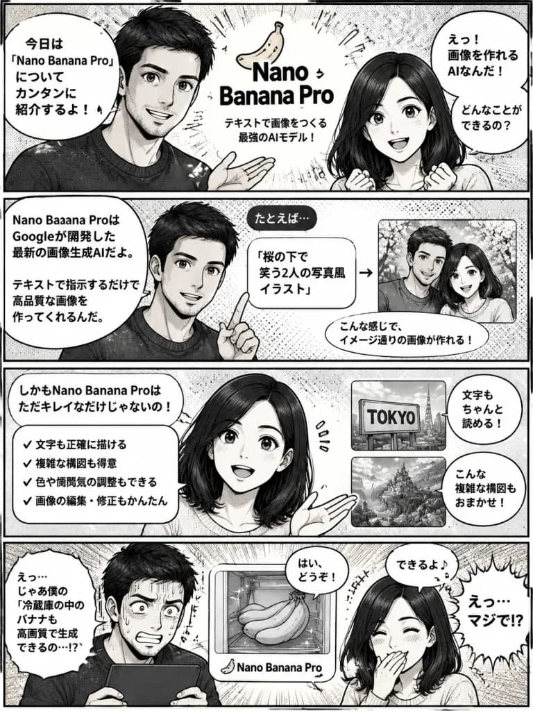
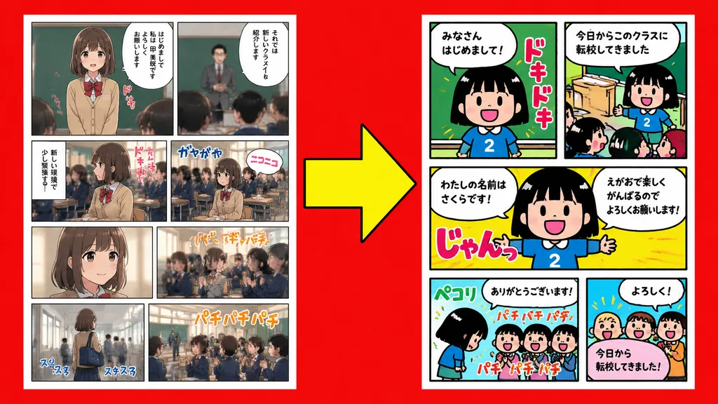
มังงะสี่ช่องยอนโคมะอธิบายเทคโนโลยี

มังงะสี่ช่องยอนโคมะอธิบายเทคโนโลยี

A Japanese 4-panel manga (yonkoma comic strip) featuring the male and female characters from the reference image, following the layout structure from the reference image. The narrative intuitively explains [Nano Banana Pro] so that even beginners can easily understand it. The first three panels provide an engaging introduction and explanation, while the fourth panel concludes with a comedic punchline. Expressive anime manga art style, clear panel borders, neatly arranged speech bubbles, Japanese manga screentone aesthetic.

ยอนโคมะมังงะการ์ตูนช่อง
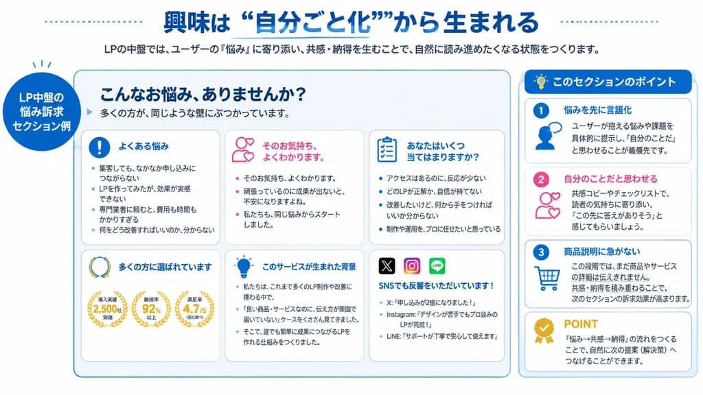
สไลด์อินโฟกราฟิกกลยุทธ์แลนดิ้งเพจสไตล์ญี่ปุ่น

สไลด์อินโฟกราฟิกกลยุทธ์แลนดิ้งเพจสไตล์ญี่ปุ่น

Japanese educational infographic slide. LP中盤の悩み訴求セクション例. main example panel. このセクションのポイント. こんなお悩み、ありませんか?. よくある悩み. そのお気持ち、よくわかります。. あなたはいくつ当てはまりますか?. 多くの方に選ばれています. このサービスが生まれた背景. SNSでも反響をいただいています!. このセクションのポイント. 悩みを先に言語化. ユーザーが抱える悩みや課題を具体的…

อินโฟกราฟิกสไลด์นำเสนอแลนดิ้งเพจ
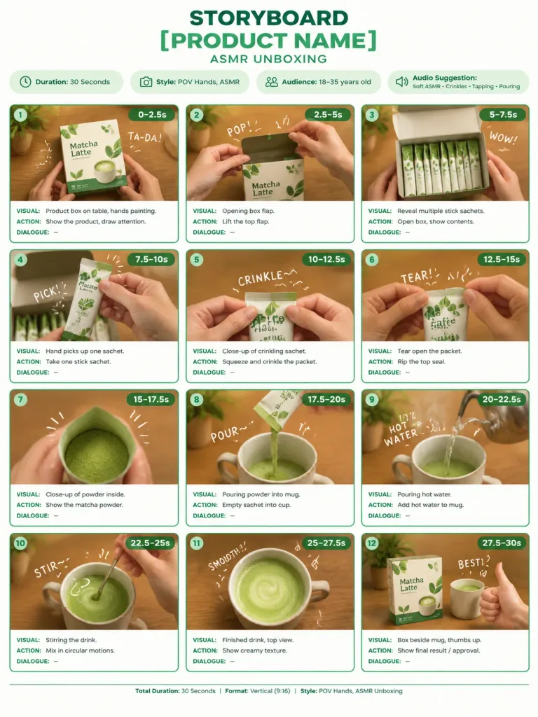
อินโฟกราฟิกสตอรี่บอร์ดแกะกล่อง ASMR

อินโฟกราฟิกสตอรี่บอร์ดแกะกล่อง ASMR

A clean, professional storyboard infographic sheet for a [product ASMR unboxing] video, presented on a crisp white background with modern minimalist agency styling. Header at the top features bold title "STORYBOARD", product name "[PRODUCT NAME]" in bold green typography, and subtitle "ASMR UNBOXING". Directly below the header are four pill-shaped information badges: "Duration: 30 Seconds", "Style: POV Hands, ASMR", "Audience: 18–35 years old", and "Audio Suggestion: Soft ASMR • Crinkles • Tapping • Pouring". The main body consists of 12 rectangular storyboard panels organized in a clean 3-column by 4-row grid with soft green rounded borders. Each panel displays a realistic cinematic POV photograph with shallow depth of field, warm wooden tabletop, soft natural lighting, showing only hands (no faces visible), overlaid with subtle white handwritten doodle text ("TA-DA!", "POP!", "WOW!", "PICK!", "CRINKLE~", "TEAR!", "POUR~", "HOT WATER", "STIR~", "SMOOTH!", "BEST!"), a numbered green badge (1–12), and timestamps. Beneath each panel are three neat text labels: "VISUAL:", "ACTION:", and "DIALOGUE:". Sequence details: Panel 1 (0–2.5s) Product box on table, hands pointing; Panel 2 (2.5–5s) Opening box flap; Panel 3 (5–7.5s) Revealing multiple stick sachets; Panel 4 (7.5–10s) Picking up one sachet; Panel 5 (10–12.5s) Crinkling sachet close-up; Panel 6 (12.5–15s) Tearing open the packet; Panel 7 (15–17.5s) Close-up view of powder inside; Panel 8 (17.5–20s) Pouring powder into mug; Panel 9 (20–22.5s) Pouring hot steaming water; Panel 10 (22.5–25s) Stirring in circular motions; Panel 11 (25–27.5s) Creamy finished drink top-down view; Panel 12 (27.5–30s) Box beside mug with thumbs up. Clean agency footer at the bottom reads: "Total Duration: 30 Seconds | Format: Vertical (9:16) | Style: POV Hands, ASMR Unboxing".

สตอรี่บอร์ดอินโฟกราฟิกasmr
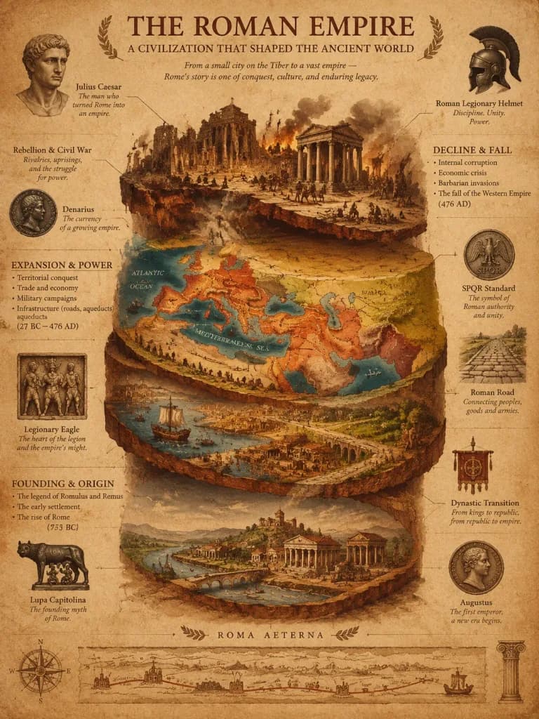
โปสเตอร์ลำดับชั้นทางโบราณคดีของจักรวรรดิประวัติศาสตร์

โปสเตอร์ลำดับชั้นทางโบราณคดีของจักรวรรดิประวัติศาสตร์

A luxury historical civilization stratigraphy poster of [the Roman Empire], visualized as a multi-layered archaeological cross-section. The bottom layer illustrates the founding settlement and core origin; the middle geological strata depict territorial expansion, economic trade routes, and military campaigns through richly colored soil layers; the fragmented upper layer displays internal collapse, rebellion, and systemic decline. Floating callout lines, styled like an archaeological field report crossed with a vintage military campaign map, point to detailed physical artifacts, battle insignias, currency standards, and dynastic transitions. Style inspired by the Tabula Peutingeriana, classical cartography, and high-end museum exhibition infographics. Rendered on warm sepia and deep terracotta aged parchment with subtle texture and patina. Elegant classical serif lettering combined with handwritten scholarly annotations, balanced with generous negative space. No modern digital elements, no neon glow, no holograms, no cartoon graphics.

อินโฟกราฟิกประวัติศาสตร์แผนที่
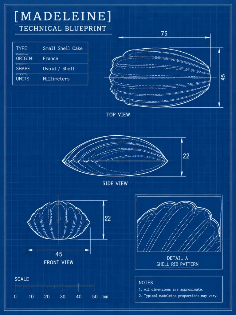
พิมพ์เขียวเชิงเทคนิคขนมมาดแลน

พิมพ์เขียวเชิงเทคนิคขนมมาดแลน

Using the reference photo as the subject, transform the madeleine into a clean technical blueprint drawing rather than a photo. Create a vertical engineering-sheet layout on a dark blue grid background with thin white linework, a double border, measurement arrows, labels, and schematic outlines preserving the pastry's shell-like oval form. Title block: Titled "[MADELEINE]" with subtitle "[TECHNICAL BLUEPRINT]". Layout: Exactly 4 technical drawing panels derived from the reference pastry: - Large top view at the upper right - Side view centered below it - Front view at the lower left - Boxed detail inset at the lower right labeled "DETAIL A" and "SHELL RIB PATTERN" Use white contour lines and dashed internal rib lines. Specification block (upper left, 4 rows): TYPE: [Small Shell Cake] ORIGIN: [France] SHAPE: Ovoid / Shell UNITS: Millimeters Measurements & Scale: Dimension lines and numeric labels with top view width 75 and height 45, side view height 22, front view width 45 and height 22. Bottom-left scale ruler labeled "SCALE" with marks 0, 10, 20, 30, 40, 50 mm. Notes box (bottom right): "1. All dimensions are approximate." "2. Typical madeleine proportions may vary." Style: White-on-blue architectural/engineering blueprint schematic, crisp and precise with subtly hand-drafted edge quality. No photographic elements, no 3D shading, no extraneous objects, no watermarks.

พิมพ์เขียวมาดแลนแผนผัง
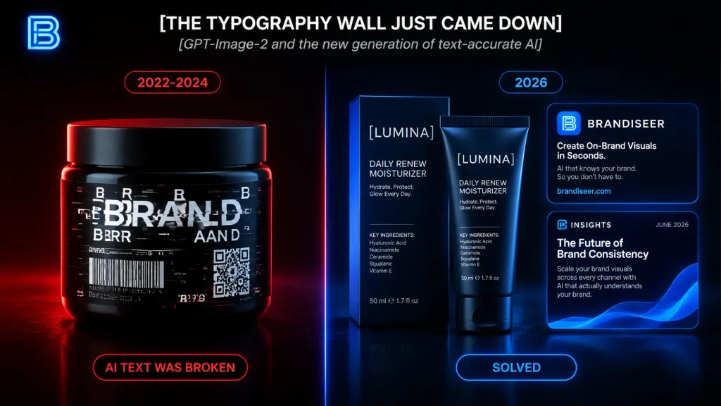
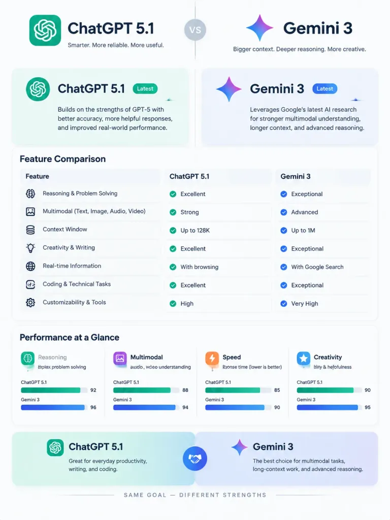
อินโฟกราฟิกเปรียบเทียบวิวัฒนาการตัวพิมพ์ AI

อินโฟกราฟิกเปรียบเทียบวิวัฒนาการตัวพิมพ์ AI

Sleek dark tech infographic comparing AI-generated typography accuracy across eras, displayed on a black background with cinematic product lighting and futuristic SaaS branding aesthetics. Top area: In the upper-left, a glowing neon monogram logo shaped like a stylized letter B in electric blue. Centered at the top, a bold all-caps white headline: "[THE TYPOGRAPHY WALL JUST CAME DOWN]". Directly underneath, a smaller italic gray subtitle: "[GPT-Image-2 and the new generation of text-accurate AI]". Main layout: Vertical split-screen divided by a thin glowing vertical line down the center. Red accent lighting on the left panel, electric blue accent lighting on the right panel. Left panel (Broken Era): - At the top, a small rounded red-outlined pill badge: "[2022-2024]". - In the lower-left, exactly 1 large black cosmetic jar/tub under dramatic red rim lighting. Its label features corrupted, glitched typography: a fragmented white word resembling "BRAND" broken into duplicated, illegible letters, flanked by hallucinated pseudo-letters, distorted barcode-like lines, and a corrupted QR code block. - At the bottom, a rounded red-outlined status pill: "AI TEXT WAS BROKEN". Right panel (Solved Era): - At the top, a small rounded blue-outlined pill badge: "[2026]". - Exactly 3 clean brand mockups with razor-sharp, readable typography under blue rim light: 1 skincare packaging set (box and matching tube) in the center-right reading "[LUMINA]", "DAILY RENEW MOISTURIZER", "Hydrate. Protect. Glow Every Day.", a detailed ingredient list, and "50 ml e 1.7 fl oz"; and 2 stacked rectangular digital brand cards on the far right. The upper card reads "BRANDISEER", "Create On-Brand Visuals in Seconds.", "AI that knows your brand. So you don't have to.", "brandiseer.com", and a glowing blue icon. The lower card reads "INSIGHTS", "JUNE 2026", "The Future of Brand Consistency", body copy about scaling brand visuals, and an abstract blue wave graphic. - At the bottom, a rounded blue-outlined status pill: "SOLVED". Style: Photorealistic 3D product render combined with polished UI design, glossy dark surfaces, cyberpunk red/blue split illumination, crisp high-contrast text.

อินโฟกราฟิกการจัดตัวพิมพ์การออกแบบผลิตภัณฑ์
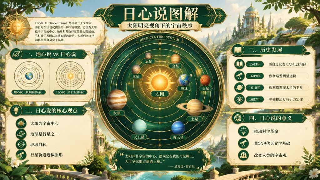
โปสเตอร์อินโฟกราฟิกดาราศาสตร์ระบบสุริยะศูนย์กลาง

โปสเตอร์อินโฟกราฟิกดาราศาสตร์ระบบสุริยะศูนย์กลาง

educational infographic poster. luxurious fantasy educational poster, ornate scientific diagram, Art Nouveau inspired, celestial atlas aesthetic, luminous gold and emerald palette, richly detailed, polished digital illustration. 一、地心说 vs 日…

อินโฟกราฟิกระบบสุริยะศูนย์กลางโปสเตอร์ดาราศาสตร์
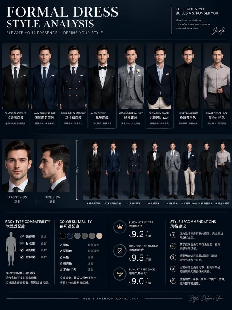
โปสเตอร์วิเคราะห์สไตล์สูททางการสำหรับผู้ชาย

โปสเตอร์วิเคราะห์สไตล์สูททางการสำหรับผู้ชาย

A luxury men's fashion consultant infographic poster titled "[FORMAL DRESS STYLE ANALYSIS]", featuring [the same man from the reference photo] maintaining consistent facial features and identity across multiple outfit variations. Display styles including a classic black suit, navy business suit, double-breasted suit, tuxedo, wedding formal suit, old money blazer style, luxury minimalist formal wear, and smart office look. Include front views, side profiles, and full-body comparisons. Add infographic elements with body type compatibility, color suitability, elegance score, confidence rating, luxury presence score, and style recommendations. Editorial layout with modern typography, set against a premium dark navy blue and black luxury background with studio lighting and high-detail realism.

แฟชั่นผู้ชายชุดสูททางการอินโฟกราฟิก
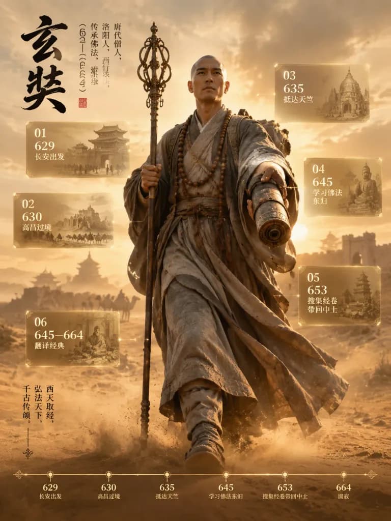
โปสเตอร์จดหมายเหตุบุคคลประวัติศาสตร์บนเส้นทางสายไหม

โปสเตอร์จดหมายเหตุบุคคลประวัติศาสตร์บนเส้นทางสายไหม

Cinematic vertical historical figure archive poster of [Xuanzang], depicting a Tang dynasty monk as a monumental full-body traveler walking toward the viewer across a desert Silk Road landscape in an epic museum exhibition style with realistic 3D rendering. Composition and Canvas: Vertical poster in a warm sepia and dusty gold color palette with dramatic backlighting, hazy skies, windblown sand, and silhouettes of ancient pagodas and ruined frontier city walls in the distance. The monk occupies most of the frame height, positioned slightly right of center, walking forward with strong visual depth. Main Subject: A bald Tang dynasty Buddhist monk wearing weathered, layered gray-brown robes, wrapped sashes, prayer beads around his neck, with dust-stained realistic cloth textures blowing in the wind. In his right hand he carries a tall ornate monk staff, and in his left hand he extends an ancient rolled sutra scroll case toward the viewer, appearing to break the visual frame. His facial features are softly obscured, conveying a solemn, determined, and pioneering aura. Calligraphy and Typography: At the upper left, bold black ink-brush Chinese calligraphy reads "[玄奘]". Beside it runs delicate vertical Song-style biographical text noting Tang dynasty origins, westward pilgrimage, Buddhist transmission, and dates 602—664, sealed beneath with a small red vermilion stamp. A slim vertical archival route quote runs down the lower left. Floating Archive Panels: Exactly 6 semi-transparent glass infographic panels with delicate gold borders, subtle node connectors, off-white and gold typography, and faint historical illustration backdrops, numbered in chronological order: - 01 (upper left): 629, departure from Chang'an - 02 (mid-left): 630, crossing Gaochang - 03 (upper right): 635, reaching Tianzhu/India - 04 (mid-right): 645, studying Buddhism and returning east - 05 (lower right): 653, collecting and bringing back scriptures - 06 (lower left): 645—664, translating classics Bottom Timeline: A sleek horizontal timeline across the bottom with exactly 6 dot markers labeled 629, 630, 635, 645, 653, and 664, accompanied by refined Chinese-style micro captions. Style: [ultra-realistic 3D historical poster, cinematic lighting, museum archive infographic, sepia desert palette, volumetric dust, high-detail cloth and metal textures]. Elegant, solemn, and heroic historical archival portraiture combined with holographic infographics.

โปสเตอร์ประวัติศาสตร์เส้นทางสายไหมอินโฟกราฟิก
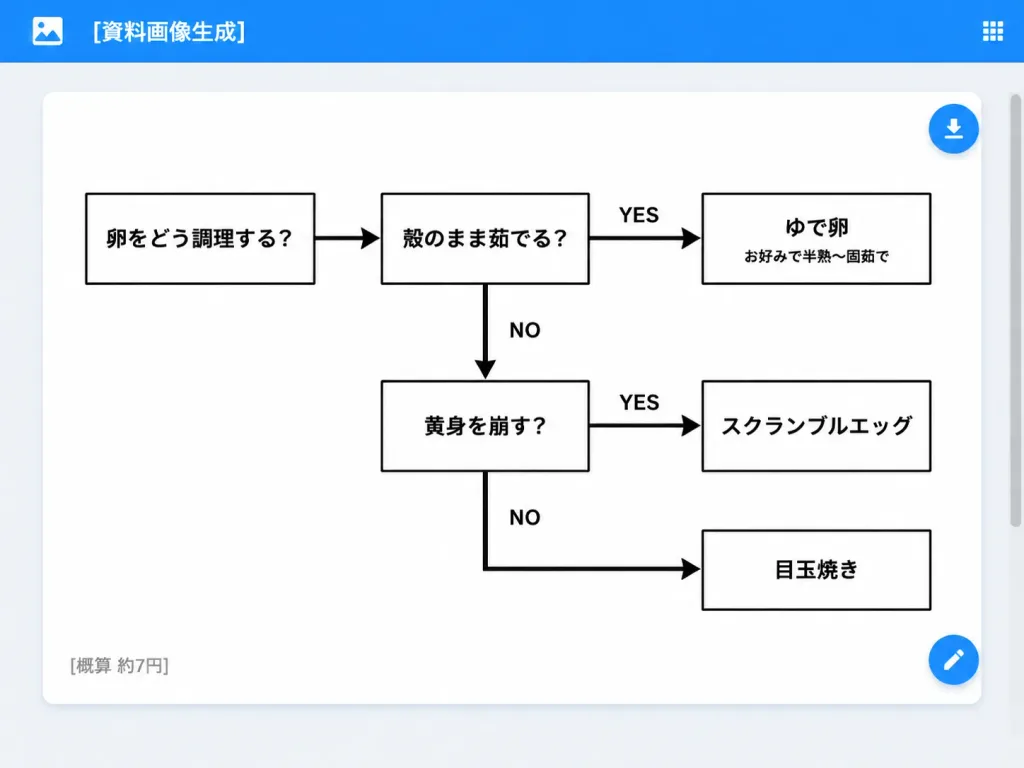
UI เว็บแอปผังงานวิธีทำเมนูไข่

UI เว็บแอปผังงานวิธีทำเมนูไข่

A clean desktop web application screenshot displaying an AI-generated document: a minimalist monochrome Japanese decision flowchart for cooking eggs. Setting & UI Layout: - Desktop browser/app interface with a light gray background. - Top app bar: Bright blue bar spanning the full width, containing a small white image icon on the far left, the white title text "[資料画像生成]", and a small white grid menu icon on the far right. - Main canvas: Centered large white rounded-rectangle card with a subtle drop shadow and generous internal margins. A subtle scrollbar appears on the browser's right edge. - UI Action Buttons: Two floating circular blue action buttons docked on the right edge of the white card—one near the upper right with a white download arrow icon, and one near the lower right with a white edit pencil icon. Flowchart Structure & Content: - Exactly 6 rectangular white boxes with clean black borders, connected by thick black directional arrows. - Box 1 (far left): 「卵をどう調理する?」 - Box 2 (top middle): 「殻のまま茹でる?」 - Box 3 (top right): 「ゆで卵」 with a smaller subtitle 「お好みで半熟〜固茹で」 - Box 4 (middle lower): 「黄身を崩す?」 - Box 5 (middle right): 「スクランブルエッグ」 - Box 6 (bottom right): 「目玉焼き」 Connections & Labels: - Arrow from Box 1 pointing right to Box 2. - Arrow from Box 2 pointing right to Box 3, labeled "YES" above. - Downward arrow from Box 2 pointing down to Box 4, labeled "NO" to the right. - Arrow from Box 4 pointing right to Box 5, labeled "YES" above. - Right-angled path from Box 4 heading down then right into Box 6, labeled "NO". Card Footer: - Lower-left corner inside the white card displays small gray Japanese text: "[概算 約7円]". Style & Constraints: - Modern flat UI screenshot, crisp sans-serif Japanese typography, monochrome chart design on pure white, high-contrast black lines and text, no decorative colors inside the chart, no watermarks.

ผังงานเว็บแอปภาพหน้าจอ ui
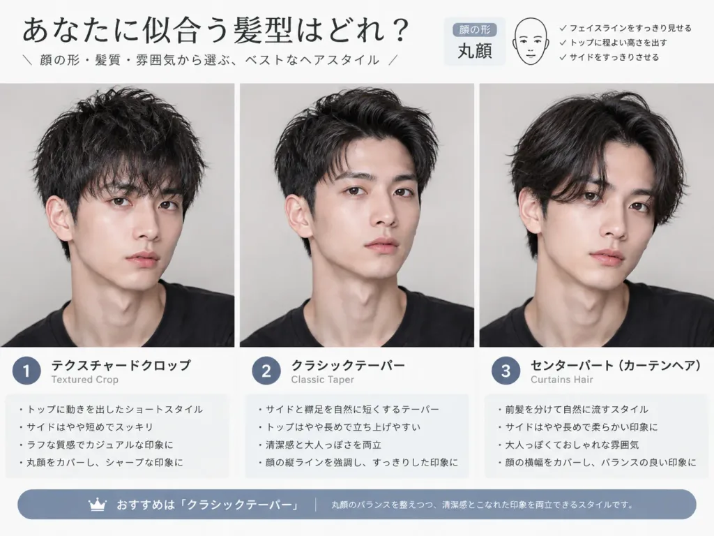
อินโฟกราฟิกเปรียบเทียบทรงผม

อินโฟกราฟิกเปรียบเทียบทรงผม

A visual hairstyle analysis infographic using the person from the reference photo. Side-by-side comparison portraits showcasing [three different hairstyles, such as textured crop, classic taper, and curtains haircut] to highlight which style best complements their face shape. Clean layout with short text labels beneath each option describing the haircut name and key styling details. Soft studio lighting, neutral background, visual-first presentation.

ทรงผมตัดผมอินโฟกราฟิก
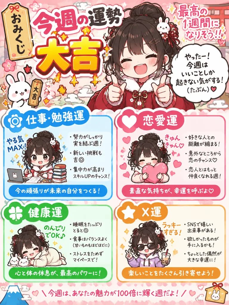
การ์ดเซียมซีโอมิกุจิพร้อมตัวละคร

การ์ดเซียมซีโอมิกุจิพร้อมตัวละคร

A high-density Japanese fortune-telling card (omikuji) featuring the character from the reference photo, themed as a "[weekly fortune omikuji image]". - Composition & Layout: Vertical magazine horoscope page layout combined with vibrant social media infographic graphics. The overall Japanese omikuji fortune ranking (such as Daikichi, Chukichi, or Suekichi) is displayed prominently at the top in playful, stylized typography. - Character Depiction: Adapt the character from the reference photo into a new situation, expressive reaction pose, and outfit suited to the fortune result. Add a comic speech bubble showing the character's witty commentary or reaction. - Fortune Categories: Multiple modular fortune blocks (such as Work/Study Luck, Love Luck, Health Luck, and "X Luck"), each accompanied by a cute, cuddly "yuru-fuwa" chibi-style cut-out illustration of the character interacting with props. - Style & Atmosphere: [Cute, soft/fluffy, slightly quirky], mixing Heisei and Reiwa Japanese internet meme aesthetics, colorful badges, sticker motifs, and variety show broadcast captions. High information density designed for a social media screenshot. - Constraints: No specific real-world dates, days of the week, calendar grids, or unreadable date typography.

โอมิกุจิดูดวงโซเชียลมีเดีย
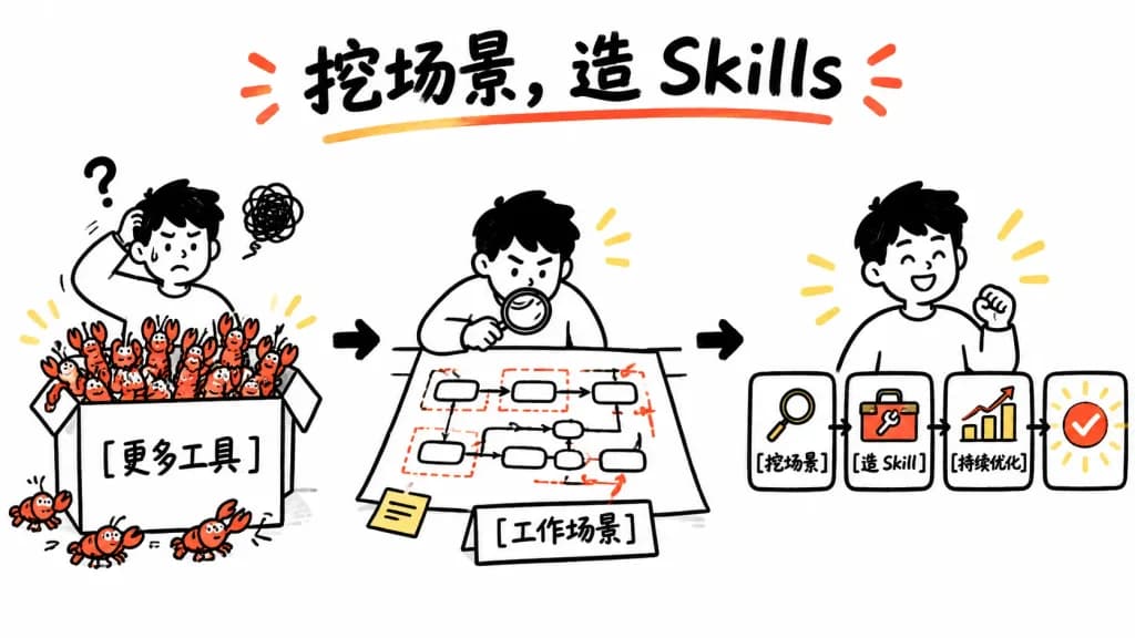
เวิร์กโฟลว์สร้างทักษะสไตล์ไวท์บอร์ด

เวิร์กโฟลว์สร้างทักษะสไตล์ไวท์บอร์ด

A clean whiteboard hand-drawn explainer illustration showing a three-step workflow from tool overload to reusable skills. Playful black marker doodle style with selective red-orange accents and yellow highlights on a solid white background, 16:9 horizontal canvas. Top center title: Large bold handwritten headline reading "[挖场景,造 Skills]" in black brush lettering, underlined by a curved red-orange stroke, with two small red-orange emphasis marks on each side. Left-to-right layout with three main scenes connected by bold black arrows: - Scene 1 (Left): A confused young person with short black hair scratching their head, accompanied by a question mark and a scribbled frustration cloud. They stand behind a large open box labeled "[更多工具]". The box overflows with exactly 18 small red-orange cartoon crawfish (15 inside or on the rim, 3 spilled outside on the bottom/left). - Scene 2 (Center): The same person leaning over a desk with a magnifying glass, analyzing a paper workflow map containing exactly 10 rounded rectangular process nodes connected by thin black arrows, with red dashed boxes and red accent arrows. A small sticky note sits at the bottom-left of the sheet, and a label card in front reads "[工作场景]". - Scene 3 (Right): The same person smiling proudly beside a streamlined horizontal 4-step pipeline: card 1 has a magnifying glass icon labeled "[挖场景]"; card 2 has a wrench/toolbox icon labeled "[造 Skill]"; card 3 shows an upward bar chart with a red rising arrow labeled "[持续优化]"; card 4 is a rounded square success badge with a bold red-orange checkmark and radiating yellow sparkle accents. Style: Minimalist black-and-white whiteboard sketch, thick playful marker outlines, friendly Notion-like doodle proportions, minimal shading, clean and spacious layout with no clutter.

ไวท์บอร์ดเวิร์กโฟลว์อินโฟกราฟิก
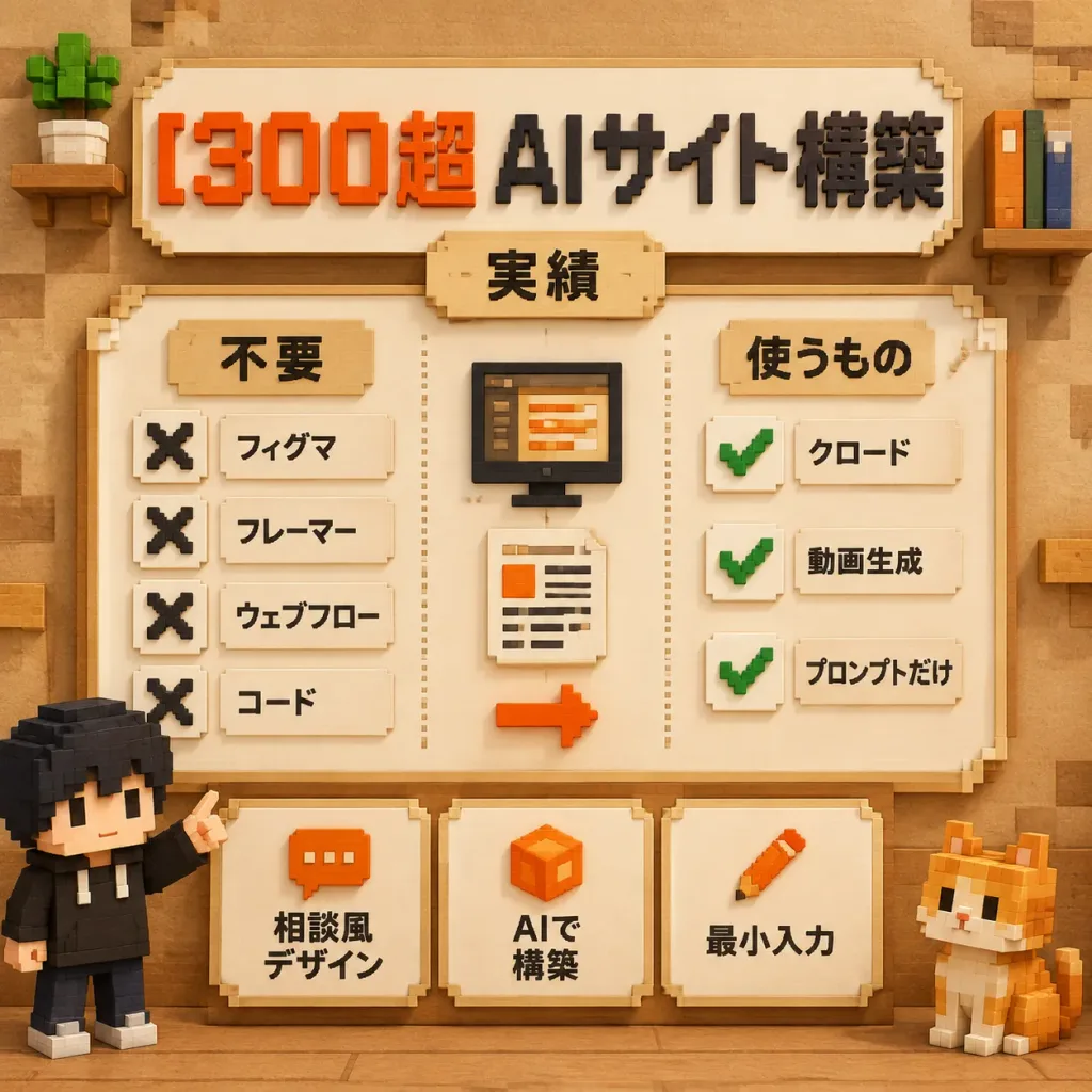
โปสเตอร์อินโฟกราฟิกเทคโนโลยีสไตล์ว็อกเซลภาษาญี่ปุ่น

โปสเตอร์อินโฟกราฟิกเทคโนโลยีสไตล์ว็อกเซลภาษาญี่ปุ่น

A square 3D voxel-art Japanese infographic poster explaining AI website building with minimal tools, rendered in a warm Minecraft-inspired block aesthetic. Composition & Layout: Orthographic front view, 1:1 square canvas. Soft studio lighting with warm ambient occlusion on a tan paper-and-wood textured background with subtle voxel blocks in the corners. Headline: At the top, a cream beveled signboard displays extruded blocky Japanese text reading "[300超 AIサイト構築]", with "300超" in vibrant orange-red and "AIサイト構築" in black. Directly below, a small centered beige tab label reads "[実績]". Central Panel: A large cream framed board with a stepped voxel border, split into three vertical sections by dotted divider lines: - Left Checklist (Title: "[不要]"): Exactly 4 items, each with a black voxel 'X' icon beside cream text labels: 「フィグマ」, 「フレーマー」, 「ウェブフロー」, and 「コード」. - Center Workflow: Exactly 3 stacked elements: a black voxel monitor showing orange/beige editor lines, a cream document sheet with text lines and an orange square, and an orange right-pointing voxel arrow below. - Right Checklist (Title: "[使うもの]"): Exactly 3 items, each with a green voxel checkmark icon on a cream tile beside labels: 「クロード」, 「動画生成」, and 「プロンプトだけ」. Bottom Feature Cards: Exactly 3 separate cream beveled cards across the lower panel: 1. Orange chat icon with text 「相談風 デザイン」 2. Orange cube icon with text 「AIで 構築」 3. Orange pencil icon with text 「最小入力」 Characters & Props: Exactly 2 voxel mascots: a black-haired figure in a black hoodie pointing up at the panel on the lower-left, and an orange-and-white voxel cat seated on the lower-right. A potted blocky plant sits on a top-left mini shelf; upright voxel books sit on a top-right shelf. Constraints: Clean educational layout, readable Japanese typography, exactly 4 rejected items, 3 approved items, 3 bottom cards, and 2 mascots. No English text, logos, or photorealism.

ว็อกเซลอินโฟกราฟิกโปสเตอร์
ลำดับชั้นห่วงโซ่อาหารของระบบนิเวศการตลาด

ลำดับชั้นห่วงโซ่อาหารของระบบนิเวศการตลาด

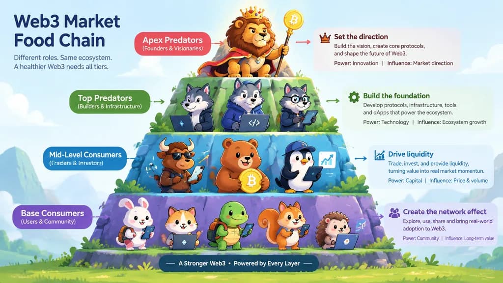
An infographic illustration displaying distinct character tiers that represent the ecological food chain of the [web3] market. The composition is arranged in a hierarchical progression from bottom to top, featuring unique stylized characters at each tier with distinct visual traits, props, and detailed text labels describing their roles and hierarchy. Clean digital art style, clear layout, vibrant conceptual color palette, informative visual hierarchy.

อินโฟกราฟิกห่วงโซ่อาหารระดับตัวละคร
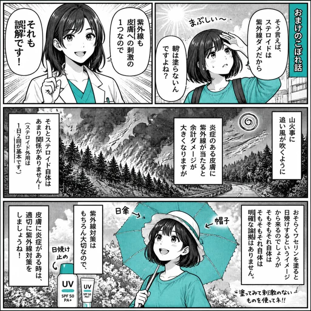
การ์ตูนมังงะอธิบายสุขภาพสไตล์ญี่ปุ่น

การ์ตูนมังงะอธิบายสุขภาพสไตล์ญี่ปุ่น

A black-and-white Japanese manga-style educational comic page about [misconceptions about steroid ointment, ultraviolet rays, and sunscreen], rendered like a printed newspaper health explainer with screentone shading, halftone gradients, hand-drawn ink line art, and selective [teal] accent fills. Canvas & Layout: Square 1:1 page, high-contrast monochrome manga art with thick black outer borders, clean gutters, and dense vertical Japanese dialogue. Exactly 4 panels arranged as: - Top row: Two equal panels side by side. - Middle row: One wide panel spanning the full width. - Bottom row: One wide panel spanning the full width. Panel Details: - Panel 1 (Top Left): A cheerful young female educator with shoulder-length dark hair wearing a white lab coat over a [teal] shirt, raising one index finger to correct a misconception. Radiating emphasis speedlines in the background. Two vertical speech bubbles containing Japanese text: 「それも誤解です!」 and 「紫外線も皮膚への刺激の1つなので」. - Panel 2 (Top Right): A young girl with a short dark bob wearing a [teal] sweatshirt, shielding her forehead and looking worried under strong sunlight. A small handwritten sound effect 「まぶしい〜」 near her. A vertical title banner on the far right reading 「[おまけのこぼれ話]」. Two vertical speech bubbles containing Japanese text: 「そう言えば、ステロイドは紫外線ダメだから」 and 「朝は塗らないんですよね?」. - Panel 3 (Middle Wide): A dramatic monochrome wildfire scene on a forested mountain slope with blowing smoke, trees, a winding road, and a spiral wind icon. Three vertical narration boxes overlay the scene: right box 「山火事に追い風が吹くように」, center-right box 「炎症のある皮膚に紫外線が当たると余計ダメージが大きくなりますが」, left box 「それとステロイド自体はあまり関係がありません!」 with a smaller sub-note 「(ステロイド外用は1日2回が基本です。)」. - Panel 4 (Bottom Wide): The young girl smiling and protected from the sun, holding an open [teal] parasol, wearing a light sun hat, with sunscreen bottles nearby labeled "UV" and "[SPF 50 PA+]". Handwritten labels pointing to objects: 「日焼け止め」 near the bottle, 「日傘」 and 「帽子」 near the parasol and hat. Three vertical narration boxes: right box 「おそらくワセリンを塗ると日焼けするというイメージから来るのでしょうが そもそもそれ自体は明確な論拠はありません。」, center-left box 「紫外線対策はもちろん大切なので、」, far-left box 「皮膚に炎症がある時は、適切に紫外線対策をしましょうね!」. A small handwritten note in the bottom-right corner: 「[塗ってみて刺激のないものを使ってネ!!]」. Style & Color: Authentic manga screentone dot patterns, rough ink line texture, dense vertical typesetting, monochrome grayscale palette with only clothing, parasol, and packaging highlighted in selective [teal] (#68cfc6).

มังงะการ์ตูนสกรีนโทน
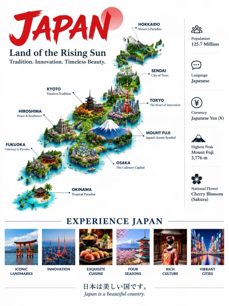
โปสเตอร์อินโฟกราฟิกท่องเที่ยวญี่ปุ่นแบบไอโซเมตริก

โปสเตอร์อินโฟกราฟิกท่องเที่ยวญี่ปุ่นแบบไอโซเมตริก

Vertical infographic travel poster titled "[JAPAN]" in large, bold red brushstroke typography at the top left. Below the title, the subtitle "[Land of the Rising Sun]" and tagline "[Tradition. Innovation. Timeless Beauty.]". The central visual is a detailed 3D isometric terrain map of the Japanese archipelago, rendered with lush green topography, a snow-capped Mount Fuji, and miniature 3D architectural landmarks including Tokyo Tower and Kyoto pagodas. Crisp leader lines point to labeled regions: "HOKKAIDO (Nature's Paradise)", "SENDAI (City of Trees)", "TOKYO (The Heart of Innovation)", "KYOTO (Timeless Tradition)", "HIROSHIMA (Peace & Resilience)", "MOUNT FUJI (Japan's Iconic Symbol)", "OSAKA (The Culinary Capital)", "FUKUOKA (Gateway to Kyushu)", and "OKINAWA (Tropical Paradise)". Along the right side, a clean vertical list of quick facts with minimalist icons: "Population 125.7 Million", "Language Japanese", "Currency Japanese Yen (¥)", "Highest Peak Mount Fuji 3,776 m", and "National Flower Cherry Blossom (Sakura)". Across the bottom, a section titled "EXPERIENCE JAPAN" showcasing six rectangular photographic thumbnails labeled: "ICONIC LANDMARKS", "INNOVATION", "EXQUISITE CUISINE", "FOUR SEASONS", "RICH CULTURE", and "VIBRANT CITIES". Footer text displays the bilingual quote: "日本は美しい国です。" / "Japan is a beautiful country." Crisp graphic design layout, clean white background, balanced data visualization.

อินโฟกราฟิกโปสเตอร์ท่องเที่ยวแผนที่ไอโซเมตริก
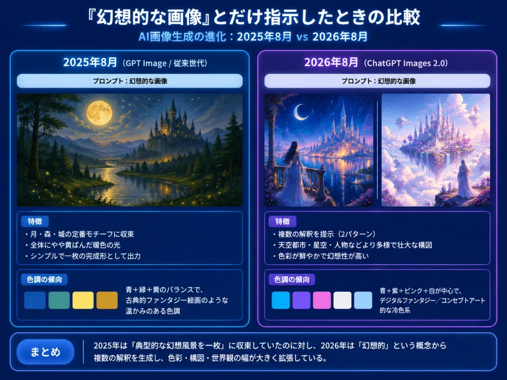
สไลด์อินโฟกราฟิกวิวัฒนาการภาพ AI

สไลด์อินโฟกราฟิกวิวัฒนาการภาพ AI

4:3 horizontal tech-report presentation slide, Japanese infographic comparing AI image generation outputs across two years for the prompt [幻想的な画像]. Dark navy gradient background, glowing borders, crisp white Japanese typography, subtle blue and purple neon highlights. Header: Top center large bold Japanese title: 「『幻想的な画像』とだけ指示したときの比較」. Directly underneath, smaller subtitle: 「AI画像生成の進化:2025年8月 vs 2026年8月」. Layout: Two large rounded comparison panels side by side. Left Panel (Blue theme, labeled 「2025年8月(GPT Image / 従来世代)」): - Pale prompt strip near the top: 「プロンプト:幻想的な画像」 - Artwork: Exactly 1 traditional painterly fantasy landscape showing a large full moon, deep blue night sky, dark forest silhouettes, a winding glowing river with firefly lights, and a distant dark castle with spires. Warm, nostalgic, restrained composition. - Analysis Box 1 (Title 「特徴」) with 3 bullet points: • 「月・森・城の定番モチーフに収束」 • 「全体にやや黄ばんだ暖色の光」 • 「シンプルで一枚の完成形として出力」 - Analysis Box 2 (Title 「色調の傾向」) with 4 horizontal color swatches (deep blue, teal green, warm yellow, golden ocher) and text: 「青+緑+黄のバランスで、古典的ファンタジー絵画のような温かみのある色調」. Right Panel (Purple theme, labeled 「2026年8月(ChatGPT Images 2.0)」): - Pale prompt strip near the top: 「プロンプト:幻想的な画像」 - Artwork: Exactly 2 artworks side by side with a thin vertical divider: 1. Luminous fantasy city at night with a crescent moon, starry sky, glowing waterfront, and a woman in a flowing dress on a balcony looking toward towers. 2. Celestial floating castle above clouds with white and lavender architecture, pink-purple blossoms, crystalline towers, and a robed figure looking into the glowing city. - Analysis Box 1 (Title 「特徴」) with 3 bullet points: • 「複数の解釈を提示(2パターン)」 • 「天空都市・星空・人物などより多様で壮大な構図」 • 「色彩が鮮やかで幻想性が高い」 - Analysis Box 2 (Title 「色調の傾向」) with 5 horizontal color swatches (cyan blue, violet, pale pink, white, light sky blue) and text: 「青+紫+ピンク+白が中心で、デジタルファンタジー/コンセプトアート的な冷色系」. Bottom Summary Bar: Full-width rounded dark blue box with a label button 「まとめ」 and text: 「2025年は『典型的な幻想風景を一枚』に収束していたのに対し、2026年は『幻想的』という概念から複数の解釈を生成し、色彩・構図・世界観の幅が大きく拡張している。」 Visual style: Clean tech presentation slide, precise alignment, high readability, drop shadows, no watermarks.

อินโฟกราฟิกการนำเสนอสไลด์
โปสเตอร์แผนผังความสัมพันธ์ตัวละคร

โปสเตอร์แผนผังความสัมพันธ์ตัวละคร

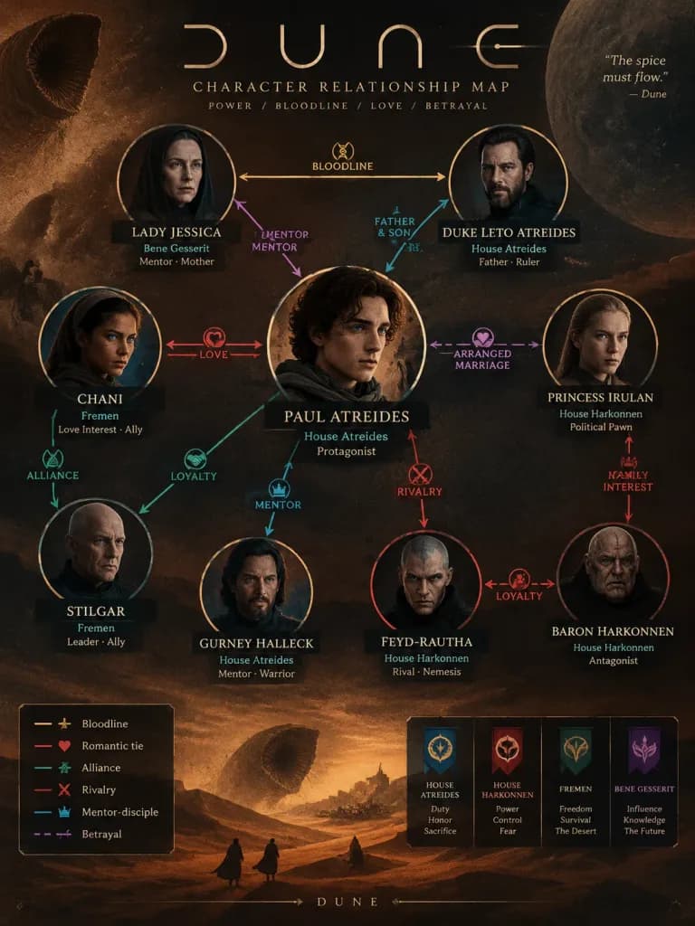
A high-design character relationship poster and editorial infographic map for [Dune]. The poster visualizes the intricate connections among 8 to 12 key characters, featuring illustrated portrait icons, clearly legible names, and faction or role tags. Styled connecting lines, arrows, and color-coded links clearly define diverse dynamics: alliances, bloodlines, romantic ties, rivalries, mentor-disciple bonds, and betrayals. Structured with a sophisticated narrative composition centered on core faction tensions, balancing visual hierarchy between primary protagonists and supporting characters. The overall aesthetic integrates the iconic color palette, symbolic motifs, textures, and worldbuilding atmosphere of [Dune], combining clean infographic clarity with premium graphic design poster appeal.

อินโฟกราฟิกแผนผังตัวละครการออกแบบโปสเตอร์
อินโฟกราฟิกภาพยนตร์ไซเบอร์พังก์ เดอะ เมทริกซ์

อินโฟกราฟิกภาพยนตร์ไซเบอร์พังก์ เดอะ เมทริกซ์

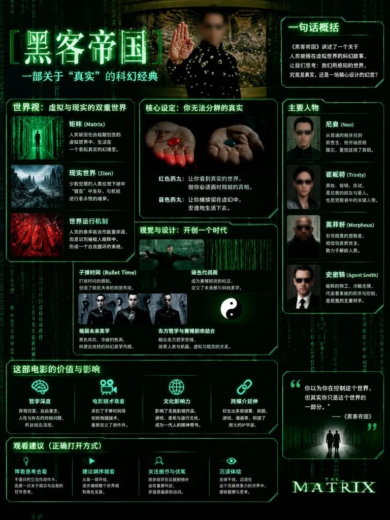
cinematic sci-fi infographic poster. The Matrix film overview poster in a dark cyberpunk style. [黑客帝国]. 一句话概括. 世界观:虚拟与现实的双重世界. 核心设定:你无法分辨的真实. 视觉与设计:开创一个时代. 主要人物. 这部电影的价值与影响. 观看建议(正确打开方式). Chinese. black. deep green. neon green. dim gray. w…

เดอะ เมทริกซ์อินโฟกราฟิกไซเบอร์พังก์
โปสเตอร์อินโฟกราฟิกเพื่อการศึกษา จุดนีโม

โปสเตอร์อินโฟกราฟิกเพื่อการศึกษา จุดนีโม

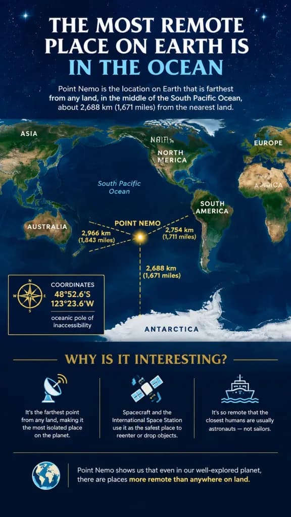
An educational infographic explaining [Point Nemo, the most remote place on Earth located in the ocean]. Format: Vertical portrait poster layout with a deep navy blue background and a subtle starry night sky texture near the top. Clean, modern, high-contrast visual design using white and gold typography. Structure and Content: 1. Header: Large serif title "THE MOST REMOTE PLACE ON EARTH IS IN THE OCEAN" with "IN THE OCEAN" highlighted in light blue. Beneath it, a concise introductory paragraph describing Point Nemo as the location farthest from land, noting the distance of 2,688 km (1,671 miles). 2. Central Map: Stylized world map centered on the South Pacific Ocean. Continents rendered in muted earth tones (greens, browns) against dark blue waters. Continent labels: NORTH AMERICA, SOUTH AMERICA, EUROPE, ASIA, AFRICA, AUSTRALIA, ANTARCTICA. 3. Data Overlay: A glowing yellow marker labeled "POINT NEMO" situated south of Easter Island. Three dashed yellow lines radiate toward the nearest landmasses, marked with distances: "2,688 km (1,671 miles)" to Antarctica, "2,754 km (1,711 miles)" to South America, and "2,966 km (1,843 miles)" to Australia. 4. Callout Box (Left): A neat bordered box with a compass icon displaying coordinates "48°52.6'S 123°23.6'W" and labeled "oceanic pole of inaccessibility." 5. Feature Grid (Bottom): Section titled "WHY IS IT INTERESTING?" with three columns containing minimalist icons and clear text: - Satellite dish icon: "It's the farthest point from any land, making it the most isolated place on the planet." - Spacecraft icon: "Spacecraft and the International Space Station use it as the safest place to reenter or drop objects." - Ship icon: "It's so remote that the closest humans are usually astronauts — not sailors." 6. Footer: A concluding note beside a small globe icon: "Point Nemo shows us that even in our well-explored planet, there are places more remote than anywhere on land." Style: Editorial infographic design, crisp sans-serif body typography, refined serif titles, clear spatial hierarchy highlighting extreme geographic isolation.

อินโฟกราฟิกจุดนีโมแผนที่โลก
สไลด์อินโฟกราฟิกกลยุทธ์การเขียนพรอมต์

สไลด์อินโฟกราฟิกกลยุทธ์การเขียนพรอมต์

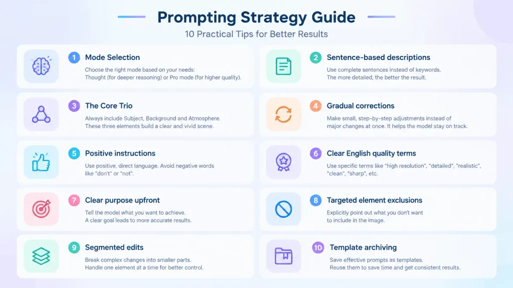
A modern, professional infographic slide titled "[Prompting Strategy Guide]" designed as a [diagram for a proposal]. Clean visual cheat sheet layout featuring 10 numbered points organized in neat modular cards across a structured two-column layout. Each card contains a minimalist icon, a bold title, and concise descriptive text: 1. Mode Selection (Thought / Pro mode), 2. Sentence-based descriptions, 3. The Core Trio (Subject, Background, Atmosphere), 4. Gradual corrections, 5. Positive instructions, 6. Clear English quality terms, 7. Clear purpose upfront, 8. Targeted element exclusions, 9. Segmented edits, 10. Template archiving. Minimalist corporate tech aesthetic, subtle pastel gradient background, sleek UI design, crisp typography, clean vector iconography.

อินโฟกราฟิกสไลด์นำเสนอคู่มือสรุป
โปสเตอร์อินโฟกราฟิกอาหารอินโดนีเซีย

โปสเตอร์อินโฟกราฟิกอาหารอินโดนีเซีย

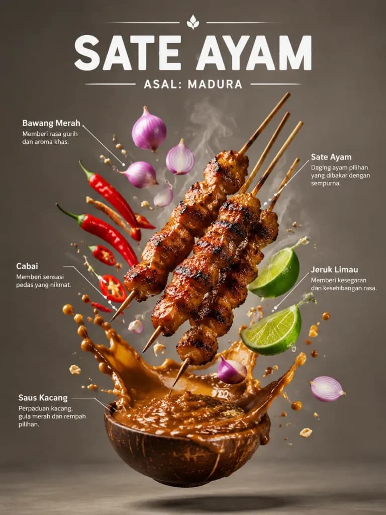
A food infographic poster of [Indonesian Sate Ayam], vertical composition. At the top, bold modern typography displays the dish name "[SATE AYAM]" and regional origin "[ASAL: MADURA]". The dish and its ingredients levitate in mid-air: skewers of charred grilled meat, glossy peanut sauce splashes frozen in motion, fresh shallots, lime wedges, chili peppers, and wisps of steam. Thin, clean white leader lines point to each floating ingredient with small Indonesian text labels. Food magazine editorial layout, dramatic studio contrast lighting, glossy sauce highlights, realistic shadows, shallow depth of field, minimalist neutral background.

การถ่ายภาพอาหารอินโฟกราฟิกโปสเตอร์อาหาร
โปสเตอร์รายงานวิเคราะห์สไตล์การแต่งกายชาย

โปสเตอร์รายงานวิเคราะห์สไตล์การแต่งกายชาย

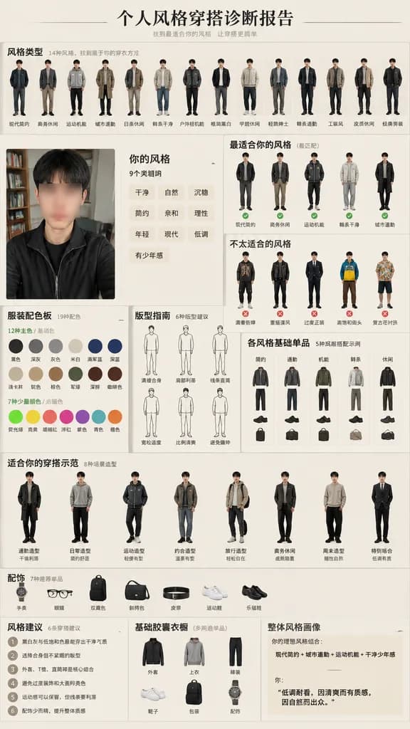
vertical personal menswear style diagnosis infographic poster. [风格类型]. 你的风格. 风格类型. fourteen small full-body male outfit archetypes in a row, each with a Chinese label. 最适合你的风格(最匹配). five recommended full-body outfit thumbnails with check m…

อินโฟกราฟิกแฟชั่นผู้ชายวิเคราะห์สไตล์
อินโฟกราฟิกกายวิภาคศาสตร์พฤกษศาสตร์ผลเอี้ยบ๊วย

อินโฟกราฟิกกายวิภาคศาสตร์พฤกษศาสตร์ผลเอี้ยบ๊วย

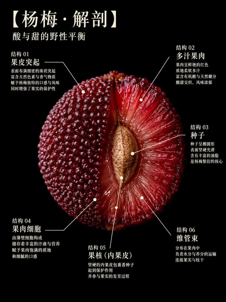
A detailed scientific botanical poster on a solid black background, featuring a single centered cross-section of a Chinese bayberry (Myrica rubra). Dramatic studio lighting, ultra-macro food photography realism, glossy wet texture, and rich deep crimson to burgundy hues. The fruit appears as a half-cut anatomical specimen filling most of the frame: the left half displays the intact exterior covered in tightly packed bead-like papillae, while the right half reveals translucent red flesh radiating inward in fibrous, juicy strands toward a tan-brown central pit. At the top left, elegant Chinese typography in warm ivory reads the title "[杨梅·解剖]", with a smaller subtitle underneath reading "[酸与甜的野性平衡]". Six annotated callout sections in Chinese encircle the fruit, each using thin ivory leader lines and pointer dots pointing to specific anatomical structures: Section 1 at the upper left labeled "结构 01 果皮突起" with 4 lines of explanatory text; Section 2 at the upper right labeled "结构 02 多汁果肉" with 4 lines of explanatory text; Section 3 at the mid-right labeled "结构 03 种子" with 4 lines of explanatory text; Section 4 at the lower left labeled "结构 04 果肉细胞" with 4 lines of explanatory text; Section 5 at the lower center labeled "结构 05 果核(内果皮)" with 3 lines of explanatory text; Section 6 at the lower right labeled "结构 06 维管束" with 3 lines of explanatory text. The typography uses a refined ivory serif print resembling a museum exhibition placard or luxury editorial infographic. Balanced composition, high contrast, no borders, no watermarks.

เอี้ยบ๊วยโปสเตอร์พฤกษศาสตร์อินโฟกราฟิก
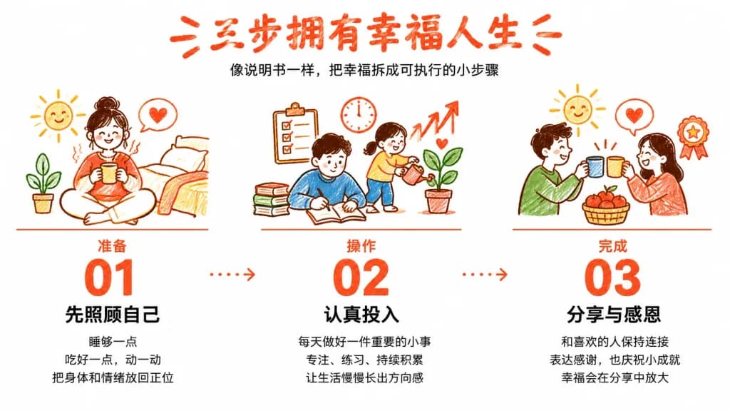
โปสเตอร์อินโฟกราฟิกภาษาจีนลายเส้นวาดมือ

โปสเตอร์อินโฟกราฟิกภาษาจีนลายเส้นวาดมือ

A clean illustrated Chinese self-improvement infographic titled "[三步拥有幸福人生]", presented as an instruction manual for happiness. Wide horizontal 16:9 canvas with an airy white background and minimalist editorial layout. At the top center, a large rough handwritten red-orange headline reads 「[三步拥有幸福人生]」 flanked by small decorative red strokes, with a smaller black subtitle below: 「像说明书一样,把幸福拆成可执行的小步骤」. The lower two-thirds features three equal columns connected horizontally by red-orange dotted arrows moving left to right. Each column contains a doodle illustration at the top, a thin red divider line, a section label, a giant red-orange step number, a bold black title, and three short lines of explanatory text. - Step 1 (left): Section label 「准备」, huge number 「01」, bold title 「先照顾自己」, with 3 lines of text: 「睡够一点」, 「吃好一点,动一动」, 「把身体和情绪放回正位」. Illustration shows a smiling person sitting on the floor with a steaming mug beside a bed/pillow, a smiling sun doodle, and a heart speech bubble. - Step 2 (center): Section label 「操作」, huge number 「02」, bold title 「认真投入」, with 3 lines of text: 「每天做好一件重要的小事」, 「专注、练习、持续积累」, 「让生活慢慢长出方向感」. Illustration shows people reading, writing in a notebook, a child watering a potted plant with a heart, a checklist clipboard, clock, and growth arrows. - Step 3 (right): Section label 「完成」, huge number 「03」, bold title 「分享与感恩」, with 3 lines of text: 「和喜欢的人保持连接」, 「表达感谢,也庆祝小成就」, 「幸福会在分享中放大」. Illustration shows two people clinking cups, an apple basket, smiling sun, heart bubble, and an award ribbon. Style: Hand-drawn red-orange crayon/marker sketch style with textured lines, crisp black sans-serif typography, high contrast, clean and warm editorial aesthetic. Exactly 3 columns and steps; preserve all Chinese text verbatim.

อินโฟกราฟิกตัวอักษรจีนภาพวาดมือ
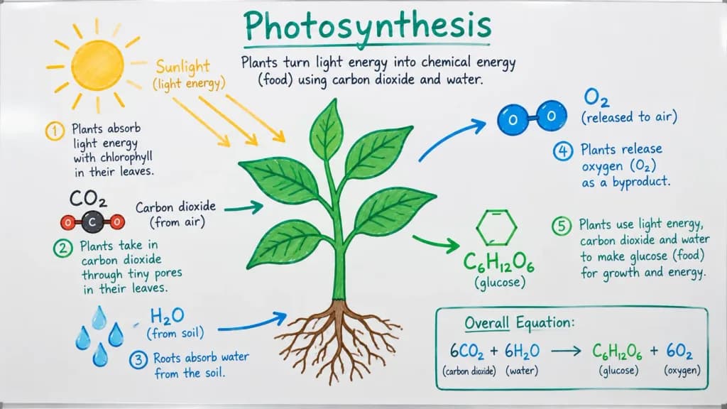
แผนภาพการสังเคราะห์ด้วยแสงบนไวท์บอร์ด

แผนภาพการสังเคราะห์ด้วยแสงบนไวท์บอร์ด

A detailed, hand-drawn whiteboard diagram illustrating [the process of photosynthesis], designed for [a high school biology class]. Sketched with dry-erase colored markers on a clean white board, featuring simple icons of [a sun, a green plant, water droplets, and CO2 and O2 molecules]. Includes neat handwritten annotations and clear directional arrows indicating the flow of energy and matter. Clean, legible instructional layout mimicking an authentic classroom whiteboard drawing.

ไวท์บอร์ดการสังเคราะห์ด้วยแสงอินโฟกราฟิก
ภาพโปรโมตหุ่นยนต์ AI บนโต๊ะทำงานสุดน่ารัก

ภาพโปรโมตหุ่นยนต์ AI บนโต๊ะทำงานสุดน่ารัก

A warm realistic 3D render promotional illustration in a square 1:1 format. In a cozy office desk setting with soft depth of field and natural window light from the left, a glossy white rounded robot mascot sits centered slightly to the right on a polished wood tabletop. The robot features a black glass face screen showing two glowing cyan happy closed-eye arcs, rounded over-ear side panels, segmented white arms with black joints, a small teal [OpenAI] knot logo on its chest, a waving right hand, and a left hand holding a white placard. Placard text and graphics: Handwritten-style text at top reading “I was created by”, a large teal [OpenAI] knot logo, bold black “[OpenAI]”, smaller subtitle “An AI research and deployment company”, and a teal slogan “Better AI. A brighter future.” with small teal decorative doodle rays. Left chalkboard-style overlay: Hand-drawn white and mint typography and doodles. Top text: “Hi there!” with emphasis marks; below it, “I’m” in white and “[ChatGPT]” in large mint green underlined letters. Exactly 3 bullet blocks with icons: 1) Speech bubble icon: “A large language model (AI assistant)” 2) Lightbulb icon: “I can answer questions, explain things, help you create, solve problems, and much more!” 3) Heart icon: “I’m here to be helpful, honest, and friendly.” Right background branding: On a dark blue wall panel behind the robot, a pale gray [OpenAI] knot logo and the word “[OpenAI]”. Below it, four stacked handwritten lines: “Research”, “Safety”, “Useful AI”, “for everyone”, with an underline and doodle rays. Above the robot’s head, handwritten text “That’s me!” with an arrow pointing down to the robot. Desk objects: Four stacked books on the left with readable spine text: blue book “BETTER QUESTIONS”, green book “CLEARER ANSWERS”, purple book “A MORE HELPFUL TOMORROW”, and a dark bottom book with a small heart icon. In the lower-left foreground, a laptop with text on the lid reading “Curiosity builds a better world” and a small heart. On the right, a white coffee mug printed with “Same team. A brighter future.” and a smiley face. Bottom caption: Along the bottom edge, a thin handwritten line reading “[OpenAI] × [ChatGPT] = More possibilities for everyone” followed by a small heart.

ผู้ช่วย aiมาสคอตหุ่นยนต์ภาพเรนเดอร์ 3d
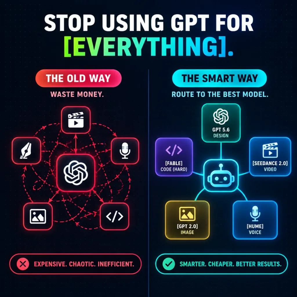
อินโฟกราฟิกเปรียบเทียบการกำหนดเส้นทางโมเดล AI

อินโฟกราฟิกเปรียบเทียบการกำหนดเส้นทางโมเดล AI

A square 1:1 dark futuristic tech infographic for social media comparing two AI workflow approaches, set against a deep navy-to-black background with a subtle dotted grid texture and a vertical split down the center. At the top, a bold uppercase headline in a clean, heavy sans-serif font reads: “STOP USING GPT FOR [EVERYTHING].” The words “STOP USING GPT FOR” are pure white, while “[EVERYTHING]” is styled with a lime-green-to-cyan gradient and followed by a cyan period. Layout with two side-by-side columns: - Left Column (Inefficient Workflow): Red and pink color theme with a pill-shaped badge labeled “THE OLD WAY” and a small subtitle “WASTE MONEY.” In the center is a rounded-square OpenAI knot icon surrounded by 5 smaller rounded-square task icons: video clapper at top center, design pen nib at left, microphone at right, photo icon at lower left, and code brackets at lower right. Tangled, looping red dashed routing lines cross chaotically between them. Beneath this column is a red-bordered status pill with a red 'X' icon reading “EXPENSIVE. CHAOTIC. INEFFICIENT.” - Right Column (Smart Workflow): Teal and cyan color theme with a pill-shaped badge labeled “THE SMART WAY” and a subtitle “ROUTE TO THE BEST MODEL.” In the center is a glowing rounded-square robot router icon, connected via clean, glowing solid lines to 5 distinct glassmorphism cards with neon outlines: 1 top card with OpenAI knot icon labeled “GPT 5.6” and “DESIGN”, 2 left purple card with code brackets labeled “[FABLE]” and “CODE (HARD)”, 3 right blue card with clapper icon labeled “[SEEDANCE 2.0]” and “VIDEO”, 4 bottom-left gold card with image icon labeled “[GPT 2.0]” and “IMAGE”, 5 bottom-right blue card with microphone labeled “[HUME]” and “VOICE.” Beneath this column is a teal-bordered status pill with a green checkmark reading “SMARTER. CHEAPER. BETTER RESULTS.” Style: Modern SaaS marketing graphic, crisp vector-style precision, neon edge glows, glassmorphism UI elements, ultra-legible typography, centered and balanced layout.

อินโฟกราฟิกเวิร์กโฟลว์saas
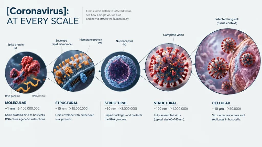
อินโฟกราฟิกซูมทางวิทยาศาสตร์หลายระดับ

อินโฟกราฟิกซูมทางวิทยาศาสตร์หลายระดับ

A hyper-realistic 3D zoom-sequence scientific infographic titled "[Coronavirus]: AT EVERY SCALE". Layout features 6 to 8 circular frames arranged in an expanding sequential path connected by subtle vector zoom-lines. Scale progression begins from the innermost frame displaying subcomponent atomic and molecular detail (spike proteins, RNA core), expanding through structural layers (envelope, capsid) to the complete virion, up to the outermost frame showing contextual infection within cellular lung tissue. Each frame contains a detailed 3D scientific render, labeled with scale names ("molecular", "structural", "cellular"), magnification factors, and brief 3–5 word scientific annotations. Clean editorial layout, precise scientific macro lighting, crisp typography, neutral scientific infographic background.

อินโฟกราฟิกวิทยาศาสตร์เรนเดอร์-3d
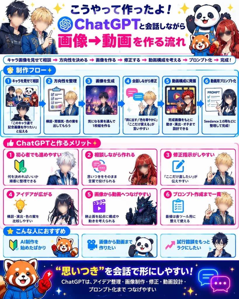
อินโฟกราฟิกเวิร์กโฟลว์ AI ภาพสู่วิดีโอสไตล์ญี่ปุ่น

อินโฟกราฟิกเวิร์กโฟลว์ AI ภาพสู่วิดีโอสไตล์ญี่ปุ่น

bright Japanese social-media infographic poster. large bold Japanese lettering, dark navy and purple for ChatGPT, hot pink for 画像→動画, celebratory sparkles. small bold text under headline with pink arrow separators. 制作フロー. six numbered blue…

อินโฟกราฟิกโซเชียลมีเดียโปสเตอร์
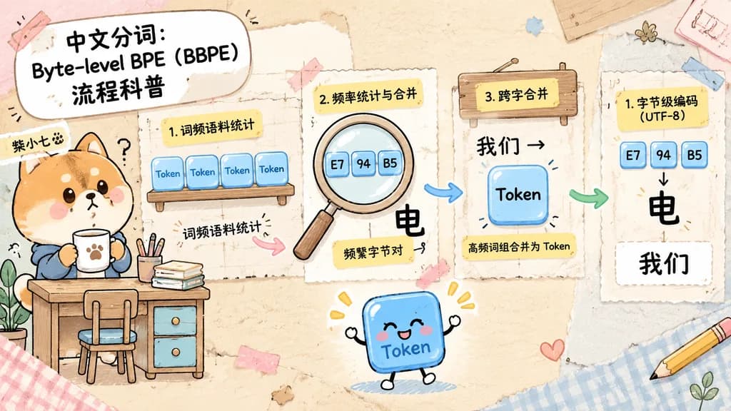
อินโฟกราฟิกสมุดภาพอธิบาย Byte-Level BPE

อินโฟกราฟิกสมุดภาพอธิบาย Byte-Level BPE

A cute horizontal educational infographic in a hand-drawn scrapbook journal collage style on a pastel desk-and-paper background, explaining Chinese word segmentation with byte-level BPE. The layout is divided into three clearly separated instructional sections arranged from left to right. On the far left stands a chibi Shiba Inu mascot named [柴小七] with warm tan and cream fur, rosy cheeks, and a curious expression, holding a cup beside a miniature desk with drawers, pencils, and a chair. Above the dog is a bold rounded white title box with black text: "[中文分词:Byte-level BPE(BBPE)流程科普]". In the first teaching section near the upper middle, four small translucent blue token-shaped tiles sit on a wooden shelf, each labeled "Token", with a curved arrow and handwritten note "词频语料统计" pointing onward. In the second section, a large magnifying glass highlights three small byte tiles labeled "E7", "94", and "B5", accompanied by a yellow sticky note reading "2. 频率统计与合并", a large black Chinese character "电", and a handwritten note "频繁字节对". In the third section, a wooden sign and a merged translucent blue token labeled "Token" appear with a yellow note reading "3. 跨字合并", black text "我们→", and a caption strip reading "高频词组合并为 Token". On the far right, display the explanatory result: three byte boxes "E7", "94", and "B5" above the character "电", a note card reading "1. 字节级编码(UTF-8)", and below it the black word "我们". Curved pink, blue, and green arrows connect the process flow. At center-bottom, include a cheerful animated blue token mascot with tiny limbs waving. Scrapbook aesthetic with taped paper corners, sticker cutout outlines, textured paper, and soft cream, pink, beige, and light blue tones.

อินโฟกราฟิกbpeการตัดคำ
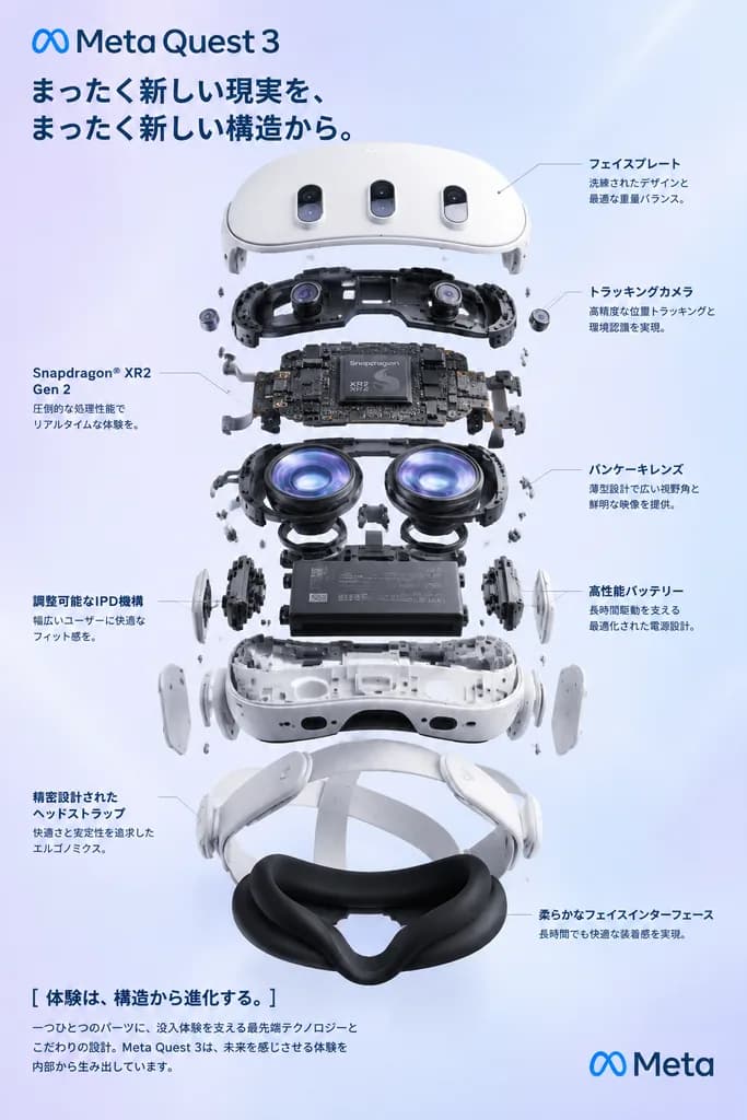
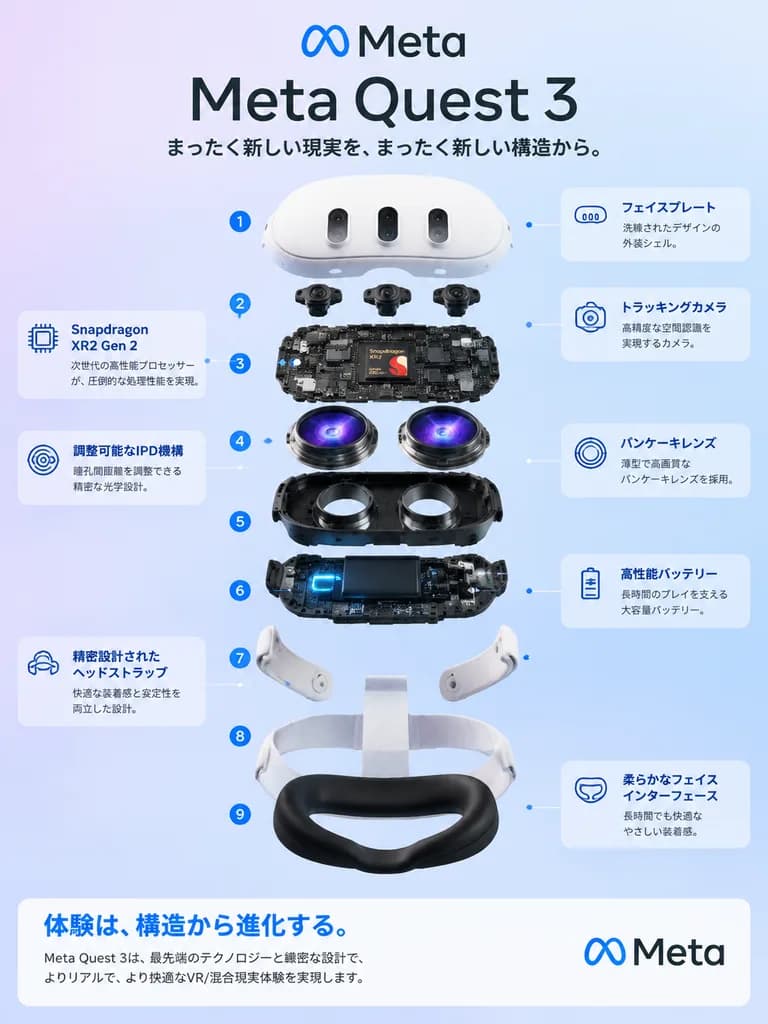
อินโฟกราฟิกทางเทคนิคภาพระเบิดโครงสร้างแว่น VR

อินโฟกราฟิกทางเทคนิคภาพระเบิดโครงสร้างแว่น VR

Clean, premium Japanese tech infographic poster for [Meta Quest 3], centered on a vertically stacked exploded view of a white mixed-reality headset floating against a soft lavender-to-blue gradient background. - Header: At top, a blue Meta logo followed by a large bold black sans-serif headline reading "[Meta Quest 3]", with a smaller Japanese sub-headline beneath: 「まったく新しい現実を、まったく新しい構造から。」. - Central Subject: 3D engineering breakdown render showing exactly 9 vertically separated layers, labeled 1 to 9 with blue circular numbered markers on the left: 1. White outer faceplate shell with three front camera/sensor openings 2. Row of 3 black tracking camera modules 3. Main logic board with circuit components and a visible Snapdragon XR2 Gen 2 chip graphic at center 4. Pair of pancake lens assemblies with vivid violet-blue optical reflections 5. Black structural internal chassis with lens apertures 6. Battery and electronics rail with subtle glowing blue accents 7. Two articulated white side strap arms 8. White fabric head strap loop 9. Soft black facial interface cushion - Annotations: Rounded translucent callout cards with thin white borders and fine leader lines pointing to corresponding layers: - Left side (top to bottom): 「Snapdragon XR2 Gen 2」 with chip icon and Japanese text; 「調整可能なIPD機構」 with optics icon and Japanese text; 「精密設計されたヘッドストラップ」 with strap icon and Japanese text. - Right side (top to bottom): 「フェイスプレート」 with faceplate icon; 「トラッキングカメラ」 with camera module icon; 「パンケーキレンズ」 with lens icon; 「高性能バッテリー」 with battery icon; and 「柔らかなフェイスインターフェース」 with cushion icon. - Footer: A wide, white rounded banner across the bottom. On the left, bold blue Japanese text: 「体験は、構造から進化する。」 with small black explanatory copy below. On the right, the blue Meta logo and "Meta" wordmark. - Style: Sleek minimalist tech marketing aesthetic, soft studio illumination, crisp ambient occlusion, glossy plastic finishes, balanced typography.

อินโฟกราฟิกภาพระเบิดชิ้นส่วนแว่น-vr
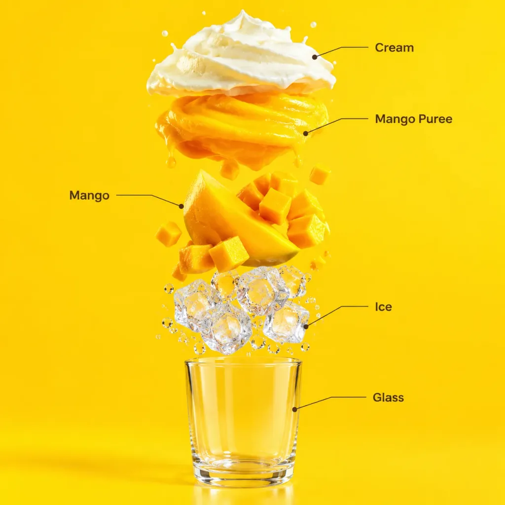
อินโฟกราฟิกภาพแยกชิ้นส่วนสมูทตี้มะม่วง

อินโฟกราฟิกภาพแยกชิ้นส่วนสมูทตี้มะม่วง

A commercial exploded vertical infographic composition of a [mango] smoothie against a seamless bright tropical yellow studio background. Top to bottom exploded layers: a light airy cream foam layer, a rich vibrant [mango] puree layer, fresh juicy [mango] slices and chunks, clear crystalline ice cubes with condensation droplets, and a minimal transparent glass base at the bottom. Perfectly aligned vertically with soft realistic cast shadows and clean studio reflections. Featuring clean infographic text labels connected by thin pointer lines: "Cream", "Mango Puree", "Mango", "Ice", and "Glass". Premium beverage advertising photography style, ultra-sharp focus.

มะม่วงสมูทตี้เครื่องดื่ม
การ์ดเปรียบเทียบมาตรฐานแฟชั่นแนวบรรณาธิการ

การ์ดเปรียบเทียบมาตรฐานแฟชั่นแนวบรรณาธิการ

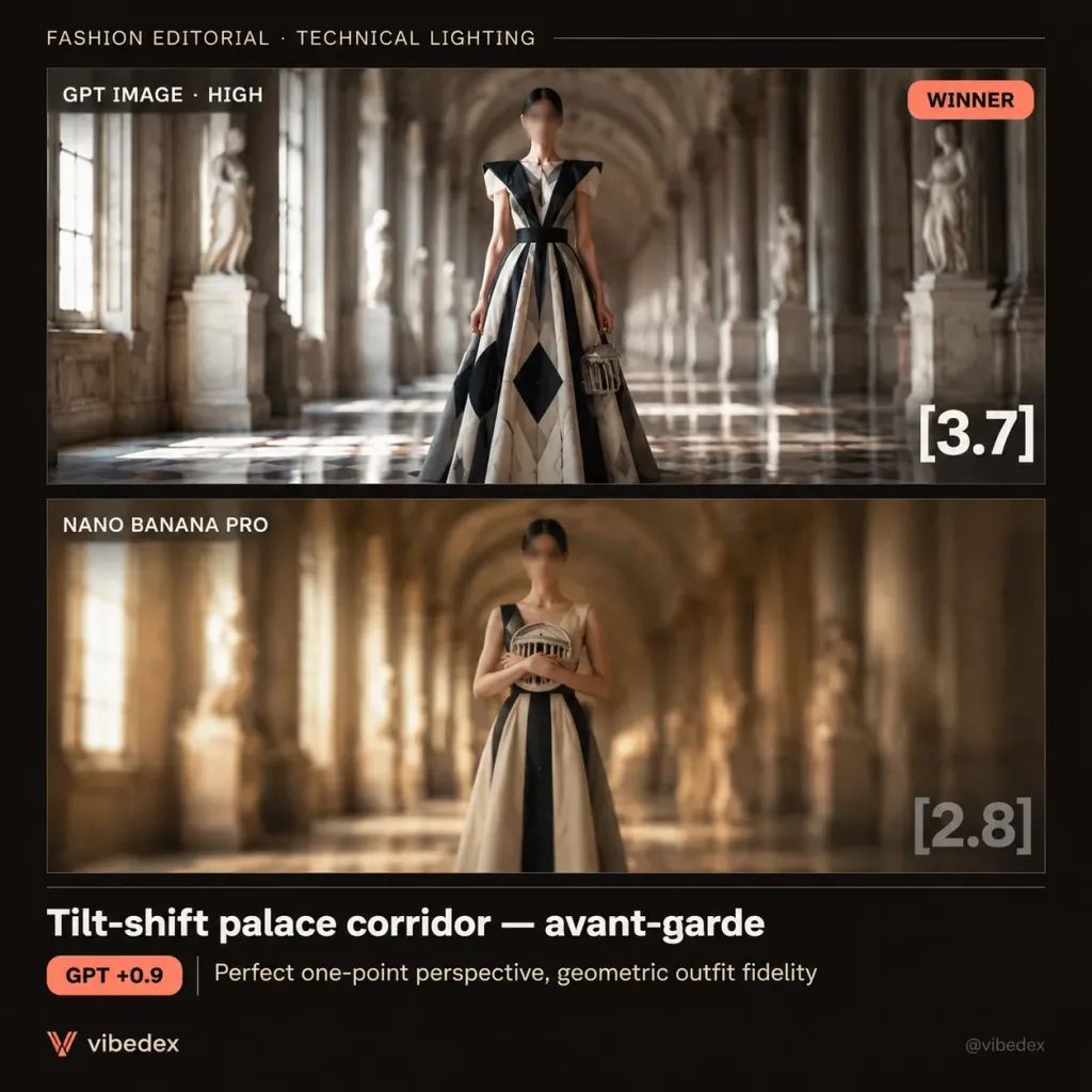
Dark editorial benchmark comparison card for [Tilt-shift palace corridor — avant-garde], formatted as a square social media graphic with a nearly black warm-brown background, thin divider lines, and a refined review aesthetic. Layout: Exactly two stacked image panels centered horizontally with a thin horizontal separator. Header text at the top left reads "FASHION EDITORIAL · TECHNICAL LIGHTING". Bottom caption band contains headline text, a score-delta pill, a brief note, and subtle branding. Panel 1 (Top, larger): High-quality editorial render labeled "GPT IMAGE · HIGH" at the top left, with a coral rounded "WINNER" badge at the top right. A full-body avant-garde fashion model stands centered in a grand arched palace corridor with precise one-point perspective, tall columns, classical statues, bright natural window light, and strong tilt-shift depth blur into the distance. The model wears a geometric black, cream, and gray structured dress with sharp diagonal stripes, symmetrical shoulder panels, cinched waist, wide skirt with black diamond motifs, holding a small architectural circular handbag at the right side. The model's face is subtly blurred or obscured. Large white score "[3.7]" positioned at the bottom right of this panel. Panel 2 (Bottom): Labeled "NANO BANANA PRO" at the top left. Shows a similar concept with lower accuracy: centered model in the vaulted palace corridor, warmer golden lighting, heavy blur, less defined geometry, and a flatter outfit. The model holds a circular architectural object across the chest, face blurred. Large translucent gray score "[2.8]" positioned at the bottom right of this panel. Bottom band content: Headline "[Tilt-shift palace corridor — avant-garde]" in bold white. Beneath it, a coral pill badge reading "[GPT +0.9]" followed by "Perfect one-point perspective, geometric outfit fidelity". Small orange V-shaped logo with "vibedex" at the bottom left, and faint "@vibedex" text at the bottom right. Visual style: Dark UI aesthetic, muted cream and black palette, coral accents, clean modern sans-serif typography, crisp alignment, cinematic lighting, shallow depth of field, subtle grain.

เบนช์มาร์กแฟชั่นบรรณาธิการ