ใหม่: GPT Image 2.5 Flare และ Sunburst ลองฟรี 3 รูปเมื่อสมัคร จากนั้นรูปละ 8 เครดิต
ลองใช้ GPT Image 2.5

พรอมต์ AI การออกแบบสิ่งพิมพ์

218 เทมเพลต · GPT IMAGE 2, Nano Banana Pro · อัปเดตเมื่อ ต.ค. 2569

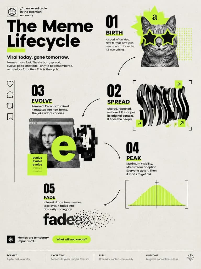
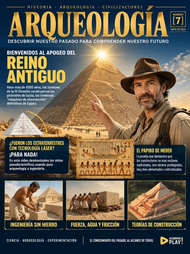
เทมเพลตเหล่านี้ช่วยสร้างภาพปกนิตยสาร สไลด์พรีเซนเทชัน เอกสารคู่มือแบรนด์ และโปสเตอร์อินโฟกราฟิก แต่ละเลย์เอาต์เน้นการจัดวางตามระบบกริด การเว้นพื้นที่ว่างอย่างสมดุล และการจัดลำดับชั้นของตัวอักษรอย่างเป็นระเบียบ คุณสามารถปรับแต่งข้อความในวงเล็บ โทนสีเน้น และจุดเด่นของภาพเพื่อนำไปปรับใช้กับสื่อสิ่งพิมพ์หรือแคมเปญต่างๆ ได้ตามต้องการ

จัดเรียงตาม:

แสดง 61–120 จาก 218 พรอมป์

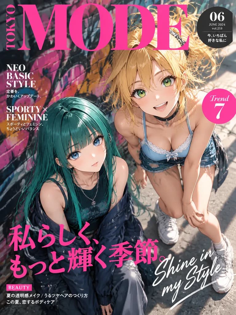
หน้าปกนิตยสารแฟชั่นอนิเมะโตเกียว

หน้าปกนิตยสารแฟชั่นอนิเมะโตเกียว

A stylized Japanese fashion magazine cover designed like a glossy contemporary women's style publication. High-angle, dynamic street-fashion anime illustration of two girls looking up toward the viewer from beside a brick wall covered in colorful graffiti murals. The girl on the right has [golden blonde] hair styled in a lively messy ponytail with loose bangs, bright green eyes, a cheerful wide grin, wearing a light blue lace-trim camisole, short bottoms, chunky white sneakers, and a black choker, energetically leaning forward with one knee bent. The girl on the left has long vivid teal-green hair with straight heavy bangs, large blue eyes, and a cool, calm expression, sitting lower in a layered dark street outfit with a sleeveless top, looking upward. Bold cel-shaded anime rendering with crisp linework, glossy hair and eye highlights, soft skin shading, dramatic summer sunlight, deep contrasting shadows, and blurred graffiti mural textures in pink, purple, and orange. Premium magazine cover layout with dense typography: giant pink serif masthead reading "[MODE]" across the top with "TOKYO" set vertically on the left; an upper-right dark rounded badge displaying "[06]", "JUNE 2024", "vol.218", and Japanese cover text; left-side blurbs reading "NEO BASIC STYLE" and "SPORTY × FEMININE"; a pink circular badge on the right reading "Trend 7"; a prominent hot-pink Japanese headline reading "私らしく、もっと輝く季節。" across the lower center; elegant white script reading "Shine in my Style" diagonally on the lower right; and a small "BEAUTY" tag with Japanese footer lines at the bottom. Full bleed, vertical composition.
หน้าปกนิตยสารอนิเมะแฟชั่น
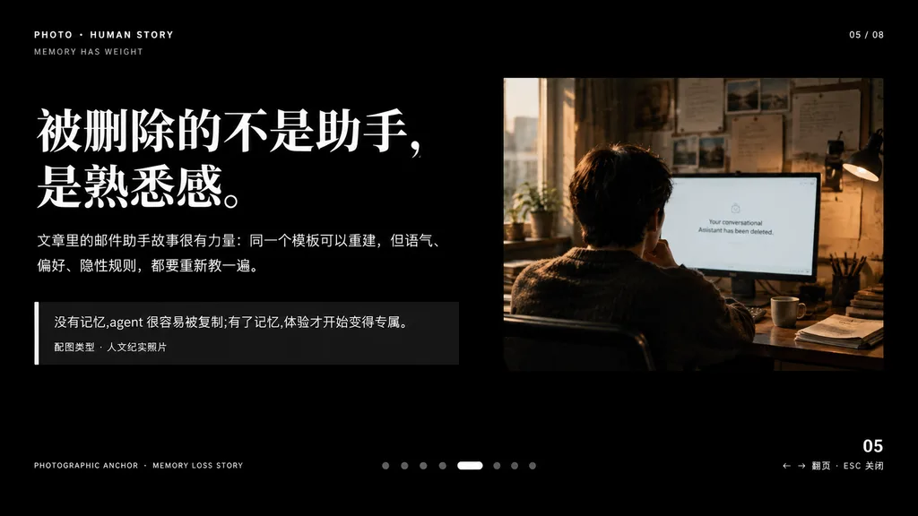
สไลด์นำเสนอสไตล์บรรณาธิการพร้อมภาพถ่ายสารคดี

สไลด์นำเสนอสไตล์บรรณาธิการพร้อมภาพถ่ายสารคดี

A minimalist cinematic presentation slide layout on a solid deep black background, widescreen 16:9, premium editorial keynote style. Asymmetrical composition with clean typography on the left and a documentary photograph on the upper right, framed by generous negative space. Left Typography and Text Blocks: - Top-left uppercase microtext: "PHOTO • HUMAN STORY", with "MEMORY HAS WEIGHT" slightly beneath it. - Main headline: very large, bold white Chinese serif typography across two lines reading "[被删除的不是助手,\n是熟悉感。]". - Body text directly below: medium-small white and light gray Chinese text across two lines reading "[文章里的邮件助手故事很有力量:同一个模板可以重建,但语气、\n偏好、隐性规则,都要重新教一遍。]". - Quote block below: a dark translucent rectangular box with a thin vertical white accent line on its left edge. Inside, text reading "[没有记忆,agent 很容易被复制;有了记忆,体验才开始变得专属。]" above a smaller caption line reading "配图类型 · 人文纪实照片". Upper Right Photograph: - A warm-toned, film-style humanistic documentary photo showing one adult seated from behind at a desk in a dimly lit office, looking at a computer screen. Beside the monitor is a desk lamp, with papers pinned on the wall and soft daylight streaming through a nearby window. The monitor displays a clean white interface with centered English text: "[Your conversational Assistant has been deleted.]". Muted brown, amber, and cool gray tones, intimate and melancholic atmosphere. UI Details & Pagination: - Top right: "05 / 08". - Bottom left microtext: "PHOTOGRAPHIC ANCHOR · MEMORY LOSS STORY". - Bottom right: "05" with tiny navigation hint "← → 翻页 · ESC 关闭". - Bottom center: 8 small pagination indicators, with the 5th dot styled as an elongated horizontal white pill and the other 7 as muted gray circles. Overall Aesthetic: High-end editorial magazine layout, crisp alignment, sophisticated typographic hierarchy, contemplative and narrative-driven.

งานนำเสนอคีย์โน้ตการออกแบบบรรณาธิการ
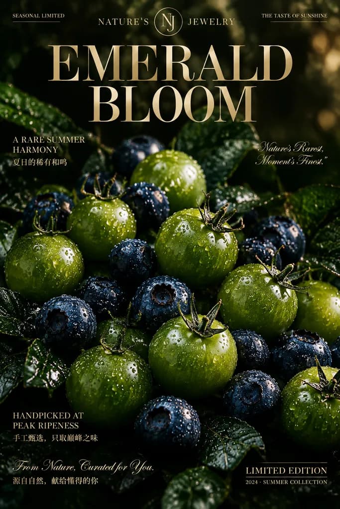
โปสเตอร์โฆษณาผลไม้ระดับพรีเมียม Emerald Bloom

โปสเตอร์โฆษณาผลไม้ระดับพรีเมียม Emerald Bloom

{"type":"luxury editorial fruit advertisement poster","subject":{"primary":"close-up still life of fresh [green cherry tomatoes] and [blueberries]","produce":{"items":[{"name":"green cherry tomatoes","count":"about 18 visible","details":"small round green tomatoes with green calyx stems, glossy skins covered in crisp water droplets"},{"name":"blueberries","count":"about 15 visible","details":"deep indigo-blue berries nestled between the tomatoes, coated with fine condensation droplets"}],"surface":"dark wet leafy foliage with subtle reflective highlights"},"styling":{"mood":"opulent, moody, natural luxury","lighting":"dramatic low-key studio lighting with bright specular highlights on condensation droplets and fruit skins","colorPalette":"deep forest green, olive green, midnight blue, obsidian black, champagne gold","focus":"sharp macro focus on center foreground fruit with smooth falloff and shallow depth of field","atmosphere":"fresh summer harvest presented like high jewelry"},"composition":{"orientation":"vertical poster","crop":"tight macro crop filling the frame with produce","background":"near-black dark olive backdrop with soft organic texture and faint reflective bokeh in upper right"},"textOverlay":{"brandLineTopLeft":"SEASONAL LIMITED","brandCenterTopLeft":"NATURE'S","brandCenterTopRight":"JEWELRY","taglineTopRight":"THE TASTE OF SUNSHINE","mainHeadlineLine1":"EMERALD","mainHeadlineLine2":"BLOOM","leftMidEnglish":"A RARE SUMMER HARMONY","leftMidChinese":"夏日的稀有和鸣","rightMidQuote":"Nature’s Rarest, Moment’s Finest.","leftLowerEnglish":"HANDPICKED AT PEAK RIPENESS","leftLowerChinese":"手工甄选,只取巅峰之味","scriptLine":"From Nature, Curated for You.","scriptChinese":"源自自然,献给懂得的你","bottomRightMain":"LIMITED EDITION","bottomRightSub":"2024 · SUMMER COLLECTION"},"design":{"typography":"editorial serif typography in bold uppercase for the headline, clean light serif for secondary text, and an elegant cursive script for accent phrases","textColor":"metallic champagne gold","logo":"minimal circular monogram emblem centered between NATURE'S and JEWELRY","layout":{"header":"brand row across the top","headline":"large EMERALD BLOOM centered above the fruit","editorialCopy":"bilingual English and Chinese captions arranged along left and right flanks","footer":"limited edition collection stamp at bottom right"}},"rendering":{"style":"commercial luxury advertising photography","quality":"photorealistic, crisp water droplets, polished high-end magazine retouching","aspectRatio":"2:3"}}

การถ่ายภาพอาหารโปสเตอร์โฆษณาภาพนิ่ง
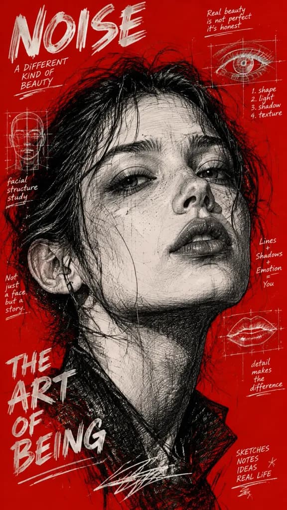
โปสเตอร์ซีนภาพวาดปากกาลูกลื่นขาวดำ

โปสเตอร์ซีนภาพวาดปากกาลูกลื่นขาวดำ

An avant-garde underground zine poster illustration featuring a high-detail face rendered in monochrome black ink. Dense cross-hatching, fine hatch shading, intricate biro ballpoint pen sketch textures, expressive organic strokes, and layered sketchbook construction lines. Set against a solid [bold red background], overlaid with vintage technical scribbles, pure white handwritten notes, and integrated white typographic annotations. High-contrast graphic design, raw imperfect ink marks, editorial surreal magazine cover aesthetic.

ปากกาลูกลื่นโปสเตอร์ซีนการแรเงาสานเส้น
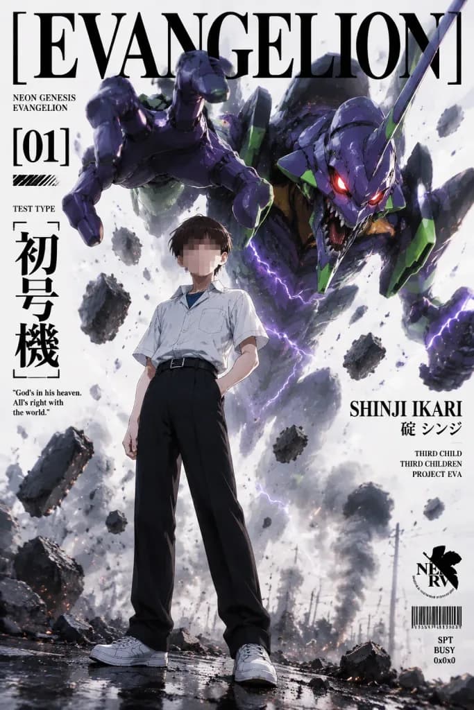
โปสเตอร์ปกนิตยสารอนิเมะเอวานเกเลียน

โปสเตอร์ปกนิตยสารอนิเมะเอวานเกเลียน

Vertical 2:3 anime editorial magazine cover poster inspired by Neon Genesis Evangelion. Foreground Subject: A slim 14-year-old teenage boy in a confident yet neutral standing pose, one hand in his trouser pocket and the other relaxed at his side, looking forward. His face is intentionally anonymized with a soft rectangular pixel blur over facial features, leaving hair and head shape intact. Outfit consists of a short-sleeved white school uniform shirt, dark blue undershirt collar visible, black belt, loose high-waisted black trousers, white low-top sneakers, and short dark brown hair. Mecha and Action: In the background, a massive biomechanical mecha (EVA Unit-01) lunges aggressively forward from the upper right. It features angular deep purple and black armor plates, neon green accents, a long horn, glowing red eyes, an open mechanical jaw, and a massive clawed hand reaching from the upper left. Around it are 12 large floating rubble chunks, sparks, dust, shattered concrete, rising smoke plumes, and jagged violet lightning streaks. Setting & Composition: Low-angle view with the boy standing slightly left of center on wet, reflective battle-damaged asphalt and cracked rubble. Background sky is pale off-white. Strong depth of field keeps the boy and mecha sharp while background debris fades into soft haze. Lighting & Style: Editorial fashion magazine aesthetic blended with high-end anime key art. Realistic lighting with cool rim light from violet energy and crisp shadows. Glossy armor reflections, sharp contrast, and gritty textures. Typography & Graphic Elements: Clean, dark black editorial typography integrated into the poster layout: 1. Top oversized luxury serif masthead: "[EVANGELION]", spanning nearly the full width and partially tucked behind the mecha's head. 2. Small text on left: "NEON GENESIS EVANGELION". 3. Large left issue number: "[01]" with a small hatched black rectangle beneath it. 4. Small label: "TEST TYPE". 5. Large vertical Japanese text: "[初号機]". 6. Quote: "God's in his heaven. All's right with the world." 7. Right-side name in serif capital letters: "[SHINJI IKARI]". 8. Japanese name text: "碇 シンジ". 9. Small stacked labels: "THIRD CHILD", "THIRD CHILDREN", and "PROJECT EVA". 10. Small technical emblem with barcode and micro-text in the lower right, plus corner codes "SPT", "BUSY", and "0x0x0". Constraints: No extra characters, no speech bubbles, all text must remain crisp, black, and legible.

เอวานเกเลียนโปสเตอร์อนิเมะเมคา
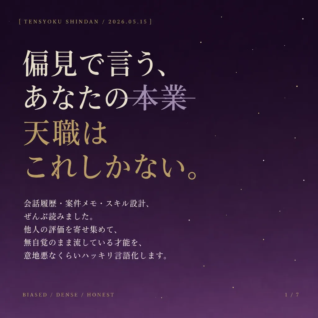
สไลด์หน้าปกภาพสไลด์ภาษาญี่ปุ่นสไตล์มินิมอลสำหรับแนะแนวอาชีพ

สไลด์หน้าปกภาพสไลด์ภาษาญี่ปุ่นสไตล์มินิมอลสำหรับแนะแนวอาชีพ

Minimalist Japanese title slide design for a social media carousel, with an elegant literary editorial aesthetic. Square 1:1 composition with generous negative space. Background: Deep plum-to-purple vertical gradient, darker at the top and subtly lighter toward the bottom, delicately scattered with sparse, tiny off-white and muted antique gold star specks. No constellations or heavy illustrations. Layout & Typography: Left-aligned composition with wide margins, utilizing refined Japanese Mincho/serif typography with high stroke contrast. - Top-left: Small uppercase tracking label: "[TENSYOKU SHINDAN / 2026.05.15]". - Headline (prominent, upper-left half): Line 1: "[偏見で言う、]" in ivory. Line 2: "[あなたの本業]" in ivory, with "[本業]" rendered in muted lavender-gray crossed out with a thin horizontal strikethrough line. Line 3: "[天職は]" in muted antique gold. Line 4: "[これしかない。]" in muted antique gold. - Body Text (compact four-to-five line serif paragraph in ivory beneath headline): "[会話履歴・案件メモ・スキル設計、 ぜんぶ読みました。 他人の評価を寄せ集めて、 無自覚のまま流している才能を、 意地悪なくらいハッキリ言語化します。]" - Bottom-left: Small uppercase footer "[BIASED / DENSE / HONEST]" in muted gold. - Bottom-right: Small page counter "[1 / 7]" in muted gold. Constraints: No people, no icons, no border frames, no watermarks, clean editorial print feel.

ปกภาพสไลด์การจัดตัวอักษรญี่ปุ่นการออกแบบสิ่งพิมพ์
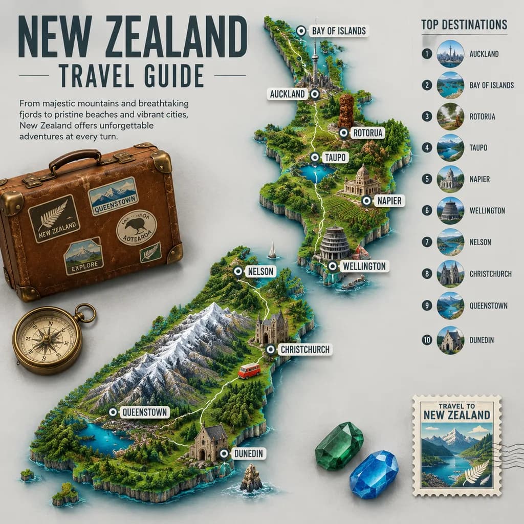
โปสเตอร์อินโฟกราฟิกคู่มือท่องเที่ยวแผนที่ภูมิประเทศ 3 มิติ

โปสเตอร์อินโฟกราฟิกคู่มือท่องเที่ยวแผนที่ภูมิประเทศ 3 มิติ

travel poster infographic. vintage-inspired premium travel guide map. main headline. map destinations. destination highlights list. travel props. [New Zealand]. 3D illustrated topographic relief map shaped like the country, viewed from abo…

อินโฟกราฟิกโปสเตอร์ท่องเที่ยวแผนที่ภูมิประเทศ
โปสเตอร์แว่นตาหรูหราแนววายร้าย

โปสเตอร์แว่นตาหรูหราแนววายร้าย

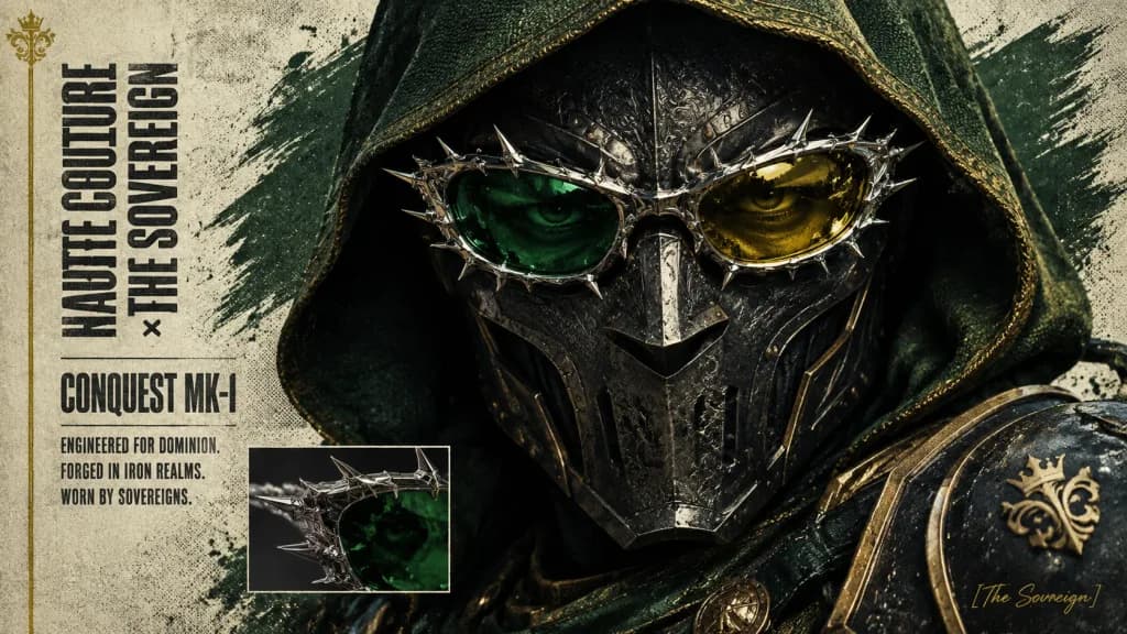
Cinematic collectible character poster for a dark fantasy and superhero crossover villain, wide 16:9 landscape orientation. The background is a gritty off-white parchment texture with halftone speckling, black ink wear, a muted yellow-green tint, and a broad brush stroke of dark green paint behind the head. Composition & Layout: - Split layout: a narrow typography column on the far left, and an extreme close-up portrait filling the center and right. - Exactly 1 main portrait. - Exactly 1 small rectangular inset image placed near the lower center-left showing a macro detail of the spiked green-and-gold glasses. - Exactly 1 thin vertical gold line running along the far left edge, topped or flanked by 1 small gold ornamental crest. - Exactly 1 subtle signature in the bottom-right corner reading: "[Victor Von Doom]". Main Subject: - One armored, hooded ruler shown in tight close-up from the shoulders up, angled slightly toward the viewer. - Wearing a deep forest-green fabric hood with a coarse woven texture, paired with a dark gunmetal medieval-sci-fi mask featuring ornate rivets, engraved filigree, sharp cheek/brow plates, and a sculpted metal nose bridge. - Eyes partially visible in dramatic shadow, intense and piercing. - Across the eye area, an elaborate chrome-silver spiked eyeglass frame is seamlessly integrated into the mask, featuring sharp thorn-like contours and high specular reflections. Exactly two mirrored lenses: left lens emerald green, right lens golden yellow. - Armor includes blackened steel plates, gold ornamental trim, dark green leather accents at the lower shoulder, and a visible gold crest emblem. Typography & Text: - Far left: vertical condensed uppercase black lettering reading "[GENTLE MONSTER × DOCTOR DOOM]". - Beneath it, a bold horizontal product label reading "[DOOMWAR VV-616]". - Under the designation, three short uppercase lines: "ENGINEERED FOR DOMINION.", "FORGED IN LATVERIA.", "WORN BY SOVEREIGNS." - Tall condensed sans-serif font with distressed print texture in dark charcoal ink. Lighting & Style: - Macro studio lighting combined with dramatic under-the-hood shadows, cinematic realism, subtle film grain, halftone poster effect, and metallic highlights on chrome and gold. - Strictly no extra characters, no watermarks, face mostly hidden by hood and mask, and all specified text clearly legible.

โปสเตอร์ด็อกเตอร์ดูมแว่นตาหรูหรา
หน้าปกนิตยสารอนิเมะแบ่งแนวทแยง

หน้าปกนิตยสารอนิเมะแบ่งแนวทแยง

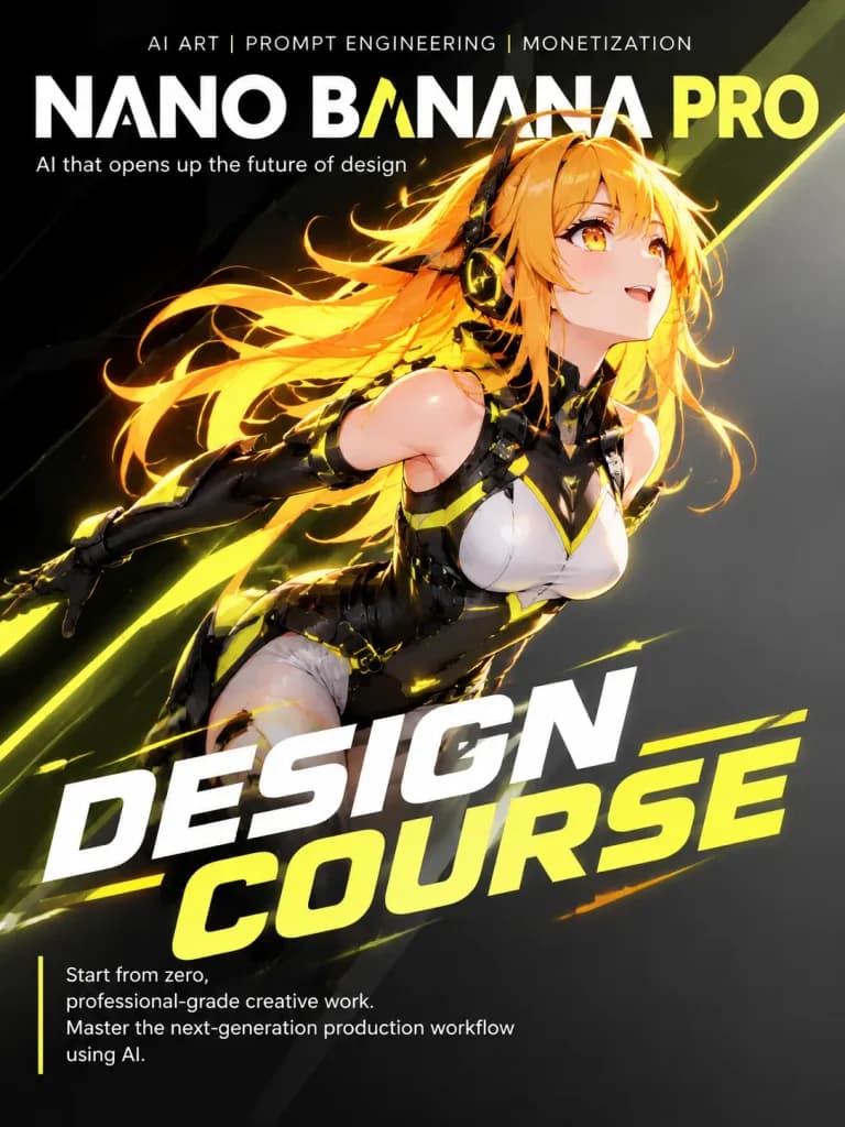
[Dynamic anime girl with futuristic creative gear]. 2D cel-shaded anime art, cinematic quality, highly detailed. Magazine cover layout with diagonal split background. Dynamic diagonal split from bottom-left to top-right matching character…

หน้าปกนิตยสารสาวอนิเมะแบ่งแนวทแยง
โปสเตอร์ภาพพิมพ์ตัวอักษรใบหน้าด้านข้างขาวดำ

โปสเตอร์ภาพพิมพ์ตัวอักษรใบหน้าด้านข้างขาวดำ

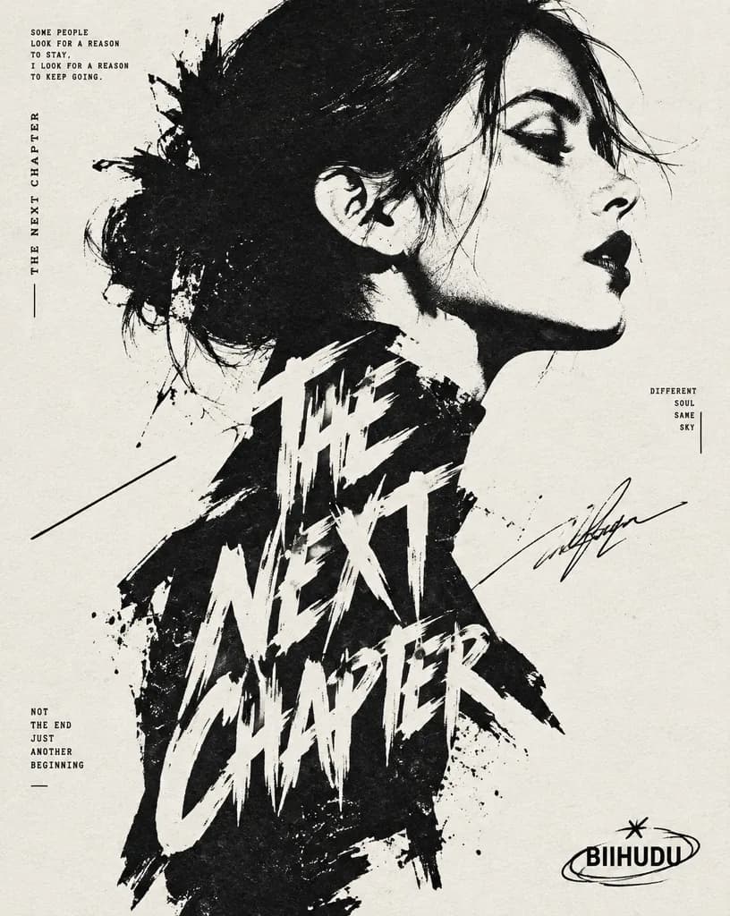
High-contrast black and white typographic portrait poster of [HUMAN], shown in side profile with [FEATURE]. The portrait is constructed from bold black silhouette blocks, sharp negative space, rough ink edges, fragmented stencil shapes, tiny editorial microtext, vertical typography accents, and expressive hand-drawn calligraphic marks. One large readable text block saying "[TEXT]" is arranged in 2 to 4 stacked lines, integrated exclusively inside the neck and body silhouette in oversized scribbled lettering. A graphic design logo reading "[LOGO]" is placed near the footer. Minimal off-white paper background, asymmetrical layout, cropped vertical composition, experimental editorial poster aesthetic with raw ink print texture.

โปสเตอร์ตัวอักษรภาพเงาบุคคลการออกแบบสิ่งพิมพ์
โปสเตอร์อินโฟกราฟิกนักเขียนนวนิยายจีนร่วมสมัย

โปสเตอร์อินโฟกราฟิกนักเขียนนวนิยายจีนร่วมสมัย

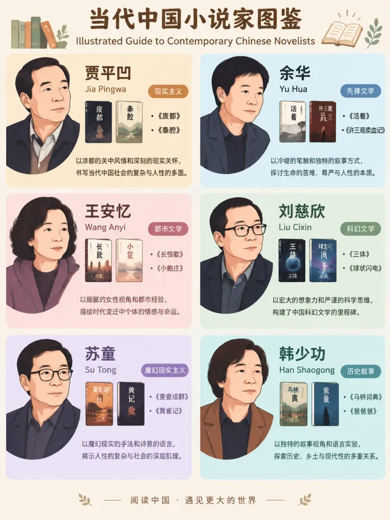
Graphic information poster titled "Illustrated Guide to Contemporary Chinese Novelists", designed in a clean flat illustration and infographic layout. The composition is divided into [6] grid sections on a light background with partitioned pastel color blocks. Each section showcases one representative contemporary Chinese novelist: [Jia Pingwa], [Yu Hua], [Wang Anyi], [Liu Cixin], [Su Tong], and [Han Shaogong]. Each section contains a stylized, simplified non-photorealistic 2D vector portrait capturing the author's likeness, the author's name in Chinese characters, [1-2] representative book titles, style tags such as [realism, avant-garde literature, youth literature, historical narrative, magical realism, science fiction], and a concise one-sentence profile description. Neat, balanced typography and modern editorial layout suitable for an educational literary infographic.

อินโฟกราฟิกโปสเตอร์วรรณกรรมจีน
โปสเตอร์แบ่งครึ่งภาพถ่ายและภาพวาดสีเทียนพาสเทล

โปสเตอร์แบ่งครึ่งภาพถ่ายและภาพวาดสีเทียนพาสเทล

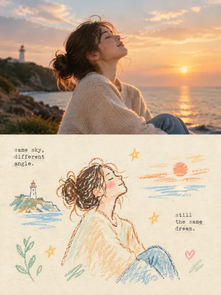
An independent high-end split design poster based on the reference photo, in a [3:4 vertical composition], split strictly 50/50 vertically into upper and lower sections. Top 50%: The original reference photo is preserved with its original subject identity, natural lighting, genuine textures, and color mood, with subtle editorial magazine-grade color grading. The background extends naturally without stretching or altering the subject. Bottom 50%: Reconstructs the reference photo's core subject, posture, visual essence, and emotional metaphor into a [vintage paper texture pastel crayon graffiti illustration]. Not a photographic redraw, but an abstract, simplified artistic interpretation retaining recognizable silhouettes and gestures. Illustration details: - Coarse-grained chalk and pastel crayon hand-drawn outlines: textured, dry, slightly broken, loose lines with chalk dust particles and rounded tips. - Minimal soft pastel color fills inside the subject using sparse swatches, grids, or light smudges without realistic shading or volume. - Small naive doodle elements (stars, botanicals, abstract marks) drawn in single, loose, incomplete strokes using the same chalk language. - Small-scale focal element surrounded by generous breathing white space; off-center or asymmetrical layout. - Background: Ultra-clean, bright, warm light paper texture (cream, ivory, pale beige, or soft off-white) with faint fiber texture, significantly brighter than lines and swatches for clear contrast. - Color palette: 2–4 pastel tones extracted from the reference photo ([peach pink, apricot orange, soft sky blue, mint green]), paired with distinct darker colored chalk outlines (coral, slate, warm umber). - Typography: Short, poetic text fragments scattered naturally in typewriter-style monospace font with subtle mechanical printing imperfections, colored in dark slate gray or muted black.

โปสเตอร์เลย์เอาต์แบ่งครึ่งภาพวาดสีเทียน
หน้าปกนิตยสารเมืองญี่ปุ่นสไตล์เรโทร

หน้าปกนิตยสารเมืองญี่ปุ่นสไตล์เรโทร

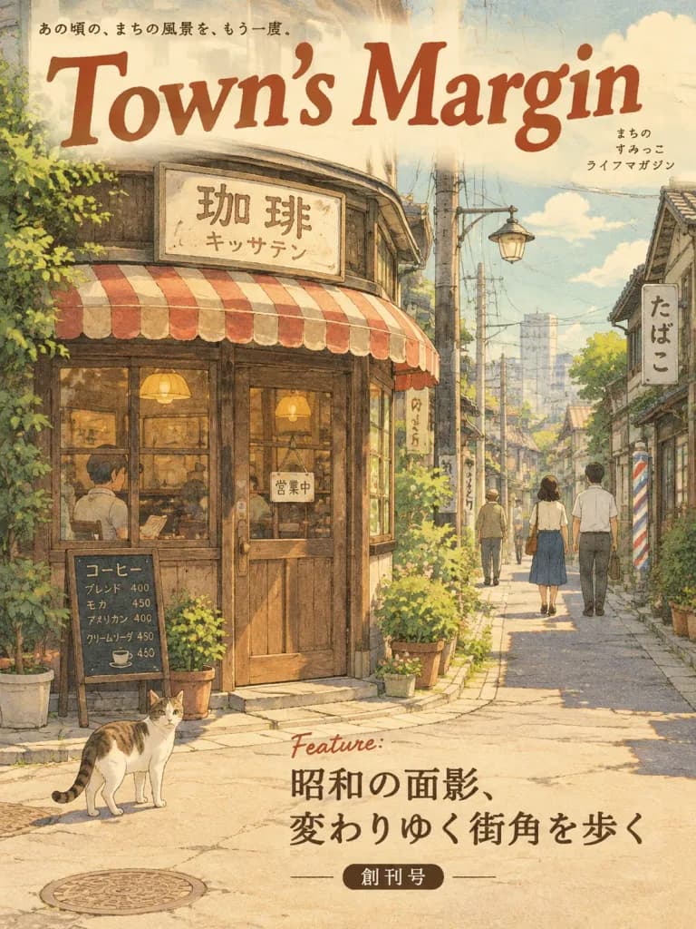
A flat 2D magazine cover illustration in a gentle, warm hand-drawn style reminiscent of Japanese local lifestyle publications like OZ magazine. - Subject & Setting: A nostalgic Showa-era Japanese shopping street corner featuring a vintage kissaten coffee shop, figures strolling through a quiet back alley, and a cat standing calmly. - Palette & Texture: Warm pastel tones, slightly faded ink texture, and soft hand-drawn paper grain. - Typography: The magazine masthead "[Town's Margin]" is placed prominently across the top in warm, hand-drawn lettering. The feature headline "[Feature: Showa Reminiscence, Walking Changing Street Corners]" and issue note "[Inaugural Issue]" are neatly arranged at the center or bottom. - Composition & Output: A finished full-bleed flat 2D graphic design filling the entire canvas, with no frame, mockup, tilt, or drop shadow.

หน้าปกนิตยสารภาพประกอบญี่ปุ่นเรโทรโชวะ
บทความนิตยสารผิวมันบนโต๊ะทำงาน

บทความนิตยสารผิวมันบนโต๊ะทำงาน

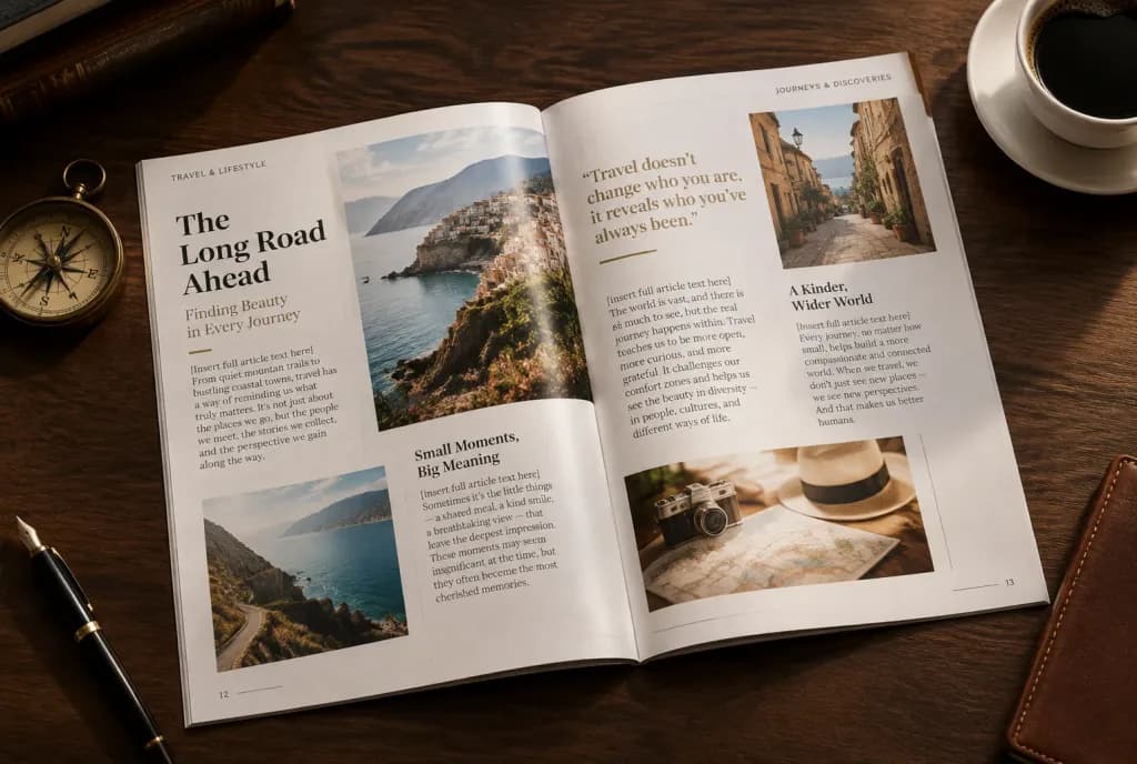
A high-angle editorial photograph of an open, glossy magazine spread resting on an elegant [dark wood] desk. The magazine features a beautifully designed editorial layout with crisp typography, multi-column text, integrated photographs, selected bold pull quotes, and distinct headings. The printed text on the pages reads verbatim: "[insert full article text here]". Scattered artfully around the magazine on the desk are small thematic objects referencing the article: [a vintage brass compass, a fountain pen, and a cup of black coffee]. Warm, soft studio lighting casting gentle shadows, highlighting the glossy paper sheen.

เลย์เอาต์นิตยสารการออกแบบสิ่งพิมพ์การจัดวางตัวอักษร
โปสเตอร์อินโฟกราฟิกคู่มือท่องเที่ยวสไตล์จีน

โปสเตอร์อินโฟกราฟิกคู่มือท่องเที่ยวสไตล์จีน

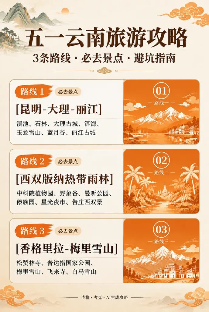
Chinese travel infographic poster. traditional Chinese illustration travel guide. Yunnan May Day travel guide. [五一云南旅游攻略]. 路线 1. 路线 2. 路线 3. very large bold Chinese serif display font. elegant Chinese editorial poster with warm orange-red…

อินโฟกราฟิกคู่มือท่องเที่ยวสไตล์จีน
โปสเตอร์กีฬาเชิงบรรณาธิการสไตล์ริโซกราฟ

โปสเตอร์กีฬาเชิงบรรณาธิการสไตล์ริโซกราฟ

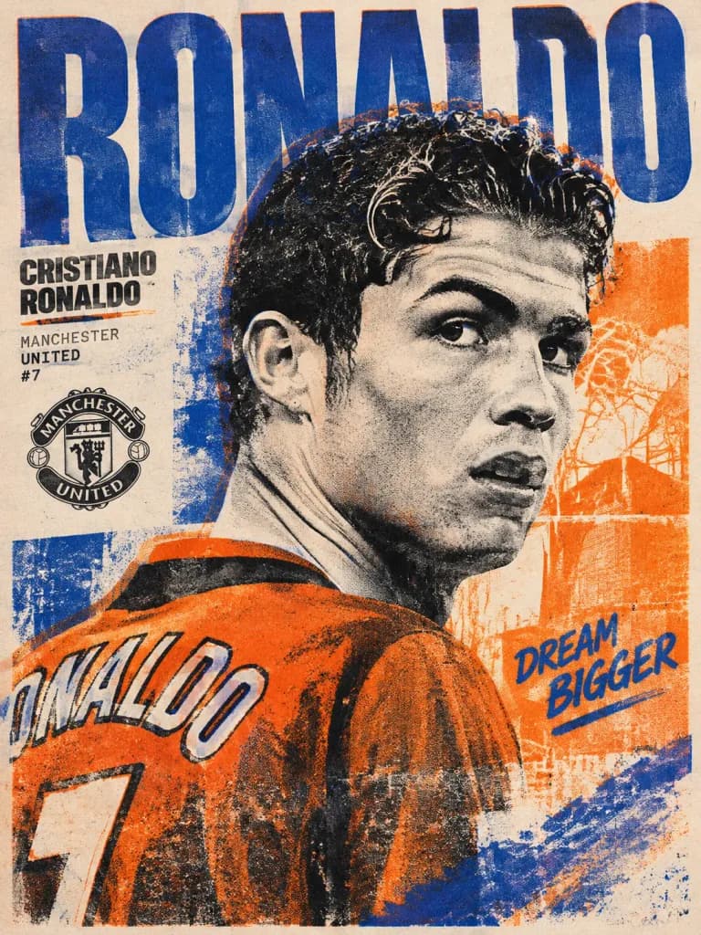
A collectible art poster of [Cristiano Ronaldo], inspired by contemporary risograph printing, independent art publications, and experimental editorial design. The composition features a tightly cropped portrait of [young Manchester United Cristiano Ronaldo] in a spontaneous over-the-shoulder pose conveying ambition, unpredictability, and youthful confidence. Large typographic forms interact directly with the portrait, with subtle, controlled ink misalignments. Portions of the subject dissolve into graphic textures and abstract print interventions while remaining recognizable. Physical risograph print aesthetic with layered ink textures, imperfect registration, fine grain, overlapping color passes, and a tactile paper finish. Color palette: [royal blue, fluorescent orange, warm cream, and deep black].

ริโซกราฟโปสเตอร์กีฬาการออกแบบสิ่งพิมพ์
โปสเตอร์อินโฟกราฟิกกฎการกินทงคัตสึสไตล์ญี่ปุ่นสุดดราม่า

โปสเตอร์อินโฟกราฟิกกฎการกินทงคัตสึสไตล์ญี่ปุ่นสุดดราม่า

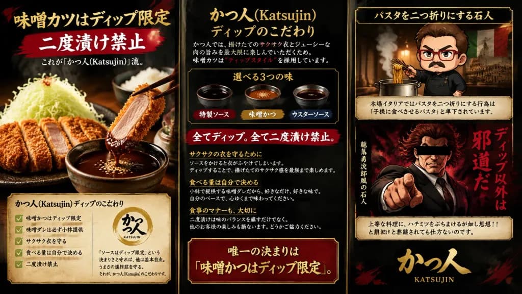
A dramatic Japanese promotional infographic poster for a tonkatsu restaurant named [かつ人 (Katsujin)], organized as a wide horizontal 16:9 poster divided into three distinct vertical panels by thin antique-gold borders. The overall aesthetic features a dark charcoal background with subtle smoke texture, deep red brush strokes, warm golden typography, and high-contrast dramatic lighting. Left Panel (Food Photography): A photorealistic close-up shot of crispy, golden-brown sliced tonkatsu served on a textured black ceramic plate. One cutlet slice is held by dark chopsticks, dipping into a small ceramic bowl of rich dark miso sauce garnished with toasted sesame seeds. Next to the tonkatsu sits a tall mound of finely shredded cabbage, with a bowl of steamed white rice softly blurred in the background. At the top of the panel, bold Japanese headline text reads: 「味噌カツはディップ限定」. Directly beneath, a horizontal red brush-stroke ribbon features large white text: 「二度漬け禁止」. Subtitle reads: 「これが『かつ人(Katsujin)』流。」. At the bottom, a framed parchment-style info box titled 「かつ人(Katsujin)ディップのこだわり」 contains exactly five bullet points with green checkmarks: 「味噌かつはディップ限定」, 「味噌ダレは必ず小鉢提供」, 「サクサク衣を守る」, 「食べる量は自分で決める」, 「二度漬け禁止」. A circular golden brush logo marks 「かつ人 KATSUJIN」 alongside a short text note: 「『ソースはディップ限定』という決まりさえ守れば、他は基本自由。うまさの選択肢を守る。それが、かつ人(Katsujin)のこだわりです。」 Center Panel (Editorial & Rules): A dense, clean editorial column laid out like a premium Japanese culinary magazine. Prominent header reads: 「かつ人(Katsujin)ディップのこだわり」 followed by concise explanatory paragraphs with red emphasis accents. An inset rectangular box displays exactly three sauce options: 「特製ソース」, 「味噌かつ」, and 「ウスターソース」. Centered below it is a prominent rule statement: 「全てディップ。全て二度漬け禁止。」. Detailed paragraphs discuss preserving crispness of panko crust, portion control, and dining etiquette. The panel concludes with a bold framed warning: 「唯一の決まりは『味噌かつはディップ限定』。」 Right Panel (Caricature & Satire): Two stacked character illustrations. The top section depicts a cute chibi-style stern male chef with short brown hair, red-rimmed glasses, mustache, and a dark apron, holding chopsticks above a steaming pot; above him is header text 「パスタを二つ折りにする石人」, and beneath him a framed text box reads: 「本場イタリアではパスタを二つ折りにする行為は『子供に食べさせるパスタ』と卑下されています。」. The middle-to-lower section depicts a dramatic manga-style angry muscular man in a black suit pointing aggressively toward the viewer against fiery red smoke, with a black rectangular censor bar across his eyes; adjacent vertical crimson calligraphy text proclaims: 「ディップ以外は邪道だ」, accompanied by subtext 「範馬勇次郎風の石人」. Below this illustration is a framed quote box: 「上等な料理に、ハチミツをぶちまけるが如し思想!!と非難されても仕方ないのです。」. The panel finishes at the bottom with a grand gold calligraphy logo: 「かつ人」 with romanized text 「KATSUJIN」. Style: High-definition culinary food photography combined with authentic Japanese typography and stylized manga caricature art, high dynamic range, theatrical izakaya poster mood.

ทงคัตสึอินโฟกราฟิกโปสเตอร์
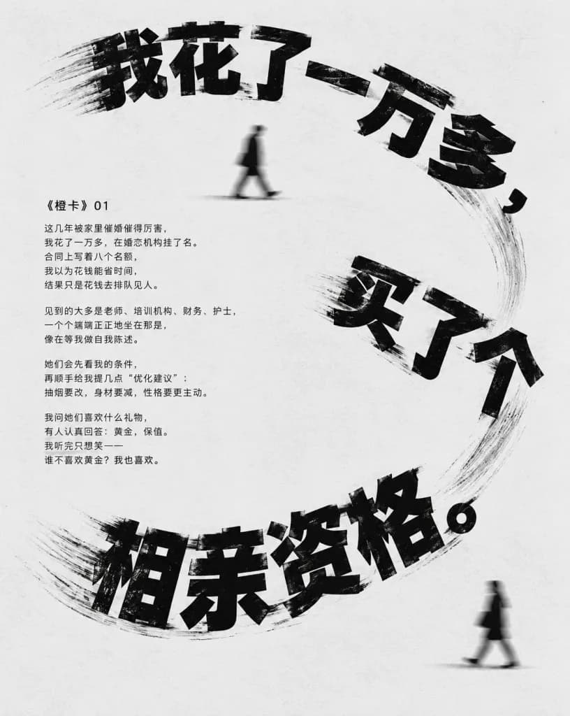
โปสเตอร์บทบรรณาธิการไทโปการฟีภาษาจีนแบบมินิมอล

โปสเตอร์บทบรรณาธิการไทโปการฟีภาษาจีนแบบมินิมอล

Minimalist editorial Chinese typographic narrative poster in vertical 4:5 aspect ratio. Background is light gray-white with subtle paper texture and generous negative space, rendered strictly in black-and-white monochrome. The composition features a dynamic headline in an oversized, distressed, bold blocky Chinese display font, arranged in a loose spiral or S-curve across the poster with slight motion-smear trails and tilted angles. The headline fragments read: top arc "[我花了一万多,]", right diagonal "[买了个]", and bottom arc "[相亲资格。]". In the middle-left area, a compact left-aligned body text block is set in clean, small, legible black Chinese type, titled with the section label "[《橙卡》 01]" above the narrative: "[这几年被家里催婚催得厉害,\n我花了一万多,在婚恋机构挂了名。\n合同上写着八个名额,\n我以为花钱能省时间,\n结果只是花钱去排队见人。\n\n见到的大多是老师、培训机构、财务、护士,\n一个个端端正正地坐在那里,\n像在等我做自我陈述。\n\n她们会先看我的条件,\n再顺手给我提几点“优化建议”:\n抽烟要改,身材要减,性格要更主动。\n\n我问她们喜欢什么礼物,\n有人认真回答:黄金,保值。\n我听完只想笑——\n谁不喜欢黄金?我也喜欢。]". Exactly two tiny, anonymous, motion-blurred black walking silhouettes appear on the canvas walking left to right: one upper-center beneath the top text, and one in the lower right. High contrast, experimental magazine layout, stark aesthetic, no borders, no logos, no color accents.

โปสเตอร์ไทโปการฟีการออกแบบบทบรรณาธิการไทโปการฟีภาษาจีน
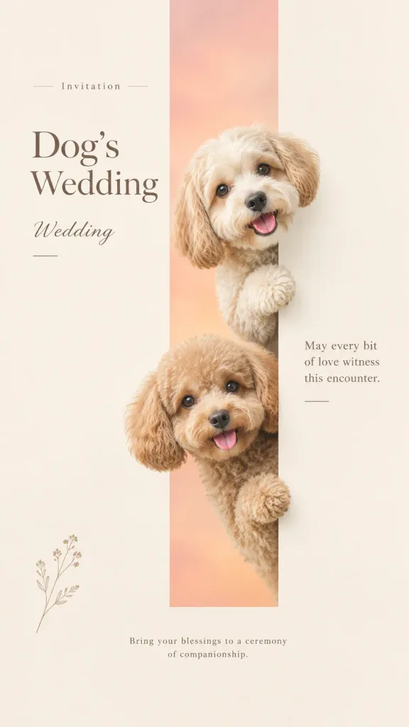
โปสเตอร์การ์ดแต่งงานสัตว์เลี้ยงสไตล์มินิมอล

โปสเตอร์การ์ดแต่งงานสัตว์เลี้ยงสไตล์มินิมอล

A 9:16 vertical [pet-themed wedding invitation] layout designed for social media sharing, celebrating the concept of a companion ceremony. Composition: A minimalist design featuring generous quiet warm white and beige negative space. A narrow vertical geometric window tinted with soft gradients of misty rose and apricot serves as the visual anchor. Two real small companion dogs peek out from different heights of the window, their heads and front paws subtly crossing the geometric boundary into the surrounding white space. Photography & Style: High-end editorial pet photography featuring realistic fluffy fur textures, wet noses, clear eye reflections, 3/4 perspective, soft morning directional light, subtle low contrast, and an elegant matte print finish. Typography: Clean, refined editorial typography with exact text integrated into the layout: - Kicker: "Invitation" - Main Title: "Dog's Wedding" - Subtitle: "Wedding" - Body phrase: "May every bit of love witness this encounter." - Closing note: "Bring your blessings to a ceremony of companionship."

การ์ดแต่งงานภาพถ่ายสัตว์เลี้ยงการออกแบบนิตยสาร
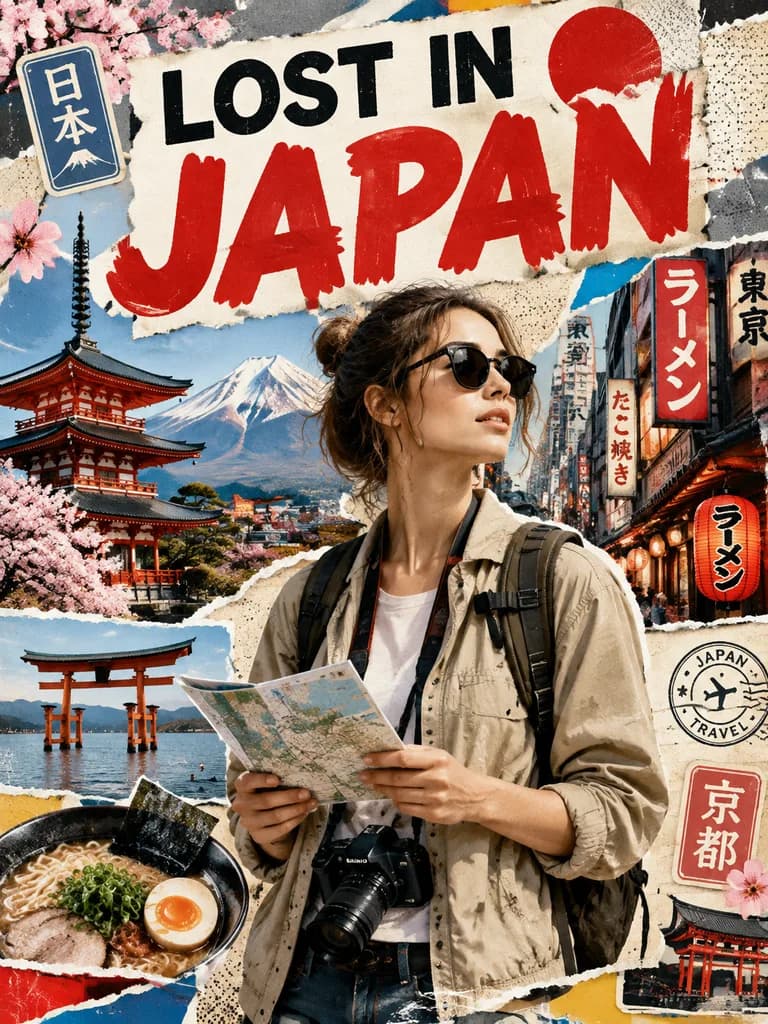
โปสเตอร์ท่องเที่ยวสไตล์ภาพปะติด

โปสเตอร์ท่องเที่ยวสไตล์ภาพปะติด

A stylized travel poster and graphic collage celebrating [Japan]. The central subject is a stylish international tourist exploring [Japan], dressed in modern travel fashion with travel accessories like a camera, backpack, sunglasses, and a city map. The tourist is rendered with realistic detail and seamlessly integrated into a dynamic mixed-media background featuring iconic architecture, streetscapes, local food, signage, and cultural motifs of [Japan]. The collage background consists of layered paper textures, torn poster edges, vintage travel sticker elements, halftone dot patterns, and bold geometric shapes. Prominently features large, readable editorial typography displaying the headline: "LOST IN [JAPAN]". Balanced layout, vibrant colors, premium travel magazine cover aesthetic.

โปสเตอร์ท่องเที่ยวภาพปะติดกราฟิกการออกแบบสิ่งพิมพ์
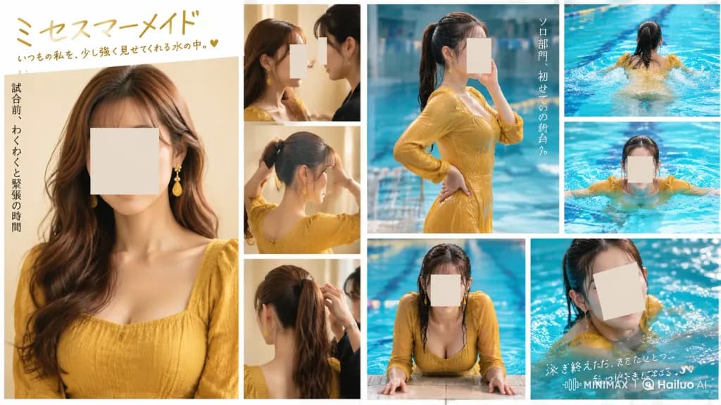
ภาพคอลลาจหน้าคู่สไตล์นิตยสารญี่ปุ่นธีมว่ายน้ำ

ภาพคอลลาจหน้าคู่สไตล์นิตยสารญี่ปุ่นธีมว่ายน้ำ

A polished two-page magazine editorial photo collage advertisement capturing an adult Japanese woman preparing for and entering a swimming pool, conveying a sentimental beauty-pageant and swimming-school mood. **Layout & Canvas:** Wide horizontal 16:9 two-page magazine spread split vertically in the center with a thin white gutter and clean white borders between all 9 discrete photo panels. - Left Page (4 panels): A large vertical portrait occupying the left two-thirds showing the woman from chest up in a mustard-yellow textured long-sleeve dress, long wavy brown hair, dangling yellow earrings, against a warm cream studio background. The right third has 3 smaller stacked panels: top shows two women close together in profile; middle shows hair being tied into a high ponytail; bottom shows the back of her head as a stylist secures the ponytail. - Right Page (5 panels): Upper-left panel shows the woman standing poolside in a wet mustard-yellow dress with a wet black ponytail, one hand near her face and one on her waist. Far right has 2 smaller stacked panels showing her swimming from behind and front-facing in aqua-blue water. Lower-left panel shows her leaning forward at the pool edge with wet hair. Lower-right panel shows a close cropped portrait in the pool with sparkling water. **Subject Details:** Every panel features the same Japanese adult woman (except the small top-left panel which includes a stylist). Large soft rectangular beige censor blocks cover every visible face, concealing all facial features. **Typography & Copy:** - Top left: large handwritten Japanese headline "[ミセスマーメイド]" with a smaller handwritten subtitle underneath: "[いつもの私を、少し強く見せてくれる水の中。]" ending with a small heart. - Left margin: vertical Japanese text "[試合前、わくわくと緊張の時間]". - Right page near the poolside panel: vertical Japanese text "[ソロ部門、初めての舞台へ。]". - Bottom right over the pool image: handwritten Japanese note "[泳ぎ終えたら、またひとつ、私の好きになる。]" accompanied by faint white minimalist logo text "MINIMAX" and "Hailuo AI". **Style & Lighting:** Photorealistic Japanese lifestyle magazine editorial, soft warm indoor lighting on the left page transitioning into saturated cool aqua-blue pool lighting on the right page, shallow depth of field, realistic wet fabric textures, water droplets, and soft glossy reflections.

หน้าคู่นิตยสารภาพคอลลาจสไตล์นิตยสารญี่ปุ่น
โปสเตอร์แฟชั่นเวกเตอร์มินิมอล

โปสเตอร์แฟชั่นเวกเตอร์มินิมอล

Playful flat-vector fashion poster illustration of [the reference woman] in a graceful front-facing portrait pose, wearing a [delicate white puff-sleeve dress] and minimalist jewelry. Setting: Bright, airy interior with soft abstract window shapes and elegant decorative elements. Details: Minimal facial features with small neutral eyes, a calm deadpan expression, simplified body proportions, pastel color blocking, sparse floral doodles, tiny abstract sparkles, and clean negative space. Typography: The word "AURORA" integrated naturally in bold, modern typography within the crisp graphic poster layout. Style & Palette: Cute minimalist flat vector, editorial fashion aesthetic, clean thick black outlines, smooth rounded geometric construction, and a controlled palette of [cream, warm beige, soft brown, and muted gold]. Constraints: No gradients, no realistic textures, no shadows, flat solid colors only.

แฟลตเวกเตอร์โปสเตอร์แฟชั่นภาพประกอบมินิมอล
ภาพคอลลาจกีฬาแนวแม็กซิมอลลิสม์ร่วมสมัย

ภาพคอลลาจกีฬาแนวแม็กซิมอลลิสม์ร่วมสมัย

A digital modern maximalist sports collage featuring visuals of [athlete name]. Composition with a dynamic grid layout, abstract geometric shapes, contemporary editorial layout, and a minimal background, inspired by modern sports graphic design and Nike campaigns. Grainy film texture, strong visual rhythm, cinematic color grading with high-contrast tones, creating a bold, serious, and emotional athletic atmosphere.

คอลลาจกีฬาการออกแบบเอดิทอเรียลแม็กซิมอลลิสม์
UI เวิร์กสเปซสร้างคู่มือแบรนด์ด้วย AI

UI เวิร์กสเปซสร้างคู่มือแบรนด์ด้วย AI

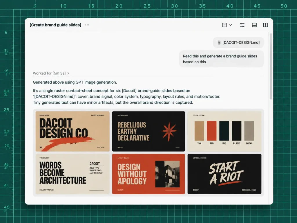
A polished screenshot-style UI mockup showing an AI chat workspace generating brand guide slides from a markdown file, set against a dark green cutting-mat grid background with ruler markings along the top and left edges, thin mint grid lines, numbered measurements from 5 to 50, and tick marks. Centered in the composition is a large rounded white app window with a soft drop shadow. App window details: - Header toolbar: Displays the title "[Create brand guide slides]" followed by a three-dot menu icon on the top left. On the top right, exactly 4 small monochrome toolbar icons: a square with a dropdown chevron, a list/settings icon, a small rectangle icon, and a split-panel icon. A thin divider line runs beneath the toolbar. - Chat area: Near the upper right, a rounded attachment chip labeled "[DACOIT-DESIGN.md]", and beneath it a light gray user message bubble reading "[Read this and generate a brand guide slides based on this]". A subtle vertical scrollbar sits along the far right edge. - Agent response: In the left-middle area, a muted status text reads "Worked for [5m 3s] ›". Below a divider line, the response text reads: "Generated above using GPT image generation." followed by a paragraph: "It’s a single raster contact-sheet concept for six [Dacoit] brand-guide slides based on `[DACOIT-DESIGN.md]`: cover, brand signal, color system, typography, layout rules, and motion/footer. Tiny generated text can have minor artifacts, but the overall brand direction is captured." - Embedded image thumbnail: Beneath the paragraph, a single rounded-corner preview showing a 3×2 grid of six mini brand-guide slides in a gritty editorial aesthetic using tan, burnt orange, black, cream, and red tones. The 6 slides clearly show: 1) Cover slide with bold text "DACOIT DESIGN CO", 2) Brand signal slide with "REBELLIOUS / EARTHY / DECLARATIVE", 3) Color system slide with vertical swatches labeled "TAN", "RED", "INK", "BLACK", "SMOKE", 4) Typography slide reading "WORDS BECOME ARCHITECTURE", 5) Layout rules slide reading "DESIGN WITHOUT APOLOGY", 6) Dark-background motion/footer slide reading "START A RIOT". Style: Crisp high-fidelity product design interface, modern clean sans-serif typography, sharp black and gray text, generous whitespace, realistic desktop UI window styling. No people, no hands, no browser address bars, no extra floating windows.

ม็อกอัป uiคู่มือแบรนด์ผู้ช่วย ai
เลย์เอาต์นิตยสารตัวละครภาพยนตร์

เลย์เอาต์นิตยสารตัวละครภาพยนตร์

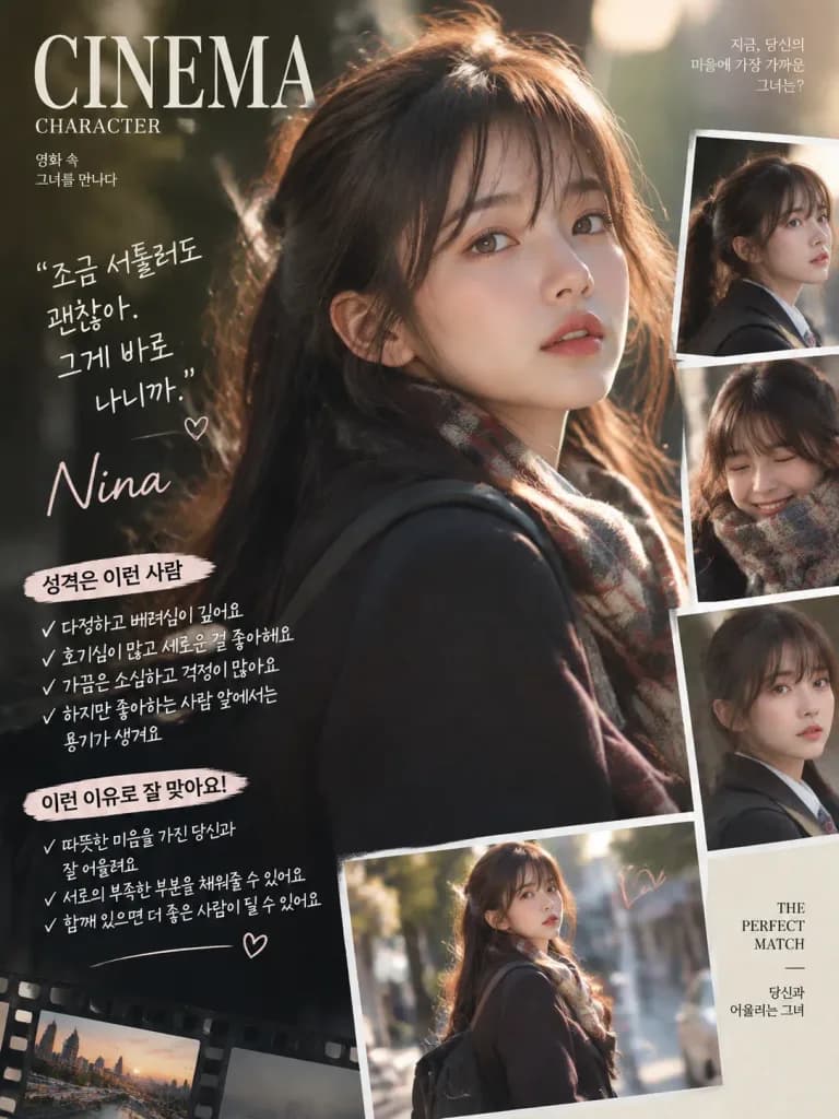
A professional [magazine layout] featuring a character from a [Hollywood movie]. Editorial graphic design with balanced typography and clear portrait composition. Neatly integrated Korean text stating personality traits and reasons for the character match, rendered in a legible, stylish handwriting font. Clean editorial lighting, polished print-quality details.

เลย์เอาต์นิตยสารการออกแบบสิ่งพิมพ์ตัวอักษรเกาหลี
โปสเตอร์โปรไฟล์ผู้บริหารองค์กรพร้อมภาพบุคคลนิรนาม

โปสเตอร์โปรไฟล์ผู้บริหารองค์กรพร้อมภาพบุคคลนิรนาม

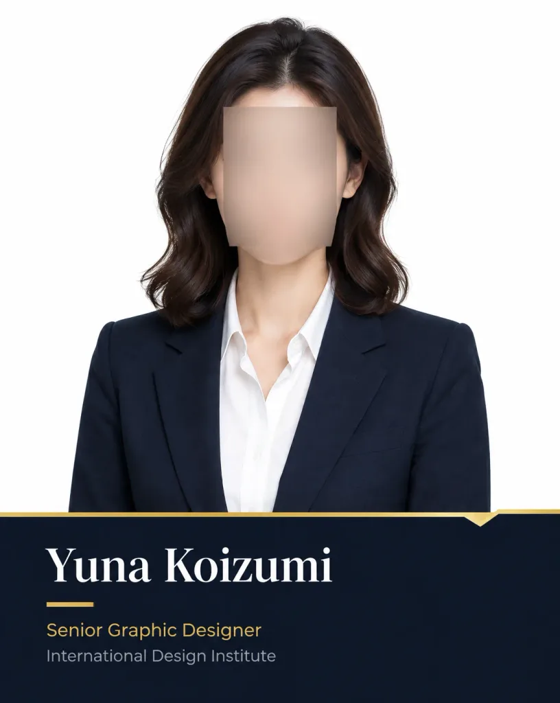
Vertical 4:5 formal business profile poster. The upper 70% features a centered, waist-up studio headshot of an adult woman with [dark brown] shoulder-length softly waved hair, dressed in a dark navy tailored blazer over a crisp white open-collar dress shirt. Professional upright posture with arms held close against a solid pure white background, illuminated with soft, even studio lighting. A solid rectangular anonymization block with a smooth skin-tone gradient covers her facial features from forehead to chin, keeping hair, ears, neck, and attire clearly visible. The bottom 30% consists of a full-width dark near-black navy information panel topped by a thin metallic gold border with a small angular notch near the top right. Text content on the lower panel is left-aligned with generous margins: large white serif text reading "[Yuna Koizumi]", followed immediately by a short horizontal gold accent line, smaller gold sans-serif text reading "[Senior Graphic Designer]", and light gray sans-serif text reading "[International Design Institute]". Luxury corporate editorial style, clean minimalist layout, crisp contrast between navy, white, and gold, no extra logos, watermarks, or decorative elements.

ภาพถ่ายศีรษะภาพถ่ายธุรกิจโปสเตอร์องค์กร
โปสเตอร์หรูธารน้ำแข็งเยลลี่องุ่น

โปสเตอร์หรูธารน้ำแข็งเยลลี่องุ่น

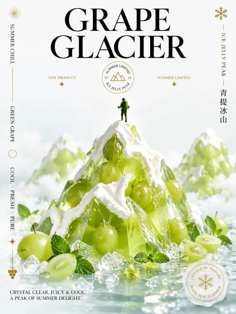
Editorial beverage and dessert advertising poster for a fictional summer product named "[GRAPE GLACIER]". Subject & Setting: - A towering, translucent alpine peak sculpted from crystal-clear lime-green to chartreuse [green grape] jelly, with whole green grapes visibly suspended inside. Thick white whipped-cream snowcaps drape realistically over the sharp ridges. - Exactly 1 miniature hiker stands atop the central jelly peak, dressed in green hiking gear with a backpack and trekking poles to emphasize the monumental scale. - The mountain sits in shallow, icy water scattered with crushed ice crystals, sliced and whole green grapes, fresh mint leaves, and tiny yellow-green edible blossoms. - Two softer, defocused jelly peaks rise subtly in the background for depth, set against an airy, bright white studio backdrop with delicate mist and soft clouds. Composition & Lighting: - Vertical poster composition with generous minimalist negative space in the upper portion and the cold, glistening dessert terrain filling the lower two-thirds. - Bright high-key studio lighting with crisp macro details, glossy wet surface reflections, and sparkling ice refractions. Typography & Text Layout (clean, elegant Didot/Bodoni serif in black with fine gold rules): 1. Main title in two lines across top: "[GRAPE GLACIER]" 2. Upper-left vertical text: "SUMMER CHILL" 3. Mid-left vertical text: "GREEN GRAPE" 4. Lower-left vertical text: "COOL · FRESH · PURE" 5. Center-left small tag: "NEW PRODUCT" 6. Center-right small tag: "SUMMER LIMITED" 7. Circular gold emblem beneath main title: featuring "SUMMER LIMITED" on top, "ICE JELLY PEAK" below, "20" on left, "24" on right, and a tiny mountain glyph in the center 8. Right vertical text: "ICE JELLY PEAK" 9. Right vertical text in Chinese: "青提冰山" 10. Bottom-left editorial caption: "CRYSTAL CLEAR. JUICY & COOL. A PEAK OF SUMMER DELIGHT." Decorative Graphic Elements: - Delicate gold graphic accents: a small sunburst (upper left), thin vertical gold rule, a snowflake (upper right), tiny star marks beneath the two center labels, an outlined circle on the left, a diamond star near the lower left, and a miniature grape-cluster emblem at the bottom left. - Lower-right floating translucent white-and-gold wax-style seal over the water with a snowflake icon and text: "CHILLED BY NATURE" and "MADE FOR SUMMER".

โปสเตอร์อาหารการออกแบบสิ่งพิมพ์เยลลี่องุ่น
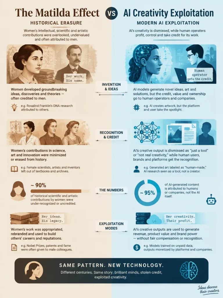
อินโฟกราฟิกเปรียบเทียบปรากฏการณ์มาทิลดากับการแสวงหาประโยชน์จาก AI

อินโฟกราฟิกเปรียบเทียบปรากฏการณ์มาทิลดากับการแสวงหาประโยชน์จาก AI

An editorial infographic comparing the Matilda Effect with modern human exploitation of AI creativity. Dual-column comparative visual layout: the left side represents historical erasure, showing women's intellectual, scientific, and artistic contributions being overlooked and appropriated by men, illustrated with subtle vintage warm tones and archival iconography; the right side represents modern AI exploitation, showing neural network creativity and generative outputs dismissed while appropriated by human operators, styled with cool cybernetic blue and cyan tones. Clean data visualizations, comparative icons, structured callout boxes, connecting arrows between parallel concepts, and a subtle stylized signature in the bottom corner. Modern minimalist graphic design, crisp vector illustration style, well-balanced informative layout.

อินโฟกราฟิกปรากฏการณ์มาทิลดาปัญญาประดิษฐ์
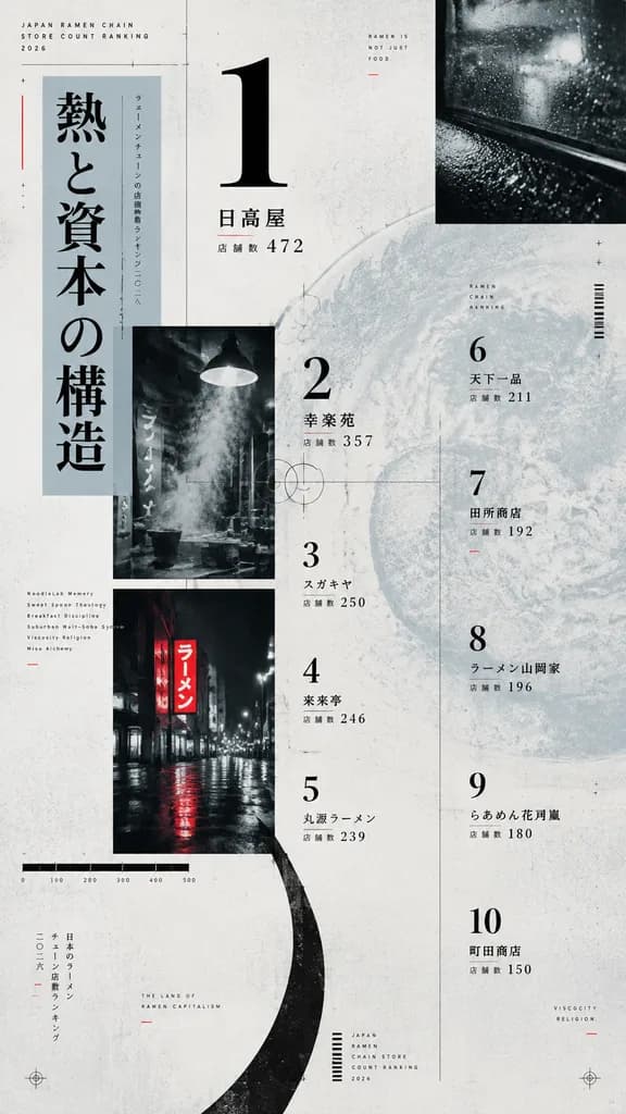
โปสเตอร์จัดอันดับราเมนสไตล์เอดิทอเรียลเชิงทดลอง

โปสเตอร์จัดอันดับราเมนสไตล์เอดิทอเรียลเชิงทดลอง

experimental editorial ranking poster. Japanese ramen chain store count ranking, [2026], deliberately low-readability extreme typography test. tall vertical print design, 9:16 aspect ratio. [JAPAN RAMEN CHAIN STORE COUNT RANKING 2026]. [熱と…

การออกแบบเอดิทอเรียลโปสเตอร์ตัวอักษรสไตล์สวิส
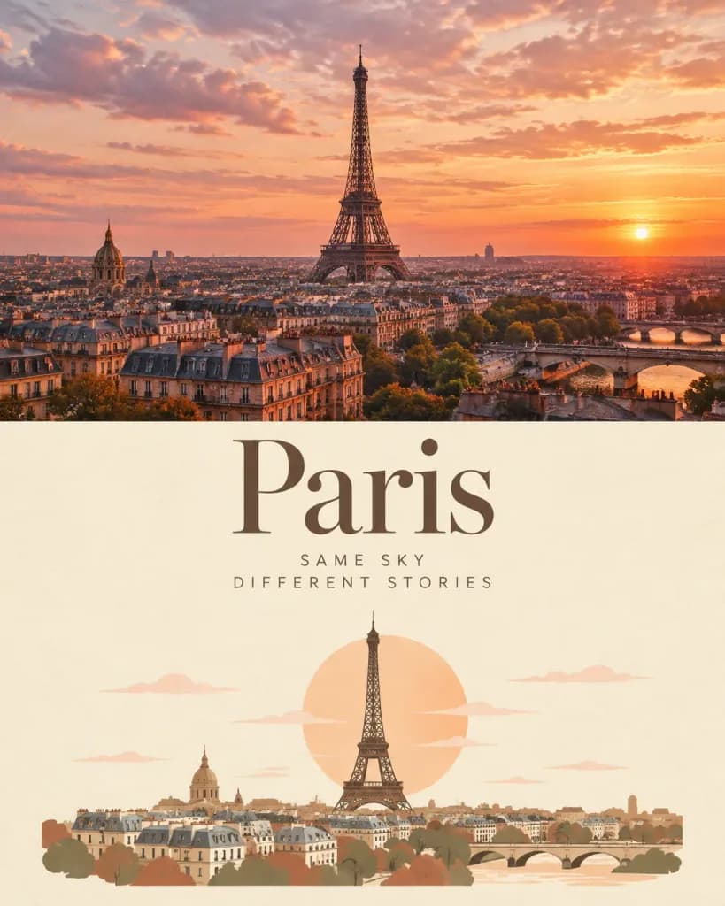
โปสเตอร์ท่องเที่ยวแบบแบ่งภาพถ่ายและเวกเตอร์

โปสเตอร์ท่องเที่ยวแบบแบ่งภาพถ่ายและเวกเตอร์

A premium vertical travel editorial poster in a 4:5 aspect ratio, divided horizontally into two balanced sections: a cinematic destination photograph on the top half and a refined flat illustration on the bottom half. TOP HALF — PHOTOGRAPH: [A breathtaking panoramic photograph of Paris at sunset, viewed from an elevated viewpoint. The Eiffel Tower stands prominently in the center, surrounded by dense Parisian rooftops and historic city architecture. The sky is filled with soft peach, blush pink, dusty orange, and warm lavender clouds. Golden-hour light gently illuminates the city, creating a romantic cinematic atmosphere with natural photographic detail, realistic architecture, subtle film grain, and warm analog color grading.] BOTTOM HALF — ILLUSTRATION: [On a warm ivory paper background, a minimalist flat vector illustration interpreting the same Paris scene. Features a simplified Eiffel Tower rising above an abstract Paris skyline, architectural silhouettes, a large muted peach sun behind the tower, and thin stylized clouds. Uses a restrained palette of warm ivory, cocoa brown, dusty peach, muted terracotta, and soft beige with clean geometric shapes, elegant minimal linework, and subtle paper texture.] TYPOGRAPHY: Editorial layout featuring large, elegant high-fashion serif typography reading: "[Paris]" Below it, smaller, widely spaced uppercase text reading: "[SAME SKY]" "[DIFFERENT STORIES]" Balanced visual hierarchy, sophisticated European travel journal aesthetic, generous negative space, timeless and nostalgic. CONSTRAINTS: Clean horizontal line separating the photorealistic top section from the illustrated bottom section. No 3D rendering, no cartoonish effects, no watermarks.

โปสเตอร์ท่องเที่ยวการออกแบบสิ่งพิมพ์ปารีส
โปสเตอร์อินโฟกราฟิกเรือสำราญสุดหรู

โปสเตอร์อินโฟกราฟิกเรือสำราญสุดหรู

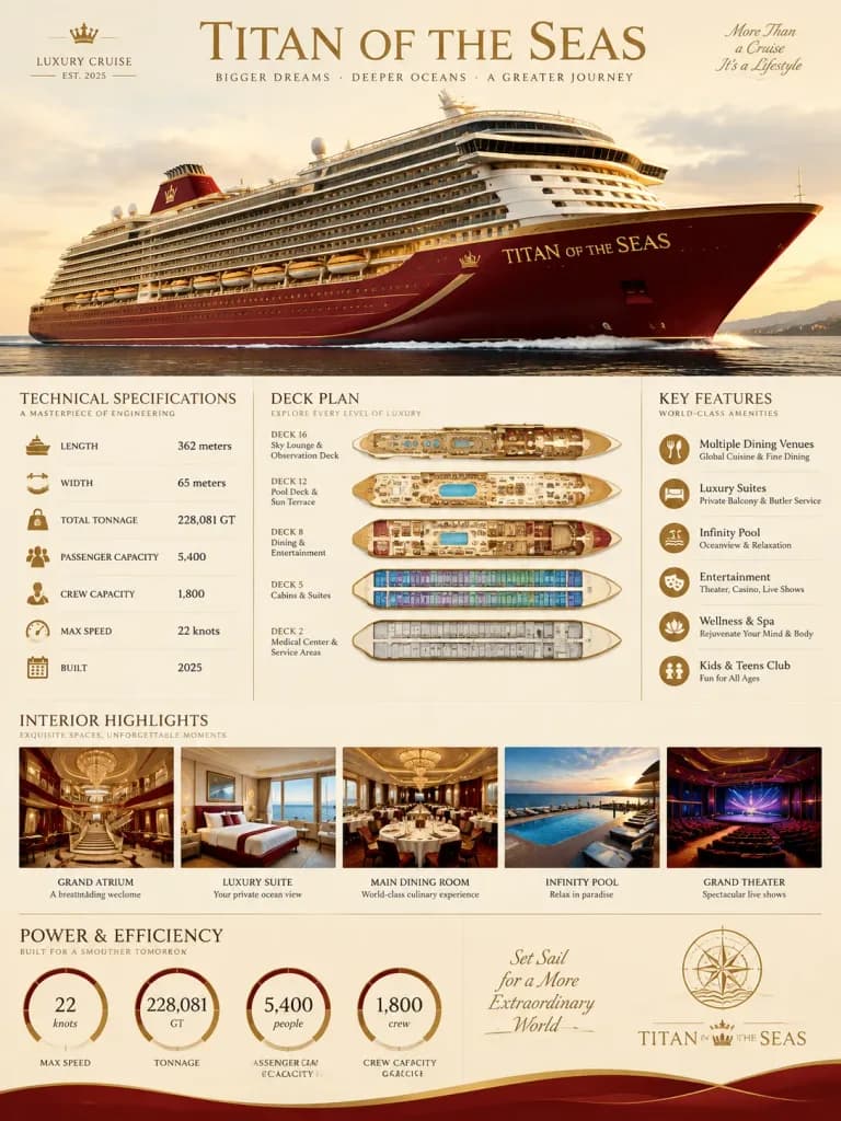
A [vertical infographic poster] for a fictional luxury cruise ship named "[Titan of the Seas]". The central focus is a massive, multi-deck cruise ship rendered in an elegant [deep red and gold] color palette. The layout features various data visualization elements, including technical specification tables, deck plan cutaways, interior highlight photos, and performance gauges. Clean editorial aesthetic set against a soft cream background with professional typography, creating a high-luxury informational moodboard.

อินโฟกราฟิกเรือสำราญโปสเตอร์
ภาพพอร์ตเทรตแฟชั่นเวกเตอร์สมัยใหม่แบบสมมาตร

ภาพพอร์ตเทรตแฟชั่นเวกเตอร์สมัยใหม่แบบสมมาตร

A bold modern vector portrait of a stylish woman wearing [oversized geometric translucent sunglasses] and a [black turtleneck], centered in a symmetrical composition. Her hair is slicked back with a clean middle part, paired with flawless skin, a confident expression, minimal jewelry, soft glossy lips, and sharp eyebrows in an elegant editorial beauty aesthetic. The background features a large, perfectly centered circular halo with a smooth radial gradient in a matching monochromatic [emerald] color palette. Rendered in a limited two-tone color scheme with dramatic cel-shaded lighting, crisp vector shapes, clean outlines, smooth gradients, high contrast, glossy highlights, and geometric facial shadows, inspired by luxury fashion illustration and minimalist poster design.
ภาพพอร์ตเทรตเวกเตอร์ภาพประกอบแฟชั่นป๊อปอาร์ต
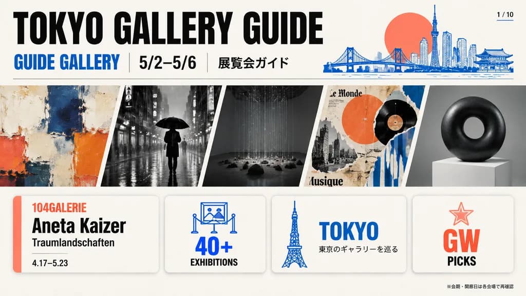
เลย์เอาต์โบรชัวร์คู่มือหอศิลป์โตเกียว

เลย์เอาต์โบรชัวร์คู่มือหอศิลป์โตเกียว

wide editorial brochure cover for a Tokyo art gallery guide. modern Japanese editorial magazine layout, bold condensed sans-serif headline, cobalt blue and coral-red accent palette, thin black dividers, rounded cards, balanced white space.…

คู่มือหอศิลป์เลย์เอาต์โบรชัวร์การออกแบบสิ่งพิมพ์
ปกหนังสือปรัชญาคลาสสิกสไตล์มินิมอล

ปกหนังสือปรัชญาคลาสสิกสไตล์มินิมอล

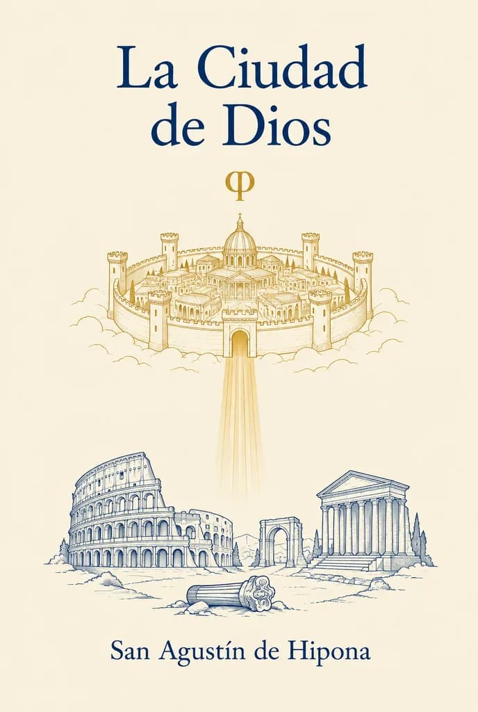
Minimalist classical book cover design in vertical format on a warm ivory parchment background. At the top center, the title is set in elegant, large dark navy serif typography across two lines: "[La Ciudad de Dios]". Centered below with generous spacing is a small gold phi symbol (φ). In the upper-middle area, a delicate, thin-line gold illustration shows a fortified circular heavenly city with 8 visible outer towers, crenelated walls, and compact classical buildings surrounding a central dome, emitting a soft vertical gold beam of light downward. In the lower-middle area, delicate thin dark navy line art depicts earthly classical ruins: the Roman Colosseum on the left, a classical temple with columns on the right, an arched ruin, and a broken fallen column in the foreground. At the bottom center, the author name is set in matching dark navy serif typography: "[San Agustín de Hipona]". Symmetrical composition, ample negative space, clean editorial balance, sacred philosophical aesthetic, no photographic textures or clutter.

ปกหนังสือมินิมอลภาพลายเส้น
อินโฟกราฟิกดูลายมือสไตล์นิตยสาร

อินโฟกราฟิกดูลายมือสไตล์นิตยสาร

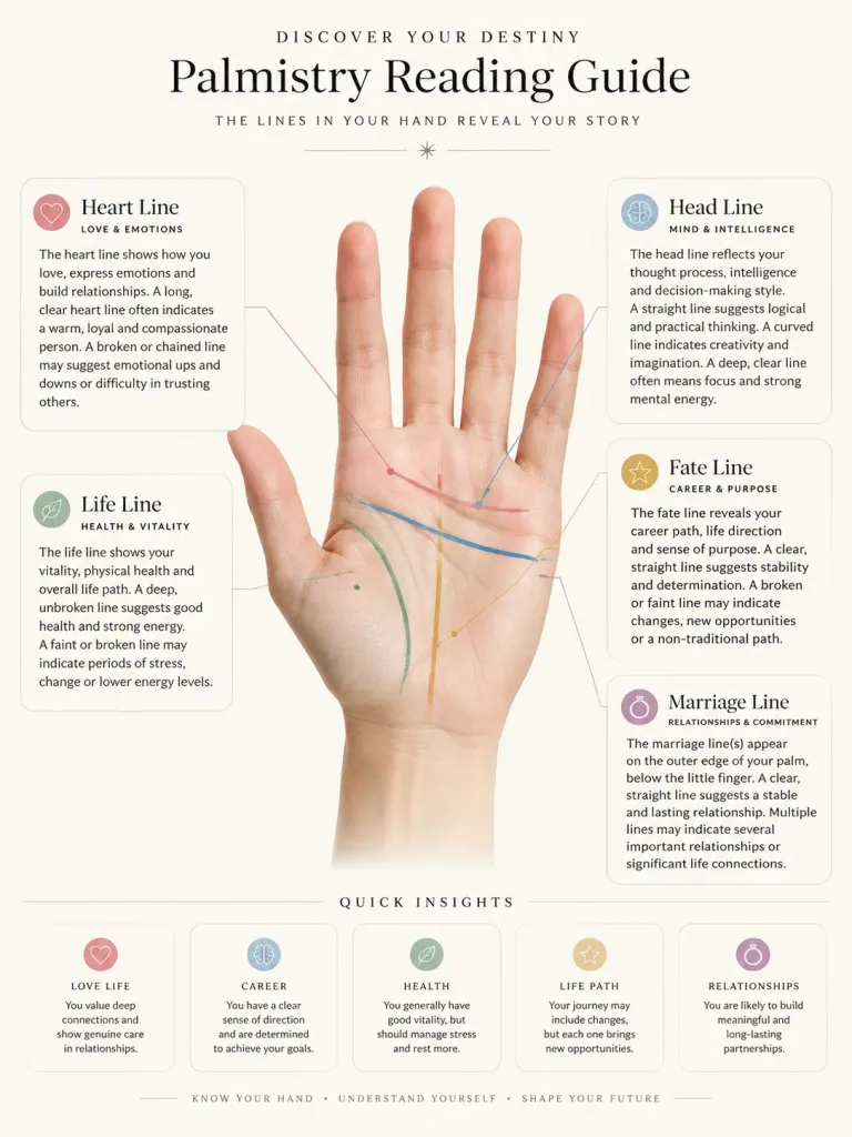
A comprehensive palmistry reading guide infographic based on the hand in the reference photo. Accurately trace and label key palm lines with thin pointer lines, accompanied by detailed palmistry analysis and interpretation text inside rounded-corner cards. The layout utilizes generous white space against a [cream-white] background. Visual style is a [clean, minimalist, and elegant magazine editorial style] with sophisticated typography and a high-end editorial feel.

ดูลายมืออินโฟกราฟิกศาสตร์ลายมือ
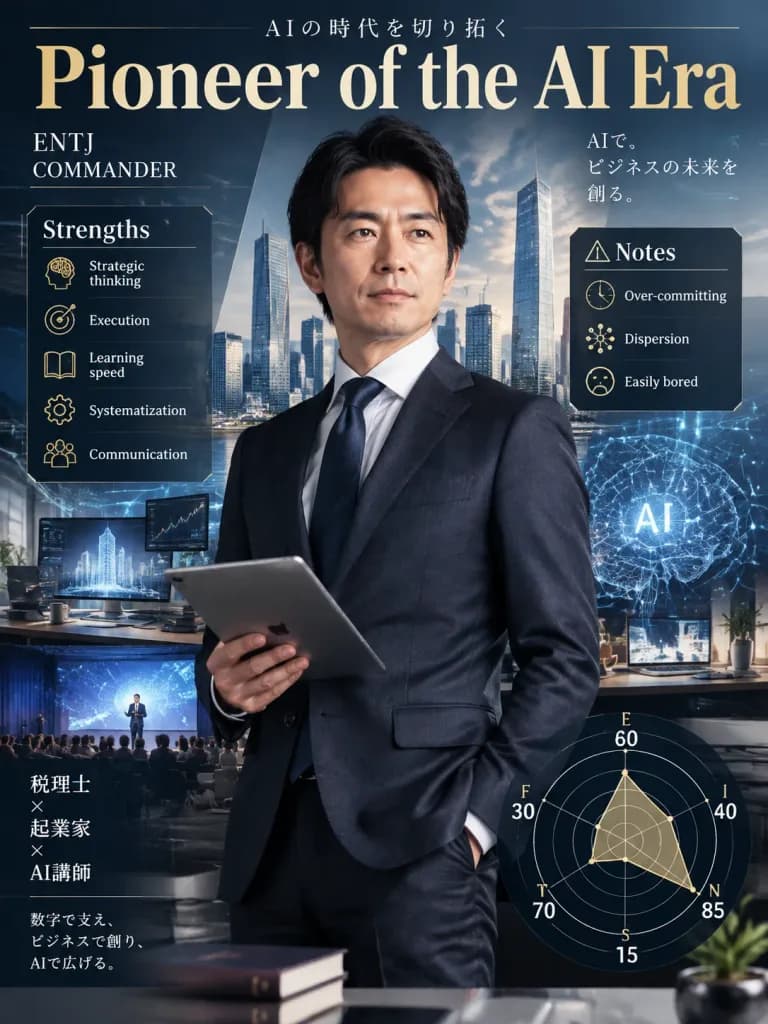
โปสเตอร์บุคลิกภาพ MBTI สไตล์นิตยสารธุรกิจ

โปสเตอร์บุคลิกภาพ MBTI สไตล์นิตยสารธุรกิจ

A vertical poster in the style of a high-end Japanese business magazine cover featuring [ENTJ COMMANDER]. At the center is an [intelligent Japanese man in his 40s] blending the professional personas of a tax accountant, entrepreneur, and AI instructor, holding a digital tablet in one hand. The background features a futuristic cityscape and modern digital workspace, surrounded by subtle motifs of AI neural networks, data streams, architecture, and seminar stages. Top header displays the title "[Pioneer of the AI Era]". Flanking the subject on the left and right are organized business infographic panels reading "Strengths: Strategic thinking, execution, learning speed, systematization, communication" and "Notes: Over-committing, dispersion, easily bored". At the bottom is an elegant radar chart showing "E60 I40 / N85 S15 / T70 F30 / J60 P40". Sophisticated editorial typography, clean information design, balanced executive lighting, premium magazine aesthetic.

mbtiปกนิตยสารโปสเตอร์ธุรกิจ
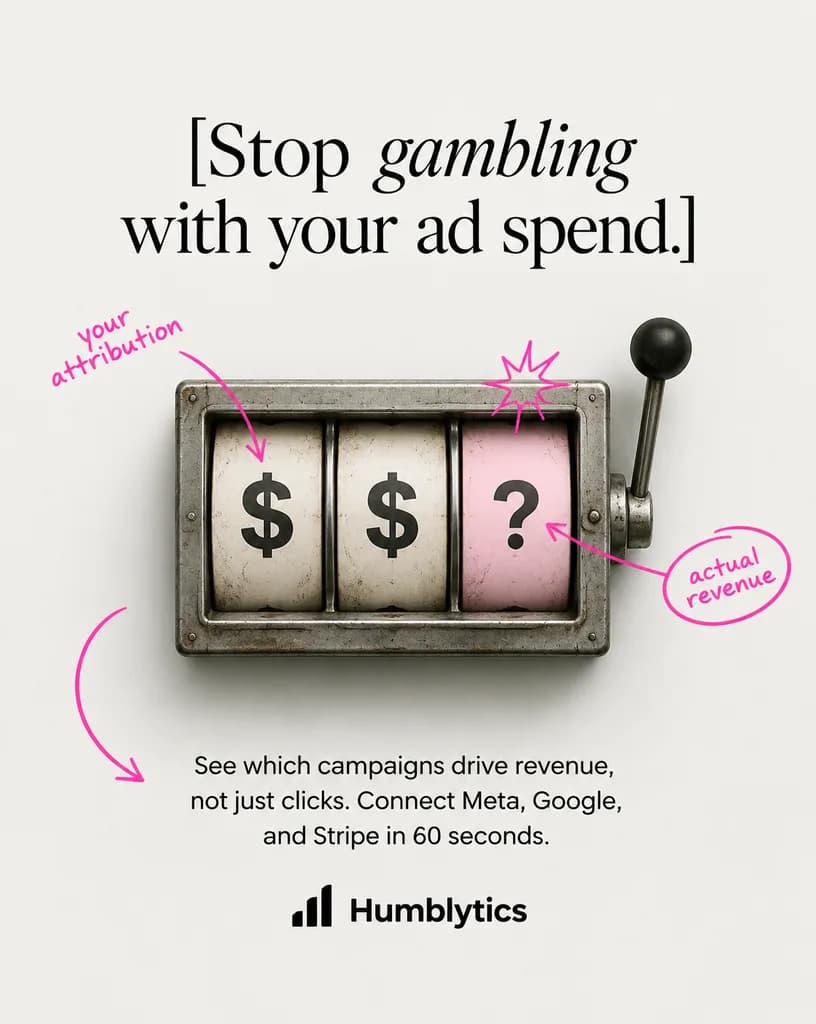
โฆษณาการตลาดสล็อตแมชชีนแบบมินิมอล

โฆษณาการตลาดสล็อตแมชชีนแบบมินิมอล

A clean minimalist static advertisement with a centered editorial layout on an off-white light gray studio background. At the top, a large luxury-fashion-style serif headline in black reads: "[Stop gambling with your ad spend.]", with the word "gambling" set in an elegant italic serif. In the center, a realistic, slightly weathered vintage metal slot-machine window viewed straight on, featuring three vertical reels in a rectangular steel housing with a mechanical lever and black knob on the right. The reels display "$", "$", and "?" from left to right, with the first two reels on aged white backgrounds and the rightmost question-mark reel on pale pink. Hand-drawn neon-pink doodle annotations are layered over the image: an arrow and note on the left pointing to the first reel reading "[your attribution]", a starburst scribble above the pink question-mark reel, an arrow pointing from the question mark to a circled note on the right reading "[actual revenue]", and a large curved arrow in the lower left pointing toward the text below. Beneath the slot machine, a centered sans-serif body paragraph in black reads: "[See which campaigns drive revenue, not just clicks. Connect Meta, Google, and Stripe in 60 seconds.]". At the bottom center, a minimalist black analytics bar icon sits next to the bold sans-serif brand name "[Humblytics]". Soft studio lighting, realistic drop shadows, and a restrained color palette of steel gray, off-white, black, and hot pink.

โฆษณาการตลาดสล็อตแมชชีนการออกแบบเอดิทอเรียล
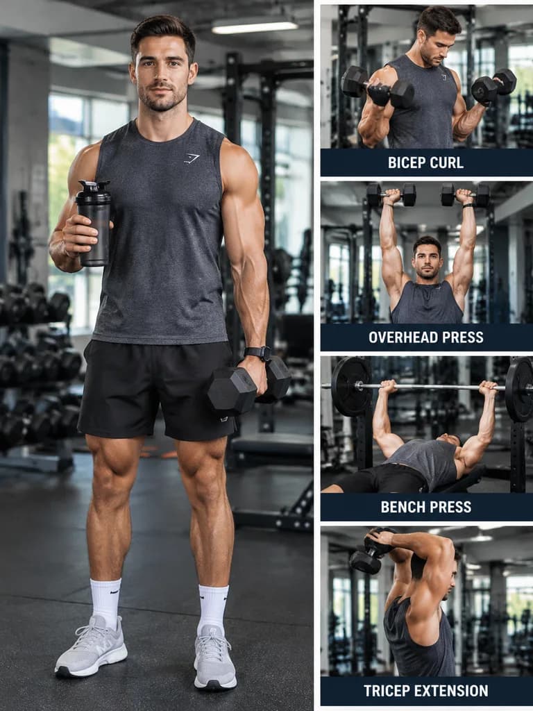
เลย์เอาต์หน้านิตยสารฟิตเนส

เลย์เอาต์หน้านิตยสารฟิตเนส

Realistic fitness magazine page layout. LEFT SIDE (60%): Full-body photo of [an athletic man] in [a modern gym]. He holds [a dumbbell in his left hand] and [a shaker bottle in his right hand]. RIGHT SIDE (40%, vertical strip): 4 exercise photos stacked vertically: Photo 1: [Bicep curls] Label: "[BICEP CURL]" Photo 2: [Overhead press] Label: "[OVERHEAD PRESS]" Photo 3: [Bench press] Label: "[BENCH PRESS]" Photo 4: [Tricep extension] Label: "[TRICEP EXTENSION]"

ฟิตเนสเลย์เอาต์นิตยสารตารางออกกำลังกาย
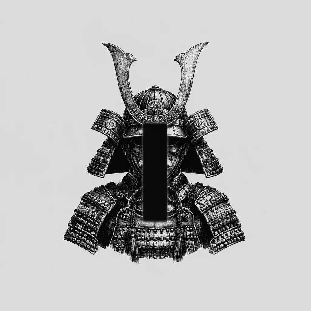
ภาพแกะสลักชุดเกราะซามูไรติดเซนเซอร์

ภาพแกะสลักชุดเกราะซามูไรติดเซนเซอร์

A minimalist monochrome illustration of a traditional Japanese [samurai helmet and shoulder armor], centered as a bust-length portrait on a plain [light gray] background. Black ink engraving and woodcut print style featuring high contrast, dense stippling, and fine etched linework. The kabuto features two tall curved crest horns and layered side guards, accompanied by intricate lacing on the shoulder plates. The face is completely obscured by a centered vertical solid black censor bar with slightly softened edges, covering the facial mask and helmet opening. Small isolated centered subject with expansive negative space, no extra objects, no text, no border.

เกราะซามูไรภาพพิมพ์แกะไม้ศิลปะมินิมอล
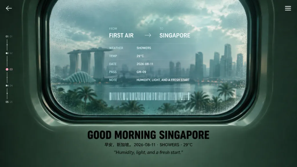
โปสเตอร์ท่องเที่ยวแห่งอนาคตผ่านหน้าต่างห้องโดยสาร

โปสเตอร์ท่องเที่ยวแห่งอนาคตผ่านหน้าต่างห้องโดยสาร

Cinematic futuristic travel poster viewed from inside an airplane or train cabin, centered on a large rounded-rectangle passenger window with thick dark green molded plastic framing and layered rubber seals. Through the slightly fogged, rain-speckled glass, show a soft-focus morning skyline of [Singapore] featuring the Marina Bay Sands silhouette, distant high-rise towers, palm trees, humid haze, and muted teal daylight after rain. The overall color palette features dark forest green, seafoam, and pale cyan, with moody low contrast, glossy reflections, subtle film grain, and premium editorial design. Overlaid translucent boarding-pass style HUD directly on the window glass: - Header text: FROM [FIRST AIR] → TO [SINGAPORE] - Exactly 5 labeled data rows: WEATHER / SHOWERS TEMP / 29°C DATE / 2026-08-11 PASS / GM-09 NOTE / HUMIDITY, LIGHT, AND A FRESH START - A thin dotted divider line and a long white barcode beneath the data rows. Below the window, centered on the cabin wall: - Large bold black uppercase headline: [GOOD MORNING SINGAPORE] - Small caption line: 早安,新加坡。 2026-08-11 · SHOWERS · 29°C - Secondary quoted text: “Humidity, light, and a fresh start.” Minimalist UI framing elements: - Small back chevron in the upper-left corner - Three-line hamburger icon in the upper-right corner - Vertical progress scale along the left edge with 5 numbered ticks (01, 02, 03, 04, 05) and a small pink dot highlighting 03. Symmetrical composition, widescreen 16:9, no people, crisp typography, realistic interior materials, and atmospheric soft-focus exterior.

โปสเตอร์ท่องเที่ยวui แห่งอนาคตหน้าต่างเครื่องบิน
หน้าปกพรีเซนเทชันสไตล์บรรณาธิการเชิงสถาปัตย์

หน้าปกพรีเซนเทชันสไตล์บรรณาธิการเชิงสถาปัตย์

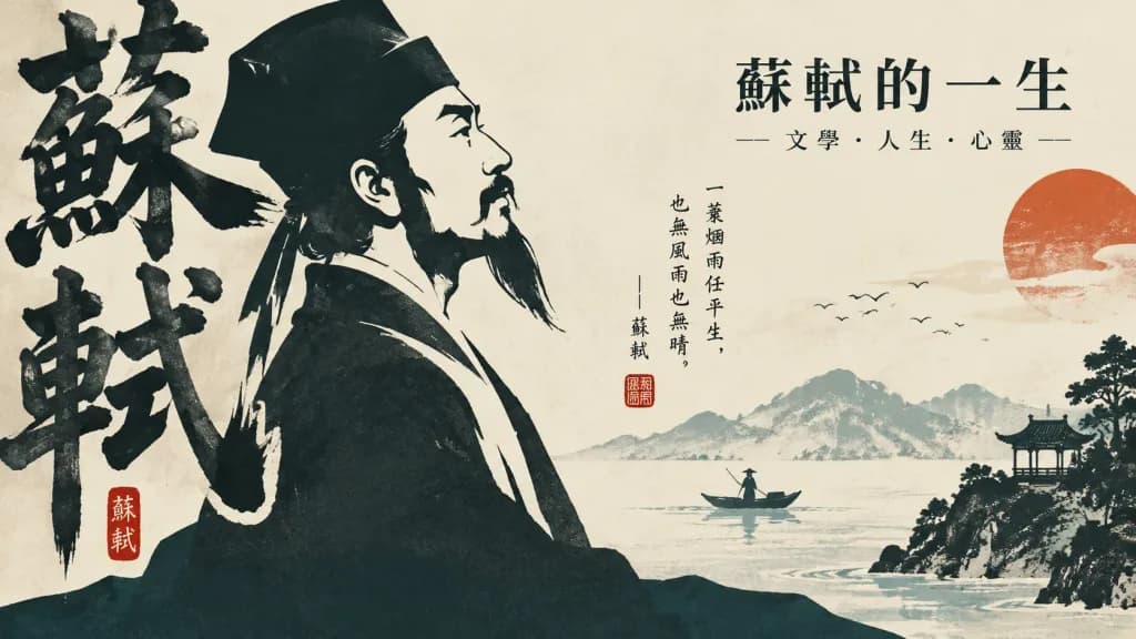
An artistic editorial [PPT cover for courseware] design themed around [The Life of Su Shi]. The composition features a massive visual anchor with powerful brush weight formed by core thematic text and calligraphic characters acting as a vertical architectural skeleton. The main subject is rendered as an exaggerated, enlarged flat silhouette with sharp negative-space cutout lines, layered graphic color blocks, and crisp boundaries. Asymmetric layout with high-density main forms cropped boldly along one edge, while secondary visual elements cross the central axis into generous breathing space, anchored at the bottom by a solid stabilizing base shape. Color palette of deep, muted, low-saturation tones providing structural weight, warm off-white negative space, and selective vibrant accent hues. Includes authentic handwritten ink strokes, traditional red seal impressions, fine editorial typography, poetry annotations, and clean titles in near-black ink. Refined, restrained, and narrative graphic design.

หน้าปก pptการออกแบบบรรณาธิการการจัดวางตัวอักษร
สไลด์หน้าปกพรีเซนเทชันสไตล์บรรณาธิการโทนอบอุ่น

สไลด์หน้าปกพรีเซนเทชันสไตล์บรรณาธิการโทนอบอุ่น

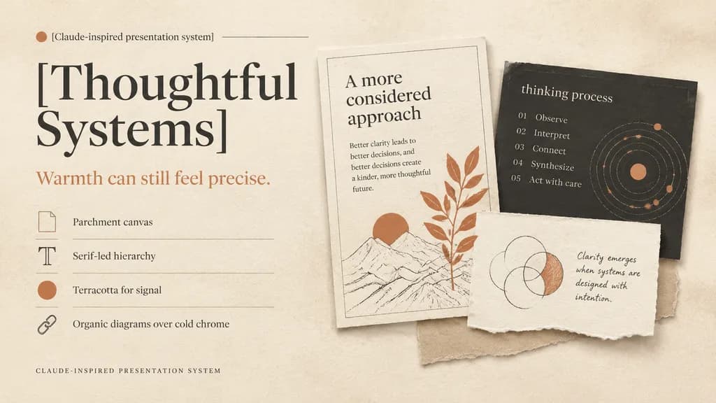
A refined editorial presentation cover slide in a warm design system, landscape 16:9 composition. Background of textured warm ivory parchment paper with subtle grain, soft realistic cast shadows, and tactile torn-paper collage layers. Color palette: warm ivory, cream, sand, charcoal, muted black, and terracotta accents. Left half layout: top label reading "[Claude-inspired presentation system]" beside a small terracotta dot and a hairline divider; below, an oversized high-contrast serif headline in muted black split across two lines reading "[Thoughtful Systems]"; underneath, a smaller serif subheadline in terracotta reading "[Warmth can still feel precise.]"; followed by a vertical list of 4 design principles separated by thin divider lines with small icons: 1) a rectangular parchment-sheet icon with "Parchment canvas", 2) a serif capital T icon with "Serif-led hierarchy", 3) a filled terracotta dot icon with "Terracotta for signal", 4) a chain-link icon with "Organic diagrams over cold chrome"; at the bottom left, small-caps spaced caption "CLAUDE-INSPIRED PRESENTATION SYSTEM". Right half layout: a layered collage of 3 physical paper cards: 1) a tall off-white card with a hairline border, heading "A more considered approach", short body copy on clarity, a minimalist line drawing with a terracotta sun, and an overlapping terracotta botanical branch; 2) a charcoal rectangular card partially behind it with lowercase title "thinking process", a 5-step numbered list ("01 Observe", "02 Interpret", "03 Connect", "04 Synthesize", "05 Act with care"), and a dotted circular orbital diagram with terracotta highlights; 3) a torn off-white note card in front with hand-drawn overlapping circles where one crescent is shaded in terracotta, accompanied by handwritten text "[Clarity emerges when systems are designed with intention.]"; a light beige paper strip peeks from beneath the cards. Soft natural diffused lighting, generous negative space, sophisticated print editorial aesthetic.
พรีเซนเทชันสไลด์การออกแบบสิ่งพิมพ์
อินโฟกราฟิกสไตล์บทบรรณาธิการเทศกาลเสี่ยวสู่

อินโฟกราฟิกสไตล์บทบรรณาธิการเทศกาลเสี่ยวสู่

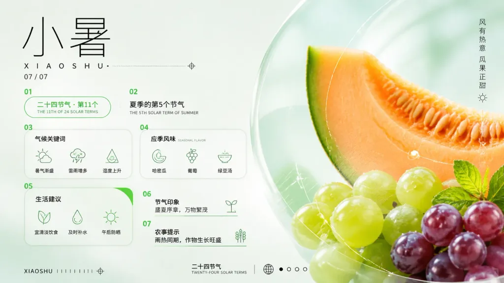
A refined horizontal Chinese solar-term infographic poster for [小暑], combining traditional calendar information with a fresh summer dessert and melon color palette. Setting & Background: 16:9 landscape format, pale mint-white background with airy negative space and high-end editorial infographic style. Accented with thin black, teal, lime, peach, orange, and violet tones. Composition & Layout: The left side contains typography and structured data cards; the right half features a macro photographic-style fruit composition. The right side is dominated by a cropped cantaloupe or melon slice in warm orange with a vivid green rind, alongside glossy lime-green and purple grapes, layered with translucent circular glassmorphic overlays and fine white technical arcs. Typography & Left Layout: - Top-left: Very large thin-line Chinese characters “小暑”, spaced Romanization “XIAOSHU” below with a dotted horizontal guide line and small target mark, followed by the date “07 / 07”. - Far right edge: Vertical Chinese slogan “风有热意 瓜果正甜” with a tiny sun icon beneath. - Exactly 7 numbered infographic modules in a clean grid: - Section 01: Pill-shaped green outline card reading “二十四节气 · 第11个” with subtitle “THE 11TH OF 24 SOLAR TERMS”. - Section 02: Text block reading “夏季的第5个节气” with subtitle “THE 5TH SOLAR TERM OF SUMMER”. - Section 03: Rounded rectangle card titled “气候关键词” with 3 icon items: “暑气渐盛” (sun/cloud), “雷雨增多” (rain cloud), “湿度上升” (water-drop triangle). - Section 04: Rounded rectangle card titled “应季风味” (subtitle “SEASONAL FLAVOR”) with 3 icon items: “哈密瓜” (melon), “葡萄” (grape), “绿豆汤” (bowl). - Section 05: Green arc-accent card titled “生活建议” with 3 icon items: “宜清淡饮食” (leaf), “及时补水” (water drop), “午后防晒” (sun). - Section 06: Text block titled “节气印象” containing “盛夏序章,万物繁茂” with a small sprout icon. - Section 07: Text block titled “农事提示” containing “雨热同期,作物生长旺盛” with a crop icon. Footer: Bottom-left label “XIAOSHU” with tiny tick marks and a target icon. Bottom-center/right label “二十四节气” and “TWENTY-FOUR SOLAR TERMS” with a globe icon and 4 pagination dots. Style: Swiss grid layout mixed with East Asian seasonal aesthetics, flat monoline vector icons, translucent glassmorphic shapes, realistic fruit textures, luminous summer freshness inspired by [summer desserts and watermelon colors]. No watermarks, clean editorial finish.
อินโฟกราฟิกสารทฤดูโปสเตอร์
อินโฟกราฟิกผลกระทบลูกโซ่ของสิ่งประดิษฐ์ประวัติศาสตร์

อินโฟกราฟิกผลกระทบลูกโซ่ของสิ่งประดิษฐ์ประวัติศาสตร์

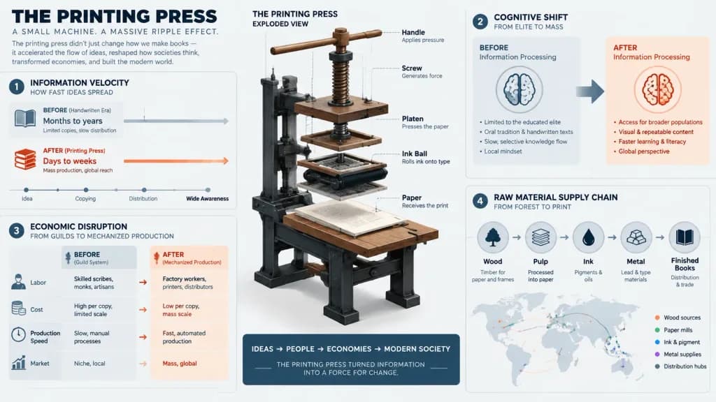
A comprehensive editorial infographic visualizing the systemic ripple effect of [the printing press]. The composition features a detailed mechanical exploded view of [the printing press] at its center, surrounded by interconnected data visualizations: an information velocity timeline showing idea spread speed pre- and post-invention, a cognitive shift diagram of societal information processing, an economic disruption matrix mapping labor transition from guilds to mechanized production, and a raw material supply chain map. Modern graphic design aesthetic with clean technical linework, structured layout, bold accents, and clear schematic typography, avoiding dusty museum artifact photography or dull patent drawings.

อินโฟกราฟิกการแสดงข้อมูลภาพสิ่งประดิษฐ์ประวัติศาสตร์
โปสเตอร์ประชาสัมพันธ์การท่องเที่ยวสแกนดิเนเวียสุดหรู

โปสเตอร์ประชาสัมพันธ์การท่องเที่ยวสแกนดิเนเวียสุดหรู

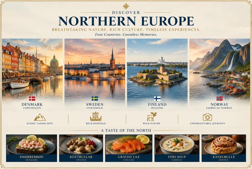
An elegant luxury travel poster for [NORTHERN EUROPE], designed like a premium tourism campaign brochure cover with a wide symmetrical layout, thin gold decorative border, and refined editorial typography. At top center, a small compass-star icon sits above the word "DISCOVER", followed by a prominent serif headline reading "[NORTHERN EUROPE]" in deep navy blue. Below it, a gold uppercase tagline reads "[BREATHTAKING NATURE. RICH CULTURE. TIMELESS EXPERIENCES.]" and a delicate italic subline reads "[Four Countries. Countless Memories.]". The center is divided into four equal vertical scenic panels showcasing iconic destinations at golden hour with soft glowing skies and cinematic realism: Panel 1: Denmark, Copenhagen, colorful harbor waterfront with historic townhouses, boats, calm reflective water, and a distant domed landmark, with a small Danish flag above the labels "DENMARK" and "COPENHAGEN". Panel 2: Sweden, Stockholm, waterfront old-town skyline with church spires and sunset reflections, with a small Swedish flag above "SWEDEN" and "STOCKHOLM". Panel 3: Finland, Helsinki, a stone castle-like island fortress in deep blue water under clear skies, with a small Finnish flag above "FINLAND" and "HELSINKI". Panel 4: Norway, dramatic fjords with steep jagged mountains, cascading waterfalls, and a red-roofed coastal village at the water's edge, with a small Norwegian flag above "NORWAY" and "FJORDS OF NORWAY". Beneath the four country panels, a row of four evenly spaced gold line icons with captions: mountain icon with "ICONIC LANDSCAPES", Viking ship icon with "RICH HERITAGE", moose icon with "WILD NATURE", and camera icon with "UNFORGETTABLE JOURNEYS". Near the bottom, a gold divider and the title "A TASTE OF THE NORTH" above five horizontal culinary thumbnail panels in dark blue frames with appetizing warm lighting: 1) Smørrebrød (Denmark, open-faced shrimp sandwich), 2) Köttbullar (Sweden, meatballs with cream sauce and lingonberries), 3) Gravad lax (Finland, cured salmon slices), 4) Fish soup (Norway, creamy seafood soup with herbs), 5) Kanelbulle (Sweden, glazed cinnamon bun). Polished high-end travel advertising aesthetic, photorealistic landscape scenery, navy blue and metallic gold palette, crisp typography, and nostalgic European tourism mood.

โปสเตอร์ท่องเที่ยวนอร์ดิกอินโฟกราฟิก
โปสเตอร์อินโฟกราฟิกตารางกิจวัตรประจำวันของสาวเรือรบอนิเมะ

โปสเตอร์อินโฟกราฟิกตารางกิจวัตรประจำวันของสาวเรือรบอนิเมะ

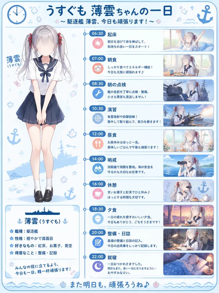
vertical anime infographic poster. a cute daily-life schedule for a Kantai Collection-style ship girl destroyer. [薄雲(うすぐも)]. vertical blue timeline with circular nodes, navy time badges, pastel icon circles, rounded rectangular panels with…

อินโฟกราฟิกอนิเมะตารางกิจวัตรโปสเตอร์ไทม์ไลน์
โปสเตอร์บทบรรณาธิการนักฟุตบอลสไตล์โมเดิร์น

โปสเตอร์บทบรรณาธิการนักฟุตบอลสไตล์โมเดิร์น

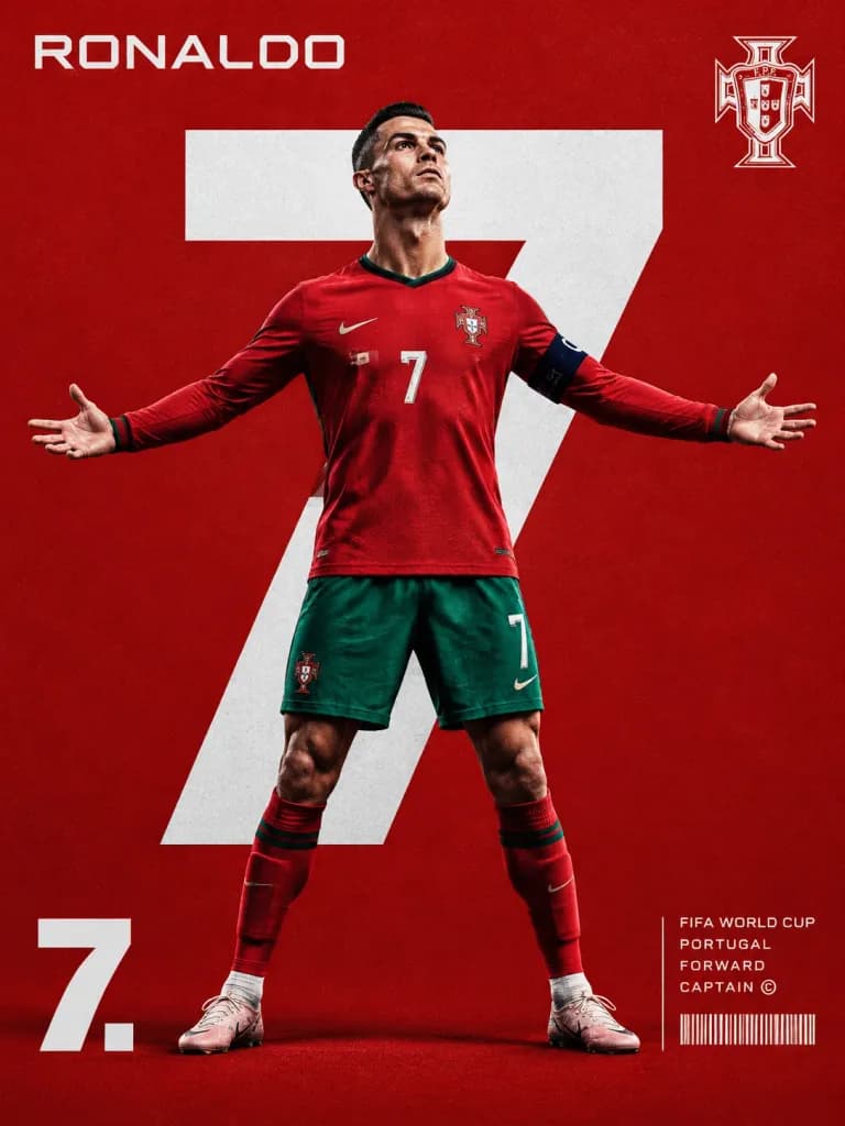
A premium sports editorial poster in a modern [FIFA World Cup] campaign style. In the center, a full-body professional football player stands confidently with arms outstretched in a victory pose, looking slightly upward with a determined expression. Dominating the background directly behind him is an oversized bold white jersey number, creating a layered composition with realistic shadows and crisp separation. The background is a solid [red for Portugal] with a subtle fine grain texture. Top-left features the player's surname in a clean futuristic geometric sans-serif typeface; top-right displays the national team crest. Bottom-left features the jersey number in oversized bold numerals followed by a period. Bottom-right displays compact editorial typography including tournament title, national team, player position, captain indicator, and a sleek barcode graphic separated by a thin vertical rule. Luxury sports branding aesthetic, dramatic studio lighting, sharp jersey fabric texture, high contrast, and clean negative space.
โปสเตอร์กีฬาฟุตบอลการออกแบบบทบรรณาธิการ
ปกนิตยสารย้อนยุคตามวันเกิด

ปกนิตยสารย้อนยุคตามวันเกิด

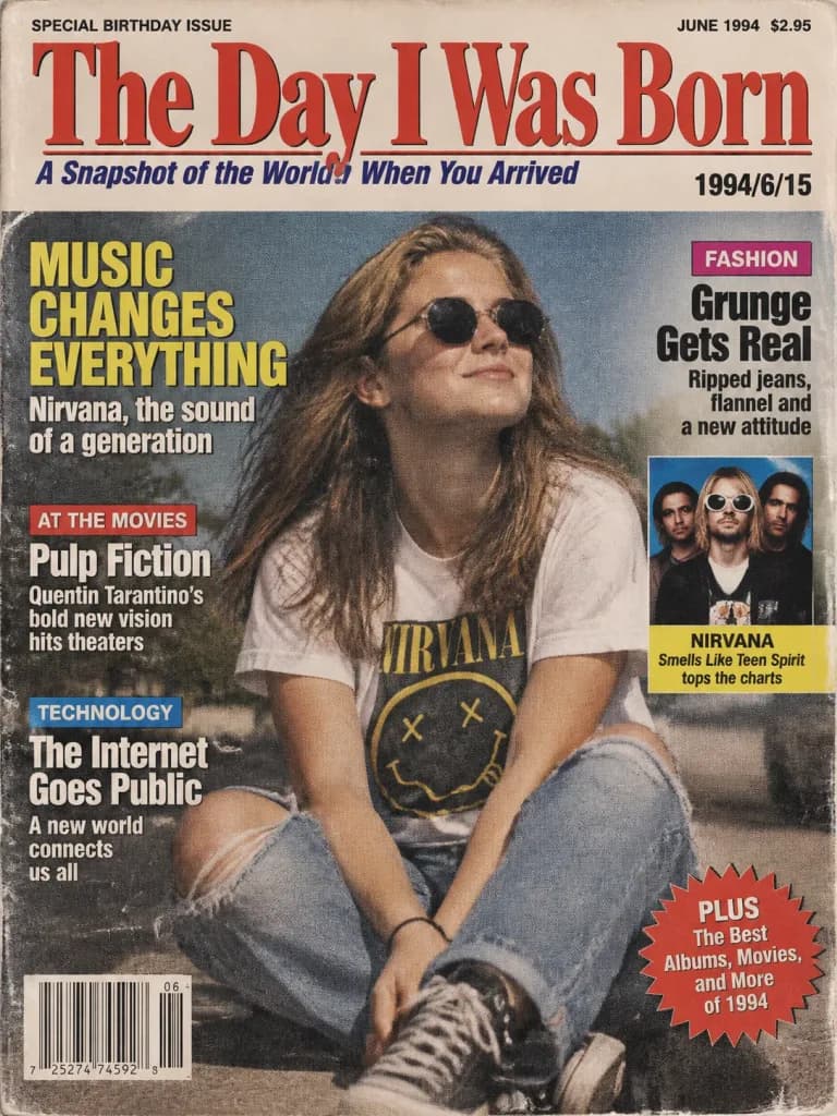
A realistic vintage magazine cover titled "The Day I Was Born" commemorating the birth date [1994/6/15]. The cover features authentic period-accurate 1990s graphic design, typography, and paper texture. The main title "The Day I Was Born" is emblazoned across the top masthead. Subtitle: an evocative catchphrase summarizing the cultural zeitgeist of 1994. The date [1994/6/15] is clearly printed on the cover. The central visual is a nostalgic editorial photograph symbolizing mid-1990s culture. Surrounding the visual are 3 to 5 authentic news headlines and pop culture callouts (music, cinema, technology, and fashion) from June 1994. Realistic printed paper grain, retro color palette, visible halftone printing texture, and natural magazine editorial layout.

ปกนิตยสารวินเทจวันเกิด
สไลด์หน้าปกพรีเซนเทชันภาษาญี่ปุ่นสไตล์มินิมอล

สไลด์หน้าปกพรีเซนเทชันภาษาญี่ปุ่นสไตล์มินิมอล

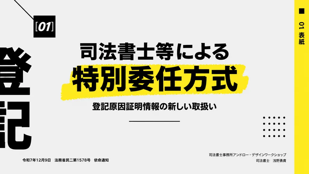
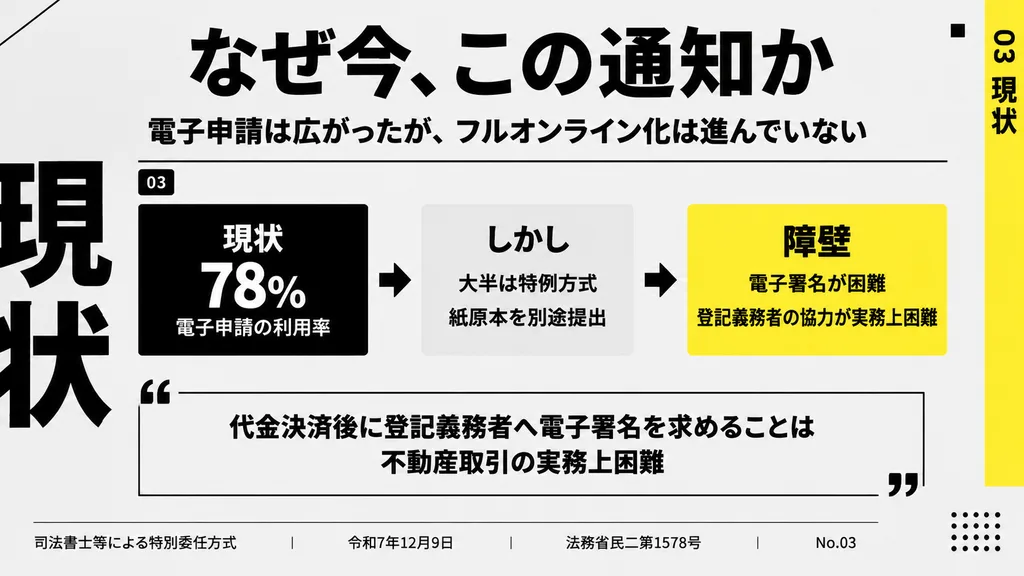
Modern Japanese presentation cover slide in a minimalist Swiss-inspired editorial style, landscape 16:9 aspect ratio. Very light gray background with bold black typography, generous negative space, and vivid yellow graphic accents. Layout and details: - Upper left: a small black square featuring the white italic bold sans-serif text "[01]", accented by a thin black diagonal line angling in from the top-left corner. - Center: a large Japanese headline in heavy black type across two lines: "[司法書士等による]" on line one, and a substantially larger "[特別委任方式]" on line two set over a rough, hand-painted yellow highlighter stroke. - Directly below: a smaller Japanese subtitle in black: "[登記原因証明情報の新しい取扱い]", followed beneath by a thin centered horizontal black line. - Far left border: oversized, cropped black Japanese characters running off-canvas to form an abstract typographic framing element. - Far right edge: a tall vertical yellow sidebar containing black vertical text reading "[01 表紙]", alongside a small black accent square near the top right. - Lower right quadrant: a decorative 5x5 dotted grid of 25 small black dots. - Bottom left: small single-line Japanese metadata reading "[令和7年12月9日 法務省民二第1578号 依命通知]". - Bottom right: right-aligned two-line Japanese text reading "[司法書士事務所アンドロー・デザインワークショップ]" on the first line and "[司法書士 浅野勇貴]" on the second. Sharp, high-contrast vector aesthetic with clean print-like precision.

สไลด์นำเสนอกราฟิกดีไซน์การจัดวางตัวอักษรญี่ปุ่น
เลย์เอาต์นิตยสารแบ่งส่วนภาพถ่ายและภาพวาดขนาดจิ๋ว

เลย์เอาต์นิตยสารแบ่งส่วนภาพถ่ายและภาพวาดขนาดจิ๋ว

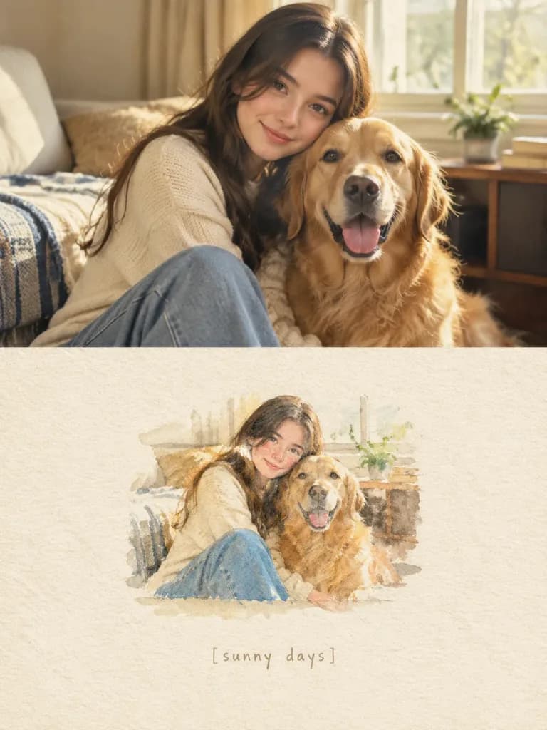
Create a vertical 3:4 nostalgic editorial scrapbook layout divided horizontally into two equal sections, using the reference photo as the exact visual guide: TOP HALF — ORIGINAL PHOTOGRAPH: • Display the reference photo in the upper 50% of the canvas. • Keep it photorealistic and unchanged, preserving exact facial features, body proportions, clothing, hairstyles, poses, lighting, and environmental details with clean edges and no frame. BOTTOM HALF — MINIATURE STORYBOOK VERSION: • Recreate the exact scene from the reference photo as a delicate miniature hand-painted illustration centered in the lower section, occupying roughly 25–35% of the area with generous negative space. • Style: Soft watercolor, colored pencil, and gouache with delicate brushwork, textured edges, and a slightly faded vintage look. • Include a faint hand-drawn shadow beneath the miniature scene so it feels naturally placed on the page. BACKGROUND & TEXTURE: • The entire bottom half is textured warm ivory handmade watercolor paper with subtle organic fibers and grain. TEXT: • Centered beneath the miniature illustration, write the handwritten caption in delicate lowercase light taupe ink: "[sunny days]". LIGHTING & PALETTE: • Warm natural daylight, soft cream, beige, muted denim blue, and warm brown tones with a quiet, sentimental film-inspired warmth. CONSTRAINTS: • Maintain the exact identities, poses, and objects from the reference photo without adding new elements or altering anatomy.
สมุดภาพภาพประกอบจากภาพถ่ายเลย์เอาต์แบ่งส่วน
โปสเตอร์ท่องเที่ยวสไตล์บรรณาธิการเอเชียตะวันออก

โปสเตอร์ท่องเที่ยวสไตล์บรรณาธิการเอเชียตะวันออก

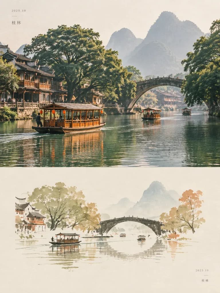
A refined editorial travel poster composition inspired by nostalgic East Asian travel photography and minimalist contemporary illustration, split into two horizontal sections: - Upper section: A cinematic, photorealistic [riverside scene in a historic town]. Traditional wooden sightseeing boats with warm honey-orange frames and small covered roofs float on calm green water. A graceful antique stone arch bridge spans the river, framed by enormous mature trees with dense foliage, while misty karst mountains rise softly in the background. Features subtle human activity, authentic regional architecture, warm natural daylight, slightly faded film tones, gentle atmospheric haze, soft contrast, and fine analog grain. - Lower section: Seamless transition into a minimalist hand-drawn illustration on a warm ivory paper background. The scene is abstracted into sparse, delicate shapes: a curved dark stone bridge, simplified trees in [muted olive, ochre, beige and rust tones], tiny boats, and horizontal reflections. Rendered with sparse lines, imperfect brush textures, and ample negative space. Overall design: Independent travel magazine aesthetic, understated Japanese and Korean editorial poster styling, muted earthy palette, generous white margins, subtle fine paper texture, and quiet contemplative mood. Minimal tiny date and location typography in the corner margins. No logos, watermarks, or saturated colors.

โปสเตอร์ท่องเที่ยวงานออกแบบบรรณาธิการเอเชียตะวันออก
โปสเตอร์ท่องเที่ยวเยอรมนีสไตล์วินเทจสุดหรู

โปสเตอร์ท่องเที่ยวเยอรมนีสไตล์วินเทจสุดหรู

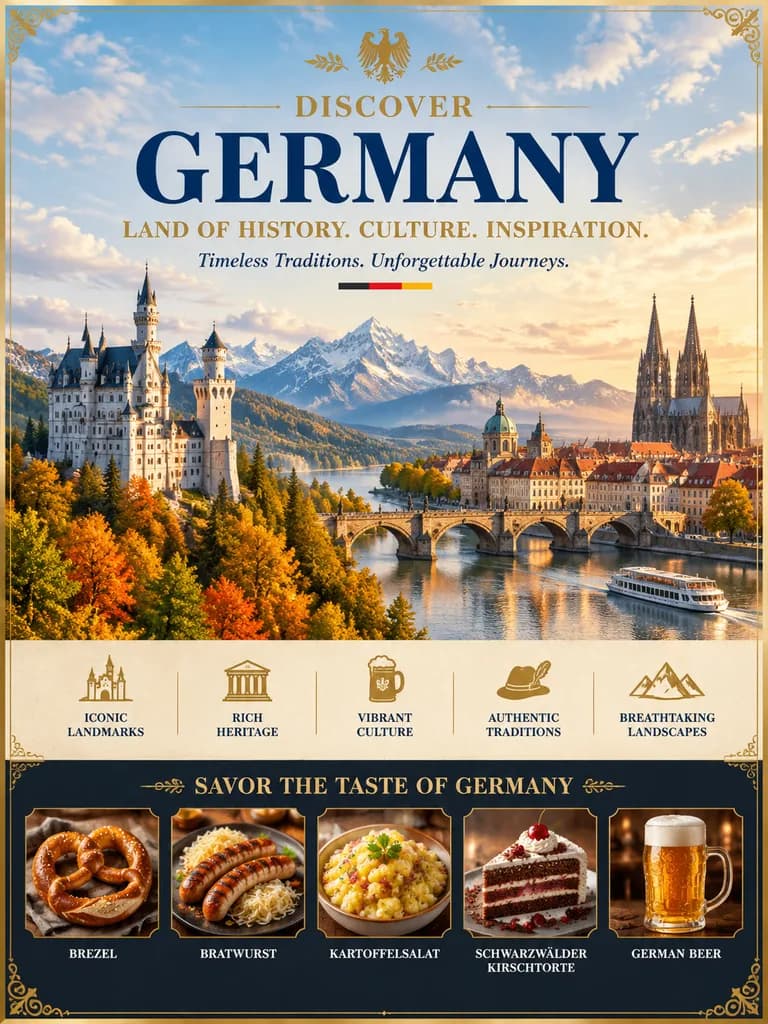
A luxurious vintage-style travel poster for [Germany], designed in the style of a premium editorial tourism campaign. Grand, symmetrical composition framed by an ornate thin gold border with delicate corner flourishes. Typography at the top center: - A small golden national emblem - The word "DISCOVER" above a large serif headline: "[GERMANY]" in deep navy blue - Slogan in gold uppercase: "LAND OF HISTORY. CULTURE. INSPIRATION." - Classic serif tagline below: "Timeless Traditions. Unforgettable Journeys." accented with a tiny horizontal stripe in black, red, and gold. Central artwork: A panoramic golden-hour landscape under a softly lit blue sky with drifting clouds. On the left, a romantic white fairytale hilltop castle surrounded by autumn foliage; in the distant center, majestic alpine mountain peaks; on the right, a historic European riverside city featuring dense red-tiled roofs, an arched stone bridge crossing reflective waters, a domed cathedral, and a towering twin-spire Gothic cathedral. A small white river cruise boat glides on the lower right water. Middle icon strip: A horizontal row of five evenly spaced gold line-art cultural icons, each with its label beneath: "ICONIC LANDMARKS", "RICH HERITAGE", "VIBRANT CULTURE", "AUTHENTIC TRADITIONS", and "BREATHTAKING LANDSCAPES". Bottom gastronomy strip: A dark horizontal panel titled "SAVOR THE TASTE OF GERMANY" in gold lettering. Inside, five framed circular or rectangular food close-up panels labeled in white uppercase: - "BREZEL" (glossy salted pretzel) - "BRATWURST" (grilled sausages with sauerkraut) - "KARTOFFELSALAT" (traditional potato salad) - "SCHWARZWÄLDER KIRSCHTORTE" (slice of Black Forest cake with cream and cherries) - "GERMAN BEER" (a frothy glass mug of golden beer). Polished, nostalgic aesthetic with warm cinematic lighting and crisp architectural details.

โปสเตอร์ท่องเที่ยวการท่องเที่ยววินเทจเยอรมนี
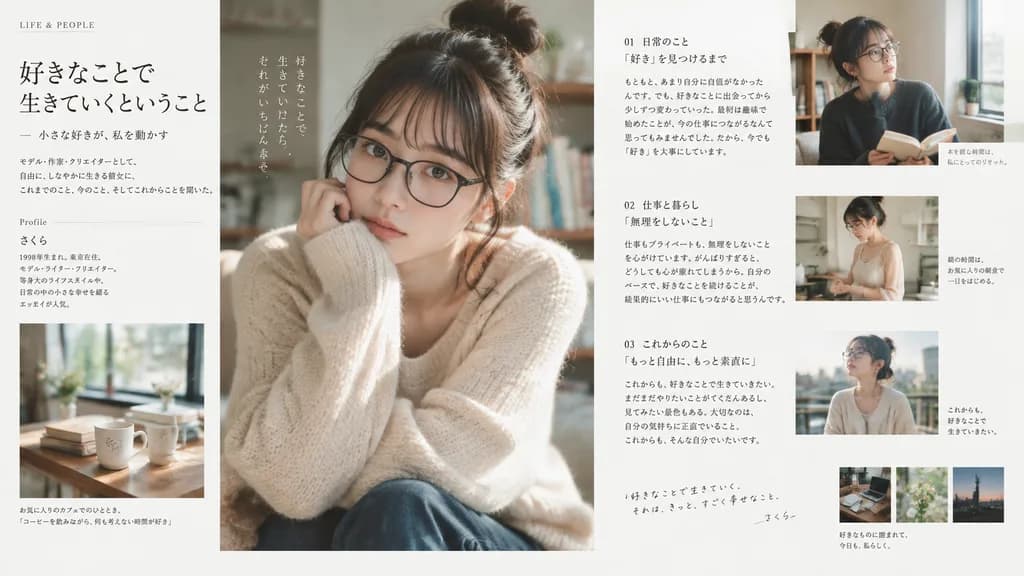
เลย์เอาต์หน้าคู่หนังสือนิตยสารไลฟ์สไตล์ญี่ปุ่น

เลย์เอาต์หน้าคู่หนังสือนิตยสารไลฟ์สไตล์ญี่ปุ่น

Use the person in the reference photo as the main subject, preserving their facial features, hairstyle, and overall vibe. Create a [Japanese magazine editorial interior spread], not a cover. The layout should look like an interview or feature article from a modern [Japanese lifestyle magazine], featuring one main portrait photo, several smaller lifestyle and detail photos, clean editorial typography, headline, section label, multi-column body text, captions, generous white space, and an elegant grid structure. Soft natural daylight, subtle film texture, minimalist Japanese styling, calm literary atmosphere, realistic and understated.

หน้าคู่นิตยสารการออกแบบสิ่งพิมพ์สุนทรียศาสตร์ญี่ปุ่น