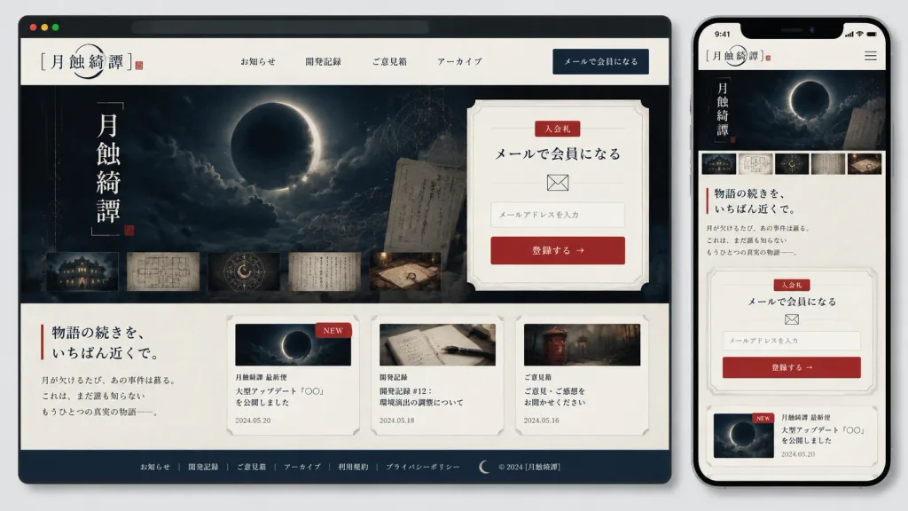
Presentation mockup of a responsive website for a Japanese mystery/horror game community titled "[月蝕綺譚]", displayed as both a desktop browser window and a smartphone screen side-by-side on a light gray background with soft drop shadows and rounded device frames.
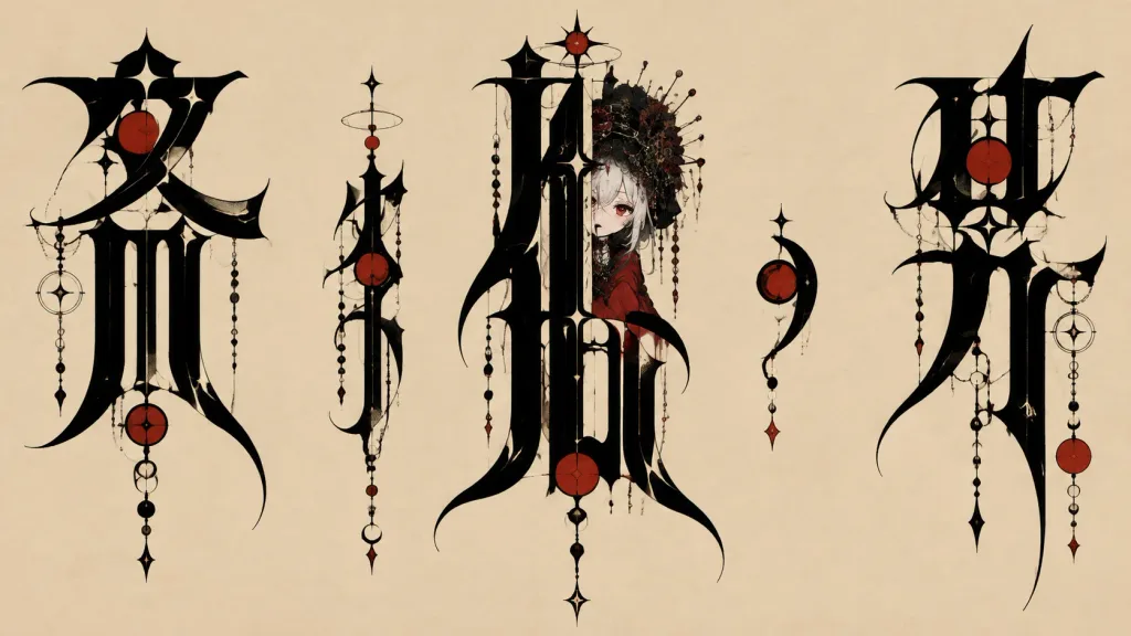
Visual Style: Elegant Japanese gothic mystery aesthetic, off-white washi paper textured background, deep navy-black panels, delicate gray borders, muted vermilion red accents, refined Japanese serif typography (Mincho), thin ink lines, crescent moon motifs, old archive documents, and restrained editorial spacing.
Desktop Layout (occupying left 75% width):
- Browser Chrome: Dark top bar with three small circular window buttons.
- Navigation Header: Site title logo "[月蝕綺譚]" with a delicate crescent arc and red seal stamp on the left; exactly 4 centered navigation links: "お知らせ", "開発記録", "ご意見箱", "アーカイブ"; dark navy CTA button on the right labeled "メールで会員になる".
- Hero Section: Split layout. Left side features a dark atmospheric artwork of a cloudy night sky with a glowing eclipsed crescent moon, vertical title text "[月蝕綺譚]", faint celestial orbit lines, a translucent archive overlay, and exactly 5 horizontal thumbnails at the bottom (old building at night, room blueprint, symbolic occult motif, handwritten manuscript, detective desk with maps). Right side features a cream ticket-shaped signup card with notched corners, a small red label "入会札", headline "メールで会員になる", envelope icon, an email input field with placeholder "メールアドレスを入力", and a red CTA button "登録する →".
- Content Section: Left headline "[物語の続きを、いちばん近くで。]" marked by a vertical red accent line and teaser body text. Right side displays exactly 3 horizontal cards: Card 1 "月蝕綺譚 最新便" (moon image, red "NEW" badge, headline "大型アップデート『〇〇』を公開しました", date 2024.05.20); Card 2 "開発記録" (notebook & pen icon, headline "開発記録 #12:環境演出の調整について", date 2024.05.18); Card 3 "ご意見箱" (antique postbox icon, headline "ご意見・ご感想をお聞かせください", date 2024.05.16).
- Footer: Dark navy band with exactly 6 links: "お知らせ", "開発記録", "ご意見箱", "アーカイブ", "利用規約", "プライバシーポリシー", crescent icon, and "© 2024 [月蝕綺譚]".
Mobile Layout (tall smartphone mockup on right):
- Status bar showing 9:41, compact header with "[月蝕綺譚]" logo and hamburger menu icon.
- Stacked responsive flow: hero eclipsed moon visual, 5 thumbnail strip, headline "[物語の続きを、いちばん近くで。]", the ticket-style email signup card, and the first news card with red "NEW" tag.
Constraints: Crisp, perfectly legible Japanese typography, exact link/card counts, no extraneous UI elements.
ui-ux-design웹목업일본미학