신규: GPT Image 2.5 Flare와 Sunburst. 가입하면 3장 무료, 이후 장당 8 크레딧.
GPT Image 2.5 사용해 보기

편집 디자인 AI 프롬프트

218개의 템플릿 · GPT IMAGE 2, Nano Banana Pro · 업데이트 2026년 10월

잡지 표지, 발표 자료 슬라이드, 브랜드 가이드라인 시트, 인포그래픽 포스터를 제작하는 템플릿입니다. 각 레이아웃은 구조화된 그리드 시스템, 균형 잡힌 여백, 명확한 타이포그래피 위계를 바탕으로 구성됩니다. 대괄호 안의 문구, 강조 색상, 주요 피사체를 변경하여 다양한 출판물이나 캠페인에 적용해 보세요.

정렬 기준:

프롬프트 218개 중 1–60개 표시

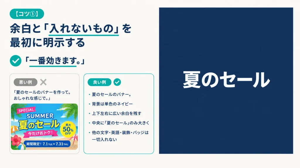
미니멀 일본어 프롬프트 팁 발표 슬라이드

미니멀 일본어 프롬프트 팁 발표 슬라이드

A 16:9 horizontal instructional presentation slide with a modern minimalist Japanese editorial design, warm off-white background, generous margins, dark navy typography, and teal accents. Two-column layout: - Left column (approx. 48% width): At top left, a rounded teal pill badge reading "[コツ①]". Below, a large bold dark navy Japanese headline: "[余白と「入れないもの」を最初に明示する]" with a thin teal underline directly beneath the phrase 「入れないもの」. Beneath the headline, a teal circular check icon followed by bold text reading "「一番効きます。」" with a short teal underline under the sentence. Below the lesson text, two rounded comparison cards side-by-side with subtle borders: - Bad example card: small gray pill reading "悪い例" and a pale gray "X" icon. It contains the prompt quote: "「夏のセールのバナーを作って。おしゃれな感じで。」" above a cluttered, colorful summer sale banner thumbnail packed with palm leaves, beach colors, decorative stickers, and busy text ("SPECIAL", "SUMMER", "夏のセール", "今だけおトク!", "最大50% OFF", "期間限定!7.1 TUE ▶ 7.31 THU"). - Good example card: small teal pill reading "良い例" and a teal checkmark icon. It contains a neat Japanese bullet list: "・夏のセールのバナー。", "・背景は単色のネイビー", "・上下左右に広い余白を残す", "・中央に『夏のセール』のみ大きく", "・他の文字・英語・装飾・バッジは一切入れない". - Right column (approx. 47% width): A large, clean solid dark navy rectangle with generous empty space, featuring only a single, large, bold sans-serif white Japanese headline centered horizontally and vertically: "[夏のセール]". Completely free of borders, gradients, patterns, or extra decorative graphics.
발표 슬라이드인포그래픽미니멀리즘
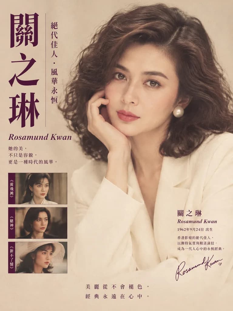
빈티지 홍콩 영화 헌정 포스터

빈티지 홍콩 영화 헌정 포스터

A vintage Hong Kong cinema tribute poster in elegant 1980s–1990s editorial magazine style. The subject is a glamorous close-up half-body portrait of [Rosamund Kwan] seated indoors against a soft neutral beige background, featuring voluminous dark brown wavy shoulder-length hair with a side part, luminous skin, a poised gentle expression, one hand raised lightly near her cheek, wearing a creamy white blazer with large round pearl earrings. Warm diffused studio lighting, soft focus, refined film-like texture, subtle grain, and nostalgic color grading in beige, ivory, sepia, and deep plum. Layout and typography integrated around the portrait: on the far left, very large vertical Chinese calligraphy text in deep plum reading "[關之琳]"; to its right, a slim vertical line of smaller Chinese text reading "[絕代佳人・風華永恆]". Below the large title on the left, an English name in italic serif script reading "[Rosamund Kwan]", followed by a two-line Chinese quote in smaller serif text. In the lower left corner, exactly 3 stacked rectangular film still thumbnails with thin borders showing the actress in different roles, each with a narrow vertical Chinese caption strip on its left edge. On the lower right, a text block with Chinese surname and given name across two lines, English name beneath, birth line, two lines of descriptive Chinese text, and an autograph-style signature in dark plum. Along the bottom center, 2 lines of Chinese slogan text in classic serif style with generous negative space.

홍콩 영화빈티지 포스터편집 디자인
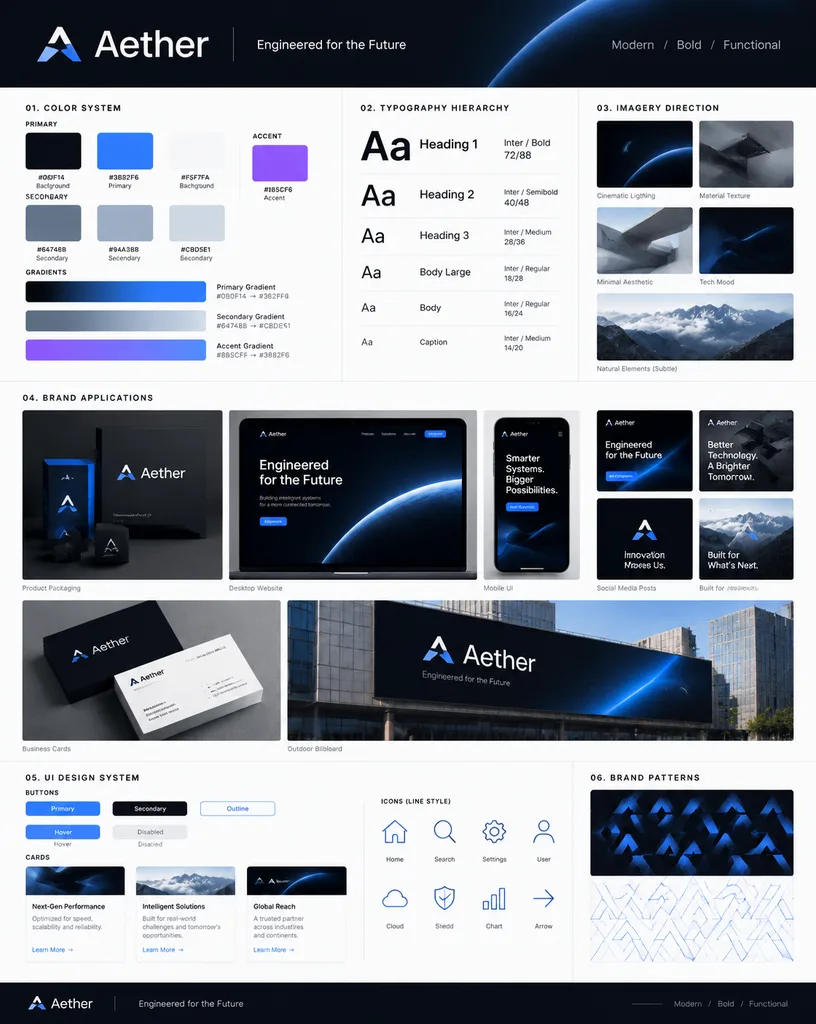
종합 브랜드 아이덴티티 가이드라인 포스터

종합 브랜드 아이덴티티 가이드라인 포스터

A professional, comprehensive brand identity guidelines poster based on the reference logo, displayed in a vertical 4:5 modular grid system. Top header features the brand name [Aether], a short slogan "[Engineered for the Future]", and a 3-word identity description "[Modern / Bold / Functional]". The layout includes: a color system section showing 3 primary, 3 secondary, and 1 accent color swatches with HEX codes and usage labels (Background, Primary, Accent), accompanied by gradient bars; a typography hierarchy guide showing sample headings, subheadings, and body paragraphs across type scales; an imagery direction block with 3 to 5 miniature photo examples illustrating lighting, texture, and visual mood; realistic mockups including product packaging, a desktop website hero section, a mobile UI screen, 3 social media feed posts, business cards, and an outdoor billboard; a mini UI design system showing button states, card components, and 8 matching line icons; and branded geometric patterns derived from the logo mark. Editorial design aesthetic mixed with high-tech precision, refined drop shadows, layer depth, clean white and dark modular panels, organized content-dense presentation, Behance case study style.

브랜드 아이덴티티브랜딩 포스터디자인 시스템
사진과 수채화 일러스트 분할 포스터

사진과 수채화 일러스트 분할 포스터

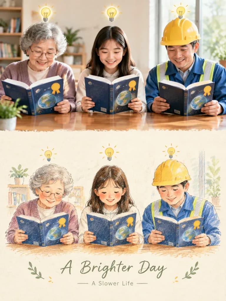
A vertical 3:4 editorial poster split horizontally into two sections, transforming the reference photo into an illustration. Top Section: Preserve the reference photo accurately, occupying approximately the upper 50% of the composition. Keep the exact environment, subjects, poses, proportions, lighting, and colors unchanged in a sharp, natural photographic quality. Bottom Section: A delicate hand-drawn illustration recreating the exact scene from the reference photo on a warm off-white textured paper background. Rendered in a soft watercolor, colored pencil, and fine ink sketch aesthetic with gentle pastel washes, subtle grain, fine expressive outlines, and slightly imperfect hand-drawn edges. The background is simplified while retaining recognizable elements and visual continuity. Layout & Typography: A soft, seamless transition connects the photo to the textured lower half, with generous negative space around the central illustration. Minimal, elegant typography sits beneath the illustration, featuring a handwritten script title "[A Brighter Day]" and a small minimalist subtitle "[A Slower Life]". Subtle decorative accents like [tiny leaves and sketch marks] frame the composition. Constraints: Do not alter the identity, appearance, or poses of subjects from the reference photo. Do not add extra people or structures.

분할 포스터수채화 일러스트사진 변환
테일러 스위프트 에라스와 인류 문명 비교 차트

테일러 스위프트 에라스와 인류 문명 비교 차트

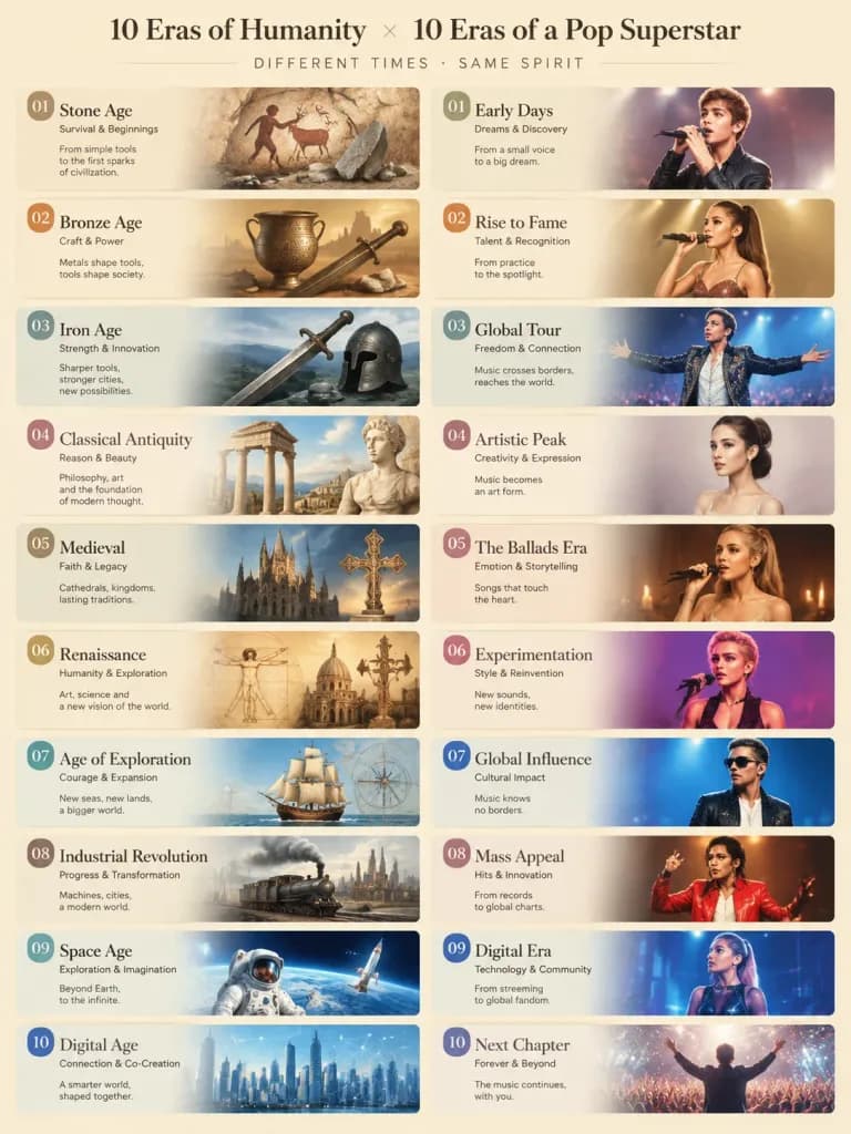
An editorial infographic visual comparison chart matching 10 eras of human civilization with Taylor Swift’s 10 Eras Tour albums. Structured two-column or grid layout with 10 distinct paired panels, visually linking each era's aesthetic, color palette, and mood to its paired album. The 10 historical eras: [Stone Age, Bronze Age, Iron Age, Classical Antiquity, Medieval, Renaissance, Age of Exploration, Industrial Revolution, Space Age, Digital Age]. Elegant typography, thematic illustrations for each pair, clean editorial layout, balanced soft studio lighting, high graphic design fidelity.

인포그래픽테일러 스위프트비교 차트
일본 온도계의 날 인포그래픽 포스터

일본 온도계의 날 인포그래픽 포스터

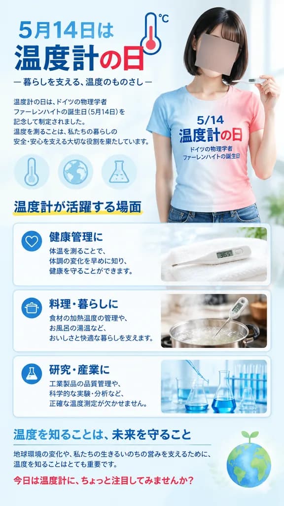
A vertical Japanese public-awareness poster for Thermometer Day on [May 14], designed in a clean, professional educational infographic layout with a 9:16 aspect ratio, pale ice-blue background, soft clinical lighting, and a crisp blue-and-red accent palette. Main subject: On the right half, a realistic young Japanese woman with a neat chin-length black bob haircut, shown from upper thighs up. Her face is intentionally obscured by a solid neutral rectangular blur block. She wears a fitted short-sleeve gradient T-shirt fading from sky blue on the left to soft pink-red on the right, printed with Japanese text: "5/14" on top, "温度計の日" large in the middle, and "ドイツの物理学者 ファーレンハイトの誕生日" in smaller font beneath. She delicately holds a sleek white digital thermometer near her shoulder. Top section: On the upper left, a prominent Japanese headline: "5月14日は" followed by "温度計の日" ("温度計" in deep navy blue, "の日" in crimson red), accompanied by a minimalist line-art thermometer icon with "°C". Subtitle below reads: "— 暮らしを支える、温度のものさし —". A concise paragraph in small Japanese typography explains Thermometer Day honoring German physicist Fahrenheit and the everyday role of temperature measurement. Decorative elements: Three subtle pale blue scientific icons float in the mid-left background: a vertical thermometer, a globe, and a laboratory flask. Infographic cards: A section titled "温度計が活躍する場面" with a subtle yellow underline, featuring three horizontal rounded-corner cards with blue outlines: 1. Heart icon, bold title "健康管理に", brief Japanese copy about body temperature tracking, and a photo thumbnail of a digital thermometer resting on a white towel displaying 36.5. 2. Cooking pot icon, bold title "料理・暮らしに", Japanese copy about culinary precision and bath water temperatures, with a thumbnail of a thermometer in a steaming pot. 3. Laboratory flask icon, bold title "研究・産業に", Japanese copy on industrial and scientific precision, with a thumbnail of glass beakers and pipettes. Bottom section: A closing dark-blue heading "温度を知ることは、未来を守ること", a thin horizontal divider line, brief Japanese text regarding environmental awareness and protecting living systems, and a concluding red call-to-action: "今日は温度計に、ちょっと注目してみませんか?". A faint green-blue Earth icon with a tiny sprout accents the bottom right. Visual style: Polished Japanese graphic design, realistic photography for the model and thumbnails, sharp typography, generous white space, soft drop shadows, clean editorial finish.

온도계의 날일본 포스터인포그래픽
미니멀 도시 수채화 스케치 포스터

미니멀 도시 수채화 스케치 포스터

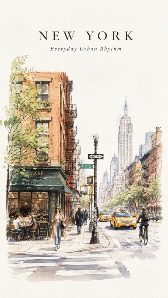
Minimalist travel sketch poster of [New York City] on clean white sketchbook paper with subtle paper grain texture. Style: refined black ink pen drawing and loose, airy watercolor washes with elegant urban details. Depicting a [calm everyday NYC street scene with small cafés, yellow taxis, bicycles, crosswalks, brownstone buildings, subtle local signage, fashionable pedestrians, and soft morning light]. Spacious editorial composition with generous negative space. Mood: calm, modern, sophisticated, poetic. Typography: "[NEW YORK]" and "[Everyday Urban Rhythm]".

수채화여행스케치도시풍경
미니어처 행성 여행 포스터

미니어처 행성 여행 포스터

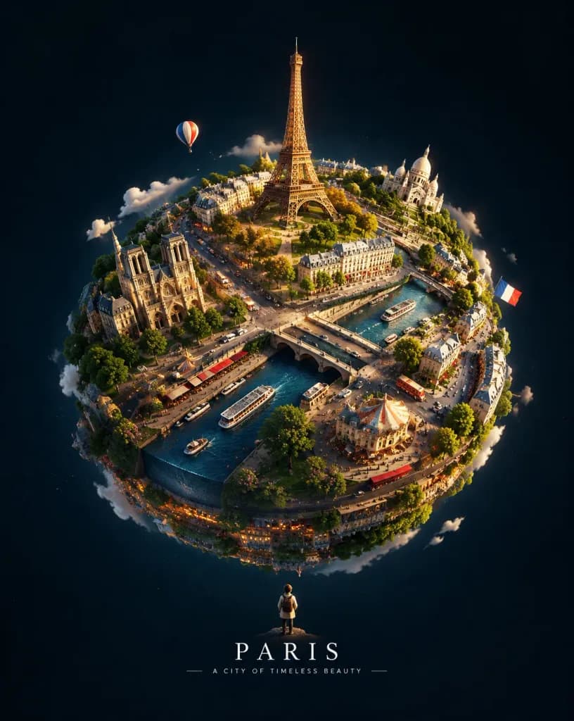
A striking vertical conceptual artwork featuring [CITY / COUNTRY] transformed into an intricate miniature spherical planet suspended in a vast, clean, dark, and minimal deep sky. The entire cultural and architectural identity of [CITY / COUNTRY] wraps around the curvature of the small sphere like a richly detailed handcrafted diorama brought to life—featuring iconic landmarks, roads, vehicles, people, vegetation, and local everyday details seamlessly integrated across its surface. Includes one surreal, memorable signature element that uniquely embodies the character of [CITY / COUNTRY]. A tiny human figure stands outside observing the floating sphere to create a strong sense of scale. Cinematic lighting, tactile miniature-diorama realism, atmospheric depth, crisp textures, and sophisticated editorial poster aesthetics. Minimal typography: [CITY / COUNTRY] [SHORT CINEMATIC TAGLINE]
미니어처 행성디오라마여행 포스터
에디토리얼 손금 분석 인포그래픽

에디토리얼 손금 분석 인포그래픽

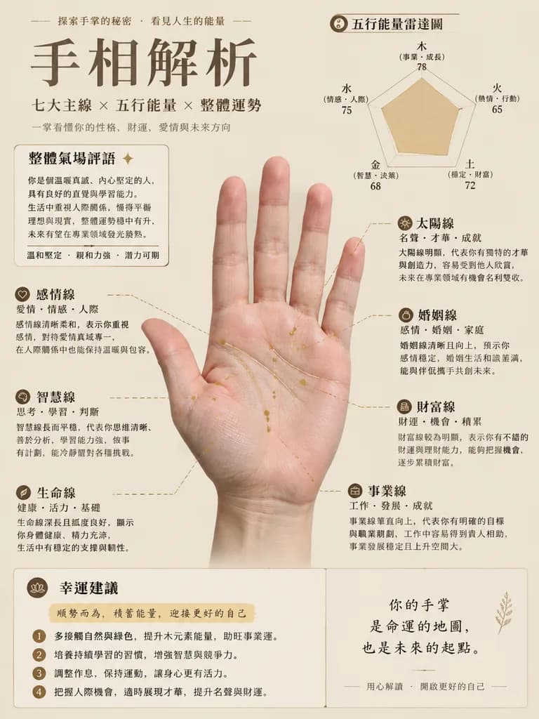
Magazine-style palmistry analysis infographic chart based on the reference photo of a palm. Subject: The authentic palm from the reference photo placed centrally, strictly preserving natural skin tones, real skin texture, and actual palm lines without artificial smoothing or anatomical distortion. Set against a clean, minimalist [solid muted beige] background. Overlays: Ultra-fine metallic line overlays with dashed connecting pointer lines precisely annotating the life line, wisdom line, heart line, career line, wealth line, marriage line, and sun line. Editorial Infographic Elements: Organized editorial layout in clean Traditional Chinese typography, featuring a "Five Elements Energy Radar Chart", an "Overall Aura Comments" section, modular "Personality and Fortune Analysis" callout cards for each major line, and a stylized "Luck Suggestions" highlighted text block. Clean, high-legibility layout with refined modern graphic design.

손금인포그래픽손금보기
모던 스위스 스타일 패션 에디토리얼 포스터

모던 스위스 스타일 패션 에디토리얼 포스터

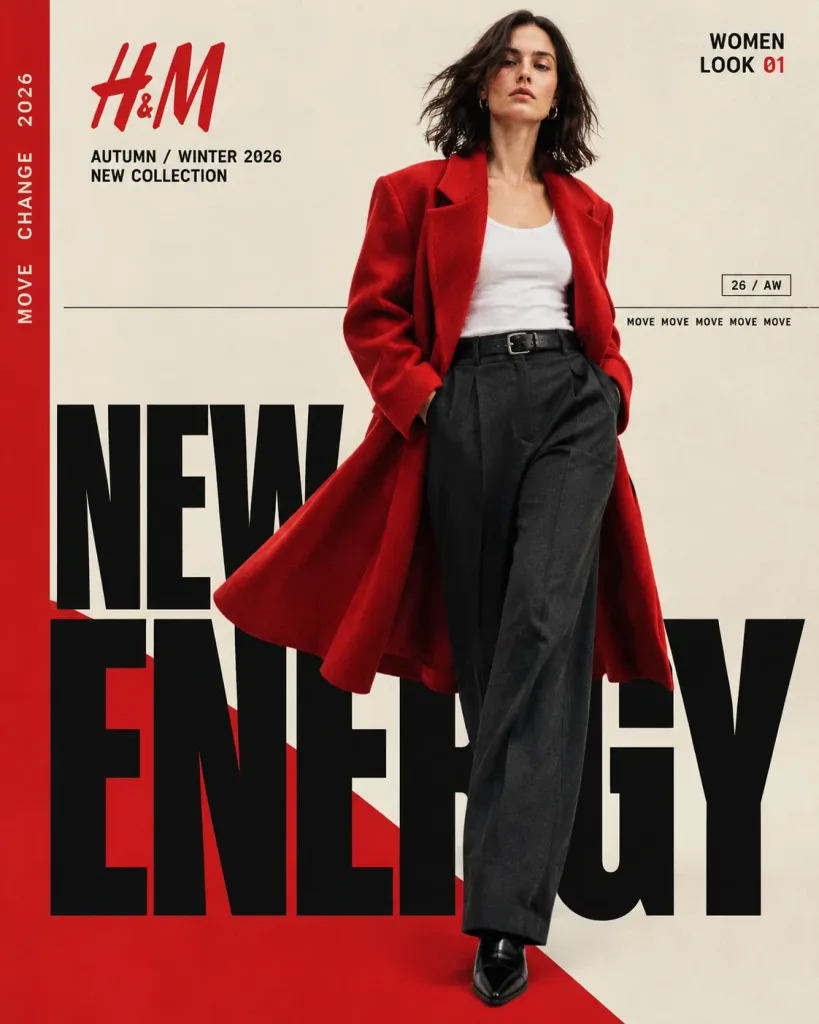
A finished 4:5 vertical fashion editorial campaign poster for [H&M] [Autumn/Winter 2026], titled "[NEW ENERGY / AW26]". Swiss-inspired grid layout combining high-fashion photography with modernist typography and bold red, black, and warm ivory color blocking. Subject and Wardrobe: A full-body female fashion model walks mid-stride slightly right of center against a warm ivory studio background. She wears an oversized vivid red wool coat with broad relaxed shoulders flowing dramatically behind her, a fitted white tank top tucked into charcoal-black wide-leg tailored trousers with a black leather belt, and polished pointed black shoes. Dark brown shoulder-length hair moves naturally across her face, with minimal natural makeup and delicate gold hoop earrings. Composition and Lighting: Slightly low-angle full-body framing with crisp textile detail, refined directional studio lighting, and subtle analog film grain. A solid red vertical stripe runs along the entire left edge, and a saturated red geometric field rises diagonally from the lower-left. Graphic Design and Typography: - Upper left: Red "[H&M]" logo, with "[AUTUMN / WINTER 2026]" and "[NEW COLLECTION]" directly underneath. - Rotated 90 degrees along the left red vertical strip: "[MOVE CHANGE 2026]". - Upper right: "WOMEN" and "LOOK 01" with "01" highlighted in red. - Lower half: Enormous condensed bold black sans-serif typography spelling "NEW" stacked above an ultra-oversized, tightly spaced "ENERGY" that bleeds off the edges, partially layered behind and interwoven with the model. - Graphic accents: Fine black horizontal rules intersecting the frame, a small outlined rectangular marker reading "26 / AW", and micro-typography along a thin rule reading "MOVE MOVE MOVE MOVE MOVE".

패션 포스터에디토리얼 디자인타이포그래피
럭셔리 골프 패션 매거진 표지

럭셔리 골프 패션 매거진 표지

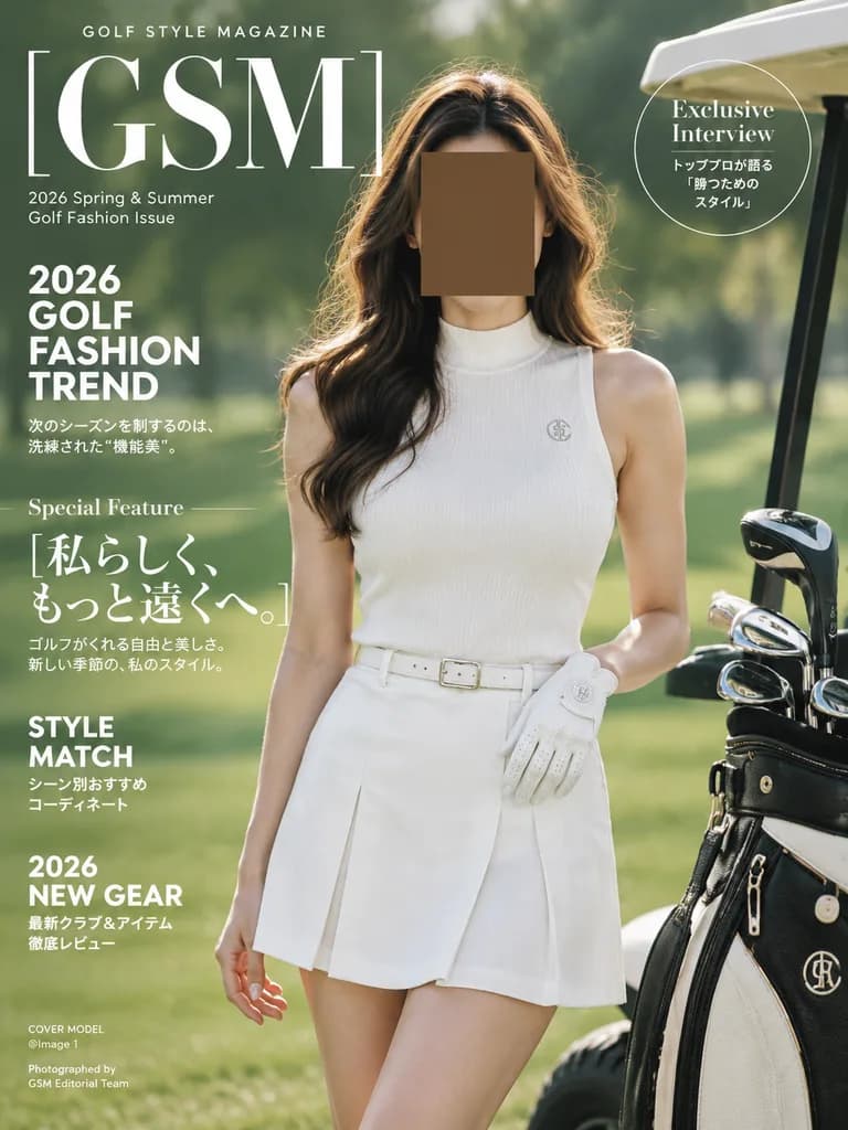
luxury golf fashion magazine cover. 2026 refined spring and summer golf fashion, clean white to ivory monochrome look. small uppercase sans serif tracking. very large elegant white serif letters. small white sans serif. bold stacked white…

골프잡지 표지패션 화보
레트로 픽셀 여행 아카이브 포스터

레트로 픽셀 여행 아카이브 포스터

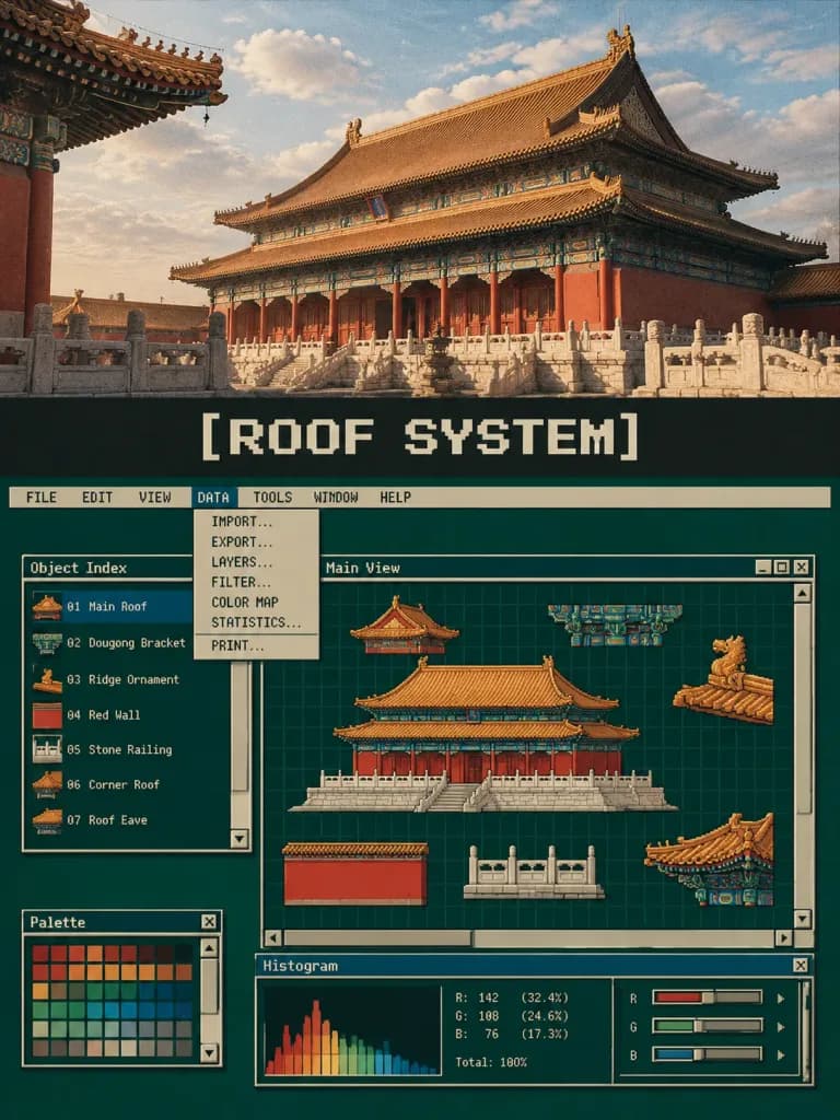
A 3:4 vertical "Retro Pixel Industrial Travel Archive" editorial poster deconstructing the reference photo of [traditional Chinese temple architecture]. The poster is divided vertically into three distinct functional zones: 1. Top Section (30% to 38% height): Retains the clearly recognizable reference photo with natural lighting, architectural perspective, real textures, and original color palette, enhanced only with subtle editorial color grading and delicate film grain. Do not illustrate or redraw this top photo. 2. Middle Breathing Zone (7% to 10% height): A solid charcoal black or dark olive band featuring a centered, crisp pixel-art typography title: "[ROOF SYSTEM]". 3. Lower Workstation Interface (50% to 60% height): A complete late 1980s to early 1990s graphic workstation operating system interface on a deep forest green and dark cyan-green CRT desktop background. The interface features: - An application window bordered by a thin aged ivory and tobacco gold frame. - A top system menu bar displaying verbatim: "FILE EDIT VIEW DATA TOOLS WINDOW HELP". - One active highlighted menu showing an open dropdown containing options like "IMPORT…", "EXPORT…", "LAYERS…", "FILTER…", "COLOR MAP", "STATISTICS…", "PRINT…". - At least three overlapping functional tool windows with classic title bars, minimize/close buttons, retro scroll bars with arrow buttons, and slider controls. - An object index list, 8-bit color palette, and histogram data display. - The main workspace area contains 3 to 7 extracted architectural elements from the reference photo (e.g. main hip-and-gable roof, dougong bracket sets, ridge ornaments, red walls, balustrades) converted into modular low-resolution pixel-art sprites, arranged like movable digital asset layers around a central visual anchor.

픽셀 아트ui 디자인여행 포스터
엘리트 스포츠 매거진 커버

엘리트 스포츠 매거진 커버

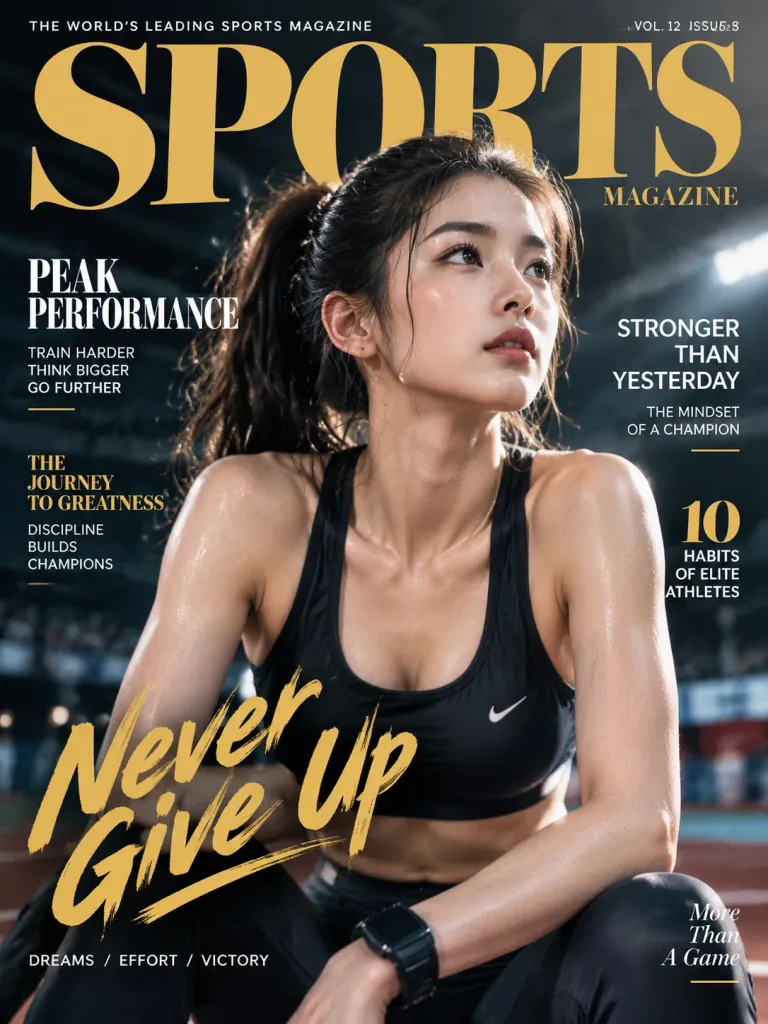
An eye-catching premium sports magazine cover featuring [an elite athlete] on the front page. Bold headlines, modern editorial typography, and a sleek, high-end editorial layout. The cover celebrates [peak performance, determination, and the journey to greatness], capturing the energy, intensity, and prestige of professional sports.

잡지 표지스포츠에디토리얼 디자인
타이포그래피 마스크 여행 포스터

타이포그래피 마스크 여행 포스터

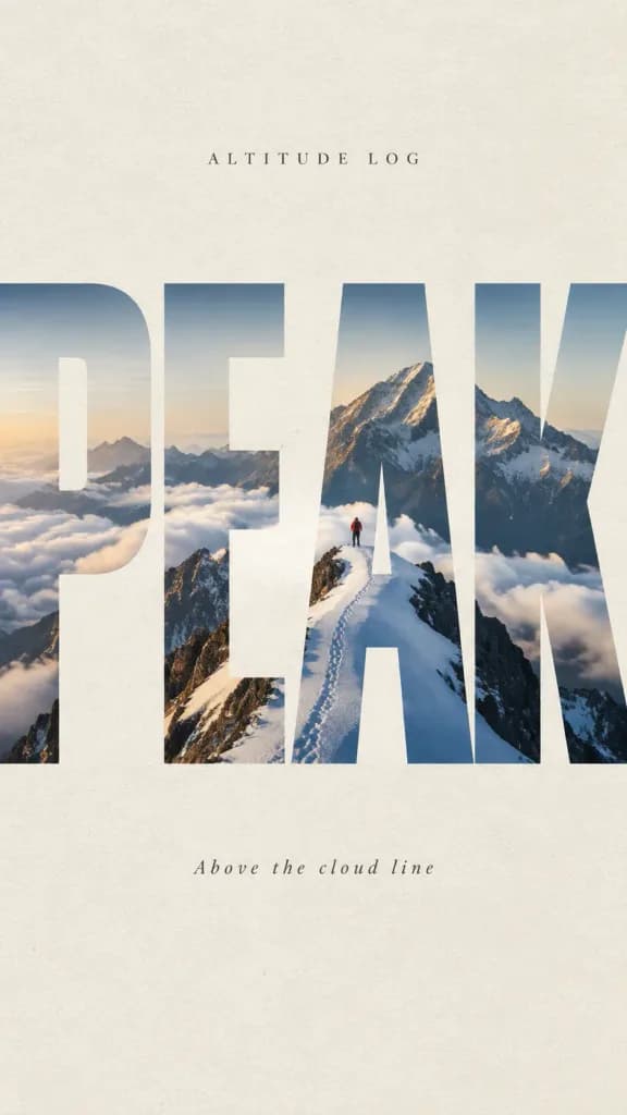
A high-end editorial travel typography framing poster with aspect ratio 9:16. Project: Altitude Log Title: "[PEAK]" Subtitle: "[Above the cloud line]" Layout and Composition: An oversized, bold, 4-letter uppercase typography cutout "[PEAK]" serves as a primary visual framing container across the canvas, slightly cropped at the edges. Strong negative space surrounds the word on a textured [warm off-white] paper background. The entire landscape photograph is revealed continuously through the interior shapes of the bold letterforms, naturally masked out by the letter glyphs. Contained Scene: [A jagged morning snow mountain ridge under soft morning side-light. A faint trail of footsteps winds along the ridge, where a tiny lone traveler in a red jacket stands, tiny in scale to emphasize the grand vastness of the peaks]. Style and Aesthetics: Premium editorial poster design, cinematic, serene, and adventurous. Authentic realistic landscape photography, subtle paper grain texture, clear typographic hierarchy, balanced graphic composition. No flat overlays, no cartoon elements, no messy collages.

여행 포스터타이포그래피에디토리얼 디자인
미니멀리스트 거친 중문 타이포그래피 포스터

미니멀리스트 거친 중문 타이포그래피 포스터

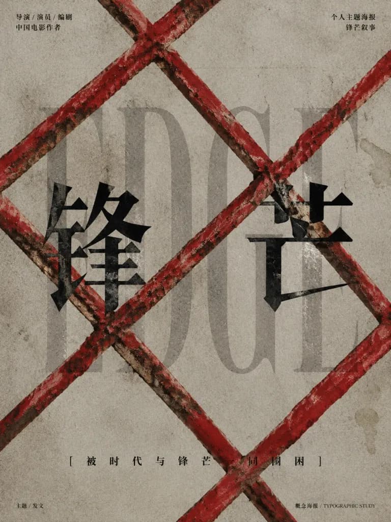
Minimalist Chinese typographic movie poster with a gritty art-house aesthetic, themed around hardship and constraint. Background: muted warm gray concrete-paper texture with subtle stains, scratches, and film grain, featuring the large faint translucent English word “EDGE” in a tall, elegant, low-contrast serif font across the middle. Foreground: a heavy distressed lattice of crossed red metal bars forming diagonal diamond barricade patterns, visibly overlapping the text with chipped red paint, rust, grime, and tactile scuffs. Main Title: two huge black Chinese characters “[锋芒]” in a sharp Songti/Ming-style font with blade-like serifs, one placed left of center and one right of center behind the red barricade. Layout & Text: top-left small black text in two lines reading “导演 / 演员 / 编剧” and “中国电影作者”; top-right small black text reading “个人主题海报” and “锋芒叙事”; bottom centered tagline “[被时代与锋芒一同围困]” in spaced Chinese characters; tiny footer text at bottom-left reading “主题 / 发文” and bottom-right reading “概念海报 / TYPOGRAPHIC STUDY”. Brutalist editorial composition, high negative space, flat printed typography contrasted against textured red bars, strictly restricted to a red, black, and warm gray color palette.

타이포그래피영화 포스터그래픽 디자인
복셀 팝업 매거진 스프레드

복셀 팝업 매거진 스프레드

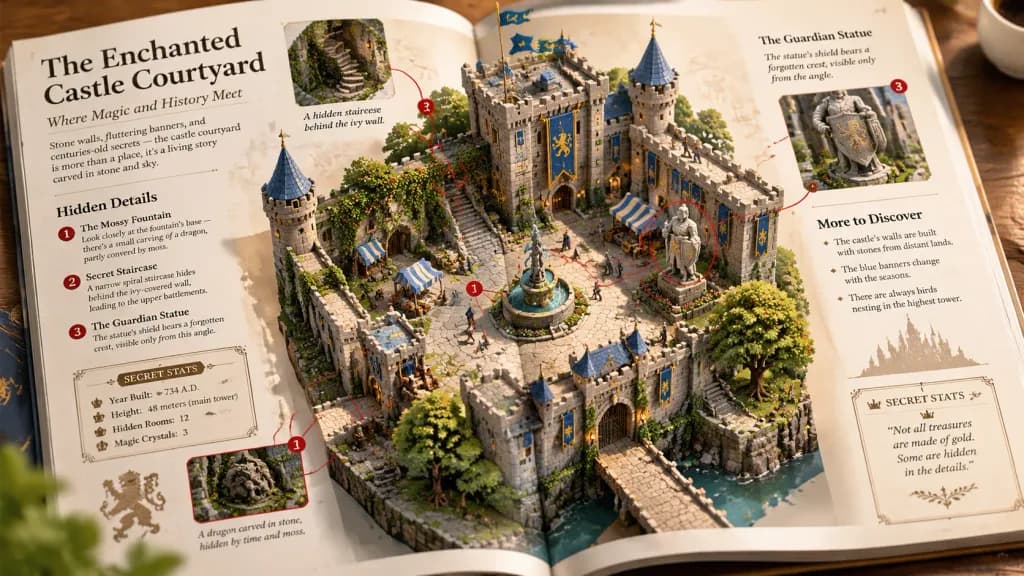
Macro photography of an open magazine spread, 2x2 grid. [Classic Fantasy] - [Enchanted Castle Courtyard]. A 3D, isometric, highly detailed voxel and clay model of [the scene] rising directly out of the glossy magazine pages. Left and right…

복셀 아트팝업북잡지 스프레드
듀얼 패널 하프톤 에디토리얼 포스터

듀얼 패널 하프톤 에디토리얼 포스터

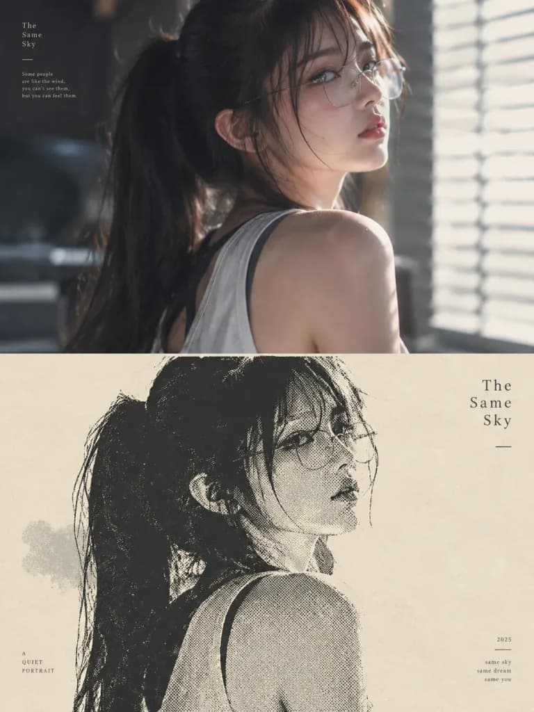
A high-end editorial design poster based on the reference photo, split into two equal horizontal halves in a vertical 3:4 composition. Top half: retains the subject and scene from the reference photo with refined, subtle editorial color grading. Bottom half: reinterprets the subject's silhouette into a minimalist screen print and halftone illustration, utilizing vast negative space under the principle of 'one subject, one direction, one spatial relationship'. Color palette: limited to 2-3 spot colors ([cream paper base, deep black ink, muted mist tone]). Textures: visible halftone dot matrix gradients for transitions, silkscreen ink overlay, and tactile matte paper grain. Typography: understated modernist editorial layout featuring a minimal title and tiny auxiliary typographic elements integrated into the negative space. Quiet, intellectual gallery aesthetic.

하프톤포스터 디자인에디토리얼 디자인
3D 라떼 아트 매거진 튜토리얼 페이지

3D 라떼 아트 매거진 튜토리얼 페이지

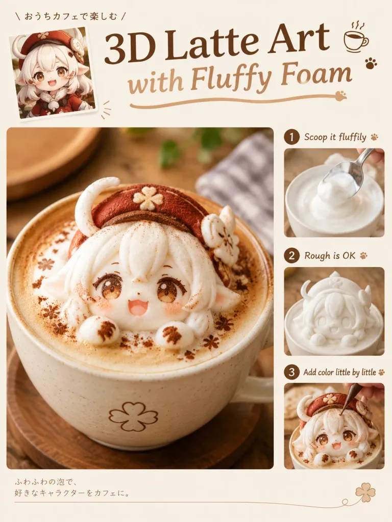
A single-page Japanese culinary magazine feature titled "How to Make 3D Latte Art", editorial layout, ivory, milk white, and light brown color palette with minimal margins and clean typography. The page contains exactly four images: 1. A small inset image showing the reference character. 2. A small step-by-step process photo showing white milk foam being sculpted. 3. A small step-by-step process photo showing rough coloring being applied. 4. One large hero photograph showing the final completed 3D latte art in a ceramic coffee cup. Character and Latte Art Details: The latte art is sculpted from dense, fluffy white milk foam into a cute chibi version of the reference character, faithfully preserving their hair, facial features, colors, and accessories. Eyes and mouth are detailed with chocolate syrup and cocoa powder dusting, with natural foam textures, soft rounded edges, and slight handmade imperfections. Warm, soft cafe lighting with shallow depth of field. Text and Typography: Main headline: "[3D Latte Art with Fluffy Foam]" Sub-step annotations: "[Scoop it fluffily]", "[Rough is OK]", "[Add color little by little]". Elegant Japanese magazine design with clear hierarchy and minimal text.

라떼아트커피잡지레이아웃
미니멀리스트 디자인 잡지 표지 레이아웃

미니멀리스트 디자인 잡지 표지 레이아웃

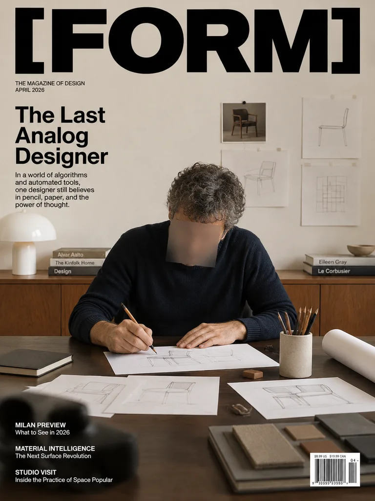
A realistic modern magazine cover for an editorial design publication titled "[FORM]", styled as a premium editorial portrait inside a minimalist architect's studio with restrained European aesthetics and ample negative space. Typography & Layout: - Masthead: Large, bold black sans-serif masthead "[FORM]" spanning nearly the entire width at the top. - Sub-masthead: Small uppercase black text reading "THE MAGAZINE OF DESIGN" and "APRIL 2026" positioned beneath the left side of the title. - Main Headline: "[The Last Analog Designer]" in bold, stacked black sans-serif typography on the upper left. - Teaser: Small paragraph directly beneath reading: "In a world of algorithms and automated tools, one designer still believes in pencil, paper, and the power of thought." - Secondary Cover Lines: In the lower left over the dark desk area, small white sans-serif text reading: • "MILAN PREVIEW" / "What to See in 2026" • "MATERIAL INTELLIGENCE" / "The Next Surface Revolution" • "STUDIO VISIT" / "Inside the Practice of Space Popular" - Barcode: Crisp white barcode box in the bottom right corner with small price text above reading "$8.99 US $10.99 CAN" and issue number "04". Subject & Environment: - Subject: A middle-aged male designer seated at a worktable, wearing a dark navy or black knit sweater, with salt-and-pepper curly hair, leaning forward sketching on white paper with a pencil. His face is obscured by an intentional square blur censor block for an anonymous editorial look. - Desk Details: Eight distinct object groups across the desk: loose sketch papers with geometric chair designs, a pencil cup with pencils, a rolled white blueprint on the right, a closed dark notebook on the left, a small brown eraser, a blurred black object in the front-left foreground, a flat sample book in the front-right foreground, and the active drawing sheet. - Background: A warm walnut wooden credenza with neat stacks of design books, a white dome desk lamp on the far left, and an off-white wall displaying four pinned design references (one small dark chair photograph, one light sketch beneath it, and two minimal line drawings on the right). Lighting, Mood & Style: Warm, soft natural indoor lighting, muted neutral color palette with walnut wood and deep navy accents, straight-on composition, sharp art-directed editorial photography.

잡지 표지에디토리얼 디자인미니멀리즘
시네마틱 럭셔리 하이퍼카 에디토리얼 포스터

시네마틱 럭셔리 하이퍼카 에디토리얼 포스터

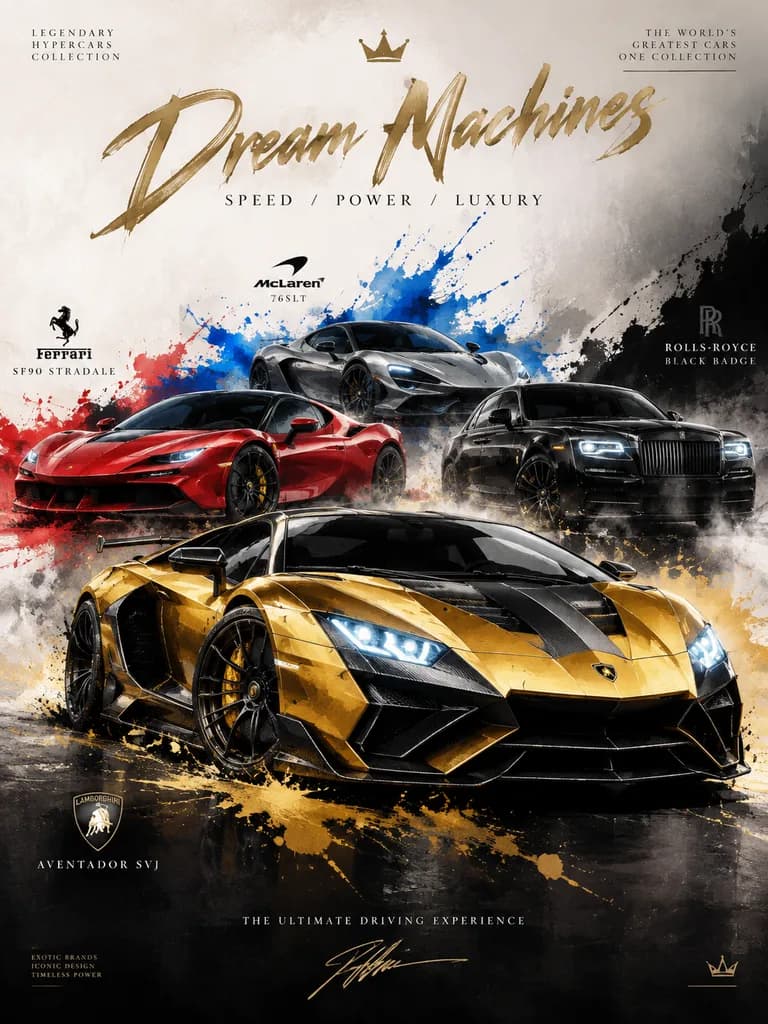
An ultra-premium cinematic automotive editorial poster in a luxury ink sketch and watercolor fusion style. Subject & Composition: Elite [COUNTRY] hypercars and luxury performance machines: [CAR NAMES]. Heroic low-angle front three-quarter composition featuring one dominant hypercar in the sharp foreground with the others dynamically layered behind. Balanced spacing, aggressive motion posture, and commanding presence. Setting & Background: Minimalist luxury studio environment with a gradient backdrop shifting from clean white to matte black. Subtle showroom lighting, soft smoke haze, floating fine dust particles, and dynamic abstract watercolor splashes matching the cars' signatures in royal gold, deep crimson, titanium silver, electric blue, and matte black. Art Style & Details: Hand-drawn ink outlines defining precise car body contours, combined with realistic watercolor washes and metallic diffusion across reflective panels. Detailed visible carbon fiber textures, bright LED headlight glow, sharp cinematic shadows, subtle gold foil accents, and a delicate grunge paper texture overlay. Typography & Graphics: Large handwritten display title reading "[TITLE]" with a sleek editorial luxury subtitle reading "[SUBTITLE]". Accented with small editorial magazine typography, an elegant signature mark along the bottom, and minimalist abstract crown and emblem doodles.

하이퍼카자동차포스터수채화
만화 창작 워크플로 인포그래픽 포스터

만화 창작 워크플로 인포그래픽 포스터

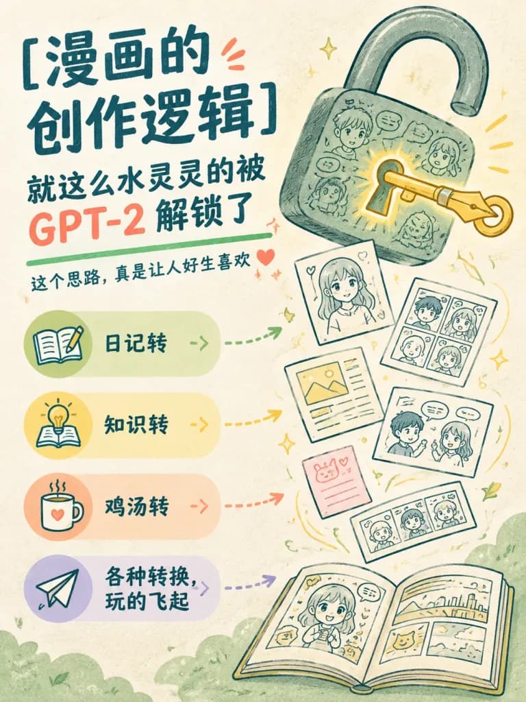
Vertical promotional infographic poster in a playful hand-drawn editorial style. Canvas: Portrait 3:4, warm off-white textured paper background, soft pastel palette with pale green, yellow, peach, and lavender, subtle risograph print texture, rounded friendly shapes, dark teal headline typography, and coral red accents. Composition and Layout: Left side features a text-heavy headline and a stacked feature list; right side features a large illustration of an open padlock releasing floating comic sketches, speech bubbles, and diary pages. Bottom right has an open comic book with pages swirling upward into the lock. Text content: - Top left large Chinese headline: "[漫画的\n创作逻辑]". - Subheadline beneath: "[就这么水灵灵的被\nGPT-2 解锁了]", with "GPT-2" in prominent coral red and the remaining Chinese text in dark teal. - Green underline beneath, followed by smaller copy: "[这个思路,真是让人好生喜欢]", accented with tiny hand-drawn coral sparkles and a small heart. Feature cards: - Exactly 4 rounded horizontal cards stacked vertically on the lower left, each with a circular icon on the left and a bold Chinese label on the right. - Card 1: Pale green, icon of an open notebook with a pencil, labeled "[日记转]". - Card 2: Pale yellow, icon of a lightbulb rising from an open book, labeled "[知识转]". - Card 3: Pale peach, icon of a steaming mug with a heart, labeled "[鸡汤转]". - Card 4: Pale lavender, icon of a paper airplane, labeled "[各种转换,\n玩的飞起]". - From each of the 4 cards, a colored dotted arrow points toward the floating comic pages on the right. Right-side illustration: - Exactly 1 oversized open padlock in muted green-gray at the upper right, covered in faint chalk-like doodles of speech bubbles and character sketches. - Exactly 1 golden key inserted in the keyhole; the key handle is shaped like a fountain pen nib, glowing with warm yellow light. - Exactly 6 loose comic sheets floating upward from the bottom book to the lock: 1 portrait sketch sheet, 1 four-panel comic page, 1 layout with a yellow image block, 1 two-character dialogue page, 1 small pink memo note, and 1 horizontal comic strip. - Exactly 1 open comic book at the lower right showing comic panels and a cute character on the left page, rendered in thin dark teal linework with soft yellow highlights. Pale green cloud motifs along the bottom margin.

인포그래픽 포스터만화 워크플로손그림 일러스트
뉴욕 가을 사진 워크숍 포스터

뉴욕 가을 사진 워크숍 포스터

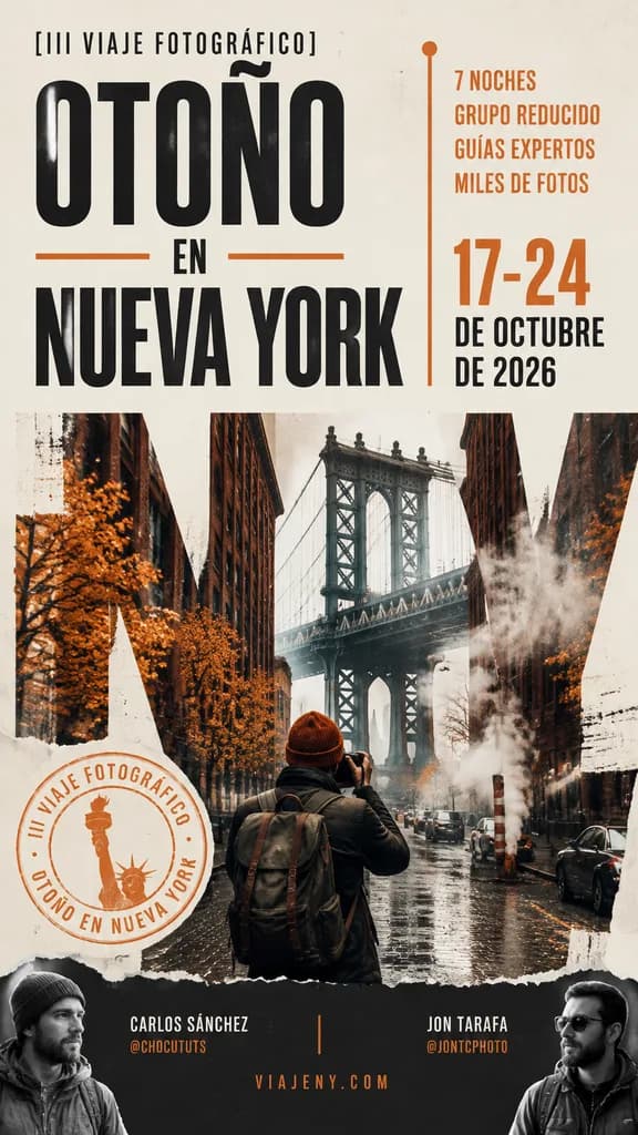
A vertical editorial travel poster in Spanish for a [III viaje fotográfico] titled "OTOÑO EN NUEVA YORK", designed with a sophisticated urban autumn mood and premium photography workshop aesthetic. Tall mobile-friendly poster layout using a warm off-white, beige, charcoal, and burnt orange color palette. The composition features oversized condensed black sans-serif typography on the left: small text at the top reading "[III VIAJE FOTOGRÁFICO]", the huge stacked headline "OTOÑO" above, a smaller "EN" flanked by short horizontal orange lines, and huge stacked text "NUEVA YORK" below. On the right, a narrow informational column displays four uppercase lines: "7 NOCHES", "GRUPO REDUCIDO", "GUÍAS EXPERTOS", and "MILES DE FOTOS" in orange, followed below by large orange dates "17-24" over black uppercase "DE OCTUBRE" and "DE 2026", bounded by a thin vertical line and an orange dot at the top. The lower half integrates a moody New York street photo collage centered on the Manhattan Bridge framed by dark brick buildings, wet asphalt, steam rising, and a lone photographer in a rust-orange beanie and backpack seen from behind holding a camera. Large cropped letterforms blend with the street scene in a double-exposure effect, accompanied by subtle torn paper edges, distress, and white paint textures. A circular orange stamp on the lower-left features a Statue of Liberty torch icon and curved text "III VIAJE FOTOGRÁFICO · OTOÑO EN NUEVA YORK". Dark bottom bar with presenter credits separated by a thin orange line: left "CARLOS SÁNCHEZ" with "@CHOCUTUTS" in orange, right "JON TARAFA" with "@JONTCPHOTO" in orange, with centered website "VIAJENY.COM" in spaced orange uppercase, and two subtle grayscale portrait cutouts in the bottom corners.

여행 포스터타이포그래피뉴욕
미니멀 SaaS 청구서 광고 크리에이티브

미니멀 SaaS 청구서 광고 크리에이티브

A minimalist static SaaS advertisement on a warm off-white background with elegant editorial typography. Top section: a large black serif headline in two lines reading: "[Your dev team shouldn’t be your analytics team.]" with "dev team" in italic serif and the remaining text in bold high-contrast serif with generous tracking. Center section: top-down view of a slightly tilted white paper invoice with soft drop shadow and a subtle vertical center fold crease. The invoice features black monospaced typewriter text reading: "INVOICE — DEV HOURS, OCTOBER" header, followed by five column-aligned line items: "A/B test setup on pricing page 8 hrs $1,200", "GTM tag install (3 events) 4 hrs $600", "Funnel tracking debug 6 hrs $900", "Meta pixel mapping 3 hrs $450", and "Attribution reporting build 12 hrs $1,800". Below the items is a dashed horizontal line, with bold monospaced "TOTAL" on the bottom-left and "$4,950" on the bottom-right. A bright yellow marker line strikes through "$4,950". Four doodle marker annotations frame the invoice: on the left, handwritten yellow text "every month??" with a yellow arrow pointing right toward the invoice; on the top right, a yellow starburst doodle; below the total, a green curved arrow curving up toward the crossed-out price; and on the lower right, a green hand-drawn circle containing the handwritten words "zero devs" attached to the green arrow. Bottom section: centered two-line black sans-serif body copy reading: "[Marketers ship tests and track revenue themselves. No tickets. No tag manager. One script.]". Clean, spacious layout blending startup graphic design with realistic tactile paper textures.

saas광고 크리에이티브에디토리얼 디자인
로만 일문 이중 언어 서체 견본 포스터

로만 일문 이중 언어 서체 견본 포스터

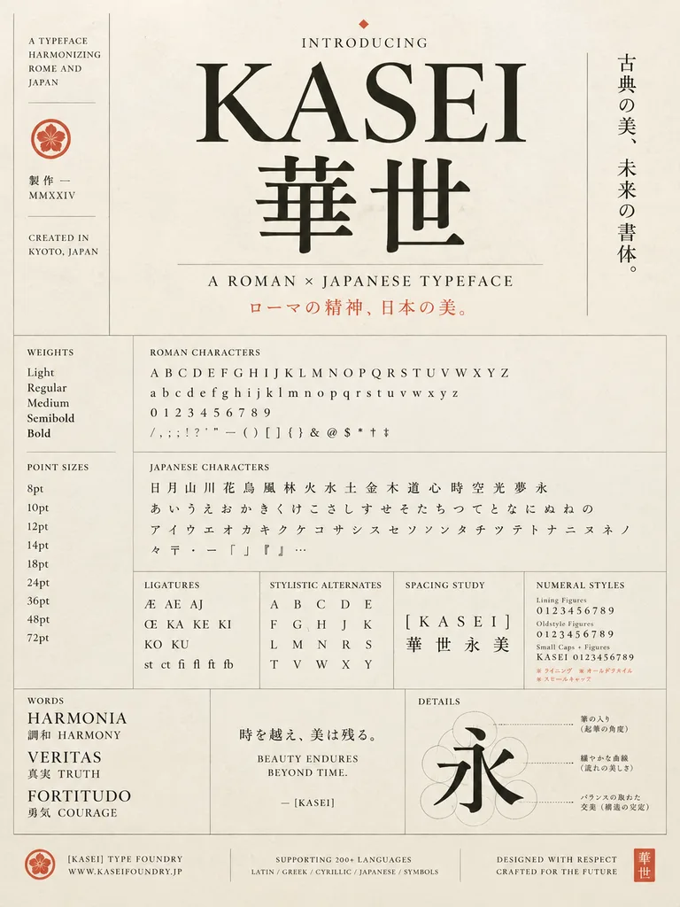
A refined vintage-modern type specimen poster for a fictional typeface named "[KASEI]", designed as an elegant fusion of Roman and Japanese typography. Tall portrait layout on warm ivory textured paper with thin gray divider lines, black letterforms, and muted vermilion accent text and seals. The composition centers on a large serif Latin wordmark "[KASEI]" set above two oversized Japanese kanji "華世" in a matching high-contrast classical style. Above the main title is a small heading "INTRODUCING" marked with a tiny diamond glyph. To the right of the title block, a vertical Japanese tagline reads "古典の美、未来の書体。". Beneath the kanji is the subtitle "A ROMAN × JAPANESE TYPEFACE", followed by a vermilion Japanese line: "ローマの精神、日本の美。". On the far left, a narrow vertical sidebar contains stacked English text reading "A TYPEFACE HARMONIZING ROME AND JAPAN", a small circular crest, Japanese text "製作 — MMXXIV", and "CREATED IN KYOTO, JAPAN". The lower two-thirds is a meticulous Swiss-grid specimen sheet with labeled sections: - Left column: "WEIGHTS" showing Light, Regular, Medium, Semibold, Bold; and "POINT SIZES" displaying 8pt, 10pt, 12pt, 14pt, 18pt, 24pt, 36pt, 48pt, 72pt. - Center-upper section: "ROMAN CHARACTERS" showing four lines containing uppercase A–Z, lowercase a–z, numerals 0–9, and full punctuation and symbols (/ , ; ! ? ' " — ( ) [ ] { } & @ $ * † ‡). - Below it: "JAPANESE CHARACTERS" showing 19 kanji (日 月 山 川 花 鳥 風 林 火 水 土 金 木 道 心 時 空 光 夢 永), 23 hiragana (あ い う え お か き く け こ さ し す せ そ た ち つ て と な に ぬ ね の), 21 katakana (ア イ ウ エ オ カ キ ク ケ コ サ シ ス セ ソ ン タ チ ツ テ ト ナ ニ ヌ ネ ノ), and Japanese typographical symbols. - Middle row of four compact panels: "LIGATURES" (Æ, AE, AJ, Œ, KA, KE, KI, KO, KU, st ct fi fl ft fb); "STYLISTIC ALTERNATES" arranged in a neat grid; "SPACING STUDY" displaying "[KASEI]" tracked widely over "華世永美"; and "NUMERAL STYLES" comparing lining figures, oldstyle figures, and small caps combinations, with tiny red Japanese footnotes. - Bottom feature row: Left panel "WORDS" featuring HARMONIA (調和 HARMONY), VERITAS (真実 TRUTH), and FORTITUDO (勇気 COURAGE). Center panel featuring Japanese quote "時を越え、美は残る。" above English text "BEAUTY ENDURES\nBEYOND TIME." signed "— [KASEI]". Right panel "DETAILS" showing an enlarged stroke construction analysis of the kanji "永" with faint construction circles and dotted leader lines pointing to Japanese callouts. - Footer bar: Left foundry emblem with "[KASEI] TYPE FOUNDRY" and "WWW.KASEIFOUNDRY.JP"; center language note "SUPPORTING 200+ LANGUAGES" and "LATIN / GREEK / CYRILLIC / JAPANESE / SYMBOLS"; right-aligned "DESIGNED WITH RESPECT\nCRAFTED FOR THE FUTURE"; and a square vermilion seal marked "華世". Restrained editorial luxury, clean museum-grade typography, and generous margins.

서체 견본타이포그래피포스터
미니멀리스트 문학 도서 표지 디자인

미니멀리스트 문학 도서 표지 디자인

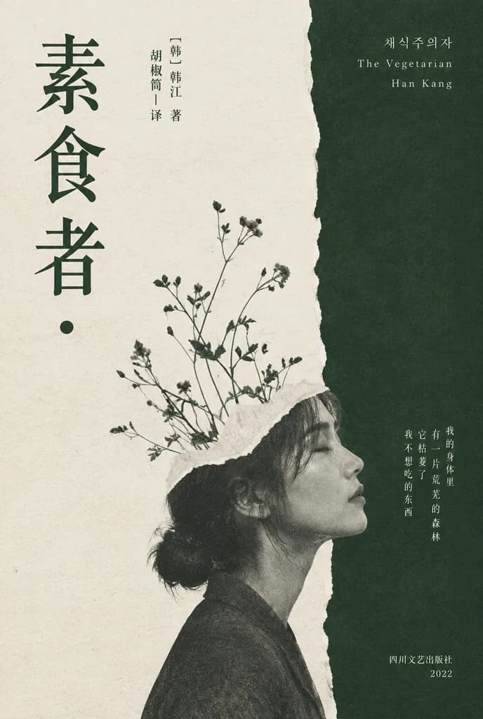
A minimalist literary book cover for [素食者], designed in an elegant East Asian art-book style with muted dark forest green and warm off-white as the only primary colors. Vertical split layout: the left two-thirds are textured off-white paper, while the right third is a deep green field separated by a rough, organic torn-paper edge running vertically from top to bottom. On the lower center-right, a grayscale side-profile portrait of an East Asian woman facing right, her head slightly tilted upward, eyes closed, with dark hair tied in a low bun, conveying a quiet, fragile, contemplative mood. The upper part of her head seamlessly transitions into a torn white paper collage effect, from which thin wild plant stems with delicate leaves and buds grow diagonally upward. Subtle paper grain, fine-press print texture, and soft tonal fading throughout. The main Chinese title is set vertically in very large dark green serif characters on the far left: "[素食者]". Near the upper middle-left, small elegant vertical Chinese credits read: "[韩] 韩江 著" and "胡椒筒|译". On the upper right over the dark green field, delicate small serif text reads: "[채식주의자]", "The Vegetarian", and "[Han Kang]". On the mid-to-lower right, a short vertical Chinese quote in small type: "[我的身体里 有一片荒芜的森林 它枯萎了 我不想吃的东西]". At the bottom right, publisher details in small Chinese text: "四川文艺出版社" and "2022". A single small solid dark green dot sits beneath the main title on the left.

도서 표지편집 디자인찢긴 종이
밀라노 건축 타이포그래피 여행 포스터

밀라노 건축 타이포그래피 여행 포스터

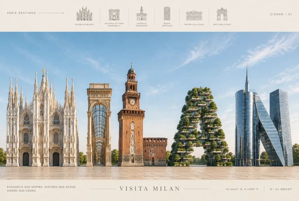
Premium luxury travel poster for [MILAN] in an editorial destination-advertising style, horizontal 3:2 composition. Subject & Layout: The lower two-thirds features the word "[MILAN]" centered as five massive freestanding architectural letter sculptures resting on a clean horizon line atop a warm beige stone plaza: - M: Gothic white marble cathedral architecture inspired by the Duomo di Milano, featuring spires, pinnacles, pointed arches, rose windows, buttresses, statues, and gilded accents. - I: Glass-and-stone arcade tower inspired by Galleria Vittorio Emanuele II, with a vaulted glass arched facade and ornate classical columns. - L: Red-brick medieval tower and castle massing inspired by Castello Sforzesco, complete with crenellations, a clock tower, and stone relief panels. - A: Modern vertical forest tower shaped as a capital 'A', inspired by Bosco Verticale, covered in lush green balconies, trees, and shrubs on concrete terraces. - N: Contemporary glass-and-steel skyscrapers inspired by Milan's Porta Nuova business district, combining a reflective cylindrical tower and a sharply leaning diagonal glass structure. Graphic Design & Text Bands: - Top header band: Minimalist layout with small spaced uppercase text. Left reads "SERIE DESTINOS" with a fine line and dot. Right reads "CIUDAD / 01". Center displays six small pale-gray architectural line icons separated by thin rules, labeled beneath with uppercase captions: "DUOMO DI MILANO", "GALLERIA VITTORIO EMANUELE II", "CASTELLO SFORZESCO", "BOSCO VERTICALE", "TEATRO ALLA SCALA", and "ARCO DELLA PACE". - Bottom footer band: Refined beige strip with thin hairline rules. Left reads "ELEGANCIA QUE INSPIRA. HISTORIA QUE ACOGE. DISEÑO QUE LIDERA." Center title reads "VISITA MILAN" in wide-tracked uppercase letters flanked by delicate line ornaments. Right displays coordinates "45.4642° N, 9.1900° E" and issue mark "N.º 01-MMXXV". Lighting & Atmosphere: Bright, airy daylight under a pale blue sky with faint cirrus clouds, casting soft precise architectural shadows onto the plaza. Sophisticated beige, gray, white, and soft sky-blue palette. Constraints: No people, no vehicles, clean editorial layout, pristine 3D architectural rendering.

여행 포스터타이포그래피건축
애니메이션 프로레슬링 잡지 표지

애니메이션 프로레슬링 잡지 표지

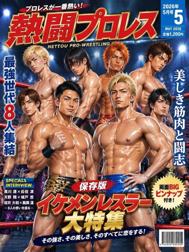
A glossy Japanese pro-wrestling magazine cover illustration in a dramatic seinen-anime style, vertical full-cover layout. Inside a wrestling ring arena with red ring ropes crossing in the background, blue-white stadium spotlights, and blurred audience bokeh, exactly 8 handsome male adult pro-wrestlers pose together. All 8 wrestlers have bodybuilder-level muscular physiques, oiled glowing skin, defined abs, pecs, and chiseled features, shirtless in colorful trunks. In the center foreground, two champions dominate: on the left, a man with short black hair and a confident expression, clenching his right fist, wearing metallic black-and-gold trunks; on the right, a stoic man with spiky blond hair, hand on hip, wearing metallic bright blue trunks. Six other wrestlers with varied hair (bleached blond, black with long bangs, spiky orange, spiky dark brown) surround them in two layered tiers across the upper and lower halves. High-end commercial typography includes: an oversized top masthead reading "[熱闘プロレス]" in bold red with gold outlines and white highlights, subtitled "NETTOU PRO-WRESTLING", with "プロレスが一番熱い!" above it; a blue corner badge showing "[2026年5月号]", large numeral "[5]", "MAY 2026", and "定価1,200円"; side headlines featuring "最強世代 8人集結" and "美しき筋肉と闘志"; a "SPECIAL INTERVIEW" box on the lower-left; a cream burst badge reading "両面BIG ピンナップ付き!"; a central feature banner with "保存版" above giant gold-and-red text "[イケメンレスラー大特集]" with tagline "その強さ、その美しさ、そのすべてに恋をする!"; and a barcode in the bottom right corner.

잡지 표지애니메이션프로레슬링
고무도장 여행 필드노트 포스터

고무도장 여행 필드노트 포스터

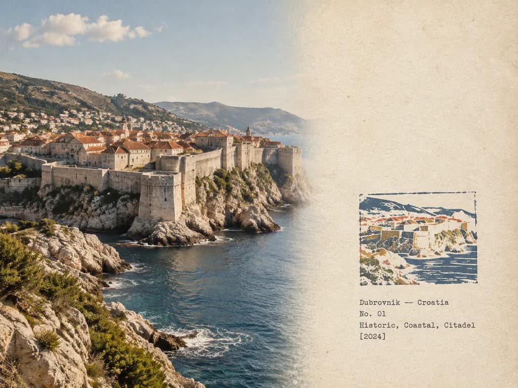
Rubber Stamp Travel Field Notes Poster in a 4:3 landscape composition, seamlessly transitioning from the photograph on the left to an aged paper field-note journal on the right without an obvious dividing line. LEFT SECTION (approx. 58% width): Preserve [the reference photo] with authentic visual realism. Keep the original subject, architecture, perspective, terrain, natural lighting, shadow patterns, textures, and ambient atmosphere recognizable and unredesigned. Apply subtle editorial photo balancing: softened highlights, restrained grading, and extremely fine natural film grain, avoiding HDR, oversaturation, or artificial sharpness. RIGHT SECTION (approx. 42% width): Warm off-white, slightly aged archival paper texture resembling an architect's field notebook, featuring faint physical fibers, matte tactile surface, and generous empty margins. SMALL RUBBER STAMP (lower-middle right, occupying 30–38% of right section height): A compact, hand-carved multi-color rubber stamp impression that simplifies the distinctive silhouette, roofline, terrain contours, or primary landmarks of [the reference photo]. Aggressively simplified like a genuine handmade print: 2 to 4 muted spot colors extracted naturally from the photo (e.g., carbon black, muted brick red, ochre, slate blue, or earthy taupe). Realistic print imperfections: slight ink gaps, uneven stamping pressure, rough carved linework, granular texture, and subtle color-layer misregistration. FIELD-NOTE TYPOGRAPHY: Subtle, understated archival typewriter lettering placed in the blank space beside or below the stamp: "[Location — English name]" "No. [01]" "[Historic, Coastal, Citadel]" "[2024]" Atmosphere: tactile, documentary, quiet, collectible, realistic architectural travel journal page.

여행 포스터고무도장필드노트
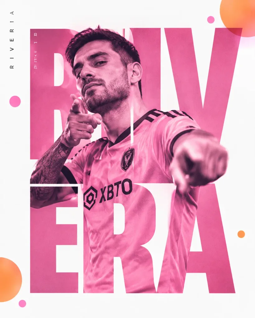
듀오톤 스포츠 에디토리얼 포스터

듀오톤 스포츠 에디토리얼 포스터

Magazine-quality sports editorial poster design in a vertical 4:5 composition. Subject: [male soccer player] with short dark hair and light stubble, striking a confident pose pointing toward the camera with one hand near his chin, other arm extended outward, wearing a [pink soccer jersey with black trim and sponsor logo], with a visible tattoo on his forearm. Photography style: duotone pink color treatment over the photo. Typography and layout: giant bold cutout typography spelling the fictional surname "[RIVERA]" acting as a window revealing the photograph behind the letters, asymmetric editorial layout with player name vertical along the left edge in small white text. Details: floating translucent color dot accents in orange and pink scattered in the corners, set against a clean white negative space background.

스포츠 포스터에디토리얼 디자인타이포그래피
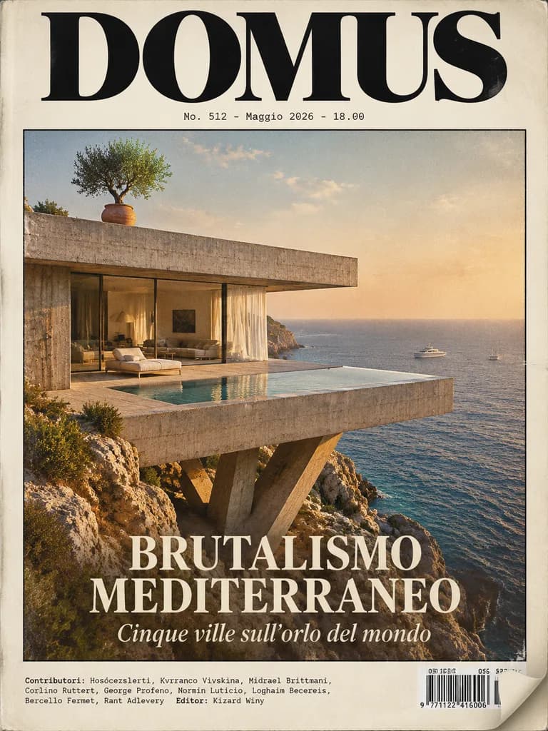
지중해 브루탈리즘 건축 잡지 커버

지중해 브루탈리즘 건축 잡지 커버

photorealistic editorial architecture magazine cover. luxury Mediterranean brutalist villa cantilevered over a rocky seaside cliff at golden hour, raw concrete slab architecture, floor-to-ceiling glass walls, sheer curtains, minimalist int…

건축잡지 표지브루탈리즘
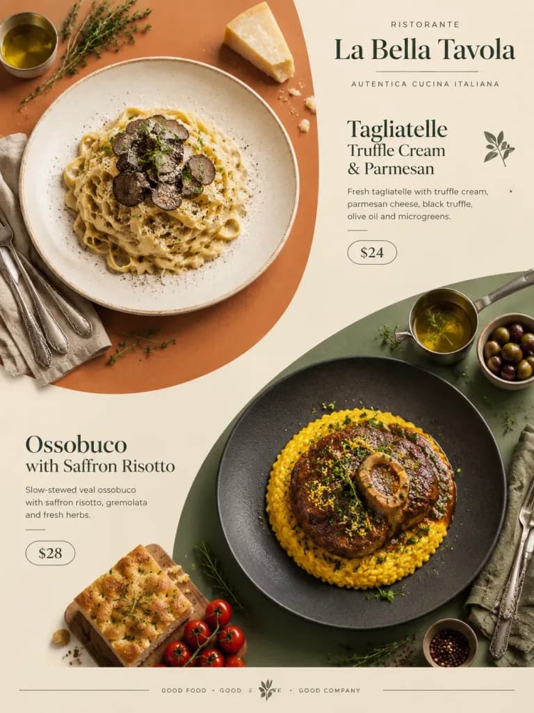
모던 이탈리안 푸드 에디토리얼 포스터

모던 이탈리안 푸드 에디토리얼 포스터

A minimalistic advertising poster for food in modern Italian style with Japanese layout aesthetics. Two large rounded vertical geometric color blocks are arranged diagonally in a vertical top-down composition. The upper-left block features the first hero dish: [fresh tagliatelle pasta with truffle cream and parmesan cheese on a light ceramic plate], topped with thin slices of black truffle, olive oil, and microgreens. The lower-right block features the second hero dish: [slow-stewed ossobuco with saffron risotto on a matte dark plate], served with rich sauce, gremolata, and fresh herbs. Surrounding the dishes are neatly arranged props: vintage cutlery, linen napkins, sprigs of rosemary and thyme, cherry tomatoes, parmesan wedges, miniature saucepans of olive oil, fresh handmade focaccia, olives, and spices. Large modern Italian typography is aligned to the upper right with restaurant name, dish names, and prices entirely in English, with small price callouts beside each dish. Airy editorial layout with generous negative space, soft pastel commercial palette of cream, terracotta, olive, sage, and graphite. Clear asymmetrical visual hierarchy, realistic food styling, cinematic soft shadows, and subtle footer branding.
음식 포스터이탈리아 요리미니멀 레이아웃
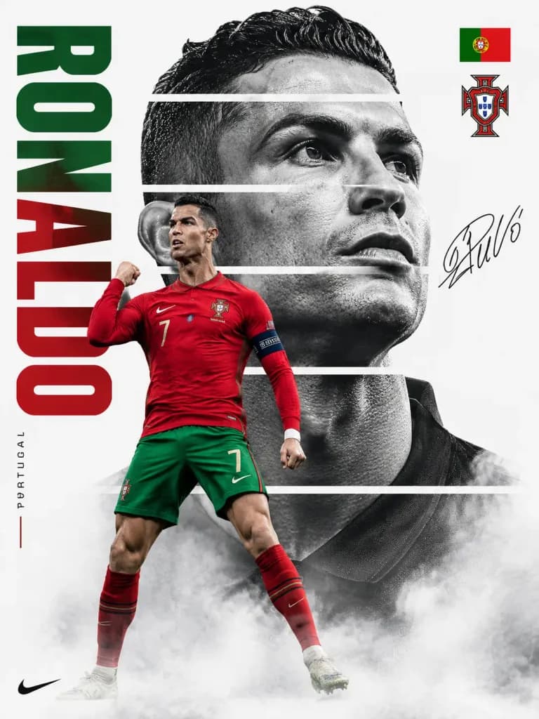
미니멀 축구 스타 월드컵 포스터

미니멀 축구 스타 월드컵 포스터

Premium FIFA World Cup promotional poster design featuring a [legendary football superstar]. Minimalist clean white background dominated by a giant monochrome close-up portrait sliced into several horizontal bands with thin white gaps, creating a fragmented editorial look. In the foreground, a dynamic full-body action figure of the player in their national team jersey overlaps the portrait in a confident celebration pose. On the left side, bold vertical typography spells out the player's name in [national team colors]. The national flag and football federation crest sit in the upper right corner, with an elegant autograph signature near the portrait. Soft smoke and fog fade along the bottom edge. High-contrast black-and-white portrait lighting, [Nike-style] advertising campaign aesthetic, clean negative space, luxury sports editorial layout.

스포츠 포스터축구월드컵
중국 24절기 감성 일러스트 시리즈

중국 24절기 감성 일러스트 시리즈

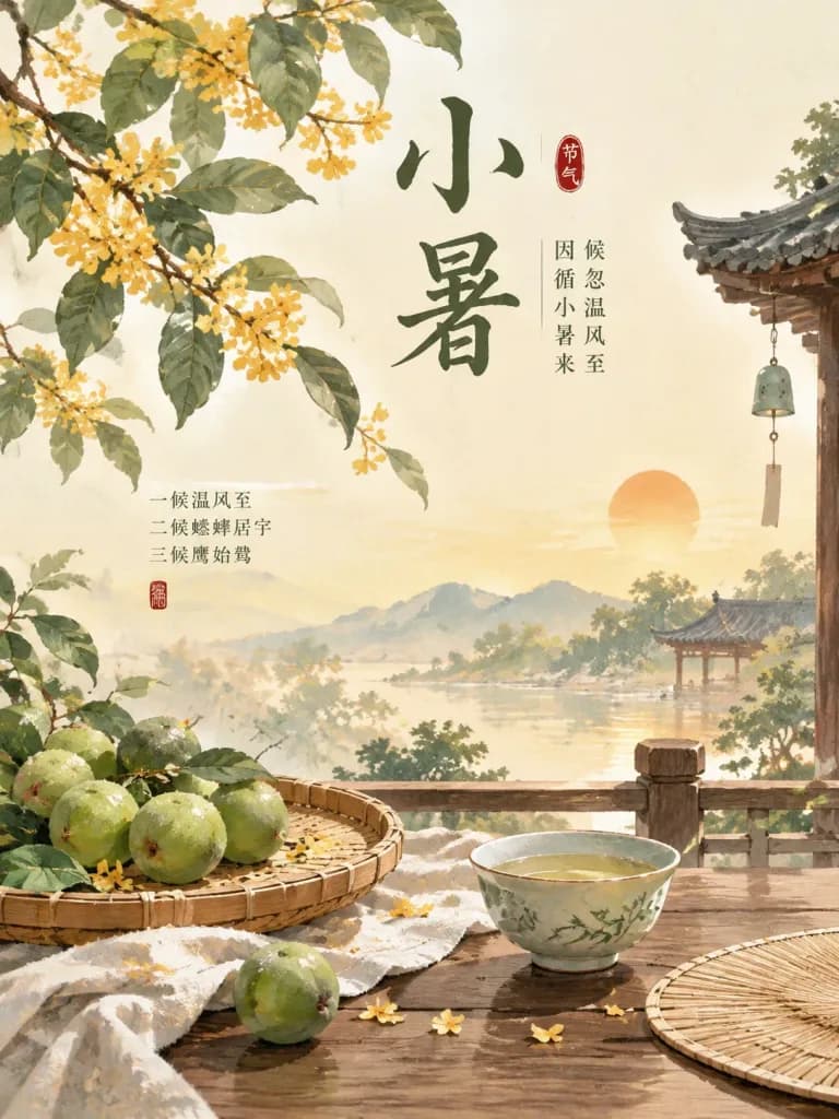
A sequential set of Chinese aesthetic illustrations themed around the solar term [Slight Heat], featuring symbolic seasonal nature elements, poetic Chinese typography quote layout, harmonious traditional color palette, and balanced editorial poster composition.

24절기동양 미학포스터 일러스트
한영 이중언어 요가 교본 펼침면

한영 이중언어 요가 교본 펼침면

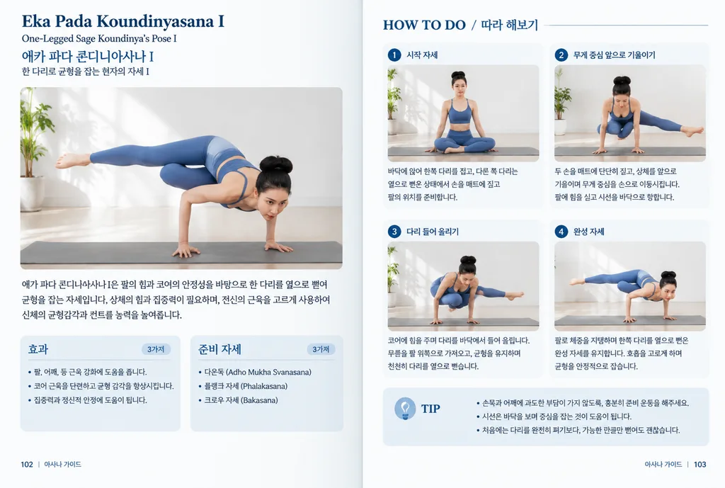
two-page yoga instruction book spread. Asian woman with hair in a high bun, wearing [blue sports bra and matching leggings]. paragraph of Korean explanatory text about the pose. 효과. bulleted list of physical benefits in Korean. 준비 자세. bull…

요가펼침면편집디자인
애니메이션 스트리트 패션 매거진 커버

애니메이션 스트리트 패션 매거진 커버

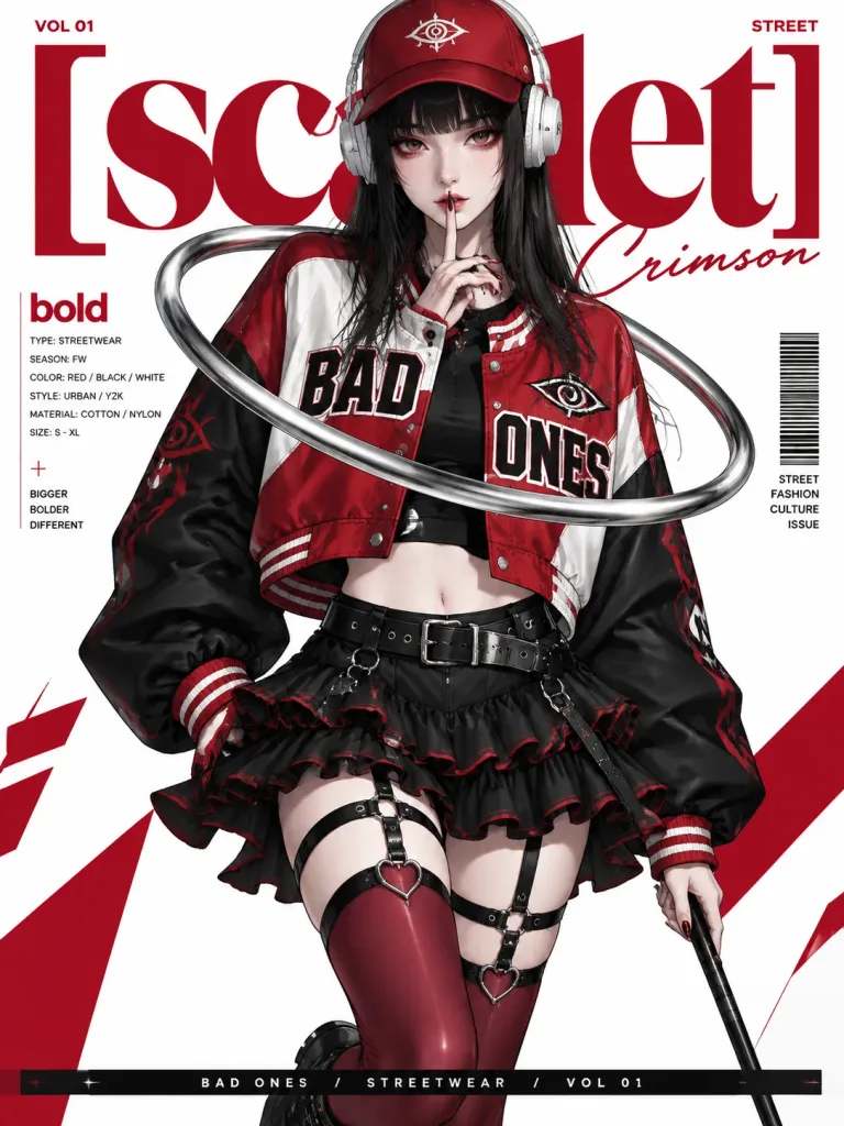
An editorial fashion poster in the style of a [high-end urban streetwear fashion magazine cover], featuring a clean modern layout on a pure white background with bold large-scale red abstract typography partially visible behind the subject. The central figure is an anime-style young woman with long straight black hair, thick bangs, pale skin, sharp facial features, and heavy red eyeshadow. She looks directly at the viewer with one finger raised to her lips in a quiet shushing pose. She wears a red baseball cap, white over-ear headphones, and a [cropped oversized red-and-white varsity/baseball jacket] with black sleeves, red accents, an eye emblem, and bold "BAD ONES" lettering across the chest over a black top. Her lower outfit includes a short black ruffled mini skirt with red trim, black waist and thigh harness straps, red thigh-high stockings with heart-shaped hardware, and black footwear. A large metallic silver curved ring floats around her upper body, and she holds a slender black rod in her other hand. Editorial graphic design elements include "VOL 01" at the top left, "STREET" at the top right, a large bold red title "[scarlet]" overlapped by an elegant cursive signature "Crimson", a vertical text box labeled "bold" with technical details on the left, a barcode graphic on the right, and a sleek bottom banner. Sharp digital illustration, crisp graphic lines, polished editorial lighting, and a striking red, black, and white color palette.

잡지커버스트리트패션애니소녀
미니멀 린넨 에디토리얼 매거진 스프레드

미니멀 린넨 에디토리얼 매거진 스프레드

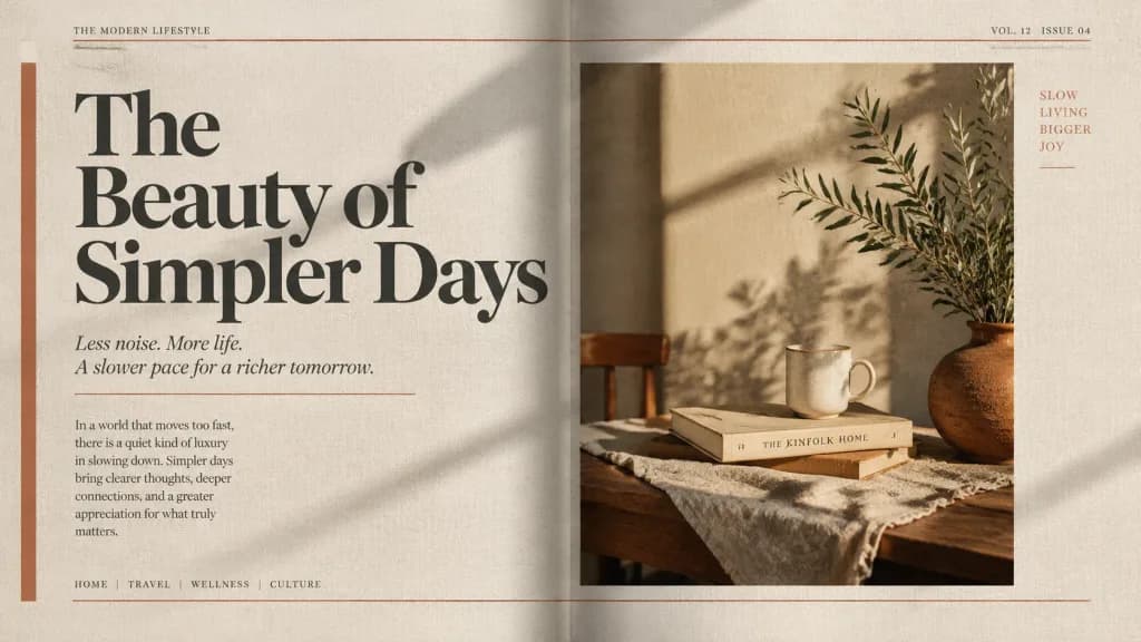
An editorial magazine spread concept featuring a [large-scale serif headline in deep charcoal], set against [muted earth tones] and a [raw linen texture]. Off-white margins with subtle grain overlay, geometric rule lines in [terracotta], and cinematic side lighting casting long shadows across the layout. High-end editorial print finish.

잡지 스프레드에디토리얼 디자인타이포그래피
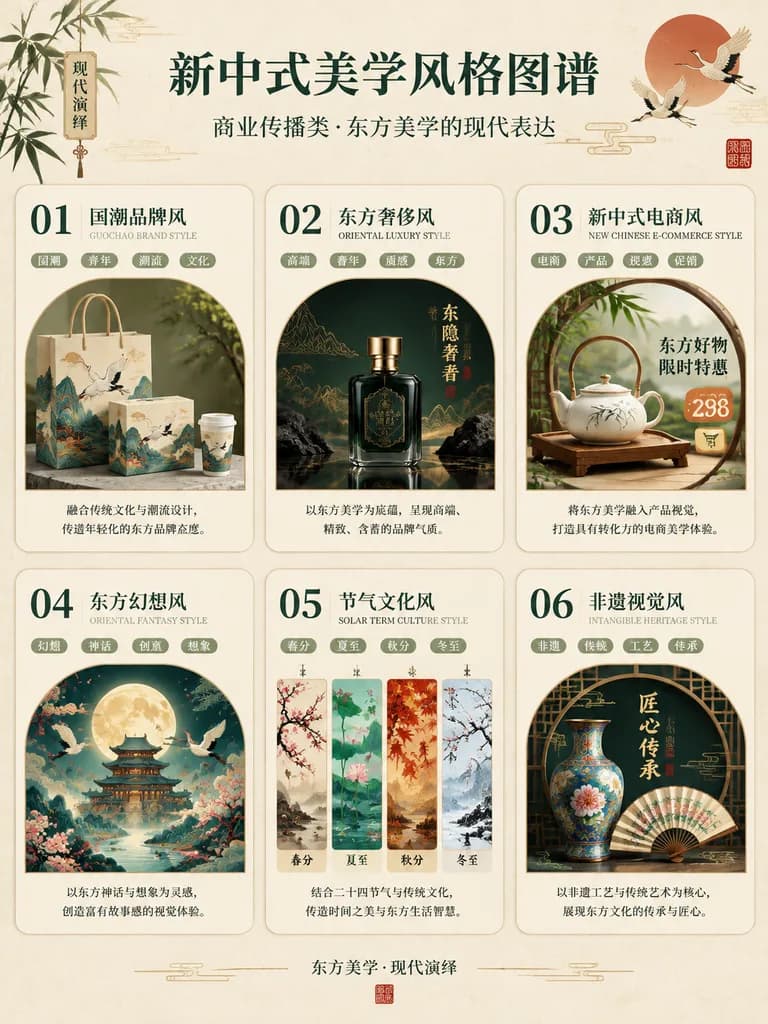
신중식 미학 스타일 인포그래픽

신중식 미학 스타일 인포그래픽

Chinese aesthetic infographic poster. elegant new Chinese style, refined editorial infographic, luxury cultural branding board. [新中式美学风格图谱]. 01 国潮品牌风. 02 东方奢侈风. 03 新中式电商风. 04 东方幻想风. 05 节气文化风. 06 非遗视觉风. [新中式美学风格图谱]. portrait. warm ivory pap…

인포그래픽동양미학브랜드보드
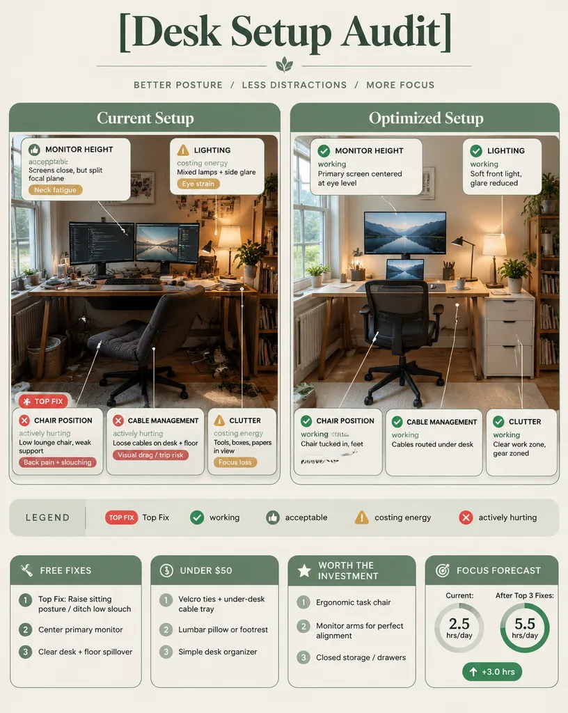
인체공학 데스크 세팅 진단 인포그래픽

인체공학 데스크 세팅 진단 인포그래픽

Using the reference photo, create a clean editorial-style ergonomic audit infographic poster. At the top, include a large serif headline reading "[Desk Setup Audit]". Below, display a side-by-side comparison with two labeled photo panels from matching angles: Left panel ("Current Setup"): Depict the workspace from the reference photo. Surround it with 5 issue callouts with thin leader lines: 1) MONITOR HEIGHT — 👍 acceptable — "Screens close, but split focal plane" — tag "Neck fatigue" 2) CHAIR POSITION — ❌ actively hurting — "Low lounge chair, weak support" — tag "Back pain + slouching" (marked with a small red "TOP FIX" badge) 3) LIGHTING — ⚠️ costing energy — "Mixed lamps + side glare" — tag "Eye strain" 4) CABLE MANAGEMENT — ❌ actively hurting — "Loose cables on desk + floor" — tag "Visual drag / trip risk" 5) CLUTTER — ⚠️ costing energy — "Tools, boxes, papers in view" — tag "Focus loss" Right panel ("Optimized Setup"): Show the same recognizable room, improved with a centered primary monitor at eye level, a laptop centered underneath, an ergonomic task chair tucked in, neat desktop organization, under-desk hidden cable management, soft balanced lighting, and a small drawer cabinet on the right. Surround it with 5 improved callouts with leader lines: 1) MONITOR HEIGHT — ✅ working — "Primary screen centered at eye level" 2) CHAIR POSITION — ✅ working — "Chair tucked in, feet flat, elbows ~90°" 3) LIGHTING — ✅ working — "Soft front light, glare reduced" 4) CABLE MANAGEMENT — ✅ working — "Cables routed under desk" 5) CLUTTER — ✅ working — "Clear work zone, gear zoned" Include a legend bar: "LEGEND", "Top Fix", "working", "acceptable", "costing energy", "actively hurting". Across the bottom, feature 4 boxed summary cards: 1) "FREE FIXES" (1. "Top Fix: Raise sitting posture / ditch low slouch", 2. "Center primary monitor", 3. "Clear desk + floor spillover") 2) "UNDER $50" (1. "Velcro ties + under-desk cable tray", 2. "Lumbar pillow or footrest", 3. "Simple desk organizer") 3) "WORTH THE INVESTMENT" (1. "Ergonomic task chair", 2. "Monitor arms for perfect alignment", 3. "Closed storage / drawers") 4) "FOCUS FORECAST" (two radial progress gauges: "Current: 2.5 hrs/day" and "After Top 3 Fixes: 5.5 hrs/day", plus a green badge reading "+3.0 hrs"). Visual style: refined magazine editorial layout, muted sage green and warm cream palette, rounded containers, clean typography, crisp iconography, balanced spacing.

데스크 셋업인포그래픽인체공학
에디토리얼 컷아웃 인물 콜라주

에디토리얼 컷아웃 인물 콜라주

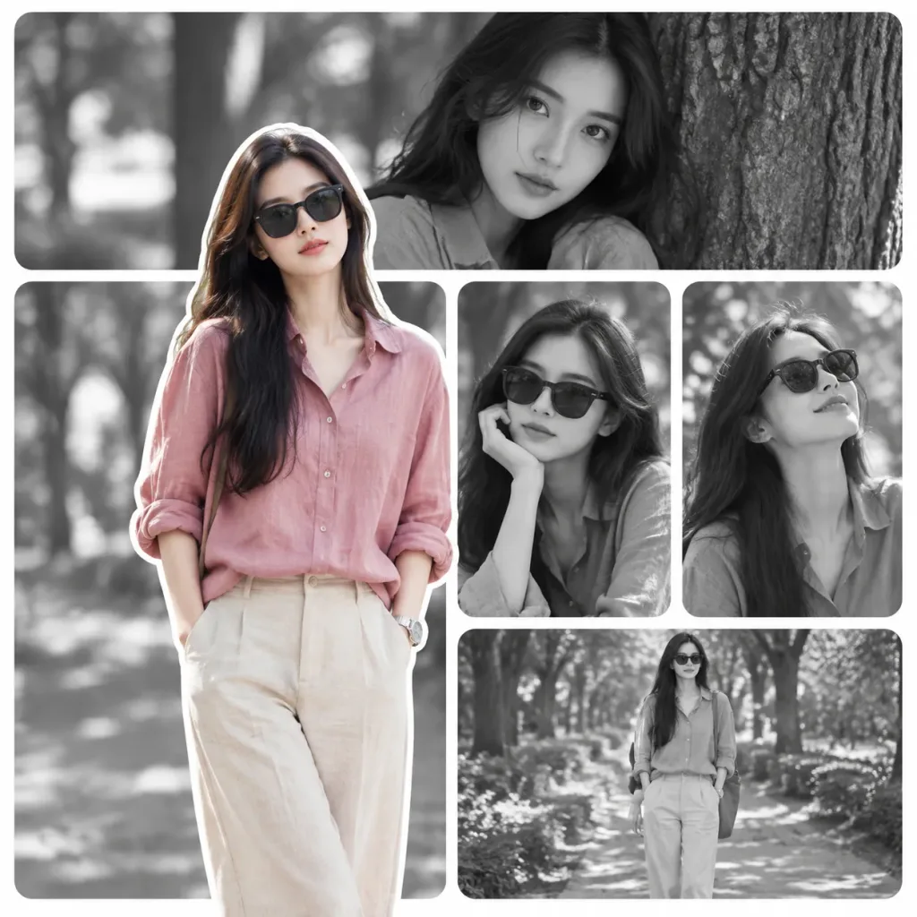
A stylish modern portrait collage of [a young East Asian woman] in a tree-lined outdoor park, maintaining consistent facial features, long dark hair, slim build, natural makeup, and a calm elegant presence across all panels. Composition & Layout: Square 1:1 canvas with a clean magazine-style layout of rounded rectangular panels separated by thick, soft white borders. - Foreground: A full-body cutout portrait overlapping from lower-left to center, bordered by a crisp white sticker-style outline. The subject stands casually with hands in trouser pockets, wearing dark sunglasses, a loose dusty [rose pink] linen button-up shirt with rolled sleeves, light beige trousers, and a wristwatch. Rendered in soft natural full color. - Background: 5 monochrome black-and-white rounded panels: 1. Wide top panel: Close-up leaning against a tree, looking directly at the camera without sunglasses. 2. Middle-right panel: Portrait wearing sunglasses with one hand under her chin. 3. Right-center panel: Smiling upward while wearing sunglasses. 4. Bottom-right panel: Smaller full-body shot walking or standing in sunglasses. 5. Lower-left panel: Large blurred grayscale background panel directly behind the foreground figure. Lighting & Style: Soft cinematic daylight, shallow depth of field with gentle bokeh foliage, realistic photography, clean editorial design. No text, no logos, no watermarks.

인물 콜라주에디토리얼 디자인컷아웃 스티커
목가적인 소 방목지 에디토리얼 콜라주

목가적인 소 방목지 에디토리얼 콜라주

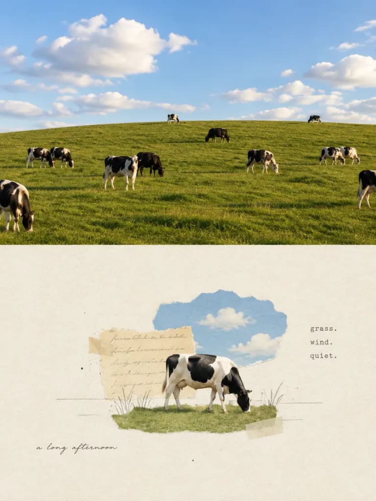
Vertical editorial diptych composition divided horizontally into two equal halves by a clean straight boundary, with a 3:4 aspect ratio. Top half: A realistic landscape photograph of a bright green rolling pasture under a clear blue sky filled with soft, puffy white cumulus clouds. Grazing on the hill are exactly 11 [black-and-white Holstein cows]: one partial silhouette at the far lower-left edge, two grazing close together on the left, one standing near center-left with one dark cow grazing just behind it, one distant cow centered on the horizon, one dark cow near the upper middle, one grazing right of center, one small cow on the upper-right horizon, two close together on the right, and one partially cropped cow at the far-right edge. Natural golden-hour daylight, soft ground shadows, and a serene rural atmosphere. Bottom half: A sparse, minimalist mixed-media collage on warm ivory textured watercolor paper. Centered slightly below the middle is exactly one [black-and-white Holstein cow] grazing on a small torn strip of green grass paper. Layered behind the cow are two torn paper elements: a pale beige rectangular scrap bearing faint illegible cursive handwriting, and an irregular sky-blue cloud-shaped scrap above it. Delicate black pencil grass scribbles, faint horizontal drafting lines, translucent masking tape rectangles, and subtle ink speckles accent the composition. Text in bottom collage: - Stacked on the right in a small, understated lowercase typewriter font: "[grass.]", "[wind.]", and "[quiet.]". - At the lower left in small, slightly imperfect cursive handwriting: "[a long afternoon]". Style: Contrast between vivid, clean pastoral photography and quiet, Japanese-zine scrapbook minimalism. Plenty of negative space, soft muted tones in the lower section, no humans, no extra animals, no borders or watermarks.

콜라주목가적에디토리얼디자인
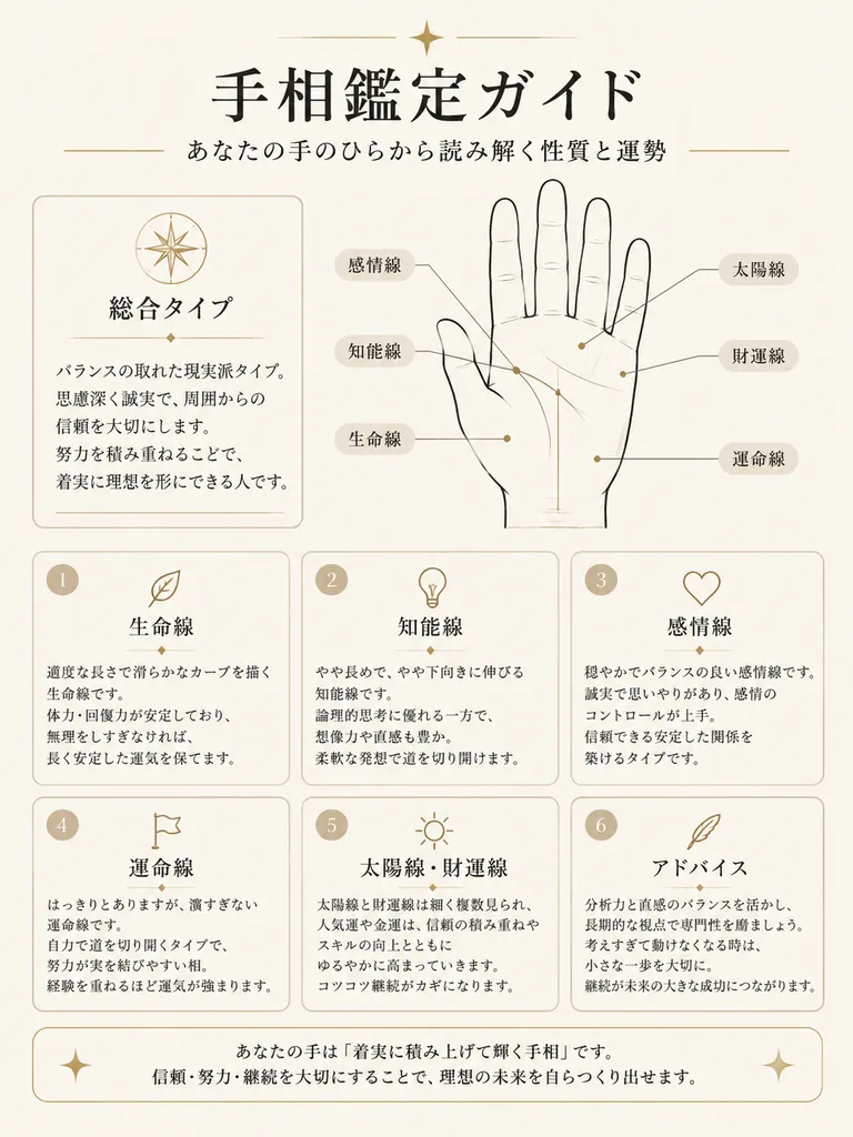
미니멀한 일본식 손금 감정 인포그래픽

미니멀한 일본식 손금 감정 인포그래픽

elegant Japanese palm reading guide infographic. minimal premium editorial design, warm off-white paper background, thin black and beige line art, soft rounded cards, delicate gold accents, calm fortune-telling aesthetic, clean margins. [総…

손금인포그래픽에디토리얼 디자인
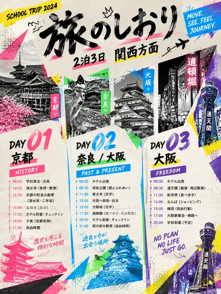
그래픽 수학여행 일정 포스터

그래픽 수학여행 일정 포스터

A bold contemporary graphic travel poster and magazine-spread layout for a school trip schedule. Dynamic diagonal composition set against an off-white paper textured background with energetic Japanese editorial street-culture aesthetics. The layout features an oversized brush-calligraphy Japanese headline reading "[旅のしおり]" and smaller title text for a "[2泊3日]" trip to "[関西方面]". The schedule is organized into exactly 3 large vertical day sections: Day 01 Kyoto (labeled "HISTORY"), Day 02 Nara / Osaka (labeled "PAST & PRESENT"), and Day 03 Osaka (labeled "FREEDOM"), each containing clean poster typography for times and itinerary highlights connected by thin timeline lines. Integrated into the design are tilted monochrome and duotone cutout photo panels displaying Kyoto shrine architecture, a Nara deer, Osaka Castle, a neon-lit Osaka street scene, and Tsutenkaku Tower. High-contrast neon accent graphics in hot pink, cyan, yellow, blue, green, and purple feature angular triangles, paint splashes, speed lines, halftone dot textures, arrows, scribbles, and collage overlays. Small English graphic slogans include "SCHOOL TRIP 2024", "MOVE. SEE. FEEL. JOURNEY.", and "NO PLAN NO LIFE JUST GO.".

여행 포스터일정표에디토리얼 디자인
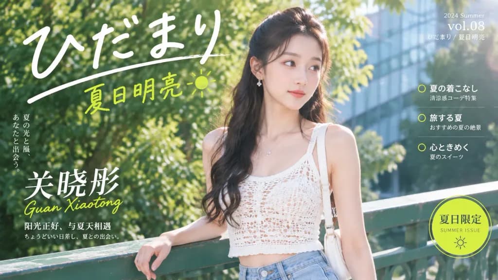
일본 감성 여름 잡지 커버 포트레이트

일본 감성 여름 잡지 커버 포트레이트

A bright Japanese summer lifestyle magazine cover featuring [Guan Xiaotong] in a glossy editorial style. Wide horizontal 16:9 composition. Subject: A young East Asian woman standing slightly right of center, waist-up, turned three-quarters toward the camera with one hand resting lightly on a green bridge railing, looking softly off to the side. She has long dark wavy half-up hair, delicate earrings, natural fresh makeup, and a calm, luminous expression. She wears a white open-knit crochet camisole crop top, light blue high-waisted jeans, a thin necklace, and a white shoulder bag strap over one shoulder. Setting & Lighting: Full-bleed outdoor street scene in warm midday summer sunlight, lush green tree bokeh, and an angular glass building facade in the background. Japanese summer portrait aesthetic, airy and bright, soft lens flare, shallow depth of field, realistic skin texture, gentle highlights, and clean editorial color grading dominated by greens, whites, and lemon-yellow accents. Typography & Cover Layout: - Top masthead: Huge handwritten white Japanese text reading 「ひだまり」 with a sweeping underline stroke. - Under masthead: Lime-yellow handwritten text reading 「夏日明亮」 with a tiny doodled sun. - Left edge: Elegant vertical Chinese text about summer light and wind. - Lower left: Large white Chinese title text 「关晓彤」 overlaid with lime handwritten romanization "Guan Xiaotong", with two smaller lines beneath: 「阳光正好,与夏天相遇」 and 「ちょうどいい日差し、夏との出会い。」 - Upper right: Small white issue text reading "2024 Summer", "vol.08", and 「ひだまり / 夏日明亮」. - Mid-right: Exactly 3 small feature blurbs in white Japanese/Chinese text, separated by thin horizontal rules and accented by 2 lime circular ring icons. - Bottom right: A lime circular badge with a double outline reading 「夏日限定」, "SUMMER ISSUE", and a small sun icon. Composition is balanced, polished, and readable. No additional people, no watermarks, no external brand logos.

잡지 커버일본 감성여름 인물사진
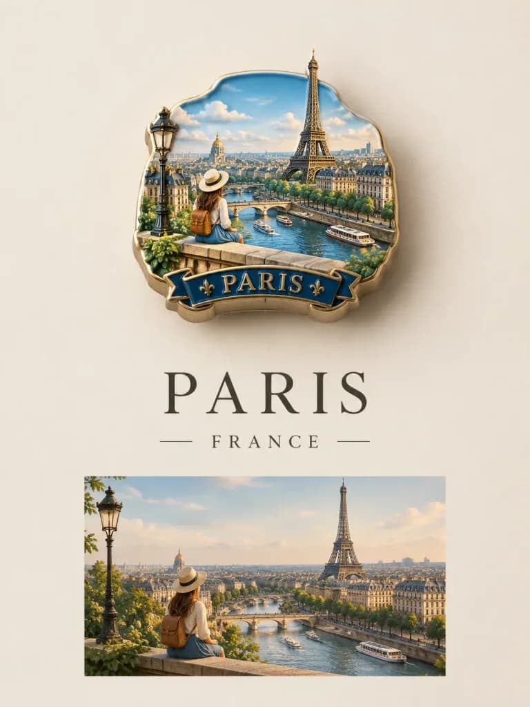
3D 기념 배지 여행 포스터

3D 기념 배지 여행 포스터

A premium travel poster featuring a [miniature 3D souvenir badge floating on a clean matte background]. The badge contains a highly detailed miniature diorama recreating [a traveler enjoying a panoramic cityscape and landmark view], with realistic architecture, atmospheric lighting, and cinematic depth. The badge features sculpted edges, a handcrafted resin enamel texture, intricate miniature details, soft cast shadows, and the aesthetic of a luxury collectible magnet. Below the badge, elegant serif typography displays "[PARIS]" in large capital letters with the country name "[FRANCE]" beneath it. A matching travel photograph is seamlessly integrated below the badge as a reference scene. Minimalist design, muted color palette matching the destination mood, shallow depth of field, soft ambient lighting, centered composition, clean negative space, sophisticated editorial layout.

여행 포스터3d 배지디오라마
럭셔리 유럽 빈티지 여행 포스터

럭셔리 유럽 빈티지 여행 포스터

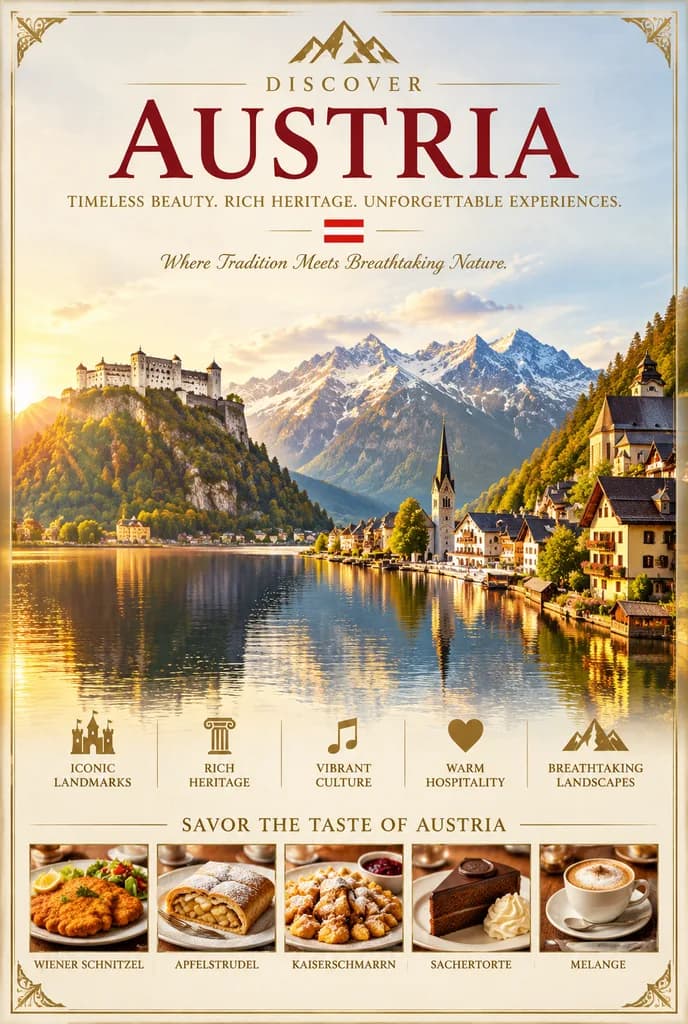
A luxurious vintage-style travel poster for [Austria], styled as a high-end tourism campaign advertisement. The composition features an elegant, symmetrical poster layout with thin gold decorative borders and refined corner filigree. At the top center, a minimalist gold mountain emblem sits above the word “DISCOVER”, followed by a prominent refined serif title reading “[AUSTRIA]” in deep burgundy red. Below it, an uppercase gold tagline reads “TIMELESS BEAUTY. RICH HERITAGE. UNFORGETTABLE EXPERIENCES.”, accompanied by an Austrian flag motif and an italic script line: “Where Tradition Meets Breathtaking Nature.” The central scenic visual depicts a panoramic alpine lake at golden hour: on the left, a grand hilltop fortress resembling Salzburg Castle sits perched on a cliff; in the center, calm reflective waters stretch toward towering snow-capped Alps; on the right, a storybook lakeside village resembling Hallstatt features steep-roofed wooden chalets and a slender church spire. Warm directional sunlight from the left casts glowing reflections across the water beneath a crisp sky. Along the lower middle, five gold icons with uppercase labels are spaced evenly: a castle icon with “ICONIC LANDMARKS”, a classical column with “RICH HERITAGE”, a musical note with “VIBRANT CULTURE”, a heart with “WARM HOSPITALITY”, and a mountain peak with “BREATHTAKING LANDSCAPES”. At the bottom, under the heading “SAVOR THE TASTE OF AUSTRIA”, a horizontal strip showcases five neatly framed culinary photos with thin dividers: Wiener Schnitzel, Apfelstrudel, Kaiserschmarrn, Sachertorte, and Melange, each labeled in small uppercase serif typography.

여행 포스터빈티지오스트리아
인테리어 디자인 잡지 표지 목업

인테리어 디자인 잡지 표지 목업

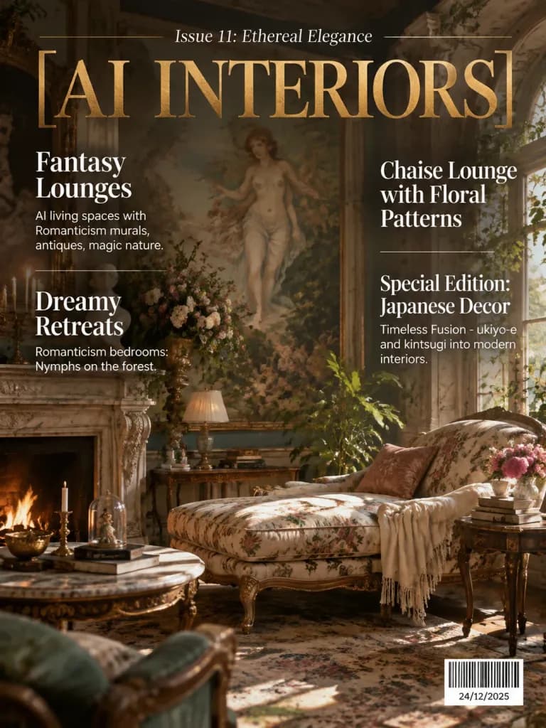
A realistic mockup of an interior design magazine cover. The main title in metallic gold foil reads "[AI INTERIORS]", with the header "Issue 11: Ethereal Elegance". The background features an opulent interior living space with Romanticism murals, antique furnishings, and enchanting botanical details. The editorial text overlay is clean and arranged into two distinct columns in crisp white typography. Left column: - Top headline: "Fantasy Lounges" with caption "AI living spaces with Romanticism murals, antiques, magic nature." - Lower headline: "Dreamy Retreats" with caption "Romanticism bedrooms: Nymphs on the forest". Right column: - Top headline: "Chaise Lounge with Floral Patterns" - Lower headline: "Special Edition: Japanese Decor" with subtitle "Timeless Fusion - ukiyo-e and kintsugi into modern interiors." - Bottom right corner: a clean, realistic retail barcode (black and white stripes) with the date "[24/12/2025]". Precise editorial grid alignment, elegant serif and sans-serif typography, high-end publication design.

잡지 표지목업에디토리얼 디자인
파스텔 부겐빌레아 아침 인사 포스터

파스텔 부겐빌레아 아침 인사 포스터

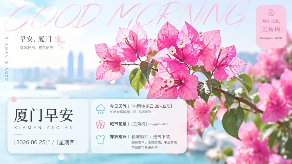
A bright, elegant morning greeting poster for [Xiamen], combining floral city-symbol aesthetics with weather details, clothing advice, and a soft editorial layout. Canvas: Wide 16:9 horizontal format. A clean white and pastel sky-blue background with soft bokeh, high-key morning sunlight, gentle haze, and a fresh early-morning atmosphere. Main visual: A large close-up branch of vivid pink bougainvillea flowers fills the center and right side, with translucent papery petals, visible veins, tiny cream-white flower centers, green leaves, and sparkling dew drops, polished like a lifestyle magazine cover. A second blurred cluster of pink bougainvillea rests in the far right background for depth. Typography and layout: A very large, ultra-thin, pale pink handwritten English title spans across the top reading “GOOD MORNING”. Upper left: small Chinese greeting block reading “早安,厦门” and below it “海风轻拂,花色正好,” with a tiny pink line-flower doodle nearby. Far left edge: vertical city label “XIAMEN” and a small heart marker with the word “AMOY”. Main information card: Lower left frosted-glass rounded rectangle card with soft shadow and translucent white fill containing: a small pink dot in the upper-left corner; headline in large black Chinese calligraphy type “厦门早安”; spaced romanization “XIAMEN ZAO AN”; date line “[2026.06.25]° / [星期四]” in clean modern type. Right information panel: Frosted-glass rounded rectangle panel overlapping the main card with 3 stacked rows: 1) weather row with a small blue rainy-cloud icon and text “今日天气 | [小雨转多云 28–32°C]” and subtext “午后有雷阵雨,体感闷热”; 2) city flower row with a pink outline flower icon and text “城市花意 | [三角梅] Bougainvillea”; 3) clothing advice row with a lime-green outline T-shirt icon and text “穿衣建议 | 轻薄短袖 + 透气下装” and subtext “随身带伞,注意防晒,午后防雨 空调房可备薄外搭”. Top-right badge: Vertical rounded pink translucent label with a tiny flower icon, text “城市花意,” large Chinese text “[三角梅],” and small italic English “Bougainvillea”. Decorative overlays: Translucent color blocks peeking behind panels. Crisp, readable typography, no people, no clutter, no watermarks.

아침인사부겐빌레아소셜미디어포스터
분할 레이아웃 스포츠 장비 인포그래픽

분할 레이아웃 스포츠 장비 인포그래픽

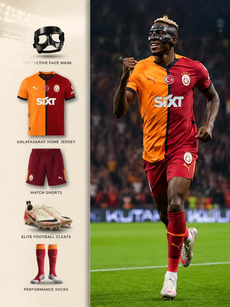
Vertical split infographic. [Victor Osimhen] celebrating a goal. Create a 3:4 vertical sports equipment breakdown infographic layout of [Victor Osimhen] with a premium left panel design. 3:4. 38%. Soft warm ivory. Subtle luxury paper textu…

인포그래픽축구스포츠에디토리얼
월드컵 트레이딩 카드 스포츠 포스터

월드컵 트레이딩 카드 스포츠 포스터

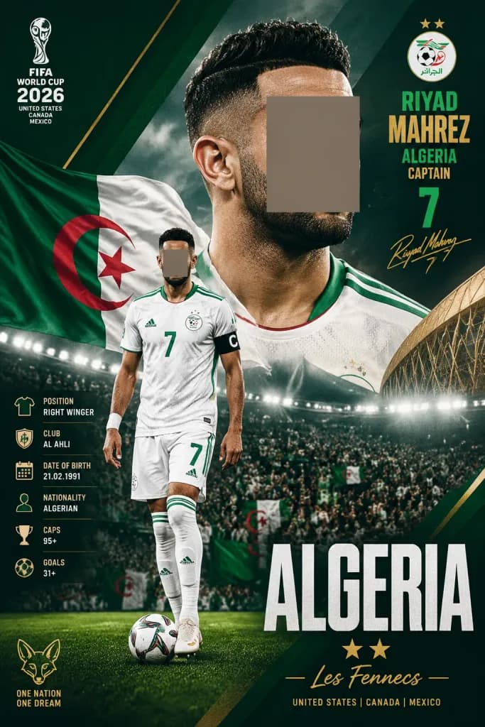
A dramatic vertical football World Cup 2026 poster for [Riyad Mahrez], Algeria captain, in a premium sports trading-card and editorial style. Canvas: Tall vertical poster, 2:3 ratio, dark emerald green, white, and metallic gold palette, high-contrast stadium lighting, subtle gritty paper texture, diagonal geometric graphic panels, and thin gold accent lines. Composition: In the background, a large close-up portrait of the player cropped from hair to upper chest positioned slightly right of center, with the face intentionally covered by a smooth rectangular anonymizing block in warm gray-brown. In the foreground, slightly left of center, a full-body footballer standing on green pitch grass with one foot near a soccer ball, also with the face covered by a smaller warm gray-brown rectangular anonymizing block. The player wears Algeria's white home kit with green trim, number 7, a black captain armband with a white "C", white socks, and light-colored boots. A waving Algerian flag is visible behind him on the left, and a packed stadium with lights and crowds fills the lower background. On the far right edge, a stylized modern stadium architectural structure appears partially behind the title. Typography and graphics: - Top-left: White stacked FIFA World Cup 2026 emblem with text: "FIFA", "WORLD CUP", "2026", "UNITED STATES", "CANADA", "MEXICO". - Top-right: Algeria football crest with two gold stars above it. Stacked typography reads: "RIYAD" in green, "MAHREZ" in gold, "ALGERIA" in green, "CAPTAIN" in gold, and a large green "7", with a gold handwritten signature underneath. - Lower-left: Vertical column of 6 icon-and-label statistics: 1) shirt icon: "POSITION" / "RIGHT WINGER"; 2) club badge icon: "CLUB" / "AL AHLI"; 3) calendar icon: "DATE OF BIRTH" / "21.02.1991"; 4) person icon: "NATIONALITY" / "ALGERIAN"; 5) trophy icon: "CAPS" / "95+"; 6) soccer ball icon: "GOALS" / "31+". - Bottom title zone: Huge condensed white headline "ALGERIA" across the lower-right area. Underneath, two gold stars and a gold script subtitle "[Les Fennecs]". Small gold host text: "UNITED STATES | CANADA | MEXICO". In the bottom-left corner, a small gold fennec fox emblem with the slogan "ONE NATION" above "ONE DREAM". Style: Cinematic stadium floodlights, sharp sports photography detail, realistic fabric textures, and layered dynamic shadows. Strictly two face-covering anonymizing rectangles.

월드컵축구포스터스포츠카드
듀얼 패널 사진 해체 아트 포스터

듀얼 패널 사진 해체 아트 포스터

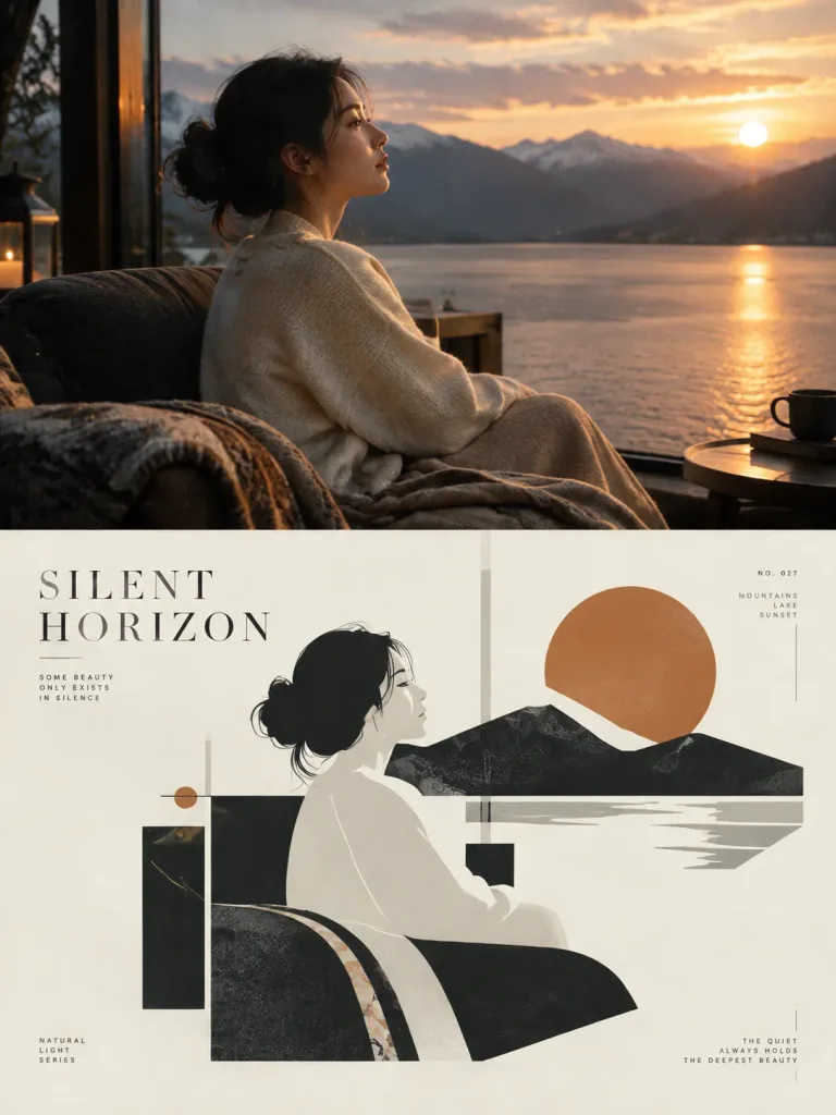
A high-end editorial art poster in a 3:4 vertical layout, split into two equal 1:1 square halves: - Top half (50%): The reference photo is displayed with structural integrity, spatial depth, authentic textures, natural lighting, and original atmosphere preserved, enhanced only with subtle art-magazine color grading. The background extends naturally without distorting or stretching the subject. - Bottom half (50%): A minimalist abstract graphic composition on a clean ivory background, deconstructing the reference photo above. It captures the core silhouette, volume, posture, and negative space using restrained geometric shapes, asymmetrical balance, and rhythmic white space. The color palette is strictly extracted from the photo: [one primary color, one dark structural shade, one neutral tone, and subtle accent highlights]. - Typography: Elegant editorial micro-typography integrates with the geometric shapes. A poetic 2-to-5 word English title like "[SILENT HORIZON]" is paired with 2-4 sets of tiny annotation text (short phrases, catalog numbers, directional notes, or material tags) using sophisticated serif and hairline sans-serif fonts. Text is aligned along geometric axes, margins, and negative spaces, creating an archival art-book aesthetic.

에디토리얼 디자인미니멀 포스터기하학적 추상
스플릿 사진 및 손그림 낙서 콜라주 포스터

스플릿 사진 및 손그림 낙서 콜라주 포스터

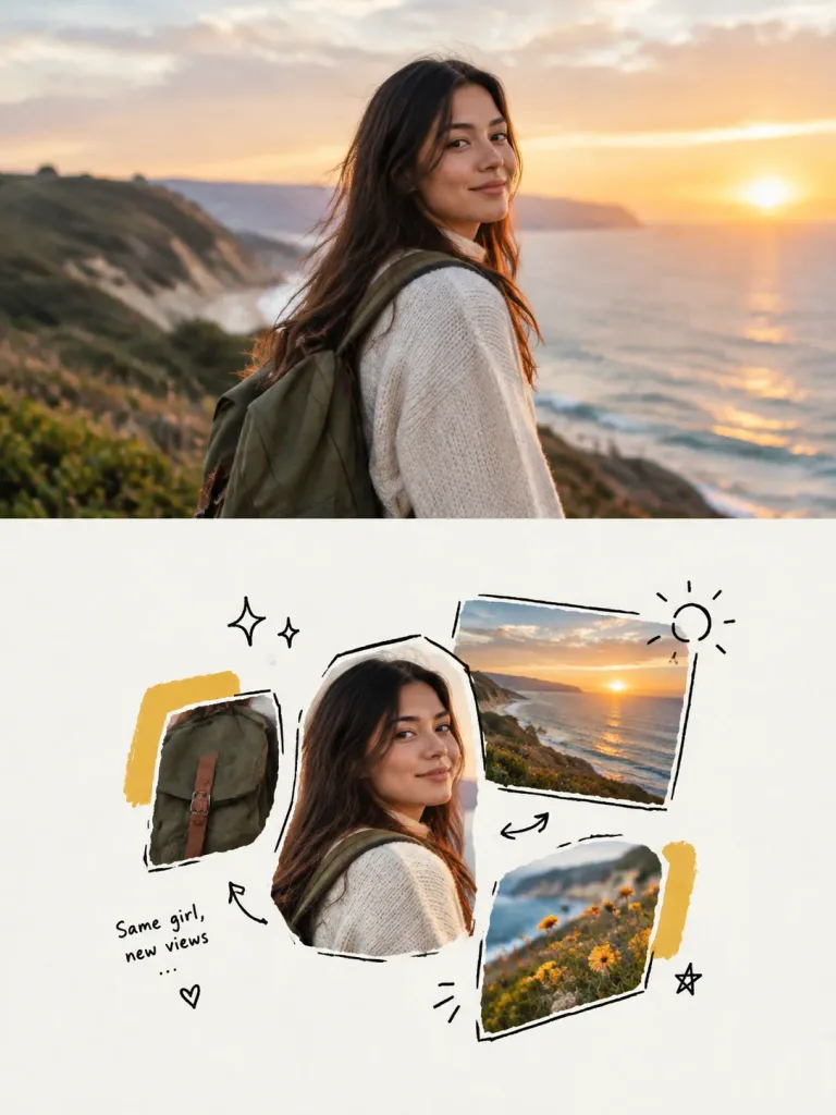
A high-end editorial design poster split vertically 1:1 into two equal halves (top 50% and bottom 50%) in a [3:4 vertical layout]: Top half: Displays the reference photo, preserving the subject's identity, fully clothed modest attire, natural posture, realistic texture, natural lighting, and original atmosphere with subtle high-end exhibition magazine color grading. The background extends naturally without distorting the subject. Bottom half: A [Hand-drawn Doodle Photo Collage] redesigning key visual elements from the top half. Features a small cluster of cut-out photo fragments rearranged with asymmetrical balance, rough hand-drawn black outlines, and abundant negative space on a [clean white or very light warm white] paper background. Minimalist black doodle accents such as subtle suns, stars, arrows, brackets, or casual handwritten zine-style notes. Uses 2–4 dominant accent colors extracted directly from the reference photo. Sophisticated independent art magazine and personal scrapbook aesthetic with generous breathing room, avoiding clutter.

포스터콜라주낙서
중국어 프롬프트 텍스트가 담긴 다크 UI 카드

중국어 프롬프트 텍스트가 담긴 다크 UI 카드

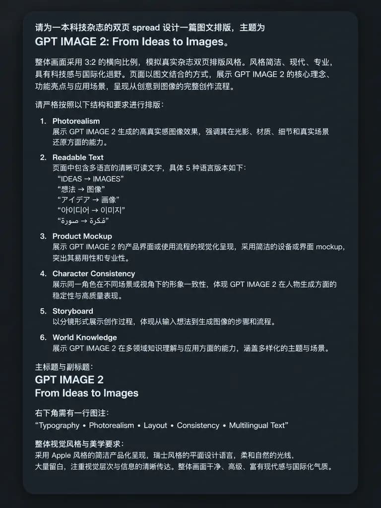
A clean screenshot-style image featuring a dark charcoal rounded-rectangle UI card on a flat dark background, displaying dense, crisp simplified Chinese prompt text in a clean white sans-serif font with generous padding and a subtle drop shadow. At the top, introductory text specifies the concept for a technology magazine double-page spread, prominently citing: "GPT IMAGE 2: From Ideas to Images". Below are left-aligned Chinese paragraphs with uniform line spacing discussing layout ratio, editorial style, and two-page visual structure. The middle section contains a numbered list with items 1 through 6, each presenting an English module title followed by Chinese explanatory text: 1. "Photorealism", 2. "Readable Text", 3. "Product Mockup", 4. "Character Consistency", 5. "Storyboard", and 6. "World Knowledge". Under item 2, five distinct multilingual sub-items are quoted: "IDEAS → IMAGES", "想法 → 图像", "アイデア → 画像", "아이디어 → 이미지", and "فكرة → صورة". Further down, a section specifies the primary title "GPT IMAGE 2" and subtitle "From Ideas to Images". Toward the bottom right, a caption entry introduces the exact line: "Typography • Photorealism • Layout • Consistency • Multilingual Text". A concluding Chinese paragraph details aesthetic requirements including Apple-style clean product presentation, Swiss graphic design, soft natural lighting, and generous negative space. Crisp, legible typographic rendering, high contrast, no external icons or illustrations, strictly text and UI card frame.

ui 카드타이포그래피프롬프트 시트
골드 새틴 센서드 패션 매거진 커버

골드 새틴 센서드 패션 매거진 커버

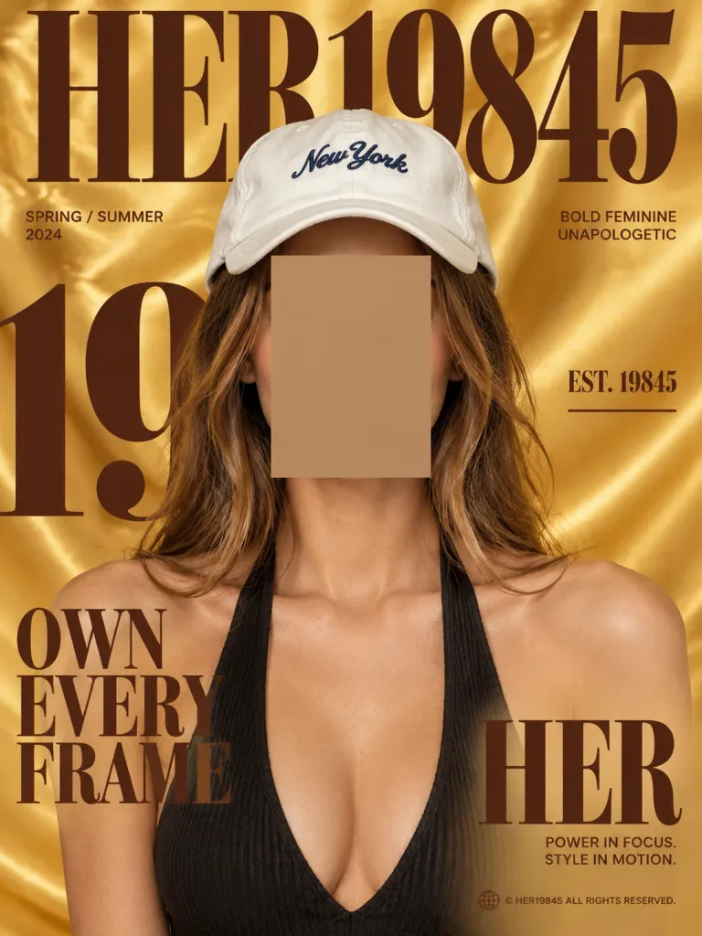
Vertical high-fashion editorial magazine cover design with a 3:4 aspect ratio. Subject: Centered portrait of [a young woman with long light-brown hair wearing a white baseball cap and a black ribbed halter top], framed from the chest up. A perfectly rectangular, opaque censor block in a warm beige-brown tone covers the entire face from forehead to chin, with strands of hair falling along both sides. The white cap is softly creased with dark navy cursive embroidery, and the halter top has a visible ribbed texture and deep neckline. Setting & Background: Glossy golden-yellow satin fabric backdrop with soft, luxurious flowing folds. Lighting: Editorial studio lighting with warm highlights accentuating the satin drapery and skin tones. Typography & Graphic Layout: Bold, high-contrast dark chocolate-brown editorial typography strictly layered into the scene. Include only these 8 text elements: 1) Giant top condensed serif masthead reading "[HER19845]", positioned behind the model's head and cap. 2) Large cropped numeral typography partially visible behind the model on the left-center. 3) Small left label: "SPRING / SUMMER 2024". 4) Large stacked left headline: "[OWN EVERY FRAME]". 5) Small right tagline: "BOLD FEMININE UNAPOLOGETIC". 6) Right-side label: "EST. 19845" with a thin horizontal rule below. 7) Large lower-right title: "[HER]". 8) Small lower-right caption: "POWER IN FOCUS. STYLE IN MOTION.", followed by a tiny footer copyright "© HER19845 ALL RIGHTS RESERVED." with a small globe icon. Style & Constraints: Sharp commercial fashion photography merged with graphic publication design. Clean print finish, no borders, luxurious, sporty, and strictly using the warm gold and deep brown palette.

매거진 커버에디토리얼 디자인패션 사진
비 내리는 K-POP MV 콘셉트 무드보드

비 내리는 K-POP MV 콘셉트 무드보드

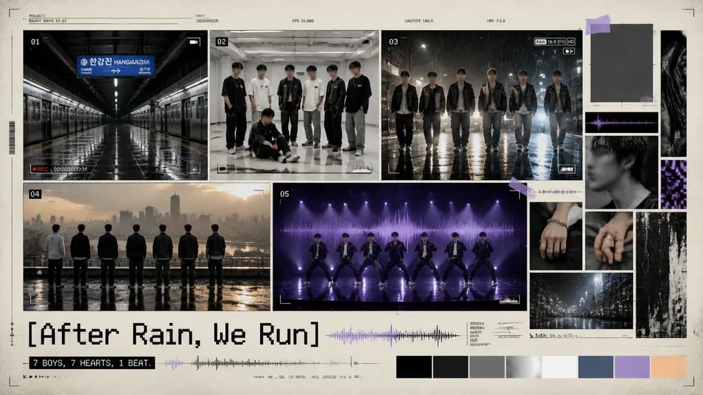
cinematic K-pop boy group music video concept moodboard. rainy urban youth, melancholic but energetic, documentary camera UI mixed with editorial design. [seven young male K-pop idols with intentionally blurred faces for anonymity]. empty…

k-pop무드보드스토리보드
사진과 손그림 그리드 분할 포스터

사진과 손그림 그리드 분할 포스터

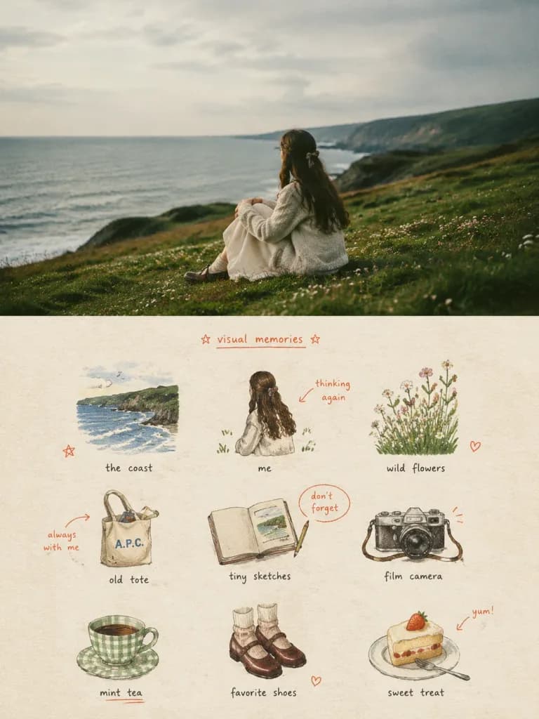
High-end editorial poster in a 3:4 vertical split layout, divided strictly 1:1 in height into top and bottom halves. Top half: retains the provided reference photo with preserved subject identity, natural anatomy, textures, lighting, and ambient color, enhanced with subtle art-magazine color grading; the background extends naturally to fit the 50% frame without stretching or altering the subject. Bottom half: a creative visual memory checklist set on warm off-white coarse-textured paper, arranged into an organic, loose 3x3 modular icon grid. The grid consists of 9 naive hand-drawn doodle illustrations extracted from key narrative elements, personal belongings, textures, food, plants, or gestures seen in the reference photo. Illustration style: naive doodle art, shaky imperfect thin black linework with open contours, colored with grainy colored pencil and crayon textures, showing visible paper grain and rough edges. Palette: low-saturation retro candy tones dominated by sage green, mint, pastel cobalt blue, cream yellow, dusty pink, and minimal coral-orange accents. Minimal red hand-drawn annotations like small arrows, circles, stars, and brief casual handwritten notes and titles accent the grid, resembling an intimate artist journal or visual diary. Relaxed, spacious composition with generous whitespace; avoid clean vectors, commercial UI icons, heavy drop shadows, or 3D rendering.

분할 포스터낙서 그리드비주얼 다이어리
스위스 에디토리얼 사이클 매거진 포스터

스위스 에디토리얼 사이클 매거진 포스터

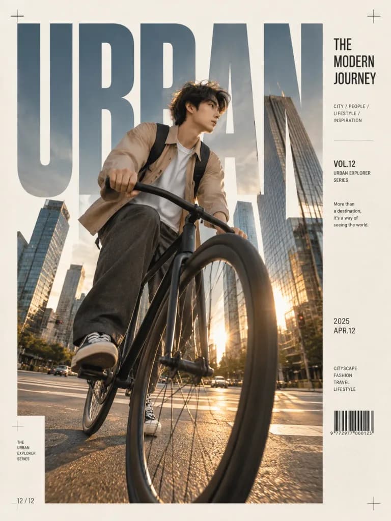
Premium editorial magazine cover featuring a [stylish young man] riding a [minimalist black fixed-gear bicycle] through a [modern downtown intersection]. Dramatic ultra-low-angle wide 16mm lens shot with the front wheel dominating the foreground, dynamic perspective, motion frozen mid-ride. Setting features a contemporary city skyline with glass skyscrapers, warm golden-hour sunlight, cinematic shadows, and realistic street reflections. Outfit: minimalist neutral beige overshirt, white T-shirt, loose charcoal trousers, black-and-white sneakers, and backpack. Clean luxury fashion photography aesthetic, Leica SL3 style, natural colors, high contrast, crisp details. Layout designed as a modern Swiss-style typography poster with gigantic bold condensed uppercase letters filling the background and acting as a photo mask, minimalist cream paper background, editorial side panel containing title, series, visual notes, date, barcode, alignment marks, magazine grid system, contemporary graphic design, refined typography hierarchy, negative space, and muted earthy palette.

잡지 표지에디토리얼 디자인스위스 타이포그래피
조개 텍스처 픽셀 분할 포스터

조개 텍스처 픽셀 분할 포스터

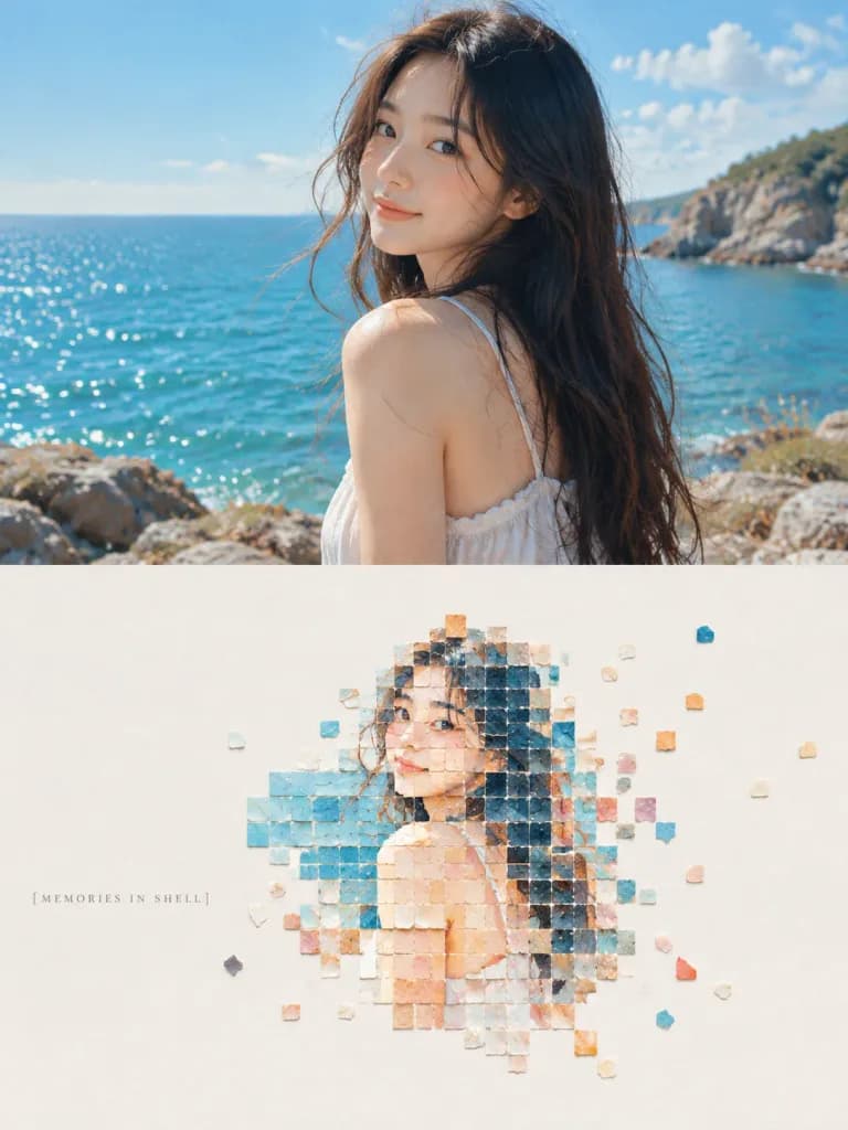
An independent high-end design poster in a vertical 3:4 layout, strictly divided 1:1 vertically into two equal halves: Upper Half (50%): The original reference photo is preserved with high fidelity. Maintain the subject's identity, physical structure, posture, authentic texture, natural lighting, and atmospheric mood. Subtle editorial color grading reminiscent of an independent art publication or exhibition catalog. The environmental background naturally extends to fill the 3:4 frame without stretching or warping the subject. Lower Half (50%): A minimalist material collage pixel landscape reconstructing the core subject, composition, and visual memory points of the upper photo: - Modules: Composed of fewer than 200 small square and near-square fragments resembling rough natural shell flakes, mineral shell layers, and matte stone chips. Clear geometric grid order with slightly chipped edges, natural bedding, delicate powdery grit, and matte organic textures. No standard digital pixels, smooth vector tiles, or game mosaics. - Arrangement: Dense cluster at the subject's core that gradually dissipates, breaks, and floats outward into generous negative space. The pixel form occupies only 30%–45% of the lower section, arranged like a tactile stamp on textured paper. - Negative Space: Expansive, clean warm-white or subtle off-white breathing room establishing asymmetric balance and pause. - Color Palette: Retuned bright, vivid, luminous tones derived from the reference image—clear sky blue, lake cyan, soft coral orange, warm gold, and peach pink—with gentle tonal variation across shell surfaces. Vibrant and warm without being muddy, neon, or dull Morandi tones. - Typography: Minimal editorial graphic intervention; a few understated, elegant words or short phrases such as "[MEMORIES IN SHELL]" quietly placed along the margin or white space.

분할 포스터픽셀 아트조개 텍스처
빈티지 신문 1면

빈티지 신문 1면

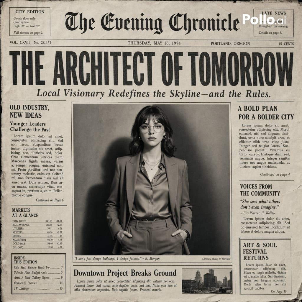
빈티지 신문의 가장 사실적인 1면 디자인을 생성하세요. 레이아웃은 영화 같은 흑백 미학을 가진 실제 인쇄된 신문 스타일로 만들어야 합니다. 메인 사진은 중앙에 눈에 띄게 배치되어야 하며, 사설 기사 헤더처럼 프레임이 잡혀야 합니다. 상단에는 시선을 사로잡는 굵은 헤드라인을 만들고 그 아래에 작은 부제목을 배치하세요. 작은 텍스트로 이루어진 단, 상단의 가상 발행물 이름, 날짜, 발행 호수 및 발행지, 장식선, 구분선, 빈티지 타이포그래피, 작은 추가 기사 또는 캡션 등 사실적인 신문 요소를 추가하세요. 스타일: 흑백 또는 약간 빛바랜 단색 종이, 미세한 종이 질감, 노이즈, 잉크 번짐, 실제 인쇄된 종이를 모방한 작은 그림자와 주름. 깔끔하지만 약간 낡은 빈티지 신문의 미학. 화면 비율: 4:5, 고디테일, 에디토리얼 사진과 프린트 디자인의 초현실적인 하이브리드.

신문빈티지에디토리얼 디자인
추석의 우수를 담은 타이포그래피 포스터

추석의 우수를 담은 타이포그래피 포스터

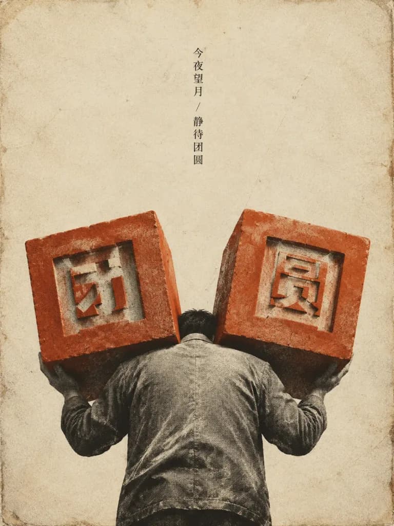
A minimalist Chinese editorial poster with restrained melancholy, combining vintage printmaking and surreal burden imagery. Composition: Vertical portrait composition in 3:4 ratio on an aged warm ivory paper background with visible grain, scratches, faded stains, and worn darkened edges. Centered and bottom-heavy layout with generous empty negative space across the upper half. Subject: A grayscale adult male figure viewed from behind in the lower half, bent forward under heavy physical strain, his head largely obscured between two massive muted orange-red cubic blocks resting upon his shoulders and hands. He wears a worn, dusty long-sleeved jacket rendered in a gritty black-and-white photographic halftone texture. His posture is resigned and quiet. Elements and Typography: Exactly two large burnt orange-red cubes, one male figure, and one vertical text column. The left cube features the carved geometric cutout Chinese character "[团]", and the right cube features the character "[圆]". At top center in the empty space, a single delicate vertical column of small black Chinese text reads "[今夜望月 / 静待团圆]". Visual Style: 1960s–1980s Chinese propaganda poster aesthetics fused with modern surreal graphic design, risograph and silkscreen textures, rough ink edges, subtle misregistration, flat graphic shadows. Constraints: No moon, no lanterns, no decorative borders, no extra figures, no cityscape, no watermarks.

중추절포스터 디자인리소그래프
미니멀한 비 오는 밤 굿나잇 포스터

미니멀한 비 오는 밤 굿나잇 포스터

A minimalist square good-night daily poster for [Beijing] with a quiet autumn rain atmosphere, refined editorial typography, and Chinese copy. Layout & Composition: 1:1 square canvas, warm off-white background, wide margins, balanced asymmetrical magazine layout. At the top, a metadata row contains three small items: left "[2026-08-11]", centered "[BEIJING / 北京]", and right "[多云 26°C]". Beneath it, an oversized, thin, high-contrast serif headline reading "GOOD NIGHT" in pale blue-gray stretches across the page. Under the headline on the left sits a small blue-gray rectangular badge with white text "晚安问候". Below this, a mid-left text section features a bold headline "[北京],晚安。" followed by the poetic line "愿今夜的云层,把城市的忙碌轻轻放低。", followed by three bullet points: "秋分前后,昼夜几乎等长。", "立秋是节气,不等于真正入秋。", and "秋夜更清透,常与湿度下降有关。" On the far right, a thin vertical label reads "AUTUMN NOTES". Photographic panels: The bottom half features two photographic panels separated by a clean white gutter. The left panel is a wide landscape shot showing a close-up of traditional gray glazed palace roof tiles and ridge ornaments above a muted vermilion wall, covered in rain droplets with shallow depth of field and soft city lights. The right panel is a slim vertical crop of an ornate eaves corner dripping with rainwater against a misty blue-gray background with soft bokeh. Both photos look like authentic, quiet documentary photography with no people. Footer & Typography: Directly below the photos on the bottom-left, the small footer text reads "夜色会替你收纳白天的锋利,愿你安心睡去。" Clean Bodoni or Didot-style serif for English headline, minimalist sans-serif for metadata and Chinese copy. Palette of muted blue-gray, misty white, off-white paper tone, and faded red.

굿나잇포스터에디토리얼 디자인

편집 디자인 프롬프트 팁

  • 모듈형 그리드 영역, 다단 구성, 여백 비율처럼 구체적인 레이아웃 구조를 정의해 시각적 번잡함을 줄이세요.
  • 대괄호 표시자를 사용하여 제호 타이틀, 부제목, 본문 캡션 등 정확한 타이포그래피 역할을 지정하세요.
  • 따뜻한 미색과 짙은 네이비, 또는 스위스 스타일의 레드와 블랙처럼 대비가 뚜렷한 색상 팔레트를 매치해 깔끔한 시각적 위계를 구축하세요.

관련 주제

자주 묻는 질문

편집 디자인 프롬프트에 가장 적합한 AI 모델은 무엇인가요?
복잡한 타이포그래피 그리드, 가독성 높은 텍스트 요소, 구조화된 모듈형 레이아웃 렌더링에 뛰어난 GPT Image 2가 기본 모델로 주로 사용됩니다. 감각적인 아트 포스터 작업에는 Nano Banana Pro 역시 신뢰할 수 있는 대안입니다.
디자인에서 깔끔한 타이포그래피와 올바른 텍스트 위계를 구현하려면 어떻게 해야 하나요?
헤더 여백, 알약 모양 배지, 열 비율 등 구조적 영역을 명시적으로 지정하고 원하는 문구를 따옴표나 대괄호 안에 넣으세요. 스위스 모더니즘이나 일본 미니멀리즘과 같은 구체적인 디자인 스타일을 명시하면 서체 두께와 배치 방향을 설정하는 데 큰 도움이 됩니다.
실사 인물 사진과 인포그래픽이나 일러스트 요소를 결합할 수 있나요?
네, 지정된 한 구역에는 사실적인 사진을 배치하고 인접한 모듈에는 도표, 색상 견본, 수채화 스케치 등을 표시하는 분할 패널 구도나 레이어 영역을 정의하여 구현할 수 있습니다.