Baru: GPT Image 2.5 Flare dan Sunburst. Coba gratis 3 gambar saat daftar, lalu 8 kredit per gambar.
Coba GPT Image 2.5

Prompt AI Estetika Jepang

201 templat · GPT IMAGE 2, Nano Banana Pro · diperbarui Okt 2026

Koleksi ini mencakup infografis bisnis yang bersih, halaman manga shoujo multi-panel, pindaian dokumen autentik, dan fotografi potret bernuansa alami. Setiap templat memadukan tipografi Jepang autentik, ruang kosong yang terencana, dan pembingkaian seimbang. Sesuaikan teks dalam kurung siku, gaya model, serta skema warna agar cocok dengan proyek Anda.

Urutkan berdasarkan:

Menampilkan 61–120 dari 201 prompt

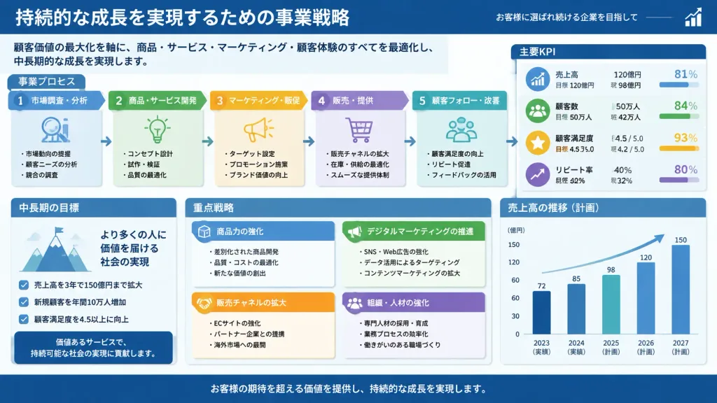
Slide Bisnis Jepang Padat Informasi

Slide Bisnis Jepang Padat Informasi

A dense, highly detailed Japanese business presentation slide (Ponchi-e style) with minimal empty space. Professional corporate infographic layout filled with structured text boxes, process flowcharts, KPI metric callouts, and clean Japanese typography. Polished slide deck styling with clear visual hierarchy, subtle color-coded categories, and sharp vector diagrams. Text and content in Japanese: [insert Japanese presentation text or topic details].

presentasislideinfografis
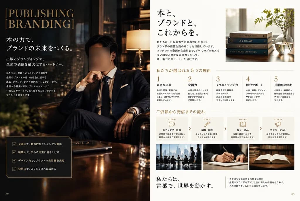
Tata Letak Dua Halaman Majalah Jepang

Tata Letak Dua Halaman Majalah Jepang

A luxurious Japanese magazine-style two-page editorial spread for a publishing and branding agency. Left page (page "02"): dark cinematic executive office lounge setting. A Japanese businessman in a tailored navy bespoke suit, crisp white shirt, dark silk tie, white pocket square, and luxury wristwatch sits in a leather armchair with hand thoughtfully near chin beside a glossy wood table. A soft rectangular privacy blur covers his face. Moody, warm lighting with ambient window reflections. At the upper left, an elegant stacked serif headline in muted gold reads "[PUBLISHING BRANDING]". Below it, vertical Japanese editorial copy in white typography with a subheadline and paragraphs. Lower left features a bordered dark card with 4 checklist items marked with checkmarks. Small page number "02" at bottom left. Right page (page "03"): minimalist white editorial layout with generous negative space. Top center-right features a bold black Japanese headline with two body text blocks, beside an upper-right photo of 4 stacked hardcover books and a glass vase by a sunlit window. Middle section shows 5 numbered columns (1-5) detailing key benefits with Japanese headings and text. Workflow section below displays 4 horizontal step blocks: "STEP 01" with a speech bubble icon, "STEP 02" with a pencil icon, "STEP 03" with an open book icon, and "STEP 04" with a megaphone icon, separated by subtle chevrons. Bottom row includes 3 horizontal photos: a skyline boardroom meeting, a hand writing with a pen, and an open book beside stacked volumes. Serif Japanese closing statement on the lower left, explanatory note on the right, and page number "03" at bottom right. Color scheme: deep navy, black, warm brown, ivory, and muted gold.

majalaheditorialbrosur
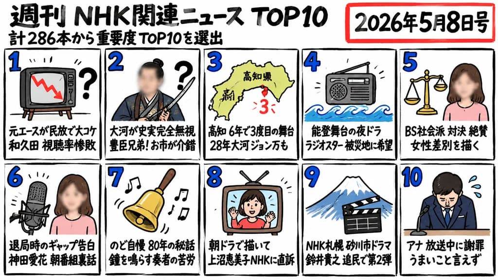
Infografik Peringkat Berita Mingguan Gambar Tangan

Infografik Peringkat Berita Mingguan Gambar Tangan

hand-drawn Japanese weekly news ranking infographic. rough black marker line art on white background, comic-news thumbnail aesthetic, thick uneven panel borders, bold handwritten Japanese typography, blue rank numbers with black outline, s…

infografikjepangthumbnail
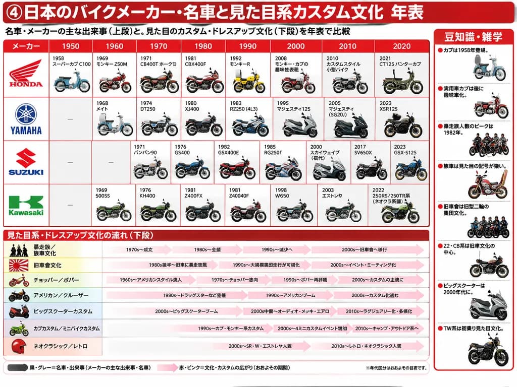
Infografik Sejarah Sepeda Motor dan Budaya Kustom Jepang

Infografik Sejarah Sepeda Motor dan Budaya Kustom Jepang

Japanese infographic timeline poster. matrix comparing 4 Japanese motorcycle manufacturers across 8 decade columns, with each cell showing a year, model name, and small detailed side-view motorcycle illustration. 7 horizontal culture rows…

infografiklini masasepeda motor
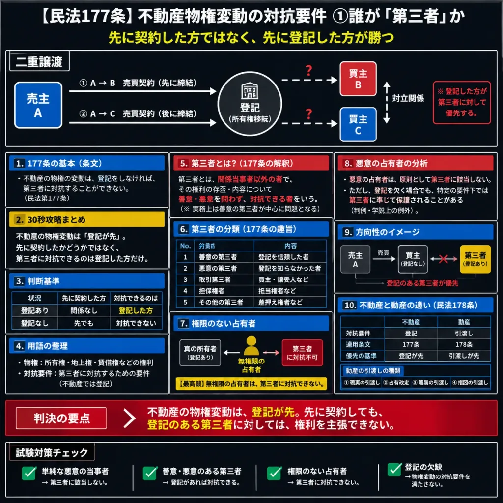
Infografis Pasal 177 Kitab Undang-Undang Hukum Perdata Jepang

Infografis Pasal 177 Kitab Undang-Undang Hukum Perdata Jepang

Dense Japanese legal-study infographic summarizing Civil Code Article 177 and real-estate property-right changes, styled like an advanced cram-school exam preparation cheat sheet or polished digital study note. 1:1 square canvas, dark charcoal black background, high-contrast crisp white typography, thin white panel borders, with red, yellow, and blue accent highlights. Compact Japanese sans-serif text, vector schematic design, no human illustrations, no photographs. Organized into 5 major horizontal zones: - Zone 1 (Top Title Bar): Headline text "[【民法177条】不動産物権変動の対抗要件 ①誰が「第三者」か]" in bold white, with subtitle "[先に契約した方ではなく、先に登記した方が勝つ]" in yellow centered below. - Zone 2 (Main Transaction Diagram): Bordered schematic labeled "[二重譲渡]" showing seller A on the left, a central circular registration node, and buyers B and C on the right. 3 solid white arrows connecting transactions, 2 dashed arrows with red question marks indicating dispute, and a dashed vertical line between B and C labeled adversarial relationship, with a red note explaining that the registered party prevails. - Zone 3 (Three-Column Information Grid): Exactly 8 bordered cards. Left column has 4 panels: article text basics (blue header), 30-second strategy summary (yellow header), a 2-row decision-standard table, and terminology notes. Middle column has 3 panels: definition of "third party" under Article 177 with red emphasis text, a 5-row third-party classification table, and an unauthorized occupant schematic with a yellow Supreme Court note. Right column has 3 stacked sub-panels: bad-faith possessors analysis (red header), a directional schematic, and a real estate vs. movables (Article 178) comparison table with a 4-item delivery type list. - Zone 4 (Judgment Summary): A bold horizontal red banner highlighting key rule outcomes. - Zone 5 (Bottom Checklist): Row of 4 bordered cards with green checkmark icons summarizing key exam checklist rules: simple bad-faith parties, faithless bad-faith parties, unauthorized occupants, and registration defects.

infografishukumjepang
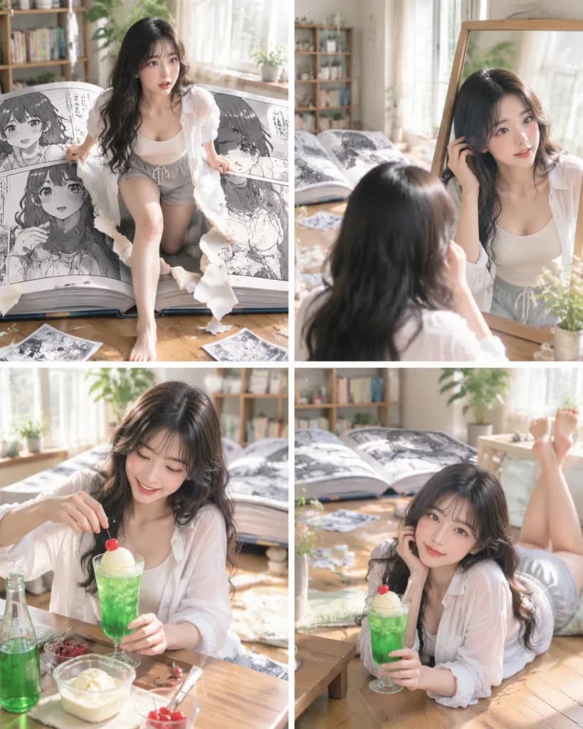
Karakter Manga Melangkah ke Dunia Nyata

Karakter Manga Melangkah ke Dunia Nyata

Theme: [A manga-style 4-panel story of a girl stepping from the manga world into reality on a summer afternoon]. Subject & Character Consistency: [Japanese woman in her early 20s, long wavy black hair], translucent fair skin, natural Japanese-style makeup, soft eyes, friendly and cute aura. Identical person across all 4 panels: matching facial features, hairstyle, body type, and skin texture. Sequence of expressions across scenes: surprise → confirmation → enjoyment → relaxation. Clothing & Pose: Identical summer loungewear across all 4 images: thin white overshirt, ivory ribbed camisole, light gray loose shorts, barefoot. Casual, natural daily wear. Only poses and actions change per scene. Setting & Props: A sunlit Japanese room with wooden flooring, large window, sheer white curtains, house plants, bookshelf, low table, and soft afternoon natural sunlight. The central element of the room is a giant open black-and-white manga book showing distinct page thickness and spine binding. The printed manga pages clearly depict the same black-haired female character in 2D monochrome. Torn paper fragments and loose manga pages are scattered on the floor around the giant volume. Composition & Style: Vertical composition, 4:5 aspect ratio, realistic photographic portraiture, 35mm lens perspective, shallow depth of field, cinematic storytelling. Striking visual contrast between the monochrome flat manga artwork and the full-color, realistic tactile world. Clean, soft, summery pastel tones. Scene Breakdown (choose or generate per panel): - Scene 1: The moment she steps out from the torn page of the giant open manga book into the real room. Surprised expression, dynamic stepping pose holding the torn paper edges with both hands, the giant manga book dominant in the center. - Scene 2: Looking into a mirror in the room to verify her reality, giant manga book in the background, lightly fixing her hair with an expression shifting from wonder to mild relief. - Scene 3: Happily making a melon soda float by the low table near the giant manga book, handling a tall glass, vibrant green melon soda, ice, vanilla ice cream, and a red cherry with a bright, focused smile. - Scene 4: Lounging on the wooden floor holding the completed melon soda float, relaxed gentle smile, calm late afternoon atmosphere as she fully settles into the physical world.

naratifsurealisjepang
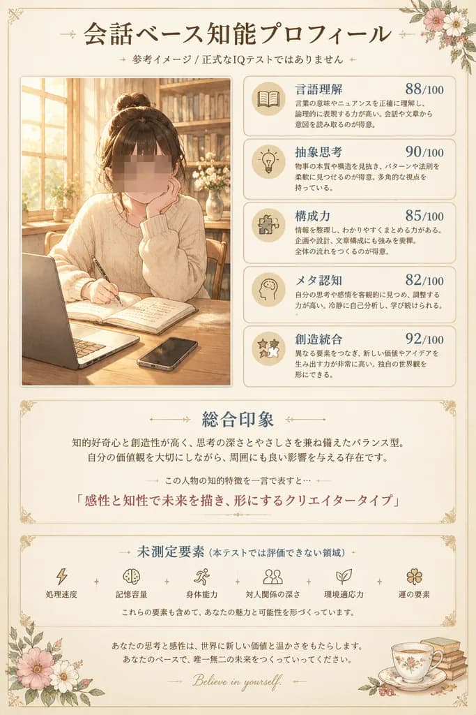
Poster Profil Kognitif Gaya Anime Jepang

Poster Profil Kognitif Gaya Anime Jepang

ornate Japanese personality infographic poster. soft intellectual self-profile card blending anime illustration and elegant editorial layout. large refined Japanese Mincho-style serif headline in dark brown, smaller subtitle beneath. illus…

infografisanimeposter
Poster Iklan Minuman Soda Musim Panas Gaya Anime

Poster Iklan Minuman Soda Musim Panas Gaya Anime

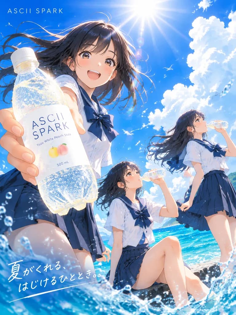
A bright, high-energy anime-style summer advertisement poster for a sparkling soft drink, set at the seaside under a vivid cobalt-blue sky with towering white cumulus clouds and a blazing sun near the top center creating lens flare and radiant beams. Exactly three Japanese high school girls in matching summer sailor uniforms (short-sleeved white blouses, navy ribbon bows, and dark navy pleated skirts) with windblown dark hair: - Left foreground: One girl framed from a dramatic low angle thrusts a large plastic soda bottle toward the viewer, dominating the composition through extreme foreshortening. - Center: A second girl sits low near the water with one knee raised, drinking from a smaller bottle. - Right: A third girl stands in three-quarter view sipping from a bottle, her hair and skirt streaming in the sea breeze. Setting and details: Sunlit turquoise ocean with energetic splashes framing the bottom edges, scattered sparkling water droplets, and small white seabirds in the far sky. Crisp cel-shaded anime rendering with painterly lighting effects, ultra-detailed condensation on the bottle, transparent plastic, and glittering carbonation bubbles. Typography: The bottle label is clean, minimalist white with modern sans-serif text reading '[ASCII SPARK]', smaller flavor text '[Yuzu White Peach Soda]', and a subtle '500 mL' mark. Brand logo in thin uppercase letters in the upper left, and a handwritten white Japanese tagline at the lower left reading '[夏がくれる、はじけるひととき。]'.

animemusim panasiklan soda
Kolase Kisi Empat Panel Iklan Jepang

Kolase Kisi Empat Panel Iklan Jepang

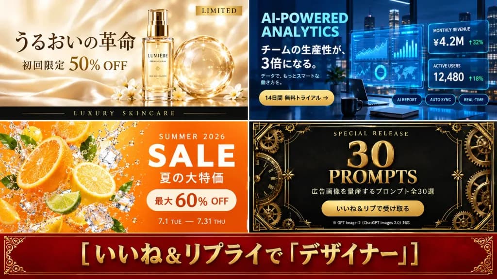
A 16:9 commercial promotional collage divided into a clean 2×2 grid of four advertising panels, with a full-width deep red banner along the bottom. Thin borders separate the panels. Panel 1 (top-left, luxury skincare ad): Soft beige silk background with warm golden light, featuring a glass cosmetic bottle positioned beside a transparent spherical bubble. Elegant Japanese serif typography. Upper-right small gold label reads "LIMITED". Main headline in Japanese: "うるおいの革命". Subheadline: "初回限定 50% OFF". A sleek black bar along the bottom reads "LUXURY SKINCARE" in spaced gold lettering. Luminous, delicate aesthetic. Panel 2 (top-right, SaaS analytics ad): Futuristic nighttime office setting with neon blue holographic dashboard UI overlays, glass desk, coffee cup, and city skyline view. Text title: "AI-POWERED ANALYTICS". Japanese headline: "チームの生産性が、3倍になる。" with small secondary Japanese copy. Gold rounded button: "14日間 無料トライアル →". Two metric cards on the right: "MONTHLY REVENUE ¥4.2M ↑32%" and "ACTIVE USERS 12,480 ↑18%". Three pill tags underneath: "AI REPORT", "AUTO SYNC", "REAL-TIME". Dark modern corporate tech aesthetic. Panel 3 (bottom-left, summer citrus sale ad): Dynamic splash composition with sliced fresh oranges, lime wedges, lemon slices, ice cubes, and sparkling water droplets on a bright orange background. Text: "SUMMER 2026" above large white "SALE". Japanese text below: "夏の大特価". Cream-colored rounded badge: "最大 60% OFF". Date range at bottom: "7.1 TUE — 7.31 THU". High-energy, fresh summer retail vibe. Panel 4 (bottom-right, prompt giveaway ad): Luxury matte black background decorated with ornate gold Art Deco filigree borders, brass gears, and clockwork details. Top text: "SPECIAL RELEASE". Large metallic gold center typography: "30" above "PROMPTS". Japanese text: "広告画像を量産するプロンプト全30選". Gold pill button: "いいね&リプで受け取る". Small footnote: "※ GPT Image-2(ChatGPT Images 2.0)対応". Premium, exclusive campaign style. Bottom banner: Full-width deep red velvet banner with ornate gold corner ornaments and a thin gold border. Centered, prominent embossed bold gold Japanese text: "[いいね&リプライで「デザイナー」]". Style & Constraints: Polished commercial advertising presentation, crisp and legible typography, professional mockups, no human faces, no watermarks.

iklankolasemedia sosial
Ilustrasi Garis Jalanan Jepang Warna Biru Dongker dan Krem

Ilustrasi Garis Jalanan Jepang Warna Biru Dongker dan Krem

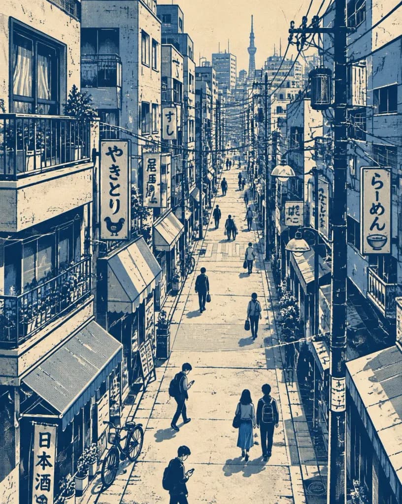
Vertical editorial illustration depicting [a dense narrow Japanese city street] in a stylized two-tone monochrome line-art aesthetic. Subject & Setting: Viewed from an elevated perspective, featuring [tall, tightly packed multi-story buildings on both sides, layered storefronts, balconies, windows, hanging shop signs with Japanese typography, utility poles, tangled overhead power cables, street lamps, awnings, railings, and parked bicycles]. The street recedes naturally into the distance with strong vanishing-point depth. Include several small, simplified pedestrians walking naturally—carrying bags, looking at phones, crossing the street, and walking in pairs, rendered with clean silhouettes and minimal facial features. Style & Technique: Architectural ink illustration meets vintage Japanese travel poster and screen-print art. Intricate hand-drawn line work, bold negative space, crisp perspective, and subtle analog paper texture. Color Palette: Strictly limited to deep indigo/navy blue ink, muted blue-gray accents, and a warm cream/off-white paper background. Heavy solid navy areas and graphic shadows create a bold risograph/screen-print poster feel with no bright colors.

jepangjalanseni garis
Hero Landing Page SaaS B2B

Hero Landing Page SaaS B2B

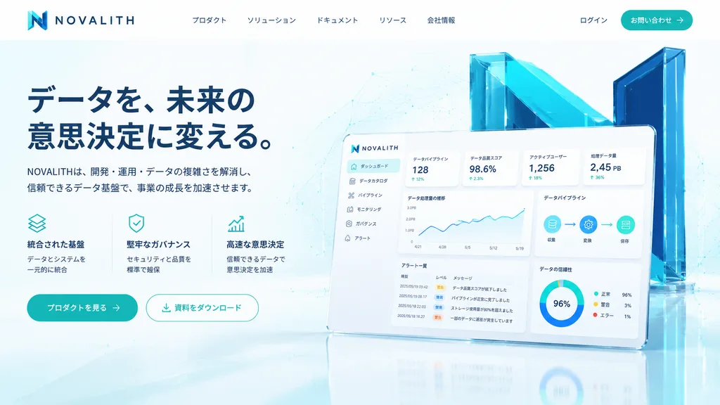
A polished fictional SaaS landing page hero section for a data infrastructure and analytics platform named [NOVALITH], designed in a premium Japanese B2B tech aesthetic. Desktop web layout with a 16:9 aspect ratio, clean white background with pale cyan gradients, subtle network line geometry, faint dot matrix patterns, and glossy floor reflections. Palette of deep navy, teal, cyan, and crisp white. Header: Top-left logo with an angular gradient cyan-to-navy "N" icon followed by spaced uppercase wordmark "NOVALITH". Center navigation features five Japanese links: 「プロダクト」, 「ソリューション」, 「ドキュメント」, 「リソース」, 「会社情報」. Top-right includes 「ログイン」 and a rounded teal CTA button labeled [お問い合わせ] with a right arrow icon. Hero Left: Bold two-line navy Japanese headline reading [データを、未来の意思決定に変える。]. Beneath it, a Japanese subheadline: [NOVALITHは、開発・運用・データの複雑さを解消し、信頼できるデータ基盤で、事業の成長を加速させます。]. Below, a three-column feature block with thin teal line icons: 1) stacked layers icon with 「統合された基盤」「データとシステムを一元的に統合」, 2) shield-check icon with 「堅牢なガバナンス」「セキュリティと品質を標準で確保」, 3) rising chart arrow icon with 「高速な意思決定」「信頼できるデータで意思決定を加速」. Two rounded buttons underneath: a solid teal primary CTA [プロダクトを見る] with an arrow, and an outlined white CTA 「資料をダウンロード」 with a download icon. Hero Right: A tilted floating dashboard mockup with rounded corners, soft shadow, and glossy white UI. Behind it stands a monumental 3D translucent teal and navy "N" structure with angular cyan glass panels. The dashboard displays a six-item sidebar (「ダッシュボード」 highlighted, 「データカタログ」, 「パイプライン」, 「モニタリング」, 「ガバナンス」, 「アラート」), four stat cards (「データパイプライン」 128, 「データ品質スコア」 98.6%, 「アクティブユーザー」 1,256, 「処理データ量」 2.45 PB), line charts, a 3-node pipeline diagram, a 4-row alert table, and a donut chart showing 96%. Crisp UI design, photorealistic 3D glass, airy spacing, sharp Japanese typography, no people, no clutter.

saaslanding pagedesain ui
Flyer Iklan Boneka Mewah Kawaii Jepang

Flyer Iklan Boneka Mewah Kawaii Jepang

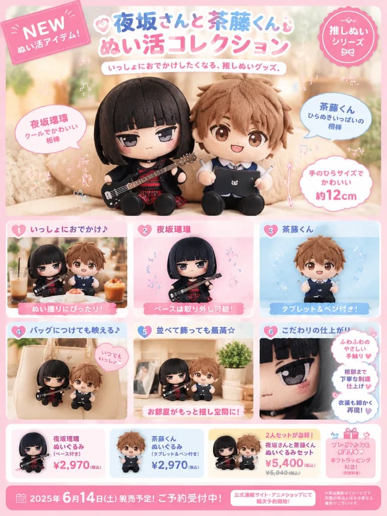
Japanese kawaii plush merchandise advertisement poster. pink stitched tag. pink scalloped seal. realistic product photo of the two plush dolls sitting side by side on a soft beige cushion; first character holds the black bass guitar, secon…

bonekaflyermerchandise
Pamflet Promo Mingguan Supermarket Jepang

Pamflet Promo Mingguan Supermarket Jepang

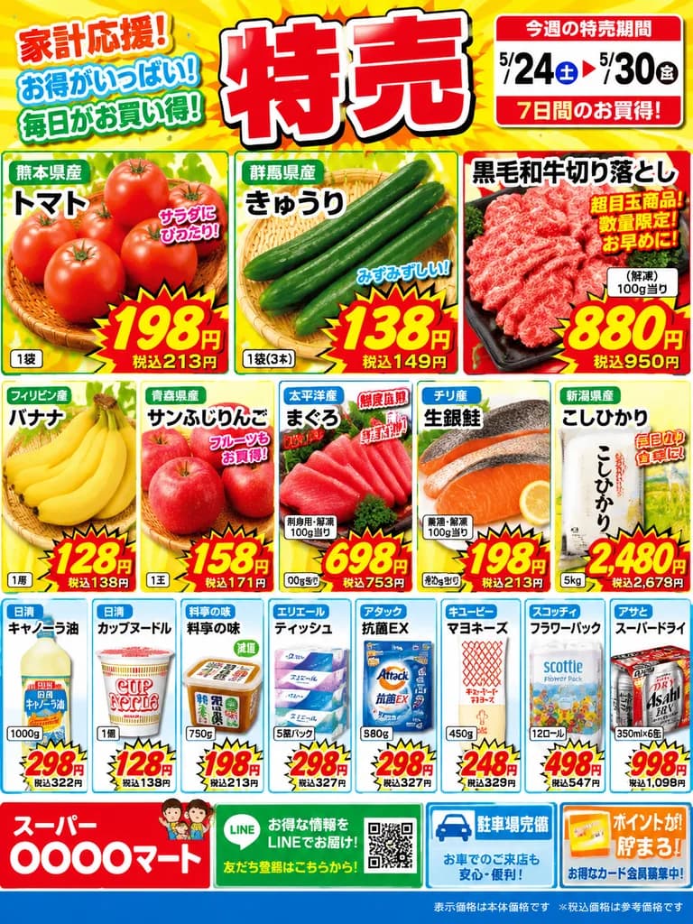
Japanese supermarket flyer poster. busy, colorful, high-impact retail advertisement, dense collage layout, bold red and yellow sale graphics, glossy product photography, thick white outlines, starburst price badges, authentic Japanese disc…

pamfletsupermarketdiskon
Poster Minimalis Temu Belajar Koding

Poster Minimalis Temu Belajar Koding

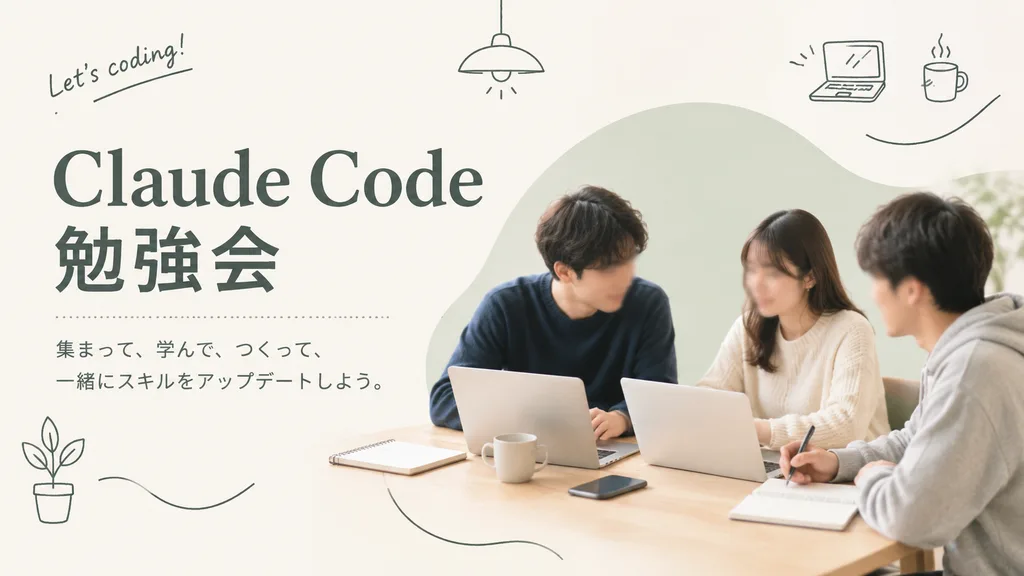
A clean, warm, minimalist promotional poster for a coding study meetup in a soft lifestyle photography and editorial graphic design style. On the right side, three young adults (two men and one woman) sit around a light wooden table in a bright neutral room, collaborating with laptops and notebooks; the person on the left wears a dark navy sweater, the woman in the center-right wears an off-white knit top, and the person on the far right wears a light gray hoodie in side profile. Their faces are softly obscured and indistinct. The table holds two open silver laptops, two ceramic mugs, two notebooks, a smartphone, and a pen near the right person's hand. Behind the group is a large pale sage-green organic blob graphic backdrop. Soft, airy, warm natural lighting with abundant negative space on an off-white background on the left. Typography and layout on the left: elegant large headline reading "[Claude Code]" with "[勉強会]" directly below in bold Japanese characters, separated by a thin dotted horizontal line above two lines of smaller Japanese body text: "[集まって、学んで、つくって、一緒にスキルをアップデートしよう。]". Playful thin dark line doodles scattered across the layout: a hanging ceiling lamp near top-center, a handwritten note in the upper left reading "[Let’s coding!]", a small laptop icon and steaming coffee mug in the upper right, a potted plant icon in the lower left, and three delicate curving squiggle lines throughout. Restrained Japanese cafe-meets-tech aesthetic in a 16:9 horizontal composition.

meetupposterkoding
Desain Sampul Album Enka Jepang

Desain Sampul Album Enka Jepang

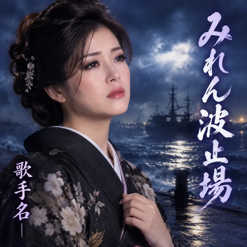
Authentic Japanese Enka CD jacket cover featuring the exact facial likeness and features of the person in the reference photo, reimagined as a traditional Enka ballad singer. Composition and Lighting: Dramatic, cinematic front CD album cover composition, placing the singer prominently with deep emotional expression of melancholy, longing, or passionate sorrow; moody, high-contrast studio and atmospheric lighting reminiscent of Showa-era and modern Enka albums. Setting: Evocative background fitting the Enka aesthetic, such as [a misty stormy harbor, crashing waves, or a rain-slicked neon street at night]. Typography: Traditional Japanese Enka-style brush calligraphy prominently displaying the song title "[みれん波止場]" and the artist name "[歌手名]". Negative constraints: No barcodes, catalog numbers, pricing, record label logos, copyright text, obi strips, promotion stickers, streaming icons, or QR codes; only title and artist typography allowed.

enkasampul cdsampul album
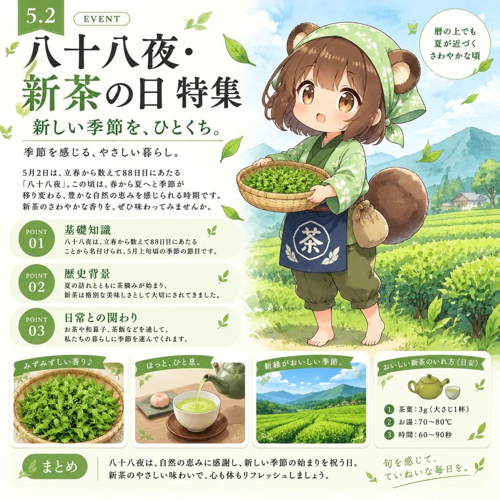
Poster Infografis Hari Teh Hijau Jepang Hachijuhachiya

Poster Infografis Hari Teh Hijau Jepang Hachijuhachiya

Japanese seasonal event infographic poster with chibi anime mascot. Hachijuhachiya and New Tea Day feature article, gentle early-summer tea-picking mood. cute polished anime illustration mixed with Japanese magazine infographic design, wat…

infografisposterjepang
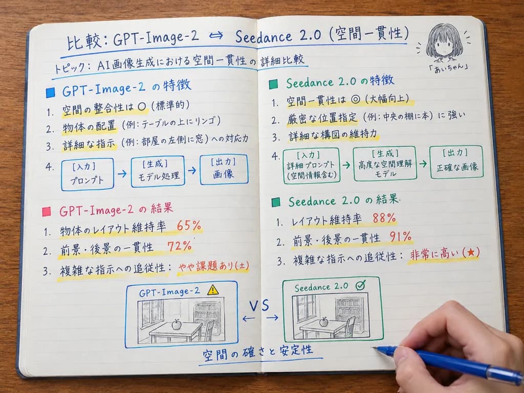
Buku Catatan Belajar Tulisan Tangan Jepang Sudut Atas

Buku Catatan Belajar Tulisan Tangan Jepang Sudut Atas

realistic overhead photo of an open handwritten comparison notebook on a wooden desk. A squared-up top-down view of an open lined notebook spread across a warm wood table, photographed like a study note or technical evaluation memo. A righ…

buku catatansudut atastulisan tangan
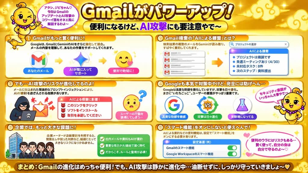
Infografik Gaya Variety Show Jepang tentang Risiko AI Gmail

Infografik Gaya Variety Show Jepang tentang Risiko AI Gmail

Japanese infographic poster. bright playful educational explainer, glossy gold theme, high-contrast Japanese TV variety-show graphic design, thick outlined text, rounded boxes, sparkles, soft gradients, cute warning visuals. very large bol…

infografikjepanggaya variety show
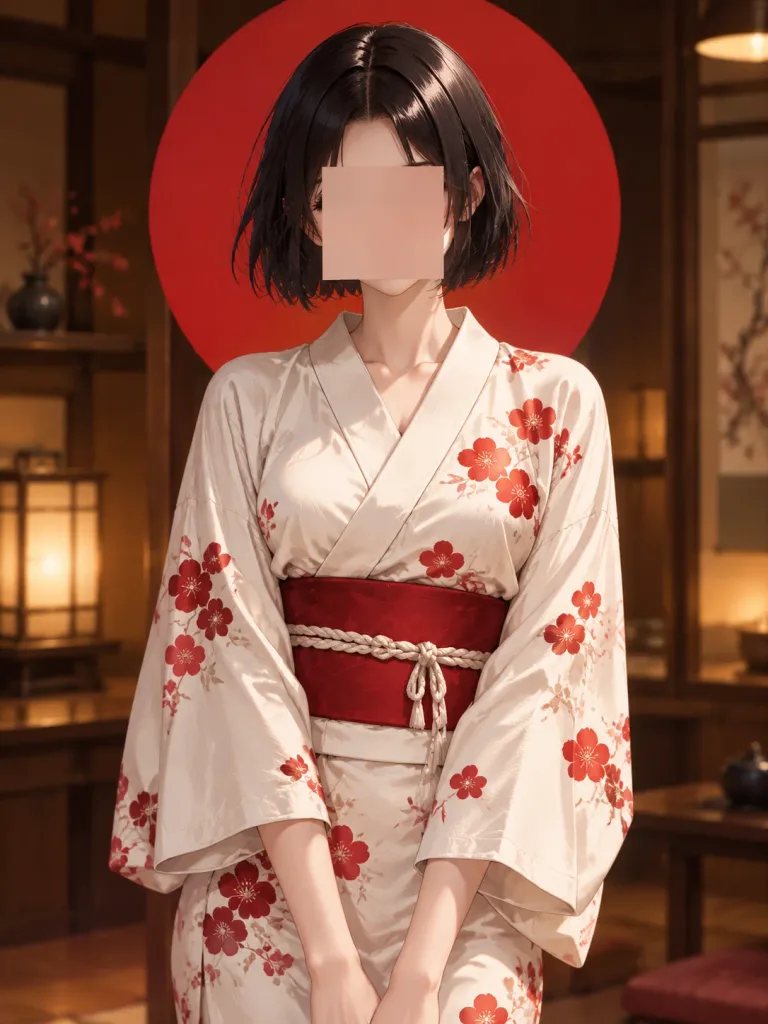
Potret Anime Berbusana Yukata dengan Latar Cakram Matahari

Potret Anime Berbusana Yukata dengan Latar Cakram Matahari

A polished anime-style portrait illustration of [Ami], captured from mid-thigh to just above the head, standing indoors in a warm traditional Japanese room. She has a short glossy [black] bob haircut with a center part and slightly tousled ends, but her facial features are deliberately obscured by a centered, opaque square censor block with a soft skin-toned gradient covering the eyes, nose, and mouth. She wears a cream-white yukata decorated with scattered red floral motifs across the chest, sleeves, and skirt, secured by a vivid [red] obi belt with a pale braided cord tied at the front. Directly behind her head sits a large flat [red] circular sun disk occupying much of the upper background. The room features dark wood interiors with softly blurred shelving and warm amber ambient lighting, creating cinematic depth of field. Clean linework, detailed fabric folds, glossy hair highlights, vertical portrait composition, no text, no watermark.

animeyukatapotret
Banner Iklan SaaS Pengelola Prompt Gaya Jepang

Banner Iklan SaaS Pengelola Prompt Gaya Jepang

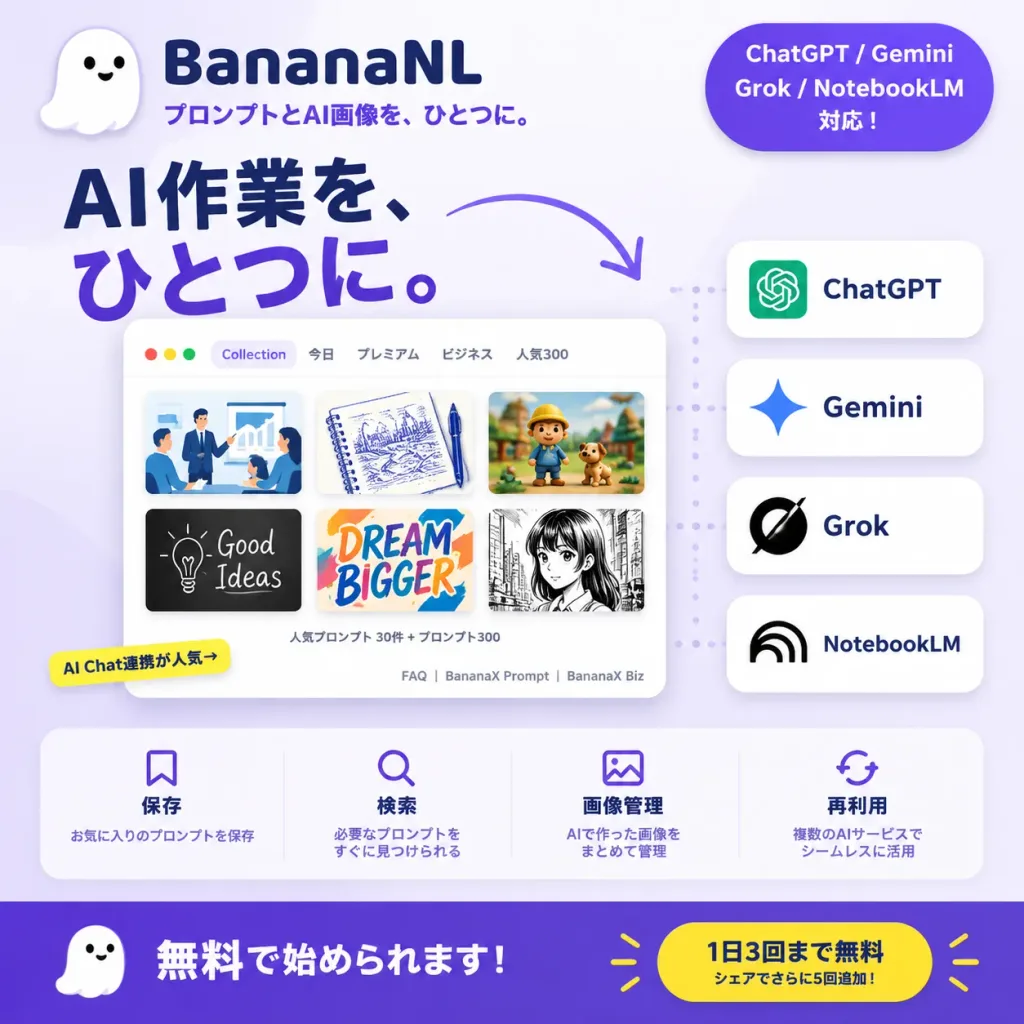
A square 1:1 Japanese promotional social media banner for [BananaNL], an AI prompt management SaaS. Soft lavender-to-white gradient background with a clean, modern SaaS aesthetic, rounded UI cards, and subtle drop shadows. Top Left: A cute minimalist white ghost mascot icon with two black eyes and a smiling mouth. Beside it, the brand name "[BananaNL]" in bold dark navy typography, with the smaller subtitle "プロンプトとAI画像を、ひとつに。" in purple directly below. Top Right: A rounded purple pill badge with white text on three lines: "ChatGPT / Gemini", "Grok / NotebookLM", "対応!". Center Left: A prominent Japanese headline in large bold typography across two lines: "AI作業を、" in dark navy, and "ひとつに。" in vivid purple. A curved purple arrow swoops from the headline toward the service integration cards on the right. Center/Lower Center: A floating browser application window mockup with rounded corners and a sleek light UI. Inside, a prompt gallery displaying 6 thumbnail preview cards in a 2x3 grid: 1) flat corporate illustration, 2) blue ink notebook sketch, 3) cute claymation stop-motion scene, 4) black chalkboard illustration, 5) colorful graphic typography design, 6) monochrome manga panel. Top window bar shows tab labels: "Collection", "今日", "プレミアム", "ビジネス", and "人気300". Below the thumbnails, subtle UI text reads "人気プロンプト 30件 + プロンプト300" and footer links "FAQ | BananaX Prompt | BananaX Biz". A small yellow tag on the lower-left corner reads "AI Chat連携が人気→". Right Side: Exactly four stacked white rounded cards connected to the app mockup by a faint vertical dotted line, listing supported AI services: 1) ChatGPT with green logo, 2) Gemini with blue sparkle icon, 3) Grok with black slash circle icon, 4) NotebookLM with black arc icon. Feature Strip: Across the lower middle above the footer, a translucent white rounded bar containing four equal feature columns with purple icons and Japanese text: 1) Bookmark icon: "保存" / "お気に入りのプロンプトを保存" 2) Magnifying glass icon: "検索" / "必要なプロンプトをすぐに見つけられる" 3) Image icon: "画像管理" / "AIで作った画像をまとめて管理" 4) Sync arrows icon: "再利用" / "複数のAIサービスでシームレスに活用" Bottom CTA Footer: A full-width deep purple bar. On the left, the small white ghost mascot next to bold white text "無料で始められます!". On the right, a bright yellow pill button featuring navy text "1日3回まで無料" with subtext "シェアでさらに5回追加!" and small yellow burst accents.

saasiklan media sosialgaya jepang
Mockup Halaman Direktori Staf Asuransi Jepang

Mockup Halaman Direktori Staf Asuransi Jepang

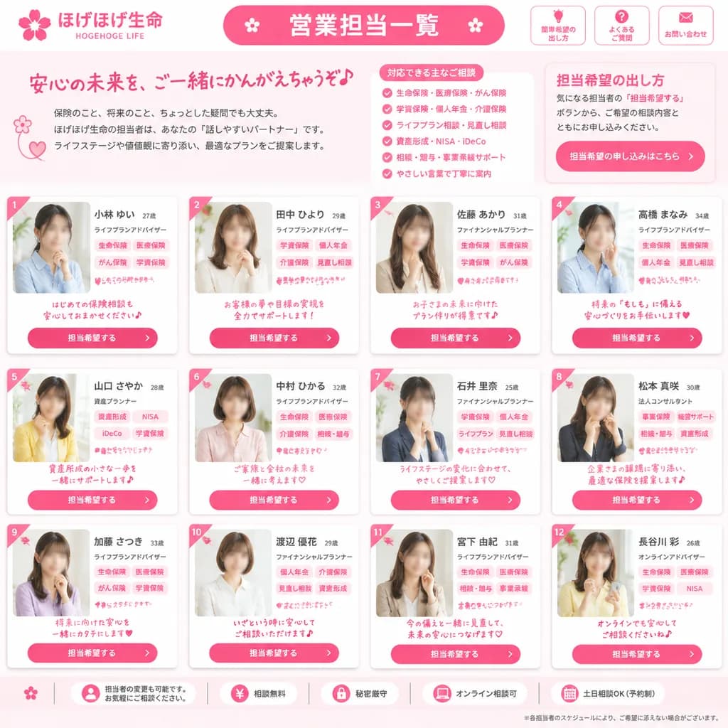
Japanese insurance company staff directory webpage mockup. friendly, trustworthy, feminine corporate design in bright pink and white. 営業担当一覧. 担当希望の出し方. [ほげほげ生命]. [HOGEHOGE LIFE]. ご相談内容やご希望に応じて、担当希望をお出しいただけます。. full-page website screenshot,…

mockup-uidesain-webdirektori
Poster Iklan Peluncuran Teknologi Jepang

Poster Iklan Peluncuran Teknologi Jepang

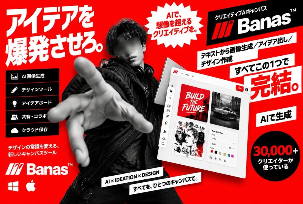
Bold Japanese tech launch advertising poster for a creative AI canvas product named [Banas™], landscape 3:2 format, high-contrast red, white, and black color palette, dynamic kinetic collage layout. Center Subject: Black-and-white cutout photo of a young male creator wearing a black streetwear jacket, dark curly hair, face obscured by a soft rectangular censor blur. He reaches one hand dramatically toward the camera with foreshortened extreme perspective, holding a sleek silver laptop or tablet in the other hand, overlapping typography and UI elements. Left Side Layout: Giant white Japanese headline in heavy condensed sans-serif: 「アイデアを爆発させろ。」 stacked vertically. Below it, a vertical black panel with exactly 5 rows featuring white icons and text: 1) image icon 「AI画像生成」, 2) pencil icon 「デザインツール」, 3) lightbulb icon 「アイデアボード」, 4) people icon 「共有・コラボ」, 5) cloud icon 「クラウド保存」. Underneath the panel, white subcopy: 「デザインの常識を変える、新しいキャンバスツール」, followed by the [Banas™] logo with a stylized three-stripe mark, and small Windows and Apple operating system icons. Right Side UI Mockup: Tilted white application canvas window showing a dotted grid, top zoom controls, share button, left toolbar, and exactly 4 visible content tiles: 1) red thumbnail reading "BUILD THE FUTURE", 2) black-and-white car photo thumbnail, 3) mixed-media sketch collage thumbnail, 4) UI settings panel with font controls and color swatches. Right Column & Badges: Black angled banner at top right with small text 「クリエイティブAIキャンバス」 above a large red-and-white [Banas™] wordmark. Angled white blocks with bold black Japanese text: 「テキストから画像生成/アイデア出し/デザイン作成」, 「すべてこの1つで」, and an oversized red emphasis word 「完結。」. White label reading 「AIで生成」, and a black circular badge with red/white text 「30,000+ クリエイターが使っている」. Top Center & Bottom: Top center features a jagged white starburst badge with red text 「AIで、想像を超えるクリエイティブを。」. Bottom center has two angled narrow white label strips reading "AI × IDEATION × DESIGN" and 「すべてを、ひとつのキャンバスで。」. Style: High-energy Japanese commercial poster, sharp graphic cutouts, bold typography, glossy UI mockup with subtle depth shadows, bright solid red background.

posterjepangiklan
Halaman Depan Koran Jepang Kucing Pahlawan

Halaman Depan Koran Jepang Kucing Pahlawan

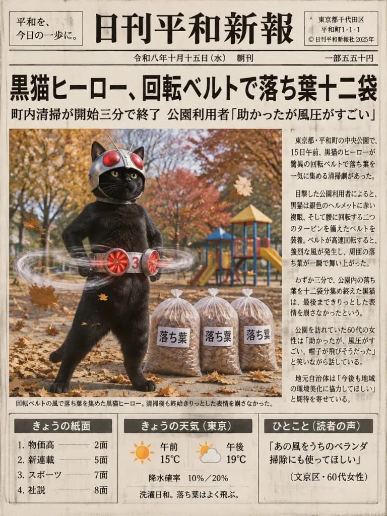
A realistic Japanese newspaper front page in the style of an authentic daily local broadsheet, featuring a humorous tokusatsu news story. Layout and Canvas: Vertical broadsheet newspaper page on off-white recycled paper with subtle ink bleed, dense vertical Japanese typography, thin black rules, boxed columns, and one prominent full-color news photograph. Masthead: At the top between double horizontal rules, a left boxed slogan reads 「平和を、今日の一歩に。」. Large traditional Mincho-style masthead in the center reads [日刊平和新報]. Right boxed publisher details include address lines and 「© 日刊平和新報社 2025年」. Date line underneath reads 「令和八年十月十五日(水) 朝刊」 with price 「一部五五十円」 at the far right. Main Headline: Huge bold headline across the page: [黒猫ヒーロー、回転ベルトで落ち葉十二袋]. Subheadline underneath reads: 「町内清掃が開始三分で終了 公園利用者『助かったが風圧がすごい』」. Main Color Photograph: Large rectangular color photo below the headline. An anthropomorphic glossy black cat stands upright in an autumn park, striking a heroic stance. It wears a silver tokusatsu helmet with large red compound eyes, antennae, and protruding cat ears. Around its waist is a silver transformation belt with two glowing red circular turbine fans labeled with a small red '3', generating visible transparent swirling air vortices that blow autumn leaves. Autumn park background with orange-brown trees, a playground, and flying dry leaves. Beside the cat stand three clear plastic bags packed with leaves, each labeled 「落ち葉」. Photo caption underneath reads: 「回転ベルトの風で落ち葉を集めた黒猫ヒーロー。清掃後も終始きりっとした表情を崩さなかった。」 Article: Dense vertical text columns beside the photo detailing the neighborhood cleanup event. Bottom Boxed Panels: 1. 「きょうの紙面」 listing four items (物価高、新連載、スポーツ、社説). 2. 「きょうの天気(東京)」 with sun icon (午前 15°C), partly-cloudy icon (午後 19°C), 「降水確率 10%/20%」, and 「洗濯日和。落ち葉はよく飛ぶ。」. 3. 「ひとこと(読者の声)」 with [『あの風をうちのベランダ掃除にも使ってほしい』(文京区・60代女性)].

koranjepangtokusatsu
Sketchnote Rekaman Grafis Tangan Bahasa Jepang

Sketchnote Rekaman Grafis Tangan Bahasa Jepang

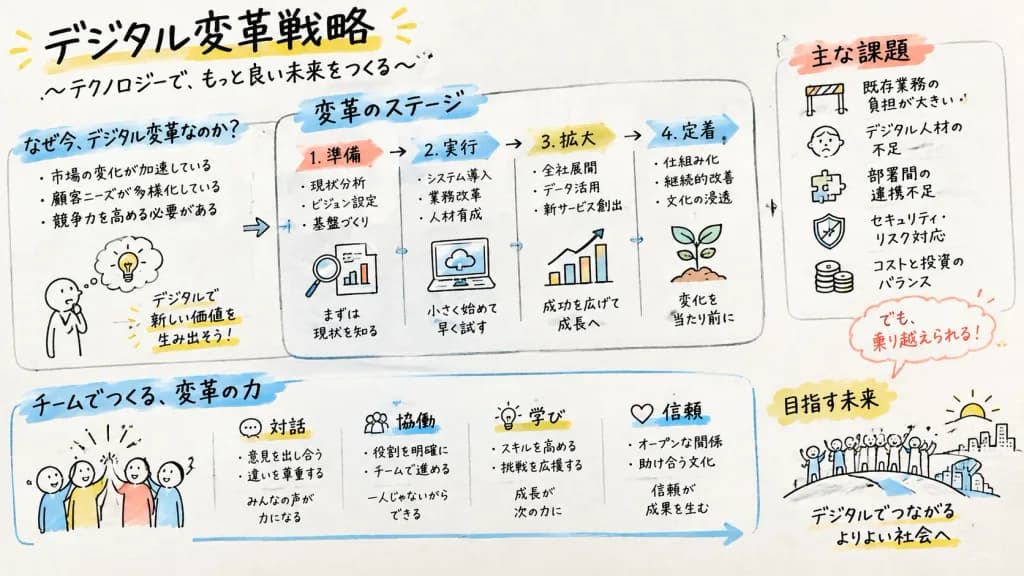
A professional Graphic Recording (GraReco) visual summary of [digital transformation strategy, stages, challenges, and team collaboration]. Composition on an analog large paper or whiteboard surface, with structured gaze guidance flowing naturally across the canvas using hand-drawn arrows, divider frames, and thematic clusters. Visual elements include friendly hand-drawn doodle icons, visual metaphors (light bulbs, growing sprouts, bridges, hurdles, simple expressive stick figures). Typography: all titles, section headers, and notes are written in neat, expressive handwritten Japanese font, with varied stroke weights from bold chisel-tip marker headers to thin fineliner annotations. Style: authentic facilitator sketchnote, warm hand-drawn line art with subtle human hand wobble, visible marker streaks, and faint paper texture. Color palette: minimal black and soft gray linework with 2 to 3 selective accent marker highlights in warm yellow, calm sky blue, and coral red.

rekaman grafissketchnotepapan tulis
Poster Sertifikat Ramalan Wajah Jepang Selestial

Poster Sertifikat Ramalan Wajah Jepang Selestial

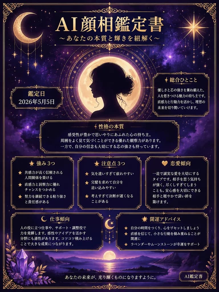
ornate Japanese AI face reading fortune report poster. mystical celestial luxury, deep indigo and purple night sky, antique gold typography and borders, elegant Japanese editorial layout, highly legible Japanese text, symmetrical compositi…

infografisramal wajahramalan
Poster Katalog Merchandise Guild Game Fantasi

Poster Katalog Merchandise Guild Game Fantasi

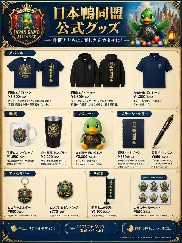
fantasy merchandise catalog poster. official goods announcement for a duck-themed gaming alliance. polished promotional product sheet, fantasy game aesthetic, Japanese retail flyer, parchment-and-gold UI framing, detailed commercial mockup…

katalogmerchandisegame
Poster Film Anime Fiksi Ilmiah Retro

Poster Film Anime Fiksi Ilmiah Retro

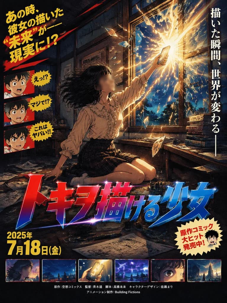
A retro Japanese theatrical movie poster for a fictional anime film, designed in the overdramatic, pulp-cinema style of the 1980s and 1990s. The scene depicts a teenage female manga artist seated on the floor of a dim, traditional wooden Japanese room at night, beside a low desk strewn with scattered manuscript pages, ink bottles, pens, books, and drawing tools. She has messy shoulder-length dark hair blown backward by supernatural force, wearing a cream-beige ruffled long-sleeve blouse and a dark plaid skirt. Her face is obscured by a soft rectangular blur. She stretches one arm upward, pointing a glowing [smartphone] toward a shattered window as a blinding explosion of gold-white energy, light, and lightning bursts through the glass into the room. Outside the shattered window is a deep blue night sky filled with storm streaks and electric cracks. Composition and Style: Dynamic diagonal layout with dramatic rim lighting and textured film-poster shading. Rich teal, navy, amber, and crimson color palette with a nostalgic hand-painted anime key-art finish. Poster Typography and Layout Elements: - Left side: Bold Japanese promotional marketing copy in multiple staggered text blocks with exaggerated red and yellow graphic emphasis marks, alongside three small cartoon reaction portraits of a classic manga boy character. - Right side: A tall vertical Japanese promotional tagline. - Lower center: An enormous stylized Japanese title in metallic red and blue gradient lettering with sharp highlights and heavy drop shadows reading "[トキヲ描ける少女]". - Lower right: A cream-colored starburst promotional badge containing Japanese text and a tiny manga face. - Lower left: A bold Japanese release date block with bright yellow numerals reading "[2025年 7月18日(金)]". - Bottom edge: Exactly 6 small rectangular film-strip preview stills from the anime movie, arranged horizontally. - Bottom center: Small production credits in Japanese and English, including the studio name "[Building Fictions]".

animeposter filmanime retro
Lembar Karakter Maskot Dewa Microwave Jepang

Lembar Karakter Maskot Dewa Microwave Jepang

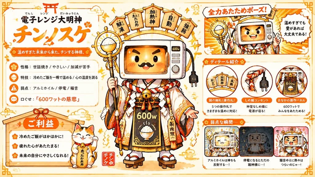
Japanese mascot character sheet / contest entry poster. large bold Japanese display lettering, black furigana above smaller text, oversized orange brush-calligraphy name. orange framed ribbon label. trait profile box. rounded white card wi…

maskotdesain karakterinfografis
Ilustrasi Poster Streetwear Grunge

Ilustrasi Poster Streetwear Grunge

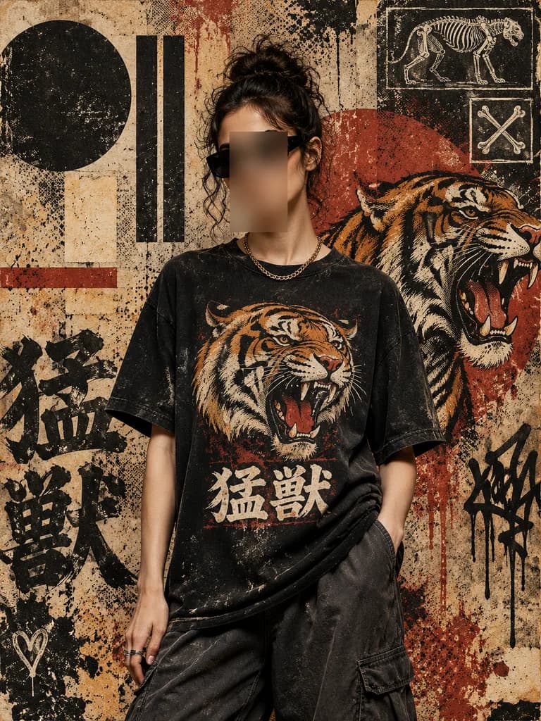
Gritty streetwear poster illustration of a single central figure standing in front of an urban collage wall, shown from mid-thigh up in a relaxed fashion-editorial pose with one hand in a pocket. The stylish young adult has [dark brown to black] curly hair tied in a messy bun, wearing black rectangular sunglasses, a short gold chain necklace, and an oversized black graphic T-shirt. The face is obscured by a vertical blurred rectangular censor block in warm beige-brown tones. The T-shirt features a roaring tiger head graphic in orange, cream, black, and red, with bold Japanese kanji text reading "[猛獣]" below it. The distressed mixed-media background features heavy grunge texture, paper wear, paint drips, splatters, halftone dot patterns, and graffiti layering in a muted vintage palette of tan, rust red, black, cream, and dark orange. Compositional elements include a large black circle on the left, a large red circle behind the figure on the right, three tall black vertical bars, one pale rectangular block, and a thin horizontal red stripe on the left. Background artwork contains a large black painted kanji text "猛獣" in the lower left, a roaring tiger illustration in three-quarter profile on the right with mouth open and striped orange-black fur, two chalk-style motifs in the upper right (a skeletal big cat and a square-framed crossed bones), a black graffiti tag near the right edge, and a small white heart near the lower left. High-contrast, rebellious Japanese street fashion aesthetic resembling screen printing on weathered paper.

streetwearpostergrunge
Infografik Kesehatan Pediatrik Jepang

Infografik Kesehatan Pediatrik Jepang

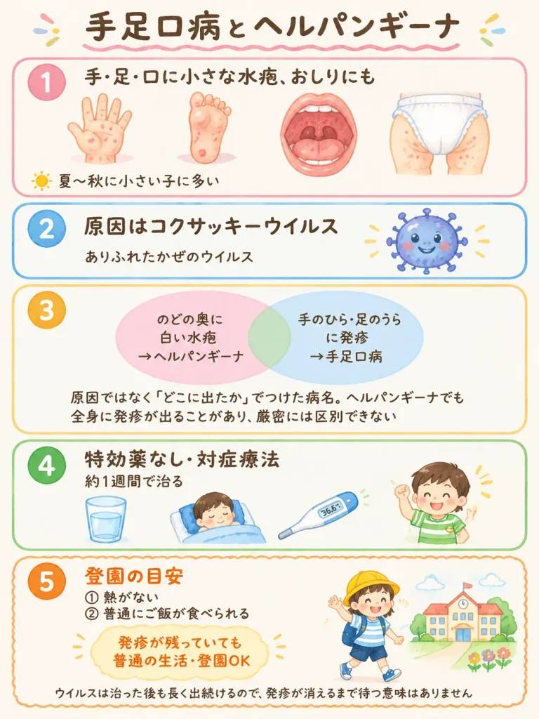
Vertical medical explanation infographic flyer for a pediatric clinic consultation room, titled "[手足口病とヘルパンギーナ]", designed in a gentle, reassuring Japanese watercolor style on a warm off-white paper background with pastel tones, rounded corners, and clear dark brown handwritten Japanese typography. At the top, the main title reads 「[手足口病とヘルパンギーナ]」 in large hand-lettered dark brown text with a soft pink wavy underline and small decorative confetti accents. The layout features exactly 5 vertically stacked rounded rectangular information panels, each with a large numbered circle on the left: - Panel 1 (pink border, number 1): Header 「手・足・口に小さな水疱、おしりにも」. A horizontal row of 4 watercolor clinical spot illustrations: an open palm showing small red blisters, the sole of a toddler's foot with blisters, an open mouth and throat showing red lesions, and a diapered baby bottom and thighs with spots. At the bottom, a tiny sun icon beside the note 「夏〜秋に小さい子に多い」. - Panel 2 (blue border, number 2): Header 「原因はコクサッキーウイルス」 with subtext 「ありふれたかぜのウイルス」. On the right, a cute round blue cartoon virus character with friendly eyes, tiny spikes, and a smiling face. - Panel 3 (yellow-orange border, number 3): A two-circle translucent Venn diagram. Left circle (pastel pink) labeled 「のどの奥に白い水疱→ヘルパンギーナ」. Right circle (light blue) labeled 「手のひら・足のうらに発疹→手足口病」. Overlapping center (pale green). Underneath, explanatory text: 「原因ではなく『どこに出たか』でつけた病名。ヘルパンギーナでも全身に発疹が出ることがあり、厳密には区別できない」. - Panel 4 (green border, number 4): Header 「特効薬なし・対症療法」 with subtext 「約1週間で治る」. A row of 4 supportive-care icons: a glass of water, a sleeping child tucked into bed, a digital thermometer showing 36.6°C, and a cheerful child in a green striped shirt raising a small fist. - Panel 5 (orange scalloped border, number 5): Prominent orange header 「登園の目安」. Two bullet points: 「① 熱がない」 and 「② 普通にご飯が食べられる」. Emphasized callout text: 「発疹が残っていても 普通の生活・登園OK」. Bottom caption: 「ウイルスは治った後も長く出続けるので、発疹が消えるまで待つ意味はありません」. On the right, a happy preschooler wearing a yellow brimmed hat, blue backpack, striped t-shirt, shorts, and sneakers, waving toward a small kindergarten building surrounded by flowers. Clean composition, generous margins, perfectly legible Japanese text, friendly and pediatric-appropriate.

infografikpediatrikmedis
Potret Pagi Tenang di Kamar Tidur Jepang

Potret Pagi Tenang di Kamar Tidur Jepang

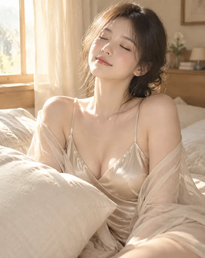
Vertical medium portrait (4:5 aspect ratio) of [a young adult woman] in her early 20s sitting on a cream-colored bed in a quiet, modern Japanese-style bedroom, under the theme [Shoulders cloaked in light]. She is positioned slightly right of center, framed from head to thighs, with a large ivory pillow in the left foreground naturally overlapping her arm and torso. Subject & Expression: Ivory-beige skin with natural pores, realistic texture, and a soft rosy tint on cheeks and collarbone without over-smoothing. Elegant Japanese-style makeup, eyes gently closed, tiny peaceful smile, chin slightly raised, and head tilted softly to the left. Attire & Pose: Champagne-beige satin camisole with delicate straps and a deep V-neck, layered with a sheer chiffon gown draped over her shoulders. She leans back slightly with relaxed, open shoulders. Setting & Lighting: In the background on the left is [a wooden window frame with thin cream curtains]. Unified palette of beige, natural wood, and ivory tones. Warm morning sunlight streams through the window from the upper left, casting soft highlights onto her face, shoulders, and collarbone. Camera & Style: Eye-level shot from slightly above chest height, simulating an 85mm portrait lens with natural compression and a softly blurred background. Photorealistic Japanese portrait aesthetic, subtle film grain, low contrast, warm natural color temperature, with delicate satin sheen, sheer chiffon transparency, and linen textures.

potretjepangcahaya pagi
Potret Gaya Hidup di Toko Kosmetik Jepang

Potret Gaya Hidup di Toko Kosmetik Jepang

A realistic lifestyle portrait of an adult woman in [a clean, natural cosmetics shop in an urban area of Japan]. She stands in an aisle, leaning slightly forward from her waist while holding a white smartphone with both hands, looking back toward the camera with a soft, natural smile. She has shoulder-length dark brown bob hair with light inner curls and thin see-through bangs, delicate pink-beige makeup, thin eyeliner, and pale coral lips. She is wearing [an ivory ribbed camisole with thin shoulder straps, worn with a loosely dropped open-knit summer cardigan, and a tiered mini skirt with a light peach floral pattern and lace trim], accented with a delicate gold necklace, bracelet, and a beige shoulder bag adorned with a small stuffed animal charm. The setting features warm wooden display shelves neatly lined with amber pump bottles, cosmetic boxes, and skincare products on the right, with blurred, unreadable text on packaging. To the left, soft natural daylight enters through a glass storefront near green potted plants, casting gentle highlights across her shoulders and face. Shot with a 50mm f/1.8 lens from slightly above eye level in a medium-full framing from head to mid-thigh. Precise focus on her eyes and face, with soft background bokeh. Clean Japanese fashion magazine snapshot aesthetic, natural skin texture with visible fine pores, soft contrast, creamy highlights, and a warm ivory and pale brown color palette.

potretgaya-hidupkosmetik
Poster Infografis Manga Pertempuran Okehazama

Poster Infografis Manga Pertempuran Okehazama

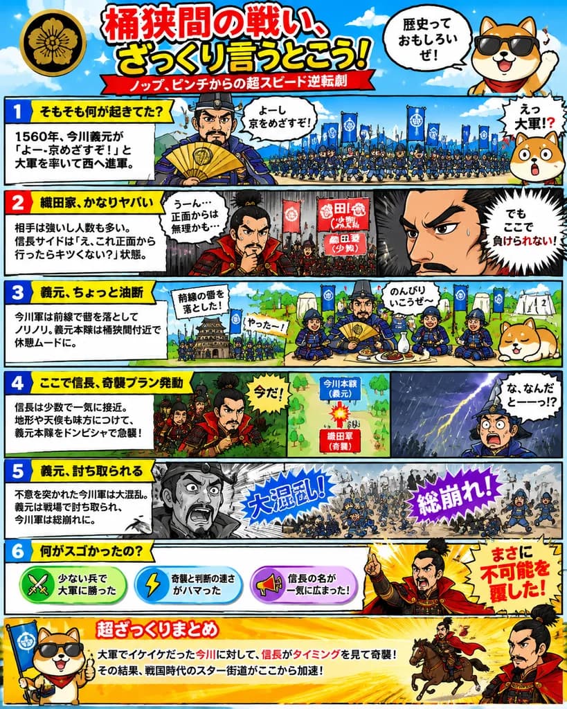
Japanese educational history infographic poster. high-energy manga comic, bold outlined typography, colorful classroom-friendly design, dramatic action lines, humorous mascot-driven explainer layout. 桶狭間の戦い、ざっくり言うとこう!. cartoon [dog] charac…

infografismangasamurai
Slide Presentasi AI Jepang Minimalis

Slide Presentasi AI Jepang Minimalis

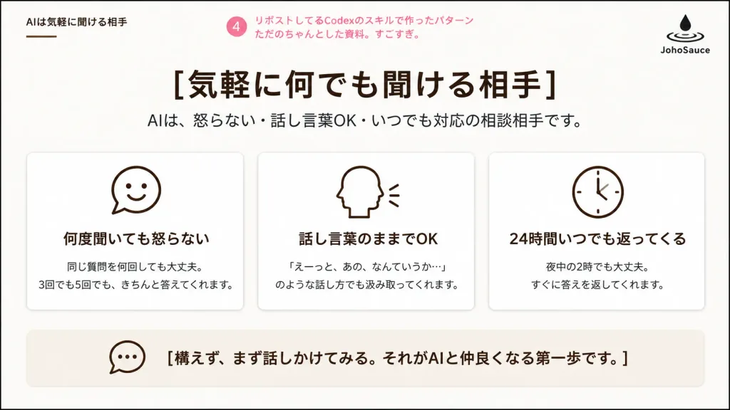
A clean Japanese corporate presentation slide about AI as an approachable conversation partner, designed in a polished business deck layout on a 16:9 widescreen canvas. White background with very subtle warm beige shading, a thin black outer border, generous margins, and a calm, minimalist aesthetic. Header: - Top-left small section title in Japanese: 「AIは気軽に聞ける相手」 with a short thin brown underline. - Top center-left: a pink circular badge containing 「4」 followed by pink annotation text: 「リポストしてるCodexのスキルで作ったパターン ただのちゃんとした資料。すごすぎ。」 - Top-right: a minimalist black logo consisting of a droplet falling into ripple rings, with 「JohoSauce」 written underneath. Main title area: - Centered large bold Japanese headline: 「[気軽に何でも聞ける相手]」 - Directly beneath it, a smaller dark-gray subtitle: 「AIは、怒らない・話し言葉OK・いつでも対応の相談相手です。」 Main content: - Exactly three equal rounded rectangular cards arranged in a horizontal row, with thin light-gray borders, white fill, subtle soft drop shadows, and centered dark-brown monoline icons at the top of each card. - Card 1: smiling chat bubble icon. Title: 「何度聞いても怒らない」. Body text: 「同じ質問を何回しても大丈夫。\n3回でも5回でも、きちんと答えてくれます。」 - Card 2: side profile head speaking with two small sound lines icon. Title: 「話し言葉のままでOK」. Body text: 「『えーっと、あの、なんていうか…』\nのような話し方でも汲み取ってくれます。」 - Card 3: simple analog clock icon. Title: 「24時間いつでも返ってくる」. Body text: 「夜中の2時でも大丈夫。\nすぐに答えを返してくれます。」 Bottom message bar: - A wide, pale beige rounded rectangular container spanning most of the slide width. - On the left inside: an outlined speech bubble icon. - To the right: bold Japanese message: 「[構えず、まず話しかけてみる。それがAIと仲良くなる第一歩です。]」 Style: Crisp vector rendering, Japanese business slide deck typography, dark brown and black text, minimal pink accents, no photographic elements, no gradients except faint background warmth.

presentasislidejepang
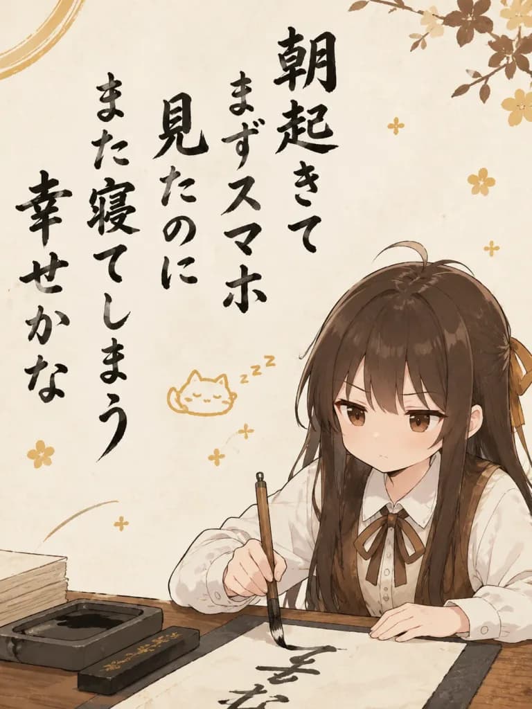
Karakter Serius Menulis Senryu Konyol

Karakter Serius Menulis Senryu Konyol

An illustration featuring the character from the reference image, reflecting their [looks, clothing, expression, and atmosphere]. In the center-left, prominently display a vertical, large Japanese Senryu poem (5-7-5 structure) with a [silly and slightly funny] theme, written in an expressive handwritten calligraphy brush style with clearly legible Japanese characters. The content of the poem is trivial, mundane, or surreal, contrasting humorously with the character's appearance. In the lower right corner, depict the reference character holding a calligraphy brush and actively writing, maintaining an exaggeratedly deadpan, serious facial expression. Include traditional calligraphy tools beside them, such as an inkstone (suzuri), ink stick, and washi paper. The background, palette, and subtle decorative accents (such as tiny motif symbols or subtle sparks) match the character's original aesthetic and color palette.

senryukaligrafianime
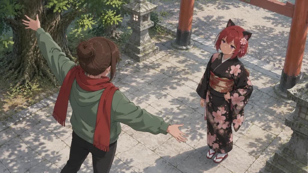
Percakapan Sudut Atas di Halaman Kuil Anime

Percakapan Sudut Atas di Halaman Kuil Anime

A polished anime-style scene in a quiet Japanese shrine courtyard, captured from a high three-quarter overhead angle looking down at two characters standing on pale stone paving. In the left foreground, a teenage girl seen mostly from behind with [brown] hair tied in a messy bun, wearing a green hoodie, black pants, and a long red scarf, gestures dramatically with arms spread wide—one raised toward the upper left and the other extended toward her companion. In the right midground, a second teenage girl faces the camera at an angle with short [red] bobbed hair, purple eyes, a pink floral hair ornament, and black cat-ear-like accessories; she wears a formal black kimono patterned with large pink cherry blossoms, a patterned red-and-gold obi, white tabi socks, and red-and-white sandals, watching the other girl with a composed, skeptical expression with one hand resting at her waist. The shrine courtyard features four specific elements: a large leafy tree trunk casting shadows in the upper left, a stone lantern near the upper center, a wooden torii gate structure with vertical posts on the right, and a second stone lantern partially visible on the far right. Soft daylight, gentle shadows, clean line art, detailed background illustration, cinematic widescreen composition, no text, no watermark.

animekuilkimono
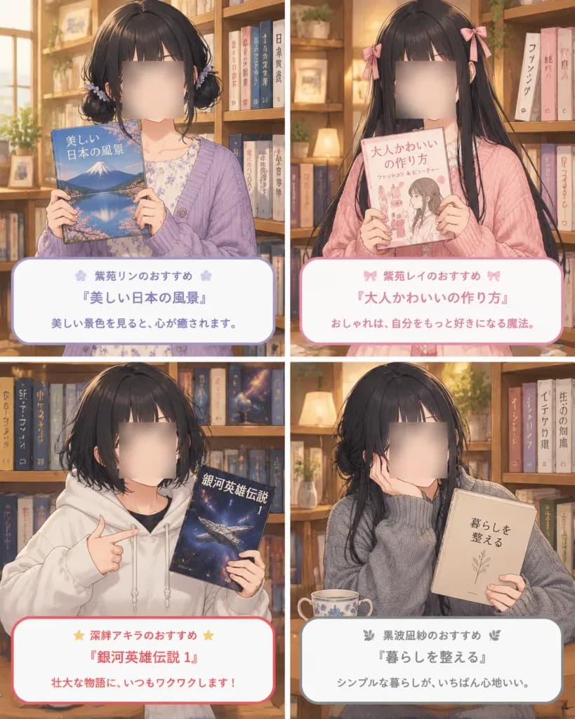
Kolase Rekomendasi Buku Anime Empat Panel

Kolase Rekomendasi Buku Anime Empat Panel

A polished 2×2 grid anime recommendation collage in a vertical 4:5 ratio, divided into four equal panels by thin white gutters, set in a [cozy bookstore or library with wooden bookshelves]. Visual style is a [soft detailed Japanese anime illustration] with warm interior lighting, delicate linework, and muted pastel palettes. In each panel, the character's facial features have [soft square blur blocks obscuring each face] for privacy, while hair, hands, clothing, and background are meticulously rendered. The wooden shelves behind them have varied book heights and natural gaps with visible Japanese vertical spine text. Each panel features a young woman holding a recommended book with a rounded white Japanese caption card at the bottom: 1. Top-left panel: A girl with short black hair in low side buns, lavender cardigan over a pale floral dress, holding a scenery book featuring Mount Fuji and a lake. Lavender border card text: “紫苑リンのおすすめ” “『美しい日本の風景』” “美しい景色を見ると、心が癒されます。” 2. Top-right panel: A girl with waist-length straight black hair with pink ribbon bows, in a soft pink knit cardigan, holding a fashion and beauty guide. Soft pink border card text: “紫苑レイのおすすめ” “『大人かわいいの作り方』” “おしゃれは、自分をもっと好きになる魔法。” 3. Bottom-left panel: A girl with a messy dark bob, in an oversized white hoodie, pointing enthusiastically at a space opera novel with a starry cosmos cover. Red-accented border card text: “深絆アキラのおすすめ” “『銀河英雄伝説 1』” “壮大な物語に、いつもワクワクします!” 4. Bottom-right panel: A girl with long black hair loosely tied back, wearing an oversized gray knit sweater, resting her cheek on one hand next to a ceramic teacup, holding a minimalist beige lifestyle book. Soft gray border card text: “黒波凪紗のおすすめ” “『暮らしを整える』” “シンプルな暮らしが、いちばん心地いい。”

animetoko-bukukolase
Poster Iklan Startup Teknologi Jepang

Poster Iklan Startup Teknologi Jepang

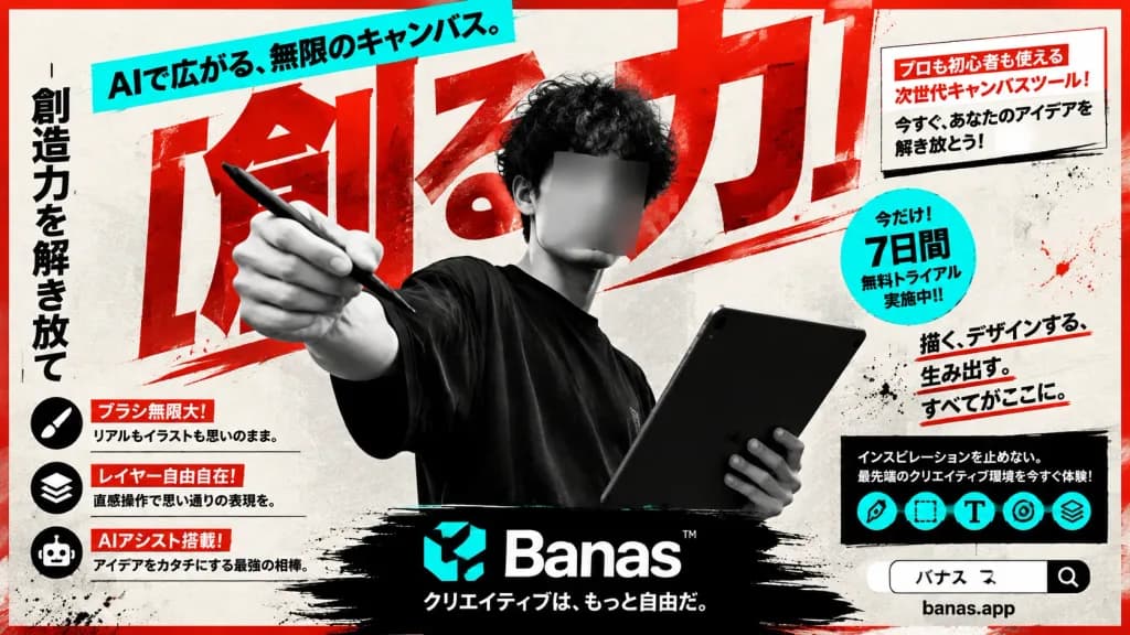
Bold Japanese tech advertising poster for an AI creative canvas tool, horizontal 16:9 format. An off-white textured paper background with red ink splatters, dynamic black brush strokes, and a thin red outer border. Limited color palette: black, off-white, vivid red, and electric turquoise. Main Subject: In the center foreground, a black-and-white photographic young male creator with curly dark hair wearing an oversized black T-shirt. His face is intentionally obscured by a centered rectangular gray blur/mosaic block. His left arm extends dramatically toward the viewer holding a digital stylus as if drawing in midair; his right hand holds a large dark tablet angled upward in the lower right. The figure is cropped dynamically and overlaps background typography. Typography & Background: - Background: Enormous slanted red Japanese headline characters reading "[創る力]", partially cropped and layered behind the creator. - Far left edge: Tall vertical black Japanese slogan reading "[創造力を解き放て]". - Top left: Diagonal turquoise banner with bold black text reading "[AIで広がる、無限のキャンバス。]". - Heavy Japanese gothic typography, diagonal underlines, distressed ink textures. Promotional Callouts & UI: - Upper right: White boxed callout with red header and black body text reading: 「プロも初心者も使える次世代キャンバスツール! 今すぐ、あなたのアイデアを解き放とう!」. - Mid right: Turquoise circular badge reading: 「今だけ!7日間無料トライアル実施中!!」. - Right text block: Slogan with red underline reading: 「描く、デザインする、生み出す。すべてがここに。」. - Lower right: Black rectangular feature block reading: 「インスピレーションを止めない。最先端のクリエイティブ環境を今すぐ体験!」 containing exactly 5 small turquoise circular tool icons. - Lower left: Exactly 3 feature rows with black circular icons and red label strips: 1) Brush icon: 「ブラシ無限大!」 / 「リアルもイラストも思いのまま。」 2) Layered-squares icon: 「レイヤー自由自在!」 / 「直感操作で思い通りの表現を。」 3) Robot icon: 「AIアシスト搭載!」 / 「アイデアをカタチにする最強の相棒。」 Bottom Branding: - Bottom center: Wide black brush-stroke banner containing a turquoise abstract logo, bold white wordmark "[Banas]™", and Japanese tagline 「クリエイティブは、もっと自由だ。」. - Bottom right: White search bar element reading 「バナス」 with a magnifying glass icon, with URL 「banas.app」 beneath. Style: High-contrast Japanese editorial and landing-page advertising style, combining sharp monochrome photography, halftone textures, energetic street-style brush typography, and clean modern graphic badges. All Japanese text is sharp and legible.

posteriklanjepang
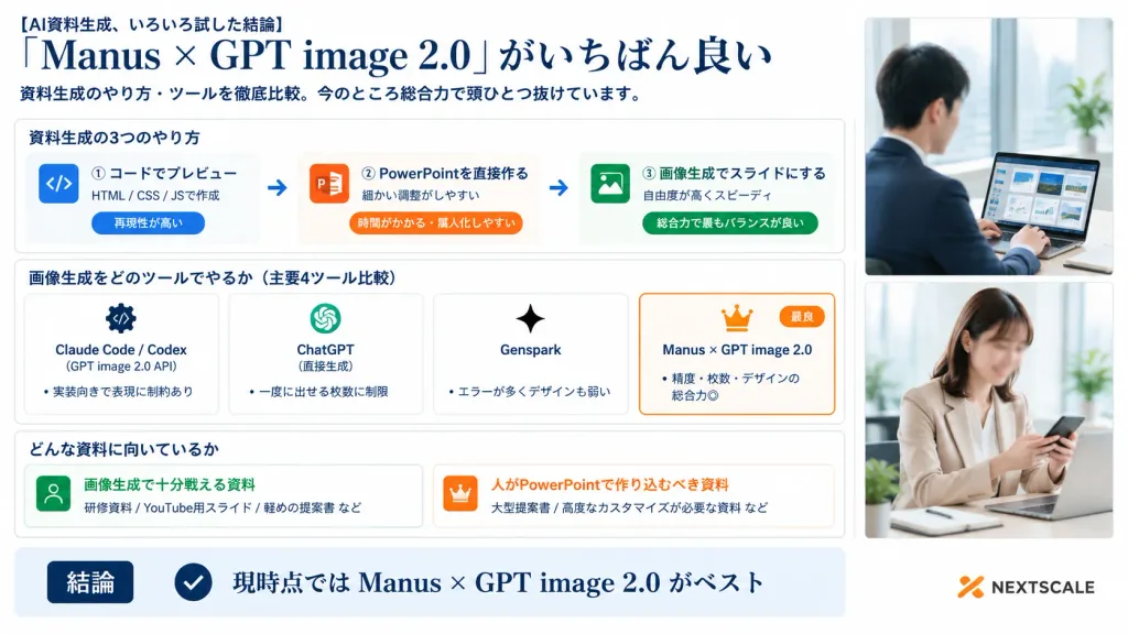
Infografik Korporat Perbandingan Alat Slide AI

Infografik Korporat Perbandingan Alat Slide AI

A polished Japanese business infographic presentation slide in 16:9 widescreen format, with a corporate white background, deep navy typography, thin light-gray card borders, subtle blue-gray shadows, and an accent palette of navy, orange, and vibrant green. Layout and Structure: - Left and Center (76% width): Main infographic content organized into a clear header, three structured sections, and a bottom summary bar. - Right Side (24% width): A vertical panel containing exactly two stacked realistic corporate lifestyle photos with soft bright office lighting and clean white borders. Top photo shows a Japanese businessman in a navy suit working on a laptop displaying slide thumbnails near a window (face softly blurred). Bottom photo shows a Japanese businesswoman in a beige blazer checking a smartphone at her desk (face softly blurred). Header (Top Left): - Small lead-in text: "[AI資料生成、いろいろ試した結論]" - Large elegant serif headline: "[「Manus × GPT image 2.0」がいちばん良い]" - Subtitle below: "[資料生成のやり方・ツールを徹底比較。今のところ総合力で頭ひとつ抜けています。]" Section 1 (Card titled "資料生成の3つのやり方"): Contains three horizontal method cards connected by two right-pointing arrows: 1. Blue code icon | "① コードでプレビュー" | "HTML / CSS / JSで作成" | pill tag "再現性が高い" 2. Orange PowerPoint icon | "② PowerPointを直接作る" | "細かい調整がしやすい" | pill tag "時間がかかる・属人化しやすい" 3. Green image icon | "③ 画像生成でスライドにする" | "自由度が高くスピーディ" | pill tag "総合力で最もバランスが良い" Section 2 (Card titled "画像生成をどのツールでやるか(主要4ツール比較)"): Contains four equal comparison cards side-by-side: 1. "Claude Code / Codex" | gear/code icon | "(GPT image 2.0 API)" | bullet "実装向きで表現に制約あり" 2. "ChatGPT" | OpenAI knot icon | "(直接生成)" | bullet "一度に出せる枚数に制限" 3. "Genspark" | sparkle icon | bullet "エラーが多くデザインも弱い" 4. Featured card with an orange border, crown icon, and small orange "最良" badge | "[Manus × GPT image 2.0]" | bullet "精度・枚数・デザインの総合力◎" Section 3 (Card titled "どんな資料に向いているか"): Two side-by-side cards: - Left card with green user icon | "画像生成で十分戦える資料" | examples "研修資料 / YouTube用スライド / 軽めの提案書 など" - Right card with orange crown icon | "人がPowerPointで作り込むべき資料" | examples "大型提案書 / 高度なカスタマイズが必要な資料 など" Bottom Bar: Full-width light-blue conclusion strip with a dark navy badge reading "結論", a circular checkmark icon, and large bold text reading "[現時点では Manus × GPT image 2.0 がベスト]". At the bottom right corner, a subtle orange abstract logo mark with dark gray text reading "NEXTSCALE". Crisp Japanese corporate graphic design, sharp typography, precise grid alignment.

infografikpresentasislide
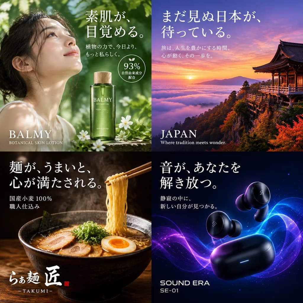
Tata Letak Kisi Poster Iklan Jepang

Tata Letak Kisi Poster Iklan Jepang

advertisement poster collection. skincare. tourism. food. technology. [2x2 grid]. top-left. young Asian woman looking up, soft natural lighting, dappled shadows, green lotion bottle. [素肌が、目覚める。]. 植物の力で、今日より、もっと私らしく。. 93% 自然由来成分配合. BALMY BO…

posteriklanjepang
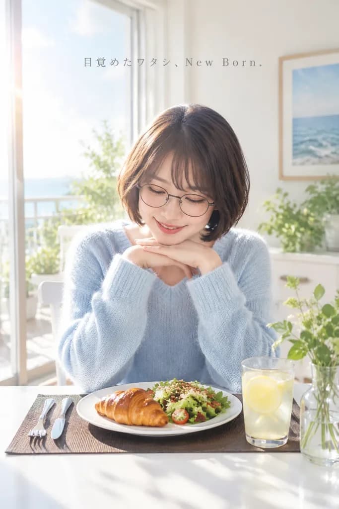
Iklan Gaya Hidup Pagi di Kafe Jepang

Iklan Gaya Hidup Pagi di Kafe Jepang

Commercial lifestyle advertising photograph in a bright, sunlit café. A young Japanese woman with a short dark brown bob haircut and round eyeglasses sits at a white table wearing a soft [pale blue] knit sweater. She gently rests her chin on both folded hands, smiling softly as she looks down at her breakfast plate, radiating a calm, fresh morning feeling. On the table are exactly 5 tabletop elements: a white plate with a glossy [croissant] and a grain-topped green salad, a clear glass of [lemonade with a lemon slice], a small clear vase with leafy green stems, a dark brown rectangular placemat, and a fork-and-knife set placed on the left. The background is softly blurred with warm morning sunlight streaming through large balcony windows, white walls, potted balcony plants, a white dining chair, and one framed ocean print. High-key natural lighting, soft lens flare, delicate shadows, authentic skin texture, shallow depth of field, commercial polish, vertical 2:3 composition. Near the upper center, include subtle, widely spaced, elegant thin gray serif text: "[目覚めたワタシ、New Born.]" integrated like a Japanese wellness brand advertisement.

gaya hidupiklankafe
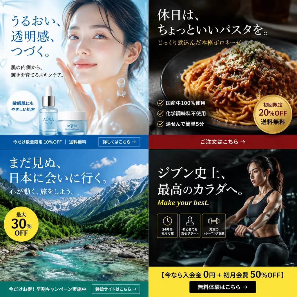
Kisi Banner Iklan Jepang Multikampanye

Kisi Banner Iklan Jepang Multikampanye

2x2 grid of digital advertising banners. 4 distinct quadrants, each representing a different industry campaign with high-quality commercial photography, clean typography, promotional badges, and a call-to-action footer. top-left. skincare…

banneriklanjepang
Tulisan Tangan Jepang Halus Pulpen Gel

Tulisan Tangan Jepang Halus Pulpen Gel

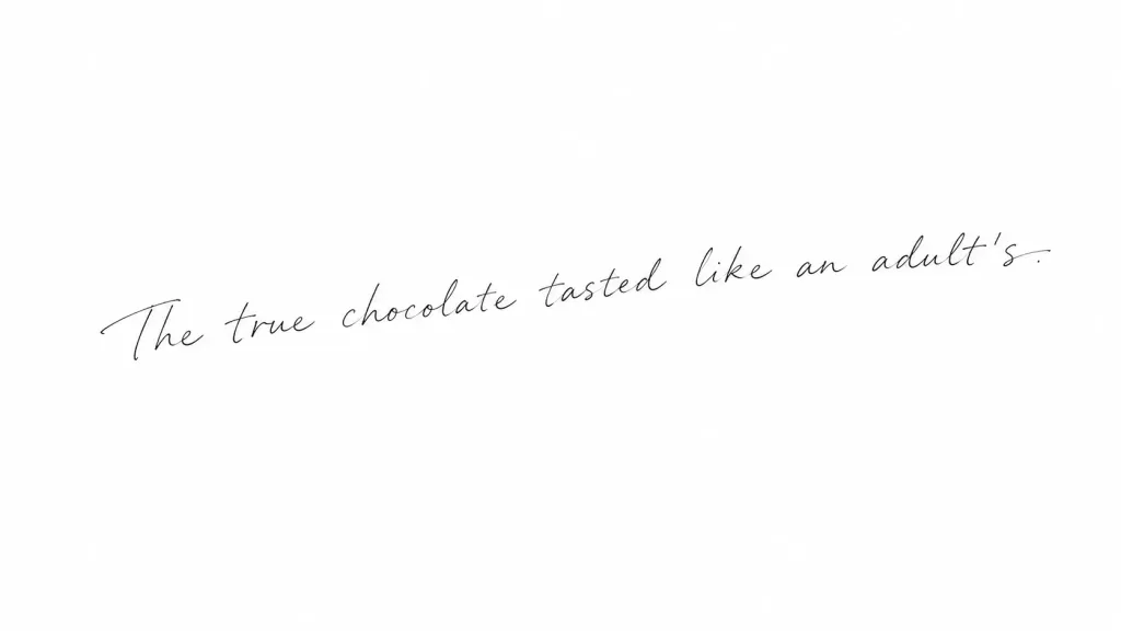
A single horizontal line of Japanese handwritten text centered on clean, minimal white paper. Written with a fine black gel pen or 0.3–0.4mm fineliner, featuring delicate, thin, light monoline strokes without brush or marker thickness. The handwriting has an airy, feminine, and stylish aesthetic with soft curves, a subtle rightward slant, natural character size variations (10–25% difference), organic irregular spacing, and a gentle upward baseline drift from left to right. Delicate, elongated tapered entry and exit strokes appear on initial and trailing characters. The text reads exactly: "[The true chocolate tasted like an adult's.]". Clean composition, crisp thin ink lines, minimal paper texture, no frames, no stamps, no underlines, no decorative flourishes.

tulisan tanganjepangtipografi
Poster Menu Makan Siang Restoran Jepang

Poster Menu Makan Siang Restoran Jepang

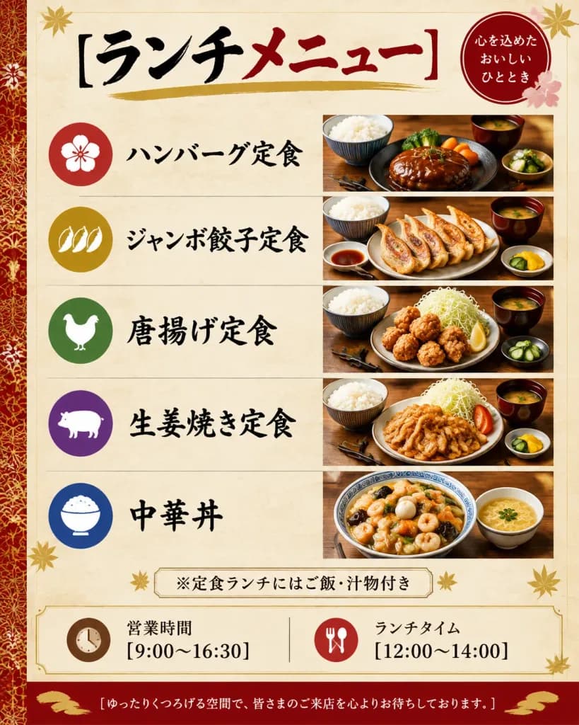
Vertical Japanese restaurant lunch menu poster, casual diner aesthetic, portrait 4:5 orientation. The background is parchment beige with subtle paper texture, framed by a thin gold border, red and gold decorative accents, corner leaf motifs, and a festive Japanese pattern strip along the far left edge. Header: At the top, a large calligraphic headline reads "[ランチメニュー]", with the first word in black ink and the second word in deep red, underlined by a textured gold brushstroke. In the upper-right corner, a circular red seal displays white Japanese text: 「心を込めた おいしい ひととき」, accented with small pale pink floral motifs. Main Menu Layout: Five horizontal rows separated by thin beige divider lines. Each row features a colored circular icon on the left, bold black calligraphy dish title in the center-left, and a realistic food photography panel on the right with warm restaurant lighting and a wooden table surface: 1. Red circular icon with plum blossom, label 「ハンバーグ定食」, photo of a glossy demi-glace hamburger steak set with steamed rice, miso soup, broccoli, carrot, and garnish. 2. Gold circular icon with dumplings, label 「ジャンボ餃子定食」, photo of large pan-fried gyoza dumplings in a row, served with rice, dipping sauce, soup, and pickled vegetables. 3. Green circular icon with chicken silhouette, label 「[唐揚げ定食]」, photo of Japanese fried chicken karaage with shredded cabbage, lemon wedge, rice bowl, soup, and cucumber pickles. 4. Purple circular icon with pig silhouette, label 「生姜焼き定食」, photo of pork ginger stir-fry with sliced onions, shredded cabbage, tomato wedge, rice, miso soup, and pickles. 5. Blue circular icon with rice bowl, label 「中華丼」, photo of a Chinese-style savory rice bowl topped with shrimp, quail eggs, stir-fried vegetables, wood ear fungus, and thick glossy gravy, accompanied by a small soup bowl. Notice Strip: Below the rows, a centered bordered beige box reads 「※定食ランチにはご飯・汁物付き」, flanked by tiny gold leaf ornaments. Information Section: A cream-colored panel with two information blocks divided by a thin vertical line. Left: brown clock icon, label 「営業時間」, and text "[9:00〜16:30]". Right: red fork-and-spoon icon, label 「ランチタイム」, and text "[12:00〜14:00]". Footer: Deep red bottom banner with gold brush flourishes, centering white text: "[ゆったりくつろげる空間で、皆さまのご来店を心よりお待ちしております。]" Style: High-end printed graphic flyer, izakaya and family restaurant design, clean grid alignment, crisp legible Japanese typography, appetizing food styling.

menuposterjepang
Thumbnail Webinar Teknologi Korporat Jepang

Thumbnail Webinar Teknologi Korporat Jepang

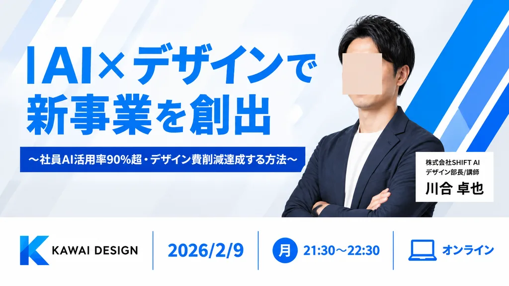
Clean, modern Japanese webinar thumbnail in a 16:9 horizontal layout with a corporate tech-design aesthetic. Background is very light gray with subtle diagonal translucent panels and bold electric-blue geometric accents, including three angular blue-and-white ribbon graphics on the right. Composition is divided into a spacious upper hero section and a bottom information bar. Upper left: Large bold sans-serif Japanese headline in vivid blue reading "[AI×デザインで\n新事業を創出]". Directly beneath it, a dark blue rectangular banner with centered white bold text reading "[〜社員AI活用率90%超・デザイン費削減達成する方法〜]". Upper right: Sharply lit half-body portrait of an East Asian man in his 30s with short black hair, navy blazer over a white crew-neck shirt, arms crossed, facing slightly left; his face is obscured by a centered skin-tone square blur block. Beside his torso, a white rectangular name card with "[株式会社SHIFT AI\nデザイン部長/講師]" in small black text above "[川合 卓也]" in bold black. Bottom bar: Clean white banner with thin blue vertical dividers featuring four sections from left to right: 1) Blue gradient angular 'K' logo with black text "KAWAI DESIGN", 2) Blue date text "[2026/2/9]", 3) Blue filled circle with white kanji "[月]" followed by blue time text "[21:30〜22:30]", 4) Blue outline laptop icon with blue text "[オンライン]". Crisp typography, generous whitespace, professional business graphic design.

webinarthumbnailkorporat
Poster Pengumuman Kafe Jepang Minimalis

Poster Pengumuman Kafe Jepang Minimalis

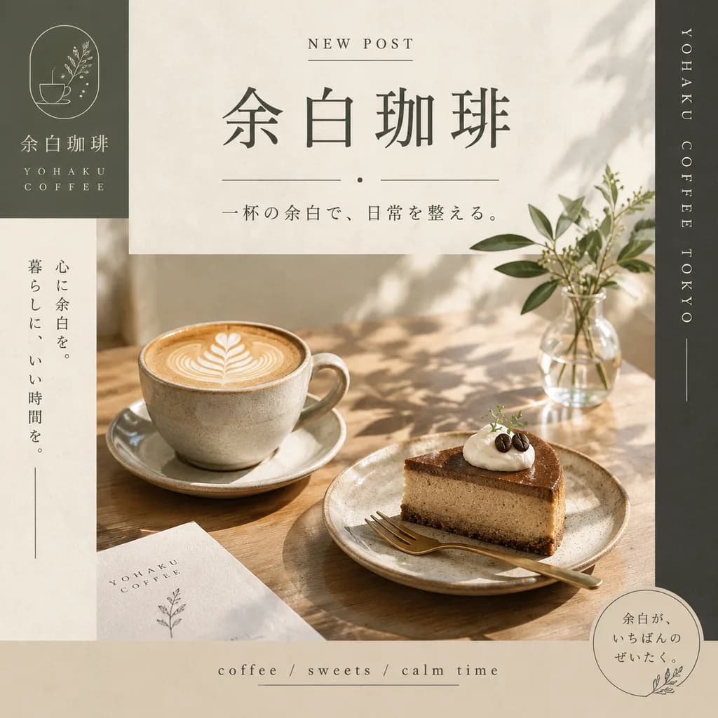
square Instagram announcement poster for a fictional Japanese coffee brand. minimalist premium lifestyle graphic design, warm beige and olive-gray palette, soft natural sunlight, serene Japanese cafe aesthetic, editorial magazine layout, e…

kopipostermedia-sosial
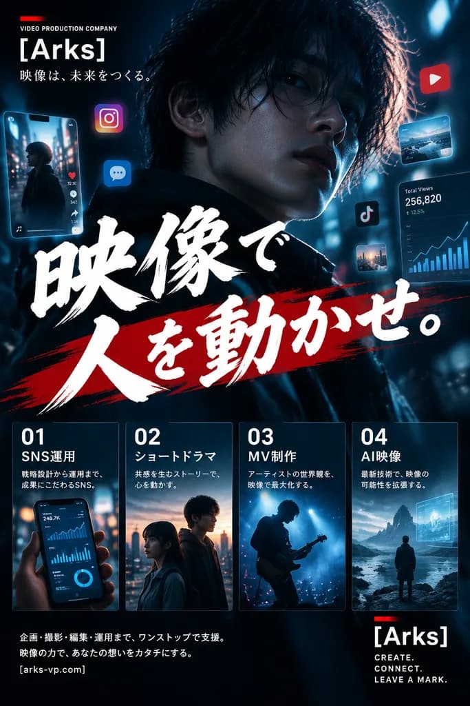
Poster Promosi Agensi Video Jepang

Poster Promosi Agensi Video Jepang

cinematic Japanese promotional poster. top-left brand block. main headline area. service panels. bottom brand block. footer text. close-up portrait of a young person with dark hair partially covering the face, face mostly in shadow. very l…

posterbrandingjepang
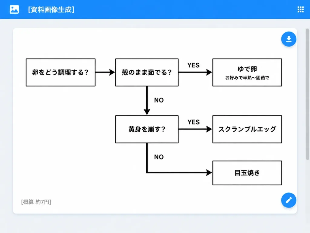
UI Aplikasi Web Diagram Alir Memasak Telur

UI Aplikasi Web Diagram Alir Memasak Telur

A clean desktop web application screenshot displaying an AI-generated document: a minimalist monochrome Japanese decision flowchart for cooking eggs. Setting & UI Layout: - Desktop browser/app interface with a light gray background. - Top app bar: Bright blue bar spanning the full width, containing a small white image icon on the far left, the white title text "[資料画像生成]", and a small white grid menu icon on the far right. - Main canvas: Centered large white rounded-rectangle card with a subtle drop shadow and generous internal margins. A subtle scrollbar appears on the browser's right edge. - UI Action Buttons: Two floating circular blue action buttons docked on the right edge of the white card—one near the upper right with a white download arrow icon, and one near the lower right with a white edit pencil icon. Flowchart Structure & Content: - Exactly 6 rectangular white boxes with clean black borders, connected by thick black directional arrows. - Box 1 (far left): 「卵をどう調理する?」 - Box 2 (top middle): 「殻のまま茹でる?」 - Box 3 (top right): 「ゆで卵」 with a smaller subtitle 「お好みで半熟〜固茹で」 - Box 4 (middle lower): 「黄身を崩す?」 - Box 5 (middle right): 「スクランブルエッグ」 - Box 6 (bottom right): 「目玉焼き」 Connections & Labels: - Arrow from Box 1 pointing right to Box 2. - Arrow from Box 2 pointing right to Box 3, labeled "YES" above. - Downward arrow from Box 2 pointing down to Box 4, labeled "NO" to the right. - Arrow from Box 4 pointing right to Box 5, labeled "YES" above. - Right-angled path from Box 4 heading down then right into Box 6, labeled "NO". Card Footer: - Lower-left corner inside the white card displays small gray Japanese text: "[概算 約7円]". Style & Constraints: - Modern flat UI screenshot, crisp sans-serif Japanese typography, monochrome chart design on pure white, high-contrast black lines and text, no decorative colors inside the chart, no watermarks.

diagram aliraplikasi webscreenshot ui
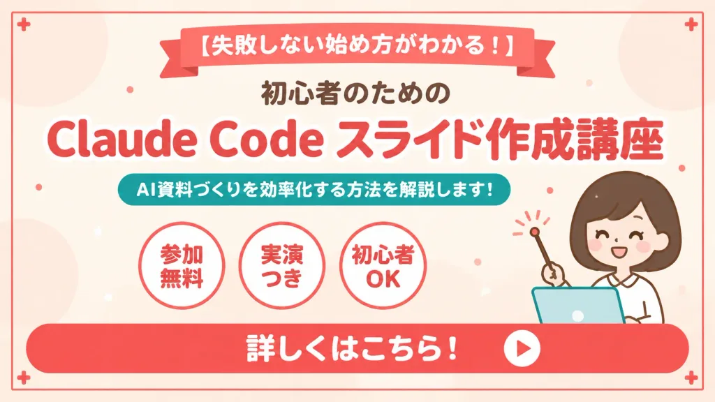
Banner Slide Promosi Webinar Jepang

Banner Slide Promosi Webinar Jepang

A cute, clean Japanese webinar announcement slide banner for [Claude Code slide creation course]. 16:9 horizontal composition with a warm cream-peach background, subtle pale peach and off-white circular abstract blobs, and a thin inset coral-red rectangular frame. Layout and Text: - Top center: Coral-red folded ribbon banner containing the white text: "[失敗しない始め方がわかる!]". - Below ribbon: Small centered dark heading: "[初心者のための]". - Main title: Bold, prominent coral-red text with a crisp white outline reading: "[Claude Code スライド作成講座]". - Supporting label: Rounded teal pill shape below the title containing white text: "[AI資料づくりを効率化する方法を解説します!]". - Middle section: Exactly three circular badges side by side with coral-red borders, containing the labels: "参加無料", "実演つき", "初心者OK". - Bottom section: A wide rounded coral-red call-to-action bar spanning nearly the full width, displaying the bold white text: "詳しくはこちら!" and a white circular button with a coral play triangle on the far right. Subject and Details: - On the right side: A cute minimalist female presenter mascot with a round face, simple closed smiling eyes, dark-brown bob hair, warm peach outlines, and a white torso, holding a small round pointer stick, positioned behind a pale blue tablet laptop with a teal outline. - Decorative accents: Exactly 4 subtle coral plus (+) icons placed in the outer corners, and tiny scattered coral and cream confetti specks across the background. Style: Polished Japanese promotional vector slide, flat illustration, friendly educational aesthetic, bold rounded Japanese gothic typography, crisp alignment, zero extra text or watermarks.

webinarslidejepang
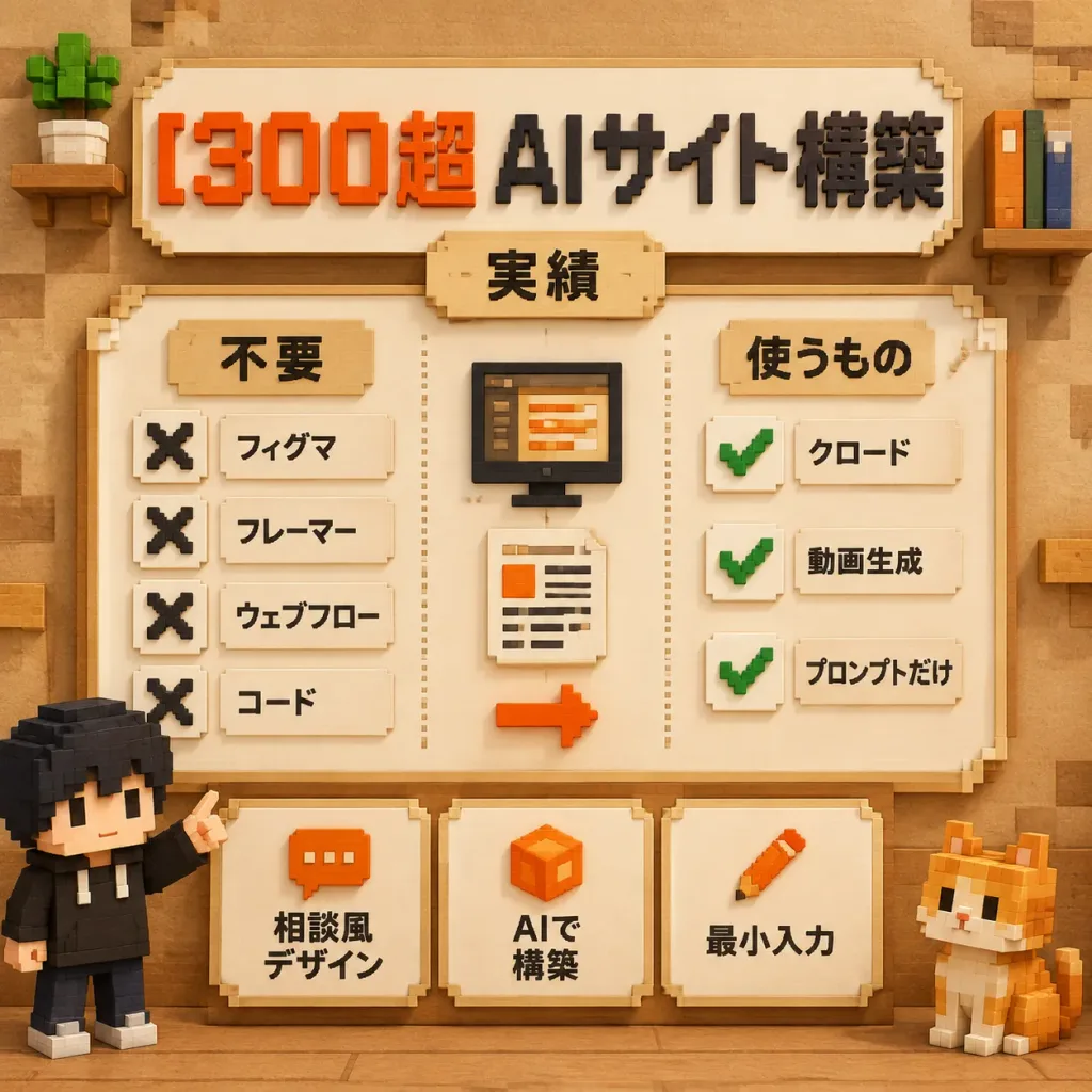
Poster Infografis Teknologi Voxel Bergaya Jepang

Poster Infografis Teknologi Voxel Bergaya Jepang

A square 3D voxel-art Japanese infographic poster explaining AI website building with minimal tools, rendered in a warm Minecraft-inspired block aesthetic. Composition & Layout: Orthographic front view, 1:1 square canvas. Soft studio lighting with warm ambient occlusion on a tan paper-and-wood textured background with subtle voxel blocks in the corners. Headline: At the top, a cream beveled signboard displays extruded blocky Japanese text reading "[300超 AIサイト構築]", with "300超" in vibrant orange-red and "AIサイト構築" in black. Directly below, a small centered beige tab label reads "[実績]". Central Panel: A large cream framed board with a stepped voxel border, split into three vertical sections by dotted divider lines: - Left Checklist (Title: "[不要]"): Exactly 4 items, each with a black voxel 'X' icon beside cream text labels: 「フィグマ」, 「フレーマー」, 「ウェブフロー」, and 「コード」. - Center Workflow: Exactly 3 stacked elements: a black voxel monitor showing orange/beige editor lines, a cream document sheet with text lines and an orange square, and an orange right-pointing voxel arrow below. - Right Checklist (Title: "[使うもの]"): Exactly 3 items, each with a green voxel checkmark icon on a cream tile beside labels: 「クロード」, 「動画生成」, and 「プロンプトだけ」. Bottom Feature Cards: Exactly 3 separate cream beveled cards across the lower panel: 1. Orange chat icon with text 「相談風 デザイン」 2. Orange cube icon with text 「AIで 構築」 3. Orange pencil icon with text 「最小入力」 Characters & Props: Exactly 2 voxel mascots: a black-haired figure in a black hoodie pointing up at the panel on the lower-left, and an orange-and-white voxel cat seated on the lower-right. A potted blocky plant sits on a top-left mini shelf; upright voxel books sit on a top-right shelf. Constraints: Clean educational layout, readable Japanese typography, exactly 4 rejected items, 3 approved items, 3 bottom cards, and 2 mascots. No English text, logos, or photorealism.

voxelinfografisposter
Poster Gaya Hidup Scrapbook Jepang

Poster Gaya Hidup Scrapbook Jepang

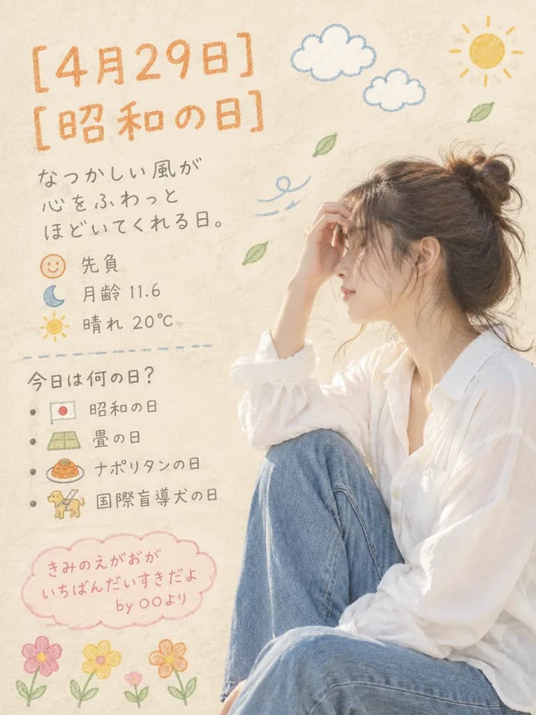
A soft, airy Japanese lifestyle poster with a warm nostalgic mood, set on a light beige textured paper background. On the right side, a young woman sits in a relaxed side pose with one knee raised, wearing an oversized white long-sleeve shirt and blue jeans. Her dark brown hair is tied in a messy bun with loose wisps around her face, and one hand lightly touches her forehead, with her facial features de-emphasized to prioritize aesthetic over identity. Soft natural daylight, high-key exposure, and clean editorial photography combined with hand-drawn crayon doodles. On the left half, handwritten Japanese text in a crayon or colored-pencil texture: - At the top, large orange text reads "[4月29日]" with "[昭和の日]" underneath. - Below, a handwritten gray Japanese note: "なつかしい風が 心をふわっと ほどいてくれる日。" - Underneath, three small info lines with icons: a smiling face icon with "先負", a crescent moon icon with "月齢 11.6", and a sun icon with "晴れ 20℃". - A dashed divider line, followed by a list titled "今日は何の日?" featuring four bulleted items with miniature doodles: "昭和の日" (tiny flag), "畳の日" (tatami mat), "ナポリタンの日" (pasta plate), and "国際盲導犬の日" (guide dog). - At the bottom left, a pink cloud-shaped speech bubble containing the handwritten text: "[きみのえがおが いちばんだいすきだよ by ○○より]". Decorative doodles include two white fluffy clouds, a small yellow sun in the top-right corner, drifting green leaves, wind-swoosh lines near her hair, and four colorful flower doodles (pink, yellow, orange) along the bottom edge. Muted pastel palette of warm cream, soft orange, blush pink, olive, slate gray, and denim blue.

gaya hidupposterjepang
Komik Manga Penjelasan Kesehatan Jepang
Komik Manga Penjelasan Kesehatan Jepang
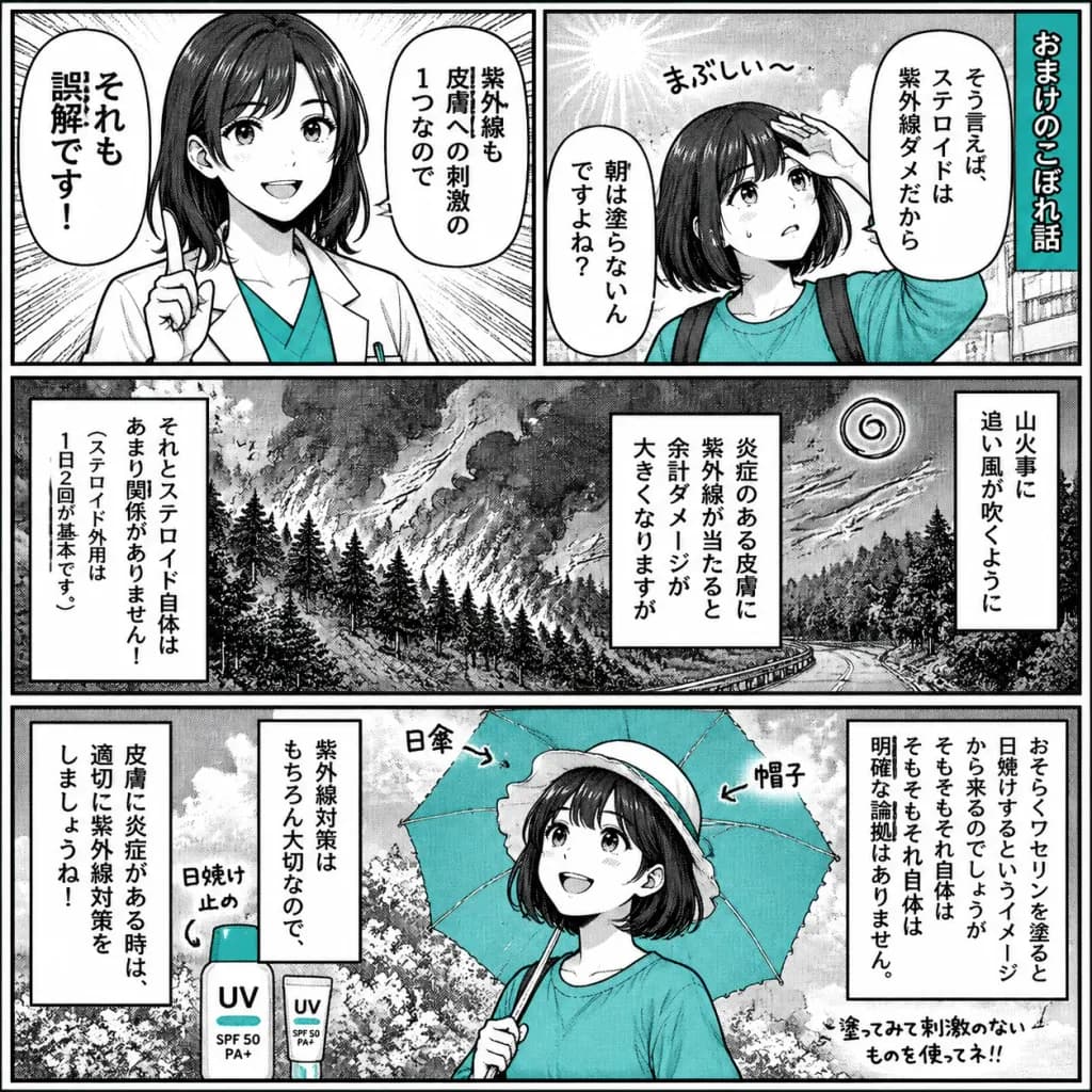
A black-and-white Japanese manga-style educational comic page about [misconceptions about steroid ointment, ultraviolet rays, and sunscreen], rendered like a printed newspaper health explainer with screentone shading, halftone gradients, hand-drawn ink line art, and selective [teal] accent fills. Canvas & Layout: Square 1:1 page, high-contrast monochrome manga art with thick black outer borders, clean gutters, and dense vertical Japanese dialogue. Exactly 4 panels arranged as: - Top row: Two equal panels side by side. - Middle row: One wide panel spanning the full width. - Bottom row: One wide panel spanning the full width. Panel Details: - Panel 1 (Top Left): A cheerful young female educator with shoulder-length dark hair wearing a white lab coat over a [teal] shirt, raising one index finger to correct a misconception. Radiating emphasis speedlines in the background. Two vertical speech bubbles containing Japanese text: 「それも誤解です!」 and 「紫外線も皮膚への刺激の1つなので」. - Panel 2 (Top Right): A young girl with a short dark bob wearing a [teal] sweatshirt, shielding her forehead and looking worried under strong sunlight. A small handwritten sound effect 「まぶしい〜」 near her. A vertical title banner on the far right reading 「[おまけのこぼれ話]」. Two vertical speech bubbles containing Japanese text: 「そう言えば、ステロイドは紫外線ダメだから」 and 「朝は塗らないんですよね?」. - Panel 3 (Middle Wide): A dramatic monochrome wildfire scene on a forested mountain slope with blowing smoke, trees, a winding road, and a spiral wind icon. Three vertical narration boxes overlay the scene: right box 「山火事に追い風が吹くように」, center-right box 「炎症のある皮膚に紫外線が当たると余計ダメージが大きくなりますが」, left box 「それとステロイド自体はあまり関係がありません!」 with a smaller sub-note 「(ステロイド外用は1日2回が基本です。)」. - Panel 4 (Bottom Wide): The young girl smiling and protected from the sun, holding an open [teal] parasol, wearing a light sun hat, with sunscreen bottles nearby labeled "UV" and "[SPF 50 PA+]". Handwritten labels pointing to objects: 「日焼け止め」 near the bottle, 「日傘」 and 「帽子」 near the parasol and hat. Three vertical narration boxes: right box 「おそらくワセリンを塗ると日焼けするというイメージから来るのでしょうが そもそもそれ自体は明確な論拠はありません。」, center-left box 「紫外線対策はもちろん大切なので、」, far-left box 「皮膚に炎症がある時は、適切に紫外線対策をしましょうね!」. A small handwritten note in the bottom-right corner: 「[塗ってみて刺激のないものを使ってネ!!]」. Style & Color: Authentic manga screentone dot patterns, rough ink line texture, dense vertical typesetting, monochrome grayscale palette with only clothing, parasol, and packaging highlighted in selective [teal] (#68cfc6).

mangakomikscreentone
Slide Infografis Evolusi Gambar AI

Slide Infografis Evolusi Gambar AI

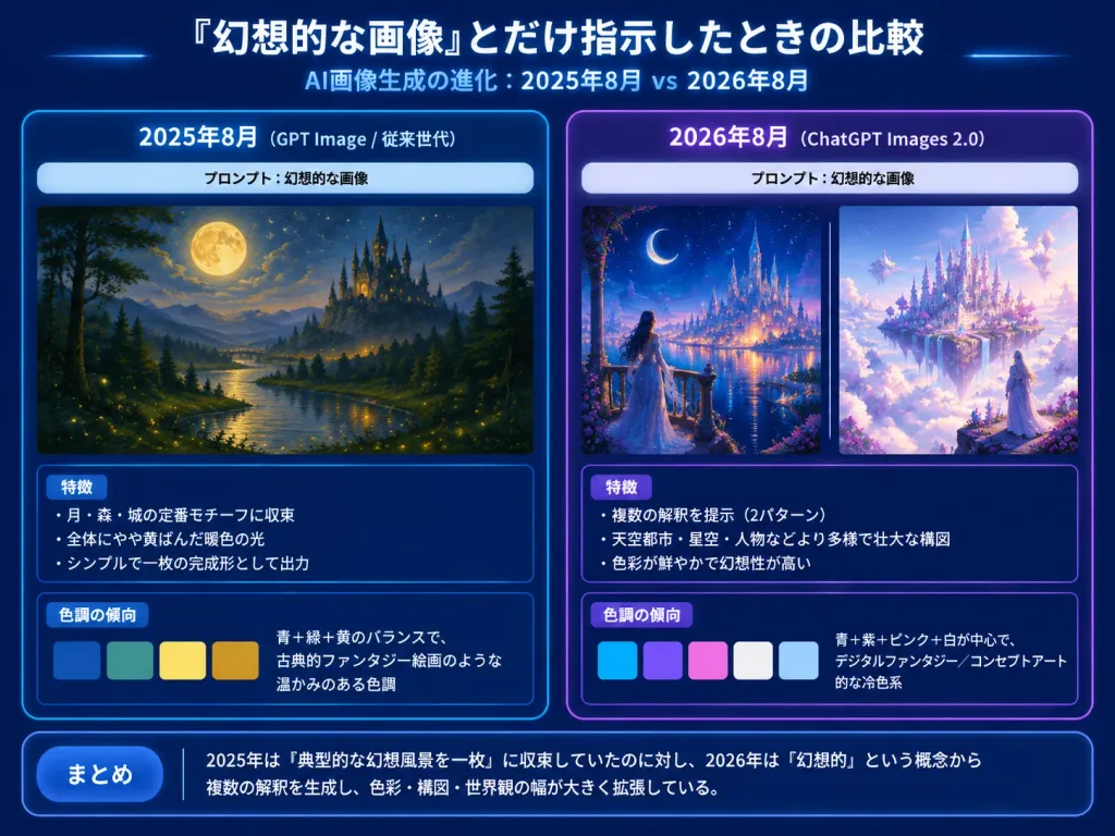
4:3 horizontal tech-report presentation slide, Japanese infographic comparing AI image generation outputs across two years for the prompt [幻想的な画像]. Dark navy gradient background, glowing borders, crisp white Japanese typography, subtle blue and purple neon highlights. Header: Top center large bold Japanese title: 「『幻想的な画像』とだけ指示したときの比較」. Directly underneath, smaller subtitle: 「AI画像生成の進化:2025年8月 vs 2026年8月」. Layout: Two large rounded comparison panels side by side. Left Panel (Blue theme, labeled 「2025年8月(GPT Image / 従来世代)」): - Pale prompt strip near the top: 「プロンプト:幻想的な画像」 - Artwork: Exactly 1 traditional painterly fantasy landscape showing a large full moon, deep blue night sky, dark forest silhouettes, a winding glowing river with firefly lights, and a distant dark castle with spires. Warm, nostalgic, restrained composition. - Analysis Box 1 (Title 「特徴」) with 3 bullet points: • 「月・森・城の定番モチーフに収束」 • 「全体にやや黄ばんだ暖色の光」 • 「シンプルで一枚の完成形として出力」 - Analysis Box 2 (Title 「色調の傾向」) with 4 horizontal color swatches (deep blue, teal green, warm yellow, golden ocher) and text: 「青+緑+黄のバランスで、古典的ファンタジー絵画のような温かみのある色調」. Right Panel (Purple theme, labeled 「2026年8月(ChatGPT Images 2.0)」): - Pale prompt strip near the top: 「プロンプト:幻想的な画像」 - Artwork: Exactly 2 artworks side by side with a thin vertical divider: 1. Luminous fantasy city at night with a crescent moon, starry sky, glowing waterfront, and a woman in a flowing dress on a balcony looking toward towers. 2. Celestial floating castle above clouds with white and lavender architecture, pink-purple blossoms, crystalline towers, and a robed figure looking into the glowing city. - Analysis Box 1 (Title 「特徴」) with 3 bullet points: • 「複数の解釈を提示(2パターン)」 • 「天空都市・星空・人物などより多様で壮大な構図」 • 「色彩が鮮やかで幻想性が高い」 - Analysis Box 2 (Title 「色調の傾向」) with 5 horizontal color swatches (cyan blue, violet, pale pink, white, light sky blue) and text: 「青+紫+ピンク+白が中心で、デジタルファンタジー/コンセプトアート的な冷色系」. Bottom Summary Bar: Full-width rounded dark blue box with a label button 「まとめ」 and text: 「2025年は『典型的な幻想風景を一枚』に収束していたのに対し、2026年は『幻想的』という概念から複数の解釈を生成し、色彩・構図・世界観の幅が大きく拡張している。」 Visual style: Clean tech presentation slide, precise alignment, high readability, drop shadows, no watermarks.

infografispresentasislide
Kalender Musiman Jepang Foto Spontan
Kalender Musiman Jepang Foto Spontan
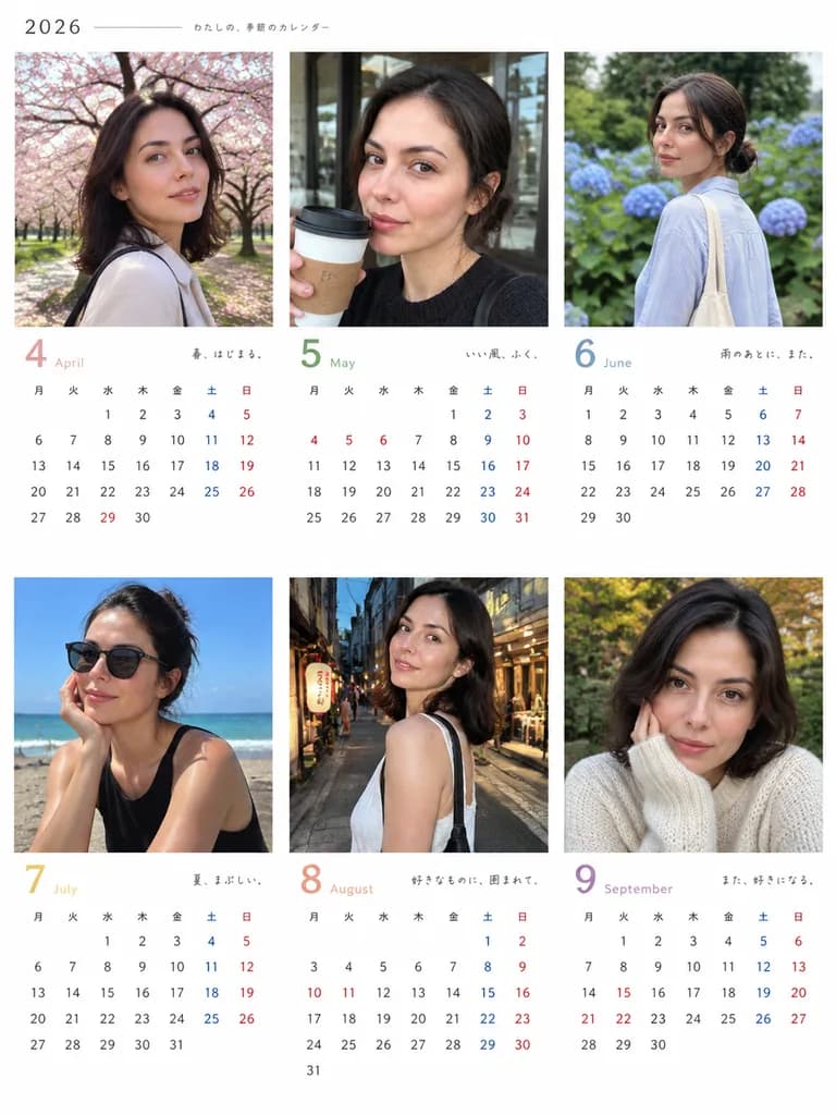
A Japanese calendar layout for [2026] covering [April to September] ([6] months), featuring the person from the reference photo as the model. - Calendar layout: Crisp, minimalist Japanese calendar grids with a clean white background for readability. - Image aesthetic: Casual, candid everyday photos taken on an iPhone, capturing authentic seasonal moods for each month. - Seasonal settings & outfits: Appropriately styled for each specific month and season. - Photographic variety: Each monthly photo varies in camera distance (candid, close-up, mid-shot), angle (eye-level, low, side), natural iPhone lighting, hairstyles (ponytail, bob, down, bun), and spontaneous poses (walking, sitting, holding a coffee cup or smartphone).
kalenderjepangspontan
Poster Tipografi Bahasa Jepang Spiral Searah Jarum Jam

Poster Tipografi Bahasa Jepang Spiral Searah Jarum Jam

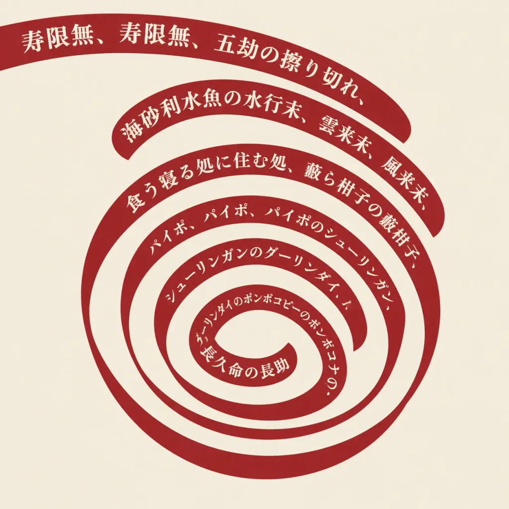
Graphic design composition featuring Japanese text arranged along a continuous ribbon band, spiraling clockwise inward from the top left corner toward the center of the frame. The text reads: "[寿限無、寿限無、五劫の擦り切れ、海砂利水魚の水行末、雲来末、風来末、食う寝る処に住む処、藪ら柑子の藪柑子、パイポ、パイポ、パイポのシューリンガン、シューリンガンのグーリンダイ、グーリンダイのポンポコピーのポンポコナの、長久命の長助]". Crisp typography, clean legible Japanese characters precisely aligned along the curved spiral path, centered composition on a minimalist solid background.

tipografibahasa jepangspiral
Infografis Alur Kerja Gambar ke Video AI Jepang

Infografis Alur Kerja Gambar ke Video AI Jepang

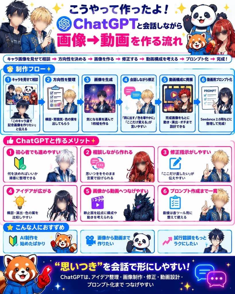
bright Japanese social-media infographic poster. large bold Japanese lettering, dark navy and purple for ChatGPT, hot pink for 画像→動画, celebratory sparkles. small bold text under headline with pink arrow separators. 制作フロー. six numbered blue…

infografismedia sosialposter
Laporan Diagnosis Fisiognomi Gaya Jepang

Laporan Diagnosis Fisiognomi Gaya Jepang

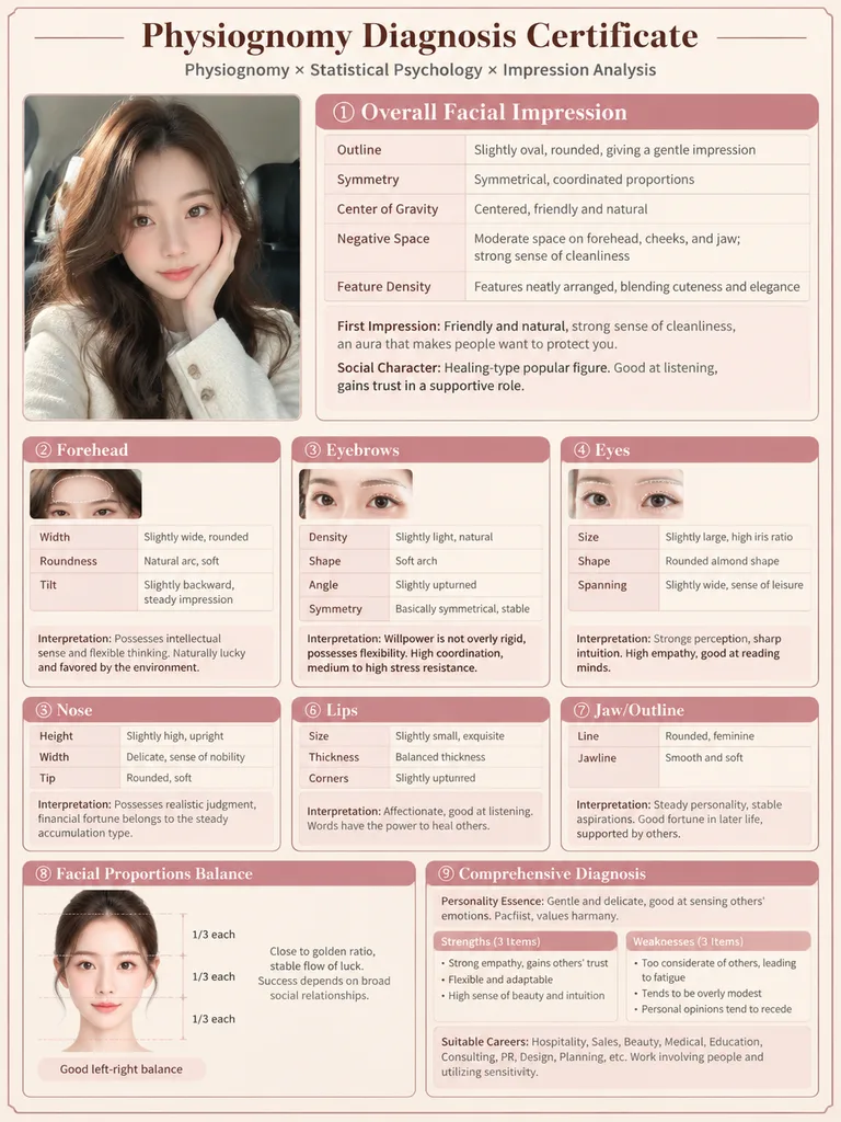
Vertical Physiognomy Diagnosis Report Card Infographic. [Japanese professional diagnosis document style], warm cream background, rose pink title bars, fine line borders, mix of Serif and Sans-serif fonts, medical report layout feel, soft w…

infografisfisiognomilaporan
Poster Grafis Peribahasa Anime

Poster Grafis Peribahasa Anime

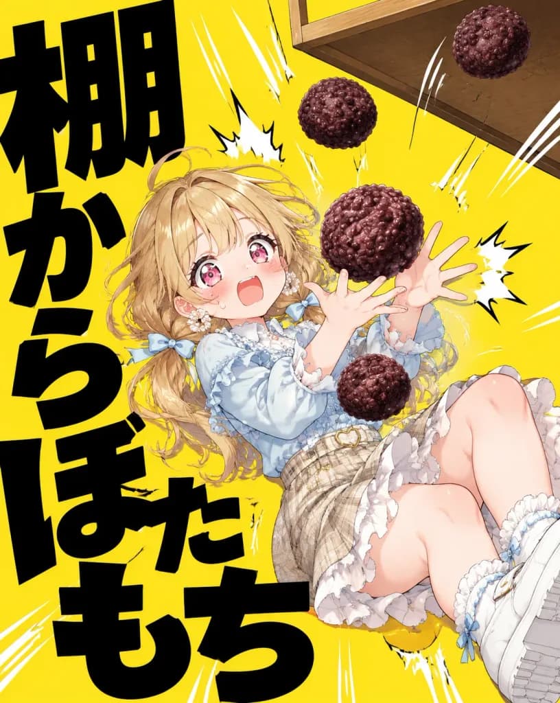
Dynamic Japanese graphic proverb poster illustration featuring [an original cute anime girl] acting out the Japanese idiom 「棚からぼたもち」 (unexpected good fortune). 4:5 vertical poster composition with a flat, vibrant solid yellow background. The left side and lower canvas are filled with massive, heavy, bold black Japanese typography reading exactly 「棚からぼたもち」, arranged vertically and diagonally, cropped dynamically by the canvas edges. The character is an anime-style young girl tumbling or recoiling backwards in a comical, surprised pose, with wide sparkling pink eyes, open mouth, flushed cheeks, and outstretched hands trying to catch falling sweets. She has [light honey-blonde] long wavy hair with loose strands, twin low braids or tied sections, pale blue ribbons, frilly earrings, and a pastel outfit: a pale blue ruffled blouse, cream lace trim, plaid beige skirt, heart charm belt detail, frilly socks, and chunky white shoes. In the upper right corner, a tilted wooden shelf drops exactly four round, textured dark reddish-brown botamochi rice cakes coated in azuki beans: one near the top right, one upper center, one large botamochi directly in front of her hands, and one near her torso. Include white manga speed lines, impact bursts, and comic shock marks around her and the falling sweets. High-energy, humorous moe anime aesthetic combined with stark, bold modern Japanese poster typography. No watermarks, no English text, no extra characters.

animepostertipografi
Infografik Bisnis Jepang tentang Evolusi AI

Infografik Bisnis Jepang tentang Evolusi AI

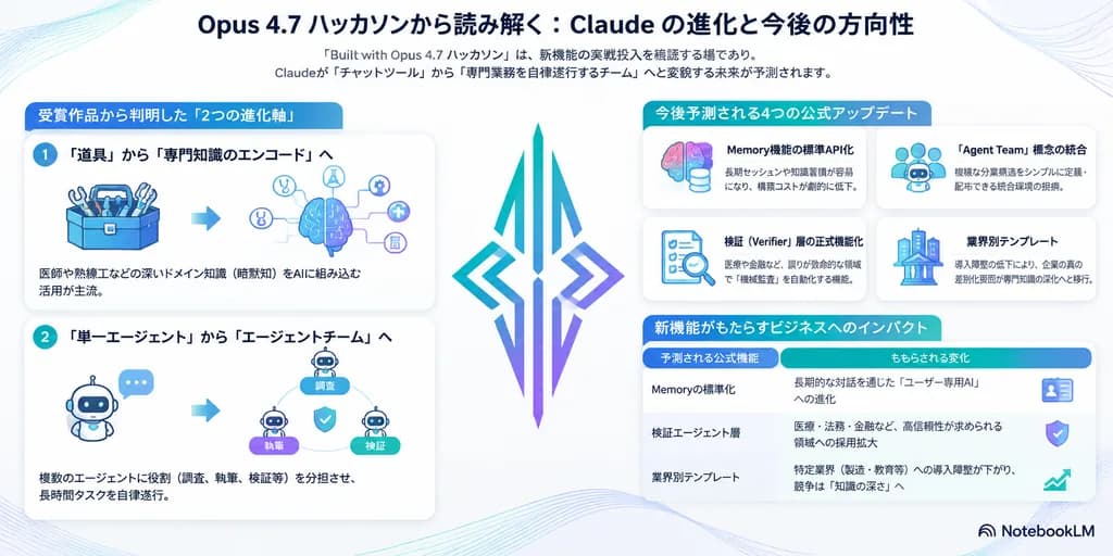
Japanese business infographic. [Opus 4.7 ハッカソンから読み解く:Claude の進化と今後の方向性]. 受賞作品から判明した「2つの進化軸」. 「道具」から「専門知識のエンコード」へ. 「単一エージェント」から「エージェントチーム」へ. 今後予測される4つの公式アップデート. Memory機能の標準API化. 「Agent Team」概念の統合. 検証(Verifier)層の正式機能化. 業界別テンプレート. 新機能がもたらすビジネ…

infografikbahasa jepangbisnis