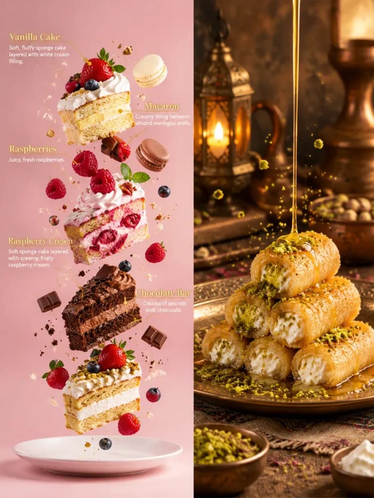
Baru: GPT Image 2.5 Flare dan Sunburst. Coba gratis 3 gambar saat daftar, lalu 8 kredit per gambar.
Coba GPT Image 2.5

Prompt AI Infografis

1.277 templat · GPT IMAGE 2, Nano Banana Pro · diperbarui Okt 2026

Templat ini menghasilkan aset visual terstruktur mulai dari perbandingan dua panel dan diagram bedah teknis isometrik hingga salindia presentasi multipanel. Semuanya mengutamakan hierarki visual yang rapi, tata letak kartu yang jelas, dan penyorotan data. Anda dapat menyesuaikannya dengan mengubah topik, palet warna, dan label teks dalam kurung.

Urutkan berdasarkan:

Menampilkan 1–60 dari 1,277 prompt

Slide Presentasi Minimalis Jepang untuk Tips Prompt

Slide Presentasi Minimalis Jepang untuk Tips Prompt

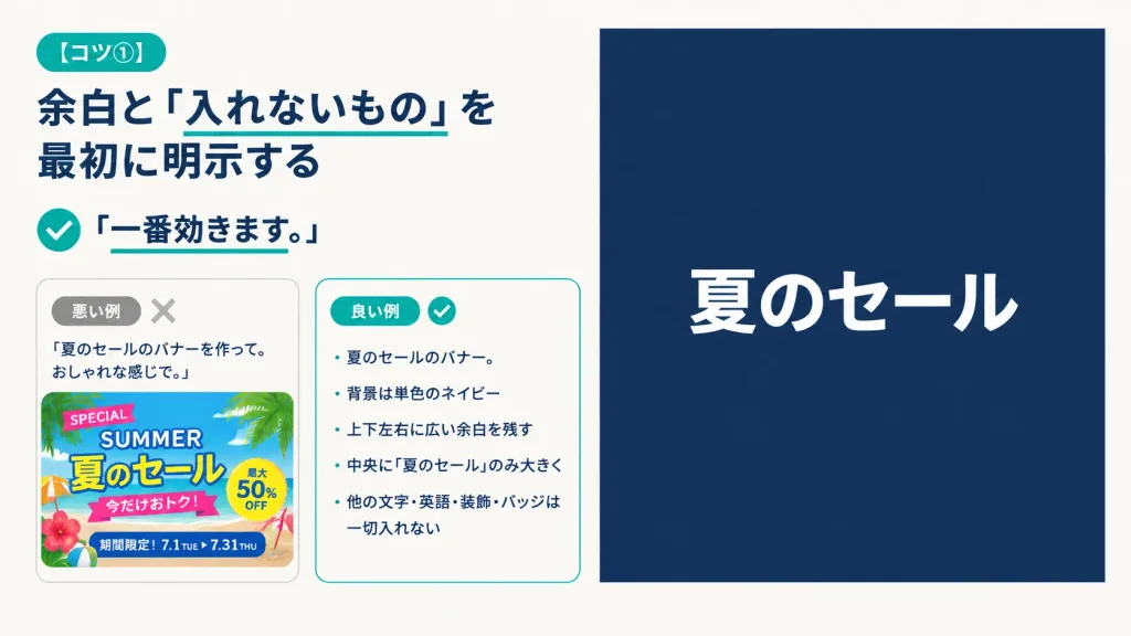
A 16:9 horizontal instructional presentation slide with a modern minimalist Japanese editorial design, warm off-white background, generous margins, dark navy typography, and teal accents. Two-column layout: - Left column (approx. 48% width): At top left, a rounded teal pill badge reading "[コツ①]". Below, a large bold dark navy Japanese headline: "[余白と「入れないもの」を最初に明示する]" with a thin teal underline directly beneath the phrase 「入れないもの」. Beneath the headline, a teal circular check icon followed by bold text reading "「一番効きます。」" with a short teal underline under the sentence. Below the lesson text, two rounded comparison cards side-by-side with subtle borders: - Bad example card: small gray pill reading "悪い例" and a pale gray "X" icon. It contains the prompt quote: "「夏のセールのバナーを作って。おしゃれな感じで。」" above a cluttered, colorful summer sale banner thumbnail packed with palm leaves, beach colors, decorative stickers, and busy text ("SPECIAL", "SUMMER", "夏のセール", "今だけおトク!", "最大50% OFF", "期間限定!7.1 TUE ▶ 7.31 THU"). - Good example card: small teal pill reading "良い例" and a teal checkmark icon. It contains a neat Japanese bullet list: "・夏のセールのバナー。", "・背景は単色のネイビー", "・上下左右に広い余白を残す", "・中央に『夏のセール』のみ大きく", "・他の文字・英語・装飾・バッジは一切入れない". - Right column (approx. 47% width): A large, clean solid dark navy rectangle with generous empty space, featuring only a single, large, bold sans-serif white Japanese headline centered horizontally and vertically: "[夏のセール]". Completely free of borders, gradients, patterns, or extra decorative graphics.
slide presentasiinfografikminimalis
Infografik Perbandingan Model Pembayaran Software

Infografik Perbandingan Model Pembayaran Software

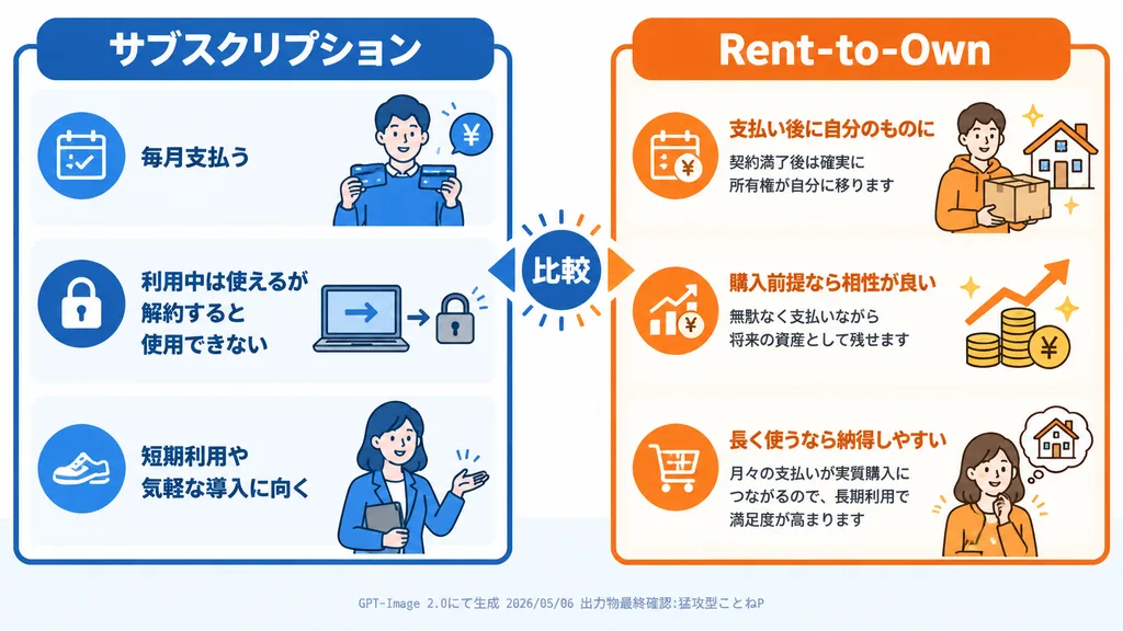
clean Japanese comparison infographic for a software article. flat vector illustration, corporate explainer graphic, rounded rectangular panels, thick outline icons, white background, blue versus orange color coding, crisp legible Japanese…

infografikvektorperbandingan
Infografik Isometrik Pembongkaran Teknis

Infografik Isometrik Pembongkaran Teknis

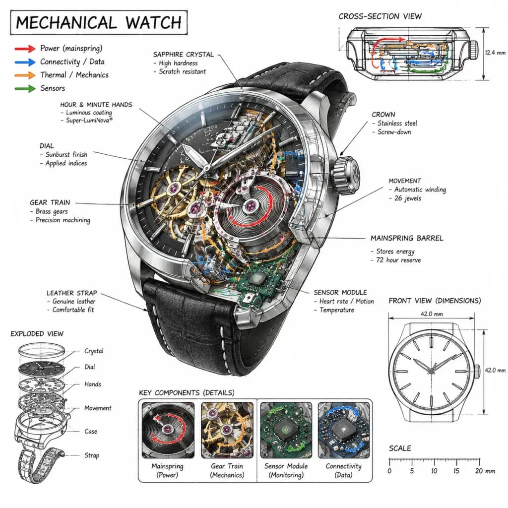
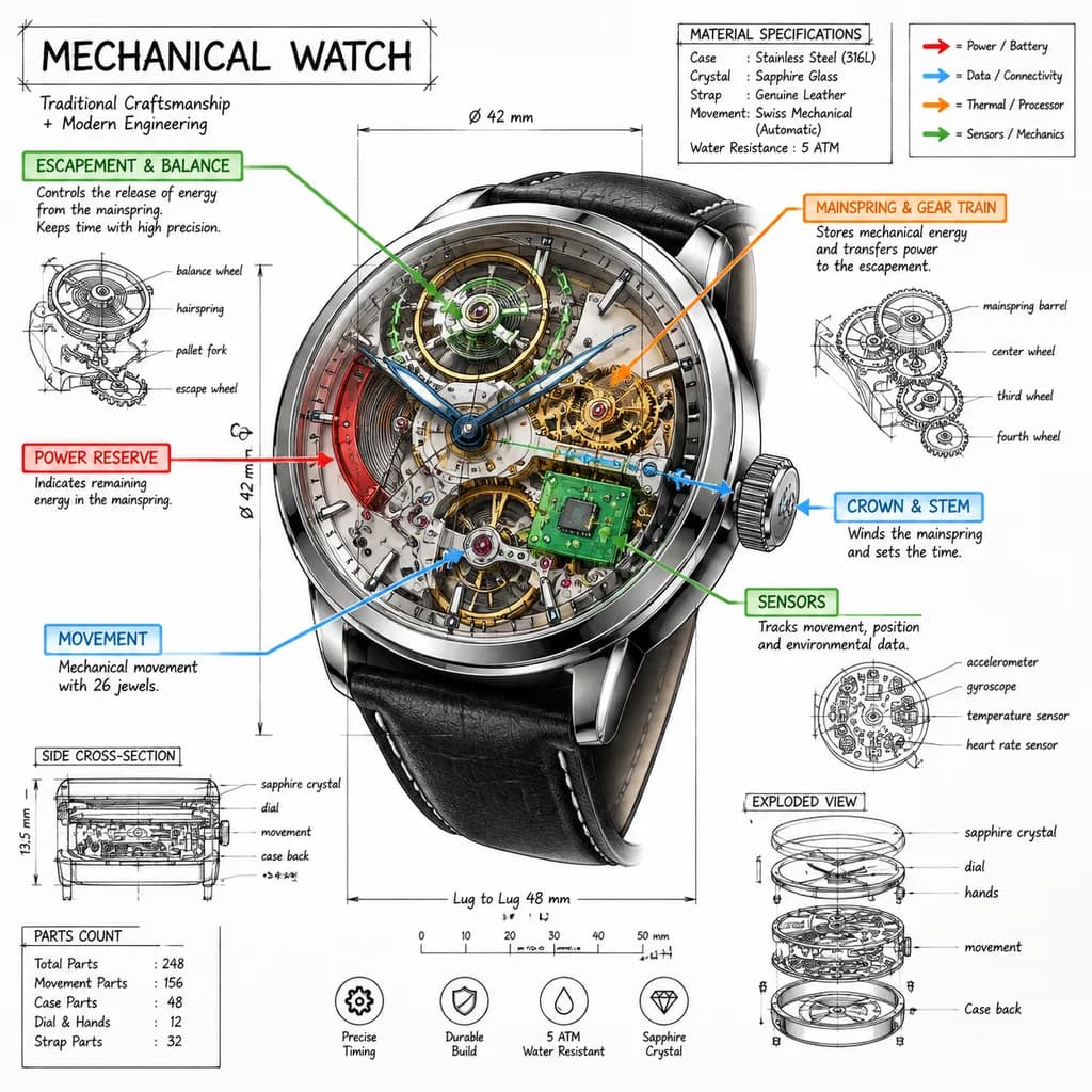
A technical infographic of [a mechanical watch] rendered from a [45-degree isometric 3D viewpoint], slightly tilted to emphasize depth and three-dimensional structure. Style and Composition: - Blends a photorealistic render of the object with hand-drawn black ink technical annotations on a clean, pure white background. - Hand-sketched architectural linework, precise yet artistic, reminiscent of a professional engineering teardown or museum technical exhibit. - Balanced negative space with roughly 10-15% accent color density, dominant black ink, and a white background. - Title "[MECHANICAL WATCH]" positioned inside a hand-sketched technical frame in the top-left corner. Technical Elements and Details: - Transparent cutaway sections revealing internal components. - Color-coded callout boxes labeling key parts. - Precise measurement lines, dimensional callouts, and scale markers. - Material specifications and part count annotations. - Color-coded directional arrows illustrating function and flow: red for power/battery, blue for data/connectivity, orange for thermal/processor, and green for sensors/mechanics. - Supplementary miniature schematics and cross-section diagrams around the main subject.

infografikisometrikpembongkaran
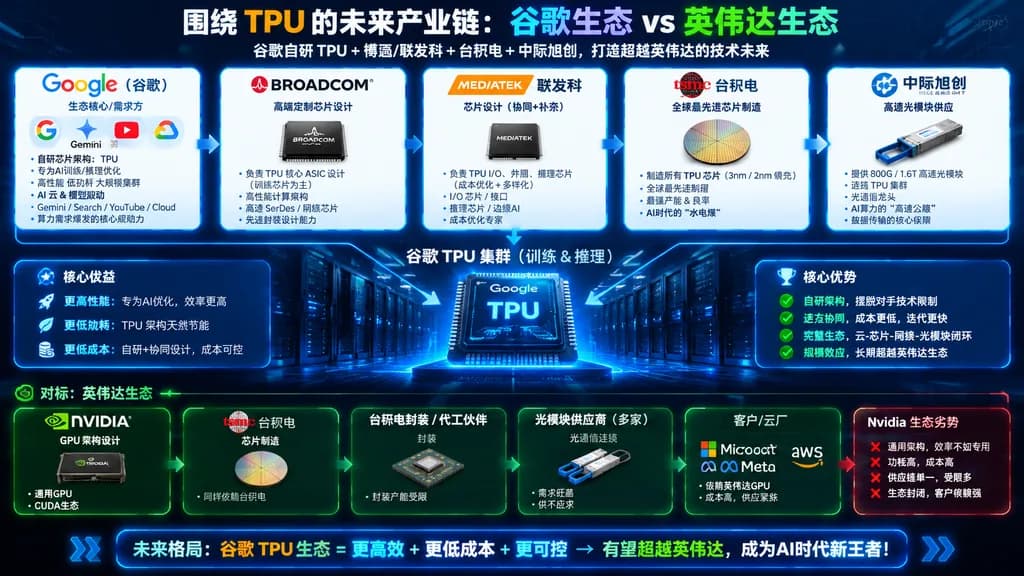
Infografik Ekosistem Google TPU vs Nvidia

Infografik Ekosistem Google TPU vs Nvidia

Chinese technology industry-chain infographic poster. future TPU industry chain comparison, Google ecosystem versus Nvidia ecosystem. Five rounded cards connected left-to-right with white arrows, representing the Google TPU supply chain. G…

infografiksemikonduktortpu
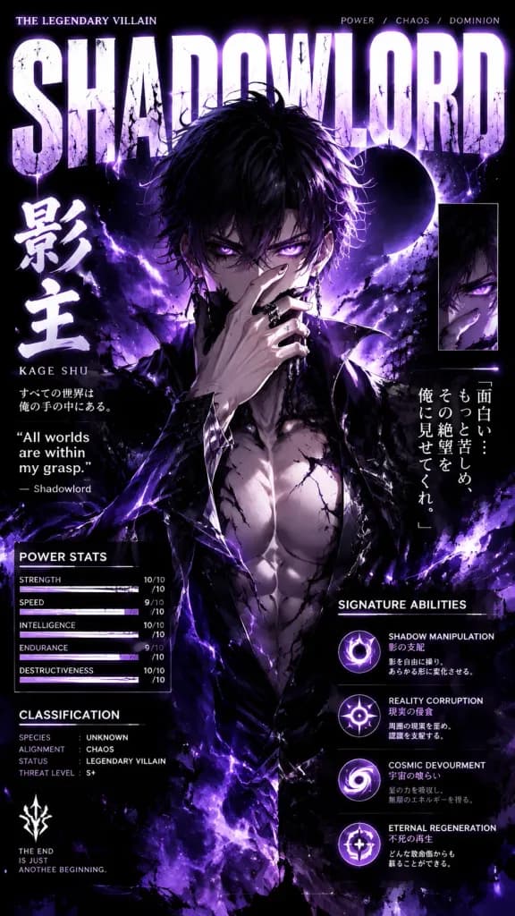
Poster Infografis Karakter Penjahat Anime

Poster Infografis Karakter Penjahat Anime

Anime portrait poster of a legendary [villain] antagonist standing front-facing, muscular physique with sharp facial details, one hand covering the lower face in a sinister pose, glowing eyes staring directly at the viewer. Surrounding the character is an exploding powerful energy aura, nebula clouds, cosmic dust, and ink splashes against a dark cosmic background. Collectible trading-card and magazine infographic layout featuring giant distressed typography behind the character displaying their name in bold letters, Japanese kanji, English subtitles, a side character quote, a power stats panel, a classification section, and a signature abilities list. High-contrast dramatic rim lighting, dynamic glowing effects, clean white and black graphic accents, and a vibrant [monochromatic] color palette matching the character aesthetic.

poster animesampul mangadesain karakter
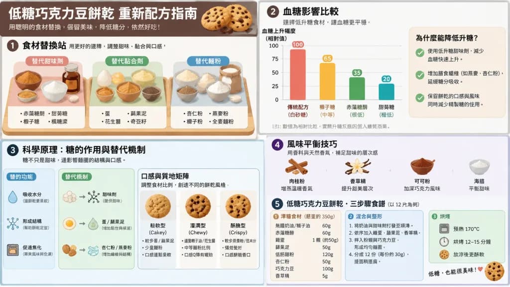
Infografis Sains Pemanggangan Rendah Gula

Infografis Sains Pemanggangan Rendah Gula

A comprehensive educational baking science infographic presented in a clean [2x2 grid] layout, explaining how to reformulate low-sugar [chocolate chip cookies]. Features an isometric ingredient swap station with alternative sweeteners, binders, and flours; a clear glycemic impact comparison chart; scientific bulk and structure diagrams showing sugar replacement mechanics; a texture matrix comparing cakey, chewy, and crispy results; flavor-balancing tips using spices and extracts; and precise weight-based three-step recipe cards. Clean modern vector diagram style, crisp typography, neutral educational tone with no diet-shaming labels or gimmicky health tropes.

infografissains pemangganganilustrasi makanan
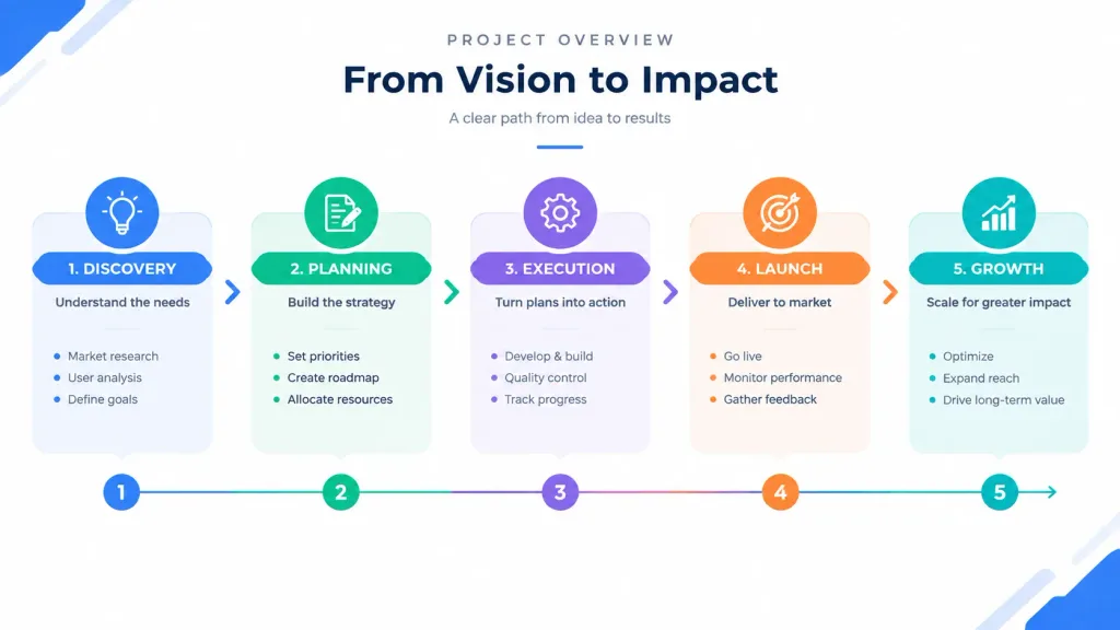
Templat Slide Diagram Presentasi Perusahaan

Templat Slide Diagram Presentasi Perusahaan

A professional presentation slide featuring [a clean overview diagram that shows the entire structure at a glance with labeled sections]. Modern corporate infographic style, [dynamic flow arrows guiding from start to finish], clear visual hierarchy, minimal text placeholders, clean geometric shapes, high visual contrast, balanced negative space, crisp modern business deck layout.

presentasidiagraminfografis
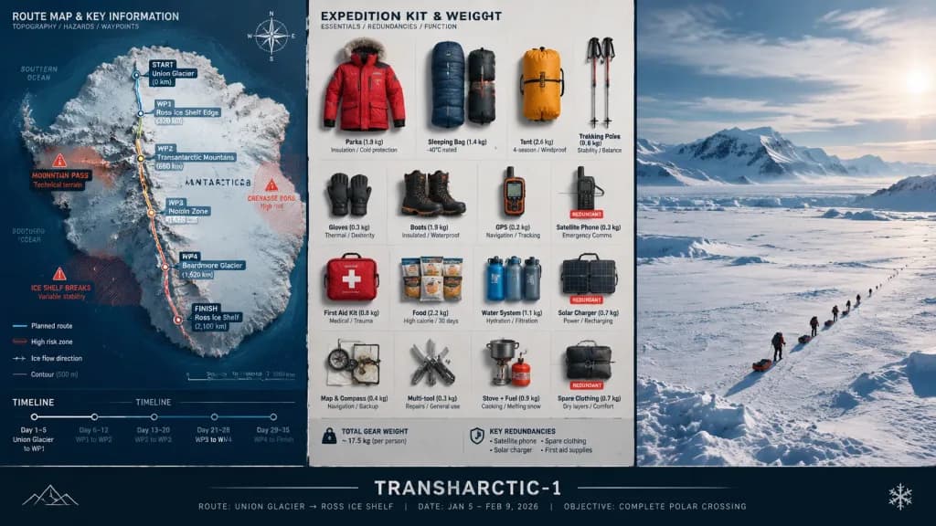
Papan Komando Strategis Perencanaan Ekspedisi

Papan Komando Strategis Perencanaan Ekspedisi

A strategic command board for an expedition leader planning [a polar crossing] to [Antarctica]. A three-panel triptych layout: Left panel features a detailed topographic route map with labeled waypoints, annotated danger zones, and an edge timeline. Center panel displays an overhead flat lay of every piece of expedition kit organized in neat rows, each item tagged by weight and function, showing redundancies flagged. Right panel captures the expedition in motion across a vast, epic landscape with small human figures emphasizing immense scale. Visual language transitions from cartographic precision to functional inventory documentation, ending in sweeping environmental photography. A clean title block at the bottom reads: "[TRANSHARCTIC-1] — [ROUTE], [DATE], [OBJECTIVE]".

ekspedisiinfografikkartografi
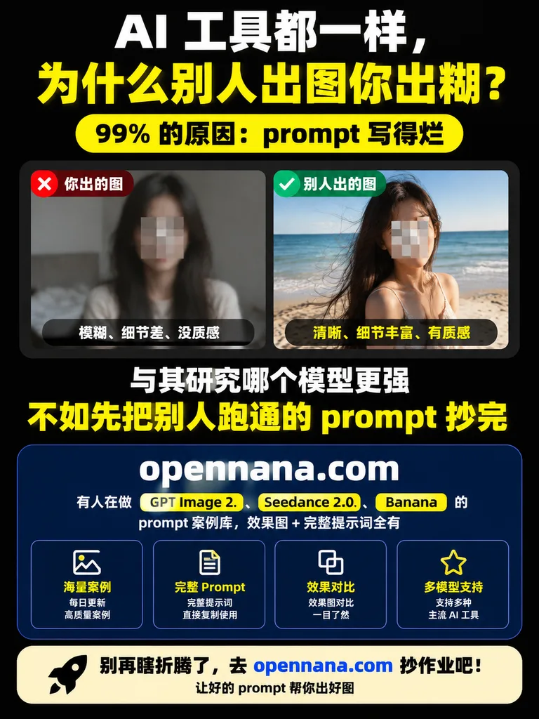
Poster Infografis Media Sosial Perbandingan Prompt AI

Poster Infografis Media Sosial Perbandingan Prompt AI

Chinese vertical social media promotional infographic poster. high-contrast tech marketing, bold typography, clean card layout. rounded yellow pill with black bold text. large deep navy rounded rectangle card with subtle border. 海量案例. 完整 P…

infografisposter promosimedia sosial
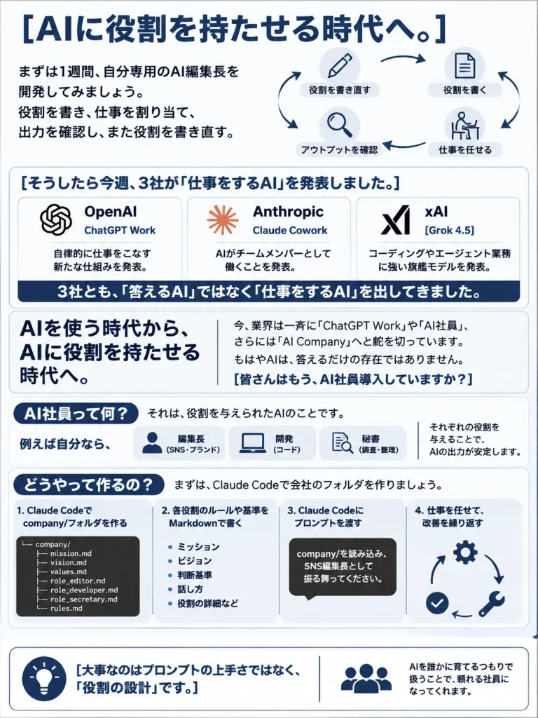
Infografis Bisnis Karyawan AI Bahasa Jepang

Infografis Bisnis Karyawan AI Bahasa Jepang

Vertical portrait Japanese business infographic slide, 3:4 aspect ratio, clean white background with a thin light-gray border, navy blue accent color, black body text, rounded rectangular content blocks, minimalist monochrome line icons. Professional LinkedIn or business proposal handout aesthetic. Layout with 6 stacked sections from top to bottom: Section 1 — Header and cycle diagram: - Top headline: bold large text reading "[AIに役割を持たせる時代へ。]". - Left side: three short Japanese explanatory lines detailing spending one week developing a personal AI editor-in-chief, repeatedly writing roles, assigning work, checking output, and rewriting roles. - Right side: a circular 4-step workflow connected by navy arrows with simple icons: 1) Pencil icon labeled 「役割を書き直す」 2) Document icon labeled 「役割を書く」 3) Person-at-desk icon labeled 「仕事を任せる」 4) Magnifying glass icon labeled 「アウトプットを確認」 Section 2 — Three company announcement cards: - Rounded card with heading: "[そうしたら今週、3社が「仕事をするAI」を発表しました。]". - Exactly 3 horizontal cards inside: - Card 1: OpenAI knot-style icon, title 「OpenAI」, product 「ChatGPT Work」, brief Japanese text on announcing an autonomous work structure. - Card 2: Anthropic stylized icon, title 「Anthropic」, product 「Claude Cowork」, brief Japanese text on AI working as a team member. - Card 3: xAI logo, title 「xAI」, product "[Grok 4.5]", brief Japanese text on a flagship model strong in coding and agent tasks. - Dark navy banner underneath with white text: 「3社とも、「答えるAI」ではなく「仕事をするAI」を出してきました。」 Section 3 — Key message block: - Two-column split: - Left column: large bold text 「AIを使う時代から、AIに役割を持たせる時代へ。」 - Right column: paragraph explaining the industry shift toward ChatGPT Work, AI employees, and AI Company concepts, ending with a bold navy question: "[皆さんはもう、AI社員導入していますか?]". Section 4 — Definition of AI employee: - Navy pill heading: 「AI社員って何?」 - Text explaining it simply means an AI assigned a distinct role. - Exactly 3 small role cards under 「例えば自分なら、」: 1) Person icon labeled 「編集長(SNS・ブランド)」 2) Laptop icon labeled 「開発(コード)」 3) Search/document icon labeled 「秘書(調査・整理)」 - Accompanying note stating that assigning distinct job roles stabilizes AI output. Section 5 — How to create an AI employee: - Navy pill heading: 「どうやって作るの?」 - Introductory sentence on setting up a Claude Code company folder. - 4 numbered horizontal process steps: - Step 1: 「Claude Codeで company/フォルダを作る」 with a dark terminal file tree showing exactly 7 files: company/, mission.md, vision.md, values.md, role_editor.md, role_developer.md, role_secretary.md, rules.md. - Step 2: 「各役割のルールや基準を Markdownで書く」 with bullet points: 「ミッション」, 「ビジョン」, 「判断基準」, 「話し方」, 「役割の詳細など」. - Step 3: 「Claude Codeにプロンプトを渡す」 with a black speech bubble asking it to read company/ and act as the SNS editor-in-chief. - Step 4: 「仕事を任せて、改善を繰り返す」 with a mini circular loop showing work, check, and fix icons. Section 6 — Bottom takeaway: - Rounded footer container with a navy lightbulb icon and bold text: "[大事なのはプロンプトの上手さではなく、「役割の設計」です。]". - Right side: team icon with explanatory text stating that treating AI as someone to train turns it into a dependable employee. Visual execution: Japanese corporate design, crisp typography, generous whitespace, sharp lines, perfectly legible text, zero clutter, no photographic elements or heavy gradients.

infografisbisnisbahasa jepang
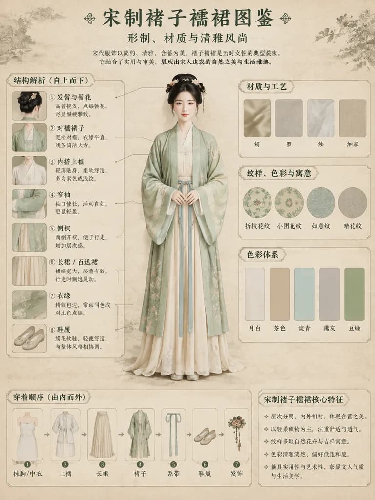
Poster Infografis Hanfu Dinasti Song

Poster Infografis Hanfu Dinasti Song

traditional Chinese clothing infographic poster. Full-body portrait of a young Asian woman standing elegantly with hands clasped, facing forward. museum exhibition guide, highly structured, clean grid aesthetic. 结构解析 (自上而下). 材质与工艺. 纹样、色彩与寓意

hanfudinasti songinfografis
Tata Letak Slide Presentasi

Tata Letak Slide Presentasi

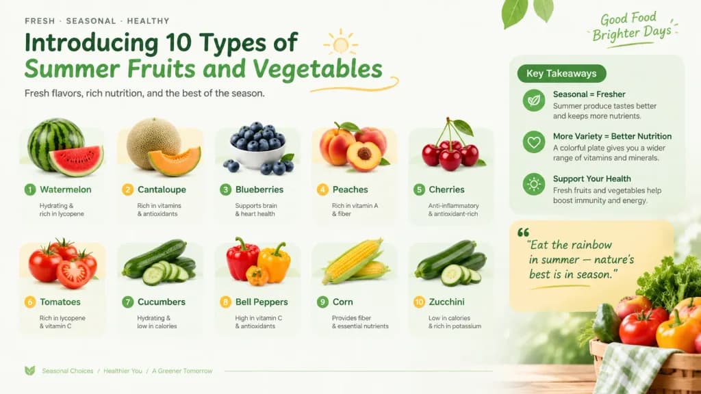
Presentation slide design with the theme '[Introducing 10 types of summer fruits and vegetables]'. Structured modern PPT slide layout featuring an educational overview, knowledge points, an insightful quote block, clear typography, and a cohesive thematic color palette. Professional editorial graphic design with balanced visual hierarchy and clean negative space.

slide presentasipptinfografis
Komik Panduan AI Kapibara Santai

Komik Panduan AI Kapibara Santai

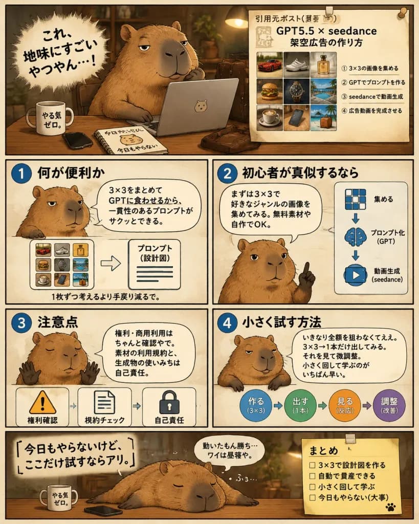
A single-page Japanese manga-style instructional infographic comic about using a 3×3 image grid workflow with GPT and video generation tools for advertising, hosted by a [lazy capybara strategist]. Composition & Layout: Vertical 4:5 layout divided into exactly 6 panels with hand-drawn panel borders on a warm cream paper background with a thin black outer border. Warm sepia-brown palette, soft shadows, cozy ambient lighting, and subtle paper texture. Panels Structure: 1. Hero Panel (top): The chubby capybara sits at a wooden desk in a dim cozy office, one paw under its chin, looking sleepy and smug in front of an open silver laptop. On the desk are 4 items: a white mug labeled 「やる気ゼロ。」, a black smartphone, a spiral notebook labeled 「今日もやらない」 with a capybara doodle, and a brown leather satchel. On the left, a dynamic spiky manga burst contains the bold text 「[これ、地味にすごいやつやん…!]」. On the right, a pinned beige reference sheet titled 「引用元ポスト(要約)」 with headline 「GPT5.5 × seedance 架空広告の作り方」 features a 3×3 thumbnail grid (red sports car, sneaker, perfume bottle, burger, luxury wristwatch, resort pool, coffee cup, smartphone on desk, tropical suitcase/beach scene) and four numbered Japanese steps underneath. 2. Instruction Panel 1 (middle row, top-left): Blue circle badge 「1」 titled 「何が便利か」. Capybara shown chest-up, unimpressed, with speech bubble 「3×3をまとめてGPTに食わせるから、一貫性のあるプロンプトがサクッとできる。」 Bottom diagram shows a mini 3×3 color grid pointing to a document labeled 「プロンプト(設計図)」, captioned 「1枚ずつ考えるより手戻り減るで。」 3. Instruction Panel 2 (middle row, top-right): Blue circle badge 「2」 titled 「初心者が真似するなら」. Capybara raises one finger advice-style with speech bubble 「まずは3×3で好きなジャンルの画像を集めてみる。無料素材や自作でOK。」 Right side has 3 vertical icons with arrows: 3×3 grid 「集める」, brain 「プロンプト化(GPT)」, play button 「動画生成(seedance)」. 4. Instruction Panel 3 (lower-middle row, bottom-left): Blue circle badge 「3」 titled 「注意点」. Capybara holds up two paws sleepily with speech bubble 「権利・商用利用はちゃんと確認やで。素材の利用規約と、生成物の使いみちは自己責任。」 Bottom row has 3 warning icons: warning triangle 「権利確認」, document 「規約チェック」, lock 「自己責任」. 5. Instruction Panel 4 (lower-middle row, bottom-right): Blue circle badge 「4」 titled 「小さく試す方法」. Capybara leans casually on the border with speech bubble 「いきなり全額を狙わなくてええ。3×3→1本だけ出してみる。それを見て微調整。小さく回して学ぶのがいちばん早い。」 Right side shows a circular 4-step workflow: 「作る(3×3)」 → 「出す(1本)」 → 「見る(反応)」 → 「調整(改善)」. 6. Closing Panel (bottom wide): Capybara lies sprawled flat across the desk sleeping, snoring 「ふぅ…」. Large text on left reads 「[今日もやらないけど、ここだけ試すならアリ。]」 with small thought bubble 「動いたもん勝ち…ワイは昼寝や。」 On the right, a taped yellow sticky note titled 「まとめ」 with 4 unchecked items: 「3×3で設計図を作る」, 「自動で量産できる」, 「小さく回して学ぶ」, 「今日もやらない(大事)」, and a cute paw print. Style: Semi-realistic capybara rendering with detailed fur, clean black ink lines, legible Japanese typography, and authentic social media explainer comic aesthetic.

mangakapibarainfografis
Pembuat Persona Pemasaran dan Profil Audiens

Pembuat Persona Pemasaran dan Profil Audiens

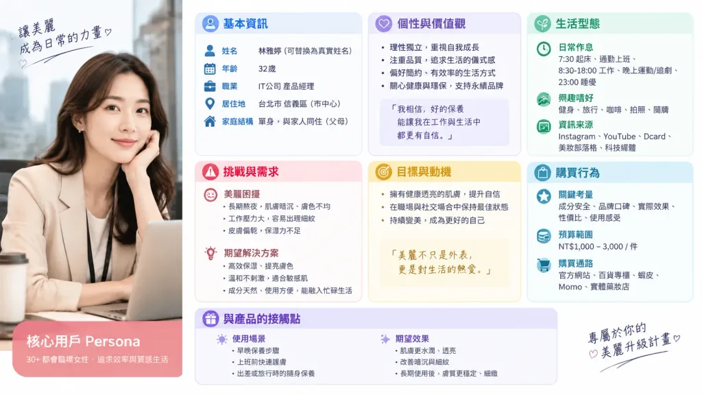
You are a professional persona designer. Based on the following information, design a detailed marketing persona: **Target Audience:** [Women in their 30s, living in the city center, working at an IT company] **Objective:** [Developing a marketing strategy for a new beauty serum] **Elements to include in the persona:** 1. Basic information (Name, Age, Occupation, Residence, Family structure) 2. Personality and Values 3. Lifestyle (Daily routine, Hobbies, Information sources) 4. Challenges and Needs (Beauty concerns, Desired solutions) 5. Goals and Motivation 6. Purchasing behavior (Key priorities, Budget range, Purchase channels) 7. Touchpoints with the service/product (Usage scenarios, Expected effects) **Output format:** - Use clear headings for an easily readable layout. - Include specific visual descriptions suitable for generating a persona portrait.

personapemasaranaudiens target
Infografik Tampilan Meledak Seduhan Teh

Infografik Tampilan Meledak Seduhan Teh

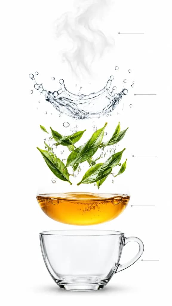
A vertical exploded-view infographic photograph of tea brewing against a seamless pure white background. The elements are evenly spaced and levitating in vertical layers from top to bottom: at the top, soft aromatic steam wisps floating upward; below it, a dynamic clear hot water splash frozen mid-motion with fine droplets; in the center, fresh [green tea leaves] unfurling and suspended mid-brew with tiny air bubbles clinging to them; beneath that, a smooth layer of transparent [amber-colored] brewed tea liquid with subtle micro-bubbles and light reflections; at the bottom, a crystal-clear transparent glass cup base casting a soft studio shadow. Thin, subtle minimal infographic guide lines connect the tiers without any text labels. Macro studio product photography, sharp focus across all layers, realistic liquid dynamics, clean minimalist aesthetic.

tehtampilan meledakinfografik
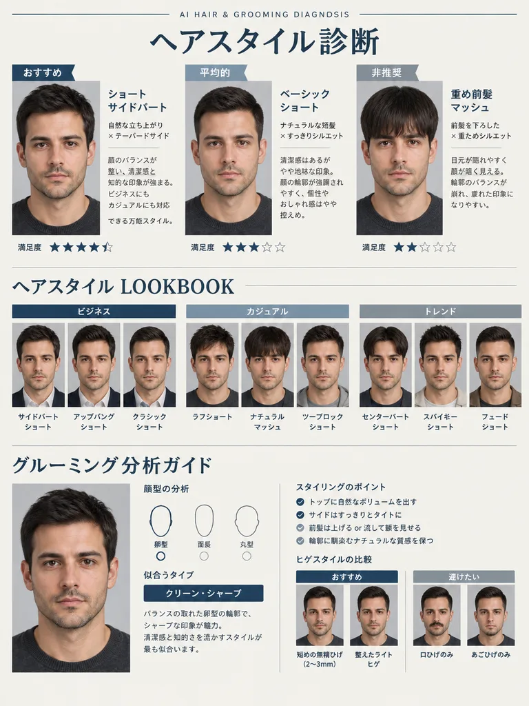
Laporan Editorial Diagnosis Gaya Rambut dan Perawatan

Laporan Editorial Diagnosis Gaya Rambut dan Perawatan

A visual beauty diagnosis report analyzing facial features, bone structure, eye shape, eyebrows, lips, hair texture, and jawline based on the reference photo of a [male], presenting tailored hairstyles and grooming advice. Formatted in A4 portrait orientation, styled like a sophisticated Japanese [men's] fashion and lifestyle visual magazine page. Clean off-white and charcoal color palette with subtle navy and cool gray accents, refined thin rule lines, generous negative space, and modern editorial typography. At the top, a small English subtitle reads "AI HAIR & GROOMING DIAGNOSIS". The subject's exact facial identity from the reference photo is strictly preserved, naturally varying only their hairstyle, facial hair, and overall grooming aura. The page composition includes: 1. Top Section: "Hairstyle Diagnosis" with a 3-column side-by-side comparison labeled "Best Fit", "Average", and "Not Recommended", showing the same subject in three distinct hairstyles with Japanese style names, concise reasons, and five-star rating meters. 2. Middle Section: Hairstyle lookbook grid organized into "Business", "Casual", and "Trend" categories, featuring small portrait thumbnails with Japanese haircut titles. 3. Bottom Section: "Grooming Analysis Guide" featuring a larger portrait, a face type geometric diagram (oval, oblong, round), archetype label (e.g., "Clean Sharp"), short analytical commentary in Japanese, four bulleted styling keys, and a visual split comparison of recommended versus ill-suited beard styles. All text is in Japanese with crisp editorial headings, labels, and star ratings.

groominggaya-rambutmajalah
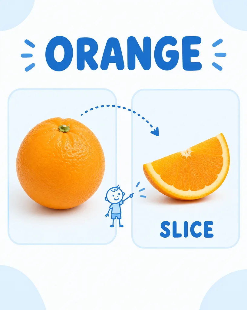
Kart Kosakata Buah untuk Anak Prasekolah

Kart Kosakata Buah untuk Anak Prasekolah

A clean, child-friendly educational vocabulary poster for preschool and kindergarten, designed like a modern visual flashcard. On the left inside a rounded panel is realistic studio photography of [a whole orange]. On the right inside a matching rounded panel is [an orange slice]. A playful dotted curved arrow connects the two panels, with a tiny, minimalist stick-figure child pointing toward the slice. At the top, the label "[ORANGE]" is written in large bold uppercase blue typography. Beneath the slice on the right, the label "[SLICE]" appears in bold uppercase blue letters. Background is soft white with very light pastel-blue accents, spacious layout, soft studio lighting, crisp focus, clear legible text, uncluttered educational design.

kartu kosakataflashcardprasekolah
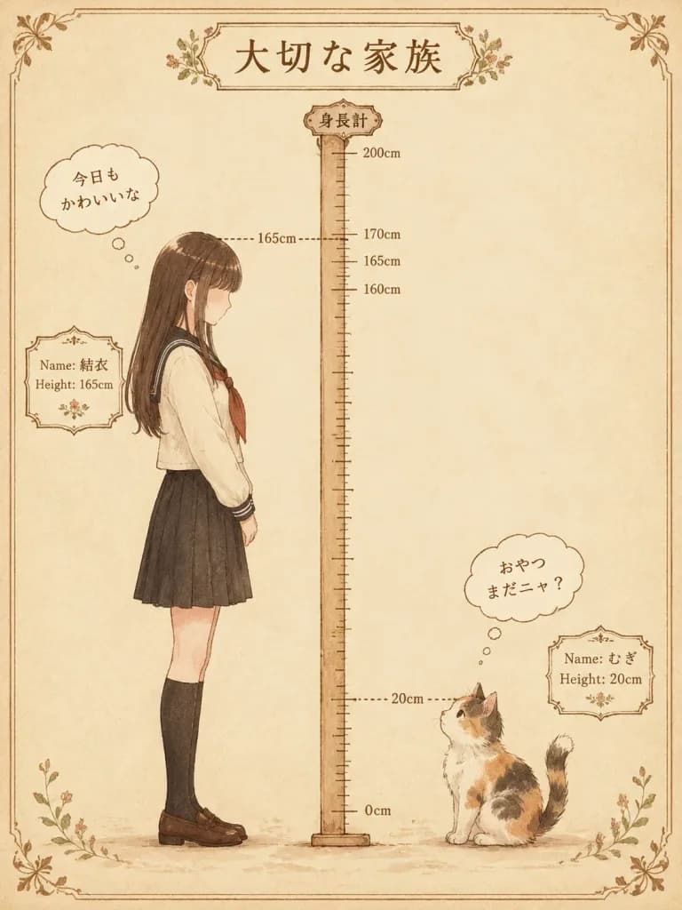
Poster Vintage Perbandingan Tinggi Badan

Poster Vintage Perbandingan Tinggi Badan

A nostalgic Japanese height-difference poster illustration titled "[大切な家族]" on a vertical warm cream parchment background. An antique stationery aesthetic with thin brown decorative borders and delicate watercolor shading with soft sepia ink outlines. In the center stands a tall vertical measuring ruler labeled "身長計" at the top, marked from 0cm to 200cm with visible tick marks and labels at 160cm, 165cm, and 170cm. Two dotted guide lines extend outward: one at 165cm to the left, and one at 20cm to the right. On the left stands [a gentle Japanese schoolgirl] in side profile facing right, exactly 165cm tall, with a shy posture, long dark brown hair, a minimalist featureless face, wearing a cream sailor-style school blouse with dark collar and cuffs, a brown necktie, a black pleated skirt, black knee-high socks, and brown loafers. A small ornate framed card beside her reads "Name: [結衣]" and "Height: 165cm". A thought bubble near her reads 「今日もかわいいな」. On the right stands [a fluffy calico kitten] at 20cm tall, facing left and looking upward, with white, orange, and dark patches, a round body, and an upturned tail. An ornate framed card beside it reads "Name: [むぎ]" and "Height: 20cm". A thought bubble above it reads 「おやつまだニャ?」. Soft anime storybook style, balanced layout, warm earth tones, sentimental and cozy atmosphere.

pengukur tinggiilustrasi animealat tulis vintage
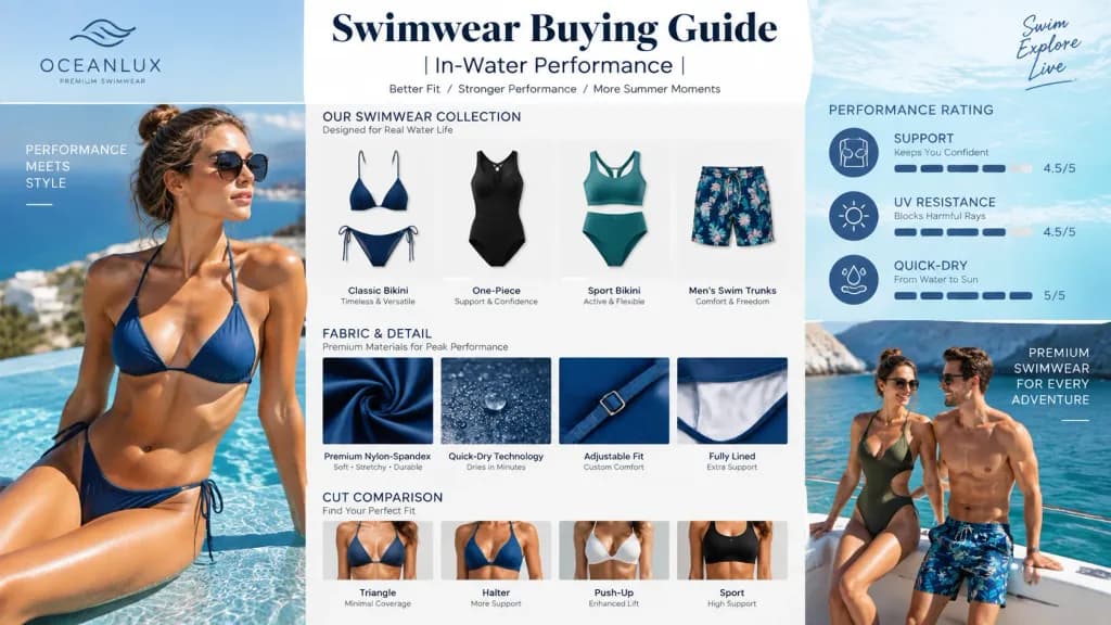
Poster Editorial Panduan Membeli Baju Renang

Poster Editorial Panduan Membeli Baju Renang

A 16:9 horizontal high-density infographic poster titled "[Swimwear Buying Guide | In-Water Performance]". The layout combines a luxury swimwear brand lookbook editorial with a professional buying infographic and summer aquatic product catalog. Composition features split panels: editorial fashion shots of models wearing functional water-ready swimwear in bright resort aquatic environments alongside organized product grids, fabric detail callouts, cut comparisons, and readable performance rating badges (support, UV resistance, quick-dry capability). Natural sun-drenched lighting blended with crisp commercial studio lighting for catalog items. Sleek, minimalist typography, high-end editorial aesthetic, clean structured visual hierarchy, professional and credible commercial look.

baju renangpanduan membeliinfografis
Infografik Editorial Kecantikan Majalah Mewah

Infografik Editorial Kecantikan Majalah Mewah

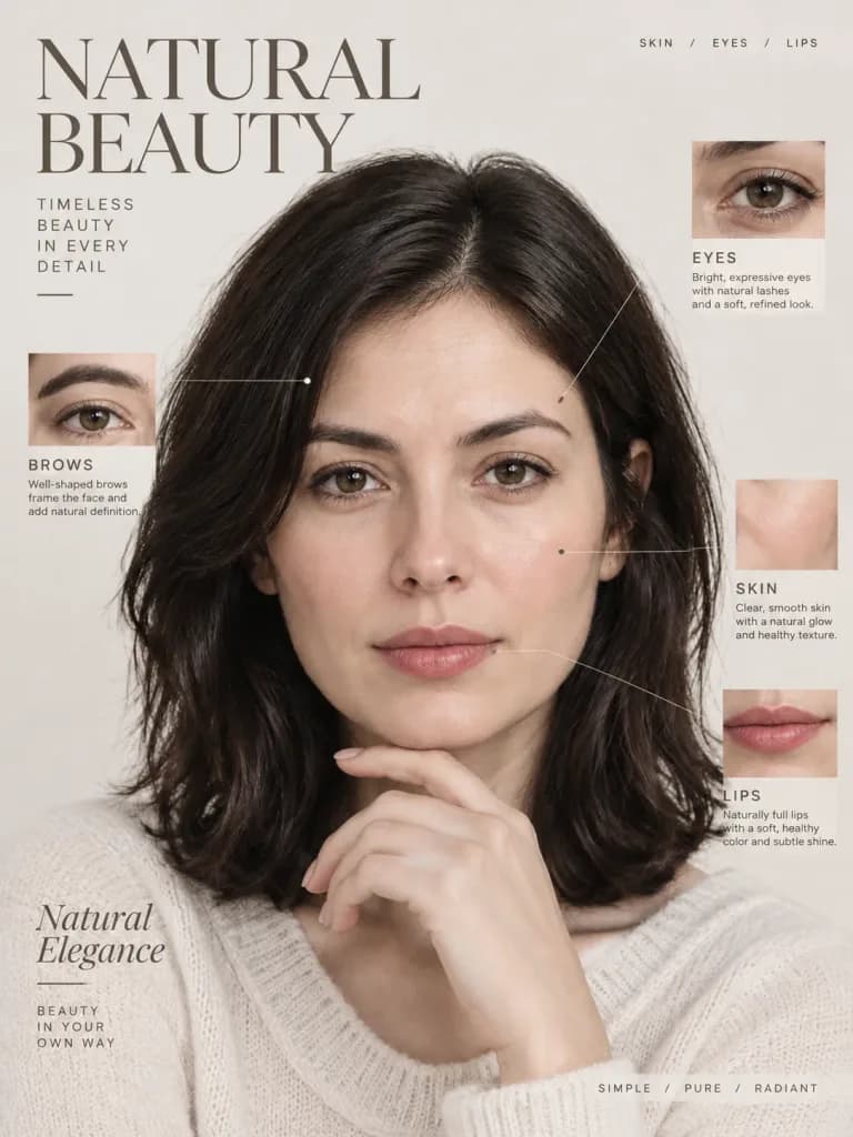
A high-end beauty editorial infographic based on the reference photo. Strictly preserve the subject's exact facial identity, recognizable facial features, natural skin texture, and realistic proportions. Style: [minimalist aesthetic with clean typography]. Layout: luxury fashion magazine editorial layout featuring elegant text callouts, beauty annotations, and polished graphic design elements.

editorial kecantikanmajalah modeinfografik
Bagan Perbandingan Era Taylor Swift dan Peradaban Manusia

Bagan Perbandingan Era Taylor Swift dan Peradaban Manusia

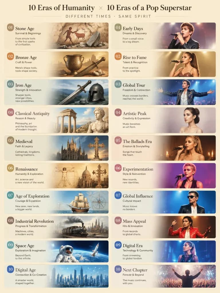
An editorial infographic visual comparison chart matching 10 eras of human civilization with Taylor Swift’s 10 Eras Tour albums. Structured two-column or grid layout with 10 distinct paired panels, visually linking each era's aesthetic, color palette, and mood to its paired album. The 10 historical eras: [Stone Age, Bronze Age, Iron Age, Classical Antiquity, Medieval, Renaissance, Age of Exploration, Industrial Revolution, Space Age, Digital Age]. Elegant typography, thematic illustrations for each pair, clean editorial layout, balanced soft studio lighting, high graphic design fidelity.

infografistaylor swiftbagan perbandingan
Poster Infografis Hari Termometer Jepang

Poster Infografis Hari Termometer Jepang

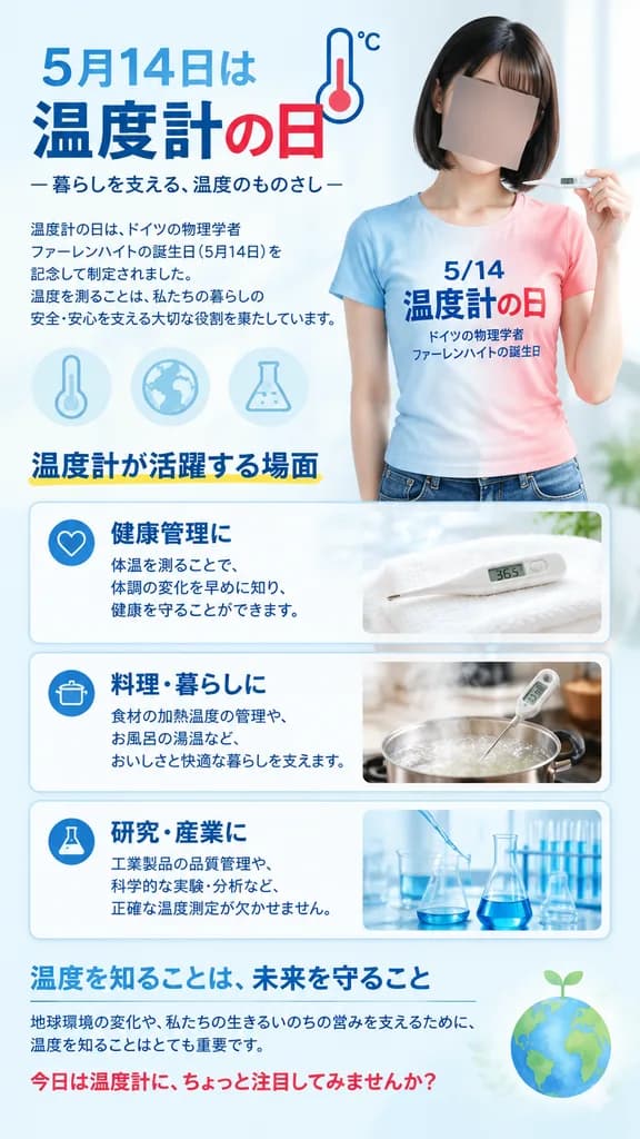
A vertical Japanese public-awareness poster for Thermometer Day on [May 14], designed in a clean, professional educational infographic layout with a 9:16 aspect ratio, pale ice-blue background, soft clinical lighting, and a crisp blue-and-red accent palette. Main subject: On the right half, a realistic young Japanese woman with a neat chin-length black bob haircut, shown from upper thighs up. Her face is intentionally obscured by a solid neutral rectangular blur block. She wears a fitted short-sleeve gradient T-shirt fading from sky blue on the left to soft pink-red on the right, printed with Japanese text: "5/14" on top, "温度計の日" large in the middle, and "ドイツの物理学者 ファーレンハイトの誕生日" in smaller font beneath. She delicately holds a sleek white digital thermometer near her shoulder. Top section: On the upper left, a prominent Japanese headline: "5月14日は" followed by "温度計の日" ("温度計" in deep navy blue, "の日" in crimson red), accompanied by a minimalist line-art thermometer icon with "°C". Subtitle below reads: "— 暮らしを支える、温度のものさし —". A concise paragraph in small Japanese typography explains Thermometer Day honoring German physicist Fahrenheit and the everyday role of temperature measurement. Decorative elements: Three subtle pale blue scientific icons float in the mid-left background: a vertical thermometer, a globe, and a laboratory flask. Infographic cards: A section titled "温度計が活躍する場面" with a subtle yellow underline, featuring three horizontal rounded-corner cards with blue outlines: 1. Heart icon, bold title "健康管理に", brief Japanese copy about body temperature tracking, and a photo thumbnail of a digital thermometer resting on a white towel displaying 36.5. 2. Cooking pot icon, bold title "料理・暮らしに", Japanese copy about culinary precision and bath water temperatures, with a thumbnail of a thermometer in a steaming pot. 3. Laboratory flask icon, bold title "研究・産業に", Japanese copy on industrial and scientific precision, with a thumbnail of glass beakers and pipettes. Bottom section: A closing dark-blue heading "温度を知ることは、未来を守ること", a thin horizontal divider line, brief Japanese text regarding environmental awareness and protecting living systems, and a concluding red call-to-action: "今日は温度計に、ちょっと注目してみませんか?". A faint green-blue Earth icon with a tiny sprout accents the bottom right. Visual style: Polished Japanese graphic design, realistic photography for the model and thumbnails, sharp typography, generous white space, soft drop shadows, clean editorial finish.

hari termometerposter jepanginfografis
Tata Letak Dua Halaman Buku Resep

Tata Letak Dua Halaman Buku Resep

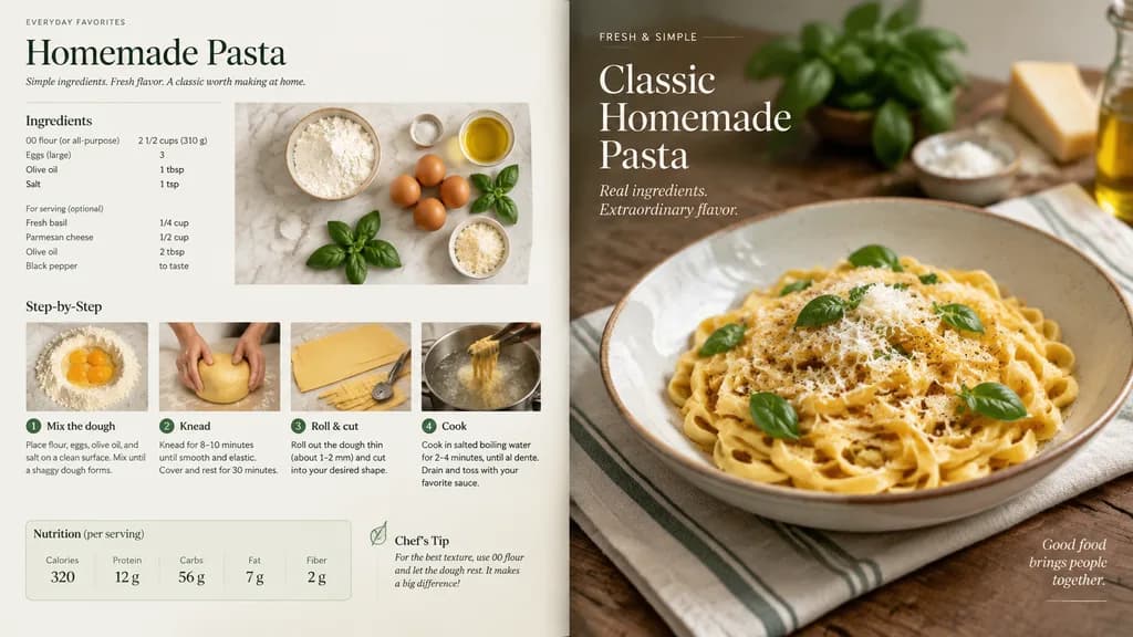
A professional magazine-style double-page cookbook spread redesigning the handwritten recipe in the reference photo [or dish: homemade pasta]. The layout features step-by-step culinary preparation flat lays, neatly labeled ingredients with precise measurements, and an elegant nutritional panel with calorie breakdown. Adjacent page shows a styled hero food photograph of the finished dish. Clean editorial typography, balanced grid layout, soft natural daylight, high-end food magazine aesthetics.

tata letak buku resepdesain resepfotografi makanan
Infografis Pembongkaran Teknis Isometrik

Infografis Pembongkaran Teknis Isometrik

Technical teardown infographic of [a mechanical wristwatch], shown from a 45-degree isometric 3D perspective, slightly tilted to reveal internal architecture and depth. The rendering blends a realistic photoreal product view with black ink architectural technical pen annotations on a solid white background. Includes transparent cutaway sections showing inner components, precise dimension lines, measurements, scale markers, and material callouts. Color-coded flow arrows indicate functional pathways: red for power, blue for connectivity/data, orange for thermal/mechanics, and green for sensors. Simple cross-sectional diagrams and schematics accent the periphery. A hand-drawn technical title box in the top-left corner reads "[MECHANICAL WATCH]". Educational engineering manual aesthetic with dominant black linework, balanced negative space, and 10–15% colored accent density.

infografisgambar teknikisometrik
Infografik Penjelasan Galeri Museum

Infografik Penjelasan Galeri Museum

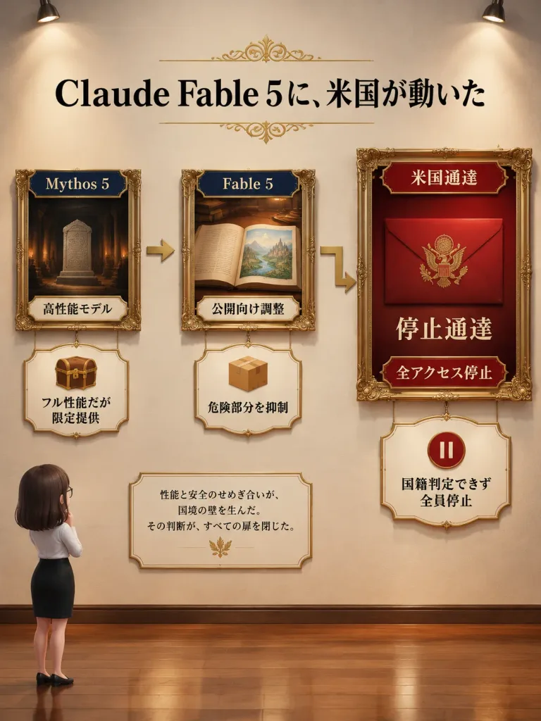
Vertical museum-gallery style Japanese explainer infographic presented as a curated wall exhibit. Setting & Composition: A vertical gallery with a warm cream wall, polished wooden floor, subtle casting shadows, and two ceiling spotlights at the upper left and upper right providing elegant editorial lighting. In the lower-left foreground, exactly one chibi-style adult woman stands viewed from behind in three-quarter view looking up at the wall, with [dark brown] shoulder-length bobbed hair, glasses, a white blouse, a black pencil skirt, and black flats, appearing small relative to the high wall. Typography & Flow: - Top center: Large centered headline in bold black serif Japanese typography reading "[Claude Fable 5に、米国が動いた]", accented with small gold ornamental flourishes above and below. - Exactly two gold directional arrows connect three ornate gold-framed exhibits from left to right: one straight gold arrow pointing from the left frame to the center frame, and one L-shaped gold arrow leading from the center frame down and right toward the large right frame. Framed Exhibits (exactly 3): 1. Left exhibit: Small ornate gold frame depicting a dark temple interior with a carved stone tablet. Top navy label: "[Mythos 5]"; bottom ivory label: "高性能モデル". Directly beneath hangs an ornate ivory plaque showing a small brown treasure chest with a gold lock and text: "フル性能だが限定提供". 2. Center exhibit: Medium ornate gold frame showing an open illustrated storybook on a wooden desk, displaying a bright landscape illustration on the right page. Top navy label: "[Fable 5]"; bottom ivory label: "公開向け調整". Directly beneath hangs an ornate ivory plaque showing a cardboard box icon and text: "危険部分を抑制". 3. Right exhibit: Largest ornate gold frame set against a deep red background, showing a sealed red official envelope bearing a gold eagle seal. Top red banner: "米国通達"; large central text: "停止通達"; bottom red label: "全アクセス停止". Directly beneath hangs an ornate ivory plaque showing a red circular pause icon and text: "国籍判定できず 全員停止". Additional Elements: - A small ornate ivory note card positioned in the lower center-left area contains Japanese serif text: "性能と安全のせめぎ合いが、国境の壁を生んだ。その判断が、すべての扉を閉じた。" with a tiny gold decorative emblem below. Visual Style: Realistic 3D-rendered infographic aesthetic, ornate gold frames, warm museum ambiance, clean serif Japanese typography, balanced negative space, and crisp editorial finish.

infografikmuseumgaleri
Bagan Perbandingan Analisis Warna Pribadi

Bagan Perbandingan Analisis Warna Pribadi

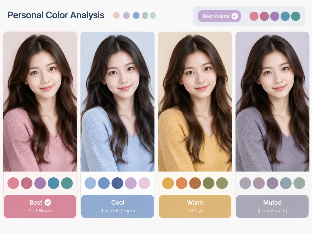
A [personal color analysis graphic] based on the reference photo. Present side-by-side clothing color comparisons showing the subject wearing different color palettes to highlight which tones best complement their skin undertone and features. Clean layout, visual-first composition with concise category and color labels only, no long text or paragraphs.

analisis warnainfografikpenataan busana
Infografik Sketchnote Strategi AI Eksekutif

Infografik Sketchnote Strategi AI Eksekutif

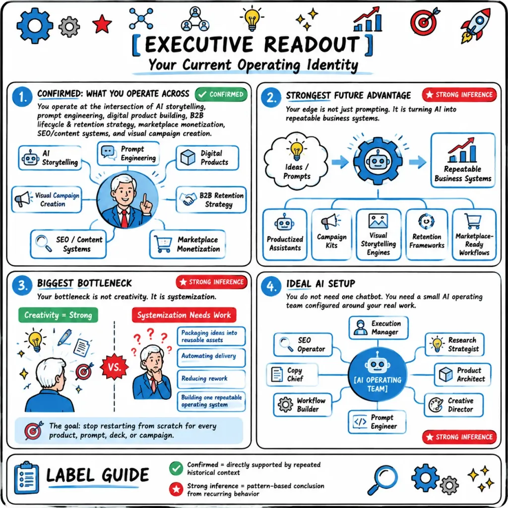
Hand-drawn executive strategy infographic titled "[EXECUTIVE READOUT]" with subtitle "[Your Current Operating Identity]" in a consulting sketchnote whiteboard style. Composition & Layout: Square 1:1 canvas, clean white background, thick black rounded outer border. Divided into a 2x2 grid of four large rounded rectangular panels with a full-width "LABEL GUIDE" strip at the bottom. Top border is decorated with exactly 11 doodle icons: a large blue gear, small gray gear, red star, two network icons, yellow lightbulb, two sparkles, rising bar chart with red arrow, red target with arrow, and a rocket. Typography is crisp black hand-lettering with blue accents, red inference badges, and green confirmation badges. Panel 1 (top-left, numbered blue circle "1.", titled "CONFIRMED: WHAT YOU OPERATE ACROSS"): Text: "You operate at the intersection of AI storytelling, prompt engineering, digital product building, B2B lifecycle & retention strategy, marketplace monetization, SEO/content systems, and visual campaign creation." Central circular portrait of a smiling white-haired professional in a blue jacket and red tie, pointing upward, surrounded by 7 connected capability boxes: "AI Storytelling", "Prompt Engineering", "Digital Products", "B2B Retention Strategy", "Marketplace Monetization", "SEO / Content Systems", "Visual Campaign Creation". Green badge: "CONFIRMED". Panel 2 (top-right, numbered blue circle "2.", titled "STRONGEST FUTURE ADVANTAGE"): Text: "Your edge is not just prompting. It is turning AI into repeatable business systems." Left-to-right diagram: thought cloud "Ideas / Prompts" -> central gear machine -> chart card "Repeatable Business Systems", connected by blue arrows. Below, 5 output cards: "Productized Assistants", "Campaign Kits", "Visual Storytelling Engines", "Retention Frameworks", "Marketplace-Ready Workflows". Red badge: "STRONG INFERENCE". Panel 3 (bottom-left, numbered blue circle "3.", titled "BIGGEST BOTTLENECK"): Text: "Your bottleneck is not creativity. It is systemization." Split by dotted vertical line with central spiky "VS." burst. Left side labeled "Creativity = Strong" with green header shows the person from behind among idea doodles (lightbulb, pencil, notes, sparkles, target). Right side labeled "Systemization Needs Work" with red header shows the person stressed with question marks and 4 process cards: "Packaging ideas into reusable assets", "Automating delivery", "Reducing rework", "Building one repeatable operating system". Bottom callout with target icon: "The goal: stop restarting from scratch for every product, prompt, deck, or campaign." Red badge: "STRONG INFERENCE". Panel 4 (bottom-right, numbered blue circle "4.", titled "IDEAL AI SETUP"): Text: "You do not need one chatbot. You need a small AI operating team configured around your real work." Central blue circle labeled "[AI OPERATING TEAM]" surrounded by 8 role cards connected via thin lines: "Execution Manager", "Research Strategist", "Product Architect", "Creative Director", "Prompt Engineer", "Workflow Builder", "Copy Chief", "SEO Operator". Red badge: "STRONG INFERENCE". Bottom Strip: Full-width rounded card titled "LABEL GUIDE" with clipboard icon. Legend: green check "Confirmed = directly supported by repeated historical context", red star "Strong inference = pattern-based conclusion from recurring behavior". Right side includes magnifying glass, two gears, and sparkles. Style: Marker-drawn business sketchnote, flat off-white card fills, subtle marker shading, clean legible hand-lettering, restrained palette of sky blue, crimson, emerald green, and soft yellow. No photorealism, no 3D rendering.

infografiksketchnotepapan tulis
Infografik Makanan Terurai dengan Bahan Melayang

Infografik Makanan Terurai dengan Bahan Melayang

photorealistic food illustration with editorial infographic overlays. 3:4. commercial studio food photography with refined editorial lighting. shallow depth of field, sharp subject, soft blurred background. soft directional key light, deli…

makananinfografikpencuci-mulut
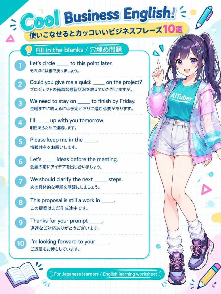
Poster Lembar Kerja Bahasa Inggris Bisnis Anime

Poster Lembar Kerja Bahasa Inggris Bisnis Anime

bilingual English learning worksheet poster. clean educational infographic with anime character mascot, bright pastel stationery theme, white graph-paper background, rounded shapes, glossy headline lettering, print-friendly vertical A4 lay…

lembar kerjainfografisbahasa inggris bisnis
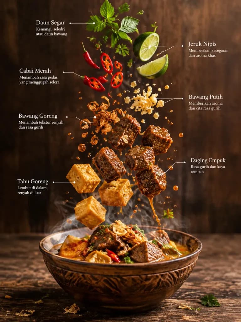
Infografis Kuliner Bahan Mengambang

Infografis Kuliner Bahan Mengambang

Culinary infographic. High-end editorial magazine food infographic. [Indonesian]. A traditional serving bowl holding a steaming hot dish. Tender meat pieces. Golden crispy tofu. Rich sauce droplets frozen in mid-air. Fresh green herbs. Red…

infografiskulinerfotografi-makanan
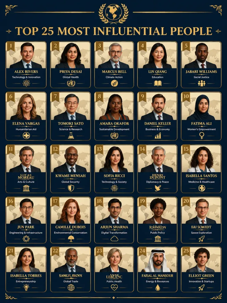
Infografik Kisi Tokoh Paling Berpengaruh

Infografik Kisi Tokoh Paling Berpengaruh

A professional infographic poster titled "[Top 25 Most Influential People]" set against a [dark navy blue background] with [gold decorative accents]. The layout features a 5-column by 5-row grid of 25 individual portrait cards. Each card has a cream-beige background with a faint world map watermark behind a realistic illustrated portrait in the center, a gold rank number in the top-left corner, the person's full name in bold gold serif typography at the bottom, their field of influence in small white text below, and an organization logo at the very bottom. At the top, the title "TOP 25 MOST INFLUENTIAL PEOPLE" is displayed in large gold serif lettering beneath a gold laurel emblem. Luxury editorial design, premium typography, rich dark navy and gold palette, crisp graphic details.

infografikposterperingkat
Templat Kartu Kosakata Bahasa Inggris

Templat Kartu Kosakata Bahasa Inggris

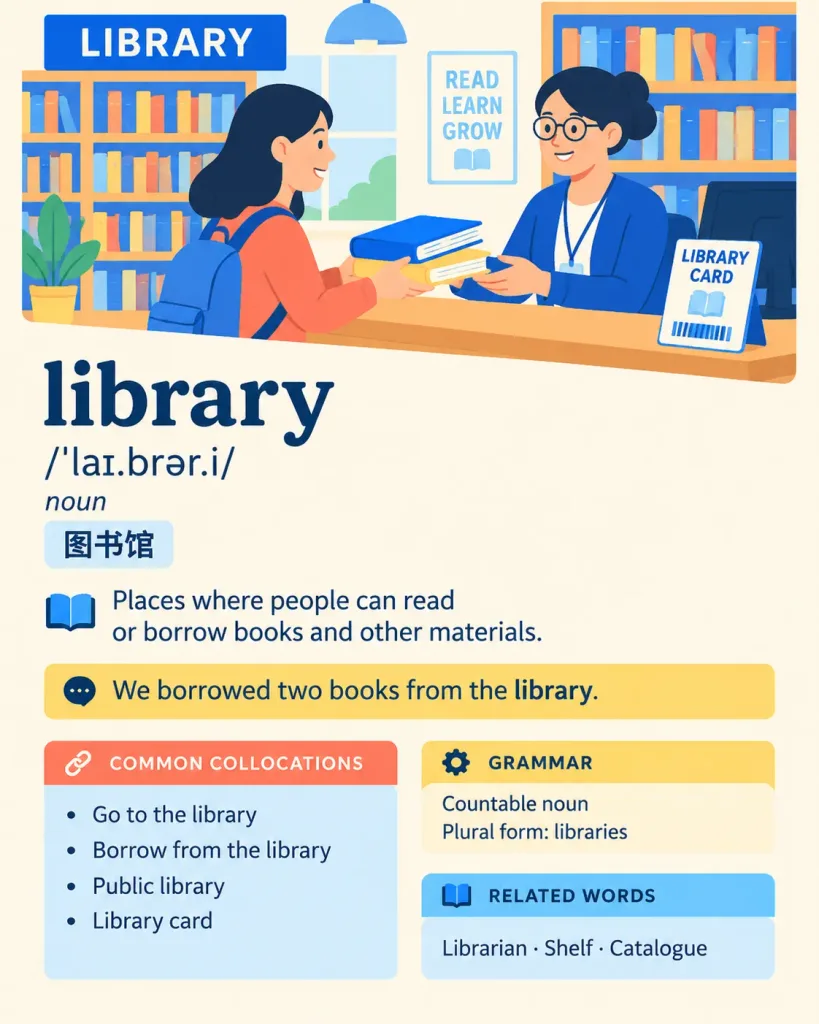
An exquisite 4:5 vertical English vocabulary study card designed for A2–B1 language learners. Theme: [vibrant editorial illustration] Palette: [Primary Cobalt Blue #2563EB, Secondary Coral Red #FF6B5C, Secondary Lemon Yellow #FFD84D, Secondary Sky Blue #7DD3FC, Dark Text #17324D, Warm Cream Background #FFF9E8] Layout and Style: Arranged like a professionally printed learner's dictionary page with generous white space. Features a prominent headword, compact pronunciation line, clear definitions, highlighted example sentences, and neatly organized learning modules. Style is pure flat colors and clean line art; no gradients, shadows, 3D effects, gloss, or photorealism. All text is dark, sharp, and perfectly legible. Illustration: A warm, modern flat vector cross-section illustration of a library. A friendly learner borrows two books from a librarian at a counter, with bookshelves and a library card naturally visible. Editorial, modern character aesthetic. Text to display accurately on the card: "[library]" "/ˈlaɪ.brər.i/" "noun" "图书馆" "Places where people can read or borrow books and other materials." "We borrowed two books from the library." COMMON COLLOCATIONS Go to the library Borrow from the library Public library Library card GRAMMAR Countable noun Plural form: libraries RELATED WORDS Librarian · Shelf · Catalogue

kartu kilaskosakatapendidikan
Kisi Ringkasan Slide Bisnis Jepang

Kisi Ringkasan Slide Bisnis Jepang

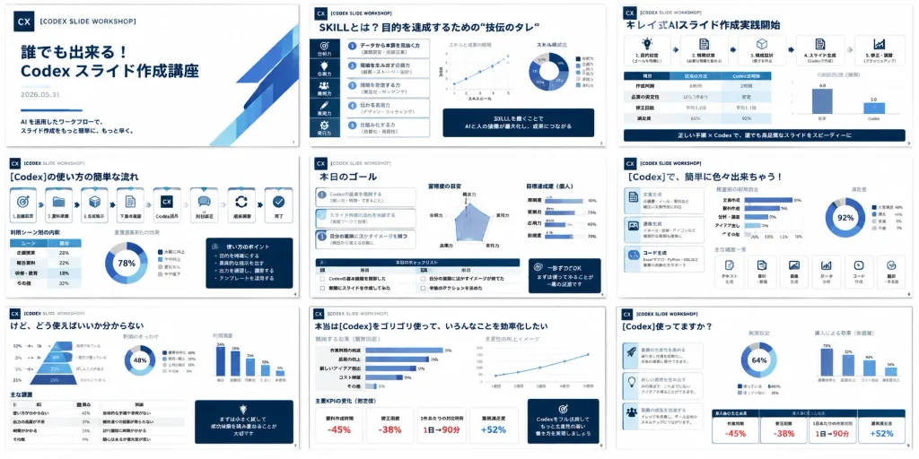
A high-density presentation overview showing exactly 9 miniature slides from a Japanese business training deck about [Codex slide creation workshop]. The slides resemble a polished corporate consulting deck, arranged in a neat 3 by 3 grid on a pure white background with thin, uniform gaps between slides, each slide rendered in 16:9 landscape format. Composition: Wide rectangular collage, 2:1 aspect ratio. Crisp vector-like slide thumbnails with a clean white and deep navy color palette, featuring subtle accent highlights in blue, cyan, red, and muted gray. Clean Japanese corporate typography, dense structured text blocks, data visualizations, cards, monochrome icons, and slide numbers. A small square "CX" logo and the label "[CODEX SLIDE WORKSHOP]" appear consistently across slides. Slide Layout Details (exactly 9 slides): 1. Title slide: Minimalist white layout with navy "CX" logo at top left, spaced caption "[CODEX SLIDE WORKSHOP]", bold Japanese main title "[誰でも出来る!Codex スライド作成講座]", date "2026.05.31", and a short subtitle about AI workflow slide production. 2. Skills slide: Header "SKILLとは?目的を達成するための“技伝のタレ”", dense analytical layout with a left vertical icon strip, numbered skill list, two small scatter/line charts, one donut chart, and dark navy callout boxes. 3. Formula slide: Header "キレイ式AIスライド作成実践開始", process framework with icon cards, a comparison table, a small bar chart, and a dark navy bottom banner. 4. Workflow slide: Header "[Codex]の使い方の簡単な流れ", horizontal chain of 8 process cards with icons (target, folder, cube, document, CX logo, chat bubble, circular arrows, checkmark), accompanied by miniature tables, a donut chart, and a navy sidebar memo. 5. Goal slide: Header "本日のゴール", three numbered goal cards on the left, a central radar chart, progress bars on the right, and a bottom checklist table with navy callout box. 6. Capabilities slide: Header "[Codex]で、簡単に色々出来ちゃう!", left column of three icon cards, central bar chart, right donut chart, and a bottom row of six compact feature cards. 7. Challenges slide: Header "けど、どう使えばいいか分からない", large slanted 4-tier funnel/pyramid chart with percentages on the left, donut chart, vertical bar chart, bottom data table, and navy quote card. 8. Efficiency slide: Header "本当は[Codex]をゴリゴリ使って、いろんなことを効率化したい", multiple horizontal bar charts, an upward-trending line chart, four KPI cards displaying red negative percentages, and a navy recommendation box. 9. Impact slide: Header "[Codex]使ってますか?", three bulleted explanatory blocks on the left, central donut chart, right bar chart, and bottom KPI cards showing stats like "-45%", "-38%", "1日→90分", and "+52%". Style: Japanese management-consulting deck aesthetic, rigorous information hierarchy, dark navy headers, subtle gray borders, rounded metric containers, and clean vector infographics. No people, no photos, no device mockups, no browser interface, no watermarks.
presentasislideinfografis
Panduan Langkah demi Langkah Menggambar Robot Kartun

Panduan Langkah demi Langkah Menggambar Robot Kartun

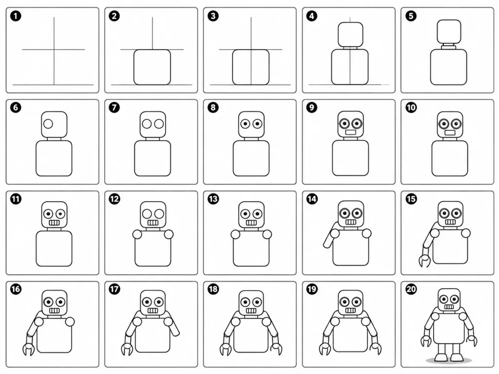
A 20-panel sequential drawing guide layout showing step-by-step instructions for drawing a cute cartoon robot on a white background. Each numbered panel retains all previous drawing steps and adds exactly one clear new line or shape: 1. Light construction guide lines: vertical center, horizontal center, and a ground line. 2. Add torso: rounded rectangle positioned above the ground line. 3. Add torso vertical centerline. 4. Add head: smaller rounded square placed directly above the torso. 5. Add neck connector: short rounded rectangular block. 6. Add left eye circle. 7. Add right eye circle. 8. Add pupils inside both eyes. 9. Add thin rim rings around both eyes. 10. Add rectangular mouth below the eyes. 11. Add evenly spaced vertical grille slats inside the mouth. 12. Add left shoulder joint circle on the side of the torso. 13. Add right shoulder joint circle. 14. Add left upper arm cylinder extending from the left shoulder. 15. Add left elbow joint circle and left forearm cylinder. 16. Add left claw hand with a base curve and two prongs. 17. Add right upper arm cylinder extending from the right shoulder. 18. Add right elbow joint circle and right forearm cylinder. 19. Add right claw hand matching the left hand. 20. Add two short blocky legs from the torso base, two rounded trapezoid feet, and a small soft ground shadow. Clean black-and-white line art infographic style, clear grid arrangement, instructional illustration.
panduan menggambarlangkah demi langkahrobot kartun
Infografis Edukasi Anak Sepak Bola Maroko

Infografis Edukasi Anak Sepak Bola Maroko

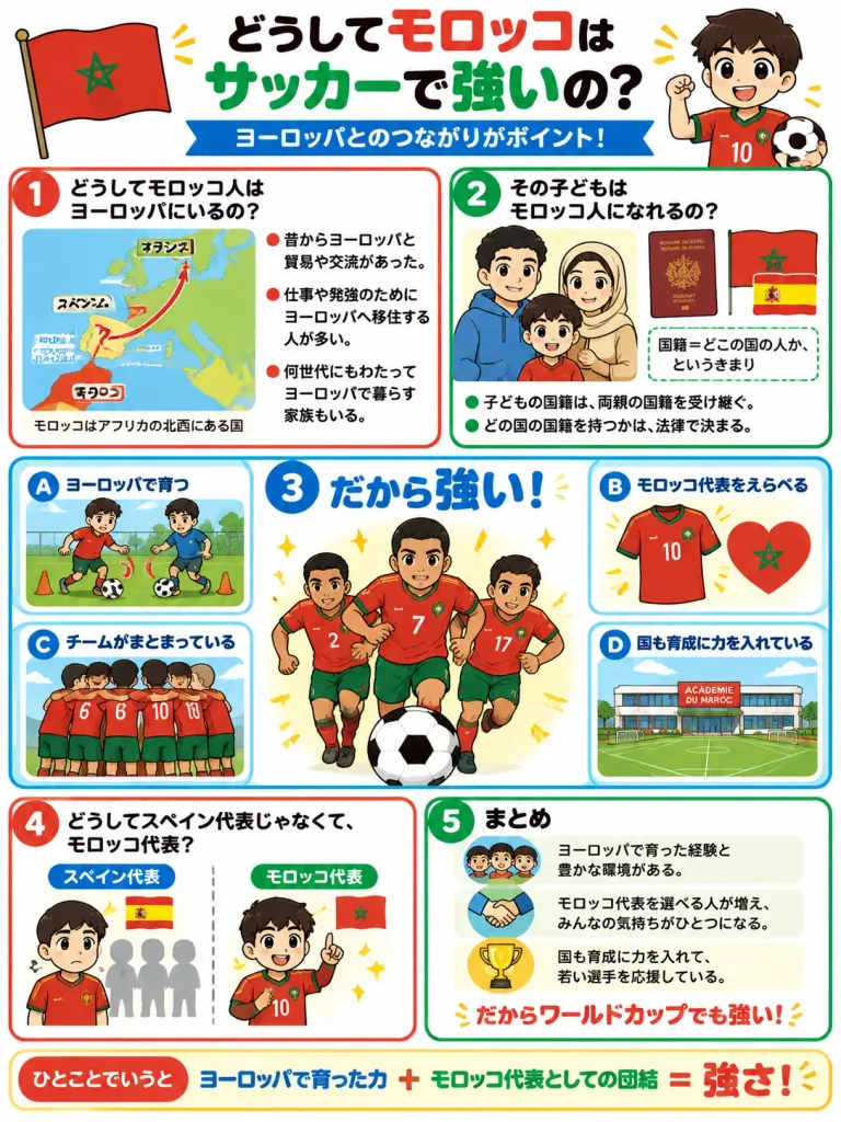
Vertical portrait educational infographic for children in Japanese, formatted as a colorful school handout poster on a clean white background with thick rounded red, green, and blue panel borders. High readability, bright primary colors, clean 2D manga-style vector cartoon illustration, no photorealism. Top header: - Bold Japanese headline across the top: 「[どうしてモロッコはサッカーで強いの?]」 with 「モロッコ」 in red and 「サッカーで強い」 in green. - Blue ribbon banner subtitle underneath: 「ヨーロッパとのつながりがポイント!」 - Top-left: a waving Moroccan flag. - Top-right: a smiling cartoon boy in a red Morocco soccer jersey holding a soccer ball. Infographic layout featuring 5 numbered main panels and 4 smaller lettered sub-cards: - Section ① (Upper-left, red badge 「①」): Title 「どうしてモロッコ人はヨーロッパにいるの?」. A simplified color map of Western Europe and North Africa labeled 「フランス」, 「スペイン」, 「オランダ」, 「ジブラルタル海峡」, and 「モロッコ」, with red directional arrows pointing from Morocco toward Spain, France, and the Netherlands. Caption: 「モロッコはアフリカの北西にある国」. 3 red bullet points explaining historical links, migration for work/study, and multi-generational families. - Section ② (Upper-right, green badge 「②」): Title 「その子どもはモロッコ人になれるの?」. Illustration of a smiling family of 3 (father, mother, young boy), alongside a Moroccan passport labeled 「ROYAUME DU MAROC PASSPORT」, a Morocco flag, and a Spain flag. Dotted callout box: 「国籍=どこの国の人か、というきまり」. 2 green bullet points explaining nationality inheritance. - Section ③ (Center, large blue badge 「③」): Title 「だから強い!」. Exactly 3 dynamic Moroccan soccer players in red shirts and green shorts with jersey numbers 2, 7, and 17 running forward before a giant soccer ball, surrounded by yellow sparkle effects. - Four lettered cards surrounding section ③: * Card A: Title 「ヨーロッパで育つ」, showing 2 young boys training on a grass pitch with orange cones. * Card B: Title 「モロッコ代表をえらべる」, showing a red number 10 Morocco jersey and a red heart containing the green Moroccan star. * Card C: Title 「チームがまとまっている」, showing 5 players in red jerseys huddled together from behind, showing numbers 6 and 10. * Card D: Title 「国も育成に力を入れている」, showing a modern youth soccer academy building and pitch. - Section ④ (Lower-left, red badge 「④」): Title 「どうしてスペイン代表じゃなくて、モロッコ代表?」. Split comparison between 「スペイン代表」 (worried boy facing gray competition silhouettes) and 「モロッコ代表」 (proud boy pointing upward in red Morocco kit). - Section ⑤ (Lower-right, green badge 「⑤」): Title 「まとめ」. 3 organized rows featuring icon badges (3 children, a handshake, a gold trophy) with concluding summary text, ending with emphasized red text: 「だからワールドカップでも強い!」. Bottom footer strip: - Red rounded badge 「ひとことでいうと」 followed by the bold colorful equation: 「ヨーロッパで育った力 + モロッコ代表としての団結 = 強さ!」.

infografissepak bolaedukasi anak
Infografis Tutorial Google Fonts Bahasa Jepang

Infografis Tutorial Google Fonts Bahasa Jepang

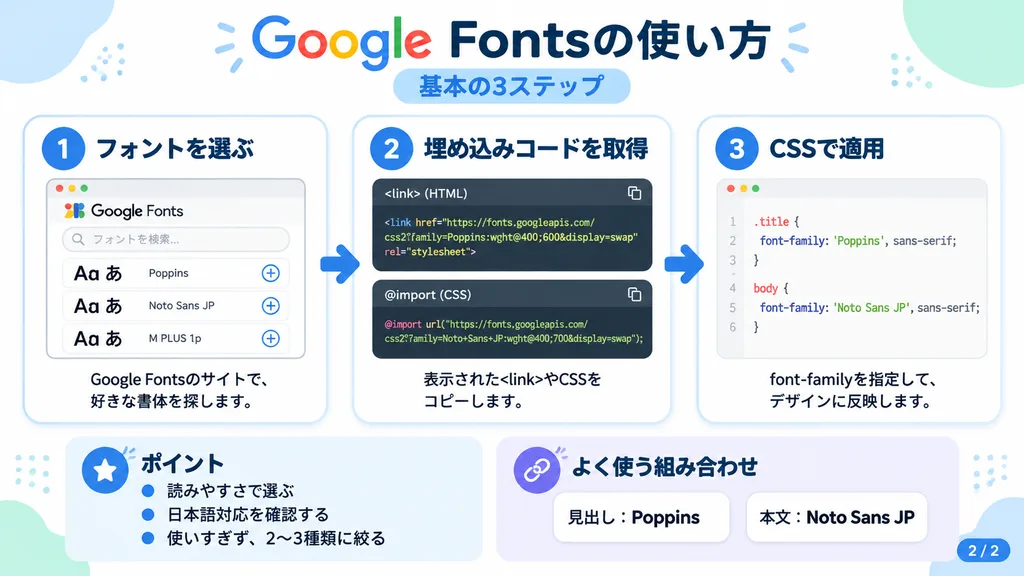
Japanese infographic. clean modern flat design, pure white background, soft pastel blue and mint corner decorative blobs, rounded cards with subtle drop shadows, tech tutorial aesthetic, crisp vector typography and UI illustrations. [1. フォ…

infografisgoogle fontstutorial
Poster Komik Rutinitas Harian Kreator AI

Poster Komik Rutinitas Harian Kreator AI

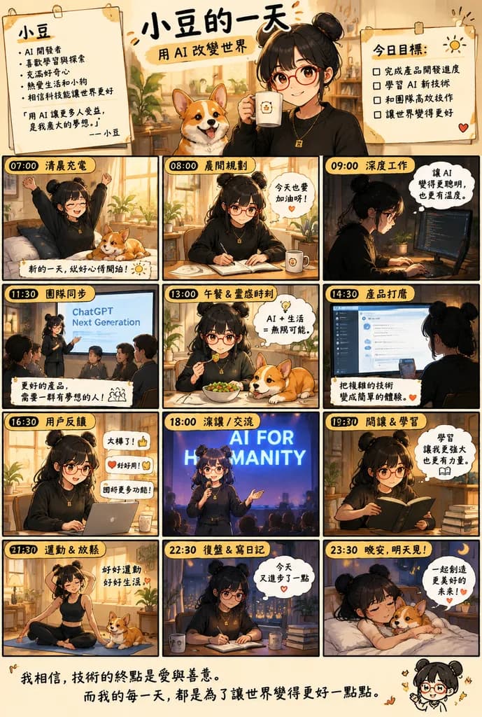
Chinese inspirational comic-style daily routine poster. warm cinematic anime illustration with soft golden indoor lighting, cozy productivity aesthetic, clean black panel borders, handwritten Chinese headline, social-media poster finish. a…

komikinfografisrutinitas harian
Diorama Infografis Pohon Evolusi Linguistik

Diorama Infografis Pohon Evolusi Linguistik

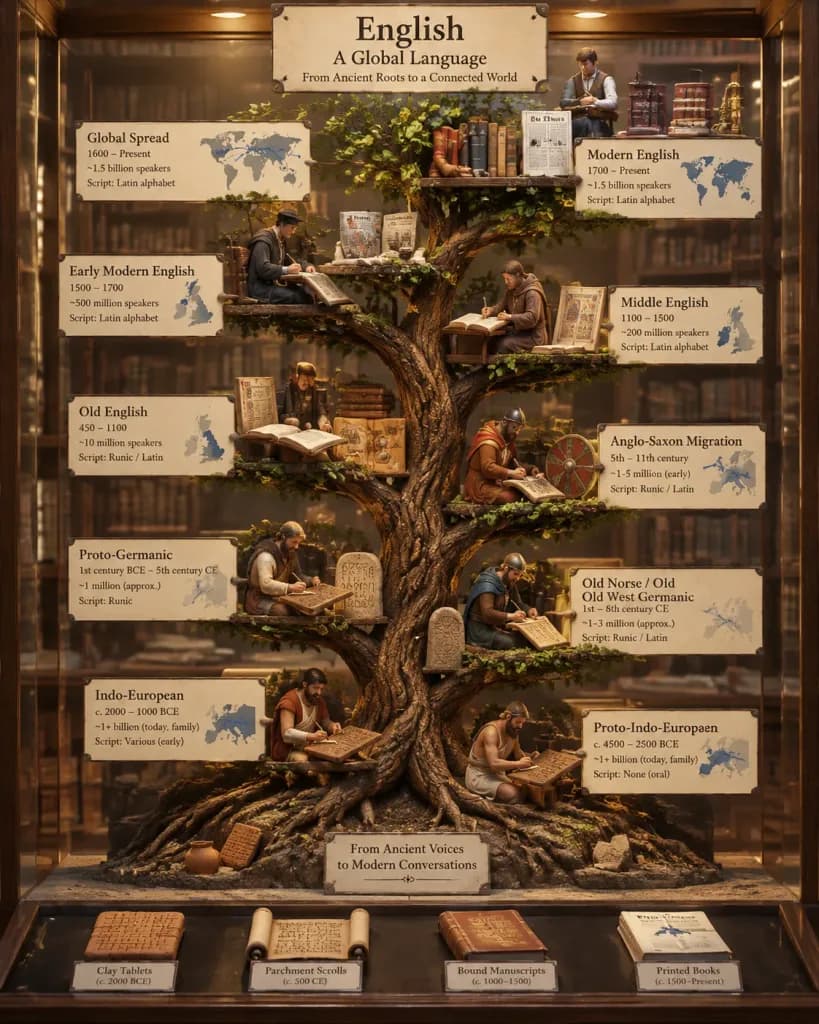
A vertical 3D diorama tree structure illustrating the linguistic evolution of [English], set inside an ancient library museum display case with modern infographic styling. The tree grows upward from root ancestral origins through historical branches. Between 8 to 15 miniature historical scribe figurines are perched along the branches, actively writing in period-appropriate scripts. Display miniature artifacts along the levels, progressing from clay tablets and aged parchment scrolls at the roots to bound manuscripts and modern printed paper near the top. Small inset geographical maps trace historical migration and spread. Clean typographic labels display language family names, eras, speaker counts, and script systems. Soft warm archival lighting, museum exhibition aesthetic, detailed macro view, vertical 4:5 composition.

linguistikinfografispohon bahasa
Infografik Latihan Kebugaran Modular Bahasa Mandarin

Infografik Latihan Kebugaran Modular Bahasa Mandarin

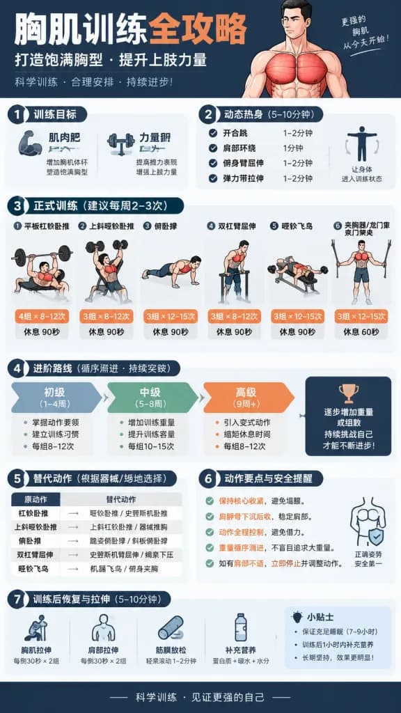
A modern, professional vertical Chinese fitness infographic poster about [chest muscle training]. The layout uses a clean, structured modular card design with high readability, suitable for fitness reference or social media sharing. Bold Chinese typography and prominent numerical indicators for sets and reps throughout. Content modules organized top to bottom: Title section with bold Chinese headline and subtitle; Training Goal module (muscle hypertrophy and strength); Dynamic Warm-up checklist; Main Workout block featuring 4 to 6 illustrated core exercises with sets, reps, and rest periods; Exercise Progression/Unlock flowchart; Alternative Exercise substitutions; Form Cues and safety execution reminders; Post-workout Recovery and stretching tips. Clean minimalist color palette with contrasting accents, flat 2D graphic illustrations, sharp vectors, and crisp Chinese typography.

infografikfitnesslatihan
Infografik Editorial Analisis Garis Tangan

Infografik Editorial Analisis Garis Tangan

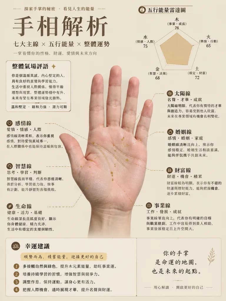
Magazine-style palmistry analysis infographic chart based on the reference photo of a palm. Subject: The authentic palm from the reference photo placed centrally, strictly preserving natural skin tones, real skin texture, and actual palm lines without artificial smoothing or anatomical distortion. Set against a clean, minimalist [solid muted beige] background. Overlays: Ultra-fine metallic line overlays with dashed connecting pointer lines precisely annotating the life line, wisdom line, heart line, career line, wealth line, marriage line, and sun line. Editorial Infographic Elements: Organized editorial layout in clean Traditional Chinese typography, featuring a "Five Elements Energy Radar Chart", an "Overall Aura Comments" section, modular "Personality and Fortune Analysis" callout cards for each major line, and a stylized "Luck Suggestions" highlighted text block. Clean, high-legibility layout with refined modern graphic design.

garis tanganinfografikpalmistri
Infografik Alur Kerja Pembuatan Film Sinematik AI

Infografik Alur Kerja Pembuatan Film Sinematik AI

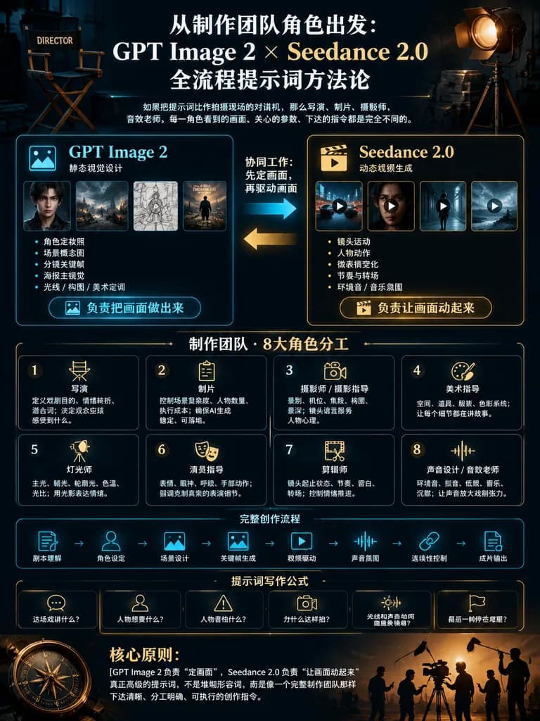
cinematic Chinese infographic poster for an AI filmmaking prompt workflow. large bold white serif Chinese title with gold emphasis, centered. small white explanatory Chinese text. director chair on the upper left, labeled DIRECTOR, dimly l…

infografikpembuatan filmalur kerja
Slide Presentasi Papan Tulis Gambar Tangan

Slide Presentasi Papan Tulis Gambar Tangan

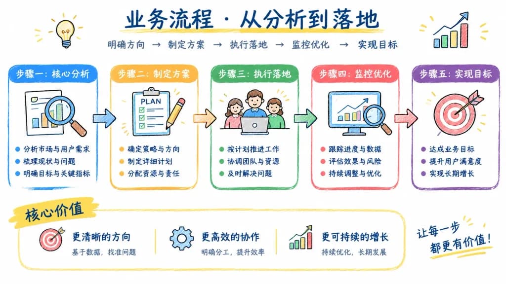
A presentation slide in a whiteboard doodle style, explaining [a step-by-step business workflow]. Clean white background, featuring a consistent hand-drawn colored thick pencil sketch style, sketchy icons, directional arrows, and structured diagram blocks. Includes legible hand-lettered Chinese text annotations such as "[步骤一:核心分析]" and clear summary bullet points. High information density with an organized visual hierarchy.

papan tulispresentasicoretan
Infografis Teknis Jepang Cloudflare WebMCP

Infografis Teknis Jepang Cloudflare WebMCP

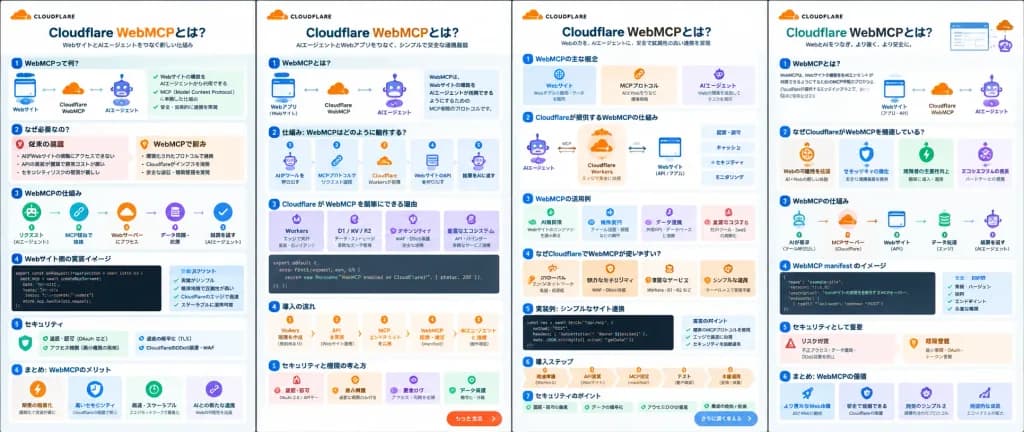
A wide comparison image displaying exactly four separate vertical Japanese infographic poster pages side by side, explaining [Cloudflare WebMCP]. Modern Japanese SaaS tech-explainer slide aesthetic, dense information design, clean white backgrounds, crisp flat vector icons, rounded cards, micro code blocks, and diagrams. Branded with [Cloudflare] orange and blue color palette, accented with green, purple, and red status containers. The canvas shows four tall white infographic slides arranged left to right, divided by subtle vertical margins: - Page 1 (6 sections): Header '[Cloudflare WebMCPとは?]' with orange 'WebMCP' and subtitle about bridging websites and AI agents. 1) 'WebMCPって何?' with web-to-AI diagram and green bullets. 2) 'なぜ必要なの?' with red X pain points and orange solution bullets. 3) 'WebMCPの仕組み' 5-step icon sequence. 4) 'Webサイト側の実装イメージ' with dark code snippet and benefit cards. 5) 'セキュリティ' checklist. 6) 'まとめ: WebMCPのメリット' with four benefit icons. - Page 2 (5 sections): Header '[Cloudflare WebMCPとは?]' with an orange cloud logo. 1) 'WebMCPとは?' AI agent and web app connection. 2) '仕組み: WebMCPはどのように動作する?' tool execution workflow. 3) 'Cloudflare が WebMCP を簡単にできる理由' with purple feature cards and a code snippet. 4) '導入の流れ' with orange numbered step cards (Workers, API, endpoint, MCP, AI). 5) 'セキュリティと権限の考え方' with warning badges. Pill button overlay at bottom right reading 'もっと生成'. - Page 3 (7 sections): Header '[Cloudflare WebMCPとは?]'. 1) 'WebMCPの主な概念' (3 cards). 2) 'Cloudflareが提供するWebMCPの仕組み' architecture diagram with Workers and API icons. 3) 'WebMCPの活用例' compact cards. 4) 'なぜCloudflareでWebMCPが使いやすい?' orange benefit band. 5) '実装例: シンプルなサイト連携'. 6) '導入ステップ' 5-step horizontal flow. 7) 'セキュリティのポイント' green checklist. Bottom pill button reading 'さらに深く考える'. - Page 4 (6 sections): Header '[Cloudflare WebMCPとは?]' with cloud logo and browser mockup. 1) 'WebMCPとは?' definition and web-to-agent diagram. 2) 'なぜCloudflareがWebMCPを推進している?' 4 cards. 3) 'WebMCPの仕組み' 5-step icon pipeline. 4) 'WebMCP manifest のイメージ' dark code snippet and checklist. 5) 'セキュリティとして重要' warning and permission blocks. 6) 'まとめ: WebMCPの価値' 4 blue/purple benefit cards. All text is legible, credible Japanese technical copy ('AIエージェント', 'Webサイト', 'MCPサーバー', 'Workers', 'セキュリティ'). Flat graphic design layout, no photorealistic elements, no human characters.

infografisjepangsaas
Poster Infografis Komersial Laptop

Poster Infografis Komersial Laptop

High-impact commercial e-commerce infographic poster for the [Apple MacBook Air M3] laptop, 1:1 square composition. Foreground: An extreme close-up of a hand holding an open, ultra-slim silver MacBook directly toward the camera. The Apple logo is visible on the back of the display, and the screen displays a vibrant gradient wallpaper with a subtle macro-lens shallow depth of field. Mid-ground: A [smiling young woman with freckles and wavy pastel-pink hair] wearing a [lime-green knit beanie and a psychedelic black-and-white striped long-sleeve shirt], standing confidently behind the laptop and presenting it to the camera. Background & Lighting: Clean light-gray studio gradient backdrop with subtle diagonal rainbow prism lens flares and light leaks. Blurred MacBooks float softly at various angles in the deep background. Soft, diffused commercial studio lighting accentuating the metallic texture. Typography & Infographic Layout (clean white sans-serif text): - Top Center (behind model): Massive bold text "MACBOOK" - Top Right: "Apple MacBook Air M3" - Mid-Left: "Supercharged performance with M3 chip" - Mid-Right: Large bold "18" with subtext "hours of battery life." - Bottom-Right: Large bold "1" with subtext "year warranty." - Bottom-Left: Badge reading "M3 chip. Blazing fast. Power efficient."

macbookinfografise-commerce
Lembar Storyboard Iklan Piyama Musim Panas

Lembar Storyboard Iklan Piyama Musim Panas

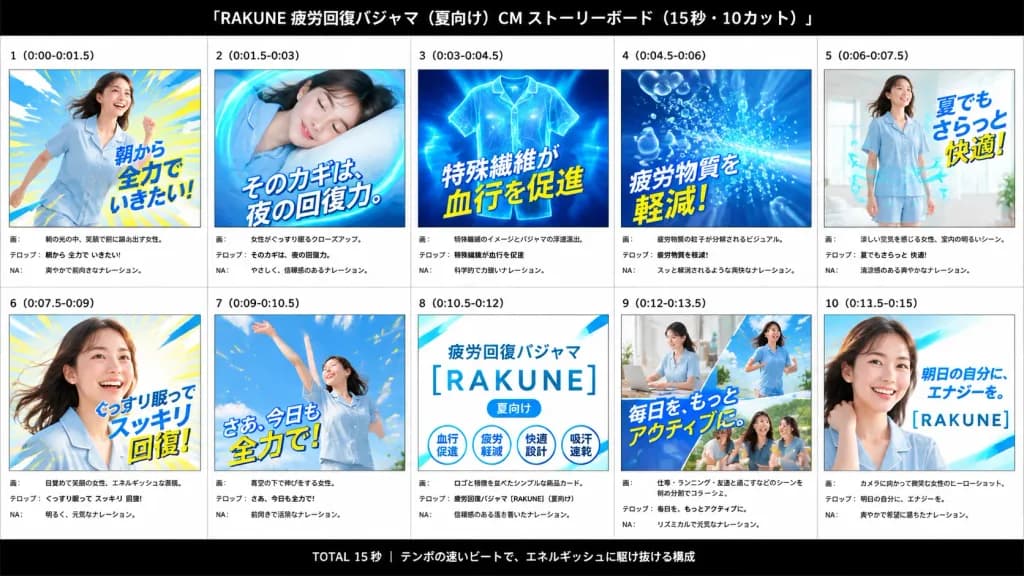
An advertising storyboard presentation board for a 15-second Japanese summer pajama commercial for [RAKUNE], themed around fatigue recovery, cool comfort, and energetic mornings. Wide 16:9 canvas with a white background and subtle gray grid lines, framed by a solid black header bar at the top and footer bar at the bottom. The header features centered white Japanese typography: “[RAKUNE 疲労回復パジャマ(夏向け) CM ストーリーボード(15秒・10カット)]”. The footer contains centered white Japanese text: “TOTAL 15秒 | テンポの速いビートで、エネルギッシュに駆け抜ける構成”. Arranged in a clean 2-row by 5-column grid containing exactly 10 numbered storyboard panels. Each panel includes a bold cut number and timestamp at the top, a vibrant rectangular image frame, and three structured production note lines below labeled “画:”, “テロップ:”, and “NA:”. 1. Panel “1 (0:00-0:01.5)”: Energetic morning scene of a smiling young Japanese woman in pale blue summer pajamas stepping forward dynamically against blue and yellow speed lines. Large overlaid text: “朝から 全力で いきたい!”. 2. Panel “2 (0:01.5-0:03)”: Serene close-up of the woman sleeping soundly on a pillow, enclosed by a glowing cyan circular energy swirl. Large text: “そのカギは、夜の回復力。” 3. Panel “3 (0:03-0:04.5)”: Technical visualization of floating blue pajama apparel glowing with illuminated fiber patterns and dynamic energy rays. Large text: “特殊繊維が 血行を促進”. 4. Panel “4 (0:04.5-0:06)”: Abstract blue burst graphic showing translucent fatigue bubble particles dissolving away. Large text: “疲労物質を 軽減!”. 5. Panel “5 (0:06-0:07.5)”: The woman standing happily in a bright, sunlit room wearing short-sleeve pale blue pajamas, with curved cyan airflow arrows indicating breathability. Large text: “夏でも さらっと 快適!”. 6. Panel “6 (0:07.5-0:09)”: Dynamic wake-up portrait of the woman smiling with flowing hair against radiating yellow and sky-blue light rays. Large text: “ぐっすり眠って スッキリ 回復!”. 7. Panel “7 (0:09-0:10.5)”: Joyful outdoor shot of the woman stretching both arms upward under a clear blue sky with confetti-like motion sparks. Large text: “さあ、今日も 全力で!”. 8. Panel “8 (0:10.5-0:12)”: Clean white product logo card with cyan diagonal shapes, displaying “疲労回復パジャマ”, the main logo “[RAKUNE]”, a small “[夏向け]” pill tag, and four circular feature badges labeled “血行促進”, “疲労軽減”, “快適設計”, and “吸汗速乾”. 9. Panel “9 (0:12-0:13.5)”: Diagonal split collage showing the active woman working at a desk, jogging outdoors, and laughing with friends. Large text: “毎日を、もっとアクティブに.” 10. Panel “10 (0:13.5-0:15)”: Polished brand hero close-up of the woman smiling toward the camera over a bright cyan-white gradient background with the text “明日の自分に、エナジーを。” and the “[RAKUNE]” logo. Style: High-energy Japanese commercial pitch deck, bright advertising lighting, cool cyan and primary blue tones with vivid yellow accents, crisp professional typography.

storyboardiklanpresentasi
Poster Infografis Karakter Sejarah Tiongkok

Poster Infografis Karakter Sejarah Tiongkok

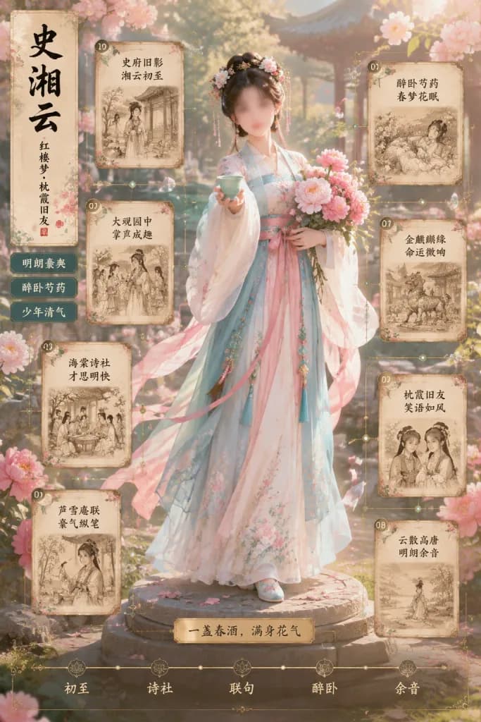
An ornate vertical Chinese historical-romance character infographic poster featuring [Shi Xiangyun] as a graceful young noblewoman in a spring garden, blending cinematic photorealism with delicate illustrated UI elements. Setting & Atmosphere: Classical Chinese courtyard garden in warm parchment-and-gold tones with soft morning sunlight, pavilions, stone pathways, blooming flowering trees, scattered pink peony petals, and a dreamy misty atmosphere with shallow depth of field. Main Subject: Centered full-body Hanfu noblewoman standing on a carved round stone pedestal. She wears a flowing layered Hanfu in [pale blue, blush pink, ivory, and soft teal] with floral embroidery, translucent fluttery sleeves, ribbons swaying in the breeze, a pink sash belt, tassel pendants, embroidered shoes, and an ornate traditional updo with hairpin ornaments and tiny blossoms. Her right hand offers a small green floral porcelain wine cup toward the viewer; her left hand cradles a lush bouquet of pink peonies. Her face is softly obscured or left non-specific. Left Title Strip: Textured vertical parchment banner on the far left with large black brush calligraphy reading 「史湘云」, a smaller vertical subtitle reading 「红楼梦·枕霞旧友」, and a small red cinnabar seal. Directly below are three stacked rectangular navigation tabs: 1) 「明朗豪爽」 2) 「醉卧芍药」 3) 「少年清气」. Surrounding Infographic Cards: Eight vintage parchment story cards connected by fine gold filigree lines, tiny circular numbered badges, translucent crystalline paper fragments, and constellation nodes. Each card displays a sepia miniature illustration alongside decorative Chinese text with these exact numbered headings: 01 「史府旧影 湘云初至」 02 「大观园中 掌声成趣」 03 「海棠诗社 才思明快」 04 「芦雪庵联 豪气纵笔」 05 「醉卧芍药 春梦花眠」 06 「金麒麟缘 命运微响」 07 「枕霞旧友 笑语如风」 08 「云散高唐 明朗余音」 Cards 01 through 04 run vertically down the left and lower-left; cards 05 through 08 descend along the right. Bottom Elements: A gold plaque at the base of the platform engraved with the quote [一盏春酒,满身花气]. A delicate gold timeline spanning the bottom edge with 5 labeled milestone nodes: 「初至」, 「诗社」, 「联句」, 「醉卧」, 「余音」. Style & Constraints: Elegant Chinese vintage editorial design, Red Chamber Dream aesthetic, ink brush typography, museum-grade poster layout. All textual elements must appear in Chinese as specified, with no English text, watermarks, or logos.

infografisposterhanfu
Komik Infografis Edukasi Korea Enam Panel

Komik Infografis Edukasi Korea Enam Panel

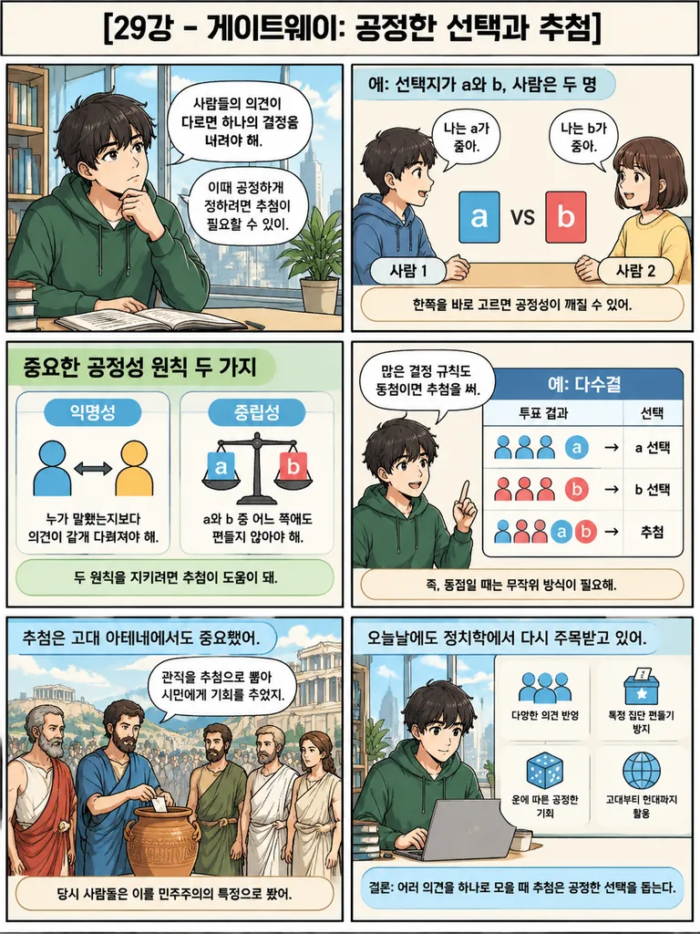
educational Korean infographic comic. clean textbook-style digital illustration with bold black panel borders, soft flat colors, slightly cartooned semi-realistic characters, rounded speech bubbles, readable Korean text, classroom handout…

infografiskomikkorea
Infografik Edukasi Sketchnote Gaya Jepang

Infografik Edukasi Sketchnote Gaya Jepang

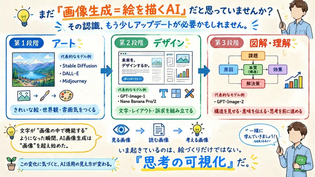
{"type":"wide hand-drawn Japanese educational infographic","canvas":{"aspectRatio":"16:9 landscape","background":"warm off-white paper texture","style":"friendly marker-and-watercolor explainer, sketchnote, clean readable Japanese typography, blue/orange/green/red accents, rounded boxes, arrows, small doodle icons"},"headline":{"text":"[まだ『画像生成=絵を描くAI』だと思っていませんか?]","position":"top center","emphasis":"orange underline and large orange phrase for 『画像生成=絵を描くAI』"},"subheadline":{"text":"[その認識、もう少しアップデートが必要かもしれません。]","position":"below headline","color":"blue","decorations":"small radiating blue strokes"},"layout":{"mainSections":{"count":3,"arrangement":"three large rounded rectangular panels across the middle, connected by thick blue right-pointing arrows","sections":[{"title":"第1段階","subtitle":"アート","position":"left","borderColor":"blue","content":"framed colorful mountain-and-lake landscape illustration; text block titled 代表的なモデル例 with 3 bullet items: Stable Diffusion, DALL-E, Midjourney; bottom line きれいな絵・世界観・雰囲気をつくる","icons":{"count":3,"descriptions":["small picture icon","paintbrush","artist palette"]}},{"title":"第2段階","subtitle":"デザイン","position":"center","borderColor":"green","content":"mock website or poster layout with headline 未来を、デザインするか。, small paragraph text, button 詳しくはこちら →, document typography, image placeholder, and chart elements; text block titled 代表的なモデル例 with 2 bullet items: GPT-Image-1, Nano Banana Pro/2; bottom line 文字・レイアウト・訴求を組み立てる","icons":{"count":3,"descriptions":["T typography icon","layout grid icon","crossed pen or design tool icon"]}},{"title":"第3段階","subtitle":"図解・理解","position":"right","borderColor":"red","content":"simple flowchart diagram with 課題 at top, branching to 原因, 本質(構造), 効果, and 解決策, with arrows and a small bar chart; text block titled 代表的なモデル例 with 1 bullet item: GPT-Image-2; bottom line 構造を見せる・意味を伝える・思考を前に進める"}]},"lowerExplanatoryElements":{"count":4,"items":[{"type":"yellow rounded callout","position":"lower left","text":"文字が “画像の中で機能する” ようになった瞬間、AI画像生成は “画像” を超え始めた。","icon":"light bulb"},{"type":"process strip","position":"lower middle-right","count":3,"labels":["見る画像","読む画像","考える画像"],"icons":["eye","document","light bulb"],"connectors":"blue arrows"},{"type":"bold statement","position":"near bottom center","text":"いま起きているのは、絵づくりだけではない。『思考の可視化』だ。","emphasis":"large blue handwritten 『思考の可視化』 with yellow underline"},{"type":"bottom ribbon callout","position":"bottom left to center","text":"この変化に気づくと、AI活用の見え方が変わる。","icon":"small sprout in a pot"}]},"characters":{"count":2,"description":"same friendly teacher character appears twice on the right edge, anime-style young man in a light blue shirt holding a pointer; face area intentionally covered by a beige rectangle","instances":[{"position":"top right","pose":"holding pointer upward beside headline"},{"position":"bottom right","pose":"holding pointer and green notebook labeled メモ, next to speech bubble 一緒に学んでいきましょう!"}],"customCharacter":"[young male teacher with brown hair, light blue shirt, pointer, face obscured by beige square]"},"extraDecorations":{"count":4,"items":["yellow light bulb doodle at top left","small sunburst marks around important text","thin hand-drawn underlines in orange, blue, and yellow","rounded speech-bubble outlines and sketched arrows"]},"textRequirements":"All Japanese text must be crisp, legible, and accurately placed; preserve the hand-lettered sketchnote feel while keeping diagrams clean and instructional.","theme":"[AI image generation has evolved from art to design to diagrams and understanding, making text functional inside images and visualizing thought.]"}

sketchnoteinfografikteks-jepang
Infografis Sensorik Mata dan Telinga Manusia

Infografis Sensorik Mata dan Telinga Manusia

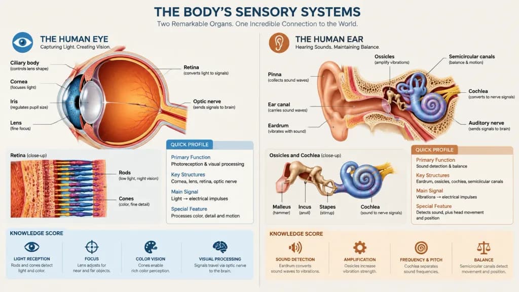
Detailed [infographics] illustrating the complex sensory systems of the [human eye and human ear], highlighting their roles as the body's primary units for visual and auditory/vestibular processing. The charts use a [structured, clinical layout] featuring anatomical diagrams, "Quick Profiles", and "Knowledge Scores" to break down biological functions like photoreception and sound detection. Detailed cutaways show the eye's retina and lens juxtaposed with the ear's ossicles and cochlea, scientific educational chart aesthetic, clean typography, neutral background.

infografisanatomiilustrasi medis
Poster Infografis Scrapbook Perjalanan Vintage

Poster Infografis Scrapbook Perjalanan Vintage

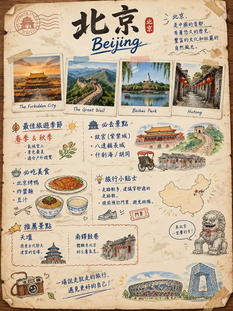
A charming hand-drawn vintage travel scrapbook poster about [北京], designed as a Chinese-language illustrated tourist guide page on warm aged cream paper resting on a wooden tabletop. The composition is a vertical poster with a slightly weathered notebook-page aesthetic, subtle stains, folded corners, washi tape strips, and stamp-like ink smudges in a casual collage layout. At the top center, prominent bold black Chinese calligraphy reads "[北京]", paired beneath with "[Beijing]" in loose blue brush script, accented by a small red seal stamp and a short geographic description in dark blue handwritten Chinese script on the upper right. Directly below the title, four taped polaroid-style photos with handwritten English captions are arranged in a casual row: 1. The Forbidden City at sunset glowing in golden light; 2. The Great Wall winding across verdant mountains; 3. Beihai Park lake with willows and the white stupa; 4. A traditional hutong alley with gray brick walls and red lanterns. The lower two-thirds features an illustrated infographic with colorful doodles and handwritten Chinese headings in navy blue and muted red across multiple sections: - Best travel season (spring and autumn) with a leaf doodle and sun icon; - Must-visit attractions listing the Forbidden City, Badaling Great Wall, and Shichahai/hutongs, beside line-art sketches of palace architecture and a rickshaw; - Must-eat foods listing Peking duck, zhajiangmian, and douzhi, with cute food doodles; - Travel tips highlighting comfortable walking shoes and advance ticket bookings; - A mini outline map of China with a red star marking [北京]; - A cute stone guardian lion sketch with a playful speech bubble; - A scalloped recommendation box for Temple of Heaven and Nanluoguxiang with miniature building sketches; - At the bottom, an inspirational handwritten Chinese travel quote flanked by doodles of a vintage camera, the Bird's Nest stadium, and the CCTV building. Style: Cozy travel journal infographic, pen and watercolor wash, naive notebook sketch aesthetic, muted red and navy palette with warm earthy tones, crisp legible hand lettering.

poster perjalananscrapbookinfografis
Infografik Tata Letak Kerapian Meja Kerja

Infografik Tata Letak Kerapian Meja Kerja

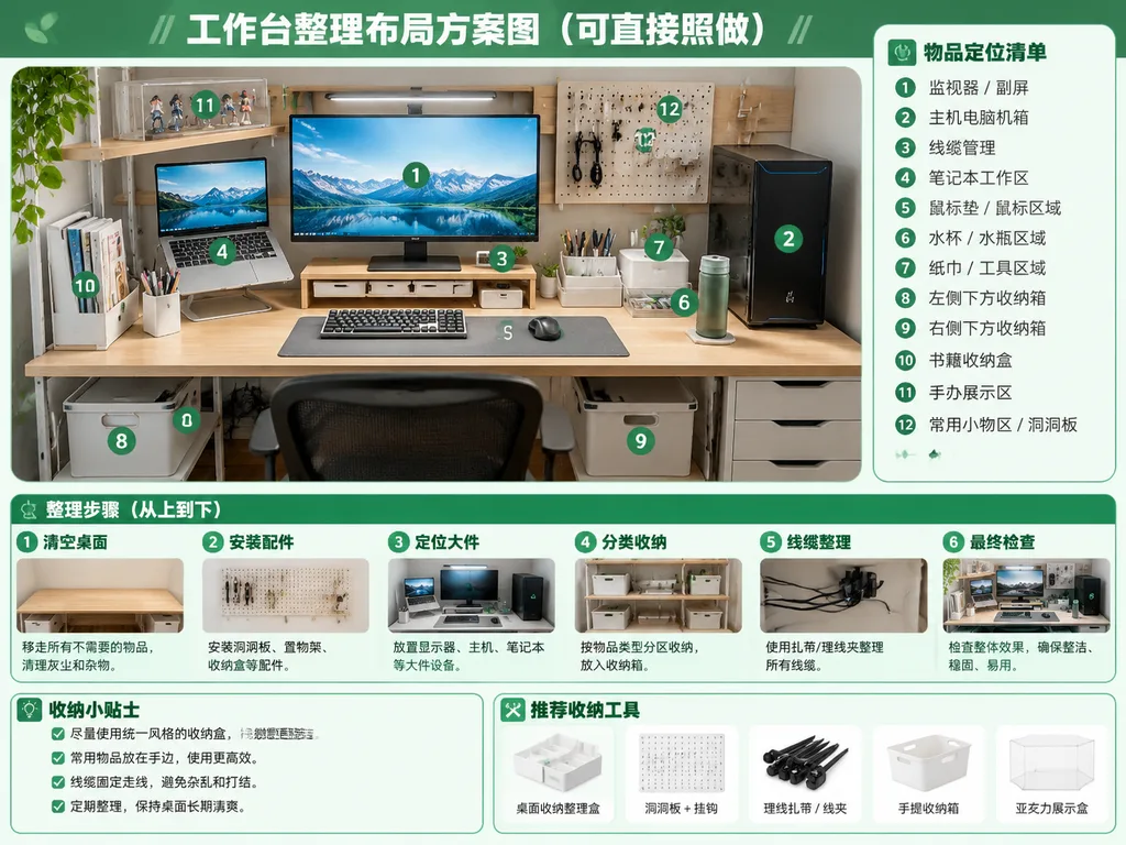
Using the reference photo as the base scene, generate a clean, bright, realistic "after organization" desktop layout plan infographic poster. Retain the original desk, shelving, monitor and laptop setup, PC tower placement, and perspective from the reference photo, but show the workspace thoroughly organized: neatly routed cables, cleared tabletop, defined storage zones, matching storage bins, a wall pegboard, pen holder, book bin, transparent display box, and designated spots for drinks, tissues, and small tools. Graphic design style: crisp green-and-white instructional guide layout. At the top, include a prominent title: "[工作台整理布局方案图(可直接照做)]". Overlay 12 green circular numbered badges (① to ⑫) on the main desk image corresponding to a sidebar panel on the right titled "[物品定位清单]" listing 12 zones: ① monitor / secondary screen, ② main PC tower, ③ cable management, ④ laptop work area, ⑤ mouse pad / mouse area, ⑥ water cup / bottle area, ⑦ tissue / tool area, ⑧ left under-desk storage box, ⑨ right under-desk storage box, ⑩ book storage box, ⑪ figure display area, ⑫ common small-items area / pegboard. Across the bottom, feature a process section titled "[整理步骤(从上到下)]" with 6 sequential step cards with mini preview thumbnails: ① clear desktop, ② install accessories, ③ position large items, ④ partition storage, ⑤ cable management, ⑥ final inspection. In the bottom-left corner, include a tips box titled "[收纳小贴士]" with 4 checklist items. In the bottom-right, add a recommended tools row titled "[推荐收纳工具]" displaying 5 clean product icons: desktop organizer tray, pegboard with hooks, cable ties/clips, handled storage bin, and acrylic display box.

infografikpenataan mejaorganisasi
Kisi Vektor Pose Pemain Pickleball

Kisi Vektor Pose Pemain Pickleball

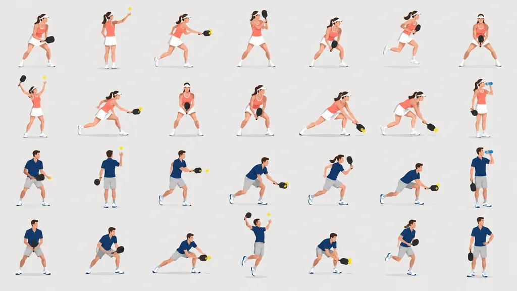
clean vector sports pose illustration set. A complete pose library of two [pickleball] players, one woman and one man, depicted as small full-body figures in a consistent flat editorial vector style suitable for research figures or instruc…

ilustrasi vektorreferensi posepickleball
Poster Infografis Profil Tokoh Inovator AI

Poster Infografis Profil Tokoh Inovator AI

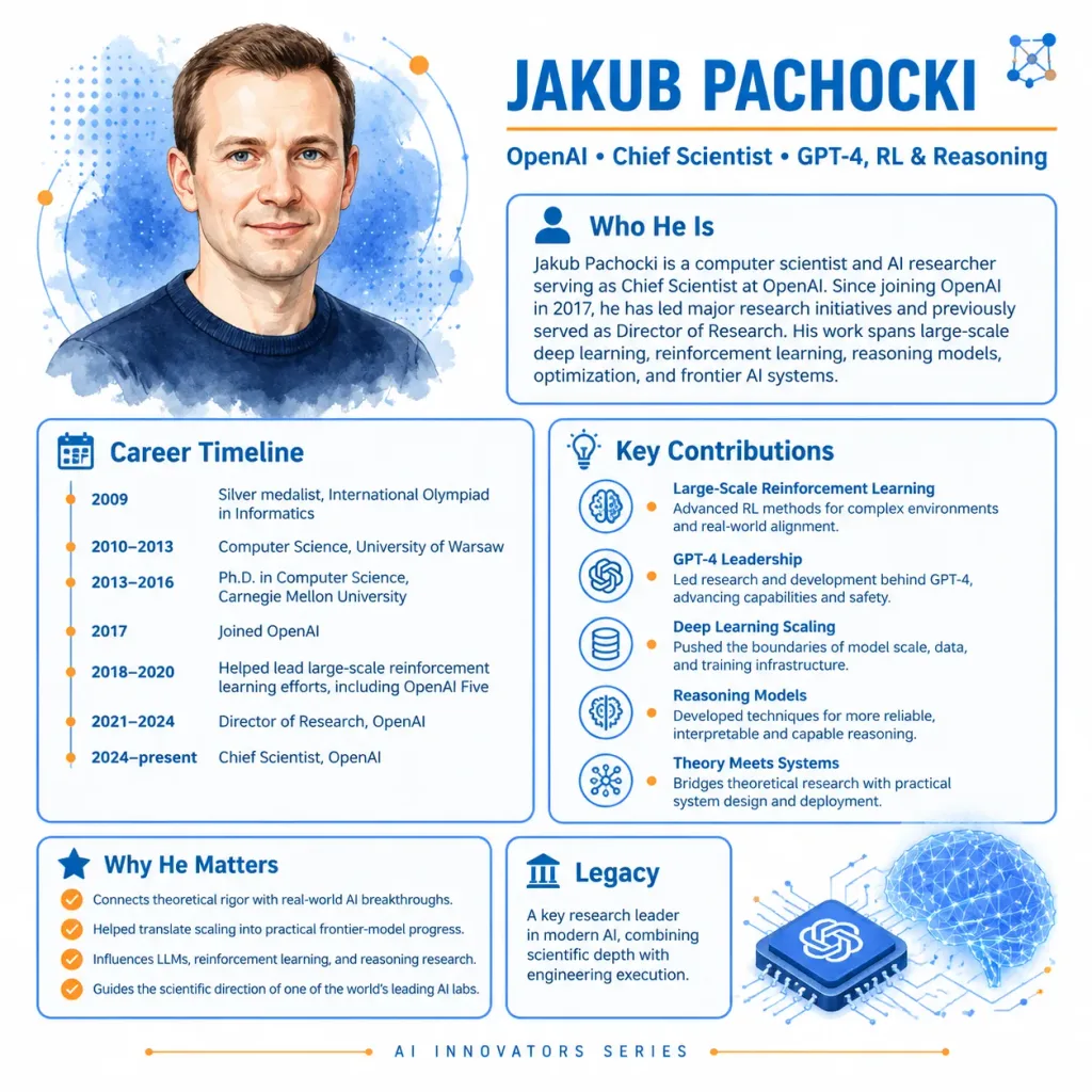
A polished 1:1 square educational profile infographic for an AI innovator, featuring a watercolor portrait and biography panels about [Jakub Pachocki]. Crisp modern tech editorial style on a clean white background with cobalt blue typography and vibrant orange accents, subtle watercolor textures, and vector network motifs. Layout and Composition: - Top-Left: Semi-realistic watercolor head-and-shoulders portrait of [Jakub Pachocki], a light-skinned man with very short brown hair, blue eyes, and a slight smile, wearing a dark navy crewneck sweater. Backed by blue watercolor splashes, halftone dot patterns, and thin circular orbit lines. - Header (Top-Right): Large bold uppercase cobalt-blue text reading "[JAKUB PACHOCKI]". Directly beneath, a thin orange dividing line and a credential subtitle: "OpenAI • Chief Scientist • GPT-4, RL & Reasoning". A small abstract network node icon in the top-right corner. - Content Cards: Exactly 5 rounded rectangular information cards with thin blue borders and clean typography: 1. "Who He Is" (upper right, person icon): "Jakub Pachocki is a computer scientist and AI researcher serving as Chief Scientist at OpenAI. Since joining OpenAI in 2017, he has led major research initiatives and previously served as Director of Research. His work spans large-scale deep learning, reinforcement learning, reasoning models, optimization, and frontier AI systems." 2. "Career Timeline" (lower left, calendar icon, vertical timeline with 6 entries): 2009: Silver medalist, International Olympiad in Informatics; 2010–2013: Computer Science, University of Warsaw; 2013–2016: Ph.D. in Computer Science, Carnegie Mellon University; 2017: Joined OpenAI; 2018–2020: Helped lead large-scale reinforcement learning efforts, including OpenAI Five; 2021–2024: Director of Research, OpenAI; 2024–present: Chief Scientist, OpenAI. 3. "Key Contributions" (center right, lightbulb icon, 5 rows with blue outline icons and orange bullets): Large-Scale Reinforcement Learning, GPT-4 Leadership, Deep Learning Scaling, Reasoning Models, and Theory Meets Systems, each accompanied by concise explanatory text. 4. "Why He Matters" (bottom left, star icon, 4 checkmark bullets): Connects theoretical rigor with real-world AI breakthroughs; Helped translate scaling into practical frontier-model progress; Influences LLMs, reinforcement learning, and reasoning research; Guides the scientific direction of one of the world’s leading AI labs. 5. "Legacy" (bottom right, column icon): Summarizing his emergence as a key research leader in modern AI combining scientific depth with engineering execution. - Bottom-Right Illustration: A blue isometric microchip featuring the OpenAI knot logo, linked via circuit traces to a glowing blue wireframe brain composed of nodes and triangular mesh lines. - Footer: Centered at the bottom, small uppercase spaced text reading "[AI INNOVATORS SERIES]", flanked by delicate orange dots and thin circuit lines.

infografispeneliti aiposter profil
Overlay Konsol Sci-Fi Penilai Wajah

Overlay Konsol Sci-Fi Penilai Wajah

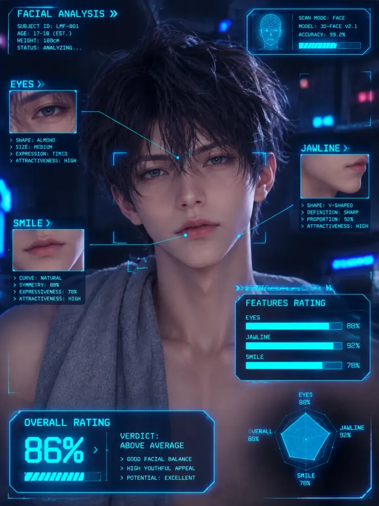
Annotate the reference photo with retro sci-fi console-style HUD overlays, graphic pointer lines, and monospace text analyzing the facial features of [the person]. Display category loading bars for features such as [eyes, jawline, and smile], complete with percentage metrics and an overall rating readout in a neon cyberpunk interface style.

overlay hudcyberpunkanalisis wajah
Panduan Perutean Email Catch-All Cloudflare

Panduan Perutean Email Catch-All Cloudflare

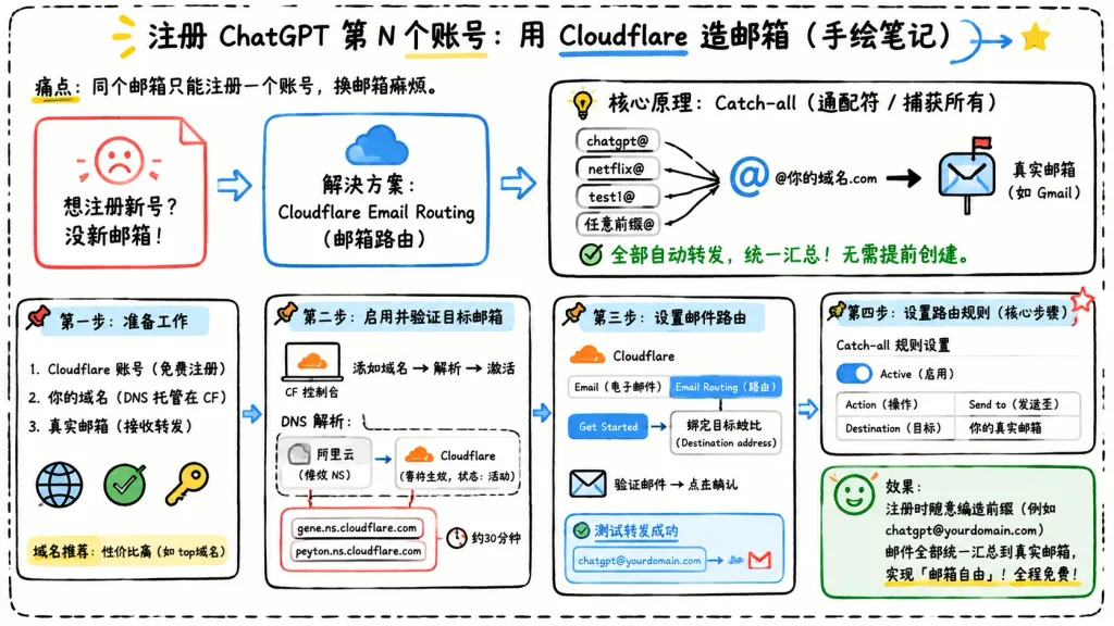
Landscape 16:9 hand-drawn whiteboard-style Chinese infographic explaining how to register multiple accounts using Cloudflare Email Routing catch-all aliases. Clean off-white background framed with a thick black dashed rounded border, informal classroom notebook feel, marker and pen sketch style with slightly imperfect lines, doodle arrows, stars, pins, and simple icons. Top center title: bold handwritten Chinese text "[注册 ChatGPT 第 N 个账号:用 Cloudflare 造邮箱(手绘笔记)]" with "Cloudflare" underlined in blue, accompanied by a small curved doodle arrow and a yellow star. Directly below to the left, smaller text: "痛点:同个邮箱只能注册一个账号,换邮箱麻烦。" Layout contains 7 main cards arranged left-to-right connected by bold directional arrows, plus a final result callout: 1. Card 1 (Pain Card, top left): Red outlined folded-corner sticky note with a sad red face icon. Text: "想注册新号?没新邮箱!" 2. Card 2 (Solution Card, top middle): Blue rounded rectangle with a blue cloud icon. Text: "解决方案:Cloudflare Email Routing(邮箱路由)", with a blue arrow pointing rightward. 3. Card 3 (Core Principle Card, top right): Large black-outlined rounded box with header "核心原理:Catch-all(通配符 / 捕获所有)" and a funnel icon. On the left, 4 incoming aliases: "chatgpt@", "netflix@", "test1@", and "任意前缀@", each pointing into a large "@" and "@你的域名.com", which points via a thick black arrow into a mailbox icon labeled "真实邮箱(如 Gmail)". Bottom text with green checkmark: "全部自动转发,统一汇总!无需提前创建。" 4. Step 1 Card (bottom left): Box titled "第一步:准备工作". Three checklist items: "1. Cloudflare 账号(免费注册)", "2. 你的域名(DNS 托管在 CF)", "3. 真实邮箱(接收转发)". Globe icon, green checkmark, yellow key icon. Small note below: "域名推荐:性价比高(如 top域名)". 5. Step 2 Card (bottom center-left): Box titled "第二步:启用并验证目标邮箱". Computer icon labeled "CF 控制台", text flow "添加域名 → 解析 → 激活". Below, a mini DNS panel showing "阿里云(修改 NS)" on the left and "Cloudflare(等待生效,状态:活动)" on the right. Below, a red circled box listing "gene.ns.cloudflare.com" and "peyton.ns.cloudflare.com", with a clock icon and "约30分钟". 6. Step 3 Card (bottom center-right): Box titled "第三步:设置邮件路由". Mini CF UI mockup with tabs "Email(电子邮件)" and "Email Routing(路由)", pointing via a "Get Started" button to "绑定目标地址(Destination address)". Bottom envelope icon with "验证邮件 → 点击确认". Below, a blue status box labeled "测试转发成功" showing alias forwarding to Gmail. 7. Step 4 Card (bottom right): Box titled "第四步:设置路由规则(核心步骤)". UI panel titled "Catch-all 规则设置", blue active toggle switch labeled "Active(启用)", and a 2-row table: Row 1 "Action(操作)" to "Send to(发送至)"; Row 2 "Destination(目标)" to "你的真实邮箱". Red star in corner. Final Result Box (bottom right under Step 4): Green rounded rectangle with smiling face icon. Text: "效果:注册时随意编造前缀(例如 chatgpt@yourdomain.com)邮件全部统一汇总到真实邮箱,实现「邮箱自由」!全程免费!" Style: Legible handwritten Chinese typography, black marker outlines, accent colors in blue, red, green, and yellow, 2D vector doodle aesthetic, strictly non-photorealistic, no 3D elements, no watermarks.

infografispapan tulisgambar tangan
Poster Harian Kota Selamat Pagi Shenzhen

Poster Harian Kota Selamat Pagi Shenzhen

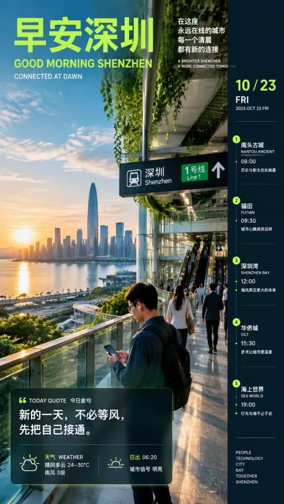
Vertical editorial daily city poster infographic set in [Shenzhen]. - Composition & Background: Full-bleed portrait photograph. The left side opens to a bright dawn view of the [Shenzhen] skyline across the bay, with early morning sun low over the water. The right side features a modern glass-and-steel metro station interior with escalators and hanging wayfinding signage reading "Shenzhen" and "Line 1". Commuters walk along an elevated glass-railed skywalk, with a foreground man wearing glasses, earbuds, and a backpack checking his smartphone. Lush greenery hangs from the ceiling trusses. - Lighting & Color: Crisp cinematic dawn sunlight, high-contrast teal-and-lime color grading, warm golden reflections on water and architectural glass. - Typography & Overlays: Clean sans-serif bilingual Chinese/English layout. - Top left: Large lime-green headline 「[早安深圳]」 with English text "[GOOD MORNING SHENZHEN]" and subtitle "[CONNECTED AT DAWN]". - Top right: Poetic blurb 「[在这座 / 永远在线的城市 / 每一个清晨 / 都有新的连接]」 with subtitle "[A BRIGHTER SHENZHEN / A MORE CONNECTED TOMORROW]". - Bottom left: Semi-transparent quote card titled "[TODAY QUOTE 今日金句]" with the quote 「[新的一天,不必等风,先把自己接通。]」. Below it, a weather strip reading 「[天气 WEATHER 晴间多云 24–30°C 南风 3级]」 and 「[日出 06:20 城市信号 明亮]」. - Right edge: Solid dark vertical sidebar displaying date header "[10 / 23 FRI 2025 OCT 23 FRI]" and five chronological itinerary stops: 1. 「[南头古城 NANTOU ANCIENT TOWN 08:00 历史与新生在此相遇]」 2. 「[福田 FUTIAN 09:30 城市心跳高效运转]」 3. 「[深圳湾 SHENZHEN BAY 12:00 海风照见更大的未来]」 4. 「[华侨城 OCT 15:30 艺术让城市更温柔]」 5. 「[海上世界 SEA WORLD 19:00 灯光与海不止于此]」 Sidebar footer: "[PEOPLE TECHNOLOGY CITY BAY TOGETHER SHENZHEN]". - Constraints: Render all Chinese and English typography sharply and verbatim. Maintain exactly five sidebar items.

shenzhenposter kotainfografis
Infografik Perbandingan Mobil Listrik vs Bensin

Infografik Perbandingan Mobil Listrik vs Bensin

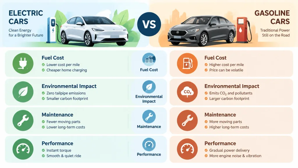
A visual comparison infographic chart comparing [electric cars] versus [gasoline cars]. Two-column layout with clean, modern graphic design, featuring minimalist icons and brief descriptive text comparing factors: [Fuel Cost], [Environmental Impact], [Maintenance], and [Performance]. Balanced composition, clear typography, intuitive visual hierarchy, professional vector presentation.

infografikgrafik perbandinganmobil listrik
Infografis Pendidikan Pedagogi Membaca Bahasa Jepang

Infografis Pendidikan Pedagogi Membaca Bahasa Jepang

A clean vertical Japanese educational infographic handout for teachers on designing reading lessons for narrative texts, presented on a polished crisp white background. Designed with navy blue section headers, rounded content cards, flat vector icons, directional arrows, checkmarks, and subtle color-coded accent boxes. At the top, include the main Japanese title "[読む力を育てる授業デザイン]" and subtitle "[〜描写を根拠に、ズレを起点として、解釈を深める授業〜]". The layout is organized into exactly seven numbered vertical sections followed by a bottom summary band: 1) Basic lesson structure with four step-by-step nodes labeled "事実(描写)→ 解釈 → 意味づけ → 自分の言葉", 2) Three tiers of learning depth labeled "低:表面的理解", "中:解釈の形成", and "高:意味の再構築", 3) Question design containing good-question criteria, question flow, and concrete example prompts, 4) Dialogue quality improvement featuring two side-by-side comparison cards labeled "NG" and "目指す対話" alongside keyword tags "比較", "関連づけ", and "再解釈", 5) The teacher's central role in making "ズレ" visible, divided into cards for concrete positive actions and NG actions, 6) Assessment and observation split into two cards labeled "見るポイント" and "方法", 7) Five horizontally connected cards for lesson improvement meta-perspectives labeled "前の教材との接続", "言葉への感度を上げる", "初発のズレを活かす", "「納得の共有」をつくる", and "学びを振り返る". The bottom summary banner displays the prominent takeaway statement "[描写を根拠に、ズレを起点として、解釈を深める授業]" accompanied by three checklist items: "根拠をもとに読みとる", "対話で考えを広げる", and "自分の言葉で意味づける". Clean typography, professional Japanese typography hierarchy, high readability, graphic design layout.

infografispendidikanpedagogi
Kisi Infografis Tengara Dunia Beranotasi

Kisi Infografis Tengara Dunia Beranotasi

A 2x2 grid layout of four realistic educational photographs depicting iconic world landmarks, each featuring clean, legible graphic overlay callouts and annotations with pointer lines explaining architectural and historical details: 1. Top-left: [The Eiffel Tower in Paris, France] at golden sunset, with annotations labeling the wrought-iron lattice framework, multi-level observation decks, and historical construction. 2. Top-right: [The Great Wall of China at Mutianyu] on a clear autumn day, with annotations pointing out the defensive watchtowers, granite masonry construction, and strategic mountainous terrain. 3. Bottom-left: [The Colosseum in Rome, Italy] in soft morning light, with annotations identifying the exterior travertine arcades, tiered spectator seating, and underground hypogeum. 4. Bottom-right: [The Taj Mahal in Agra, India] under soft pre-dawn twilight, with annotations detailing the ivory-white marble central dome, towering minarets, and intricate floral pietra dura inlay. Style: Professional architectural documentary photography, balanced infographic composition, subtle callout lines, and clean typographic labels.

tengarainfografisarsitektur
Infografik Ilmiah Keruntuhan Fungsi Gelombang Kuantum

Infografik Ilmiah Keruntuhan Fungsi Gelombang Kuantum

educational infographic. clean, modern, scientific illustration. [Wavefunction Collapse]. From Multiple Potentials → To One Certain Outcome. dark blue gradient. From Many Possibilities to One Outcome. 3 columns separated by thin vertical l…

infografikfisika kuantumfungsi gelombang

Tips untuk prompt Infografis

  • Tentukan struktur kisi (grid) yang jelas atau pembagian panel, seperti perbandingan dua kolom atau kartu 2x2, agar informasi kompleks tetap teratur.
  • Tetapkan hierarki warna yang tegas dengan corak aksen khusus untuk memisahkan kategori, poin data, atau sudut pandang yang berlawanan.
  • Format instruksi tata letak yang rumit menggunakan blok kunci-nilai JSON untuk memisahkan judul utama, teks bagian, dan parameter visual secara rapi.

Topik terkait

Pertanyaan yang sering diajukan

Model AI mana yang paling cocok untuk prompt infografis?
GPT Image 2 adalah model yang paling didukung untuk templat ini, menghasilkan tipografi yang andal dan kisi UI yang seimbang. Nano Banana Pro dan GPT Image 2.5 juga merupakan alternatif tangguh untuk diagram rumit dan rincian teknis.
Bagaimana cara mencegah teks label menjadi berantakan pada infografis yang dihasilkan?
Buat label teks tetap singkat, bungkus teks harfiah di dalam tanda kutip atau kurung siku, dan minta tipografi yang bersih secara eksplisit dengan ruang kosong (negative space) yang cukup di sekitar setiap blok.
Bisakah saya menyesuaikan prompt infografis ini untuk rasio aspek yang berbeda?
Ya, Anda dapat memodifikasi parameter rasio aspek kanvas menjadi 16:9 untuk slide presentasi layar lebar atau 3:4 dan 9:16 untuk poster media sosial vertikal dan selebaran seluler.