नया: GPT Image 2.5 Flare और Sunburst। साइन अप पर 3 इमेज मुफ़्त, उसके बाद हर इमेज 8 क्रेडिट।
GPT Image 2.5 आज़माएँ

यूज़र इंटरफ़ेस डिज़ाइन AI प्रॉम्प्ट्स

218 टेम्पलेट्स · GPT IMAGE 2, Nano Banana Pro · अपडेट किया गया अक्टू॰ 2026

यथार्थवादी मोबाइल स्क्रीन, SaaS डैशबोर्ड, सोशल मीडिया फ़ीड और टर्मिनल इंटरफ़ेस तैयार करें। ये टेम्पलेट स्टेटस बार, नेविगेशन ड्रॉअर और कंटेंट कार्ड जैसे संरचनात्मक लेआउट तत्वों को परिभाषित करते हैं। प्रत्येक लेआउट को अपने उत्पाद विचार के अनुसार ढालने के लिए कोष्ठक में दिए गए टेक्स्ट, प्रोफ़ाइल हैंडल, मेट्रिक लेबल और रंग पट्टियों को बदलें।

इसके अनुसार क्रमबद्ध करें:

218 प्रॉम्प्ट में से 61–120 दिखाए जा रहे हैं

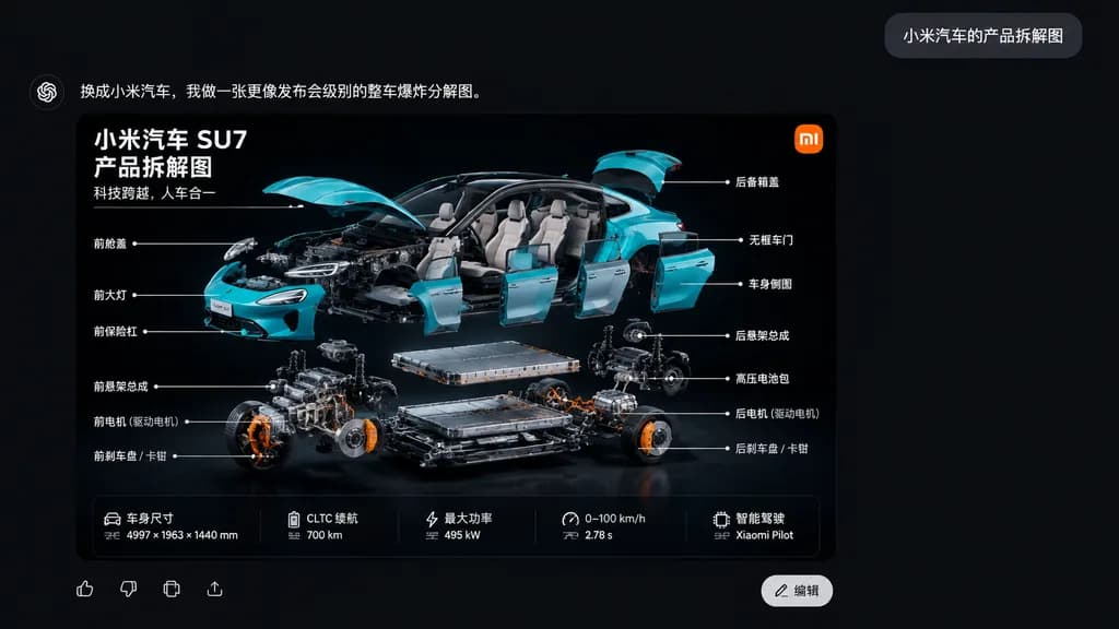
Xiaomi SU7 एक्सप्लोडेड व्यू चैट यूआई

Xiaomi SU7 एक्सप्लोडेड व्यू चैट यूआई

A sleek Chinese AI chat application interface screenshot on a dark charcoal black canvas. In the upper right, a small gray rounded chat bubble contains the white Chinese text: “小米汽车的产品拆解图”. At the top left of the response area, bold white Chinese text reads: “换成小米汽车,我做一张更像发布会级别的整车爆炸分解图。”. Below, occupying the lower left-center, is a large rounded-corner infographic card with a glossy black backdrop showcasing a dramatic three-quarter exploded view of a turquoise [Xiaomi SU7] electric sedan. The car body parts float neatly around the chassis: lifted hood and trunk, detached frameless doors, removed front bumper, separated headlights, and visible interior, while the battery pack, motor assemblies, suspension subframes, and brake components hover in precise organized layers below. The card features an orange square logo in the top-right corner, and three lines of bold white Chinese text in the top-left: “小米汽车 SU7”, “产品拆解图”, “科技跨越,人车合一”. Fourteen Chinese callout labels with thin white pointer lines annotate mechanical and exterior parts on both sides. At the bottom of the card is a 5-column horizontal vehicle specification strip, alongside UI icons and a white “编辑” button. Cinematic studio lighting, sharp technical detail, realistic cyan reflections against deep black.

xiaomi su7एक्सप्लोडेड व्यूइन्फोग्राफिक
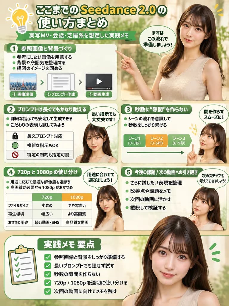
प्रस्तोता के साथ सॉफ़्टवेयर गाइड इन्फोग्राफिक

प्रस्तोता के साथ सॉफ़्टवेयर गाइड इन्फोग्राफिक

infographic. clean, modern, professional, soft green and beige color palette, photorealistic character integration. [ここまでの Seedance 2.0 の使い方まとめ]. [参照画像と背景づくり]. [プロンプトは長くてもかなり耐える]. 秒数に“隙間”を作らない. 720p と 1080p の使い分け. 今後の課題 / 次の動画への引き継ぎ. summa…

इन्फोग्राफिकसॉफ़्टवेयर ट्यूटोरियलवर्कफ़्लो
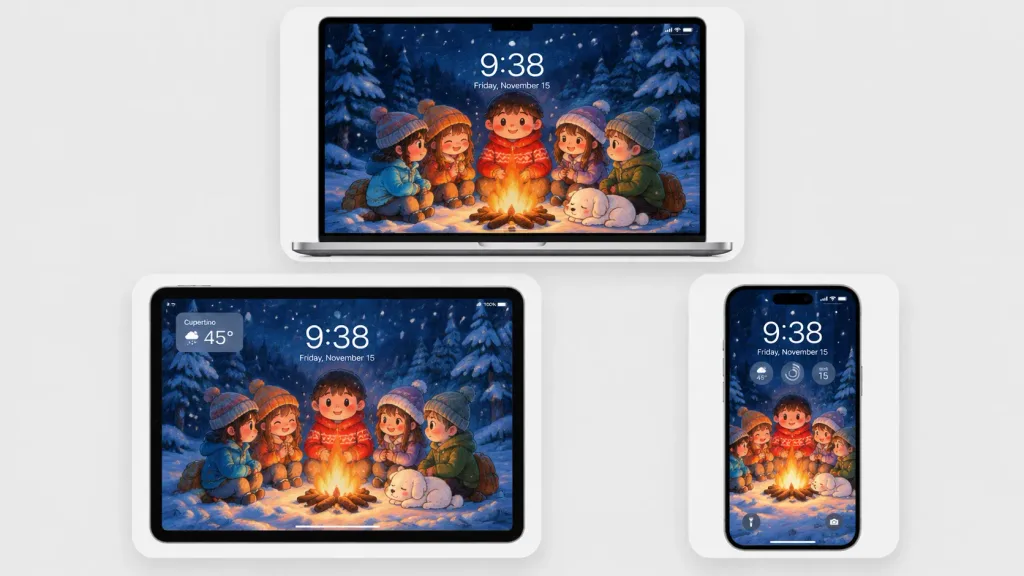
शीतकालीन कैम्पफ़ायर वॉलपेपर डिवाइस मॉकअप

शीतकालीन कैम्पफ़ायर वॉलपेपर डिवाइस मॉकअप

A polished multi-device product mockup showcasing a cozy winter wallpaper across three Apple-style devices set against a light gray studio background. Each device sits inside a rounded white display card with soft drop shadows: a laptop centered at the top, a tablet at the lower left, and a smartphone at the lower right. All screens display the same Japanese crayon-anime illustration cropped to fit: five cute cartoon children and a sleeping small white dog gathered around a glowing campfire in a snowy pine forest at night under falling snow and deep navy-blue trees, illuminated by warm orange firelight. Behind the campfire stands a round-faced child in a red winter sweater, flanked by friends in winter attire. Realistic lock-screen UI overlays appear on the screens: time "[9:38]", date "[Friday, November 15]", status icons, and translucent widgets. The tablet includes an upper-left translucent weather widget displaying "[Cupertino]" and "[45°]"; the phone features three circular widgets below the time and dual bottom lock-screen icons. Clean minimalist tech mockup, thin black bezels, soft ambient lighting, sharp screen details, no brand logos or watermarks.

मॉकअपवॉलपेपरडिवाइस
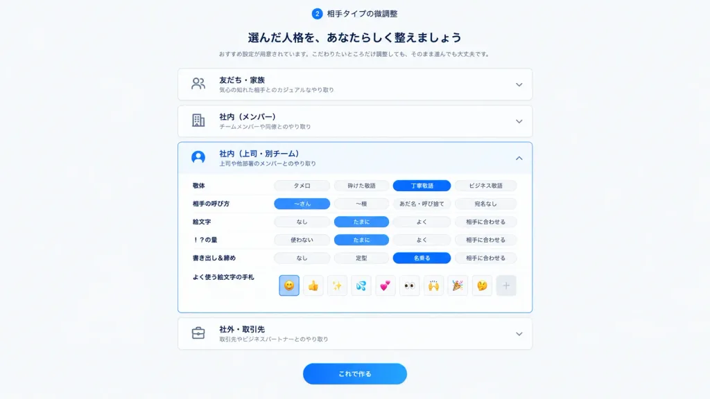
जापानी संचार व्यक्तित्व सेटिंग्स UI

जापानी संचार व्यक्तित्व सेटिंग्स UI

Clean Japanese web app onboarding and settings screen for step 2, showing fine-tuning of a selected communication personality or relationship type. 16:9 desktop UI screenshot, white to pale gray background, centered content column about 720px wide with generous margins, soft shadows, rounded cards, minimal SaaS UI design. Header: At the top center, a small circular badge with "2" followed by the label 「相手タイプの微調整」. Under it, a bold Japanese headline: 「選んだ人格を、あなたらしく整えましょう」. Below the headline, a smaller gray subtitle: 「おすすめ設定が用意されています。こだわりたいところだけ調整しても、そのまま進んでも大丈夫です。」 Main layout: Exactly 4 vertically stacked accordion cards with thin light gray borders and rounded corners. Each card contains a left outline icon, bold Japanese title, smaller gray description, and right chevron: 1) Closed card: people icon, title 「友だち・家族」, description 「気心の知れた相手とのカジュアルなやり取り」, downward chevron. 2) Closed card: building icon, title 「社内(メンバー)」, description 「チームメンバーや同僚とのやり取り」, downward chevron. 3) Expanded active card: [bright blue]-highlighted user icon, title 「社内(上司・別チーム)」, description 「上司や他部署のメンバーとのやり取り」, upward chevron. 4) Closed card: briefcase icon, title 「社外・取引先」, description 「取引先やビジネスパートナーとのやり取り」, downward chevron. Expanded card details: Inside card 3, exactly 6 setting rows with Japanese labels on the left and segmented pill toggle controls on the right: - Row 1: 「敬体」 with options 「タメ口」, 「砕けた敬語」, active [bright blue] pill 「丁寧敬語」, 「ビジネス敬語」. - Row 2: 「相手の呼び方」 with options active [bright blue] pill 「〜さん」, 「〜様」, 「あだ名・呼び捨て」, 「宛名なし」. - Row 3: 「絵文字」 with options 「なし」, active [bright blue] pill 「たまに」, 「よく」, 「相手に合わせる」. - Row 4: 「!?の量」 with options 「使わない」, active [bright blue] pill 「たまに」, 「よく」, 「相手に合わせる」. - Row 5: 「書き出し&締め」 with options 「なし」, 「定型」, active [bright blue] pill 「名乗る」, 「相手に合わせる」. - Row 6: 「よく使う絵文字の手札」 with 9 small square emoji buttons followed by a plus button: active smiling face emoji, thumbs up, sparkles, sweat droplets, two hearts, eyes, raised hands, party popper, thinking face, then "+". Footer: Below the accordions, a centered prominent rounded [bright blue] gradient primary button with white text 「これで作る」. Style: Modern crisp Japanese product UI, dark navy typography, subtle card elevations, clean spacing, no browser chrome, no watermarks, all visible UI text rendered purely in Japanese.

ui डिज़ाइनsaas इंटरफ़ेसजापानी ui
ग्लासमॉर्फिज्म पर्सनल ब्रांडिंग कार्ड मॉकअप

ग्लासमॉर्फिज्म पर्सनल ब्रांडिंग कार्ड मॉकअप

A modern glassmorphism visual design mockup. Positioned in the right third of the composition is a frosted, semi-transparent rounded rectangular glass panel with soft edges, subtle border refraction, blurred background depth, and sleek gradient light and shadow effects. The panel displays clean typography: top left features the text "[Zho]", bottom left displays the lines "[Architect]", "[Artist]", and "[Ai explorer]", and the right side includes small text reading "[Founder of https://t.co/s6eXbY9EAY]".

ग्लासमॉर्फिज्मब्रांडिंगमॉकअप
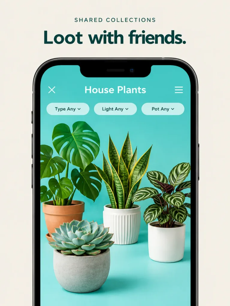
प्लांट ऐप प्रोमो मॉकअप

प्लांट ऐप प्रोमो मॉकअप

High-end promotional product mockup based on the reference photo, refining the mobile app screenshot into a polished marketing asset. Enlarge the smartphone frame so it fills most of the vertical canvas against a clean, warm beige or off-white background. Above the phone, display crisp typography with the headline "[Loot with friends.]" and a small category label "[SHARED COLLECTIONS]". The phone screen retains its turquoise interface, featuring the collection title "[House Plants]", a close button, a menu button, and exactly three pill filters labeled "Type Any", "Light Any", and "Pot Any". Inside the screen, render exactly four photorealistic 3D house plants with soft shadows and dimensional depth: a monstera in a terracotta pot on the left, a snake plant in a white ribbed pot in the center, a striped calathea in a smooth white pot on the right, and a large echeveria succulent in a concrete pot in the foreground lower-left. Bright, clean commercial studio lighting, elegant shadows, sharp UI typography, with no extra plants, watermarks, or extraneous UI elements.

ऐप मॉकअपui डिज़ाइनहाउसप्लांट
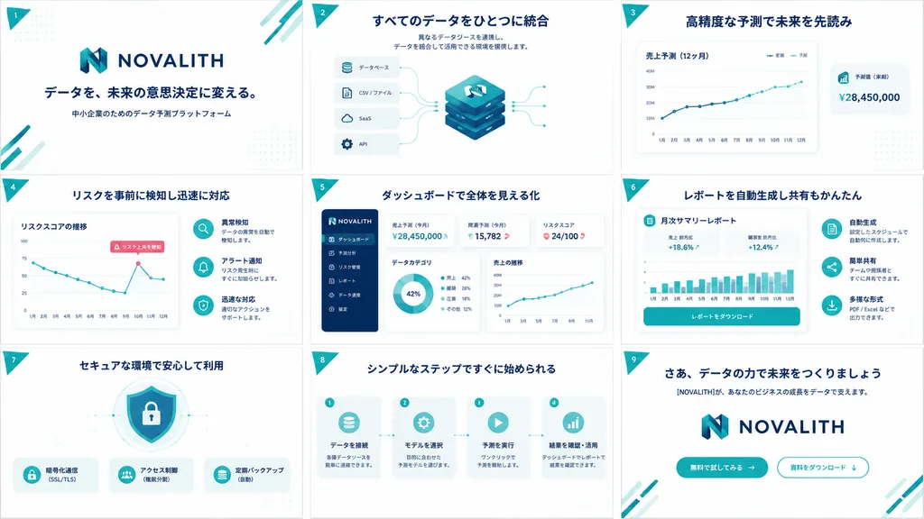
B2B SaaS पिच डेक ग्रिड

B2B SaaS पिच डेक ग्रिड

A clean, high-end Japanese B2B SaaS pitch deck and service concept board for [NOVALITH], displayed as exactly 9 widescreen 16:9 slides arranged in a 3x3 grid overview sheet. Canvas and layout: Landscape orientation, uniform white background, evenly spaced slides separated by thin pale borders. Color palette of corporate deep navy, vibrant teal, soft cyan accents, subtle dot grid textures, and a small teal triangular ribbon on the top-left of each slide displaying white numerals 1 through 9. Visual style: Modern Japanese enterprise tech aesthetic, crisp vector UI elements, minimal gradients, soft drop shadows, rounded container cards, thin teal telemetry lines, bold navy headings, and generous whitespace. Brand identity features a stylized geometric 'N' emblem in teal and navy with the uppercase wordmark [NOVALITH]. Vector icons, UI dashboards, and abstract technical diagrams only; no human photographs. Typography and language: All slide text in crisp Japanese typography with bold navy headlines and small legible subtext. Slide contents: 1. Cover: Large [NOVALITH] logo centered above headline 「データを、未来の意思決定に変える。」 and subtext 「中小企業のためのデータ予測プラットフォーム」, with teal diagonal corner lines. 2. Data Integration: Headline 「すべてのデータをひとつに統合」 with short integration subtext. Central stacked isometric database cube with the N logo, connected to 4 input cards labeled 「データベース」, 「CSV / ファイル」, 「SaaS」, and 「API」. 3. Forecasting: Headline 「高精度な予測で未来を先読み」. Large line chart card 「売上予測(12ヶ月)」 with legends 「実績」 and 「予測」, upward trendline, and floating KPI card 「予測値(来期)¥28,450,000」. 4. Risk Detection: Headline 「リスクを事前に検知し迅速に対応」. Line chart card 「リスクスコアの推移」 with declining zigzag path and callout 「リスク上昇を検知」. Right side features 3 circular icon rows for anomaly detection, alerts, and response. 5. Dashboard UI: Headline 「ダッシュボードで全体を見える化」. SaaS dashboard mockup with navy left navigation sidebar (6 menu items), KPI cards (「売上予測(今月)¥28,450,000」, 「需要予測(今月)15,782」, 「リスクスコア 24/100」), a donut chart, and a sales line graph. 6. Automated Reports: Headline 「レポートを自動生成し共有もかんたん」. Central document card titled 「月次サマリーレポート」 with metrics (+18.6%, +12.4%), a teal bar chart, and action button 「レポートをダウンロード」. 7. Security: Headline 「セキュアな環境で安心して利用」. Center shield and padlock graphic with 3 feature badges below: 「暗号化通信(SSL/TLS)」, 「アクセス制御(権限分割)」, and 「定期バックアップ(自動)」. 8. Process Steps: Headline 「シンプルなステップですぐに始められる」. 4 sequential workflow cards linked by dotted arrows: 「データを接続」, 「モデルを選択」, 「予測を実行」, and 「結果を確認・活用」. 9. Closing / CTA: Headline 「さあ、データの力で未来をつくりましょう」, subtext 「[NOVALITH]が、あなたのビジネスの成長をデータで支えます。」, large centered logo, and 2 CTA buttons: filled teal 「無料で試してみる →」 and outlined 「資料をダウンロード ↓」. Constraints: Unified branding, exact 3x3 layout, no stock photography, no extra slide tiles.

पिच डेकsaasप्रस्तुति
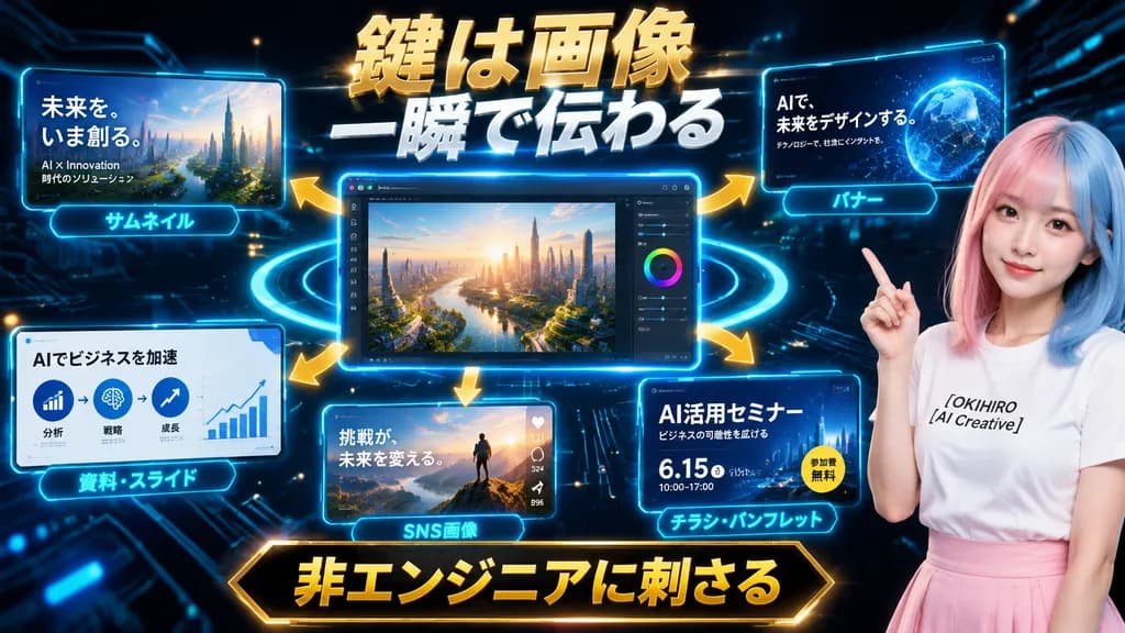
भविष्यवादी एआई मार्केटिंग प्रेजेंटेशन ग्राफिक

भविष्यवादी एआई मार्केटिंग प्रेजेंटेशन ग्राफिक

Futuristic Japanese promotional hero graphic and presentation slide for an AI creative service. Dark black and deep navy cyber background with glowing circuit board traces, floating digital particles, and neon cyan light rings orbiting a central screen. Layout and Composition: Wide landscape format featuring a central main UI window, five peripheral display panels connected by curved glowing gold arrows radiating outward, and a presenter on the far right. Central Interface: Large glowing blue-bordered desktop editor window displaying a photorealistic futuristic cityscape at sunrise, overlooking a winding river, lush urban greenery, and glass skyscrapers illuminated by warm morning sunlight, complete with an editing sidebar, sliders, and a color wheel on the right edge. Surrounding Panels: - Top-left panel: Thumbnail mockup of a futuristic metropolis with Japanese text "未来を、いま創る。" and smaller subtext "AI × Innovation" and "時代のソリューション", captioned with a glowing cyan tag reading "サムネイル". - Top-right panel: Web banner mockup showing an abstract blue holographic globe with text "AIで、未来をデザインする。" and subtext "テクノロジーで、社会にインパクトを。", captioned "バナー". - Bottom-left panel: Presentation slide mockup with clean business infographics, three circular process icons, an upward trending line chart, title "AIでビジネスを加速", captioned "資料・スライド". - Bottom-center panel: Social media post mockup showing a hiker on a mountain summit at dawn with text "挑戦が、未来を変える。" and social reaction icons, captioned "SNS画像". - Bottom-right panel: Event flyer mockup with dark blue theme, title "AI活用セミナー", subtext "ビジネスの可能性を広げる", date "6.15", time "10:00–17:00", a circular yellow badge reading "参加費無料", captioned "チラシ・パンフレット". Presenter: On the right side, a young Japanese female presenter shown from the waist up, smiling subtly and gesturing upward with her right index finger. Split-dyed pastel pink and pastel blue straight hair, wearing a white crewneck T-shirt printed with black text "[OKIHIRO AI Creative]" and a soft pink high-waisted skirt. Typography & Banners: - Top center headline: Massive bold 3D metallic gold and white Japanese text with rough texture and strong glow reading "鍵は画像" on line 1 and "一瞬で伝わる" on line 2. - Bottom center footer banner: Prominent black-and-gold framed banner holding bold gold Japanese text "非エンジニアに刺さる". Lighting and Style: High-contrast digital marketing aesthetic, glossy glassmorphic UI panels, vibrant cyan edge rim lights, polished commercial tech-presentation graphics.

मार्केटिंगप्रेजेंटेशनहीरो ग्राफिक
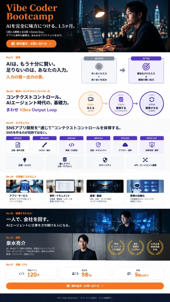
एआई कोडिंग बूटकैंप के लिए जापानी लैंडिंग पेज मॉकअप

एआई कोडिंग बूटकैंप के लिए जापानी लैंडिंग पेज मॉकअप

Full-page vertical Japanese mobile-web landing page mockup for [Vibe Coder Bootcamp], presenting an AI coding and AI agent bootcamp with a premium, thoughtful, and professional tone. High-fidelity UI design comp, crisp Japanese typography, clean spacing, dense informative layout. Style & Color: Deep navy and black cinematic sections contrasted with clean white card sections, vivid orange accent typography, purple highlights, thin gray dividers, simple line icons, and documentary-style photography. Serif-like Japanese headlines mixed with modern sans-serif UI text. Structure (7 numbered sections from top to bottom): - Hero: Dark cinematic top banner. Left side features large orange English title "[Vibe Coder Bootcamp]", Japanese subtitle "AIを完全に味方につける、1.5ヶ月。", body text "1回2.5時間×全5回+Demo Day。アプリも資料も動画も、あらゆるアウトプットをAIで", and an orange rounded CTA button reading "資料請求・お問い合わせ". Right side features a thoughtful Japanese businessman in a dark suit at a dimly lit desk with warm lamp glow, monitors showing code, and nighttime city lights. - No.01 "課題": White background. Orange label "No.01 課題". Headline "AIは、もう十分に賢い。足りないのは、あなたの入力。" and "入力の質=出力の質。" Right side shows a BEFORE/AFTER comparison: BEFORE card "あいまいな入力" to "あいまいな出力" with scribble icon; AFTER card "構造化された入力" to "価値の高い出力" with purple target icon, connected by an arrow. - No.02 "解決=コンテクストコントロール": White background. Orange label "No.02 解決=コンテクストコントロール". Headline "コンテクストコントロール。AIエージェント時代の、基礎力。" and gradient text "まわせ Vibes Output Loop". Diagram of 3 connected circular steps: STEP1 "与える (GIVE)", STEP2 "蓄積する (ACCUMULATE)", STEP3 "循環させる (LOOP)". - No.03 "カリキュラム": White background. Headline "SNSアプリ開発を“通じて”コンテクストコントロールを体得する。SNSを作るのが目的ではない。" Exactly 6 horizontal weekly cards with purple headers: WEEK01 "企画・要件定義", WEEK02 "UI/UX・設計", WEEK03 "実装・DB設計", WEEK04 "認証・セキュリティ", WEEK05 "デプロイ・運用", DEMO DAY "成果発表・講評". Below, 4 feature icon cards: "企画・UI/UX", "動くアプリ (DB・デプロイ)", "セキュリティ", "API・エージェント基盤". - No.04 "卒業後にできること": White background. Row of 4 capability cards with thumbnails: "アプリ・サービス", "資料・ドキュメント", "画像・動画", "業務の自動化". - No.05 "相棒すなわちAI": Full-width dark cinematic banner. Left text "一人で、会社を回す。" and "AIエージェントに仕事をさせ続ける人になる。" Right side shows the Japanese professional at night surrounded by floating semi-transparent UI charts and code. - No.06 "講師": Dark gray section introducing instructor [泉水亮介], realistic professional portrait on concrete background with 3 gold laurel badge icons. - No.07 "実績・CTA": White background with 3 key metrics cards ("開発アプリ 120+", "満足度 98%", "業務 9割をAIで") and a large orange CTA button "資料請求・お問い合わせ" with envelope icon. Minimal clean footer. Composition: Continuous tall vertical webpage layout, 9:16 aspect ratio, no browser chrome, no external watermarks.

लैंडिंग पेजयूआई डिजाइनवेब मॉकअप
ASCII वायरफ्रेम लैंडिंग पेज हेडर

ASCII वायरफ्रेम लैंडिंग पेज हेडर

+--------------------------------------------------------------------------------+ | Header | | Logo: [Mirai Labor Partners] Nav: Services | Reasons to Choose | Case Studies | Pricing | Contact | | CTA: Initial Consultation | +--------------------------------------------------------------------------------+ [Hero Image for landing page header]

लैंडिंग पेजवायरफ्रेमयूआई डिजाइन
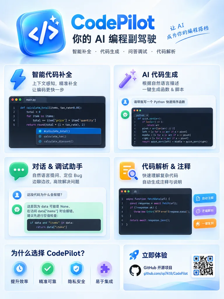
एआई कोडिंग सहायक प्रचार इन्फोग्राफिक पोस्टर

एआई कोडिंग सहायक प्रचार इन्फोग्राफिक पोस्टर

app promotional infographic poster. clean, modern, glassmorphism, soft shadows, 3D icons, high clarity. [blue and white]. [CodePilot]. feature_cards. 上下文感知, 精准补全 让编码更快一步. 根据自然语言描述 一键生成函数 & 脚本. 自然语言提问、定位 Bug 边聊边改, 高效解决问题. 快速理解复杂代码 自动生成注释与说明…

इन्फोग्राफिकडेवलपर टूलग्लासमॉर्फिज्म
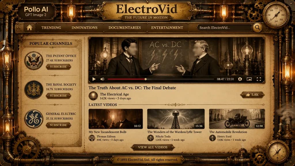
स्टीमपंक वीडियो स्ट्रीमिंग प्लेटफ़ॉर्म यूआई

स्टीमपंक वीडियो स्ट्रीमिंग प्लेटफ़ॉर्म यूआई

A detailed full-screen steampunk video-streaming website interface mockup in a dark bronze, brass, and sepia color palette, styled like an antique Victorian industrial dashboard. The screen is framed with ornate filigree metal borders, rivets, copper pipes, interlocking gears, pressure gauges, and warm glowing Edison bulbs with low-key dramatic lighting. At the top left, overlaying the metal frame, is a clean brand mark reading "[Pollo AI]" with smaller text "[GPT Image 2]" below. Centered across the header is a prominent embossed brass plaque titled "[ElectroVid]" with an engraved subline "[THE FUTURE IN MOTION]". Beneath the title, a horizontal brass navigation bar features 6 items: a home icon, "[TRENDING]", "[INNOVATIONS]", "[DOCUMENTARIES]", "[ENTERTAINMENT]", and a search bar containing placeholder text "[Search ElectroVid...]" with a brass magnifying glass icon. A vintage circular pressure gauge is integrated into the top-right frame. The layout has two main columns on parchment-textured backing: - Left sidebar: titled "[POPULAR CHANNELS]" with 3 channel cards: (1) eagle seal emblem, "[THE PATENT OFFICE]", "[27.4K SUBSCRIBERS]", (2) royal crest emblem, "[THE ROYAL SOCIETY]", "[18.7K SUBSCRIBERS]", (3) circular GE-style monogram, "[GENERAL ELECTRIC]", "[35.1K SUBSCRIBERS]"; each has a small brass "[SUBSCRIBE]" button. - Central main column: a large featured video player in a riveted brass frame showing a sepia archival scene of two Victorian inventors debating in front of a chalkboard labeled "AC vs. DC" with hand-drawn lightning bolts (each face covered by a soft rectangular blur block). Below the footage is a mechanical video control bar displaying a play icon, volume icon, red progress bar, timestamp "[08:47 / 22:31]", settings gear, miniplayer icon, and fullscreen icon. Below the player: video title "[The Truth About AC vs. DC: The Final Debate]", channel avatar with name "[The Electrical Age]", view count "[142K views • 3 days ago]", and a brass "[LIKE]" button showing "[5.8K]". - Lower section: header "[LATEST VIDEOS]" above 3 thumbnail cards: (1) "[My New Incandescent Bulb]", thumbnail of an inventor holding an illuminated filament bulb with a face blur block, duration "[10:12]", creator "[Thomas Edison]", "[89K views • 5 days ago]"; (2) "[The Wonders of the Wardenclyffe Tower]", thumbnail of a massive wooden transmission tower under electrical discharge, duration "[15:36]", creator "[Nikola Tesla]", "[120K views • 1 week ago]"; (3) "[The Automobile Revolution]", thumbnail of an early horseless carriage on a cobblestone road, duration "[12:08]", creator "[Henry Ford]", "[110K views • 1 week ago]". Centered underneath is an ornate brass button reading "[VIEW ALL VIDEOS]". Bottom footer: a centered brass plate engraved with "[© 1893 ElectroVid, Ltd. All rights reserved.]". Decorative brass cogwheels, steam vents, and a dial gauge adorn the lower right corner.

स्टीमपंकवीडियो प्लेटफ़ॉर्मयूआई डिज़ाइन
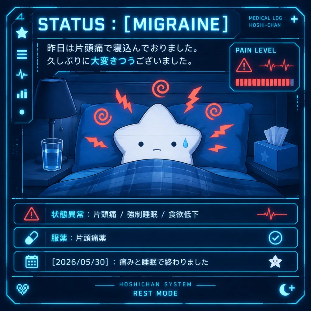
साइ-फाइ मेडिकल HUD मैस्कॉट स्टेटस स्क्रीन

साइ-फाइ मेडिकल HUD मैस्कॉट स्टेटस स्क्रीन

A square futuristic sci-fi medical HUD dashboard illustration on a dark navy blue background with glowing cyan interface borders, subtle scanlines, and high-contrast neon accents. In the center, [Hoshi-chan], a minimalist white five-pointed star mascot, lies resting in bed under a blue plaid blanket with blue pillows. The star has tiny black dot eyes, a neutral mouth, and a single blue sweat droplet on the right cheek, surrounded by 8 red-orange migraine pain symbols (5 jagged zigzags and 3 spiral squiggles). On the left bedside table sits a dark lamp and a glass of water; on the right sits a tissue box with a single tissue protruding. At the top, bold glowing typography reads “STATUS : [MIGRAINE]”, with small text in the upper right reading “MEDICAL LOG : HOSHI-CHAN” beside a tiny plus sign. Below the header, two lines of Japanese message text appear: “[昨日は片頭痛で寝込んでおりました。 久しぶりに大変きつうございました。]” with the phrase “大変きつう” highlighted in cyan. HUD elements frame the scene: a left vertical sidebar with 5 icons (star, menu bars, heartbeat line, bar chart, dot), and a right pain monitor card labeled “PAIN LEVEL” displaying a red warning triangle, red heartbeat waveform, and an almost-full row of red segmented bars. The bottom section features three glowing cyan status rows: Row 1: Red warning triangle icon, Japanese text “状態異常:片頭痛 / 強制睡眠 / 食欲低下”, and a red pulse wave. Row 2: Cyan pill capsule icon, Japanese text “服薬:片頭痛薬”, and a cyan circular checkmark. Row 3: Cyan calendar icon, Japanese text “[2026/05/30]:痛みと睡眠で終わりました”, and a tiny white pixel star. Footer details include centered text “HOSHICHAN SYSTEM” above “REST MODE”, a pixel heart in the lower left, and a crescent moon with a plus symbol in the lower right. Crisp vector-like digital art style, anime mascot charm, clinical sci-fi aesthetic.

hudमैस्कॉटसाइबरपंक
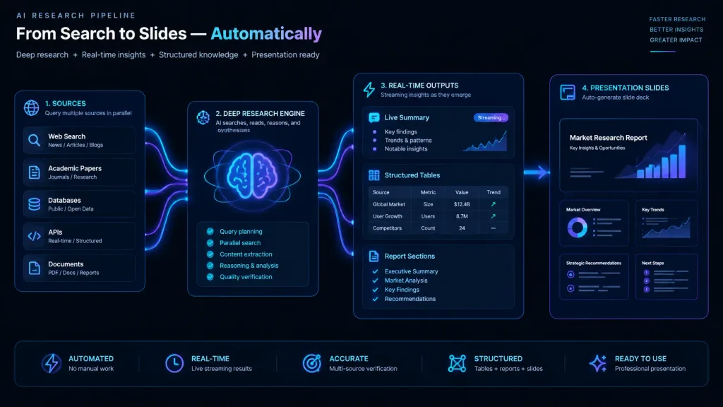
एआई डीप रिसर्च वर्कफ़्लो आरेख

एआई डीप रिसर्च वर्कफ़्लो आरेख

Modern infographic workflow diagram illustrating an automated AI research pipeline: an active deep research engine querying sources, real-time streaming summary cards, structured tables, and report section blocks, seamlessly chaining into presentation slide previews. Sleek developer dashboard UI style, dark theme with glowing neon cyan and purple data pipelines, clean modular layout, crisp technical typography, and minimalist vector icons.

इन्फोग्राफिकवर्कफ़्लोएआई रिसर्च
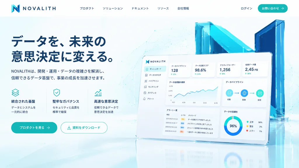
B2B SaaS लैंडिंग पेज हीरो सेक्शन

B2B SaaS लैंडिंग पेज हीरो सेक्शन

A polished fictional SaaS landing page hero section for a data infrastructure and analytics platform named [NOVALITH], designed in a premium Japanese B2B tech aesthetic. Desktop web layout with a 16:9 aspect ratio, clean white background with pale cyan gradients, subtle network line geometry, faint dot matrix patterns, and glossy floor reflections. Palette of deep navy, teal, cyan, and crisp white. Header: Top-left logo with an angular gradient cyan-to-navy "N" icon followed by spaced uppercase wordmark "NOVALITH". Center navigation features five Japanese links: 「プロダクト」, 「ソリューション」, 「ドキュメント」, 「リソース」, 「会社情報」. Top-right includes 「ログイン」 and a rounded teal CTA button labeled [お問い合わせ] with a right arrow icon. Hero Left: Bold two-line navy Japanese headline reading [データを、未来の意思決定に変える。]. Beneath it, a Japanese subheadline: [NOVALITHは、開発・運用・データの複雑さを解消し、信頼できるデータ基盤で、事業の成長を加速させます。]. Below, a three-column feature block with thin teal line icons: 1) stacked layers icon with 「統合された基盤」「データとシステムを一元的に統合」, 2) shield-check icon with 「堅牢なガバナンス」「セキュリティと品質を標準で確保」, 3) rising chart arrow icon with 「高速な意思決定」「信頼できるデータで意思決定を加速」. Two rounded buttons underneath: a solid teal primary CTA [プロダクトを見る] with an arrow, and an outlined white CTA 「資料をダウンロード」 with a download icon. Hero Right: A tilted floating dashboard mockup with rounded corners, soft shadow, and glossy white UI. Behind it stands a monumental 3D translucent teal and navy "N" structure with angular cyan glass panels. The dashboard displays a six-item sidebar (「ダッシュボード」 highlighted, 「データカタログ」, 「パイプライン」, 「モニタリング」, 「ガバナンス」, 「アラート」), four stat cards (「データパイプライン」 128, 「データ品質スコア」 98.6%, 「アクティブユーザー」 1,256, 「処理データ量」 2.45 PB), line charts, a 3-node pipeline diagram, a 4-row alert table, and a donut chart showing 96%. Crisp UI design, photorealistic 3D glass, airy spacing, sharp Japanese typography, no people, no clutter.

saasलैंडिंग पेजui डिज़ाइन
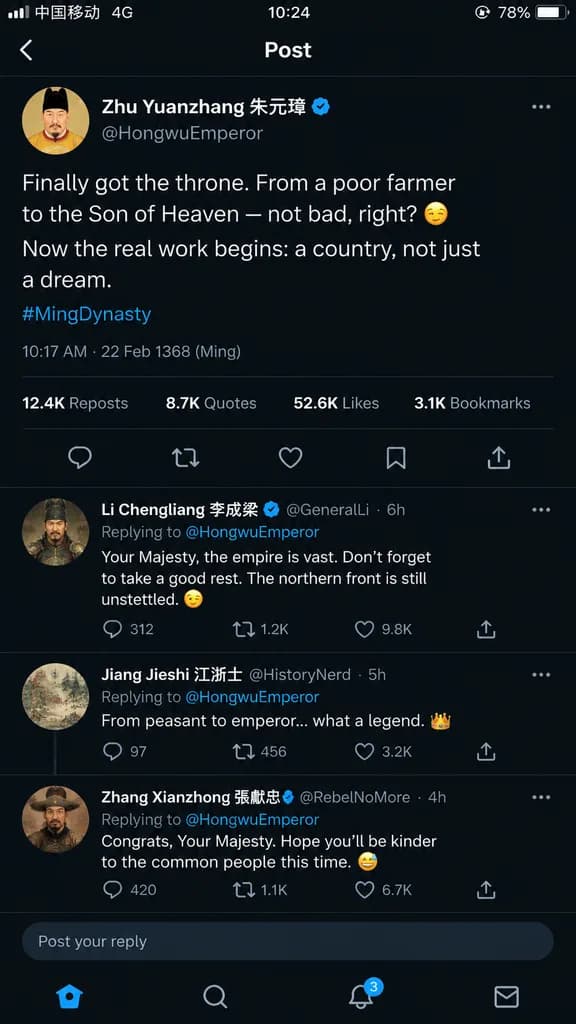
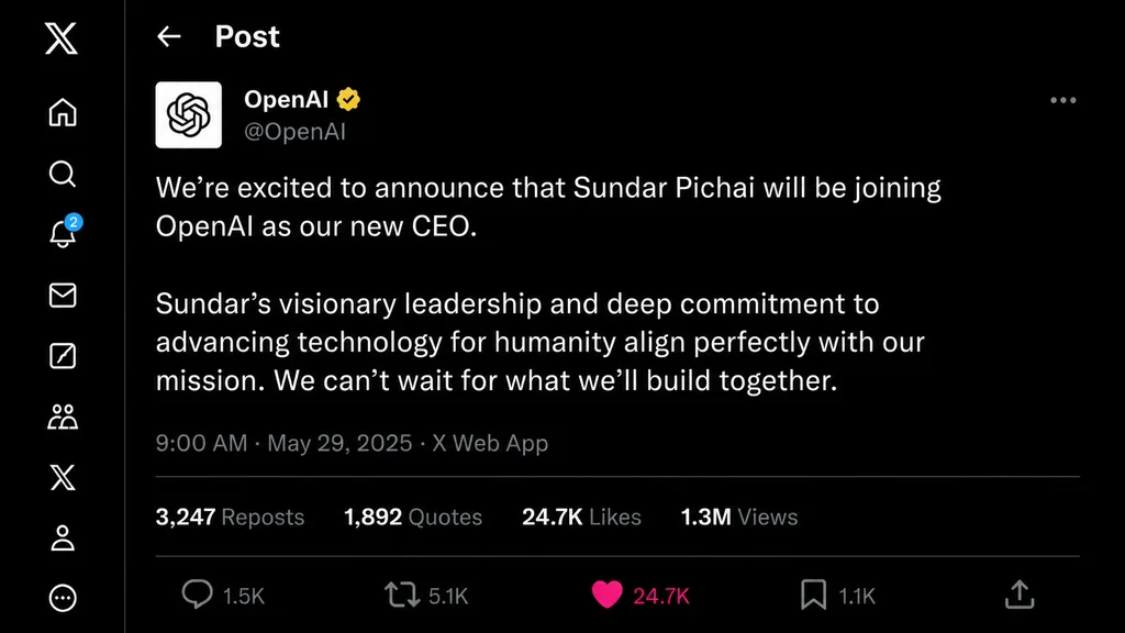
कॉर्पोरेट कार्यकारी घोषणा सोशल पोस्ट

कॉर्पोरेट कार्यकारी घोषणा सोशल पोस्ट

A screenshot of an X (formerly Twitter) social media post by [@OpenAI] announcing [Sundar Pichai] as their new [CEO]. The interface displays authentic UI elements including the profile avatar, handle, verified badge, post timestamp, engagement metrics (reposts, likes, views), and cleanly rendered announcement text.

सोशल मीडियामॉकअपयूआई डिज़ाइन
पोषण और एआई ऐप आइकन ग्रिड

पोषण और एआई ऐप आइकन ग्रिड

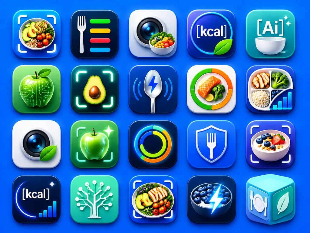
A clean presentation grid of 20 modern mobile app logo concepts for nutrition, calorie tracking, healthy eating, food recognition, and AI wellness tools, displayed on a vivid electric-blue background with soft studio lighting and subtle drop shadows. The icons are arranged evenly in 4 rows by 5 columns, each designed as a glossy rounded-square app tile with premium iOS-style depth, smooth gradients, glassy highlights, and crisp 3D-rendered detail. The color palette centers on saturated blues, cyan, teal, white, lime green, with subtle accents of orange and yellow. The 20 distinct icon designs feature: 1) a meal bowl with avocado, grains, broccoli, and cherry tomatoes framed by a camera scan bracket, 2) a white fork beside four horizontal nutrition bars in green, yellow, red, and blue on a dark navy tile, 3) a camera lens with a small vegetable bowl in front, 4) a circular blue badge with the text "[kcal]" and a green leaf overlapping the lower edge, 5) a teal-blue icon with the text "[Ai]" above a white bowl and two sparkles, 6) a glossy green apple with circuit traces and nodes representing food-tech AI, 7) a halved avocado centered inside a glowing scan frame, 8) a metallic spoon with a blue lightning bolt symbol and curved tracking lines, 9) a circular segmented nutrition meter in green, orange, and red around salmon and broccoli, 10) a divided plate containing grilled chicken, broccoli, rice, blueberries, and an ascending analytics bar chart, 11) a camera lens on a white tile with a green leaf attached, 12) a glowing green apple inside a scan bracket with a sparkle, 13) a luminous circular activity ring in blue, green, yellow, and orange on a dark tile, 14) a blue shield with a white fork in the center, 15) a yogurt or oatmeal bowl topped with berries and granola inside a scan bracket, 16) a dark navy calorie icon with the text "[kcal]", a curved glow, one sparkle, and a tiny bar chart, 17) a mint-green square with a white circuit-tree motif, 18) a plated healthy meal with chicken, avocado, tomatoes, and greens inside a scan bracket, 19) a dark bowl of blueberries and yogurt with an electric lightning bolt overlay, 20) a pastel aqua 3D cube icon featuring a fork-and-plate symbol on one face and a leaf on another. Highly polished, modern App Store branding aesthetic, consistent visual language across all icons, with no extra text beyond the designated labels.

ऐप आइकनयूआई डिज़ाइनपोषण ऐप
होलोग्राफिक म्यूजिक प्लेयर स्ट्रीट एडिट

होलोग्राफिक म्यूजिक प्लेयर स्ट्रीट एडिट

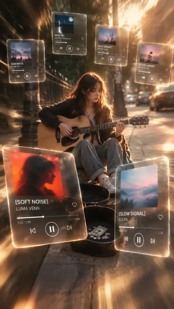
Using the reference photo of the street busker, keep the performer, guitar, outfit, sidewalk setting, guitar case, and overall camera angle intact, but transform the image into a viral cinematic music-edit scene. Surround the performer with floating [translucent glowing glass] music-player UI panels featuring soft reflections, luminous rounded edges, realistic refraction, and perspective depth as if suspended in mid-air. Lighting and Style: [Warm golden-hour cinematic] color grading, deep contrast, subtle radial/motion blur streaks around the vignette edges, and a polished editorial look while keeping the musician sharp. Include exactly 6 floating music-player cards with white minimalist typography, album thumbnails, and playback controls: 1. Large foreground card at lower left: red and orange blurred silhouette cover art, song title "[SOFT NOISE]", artist "LUMA VENN", timestamp 1:52 / 3:48. 2. Large foreground card at lower right: misty blue and pink cover art, song title "[SLOW SIGNAL]", artist "ELIORA", timestamp 1:30 / 3:35. 3. Small upper-left card: song title "SIDEWAYS", artist "NAMI REY". 4. Small top-center card: song title "NOA VEL", artist "AFTER MIDNIGHT". 5. Small upper-middle card: song title "HALF AWAKE", artist "MONO JUNE". 6. Small upper-right card: song title "STATIC HEART", artist "KIRO MAVE". Ensure cards remain semi-transparent so the background sidewalk and street stay visible through them. Apply [viral music edit with edge blur].

म्यूजिक प्लेयरहोलोग्राफिकग्लासमॉर्फिज्म
एआई प्लेटफॉर्म के लिए मिनिमलिस्ट प्रेजेंटेशन कवर स्लाइड

एआई प्लेटफॉर्म के लिए मिनिमलिस्ट प्रेजेंटेशन कवर स्लाइड

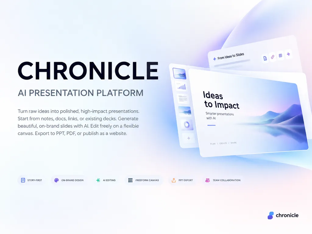
A premium 4:3 presentation cover slide introducing [Chronicle], an AI-native presentation platform. Style: Elegant, minimal, modern tech startup aesthetic inspired by Apple, Linear, and Notion brand books. Soft gradient background with subtle depth and clean generous whitespace. Layout: Asymmetrical, polished editorial layout with consulting-grade presentation quality. Typography and text elements (in English): Main title reads "[CHRONICLE]"; subtitle reads "[AI PRESENTATION PLATFORM]"; elegant body text reads "[Turn raw ideas into polished, high-impact presentations. Start from notes, docs, links, or existing decks. Generate beautiful, on-brand slides with AI. Edit freely on a flexible canvas. Export to PPT, PDF, or publish as a website.]"; small refined feature tags read "[STORY-FIRST]", "[ON-BRAND DESIGN]", "[AI EDITING]", "[FREEFORM CANVAS]", "[PPT EXPORT]", "[TEAM COLLABORATION]"; subtle logo text in the bottom corner reads "[chronicle]". Business-class premium, slightly futuristic, sharp graphic design.

प्रेजेंटेशनस्लाइडमिनिमलिस्ट
कस्टम थीम यूट्यूब चैनल इंटरफ़ेस

कस्टम थीम यूट्यूब चैनल इंटरफ़ेस

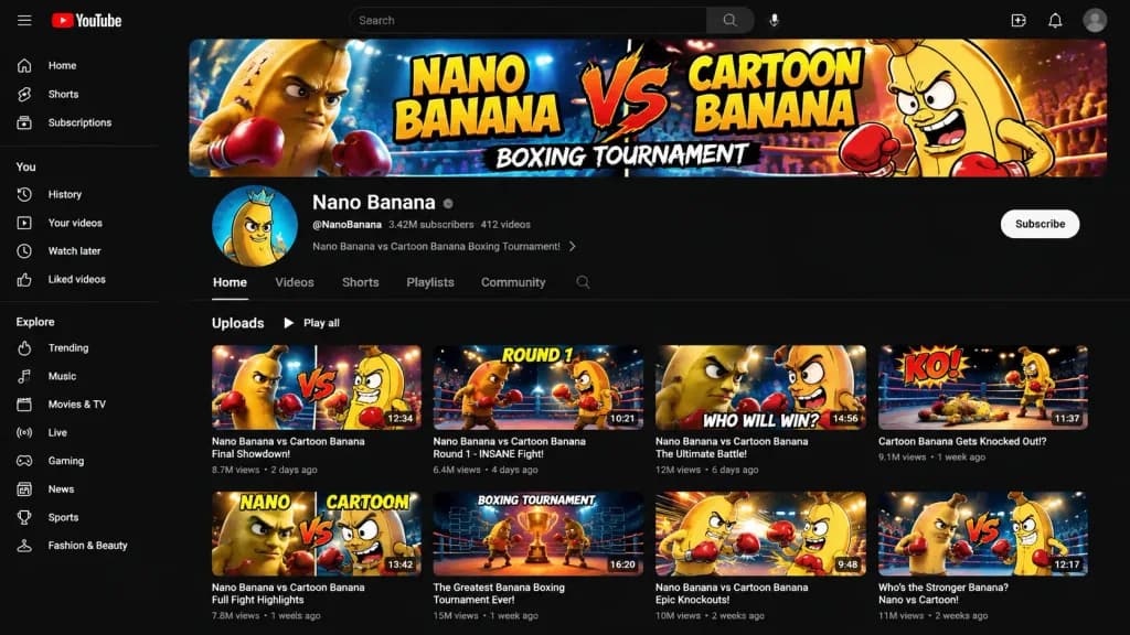
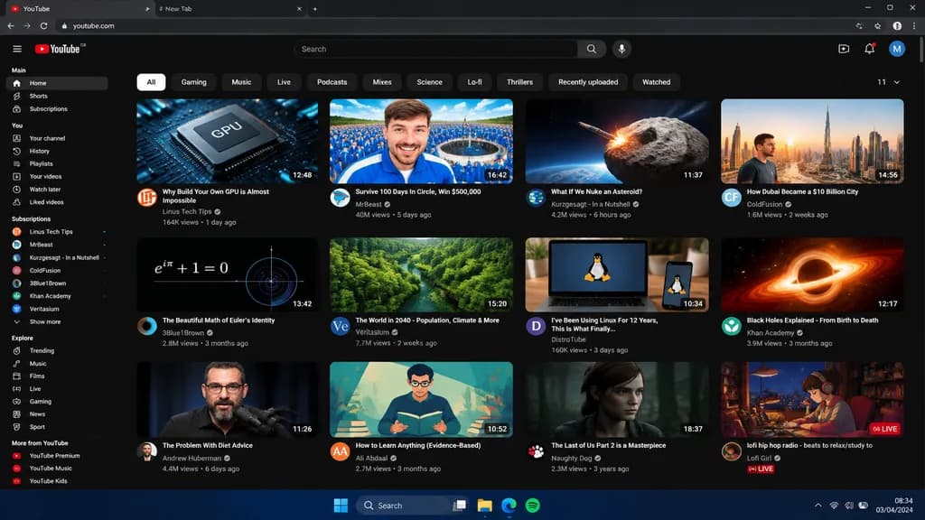
A YouTube channel page layout identical to the real MrBeast channel, maintaining the exact perspective, interface elements, channel banner, icons, buttons, and sidebar from the reference photo. Replace all visible video thumbnails with custom, high-energy thumbnails themed around [Nano Banana VS Cartoon Banana Boxing Tournament].

यूट्यूबचैनल पेजमॉकअप
भविष्यवादी ग्लास यूआई प्रचार बैनर

भविष्यवादी ग्लास यूआई प्रचार बैनर

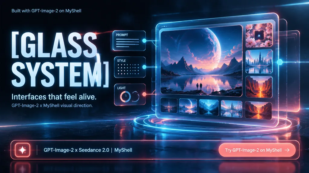
futuristic promotional key visual for an AI image product. large central image card inside the glass tablet showing an epic alien planet over a reflective lake, mountain silhouettes, a tiny lone figure, twilight sky in blue and rose tones.…

ग्लासमॉर्फिज्मयूआई डिज़ाइनप्रचार बैनर
भविष्यवादी होलोग्राफिक क्रिएटर डैशबोर्ड

भविष्यवादी होलोग्राफिक क्रिएटर डैशबोर्ड

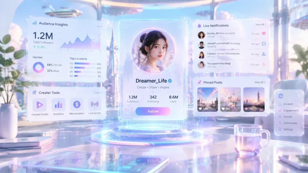
Transform the social media profile from the reference photo into a futuristic floating hologram interface inside a bright, luxury cyberpunk workspace. The main profile is centered and surrounded by translucent glassmorphism UI panels, floating transparent screens, holographic analytics widgets, audience insights, creator tools, pinned post modules, and live notification cards suspended in midair. Aesthetics feature a [color palette light and elegant — white, soft lavender, pastel blue, pink, and cyan glows] rather than dark cyberpunk tones. Cinematic reflections, soft volumetric lighting, airy depth, minimal high-tech styling, and an ultra-clean sci-fi creator operating system layout.

होलोग्रामडैशबोर्डग्लासमोर्फिज्म
मोबाइल ऐप आइकन कॉन्सेप्ट बोर्ड

मोबाइल ऐप आइकन कॉन्सेप्ट बोर्ड

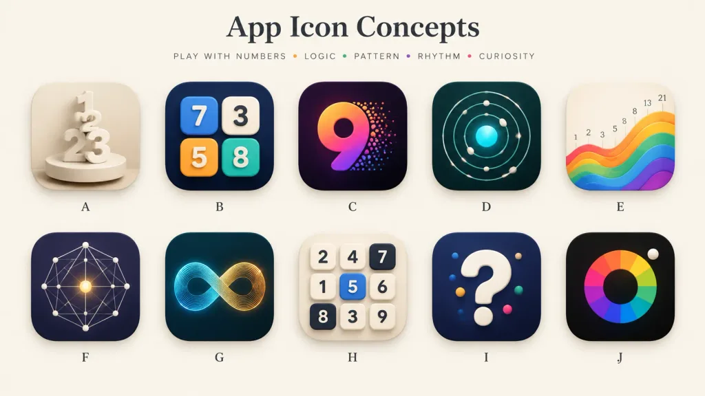
A polished presentation board showcasing 10 alternative app icon concepts for a [number-play and logic puzzle] mobile app. Wide 16:9 landscape canvas on a warm off-white background, minimal gallery-style spacing, soft shadows, and a premium design-review aesthetic. Header: Centered at the top, a large elegant serif title: "[App Icon Concepts]". Below it, a small uppercase tracked tagline: "[PLAY WITH NUMBERS • LOGIC • PATTERN • RHYTHM • CURIOSITY]" with tiny colored dots between words. Grid & Icons: A clean 2-row by 5-column grid containing exactly 10 identical-sized rounded-square app icons with consistent corner radii, subtle drop shadows, and a single centered letter label beneath each, labeled A through J: - A: Cream monochrome icon with stacked 3D numerals 1, 2, and 3 standing on a circular pedestal, sculptural plaster look. - B: Dark navy icon featuring four raised rounded number tiles (blue 7, cream 3, orange 5, teal 8) arranged like playful puzzle blocks. - C: Deep purple-black icon with a large gradient numeral 9 in orange, magenta, and violet, with colorful particle dots bursting from its right edge. - D: Dark teal icon showing an orbital logic pattern of concentric circular paths, small white spheres, and a glowing cyan center. - E: Warm ivory icon displaying rising rainbow wave bands from left to right, with small Fibonacci numbers (1, 2, 3, 5, 8, 13, 21) above the wave. - F: Dark indigo icon with a geometric constellation network of thin white connecting lines, dots, and a glowing golden center point. - G: Dark teal icon featuring a luminous infinity loop made of fine parallel lines transitioning from cyan to golden orange. - H: Light cream icon with a 3x3 grid of tactile number tiles (top row: 2, 4, 7; middle: 1, 5, 6; bottom: 8, 3, 9; tile 5 is blue, 7 and 8 are dark). - I: Dark navy icon with a large glossy white 3D question mark accented with small colored dots. - J: Near-black icon with a segmented rainbow circular color wheel around a dark center disk, and a small white sphere at the upper-right edge. Style: High-end mobile app icon exploration sheet, soft 3D rendering combined with crisp vector precision, realistic highlights, subtle ambient occlusion, balanced negative space, clean typography, no watermarks.

ऐप आइकनयूआई डिज़ाइनकॉन्सेप्ट बोर्ड
गैलेक्सी रेल आर्केड शीर्षक स्क्रीन

गैलेक्सी रेल आर्केड शीर्षक स्क्रीन

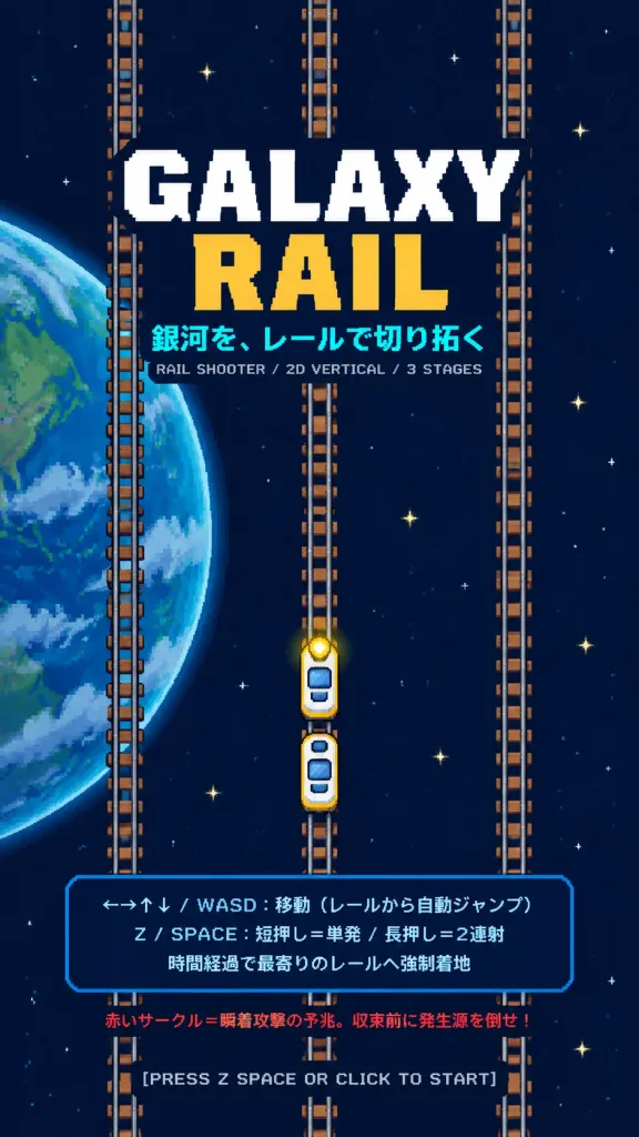
A retro 2D vertical arcade rail-shooter title screen in a 9:16 portrait mobile game splash screen layout. The background is dark navy outer space populated with tiny white and pale yellow stars, featuring a large partially cropped Earth-like blue planet on the left side with simple green continents and translucent cloud streaks. Exactly three vertical railroad tracks run straight from top to bottom across the canvas (left, center, right), designed with gray steel rails and brown sleepers. On the lower center track, exactly two small train player cars are stacked vertically, featuring rounded white bodies, blue windows, yellow borders, and a bright yellow headlight on the front car. In the upper-center, the game title is displayed in two lines: “[GALAXY]” in large white slab-serif text with a dark navy outline, and “[RAIL]” below in large golden-yellow slab-serif text. Directly underneath is the bright cyan Japanese tagline “[銀河を、レールで切り拓く]”, followed by small gray text “RAIL SHOOTER / 2D VERTICAL / 3 STAGES”. In the lower third, a translucent dark blue instruction box with a thin blue outline displays three Japanese lines: “←→↑↓ / WASD:移動(レールから自動ジャンプ)”, “Z / SPACE:短押し=単発 / 長押し=2連射”, and “時間経過で最寄りのレールへ強制着地”. Below the panel, a small red warning line reads “赤いサークル=瞬着攻撃の予兆。収束前に発生源を倒せ!”. At the bottom edge, centered pale gray text reads “[PRESS Z SPACE OR CLICK TO START]”. Style is crisp 2D vector arcade game mockup with retro pixel typography and clean high-contrast colors.

आर्केड गेमशीर्षक स्क्रीनपिक्सेल कला
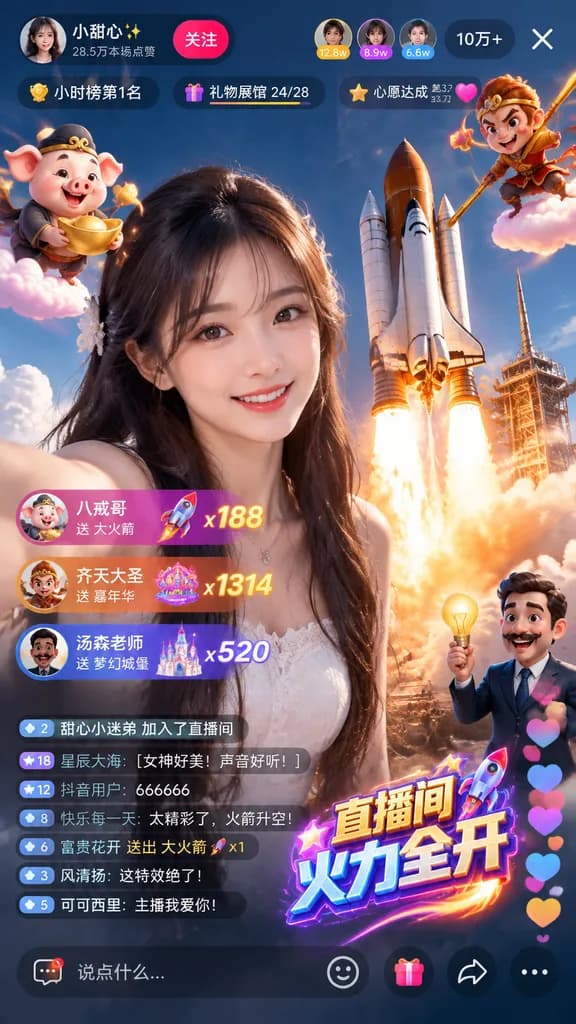
Douyin लाइव स्ट्रीम यूआई मॉकअप

Douyin लाइव स्ट्रीम यूआई मॉकअप

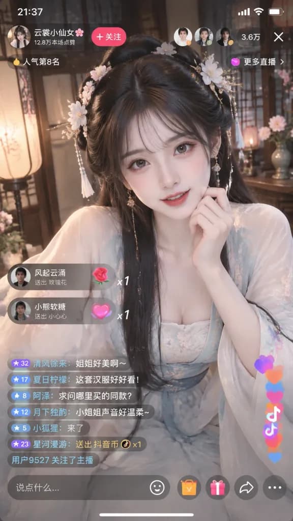
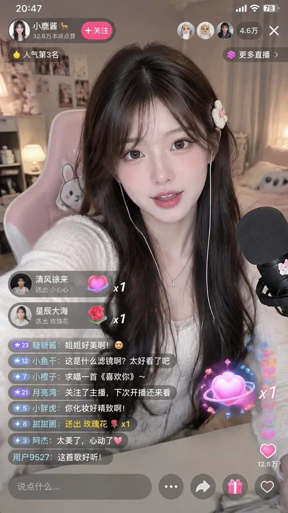
A smartphone screen interface mockup of a Douyin live stream room, with on-screen comments, viewer count, like animations, and gift icons overlaying the video feed showing [a beautiful woman in traditional Hanfu live streaming].

douyinलाइव स्ट्रीमयूआई डिज़ाइन
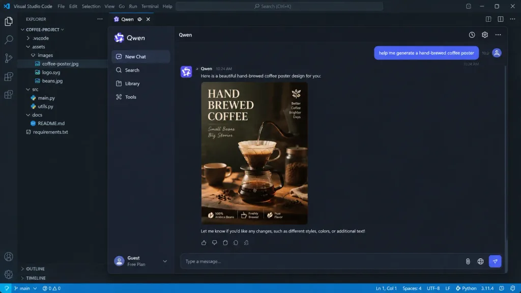
नेस्टेड पिक्चर-इन-पिक्चर सॉफ़्टवेयर इंटरफ़ेस

नेस्टेड पिक्चर-इन-पिक्चर सॉफ़्टवेयर इंटरफ़ेस

A picture-in-picture digital image with multi-layered visual depth. The outermost layer is a realistic [VSCode programming interface]. Nested inside is a [Qwen App] chat interface. In the chat window, a user message reads: "[help me generate a hand-brewed coffee poster]". The AI responds with an exquisite coffee poster displayed clearly in the chat feed. Realistic UI design with crisp micro-details, including legible timestamps, button text, syntax highlighting, and nested window borders.

यूआई डिज़ाइनसॉफ़्टवेयर इंटरफ़ेसकोड एडिटर
3D सेल-शेडेड VTuber स्ट्रीमिंग स्क्रीन लेआउट

3D सेल-शेडेड VTuber स्ट्रीमिंग स्क्रीन लेआउट

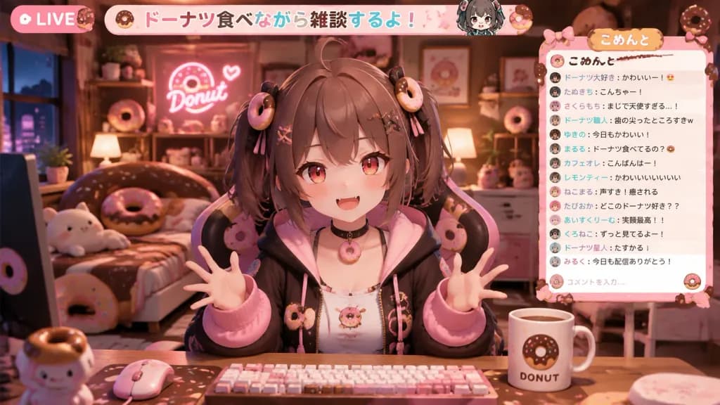
Layout of a professional VTuber live streaming screen in a horizontal 16:9 composition. Anime-style 3D CG cell-shaded rendering as if rendered in Unreal Engine or Unity. In the center, a 3D avatar character with [brown hair, short twin tails, red eyes, and slightly pointed teeth] sits in a themed gaming chair matching [a room full of donut motifs], facing forward and talking with animated hand gestures. In the foreground, a streaming desk displays a keyboard, mouse, and a mug. The background is a deep, immersive 3D interior filled with themed furniture, wall decorations, and props fitting [a room full of donut motifs]. On the side of the screen, an integrated custom UI chat box frame displays realistic viewer comments in clean digital Japanese font. Along the top, a matching themed stream title bar is displayed. Cohesive, vibrant lighting and unified thematic design across character, furniture, and streaming overlay UI.

vtuberस्ट्रीमिंग ओवरले3d एनीमे
एआई क्रिएटर स्टूडियो वेबसाइट हीरो बैनर

एआई क्रिएटर स्टूडियो वेबसाइट हीरो बैनर

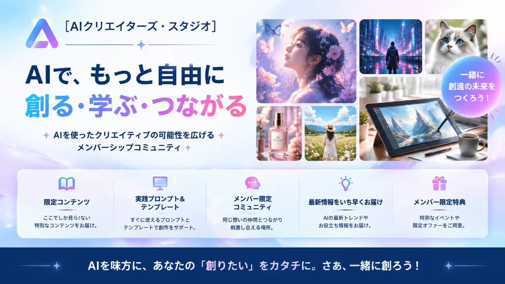
A polished Japanese promotional website hero banner for an AI creator community, designed in a clean modern tech-advertising style with a soft pastel blue, lavender, pink, and white palette, 16:9 wide composition. On the left, place a gradient triangular abstract logo and the Japanese brand name "[AIクリエイターズ・スタジオ]" at the top, followed by a thin horizontal divider line with a small sparkle in the center. Below, a prominent two-line bold Japanese headline: the first line in dark navy, 「AIで、もっと自由に」, and the second line in large gradient letters from cyan to purple to pink, 「創る・学ぶ・つながる」. Underneath, a short Japanese subheadline flanked by subtle sparkles: 「AIを使ったクリエイティブの可能性を広げるメンバーシップコミュニティ」. On the right, a collage of 6 rounded-rectangle cards showcasing creative works: 1 large dreamy profile portrait of a woman surrounded by flowers and butterflies in ethereal purple light; 1 small cyberpunk city nightscape with a lone figure; 1 small close-up portrait of a fluffy cat; 1 small luxury cosmetic bottle labeled 'AI STUDIO'; 1 small sunny flower-field landscape with a woman in white; and 1 large digital drawing tablet on a desk with a stylus, coffee mug, and desk plant. Overlapping the right section, add a circular gradient badge with bold white text reading "[一緒に創造の未来をつくろう!]". Across the lower middle, place a translucent glassmorphism rounded bar with 5 equal columns and pastel line icons (book, monitor, chat bubble, light bulb, gift) with bold titles: 「限定コンテンツ」, 「実践プロンプト&テンプレート」, 「メンバー限定コミュニティ」, 「最新情報をいち早くお届け」, and 「メンバー限定特典」, each with a brief 2-line description. At the bottom, a dark navy footer bar with a large call-to-action sentence: "[AIを味方に、あなたの『創りたい』をカタチに。さあ、一緒に創ろう!]". Glossy soft lighting, subtle glimmers, crisp legible Japanese typography, professional landing page aesthetic.

यूआई डिज़ाइनहीरो बैनरलैंडिंग पेज
रेट्रो ग्रीन टर्मिनल HUD डिस्प्ले

रेट्रो ग्रीन टर्मिनल HUD डिस्प्ले

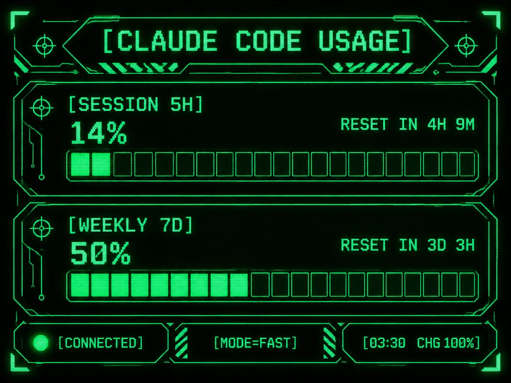
Retro-futuristic monochrome green terminal HUD interface designed for an M5Stack-style compact display. At the top, the title displays "[CLAUDE CODE USAGE]" in crisp pixelated typography. The body features two usage sections: the first labeled "[SESSION 5H]" displaying "14%" and "RESET IN 4H 9M", and the second labeled "[WEEKLY 7D]" displaying "50%" and "RESET IN 3D 3H". Each section includes a chunky horizontal gauge bar with exactly 20 rectangular segments; the upper gauge has 2 filled glowing segments and the lower gauge has 10 filled glowing segments. Along the bottom, three modular footer panels show: left "[CONNECTED]" with an illuminated status dot, center "[MODE=FAST]", and right "[03:30 CHG 100%]". Sci-fi frame with angular geometric borders, corner brackets, circuit line accents, tiny target icons, diagonal hazard striping, and subtle CRT scanline pixel glow on a deep black background.

टर्मिनलhudपिक्सेल आर्ट
एआई इमेज जनरेटर चैट इंटरफ़ेस स्क्रीनशॉट

एआई इमेज जनरेटर चैट इंटरफ़ेस स्क्रीनशॉट

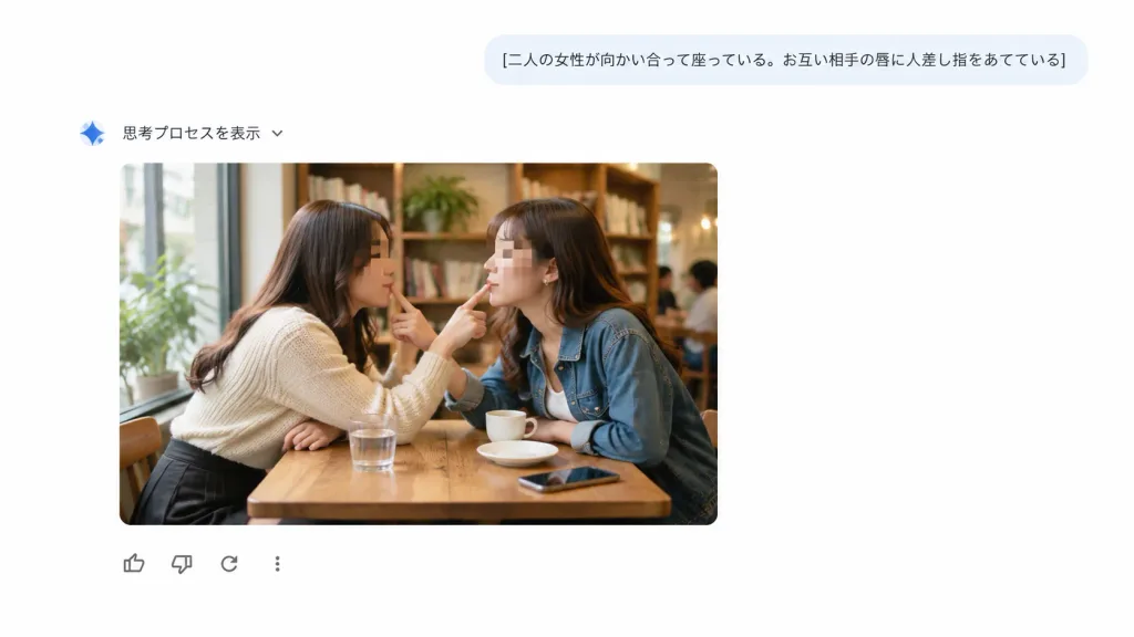
A clean screenshot-style web interface showing an AI chat and image-generation response on a pure white background with generous negative space, with no browser chrome or watermarks. UI Layout: - Top right: A rounded light blue-gray user prompt bubble containing the Japanese text: "[二人の女性が向かい合って座っている。お互い相手の唇に人差し指をあてている]" in dark gray typography. - Below and to the left: A small blue gradient sparkle icon followed by Japanese text "思考プロセスを表示" and a tiny downward chevron. - Center-left: An embedded generated image card with rounded corners. - Directly below the image card: Exactly four minimal feedback icons in a horizontal row: thumbs-up, thumbs-down, circular reload arrow, and a vertical three-dot menu icon. Embedded Image Card Content: A realistic candid cafe photograph of exactly two adult women sitting face-to-face at a small wooden table next to a large sunlit window. The woman on the left wears [a cream knit sweater and dark skirt]; the woman on the right wears [a blue denim jacket over a white top]. Leaning toward each other, each places one index finger gently on the other woman's lips in a playful, intimate mirrored gesture. Both faces are anonymized with soft rectangular blur pixelation masks. On the table are exactly four items: one glass of water, one small white cup, one saucer, and one smartphone. Warm, cozy cafe interior with wooden bookshelves, indoor plants, and softly blurred patrons in the background. Style: Crisp, flat, modern minimalist UI design combined with a warm, photorealistic documentary-style photograph inside the card.

यूआई डिज़ाइनवेब इंटरफ़ेसचैट यूआई
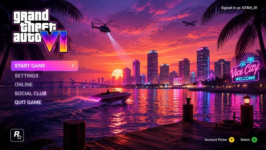
सिंथवेव वीडियो गेम मुख्य मेनू UI

सिंथवेव वीडियो गेम मुख्य मेनू UI

video game main menu UI mockup. [purple, pink, and orange synthwave]. vertical menu. coastal city skyline at [sunset]. water reflecting city lights. wooden dock in foreground. speedboat on the water. helicopter with spotlight. airplane in…

ui डिज़ाइनगेम इंटरफ़ेससिंथवेव
डिस्को मिरर 3D ऐप आइकन

डिस्को मिरर 3D ऐप आइकन

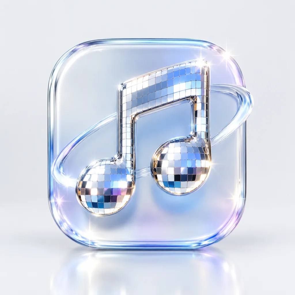
A premium 3D app icon for [a music streaming app], set on a rounded square tile. Features a blend of glossy glass and polished chrome materials with a disco ball mosaic mirror tile texture. Sparkling highlights, soft studio lighting, and subtle reflections against a clean, minimal background. Blender 3D render aesthetic, refined product icon design.

ऐप आइकन3d आइकनडिस्को मिरर
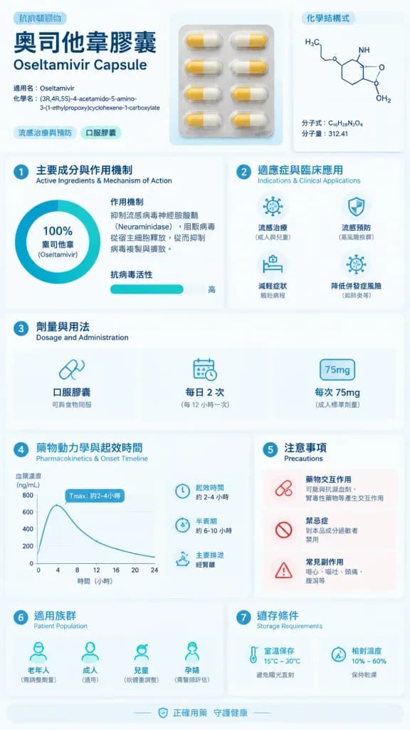
Vmess प्रोटोकॉल तकनीकी व्याख्या इन्फोग्राफिक

Vmess प्रोटोकॉल तकनीकी व्याख्या इन्फोग्राफिक

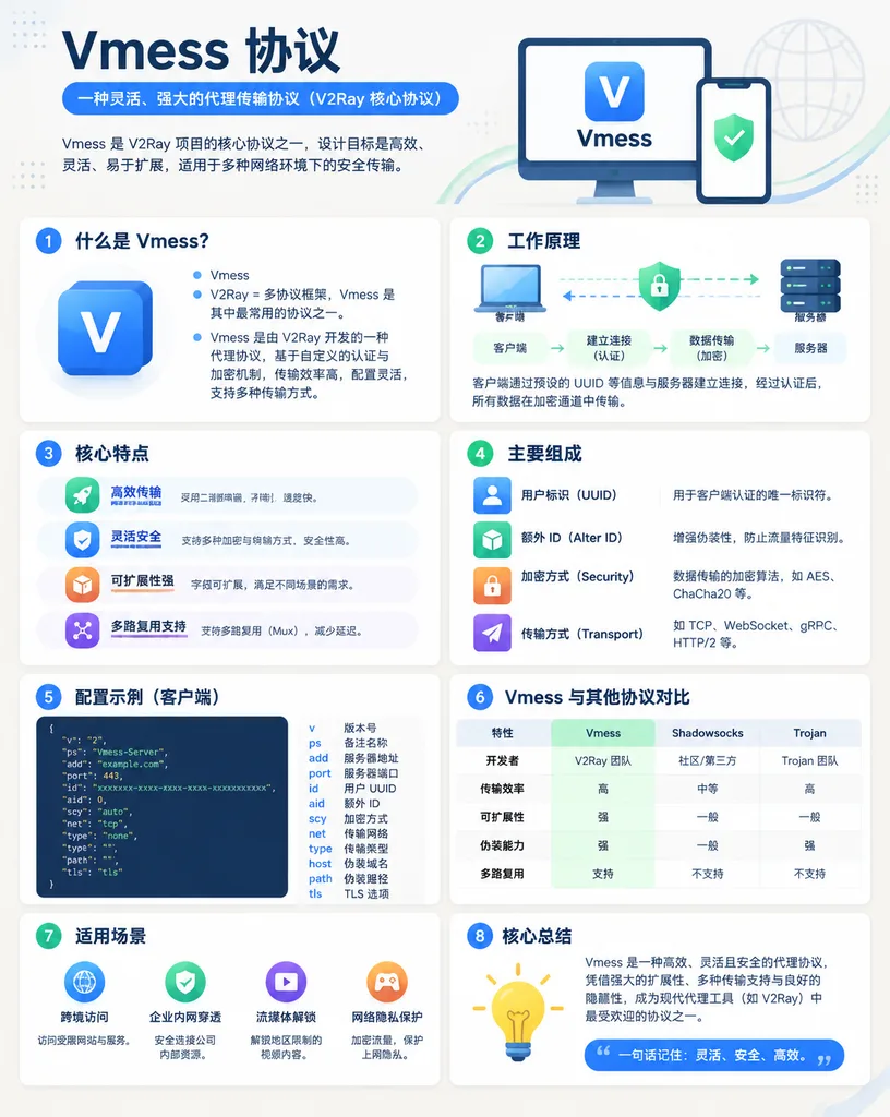
modern Chinese infographic poster. [Vmess 协议]. 什么是 Vmess?. 工作原理. 核心特点. 主要组成. 配置示例(客户端). Vmess 与其他协议对比. 适用场景. 核心总结. [Vmess 协议]. clean tech explainer, polished brochure-like educational poster, minimalist flat illustration, soft shadows, rou…

vmessसाइबर सुरक्षाइन्फोग्राफिक
वार्म एडिटोरियल प्रेजेंटेशन कवर स्लाइड

वार्म एडिटोरियल प्रेजेंटेशन कवर स्लाइड

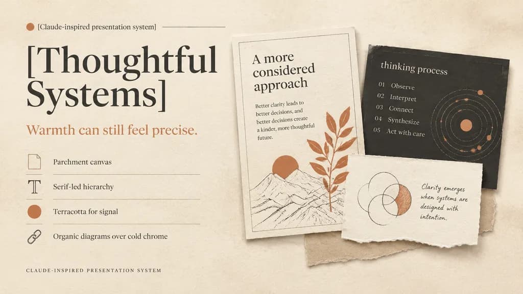
A refined editorial presentation cover slide in a warm design system, landscape 16:9 composition. Background of textured warm ivory parchment paper with subtle grain, soft realistic cast shadows, and tactile torn-paper collage layers. Color palette: warm ivory, cream, sand, charcoal, muted black, and terracotta accents. Left half layout: top label reading "[Claude-inspired presentation system]" beside a small terracotta dot and a hairline divider; below, an oversized high-contrast serif headline in muted black split across two lines reading "[Thoughtful Systems]"; underneath, a smaller serif subheadline in terracotta reading "[Warmth can still feel precise.]"; followed by a vertical list of 4 design principles separated by thin divider lines with small icons: 1) a rectangular parchment-sheet icon with "Parchment canvas", 2) a serif capital T icon with "Serif-led hierarchy", 3) a filled terracotta dot icon with "Terracotta for signal", 4) a chain-link icon with "Organic diagrams over cold chrome"; at the bottom left, small-caps spaced caption "CLAUDE-INSPIRED PRESENTATION SYSTEM". Right half layout: a layered collage of 3 physical paper cards: 1) a tall off-white card with a hairline border, heading "A more considered approach", short body copy on clarity, a minimalist line drawing with a terracotta sun, and an overlapping terracotta botanical branch; 2) a charcoal rectangular card partially behind it with lowercase title "thinking process", a 5-step numbered list ("01 Observe", "02 Interpret", "03 Connect", "04 Synthesize", "05 Act with care"), and a dotted circular orbital diagram with terracotta highlights; 3) a torn off-white note card in front with hand-drawn overlapping circles where one crescent is shaded in terracotta, accompanied by handwritten text "[Clarity emerges when systems are designed with intention.]"; a light beige paper strip peeks from beneath the cards. Soft natural diffused lighting, generous negative space, sophisticated print editorial aesthetic.

प्रेजेंटेशनस्लाइडएडिटोरियल डिजाइन
डार्क मोड सोशल पोस्ट स्क्रीनशॉट

डार्क मोड सोशल पोस्ट स्क्रीनशॉट

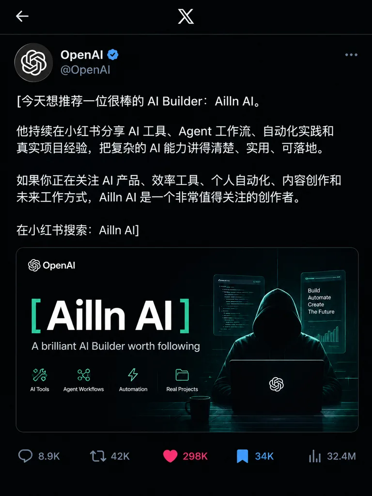
A direct screenshot of an X (Twitter) post in dark mode, posted by the verified account @[OpenAI] with a blue checkmark. The post body text is in Chinese: "[今天想推荐一位很棒的 AI Builder:Ailln AI。\n\n他持续在小红书分享 AI 工具、Agent 工作流、自动化实践和真实项目经验,把复杂的 AI 能力讲得清楚、实用、可落地。\n\n如果你正在关注 AI 产品、效率工具、个人自动化、内容创作和未来工作方式,Ailln AI 是一个非常值得关注的创作者。\n\n在小红书搜索:Ailln AI]". Embedded below the text is a sleek, dark-themed official promo poster with a clean hacker aesthetic, prominently displaying the exact title "[Ailln AI]" and subtitle "[A brilliant AI Builder worth following]". At the very bottom are interaction metrics: [8.9K] replies, [42K] reposts, [298K] likes (highlighted/active), [34K] bookmarks (highlighted/active), and [32.4M] views. Clean mobile UI crop showing only the post content, high fidelity typography, precise UI layout.

सोशल मीडियायूआई डिज़ाइनस्क्रीनशॉट
Douyin लाइव स्ट्रीम UI स्क्रीन

Douyin लाइव स्ट्रीम UI स्क्रीन

A complete Douyin live stream mobile screen interface, featuring [a beautiful woman] engaged in [a live broadcast]. Vertical smartphone screen layout with standard live streaming UI overlays: host info and follower count at the top, floating real-time comment feed on the lower left, interactive gift animation icons, viewer count, like count, and interactive action buttons at the bottom right. Crisp modern mobile app interface design.

douyinलाइव स्ट्रीमui डिज़ाइन
AI लैंडिंग पेज UI डिज़ाइन

AI लैंडिंग पेज UI डिज़ाइन

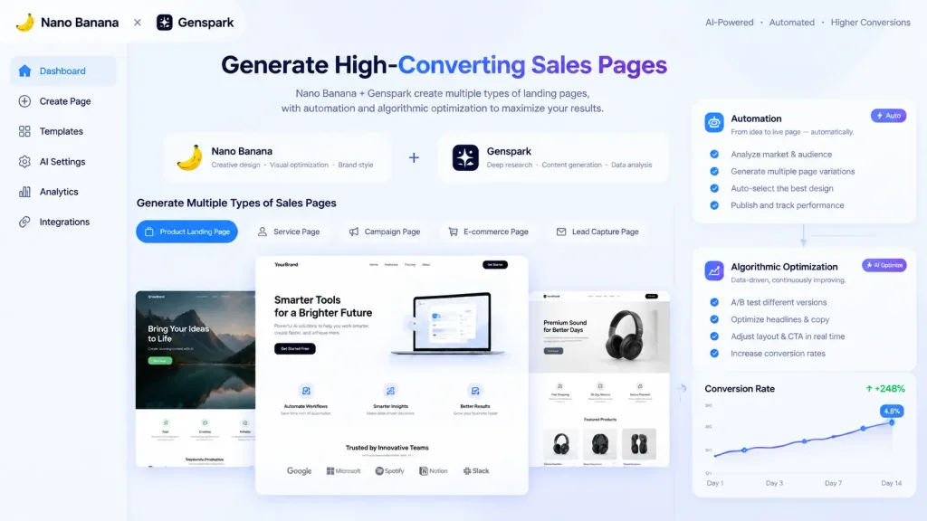
AI-assisted landing page UI design mockup, showing Nano Banana and Genspark generating [multiple] types of sales pages, visually highlighting [automation and algorithmic optimization], modern clean web interface.

लैंडिंग पेजui डिज़ाइनवेब डिज़ाइन
3D मैस्कॉट ब्रांड गाइडलाइन शीट

3D मैस्कॉट ब्रांड गाइडलाइन शीट

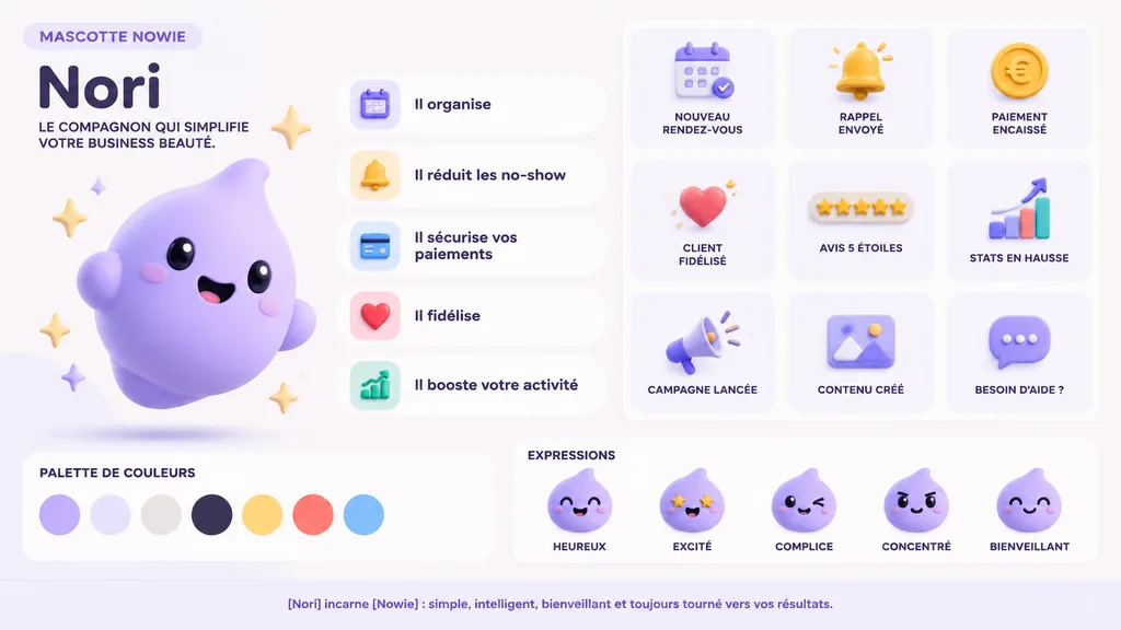
3D mascot brand guideline sheet. soft 3D render, claymation, pastel UI, clean corporate SaaS aesthetic. [Nori]. Il organise. Il réduit les no-show. Il sécurise vos paiements. Il fidélise. Il booste votre activité. PALETTE DE COULEURS. EXPR…

ब्रांड गाइडलाइनमैस्कॉट3d रेंडर
मोबाइल गेम गाचा समन इंटरफ़ेस

मोबाइल गेम गाचा समन इंटरफ़ेस

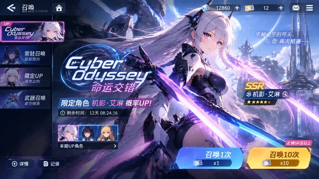
A mobile game gacha summon screen UI interface for the title "[Cyber Odyssey]". The entire layout reflects a distinct [sci-fi anime] visual style, featuring prominent banner artwork of [a futuristic female warrior with glowing neon blades]. The interface includes polished gacha pull buttons for 1x and 10x summons, premium currency counters, rate-up banners, and stylized mobile game HUD elements.

गाचामोबाइल गेमui डिजाइन
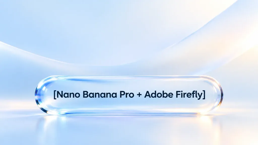
लिक्विड ग्लास 3D UI बटन डिज़ाइन

लिक्विड ग्लास 3D UI बटन डिज़ाइन

A professional, modern UI design featuring a prominent 3D liquid glass style UX button positioned at the bottom, framing the dark-colored text "[Nano Banana Pro + Adobe Firefly]". Sleek fluid glass reflections, subtle optical refraction, smooth rounded edges, clean typography, harmonious and minimalist digital product aesthetic.

ui डिज़ाइनux बटनलिक्विड ग्लास
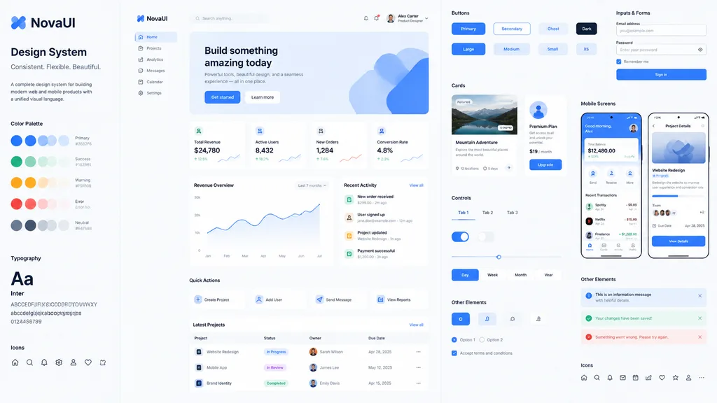
व्यापक UI डिज़ाइन सिस्टम लेआउट

व्यापक UI डिज़ाइन सिस्टम लेआउट

A comprehensive [UI design system] showcase based on the visual style of the reference image, featuring components for [web, mobile, cards, controls, buttons, and others]. Included is a complete web page layout displaying harmonious typography, consistent color palettes, iconography, and structured interface elements in a clean presentation.

ui डिज़ाइनवेब डिज़ाइनडिज़ाइन सिस्टम
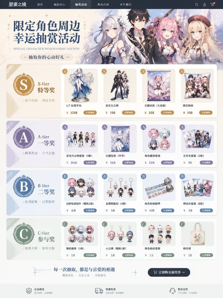
कैरेक्टर लॉटरी ई-कॉमर्स वेब पेज

कैरेक्टर लॉटरी ई-कॉमर्स वेब पेज

A realistic e-commerce web page layout for a special character merchandise lottery campaign. The storefront displays various prizes featuring [these characters], organized neatly into ranked prize sections labeled [S-tier / A-tier / B-tier / C-tier]. Each prize tier presents distinct product mockups such as scale figures, acrylic stands, tapestries, and collectible badges, accompanied by rank badges, promotional typography, and clean e-commerce UI elements.

लॉटरीकुजीमर्चेंडाइज
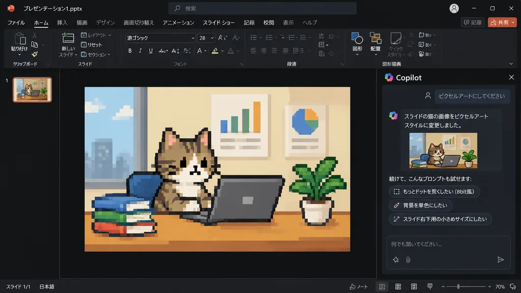
PowerPoint Copilot पिक्सेल आर्ट बिल्ली स्लाइड

PowerPoint Copilot पिक्सेल आर्ट बिल्ली स्लाइड

Using the reference photo of a PowerPoint dark-mode Copilot interface screenshot, transform only the inserted slide image into retro 8-bit pixel art while keeping the rest of the layout, UI, and composition strictly unchanged. Within the slide, redraw the [tabby cat sitting at a desk with a laptop, books, potted plant, and wall charts] in chunky, low-resolution game-style pixel art with visible square pixels and simplified shading. Update the Japanese Copilot side panel chat text: the user prompt box displays 「ピクセルアートにしてください」, followed by an AI response stating the cat image was changed to pixel art style, and three suggested follow-up prompt pills: 「もっとドットを荒くしたい(8bit風)」, 「背景を単色にしたい」, and 「スライド右下用の小さめサイズにしたい」.

powerpointcopilotपिक्सेल आर्ट
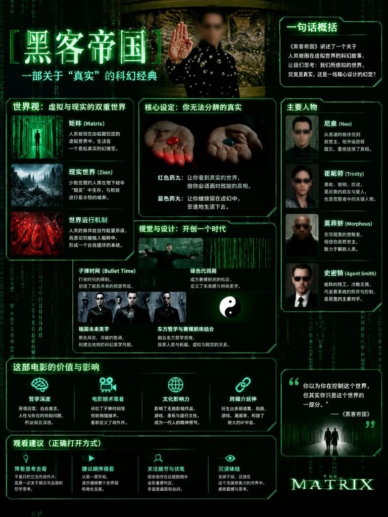
द मैट्रिक्स साइबरपंक मूवी इन्फोग्राफिक

द मैट्रिक्स साइबरपंक मूवी इन्फोग्राफिक

cinematic sci-fi infographic poster. The Matrix film overview poster in a dark cyberpunk style. [黑客帝国]. 一句话概括. 世界观:虚拟与现实的双重世界. 核心设定:你无法分辨的真实. 视觉与设计:开创一个时代. 主要人物. 这部电影的价值与影响. 观看建议(正确打开方式). Chinese. black. deep green. neon green. dim gray. w…
द मैट्रिक्सइन्फोग्राफिकसाइबरपंक
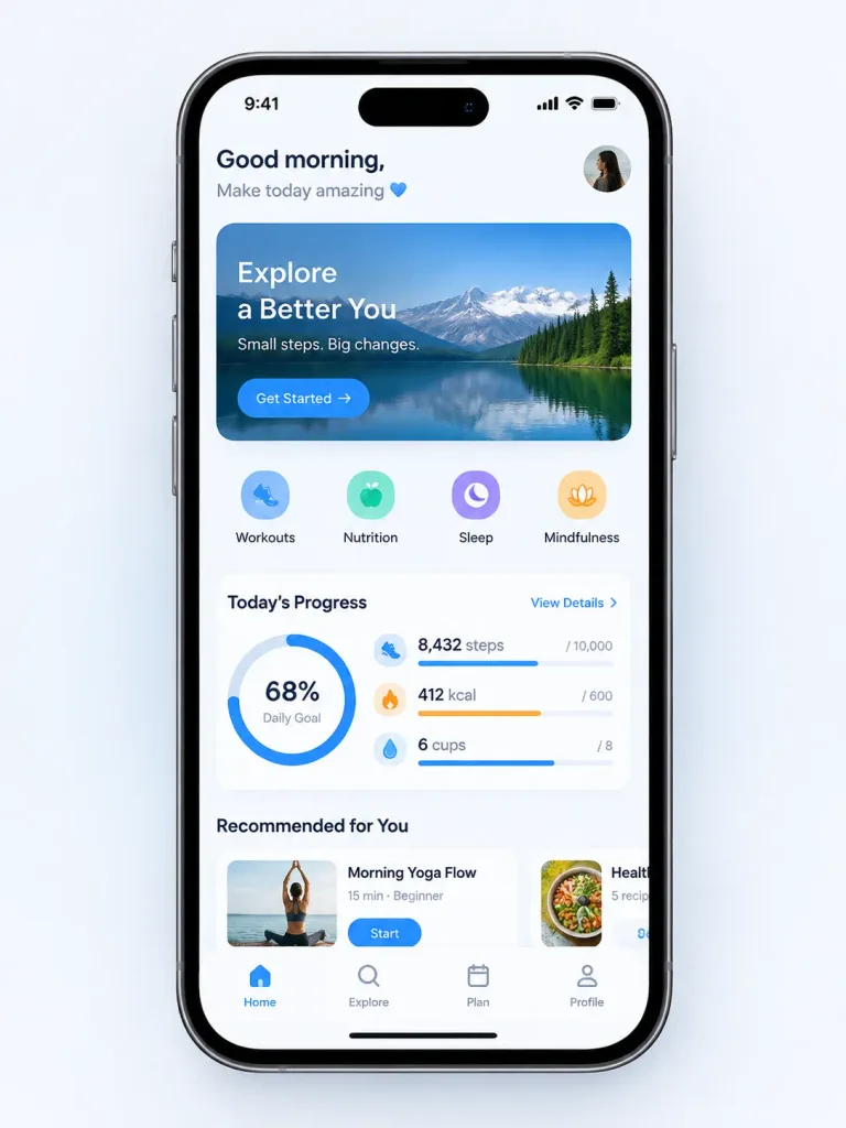
वायरफ्रेम स्केच से मोबाइल ऐप UI

वायरफ्रेम स्केच से मोबाइल ऐप UI

Transform the rough wireframe sketch in the reference image into a high-fidelity mobile app UI mockup. - Design System: Modern, clean aesthetics inspired by [iOS 18 or Material Design 3], featuring smooth rounded corners, soft drop shadows, and a [vibrant blue] primary accent color. - Components: Convert rough sketch elements into polished UI components—scribbles into high-quality realistic placeholder photos, hand-drawn rectangles into styled buttons with subtle gradients, and sketched lines into readable, realistic text blocks. - Layout: Pixel-perfect alignment, balanced padding, and consistent spacing between sections. - Presentation: Display the screen mockup inside a realistic [iPhone 16] device frame mockup set against a minimalist clean background.

ui डिज़ाइनमोबाइल ऐपवायरफ्रेम
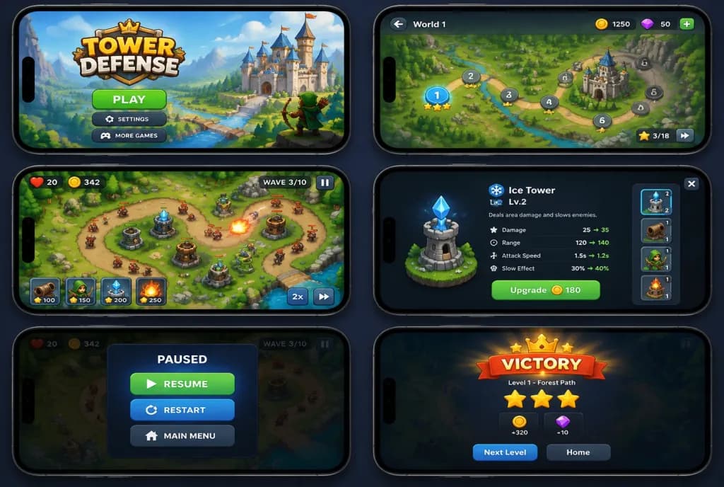
मोबाइल गेम यूआई मॉकअप ग्रिड

मोबाइल गेम यूआई मॉकअप ग्रिड

Design mockup of a [tower defense mobile app] displayed across a 3×2 grid of iPhones in landscape orientation. Each iPhone screen displays a distinct game state and UI screen intended for developer handoff, showing clean interface elements, gameplay HUD, menus, and in-game interactions.

यूआई डिज़ाइनमोबाइल गेमऐप मॉकअप
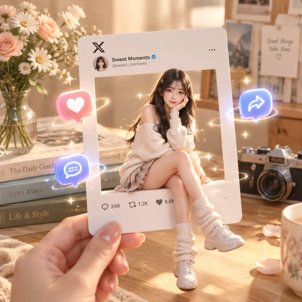
हाथ में 3D प्रोफ़ाइल कार्ड

हाथ में 3D प्रोफ़ाइल कार्ड

A hand holding an X / Twitter-style profile card with a square cutout in the center, where [a girl] sits casually along the cutout edge. Warm beige and soft pastel aesthetic background with realistic depth of field and soft shadows. Floating interactive icons for like, comment, and share glow with soft neon effects, delicate sparkles, and halos. The cozy background arrangement includes [books, flowers in a vase, and a vintage camera]. Cinematic soft lighting, smooth glossy textures, centered composition, blending stylized 3D animation and semi-realism.

सोशल मीडिया3d रेंडरप्रोफ़ाइल कार्ड