
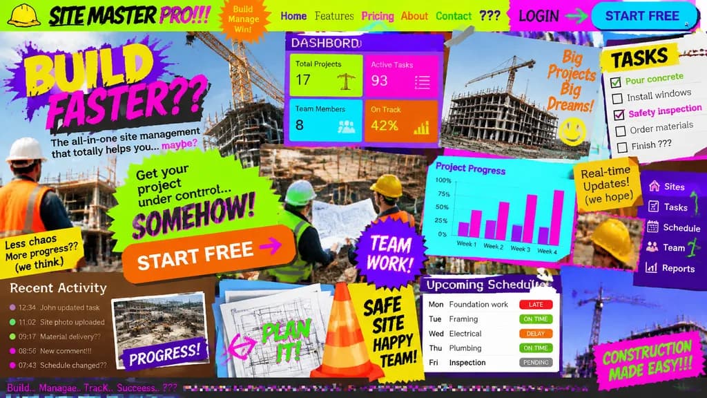
Schlechtestes UI/UX-Landingpage-Konzept
Erstellt ein absichtlich chaotisches und unleserliches Landingpage-Konzept. Ändern Sie das Thema in Klammern, um schlechte Benutzeroberflächen zu testen.
Prompt
Landing page design for [a site management app for the construction industry] intentionally crafted with the worst possible UI/UX practices: zero legibility, zero readability, zero utility, and visually painful aesthetics. Chaos-driven cluttered layout, disastrous clashing color scheme with unreadable low-contrast text, awful mismatched novelty font choices, low-resolution unaligned stock photos overlapping haphazardly, broken alignment, overlapping buttons, and broken responsive grid elements creating maximum visual confusion.
Was Sie anpassen können
Ersetzen Sie diese Teile des Prompts vor dem Generieren durch Ihr eigenes Motiv oder Ihren eigenen Text.
[a site management app for the construction industry]Platzhalter
Prompt-Details
- Kategorie
- UI-/UX-Design
- Modell
- GPT IMAGE 2
- Kosten pro Bild
- 1K: 43 Credits · 2K: 86 Credits · 4K: 143 Credits
- Seitenverhältnis
- 16:9
- Hinzugefügt