
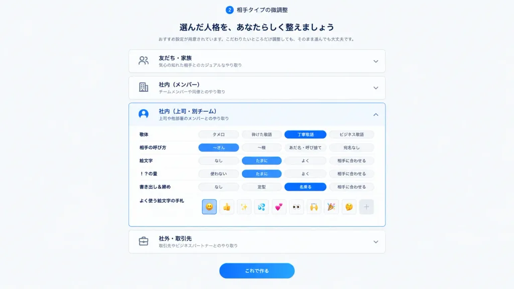
Japanische Persona-Einstellungs-UI
Erzeugt einen klaren japanischen SaaS-Onboarding-Bildschirm zur Feinabstimmung von Kommunikationstönen. Akkordeon-Zustände, Texte oder Akzentfarben sind anpassbar.
Prompt
Clean Japanese web app onboarding and settings screen for step 2, showing fine-tuning of a selected communication personality or relationship type. 16:9 desktop UI screenshot, white to pale gray background, centered content column about 720px wide with generous margins, soft shadows, rounded cards, minimal SaaS UI design. Header: At the top center, a small circular badge with "2" followed by the label 「相手タイプの微調整」. Under it, a bold Japanese headline: 「選んだ人格を、あなたらしく整えましょう」. Below the headline, a smaller gray subtitle: 「おすすめ設定が用意されています。こだわりたいところだけ調整しても、そのまま進んでも大丈夫です。」 Main layout: Exactly 4 vertically stacked accordion cards with thin light gray borders and rounded corners. Each card contains a left outline icon, bold Japanese title, smaller gray description, and right chevron: 1) Closed card: people icon, title 「友だち・家族」, description 「気心の知れた相手とのカジュアルなやり取り」, downward chevron. 2) Closed card: building icon, title 「社内(メンバー)」, description 「チームメンバーや同僚とのやり取り」, downward chevron. 3) Expanded active card: [bright blue]-highlighted user icon, title 「社内(上司・別チーム)」, description 「上司や他部署のメンバーとのやり取り」, upward chevron. 4) Closed card: briefcase icon, title 「社外・取引先」, description 「取引先やビジネスパートナーとのやり取り」, downward chevron. Expanded card details: Inside card 3, exactly 6 setting rows with Japanese labels on the left and segmented pill toggle controls on the right: - Row 1: 「敬体」 with options 「タメ口」, 「砕けた敬語」, active [bright blue] pill 「丁寧敬語」, 「ビジネス敬語」. - Row 2: 「相手の呼び方」 with options active [bright blue] pill 「〜さん」, 「〜様」, 「あだ名・呼び捨て」, 「宛名なし」. - Row 3: 「絵文字」 with options 「なし」, active [bright blue] pill 「たまに」, 「よく」, 「相手に合わせる」. - Row 4: 「!?の量」 with options 「使わない」, active [bright blue] pill 「たまに」, 「よく」, 「相手に合わせる」. - Row 5: 「書き出し&締め」 with options 「なし」, 「定型」, active [bright blue] pill 「名乗る」, 「相手に合わせる」. - Row 6: 「よく使う絵文字の手札」 with 9 small square emoji buttons followed by a plus button: active smiling face emoji, thumbs up, sparkles, sweat droplets, two hearts, eyes, raised hands, party popper, thinking face, then "+". Footer: Below the accordions, a centered prominent rounded [bright blue] gradient primary button with white text 「これで作る」. Style: Modern crisp Japanese product UI, dark navy typography, subtle card elevations, clean spacing, no browser chrome, no watermarks, all visible UI text rendered purely in Japanese.
Was Sie anpassen können
Ersetzen Sie diese Teile des Prompts vor dem Generieren durch Ihr eigenes Motiv oder Ihren eigenen Text.
[bright blue]Platzhalter“相手タイプの微調整”Text in Anführungszeichen“選んだ人格を、あなたらしく整えましょう”Text in Anführungszeichen“おすすめ設定が用意されています。こだわりたいところだけ調整しても、そのまま進んでも大丈夫です。”Text in Anführungszeichen“友だち・家族”Text in Anführungszeichen“気心の知れた相手とのカジュアルなやり取り”Text in Anführungszeichen“社内(メンバー)”Text in Anführungszeichen“チームメンバーや同僚とのやり取り”Text in Anführungszeichen
Prompt-Details
- Kategorie
- UI-/UX-Design
- Modell
- GPT IMAGE 2
- Kosten pro Bild
- 1K: 43 Credits · 2K: 86 Credits · 4K: 143 Credits
- Seitenverhältnis
- 16:9
- Hinzugefügt