
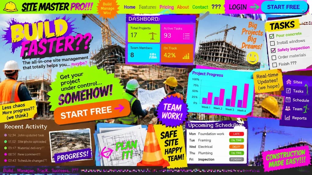
Ý tưởng Landing Page UI/UX Tồi tệ Nhất
Tạo ra một trang landing page cố tình thiết kế hỗn loạn và khó đọc. Thay đổi chủ đề ứng dụng trong ngoặc vuông để thử nghiệm giao diện tệ hại.
Prompt
Landing page design for [a site management app for the construction industry] intentionally crafted with the worst possible UI/UX practices: zero legibility, zero readability, zero utility, and visually painful aesthetics. Chaos-driven cluttered layout, disastrous clashing color scheme with unreadable low-contrast text, awful mismatched novelty font choices, low-resolution unaligned stock photos overlapping haphazardly, broken alignment, overlapping buttons, and broken responsive grid elements creating maximum visual confusion.
Những phần bạn có thể tùy chỉnh
Trước khi tạo ảnh, hãy thay các phần này của prompt bằng chủ đề hoặc nội dung của bạn.
[a site management app for the construction industry]chỗ giữ chỗ
Chi tiết prompt
- Danh mục
- Thiết kế UI / UX
- Mô hình
- GPT IMAGE 2
- Chi phí mỗi ảnh
- 1K: 43 tín dụng · 2K: 86 tín dụng · 4K: 143 tín dụng
- Tỷ lệ khung hình
- 16:9
- Ngày thêm