
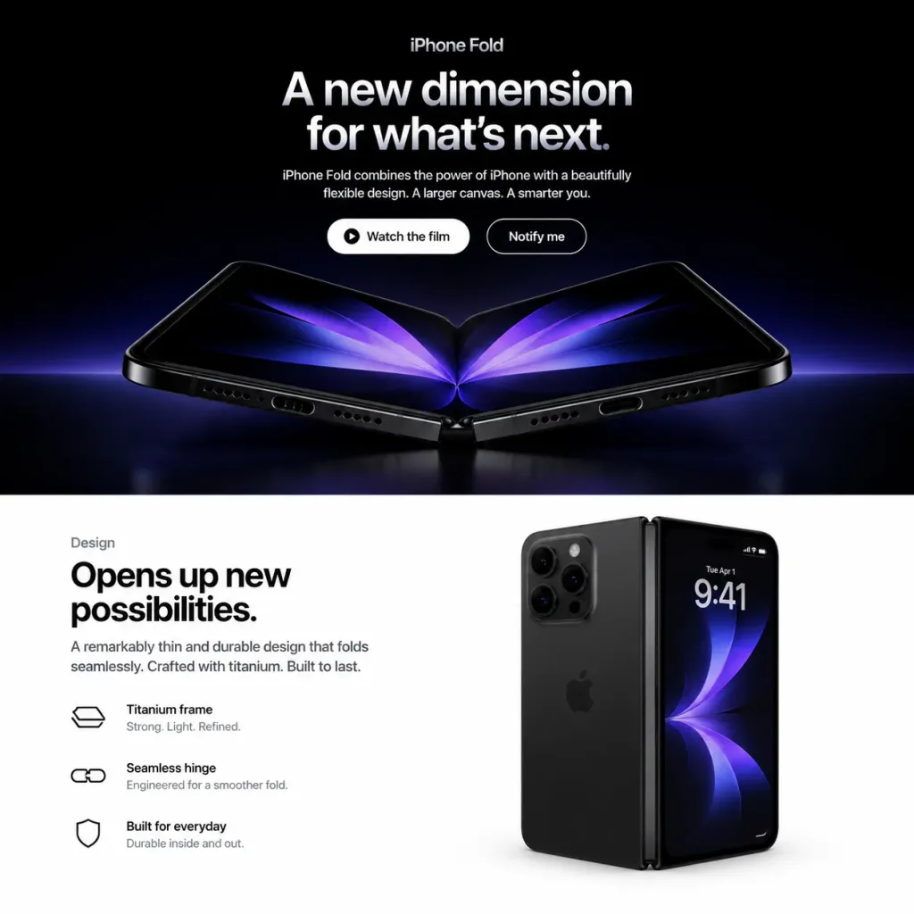
Mockup Trang Đích Điện Thoại Gập
Tạo giao diện trang đích chia đôi theo phong cách Apple cho điện thoại gập giả tưởng. Tùy chỉnh tên sản phẩm, tiêu đề và nội dung để hiển thị thiết bị khác.
Prompt
Square 1:1 web mockup of a polished Apple-style product landing page for a fictional [iPhone Fold], split into exactly two horizontal sections: a dark cinematic hero section on top (approx. 58% height) and a bright white design section on the bottom (approx. 42% height). Top Hero Section: - Background: Pure black with a subtle blue-purple ambient glow near the lower boundary. - Typography & UI: Centered alignment. At the top, a small category label reads "[iPhone Fold]". Below, a large bold Apple-style headline in white-to-silver gradient text reads "[A new dimension for what’s next.]". Beneath the headline, a short centered paragraph reads "[iPhone Fold combines the power of iPhone with a beautifully flexible design. A larger canvas. A smarter you.]". - Call-to-action: Two pill buttons side by side: a solid white button with black text "Watch the film" and a subtle play-circle icon, and a dark button with a thin white stroke and white text "Notify me". - Product Render: Beneath the buttons, a photorealistic foldable smartphone opened in a shallow V-shape rests on a reflective dark surface. It features black titanium edges, visible speaker grilles and charging port on the bottom edge, a precision central hinge, rounded corners, and a dark inner OLED display displaying mirrored abstract purple-blue petal-like light graphics. Dramatic rim lighting and faint surface reflections. Bottom Design Section: - Background: Clean, minimal pure white Apple product layout. - Left Column: Small label "Design" above a large bold black headline: "[Opens up new possibilities.]". Supporting copy: "A remarkably thin and durable design that folds seamlessly. Crafted with titanium. Built to last." Followed by three horizontal feature rows featuring minimal black line icons and two lines of text: 1) "Titanium frame" with "Strong. Light. Refined.", 2) "Seamless hinge" with "Engineered for a smoother fold.", 3) "Built for everyday" with "Durable inside and out." - Right Column: A second photorealistic render of the black foldable phone standing vertically in a partially folded state. The left side displays the matte black rear chassis with a triple-lens camera module, while the right side shows the active outer screen displaying "9:41", date "Tue Apr 1", tiny status icons, and an abstract dark blue-purple wallpaper. Soft contact shadows and realistic glass reflections. Style & Constraints: Minimalist luxury tech keynote aesthetic, San Francisco typography, generous white space, precise grid alignment. No browser chrome, navigation bars, watermarks, or extraneous elements.
Những phần bạn có thể tùy chỉnh
Trước khi tạo ảnh, hãy thay các phần này của prompt bằng chủ đề hoặc nội dung của bạn.
[iPhone Fold]chỗ giữ chỗ[A new dimension for what’s next.]chỗ giữ chỗ[Opens up new possibilities.]chỗ giữ chỗ“Watch the film”văn bản trong ngoặc kép“Notify me”văn bản trong ngoặc kép“Design”văn bản trong ngoặc kép“Titanium frame”văn bản trong ngoặc kép“Strong. Light. Refined.”văn bản trong ngoặc kép
Chi tiết prompt
- Danh mục
- Thiết kế UI / UX
- Mô hình
- GPT IMAGE 2
- Chi phí mỗi ảnh
- 1K: 43 tín dụng · 2K: 86 tín dụng · 4K: 143 tín dụng
- Tỷ lệ khung hình
- 1:1
- Ngày thêm