
ออกแบบ UI / UX
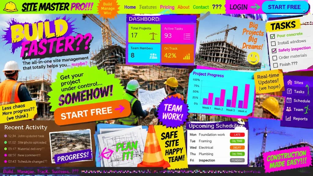
คอนเซปต์หน้า Landing Page ที่มี UI/UX แย่ที่สุด
สร้างหน้า Landing Page ที่จงใจออกแบบให้รกและใช้งานไม่ได้อย่างสมบูรณ์แบบ เปลี่ยนหัวข้อในวงเล็บเพื่อทดสอบ UI ที่แย่สำหรับทุกวงการ
การออกแบบ-ui-uxแลนดิ้งเพจui-แย่ออกแบบเว็บแอนตีดีไซน์ม็อกอัป
ดูพรอมต์ที่คล้ายกันพรอมต์ AI ม็อกอัปสินค้าและหน้าจอ
พรอมป์
Landing page design for [a site management app for the construction industry] intentionally crafted with the worst possible UI/UX practices: zero legibility, zero readability, zero utility, and visually painful aesthetics. Chaos-driven cluttered layout, disastrous clashing color scheme with unreadable low-contrast text, awful mismatched novelty font choices, low-resolution unaligned stock photos overlapping haphazardly, broken alignment, overlapping buttons, and broken responsive grid elements creating maximum visual confusion.
ส่วนที่ปรับแต่งได้
ก่อนสร้างภาพ ให้แทนที่ส่วนเหล่านี้ของพรอมป์ด้วยหัวข้อหรือข้อความของคุณเอง
[a site management app for the construction industry]ตัวแทนข้อความ
รายละเอียดพรอมป์
- หมวดหมู่
- ออกแบบ UI / UX
- โมเดล
- GPT IMAGE 2
- ค่าใช้จ่ายต่อภาพ
- 1K: 43 เครดิต · 2K: 86 เครดิต · 4K: 143 เครดิต
- อัตราส่วนภาพ
- 16:9
- วันที่เพิ่ม