
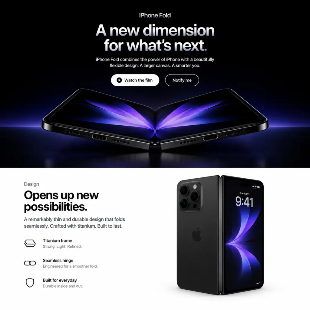
ม็อกอัปหน้าแลนดิ้งเพจสมาร์ตโฟนพับได้
สร้างเลย์เอาต์หน้าแลนดิ้งเพจสไตล์ Apple สำหรับสมาร์ตโฟนพับได้จำลอง ปรับเปลี่ยนชื่อผลิตภัณฑ์ หัวข้อ และข้อความ UI เพื่อนำเสนออุปกรณ์อื่นได้
พรอมป์
Square 1:1 web mockup of a polished Apple-style product landing page for a fictional [iPhone Fold], split into exactly two horizontal sections: a dark cinematic hero section on top (approx. 58% height) and a bright white design section on the bottom (approx. 42% height). Top Hero Section: - Background: Pure black with a subtle blue-purple ambient glow near the lower boundary. - Typography & UI: Centered alignment. At the top, a small category label reads "[iPhone Fold]". Below, a large bold Apple-style headline in white-to-silver gradient text reads "[A new dimension for what’s next.]". Beneath the headline, a short centered paragraph reads "[iPhone Fold combines the power of iPhone with a beautifully flexible design. A larger canvas. A smarter you.]". - Call-to-action: Two pill buttons side by side: a solid white button with black text "Watch the film" and a subtle play-circle icon, and a dark button with a thin white stroke and white text "Notify me". - Product Render: Beneath the buttons, a photorealistic foldable smartphone opened in a shallow V-shape rests on a reflective dark surface. It features black titanium edges, visible speaker grilles and charging port on the bottom edge, a precision central hinge, rounded corners, and a dark inner OLED display displaying mirrored abstract purple-blue petal-like light graphics. Dramatic rim lighting and faint surface reflections. Bottom Design Section: - Background: Clean, minimal pure white Apple product layout. - Left Column: Small label "Design" above a large bold black headline: "[Opens up new possibilities.]". Supporting copy: "A remarkably thin and durable design that folds seamlessly. Crafted with titanium. Built to last." Followed by three horizontal feature rows featuring minimal black line icons and two lines of text: 1) "Titanium frame" with "Strong. Light. Refined.", 2) "Seamless hinge" with "Engineered for a smoother fold.", 3) "Built for everyday" with "Durable inside and out." - Right Column: A second photorealistic render of the black foldable phone standing vertically in a partially folded state. The left side displays the matte black rear chassis with a triple-lens camera module, while the right side shows the active outer screen displaying "9:41", date "Tue Apr 1", tiny status icons, and an abstract dark blue-purple wallpaper. Soft contact shadows and realistic glass reflections. Style & Constraints: Minimalist luxury tech keynote aesthetic, San Francisco typography, generous white space, precise grid alignment. No browser chrome, navigation bars, watermarks, or extraneous elements.
ส่วนที่ปรับแต่งได้
ก่อนสร้างภาพ ให้แทนที่ส่วนเหล่านี้ของพรอมป์ด้วยหัวข้อหรือข้อความของคุณเอง
[iPhone Fold]ตัวแทนข้อความ[A new dimension for what’s next.]ตัวแทนข้อความ[Opens up new possibilities.]ตัวแทนข้อความ“Watch the film”ข้อความในเครื่องหมายคำพูด“Notify me”ข้อความในเครื่องหมายคำพูด“Design”ข้อความในเครื่องหมายคำพูด“Titanium frame”ข้อความในเครื่องหมายคำพูด“Strong. Light. Refined.”ข้อความในเครื่องหมายคำพูด
รายละเอียดพรอมป์
- หมวดหมู่
- ออกแบบ UI / UX
- โมเดล
- GPT IMAGE 2
- ค่าใช้จ่ายต่อภาพ
- 1K: 43 เครดิต · 2K: 86 เครดิต · 4K: 143 เครดิต
- อัตราส่วนภาพ
- 1:1
- วันที่เพิ่ม