
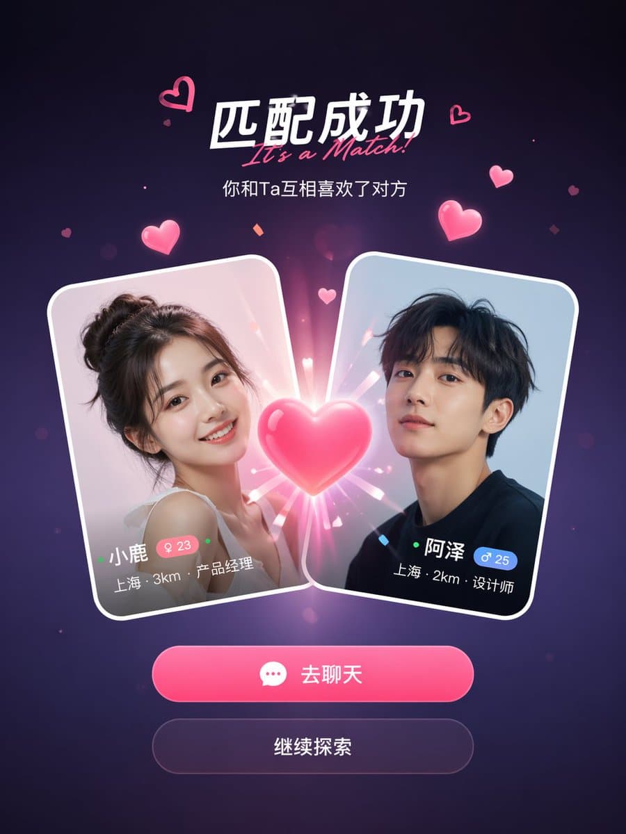
หน้าจอจับคู่สำเร็จของแอปโซเชียล
ตัวอย่างหน้าจอจับคู่สำเร็จของแอปโซเชียลของ GPT Image 2
พรอมป์
mockup หน้าจอจับคู่สำเร็จของแอปโซเชียลหาคู่ การ์ดโปรไฟล์ผู้ใช้สองใบชนกันตรงกลางพร้อมเอฟเฟกต์รูปหัวใจเรืองแสงระหว่างการ์ด หัวข้อเขียนว่า "It's a Match!" พร้อมคำบรรยายด้านล่าง การ์ดแต่ละใบแสดงรูปโปรไฟล์ ชื่อ อายุ สถานที่ และตำแหน่งงาน ด้านล่างของการ์ดมีปุ่มดำเนินการสองปุ่ม: ปุ่มหลักสีชมพู "Chat" และปุ่มรอง "Continue" พื้นหลังไล่ระดับสีม่วงเข้มพร้อมอนุภาคหัวใจสีชมพูลอยอยู่และเอฟเฟกต์ประกายแสง การออกแบบ mobile UI ที่ดูสะอาดตาและทันสมัย อัตราส่วนแนวตั้ง 9:16 ความสวยงามแบบสกรีนช็อตแอปที่สมจริง เงาที่ขัดเกลาอย่างดี และขอบการ์ดสไตล์ glass-morphism
ภาพตัวอย่าง
ตัวอย่างองค์ประกอบและสไตล์ที่สร้างด้วยเครื่องมือภาพในตัว
คู่มือการใช้งาน
คู่มือการใช้งานนี้มีให้บริการเป็นภาษาอังกฤษในขณะนี้
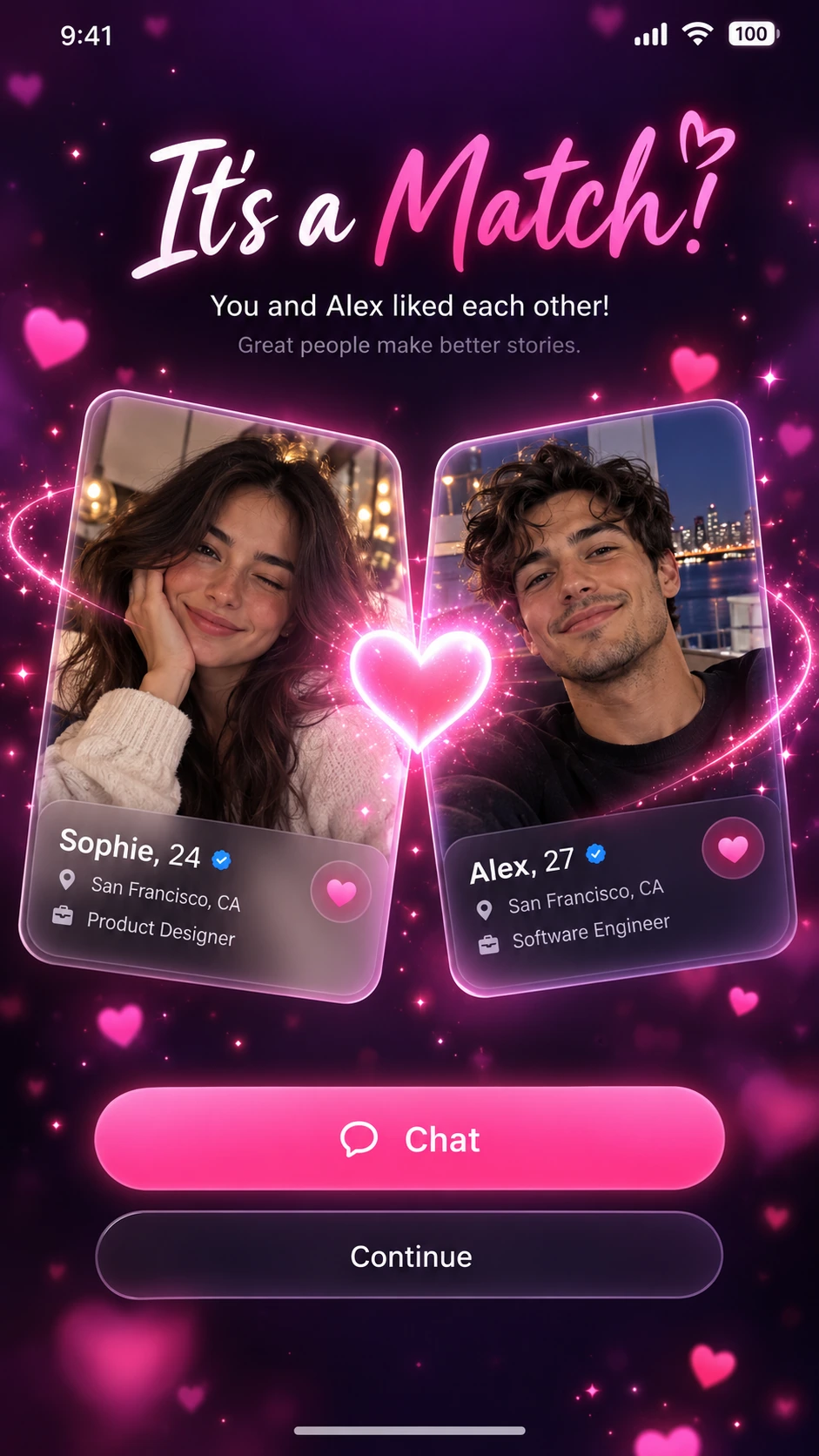
A match-success mobile screen centered on two profile cards, one emotional headline, and a clear next action. The visual hierarchy should separate celebration from navigation.
When to use
Social-app visual explorations, onboarding presentations, and interface mood boards. It is a static design concept rather than a working or interaction-tested screen.
What the existing example shows
The example uses a dark purple background, two portrait cards, a bright pink heart, and stacked Chat and Continue actions. The glowing center is the strongest focal point.
Suggested setup
- Aspect ratio
- 9:16 · Use a full mobile screen with space for a status bar, headline, profile cards, and bottom actions. Keep the primary button above the lower screen edge.
- Reference images
- Optional. Use permitted portrait assets if the profile cards need specific identities; neutral fictional profiles are enough for a concept.
What to customize
- Success messageYou found a study partner!
- Change the headline and the meaning of the primary action together so the screen tells one coherent story.
- Profile fieldsFirst name, shared subject, and preferred study time
- Use only a few short fields per card. Dense profile text is difficult to keep legible in a generated mockup.
- Action hierarchyPrimary: Start chat; secondary: Later
- Give the primary action the strongest contrast and keep celebration effects away from its text.
View a complete adaptation
Study-partner match screen
A non-dating version that keeps the two-card composition while changing the copy and profile information.
This adaptation has not been generated. The existing image belongs to the original illustration record.
Design a 9:16 mobile success-screen concept for a fictional study-partner app. Use a calm midnight-blue background with a restrained teal glow, not a field of floating particles. At the top, show the exact headline "You found a study partner!" and the short subtitle "Plan your first session". Center two slightly overlapping profile cards for fictional adult students, Maya and Alex. Each card contains a portrait, the shared subject "Physics", and the time "Evenings". Place a small connection symbol between the cards. Below them, add one prominent teal button labeled "Start chat" and one quiet secondary action labeled "Later". Keep the typography clean, the card edges distinct, and generous spacing around all controls. Show a polished static interface, without claiming functional interactions.
Troubleshooting
- Celebration effects obscure the interface
- Reduce particles and glow around text and buttons, then restore a clear top-to-bottom reading order.
- Text looks polished but is not readable
- Shorten profile fields and specify exact labels; recreate the final text and controls in a UI tool before evaluating interaction.
Editorial notes and generation record
AI-assisted editorial analysis of the source prompt and existing illustration. Settings are starting suggestions; the new adaptation is not a model test.
The existing illustration was generated with the built-in image tool. Its provider model is not disclosed. Actual image size: 941 × 1672.
Original illustration input
Create one finished image illustrating this image prompt.
Aspect ratio: 9:16.
A social dating app match success screen mockup. Two user profile cards colliding in the center with a glowing heart effect between them. The headline reads "It's a Match!" with a subtitle below. Each card shows a profile photo, name, age, location, and job title. Below the cards, two action buttons: a primary pink "Chat" button and a secondary "Continue" button. Dark purple gradient background with floating pink heart particles and sparkle effects. Clean, modern mobile UI design, 9:16 vertical aspect ratio, realistic app screenshot aesthetic, polished shadows, and glass-morphism card edges.
รายละเอียดพรอมป์
- หมวดหมู่
- ออกแบบ UI / UX
- โมเดล
- GPT IMAGE 2
- ค่าใช้จ่ายต่อภาพ
- 1K: 43 เครดิต · 2K: 86 เครดิต · 4K: 143 เครดิต
- อัตราส่วนภาพ
- 9:16
- ผู้สร้าง
- @songguoxiansen
- วันที่เพิ่ม
- อัปเดตล่าสุด