
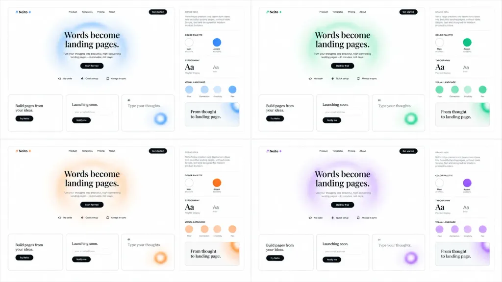
SaaS 브랜드 컬러 탐색 보드 목업
4가지 강조 색상으로 구성된 미니멀한 2×2 SaaS 브랜드 및 랜딩 페이지 탐색 보드를 생성합니다. 브랜드명과 헤드라인, 색상을 맞춤 설정하세요.
프롬프트
Clean brand exploration presentation board for a SaaS landing-page builder called [Neito], displaying the same website and brand identity system across 4 accent color themes: [blue, green, orange, purple]. Composition & Layout: Wide 16:9 white background canvas arranged as a neat 2×2 grid of four mockup panels separated by generous white space. Each panel contains two sections: a large landing-page mockup on the left and a narrow brand-guide column on the right. Landing-Page Mockup Details: - Top navigation: Logo mark showing two forward slashes followed by "Neito" and a small star/spark icon; navigation links "Product", "Templates", "Pricing", "About", and a black rounded "Get started" button. - Hero section: Large editorial serif headline reading "[Words become landing pages.]" centered over a soft, airy blurred circular gradient ring in the panel's accent color. Below, small gray descriptive copy, a black pill button reading "Start for free", and three small feature chips with icons: "No code", "Quick setup", and "Always in sync". - Bottom cards: Exactly three rectangular cards with thin borders and rounded corners. Card 1: "Build pages from your ideas." with a black pill button "Try Neito". Card 2: "Launching soon." with an email input pill and a black "Notify me" button. Card 3: Numbered "01" with text "Type your thoughts." and a cropped blurred accent-color gradient ring. Brand-Guide Column Details: - Header "BRAND IDEA" with a short paragraph block in small typography. - Four labeled sections separated by thin light-gray divider rules: "COLOR PALETTE" showing 2 circular swatches (Main near-white and Accent theme color with small hex labels); "TYPOGRAPHY" showing a serif headline "Aa" and a sans-serif body "Aa"; "VISUAL LANGUAGE" showing 4 circular tokens labeled "Flow", "Connection", "Simplicity", and "Flex"; and a preview card reading "From thought to landing page." Style & Aesthetics: Minimalist Figma-style design system showcase, monochrome typography, light gray borders, crisp vector UI elements, subtle shadows, frosted gradients, and ample negative space. No real people, device bezels, or dark backgrounds.
바꿔 쓸 수 있는 부분
생성하기 전에 프롬프트의 이 부분을 원하는 주제나 문구로 바꿔 보세요.
[Neito]자리 표시자[blue, green, orange, purple]자리 표시자[Words become landing pages.]자리 표시자“Neito”따옴표 안 문구“Product”따옴표 안 문구“Templates”따옴표 안 문구“Pricing”따옴표 안 문구“About”따옴표 안 문구
프롬프트 정보
- 카테고리
- UI / UX 디자인
- 모델
- GPT IMAGE 2
- 이미지당 비용
- 1K: 43 크레딧 · 2K: 86 크레딧 · 4K: 143 크레딧
- 화면 비율
- 16:9
- 추가일