
인포그래픽 / 교육
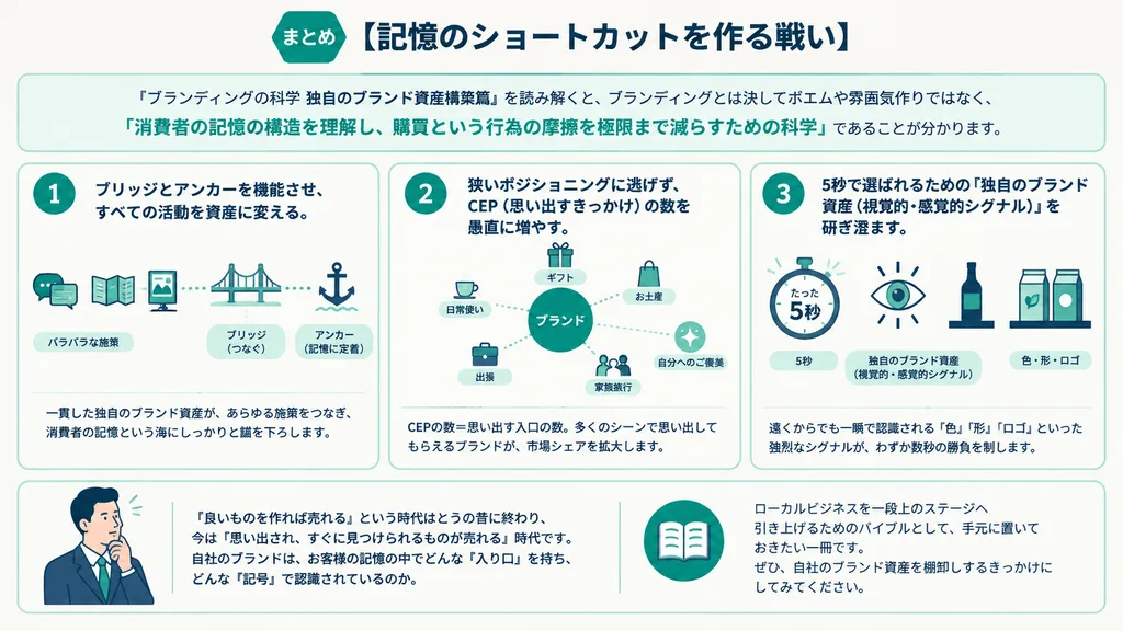
일본 기업 브랜딩 전략 인포그래픽
아이콘과 3열 카드 레이아웃으로 구성된 깔끔한 일본식 마케팅 인포그래픽을 제작합니다. 대괄호 안의 텍스트와 라벨을 변경해 다양한 비즈니스 개념에 맞추세요.
인포그래픽브랜딩기업마케팅벡터플랫 디자인일본어 텍스트
프롬프트
{
  "type": "Japanese branding infographic",
  "style": {
    "visual": "clean corporate flat design, website-brand-consistent explainer graphic, teal and dark navy color palette, soft off-white background, thin mint-green outlines, rounded cards, minimal vector icons, generous spacing, editorial layout",
    "mood": "professional, trustworthy, educational, easy to understand"
  },
  "canvas": {
    "aspect_ratio": "16:9",
    "background": "light warm gray"
  },
  "header": {
    "badge": {
      "text": "まとめ",
      "shape": "rounded hexagon badge",
      "color": "teal"
    },
    "title": "[記憶のショートカットを作る戦い]"
  },
  "intro": {
    "position": "below header",
    "shape": "large rounded rectangle",
    "text": "[『ブランディングの科学 独自のブランド資産構築篇』を読み解くと、ブランディングとは決してポエムや雰囲気作りではなく、『消費者の記憶の構造を理解し、購買という行為の摩擦を極限まで減らすための科学』であることが分かります。]",
    "emphasis": "the quoted sentence in teal and slightly bolder"
  },
  "layout": {
    "sections": [
      {
        "title": "1",
        "position": "left middle",
        "count": 3,
        "labels": [
          "[バラバラな施策]",
          "[ブリッジ(つなぐ)]",
          "[アンカー(記憶に定着)]"
        ],
        "heading": "[ブリッジとアンカーを機能させ、すべての活動を資産に変える。]",
        "graphics": {
          "icon_count": 5,
          "icons": [
            "speech bubble with card",
            "brochure or folded leaflet",
            "display stand or signboard",
            "suspension bridge",
            "anchor with small waves"
          ],
          "connector": "dotted line connecting the sequence toward bridge and anchor"
        },
        "footer": "[一貫した独自のブランド資産が、あらゆる施策をつなぎ、消費者の記憶という海にしっかりと錨を下ろします。]"
      },
      {
        "title": "2",
        "position": "center middle",
        "count": 5,
        "labels": [
          "[ギフト]",
          "[お土産]",
          "[自分へのご褒美]",
          "[出張]",
          "[家族旅行]"
        ],
        "heading": "[狭いポジショニングに逃げず、CEP(思い出すきっかけ)の数を愚直に増やす。]",
        "graphics": {
          "center": "teal filled circle labeled [ブランド]",
          "outer_icon_count": 5,
          "outer_icons": [
            "gift box",
            "shopping bag",
            "sparkles in circle",
            "briefcase",
            "group of people"
          ],
          "extra_icon": "coffee cup at left as daily-use cue",
          "connector": "dotted radial lines from center brand circle to each surrounding cue"
        },
        "footer": "[CEPの数=思い出す入口の数。多くのシーンで思い出してもらえるブランドが、市場シェアを拡大します。]"
      },
      {
        "title": "3",
        "position": "right middle",
        "count": 3,
        "labels": [
          "[5秒]",
          "[独自のブランド資産(視覚的・感覚的シグナル)]",
          "[色・形・ロゴ]"
        ],
        "heading": "[5秒で選ばれるための『独自のブランド資産(視覚的・感覚的シグナル)』を研ぎ澄ます。]",
        "graphics": {
          "icon_count": 4,
          "icons": [
            "stopwatch with large text たった5秒",
            "eye symbol",
            "bottle on shelf",
            "two cartons or packaged products on shelf"
          ],
          "accent": "short motion lines around stopwatch and eye"
        },
        "footer": "[遠くからでも一瞬で認識される『色』『形』『ロゴ』といった強烈なシグナルが、わずか数秒の勝負を制します。]"
      }
    ],
    "bottom_band": {
      "count": 2,
      "left_block": {
        "graphics": "waist-up illustration of a thinking businessman in suit, hand on chin, simplified flat vector style",
        "text": "[『良いものを作れば売れる』という時代はとうの昔に終わり、今は『思い出され、すぐに見つけられるものが売れる』時代です。 自社のブランドは、お客様の記憶の中でどんな『入り口』を持ち、どんな『記号』で認識されているのか。]"
      },
      "right_block": {
        "graphics": "circular badge containing an open book icon",
        "text": "[ローカルビジネスを一段上のステージへ引き上げるためのバイブルとして、手元に置いておきたい一冊です。 ぜひ、自社のブランド資産を棚卸しするきっかけにしてみてください。]"
      }
    }
  },
  "typography": {
    "language": "Japanese",
    "title_weight": "bold heavy sans-serif",
    "body_weight": "clean sans-serif",
    "number_badges": "white numerals inside teal circles"
  },
  "composition": {
    "grid": "three evenly spaced rounded cards across the middle row, with a full-width intro panel above and a full-width concluding panel below",
    "alignment": "balanced, centered, spacious",
    "shadow": "very subtle or none"
  }
}바꿔 쓸 수 있는 부분
생성하기 전에 프롬프트의 이 부분을 원하는 주제나 문구로 바꿔 보세요.
[記憶のショートカットを作る戦い]자리 표시자[バラバラな施策]자리 표시자[ブリッジ(つなぐ)]자리 표시자[アンカー(記憶に定着)]자리 표시자[ブリッジとアンカーを機能させ、すべての活動を資産に変える。]자리 표시자[一貫した独自のブランド資産が、あらゆる施策をつなぎ、消費者の記憶という海にしっかりと錨を下ろします。]자리 표시자[ギフト]자리 표시자[お土産]자리 표시자
프롬프트 정보
- 카테고리
- 인포그래픽 / 교육
- 모델
- GPT IMAGE 2
- 이미지당 비용
- 1K: 43 크레딧 · 2K: 86 크레딧 · 4K: 143 크레딧
- 화면 비율
- 16:9
- 추가일