प्रॉम्प्ट सुझावों वाली जापानी मिनिमल प्रेजेंटेशन स्लाइड
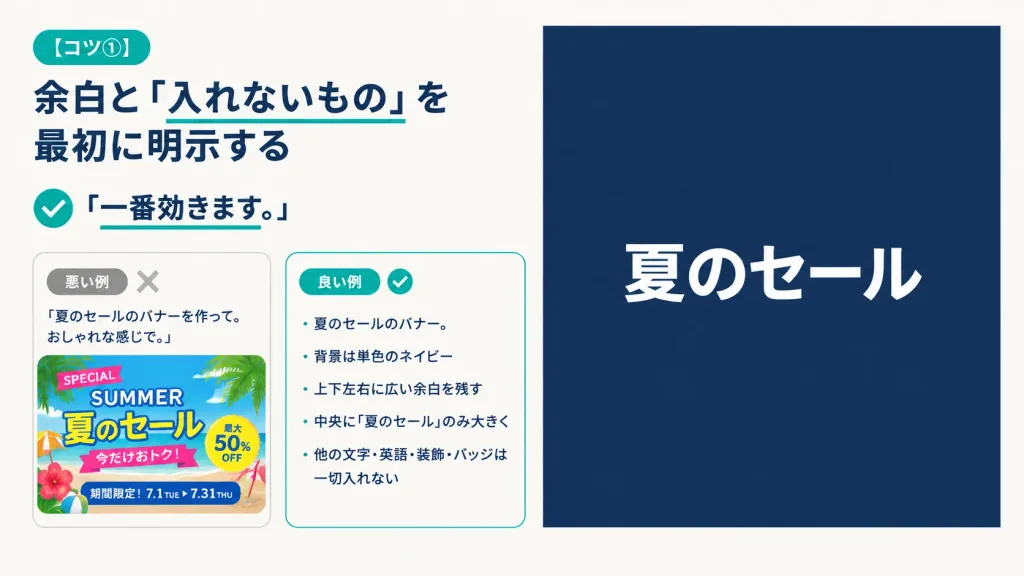
A 16:9 horizontal instructional presentation slide with a modern minimalist Japanese editorial design, warm off-white background, generous margins, dark navy typography, and teal accents. Two-column layout: - Left column (approx. 48% width): At top left, a rounded teal pill badge reading "[コツ①]". Below, a large bold dark navy Japanese headline: "[余白と「入れないもの」を最初に明示する]" with a thin teal underline directly beneath the phrase 「入れないもの」. Beneath the headline, a teal circular check icon followed by bold text reading "「一番効きます。」" with a short teal underline under the sentence. Below the lesson text, two rounded comparison cards side-by-side with subtle borders: - Bad example card: small gray pill reading "悪い例" and a pale gray "X" icon. It contains the prompt quote: "「夏のセールのバナーを作って。おしゃれな感じで。」" above a cluttered, colorful summer sale banner thumbnail packed with palm leaves, beach colors, decorative stickers, and busy text ("SPECIAL", "SUMMER", "夏のセール", "今だけおトク!", "最大50% OFF", "期間限定!7.1 TUE ▶ 7.31 THU"). - Good example card: small teal pill reading "良い例" and a teal checkmark icon. It contains a neat Japanese bullet list: "・夏のセールのバナー。", "・背景は単色のネイビー", "・上下左右に広い余白を残す", "・中央に『夏のセール』のみ大きく", "・他の文字・英語・装飾・バッジは一切入れない". - Right column (approx. 47% width): A large, clean solid dark navy rectangle with generous empty space, featuring only a single, large, bold sans-serif white Japanese headline centered horizontally and vertically: "[夏のセール]". Completely free of borders, gradients, patterns, or extra decorative graphics.