
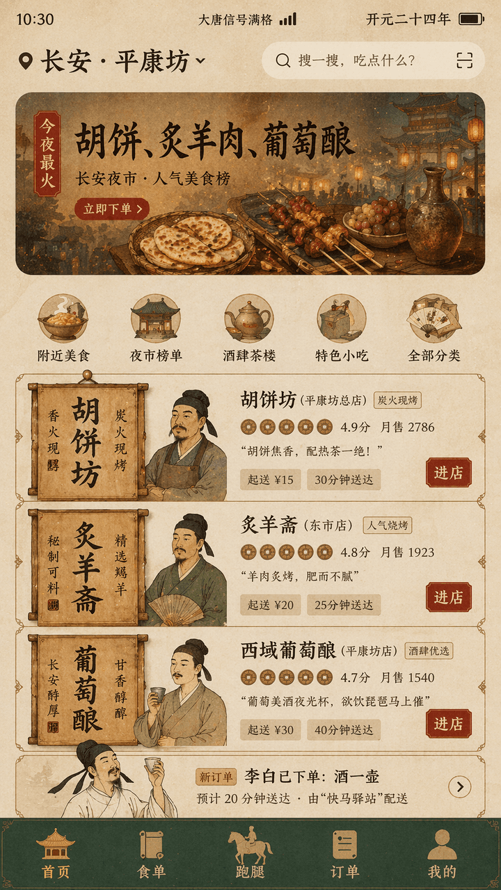
App de comida a domicilio de la dinastía Tang
Genera un diseño de interfaz de usuario móvil que combina la estética de la dinastía Tang con una moderna app de entrega de comida, ideal para portafolios de diseño y publicaciones en redes sociales.
Prompt
"Tang Dynasty Food DELIVERY INTERFACE" es un diseño de fusión entre escenas de la vida antigua y la interfaz de usuario de un producto móvil moderno. La pantalla simula la interfaz de la página de inicio de comida a domicilio en un teléfono móvil, y la ubicación superior muestra "Chang'an · "Pingkangfang", la recomendación del banner dice "Tonight's most popular: Hu cakes, roasted mutton, grape wine", la tarjeta del comerciante se reconstruye utilizando carteles de tiendas y elementos de letreros de madera de la dinastía Tang, el avatar es un busto del comerciante en estilo meticuloso, la puntuación se presenta como un icono de moneda de cobre, "Li Bai has placed an order: a pot of wine" aparece en la lista de pedidos, y la barra de navegación inferior es "Homepage/Food List/Run Errands/Orders/Mine", la barra de estado muestra "Datang Signal Full" y "Kaiyuan Twenty-Fourth Year", el color general es ocre, verde piedra, rojo pan de oro, la fuente es una mezcla de palabras de título de estilo monumental y modernas sans-serif finas, la interfaz parece un borrador real de diseño de producto, pero también tiene un sentido del humor histórico, y la proporción 9:16.
Guía de uso
Esta guía de uso está disponible actualmente en inglés.
A food-delivery home screen set in Tang dynasty Chang'an: a ward-level location pin, a night-market banner, merchant cards rebuilt from wooden shop signs, copper-coin ratings and an order strip announcing that a poet has ordered a jug of wine. Good for heritage merchandise, time-slip product concepts and classroom visuals.
When to use
Playful content for tourism and museum accounts, concept practice for product designers, promotional material for history-themed restaurants, and exhibition boards. Keep the real delivery-app order: location and search, banner, category icons, three merchant cards, order strip, bottom tabs; do not break that sequence to squeeze in more shops.
What the existing cover image shows
The existing cover illustration is a 9:16 phone home screen on an aged-paper ground. The status bar shows a clock, a full-signal label and the reign year; the location row names the city and ward beside a search field. The banner is a painted night market with a hot-tonight tag, a large three-dish headline and a red order button. Below five round category icons sit three merchant cards, each with a vertical calligraphy sign on the left, a fine-brush shopkeeper bust, copper-coin ratings, monthly sales, a one-line slogan, minimum order and delivery time, and a red enter-shop button; then an order strip about the poet's jug of wine, and a dark green bottom bar whose five icons are pavilions, scrolls and a post horse. Text is sharp throughout, and the mix of stele-style headings with a thin sans serif is really there. Weaker points: prices use a modern currency sign, the stone-green tone shows almost only in the bottom bar, and the three shopkeepers share similar faces and dress.
Suggested setup
- Aspect ratio
- 9:16 · The prompt calls for 9:16 and the cover matches it; the 1:1 in the record fits neither. Ask for a complete phone screen with the status bar and bottom tabs inside the frame, the banner taking about the top quarter, and three merchant cards of equal height, each with room for its wooden sign.
- Reference images
- None. The interface and shops are invented; do not upload screenshots of real delivery apps, or their icons and colors will be copied. For a specific painting manner, one fine-brush figure painting or a Tang mural can serve as a style reference.
What to customize
- City, ward and banner dishesLuoyang, South Market; tonight's hits: sesame flatbread, steamed fish, pear-blossom wine
- Keep exactly three dishes so the banner headline stays on one line, and write the location as city plus place so the pin row does not wrap.
- Three merchants and their keepersSesame Flatbread Shop, Steamed Fish Hall, Pear Blossom Tavern, run by an old man with a fan, a sturdy cook in an apron and a young man holding a cup
- Stay with three cards and give each keeper a distinct age, beard and hand-held object, or the three faces will come out alike.
- Palette and typePorcelain blue, rice-paper white, cinnabar red; stele-style headings with a thin sans body
- Assign each color to a region (background, bar, buttons) and name heading and body fonts separately, or everything merges into one warm yellow.
View a complete adaptation
Ming dynasty ride-hailing app
The same period-life-meets-mobile-UI design, recast as the home screen of a Ming-era Nanjing ride app offering sedan chairs, carriages and pleasure boats, in porcelain blue and rice-paper white at 9:16.
This adaptation has not been generated. The existing cover image comes from the original prompt collection and is not a result of this adaptation.
Ming Dynasty Ride Hailing Interface, a design that fuses period daily life with modern mobile product UI. The screen imitates the home page of a ride app on a phone. The location at the top reads Nanjing, Qinhuai riverside; the banner reads Travel today: soft sedan chair, two-horse carriage, night pleasure boat. Vehicle cards are rebuilt from Ming memorial-arch and wooden-sign elements, with fine-brush half-length portraits of a chair bearer, a carriage driver and a boatwoman as avatars; ratings appear as silver-ingot icons. The trip list includes: a Qinhuai painter has requested one pleasure boat. Bottom tabs: Home, Chairs and Horses, Boats, Trips, Me. Status bar: Great Ming Post Signal Full and the reign year Wanli 8. Palette of cobalt porcelain blue, rice-paper white and cinnabar red; regular-script style headings mixed with a modern thin sans serif. It should look like a real product design mockup while carrying a time-travel sense of humor, ratio 9:16.
Troubleshooting
- The three shopkeepers come out as the same face
- Describe each keeper's age, beard, headwear and hand-held item separately and require different sign text on each card; if they still repeat, regenerate the three cards enlarged on their own and composite them back.
- The phone frame gets cropped, losing the status bar or bottom tabs
- Write 'complete phone screen with a narrow margin on all sides' and list all five tab labels verbatim so the model is obliged to draw them.
Editorial notes and generation record
AI-assisted editorial analysis of the source prompt and existing illustration. Settings are starting suggestions; the new adaptation is not a model test.
No new illustration was generated for this guide. The observations refer to the prompt's existing cover image from its source collection; its generation details are not recorded.
Detalles del prompt
- Categoría
- Diseño UI / UX
- Modelo
- GPT IMAGE 2
- Costo por imagen
- 1K: 43 créditos · 2K: 86 créditos · 4K: 143 créditos
- Relación de aspecto
- 1:1
- Añadido
- Actualizado