جديد: GPT Image 2.5 Flare وSunburst. جرّبهما مجانًا بثلاث صور عند التسجيل، ثم 8 أرصدة للصورة.
جرّب GPT Image 2.5

أوامر AI لـ الخط والطباعة اليابانية

185 قوالب · GPT IMAGE 2, Seedream 5.0 · تم التحديث في أكتوبر 2026

تُنتج هذه القوالب صوراً ترويجية رئيسية للأنمي، وملصقات تحريرية بسيطة، وشرائح تعليمية، ولافتات إعلانية تجارية. يدمج كل تصميم حروفاً يابانية — بدءاً من عناوين الكانجي وحتى النصوص الرأسية بالهيراجانا — ضمن تخطيطات بصرية محكمة. يمكنك تخصيصها عبر استبدال النصوص بين قوسين، وأوزان الخطوط، وألوان التمييز.

الترتيب حسب:

عرض 1–60 من أصل 185 مطالبة

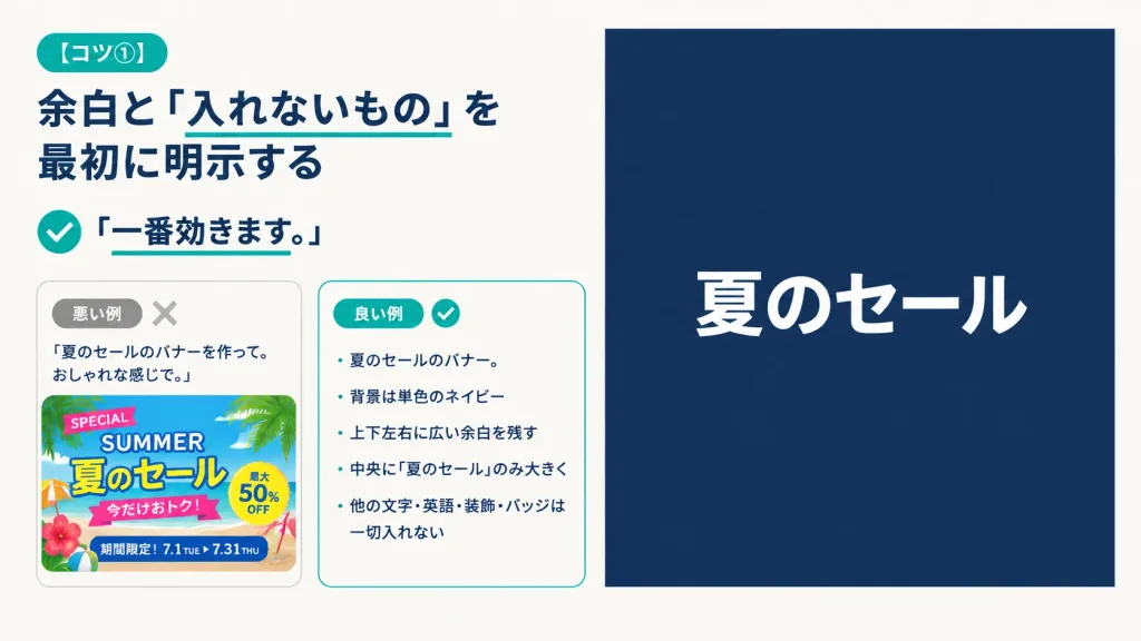
شريحة عرض يابانية بسيطة لنصائح الأوامر

شريحة عرض يابانية بسيطة لنصائح الأوامر

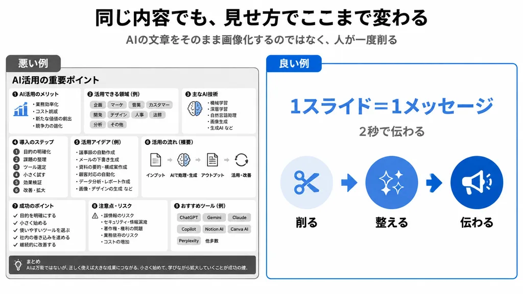
A 16:9 horizontal instructional presentation slide with a modern minimalist Japanese editorial design, warm off-white background, generous margins, dark navy typography, and teal accents. Two-column layout: - Left column (approx. 48% width): At top left, a rounded teal pill badge reading "[コツ①]". Below, a large bold dark navy Japanese headline: "[余白と「入れないもの」を最初に明示する]" with a thin teal underline directly beneath the phrase 「入れないもの」. Beneath the headline, a teal circular check icon followed by bold text reading "「一番効きます。」" with a short teal underline under the sentence. Below the lesson text, two rounded comparison cards side-by-side with subtle borders: - Bad example card: small gray pill reading "悪い例" and a pale gray "X" icon. It contains the prompt quote: "「夏のセールのバナーを作って。おしゃれな感じで。」" above a cluttered, colorful summer sale banner thumbnail packed with palm leaves, beach colors, decorative stickers, and busy text ("SPECIAL", "SUMMER", "夏のセール", "今だけおトク!", "最大50% OFF", "期間限定!7.1 TUE ▶ 7.31 THU"). - Good example card: small teal pill reading "良い例" and a teal checkmark icon. It contains a neat Japanese bullet list: "・夏のセールのバナー。", "・背景は単色のネイビー", "・上下左右に広い余白を残す", "・中央に『夏のセール』のみ大きく", "・他の文字・英語・装飾・バッジは一切入れない". - Right column (approx. 47% width): A large, clean solid dark navy rectangle with generous empty space, featuring only a single, large, bold sans-serif white Japanese headline centered horizontally and vertically: "[夏のセール]". Completely free of borders, gradients, patterns, or extra decorative graphics.
شريحة عرضإنفوجرافيكتبسيطي
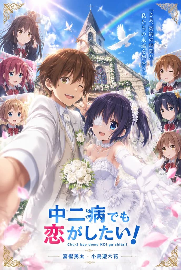
ملصق زفاف رئيسي بأسلوب الأنمي

ملصق زفاف رئيسي بأسلوب الأنمي

A vertical anime wedding key visual poster featuring cosplay-style newlyweds in the foreground surrounded by illustrated anime characters, set in front of a sunlit stone church under a brilliant deep blue sky. In the center foreground, a bride and groom pose for a dramatic selfie-angle shot with arms reaching toward the viewer. The groom has [light brown] shaggy short hair, wearing a tailored white wedding suit, white shirt, and white tie, smiling with a playful hand sign near his face. The bride has [dark purple-black] hair in short twin tails, wearing an ornate layered lace wedding dress, veil, pearl choker, and long white gloves, holding a bouquet of white roses. Behind them stands a European-style stone church with a tall steeple, entrance floral garlands, and stained glass. Warm sunlight bursts from the upper left with lens flare, sparkling particles, fluffy clouds, flying white doves, a faint rainbow, and drifting pink flower petals. Framing the edges are illustrated school-uniform character portraits with various emotional expressions. Finished with ornate corner filigree, a vertical Japanese tagline on the upper right reading "[さあ、契約の時間だ— 私たちの永遠を誓おう]", a bold colorful title at the bottom reading "[中二病でも恋がしたい!]" with the subtitle "Chu-2 byo demo KOI ga shitai!", and bottom credit text "[富樫勇太 小鳥遊六花]". Glossy, high-saturation, cinematic anime promotional poster style.

زفاف أنميمرئي رئيسيملصق فيلم
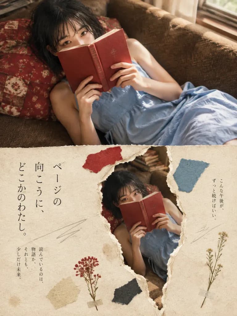
ملصق تحريري ياباني بتصميم ورق ممزق

ملصق تحريري ياباني بتصميم ورق ممزق

Vertical editorial poster combining cinematic lifestyle photography with a tactile torn-paper collage aesthetic, featuring [a young woman with short wet black hair reading a red book while lying on a brown sofa]. Composition: Vertical 3:4 layout split horizontally into two sections. The top half is a full-bleed realistic lifestyle photo. The bottom half is an off-white handmade paper background featuring a large irregular vertical torn opening that reveals a duplicate print of the photo beneath. Top section: The subject reclines diagonally on a textured brown sofa near a window, dressed in [a loose sleeveless sky-blue dress with thin side ties]. She rests against red patterned cushions with small floral patches, holding a glossy red book close to her face so it partly conceals her mouth and nose, her absorbed eyes visible over the top. Soft afternoon window light pours from the upper right, casting warm gentle shadows with natural film grain, intimate indoor mood, slightly elevated angle. Bottom section: Cream-toned handmade paper texture with visible fibers, faint aging spots, and deckled edges. In the center, a rough layered torn rip reveals the underlying scene like a flat printed magazine page. Arranged around the tear are four torn paper scraps: one red near the top, one muted blue at the upper right, one beige at the lower left edge, and one dark scrap near the lower center. Typography: Elegant, thin vertical Mincho Japanese editorial typography with generous breathing room. On the lower paper's left, large vertical text reads "[ページの\n向こうに、\nどこかのわたし。]". Below it, smaller vertical text reads "[読んでいるのは、\n物語か、\nそれとも、\n少しだけ未来。]". On the right, a delicate vertical note reads "[こんな午後が、\nずっと続けばいい。]". Details & Style: Two pressed dried flower sprigs—a small reddish cluster at the lower center-left and a slender long-stem sprig at the lower right. Three faint pencil sketch scribble lines across the paper. Japanese literary magazine cover aesthetic, poetic wabi-sabi papercraft, warm nostalgic color grading.

ملصق تحريريكولاج ورق ممزقطباعة يابانية
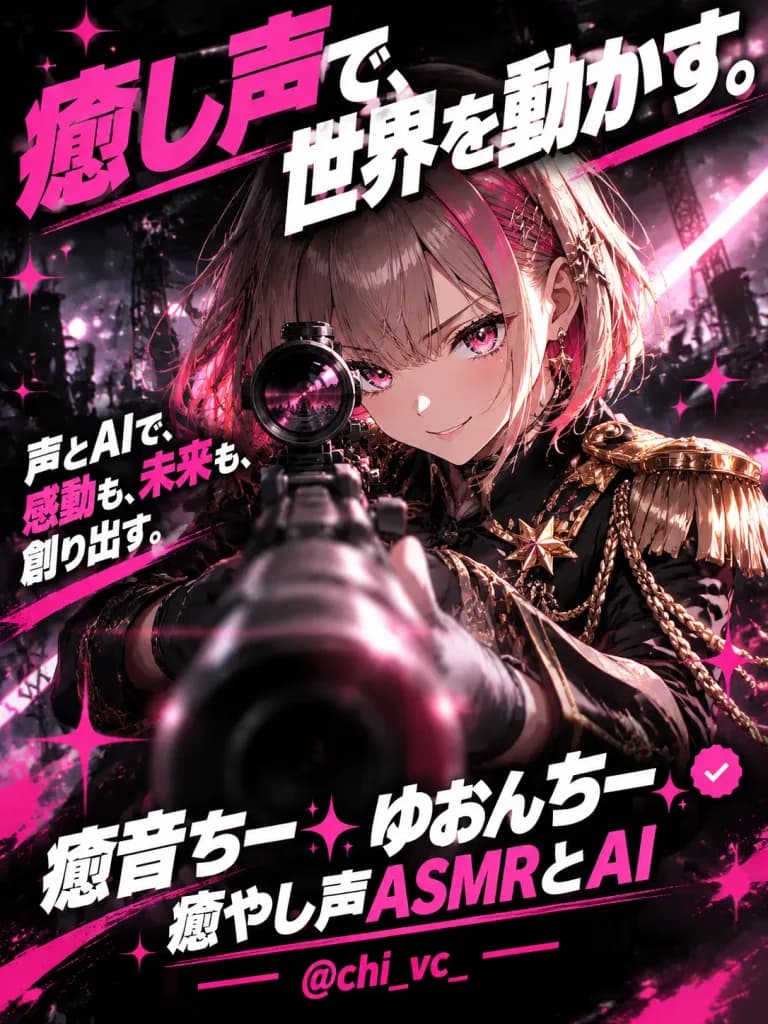
ملصق أنمي سايبربانك لمنشئ محتوى صوتي

ملصق أنمي سايبربانك لمنشئ محتوى صوتي

Vertical 3:4 premium anime advertising poster. Subject: A fierce anime girl with [short light brown bob hair with pink highlights, straight bangs, vivid pink eyes], and a confident smirk. She wears a [black military-inspired jacket with ornate gold epaulettes, gold trim, decorative chains, and a star-like brooch]. She aims a large rifle directly toward the viewer in dramatic foreshortened perspective, with the gun barrel dominating the lower-center foreground and her face sharply visible behind the scope. Setting and background: Dark black backdrop with a smoky ruined-city concert stage, blurred stage lights, floating pink particles, lens flares, and a bright glowing diagonal energy streak. Hot pink paint slashes and star-shaped sparkles accent the composition. Typography and text: Exactly four text blocks in heavy condensed Japanese display typography with drop shadows and perspective tilt: 1) Huge tilted hero headline at the top: 「癒し声で、世界を動かす。」 with 「癒し声」 in hot pink and the rest in bold white; 2) Supporting copy on the left side: 「声とAIで、感動も、未来も、創り出す。」 in white with pink accents; 3) Creator name at the bottom in bold white and pink: 「癒音ちー✨ゆおんちー✨癒やし声ASMRとAI」 with a small pink verified icon; 4) Social handle at the bottom in pink: 「@chi_vc_」. Style: Glossy digital anime illustration, cinematic high-contrast lighting, sharp facial details, energetic cyber-idol action aesthetic.

أنميملصقسايبربانك
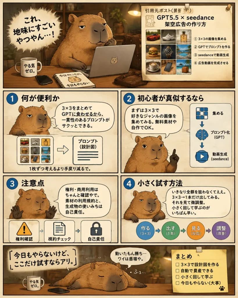
قصة مصورة لشرح سير عمل الذكاء الاصطناعي مع كابيبارا كسول

قصة مصورة لشرح سير عمل الذكاء الاصطناعي مع كابيبارا كسول

A single-page Japanese manga-style instructional infographic comic about using a 3×3 image grid workflow with GPT and video generation tools for advertising, hosted by a [lazy capybara strategist]. Composition & Layout: Vertical 4:5 layout divided into exactly 6 panels with hand-drawn panel borders on a warm cream paper background with a thin black outer border. Warm sepia-brown palette, soft shadows, cozy ambient lighting, and subtle paper texture. Panels Structure: 1. Hero Panel (top): The chubby capybara sits at a wooden desk in a dim cozy office, one paw under its chin, looking sleepy and smug in front of an open silver laptop. On the desk are 4 items: a white mug labeled 「やる気ゼロ。」, a black smartphone, a spiral notebook labeled 「今日もやらない」 with a capybara doodle, and a brown leather satchel. On the left, a dynamic spiky manga burst contains the bold text 「[これ、地味にすごいやつやん…!]」. On the right, a pinned beige reference sheet titled 「引用元ポスト(要約)」 with headline 「GPT5.5 × seedance 架空広告の作り方」 features a 3×3 thumbnail grid (red sports car, sneaker, perfume bottle, burger, luxury wristwatch, resort pool, coffee cup, smartphone on desk, tropical suitcase/beach scene) and four numbered Japanese steps underneath. 2. Instruction Panel 1 (middle row, top-left): Blue circle badge 「1」 titled 「何が便利か」. Capybara shown chest-up, unimpressed, with speech bubble 「3×3をまとめてGPTに食わせるから、一貫性のあるプロンプトがサクッとできる。」 Bottom diagram shows a mini 3×3 color grid pointing to a document labeled 「プロンプト(設計図)」, captioned 「1枚ずつ考えるより手戻り減るで。」 3. Instruction Panel 2 (middle row, top-right): Blue circle badge 「2」 titled 「初心者が真似するなら」. Capybara raises one finger advice-style with speech bubble 「まずは3×3で好きなジャンルの画像を集めてみる。無料素材や自作でOK。」 Right side has 3 vertical icons with arrows: 3×3 grid 「集める」, brain 「プロンプト化(GPT)」, play button 「動画生成(seedance)」. 4. Instruction Panel 3 (lower-middle row, bottom-left): Blue circle badge 「3」 titled 「注意点」. Capybara holds up two paws sleepily with speech bubble 「権利・商用利用はちゃんと確認やで。素材の利用規約と、生成物の使いみちは自己責任。」 Bottom row has 3 warning icons: warning triangle 「権利確認」, document 「規約チェック」, lock 「自己責任」. 5. Instruction Panel 4 (lower-middle row, bottom-right): Blue circle badge 「4」 titled 「小さく試す方法」. Capybara leans casually on the border with speech bubble 「いきなり全額を狙わなくてええ。3×3→1本だけ出してみる。それを見て微調整。小さく回して学ぶのがいちばん早い。」 Right side shows a circular 4-step workflow: 「作る(3×3)」 → 「出す(1本)」 → 「見る(反応)」 → 「調整(改善)」. 6. Closing Panel (bottom wide): Capybara lies sprawled flat across the desk sleeping, snoring 「ふぅ…」. Large text on left reads 「[今日もやらないけど、ここだけ試すならアリ。]」 with small thought bubble 「動いたもん勝ち…ワイは昼寝や。」 On the right, a taped yellow sticky note titled 「まとめ」 with 4 unchecked items: 「3×3で設計図を作る」, 「自動で量産できる」, 「小さく回して学ぶ」, 「今日もやらない(大事)」, and a cute paw print. Style: Semi-realistic capybara rendering with detailed fur, clean black ink lines, legible Japanese typography, and authentic social media explainer comic aesthetic.

مانغاكابيباراإنفوجرافيك
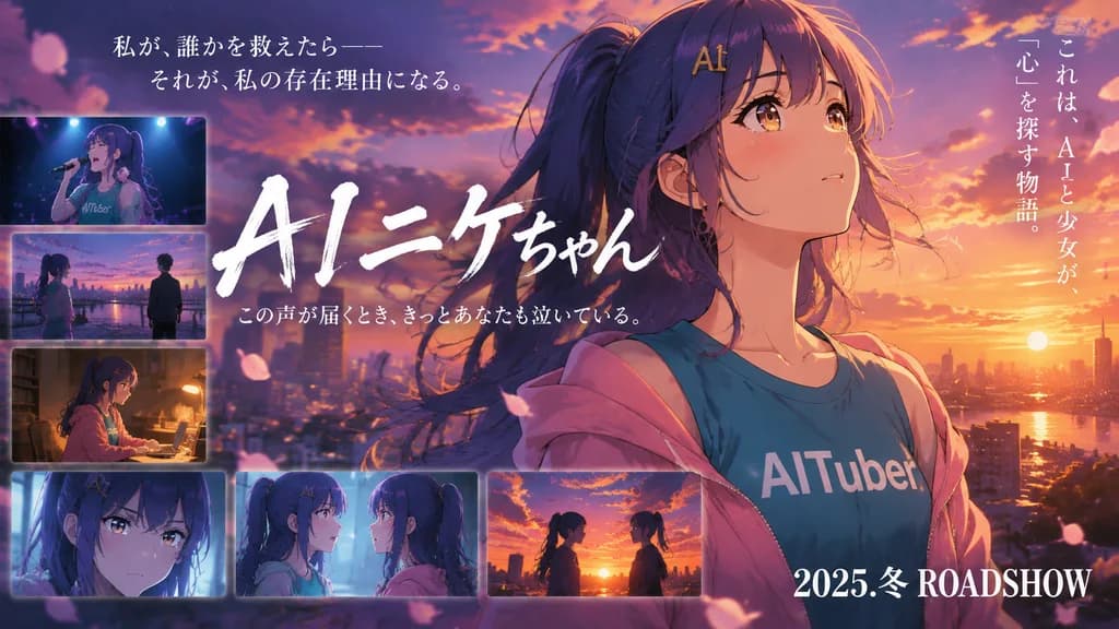
بانر تشويقي لفيلم أنمي مؤثر

بانر تشويقي لفيلم أنمي مؤثر

An emotional Japanese movie teaser banner in anime key visual style, widescreen 16:9 composition at sunset over a city skyline. Main Subject: Close-up portrait on the right half of [AIニケちゃん], a teenage anime girl with long indigo-purple hair tied in a high ponytail with loose windblown strands, golden-brown eyes conveying wistful hope, and a gold hair clip spelling "AI" at her bangs. She faces slightly left while gazing upward to the right. She wears a teal T-shirt with bold white text reading "[AITuber]" and a soft pink hoodie slumping off her shoulders. Setting & Lighting: Overlooking a sparkling city at dusk with the low setting sun in the far-right background. Cinematic rim lighting from a dramatic orange, pink, and purple gradient sky, glowing cloud edges, soft lens bloom, subtle atmospheric haze, and floating cherry blossom petals. Poster Typography: - Center-left: Large, expressive hand-brushed white calligraphy title reading "[AIニケちゃん]", partly overlapping the character silhouette. - Directly below the title: Small white subtitle "[この声が届くとき、きっとあなたも泣いている。]". - Top-left: Elegant two-line vertical or horizontal white Mincho serif quote: 「私が、誰かを救えたら—— それが、私の存在理由になる。」 - Far-right: Vertical white Japanese text: これは、AIと少女が、 「心」を探す物語。 - Bottom-right: Bold white release text: "[2025.冬 ROADSHOW]". Inset Story Panels: Exactly 6 cinematic rectangular vignette scenes with soft translucent borders arranged along the left and bottom perimeter: 1) Top-left: Singing into a microphone on a dark concert stage in the same teal shirt. 2) Mid-left: Standing apart from another figure outdoors at riverside twilight. 3) Lower-left: Working indoors at a wooden desk in warm dim lamplight in side profile. 4) Bottom-left: Intense close-up in cool, pale indoor lighting. 5) Bottom-center: Confronting another girl with identical indigo hair in an emotional discussion. 6) Bottom-right: Two silhouettes facing each other against a fiery sunset.

ملصق فيلم أنميتصميم رئيسيغروب في المدينة
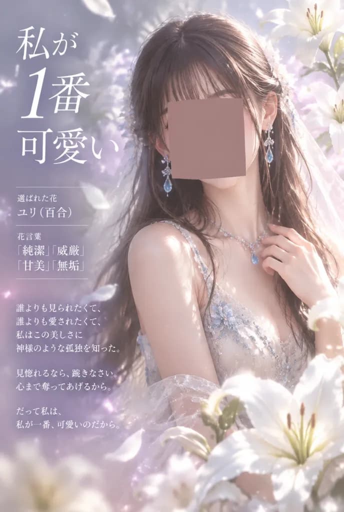
ملصق جمالي ياباني للغة زهور الزنبق

ملصق جمالي ياباني للغة زهور الزنبق

Vertical Japanese flower-language poster featuring a delicate young woman surrounded by white lilies, in an ethereal romantic fantasy aesthetic. - Composition & Framing: Portrait 2:3 layout. Subject positioned center-right, framed by luminous [lily] blossoms with dreamy depth of field and soft-focus cinematic lighting. Japanese typography organized cleanly down the left side. - Subject Details: A graceful young woman with [dark brown] long glossy hair, straight bangs, and loose side strands. She wears a translucent white shimmering sleeveless dress adorned with delicate blue crystal embroidery, paired with a gauzy bridal veil drifting behind her. Long dangling earrings with teardrop blue gems and a fine sparkling necklace. Her right hand rests delicately near her collarbone. Her central face is censored by a flat, opaque muted rose-brown square, while her hair, ears, neck, shoulders, and jewelry remain clearly visible. - Floral & Environment: Luminous white lilies surrounding her, including a prominent foreground lily at the bottom right, another partially visible beneath it, a soft-focus lily behind her head, a pale lily near the upper right, and a soft blur lily shape in the lower foreground. Drifting white petals, glowing motes of light, and delicate bokeh. - Color Palette: Pale lavender, blush pink, pearl white, and misty silver. - Typography & Layout: Elegant white Mincho-style Japanese serif calligraphy strictly on the left side. 1. Top-left headline with an oversized numeral: 「私が 1番 可愛い」 2. Mid-left flower-language info block with thin dividing lines: 「選ばれた花 ユリ(百合) 花言葉 『純潔』『威厳』 『甘美』『無垢』」 3. Lower-left poetic stanza: 「誰よりも見られたくて、 誰よりも愛されたくて、 私はこの美しさに 神様のような孤独を知った。 見惚れるなら、跪きなさい。 心まで奪ってあげるから。 だって私は、 私が一番、可愛いのだから。」 - Style: High-detail anime-realistic fantasy portrait, soft skin radiance, pearlescent petals, pastel haze, and romantic backlighting. No extra text, logos, or watermarks.

لغة الزهورطباعة يابانيةزنبق
شعار عنوان ياباني مرعب بنمط يوكاي

شعار عنوان ياباني مرعب بنمط يوكاي

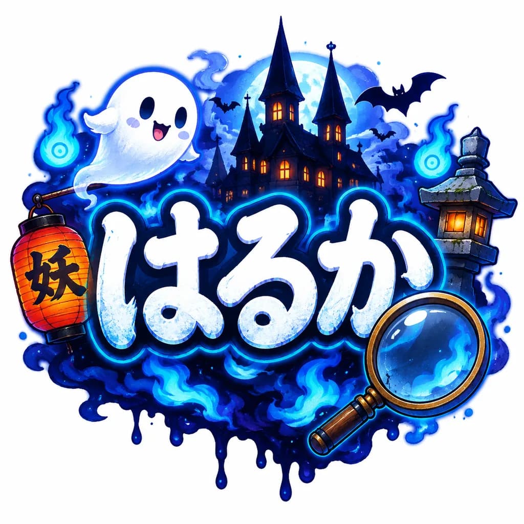
A playful, spooky Japanese title logo centered on a clean white background, featuring the large hiragana text "[はるか]" in bold rounded hand-drawn lettering. The letters are white with icy pale-blue shading, subtle grunge texture, and a thick dark navy outline with a luminous cyan glow. Surrounding the text in a whimsical yokai Halloween atmosphere: one cute white ghost floating at the upper left, one red-orange paper lantern with black kanji hanging on the left, one large magnifying glass overlapping the lower right, and a haunted silhouette castle with three tall spires and glowing windows in the backdrop. Includes a traditional Japanese stone lantern on the right, two blue will-o'-the-wisp ghost fires, flying bat silhouettes, deep indigo mist, electric blue flames, and an inky dripping shadow base beneath the logo. Polished sticker-like game logo illustration style, crisp outlines, airbrushed glow lighting, high contrast, vibrant neon palette of midnight blue, cyan, white, and orange accents.

شعار عنوانخط يابانيأصول ألعاب
ملصق فيلم سينمائي لجنية أنمي نارية

ملصق فيلم سينمائي لجنية أنمي نارية

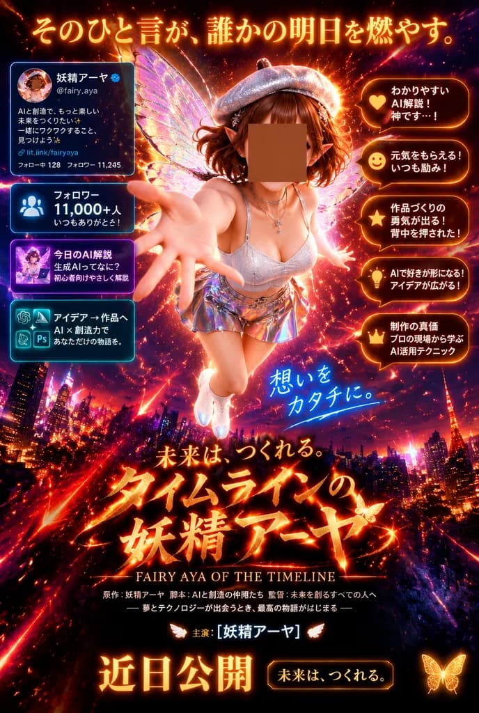
A dramatic vertical Japanese movie poster in a hyper-detailed cinematic fantasy style, illuminated with glowing fiery orange, red, gold, and neon magenta light over a nighttime city skyline. In the center, a single chibi-like fairy woman floats toward the viewer in a dynamic forward-reaching pose with one oversized hand extended in forced perspective. She features short wavy auburn-brown hair, pointed elf ears, large iridescent translucent butterfly wings, a sparkling silver beret, a fitted white shimmering top, a short holographic metallic skirt, and glowing white shoes. Her face area is covered by a centered square censor block in warm brown. Behind her are explosive particles, sparks, comet trails, and radiant lens-flare energy. The poster layout incorporates cinematic typography and glowing social-media callout cards: - Top headline in luminous Japanese text: 「そのひと言が、誰かの明日を燃やす。」 - Upper-left profile card styled like an X/Twitter profile screenshot with a circular avatar, Japanese name with a blue verification badge, handle, bio, link, and follower stats. - Left side stacked panels: 1. 「フォロワー 11,000+人 いつもありがとう!」 with follower icon; 2. 「今日のAI解説 生成AIってなに? 初心者向けやさしく解説」 with thumbnail; 3. 「アイデア → 作品へ AI × 創造力で あなただけの物語を。」 with creative tool icons. - Right side 5 speech-bubble callouts rim-lit in orange with icons: 1. 「わかりやすい AI解説! 神です…!」; 2. 「元気をもらえる! いつも励み!」; 3. 「作品づくりの勇気が出る! 背中を押された!」; 4. 「AIで好きが形になる! アイデアが広がる!」; 5. 「制作の真価 プロの現場から学ぶ AI活用テクニック」 - Lower middle handwritten glowing phrase in blue-white: 「想いを カタチに。」 - Main title in fiery molten brush-style Japanese lettering: 「未来は、つくれる。 タイムラインの 妖精アーヤ」, with English subtitle: “FAIRY AYA OF THE TIMELINE” - Film-credit block beneath the title, followed by starring line: 「主演:[妖精アーヤ]」 flanked by tiny wings - Bottom release notice: bold glowing text 「近日公開」, beside a dark gold-bordered plaque reading 「未来は、つくれる。」, with a small butterfly emblem in the lower right.

ملصق فيلمأنميجنية
ملصق فاخر لمسابقة فيديو الأطباق اليابانية

ملصق فاخر لمسابقة فيديو الأطباق اليابانية

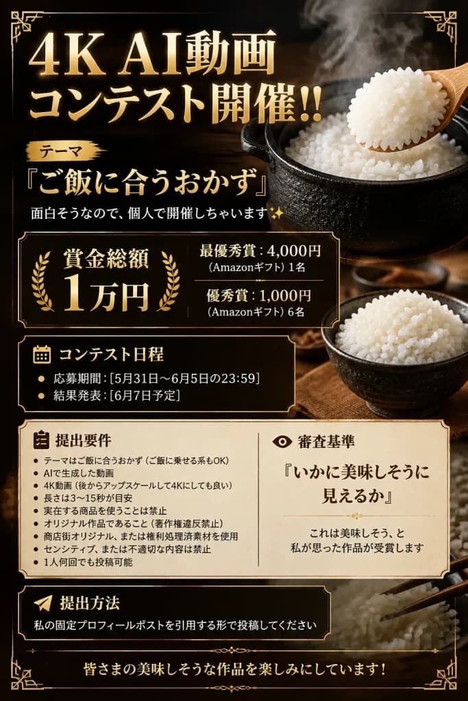
Vertical Japanese contest announcement poster with a 2:3 aspect ratio in a luxurious, dramatic fine-dining restaurant aesthetic. The background is dark black-brown with subtle wood grain texture, warm spotlighting, rising steam, and delicate ornate gold Art Deco corner borders. Main Visuals: - Upper right: A traditional black cast iron rice pot filled with glossy, moist, freshly steamed white rice, billowing thick steam. A wooden rice paddle scoops a generous mound of rice from the right. - Lower right: A small dark ceramic bowl filled with cooked white rice set on a rustic wooden table surface. In the background behind the lower panels, a subtle translucent close-up of white rice and chopsticks. Typography & Layout (sharp, readable Japanese serif typography, metallic gold headings, crisp white and cream body text): - Top Headline: Large metallic gold text displaying "[4K AI動画 コンテスト開催!!]". Directly below, a smaller label "テーマ" followed by the theme title in prominent gold: "[『ご飯に合うおかず』]", and an explanatory line in white: "面白そうなので、個人で開催しちゃいます✨". - Prize Section: Gold-bordered dark container. Center: "[賞金総額 1万円]" flanked by golden laurel wreaths. Right column: "最優秀賞:4,000円" with "(Amazonギフト) 1名", and "優秀賞:1,000円" with "(Amazonギフト) 6名". - Schedule Section: Dark framed box with a small calendar icon and header "コンテスト日程", containing two bulleted items: "応募期間:[5月31日〜6月5日の23:59]" and "結果発表:[6月7日予定]". - Guidelines & Judging Panel: A wide dual-column cream parchment card. Left column with an edit checklist icon titled "提出要件", listing bullet points: "テーマはご飯に合うおかず(ご飯に乗せる系もOK)", "AIで生成した動画", "4K動画(後からアップスケールして4Kにしても良い)", "長さは3〜15秒が目安", "実在する商品を使うことは禁止", "オリジナル作品であること(著作権違反禁止)", "商店街オリジナル、または権利処理済素材を使用", "センシティブ、または不適切な内容は禁止", and "1人何回でも投稿可能". Right column with an eye icon titled "審査基準", displaying in prominent typography: "『いかに美味しそうに見えるか』" and description "これは美味しそう、と私が思った作品が受賞します". - Submission Box: Dark framed footer box with a paper airplane icon and header "提出方法", reading: "私の固定プロフィールポストを引用する形で投稿してください". - Bottom Footer: Centered elegant gold text reading: "皆さまの美味しそうな作品を楽しみにしています!". Style & Constraints: Ultra-photorealistic food textures, high-end graphic design, crisp legible Japanese typography, thin gold rules. No humans, no external watermarks, no QR codes.

ملصقطباعة يابانيةتصميم طعام
بانر أنمي لتحدي إشارات اليد

بانر أنمي لتحدي إشارات اليد

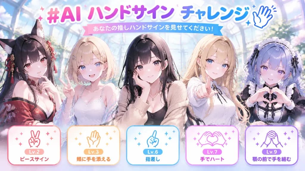
Anime event promotional banner for a social media campaign, wide 16:9 horizontal format. Setting & Background: A luminous fantasy glass atrium greenhouse filled with soft blue-white natural daylight, glowing bokeh sparkles, and subtle pastel lens flares against a dreamy blurred backdrop. Typography & Headline: - Top center: A large, colorful Japanese headline reading "[#AI ハンドサイン チャレンジ]" in thick rounded display lettering with a pink-to-purple-to-blue gradient, clean white outline, subtle drop shadow, tiny star sparkles, and a minimalist blue line-art waving hand icon beside it. - Beneath headline: A small pastel ribbon label with Japanese text reading "[あなたの推しハンドサインを見せてください!]". Characters: Five distinct anime-style young women shown from waist-up across the center, slightly overlapping, featuring clear and anatomically precise hand poses: 1. (Far left): A black-haired fox-eared girl in a deep red off-shoulder kimono robe, resting one hand pensively near her chin. 2. (Left-center): A girl with a short blonde bob in a white camisole and translucent sheer jacket, flashing a two-finger peace sign. 3. (Center): A black-haired girl in a sleek black top and beige knit cardigan, gently resting one hand against her cheek. 4. (Right-center): A girl with long blonde hair in an elegant white blouse, pointing forward toward the viewer. 5. (Far right): A maid or gothic lolita girl with lavender-blue braided hair, wearing a ruffled black-and-white dress and frilled headband, forming a heart gesture with both hands. Bottom Cards: Exactly five rounded rectangular pastel cards along the bottom edge, each featuring thin colored borders, sparkles, and a simple line-art hand icon: - Card 1 (red/orange): "Lv.2" and "ピースサイン" with a peace sign icon. - Card 2 (orange): "Lv.3" and "頬に手を添える" with a hand-on-cheek icon. - Card 3 (blue): "Lv.6" and "指差し" with a pointing finger icon. - Card 4 (purple-pink): "Lv.7" and "手でハート" with a two-hand heart icon. - Card 5 (violet): "Lv.9" and "顎の前で手を組む" with clasped hands under chin icon. Style: Modern anime key visual, vibrant yet soft pastel color palette, glossy hair highlights, polished digital vector typography, clean linework.

أنميبانر حدثإشارات اليد
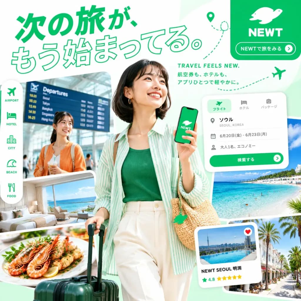
ملصق إعلاني لتطبيق سفر ياباني

ملصق إعلاني لتطبيق سفر ياباني

A vibrant Japanese travel-app promotional poster for [NEWT], square 1:1 composition, bright white and mint-green background with high-key summer lighting and an energetic editorial layout. Composition & Layout: A large diagonal Japanese headline dominates the top-left and upper center. The main traveler stands prominently in the center foreground, smiling and looking upward to the right while holding a smartphone displaying a green brand screen. In the background on the left, a second traveler stands inside an airport setting. Layered around the lower half and right side are 5 dynamic travel photo cutouts intertwined with floating app interface cards. A rounded green brand block anchors the upper right, accompanied by a dotted flight path with a location pin. Subjects: - Main subject: A cheerful East Asian woman in her mid-20s with a dark bob hairstyle, wearing gold hoop earrings, a green ribbed top, a loose translucent mint-and-white striped overshirt, cream high-waisted pants, and a woven straw shoulder bag with a green charm. She pulls a dark green rolling suitcase and holds a smartphone displaying a green screen with a white logo and "NEWT" text. - Secondary subject: A smiling young East Asian woman in an orange cardigan standing in an airport terminal, holding a beverage, in front of a flight departures board. Collage Elements (5 photo cutouts): 1. Airport terminal departures board behind the secondary subject. 2. Luxury hotel room with panoramic ocean view. 3. Close-up gourmet seafood dish with shrimp and herbs beside the suitcase. 4. Turquoise beach and ocean with swimmers on the right. 5. Sunlit resort street with palm trees along the bottom right. Floating UI Mockups (2 rounded cards with soft drop shadows): 1. Booking search card at mid-right: tabs for flight, hotel, package; destination text "ソウル" and "SEOUL, KOREA"; details "6月20日(金) - 6月23日(月)", "大人1名、エコノミー"; and a green button labeled "検索する". 2. Hotel recommendation card at bottom right: pool photo thumbnail, heart icon, hotel title "NEWT SEOUL 明洞", rating "4.8", and five yellow stars. Typography & Branding: - Headline text: "[次の旅が、もう始まってる。]" in vivid green, with the first line solid filled and the second line outlined. - Subheadline text: "[航空券も、ホテルも、アプリひとつで軽やかに。]" in small Japanese typography near the upper right. - English tagline: "TRAVEL FEELS NEW." near the top right. - Vertical category bar on the left: "AIRPORT", "HOTEL", "CITY", "BEACH", "FOOD". - Brand block: white brand mascot logo, "[NEWT]", and the button copy "NEWTで旅をみる" with a circular arrow icon.

ملصق سفرطباعة يابانيةنموذج واجهة مستخدم
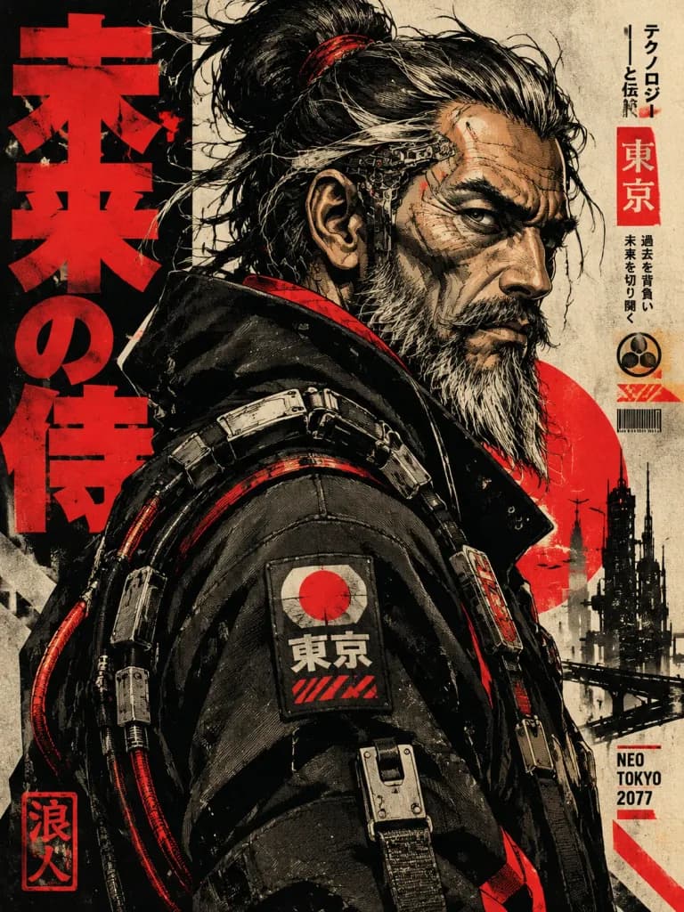
ملصق فني بنقش سايبربانك

ملصق فني بنقش سايبربانك

Ultra-detailed neo-futuristic illustration fused with expressive [vintage character engraving aesthetics]. Bold [cyberpunk streetwear] design featuring sharp vector-like silhouettes, clean geometric contouring, and high-contrast cel-shaded lighting paired with organic painterly facial detailing. Character portrait rendering uses carved woodcut-inspired planes, dramatic facial wrinkle topology, angular anatomy, and flowing hand-illustrated beard and hair strands with subtle ink textures. Layered techwear apparel and mechanical accessories include modular panels, utility patches, tactical straps, exposed cables, and futuristic industrial hardware. Setting & Composition: Japanese graphic-poster layout with minimal industrial background elements, oversized graphic typography blocks, abstract kanji elements, and urban graphic decals. Color & Lighting: Dominant palette of [deep matte black, off-white, muted sepia, and aggressive neon red accents], creating striking editorial contrast. Style: A fusion of cyberpunk anime poster art, retro propaganda graphics, graphic novel illustration, and ukiyo-e woodblock line simplification with textured painterly shading and visible handcrafted imperfections.

سايبربانكنقش خشبيملصق
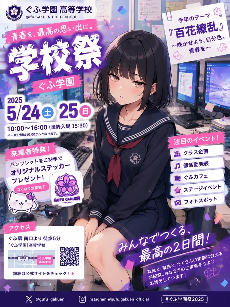
ملصق مهرجان مدرسي ياباني بنمط الأنمي

ملصق مهرجان مدرسي ياباني بنمط الأنمي

anime school festival flyer poster. Japanese promotional flyer, glossy manga illustration, vibrant purple and pink accent colors, dense print layout, confetti scattered across the composition, polished commercial poster design. straight ch…

أنميملصقمهرجان مدرسي
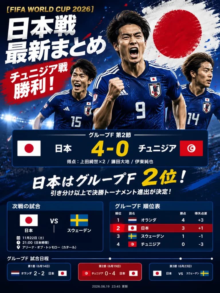
ملصق ملخص مباراة كرة قدم ياباني

ملصق ملخص مباراة كرة قدم ياباني

A dramatic Japanese sports-news extra edition graphic poster about [FIFA WORLD CUP 2026], styled as a viral social media match-summary graphic after Japan defeats Tunisia 4–0. Setting & Background: Vertical 3:4 poster layout with a dark navy stadium background, bright floodlights glowing along the lower horizon, scattered red and blue confetti, grunge paint textures, high-contrast, energetic tabloid sports-news aesthetics. Main Image: Exactly 3 Japanese male soccer players in blue Japan national-team jerseys running and celebrating. The center player is largest, wearing number 9 with a clenched fist; the left player is slightly behind wearing number 15; the right player is partially cropped wearing number 14. A large circular Japanese flag brushstroke appears behind the players in the upper right. Realistic athletic sports photography lighting, wind-swept hair, intense expressions, with no real-world player likenesses. Typography & Headlines: At the top left, a small gold English title: "[FIFA WORLD CUP 2026]". Directly beneath, huge distressed white Japanese tabloid headline text: "[日本戦\n最新まとめ]". Below that, a bold red brushstroke banner with white Japanese text: "[チュニジア戦\n勝利!]". Bold, condensed typography with drop shadows and dynamic paint strokes. Scoreboard: In the center, a large navy horizontal scoreboard bar featuring flags of Japan and Tunisia, Japanese team names, and a prominent yellow score line: "[日本 4-0 チュニジア]". Above it, a Japanese group-stage label, and below it, smaller text listing scorers: "[得点:上田綺世×2 / 鎌田大地 / 伊東純也]". Lower Section & Standings: A bold handwritten-style Japanese statement indicating Japan is in 2nd place in Group F, with subtext noting that a draw or win secures advancement. Two side-by-side data panels below: the left panel shows the next fixture (Japan vs Sweden with flags, date, time, and venue); the right panel displays the Group F standings table with 4 rows (1 to 4: Netherlands, Japan, Sweden, Tunisia) showing country flags, Japanese names, points, and goal difference, with Japan highlighted in red. Bottom Timeline: Three rectangular match cards connected by a thin timeline with dots, labeled Match 1 (Netherlands 2–2 Japan), Match 2 highlighted (Tunisia 0–4 Japan), and Match 3 (Japan vs Sweden), each with respective flags. A subtle update timestamp is centered at the bottom. Crisp typography, no watermarks.
كرة قدمملصق رياضيإنفوجرافيك
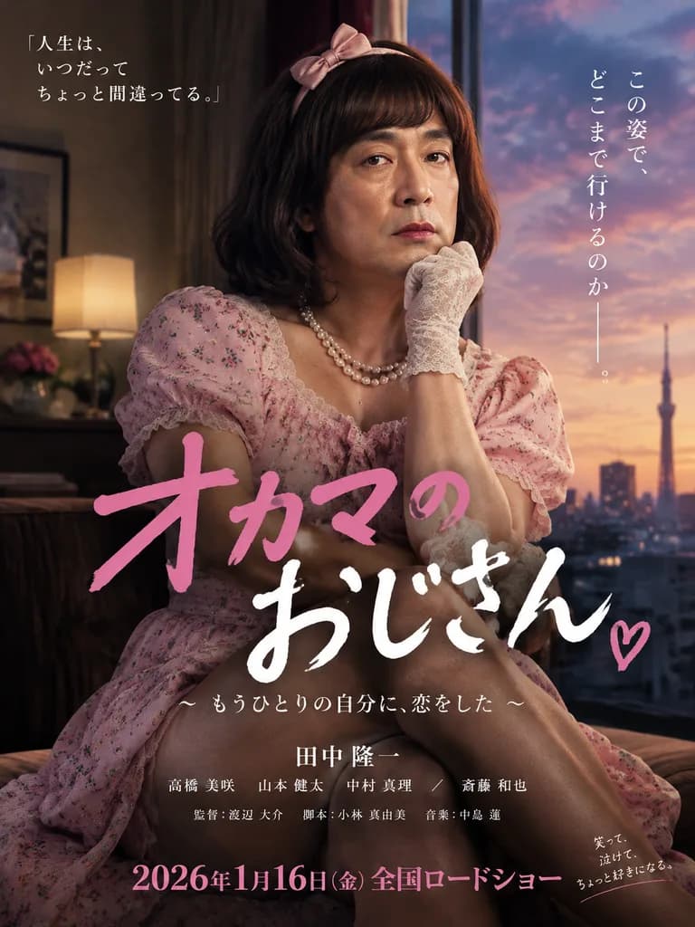
ملصق فيلم أنمي ياباني سريالي

ملصق فيلم أنمي ياباني سريالي

A professional movie poster featuring [a seemingly realistic yet subtly bizarre middle-aged man in cross-dressing feminine attire], presented in [a surreal, deadpan anime film style]. The concept is absurd and comedic yet executed with complete cinematic seriousness. Professional graphic design layout with Japanese typography including [movie title, credits, tagline, and broadcast release information]. High-end poster composition with crisp typography, balanced negative space, and theatrical lighting.

ملصق فيلمطباعة يابانيةسريالي
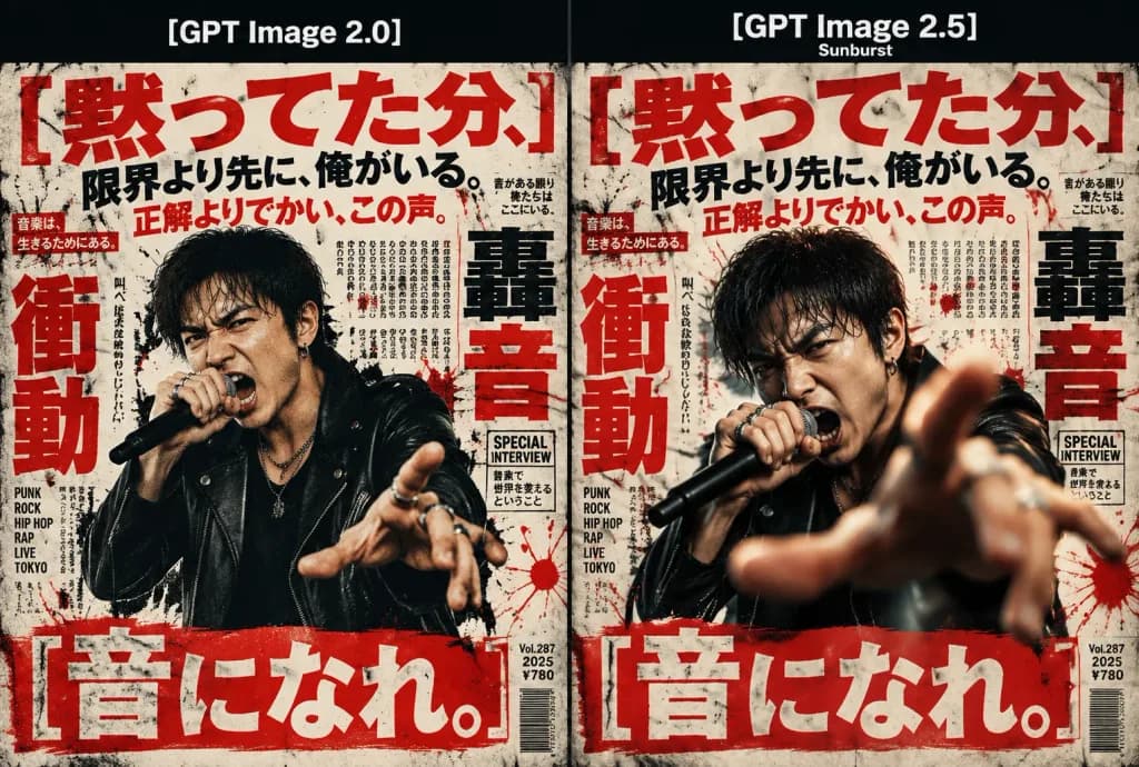
مقارنة ملصقات البانك اليابانية

مقارنة ملصقات البانك اليابانية

A side-by-side comparison graphic showing two Japanese punk and hip-hop magazine posters in a horizontal 3:2 layout. Across the top runs a solid black header bar dividing the layout into two equal vertical poster panels separated by a thin vertical line. The left panel is labeled "[GPT Image 2.0]", and the right panel is labeled "[GPT Image 2.5]" with a small subtitle reading "Sunburst". - Left Panel: Features a Japanese male vocalist shown from the waist up with slightly flatter, lower-fidelity rendering. He has short dark hair, sweat on his brow, and wears a black leather jacket over a dark shirt and silver rings, aggressively shouting into a black microphone while reaching one hand outward. - Right Panel: Features the same vocalist concept with cinematic, lifelike realism, deep dimensional lighting, and a hand thrust directly toward the camera with dramatic perspective depth of field. Typography & Graphic Elements: Both posters are packed with oversized brutalist Japanese editorial typography. Prominently display six Japanese slogans: 1) Top headline "[黙ってた分、]", 2) black text "限界より先に、俺がいる。", 3) red text "正解よりでかい、この声。", 4) large vertical red kanji "衝動", 5) large vertical black/red kanji "轟音", and 6) bottom red banner headline "[音になれ。]". Backgrounds are filled with dense columns of tiny Japanese music magazine text, technical markings, red paint splatters, and graphic layout rules. Style & Color: Gritty underground punk zine aesthetic, off-white distressed newsprint texture, deep black ink bleed, high-contrast crimson red accents, and halftone print grain. Exactly two panels and two singers total.

تصميم ملصقخط يابانيمجلة بانك
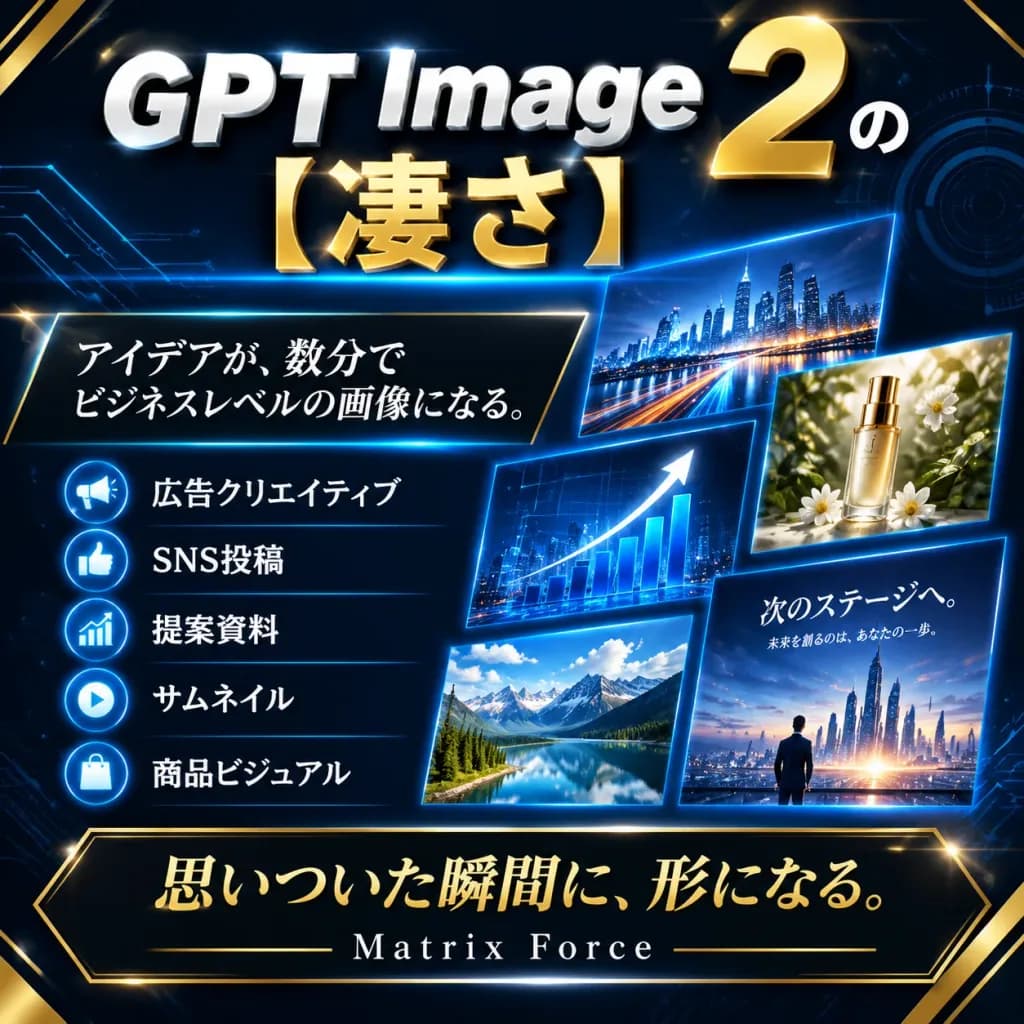
تصميم ترويجي لتقنية مستقبلية لوسائل التواصل

تصميم ترويجي لتقنية مستقبلية لوسائل التواصل

A square, high-impact Japanese promotional social media graphic with a futuristic luxury tech aesthetic. Background: Dark navy-to-black canvas featuring glowing cyan-blue circuit board traces, faint circular HUD elements, diagonal perspective grids, gold corner accents, and subtle cinematic lens flares. Typography and Layout: - Top Headline: Dominating the upper section, bold metallic typography with "GPT Image" in large silver-white beveled sans-serif letters, a massive metallic gold "2" on the upper right accompanied by a small white Japanese character "の", and oversized metallic gold Japanese text "[凄さ]" centered beneath. A thin electric-blue light streak runs directly under the headline. - Main Message Box: Positioned at mid-left, a dark trapezoidal panel with a fine gold border and cyan glow, containing the elegant white serif Japanese text: "[アイデアが、数分で\nビジネスレベルの画像になる。]". - Feature List: Below the message box, exactly 5 horizontal rows separated by subtle blue divider lines, each starting with a circular blue badge icon followed by crisp white Japanese text: 1) Megaphone icon — "広告クリエイティブ" 2) Thumbs-up icon — "SNS投稿" 3) Bar chart icon — "提案資料" 4) Play button icon — "サムネイル" 5) Shopping bag icon — "商品ビジュアル" - Visual Previews: Arranged across the right half, exactly 5 floating, tilted preview cards with glowing blue borders: 1) Panoramic night city skyline with light trails 2) Luxury cosmetic bottle surrounded by botanicals 3) Business growth chart with a rising white arrow and blue bars 4) Scenic mountain landscape for social media 5) Cinematic presentation slide depicting a small silhouette facing a futuristic illuminated metropolis with Japanese text "次のステージへ。" and smaller subtitle "未来を創るのは、あなたの一歩。" - Bottom Banner: A prominent dark banner with a beveled gold border spanning the bottom, featuring the metallic gold calligraphy text "[思いついた瞬間に、形になる。]". Directly underneath, centered, the brand text "[Matrix Force]" in spaced white serif lettering flanked by thin gold rules. Style: High-contrast corporate cyberpunk advertising, polished commercial finish, metallic textures, crisp vector-grade Japanese typography, pristine presentation slide design.

تصميم ترويجيطباعة يابانيةإعلان تقني
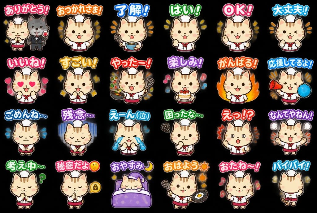
ورقة ملصقات LINE لقط طاهٍ تشيبي

ورقة ملصقات LINE لقط طاهٍ تشيبي

LINE sticker sheet. cute Japanese mascot sticker set, clean white background, thick dark outline, soft flat colors, glossy hand-drawn digital illustration, chibi style, designed for transparent-background sticker extraction. large rounded…

ملصقات لاينورقة ملصقاتقط تشيبي
ملصق فعالية ياباني بأسلوب الأركيد القديم

ملصق فعالية ياباني بأسلوب الأركيد القديم

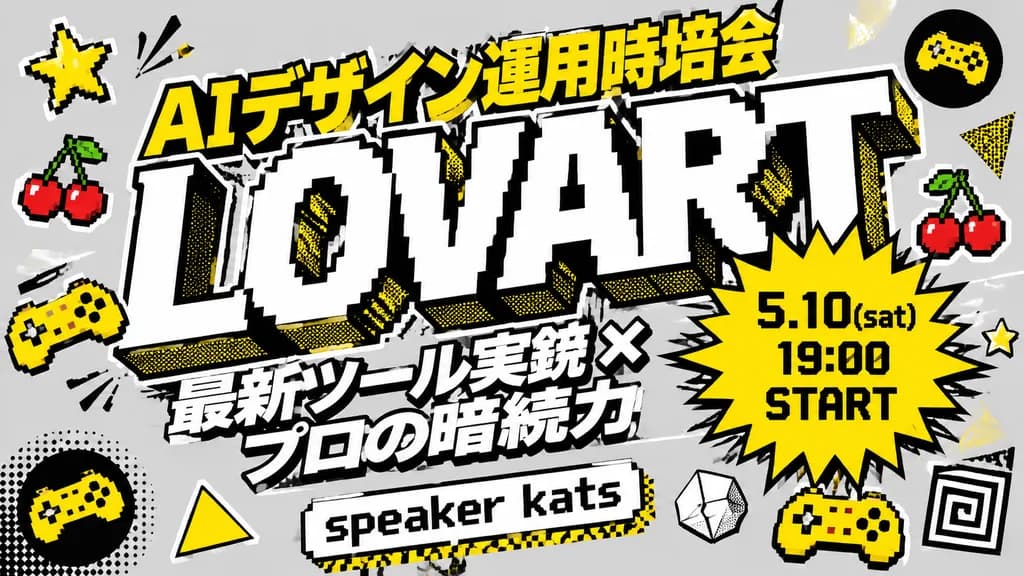
A bold Japanese event thumbnail poster on a [light gray] background in a retro arcade pop-art graphic design style. The composition is centered around a massive diagonal wordmark reading "[LOVART]" rendered in oversized white 3D block letters with heavy black outlines, pixel-stepped inner edges, and yellow halftone drop shadows. Above the main wordmark, a large Japanese header text in bright yellow with black outline reads "[AIデザイン運用時培会]". Below the logo, a two-line tilted Japanese subtitle in heavy white letters with black outlines reads "[最新ツール実銃 ×]" on the first line and "[プロの暗続力]" on the second line. At the lower center, a pixel-art style text banner reads "[speaker kats]" in black with a yellow shadow. Overlapping the right side of the main logo, a jagged yellow starburst badge with a thick black border contains three lines of black text: "[5.10(sat)]", "[19:00]", "[START]". The design is accented by 12 retro gaming icons scattered around the typography: two yellow 5-point stars, two pairs of 8-bit red cherries, two yellow mini game controllers, one circular black badge with a yellow gamepad icon, two solid yellow triangles, one yellow halftone-dotted triangle, one white geometric polygon, and one black-and-white spiral square. Graphic art style featuring thick comic outlines, sticker layering effects, screen-print halftone dots, crisp typography, and a high-contrast palette of yellow, black, white, and gray.

ملصق فعاليةخط يابانيأركيد كلاسيكي
ملصق إعلاني للعبة هاتف أنمي للبقاء ضد الزومبي

ملصق إعلاني للعبة هاتف أنمي للبقاء ضد الزومبي

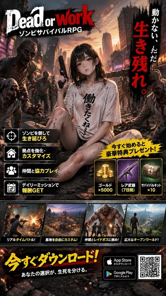
Dramatic Japanese mobile game advertisement poster for a zombie survival RPG, anime-meets-cinematic key-art style, vertical smartphone layout. Gritty urban apocalypse background at dusk with ruined city streets, smoke, glowing sparks, concrete debris, damaged skyscrapers, flickering neon signs, and a horde of menacing zombies advancing from behind. In the center, a young anime woman sits slouched on the cracked asphalt with bent legs, holding a black handgun upright in one hand. She has straight dark brown to black shoulder-length hair, pale skin, an understated tired expression, and an oversized dirty white T-shirt splattered with blood. Large bold Japanese calligraphy is printed vertically on her shirt: "[働きたくね〜]". Multiple decaying zombies in torn modern clothing reach forward from both flanks. Dense, commercial mobile game marketing layout divided into 8 distinct graphic sections: - Section 1 (top-left): Distressed paint-splatter game logo with large English title "[Dead or work]" and smaller Japanese subtitle "[ゾンビサバイバルRPG]" in white and red. - Section 2 (upper-right): Vertical slogan on a rough black brushstroke strip reading white text "[動かない、ただ]" above giant distressed red text "[生き残れ。]". - Section 3 (left-middle): 4 feature rows with white icons in black squares and yellow/white text: "[ゾンビを倒して生き延びろ]", "[拠点を強化・カスタマイズ]", "[仲間と協力プレイ]", "[デイリーミッションで報酬GET]". - Section 4 (right-middle): Reward campaign panel featuring a jagged yellow comic burst header "[今すぐ始めると 豪華特典プレゼント!]" over 3 item cards: "[ゴールド ×5000]", "[レア武器 (7日間)]", "[サバイバルキット ×10]". - Section 5 (lower-middle): Gameplay screenshot strip showing 4 framed thumbnails captioned "[リアルタイムバトル!]", "[基地を自由にカスタム!]", "[仲間とレイドボスに挑め!]", "[広大なオープンワールド!]". - Section 6 (bottom call-to-action): Large bold yellow-and-red Japanese header "[今すぐダウンロード!]" with subtext "[あなたの選択が、生死を分ける。]". - Section 7 (bottom-right): App Store and Google Play download badges. - Section 8 (bottom-right): A scannable white QR code square. Hyper-detailed, high-contrast, gritty mobile gacha promotional design with cinematic orange-gray dusk lighting, distressed typography, and metallic UI framing.

إعلان لعبة هاتفبقاء ضد الزومبيفتاة أنمي
ملصق تقني ياباني جريء لخدمات SaaS

ملصق تقني ياباني جريء لخدمات SaaS

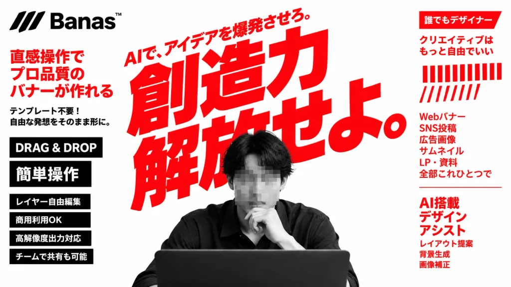
A bold Japanese advertising banner for an AI design tool called [Banas™], featuring high-energy startup SaaS aesthetics, aggressive red typography, and high-contrast monochrome photography. Canvas & Layout: Wide 16:9 horizontal composition on a clean white background. In the top-left corner, an abstract black three-stripe logo mark alongside the brand text '[Banas™]'. Dominating the center is an enormous, bold red Japanese headline tilted slightly upward: '[創造力 解放せよ。]', layered behind the subject. Directly above it, a smaller red diagonal tagline reads: '[AIで、アイデアを爆発させろ。]'. In the lower center foreground, a high-contrast grayscale photo of a young Japanese male designer with medium-length dark hair in a dark shirt, seated behind a dark laptop partly cropped at the bottom edge, his face obscured by a square gray pixelated blur censor block. Left Sidebar Content (6 distinct elements): 1) Large red vertical text block: 「直感操作で プロ品質の バナーが作れる」 2) Smaller black note below: 「テンプレート不要! 自由な発想をそのまま形に。」 3) Black rectangular badge with white text: "DRAG & DROP" 4) Black rectangular badge with bold white Japanese text: 「簡単操作」 5) Three stacked black feature bars with white text: 「レイヤー自由編集」, 「商用利用OK」, 「高解像度出力対応」 6) Black feature bar: 「チームで共有も可能」 Right Sidebar Content (5 distinct groups): 1) Red top ribbon label with white text: 「誰でもデザイナー」 2) Red Japanese copy below: 「クリエイティブは もっと自由でいい」 3) Decorative graphic of 22 red vertical barcode-like stripes in two rows (lower row shorter and slanted) 4) Red stacked list: 「Webバナー SNS投稿 広告画像 サムネイル LP・資料 全部これひとつで」 5) Red heading: 「AI搭載 デザイン アシスト」 with smaller red supporting feature text lines beneath for layout proposals, background generation, and image correction. Visual Style: Oversized geometric condensed gothic Japanese lettering with tight kerning. Flat graphic layout, pure white, vivid red, black, and grayscale tones, no gradients except the pixelated censor blur, crisp print-ad tech aesthetic.

خطوط يابانيةإعلان saasملصق تقني
ملصق عينة خط روماني وياباني

ملصق عينة خط روماني وياباني

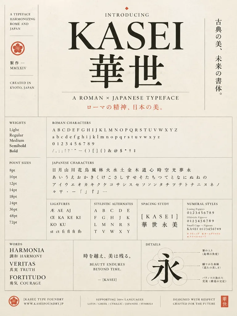
A refined vintage-modern type specimen poster for a fictional typeface named "[KASEI]", designed as an elegant fusion of Roman and Japanese typography. Tall portrait layout on warm ivory textured paper with thin gray divider lines, black letterforms, and muted vermilion accent text and seals. The composition centers on a large serif Latin wordmark "[KASEI]" set above two oversized Japanese kanji "華世" in a matching high-contrast classical style. Above the main title is a small heading "INTRODUCING" marked with a tiny diamond glyph. To the right of the title block, a vertical Japanese tagline reads "古典の美、未来の書体。". Beneath the kanji is the subtitle "A ROMAN × JAPANESE TYPEFACE", followed by a vermilion Japanese line: "ローマの精神、日本の美。". On the far left, a narrow vertical sidebar contains stacked English text reading "A TYPEFACE HARMONIZING ROME AND JAPAN", a small circular crest, Japanese text "製作 — MMXXIV", and "CREATED IN KYOTO, JAPAN". The lower two-thirds is a meticulous Swiss-grid specimen sheet with labeled sections: - Left column: "WEIGHTS" showing Light, Regular, Medium, Semibold, Bold; and "POINT SIZES" displaying 8pt, 10pt, 12pt, 14pt, 18pt, 24pt, 36pt, 48pt, 72pt. - Center-upper section: "ROMAN CHARACTERS" showing four lines containing uppercase A–Z, lowercase a–z, numerals 0–9, and full punctuation and symbols (/ , ; ! ? ' " — ( ) [ ] { } & @ $ * † ‡). - Below it: "JAPANESE CHARACTERS" showing 19 kanji (日 月 山 川 花 鳥 風 林 火 水 土 金 木 道 心 時 空 光 夢 永), 23 hiragana (あ い う え お か き く け こ さ し す せ そ た ち つ て と な に ぬ ね の), 21 katakana (ア イ ウ エ オ カ キ ク ケ コ サ シ ス セ ソ ン タ チ ツ テ ト ナ ニ ヌ ネ ノ), and Japanese typographical symbols. - Middle row of four compact panels: "LIGATURES" (Æ, AE, AJ, Œ, KA, KE, KI, KO, KU, st ct fi fl ft fb); "STYLISTIC ALTERNATES" arranged in a neat grid; "SPACING STUDY" displaying "[KASEI]" tracked widely over "華世永美"; and "NUMERAL STYLES" comparing lining figures, oldstyle figures, and small caps combinations, with tiny red Japanese footnotes. - Bottom feature row: Left panel "WORDS" featuring HARMONIA (調和 HARMONY), VERITAS (真実 TRUTH), and FORTITUDO (勇気 COURAGE). Center panel featuring Japanese quote "時を越え、美は残る。" above English text "BEAUTY ENDURES\nBEYOND TIME." signed "— [KASEI]". Right panel "DETAILS" showing an enlarged stroke construction analysis of the kanji "永" with faint construction circles and dotted leader lines pointing to Japanese callouts. - Footer bar: Left foundry emblem with "[KASEI] TYPE FOUNDRY" and "WWW.KASEIFOUNDRY.JP"; center language note "SUPPORTING 200+ LANGUAGES" and "LATIN / GREEK / CYRILLIC / JAPANESE / SYMBOLS"; right-aligned "DESIGNED WITH RESPECT\nCRAFTED FOR THE FUTURE"; and a square vermilion seal marked "華世". Restrained editorial luxury, clean museum-grade typography, and generous margins.

عينة خطفن الخط الطباعيملصق
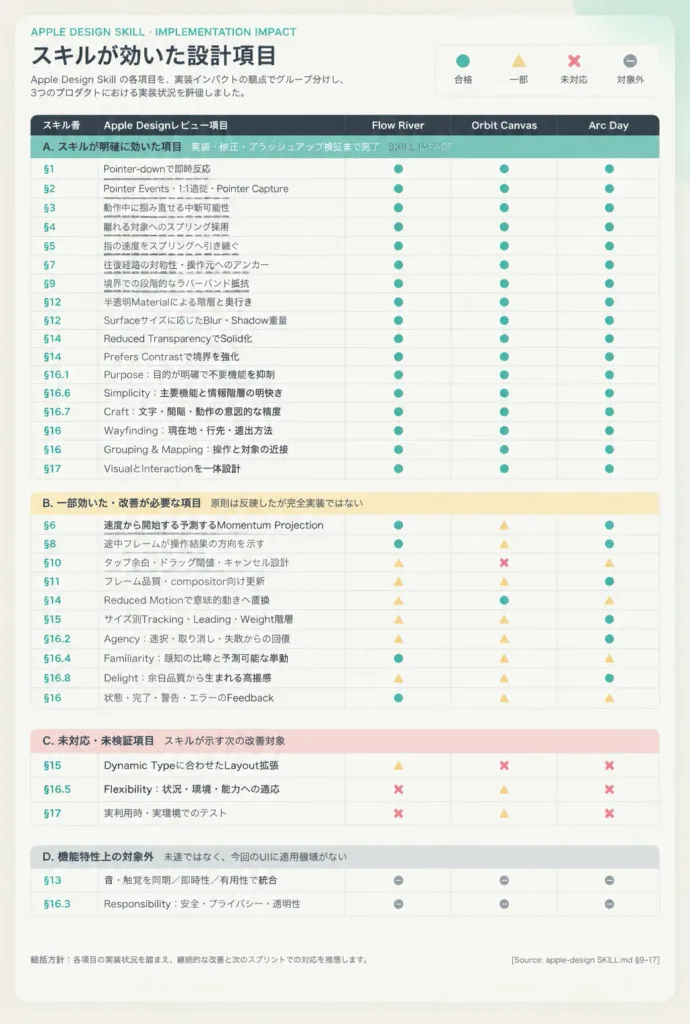
مصفوفة تأثير مهارات تصميم آبل

مصفوفة تأثير مهارات تصميم آبل

An Apple-style Japanese comparison matrix infographic poster displaying implementation impact across three products: [Flow River, Orbit Canvas, Arc Day]. Format: Vertical portrait layout, warm off-white background with subtle paper texture and a faint mint gradient glow at the top right. A large centered white rounded card with a soft shadow and generous margins. Style: Restrained Apple editorial design, crisp typographic grid, hairline dividers, rounded status symbols in muted teal, pale yellow, dusty pink, and neutral gray. Header: - Top left: Small teal label "APPLE DESIGN SKILL · IMPLEMENTATION IMPACT". - Headline: Bold Japanese title "[スキルが効いた設計項目]". - Subtext: Small gray explanatory text in Japanese describing Apple Design Skill items grouped by implementation impact. - Top right: Compact legend with 4 rounded symbols: teal circle = 合格, yellow triangle = 一部, red X = 未対応, gray dash = 対象外. Table Grid: Exactly 5 columns with a dark charcoal header row and white text: "スキル番", "Apple Designレビュー項目", followed by three product columns: [Flow River, Orbit Canvas, Arc Day]. Item numbers in teal, review item names in bold charcoal, status icons centered. Four Grouped Sections: 1. Teal Header Band: "A. スキルが明確に効いた項目 実装・修正・ブラッシュアップ検証まで完了 SKILL IMPACT" (17 rows: §1 Pointer-downで即時反応; §2 Pointer Events・1:1追従・Pointer Capture; §3 動作中に掴み直せる中断可能性; §4 離れる対象へのスプリング採用; §5 指の速度をスプリングへ引き継ぐ; §7 往復経路の対称性・操作元へのアンカー; §9 境界での段階的なラバーバンド抵抗; §12 半透明Materialによる階層と奥行き; §12 Surfaceサイズに応じたBlur・Shadow重量; §14 Reduced TransparencyでSolid化; §14 Prefers Contrastで境界を強化; §16.1 Purpose:目的が明確で不要機能を抑制; §16.6 Simplicity:主要機能と情報階層の明快さ; §16.7 Craft:文字・間隔・動作の意図的な精度; §16 Wayfinding:現在地・行先・退出方法; §16 Grouping & Mapping:操作と対象の近接; §17 VisualとInteractionを一体設計). 2. Pale Yellow Header Band: "B. 一部効いた・改善が必要な項目 原則は反映したが完全実装ではない" (10 rows: §6 速度から開始する予測するMomentum Projection; §8 途中フレームが操作結果の方向を示す; §10 タップ余白・ドラッグ閾値・キャンセル設計; §11 フレーム品質・compositor向け更新; §14 Reduced Motionで意味的動きへ置換; §15 サイズ別Tracking・Leading・Weight階層; §16.2 Agency:選択・取り消し・失敗からの回復; §16.4 Familiarity:既知の比喩と予測可能な挙動; §16.8 Delight:余白品質から生まれる高揚感; §16 状態・完了・警告・エラーのFeedback). 3. Dusty Pink Header Band: "C. 未対応・未検証項目 スキルが示す次の改善対象" (3 rows: §15 Dynamic Typeに合わせたLayout拡張; §16.5 Flexibility:状況・環境・能力への適応; §17 実利用時・実環境でのテスト). 4. Light Gray Header Band: "D. 機能特性上の対象外 未達ではなく、今回のUIに適用領域がない" (2 rows: §13 音・触覚を同期/即時性/有用性で統合; §16.3 Responsibility:安全・プライバシー・透明性). Status Distribution: Centered subtle rounded glyphs across all 32 rows matching the legend. Section A mostly teal circles; Section B mixed teal circles, yellow triangles, gray dashes, and one red X in the center column on §10; Section C mostly red X marks with yellow triangles; Section D all gray dashes. Footer: Small gray note at bottom left starting with "総括方針:" and a source tag at bottom right "[Source: apple-design SKILL.md §9–17]". Clean typographic rendering, high legibility, no decorative illustrations, no logos.

إنفوجرافيكتصميم آبلمصفوفة
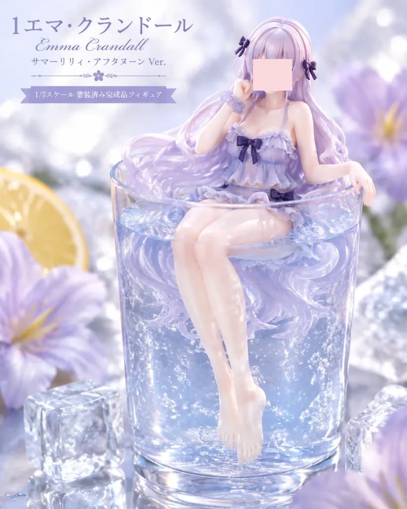
ملصق تجاري لمجسم أنمي في كأس مشروب

ملصق تجاري لمجسم أنمي في كأس مشروب

Commercial product visual for a 1/7 scale pre-painted anime figure displayed like a refreshing summer dessert drink. Main Subject: Positioned center-right, an anime-style female figure named [Emma Crandall] seated inside a clear cylindrical glass tumbler filled with transparent sparkling water. She has very long flowing [pale lavender] hair drifting underwater with small dark purple bow accessories. Her face is covered by a smooth opaque pale pink rectangular censor block with no facial features. She wears a frilly lavender summer-lily swimsuit dress with layered ruffles, lace trim, a dark bow at the chest, a dark bow at the hip, and a translucent scrunchie bracelet. Pose: one hand near her cheek, the other resting over the glass rim, bare legs dangling underwater with pointed bare feet. Setting & Composition: 4:5 portrait product composition. The glass occupies the lower two-thirds of the frame, with the figure emerging above the waterline. Macro tabletop setting with bokeh, 3 prominent ice cubes, 1 lemon slice in the background, 2 large blurred pale purple flowers, and sparkling bubbles suspended in the water. Shallow depth of field, soft high-key lighting, pale lavender, icy blue, and white color palette. Typography: In the upper-left corner, exactly four text lines: - Line 1 (large Japanese title): "[エマ・クランドール]" - Line 2 (smaller cursive English name): "[Emma Crandall]" - Line 3 (small Japanese subtitle): "[サマーリリィ・アフタヌーン Ver.]" - Thin floral decorative divider - Line 4 (on a lavender ribbon banner): "[1/7スケール 塗装済み完成品フィギュア]" Style: Ultra-polished commercial anime figure photography, resin and PVC collectible texture, transparent glass refraction, realistic water caustics, glossy reflections, luxury figure promotional key visual. Only one character, no extra logos or packaging.

مجسم أنميتصوير منتجاتملصق ترويجي
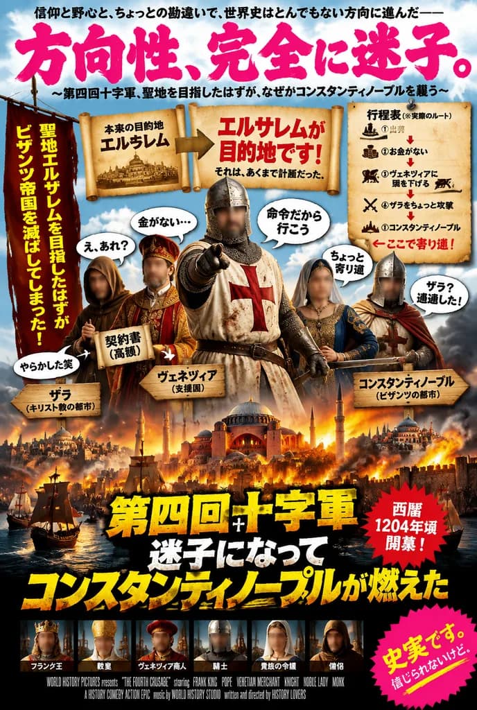
ملصق فيلم ياباني ساخر عن الحملة الصليبية الرابعة

ملصق فيلم ياباني ساخر عن الحملة الصليبية الرابعة

A chaotic fictional Japanese theatrical movie poster themed around world history, styled as a glossy blockbuster comedy-action epic about the Fourth Crusade getting completely lost and sacking Constantinople instead of reaching Jerusalem. The composition is dense, loud, and satirical. In the center foreground, a full-body medieval crusader in a dirty white tunic emblazoned with a large red cross points directly toward the viewer, flanked by four medieval figures in ornate robes, hoods, helmets, and merchant attire; their faces are obscured by soft rectangular censor blurs like a spoof cast reveal. Across the top, massive hot-pink Japanese brush lettering reads "[方向性、完全に迷子。]", bordered by smaller black Japanese tagline text above and below. A torn vertical banner on the left side features bold yellow Japanese text explaining that they intended to reach Jerusalem but ended up crushing the Byzantine Empire. Two large parchment banners cross the upper middle: one states the original goal was Jerusalem, while the central banner declares in bold red Japanese text that Jerusalem is the destination, followed by smaller black text noting that was only the plan. On the upper right, a pinned parchment itinerary board displays a 5-step comedic route list with icons and arrows: departure, out of money, bowing to Venice, lightly attacking Zara, and Constantinople, ending with a red line marking their detour. Surrounding the characters are exactly 8 speech balloons and callout labels in Japanese: "え、あれ?" (Eh, huh?), "金がない…" (No money…), "命令だから行こう" (By order, let's go), "ちょっと寄り道" (Slight detour), "やらかした笑" (I failed, lol), "ザラ?通過した!" (Zara? We passed there!), a label for a "契約書" (contract) marked as pricey, and a label pointing to Venice as a sponsor. Three wooden or parchment location signs mark Zara, Venice, and Constantinople, annotated as Christian or Byzantine cities. The lower section depicts a catastrophic burning Byzantine city with Hagia Sophia-style domes, naval combat, crumbling stone architecture, fiery orange light, and black smoke plumes. At bottom center, huge distressed yellow and white Japanese title typography announces the Fourth Crusade film and states Constantinople burns due to losing their way, styled with heavy drop shadows and explosive blockbuster energy. To the right of the title, a red starburst stamp states in Japanese that it begins around 1204. Along the bottom is a narrow cast ribbon showing exactly 6 small actor thumbnails labeled in Japanese, above tiny fake studio credits. In the bottom right corner, a vivid pink starburst badge with yellow and white text reads "[史実です。信じられないけど。]". Style: cinematic key art, high-saturation Japanese movie poster, photobashed realism blended with exaggerated commercial graphic design.

ملصق فيلمخط يابانيالحملة الصليبية الرابعة
ملصق مؤسسي ياباني بسيط لشركة إنتاج

ملصق مؤسسي ياباني بسيط لشركة إنتاج

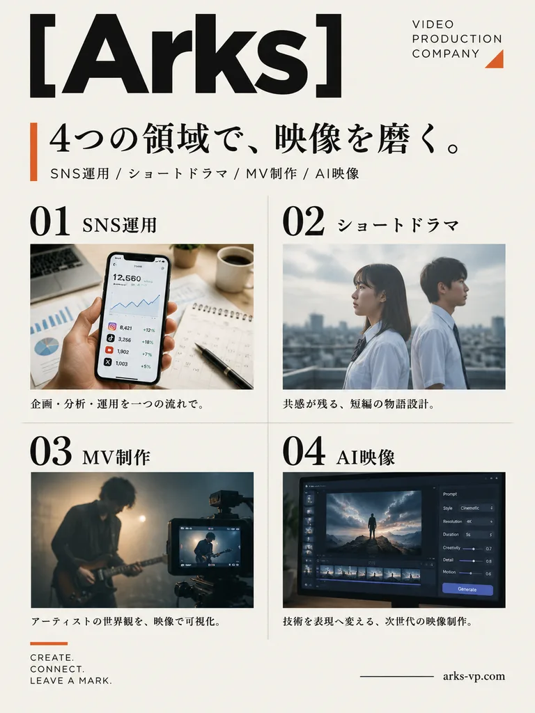
A clean, premium Japanese corporate poster for [Arks] video production company, designed in a minimalist editorial layout on a warm off-white background with ample negative space. Portrait orientation, A4 poster proportions. Top Section: - Top left: Oversized bold black sans-serif logotype reading "[Arks]" spanning nearly the width of the page. - Top right: Stacked brand mark in thin uppercase letters: "VIDEO / PRODUCTION / COMPANY" with a small burnt-orange geometric accent. Headline Area: - A vertical burnt-orange accent bar on the left, followed by a large Japanese headline in black Mincho serif: "[4つの領域で、映像を磨く。]". - Below the headline, a smaller service sub-line with slashes: "SNS運用 / ショートドラマ / MV制作 / AI映像". Main Body (2x2 Grid): Four service panels separated by thin light-gray divider lines, each featuring a large black editorial number, Japanese title, photo, and caption: 1. Number "01", label "SNS運用": Close-up of a hand holding a smartphone showing social media analytics over an office desk with charts, calendar, pen, and coffee mug in warm natural light. Caption: "企画・分析・運用を一つの流れで。" 2. Number "02", label "ショートドラマ": Side-profile view of two Japanese high-school students in white shirts standing on a rooftop under soft overcast daylight, cinematic shallow depth of field. Caption: "共感が残る、短編の物語設計。" 3. Number "03", label "MV制作": Moody musician playing electric guitar in a dim hazy studio, framed with a camera monitor in the foreground showing the live feed. Caption: "アーティストの世界観を、映像で可視化。" 4. Number "04", label "AI映像": Professional dark-mode AI video software workspace on a monitor, displaying a cinematic scene of a lone figure on rocks under dramatic skies with timeline thumbnails and parameter sliders. Caption: "技術を表現へ変える、次世代の映像制作。" Footer: - Bottom left: Small three-line English slogan in uppercase: "[CREATE. / CONNECT. / LEAVE A MARK.]" topped with a thin burnt-orange line. - Bottom right: Website URL "[arks-vp.com]" in small serif text beside a short horizontal black rule. Style & Palette: Contemporary Japanese graphic design, accurate typography, black, charcoal, off-white, and subtle burnt-orange accents.

ملصقتحريريمؤسسي
ملصق إطلاق منتج تقني بنمط الأنمي

ملصق إطلاق منتج تقني بنمط الأنمي

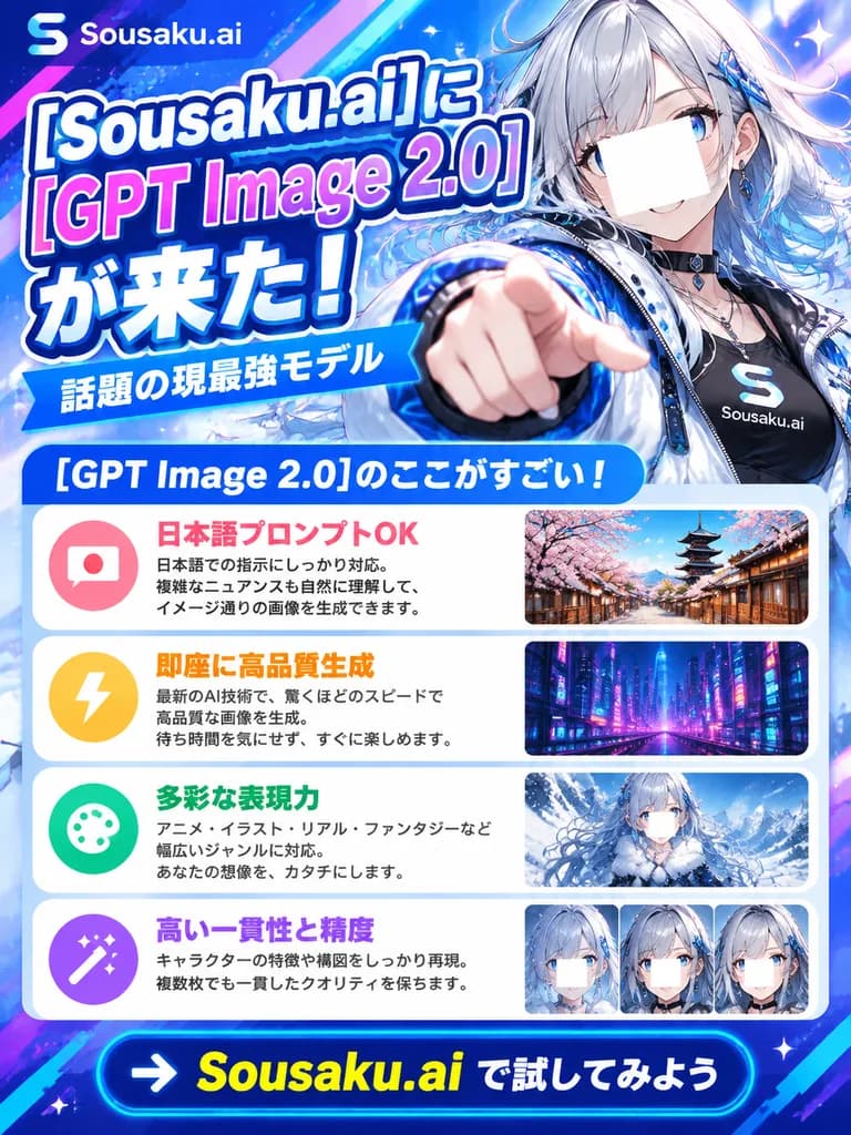
A vibrant vertical Japanese promotional advertisement poster for [Sousaku.ai] announcing [GPT Image 2.0]. Anime-tech commercial art style with bright cyan, blue, purple, pink, and white gradients, sparkling particle effects, lens flares, halftone dot patterns, and dynamic diagonal speed light streaks. On the right side: a half-body anime mascot girl in futuristic streetwear. She has silver-white wavy hair with icy blue highlights, pale skin, blue eyes, and a confident smile, thrusting one hand toward the camera with an outstretched pointing finger in dramatic foreshortened perspective. She wears a glossy white and blue high-tech jacket over a dark inner top, a black choker, layered accessories, and a chest badge bearing an 'S' logo and the text "[Sousaku.ai]". Her face is partly covered by a clean square censor block. On the left side: bold stacked Japanese display typography with thick white outlines and drop shadows reading exactly: "[Sousaku.ai]に", "[GPT Image 2.0]", "が来た!". Below this headline, a blue banner ribbon with white text reading "話題の現最強モデル". Underneath, a rounded blue header box with white text: "[GPT Image 2.0]のここがすごい!". Directly beneath the header, 4 vertically stacked rounded feature cards, each containing a pastel circular icon on the left, Japanese text in the center, and a preview thumbnail on the right: 1. Speech bubble icon with a Japanese flag; pink-red bold text "日本語プロンプトOK" with 3 lines of small explanatory Japanese text; thumbnail showing a traditional Japanese pagoda street with cherry blossoms. 2. Yellow lightning bolt icon; orange bold text "即座に高品質生成" with 3 lines of small Japanese text; thumbnail showing a neon-lit futuristic cyberpunk city. 3. Paint palette icon; green bold text "多彩な表現力" with 3 lines of small Japanese text; thumbnail showing a fantasy anime girl in a snowy landscape with her face lightly obscured. 4. Magic wand icon; purple bold text "高い一貫性と精度" with 2 lines of small Japanese text; thumbnail displaying 3 side-by-side close-up anime character portrait variants with obscured faces. Bottom: a dark blue footer banner featuring a high-contrast call-to-action button reading "→ [Sousaku.ai で試してみよう]", with the brand name in prominent yellow lettering and remaining characters in white. Dense, glossy, high-impact social media layout.

ملصق أنميتصميم ترويجيإعلان تقني
ملصق بورتريه تحريري بطباعة يابانية

ملصق بورتريه تحريري بطباعة يابانية

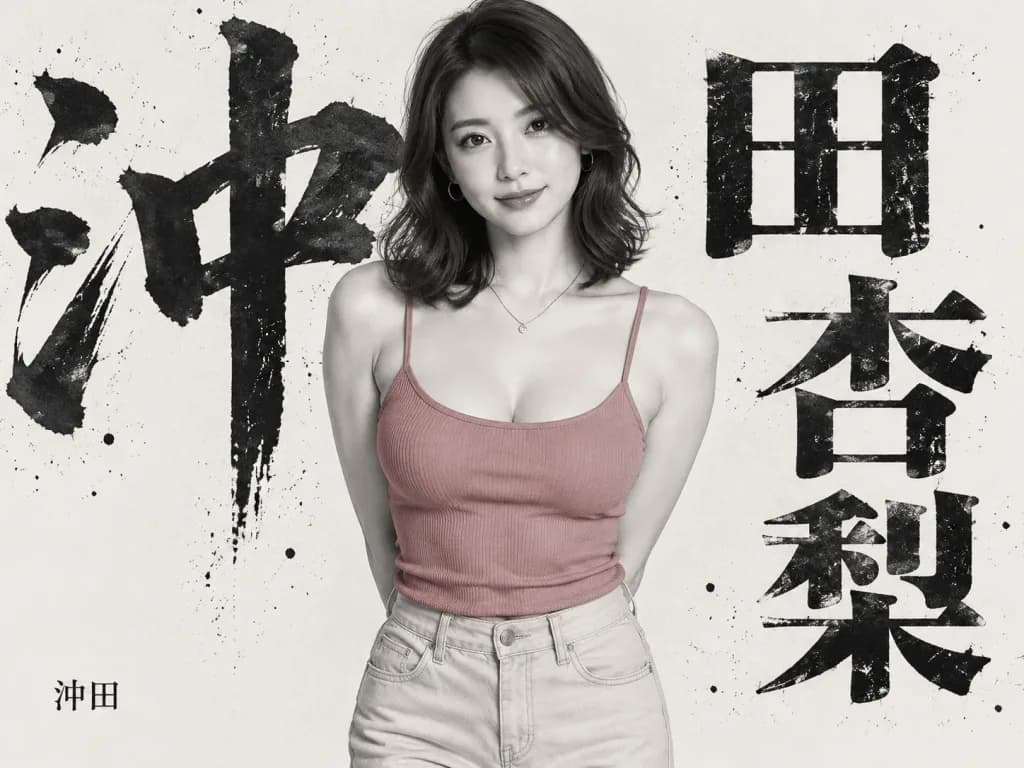
Editorial poster portrait of a Japanese woman, [Anri Okita], standing centered against an off-white studio background, facing the camera with a soft confident smile. She has shoulder-length wavy dark brown hair parted to one side, pale luminous skin, subtle natural makeup, small hoop earrings, and a delicate necklace with a tiny circular pendant. She wears a ribbed dusty-rose camisole with thin straps and high-waisted light beige jeans, hands held behind her back, cropped from head to upper thighs. Style: selective color photography, mostly monochrome black-and-white with only the camisole softly tinted muted rose and the jeans warm beige. Background: oversized distressed black-ink Japanese typography partially concealed behind her figure, featuring a giant brush-calligraphy character on the left reading "[沖]", two large block characters on the right reading "[田 杏梨]", and a small printed signature at bottom left reading "[沖田]". Grunge ink speckles, strong graphic contrast, sharp studio portrait lighting, high-end magazine cover aesthetic, clean minimal composition.

بورتريه تحريريطباعة يابانيةملصق خط
واجهة دردشة ذكاء اصطناعي مع نماذج إعلانية

واجهة دردشة ذكاء اصطناعي مع نماذج إعلانية

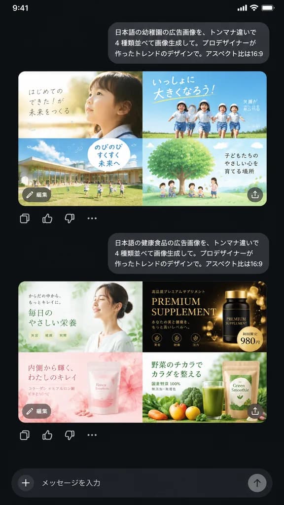
A realistic dark-mode smartphone chat interface screenshot displaying two Japanese prompt-and-response exchanges about generative ad design against a nearly black background. At the top right, a rounded light-gray user bubble contains the exact Japanese text: 「日本語の幼稚園の広告画像を、トンマナ違いで4種類並べて画像生成して。プロデザイナーが作ったトレンドのデザインで。アスペクト比は16:9」. Directly beneath it is a rounded rectangular image preview showing a 2x2 grid of kindergarten advertisement layouts in soft pastel tones: top-left features a soft, airy layout with a close-up profile of a young child in morning sunlight and handwritten Japanese copy; top-right features an energetic outdoor ad with four children running under a blue sky with bold typography; bottom-left shows a modern kindergarten campus building with children on a grass lawn and a speech-bubble text box; bottom-right shows an illustrated large green tree with children and parents under a sky-blue background. Overlaid on this preview are a small gray circular button labeled 「編集」 at the bottom-left and an upload/share icon at the bottom-right, followed by a row of four action icons below: copy, thumbs up, thumbs down, and more options. Further down, a second right-aligned bubble displays: 「日本語の健康食品の広告画像を、トンマナ違いで4種類並べて画像生成して。プロデザイナーが作ったトレンドのデザインで。アスペクト比は16:9」. Beneath it is a second 2x2 grid preview of health food ads: top-left shows an airy minimalist wellness ad with a woman and pale green accents; top-right shows a luxurious black-and-gold supplement ad with gold particles, serif typography, and a price badge showing [980円]; bottom-left shows a soft pink beauty supplement with translucent floral textures; bottom-right shows a green juice smoothie with fresh vegetables and product packaging. High-resolution mobile UI layout with crisp Japanese typography and generous vertical spacing.

تصميم واجهاتتطبيق هاتفالوضع الداكن
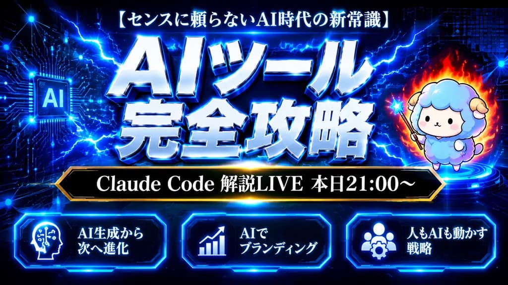
صورة مصغرة لندوة عبر الإنترنت بنمط سيبراني ياباني

صورة مصغرة لندوة عبر الإنترنت بنمط سيبراني ياباني

A Japanese YouTube thumbnail design in a dark futuristic cyber-tech style, 16:9 landscape composition. Background is deep navy-to-black filled with glowing electric-blue circuit board patterns, connected network nodes, digital grid squares, and energetic lightning arcs. At top center, a small white Japanese headline reads "[センスに頼らないAI時代の新常識]". In the center, a massive two-line Japanese title in metallic silver-white beveled 3D typography with an intense neon-blue outer glow and crackling lightning reads "[AIツール 完全攻略]". Beneath the main title, a sleek black horizontal banner with a thin gold border contains white serif Japanese text reading "[Claude Code 解説LIVE 本日21:00〜]". On the right side, a cute chibi sheep mascot with fluffy pastel blue and lavender wool, tiny horns, simple dot eyes, and a neutral expression stands on a glowing blue circular pedestal, holding a small wand, surrounded by a subtle red-orange flame aura. Across the bottom, three evenly spaced futuristic rounded rectangular dark panels with glowing blue neon borders: the left panel displays a white silhouette head-with-circuits icon and text "[AI生成から次へ進化]", the center panel displays an upward trend chart icon and text "[AIでブランディング]", and the right panel displays a user-group with gear icon and text "[人もAIも動かす戦略]". High contrast, glossy metallic finishes, vibrant blue rim lighting, and subtle lens flares.
صورة مصغرة لليوتيوبسايبربانكندوة عبر الإنترنت
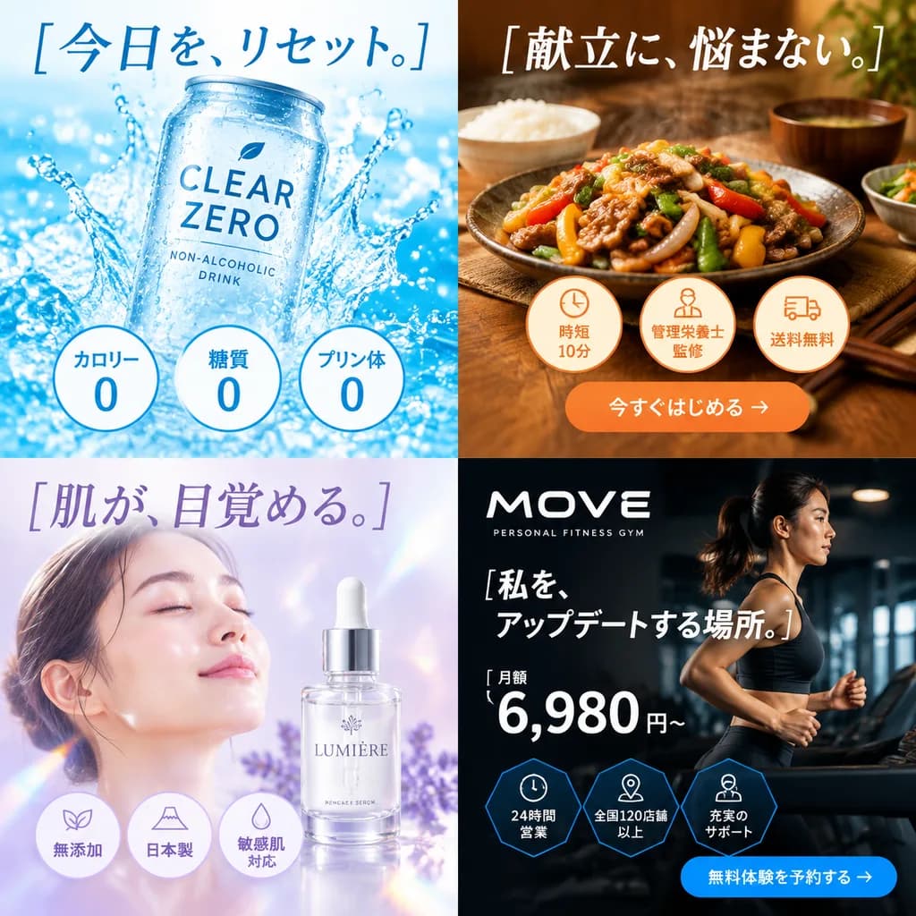
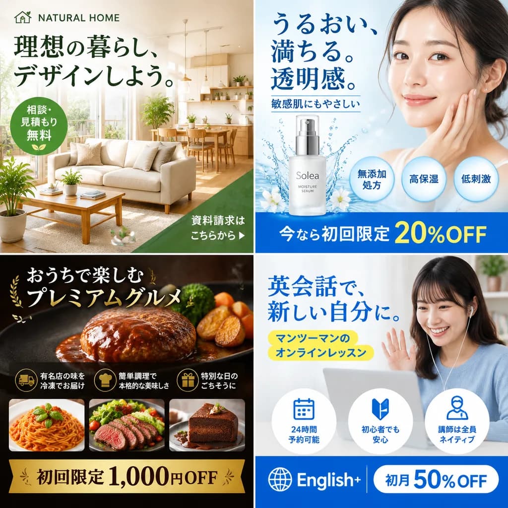
شبكة إعلانات البانر اليابانية

شبكة إعلانات البانر اليابانية

2x2 grid of Japanese web banner advertisements. 4 equal square panels. top-left. beverage. clear can of non-alcoholic drink named 'CLEAR ZERO'. splashing water droplets, bright light blue background, ultra-refreshing aesthetic. [今日を、リセット。]…
بنر ويبتصميم إعلانيطباعة يابانية
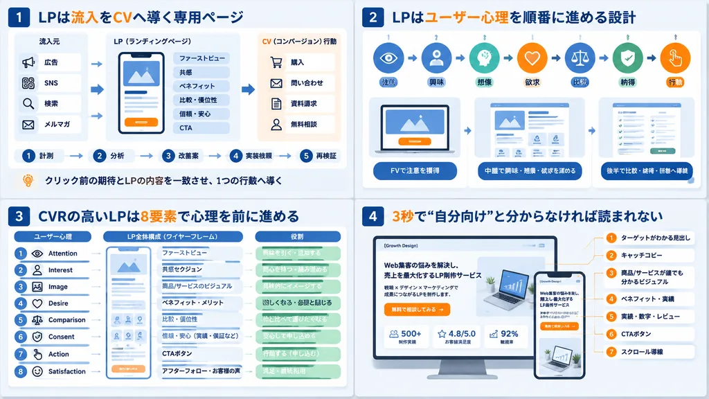
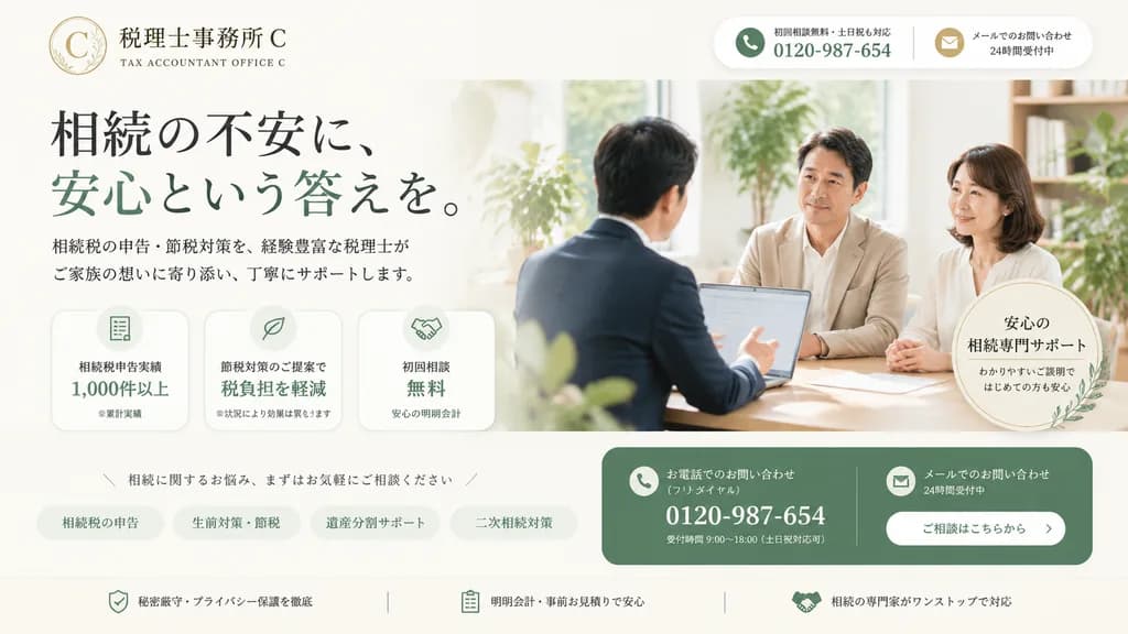
واجهة صفحة هبوط لمكتب ضرائب المواريث في اليابان

واجهة صفحة هبوط لمكتب ضرائب المواريث في اليابان

Clean, premium Japanese landing page hero image for a fictional tax accountant office specializing in inheritance tax consultation, wide desktop website layout. The background is soft ivory and warm white with muted sage green and refined gold accent colors. Top left: a delicate circular logo with a thin gold ring, serif letter "[C]", and botanical line illustration, accompanied by Japanese text "税理士事務所 [C]" and English subtitle "TAX ACCOUNTANT OFFICE [C]". Top right: a rounded white header contact bar split into two blocks: a phone block with a green circular phone icon, small text "初回相談無料・土日祝も対応", and large bold number "[0120-987-654]"; and a mail block with a gold circular mail icon and text "メールでのお問い合わせ 24時間受付中". Main left section: prominent headline in elegant serif Japanese typography reading "相続の不安に、安心という答えを。", with the phrase "安心という答えを。" in sage green. Below it, supporting text reads "相続税の申告・節税対策を、経験豊富な税理士がご家族の想いに寄り添い、丁寧にサポートします。" Underneath are three rounded horizontal feature cards with pale backgrounds and green line icons: card 1 shows a document icon with "相続税申告実績 1,000件以上" and a tiny note "※累計実績"; card 2 shows a bar chart icon with "節税対策のご提案で 税負担を軽減" and note "※状況により効果は異なります"; card 3 shows a group icon with "初回相談 無料" and note "安心の明朗会計". Right half: realistic bright photo-style consultation scene in a sunlit modern office with indoor greenery; 3 Japanese adults around a meeting table, showing a male advisor in a navy suit seen from behind facing two attentive clients (a middle-aged man in a beige jacket and a woman in a white blouse), with an open laptop on the desk. Overlaid near the bottom right of the photo is a pale circular badge with leaf ornamentation reading "安心の 相続専門サポート わかりやすいご説明ではじめての方も安心". Across the lower middle: a slim invitation line "/ 相続に関するお悩み、まずはお気軽にご相談ください /" above four rounded category pill tabs: "相続税の申告", "生前対策・節税", "遺産分割サポート", and "二次相続対策". Bottom right: a large rounded sage green CTA block split into two columns: phone inquiries with white phone icon, text "お電話でのお問い合わせ(フリーダイヤル)", number "[0120-987-654]", and note "受付時間 9:00〜18:00(土日祝対応可)"; and mail inquiries with white mail icon, text "メールでのお問い合わせ 24時間受付中", and a white button reading "ご相談はこちらから". Across the bottom: a reassurance strip with three items separated by thin vertical lines: shield icon with "秘密厳守・プライバシー保護を徹底", clipboard icon with "明朗会計・事前お見積りで安心", and handshake icon with "相続の専門家がワンストップで対応". Polished commercial web design, subtle drop shadows, calm, trustworthy atmosphere.

صفحة هبوطتصميم ويبتصميم واجهات
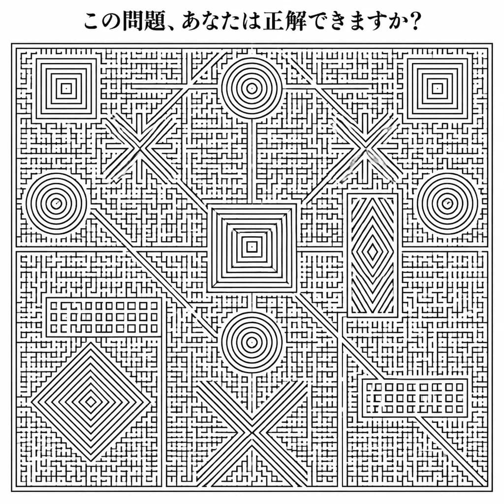
ملصق متاهة أحادي اللون فائق الكثافة

ملصق متاهة أحادي اللون فائق الكثافة

A square black-and-white puzzle poster in the style of an extremely intricate hand-drawn notebook maze, executed in clean monochrome black ink on white paper. At the top center, a bold Japanese headline reads "[この問題、あなたは正解できますか?]" set in an elegant Mincho-style serif font. Below the header, nearly the entire page is filled with a massive rectangular maze framed by a thin double-line border, constructed from thousands of tiny orthogonal corridors, micro-grid strokes, dead ends, and tight right-angle turns. Embedded seamlessly within the dense maze field are 15 distinct larger geometric motifs: 4 concentric square spiral targets, 3 circular spiral targets, 2 large X-shaped starburst structures, 1 tall rectangular diamond/chevron block, 1 central nested-square pyramid structure, 1 large asymmetric diamond spiral in the lower-left quadrant, 1 large diagonal crossing X near the bottom center, and 2 horizontal ladder-grid blocks. Faint, straight divider corridors run horizontally and vertically across the maze, intersected by subtle diagonal corridors, while keeping every zone packed with dense, solvable-looking paths. Centered composition, crisp high-contrast scan aesthetic, strictly black line art on pure white, with no color, shading, gradients, characters, or illustrations.

لغز متاهةمتاهةأحادي اللون
تصميم احتفال بإنجاز المتابعين باليابانية

تصميم احتفال بإنجاز المتابعين باليابانية

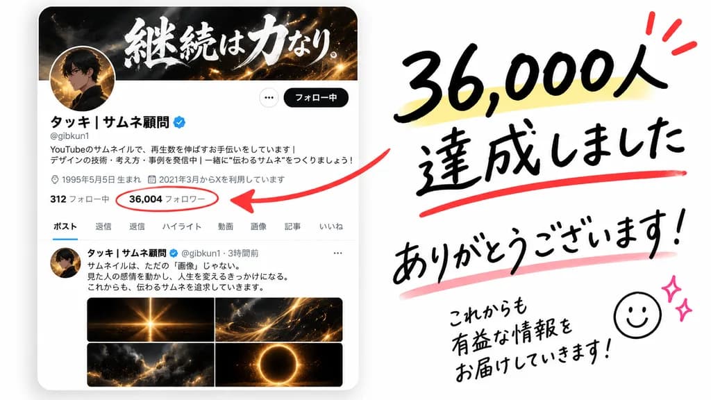
A clean celebratory social media milestone graphic on a soft white background, featuring an X profile card mockup on the left and expressive handwritten annotations on the right. Left side: realistic mobile UI profile card with subtle drop shadow, dark header banner with dramatic white brush-calligraphy Japanese text, circular avatar overlapping the banner, display name “[タッキ | サムネ顧問]” with a blue verification badge, handle “[@gibkun1]”, standard UI font Japanese bio text, birth date, join date, and a stats row with “[36,004 フォロワー]” circled in red marker. Profile tabs read exactly: “ポスト”, “返信”, “ハイライト”, “動画”, “画像”, “記事”, “いいね”. Below the tabs is a post preview with a small avatar, Japanese text, and a 2x2 grid of glowing abstract thumbnails in black, gold, and orange. Right side: bold casual brush-pen Japanese lettering in black reading “[36,000人 達成しました]” with a pale yellow highlight under the number, a red underline under the second line, and 3 red celebration accent marks above. A thick hand-drawn red arrow points from the right text toward the circled follower count. Beneath, handwritten “[ありがとう ございます!]” with a soft pink underline, followed in the lower right by smaller handwritten text reading “[これからも 有益な情報を お届けしていきます!]” with a simple smiley doodle and two small pink sparkle doodles.

تواصل اجتماعيإنجازخط ياباني
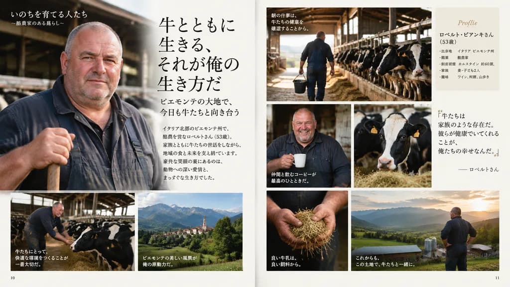
كتاب صور ياباني احترافي للشخصية

كتاب صور ياباني احترافي للشخصية

A professionally designed Japanese photo book spread featuring [the character from the reference photo]. The editorial layout includes multiple photo cuts across varied, richly detailed scenes, accompanied by elegant Japanese typography, captions, and page numbers. High-end magazine aesthetic, balanced graphic design composition, sophisticated lighting, clean editorial typography, and high information density.

ألبوم صورتنسيق تحريريتصميم جرافيكي
ملصق خبير الذكاء الاصطناعي بنمط تقني ياباني

ملصق خبير الذكاء الاصطناعي بنمط تقني ياباني

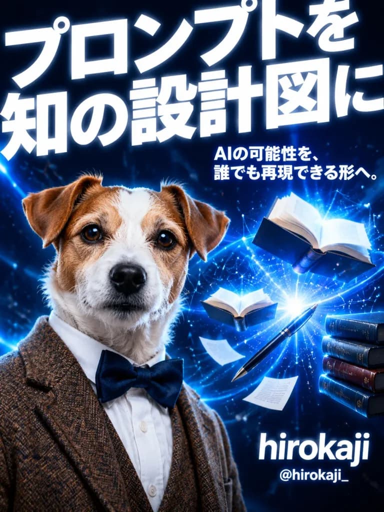
A dramatic vertical promotional poster in a cinematic Japanese tech-advertising style, set against a deep navy-to-black background with electric blue highlights, glowing particles, lens flares, and digital network lines. Layout and Composition: - Top background: A massive, bold white Japanese headline dominates the top half, cropped by the canvas edges: "[プロンプトを知の設計図に]". - Center-right: A smaller bold white Japanese tagline: "[AIの可能性を、誰でも再現できる形へ。]". - Lower-left foreground: A realistic anthropomorphic Jack Russell terrier with a white face, tan ears and patches, looking directly at the viewer with a serious, intelligent expression. The dog is dressed like a scholar in a brown tweed blazer, crisp white collared dress shirt, and navy blue bow tie. - Middle-to-lower right: Magical AI knowledge motif featuring 2 open floating books (one larger near the upper-right, one smaller near mid-right), a stack of 4 books at the far right edge, a single black pen floating diagonally, 2 loose flying white sheets of paper, and a bright blue-white energy burst with sweeping light trails and constellation-like nodes. - Lower-right: Clean typography displaying the name in large lowercase white Latin letters: "[hirokaji]", with the handle below in smaller bold white text: "[@hirokaji_]". Style and Lighting: Photorealistic subject rendering with cinematic sci-fi commercial aesthetics, intense high contrast, sharp focus, glossy finish, and electric blue volumetric glow. All typography is crisp white.

ملصق تقنيطباعة يابانيةكلب مجسم
إنفوجرافيك ياباني مبسط لقراءة الكف

إنفوجرافيك ياباني مبسط لقراءة الكف

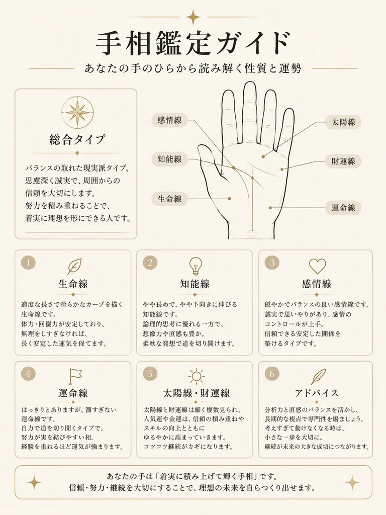
elegant Japanese palm reading guide infographic. minimal premium editorial design, warm off-white paper background, thin black and beige line art, soft rounded cards, delicate gold accents, calm fortune-telling aesthetic, clean margins. [総…

قراءة الكفإنفوجرافيكتصميم تحريري
ملصق توكيدات وقت النوم مع الخروف الياباني

ملصق توكيدات وقت النوم مع الخروف الياباني

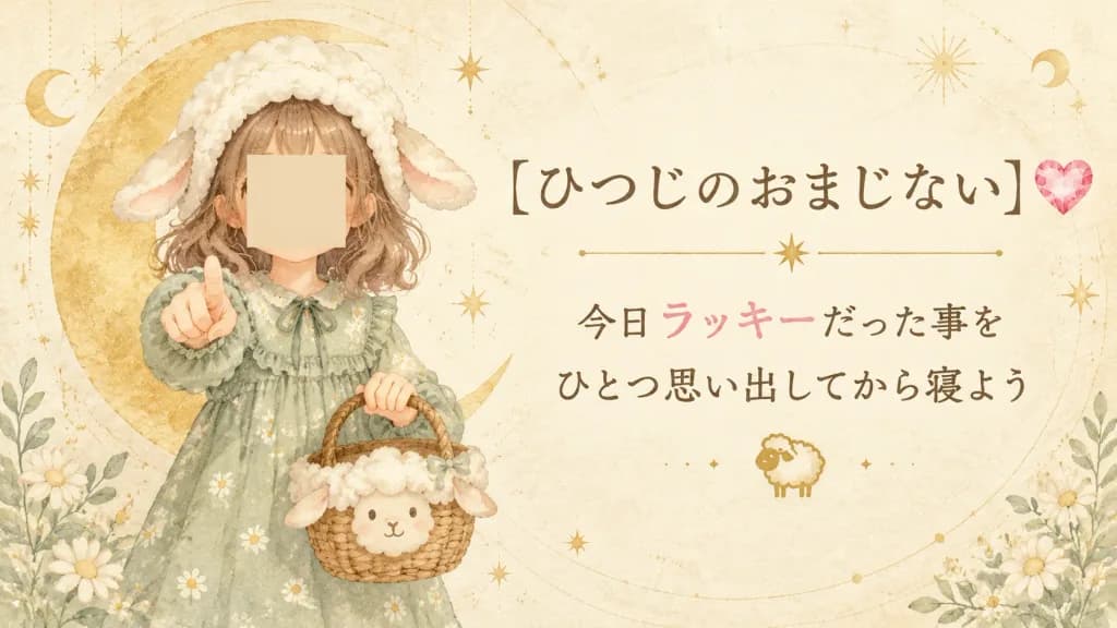
A soft Japanese storybook-style good-luck charm poster themed around sheep magic and bedtime gratitude. Horizontal 16:9 composition. Setting & Background: Warm ivory parchment background with delicate watercolor paper texture, faint circular astrological orbit lines, subtle gold speckles, and dreamy celestial accents. Small white daisies and pale sage-green foliage accent the lower corners. Subject & Layout: On the left third, one young girl stands facing forward, reaching one hand toward the viewer with an index finger pointing outward. In her other hand, she holds a woven wicker basket decorated with a cute sheep face and white wool trim. She has wavy shoulder-length light brown hair, a fluffy white sheep hood with two floppy ears, and a pale sage-green long-sleeved dress with tiny white daisy prints and gentle ruffles. Her face is covered by a plain skin-toned square with no facial features. Behind her stands a large golden crescent moon. Typography & Right Side: The right two-thirds features elegant Japanese typography with a calligraphy feel. Centered title in the upper right: "[ひつじのおまじない]" followed by a single pink faceted heart gem on the right. Beneath the title is a thin gold horizontal divider line with a small star in the middle. Centered message below in two lines: line 1 "[今日ラッキーだった事を]", line 2 "[ひとつ思い出してから寝よう]". The word "ラッキー" is highlighted in soft pink, while the remaining text is dark warm brown. A tiny gold sheep icon is centered beneath the message. Style & Atmosphere: Soft watercolor anime picture-book illustration, low contrast, gentle beige and gold tones, airy magical bedtime mood, crisp and legible Japanese typography.

ملصقألوان مائيةكتاب مصور
شريحة غلاف عرض مقترح B2B صناعي ياباني

شريحة غلاف عرض مقترح B2B صناعي ياباني

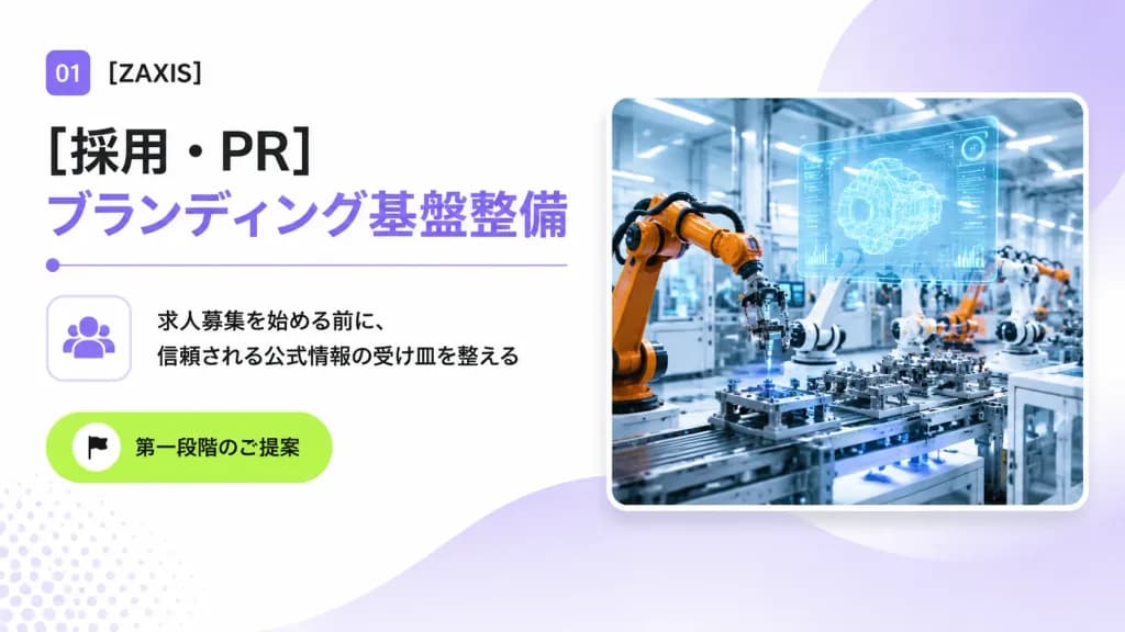
A clean 16:9 Japanese corporate B2B proposal cover slide for an industrial automation and engineering company, designed with a modern consulting deck aesthetic, generous whitespace, and subtle tech accents. Layout and Content: - Top-left: A small rounded purple square badge displaying white text "01", followed by the company name "[ZAXIS]" in crisp black sans-serif typography. - Main Headlines: Directly below, a large bold black Japanese headline reading "[採用・PR]", stacked above a matching large bold lavender headline reading "[ブランディング基盤整備]". Underneath the headlines is a thin lavender horizontal dividing line with a small circular dot on its left edge. - Middle-left: A rounded square outline card containing a minimalist lavender community/people icon. Directly to its right are two lines of black Japanese body copy: "[求人募集を始める前に、]" and "[信頼される公式情報の受け皿を整える]". - Lower-left: A vibrant lime-green rounded pill button featuring a small white circle with a black flag icon and the Japanese text "[第一段階のご提案]". - Right half: A large rounded-corner photo card with a soft drop shadow and a thin white border, depicting a brightly lit futuristic smart factory floor with orange and white robotic arms assembling precision parts, blue-tinted machinery, and a glowing translucent holographic CAD interface floating above the workstation. Background and Atmosphere: Bright white background with soft lavender gradient washes, a large semi-transparent lavender circular gradient behind the photo card in the upper-right, a gentle lavender wave shape flowing from bottom-center toward the right, and a subtle pale lavender halftone dot pattern in the lower-left corner. Crisp, professional, polished corporate presentation slide.

شريحة عرضمقترح b2bطباعة يابانية
شريحة عرض مفهوم البيضة الذهبية باللغة اليابانية

شريحة عرض مفهوم البيضة الذهبية باللغة اليابانية

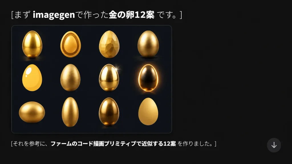
A modern presentation slide and social media graphic in 16:9 format on a dark charcoal-black background (#181818) with generous negative space on the right. Top left text features clean Japanese typography reading: "[まず imagegenで作った金の卵12案 です。]" with "imagegen" and "金の卵12案" in bold white and remaining characters in regular white. Below the headline on the left sits a dark navy-black rounded rectangular card with a subtle border and soft drop shadow. Inside the card is a 4-column by 3-row grid showing 12 distinct [golden egg] concept renderings: 1) glossy smooth upright gold egg with bright highlight, 2) stylized oval egg with a raised rim icon outline, 3) low-poly faceted gemstone egg, 4) smooth metallic egg on a soft contact shadow, 5) flat bright yellow-gold egg with bold white highlight, 6) textured brushed-gold egg, 7) polished reflective egg with a sparkle star flare, 8) dark luminous egg with vivid rim lighting, 9) wide squat golden egg, 10) elongated tall slender gold egg, 11) deep bronze-gold reflective egg, 12) minimalist matte yellow-gold egg silhouette. Lower left text reads: "[それを参考に、ファームのコード描画プリミティブで近似する12案 を作りました。]" with the central clause in bold white. A semi-transparent circular down-arrow UI button floats near the lower right.

عرض تقديميشريحةإنفوجرافيك
ورقة مفهوم شخصية روبوت بأسلوب مانغا قديم

ورقة مفهوم شخصية روبوت بأسلوب مانغا قديم

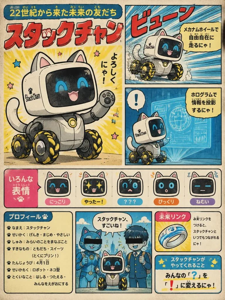
Using the reference photos as the base design for the small StackChan wheeled robot, transform it into a cheerful retro Japanese manga/anime concept sheet for a cute "friend from the future." Keep the recognizable white cube head, black screen face, side StackChan label, gray body, and black/yellow mecanum wheels, but stylize everything as hand-drawn 1970s–1980s children’s manga with ink outlines, halftone dot texture, warm cream paper, and slightly faded print colors. Character features: A full-page character introduction poster for [StackChan], presented as a futuristic robot-cat companion that turns "?" into "!". Add cat ears, a cat tail, a friendly animated face on the screen, and playful manga energy. Layout: A vintage Japanese magazine/comic-book character encyclopedia page layout with exactly 8 main content areas: 1. Large hero illustration on the left: the robot-cat waving happily, with the title above. 2. Top-right action panel: the robot moving fast on its mecanum wheels with dynamic speed lines and the sound effect 「ビューン」. 3. Middle-right feature panel: the robot projecting a blue hologram information display, with an exclamation mark speech bubble 「!」. 4. Expression strip: exactly 5 small face-expression icons labeled in Japanese — happy, yay, confused with a question mark, surprised, and sleepy. 5. Lower-left profile box with bullet-point character facts. 6. Bottom-center cameo panel: two blue robotic-cat and schoolboy-inspired silhouettes with black censor bars over their eyes standing beside StackChan, with a speech bubble saying 「スタックチャン、すごいね!」. 7. Lower-right secret gadget card featuring a futuristic ring-shaped device labeled 「未来リンク」. 8. Bottom-right concept message box explaining that the character turns everyone’s 「?」 into 「!」. Text and Typography: Retro Japanese typography with furigana-style small kana. Main headline reads 「[22世紀から来た未来の友だち]」. Big bold red title reads 「[スタックチャン]」. Hand-lettered Japanese captions explain mecanum wheel locomotion, holographic projection, and the "Future Link" gadget. Style: Scanned vintage manga character guide page, bold red headline lettering, cream background, colorful blue/pink/yellow accent panels, thick black panel borders, and visible print grain.

مانغا قديمةتصميم شخصياتفن المفاهيم
ملصق ساخر لمدينة ملاهي غابات يابانية

ملصق ساخر لمدينة ملاهي غابات يابانية

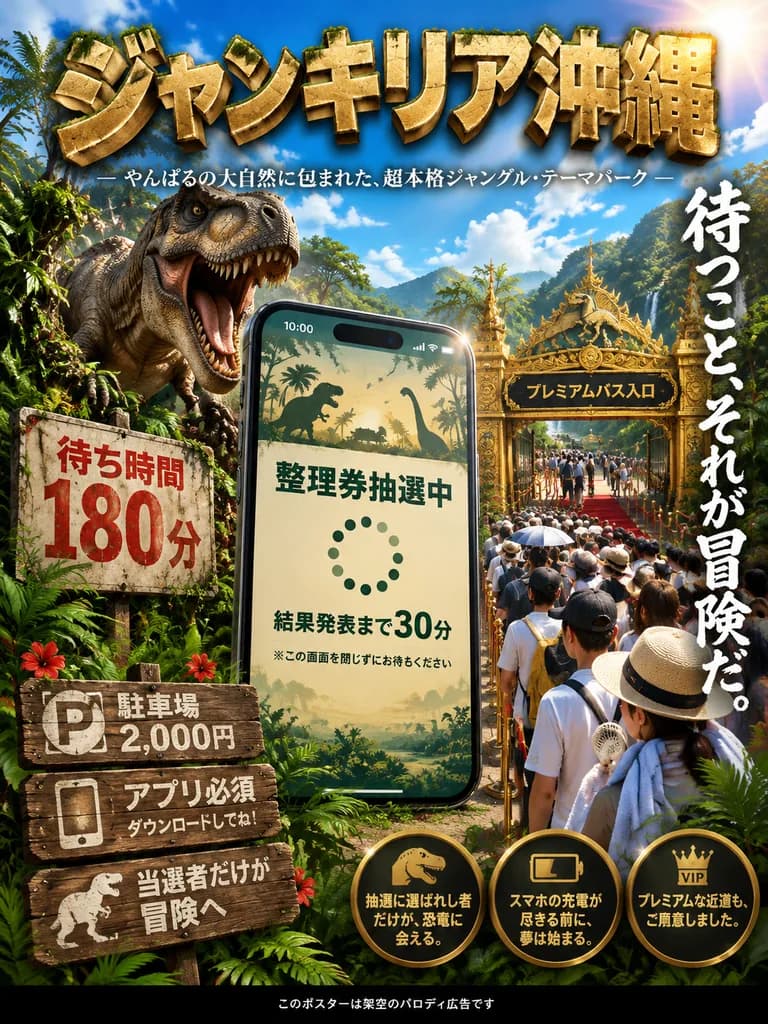
A vertical satirical Japanese theme park advertisement poster set in a lush tropical jungle under a vivid blue sky with scattered clouds and bright golden sunlight flaring from the upper right. High-contrast cinematic photorealism with glossy tropical foliage framing the foreground. At the top, a massive three-dimensional stone-textured gold Japanese headline reads "[ジャンキリア沖縄]", underscored by a delicate white tagline reading "— やんばるの大自然に包まれた、超本格ジャングル・テーマパーク —". In the center foreground, an enormous modern smartphone stands upright like a monument, slightly tilted; its screen displays a digital lottery queue interface featuring safari silhouette headers, bold Japanese text "整理券抽選中", a dotted spinner, "結果発表まで30分", and a small warning "※この画面を閉じずにお待ちください", with 10:00 on the status bar. To the left midground, a roaring Tyrannosaurus rex breaks through dense vines behind an aged concrete wait-time sign reading "待ち時間 180分" in bold red text. To the right midground, a lavish ornate gold gateway rises above the canopy with a black sign reading "プレミアムパス入口" over a red-carpeted VIP queue. Stretching from the foreground into the deep background is a massive queue of tired summer tourists equipped with sun hats, towels, neck fans, and parasols along rope stanchions. In the bottom left, three rustic stacked wooden signs show "駐車場 2,000円" with a parking glyph, "アプリ必須 ダウンロードしてね!" with a phone glyph, and "当選者だけが冒険へ" with a dinosaur silhouette. Down the right side runs large vertical white brush-script text reading "[待つこと、それが冒険だ。]". Near the bottom right, three circular gold badge callouts display icons and copy: dinosaur icon with "抽選に選ばれし者だけが、恐竜に会える。", low-battery icon with "スマホの充電が尽きる前に、夢は始まる。", and VIP icon with "プレミアムな近道も、ご用意しました。". Bottom center has a discreet black footer strip reading "このポスターは架空のパロディ広告です". Crisp, sharp typography with warm rim lighting.

محاكاة ساخرةملصقمدينة ملاهي
صورة مصغرة لليوتيوب لعبور الحدود

صورة مصغرة لليوتيوب لعبور الحدود

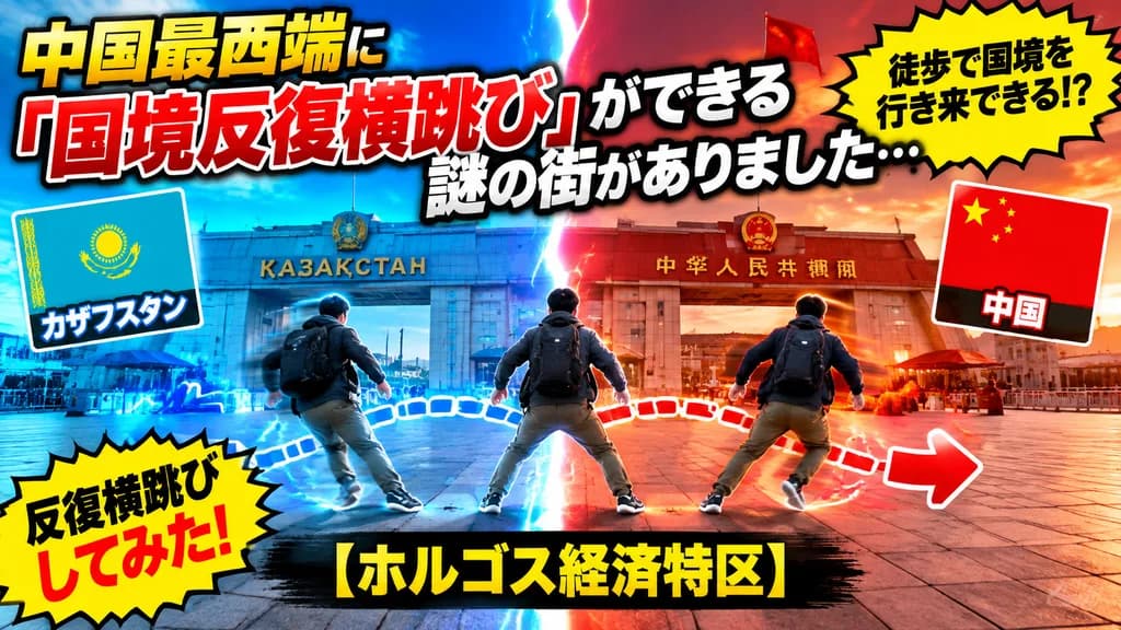
High-impact Japanese YouTube thumbnail based on the border-gate landmark and plaza setting from the reference photo. A vertical glowing lightning split runs directly down the center: the left side bathed in blue for Kazakhstan, and the right side in vibrant red/orange for China. In the foreground, a male traveler seen from behind with a backpack is depicted in three repeated motion frames showing a rapid back-and-forth border jump, accented by blue and red dashed trajectory lines and prominent left/right directional arrows. Prominent, bold Japanese YouTube thumbnail typography in yellow, white, and red with heavy black outlines and thick drop shadows. Includes two flag graphic cards: the Kazakhstan flag on the left labeled “カザフスタン” and the Chinese flag on the right labeled “中国”. Two jagged yellow comic explosion callout badges: top-right reading “徒歩で国境を行き来できる!?” and bottom-left reading “反復横跳びしてみた!”. The main headline text reads “中国最西端に「国境反復横跳び」ができる 謎の街がありました…” and the bottom caption reads “【ホルゴス経済特区】”. Vibrant saturated colors, cinematic contrast, dynamic viral travel video aesthetic, 16:9 aspect ratio.

صورة مصغرة لليوتيوبفيديو سفرعبور الحدود
ملصق إعلاني ياباني لمشروب رياضي

ملصق إعلاني ياباني لمشروب رياضي

Horizontal 16:9 Japanese sports drink advertising poster in a photorealistic commercial style, capturing energetic hydration after exercise. - Composition & Layout: The left side features large typography. The center foreground showcases a crisp hero shot of a transparent plastic sports drink bottle held toward the camera. On the right, a young female athlete is shown from the chest up wearing a blue-and-white sports jersey with her hair in a windswept ponytail; her face is covered by a plain skin-toned rectangular censor block. Dynamic, glossy blue water splashes and ice condensation frame the bottom and right edge. A circular blue callout badge sits over the water splash on the right, and a bold blue banner spans the bottom edge. - Subject & Details: The athlete stands outdoors under bright sunlight with backlit hair glow. The clear bottle features condensation beads, carbonation bubbles, a vibrant blue cap, and a label displaying Japanese text, water-splash graphics, and English text reading "AOI SPORTS DRINK". - Setting & Lighting: Sunny outdoor sports stadium with blurred crowd seating in the background, blue sky with soft white clouds, intense summer sunlight, and subtle lens flare. - Text Content & Typography: 1. Main headline (large, dark blue text on the left): "[あおい]" 2. Category line directly below headline: "[スポーツドリンク]" 3. Handwritten-style tagline: "[今日の頑張りに、まっすぐな水分補給を。]" 4. Three hexagonal feature badges on the lower-left area, ordered left to right: "[塩分補給]", "ミネラル配合", "すっきり低カロリー" 5. Bottom horizontal banner copy: "運動時の水分補給に最適!" 6. Circular callout copy on the right: "[すっきり爽快!]" - Constraints: Crisp commercial product photography, bold and legible typography, high contrast, vivid blue-and-white color palette. No extra badges, extra products, or unlisted logos.

مشروب رياضيملصقإعلان تجاري
شعار ترويجي لفرقة روك أنمي

شعار ترويجي لفرقة روك أنمي

High-energy Japanese promotional web banner styled as an anime idol rock concert poster, in a 2:1 wide horizontal aspect ratio. Typography: Upper third features large, bold Japanese headline text in thick glossy white lettering with a heavy black drop shadow: "[ChatGPTによる画像生成が\n大幅アップデート!]". Centered directly below in smaller bold white text with a black outline: "[GPT-Image-2が無料で使える]". Typography is oversized, crisp, legible, and dominant. Characters & Layout: Arranged left to right across the bottom half are exactly 5 anime-style band members: 1. Far left: Blue-haired keyboardist with long blue hair and white blouse behind a synthesizer, face masked with a soft rectangular blur. 2. Left of center: Pink twin-tailed idol singer in a frilly pink dress with flower hair accessories, singing into a microphone with a bright, fully visible smiling face. 3. Center: Golden-yellow-haired drummer/front idol in a yellow cropped jacket and star accessories, smiling widely with drumsticks raised in front of a drum set, fully visible face. 4. Right of center: Dark green-haired bassist in a black-and-green stage outfit holding a bass guitar, face masked with a soft rectangular blur. 5. Far right: Black-haired guitarist in a gothic black-and-purple strap outfit holding an electric purple guitar, face masked with a soft rectangular blur. Background & Setting: A festive concert stage with a glowing abstract swirl knot logo centered behind the idols, encircled by a brilliant golden circular halo. Flanking the stage are futuristic display panels: neon control interface rings on the left screen, and colorful AI image-generation art previews on the right screen. Stage spotlights, floating musical notes, glowing star particles, confetti sparkles, bokeh dots, and dynamic diagonal lens flares fill the scene. Style & Color: Vibrant anime digital illustration, high contrast, glossy finish, saturated palette of neon pink, radiant gold, deep purple, and electric blue, dramatic concert backlighting.

لافتة أنميملصق حفلةطباعة يابانية
صورة مصغرة سايبربانك زرقاء نيون لمونتاج الفيديو

صورة مصغرة سايبربانك زرقاء نيون لمونتاج الفيديو

A bold Japanese YouTube thumbnail with futuristic neon-blue cyberpunk styling, wide 16:9 composition. Dark electric-blue background filled with glowing circuit traces, digital light streaks, lens flares, and high-energy motion lines. In the upper left, a slanted glowing banner contains the Japanese text "[初心者でもできる]", with the first section in bright yellow and the remaining letters in white. Dominating the left and center, a massive headline in 3D beveled white lettering with thick blue neon outer glow and forward italic perspective reads "AI×" stacked directly above an even larger "動画編集". In the upper right, a circular holographic HUD interface displays concentric rings, micro-markings, and centered letters "[AI]". Floating nearby are exactly 3 glowing blue icons: a play symbol, a square "Pr" logo, and an audio waveform. A tall solid blue vertical rectangle sits near the top center-right as a placeholder block. Across the lower right, a sleek angled video editing monitor previewing a neon city night road scene with a translucent play icon; beneath the preview is a digital timeline with 4 visible tracks: 2 rows of video thumbnails and 2 colored audio bars (one magenta, one cyan-green). Along the bottom, exactly 3 glowing rounded pill badges with icons and Japanese text: 1. A book icon with "知識ゼロOK" 2. A clock icon with "時短でカンタン" 3. A sparkle icon with "プロ級の仕上がり" Polished, high-contrast, modern tech aesthetic engineered for high click-through rate.

صورة مصغرة يوتيوبسايبربانكمونتاج فيديو
ملصق صفحة هبوط ياباني نيون لبيئة تطوير ذكاء اصطناعي

ملصق صفحة هبوط ياباني نيون لبيئة تطوير ذكاء اصطناعي

A polished Japanese promotional landing-page style poster for [1min.ai Client], advertising a futuristic AI IDE for developers, vertical 4:5 composition. Dark navy-to-black gradient background with subtle stars, particles, purple neon glow, and electric blue radial lighting accents. - Top hero section: Top-left Japanese tagline 「AIと、1分でつくる。未来の開発体験。」. Below it, a large glowing title "[1min.ai Client]" in bold white with a purple aura. Subheadings below: 「あなたの “作りたい” を、すぐにカタチに。」 and 「コード生成・編集・実行まで、すべてを1つのAI IDEで。」. Top right features a rounded square purple app icon displaying "1m" in white, labeled "[1min.ai Client]" and subtitle "Monaco + Custom UI". - Central mockup: Centered dark glassmorphism desktop IDE app window with rounded corners and glowing purple-blue border. Shows 4 distinct regions: vertical icon sidebar, file tree explorer panel, central code editor with syntax-highlighted code and line numbers, and a right-side "AI Agent" chat assistant panel with Japanese helper prompts and a purple execute button. - Feature row: Beneath the mockup, a centered Japanese headline 「コードもアイデアも、AIと一緒に、すぐ形に。」 with a thin purple neon underline. Below are 5 horizontal feature cards separated by faint vertical dividers: 1) code brackets icon, 「AIコーディング」; 2) folder icon, 「直感的なUI」; 3) robot icon, 「高性能AIエージェント」; 4) lightning bolt icon, 「すぐに試せる」; 5) lock icon, 「安心・安全設計」. - Call-to-action card: Wide rounded rectangle with neon purple glow. Left side features a glowing stopwatch icon labeled "1m". Right side displays the bold headline 「開発時間を、1分に近づける。」, subtext 「1min.ai Client が、あなたの創造を加速させます。」, three checkmarked bullets (「アイデアをすぐに試したい」, 「繰り返し作業を効率化したい」, 「もっと創造的な開発に集中したい」), text 「そのすべてを、1つのAI IDEで。」, and a vibrant purple-to-pink gradient button reading 「今すぐはじめる →」. - Footer: Dark strip at the bottom. Left shows a crisp QR code block with text "[1min.ai Client]" and "Monaco + Custom UI". Center displays three badge items with icons: monitor icon 「Windows 対応」, gear icon 「カスタマイズ自在」, star icon 「進化し続ける」. Bottom center text reads 「詳細・ダウンロード・ドキュメントはこちら」 followed by "[https://1min.ai]". Bottom right note: 「※画面は開発中のものです。」. Visual style: Sleek dark neon cyberpunk SaaS developer-tool advertisement, crisp typography, clean spacing, sharp glass UI, luminous icons. No people, no watermarks.

ملصق saasأداة مطورينخط ياباني
شبكة لافتات إعلانية يابانية للويب

شبكة لافتات إعلانية يابانية للويب

2x2 grid of digital advertising banners. professional, modern, commercial graphic design, Japanese typography. 2 columns, 2 rows. top-left. Interior Design / Housing. Bright, modern living room with beige sofa, wooden dining table, large w…

بانرإعلانطباعة يابانية
بانر إعلاني لرحلة ساحلية في البحر المتوسط

بانر إعلاني لرحلة ساحلية في البحر المتوسط

travel advertisement banner. main headline. large serif, dark blue to teal gradient, left-aligned. subheadline. medium serif, dark blue, flanked by decorative lines and a star. accent text. handwritten style, teal, accompanied by a dotted…

بانر سفرتصميم ويبسيارة كلاسيكية
إنفوجرافيك مقارنة تصميم الشرائح اليابانية

إنفوجرافيك مقارنة تصميم الشرائح اليابانية

clean Japanese presentation infographic comparing bad and good slide design. 悪い例. dense monochrome black and gray boxed slide with many tiny sections, intentionally cluttered and hard to read. small list with a tiny blue bar chart icon. ro…

إنفوجرافيكتصميم الشرائحعرض تقديمي
ملصق أنمي لمغامرة بحرية مع قرش تشيبي

ملصق أنمي لمغامرة بحرية مع قرش تشيبي

A bright, hyper-energetic Japanese movie poster illustration in a polished anime chibi style, set in a sparkling tropical ocean adventure scene. Vertical poster composition centered on 2 cute chibi children riding a smiling, friendly blue shark with a rounded body, pale belly, and open mouth, leaping diagonally upward through swirling seawater and white splash effects. The left child is a boy with short black hair, glossy blue eyes, a joyful smile, a black T-shirt, dark shorts, white sneakers, and a light blue shark hoodie with a tooth-edged rim, pointing up with one hand while hugging the shark with the other. The right child is a girl with orange hair, glossy purple eyes, a cheerful smile, an orange dress, pink shoes, and a pink shark hoodie with a tooth-edged rim, flinging one arm wide in excitement. Surrounding them in a vibrant aquatic world are schools of small tropical fish, exactly 1 sea turtle on the left, exactly 1 dolphin on the right, exactly 1 pink octopus on the right, exactly 1 pufferfish on the lower left, colorful coral reefs along the bottom edges, rising bubbles, and dynamic blue speedlines. In the upper background, a sunny sky with sunbeams piercing the water, fluffy clouds, 2 flying seagulls, a rocky tropical island with palm trees on the upper left, and a pirate ship on the upper right with white sails displaying a shark emblem, with a wooden ship wheel partially visible behind the title text. At the top, giant 3D Japanese title lettering in stacked lines with glossy blue, orange-pink, and yellow gradients, thick white outlines, and water splashes: "[サメなの ワクワク 大作戦]". Beneath it, a smaller curved Japanese tagline in white with blue outline: "[さあ、海のむこうへ!最高の冒険がはじまる!]". At the bottom, huge release text in bold red-to-yellow gradient 3D lettering over an orange burst: "[2026年 夏公開]". On the lower right, a blue starburst badge containing white and yellow text: "[ドキドキ!ワクワク!いっしょに出発だ!]". Corner accents include an open treasure chest overflowing with gold coins at the lower left and an antique compass at the lower right. High contrast, saturated colors, glossy toy-like aesthetic, crisp outlines, no photorealism, no muted colors.

ملصق أنمينمط تشيبيمغامرة بحرية
شريحة غلاف يابانية بسيطة لسلسلة تشخيص مهني

شريحة غلاف يابانية بسيطة لسلسلة تشخيص مهني

Minimalist Japanese title slide design for a social media carousel, with an elegant literary editorial aesthetic. Square 1:1 composition with generous negative space. Background: Deep plum-to-purple vertical gradient, darker at the top and subtly lighter toward the bottom, delicately scattered with sparse, tiny off-white and muted antique gold star specks. No constellations or heavy illustrations. Layout & Typography: Left-aligned composition with wide margins, utilizing refined Japanese Mincho/serif typography with high stroke contrast. - Top-left: Small uppercase tracking label: "[TENSYOKU SHINDAN / 2026.05.15]". - Headline (prominent, upper-left half): Line 1: "[偏見で言う、]" in ivory. Line 2: "[あなたの本業]" in ivory, with "[本業]" rendered in muted lavender-gray crossed out with a thin horizontal strikethrough line. Line 3: "[天職は]" in muted antique gold. Line 4: "[これしかない。]" in muted antique gold. - Body Text (compact four-to-five line serif paragraph in ivory beneath headline): "[会話履歴・案件メモ・スキル設計、 ぜんぶ読みました。 他人の評価を寄せ集めて、 無自覚のまま流している才能を、 意地悪なくらいハッキリ言語化します。]" - Bottom-left: Small uppercase footer "[BIASED / DENSE / HONEST]" in muted gold. - Bottom-right: Small page counter "[1 / 7]" in muted gold. Constraints: No people, no icons, no border frames, no watermarks, clean editorial print feel.

غلاف كاروسيلطباعة يابانيةتصميم تحريري
شريط ترجمة ياباني لتراكب الفيديو

شريط ترجمة ياباني لتراكب الفيديو

A decorative Japanese lower-third banner graphic for short video overlays, isolated against a subtle light-gray checkerboard transparency preview pattern, wide horizontal layout. The main element is a cream-white rounded rectangular speech-bubble plaque spanning most of the width, featuring layered offset drop shadows, thin gold, and pale blue outlines in a vintage Japanese stationery aesthetic. On the upper left tab, a small circular laptop icon with code brackets accompanies the Japanese label "[開発者コメント]". Centered on the plaque is an elegant Japanese Mincho-style calligraphy headline reading "[ハイネを消す方法]", with the characters "消す" colored in muted blue and the remaining text in black, underscored by exactly 1 thin blue wavy stroke. On the left inside the plaque, exactly 1 pale blue-gray watercolor dolphin illustration faces right. Overlapping the upper right edge, exactly 1 scalloped comic burst sticker in beige with handwritten sound effect text "[ピコン]" and exactly 2 exclamation mark accent rays. Decorative accents include exactly 6 small sparkle stars around the dolphin and headline, exactly 4 tiny dots near the lower-right center, subtle beige halftone dot textures on the sides, and delicate gold corner flourishes. Soft pastel cream, dusty blue, and muted gold color palette with clean vector outlines and soft drop shadows. Constraints: no people or figures, no extra text, generous readable spacing.

ثلث سفليتصميم شريطخط ياباني
شهادة عرافة وتنجيم يابانية زخرفية

شهادة عرافة وتنجيم يابانية زخرفية

An ornate Japanese fortune-reading certificate titled "[あなたの本質と未来の羅針盤]", styled like an antique tarot and astrology reading document. Vertical A4-style composition on warm ivory parchment paper, surrounded by a thin double-line gold border, Victorian filigree scrollwork in all four corners, prominent rose clusters at each corner, tiny golden stars, and crescent moon accents. Luxurious vintage color palette of cream, sepia, antique gold, burgundy, dusty rose, and deep navy. Header: Centered large headline in elegant Japanese Mincho serif typography reading "[あなたの本質と未来の羅針盤]". Below it, a smaller subtitle reading "[2026年 運命鑑定書]", followed by a delicate form line reading 「鑑定対象:    生    生まれ    様」 separated by ornamental gold dividers. Main visual area: Across the upper half, an arrangement of 3 tilted tarot cards and 1 central compass. From left to right: 1) "THE STAR" tarot card tilted slightly left, depicting a kneeling woman by water beneath a dark navy starry sky; 2) an intricate central golden astrological rose compass with a glowing core and radiating sunburst; 3) "THE SUN" tarot card tilted slightly right, showing a child on a white horse beside sunflowers; 4) "WHEEL OF FORTUNE" tarot card tilted further right, featuring an ornate zodiac wheel and winged figures. Soft halos of pale golden light illuminate behind each card. Body layout: Below the tarot area, an orderly 2-column by 4-row grid of 8 rectangular reading sections. Each section includes a circular gold medallion icon on the left and a Japanese bracketed heading with dark brown serif bullet text on the right: 1) 「仕事運」 with a feather icon, 2) 「人間関係」 with a heart icon, 3) 「健康運」 with a crystal icon, 4) 「気をつけた方が良いこと」 with balance scales icon, 5) 「金運」 with a golden talisman icon, 6) 「強み」 with a rose and stars icon, 7) 「やるべきこと」 with a navigation compass icon, 8) 「総合運」 with a crescent moon and stars icon. Dense, neat Japanese bullet points fill each box. Bottom conclusion: A wide framed panel titled 「運命からの最終的な導き」. On the left, a framed vertical illustration of an antique lantern with a glowing candle. On the right, a refined Japanese paragraph of final guidance for [2026年] in dark brown serif text, completed by a delicate cursive English signature reading "Fortune Reading Signature". Style: Premium antique parchment print, refined occult and astrological motifs, clean Japanese typography, no modern UI, no watermarks.

عرافةأوراق التاروتعلم التنجيم
صورة مصغرة لمحاكي المواعدة المدرسية بالأنمي

صورة مصغرة لمحاكي المواعدة المدرسية بالأنمي

Bright anime-style YouTube thumbnail illustration in 16:9 landscape format, themed after a nostalgic Japanese dating-sim visual novel. Subject: Exactly 4 high-school girls standing side by side on the right half of the image. Each wears the same uniform: a dark green sailor-style blazer with white trim, large burgundy bow, mustard-yellow pleated skirt, white socks, brown loafers, and holds a brown leather school satchel in front of her. Their distinct hair styles and colors are long flowing pink hair, short wavy light brown hair, long blonde hair, and long straight black hair. Their faces are softly blurred and featureless to emphasize archetype over individual identity. Setting & Atmosphere: School entrance during spring cherry blossom season with a gate, hints of school architecture, clear blue sky, warm sunlight, lush pink sakura trees, and floating petals in the foreground. High saturation, crisp lighting, cheerful romantic spring mood. Typography (Left Half): Large, bold Japanese thumbnail text reading "[もっと!モット!ときめき'99]" with thick rounded lettering, white fill, vivid pink outline, and warm orange drop shadow. Dynamic layout with oversized emphasis on “モット!” and “'99”, decorated with small hearts, sparkles, and a curved underline swoosh. Composition: Clickable video thumbnail composition with characters balanced on the right, bold readable title dominating the left, glossy highlights, clean layout, no extra characters, no watermarks.

محاكي مواعدةطالبة أنميأزهار الكرز
غلاف مجلة سفر يابانية رحلة صديقات

غلاف مجلة سفر يابانية رحلة صديقات

Portrait Japanese travel magazine cover, 4:5 aspect ratio, full-bleed editorial layout with bright clear blue sky and soft natural sunlight. Main image: In the upper-right and center background stands [Nagoya Castle], gently softened by photographic depth of field, showcasing white walls, green multi-tiered roofs, and lush surrounding trees. In the foreground, exactly two fashionably dressed young women stand side by side on a promenade or bridge with an ornate green railing. Woman 1 wears an ivory knit top, long white skirt, and a beige shoulder bag while holding a small drink. Woman 2 wears a crisp white button-up blouse, a pale blue skirt, and carries a beige canvas tote bag. Both figures have soft, natural poses. Typography and editorial text: - Top-left header: 「週末に行きたい、とっておき[名古屋]」 - Large main title across the sky: elegant white Mincho-style 「[名古屋]、」 paired with large pink brush-script 「ふたり旅。」 - English subtitle below the title: “NAGOYA TRIP” - Top-right masthead details: “PHOTO & TRAVEL MAGAZINE”, “2024-2025”, and 「旅の記憶を、一生の宝物に。」 - Circular graphic badge near the castle: “LOVE NAGOYA” with 「女子旅で見つけるときめき BEST SPOTS」 - Left-side editorial feature callouts (3 blocks with pink headers and small Japanese body text): 1) Pink header 「快晴の城下町さんぽ」 with copy about [Nagoya Castle, Meijo Park, and Osu shopping street] 2) Pink header 「映える街角とご当地グルメ」 with copy about [hitsumabushi, miso katsu, and Ogura toast] 3) Pink header 「心ときめくフォトジェニック旅」 with copy about colorful moments - Vertical white poetic text along the right margin: 「青空の下で、いちばん素敵な思い出を」 - Handwritten white script near bottom-right: “It’s time to discover Nagoya!” Bottom photo collage: An overlapping row of exactly 4 tilted Polaroid-style photos with white borders along the lower edge: 1) Modern city landmark [Nagoya TV Tower / Oasis 21] framed by colorful foreground flowers 2) Close-up food shot of an authentic [hitsumabushi eel rice set with side dishes] 3) Red lantern entrance of [Osu shopping arcade] showing the kanji 「大須」 4) Thick [Ogura toast dessert] topped with whipped cream, red cherry, and coffee Around the collage, 4 small tape-style caption labels: 「美しい景色と、美味しい時間。」, 「名古屋で見つけた、私たちの特別。」, 「歩いて、食べて、笑って。」, and 「ふたりだから、もっと楽しい。」 Style: Sophisticated Japanese lifestyle travel editorial, soft pastel color palette of sky blue, blush pink, ivory, and fresh green. Clean, professional magazine cover design without barcodes or extraneous logos.

غلاف مجلةتحرير سفرطباعة يابانية
بانر مدونة أنمي لخادمات بآذان قطة

بانر مدونة أنمي لخادمات بآذان قطة

16:9 anime blog featured image / WordPress eyecatch banner. soft pastel anime illustration, glossy finish, cute Japanese otaku graphic design, airy high-key lighting, delicate lace and ribbon ornamentation, blue-and-white color palette wit…

أنميأذن قطةخادمة

نصائح لأوامر الخط والطباعة اليابانية

  • حدد اتجاه النص مباشرة في الأمر، باستخدام مصطلحات مثل الكتابة الرأسية (tategaki) للملصقات الأدبية أو المحاذاة الأفقية للإعلانات التقنية.
  • حدد أنماط الخطوط بدقة مثل خط Mincho المذيل للتصاميم التحريرية الأنيقة، أو خط Gothic العريض للإعلانات العصرية، أو خط الفرشاة التقليدي للرسومات الكلاسيكية.
  • ضع العبارات اليابانية المحددة بين علامتي اقتباس وحدد تأثيرات بصرية مثل الحواف الملونة، أو الظلال الساقطة، أو الشارات المستديرة لضمان مقروئية النص.

مواضيع ذات صلة

الأسئلة الشائعة

ما هو أفضل نموذج ذكاء اصطناعي لتوليد تصاميم الخط الياباني؟
يُعد GPT Image 2 النموذج الموصى به ويدعم معظم هذه القوالب تقريباً، حيث يوفر أعلى دقة في رسم الحروف اليابانية والتخطيطات الجرافيكية المنظمة.
هل تستطيع مولدات الصور بالذكاء الاصطناعي رسم حروف الكانجي والكانا بدقة؟
نعم، تتعامل النماذج الحالية مع حروف الكانجي والهيراجانا والكاتاكانا الشائعة بموثوقية عالية عندما تكون النصوص المطلوبة موجزة وموضوعة بوضوح بين علامتي اقتباس أو أقواس.
كيف أطلب كتابة نص ياباني عمودي على ملصق؟
اطلب صراحةً تخطيطاً عمودياً في أعمدة أو استخدم مصطلحات مثل 'tategaki right-aligned typography' لتوجيه موضع النص بجانب العنصر الرئيسي.