
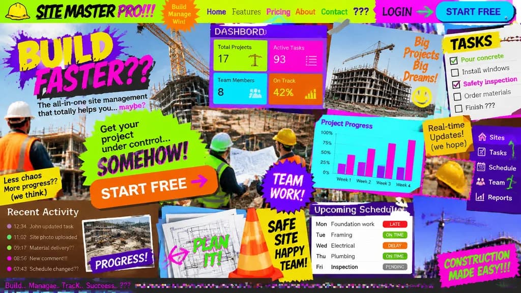
Konsep Landing Page UI/UX Terburuk
Menghasilkan konsep landing page yang sengaja dibuat kacau dan tidak terbaca. Ubah topik aplikasi dalam kurung siku untuk menguji UI terburuk di bidang apa pun.
Prompt
Landing page design for [a site management app for the construction industry] intentionally crafted with the worst possible UI/UX practices: zero legibility, zero readability, zero utility, and visually painful aesthetics. Chaos-driven cluttered layout, disastrous clashing color scheme with unreadable low-contrast text, awful mismatched novelty font choices, low-resolution unaligned stock photos overlapping haphazardly, broken alignment, overlapping buttons, and broken responsive grid elements creating maximum visual confusion.
Yang bisa Anda ubah
Sebelum membuat gambar, ganti bagian prompt ini dengan subjek atau teks Anda sendiri.
[a site management app for the construction industry]placeholder
Detail prompt
- Kategori
- Desain UI / UX
- Model
- GPT IMAGE 2
- Biaya per gambar
- 1K: 43 kredit · 2K: 86 kredit · 4K: 143 kredit
- Rasio aspek
- 16:9
- Ditambahkan