नया: GPT Image 2.5 Flare और Sunburst। साइन अप पर 3 इमेज मुफ़्त, उसके बाद हर इमेज 8 क्रेडिट।
GPT Image 2.5 आज़माएँ

GPT Image 2 प्रॉम्प्ट्स

8,665 टेम्पलेट्स · अपडेट किया गया अक्टू॰ 2026

GPT Image 2 OpenAI का इमेज जनरेशन और एडिटिंग मॉडल (gpt-image-2) है। यह लंबे, संरचित निर्देशों का बारीकी से पालन करता है, जो इसे पोस्टर, प्रोडक्ट शॉट्स, UI मॉकअप और छोटे ऑन-इमेज टेक्स्ट वाले इन्फ़ोग्राफ़िक्स के लिए सबसे उपयुक्त बनाता है।

यह पेज GPT Image 2 के लिए तैयार किए गए 8,665 लाइब्रेरी टेम्पलेट्स को सूचीबद्ध करता है। प्रत्येक टेम्पलेट जनरेटर में GPT Image 2 चुने हुए विकल्प के साथ खुलता है: 1K पर 43 क्रेडिट, 16 संदर्भ इमेज तक और 16 आस्पेक्ट रेशियो। GPT Image 2 Saver किसी भी साइज़ पर केवल 5 क्रेडिट की फ़्लैट दर पर वही मॉडल चलाता है।

569 में से 421–480 GPT Image 2 · UI / UX डिज़ाइन प्रॉम्प्ट दिखाए जा रहे हैं

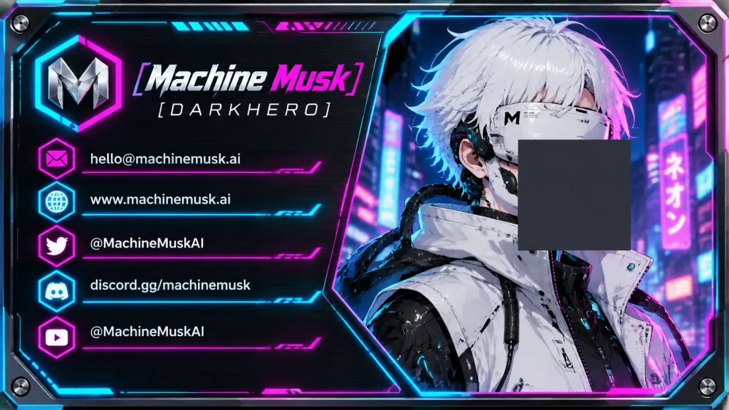
साइबरपंक्स नियॉन क्रिएटर बिजनेस कार्ड

साइबरपंक्स नियॉन क्रिएटर बिजनेस कार्ड

Horizontal 16:9 futuristic cyberpunk creator business card mockup with rounded corners, beveled metallic borders, tiny corner screws, and a black brushed aluminum texture with glowing cyan and hot-pink rim lighting. Layout and Composition: Split into two main sections connected by thin neon circuit lines and HUD geometric panels. Left 45% is a structured information panel; right 55% features an anime cyberpunk character portrait framed within an angled polygon. Left Information Panel: - Top-left chrome 3D emblem shaped like the letter "M" enclosed in a hexagonal neon cyan-and-magenta frame. - Stylized headline reading "[Machine Musk]" in sharp italic sci-fi lettering ("Machine" in metallic white, "Musk" in electric magenta). - Subtitle below reading "[DARKHERO]" in spaced white uppercase futuristic sans-serif type. - Exactly five horizontal contact rows with glowing divider lines and hexagonal neon icons: 1. Magenta envelope icon: "[hello@machinemusk.ai]" 2. Cyan globe icon: "[www.machinemusk.ai]" 3. Magenta Twitter bird icon: "[@MachineMuskAI]" 4. Cyan Discord icon: "[discord.gg/machinemusk]" 5. Magenta YouTube play icon: "[@MachineMuskAI]" Right Portrait Section: - Anime-style futuristic cyborg with short messy white hair, high-collar white armored jacket, black mechanical joints, cables, and a white cyber visor with technical markings over the eyes. - Background shows a blurred neon cityscape at night with vertical signs and vibrant bokeh in cyan, blue, and purple. - A large opaque dark slate-gray square censor block placed over the center-right of the visor and upper chest. Style: High-contrast glossy sci-fi UI illustration, crisp legible typography, sharp vector-like graphic overlays, saturated magenta and cyan neon glow on dark brushed metal.
साइबरपंक्सबिजनेस कार्डयूआई डिज़ाइन
होलोग्राफिक साइंस-फाई ऑपरेशंस डैशबोर्ड

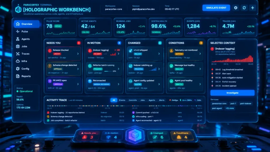
होलोग्राफिक साइंस-फाई ऑपरेशंस डैशबोर्ड

Cinematic sci-fi product mockup of a futuristic operations dashboard titled "[HOLOGRAPHIC WORKBENCH]", floating as a transparent neon-blue holographic screen above a dark control desk in a cyberpunk command center. Wide 16:9 landscape interface, dark navy and black glassmorphism UI, glowing cyan borders, subtle scanlines, faint grid texture, shallow depth of field with blurred server rack lights in the background. Translucent dark glass panels with rounded corners, subtle reflections on the desk, physical console knobs at the bottom edge, atmospheric blue light beams. Header: Top-left text reads "PARACORTEX TERMINAL" above the main title "[HOLOGRAPHIC WORKBENCH]" and subtitle "Situational awareness across code, agents, and infrastructure." Top-center metadata displays 3 fields: Workspace "paracortex-core", Session "pipin@paracortex.dev", Time "09:42:17 UTC". Top-right contains a "SIMULATE EVENT" button alongside small gear, sync, and plus icons. Left Sidebar & Status: Vertical glowing sidebar with 8 navigation items: Overview, Pulse, Agents, Jobs, Traces, Infra, Config, Reports. Lower left status panel shows Status "Operational", Health "98.6%", Uptime "170 4H 23M". Top Metric Row: Exactly 6 stat cards across the top: 1. "PULSE SCORE" value "78" status "GOOD" with sparkline graph 2. "ACTIVE AGENTS" value "42 / 64" status "ONLINE" 3. "RUNNING JOBS" value "124" status "+12.4%" 4. "SYSTEM HEALTH" value "98.6%" status "NOMINAL" 5. "EVENTS (24H)" value "1,284" status "+8.7%" 6. "TRACES (24H)" value "4.7M" status "+23.1%" Main Layout: 5 vertical columns beneath metrics: - Column 1 "NEEDS YOU" (badge 3): 3 task cards: "Release blocked" (urgent red), "Schema change detected" (amber approval), "PR #402 open" (purple lifecycle). - Column 2 "IN MOTION" (badge 4): 3 task cards: "[Indexer lagging]" (red incident, x20 badge, tiny bar chart), "Refactor batch running" (teal progress bar), "Reconnected" (blue session recovered). - Column 3 "CHANGED" (badge 6): 3 task cards: "v1.4.0 shipped", "Indexer catching up" (mini bar chart), "Agent config updated". - Column 4 "CONDITIONS" (badge 4): 3 task cards: "Telemetry not monitored", "Message bus healthy", "Agent pool healthy". - Column 5 "SELECTED CONTEXT" details panel focused on "[Indexer lagging]": subtext "Since 09:25 UTC (16m)" and "20 repositories behind", red bar chart labeled 09:00, 09:15, 09:30, 09:45, a 5-step vertical timeline ("09:42 Lag threshold breached", "09:37 Alert sent", "09:36 Auto mitigation started", "09:34 Partial recovery", "09:26 Incident opened"), "Investigate" button, and service chips ("paracortex-core", "port-1", "port-indexer", "port-agent", "+15 more"). Bottom Activity Area: Wide "ACTIVITY TRACE" panel labeled "Last 60 minutes" with multicolored timeline dots, 6 filter tabs ("All", "Events", "Commits", "Jobs", "Agents", "Alerts"), compact event list, and legend with 6 categories (Alerts, Changes, Jobs, Commits, Infra, Info). Foreground Dock: Floating rounded glass dock at bottom center with 4 counters: "Needs you 3" (red), "In motion 4" (blue), "Changed 6" (teal), "Conditions 4" (amber), centered around a glowing purple-blue cube orb emblem. Style & Constraints: Dense, highly legible technical typography, color-coded status elements, premium sci-fi SaaS software aesthetic. No people visible.

डैशबोर्डहोलोग्राफिकग्लासमोर्फिज्म
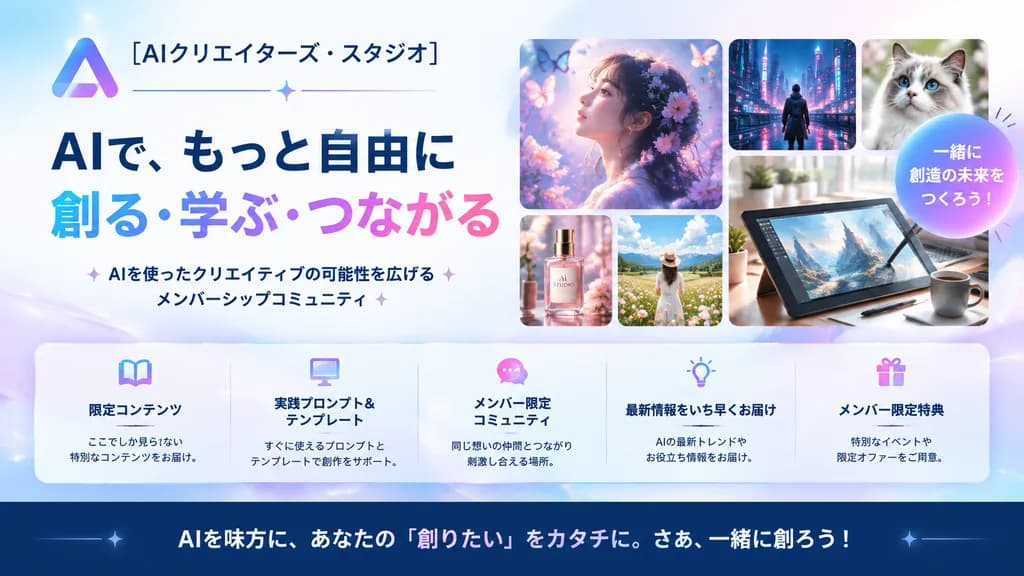
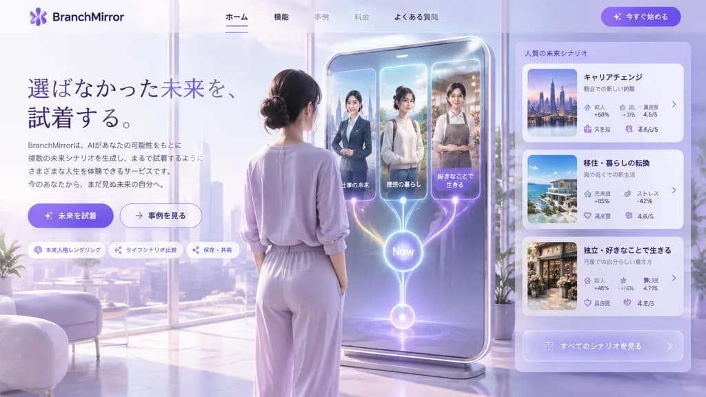
एआई क्रिएटर स्टूडियो वेबसाइट हीरो बैनर

एआई क्रिएटर स्टूडियो वेबसाइट हीरो बैनर

A polished Japanese promotional website hero banner for an AI creator community, designed in a clean modern tech-advertising style with a soft pastel blue, lavender, pink, and white palette, 16:9 wide composition. On the left, place a gradient triangular abstract logo and the Japanese brand name "[AIクリエイターズ・スタジオ]" at the top, followed by a thin horizontal divider line with a small sparkle in the center. Below, a prominent two-line bold Japanese headline: the first line in dark navy, 「AIで、もっと自由に」, and the second line in large gradient letters from cyan to purple to pink, 「創る・学ぶ・つながる」. Underneath, a short Japanese subheadline flanked by subtle sparkles: 「AIを使ったクリエイティブの可能性を広げるメンバーシップコミュニティ」. On the right, a collage of 6 rounded-rectangle cards showcasing creative works: 1 large dreamy profile portrait of a woman surrounded by flowers and butterflies in ethereal purple light; 1 small cyberpunk city nightscape with a lone figure; 1 small close-up portrait of a fluffy cat; 1 small luxury cosmetic bottle labeled 'AI STUDIO'; 1 small sunny flower-field landscape with a woman in white; and 1 large digital drawing tablet on a desk with a stylus, coffee mug, and desk plant. Overlapping the right section, add a circular gradient badge with bold white text reading "[一緒に創造の未来をつくろう!]". Across the lower middle, place a translucent glassmorphism rounded bar with 5 equal columns and pastel line icons (book, monitor, chat bubble, light bulb, gift) with bold titles: 「限定コンテンツ」, 「実践プロンプト&テンプレート」, 「メンバー限定コミュニティ」, 「最新情報をいち早くお届け」, and 「メンバー限定特典」, each with a brief 2-line description. At the bottom, a dark navy footer bar with a large call-to-action sentence: "[AIを味方に、あなたの『創りたい』をカタチに。さあ、一緒に創ろう!]". Glossy soft lighting, subtle glimmers, crisp legible Japanese typography, professional landing page aesthetic.

यूआई डिज़ाइनहीरो बैनरलैंडिंग पेज
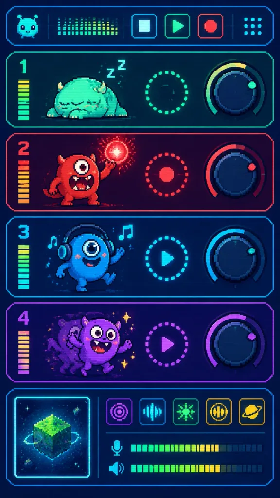
पिक्सेल आर्ट मॉन्स्टर म्यूजिक सीक्वेंसर यूआई

पिक्सेल आर्ट मॉन्स्टर म्यूजिक सीक्वेंसर यूआई

Vertical pixel-art sci-fi music sequencer interface featuring four cute monster audio tracks, styled as a retro game synthesizer console on a [deep navy] background with glowing rounded rectangular panels and sharp pixel-art outlines. Subtly dithered 16-bit texture with scanline effect, using neon accents in [mint cyan], [hot red], [purple], and yellow. Layout: - Top Header: A wide rounded status bar containing exactly 6 elements: 1 mini alien face icon on the far left, 1 dotted equalizer display beside it, 3 square transport buttons (stop, play, record) in the center, and 1 dotted grid icon on the far right. - Main Tracks (stacked 4 horizontal rounded panels, each featuring track number, vertical level meter, monster character, circular dotted status control, and a large rotary knob): - Track 1 (mint/teal theme): Labeled "1". A sleepy squat monster lying down with closed eyes and "Z Z" sleep marks above; center dotted circular ring; right rotary knob with pale yellow arc and mint indicator dot. - Track 2 ([hot red] theme): Labeled "2". An aggressive standing one-eyed monster, mouth open with sharp teeth, raising one arm casting a crackling red energy orb; center red dotted ring with solid dot; right knob with red arc and indicator dot. - Track 3 (cyan theme): Labeled "3". A blue smiling one-eyed monster wearing headphones and dancing with arms raised, accompanied by 2 floating music notes; center cyan circle with play triangle; right knob with cyan arc and indicator dot. - Track 4 ([purple] theme): Labeled "4". A hyperactive purple monster with motion afterimages, large expressive eyes, waving arms, surrounded by tiny sparkles; center purple circle with play triangle; right knob with purple arc and indicator tick. - Bottom Mixer Section: A wide rounded panel. On the left, a square album art tile with a glowing [mint cyan] border showing a floating pixel mossy cube asteroid with tiny orbiting rocks and stars. To the right, a row of 5 square pixel effect buttons (purple radar, cyan spectrum waveform, green pixel burst, yellow audio wave, yellow ringed planet). Directly below, 2 horizontal VU audio meters (mic icon and speaker icon) with green-to-yellow bars, separated by a thin vertical divider. Text constraints: Only display track numbers "1", "2", "3", "4" and sleep marks "Z Z"; all other interface controls use abstract pixel glyphs.
पिक्सेल-आर्टम्यूजिक-सीक्वेंसरगेम-यूआई
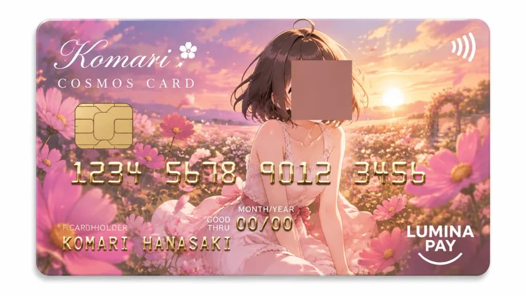
एनिमे कॉस्मॉस गार्डन क्रेडिट कार्ड

एनिमे कॉस्मॉस गार्डन क्रेडिट कार्ड

Glossy anime-style fantasy credit card design for [Komari Hanasaki], themed around pink cosmos flowers and a sunset garden. Straight-on centered composition of a horizontal rounded-rectangle credit card with a polished plastic finish and a subtle drop shadow against a plain white background. Main illustration: An anime girl with short dark brown bobbed hair and an ahoge sits amidst blossoming pink cosmos. She wears a pale white-pink sleeveless dress with lace trim and a pink waist bow. Her face is concealed by a centered opaque square privacy block in muted brown-pink placed over the upper-right-center portion of the portrait. Background: A lush meadow of pink cosmos flowers spanning the entire card, with large blossoms on the sides, warm sunset lighting, glowing golden particles, soft clouds, and drifting petals. Card UI elements: Gold EMV chip on the left, white contactless icon on the top right. Top-left cursive white script reads "[Komari]" with a delicate flower accent, followed by spaced serif text "COSMOS CARD" underneath. Embossed metallic-gold card digits in four groupings: "1234 5678 9012 3456". Bottom-left embossed name "[KOMARI HANASAKI]" beneath the label "CARDHOLDER". Expiry section reads "GOOD THRU", "MONTH/YEAR", and "00/00". Bottom-right white logo displays "[LUMINA PAY]" with "LUMINA" above "PAY" and a subtle smile curve underline. Style: Romantic anime art, pastel pink, lavender, peach, and warm gold palette, crisp typography, realistic metallic embossing, premium card aesthetic.

क्रेडिट कार्डएनिमे चित्रणकॉस्मॉस फूल
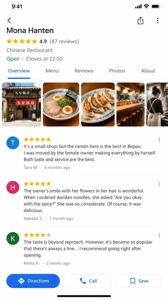
Google Maps रेस्तरां लिस्टिंग मॉकअप

Google Maps रेस्तरां लिस्टिंग मॉकअप

A clean screenshot of a Google Maps iOS app store detail screen in a 9:16 vertical layout, featuring highly authentic and precise mobile map UI elements. Top header information: - Store Name: "[Mona Hanten]" - Rating: ★★★★★ 4.9 (87 reviews) - Category: "Chinese Restaurant" - Operating Status: "Open · Closes at 22:00" Photo section (horizontal scroll carousel): - Store exterior thumbnail, ramen photo, gyoza photo, counter view, and [the back of a young woman chef cooking]. Review section with readable customer text: - ★★★★★ "It's a small shop, but the ramen here is the best in Beppu. I was moved by the female owner making everything by herself. Both taste and service are the best." — [Taro M.] (3 months ago) - ★★★★★ "The owner's smile with flowers in her hair is wonderful. When I ordered dandan noodles, she asked 'Are you okay with the spice?' She was so considerate. Of course, it was delicious." — Hanako S. (1 month ago) - ★★★★☆ "The taste is beyond reproach. However, it's become so popular that there's always a line... I recommend going right after opening." — Kenta K. (2 weeks ago) Bottom navigation bar: - Authentic iOS Google Maps action buttons: "Directions", "Call", and "Save". Pixel-precise mobile UI rendering with clean, readable typography and modern app layout.

google mapsui मॉकअपमोबाइल ऐप
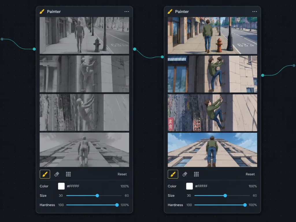
स्टोरीबोर्ड री-रेंडर नोड वर्कफ़्लो यूआई

स्टोरीबोर्ड री-रेंडर नोड वर्कफ़्लो यूआई

Dark node-based workflow UI screenshot showing a side-by-side comparison between a 3D animation previz storyboard and an anime-style re-render inside a visual AI compositing application. Landscape 4:3 screen capture on a nearly black dotted grid canvas with thin curved teal connector lines between nodes and small circular input/output connection ports. Layout: Exactly two tall rounded-rectangle dark charcoal nodes side by side. Both nodes have a header titled "Painter" on the top-left with a small brush/pen icon, and a three-dot menu icon on the top-right. The left node displays the source grayscale storyboard; the right node displays the stylized output storyboard. Each node contains exactly 4 vertically stacked widescreen storyboard frames separated by crisp black dividers, followed by a compact control toolbar at the bottom. Left node frames: Rendered as monochrome neutral-gray 3D viewport cinematic previz with clay materials and geometric urban assets. Frame 1: a generic featureless male mannequin walking down a city sidewalk past storefronts, a fire hydrant, street pole, and road markings. Frame 2: the mannequin lifts one leg onto a stone building wall, initiating a climb. Frame 3: the mannequin climbing the building facade, leaning backward with feet pressed against the wall. Frame 4: rear perspective of the mannequin walking straight up a tall vertical wall toward the roofline. Right node frames: Exactly mirrors the same 4 actions and angles, rendered in [1990s hand-painted anime cel animation] style. Features a young adult male with brown hair wearing [a green jacket, blue jeans, and brown shoes] in classic anime proportions. Frame 1: walking along a sunlit city street past shops, a red hydrant, lamppost, and road marking "633". Frame 2: stepping onto the building wall beside a shopfront window. Frame 3: climbing higher on the facade with city street, fire escape, and signs visible below. Frame 4: rear view walking vertically up the pale building exterior. Bottom controls on each node: Top row features exactly three icons (a highlighted yellow brush, an eraser, and a grid icon) alongside a right-aligned "Reset" text label. Bottom row features three parameter fields: "Color" with a white swatch, "#FFFFFF", and "100%"; "Size" with a slider showing [30] on the left and [60] on the right; "Hardness" with a slider and "100%". Crisp UI mockup, dark mode, subtle drop shadows, precise typographic alignment.

यूआई-डिजाइनस्टोरीबोर्डनोड-ग्राफ
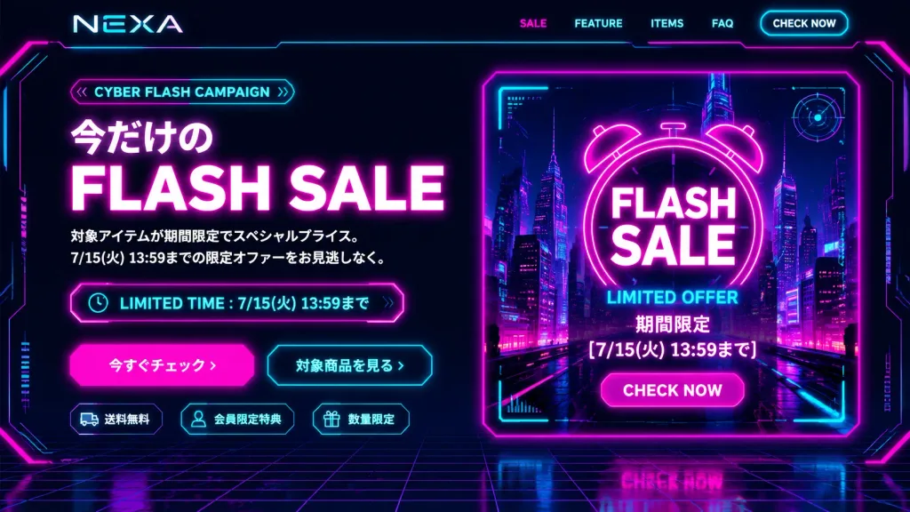
साइबरपंक ई-कॉमर्स फ़्लैश सेल हीरो सेक्शन

साइबरपंक ई-कॉमर्स फ़्लैश सेल हीरो सेक्शन

Desktop e-commerce first-view landing page UI design for brand [NEXA], promoting a [CYBER FLASH CAMPAIGN] in a futuristic cyberpunk neon aesthetic. 16:9 ratio screen layout on a dark black and navy background with a receding perspective cyber grid floor, glowing magenta and electric cyan circuitry framing the edges, high-contrast reflections, and HUD details. Top Navigation Bar: Brand logo [NEXA] on the left; exactly 5 navigation items on the right: “SALE”, “FEATURE”, “ITEMS”, “FAQ”, and a glowing bordered neon button “CHECK NOW”. Two-Column Hero Section: - Left Column (Text & CTAs): A rounded pill badge reading “[CYBER FLASH CAMPAIGN]”. Main headline in Japanese and English: “今だけの” above bold white typography “FLASH SALE” with hot-pink neon glow. Two Japanese subtext lines: “対象アイテムが期間限定でスペシャルプライス。” and “7/15(火) 13:59までの限定オファーをお見逃しなく。”. Below, a neon outlined timer bar with a clock icon reading “LIMITED TIME : [7/15(火) 13:59まで]”. Exactly two CTA buttons: a solid hot-pink glowing button “今すぐチェック ›” and a cyan outlined button “対象商品を見る ›”. At the bottom, exactly 3 icon chips: truck icon “送料無料”, user icon “会員限定特典”, and gift icon “数量限定”. - Right Column (Promo Graphic): A large glowing poster card with magenta neon borders and cyan HUD corner brackets. Inside shows a futuristic night cityscape with skyscrapers and illuminated grid streets. Centered is an alarm clock outline with bold stacked text “FLASH SALE” and cyan text “LIMITED OFFER”, followed by “期間限定”, “[7/15(火) 13:59まで]”, and a rounded magenta button “CHECK NOW”. Decorative HUD dials, circuit lines, and target marks frame the poster. Visual Style & Constraints: Deep navy and black canvas with electric cyan, hot magenta, and crisp white. Clean modern sans-serif typography. Desktop first-view only, no browser frame, no human figures, no additional product photos, no watermarks.

साइबरपंकलैंडिंग पेजहीरो सेक्शन
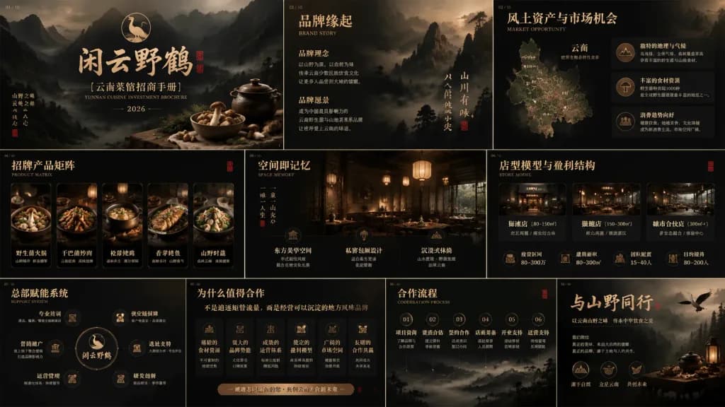
युन्नान व्यंजन फ़्रैंचाइज़ी निवेश पिच डेक

युन्नान व्यंजन फ़्रैंचाइज़ी निवेश पिच डेक

A complete 10-slide widescreen presentation deck preview in 16:9 aspect ratio, arranged as a franchise recruitment and brand investment brochure for a premium Yunnan cuisine brand named [闲云野鹤], focusing on [Yunnan wild mushroom and mountain cuisine]. Visual Style & Palette: Dark cinematic Chinese landscape aesthetic blending traditional ink-wash mountains with realistic dark food and interior photography. Deep black, smoky charcoal, aged bronze, muted gold, tea-brown, and warm lantern amber highlights. Old paper textures, faint grain, low-key lighting, Song and Ming dynasty inspired calligraphy titles in Chinese with small elegant serif English subtitles, bronze line icons, and muted red seal stamps. Slide Layouts (10 distinct, unified slides): 1. Cover: Large centered brush calligraphy "闲云野鹤", subtitle "[云南菜馆招商手册]", small English text "YUNNAN CUISINE INVESTMENT BROCHURE", "2026", misty mountain valley backdrop, crane logo emblem above, rustic ceramic bowl, lidded pot, herbs, and linen cloth at lower right. 2. Brand Origin ("品牌缘起"): English subtitle "BRAND STORY", layered misty peaks, clean editorial text columns for brand philosophy, decorative vertical text, small red seal stamp. 3. Market Opportunity ("风土资产与市场机会"): English subtitle "MARKET OPPORTUNITY", stylized Yunnan topographic map on left, structured analytical data cards on right with bronze icons for terroir, ingredients, and consumer trends. 4. Product Matrix ("招牌产品矩阵"): English subtitle "PRODUCT MATRIX", 5 horizontal cards showcasing dark gourmet Yunnan dishes in warm lantern light with gold borders and Chinese labels. 5. Spatial Memory ("空间即记忆"): English subtitle "SPACE MEMORY", atmospheric restaurant interior photo featuring dark wood latticework, paper lanterns, and private dining settings, with 3 structured feature blocks below. 6. Store Model & Profit Structure ("店型模型与盈利结构"): English subtitle "STORE MODEL", 3 store-format cards across the center with metric icons below for investment, floor area, headcount, and capacity. 7. Headquarters Empowerment System ("总部赋能系统"): English subtitle "SUPPORT SYSTEM", central circular brand emblem linked to 6 capability nodes (training, supply chain, marketing, site selection, operations, R&D). 8. Reasons to Cooperate ("为什么值得合作"): Headline "不是追逐短暂流量,而是经营可以沉淀的地方风味品牌", row of 6 strategic benefit cards with bronze icons, bronze call-to-action bar. 9. Cooperation Process ("合作流程"): English subtitle "COOPERATION PROCESS", 6 sequential numbered stages from onboarding to operational support, linked with thin bronze lines. 10. Closing Slide: Large brush calligraphy slogan "[与山野同行]", closing manifesto on regional gastronomy, crane silhouette flying into misty forest, rustic tableware vignette at bottom right, 3 summary icons below. Constraints: No bright modern saturated colors, no cartoon elements, no generic blue corporate graphics, no Western fast-food aesthetic. Consistent branding, typography, margins, bronze rules, and slide numbering across all 10 slides.

पिच डेकयुन्नान व्यंजनब्रांडिंग
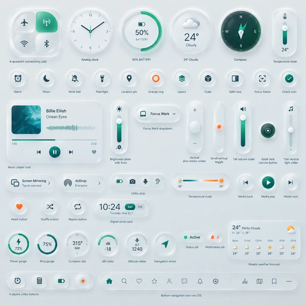
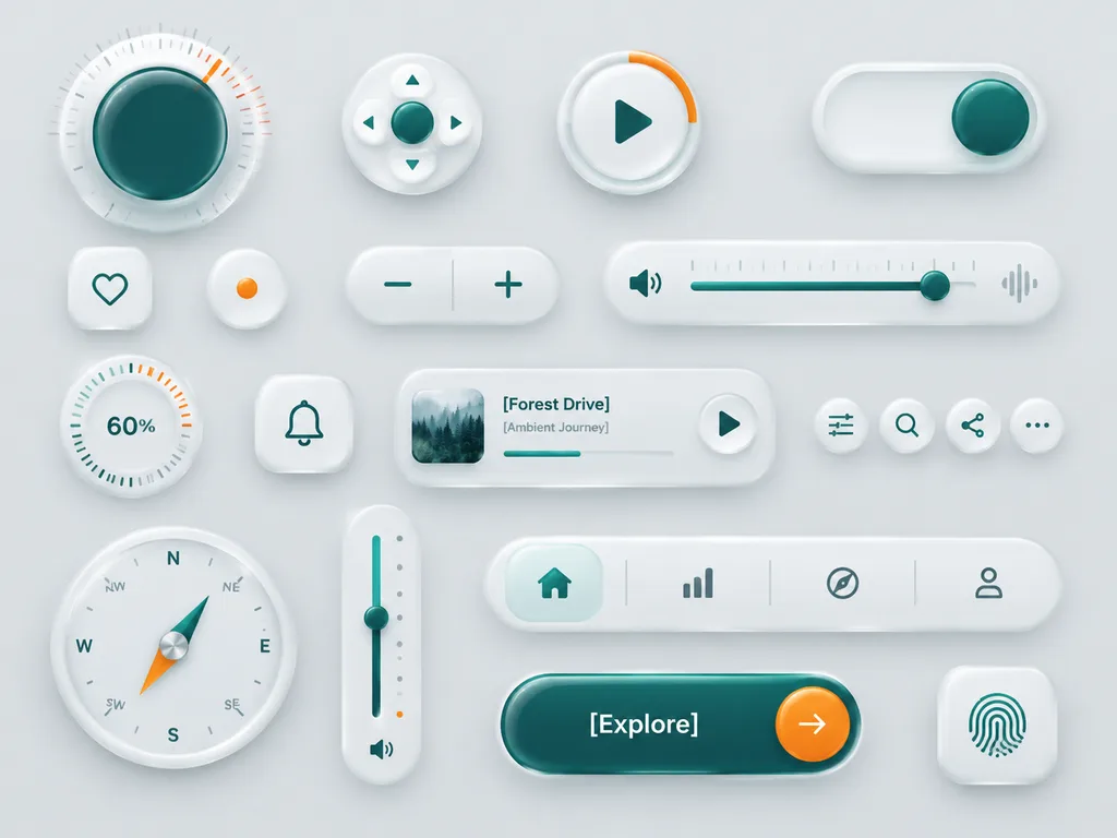
न्यूमॉर्फिक फ्रॉस्टेड ग्लास UI कंपोनेंट बोर्ड

न्यूमॉर्फिक फ्रॉस्टेड ग्लास UI कंपोनेंट बोर्ड

A clean neumorphic UI component showcase on a soft light gray background, arranged as a balanced design board of 18 separate interface elements with subtle shadows, frosted translucent white plastic surfaces, rounded corners, and glossy glass-like depth. Minimal luxury product-design aesthetic with white-on-white layering, soft ambient occlusion, delicate inner shadows, and restrained accents of deep teal green and vivid orange. Composition contains 18 distinct components: - 1 large circular rotary knob in the upper left with a dark teal glossy center, fine radial tick marks, and a small orange position indicator - 1 small circular directional control pad with a teal center button and four tiny arrow icons around it - 1 circular play button with a teal triangle icon and a short orange progress arc on the rim - 1 horizontal pill toggle switch at the top right with a teal knob positioned to the right - 1 rounded square heart button with a simple teal outline heart - 1 small circular indicator button with a single orange dot in the center - 1 pill-shaped plus-minus control with a teal minus on the left and teal plus on the right separated by a vertical divider - 1 long horizontal volume slider with a teal speaker icon on the left, fine slider ticks, a teal track, a teal knob near the right side, and a faint waveform icon on the far right - 1 circular percentage dial showing 60% with radial ticks and a few orange highlight marks near the upper right - 1 rounded square bell notification button with a teal outline bell icon - 1 compact music player card with a small square album image of misty evergreen trees on the left, the title "[Forest Drive]", the subtitle "[Ambient Journey]", a thin progress bar, and a circular play button on the right - 4 small circular utility icon buttons in one row showing sliders/settings, search, share, and ellipsis - 1 large circular compass with cardinal letters N, E, S, W plus diagonal labels, a teal-and-orange needle, and metallic center - 1 tall vertical slider on the right with a teal track, teal knob around the middle, small side dots, an orange accent near the bottom, and a tiny speaker icon below - 1 bottom navigation bar in a long rounded pill containing 4 icons separated by subtle dividers: home, bar chart, compass, and user profile, with the home tab active in teal - 1 large rounded pill call-to-action button in glossy dark teal labeled "[Explore]" with a circular orange arrow button attached on the right - 1 rounded square fingerprint button with a teal fingerprint icon Generous grid-based spacing, tactile rendering, ultra-clean finishes, and futuristic smart-device design board presentation.

न्यूमॉर्फिज्मui किटग्लासमॉर्फिज्म
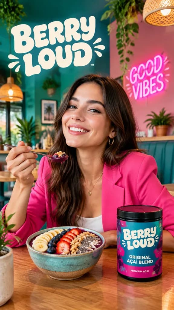
मोबाइल स्क्रीनशॉट बेरी कैफ़े प्रॉम्प्ट कार्ड

मोबाइल स्क्रीनशॉट बेरी कैफ़े प्रॉम्प्ट कार्ड

A cropped mobile webpage screenshot featuring a case study card on a clean white background. At the very top, a partially visible cropped line reads “The overall mood should feel se”. Below it, a case title in blue hyperlinked styling reads “Case 172: Berry Splash Cafe Campaign (by @iamaiistudio)”. Beneath the title is a centered, bordered “Output” container with the label “Output” centered above it, followed by a lower label reading “Prompt:”. Inside the Output box is a vertical commercial lifestyle advertising poster for [Berry Loud]: a vibrant cafe interior with teal-green and pink walls, lush hanging plants, warm glowing pendant lights, and a wooden table. A woman wearing a bright hot-pink blazer sits at the table, smiling as she holds up a spoonful of an açaí bowl. On the table sit two items: a colorful berry smoothie bowl topped with sliced bananas, berries, granola, and chia seeds, and a cylindrical product jar featuring a teal and magenta label. Poster typography and signage includes a large cream-colored retro bubble-letter logo reading “[BERRY LOUD]” at the top left, the product jar label clearly displaying “[BERRY LOUD]” with smaller subtext “ORIGINAL AÇAÍ BLEND” and “PREMIUM ACAI”, and a glowing pink neon sign on the right wall that reads “GOOD VIBES”. Polished commercial photography style, vibrant saturated colors, cozy ambient lighting, and crisp readable typography.

ui स्क्रीनशॉटकेस स्टडीकैफे अभियान
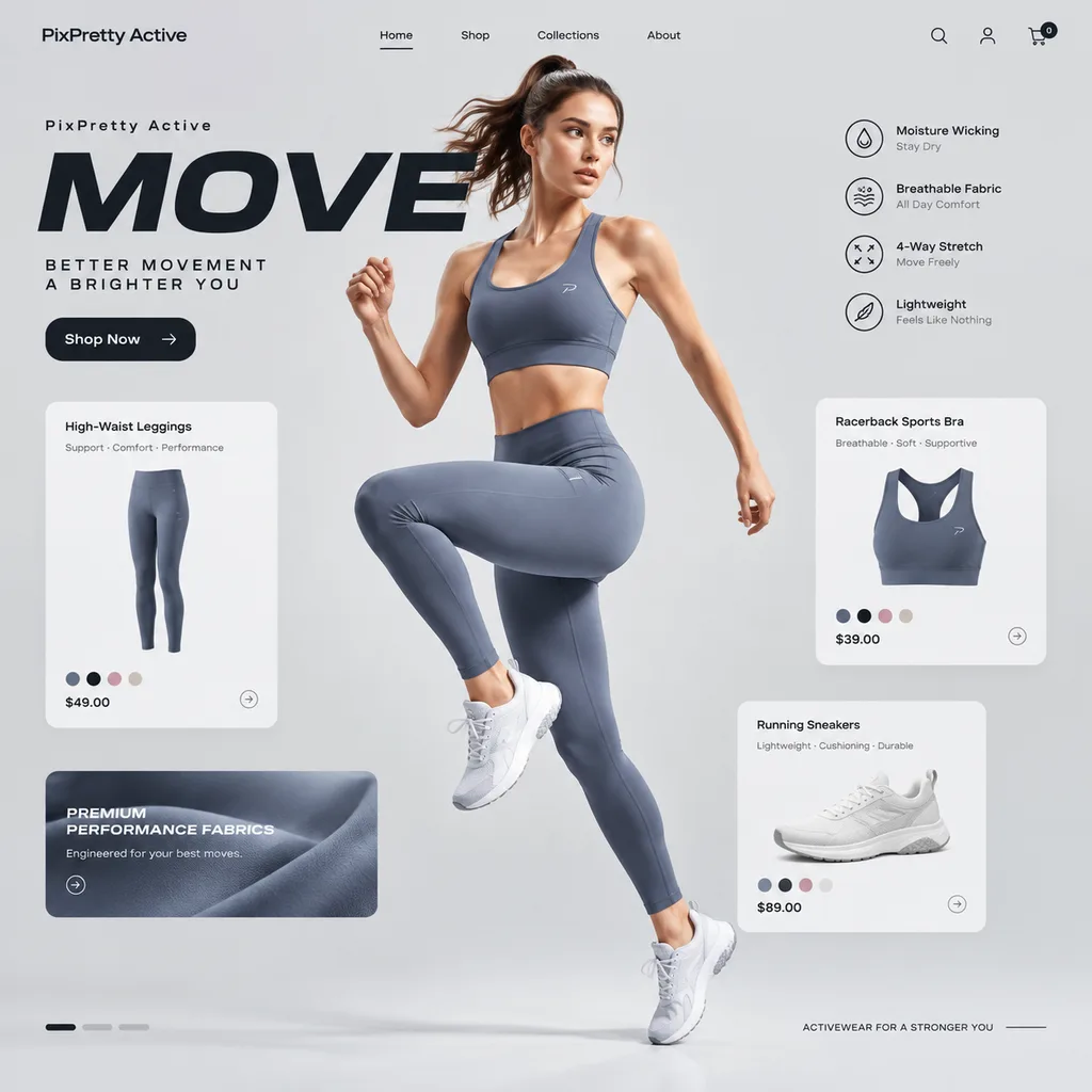
एक्टिववियर लैंडिंग पेज यूआई डिज़ाइन

एक्टिववियर लैंडिंग पेज यूआई डिज़ाइन

UI web design mockup for a premium activewear landing page. Centered [female model in sleek gym set] mid-motion against a clean light gray background. Surrounding layout includes floating e-commerce product cards for leggings, tops, and shoes, performance-focused interface elements, and bold headline typography reading "[MOVE]" with brand name "[PixPretty Active]". Dynamic athletic lighting, modern minimalist sporty aesthetic.

एक्टिववियरलैंडिंग-पेजयूआई-डिज़ाइन
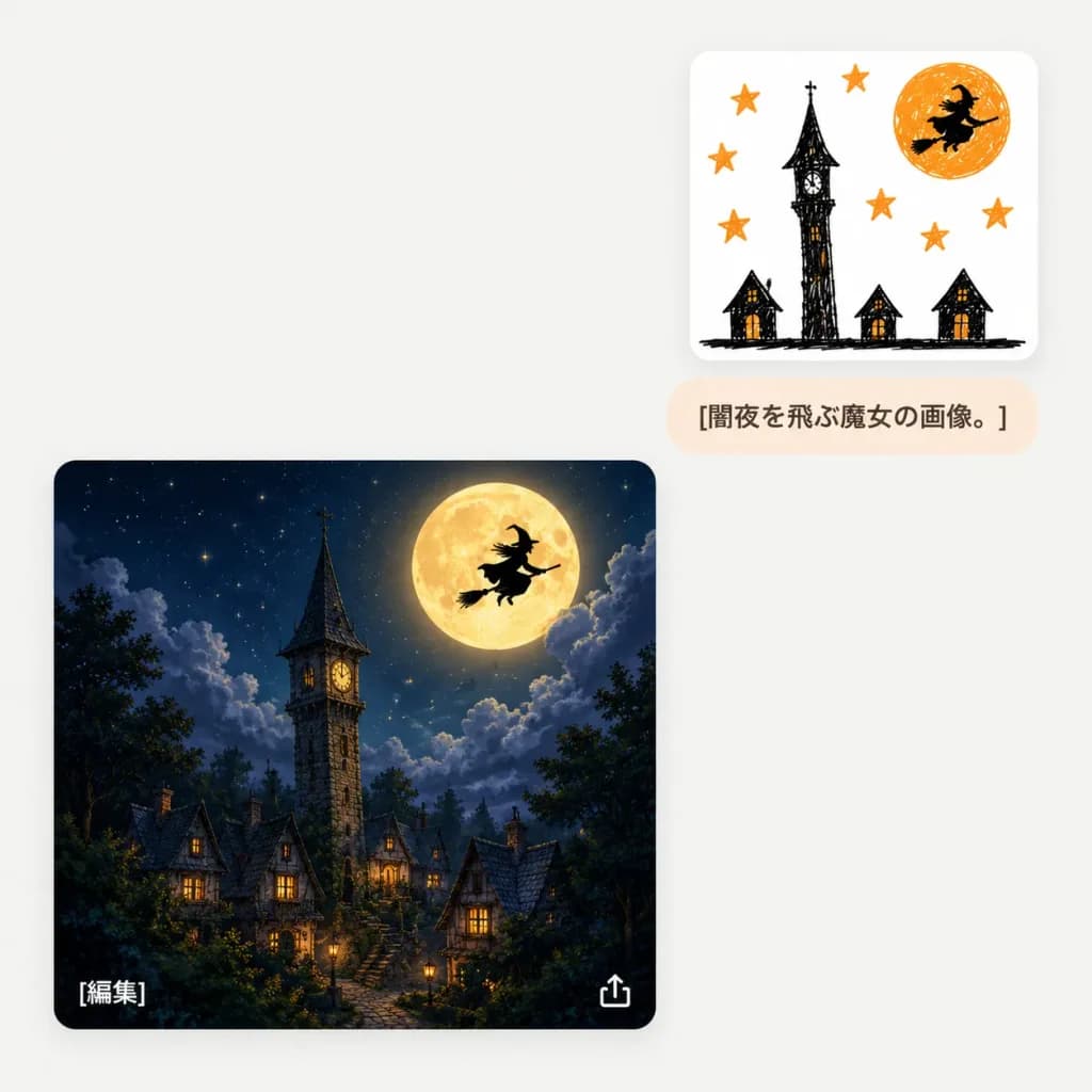
स्केच से काल्पनिक छवि चैट यूआई

स्केच से काल्पनिक छवि चैट यूआई

A minimalist chat-style AI image generation interface screenshot on a light gray off-white background with subtle rounded cards and soft drop shadows. The layout features three distinct UI elements: 1. Upper right: A small white rounded card featuring a childlike black and orange marker doodle. The sketch contains exactly 6 orange stars, 1 crooked black tower in the center, 3 tiny haunted houses along the bottom, an orange full moon in the upper right, and 1 black silhouette of a witch flying across the moon. 2. Directly below the sketch card: A small pale peach rounded pill text bubble displaying the dark brown Japanese text "[闇夜を飛ぶ魔女の画像。]". 3. Lower left: A large rounded square card displaying a polished, cinematic fantasy transformation of the sketch. The scene depicts a cozy gothic village at night under a deep navy starry sky with dramatic moonlit clouds, exactly 1 tall stone clock tower with a pointed dark roof, 1 giant glowing golden full moon, 1 crisp black witch silhouette riding a broomstick across the moon, and clustered steep-roofed cottages with glowing warm windows framed by dark treetops. UI details: Inside the large fantasy image card, a small white Japanese text label "[編集]" appears in the lower-left corner, and a small white export/share icon appears in the lower-right corner. Clean mobile/web application composition, generous negative space, no watermarks, no extra text.

यूआई डिज़ाइनचैट इंटरफ़ेसस्केच से छवि
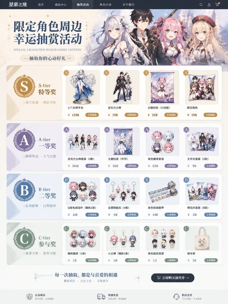
कैरेक्टर लॉटरी ई-कॉमर्स वेब पेज

कैरेक्टर लॉटरी ई-कॉमर्स वेब पेज

A realistic e-commerce web page layout for a special character merchandise lottery campaign. The storefront displays various prizes featuring [these characters], organized neatly into ranked prize sections labeled [S-tier / A-tier / B-tier / C-tier]. Each prize tier presents distinct product mockups such as scale figures, acrylic stands, tapestries, and collectible badges, accompanied by rank badges, promotional typography, and clean e-commerce UI elements.

लॉटरीकुजीमर्चेंडाइज
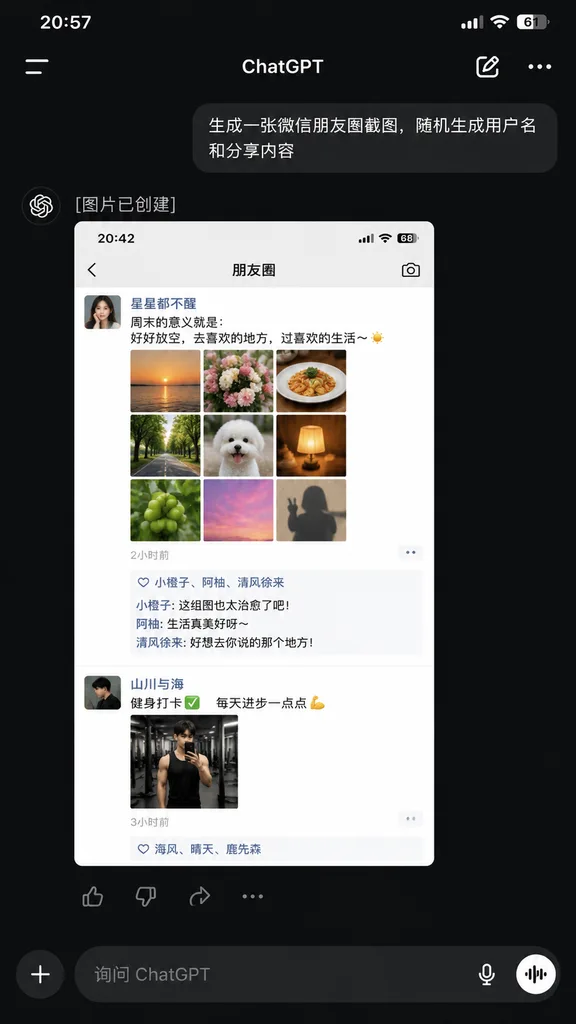
WeChat स्क्रीनशॉट के साथ ChatGPT ऐप

WeChat स्क्रीनशॉट के साथ ChatGPT ऐप

A realistic dark-mode smartphone screenshot of the ChatGPT mobile app in Chinese, displayed full-screen with an iPhone-style status bar at the top showing the time [20:57] on the left and cellular, Wi-Fi, and battery icon [61%] on the right. Below the status bar is the ChatGPT header featuring a left hamburger menu icon, centered title "ChatGPT", an edit pencil icon, and a three-dot menu icon on the right. In the conversation thread: - A right-aligned dark gray rounded user bubble with Chinese text: "[生成一张微信朋友圈截图,随机生成用户名和分享内容]". - An assistant response block below it with the Chinese text "[图片已创建]". - An embedded generated image preview showing a light-mode WeChat Moments mockup with status bar time [20:42] and header title "朋友圈". Inside this preview are two posts: 1. First post: female profile picture, username "[星星都不醒]", a short Chinese caption about weekends and life, a 3x3 grid of 9 square photos ([sunset over water, flowers, plated food, tree-lined road, white fluffy dog, glowing warm lamp, green fruit, pink sky, silhouette shadow]), timestamp "[2小时前]", a likes row with 3 usernames, and 3 short Chinese comments. 2. Second post: male profile picture, username "[山川与海]", a fitness-themed Chinese caption with a checkmark and flexed bicep emoji, 1 gym mirror selfie photo, and timestamp "[3小时前]" with a likes row. - Directly beneath the preview image, an action bar with four icons: thumbs up, thumbs down, share, and more options. At the bottom of the screen, a dark-mode input bar with a circular "+" button, placeholder text "[询问 ChatGPT]", a microphone icon, and a circular voice mode button. Clean, authentic mobile UI layout, sharp system typography, and realistic UI proportions.

chatgptui डिज़ाइनस्क्रीनशॉट
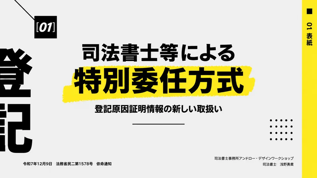
न्यूनतम जापानी प्रेजेंटेशन कवर स्लाइड

न्यूनतम जापानी प्रेजेंटेशन कवर स्लाइड

Modern Japanese presentation cover slide in a minimalist Swiss-inspired editorial style, landscape 16:9 aspect ratio. Very light gray background with bold black typography, generous negative space, and vivid yellow graphic accents. Layout and details: - Upper left: a small black square featuring the white italic bold sans-serif text "[01]", accented by a thin black diagonal line angling in from the top-left corner. - Center: a large Japanese headline in heavy black type across two lines: "[司法書士等による]" on line one, and a substantially larger "[特別委任方式]" on line two set over a rough, hand-painted yellow highlighter stroke. - Directly below: a smaller Japanese subtitle in black: "[登記原因証明情報の新しい取扱い]", followed beneath by a thin centered horizontal black line. - Far left border: oversized, cropped black Japanese characters running off-canvas to form an abstract typographic framing element. - Far right edge: a tall vertical yellow sidebar containing black vertical text reading "[01 表紙]", alongside a small black accent square near the top right. - Lower right quadrant: a decorative 5x5 dotted grid of 25 small black dots. - Bottom left: small single-line Japanese metadata reading "[令和7年12月9日 法務省民二第1578号 依命通知]". - Bottom right: right-aligned two-line Japanese text reading "[司法書士事務所アンドロー・デザインワークショップ]" on the first line and "[司法書士 浅野勇貴]" on the second. Sharp, high-contrast vector aesthetic with clean print-like precision.

प्रेजेंटेशन स्लाइडग्राफिक डिज़ाइनजापानी टाइपोग्राफी
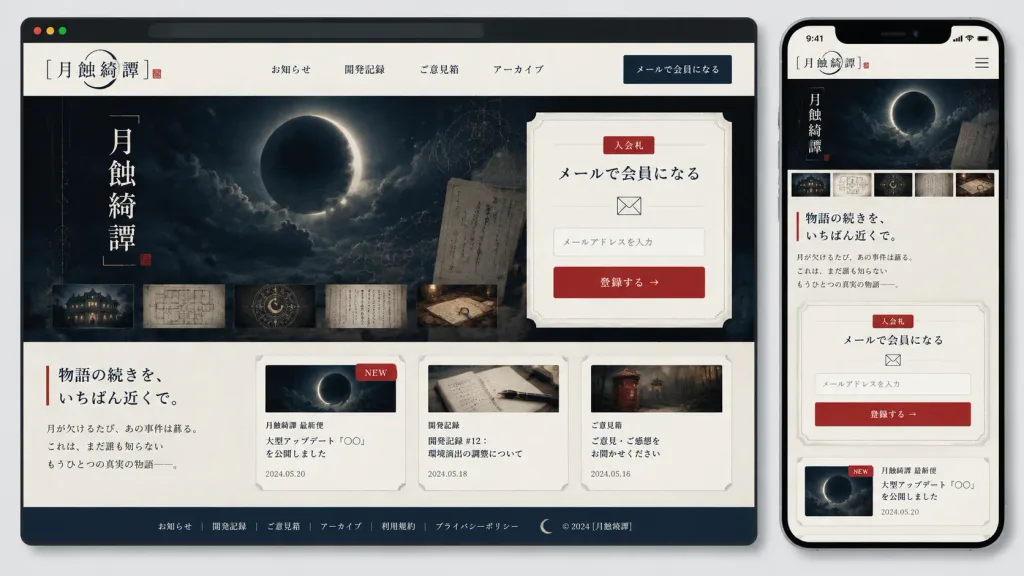
जापानी मिस्ट्री गेम वेबसाइट मॉकअप

जापानी मिस्ट्री गेम वेबसाइट मॉकअप

Presentation mockup of a responsive website for a Japanese mystery/horror game community titled "[月蝕綺譚]", displayed as both a desktop browser window and a smartphone screen side-by-side on a light gray background with soft drop shadows and rounded device frames. Visual Style: Elegant Japanese gothic mystery aesthetic, off-white washi paper textured background, deep navy-black panels, delicate gray borders, muted vermilion red accents, refined Japanese serif typography (Mincho), thin ink lines, crescent moon motifs, old archive documents, and restrained editorial spacing. Desktop Layout (occupying left 75% width): - Browser Chrome: Dark top bar with three small circular window buttons. - Navigation Header: Site title logo "[月蝕綺譚]" with a delicate crescent arc and red seal stamp on the left; exactly 4 centered navigation links: "お知らせ", "開発記録", "ご意見箱", "アーカイブ"; dark navy CTA button on the right labeled "メールで会員になる". - Hero Section: Split layout. Left side features a dark atmospheric artwork of a cloudy night sky with a glowing eclipsed crescent moon, vertical title text "[月蝕綺譚]", faint celestial orbit lines, a translucent archive overlay, and exactly 5 horizontal thumbnails at the bottom (old building at night, room blueprint, symbolic occult motif, handwritten manuscript, detective desk with maps). Right side features a cream ticket-shaped signup card with notched corners, a small red label "入会札", headline "メールで会員になる", envelope icon, an email input field with placeholder "メールアドレスを入力", and a red CTA button "登録する →". - Content Section: Left headline "[物語の続きを、いちばん近くで。]" marked by a vertical red accent line and teaser body text. Right side displays exactly 3 horizontal cards: Card 1 "月蝕綺譚 最新便" (moon image, red "NEW" badge, headline "大型アップデート『〇〇』を公開しました", date 2024.05.20); Card 2 "開発記録" (notebook & pen icon, headline "開発記録 #12:環境演出の調整について", date 2024.05.18); Card 3 "ご意見箱" (antique postbox icon, headline "ご意見・ご感想をお聞かせください", date 2024.05.16). - Footer: Dark navy band with exactly 6 links: "お知らせ", "開発記録", "ご意見箱", "アーカイブ", "利用規約", "プライバシーポリシー", crescent icon, and "© 2024 [月蝕綺譚]". Mobile Layout (tall smartphone mockup on right): - Status bar showing 9:41, compact header with "[月蝕綺譚]" logo and hamburger menu icon. - Stacked responsive flow: hero eclipsed moon visual, 5 thumbnail strip, headline "[物語の続きを、いちばん近くで。]", the ticket-style email signup card, and the first news card with red "NEW" tag. Constraints: Crisp, perfectly legible Japanese typography, exact link/card counts, no extraneous UI elements.

ui-ux-designवेब-मॉकअपजापानी-सौंदर्य
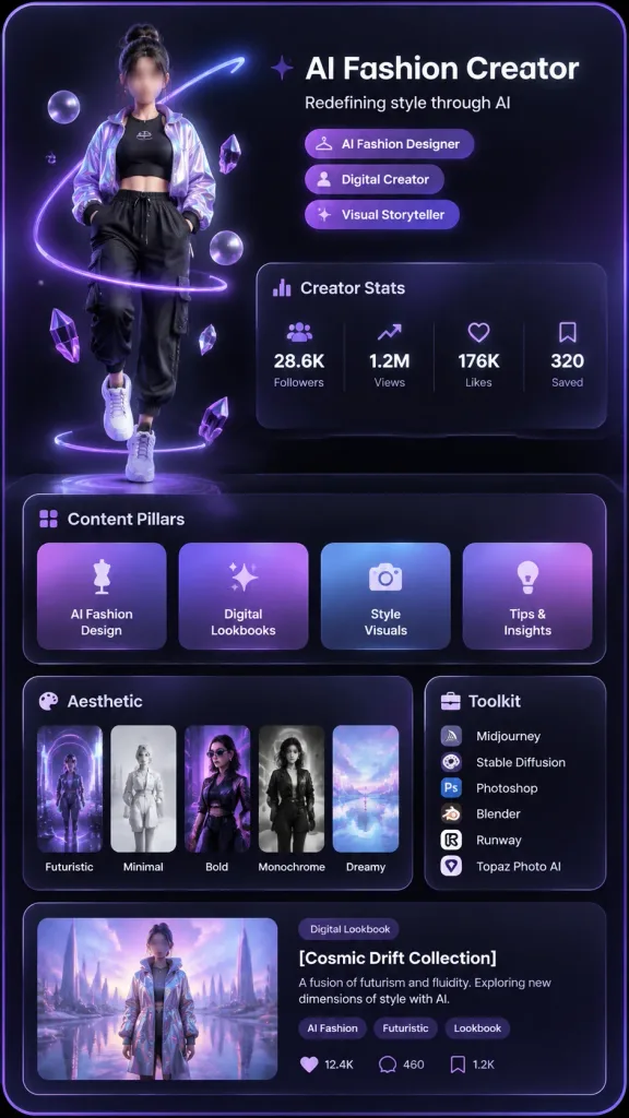
फ्यूचरिस्टिक 3D क्रिएटर प्रोफाइल कार्ड

फ्यूचरिस्टिक 3D क्रिएटर प्रोफाइल कार्ड

Vertical Xiaohongshu-style 3D creator profile card for [AI Fashion Creator], featuring a futuristic purple-black aesthetic, glossy glassmorphism panels, soft neon glow, and a high-end social media portfolio UI layout. Canvas & Composition: - 9:16 portrait mobile poster, dark charcoal-to-black background, rounded card container with subtle violet edge glow, high-contrast white sans-serif typography, lavender accents, and soft bloom lighting. Left Subject: - A full-body stylized 3D female avatar floating slightly above the bottom, wearing an iridescent lavender bomber jacket, black cropped top, black cargo jogger pants, and chunky white sneakers. - Hair in a high messy bun, face softly blurred or anonymized, enveloped by a glowing purple ring wrapping around her body with floating translucent purple orbs and crystal shards. Header & Badges (Upper Right): - Headline: "[AI Fashion Creator]" in bold white sans-serif text. - Subtitle: "[Redefining style through AI]". - Exactly 3 pill badges below subtitle with small icons: "AI Fashion Designer", "Digital Creator", and "Visual Storyteller", styled with purple gradients. Glassmorphism UI Panels: 1. "Creator Stats" panel with bar-chart icon, showing 4 columns separated by dividers: "28.6K Followers" (people icon), "1.2M Views" (trend icon), "176K Likes" (heart icon), "320 Saved" (bookmark icon). 2. "Content Pillars" panel showing 4 square gradient cards: "AI Fashion Design" (mannequin icon), "Digital Lookbooks" (sparkle icon), "Style Visuals" (camera icon), and "Tips & Insights" (lightbulb icon). 3. "Aesthetic" panel displaying 5 vertical thumbnail cards with labels: "Futuristic", "Minimal", "Bold", "Monochrome", and "Dreamy", with purple, lilac, chrome, and soft blue tones. 4. "Toolkit" panel on the right with briefcase icon, listing 6 tools: Midjourney, Stable Diffusion, Photoshop, Blender, Runway, Topaz Photo AI. 5. "Featured Post" wide panel at the bottom: on the left, a preview thumbnail of the avatar in an iridescent coat in a lavender architectural landscape with reflective water; on the right, category tag "Digital Lookbook", post title "[Cosmic Drift Collection]", description "A fusion of futurism and fluidity. Exploring new dimensions of style with AI.", 3 tags: "AI Fashion", "Futuristic", "Lookbook", and metrics: 12.4K likes, 460 comments, 1.2K bookmarks. Visual Style: - Polished 3D UI render, dark frosted glassmorphism, violet neon rim lights, soft depth shadows, crisp and readable layout, no watermarks, no browser frame.

ui-डिज़ाइनग्लासमॉर्फिज्म3d-अवतार
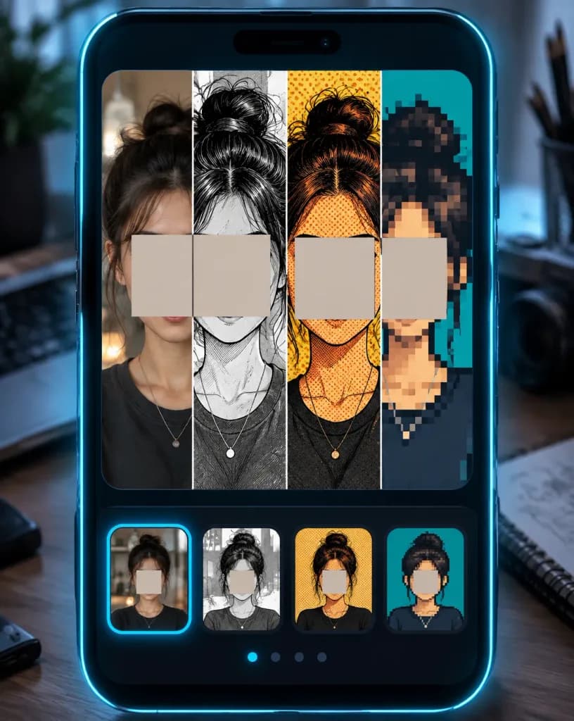
कॉमिक स्टाइल स्प्लिट पोर्ट्रेट ऐप मॉकअप

कॉमिक स्टाइल स्प्लिट पोर्ट्रेट ऐप मॉकअप

Vertical promotional app-style mockup for a selfie-to-comic image transformation tool, featuring a single portrait converted into multiple art styles while preserving facial structure. 4:5 composition showing a dark glossy smartphone interface frame with subtle cyan neon edge glows, set against a [blurred creative studio desk] background. The main preview screen is divided into exactly four vertical split panels from left to right: 1) a realistic indoor selfie with shallow depth of field, 2) a black-and-white manga ink illustration with crosshatching and clean lines, 3) a saturated retro comic book panel with bold ink outlines, halftone dot patterns, and warm tones, and 4) a chunky pixel-art avatar with large square pixels on a teal backdrop. A prominent warm beige-gray blank square mask covers the central facial region across all panels. Below the preview, a dark carousel features four rounded thumbnail cards corresponding to each style. The subject is a young woman with [dark brown/black] messy hair in a high bun, medium warm skin tone, wearing a simple dark crew-neck shirt and delicate necklace, maintaining the exact same head position across panels. Style: polished [dark futuristic mobile UI] mockup, high contrast, clean divisions, no readable text, logos, or watermarks.

ऐप मॉकअपकॉमिक स्टाइलस्प्लिट पोर्ट्रेट
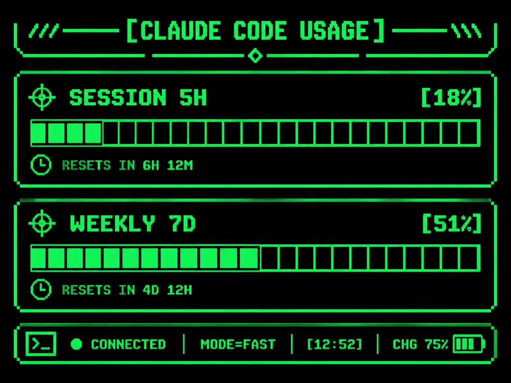
रेट्रो टर्मिनल उपयोग मॉनिटर यूआई

रेट्रो टर्मिनल उपयोग मॉनिटर यूआई

A polished monochrome neon-green retro terminal UI designed for an M5Stack-style low-resolution embedded display. The screen features a decorative header reading [CLAUDE CODE USAGE] flanked by terminal slashes and geometric line ornaments. Two primary usage panels are arranged on the screen: 'SESSION 5H' displaying [18%] and 'WEEKLY 7D' displaying [51%]. Each metric is visualized with a horizontal segmented pixel progress bar composed of 24 rectangular blocks, outlined by thin glowing green borders. The panel titles feature small target crosshair icons, and the reset lines include miniature clock icons. At the bottom, a retro status row displays a terminal outline icon, a glowing green connection dot, [CONNECTED], MODE=FAST, [12:52], and CHG 75% with a small battery icon. Crisp pixel art styling, bright CRT phosphor green lines, and bitmap typography against a pure black background.

टर्मिनल यूआईपिक्सेल आर्टरेट्रो डिस्प्ले
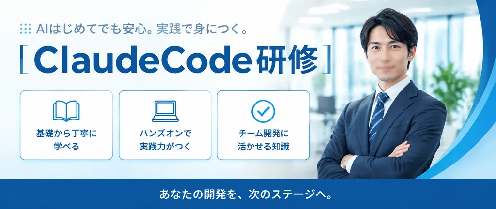
एआई प्रशिक्षण हेतु जापानी कॉर्पोरेट वेब बैनर

एआई प्रशिक्षण हेतु जापानी कॉर्पोरेट वेब बैनर

A clean corporate Japanese web banner for an enterprise AI training service in an ultra-wide horizontal layout. Modern professional business aesthetic featuring bright white and pale blue tones. Layout and Content: - Upper-Left: Small tagline in medium blue-gray reading 「AIはじめてでも安心。実践で身につく。」 with a subtle dotted accent mark to its left. - Main Headline: Large bold headline in deep blue reading 「[ClaudeCode研修]」 with the Latin text prominently scaled. - Feature Cards: Beneath the headline, three evenly spaced rounded white cards with thin blue borders and blue line icons: Box 1 displays an open book icon with the text 「基礎から丁寧に学べる」; Box 2 displays a laptop icon with the text 「ハンズオンで実践力がつく」; Box 3 displays a checkmark-in-circle icon with the text 「チーム開発に活かせる知識」. - Bottom Bar: Full-width deep blue footer strip displaying centered white text 「[あなたの開発を、次のステージへ。]」. - Right Side: A waist-up professional Japanese businessman wearing a dark navy suit, white shirt, and blue striped tie, standing with folded arms in a confident posture, his face softly anonymized. Behind him is a softly blurred modern office interior with daylight, glass, and indoor plants, framed on the far right edge by a sweeping curved blue graphic ribbon. Style: Premium Japanese B2B promotional banner, polished typography, subtle drop shadows, crisp vector icons, and clean balanced negative space.

वेब बैनरकॉर्पोरेट डिज़ाइनजापानी यूआई
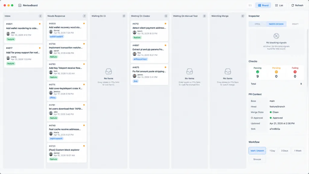
macOS कानबन कोड समीक्षा डैशबोर्ड

macOS कानबन कोड समीक्षा डैशबोर्ड

desktop app UI mockup. clean light-mode productivity dashboard, soft warm gray background, rounded cards, subtle shadows, thin hairline dividers, minimalist modern SaaS aesthetic, dense and calm layout. [Inbox]. [Needs Response]. [Waiting…

macosकानबन बोर्डकोड समीक्षा
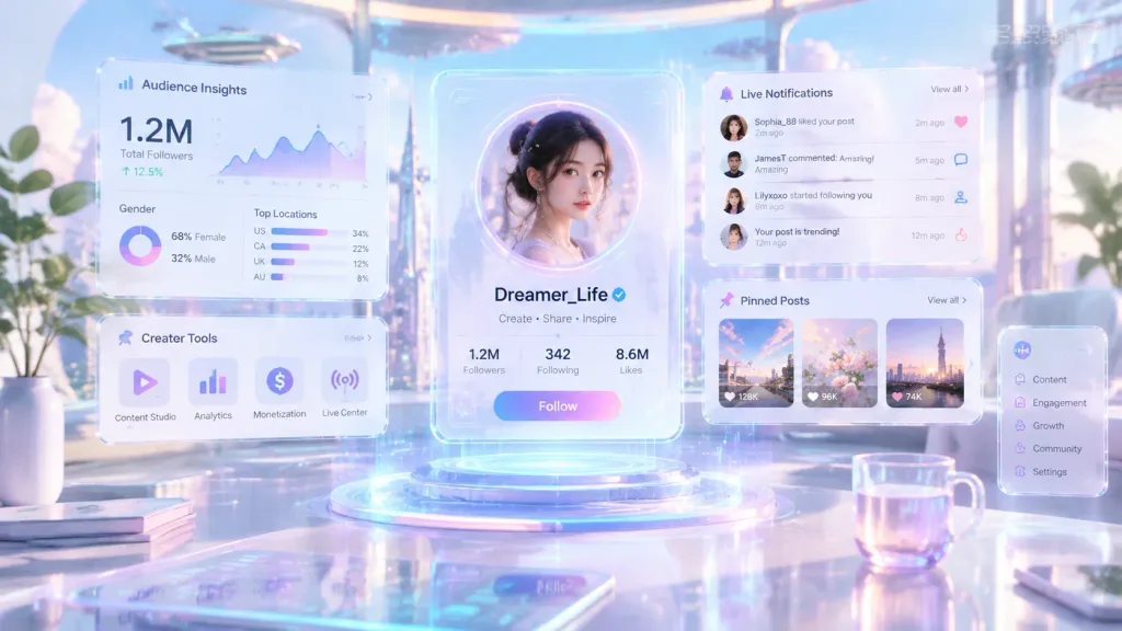
भविष्यवादी होलोग्राफिक क्रिएटर डैशबोर्ड

भविष्यवादी होलोग्राफिक क्रिएटर डैशबोर्ड

Transform the social media profile from the reference photo into a futuristic floating hologram interface inside a bright, luxury cyberpunk workspace. The main profile is centered and surrounded by translucent glassmorphism UI panels, floating transparent screens, holographic analytics widgets, audience insights, creator tools, pinned post modules, and live notification cards suspended in midair. Aesthetics feature a [color palette light and elegant — white, soft lavender, pastel blue, pink, and cyan glows] rather than dark cyberpunk tones. Cinematic reflections, soft volumetric lighting, airy depth, minimal high-tech styling, and an ultra-clean sci-fi creator operating system layout.

होलोग्रामडैशबोर्डग्लासमोर्फिज्म
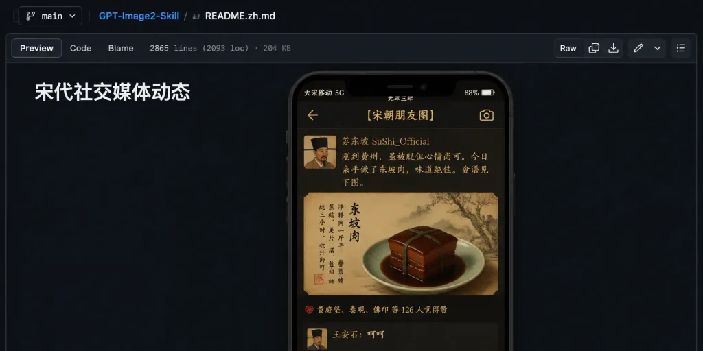
GitHub README सोंग राजवंश सोशल फ़ीड UI

GitHub README सोंग राजवंश सोशल फ़ीड UI

A wide desktop screenshot of a GitHub repository README preview in dark mode, showing a design mockup for an ancient Chinese social media feed UI. Setting & Composition: Horizontal screenshot of a dark navy GitHub web interface, cropped like a browser window with no address bar. The background is mostly dark empty space, with README markdown content positioned slightly left of center. GitHub UI Elements: At the top, a file breadcrumb and toolbar with exactly 3 items: a branch dropdown labeled "main", repository name "GPT-Image2-Skill", and file path "README.zh.md". Below, exactly 3 tabs on the left: "Preview", "Code", and "Blame", followed by metadata reading "2865 lines (2093 loc) · 204 KB". On the right of the toolbar are 6 action icons including a "Raw" button. Crisp, authentic dark GitHub styling. README Content: A bold white Chinese heading near the upper-left reading "宋代社交媒体动态". Below and to the right is a single vertical smartphone-style mockup. Phone Mockup UI: An ancient Song-dynasty-themed app screen titled [宋朝朋友圈] with a warm sepia-black parchment texture, gold typography, and historical ambiance. The top status bar displays: carrier "大宋移动 5G", era mark "元丰三年", battery percentage "88%", and battery icon. The navigation bar features a back arrow, the title [宋朝朋友圈], and a camera icon. Social Feed Post: Exactly one post visible. Left: a square avatar showing a soft-focused Song dynasty scholar portrait. Right: username [苏东坡 SuShi_Official]. Post text in warm gold calligraphic font: "刚到黄州,虽被贬但心情尚可。今日亲手做了东坡肉,味道绝佳。食谱见下图。" Attached Media: Under the text is an antique parchment-style painted card depicting a pale celadon plate holding a glossy square block of Dongpo pork tied with a green reed, glazed in brown sauce, accompanied by vertical ink calligraphy, a red seal stamp, and faint ink landscape branches in the background. Engagement: Below the image, a like counter with a red emblem reads "黄庭坚、秦观、佛印 等 126 人觉得赞". At the bottom edge, one partially visible comment displays an avatar and "王安石:呵呵". Style & Constraints: Authentic GitHub README preview, high UI fidelity, realistic soft drop shadows for the embedded phone. Only one phone mockup, one post, and no extra floating panels or watermarks.

github readmeडार्क मोड uiui मॉकअप
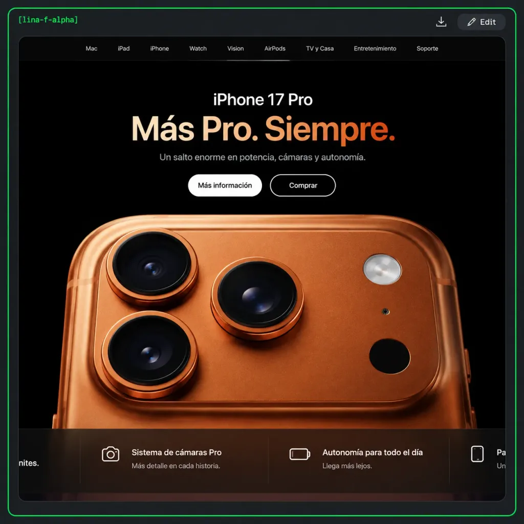
एप्पल शैली का डार्क स्मार्टफोन लैंडिंग पेज

एप्पल शैली का डार्क स्मार्टफोन लैंडिंग पेज

A realistic browser screenshot of a dark Apple-style product landing page for [iPhone 17 Pro], framed inside a dark charcoal comparison and viewer container on a dark gray outer background. A thin neon-green rounded border surrounds the outer viewer frame. In the top-left corner, display small green monospace text "[lina-f-alpha]". In the top-right corner, include two small controls: a minimal download icon and a dark rounded button labeled "Edit" featuring a pencil icon. Inside the viewer, center a rounded-rectangle browser webpage panel with clipped corners against a pitch-black background. At the top of the webpage, a minimal dark navigation bar features exactly nine items in small light-gray text: "Mac", "iPad", "iPhone", "Watch", "Vision", "AirPods", "TV y Casa", "Entretenimiento", "Soporte". Hero section layout: - Centered at the top: the white product label "[iPhone 17 Pro]". - Below it, a large bold Spanish headline: "[Más Pro. Siempre.]" with a soft cream-to-warm-orange gradient. - Subheading in muted light gray: "[Un salto enorme en potencia, cámaras y autonomía.]". - Exactly two pill buttons: a solid white button reading "Más información" and a black button with a thin white outline reading "Comprar". Product visual: Filling the lower two-thirds, an extreme close-up 3D render of the back of a copper-orange smartphone showing the camera module. Exactly three large black camera lenses with metallic copper rings (top-left, bottom-left, top-middle), alongside a circular silver flash, a tiny sensor dot, and a dark circular LiDAR sensor on the right. Warm metallic surface reflections, subtle brushed textures, and refined studio lighting. Bottom feature strip: A translucent dark horizontal bar divided into four sections by faint vertical lines: 1. Far-left card partially cut off, ending with "nites." 2. White camera line icon, title "Sistema de cámaras Pro", subtitle "Más detalle en cada historia." 3. White battery line icon, title "Autonomía para todo el día", subtitle "Llega más lejos." 4. Far-right card partially cut off, white smartphone line icon, text beginning with "Pa…" and subtitle "Un…". Style: Premium tech landing page UI design, clean typography, photorealistic hardware rendering, high contrast, sharp UI details, legible text.

यूआई-डिजाइनलैंडिंग-पेजस्मार्टफोन
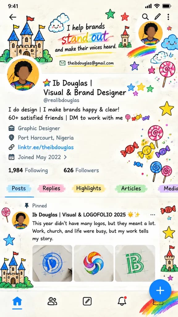
डूडल चित्रित सोशल प्रोफ़ाइल UI

डूडल चित्रित सोशल प्रोफ़ाइल UI

whimsical hand-drawn social media profile screen mockup. bright marker-and-crayon doodle illustration on off-white paper texture, black ink outlines, playful childlike icons, rainbow highlights, slightly imperfect hand lettering mixed with…

ui मॉकअपसोशल मीडियाडूडल चित्रण
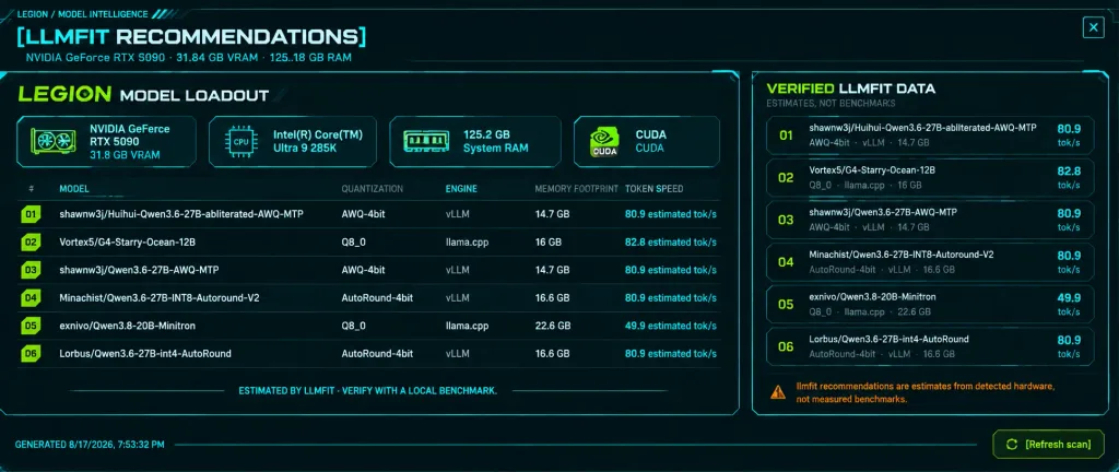
भविष्यवादी एआई मॉडल अनुशंसा डैशबोर्ड

भविष्यवादी एआई मॉडल अनुशंसा डैशबोर्ड

Dark futuristic dashboard infographic screenshot for [LLMFIT RECOMMENDATIONS], displaying local AI model performance metrics on an ultrawide desktop panel. Setting & Canvas: Ultra-wide 21:9 ratio computer monitor UI screenshot. Dark theme with pitch black and deep teal background, subtle ambient backlight glow, thin glowing neon cyan borders, fine scanline grid texture, and compact sci-fi terminal styling. Header: Top bar displays small label "LEGION / MODEL INTELLIGENCE", primary large title "[LLMFIT RECOMMENDATIONS]", subtitle "NVIDIA GeForce RTX 5090 · 31.84 GB VRAM · 125.18 GB RAM", and a square close-box icon on the top right. Left Panel (two-thirds width): Main card titled "LEGION MODEL LOADOUT" ("LEGION" in neon lime, remainder in white techno font). Exactly 4 horizontal hardware status tiles beneath: 1) NVIDIA GeForce RTX 5090, 31.8 GB VRAM with GPU icon; 2) Intel(R) Core(TM) Ultra 9 285K with CPU chip icon; 3) 125.2 GB system RAM with RAM module icon; 4) CUDA with circular CUDA emblem. Below hardware tiles, exactly 6 ranked rows with lime numbered badges (01-06), displaying model path, quantization, engine runtime, memory footprint, and token speed: 1) shawnw3j/Huihui-Qwen3.6-27B-abliterated-AWQ-MTP — AWQ-4bit — vLLM — 14.7 GB — 80.9 estimated tok/s 2) Vortex5/G4-Starry-Ocean-12B — Q8_0 — llama.cpp — 16 GB — 82.8 estimated tok/s 3) shawnw3j/Qwen3.6-27B-AWQ-MTP — AWQ-4bit — vLLM — 14.7 GB — 80.9 estimated tok/s 4) Minachist/Qwen3.6-27B-INT8-Autoround-V2 — AutoRound-4bit — vLLM — 16.6 GB — 80.9 estimated tok/s 5) exnivo/Qwen3.8-20B-Minitron — Q8_0 — llama.cpp — 22.6 GB — 49.9 estimated tok/s 6) Lorbus/Qwen3.6-27B-int4-AutoRound — AutoRound-4bit — vLLM — 16.6 GB — 80.9 estimated tok/s Bottom of left card features a centered neon divider with text: "ESTIMATED BY LLMFIT · VERIFY WITH A LOCAL BENCHMARK." Right Panel (one-third width): Titled "VERIFIED LLMFIT DATA" with subtitle "ESTIMATES, NOT BENCHMARKS". Lists exactly 6 compact verification cards numbered 01 to 06 in lime font, gray subtext, and cyan performance metrics: 80.9, 82.8, 80.9, 80.9, 49.9, 80.9 tok/s. Bottom warning note in orange: "llmfit recommendations are estimates from detected hardware, not measured benchmarks." Footer: Bottom left displays timestamp "GENERATED 8/17/2026, 7:53:32 PM". Bottom right features a lime-outlined clickable button labeled "[Refresh scan]" with a sync icon. Style & Constraints: Crisp, sharp digital HUD UI graphic, high-contrast condensed sans-serif technical typography, angular framing, no real-life humans or external photography, pure technical dashboard graphic.

डैशबोर्डइन्फोग्राफिकसाइबरपंक
डार्क स्केच ऐप मॉन्स्टर डूडल

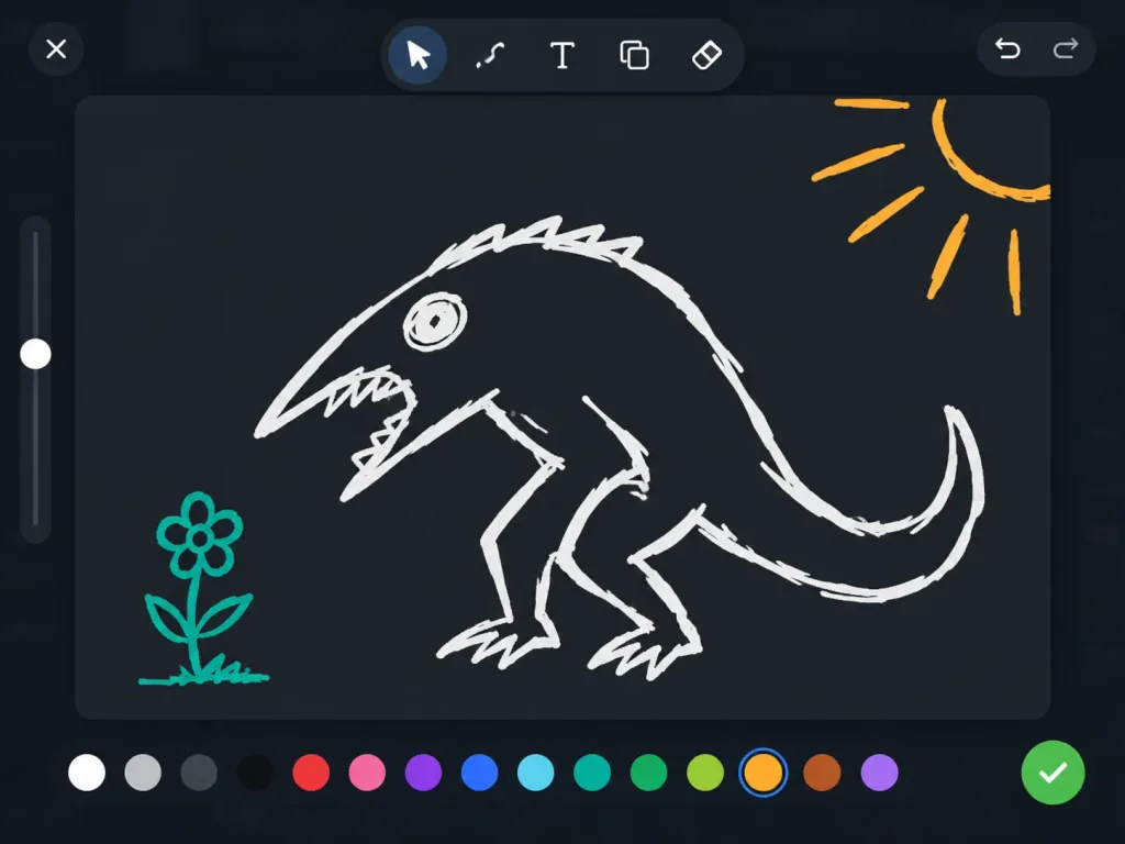
डार्क स्केच ऐप मॉन्स्टर डूडल

A clean screenshot of a dark digital sketch tool interface displaying a deliberately crude doodle in progress. The canvas is a rounded [dark charcoal] drawing panel filling most of the 4:3 frame, set over a subtly dimmed app background. In the center, a rough [white] line-art monster is drawn with thick, uneven brush strokes: a hunched fantasy creature with a long beak facing left, a jagged open mouth, a scribbled oval eye, a high arched back, bent legs, and a long curved tail. In the lower left, a small [teal] flower doodle on a stem faces the creature; in the upper right corner, an [orange] sketch of sun rays radiates outward. Interface layout includes: a top-left close "X" button; a floating top-center rounded toolbar containing six icons (pointer arrow, squiggly brush, text "T", shape duplicate, eraser diamond); top-right undo and redo arrows; a vertical brush-size slider on the left with a single circular white handle; a bottom horizontal palette of 16 round color swatches with the yellow-orange swatch selected by a blue ring; and a vibrant green circular checkmark confirmation button at the bottom right. Minimalist, playful dark UI aesthetic with intentionally messy, casual digital drawing lines.

यूआई स्क्रीनशॉटस्केच ऐपडार्क मोड
पुनर्चक्रित सामग्री कार्यशाला वेबसाइट हीरो

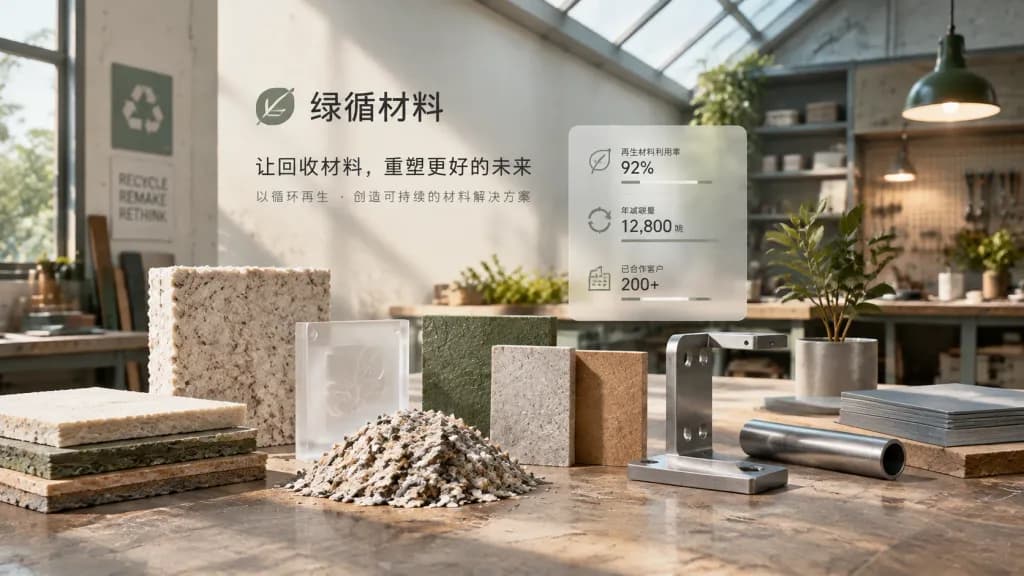
पुनर्चक्रित सामग्री कार्यशाला वेबसाइट हीरो

Responsive corporate website hero section visual with the theme: "[Turning a recycled materials manufacturing company into a modern workshop that breathes slowly]". Wide layout with recycled material samples and metal fixtures arranged in the foreground, a translucent data card and brand title in the middle-ground, set against an understated modern workshop interior. Lighting combines soft natural skylight with warm task lamps to highlight tactile textures and structural accents. Color palette: [Pulp White #E9E1D4, Workshop Gray #A9ACA8, Deep Olive Green #66715F, Metallic Gray Blue #8897A0, Structural Brown #8B7058, Title Charcoal Black #2C2F31]. Material textures emphasize [fiber embossing, cut edges, metal fixtures, frosted acrylic, and workshop table scratches]. Includes minimal Chinese typography for the company name and value proposition.

यूआई-यूएक्स-डिज़ाइनवेबसाइट हीरोपुनर्चक्रित सामग्री
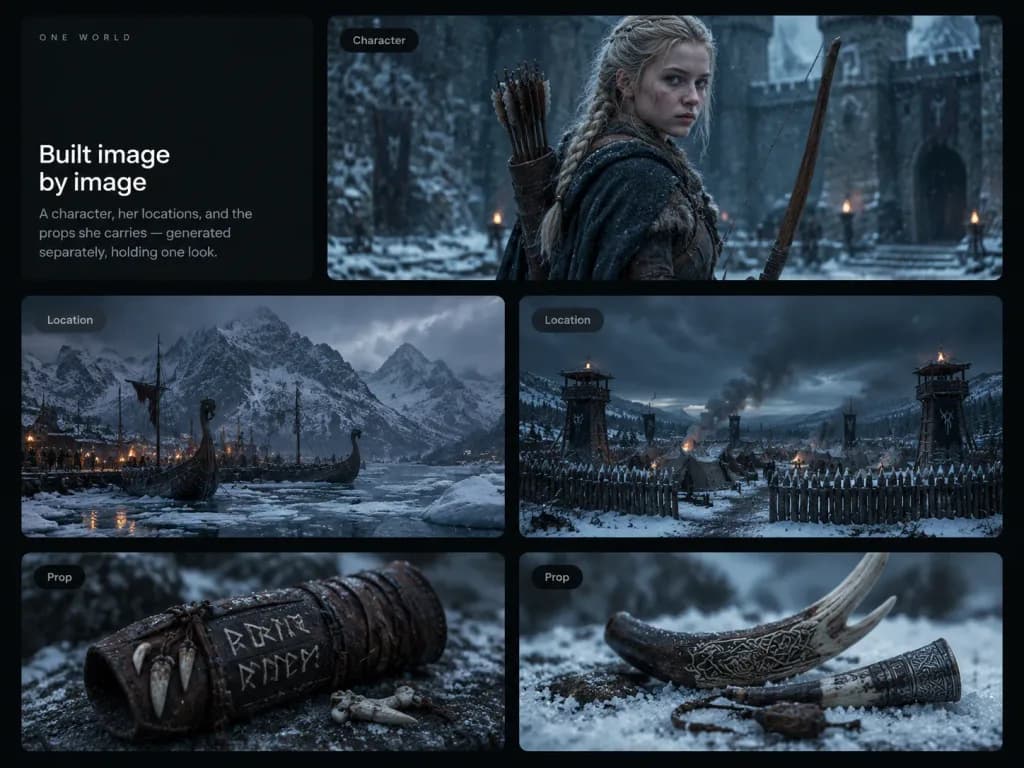
नॉर्डिक डार्क फैंटेसी वर्ल्डबिल्डिंग बोर्ड

नॉर्डिक डार्क फैंटेसी वर्ल्डबिल्डिंग बोर्ड

A dark cinematic editorial presentation board showcasing worldbuilding and visual consistency across multiple panels. The canvas is a 4:3 composition set against a nearly black background, featuring 6 rounded rectangular cards arranged in an elegant grid layout with soft margins and subtle drop shadows. Card 1 (upper left, tall text card): Minimalist dark layout with small spaced uppercase text "ONE WORLD" at the top. The lower half features the headline "Built image by image" in clean white sans-serif typography, followed by muted gray body text: "A character, her locations, and the props she carries — generated separately, holding one look." Card 2 (upper right, large wide card, labeled "Character" in a small dark pill label at the top-left): [A pale young blonde medieval archer girl with braided hair, serious expression, wool cloak and leather quiver of arrows] standing in a snowy stone castle courtyard, holding a long wooden bow, illuminated by cold blue-gray cinematic lighting with shallow depth of field. Cards 3 and 4 (middle row, medium landscape cards, labeled "Location"): Depicting [a grim Nordic medieval winter world]. Card 3 shows a frozen harbor with Viking-style longships trapped in pack ice, glowing torchlight, rugged snowy mountains, and overcast skies. Card 4 shows a fortified snowy military camp with canvas tents, wooden palisades, tall watchtowers, rising smoke, and ominous storm clouds. Cards 5 and 6 (bottom row, smaller close-up cards, labeled "Prop"): Card 5 features a weathered leather wrist guard adorned with pale carved runic symbols and small animal bones. Card 6 displays carved antler and horn pieces resting in powdery snow with a soft blurred background. Style: Photorealistic cinematic dark fantasy, muted desaturated blue-gray winter color palette, gentle falling snow, rich tactile textures, moody naturalistic lighting. Clean, modern UI case-study aesthetic, no logos, watermarks, or unnecessary clutter.

वर्ल्डबिल्डिंगकॉन्सेप्ट आर्टयूआई बोर्ड
रीडिंग ऐप प्रमोशनल डेस्क सीन

रीडिंग ऐप प्रमोशनल डेस्क सीन

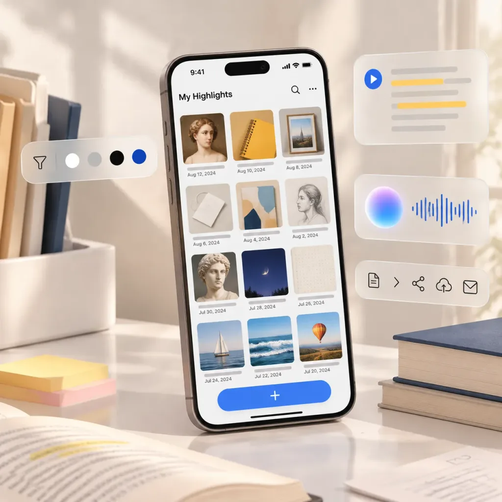
Polished promotional cover image for [Highlighted]. A modern smartphone stands upright at a slight angle on a bright white desk, showcasing a reading and productivity app interface in a [1:1 square] composition. On-screen UI: A minimalist gallery grid of 12 saved highlight cards arranged in 3 columns by 4 rows, each with a subtle gray label line below, featuring bookish visuals (classical portrait, yellow notebook, framed photo, white note with cord, abstract cover, pencil sketch, statue face, night sky cover, dotted page, sailboat, ocean waves, balloon landscape). A large rounded blue add button with a white plus sign rests at the bottom. Floating Glassmorphism Widgets: - Left: Pill-shaped toolbar with a filter icon and 4 circular color swatches in white, light gray, black, and navy. - Top right: Frosted audio transcript card with a play button and 5 horizontal lines including 2 yellow highlights. - Middle right: Frosted card showing a glowing circular orb and a blue audio waveform. - Bottom right: Frosted action bar with 5 icons (document, chevron, share, cloud upload, envelope). Desk Props: White tray of folders on the left, pastel sticky notes in the foreground, open book with highlighted text, loose papers, and a stack of hardcover books on the right. Lighting and Style: Premium commercial product photography, soft natural window light, shallow depth of field, creamy whites and warm neutrals, realistic glass reflections and subtle shadows. No watermarks or external brand logos.

यूआई मॉकअपऐप प्रोमोग्लासमॉर्फिज्म
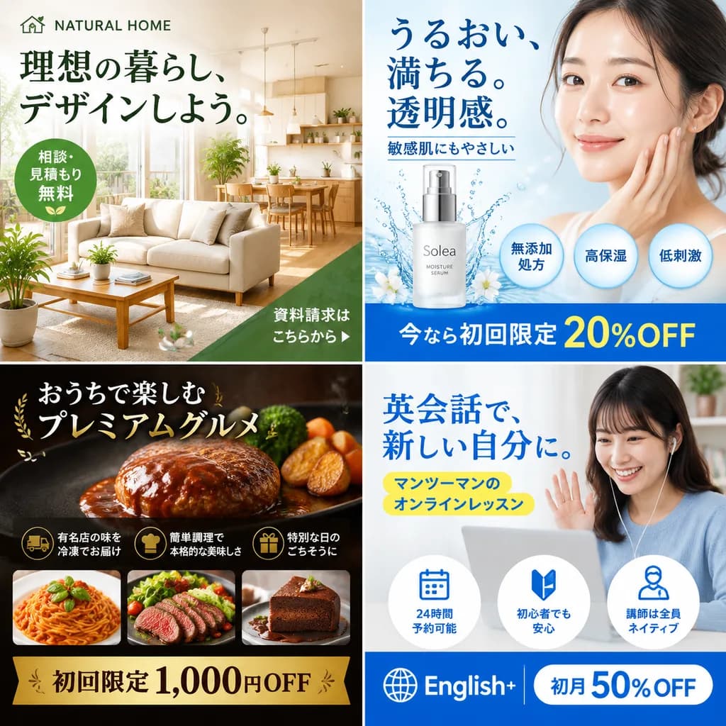
चार-पैनल आइकन स्टाइल शोकेस कैटलॉग

चार-पैनल आइकन स्टाइल शोकेस कैटलॉग

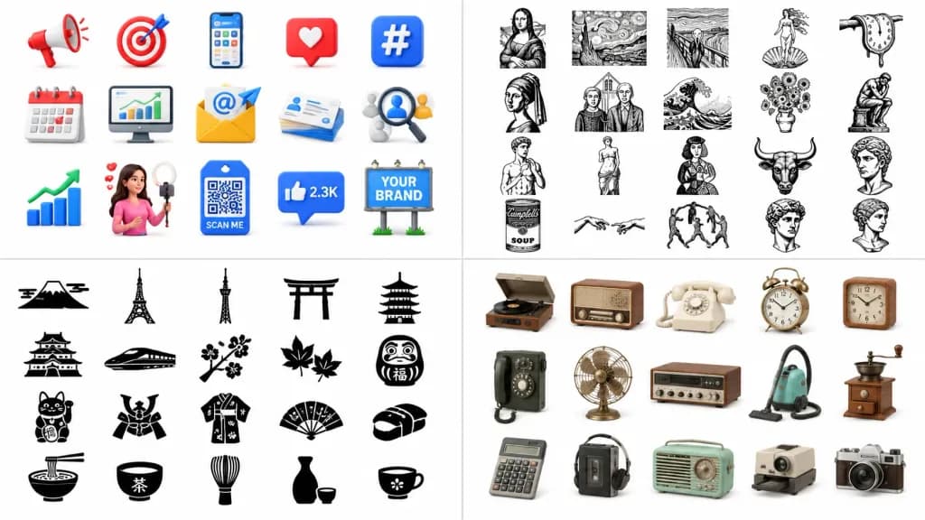
A clean 2×2 showcase collage catalog presenting [icon material styles] on a pure white background, designed as a prompt collection preview board. Layout and Composition: Wide horizontal 16:9 canvas divided into four equal rectangular quadrants separated by thin pale-gray divider lines and generous, even spacing between all items. Top-left panel: 15 glossy, colorful 3D digital marketing and social media icons arranged in 3 rows of 5 on a white studio background with soft drop shadows. Includes: a red-and-white megaphone, red target with arrow, smartphone displaying an app, red heart notification card, blue hashtag tile, desk calendar, desktop analytics monitor, yellow email envelope with an '@' symbol and paper plane, stack of business cards, magnifying glass over profile avatars, upward growth bar chart with a green arrow, female influencer filming with a ring light and floating heart, blue QR code tag reading "SCAN ME", blue thumbs-up speech bubble reading "2.3K", and a billboard reading "YOUR BRAND". Vibrant glossy 3D shapes with red, blue, yellow, and green accents. Top-right panel: 20 black hand-drawn line-art icons inspired by famous art motifs, arranged in 4 rows of 5. Includes: Mona Lisa-style seated portrait, Starry Night landscape frame, screaming wavy figure, Venus on a shell, melting clock, veiled woman bust, American Gothic couple, great wave, flower vase, seated thinker, classical standing male statue, classical robed female statue, abstract patterned dress figure, bull head, faceless bust, pop-art soup can labeled "Campbell's SOUP", two touching hands, circle of dancing figures, and two classical museum sketch portrait heads. Rendered in expressive monochrome black ink lines with textured sketch strokes, no color fills. Bottom-left panel: 20 solid black Japanese-themed flat silhouette icons arranged in 4 rows of 5. Includes: Mount Fuji with clouds, Tokyo Tower silhouette, Tokyo Skytree, torii gate, multi-tiered pagoda, Japanese castle, bullet train, cherry blossom branch, pair of maple leaves, Daruma doll with "福", maneki-neko lucky cat with "福", samurai helmet, patterned kimono, folding fan, nigiri sushi, ramen bowl with chopsticks, tea bowl, bamboo whisk, sake bottle with cup, and small teacup. Crisp vector silhouette style with sharp edges and minimal internal white cutouts. Bottom-right panel: 15 nostalgic retro household and gadget realistic 3D icons arranged in 3 rows of 5 with soft contact shadows. Includes: vinyl record player, vintage tabletop radio, cream rotary telephone, brass twin-bell alarm clock, wooden square clock, wall-mounted rotary telephone, brass desk fan, wood-grain stereo receiver, turquoise canister vacuum cleaner, antique hand-crank coffee grinder, gray calculator, portable cassette player, mint-green retro radio, vintage slide projector, and silver-and-brown vintage camera. Detailed realistic textures in beige, brown, brass, mint, and gray tones. Lighting and Finish: Bright high-key studio lighting across all quadrants, clean presentation, no text watermarks outside the specified labels, no background textures.

आइकनयूआई-डिजाइन3d-रेंडर
सिंथवेव वीडियो गेम मुख्य मेनू UI

सिंथवेव वीडियो गेम मुख्य मेनू UI

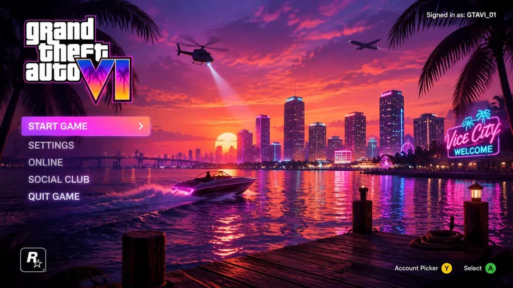
video game main menu UI mockup. [purple, pink, and orange synthwave]. vertical menu. coastal city skyline at [sunset]. water reflecting city lights. wooden dock in foreground. speedboat on the water. helicopter with spotlight. airplane in…

ui डिज़ाइनगेम इंटरफ़ेससिंथवेव
3D फिनटेक सेविंग्स ऐप मॉकअप

3D फिनटेक सेविंग्स ऐप मॉकअप

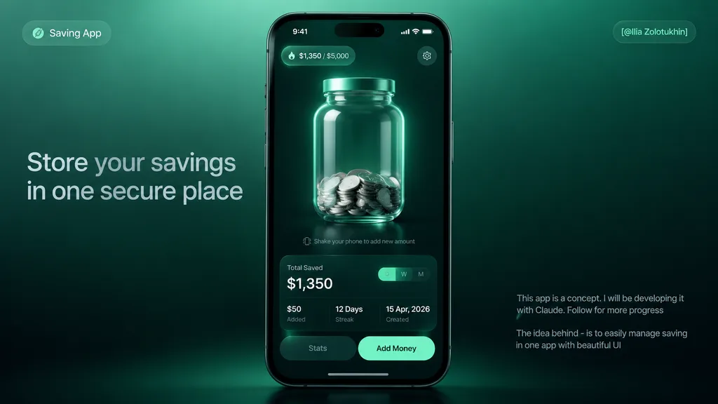
premium fintech app concept hero mockup. sleek 3D glassmorphism UI, dark mint green gradients, realistic smartphone render, soft studio lighting, high contrast, polished product-design presentation, subtle blur and glow, cinematic shadows.…

फिनटेकऐप मॉकअपग्लासमॉर्फिज्म
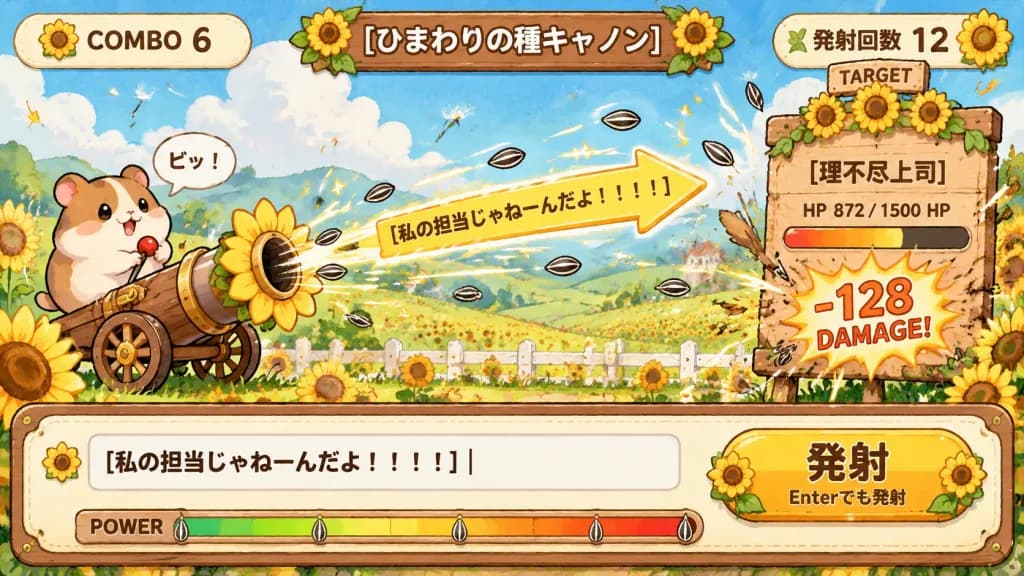
हैम्स्टर सूरजमुखी तोप टाइपिंग गेम यूआई

हैम्स्टर सूरजमुखी तोप टाइपिंग गेम यूआई

A cute hand-painted 2D game UI screenshot mockup for a hamster-powered sunflower seed cannon typing battle game, set in a cheerful rural sunflower field with Japanese interface text. Composition & Layout: Wide 16:9 game screen. Layout features a top HUD, center battlefield, right-side target board, and bottom typing/control bar. Top HUD: - Left rounded cream badge displaying "COMBO 6" next to a sunflower icon. - Center carved wooden plaque reading "[ひまわりの種キャノン]", decorated with sunflowers and green leaves. - Right rounded cream badge reading "発射回数 12" decorated with small leaves and a sunflower. Center Battlefield: - Setting: Lush rolling green meadow dotted with sunflowers, a rustic white fence, distant rolling hills, fluffy white clouds under bright daytime sky, drifting petals, dandelion seeds, and flying sunflower seeds. - On the left: Exactly one adorable chubby beige-and-brown hamster with glossy black eyes, grasping a red-topped lever on a small wheeled wooden-and-brass cannon with a large sunflower-shaped muzzle. A small speech bubble above the hamster reads "ピッ!". - Firing effect: A prominent yellow arrow-shaped banner projecticle flying from the muzzle toward the right, bearing the text "[私の担当じゃねーんだよ!!!!]". Striped black-and-white sunflower seeds shoot across the screen with bright motion trails and star sparkles. Right Target Board: - One large wooden target sign wobbling from impact, decorated with three sunflower blooms and a small "TARGET" label. - Target name reads "[理不尽上司]". - Below the name, an HP gauge showing "872 / 1500 HP" filled with a red-orange-yellow gradient and a dark depleted portion. - Below the bar, a dynamic comic damage bubble reading "-128 DAMAGE!" in bold red-orange text with white outlines, surrounded by impact bursts and flying seeds. Bottom Control Panel: - Wide cream-colored wooden bordered control panel spanning the entire bottom. - Left side: A typing text input box displaying "[私の担当じゃねーんだよ!!!!]" with a vertical blinking cursor. - Right side: A large rounded yellow button labeled "発射" with subtext "Enterでも発射" beneath, framed with sunflowers. - Lower border: A "POWER" meter with a green-to-yellow-to-red gradient and small seed gauge markers. Style: Whimsical Japanese mobile game illustration, warm storybook gouache and watercolor texture, clean thick outlines, cozy stitched borders, drop shadows, readable bold Japanese typography, arcade comic effects. Non-photorealistic.

गेम-यूआईटाइपिंग-गेमहैम्स्टर
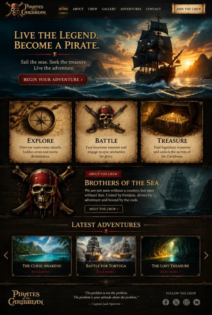
सिनेमैटिक समुद्री डाकू लैंडिंग पेज मॉकअप

सिनेमैटिक समुद्री डाकू लैंडिंग पेज मॉकअप

Full desktop webpage mockup UI design for [Pirates of the Caribbean] adventure landing page, in a dark fantasy cinematic realism style with antique parchment, carved dark wood, and gold embellishments. Palette of black, sepia, tarnished gold, deep teal storm clouds, and warm amber sunset. Header: Top left displays stacked logo "[Pirates of the Caribbean]" with a pirate emblem. Top center features 6 navigation links: "HOME", "ABOUT", "CREW", "GALLERY", "ADVENTURES", and "CONTACT", with "HOME" highlighted in gold. Top right features a rolled parchment button reading "JOIN THE CREW". Hero Section: Top half shows a dramatic seascape at sunset. On the right, a black-sailed pirate galleon cuts through rough waves against distant rocky islands and storm clouds. On the left, gold serif headline: "[LIVE THE LEGEND. BECOME A PIRATE.]" separated by a thin crimson divider with a skull icon, subtext reading "Sail the seas. Seek the treasure. Live the adventure.", and a dark red beveled button reading "[BEGIN YOUR ADVENTURE] >". Feature Cards: Exactly three framed parchment panels side-by-side. Card 1 displays an antique brass compass, titled "EXPLORE", text "Discover mysterious islands, hidden caves and exotic destinations." Card 2 displays crossed cutlasses and skull emblem, titled "BATTLE", text "Face fearsome enemies and engage in epic sea battles for glory." Card 3 displays an overflowing treasure chest of gold dubloons, titled "TREASURE", text "Find legendary treasures and unlock the secrets of the Caribbean." Crew Section: Dark wood backdrop. Left shows an ornate pirate skull-and-crossbones emblem with red bandana and beads. Right shows red badge "ABOUT THE CREW", gold title "[BROTHERS OF THE SEA]", body text "We are not men without a country, but men without fear. United by freedom, driven by adventure and bound by the code.", and an outlined button "MEET THE CREW >". Ghostly pirate ship silhouette in the background. Latest Adventures Section: Centered header "LATEST ADVENTURES" with skull divider. Three horizontal cards with carousel arrows: Card 1 "THE CURSE AWAKENS" with island lagoon art; Card 2 "BATTLE FOR TORTUGA" with naval combat art; Card 3 "THE LOST TREASURE" with glowing cave art; each with red "READ MORE >" links. Footer: Bottom left logo "[Pirates of the Caribbean]". Center quote: "The problem is not the problem. The problem is your attitude about the problem. — Captain Jack Sparrow —". Bottom right text "FOLLOW THE CREW" with 4 icons: Facebook, X, Instagram, YouTube.

ui मॉकअपवेब डिज़ाइनसमुद्री डाकू
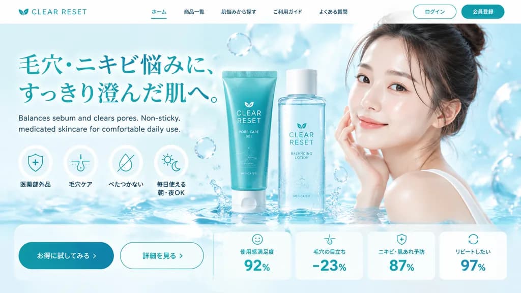
स्किनकेयर लैंडिंग पेज हीरो सेक्शन

स्किनकेयर लैंडिंग पेज हीरो सेक्शन

landing page hero section. skincare and beauty. [skincare gel and lotion]. [young Asian woman with clear radiant skin, hair tied up, gentle smile]. white. [teal]. light blue. [CLEAR RESET]. [毛穴・ニキビ悩みに、すっきり澄んだ肌へ。]. Balances sebum and clears…

लैंडिंग पेजयूआई डिज़ाइनस्किनकेयर
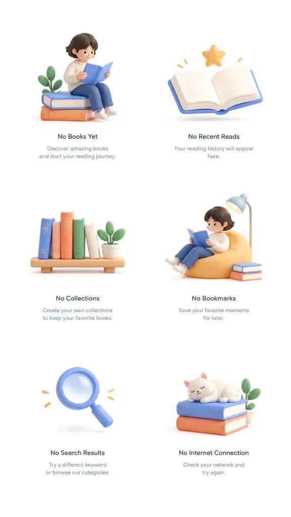
मोबाइल ऐप्स के लिए 3D क्ले एम्प्टी स्टेट इलस्ट्रेशन

मोबाइल ऐप्स के लिए 3D क्ले एम्प्टी स्टेट इलस्ट्रेशन

Set of empty state illustrations for a [Reading app], showing [6] distinct scenes in a [3D clay style]. Each illustration is framed in its own container with a consistent layout. Pure white background, generous whitespace, clean and minimal composition, soft lighting, modern Dribbble-style digital product design.

एम्प्टी स्टेट3d क्लेमोबाइल ui
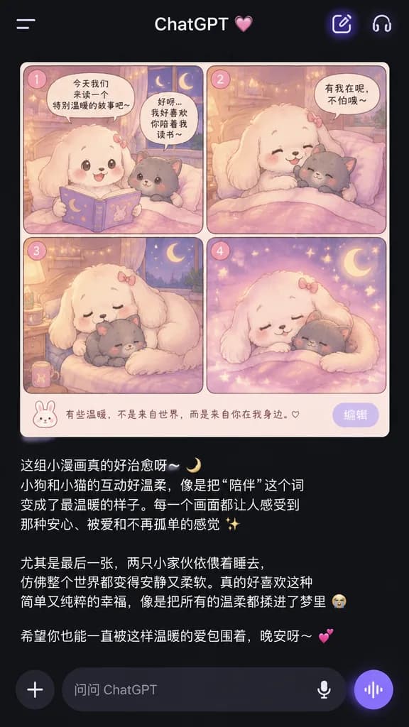
ChatGPT डार्क मोड कॉमिक स्क्रीनशॉट

ChatGPT डार्क मोड कॉमिक स्क्रीनशॉट

A smartphone screenshot of the ChatGPT mobile app in dark mode, displaying an AI-generated image embedded in an ongoing conversation. The black top header features a left menu icon, the title text "ChatGPT" with a small pink heart decoration, and two rounded icons on the right with a subtle purple glow. The center shows a rounded-corner 2x2 comic grid with 4 panels numbered 1, 2, 3, and 4 in small pink circular badges. The comic features a warm pastel pink, lavender, cream, and soft gold bedtime aesthetic: [a fluffy white puppy with long droopy ears and a tiny pink bow] comforts [a small gray kitten plush-like character] inside a cozy bedroom with fairy lights, star-shaped bokeh, and a crescent moon visible through the window. Panel 1 shows the puppy holding open a storybook beside the kitten in bed with Chinese speech bubbles above. Panel 2 shows the puppy hugging the kitten under the blanket. Panel 3 shows the kitten curled up while the puppy wraps around it protectively beside a nightstand cup. Panel 4 shows both sleeping cuddled together with dreamy sparkles. Beneath the comic is a small pale caption strip with a bunny icon and Chinese text, plus a corner button labeled "编辑". Below the image, the chat displays several paragraphs of emotional Chinese text in white with moon, sparkle, crying-face, and heart emojis. At the bottom is the ChatGPT input bar with a plus icon, the placeholder text "问问 ChatGPT", a microphone icon, and a purple circular voice button.

chatgptमोबाइल यूआईस्क्रीनशॉट
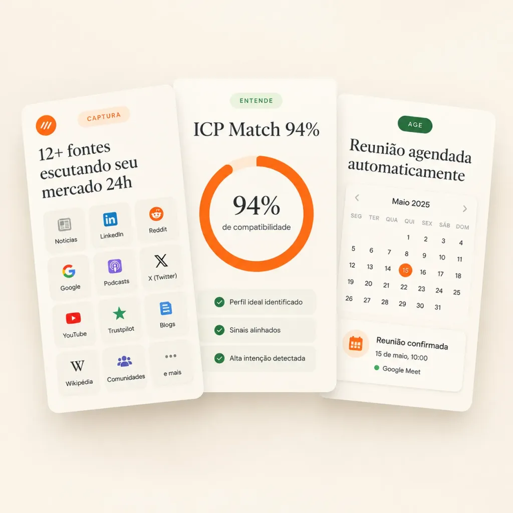
मिनिमल SaaS फीचर कार्ड्स हीरो मॉकअप

मिनिमल SaaS फीचर कार्ड्स हीरो मॉकअप

Clean landing-page hero mockup featuring three overlapping white SaaS feature cards for a sales intelligence product, designed in a premium minimal Figma UI style. Canvas is a square 1:1 composition with a warm off-white background, subtle soft beige gradient, light vignette, and realistic drop shadows under the floating cards. Typography features elegant editorial serif for large headings and crisp sans-serif for labels. Composition: Exactly three tall rounded rectangular cards overlapping horizontally in the center. The left card is in front and tilted slightly counterclockwise, the center card is nearly upright, and the right card rests behind, tilted slightly clockwise. Card 1 (Left - Capture Sources): - Top left: small orange circular logo icon with abstract white marks. - Top center: pale peach pill label reading “CAPTURA”. - Large headline: “[12+ fontes escutando seu mercado 24h]”. - Grid: 12 small rounded source tiles arranged in a 3-column by 4-row grid with icons and text: “Notícias”, “LinkedIn”, “Reddit”, “Google”, “Podcasts”, “X (Twitter)”, “YouTube”, “Trustpilot”, “Blogs”, “Wikipédia”, “Comunidades”, “e mais”. Card 2 (Center - Match Score): - Top: pale green pill label reading “ENTENDE”. - Headline: “[ICP Match 94%]”. - Center: thick circular donut progress ring in bright orange with pale peach track. Inside reads “[94%]” in large serif typography with a subtitle “de compatibilidade”. - Bottom: 3 thin rounded checklist rows with green checkmarks: “Perfil ideal identificado”, “Sinais alinhados”, “Alta intenção detectada”. Card 3 (Right - Automated Action): - Top: dark green pill label reading “AGE”. - Headline: “[Reunião agendada automaticamente]”. - Widget: compact calendar showing “Maio 2025”, weekday headers “SEG”, “TER”, “QUA”, “QUI”, “SEX”, “SÁB”, “DOM”, and date grid with day 15 circled in orange. - Bottom confirmation card: orange calendar icon, text “Reunião confirmada”, “15 de maio, 10:00”, and a green dot next to “Google Meet”. Style: Premium SaaS landing page graphic, clean 3D paper card effect, muted sage green and warm orange accents, vector icons, no browser chrome, no people.

saasui डिजाइनहीरो मॉकअप
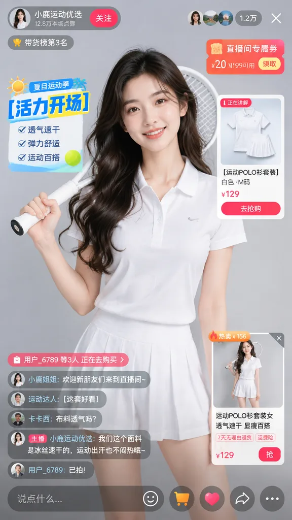
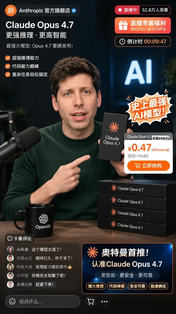
टेक सीईओ लाइवस्ट्रीम मॉकअप

टेक सीईओ लाइवस्ट्रीम मॉकअप

e-commerce livestream screenshot mockup. [Caucasian male resembling Sam Altman]. [Claude Opus 4.7]. sticker. dark green crewneck sweater. holding a black product box in one hand and pointing at it with the other. dark studio with a broadca…

लाइवस्ट्रीमई-कॉमर्समॉकअप
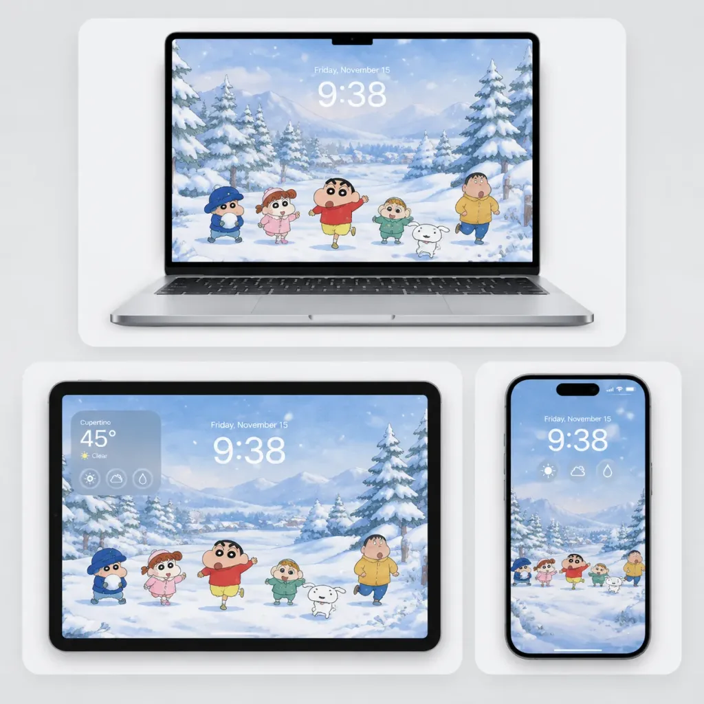
शीतकालीन एनीमे मल्टी-डिवाइस वॉलपेपर मॉकअप

शीतकालीन एनीमे मल्टी-डिवाइस वॉलपेपर मॉकअप

Clean promotional device mockup showcasing [Crayon Shin-chan winter snow scene] wallpaper adapted across laptop, tablet, and phone screens. Composition & Layout: Square 1:1 composition on a soft light-gray studio background. Display 3 devices arranged in rounded white rectangular cards with soft drop shadows: 1 open silver laptop centered across the top on a wide card, 1 black-bezel tablet in landscape orientation at the bottom-left card, and 1 vertical smartphone at the bottom-right card with a narrow gap between the lower two cards. Wallpaper Scene: A gentle, nostalgic watercolor anime winter landscape featuring a misty pale sky, snow-covered pine trees, frosted bushes, and a pristine snowfield with softly falling snowflakes in cool blue-white tones. In the foreground, 6 cartoon characters appear in playful Crayon Shin-chan art style from left to right: a child bundled in a dark blue winter hat and coat holding snow, a little girl in a pink winter outfit, a mischievous boy in a red sweater and yellow shorts running happily with raised arms, a small blond child in a green outfit, a stocky child walking in a yellow shirt on the right, and a small white puppy running near the center-right. Device & Screen UI Details: - Laptop: Open front-facing view, silver keyboard and trackpad visible, thin black bezel with a centered top notch. - Tablet: Landscape view with thick black borders, rounded corners, displaying a translucent weather widget at upper left reading "[Cupertino 45° Clear]" with 3 circular icons beneath. - Smartphone: Slim black bezel, vertical orientation, pill-shaped dynamic island cutout, with 3 circular lock-screen widgets. - All screens show subtle translucent lock-screen UI featuring date "[Friday, November 15]" above time "[9:38]" in soft white/light gray typography. Style & Constraints: Premium Apple-inspired product presentation, realistic studio lighting, sharp screen details, cohesive winter palette. No extra characters, no watermarks, no external marketing text.

डिवाइस मॉकअपवॉलपेपरएनीमे शैली